WE ASKED SOME OF OUR FAVOURITE GRAPHIC DESIGNERS TO CHOOSE THEIR BEST-LOVED BAND LOGOS. SEATTLE’S ART CHANTRY HAD NO HESITATION IN PICKING OUT THE BEATLES’ CELEBRATED ‘DROP T’ LOGO. AND HERE’S WHY HE DID …
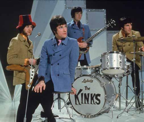
In a rare interview, The Kinks drummer Mick Avory reveals that the band’s soleful ‘kinky boots’ logo was inspired by an earlier version, designed by someone very close to home.
Pared down to its very essentials, the Abba logo is one of the purest logos imaginable — almost brutalist in its form. Launched in 1976, its Nordic simplicity went against the grain, at a time when many contemporary bands espoused a more flamboyant, illustrative aesthetic.
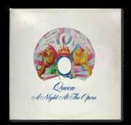
Queen’s ornate, over-the-top coat-of-arms band logo deftly captures the flamboyance, bombast and campness of the enduring arena rockers.
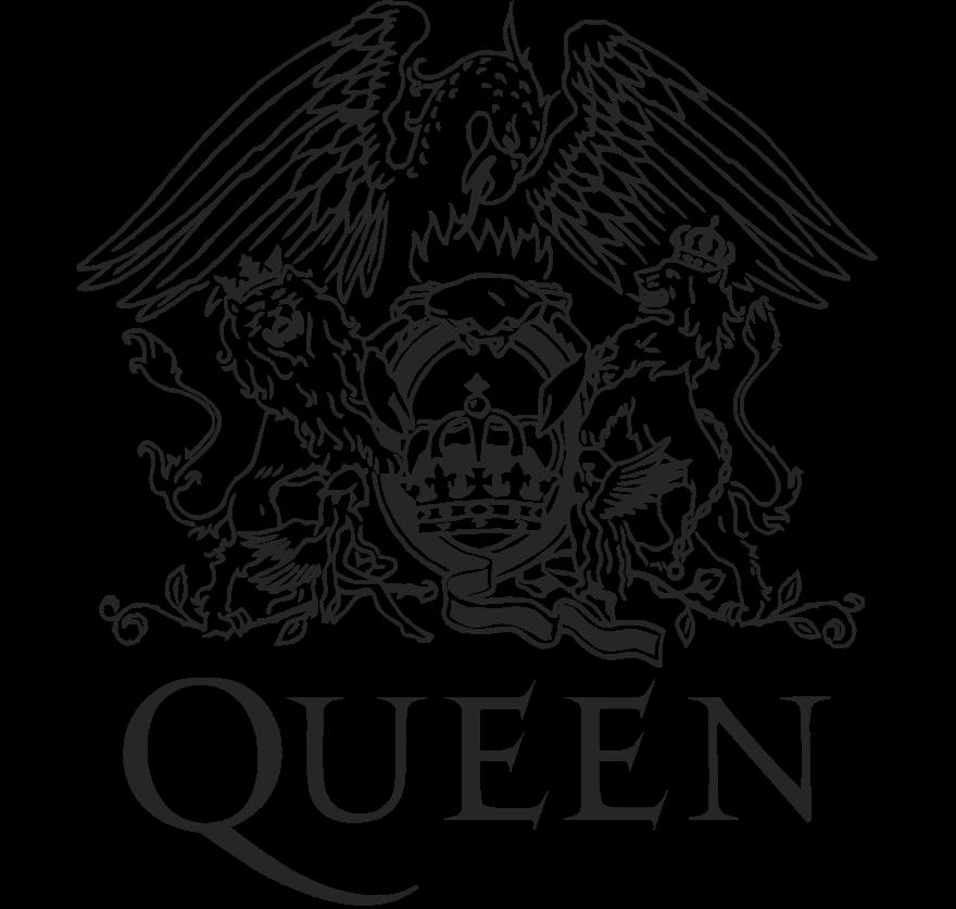
It’s hardly your typical punchy typographic marque, but a baroque, tongue-in-cheek ‘royal crest’, laden with elaborate symbolism and layers of hidden meaning. It first appeared on their eponymous debut album Queen in 1973, as a small sketch on the back-cover collage.
While it’s not unusual for band members to design their own logos, the results can be ‘mixed’. But the Queen crest, conceived and drawn by Freddie Mercury (at this point still trading under his real name Farrokh ‘Freddie’ Bulsara), manages to be original, ambitious and amusing.
That Queen guitarist Brian May studied Maths and Physics at Imperial College (where he famously built his own, bespoke guitars) is well documented. What’s perhaps less well known is that Mercury took Art and Graphic Design at Ealing Art College in west London, and was no slouch at illustration. And while May dabbled in astrophysics, Mercury was obsessed with astrology.
Consequently, the cod-heraldic Queen logo manages to seamlessly combine the zodiac signs of all four group members. There are two lions for bassist John Deacon and drummer Roger Taylor, both Leos; a crab for Cancerian May; and two fairies representing Virgo Freddie Mercury (although there may be additional subtext here).

The lions rampant embrace a stylised letter Q, seemingly made from artfully swirled ribbon, while the crab sits languidly on top of it. Inside the bowl of the Q, there’s an ornate, bejewelled crown, while the entire tableau is framed by a large, pointy-tongued phoenix rising from flickering flames.
Later, Mercury’s crest would be joined by a relatively sedate but elegant logotype designed by the band’s longtime photographer and visual artist Richard Gray. Set in all caps, this is most notable for the long, exaggerated flourish of the Q’s tail and the spiky angled serifs jutting upwards from the two E’s.
The main crest wasn’t just used as a b(r)and marque — it was painstakingly enlarged, lavishly coloured and rebooted for the cover of the band’s most celebrated album, A Night at the Opera. And then tweaked again and reprised for its follow-up A Day at the Races
Art direction for these instantly recognisable covers is credited to David Costa of Wherefore Art? Although, judging by the commentary on his website, he seems surprisingly underwhelmed by his efforts — ‘Queen: two early album sleeves best not remembered but selling in prodigious quantities’. JKD
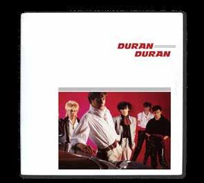
Duran Duran’s logo never stood still. Under the graphic guidance of designer Malcolm Garrett, it evolved iteratively from one single to the next and changed completely when a new album was released. Bands are constantly shifting course musically and image-wise, so it makes sense that a logo (or should that be logos?) reflects that sense of ongoing artistic progression, he argues ...
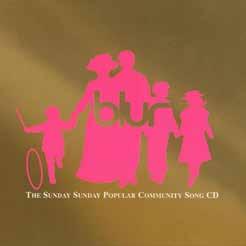
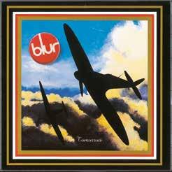
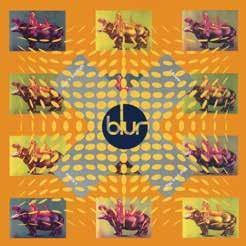
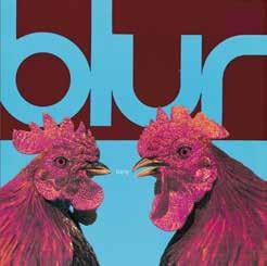
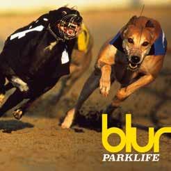

1992, Manchester. In a Sliding Doors moment, 20-something graphic designer Brian Cannon stepped into the same lift as Inspiral Carpets’ roadie, Noel Gallagher. This was to be the start of a beautiful creative relationship.
They got chatting about vintage adidas trainers and struck up a rapport. It turned out that Cannon’s £25-a-week studio (‘if you could call it that’) shared the same building as the Inspirals’ modest HQ.
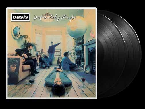
A mere two years later, Oasis’s debut album Definitely Maybe was released, featuring cover art direction and logo by Cannon. It went on to sell over 15 million copies worldwide.
Not long after the elevator pitch, Cannon met the rest of the band at a gig in Sheffield, where they were supporting another Creation Records signing, BMX Bandits. He’d taken along a book of classic record sleeves to test the water with Noel, Liam, Bonehead, and the rest. Flicking through, he alighted on an old Rolling Stones cover called, suitably enough, Out of Our Heads. It wasn’t so much the sleeve itself, as the Decca record label logo that caught his attention.
‘I never refer to other record sleeves to avoid becoming derivative,’ says Cannon. ‘In fact, I’m much more influenced by Renaissance Flemish painters like Jan van Eyck. The Definitely Maybe cover really picks up on his work. Wonderwall was a little more contemporary, referencing the Belgian surrealist René Magritte. I’m really intrigued by symbolism and visual metaphors. But I could see the potential of creating a serious branding exercise for Oasis. Even then, I knew they would become absolutely massive.’
The box-frame device was lifted directly from the Decca logo, but the first incarnation of the Oasis logotype was based on an ‘approximation of the Adidas font, which is a variation of Futura’, explains Cannon. However, as it turned out, the o’s and the a’s proved too similar. ‘From a distance the word looked too much like “Oosis”,’ says Cannon. Instead, he plumped for Univers Black Italic,
Van Eyck, Eyck baby Designer Brian Cannon and photographer Michael Spencer Jones peppered the Definitely Maybe artwork with visual riddles and clues, like a Renaissance painting.
I won’t pretend that I slavishly followed Pulp through their more obscure 1980s releases. Formed in 1978, the band was already three years older than me by the time I first saw the Common People video, in all its camp disco glory, on ITV’s Chart Show in 1995. But I immediately fell in love with the whole package. The kitschy, cheap synths; the shoe-gazey dancing; the sleazy, cigarette-burns-on-a-second-handmattress lyrics; and, of course, the design and art direction.
At that moment, disco — both the sound and the concept — had been out of favour for a long time, replaced by mumbling Seattle grunge and buoyant, larkish Britpop. Growing up in rural Lincolnshire, I wasn’t sure if discotheques even still existed, but I sought out the CD single that very afternoon.
Unbeknown to my 14-year-old self (who hadn’t even heard the terms ‘graphic design’ or ‘typography’ at that point), the cover of the single was designed by Sheffield’s other prodigal sons, The Designers Republic. And specifically designer Nick Bax — now the founder of Human Studio — who I reached out to for some insight:
‘It was created a few months after the release of the album His ’n’ Hers [the previous album] as a standalone design for T-shirts for them to sell at gigs, as the font used for that album [a lightweight cut of Futura] didn’t translate well for merchandise … Jarvis [Cocker] and Steve [Mackey] visited the studio a couple of times while I was working on the design. I showed them a few options and they went for the chrome vibe which I explained was inspired by the membership cards that video shops had
in the mid-late 80s. There is also a healthy mid-80s Doctor Who influence in there …’
‘I went to see them play at Sheffield Arena in June [2023] and it was wonderful to witness the design still being used and loved. Also quite satisfying that, since reforming, they are rocking the TDR-designed Pulp logo and not the one that [Joy Division designer] Peter Saville created a few years later.’
The base of the logo is the stylised display typeface Chromium One, designed by David Harris in 1983. The glossy, reflective lines found inside the letters taking on an almost art nouveau appearance, perfectly capturing the cheesy, faded glory of the 1970s and 80s club scene.
Pulp’s line-up has changed several times over the years, particularly early on, and the chrome logo only featured on the one album (Different Class). But, while the art direction and sound have changed, it’s still this logo which finds its way onto concert merchandise, fan sites and social media, having become visual shorthand for the band in general, not just the band at a specific moment in time. It’s always hard to say why one particular mark cuts through or transcends its original use, but this particular lock-up will always hold a certain power and conjure up a cornucopia of memories for those of us who were there in 1995.
Craig Ward is a highly decorated, globally recognised design director who has partnered with everyone from rock stars to Fortune 500 mainstays. www.ward.studio
I SHOWED THEM A FEW OPTIONS AND THEY WENT FOR THE CHROME VIBE, WHICH I EXPLAINED WAS INSPIRED BY THE MEMBERSHIP CARDS THAT VIDEO SHOPS HAD IN THE MID TO LATE 80S. THERE’S ALSO A HEALTHY MID-80S DOCTOR WHO INFLUENCE IN THERE …

Uncommon type
Common People hit #2 in the UK charts in June 1995. ‘The video was just a little dance I made up on the spot. It was rubbish, really, but it worked,’ confided Jarvis Cocker to Uncut magazine.
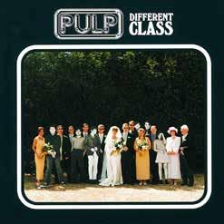
Class cover art
The artwork for Different Class, Pulp’s fifth LP, takes an almost inverted Sgt Pepper’s approach, with cutouts of the band at family wedding.

Pulp up the volume
The classic The Designers Republic logo looking loud and proud at Pulp’s 2023 live shows.
TYPE DESIGNER AND DANCE MUSIC LOVER RICK BANKS IS DAFT ABOUT THE DAFT PUNK LOGO.
I’M NOT REALLY INTO BANDS. NEVER HAVE BEEN. GROWING UP I IDOLISED DJS AND INDIVIDUAL PRODUCERS MORE.
IN THE DANCE MUSIC WORLD, THERE AREN’T THAT MANY ‘BAND’ LOGOS. HOWEVER, ONE STOOD OUT. IT WAS THE FIRST ALBUM I BOUGHT (LET’S CONVENIENTLY FORGET THAT LIGHTHOUSE FAMILY ALBUM) AND IT BLEW ME AWAY. STILL DOES. I REMEMBER THE EXACT MOMENT I BOUGHT IT — BOLTON WH SMITH IN 1997, AGED 11.
IT HAD THIS ORANGE EMBROILED LOGO ON THE FRONT DESIGNED BY BAND MEMBER GUY-MANUEL DE HOMEM-CHRISTO. THE ALBUM WAS CALLED HOMEWORK. THE BAND WERE ORIGINALLY CALLED DARLIN’, BUT FAMOUSLY CHANGED THEIR NAME TO DAFT PUNK AFTER A SCATHING REVIEW IN MELODY MAKER DESCRIBED THEIR MUSIC AS ‘DAFT PUNKY TRASH’.
OVER THE YEARS, THE LOGO HAS BEEN RENDERED IN SO MANY MATERIALS AND IT STILL LOOKS AS COOL AND UNIQUE AS IT DID BACK IN 1997.
Franz Ferdinand’s Alex Kapranos and designer Matthew Cooper enjoy a trip down memory lane to chat about the band’s brilliant Bauhaus-inspired logotype. Stopping off along the way to muse on constructivism, colour palette and collaboration.

Logo Rhythm: How did you find each other?
Alex Kapranos: We first met Matt back in 2003, working on the Darts Of Pleasure cover. I really got on with him straight away. He totally got any reference immediately, then topped it with a couple more, even better. He’s a gentle, cool guy, with a quiet confidence that lets you know it’s all going to be cool.
Matthew Cooper: I’d been doing various design projects for Laurence [Bell, the founder of Domino Recording Co] when he was running Roughneck Records. Then, when he set up Domino, Laurence asked to me to design the label’s logo and I’ve been working with him ever since. Later, when Franz Ferdinand signed to Domino, I guess it was natural that he’d ask me to help them with their artwork. I first saw the band live at The Africa Centre [in London’s Covent Garden] in July 2003 and knew immediately that this was a band that I ‘got’. I remember meeting Alex for the first time in the Portuguese café around the corner from my studio … he had Marmite on toast and tea.
AK: I’d forgotten about the Marmite. I remember the café though.
LR: Franz Ferdinand are known as being an ‘art school’ band — do they get involved with the visuals?
Pleasure principle
A horizontal version of the Franz Ferdinand logotype first appeared on the 2003 single Darts of Pleasure
AK: I’d only go to the art school to get drunk or sneak into the odd lecture when I was on the dole. Bob [Hardy, bass] studied Fine Art. Paul [Thomson, drums] used to be a life model there. We all had girlfriends at the art school.
MC: Yes! All the band members have been involved down the years in the artwork. It has been, and remains, a real collaboration, which is my favourite way to work.
LR: So how did your creative relationship develop?
AK: I used to knock up crude versions of the artwork on a cracked copy of Photoshop, then send it to Matt who would make it look wonderful. The major reference points were constructivism, dada and the Bauhaus, probably in that order. We were quite strict about what we wanted. Probably quite opinionated. It was cool to work with Matt who totally got it.
MC: The band would send me rough sketches or ideas which I would then develop further, tighten up or redo, depending on how fully formed their ideas were. The limited colour palette was settled on very early and this became as much of a signature as the logo.
Working within quite a well-defined design aesthetic — inspired very much by the Russian constructivists, the Bauhaus and dadaists – placed welcome restrictions on
