

Introduction to the Catalogue
Sonia Del Re
The preceding essay chronicled the development of the Department of Prints and Drawings as a history of firsts. Its centennial is not only an occasion to review its celebrated past, but also one to revisit its publications (albeit briefly and incompletely here), for every generation of paper curators at the Gallery had the opportunity to publish a drawings collection catalogue, as we do now in our turn.
The first was a follow-up to the three-volume catalogue of Western paintings and sculptures: curator Kathleen M. Fenwick and drawings acquisition advisor Arthur E. Popham published a fourth volume in 1965 containing the three hundred and twenty-two European drawings collected up to then, minus the British holdings, too extensive to publish concurrently.1 The plan was to compose separate volumes for drawings of the British and Canadian schools, which would take another forty years to accomplish in the first case (see below), whereas the Canadian holdings have yet to be published.
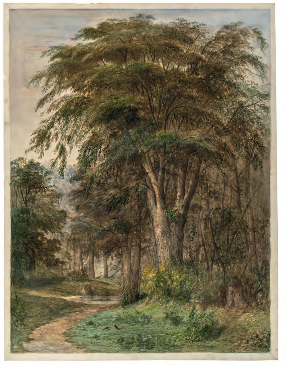
The 1988 catalogue Master Drawings from the National Gallery of Canada, published by the National Gallery of Art, Washington, showcased ninety greatest hits made before 1900 in conjunction with an exhibition held in Washington, which travelled to Ottawa and Vancouver. 2 Its memorable cover features Samuel Palmer’s Oak Trees, Lullingstone Park (fig. 7) – a work that exhibition co-curator Douglas Schoenherr later extolled as “the flagship of the NGC’s British collection and one of the supreme achievements of British draughtsmanship at it most exalted.” 3
In the 2000s, under the guidance of Chief Curator David Franklin,4 the department embarked on the publication of a five-volume series by school: Italian (2003); Dutch and Flemish (2004) – featuring mainly works from the promised gift of Frank and Marianne Seger of Toronto, in part acquired now; French (2004); British (2005); and Central European (2007). Particularly with this last volume, the publication project led to a noteworthy acquisition campaign that enhanced otherwise lean holdings.

Since then, we have gathered dozens more sheets for the historical Western holdings, which have been awaiting their moment in the sun – inasmuch as light is the greatest threat to works on paper. In 2019 we applied to the Getty Foundation’s Paper Project initiative, which supports the work of young and mid-career curato rs of works on paper – an area of the museum field chronically underfunded, with a publication proposal to honour the centennial anniversary of the Department of Prints and Drawings at the Gallery. The Getty Foundation supported our aspirations with a major grant. Alongside the new additions, many of which are making their Canadian debut, we have presented earlier acquisitions that also deserve their hour of glory, for the joy in curating an exhibition of drawings offers a wonderful “excuse to poke about in the solander boxes,” as Mimi Cazort fittingly expressed. 5
The discoveries presented here thus encompass the finds we brought into the drawings vault as well as the previous acquisitions unearthed from within. If we initially aimed at presenting one hundred sheets to commemorate the department’s 100th anniversary in 2021, we included three more for the years that have since elapsed due to institutional hurdles and ensuing delays. They serve as symbols of continuity in curation and collection building, for some acquisitions are still being processed as I write these lines.
It is also worth noting that sheets by women artists feature far more prominently in this collection catalogue than in any other previously published by the Gallery. The wide-ranging selection from our ever-evolving, world-class holdings of historical drawings dating from the Renaissance to the twentieth century, and in every medium, from graphite to ink and pastel to watercolour, does not fit neatly into standard categories. Nor did we wish to reduce it to a chronological or geographical demonstration. Therefore, they are brought together into groupings that each have their own flavour.
In the Making
This catalogue begins with a selection of sheets we are extremely proud to have brought into the fold of the collection for they bear, for the most part, close relationships to a sculpture and numerous paintings that grace the walls of our institution. For instance, a tranquil landscape by Otto Greiner acquired in 2018 finds – ten years after it was put to paper – its way to the background of his monumental Prometheus, a painting gifted to the Gallery back in 1978. Three exceptions stand out here: a preparatory drawing by Simon Vouet for a painting now in a church outside of Quebec City, and two more by his pupil, the enigmatic Claude François, recorded as the first European professional artist to paint in New France in 1670–71. We hope that the discovery of these two last studies will spur additional interest in this undervalued painter and draughtsman. Although finding a sheet related to an object belonging to the Gallery always feels like a coup, the collection of drawings goes well beyond complementing the holdings of paintings and sculpture as it investigates facets of art history otherwise unexplored in our permanent displays.
Heroes and Foes
History painting – that is, subject matter drawn from history, mythology and religion – occupies the top position in the traditional hierarchy of genres. It is not surprising therefore that a group of such depictions is assembled here. Fascinatingly, each and every work features a leading protagonist in the throes, more often than not, of a struggle with an adversary. Sometimes their presence is conspicuous, like in one of Laurent de La Hyre’s final drawings in which a handsome Apollo stares victoriously at the defeated serpent Python. In others, they lurk in the background, like the prophetkilling Queen Jezebel in her chariot in Sébastien Bourdon’s ominous interpretation of one of The Seven Acts of Mercy This section contains the smallest work in the exhibition and many of the largest. The former, by Johan Wierix, was meant to be held in one’s hand for private devotion,


Sébastien Bourdon was one of the leading French artists of the seventeenth century, along with Charles Le Brun (cat. 56) and Laurent de La Hyre (cat. 16), with whom he founded the Académie royale de peinture et de sculpture in 1648. When he was around fifty, Bourdon embarked on a group of works titled The Seven Acts of Mercy, 1 which in format and design drew inspiration from Nicolas Poussin’s series The Seven Sacraments, executed during the 1640s. Both ensembles consist of seven paintings, each portraying a biblical episode to illustrate a moral theme. For Giving Drink to the Thirsty (fig. 36), Bourdon chose a passage from the First Book of Kings: “When Jezebel was killing off the prophets of the Lord, Obadiah took a hundred prophets, hid them fifty to a cave, and provided them with bread and water” (I Kings 18.4). According to Guillet de Saint-Georges, first historiographer of the Académie royale, Bourdon worked on the seven canvases between 1665 and 1671, commissioned by a connoisseur named Le Clerc. 2
To ensure the perpetuity of this cycle of paintings –currently at The Ringling museum in Sarasota, Florida –Bourdon reproduced all seven himself, during the same period. The resulting etchings, dedicated to Louis XIV’s
Sébastien Bourdon
Montpellier, France 1616–1671 Paris, France
17 Potare Sitientes or Giving Drink to the Thirsty c. 1665–71 pen and brown ink with grey and brown wash over black chalk on cream laid paper
45.8 × 60.3 cm no. 48520
Provenance private collection, France; Galerie Alexis Bordes, Paris; purchased by the National Gallery of Canada, 2018
controller-general of finances Jean-Baptiste Colbert, captioned in Latin and sold out of the artist’s home, are considered masterpieces. In 1835 the great historian of French prints Alexandre-Pierre-François Robert-Dumesnil wrote: “The prints by this master, in particular his acts of mercy works, are extremely fine and offer enduring proof of the power of his talent as an etcher and engraver.” 3
In the Gallery’s preparatory drawing for the plate illustrating the second act of mercy, Giving Drink to the Thirsty, Bourdon first roughed out the scene in black chalk, then added details with pen and brown iron gall ink and finally used washes to create relief – various tones of grey, with areas of bistre and sepia in the background. Against a setting featuring elements of classical architecture, where the terrible Queen Jezebel can be glimpsed perched on her chariot, a group of prophets cower in the foreground at the mouth of a cave, quenching their thirst from the jars of water brought by Obadiah, the figure standing on the right. As one would expect, the drawing is identical in composition and format to the etching (fig. 37). There is only one other known drawing that can be related to the Acts of Mercy cycle: 4 a study of figures that includes a sketch for Obadiah and possibly, at the lower left, a second for a figure further to the rear.
Bourdon’s drawing reflects the energy and skill he brought to its execution. The confident draughtsmanship heightens the intensity of an already dramatic scene, with its assembled characters’ diverse poses and sooty eyes. This large work is unique in the corpus of Bourdon’s drawings, which specialists judge to be very small, the majority having undoubtedly not survived. 5 There is no other sheet by Bourdon in North America that matches it, for either size or degree of completion.6 It is all the more fascinating for being preparatory to an etching that Bourdon executed himself, rather than assigning the task to an engraver.
S.D.

Fig. 36 Sébastien Bourdon, Giving Drink to the Thirsty, 1665–70, oil on canvas, 123.8 × 175.3 cm. The John and Mable Ringling Museum of Art, the State Art Museum of Florida, Florida State University, Sarasota. Bequest of John Ringling, 1936 (SN367)

Fig. 37 Sébastien Bourdon, Giving Drink to the Thirsty, 1665–70, etching and engraving on laid paper, 44.1 × 58.9 cm (sheet). Promised gift of Gilbert L. Gignac, Ottawa to the National Gallery of Canada, Ottawa

Provenance
Adriaen van Ostade was an accomplished painter, etcher and draughtsman, 3 with a career spanning more than fifty years in Haarlem. He specialized in genre scenes, especially low-life subjects of farmers and village folk drinking, dancing, listening to music, smoking, gambling and playing cards, as well as some quieter moments of peasant life. An important and influential master of the genre, he was emulated by many.
This drawing by Van Ostade is a preparatory study for his signed and dated painting Peasants Making Merry in a Barn (fig. 47).4 The drawing is typical of his compositional sketches of the 1640s, when he concentrated on multifigural arrangements with quick expressive strokes of pen and brown ink and brushes of brown wash. The figures are more differentiated, detailed and three-dimensional than in his earlier work. In the drawing, he focuses on the fiddler and dancers and nearby watchers and listeners, all of whom reappear in the centre of the painting largely unchanged. For instance, the exuberance of the two dancers has been subdued, and the pose of the seated figure has shifted slightly. But the setting in the painting, aside from the dormer window to the left, is entirely
Adriaen van Ostade
Haarlem, Netherlands 1610–1685
28 An Interior with a Fiddler and Peasants Dancing c. 1645
pen and brown ink, brush with brown and grey wash, over graphite and black chalk on ivory laid paper solidly attached to laid paper 21.6 × 28.3 cm (including 1.8 cm strip of paper added to left edge)1 no. 42929
John Barnard (L. 1419), no. 987; 2 his sale, Greenwood, London, 17 February 1787, lot 48; Anton W.M. Mensing (1866–1936), Amsterdam; his sale, Mensing & Fils (Frederick Muller & Co.), Amsterdam, 27 April 1937, lot 511; Christiaan Pieter van Eeghen (1880–1968), Amsterdam (L. 6016); by descent to his daughter Catharina Croockewit-van Eeghen (1917–2006), Arnhem; by descent to her family; purchased by the National Gallery of Canada, 2009, through Art Consult B.V., Amsterdam
different. The intimate interior of a peasant’s kitchen with the hearth on the right and a closet bed in the back has been expanded into a cavernous barn interior. A substantial post, decorated with baskets and harnesses, supports a steep high roof, and a hayloft is just visible in the gloom behind. Peripheral listeners and revellers have filled in the extra space along with anecdotal still-life elements, such as the empty beer stein tipped over on the floor, and the cast of a cat and two dogs, who add considerable charm as they too listen to the fiddler or eat off a plate. Notably, in the drawing the setting and background details are executed in a lighter ink, indicating they were added by another hand, most likely that of Cornelis Dusart, Van Ostade’s last and most important pupil. Dusart inherited his master’s studio estate, which included large portfolios of drawings that the younger artist took great advantage of in several different ways. He used them for inspiration, he copied them and he reworked them, much as he did here, by filling in empty backgrounds. 5
Low-life subjects, often moralizing, form a genre of considerable popularity and significance in Dutch seventeenth-century art. Van Ostade’s drawing has a lively, carefree and non-judgmental tone. The merrymaking peasants are less overtly comic than in his earlier work and are more nuanced than the drunken peasants brawling in taverns characteristic of his teacher Adriaen Brouwer. This is also the moment when Van Ostade first introduces the dancing farmer, a stock character in his later repertoire.6 Toward 1650, Van Ostade began making a different kind of study of single figures in chalk drawn “from life” (naer het leven) in preparation for his paintings and etchings. Dusart developed this practice further in such works as Study of a Seated Man Holding a Pipe (cat. 29). During the second half of his career, Van Ostade also produced finished pen and watercolour drawings, like miniature paintings, which were highly sought after.
E.D.

Current location unknown


Giacomo Balla played a decisive role in the development of Italian Futurism. When poet Filippo Tommaso Marinetti’s Manifeste du futurisme appeared in the Paris daily Le Figaro on 20 February 1909, launching this initially literary movement, Balla and his friends were lured by its call for a definitive break with the past and a new focus on movement, speed and scientific and technological progress.
In 1910 these artists went on to sign the Manifesto dei pittori futuristi and La pittura futurista: Manifesto tecnico, but Balla’s work remained fundamentally conventional, and he did not take part in the first Futurist exhibition, held in 1912. Toward the end of that year, however, he became a full-fledged member of the movement, even auctioning off his entire previous painting production. Increasingly involved in the group’s activities, he began creating his first major Futurist works, moving from verismo – the realist representation of objects – to an innovative approach in which movement is suggested by the juxtaposition of repeated forms to create a single image. This sequential picturing of speed is epitomized by his famous painting Dynamism of a Dog on a Leash (fig. 77).
Giacomo Balla
Turin, Italy 1871–1958 Rome, Italy
47 Sunset with Goldfish c. 1913–14 pastel on laid paper prepared with pale grey ground 24.8 × 37.9 cm no. 46514
Provenance gif t of the artist to his student Benedetta Cappa (1897–1977), 1914; purchased by Lydia Winston Malbin (1897–1989), New York, 1958 (catalogued under no. W-33 in her collection); her sale, Sotheby’s, New York, 16 May 1990, lot 11; purchased by Jan Krugier (1928–2008); sale, Sotheby’s, London, 4 February 2015, lot 173, as part of the Jan Krugier Collection; purchased by Stephen Ongpin Fine Art, London; purchased by the National Gallery of Canada, 2015
Chronologically and stylistically, Sunset with Goldfish marks a crucial point in Balla’s development, when he began deconstructing form into rhythmic harmonies of line and colour.1 It is one of his highly schematic studies of light and motion aimed at representing movement in itself rather than the particular movement of a given object. What must be sought among these lines, instead of an objectively figurative “sun” or “goldfish,” or the “sea” of the drawing’s French title, 2 are allusions to the fleeting effects of light resulting from the complementary contrast of blue and orange.
Balla’s early Futurist experiments analyzing the spatial displacement of an object had thus evolved into an exploration of the limits of abstraction, focusing particularly on the representation of cosmic or cosmogonic themes – as here, where pastel has been used to create a series of light effects. While exemplifying the dynamism, spontaneity and optimism of Italian Futurism in general, the drawing also vividly illustrates Balla’s unique brand of abstract Futurist work.
The artist gifted the drawing to his student, Benedetta Cappa, in 1914, which gives us a terminus ante quem for its execution. Cappa joined the Futurists in 1917, and in 1923 she married Marinetti, the movement’s founder. Balla would remain her mentor and close friend, and she kept the pastel until his death. It was then acquired by art patron Lydia Winston Malbin, who mounted a major collection of modern European art centred largely on the Italian Futurists. 3
S.D.

Dynamism of a Dog on a Leash 1912, oil on canvas, 89.8 × 109.8 cm. Buffalo AKG Art Museum. Bequest of A. Conger Goodyear and Gift of George F. Goodyear, 1964 (1964:16)

In the early twentieth century, the Caravaggio scholar Roberto Longhi brought to light the significance in Lombardi of the work of the Campi brothers – Giulio and the much younger Antonio and Vincenzo.1 Since their rehabilitation by Longhi, the Campi family has been recognized for their innovations in style, typified by a high degree of naturalism and dramatic chiaroscuro, accessible compositional schemes, and unusual choice of subject matter. 2
Although known primarily as a painter, Antonio was also active in the fields of architecture and sculpture and was a published and decorated historian. 3 His involvement in two confraternities, the Compagnia di Santa Corona Spinea and the Oratorio di Santa Maria della Stella, likely enhanced his popularity among the religious milieu of the Catholic Reform.4 His close ties to Cardinal Carlo Borromeo, Archbishop of Milan, are well documented in a series of letters in which the two discuss artistic matters. 5 The brothers’ connection to the cardinal supplied them with many public commissions through which they gained quick success and a strong foothold in Milan starting at the beginning of the 1570s.
Antonio Campi
Cremona, Italy 1524–1587
52 Study of Nudes c. 1555–65 black chalk on ivory laid paper 26.4 × 42.4 cm no. 42522
Inscriptions upper left, pen and brown ink, n. 451; upper right, pen and brown ink, 30; lower right, pen and brown ink, Pelegrino Tibaldi; verso: centre, pen and brown ink, several numerical inscriptions
Provenance John Clerk, Lord Eldin, Edinburgh (L. 505); his sale, Edinburgh, 14–27 March 1833; Paul Frantz Marcou, Paris (L. 1911b); private collection; sale, Drouot/Lafon, Paris, 23 May 2007, lot 17 (attrib. to Giovanni Battista Naldini); Pandora Old Masters, New York (attrib. to Antonio Campi); purchased by the National Gallery of Canada, 2009, with the assistance of a contribution from Lester Carissimi, New York

Fig. 83 Giovanni Antonio Pordenone, The Lamentation, compositional study for a painting, 1522, red chalk over stylus underdrawing, squared for transfer with the stylus, 36.7 × 27.7 cm. The British Museum, London (1958,0208.1, recto)
The Ottawa sheet dates from this period. If the old attribution to Pellegrino Tibaldi inscribed on the recto is inaccurate, he too was closely connected to Cardinal Borromeo when he was employed as his architect in Milan in the same years. However, some of the individual studies relate to Antonio Campi’s works, such as the large nudes in his Loves of the Gods frieze in Adalberto Pallavicino’s villa (today Palazzo Barbò) in Torre Pallavicina, province of Bergamo. Marco Tanzi suggests they represent lively mythological figures and may have been drawn in preparation for the mythological scenes that decorate the ceiling of one of the rooms of Palazzo Maggi in Cadignano, province of Brescia.6
While the many expressive bodies depicted in the Ottawa sheet keep us engrossed, a squared-off figure in the top-left corner is particularly noteworthy. The inert, recumbent man faces viewers feet first, with legs splayed and torso and head receding into space in an acute foreshortening. This macabre pose is extracted from a study by Giovanni Antonio Pordenone for his 1522 frescoed Lamentation on the inner-west wall to the left of the door of Cremona Cathedral (fig. 83). 7
Long before Study of Nudes was linked to Antonio Campi, Caterina Furlan had already intimated that the London sheet by Pordenone may have belonged to Campi, for the Dead Christ (now reversed by the process) has been traced out on the verso by a hand other than Pordenone’s, that of Antonio Campi (fig. 84). 8 The latter, as Furlan notes, goes on to reuse this reversed posed corpse for the character of Patroclus in his 1564 fresco of Saint Paul Raising Patroclus in the Milanese church San Paolo Converso.9 The open legs, now back in Pordenone’s original direction, make another appearance in the figure of the sleeping soldier in the foreground of the 1570s Turin Resurrection (fig. 85).10
S.D.
Giovanni Antonio Pordenone and Antonio Campi, verso: Study of a nude male standing holding nails and the Crown of Thorns, and a study for the dead Christ in Lamentation, 1522, red chalk and pen and brown ink, 36.7 × 27.7 cm, The British Museum, London (1958,0208.1, verso)

Antonio Campi, The Resurrection of Christ, c. 1570–78, oil on panel. Musei Reali Torino, Galleria Sabauda, Turin (990)

Suzanne Valadon was a model and an artist in the workingclass neighbourhood of Montmartre, the heart of the Parisian bohemian artworld at the turn of the twentieth century. Raised in poverty by her single mother, a chambermaid, she taught herself to draw while still a child. Later, while modelling for painters such as Puvis de Chavannes, Auguste Renoir and Henri de Toulouse-Lautrec, she was able to hone her skills through careful observation. In 1896 she turned her hand to painting and went on to have an erratic but lucrative and successful career. 3
Renoir encouraged her to draw, and around 1894 she was introduced to Edgar Degas (cats. 42, 43), possibly by Toulouse-Lautrec.4 Degas, impressed by her talents, purchased a drawing that had been exhibited at the Exposition Nationale des Beaux-Arts in 1894.5 He eventually acquired more than thirty works (both drawings and prints), including Young Girl Resting on Her Arms, sold at his estate sale in 1918, and possibly a soft-ground etching after Catherine Drying Herself 6 Degas became a close friend and fervent supporter. In his correspondence, he frequently praised her “bold and supple lines,” and repeatedly implored her to bring him more of her “wicked and supple drawings.” 7
Suzanne Valadon
Bessines-sur-Gartempe, France 1865–1938 Paris, France
58 Catherine Drying Herself 1895 graphite over black chalk with touches of gouache on yellow waxed transparent paper
19.8 × 14.3 cm no. 9068
Inscriptions signed, lower left, graphite, S. Valadon; lower right, graphite, 1895 Provenance Aurélien-Marie Lugné-Poe (1869–1940), Paris (not in Lugt); The Reid Gallery, London, by 1960; purchased by the National Gallery of Canada, 1960
59 Young Girl Resting on Her Arms c. 1894 black chalk on wove paper
31.1 × 25.5 cm no. 6877
Inscriptions signed, upper right, black chalk, S. Valadon
Provenance Edgar Degas, Paris; his sale (Vente II), Hôtel Drouot, Paris, 15–16 November 1918, lot 256; 1 purchased by Hausel (possibly Jos Hessel); 2 John Rewald, New York (Lugt supp. 1514a); Peter Deitsch Gallery, New York, by 1957; purchased by the National Gallery of Canada, 1957

Fig. 98 Edgar Degas, After the Bath, c. 1892–94, charcoal and pastel on off-white wove paper, 43.5 × 33.2 cm. Harvard Art Museums/Fogg Museum, Bequest of Meta and Paul J. Sachs (1965.259)
Valadon’s style was deeply rooted in her proletarian background. In both drawings we see the bold use of contour lines that Degas so admired, which imbues her figures with a grounded solidity and vitality very different from the refined sensibilities of her contemporaries Mary Cassatt and Berthe Morisot (cat. 57). The long unhesitating strokes of black chalk or graphite give both subjects – a mature woman and a scrawny child –a powerful, weighty presence that is amplified by the surrounding empty space.
Unlike her male counterparts, Valadon often named her nude models, as seen in Catherine Drying Herself (cat. 58), depicting her housemaid. She also frequently drew children, particularly young girls from the neighbourhood, and her son, Maurice Utrillo (who later became an artist himself). 8 Her studies of children have a particular raw awkwardness to them, a disquiet especially palpable in another very similar composition of a girl sitting on the floor (fig. 99). Degas, who portrayed many nude women at their toilettes, usually invades the space of his models (fig. 98). The softness and quickness of Degas’ strokes of chalk and pastel allows the figure to blend into her surroundings, evoking a fleeting, less individualized presence. In contrast, Valadon’s firm outlines not only enliven her models, but also capture the ungainly realities of the naked human body with an unflinching eye: the undulant folds of skin as Catherine leans forward, or the squashed flesh of the girl’s thin buttocks as she sits on the floor (cat. 59).
Valadon often drew on thin transparent paper (a type of tracing paper or papier calque) more typically used to transfer drawings in printmaking, such as the soft-ground etchings, a technique Degas taught her. While she did create a print of Catherine Drying Herself, these two drawings (both notably signed) and many others were standalone pieces, suggesting the transfer paper was a deliberate aesthetic choice. Such a predilection appears to have been distinctive to Valadon, an independent artist who followed her intuition, and whose oeuvre resists being classified under any single modern art movement.9
E.D.

Ernst Ferdinand Oehme was a prominent figure in the Dresden Academy in the first half of the nineteenth century and an important, yet often overlooked,1 painter of the German Romantic period. A native of Dresden, at the age of twenty-two he enrolled in the Academy, celebrated for its thriving school of landscape painters. He became the private pupil of Johan Christian Clausen Dahl (cat. 64), who had only recently moved to the city from Copenhagen. In 1820 Oehme transferred to the workshop of Dahl’s friend, the great German Romantic landscapist Caspar David Friedrich, with whom he shared a greater stylistic affinity. He is one of the few artists who can be called a pupil of Friedrich.
Like many artists of his day, 2 Oehme spent time in Italy during his Wanderjahre 3 Upon returning to Dresden in 1825, he was appointed court painter, and in due course was made honorary member of the Academy. Among his pupils was his son, Ernst Erwin Oehme, a successful easel and fresco painter.
Oehme shied away from the picturesque and overt naturalism of artists such as Dahl, turning instead toward a more subjective style, like that of Friedrich. His later work
Ernst Ferdinand Oehme
Dresden, Germany 1797–1855
65 Landscape near Plauen c. 1830 watercolour and graphite on beige wove paper 12.5 × 21.2 cm no. 48748
Inscriptions verso: signed [?], lower right, graphite, Ernst Oehme; upper left, graphite, 15; central area, graphite, erased, 20 [?]; lower right, graphite, 370 370
Provenance
Ludwig Richter (1803–1884), Dresden; his sale, V. Zahn & Jaensch, Dresden, no. 307, 1924, lot 176; anonymous sale, V. Zahn & Jaensch, Dresden, 500 Handzeichnungen und Aquarelle alter und neuer Meister, no. 318, 1925, lot 227; Carl Heumann (1886–1945), Chemnitz (L. 555b and 2841a); taken to West Germany by his heirs after the war and kept in the family; Heumann collection sale, Galerie Kornfeld, Bern, 17 June 2004, lot 44; purchased by C.G. Boerner Inc., New York; purchased by Philip R.L. Somerville, Toronto, 15 April 2005; gift of Philip R.L. Somerville, Toronto, to the National Gallery of Canada, 2019

especially demands the same emotional involvement sought by Friedrich. However, according to his artist friend Ludwig Richter, the first owner of this sheet, “Oehme conceives of … nature differently from Friedrich and goes his own good way … [he] had an overriding taste for so-called atmospheric pictures … [and] was a night bird who loved to flit around at dusk and at night.” 4
This scene of the countryside near Plauen, a town in Saxony close to Dresden, brilliantly captures Richter’s characterization of Oehme. A melancholic array of trees borders a small body of water. The towering, isolated tree at left is the protagonist, its spindly branches reflected in the water’s surface, stretching out toward the trunk in the foreground as a sort of counterpoint. It is winter or early spring – one can sense the harshness of the cold in the jagged naked brush – and, as the soft glow washing over the landscape indicates, it is most likely dusk. There is a depth and complexity to the forms; delicate wisps of tree trunks are incised into the paper, with other lines and washes layered over them in rich shades of green and brown. 5 In the foreground, Oehme may have used reduction (paint removal) techniques to create a textural quality that gives the impression of moss surrounding the gnarled trunk, with small dots of opaque watercolour interspersed throughout, perhaps to represent flowers. Moreover, the artist appears to have rubbed or manipulated the image at centre to create a semi-transparency of fog without applying another layer of watercolour, a technique he is known to have used elsewhere (fig. 107); 6 this mist-like effect further adds to the scene’s supernatural quality.
The image is both lifelike and otherworldly; Oehme offers a naturalistically convincing setting, and yet weaves mystery and enchantment throughout. The dominant, foreboding tree (a symbolically evocative detail reminiscent of Friedrich’s canvases), frigid air and haunting forms bespeak loneliness, isolation and moribundity. In true Romantic fashion, Oehme offers a raw, poetic transformation of the landscape to evoke a mood.
K.A.


In the previous plate (cat. 79), Dante Gabriel Rossetti portrayed his friend and business partner, the famed designer William Morris, as a damned soul dragged to hell by a devil. This mordant depiction encapsulates the complex ties between the two men, who shared as of the late 1860s the attention of Morris’ wife, Jane Morris, née Burden. After Elizabeth Siddal (cat. 74), Jane Morris is the Pre-Raphaelite stunner who became Rossetti’s main muse in his later years (fig. 128). Rossetti immortalized her in his work, perhaps most memorably in the iconic Proserpine (1874, Tate Britain, London), although the Gallery’s 1870 pencil drawing The Roseleaf also stands among the finest representations of Jane Morris’ uncanny beauty – one Rossetti held on to his entire life.1 Indeed, Rossetti’s obsessive renditions of Jane Morris have unto themselves defined Pre-Raphaelite aesthetics for twentieth- and twenty-first-century viewers.
This recently rediscovered profile of Morris occupies a somewhat liminal position in Rossetti’s vast and varied production for it is a highly idiosyncratic likeness, yet partly unfinished, as though the draughtsman was primarily focused on capturing her face and neck at the
Dante Gabriel Rossetti
London, England 1828–1882 Birchington-on-Sea, England
80 Portrait Study of Jane Morris c. 1868 coloured chalks and graphite on buff mounting board
50.0 × 39.5 cm (uneven) no. 51146
Inscriptions signed [in monogram], lower-left quadrant, brown chalk; lower-left corner, graphite, Howell / will take / this for 2 [illegible] / & keep it
Provenance
Charles Augustus Howell; Mrs. H.T. Williams, Bernardsville, NJ; purchased by Hank Staenberg, Morristown, NJ, 1979; by descent to his wife Iris Staenberg, Morristown, NY; by gift to their daughter Jill Staenberg, Montreal, 2016; gift of Jill Staenberg, Montreal, to the National Gallery of Canada, 2024, in memory of her parents Hank and Iris Staenberg
expense of her hair, shoulders and hands. Here, her characteristic thick, wavy mane which she painstakingly coiffed over her brow – and which Rossetti tended to tame – takes on a helmet-like appearance; shorter than usual, it lacks expression of individual strands of hair. All the same, there is evidence of blending throughout this area, possibly with a wet brush or with stumping tools; is this a shorthand of sorts for an otherwise laborious undertaking?
With her graceful profile facing left and her head angled slightly downward, she relates to two much more fully realized sheets: Aurea Catena (fig. 129) and a pastel in Rome (fig. 130), 2 in which the face aligns perfectly with the one presented here for the first time. Likewise, although it is only sketched in, the gesture of the hand resting on her breast or possibly clutching something, is akin to the hand on the rail in Aurea Catena. Virginia Surtees argued that the Roman pastel, albeit dated 1874 by the artist, was almost certainly produced around the same time as Aurea Catena, 3 thus helping us situate the Ottawa portrait in time.
An inscription below the present sheet and its contour line indicates that the drawing was given or sold to Charles Augustus Howell, an art dealer who later gained a notorious reputation.4 Consequently, Christopher Newall proposes that this drawing may be recognized as the portrait of Morris that Rossetti referenced in his letters to Howell dated on the 12th and 16th of February 1868. 5 The first reads: “I’ll let you have also the drawing of J[aney], which I cleaned while you were here on the terms you proposed.” Perhaps therein lies the answer to the patchy coif. The second letter expounds: “I find I have one more Mrs. Morris rather larger than the average ones [i.e. Aurea Catena], which I would put to Valpy’s lot, so there are 4 done for him, besides the one for you [emphasis added].” 6
S.D.


Margaret Macdonald Mackintosh and her sister Frances were arguably the most important women Symbolist artists of their generation. By 1900 Macdonald had established an international reputation, exhibiting in London, Liège and Vienna at the Vienna Secession, and had been published in Yellow Book, The Studio, Dekorative Kunst, Ver Sacrum and elsewhere. Macdonald’s most renowned work, the six-metre-wide gesso frieze for Fritz Waerndorfer’s Music Room in Vienna (1902–06),1 is one of the most significant examples from this period of a gesamtkunstwerk, a “total work of art” combining different art forms – in this case the artist’s painting and architectural design by her husband, Charles Rennie Mackintosh (cat. 92).
Together with Charles, her sister Frances and Frances’ husband Herbert McNair, Macdonald championed a distinctive Scottish version of Art Nouveau that came to be known as “The Glasgow Style.” “The Glasgow Four,” as the informal creative alliance was called, had met around 1893 as students at the Glasgow School of Art, then led by Francis Newbery, an enlightened disciple of William Morris and his mission to bring art into all aspects
Margaret Macdonald
Tipton, England 1864–1933 London, England
91 Pool of Silence 1913 watercolour and gouache with other pigments on parchment 75.7 × 63.2 cm no. 43499
Inscriptions signed and dated, lower left, MARGARET / MACDONALD / MACKINTOSH / 1913
Provenance acquired after the artist’s death by Ronald W.B. Morris (1902–1992), who presented it to the Society of Lady Artists’ Club, Glasgow, by 1968; the artist Gordon House (1932–2004) and his wife Jo, by 1978; private collection; gift of an anonymous donor to the National Gallery of Canada, 2010

of everyday life. The Four collaborated in their early exhibitions, producing work akin to that of Dutch Symbolist Jan Toorop or English illustrator Aubrey Beardsley (cat. 85), but with an innovative flair of its own, known for its strange linearity, stylized organic motifs, obscure symbolism and seductive, ethereal quality. 2
Macdonald first exhibited watercolour paintings at the Royal Scottish Society of Painters in Water Colours (RSW) in 1893 and remained a member for thirty years until she departed England with her husband for the south of France. Her ambitious Pool of Silence was exhibited twice at the RSW, the first time in 1913 when critics remarked upon the “gravely decorative way” in which the image “fulfils its symbolic purpose,” while another praised the technique, commenting, “the picture will no doubt be an attraction to artists for its craftsmanship as well as its imagery.” 3 It was exhibited a second time in 1914 and later at her memorial exhibition in 1933 (fig. 144).
The melancholic image features a cloaked figure with eyes closed, her finger placed gently against her lips in a call for silence. Her reflection appears in the calm surface of the pool below, while before her rests a supine woman cradled in a cocoon-like craft. A “spell of quietude” 4 reigns over the picture, enhanced by the thick layers of sombre grey gouache – relieved only by dabs of ruby red and violet – applied in broad, rhythmic swathes creating two-dimensional figure patterns.
For some, the picture is thought to commemorate the death of the artist’s mother, Frances Grove Hardeman Macdonald. 5 For others, it represents a return to the earlier theme of her Music Room panel for Waerndorfer, based on the Symbolist play The Seven Princesses by Belgian writer Maurice Maeterlinck.6 The panel shows Prince Marcellus presiding over the body of his dead cousin, Princess Ursula, while her six sisters stand in flowing robes behind (fig. 145). Pool of Silence shares the elegiac mood of the Waerndorfer frieze, a solemn tribute to passage and transformation.
Maeterlinck’s lingering influence may also be understood in the drawing’s title. As Pamela Robertson has pointed out, Maeterlinck believed strongly in the power of silence; his 1895 essay “Le Silence” is a kind of homage to the potential of meditation and silent communication:7 “the true life, the only life that leaves a trace behind, is made up of silence alone.” 8
K.A.


Long acknowledged as a major figure of the Bauhaus1 and one of the leading American artists of the first half of the twentieth century, Lyonel Feininger is renowned for his ethereal, crystalline paintings of architecture and seascapes. Less well known are the whimsical aspects of his work, including a large series of small drawings and watercolours that he executed later in life for family and friends. “Manikins,” he called them, and also “ghosties,” “spooks,” “little people,” “grotesques,” “demons,” “pixies,” “Mysterious Petes” and other names. Drawn in outline, either in his characteristic straight-edged, rectilinear style, or in a fluid, organic manner, these creatures are intimate creations, perfectly embodying Feininger’s warmth, humour and unassuming joie de vivre. 2 According to Hans Hess, the artist’s biographer and close family friend, “True nonsense, without mystic overtones, these sprites are entirely irresponsible and harmless. They are alive in the way that any creation is alive; they move when we are not looking; and they are as good-natured as their maker.” 3
In Four Ghosties (cat. 96), four figures come to life through a series of simple overlapping straight lines. Their angular style that evokes the formal aesthetics of Cubism, while
Lyonel Feininger
New York City, USA 1871–1956
96 Four Ghosties c. 1950
pen and black ink, brush and watercolour over charcoal on cream laid paper
12.1 × 15.9 cm no. 51140
Inscriptions signed, lower left, pen and black ink, Feininger; verso: upper left, graphite, 10 [encircled]
Provenance the artist’s son Andreas Feininger (1906–1999), New York; by descent to his wife Gertrud Wysse Feininger (1912–2006), New York; by descent to their son Tomas Feininger (1935–2019), Quebec City and Ottawa; by descent to his daughters Ingrid and Anna Feininger, Ottawa; gift of Ingrid Feininger (cats. 96–98) and Anna Feininger (cats. 99–101), Ottawa, to the National Gallery of Canada, 2024
97 Three Ghosties c. 1950
pen and black ink, brush and watercolour over charcoal on beige wove paper
8.9 × 10.4 cm no. 51141
Inscriptions signed, lower right, pen and black ink, PAPILEO; verso: upper left, graphite, 22; lower left, graphite, WF
Provenance see cat. 96

their non-objective colour recalls the evocative nature of Cubism. A ghostie in blue holds up a matching umbrella, perhaps for the childlike form in the foreground sporting a cheerful red hat. The angling of their “bodies” seems to suggest movement toward the left, where they encounter a gentleman in a top hat and his yellow companion. One wonders if they know each other – is it an exchange of words or mere glances?
Another drawing features three mischievous-looking sprites defined by scraggly, vibrating lines (cat. 97). The work was most likely a gift to Feininger’s three sons, Andreas, Laurence and Theodore Lux, as it is signed “Papileo,” an affectionate nickname combining an abbreviation of the artist’s first name with the German word for father. Three small figures appear again in a drawing titled Lurking (cat. 101), this time with a larger figure in purple and blue. The small form to the right brandishes a tall object as it looks defiantly toward the others. Perhaps it is a portrait of Feininger or his wife with their three sons. Either way, the artist piques curiosity and arouses delight with his implied narrative and “childlike joyous and fantastic-bizarre Feininger world,” as he himself called it.4
Among these drawings are two that demonstrate Feininger’s persistent fascination with seascapes5 and architecture. In the first (cat. 98), four beings float along the shoreline, while a zigzag formation mysteriously tracks the sun breaking through the clouds. The diminutive figures dwarfed by an infinite sea and sky recalls the iconic painting Monk by the Sea by the German Romantic painter Caspar David Friedrich. In the second landscape (cat. 99), the city – thought to be Quimper, France, which held a special appeal for Feininger 6 – seems to flow around three figures at centre, the buildings outlined with the merest essence of line and swaths of black and luminous gold.
While seemingly at odds with the cool, prismatic pictorial language for which Feininger is best known, 7 these ghosties find context and inspiration in his early work as Germany’s leading caricaturist, illustrator and cartoonist at the turn of the twentieth century. 8 “I enjoy harking back to drolleries,” Feininger wrote in 1954, “somehow, the little doodlings seem to me, at least on formal grounds, to outrank the more exacting large-scale watercolours.” 9
K.A.


Bridget Riley is a much-celebrated abstract artist who made her name in the 1960s with the advent of Op Art. She is still working, well into her nineties.1 She studied art in London at Goldsmiths’ College and the Royal College of Art and fell into commercial design soon after graduating. But good fortune led her to an encounter with the director of Gallery One in London, Victor Musgrave, 2 who after seeing her portfolio of drawings offered her a solo show, after which she went on to have a groundbreaking career.
Riley began her foray into Op Art in 1961, drawing and experimenting with converging shapes and lines strictly in black and white. 3 In these works, she played with shapes, making them move away and come together in ways that created effects that challenge our perception. It was a distinct shift from her earlier explorations into the optical effects and colour of pointillism. However, colour made a significant return to her work after 1966.
The present drawing, though undated, is related to other works from 1963, notably the signed and dated Study (fig. 154) and the painting Ascending and Descending Hero
Bridget Riley
London, England 1931
103 Untitled No. 3 c. 1963 black ink and graphite on bristol board 31.2 × 50.6 cm no. 15232
Inscriptions signed, lower left, graphite, Bridget Riley; verso: upper left, graphite, N4 [encircled]
Provenance Robert Fraser Gallery, London; purchased by the National Gallery of Canada, 1966
(fig. 155).4 These pieces play with elongated triangles, shifting in size, proportions and placement, creating the illusion of lines and movement where none are explicitly drawn. In the painting, the simulated line is straight, with the sense of movement oscillating according to the orientation of the triangles’ apex, rising, descending and rising again, hence the title. 5 Study shifts the design horizontally, with the movement converging toward a curving central line. In the Ottawa drawing, the orientation is vertical, but the movement flows solely downward in a curving line.
The appearance of lines where none are drawn and the effect of movement is a particular aspect of Op Art, one that Riley mastered by her own study and experimentation rather than relying on the applied science of optics. The effects are dynamic and are created by the viewer in an active relationship – in dialogue, so to speak – with the work of art. According to Maurice de Sausmarez, “…these works are not to be explained as demonstrations of a theory of perception; in addition to their teasing ambiguities, they have a lyricism, a structural strength, an immaculate and vibrating freshness, that is the clearest evidence of a creative sensibility, an acutely refined judgment.” 6
The interplay within Riley’s works, operating as she did (and still does in different ways) with themes and variations (rhythm, consonance and dissonance, etc.), have been likened to music. As we can see in the examples presented here, there is not only an implied movement but also tempo. And as the melodies and chords of music elucidate emotions via aural perception, the frequencies found in Op Art can affect us through our visual senses. 7
The Ottawa drawing is a fine example of Riley’s black-andwhite compositions from this period. It is a finished work, distinct from her studies. According to an inscription on the 1963 Study, the series of iterations that produced a curved line through the composition was never developed by the artist into the large format of a painted canvas. 8 However, the precision and visual power of Untitled No. 3 belies its size.
E.D.

Fig. 154 Bridget Riley, Study ’63 [Untitled Study], 1963, graphite ƒand ink on paper, 56.2 × 37 cm. © Bridget Riley 2024. All rights reserved

Fig. 155 Bridget Riley, Ascending and Descending Hero, 1963–65, acrylic emulsion on canvas, 182.9 × 274.3 cm. Art Institute of Chicago. Gift of Society for Contemporary Art (1968.102)
