LEARNING CURVE IDENTITY MANUAL & GUIDELINES – 1
– LEARNING CURVE IDENTITY MANUAL & GUIDELINES 2
LEARNING CURVE IDENTITY MANUAL & GUIDELINES – 3
Introduction Typography Brand Assets Identity Files Index Brand In-Use Logo Color Brand Story Values Personality Mission Vision 5 6 7 8 9 Primary Typeface Secondary Typeface Type Hierarchy: Print Type Hierarchy: Digital 27 28 29 30 Photography Illustrations Patterns Texture 32 33 34 35 Identity Files Index 42 Stationary Tablet App Promotional Box Social Media 37 38 39 40 Design Meaning Primary Logo & Clearspace Secondary Logo & Clearspace Monogram & Clearspace Seal & Clearspace Integrity of the Design 11 12 14 16 18 20 Core Color Palette Secondary Color Palette Color Pairings 23 24 25
Table of Contents
– LEARNING CURVE IDENTITY MANUAL & GUIDELINES 4
Introduction
Brand Story
At Learning Curve, we believe in the timeless art of cursive writing and its power to enhance communication and creativity. Our journey began with a passion for preserving this beautiful script and sharing it with the world. We are more than just a learning community; we are a vibrant hub where individuals of all ages come together to embrace mistakes and master the art of cursive writing. Our resources and community foster a love for penmanship that connects generations. Join us on this enriching journey, where every curve and stroke brings words to life.

LEARNING CURVE IDENTITY MANUAL & GUIDELINES – 5
Values
EDUCATION:
• We aim to provide resources and be a resource.
• We want to be safe space to experiment and make mistakes.
• We strive for growth in everything we do.
• We aspire to teach proper techniques.
• We hope to share the importance of cursive writing.
CONNECTION:
• We are a learning community.
• We aim to celebrate accomplishments, both big and small.
• We hope to explain how handwriting can be a tool to connect generations.
ACCESSIBILITY:
• We are a community where anyone and everyone is welcome.
• We will always provide equal opportunities for learning.
• We aim to provide resources for all kinds of learning practices.
– LEARNING CURVE IDENTITY MANUAL & GUIDELINES 6
Personality
WE ARE:
• Encouraging
• A learning community
• Inclusive
• A Resource
• Inspiring
• Growth-oriented
• Driven by connection
• Innovative
WE ARE NOT:
• Exclusive
• Disconnected from Technology
• Resistant to change
• Solely nostalgia-driven
• A rigid learning experience
LEARNING CURVE IDENTITY MANUAL & GUIDELINES – 7
Mission
Our mission is to be a learning community that focuses on teaching handwriting through the practice of cursive to give those who are dedicated to improving their handwriting the tools and knowledge to grow their confidence and understanding of the writing process which can result in life-long benefits beyond the physical practice.
– LEARNING CURVE IDENTITY MANUAL & GUIDELINES 8
Vision
In the coming years we hope to see improvement in handwriting within the United States but also see an increase in knowledge and understanding of the benefits of handwriting.
LEARNING CURVE IDENTITY MANUAL & GUIDELINES – 9
– LEARNING CURVE IDENTITY MANUAL & GUIDELINES 10 Logo
Design Meaning
Learning Curves’ mission is to be a learning community that focuses on teaching handwriting through the practice of cursive to give those who are dedicated to improving their handwriting the tools and knowledge to grow their confidence and understanding of the writing process which can result in life-long benefits beyond the physical practice.
Learning Curve’s visual identity system was designed to showcase the core values and vision they have established for their brand. The keywords used to guide this creation were, education, connection, growth, personal, and accessibility.
Refer to the diagram on this page to see how they identity has been intentionally designed with these values in mind.
The arrows that are traditionally shown on cursive practice sheets have been introduced to show that it is process to learn something new and Learning Curve embraces that process.
“Learning” has been placed in a sans serif typeface to be inviting to those who can’t read cursive and let them know that no prior cursive knowledge is necessary.
The traditional guidelines for learning to write have been included in the logo to visually represent that Learning Curve will provide the audience resources and structure to learn the techniques and benefits of cursive writing.
“Curve” has been written in a traditional cursive typeface to showcase that learning cursive is the main goal when using this resource.
LEARNING CURVE IDENTITY MANUAL & GUIDELINES – 11
Primary Logo
Reference page 11 to learn more about the meaning of the primary logo design. The Learning Curve primary logo can be used in color, black, and white. See page 42 for the files provided.
The Primary Logo should never be smaller than 0.5” in print or 38.4 pixels for digital for the height when used in other projects.
Each logo is intentionally designed with the correct size and scale relationship of all the combined elements. No other variation of the logo should be used outside of the options that are defined in this document.
– LEARNING CURVE IDENTITY MANUAL & GUIDELINES 12
Minimum Height: Print: 0.5 in Digital: 38.4 px
Primary Logo Clearspace
To keep the integrity of the Learning Curve primary logo, a set amount of space has been defined that surrounds the design. This is an important aspect to the identity design to make sure that the identity isn’t crowded which prevents unclear messaging and allows the identity to maximize its impact.
The diagram on this page will define the space that should surround the primary logo and should be followed during every use.
LEARNING CURVE IDENTITY MANUAL & GUIDELINES – 13
Secondary Logo
The Learning Curve secondary logo is a variation that provides a horizontal layout of the identity.
The Learning Curve secondary logo can be used in color, black, and white. See page 43 for the files provided.
The secondary logo should never be smaller than 0.25” in print or 24 pixels in digital for the height when used in other projects.
Each logo is intentionally designed with the correct size and scale relationship of all the combined elements. No other variation of the logo should be used outside of the options that are defined in this document.
– LEARNING CURVE IDENTITY MANUAL & GUIDELINES 14
Minimum Height: Print: 0.25 in Digital: 24 px
Secondary Logo Clearspace
To keep the integrity of the Learning Curve secondary logo, a set amount of space has been defined that surrounds the design. This is an important aspect to the identity design to make sure that the identity isn’t crowded which prevents unclear messaging and allows the identity to maximize its impact.
The diagram on this page will define the space that should surround the secondary logo and should be followed during every use.
LEARNING CURVE IDENTITY MANUAL & GUIDELINES – 15
Monogram
The Learning Curve monogram is a simplified version of the primary logo using the two main letters “L” and “C” as well as the addition of arrows to keep the look and feel consistent.
The Learning Curve monogram can be used in color, black, and white. See page 44 for the files provided.
The monogram should never be smaller than 0.5” in print or 38.4 pixels in digital for the height when used in other projects.
Each logo is intentionally designed with the correct size and scale relationship of all the combined elements. No other variation of the logo should be used outside of the options that are defined in this document.
Minimum Height: Print: 0.5 in Digital: 38.4 px
– LEARNING CURVE IDENTITY MANUAL & GUIDELINES 16
Monogram Clearspace
To keep the integrity of the Learning Curve monogram, a set amount of space has been defined that surrounds the design. This is an important aspect to the identity design to make sure that the identity isn’t crowded which prevents unclear messaging and allows the identity to maximize its impact.
The diagram on this page will define the space that should surround the monogram and should be followed during every use.
LEARNING CURVE IDENTITY MANUAL & GUIDELINES – 17
Seal
The Learning Curve seal is a decorative version to display the identity to use on special projects. The addition of the seal, which is traditionally seen on mail, also furthers the value of connection the Learning Curve has established.
The Learning Curve seal can be used in color, black, and white. See page 45 for the files provided.
The seal should never be smaller than 1.25” in print or 120 pixels in digital for the height when used in other projects.
Each logo is intentionally designed with the correct size and scale relationship of all the combined elements. No other variation of the logo should be used outside of the options that are defined in this document.
Minimum Height: Print: 1.25 in Digital: 120 px
– LEARNING CURVE IDENTITY MANUAL & GUIDELINES 18
Seal Clearspace
To keep the integrity of the Learning Curve seal, a set amount of space has been defined that surrounds the design. This is an important aspect to the identity design to make sure that the identity isn’t crowded which prevents unclear messaging and allows the identity to maximize its impact.
The diagram on this page will define the space that should surround the seal and should be followed during every use.
LEARNING CURVE IDENTITY MANUAL & GUIDELINES – 19
Integrity of the Design
Keeping the appearance of the Learning Curve identity consistent is an important part to the success of the identity system itself. Having a consistent identity helps to establish brand recognition. The Learning Curve identity should not be manipulated, modified, or added to in any way. The logo should be used in only the layouts defined in this document.
On the following pages, 20-21, some of the common misuses have been showcased for reference.
Do not add any effects, like drop shadows, to any variation of the logo.
Do not add a stroke to any variation or any part of the logo.
LEARNING
Do not outline the logo.
Do not stretch, compress, or warp the logo of any degree.
Do not replace text with other typefaces outside of the ones used.
Do not alter between any part of the logo like letters or other graphic elements.
– LEARNING CURVE IDENTITY MANUAL & GUIDELINES 20
Do not rotate the logo in any direction.
Do not make the logo transparent.
Do not create any other lockup variations than the ones outlined in this document.

Do not add a pattern, textures, or photos as fills to the logo.
Do not swap or change colors of any part of the logo.
Do not alter the proportions of any part of the logo.
LEARNING CURVE IDENTITY MANUAL & GUIDELINES – 21
– LEARNING CURVE IDENTITY MANUAL & GUIDELINES 22 Color
Core Color Palette
The Learning Curve identity should never be remade using any other colors outside of the palette that is defined. Using these specific colors in all cases helps keep the design consistent and keep the name and brand connected to a visual system.
The Core Color Palette are the 2 colors that have been curated to establish the brand’s identity to create brand recognition and consistency.
The CMYK, RGB, and Hex values have all been provided and should be used in the correct context. CMYK is to be used when working with print design. RGB and Hex are to be used when working with online or web designs.
Lined Paper
Hex: 73bafa
RGB: 115/186/250
CMYK: 48/16/0/0
Pencil Lead Hex: 2e2e2e
RGB: 46/46/46
CMYK: 70/64/63/63
Pink Eraser
Hex: fc4a57
RGB: 252/74/87
CMYK: 0/85/59/0
White Out Hex: ffffff
RGB: 255/255/255
CMYK: 0/0/0/0
LEARNING CURVE IDENTITY MANUAL & GUIDELINES – 23
Secondary Color Palette
The Secondary Color Palette are the 2 colors that have been curated to provide additional depth, versatility, and variety to the identity system.
The CMYK, RGB, and Hex values have all been provided and should be used in the correct context. CMYK is to be used when working with print design. RGB and Hex are to be used when working with online or web designs.
SECONDARY COLOR PALETTE
Electric Sharpener
Hex: e8d942
RGB: 232/217/66
CMYK: 11/7/87/0
Spiral Notebook
Hex: ca98e2
RGB: 202/152/226
CMYK: 23/43/0/0
– LEARNING CURVE IDENTITY MANUAL & GUIDELINES 24
Color Pairings
Color pairings are important to adhere to when working with the Learning Curve brand because they aim to make their resources accessible by all. Here are some of the acceptable color pairings that pass Web AIM contrast checker.
LEARNING CURVE IDENTITY MANUAL & GUIDELINES – 25
Acceptable Acceptable Acceptable Acceptable Acceptable Acceptable Acceptable Acceptable Contrast Ratio: 13.57:1 Contrast Ratio: 8.22:1 Contrast Ratio: 9.26:1 Contrast Ratio: 5.88:1 Contrast Ratio: 6.64:1 Contrast Ratio: 8.22:1 Contrast Ratio: 9.26:1 Contrast Ratio: 5.88:1
Typography
– LEARNING CURVE IDENTITY MANUAL & GUIDELINES 26
Primary Typeface
A traditional cursive font has been hand picked to help guide Learning Curve’s community members in understanding the cursive writing style. Being that Learning Curve focuses on cursive writing instruction, it was important to include a font that represents this mission and incorporate an example for users to reference in their own practice.
The font name is “Cursive Writing” and a license can be purchased from the Etsy shop, “SewSweetParadise.” https://www.etsy.com/ listing/1048474498/cursive-font-svg-ttfcursive-font?transaction_
LEARNING CURVE IDENTITY MANUAL & GUIDELINES – 27
Aa Bb Cc Dd Ef Ff Gg Hh Ii Jj Kk Ll Mm Nn Oo Pp Qq Rr Ss Tt Uu Vv Ww Xx Yy Zz 1 2 3 4 5 6 7 8 9 0 CURSIVE HANDWRITING
Secondary Typeface
Since Learning Curve encourages those of all cursive backgrounds to participate, it was important to include a legible font to guide users throughout the learning process.
The font that was chosen is called “Brevia” and can be downloaded from the Adobe Fonts link below with an Adobe license:
https://fonts.adobe.com/fonts/brevia
– LEARNING CURVE IDENTITY MANUAL & GUIDELINES 28
Aa Bb Cc Dd Ef Ff Gg Hh Ii Jj Kk Ll Mm Nn Oo Pp Qq Rr Ss Tt Uu Vv Ww Xx Yy Zz 1 2 3 4 5 6 7 8 9 0
BREVIA
Type Heirarchy: Print
A type hierarchy guide has been created and should be followed when adding text to any and all Learning Curve projects. These size guidelines are purposeful in making all aspects of Learning Curve legible and accessible.
Please follow these outlined rules located on this page for all PRINT projects for the Learning Curve.
LEARNING CURVE IDENTITY MANUAL & GUIDELINES – 29
Cursive Handwriting + Regular + 75pt + Tracking: 0 + Leading: 75%
Cursive Handwriting + Regular + 50pt + Tracking: 0 + Leading: 75%
Heading 1
Heading 2
+ Medium + 30pt + Tracking: -30 + Leading: 110%
Heading 3 Brevia
Heading 4 Brevia + Medium + 20pt + Tracking: -30 + Leading: 110% Subheading
Brevia + Regular Italic + 20pt + Tracking: -30 + Leading: 110%
+ Regular + 8pt + Tracking: -30 + Leading: 150%
Body Copy Brevia + Regular + 12pt + Tracking: -30 + Leading: 150% Caption Brevia
Type Heirarchy: Digital
A type hierarchy guide has been created and should be followed when adding text to any and all Learning Curve projects. These size guidelines are purposeful in making all aspects of Learning Curve legible and accessible.
Please follow these outlined rules located on this page for all DIGITAL projects for the Learning Curve brand.

– LEARNING CURVE IDENTITY MANUAL & GUIDELINES 30
LEARNING CURVE IDENTITY MANUAL & GUIDELINES – 31
Brand Assets
Photography
Images can be used within Learning Curve projects. Little editing has to be done to images, but ensure images are of high quality, are well composed, and have bright even lighting.
Image overlays can be added to photographs to help them adhere more to the colors of the brand and serve as background when graphics are placed on top of them. The colors that can be overlaid include only the Core Color Palette. Please refrain from using the Secondary Color Palette as image overlays.
The overlay opacity should be set at 46% no matter what color is used.


– LEARNING CURVE IDENTITY MANUAL & GUIDELINES 32
Lined Paper Overlay at 46%
White Out Overlay at 46% Lead Pencil Overlay at 46%
Pink Eraser Overlay at 46%
Additional elements have been created to assist in the communication of important information and add additional visual diversity.
Within the elements include iconography that is used to communicate quickly and efficiently on digital projects. Illustrations


LEARNING CURVE IDENTITY MANUAL & GUIDELINES – 33
letter wrote a lesson completed 1st letter sent a in-app workbook added to my
Patterns
To add depth and variety, a few patterns have been created to use in the Learning Curve brand. These can be used for backgrounds, packaging, and more.
– LEARNING CURVE IDENTITY MANUAL & GUIDELINES 34
Texture
A paper texture has been picked out to incorporate into the identity of Learning Curve to reference the roots of traditional writing practices and further bridge the gaps of digital and print. The “Blue Paper Texture” PNG file can be downloaded from Dropbox using the link below.
https://www.dropbox.com/scl/fi/ gqqc7u0q9dfexyyuvblto/Blue-PaperTexture.

LEARNING CURVE IDENTITY MANUAL & GUIDELINES – 35
– LEARNING CURVE IDENTITY MANUAL & GUIDELINES 36
Brand In Use
Stationary

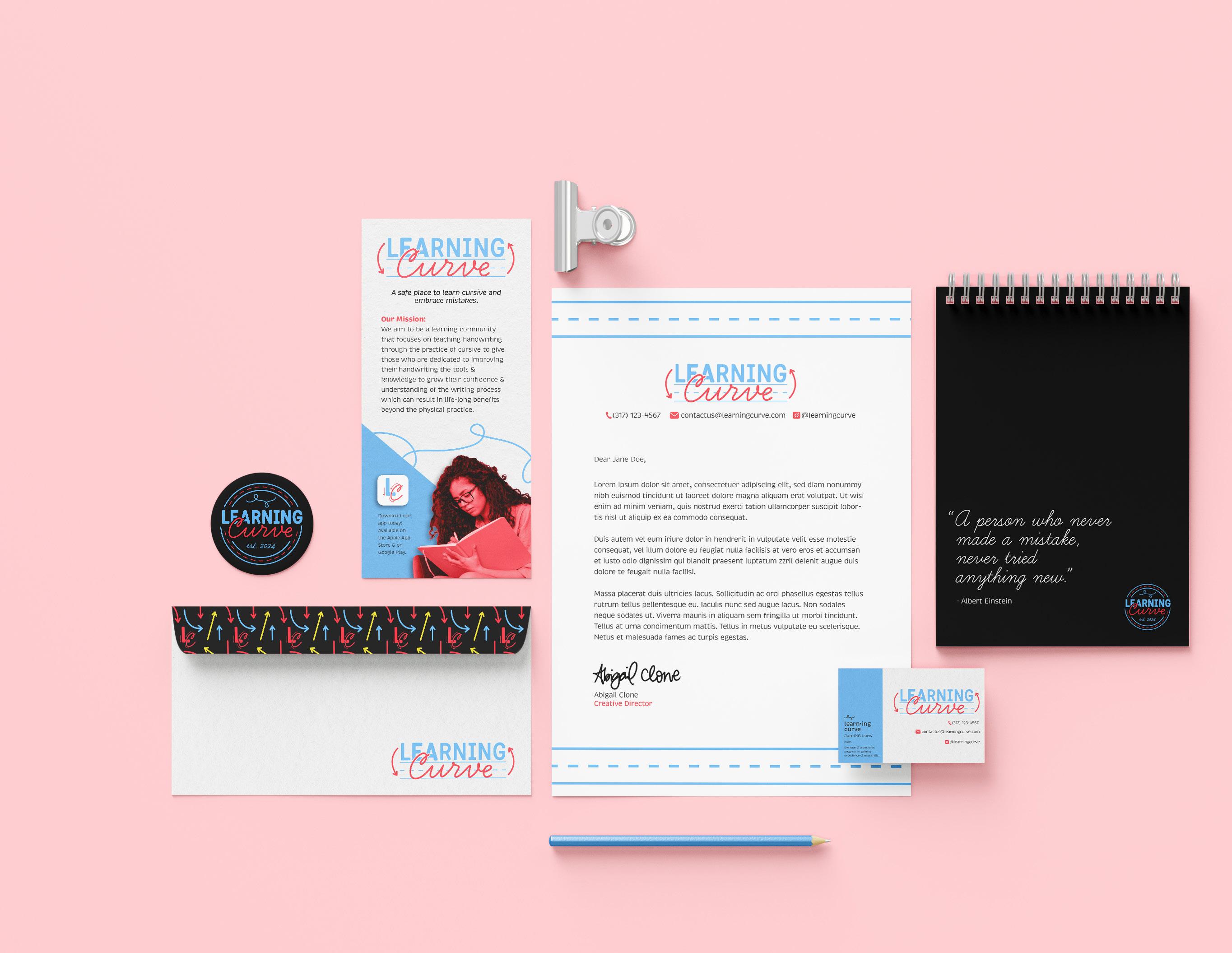
This application of Learning Curve’s identity showcases how elements within the system can be combined and used to create a consistent feel in all printed materials such as letterheads, mailers, and merchandise.
LEARNING CURVE IDENTITY MANUAL & GUIDELINES – 37
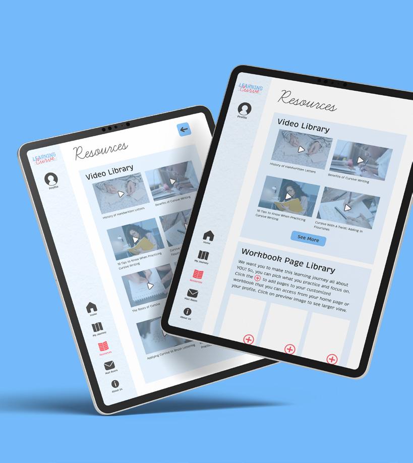
Tablet App

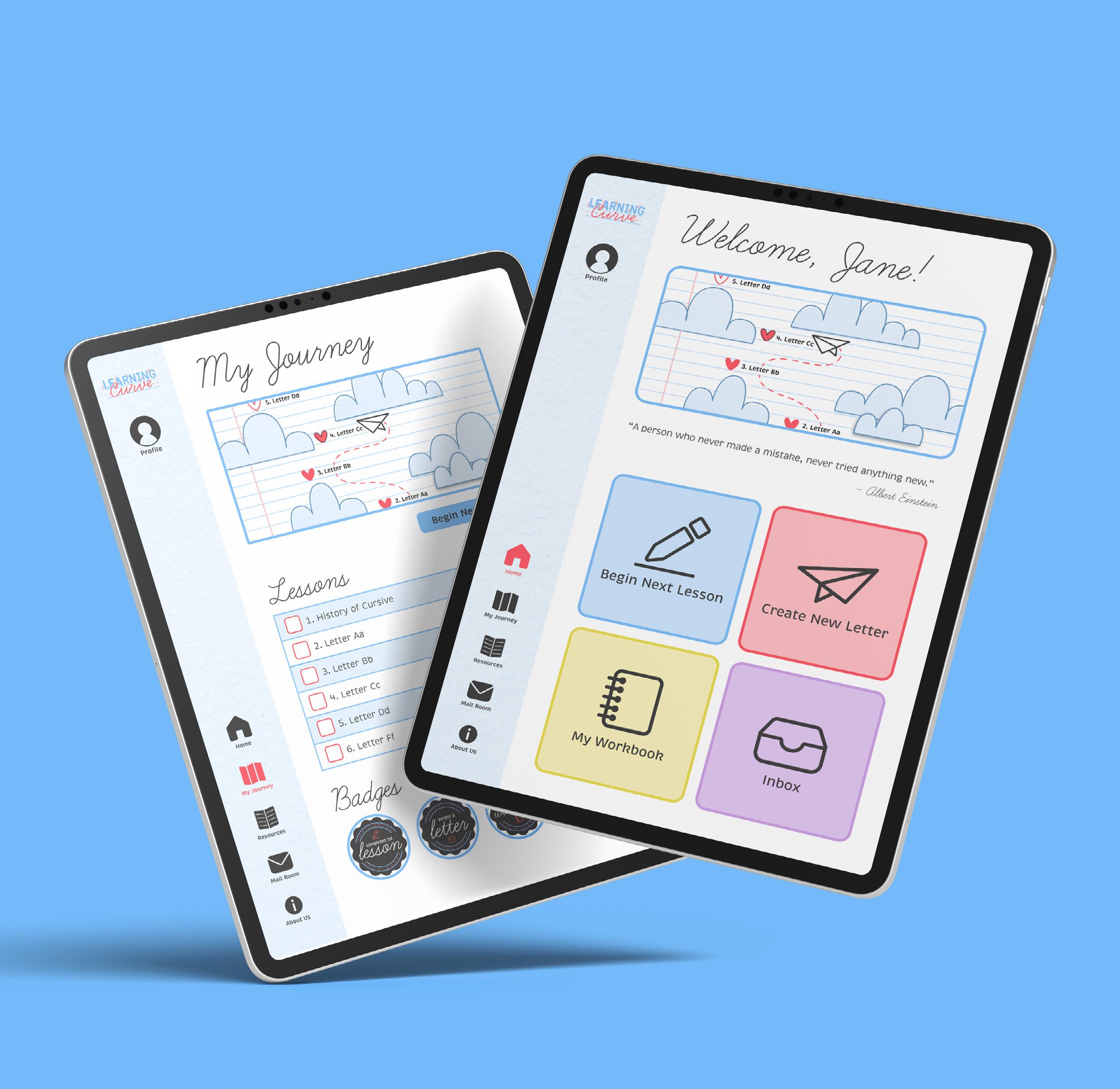
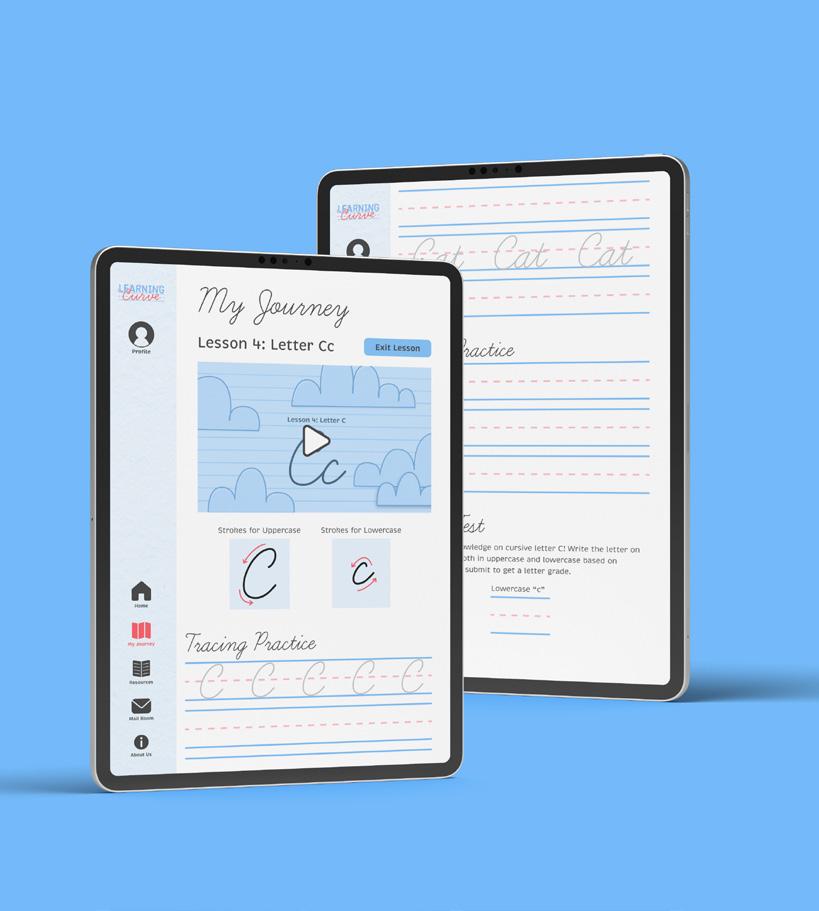
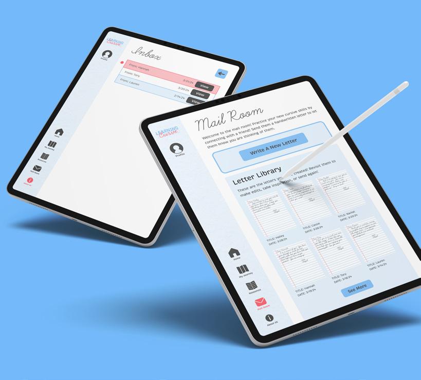
This application of Learning Curve’s identity showcases how the identity applies to digital products.


– LEARNING CURVE IDENTITY MANUAL & GUIDELINES 38
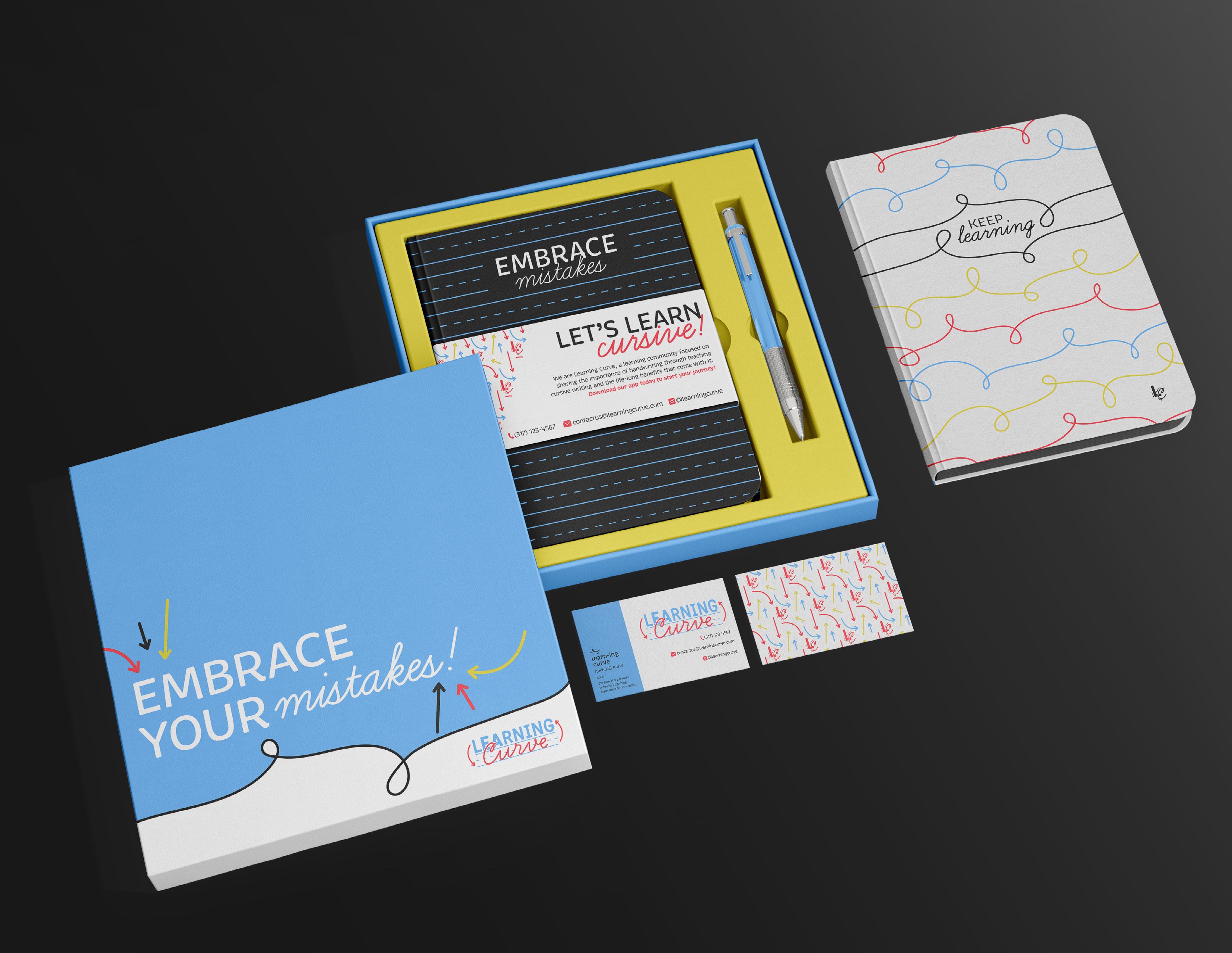
Promotional Box

This application of Learning Curve’s identity showcases its use in physical products that can be used as direct mail marketing materials.
LEARNING CURVE IDENTITY MANUAL & GUIDELINES – 39

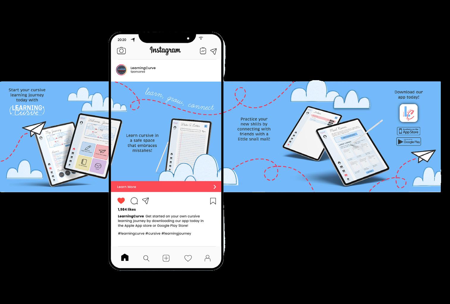
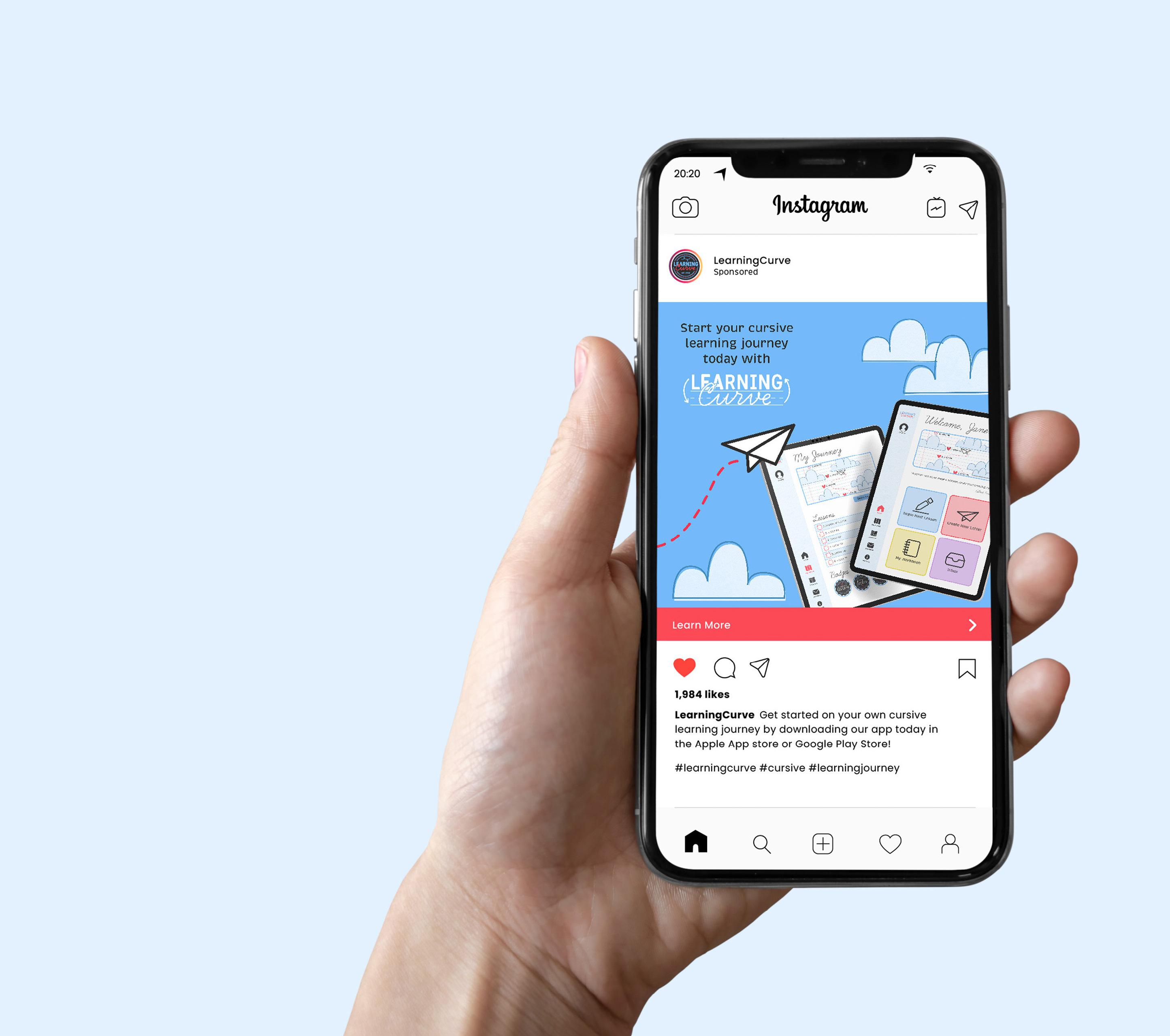
Social Media
This application of Learning Curve’s identity showcases how the identity can work in a social media setting as digital marketing content.


– LEARNING CURVE IDENTITY MANUAL & GUIDELINES 40
Identity Files Index
LEARNING CURVE IDENTITY MANUAL & GUIDELINES – 41
Identity Files Index
Pages 42-45 of this document provide the identity files for the Learning Curve identity. This includes the Primary Logo, Secondary Logo, Monogram, and Seal. Each version has a color, black, and white option to choose from. Further, each file can be found as JPEG, PDF, and PNG formats.
File format reference information:
JPEG is a compressed image file. Compression can be altared when saving the initial file, so these files have been saved at a high quality.
JPEGs are intended to be used in online or web formats so they have been saved in the RGB color profile.
PDF files are intended to be used when printing so they have been saved with the CMYK color profile.
PNG is a transparent graphic file which means there is no background saved in the file. They have been saved in the RGB color profile with the intended use of being online or on the web.


LearningCurve_Primary_Color.jpg
LearningCurve_Primary_Color.pdf
LearningCurve_Primary_Color.png
LearningCurve_Primary_Black.jpg
LearningCurve_Primary_Black.pdf
LearningCurve_Primary_Black.png
LearningCurve_Primary_White.jpg
LearningCurve_Primary_White.pdf
LearningCurve_Primary_White.png
– LEARNING CURVE IDENTITY MANUAL & GUIDELINES 42


LearningCurve_Secondary_Color.jpg
LearningCurve_Secondary_Color.pdf
LearningCurve_Secondary_Color.png
LearningCurve_Secondary_Black.jpg
LearningCurve_Secondary_Black.pdf
LearningCurve_Secondary_Black.png
LearningCurve_Primary_White.jpg
LearningCurve_Primary_White.pdf
LearningCurve_Primary_White.png
LEARNING CURVE IDENTITY MANUAL & GUIDELINES – 43

LearningCurve_Monogram_Color.jpg
LearningCurve_Monogram_Color.pdf
LearningCurve_Monogram_Color.png

LearningCurve_Monogram_Black.jpg
LearningCurve_Monogram_Black.pdf
LearningCurve_Monogram_Black.png

LearningCurve_Monogram_White.jpg
LearningCurve_Monogram_White.pdf
LearningCurve_Monogram_White.png
– LEARNING CURVE IDENTITY MANUAL & GUIDELINES 44

LearningCurve_Seal_Color.jpg
LearningCurve_Seal_Color.pdf
LearningCurve_Seal_Color.png

LearningCurve_Seal_Black.jpg
LearningCurve_Seal_Black.pdf
LearningCurve_Seal_Black.png

LearningCurve_Seal_White.jpg
LearningCurve_Seal_White.pdf
LearningCurve_Seal_White.png
LEARNING CURVE IDENTITY MANUAL & GUIDELINES – 45
– LEARNING CURVE IDENTITY MANUAL & GUIDELINES 46


