Retail food branding
BRIEF
To create a name, logo and overall branding for a new retail food brand. An original logo, business card and menu design, as well as company clothing/uniform were requried to market the brand.
PROBLEM
Developing a creative business concept that would stand out and fill a gap in the market with the help of smart brand design.
SOLUTION
After discovering the relatively unknown gnocci alternative, gnudi (“noo-di”), a gap in the market was found and the wordplay potential for the business name followed.
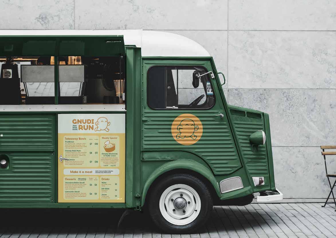
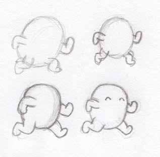
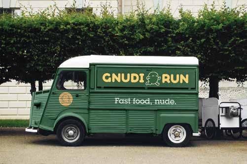
Gnudi Run was chosen as the brand name, which appropriately suited the fun and modern nature of a potentially successful food truck brand. Once a name was settled on, a cartoon dumpling was drawn that would then become the company's mascot and part of the company logo.
“Fast food, nude” is both a reference to the running mascot and the uncoated nature of gnudi dumplings.
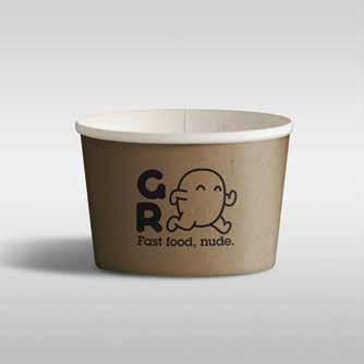
With sustainability being the forefront of many retailers of today, paper bowls with bioplastic lids would be the chosen vessel for the takeaway dumplings.
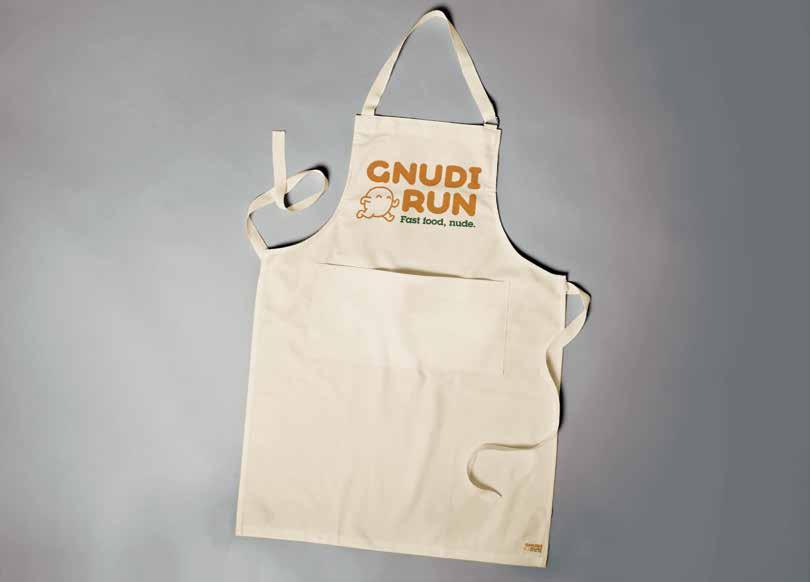
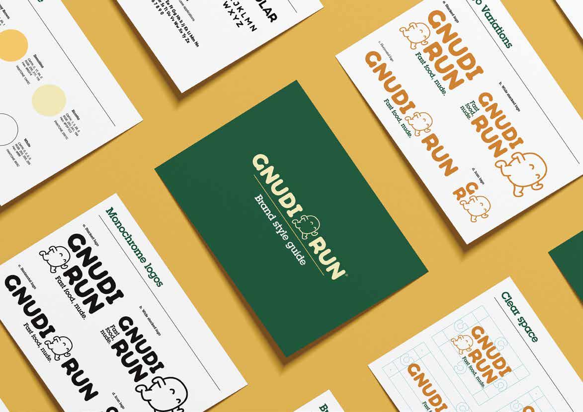
Different logo variations were developed for different uses - icon logos, wide logos for wider horizontal settings, and stacked logos for uniforms and illustration-friendly applications.
Song Interpretation
BRIEF
To create a visual representation for a chosen song.
PROBLEM
The final outcome had to showcase the use of handillustrated type, and clearly communicate the chosen song’s message through the a combination of imagery and type.
SOLUTION
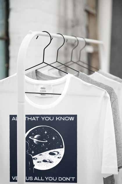
The final sci-fi-inspired design uses hand illustration and hand lettering to communicate the song’s feeling of awe and humility in relation to the vast unknown and outer space.
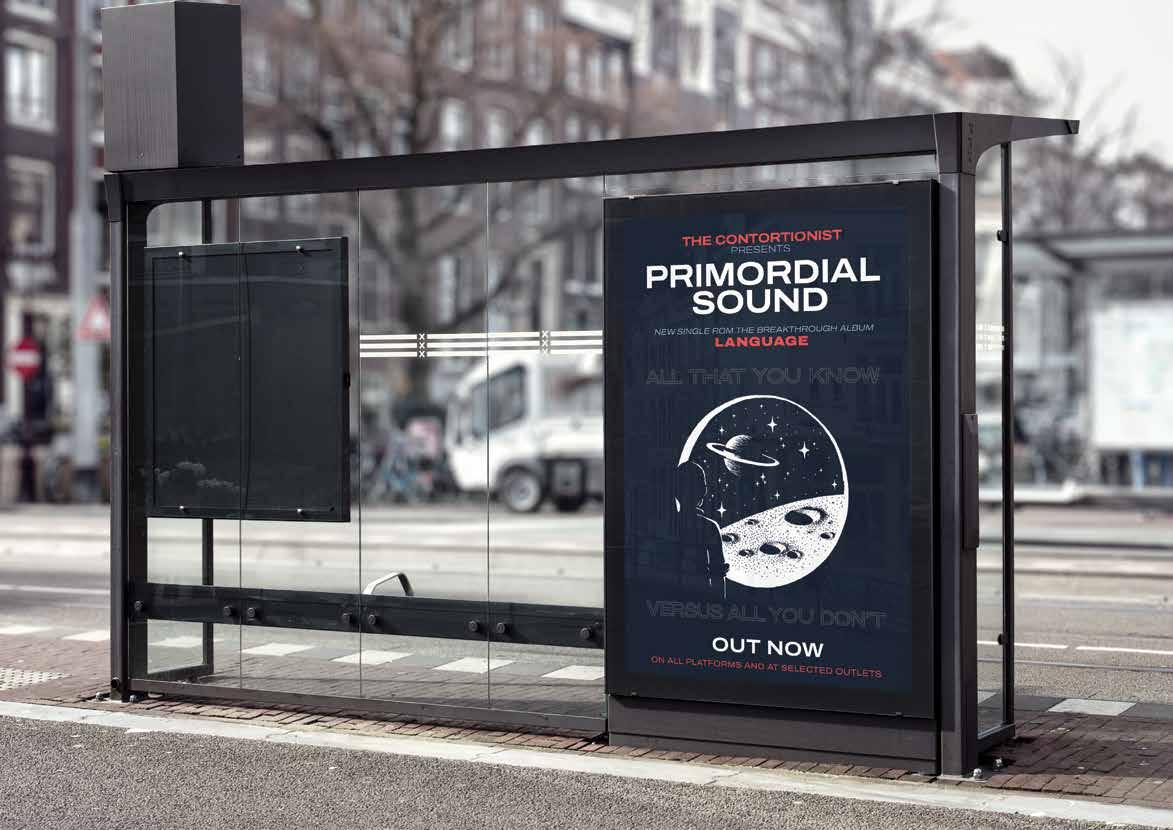
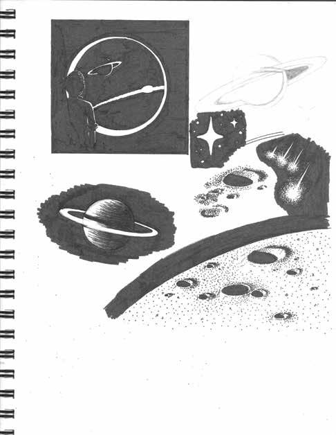

Using a combination of fineliner pens on paper, various elements were drawn and later processed, arranged and edited in Adobe Illustrator and Photoshop.
The lyrics, “all that you know versus all that you don’t ”, are repeated throughout The Contortionist’s song ‘Primodial Sound’, while the music transforms from eerily quiet to tense and dynamic. The final artwork could be at home on a T-shirt or poster.
Brisbane Canvas Booklet
BRIEF
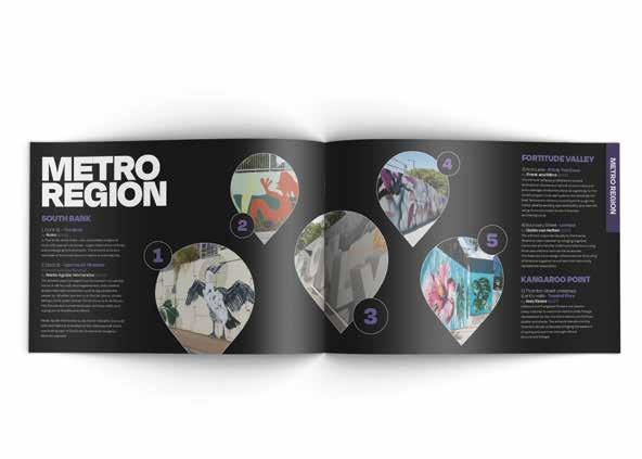
To design multi-page guidebook for the Brisbane Council’s Brisbane Canvas project, which displays the commissioned street art that the city has to offer.
PROBLEM
The booklet must be aesthetically pleasing and be effective at guiding tourists to the many attractions included in the Brisbane Canvas project.
SOLUTION
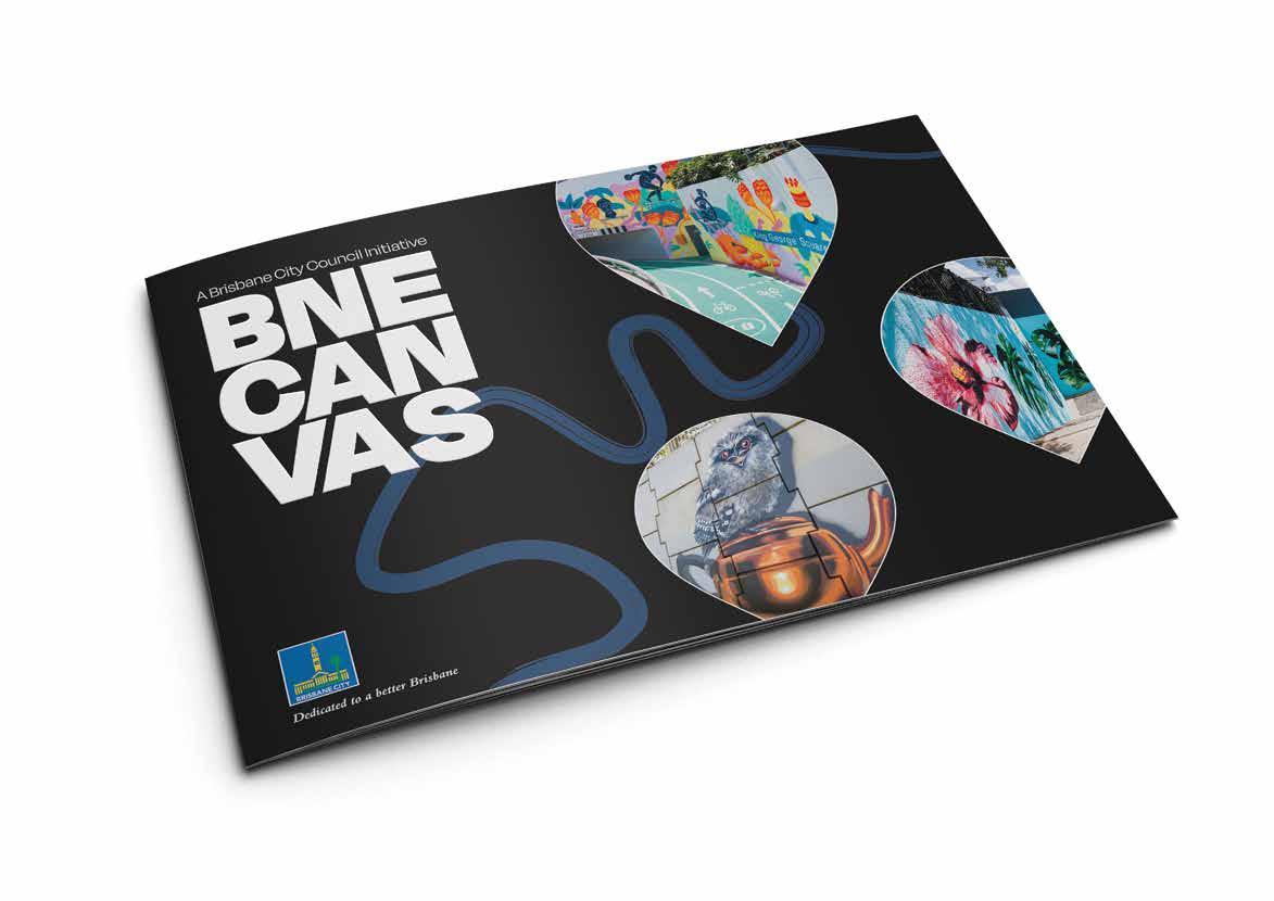
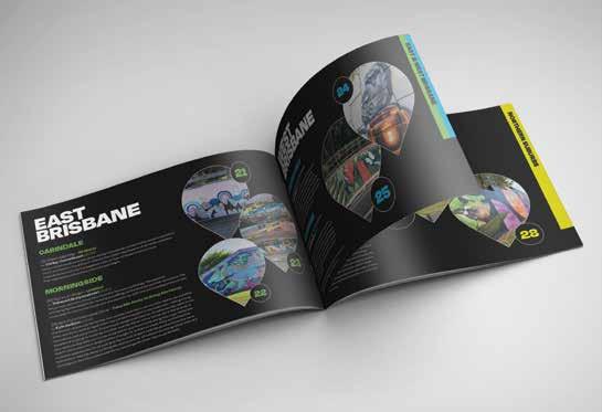
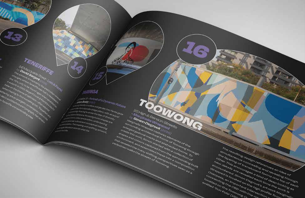
The use of a GPS-like teardrop as a recurring design element allows for more page space and a range of dynamic page layouts. The use of colour-coded chapters gives the reader a clear direction to locations and transport options.
Organising the street art by locations gives the reader a well-formed idea of proximity, and invites them to plan a day visiting the commissioned Brisbane street art.
Numbering each location means that the reader can refer directly to the colourcoded location map and transport options.
A dark grey and white theme gives the 20 page booklet a modern feeling and showcases the included imagery.
The outer cover is printed on a thicker card stock than the inner pages, with Spot UV embellishment on the title, giving the booklet a professional appeal.
Personal Branding
BRIEF
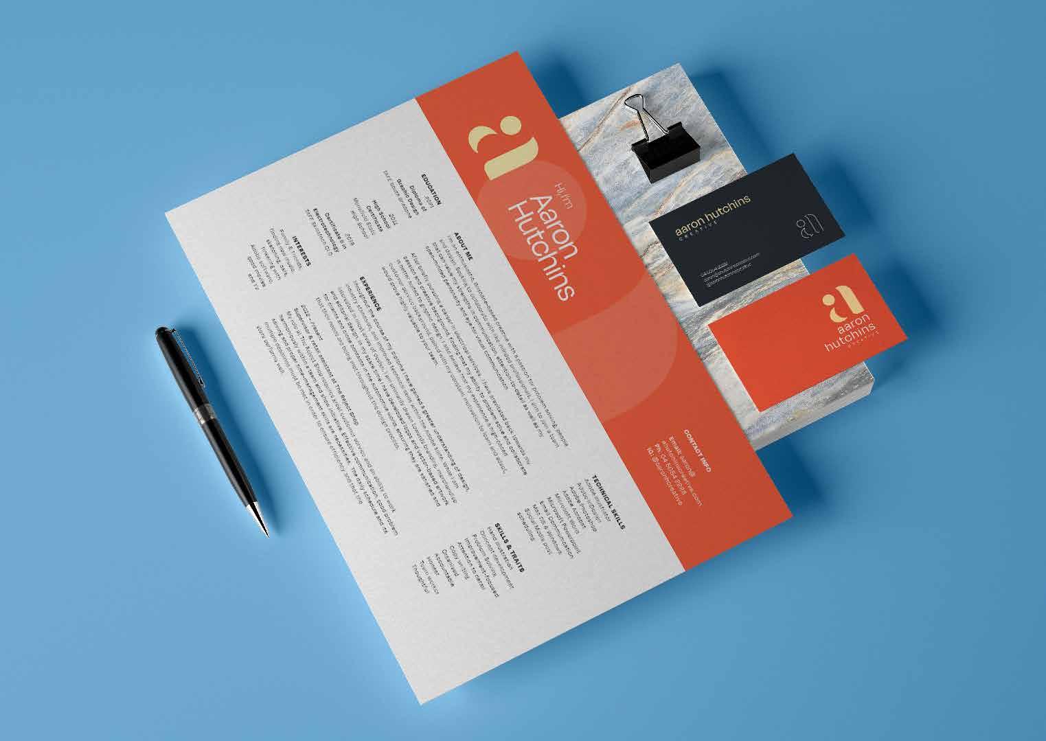
To create an identity to promote myself as an up and coming designer.
PROBLEM
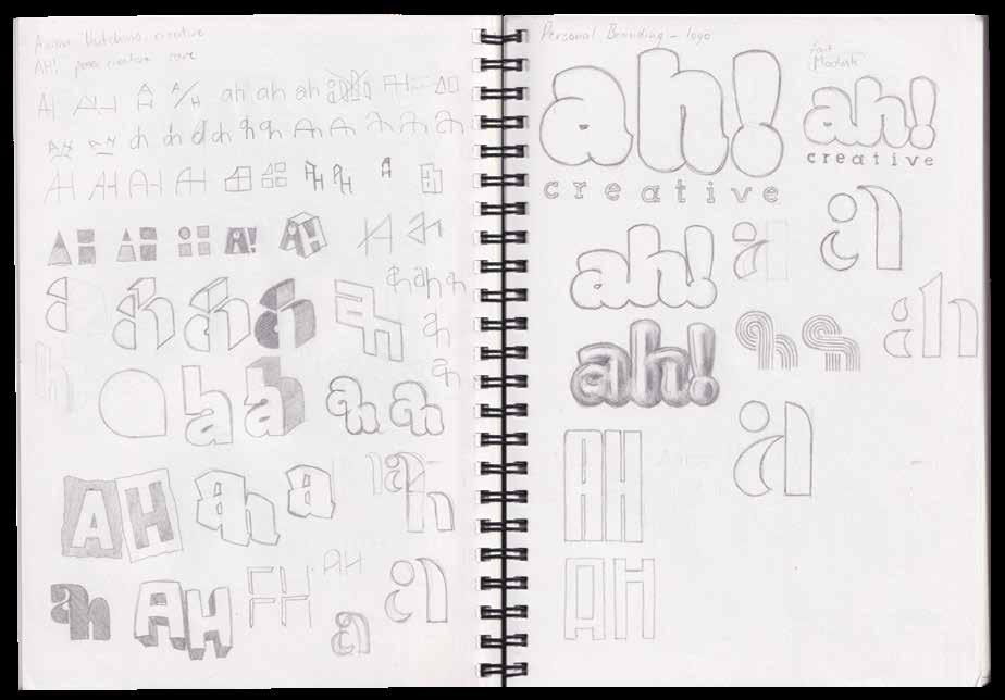
To develop a design theme that effectively represents my strengths and personal style as a designer.
SOLUTION
A dynamic and bright colour palette, paired with clean minimalistic design was chosen to represent the balance between my design interests and strengths as a designer.
Design Report
BRIEF
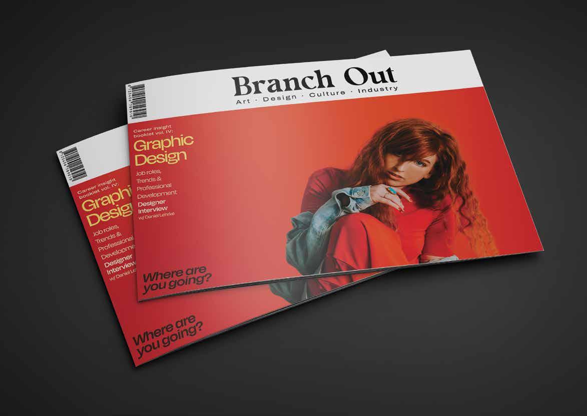
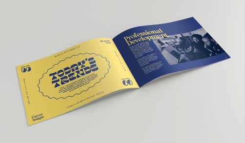
To write and design a report, giving clear yet valuable insight into graphic design roles and business, as well as the impacts of different trends on designers.
PROBLEM
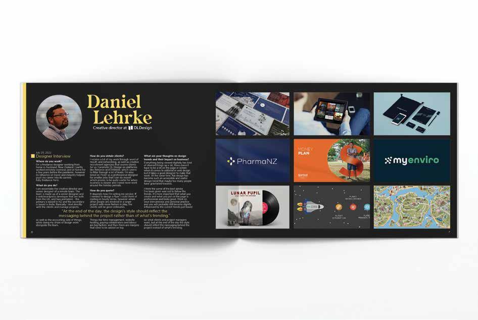
The report had to be designed effectively, giving considerable consideration to layout, space and typesetting, while featuring an interview on an experienced designer in the field.
SOLUTION
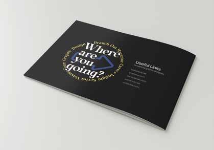
A landscape, A5 booklet seemed fitting to communicate various points in a visually pleasing manner. The booklet is designed as a career guide spinoff of an imaginary magazine.

Festival Promotion
BRIEF
To create advertising promotions for a festival event. A concept would be applied to a magazine advertisement design and two online advertising pieces.
PROBLEM
The design had to have a wide appeal and a capacity to engage an audience of varied ages and backgrounds.
SOLUTION
A colourful yet strong design theme draws in a wide audience and effectively portrays the diversity and progressive nature of the passionate and heavy music acts.
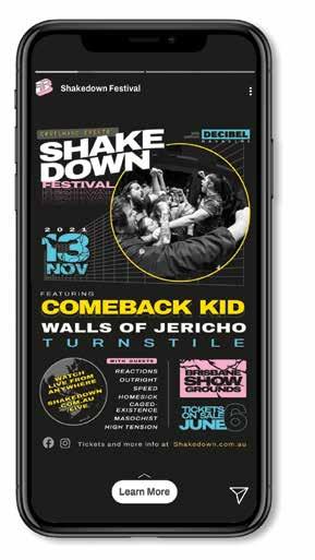
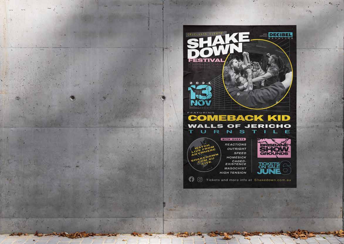 Incorporated photo by Nicole Goodwin
App Design
BRIEF
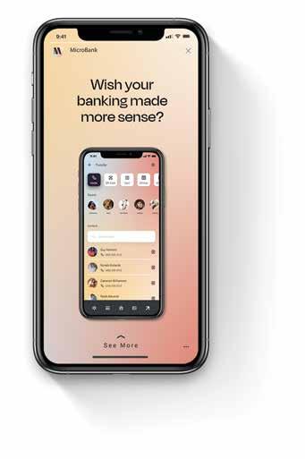
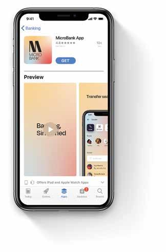
To develop a prototype banking app aimed at a young audience through the design and use of an effective marketing funnel.
PROBLEM
The prototype must be tested by a range of people and meet a range of criteria that ensure the final user experience is satisying and good enough to gain new customers.
SOLUTION
A simple yet predictable, and aesthetically pleasing experience was designed to stand out and capitalise on features that existing products seem to lack.

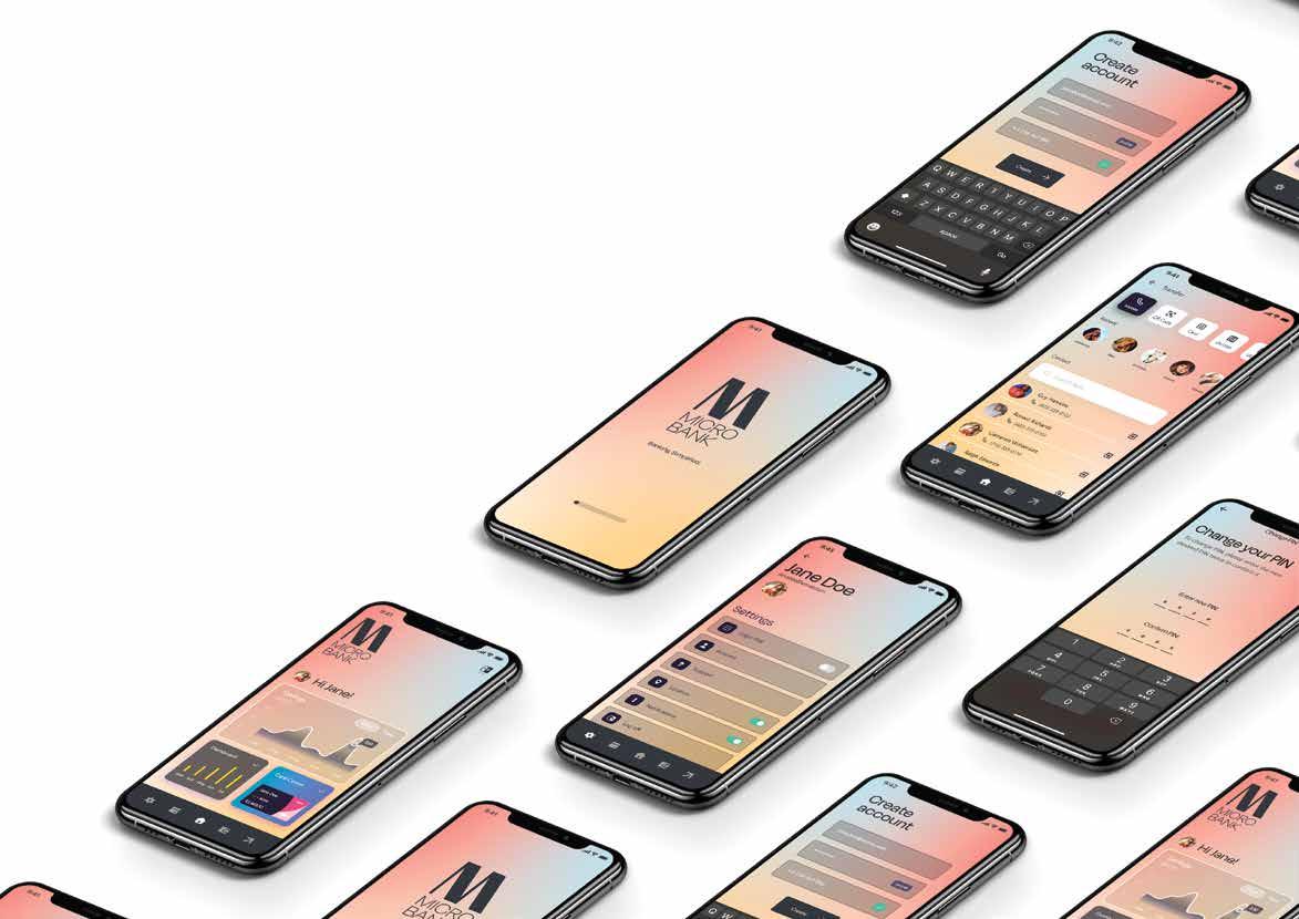
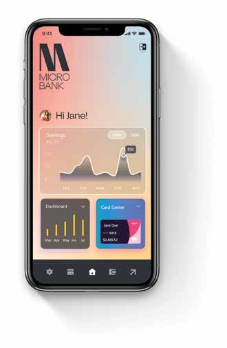
The use of pastel colours and smooth freeform gradients were the basis of the prototype’s design, giving the app and overall banking experience a calm and satisying atmosphere.

Test subjects were pleased with the included features and simple navigation, while noting that their past and current online banking experiences have been overly complicated and sometimes too confusing.
The Microbank logo and colour theme were well received.
Location Branding
BRIEF
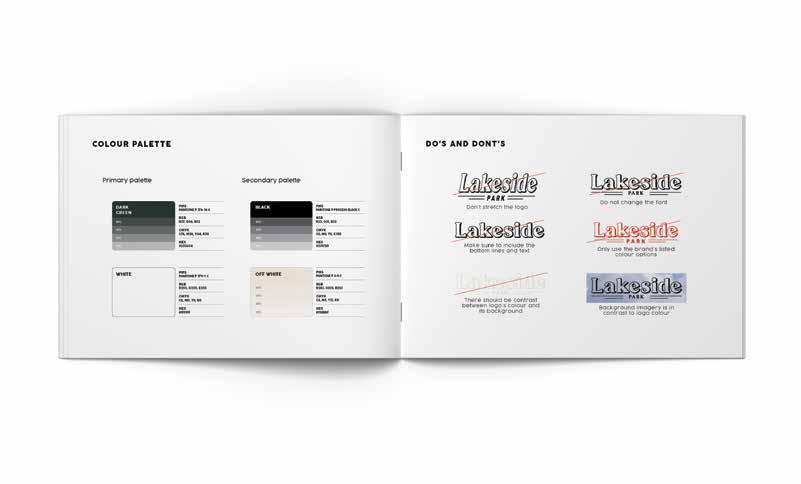
To design and produce an identity and branding system for the Lakeside Park racing precinct.
PROBLEM
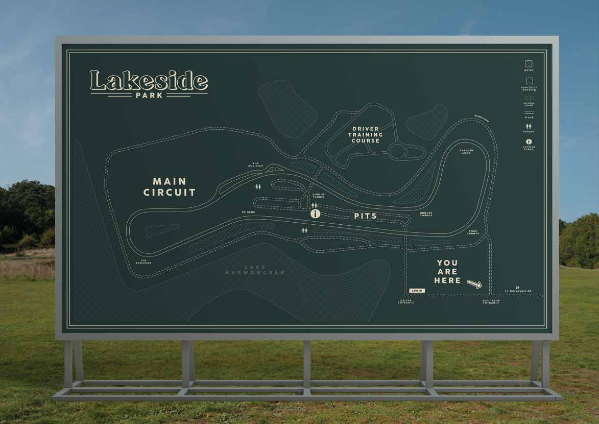
The client required a logo and branding guidelines, directional and wayfinding signage, stationery and a presentation template.
SOLUTION
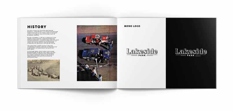
Through thorough research and concept development, a rebrand has been designed to enhance the venue’s image, focusing on Lakeside Park's rich motoring history and unique character.
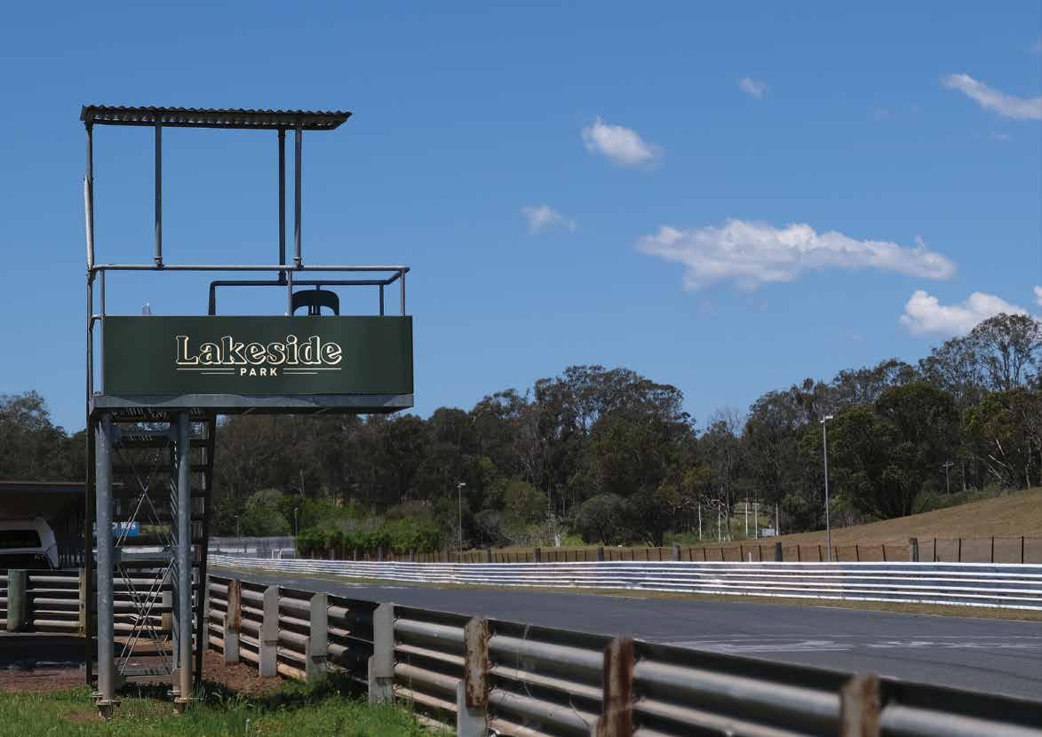
Lakeside's history was an important starting point for its redesign, and a vintage themed logo and colour palette would eventually become the basis of the circuit's rebrand.
Opting for a classic and less energetic brand than venues that are rooted in 90's and 2000's motorsport, the new look is more reminiscent of the 60's-1980's motorsport and design that were present in the venue's opening and heyday respectively.
ENTRANCE
ENTRANCE

 Aaron Hutchins
