
Responsive Web Design: Optimizing User Experience Across Devices
Ensuring Seamless Website Experiences for a Website Design Company in Mumbai
Introduction:
• Responsive web design is crucial for providing a consistent user experience across devices.
• In this presentation, we'll explore practical strategies, reference tools, and platforms to optimize responsive web design and enhance user experiences for a website design company in Mumbai.
Understanding Responsive Web Design:
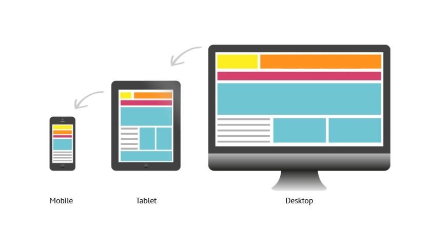
• Responsive web design adapts website layouts and elements to different screen sizes and devices.
• Utilize CSS frameworks like Bootstrap or Foundation that offer responsive design components.
• Leverage responsive design tools like Responsive Design Checker or Am I Responsive to preview and test your designs across multiple devices.
Mobile-First Design Approach:
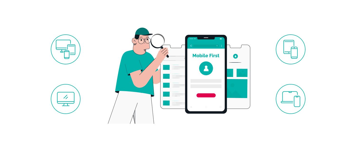
• Start with designing for mobile devices first, then scale up for larger screens.
• Use mobile design patterns and prioritize content based on mobile user needs.
• Design with touch-friendly elements and consider mobile-specific interactions.
Fluid Grids and Flexible Layouts:
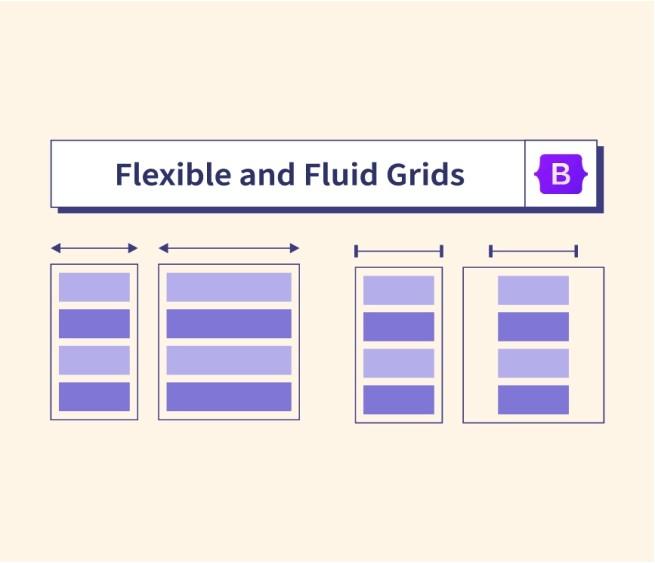
• Use fluid grids that automatically adjust and distribute content proportionally across devices.
• Employ CSS media queries to apply different styles based on screen size breakpoints.
• Implement flexible layouts that adapt to different orientations and aspect ratios.
Optimizing Images for Different Devices:
• Use responsive images that automatically adjust their size and resolution based on device capabilities.
• Implement image compression techniques to optimize loading times without sacrificing quality.
• Leverage tools like Kraken.io or Cloudinary to automatically optimize and deliver responsive images.

Testing and Debugging:

• Regularly test your responsive designs on various devices and browsers.
• Use browser developer tools like Chrome DevTools or Firefox Developer Tools to inspect and debug responsive layouts.
• Consider using cross-browser testing platforms like BrowserStack or LambdaTest to ensure consistent experiences across different browsers and devices.
Performance Optimization:
• Optimize your responsive designs for fast loading times.

• Minify CSS and JavaScript files to reduce file sizes.
• Leverage content delivery networks (CDNs) to deliver assets from servers closer to users.
User Feedback and Usability Testing:

• Gather user feedback to identify areas of improvement in your responsive designs.
• Conduct usability testing with tools like UserTesting or UsabilityHub to evaluate the user experience across devices.
• Implement iterative design changes based on user insights and feedback.
Conclusion:
• Responsive web design is crucial for a website design company in Mumbai to deliver seamless user experiences across devices.
• Implement the strategies discussed in this presentation, leverage reference tools and platforms, to optimize responsive web design and create engaging experiences.
Q&A and Contact Information:
• We're here to answer any questions you may have regarding responsive web design or website design services in Mumbai.
• Contact us at Aarav Infotech at biz@aaravinfotech.com or WhatsApp at +917506506672 for further assistance and to learn more about our website design services.