Lee

GRAPHIC & BUSINESS DESIGNER


Iʼm yihsin Lee. Iʼm a Graphic and Business designer from Taiwan, currently based in Milan. I have been doing visual graphics for over 4 years and Iʼm proficient in Branding, Graphic Design, Social Media Management, and Photography.

+39 3519454615 https://www.behance.net/a98562303565 a9856230@gmail.com April, 02, 1996 About me Education Bachelor in Applied Arts, Interior Design Fu Jen Catholic University Taipei, Taiwan 2014 2018 Master in Business Design Domus Academy Milan, Italy 2020 2021 Here’s what I can do Ai PrId
Hello,
yihsin
Packaging Design3 UI Design4 Other5 Branding1 Social Media Content2
Branding

1
CONTENT
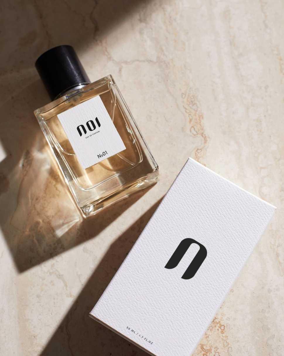
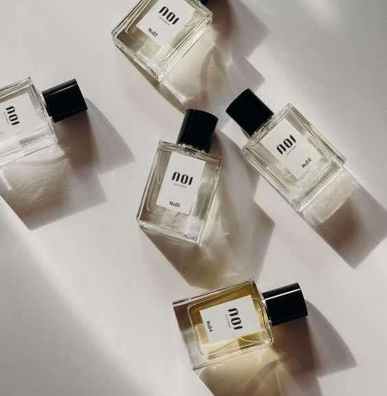
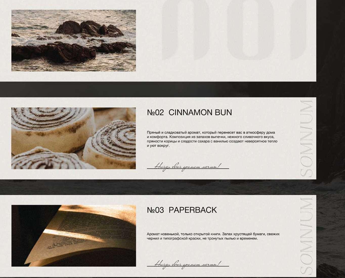
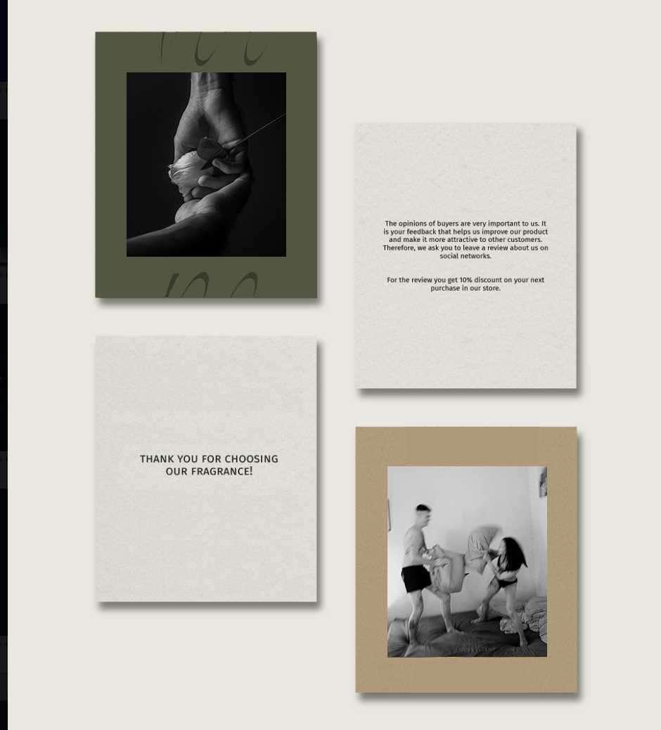
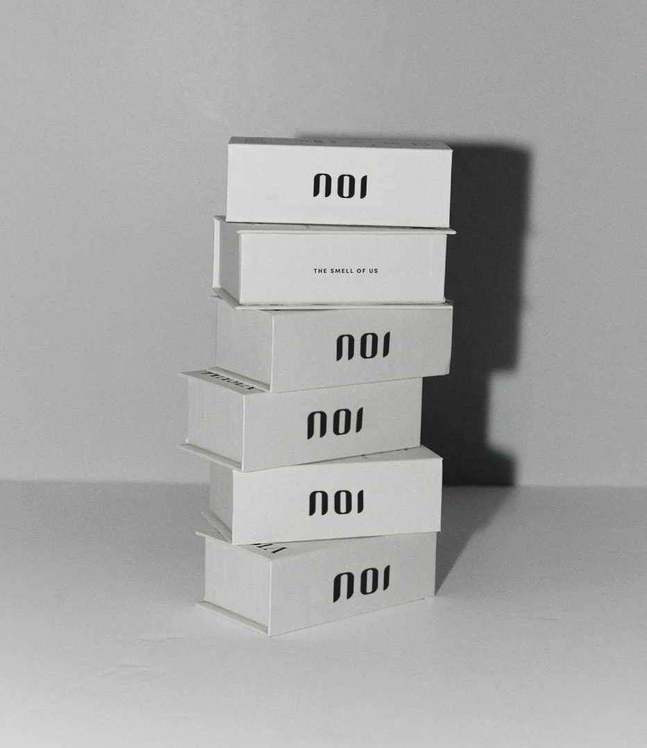
01 BRANDING_NOI2 0 2 2 D E S G N P O R T F O L I O Y - H S N L E E Client Noi is an Italian niche perfume brand offering a contemporary and authentic collection of fragrances, Their formula contains rare ingredients, thanks to which the fragrances are revealed on the skin in a special way and are transformed over time. Aim Create a corporate identity that will reflect the exclusivity of products, emphasize the values and the character of the brand which convey sensual, seductive, enticing, and romantic. The brand essence reflects the pleasure of the perfumeʼs composition, its inner spirit. 2021NOI VISUAL IDENTITY LOGO SOCIAL
Ai Ps
Brand Story
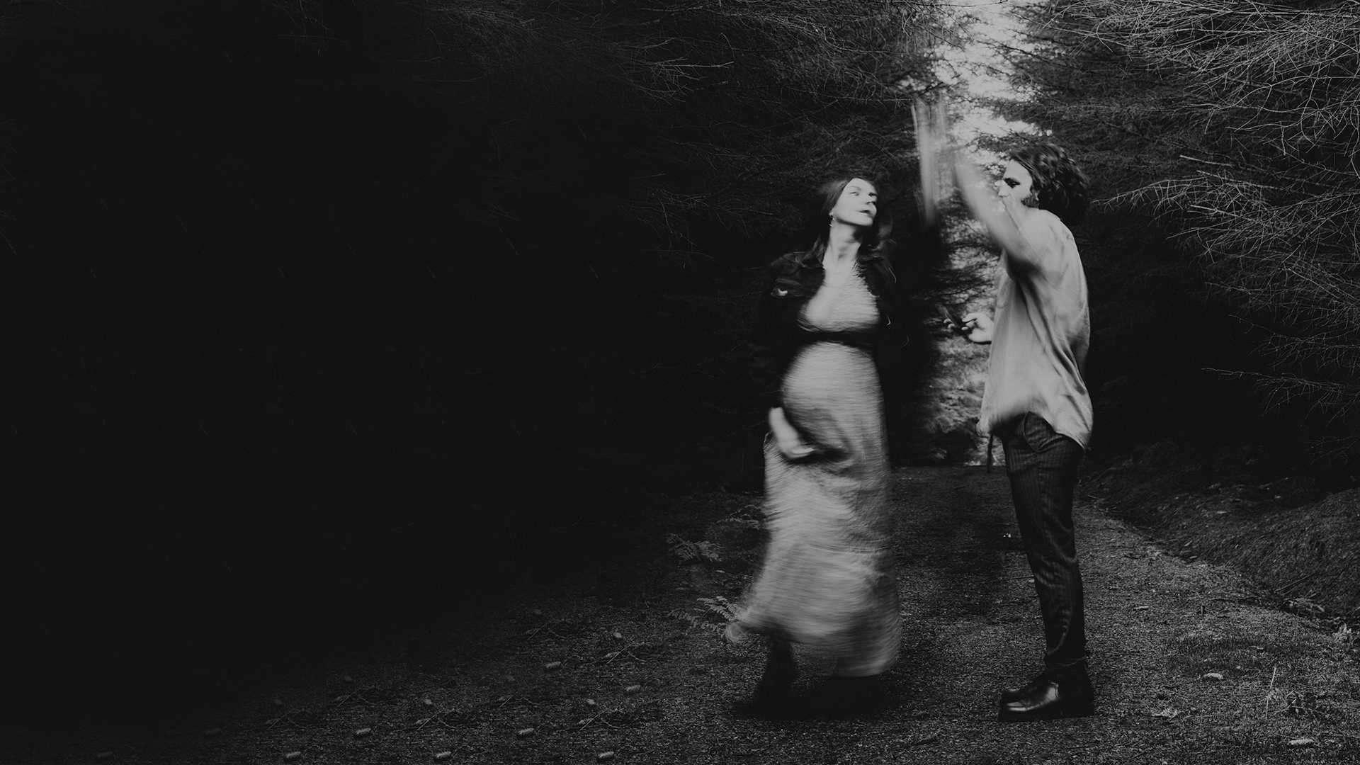
Noi mean “us” in italian, the collections are inspired by the relationship between lovers. The brand co-founder believes she is living proof of love at first smell:
– I knew I had met the man in my life the second I felt his scent. I have always been receptive and sensitive to the impressions that scent makes, but this time it was di erent. He just smelled incredible! His scent made me feel both secure and attracted to him. “
“ Ecstasy ” “Sensual” ”Flipped” and Spellbound” are the four signature scent. Through its diversity and intricate details, envoke a sense of intimacy and sexiness. The core of the brand's target audience consists of people who value every moments with their loves one.
Among the emotional benefits of the brand, I identified the following: it helps people feel confident, gives a sense of love and eternal. Based on this input, an exclusive identity for the brand was created.
01 BRANDING_NOI2 0 2 2 D E S G N P O R T F O L I O Y - H S N L E E
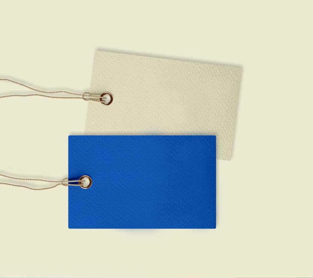
2 0 2 2 D E S G N P O R T F O L I O Y - H S N L E E #B39D84 Romantic Khaki Brown cmyk 36 40 48 0 #525842 Memorable Atrovirens cmyk 72 60 77 22 01 BRANDING_NOI
Logo & Typeface
PARFUM
EAU DE
Poppins The curve and the simplistic style shows the minimalist yet exclusive feeling, hope every customers could find their own smell and to enjoy the moment with the niche fragrance. I chose Poppings for the font as this typeface comes with beautiful and eye-catchy curves provides an elegent and sophisticated feeling, which is also the spirit of the brand. ABCDEFGHIKLMNOPQRSTUVWXYZ abcdefghijklmn opqrstuvwxyz 0123456789|!ӣ$%&/()=?^ 01 BRANDING_NOI2 0 2 2 D E S G N P O R T F O L I O Y - H S N L E E
Keyword
The main keyword of the brand was derived in order for the development of the design concept. Each keyword is connected to each other for the purpose of intensifying the brand concept.
Memories
Gives you precious memories
Mysterious
Envoke a subtle sexiness
Exclusive
The smell belongs to each other

Eternal
The romantic moment of two souls
Series
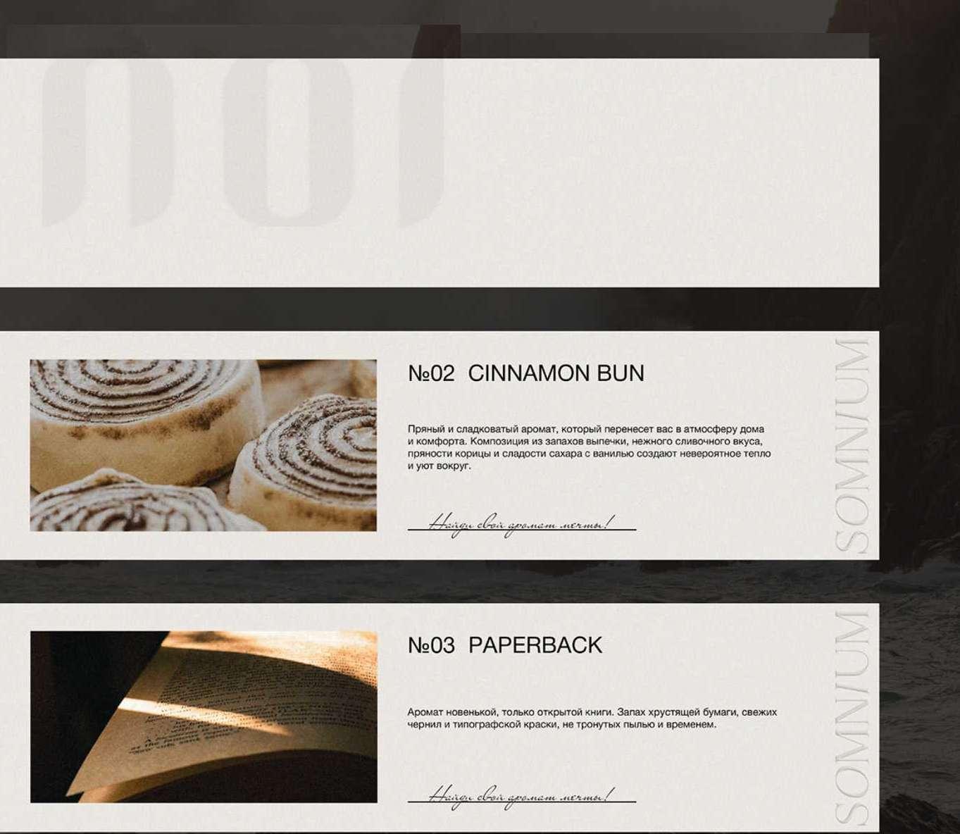
There are four signature fragrance
ECSTASY
FLIPPED
1
2
3
4
SENSUAL
SPELLBOUND
01 BRANDING_NOI2 0 2 2 D E S G N P O R T F O L I O Y - H S N L E E
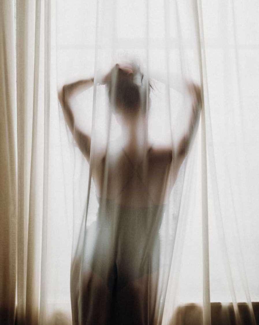
Everytime we touch. Something courses through my blood. Can you feel this warmth too?

Close your eyes. You don’t see me. But you can touch me. You can feel me.

me
your skin
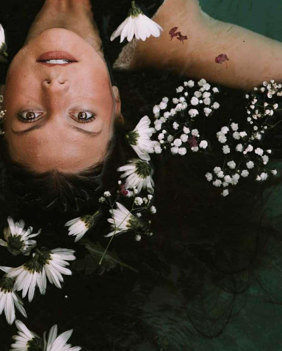
Some of us get dipped in flat, some in satin, some in gloss, but every once in a while you find someone who's iridescent, and once you do, nothing will ever compare
You got me spellbound, feel be witched You got me so strong. Then I'll resist You really got me in a fairy tale. And won't break the spell
N 01 ECSTASY
N 02 SENSUAL N 03 FLIPPED N 04 SPELLBOUND
Feel
on
01 BRANDING_NOI2 0 2 2 D E S G N P O R T F O L I O Y - H S N L E E
01 BRANDING_NOI2 0 2 2 D E S G N P O R T F O L I O Y - H S N L E E
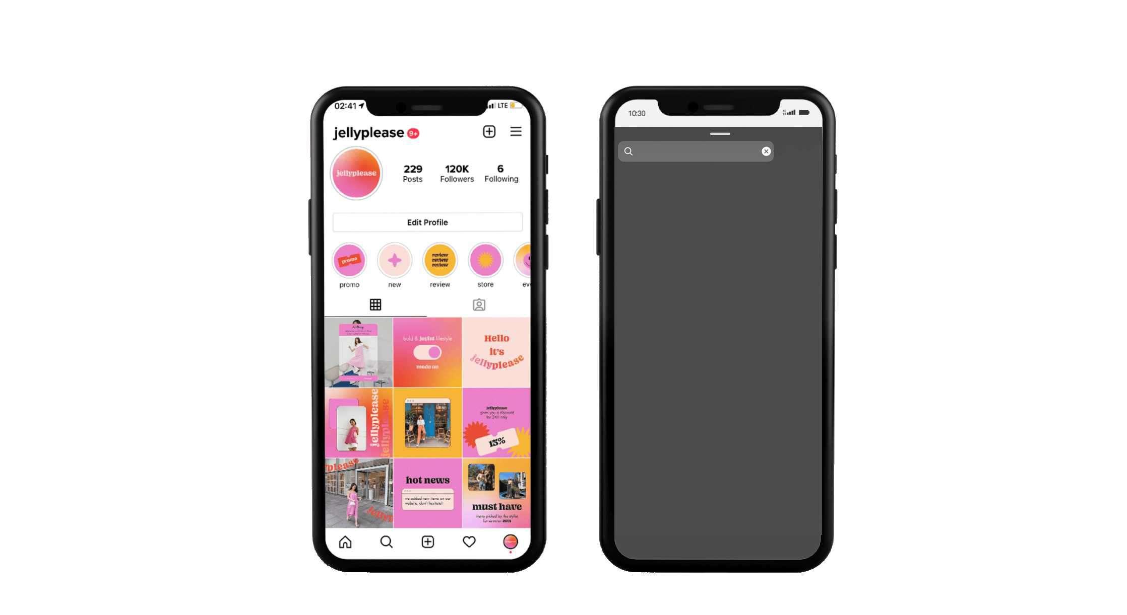
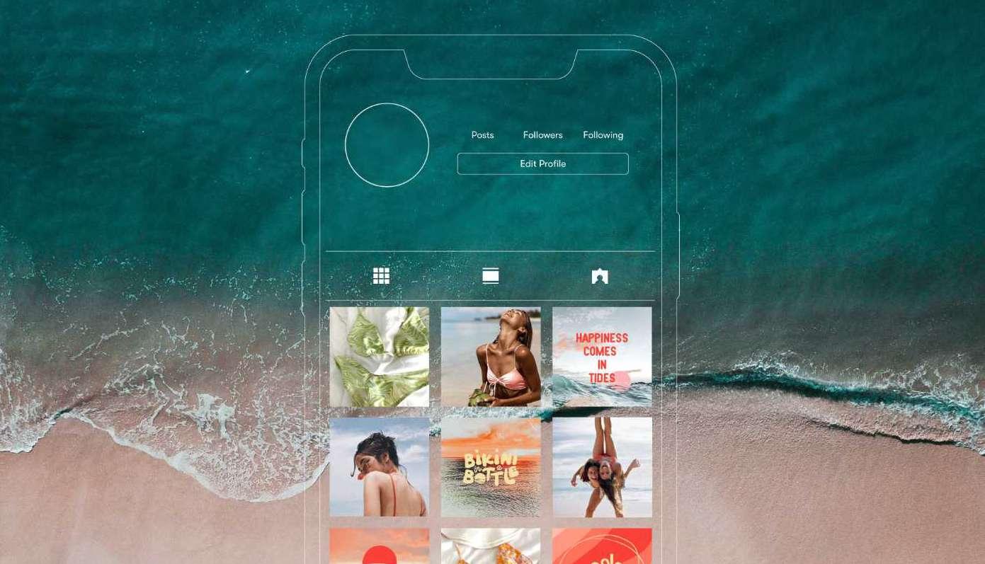
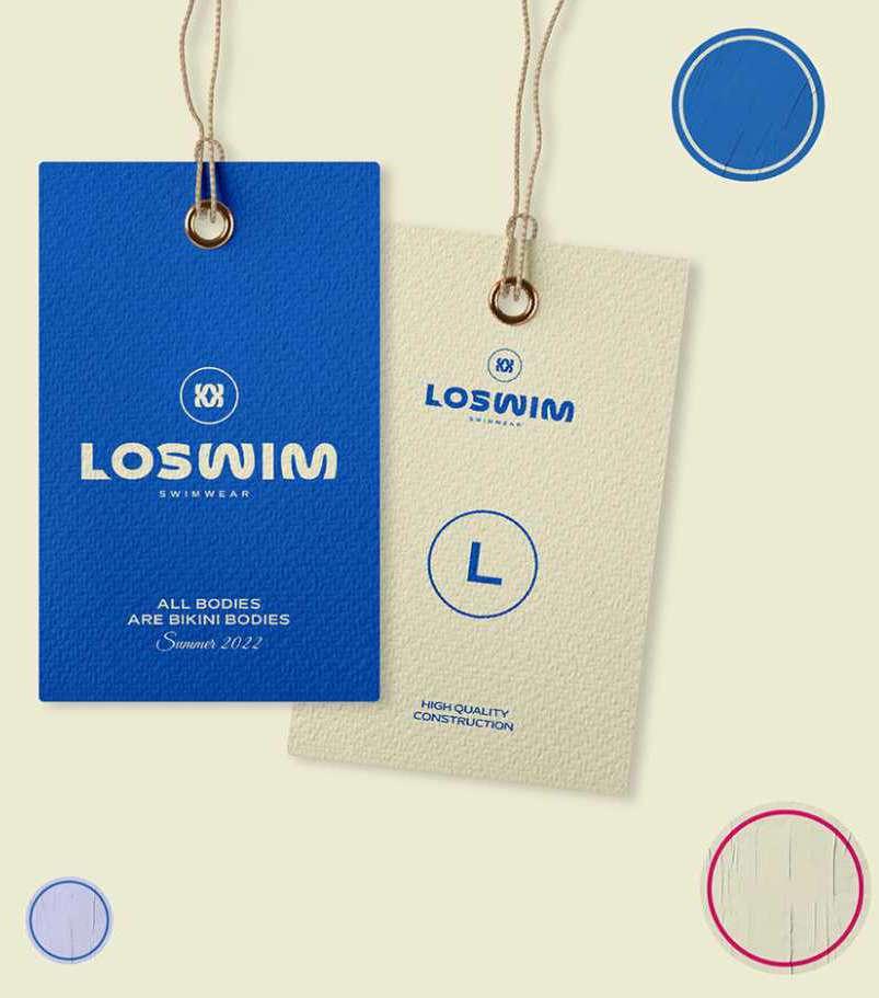
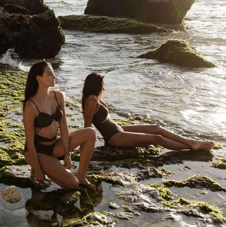
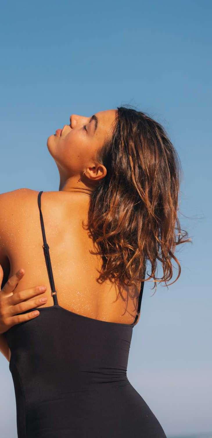
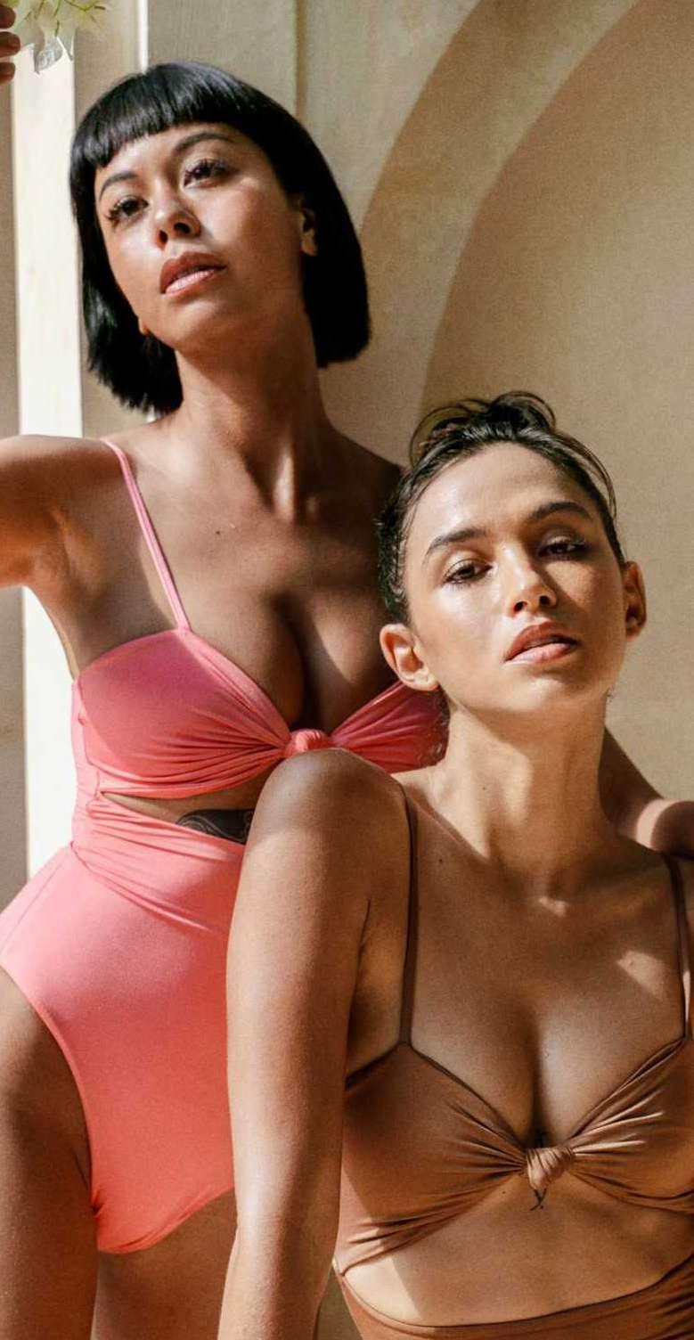
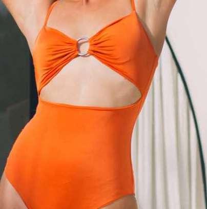
Social Media Content
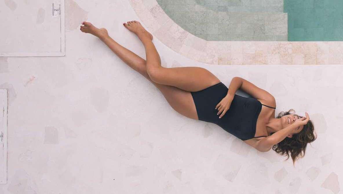
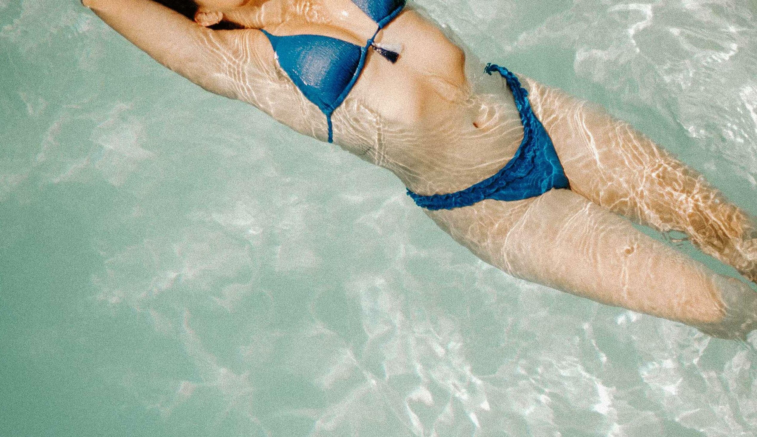
PENG
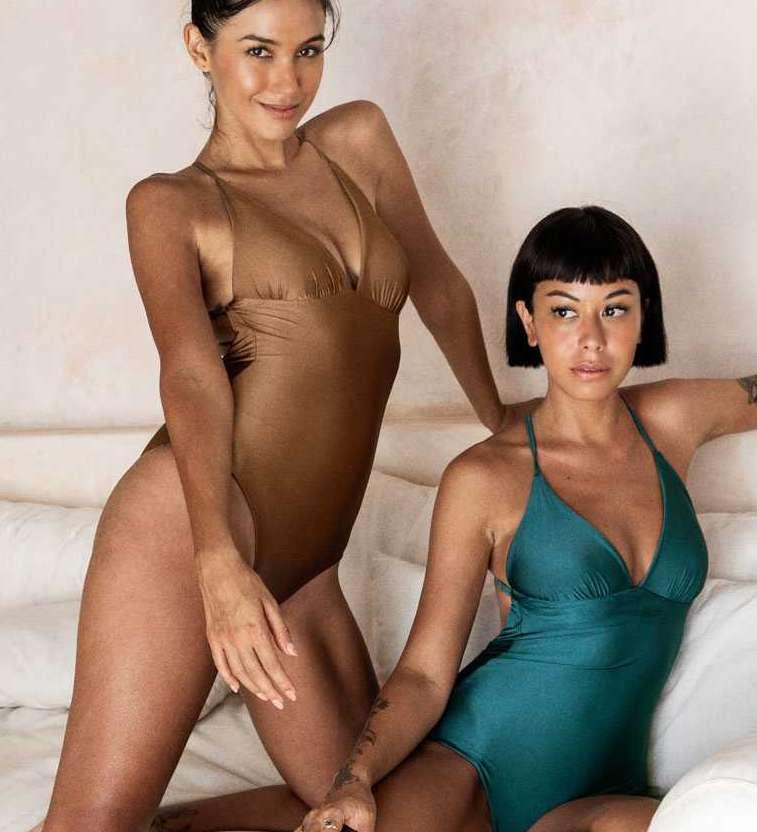
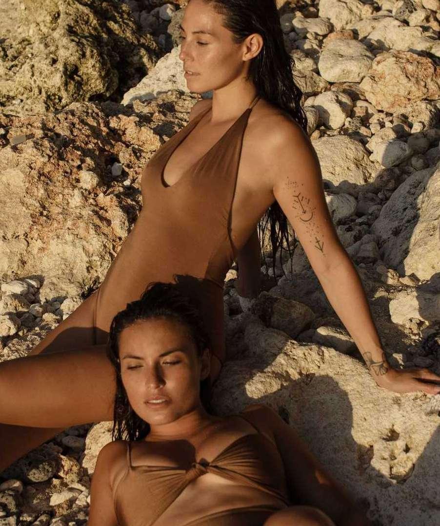
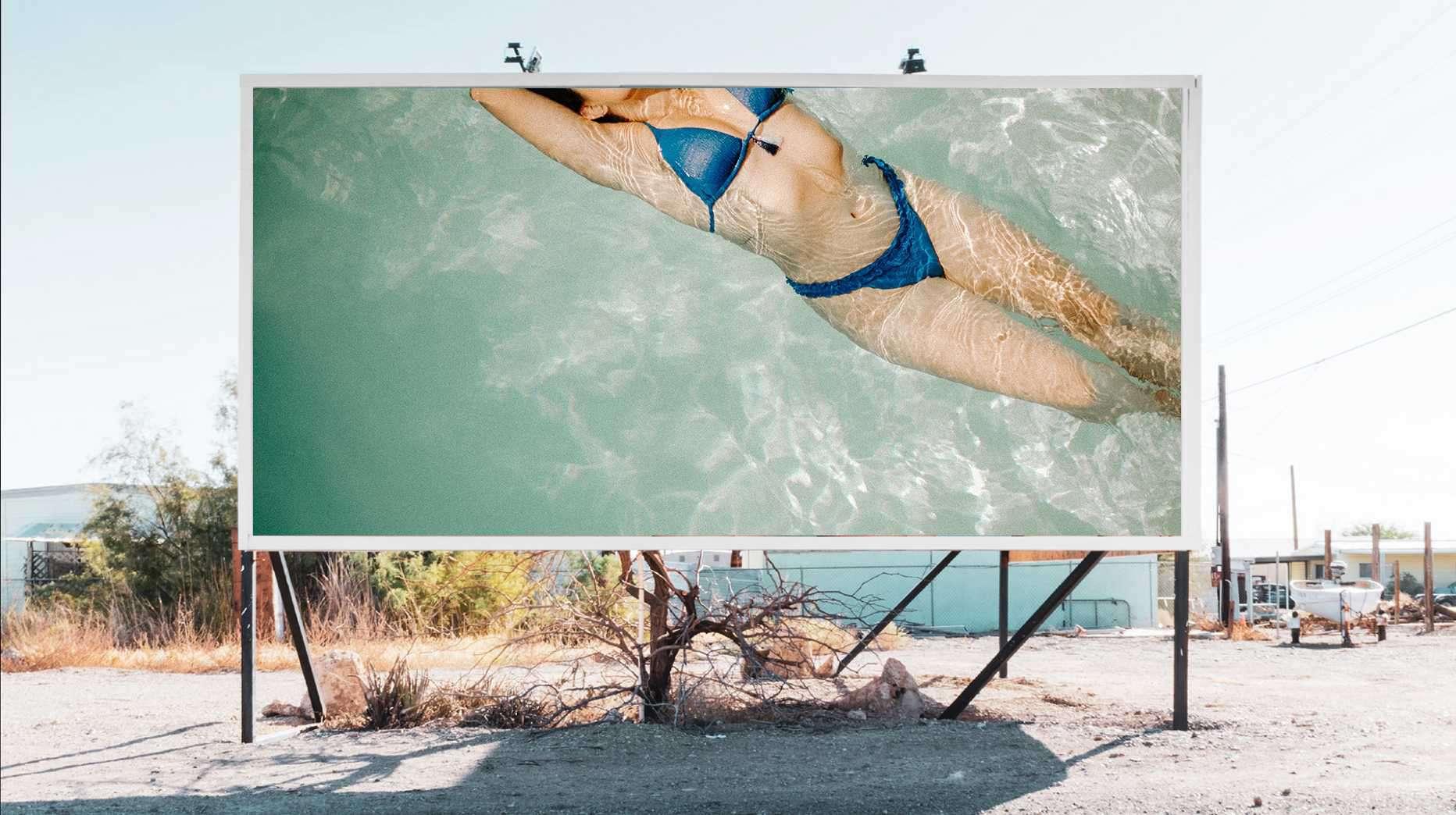
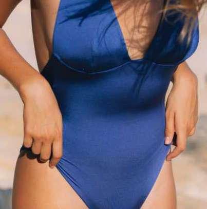
Client
Peng is a Taiwanese swimwear brand, has a large variety of bikini, from contemporary high cut sexy bikinis to classic shaped one-piece suits to show o all your best bits. Each collection – sculpted with the natural figure of the female body in mind. Rich in details, each piece is intended for the wearer to feel confident in her own skin.
Aim
Everything, starting by the name, all components of the brand trying to let women show o their bodies, feel confident, glamorous, flirty, and fun, all at the same time in their sexy bikinis. Based on this input, a bold and strong identity for the brand was created.
02 SOCIAL MEDIA CONTENT_PENG2 0 2 2 D E S G N P O R T F O L I O Y - H S N L E E
2020
VISUAL IDENTITY LOGO BRANDING PACKAGING DESIGN
Ai Ps
Brand Story
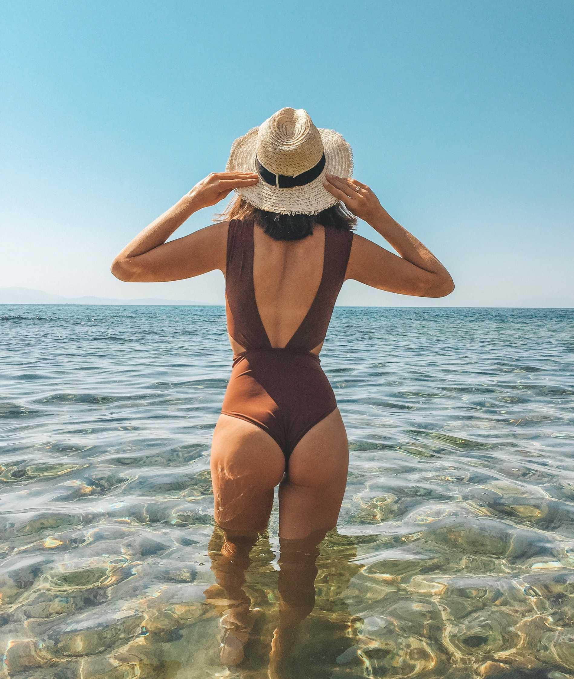
Do you want to be the most attractive girl on the beach this summer ?
Meet “ PENG ”, a timeless swimwear label that puts a sensual touch to all its sophisticated pieces.
“ PENG ” means very appealing, attractive and desirable. The brand was born from the story between the founder and her boyfriend.
“ She’s peng ” is the first impression when he saw her on the beach. The aesthetics of the brand is “coquettish, irreverent, playful and sexy.” The founder wants all the girl looks attrative and feel stunning when wearing their design.
LOGO
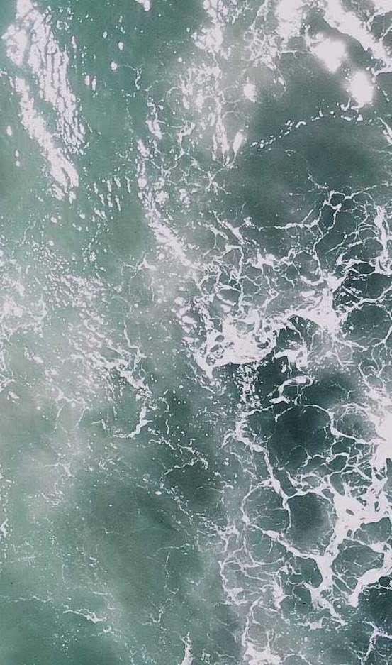
The logo inspired by the sexy curve of a woman’s body and waves of the sea. The core of the brand identity emphasizes the beauty in women, intends to evoke emotions of aesthetically pleasing and the desire of being sexually attractive.
SWIMWEAR
SHINE IN DIFFERENT BODY
02 SOCIAL MEDIA CONTENT_PENG2 0 2 2 D E S G N P O R T F O L I O Y - H S N L E E
02 SOCIAL MEDIA CONTENT_PENG2 0 2 2 D E S G N P O R T F O L I O Y - H S N L E E #CA336E #3165A5 #EDEAD6 Typeface Colors Sofia Pro ABCDEFGHIKLMNOPQRSTUVWXYZ abcdefghijklmn opqrstuvwxyz 0123456789|!ӣ$%&/()=? ^ I decided to choose a sans-serif typeface to match with the logo and the brand, with rounded edges in favor of a smooth and clean look, it would be an identification-based cut that balance the strong character of the logo.

2 0 2 2 D E S I G N P O R T F O L O Y I - H S I N L E E2 2 D E S G N R F O L I O Y - H S I N L
2 0 2 2 D E S G N P O R T F O L I O Y - H S N L E E 17
PENG
18 02 SOCIAL MEDIA CONTENT_PENG
PENG PENG PENG Peng Cancel Bikini Time SS22 PENG GIRL SIZESUMMER NEWJOURNALQ&A Peng 02 SOCIAL MEDIA CONTENT_PENG2 0 2 2 D E S G N P O R T F O L I O Y - H S N L E E
SHINE IN DIFFERENT BODY
Comment Peng 2hr Learn More Peng Sponsored
#bof #vogueitalia #clubhouse #slamjam #SlamJamSafeSpaceTalks #SlamJamArchivio New arrivals: Hollywood Plunge & Lift gives you all the support you need. Follow us on Instagram @peng Peng Peng 02 SOCIAL MEDIA CONTENT_PENG2 0 2 2 D E S I G N P O R T F O L O Y I - H S I N L E E


#YouArePeng BE THE PENG GIRL THIS SUMMER 229 Peng Be the peng girl this summer www.peng.com 6120k 02 SOCIAL MEDIA CONTENT_PENG2 0 2 2 D E S G N P O R T F O L I O Y - H S N L E E
02 SOCIAL MEDIA CONTENT_PENG
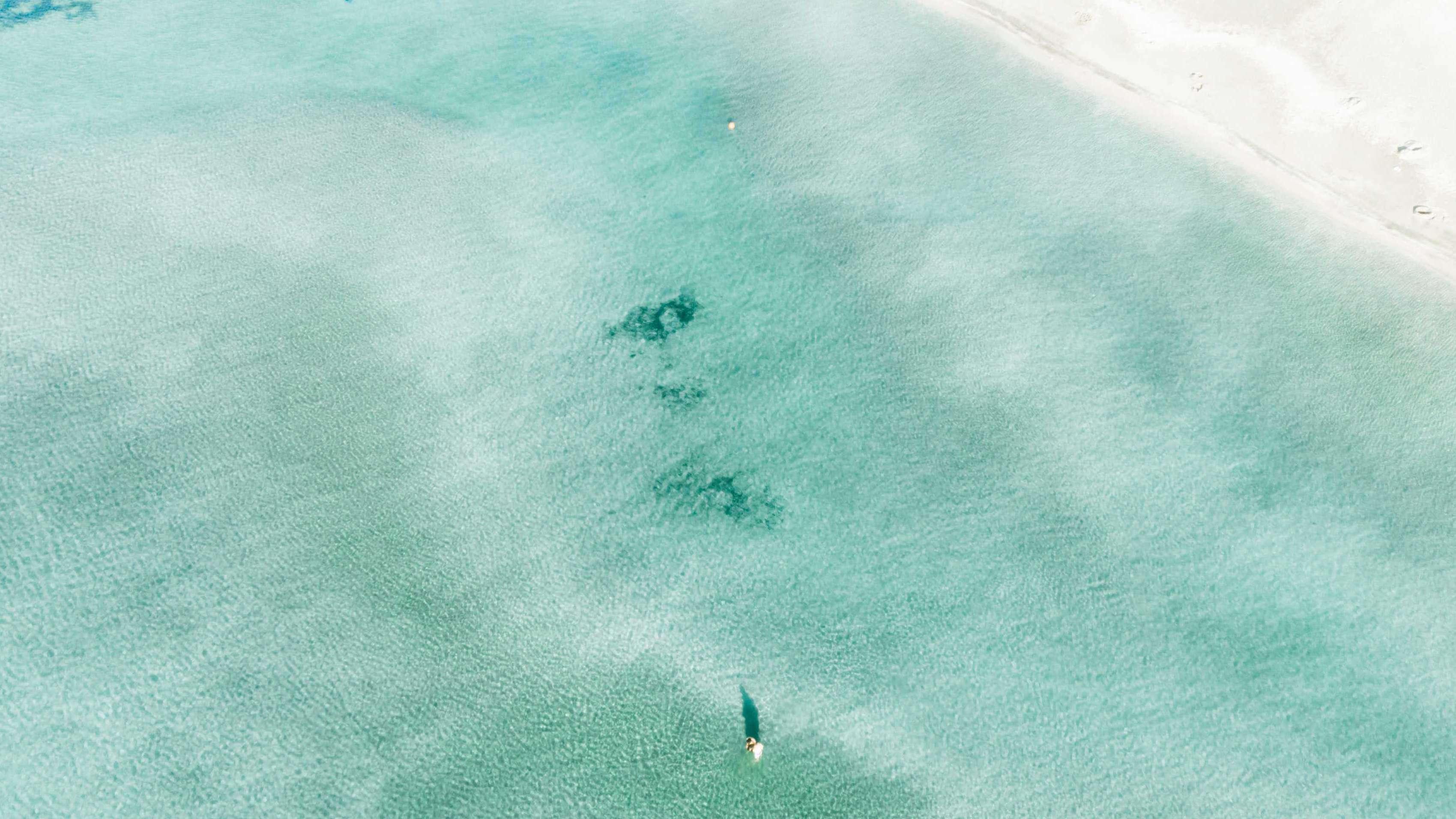
Peng Hualien, Taiwan
Peng
Kenting, Taiwan
Comment Peng
2hr
02 SOCIAL MEDIA CONTENT_PENG2 0 2 2 D E S G N P O R T F O L I O Y - H S N L E E
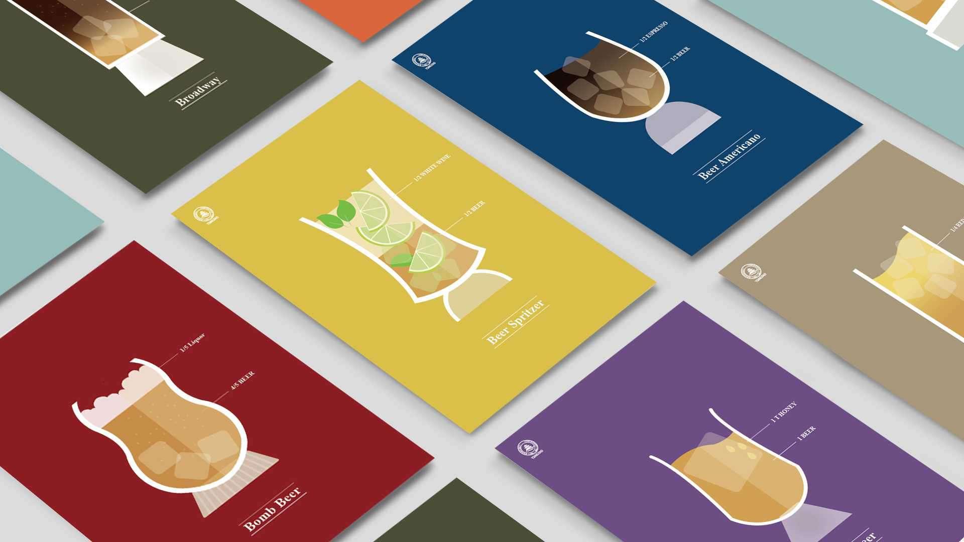
3Packaging Design
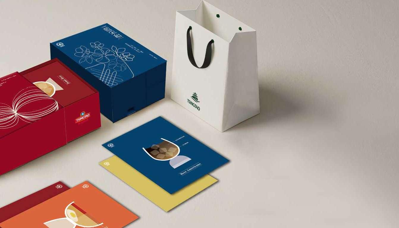
TSINGTAO
PACKAGING DESIGN ILLUSTRATION
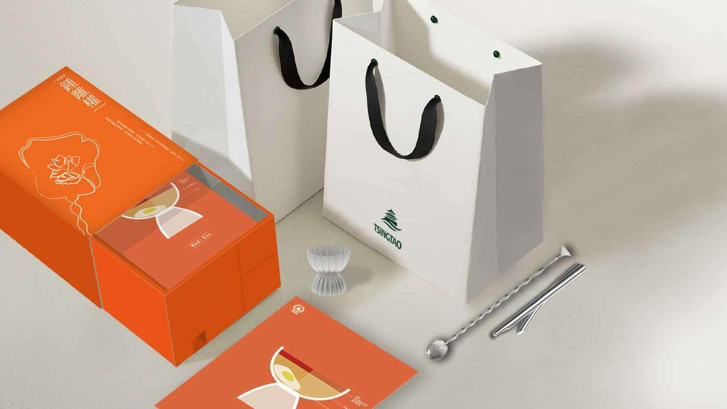
Client Tsingtao,was established in 1903 by German and British merchants. As one of the earliest breweries in China, Tsingtao is currently the sixth largest brewer in the world, the brand brings together a unique formula of bold Chinese craftsmanship, refined German technology, and the most extraordinary selection of ingredients to craft a truly refreshing beer.
Aim

Propose a package of 3-5 gift items, including a multi-functional beer bottle opener, the product proposal should have a strong visual and iconic identity, is crucial to analyze the brand identity and value of Tsingtao Beer in order to integrate their brand culture within the product.
Product Design: Mingyoneg Lee / Ruifeng He
Ai Ps Id 03 PACKAGING DESIGN_TSINGTAO
2021
STORY TELLING
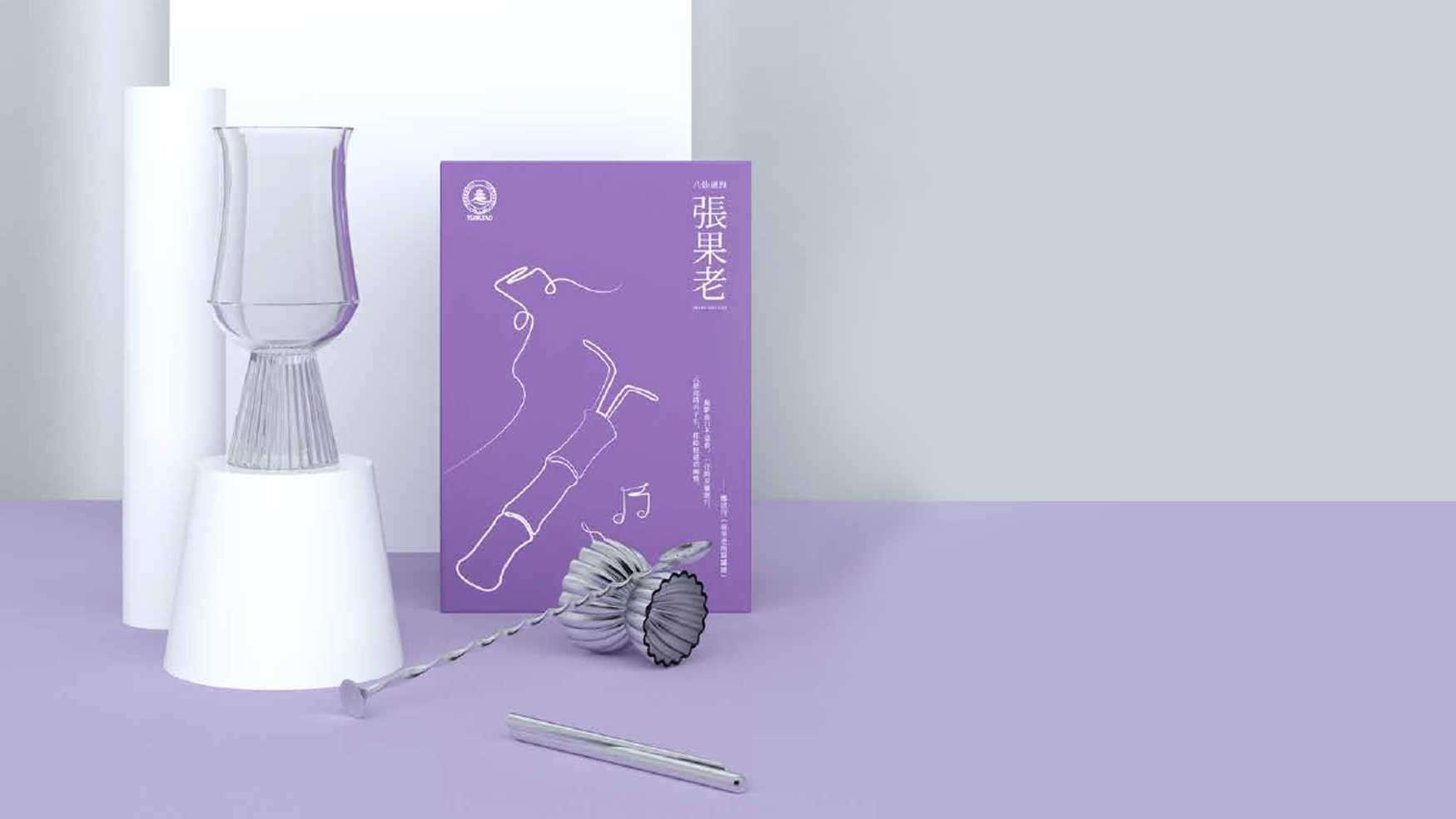
In Chinese mythology, the eight Immortals were a legendary group of eight individual beings who had transcended the human state to become endowed with divine and supernatural attributes or powers. Each immortal is endowed with a power that can give life or help them fight against evil.
Inspired by the myth of the eight gods, which is a symbol of Qingdao and used in the advertisement in Tsingtado beer, we intend to embody them with objects such as gourds, lotus, bamboo flutes, which are magical tools of the eight gods.
03 PACKAGING DESIGN_TSINGTAO2 0 2 2 D E S G N P O R T F O L I O Y - H S N L E E
03 PACKAGING DESIGN_TSINGTAO2 0 2 2 D E S G N P O R T F O L I O Y - H S N L E E
03 PACKAGING DESIGN_TSINGTAO2 0 2 2 D E S G N P O R T F O L I O Y - H S N L E E
UI Design
4
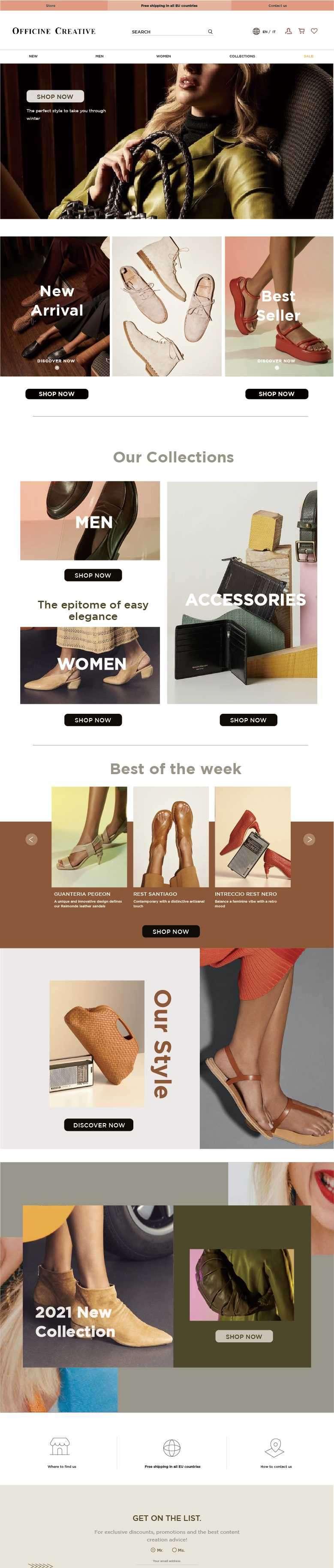
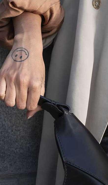
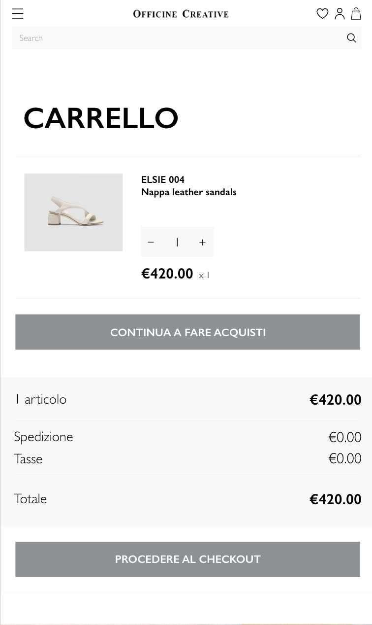
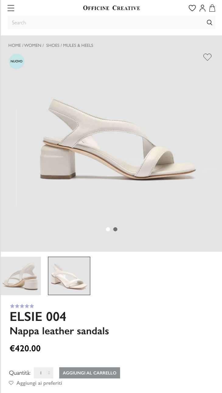
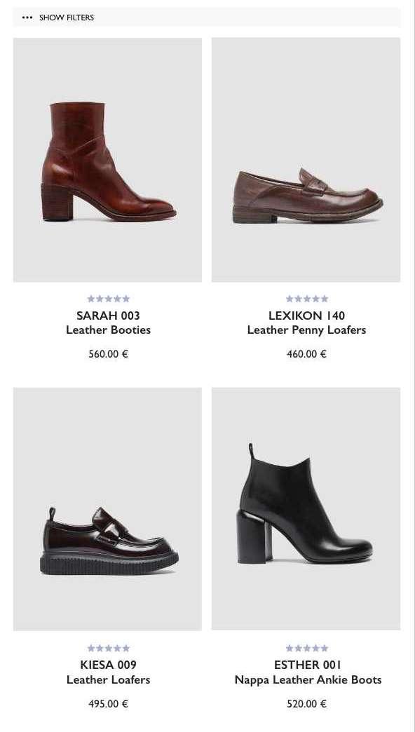
OFFICINE CREATIVE
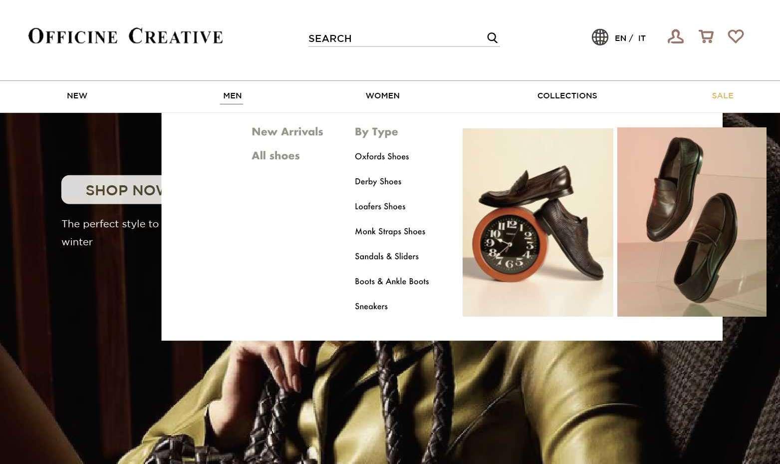
04 UI DESIGN2 0 2 2 D E S G N P O R T F O L I O Y - H S N L E E 2021
04 UI DESIGN2 0 2 2 D E S G N P O R T F O L I O Y - H S N L E E
04 UI DESIGN2 0 2 2 D E S G N P O R T F O L I O Y - H S N L E E
03 UI DESIGN2 0 2 2 D E S G N P O R T F O L I O Y - H S N L E E UI

04 UI DESIGN2 0 2 2 D E S G N P O R T F O L I O Y - H S N L E E
RELOOVED
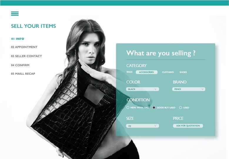

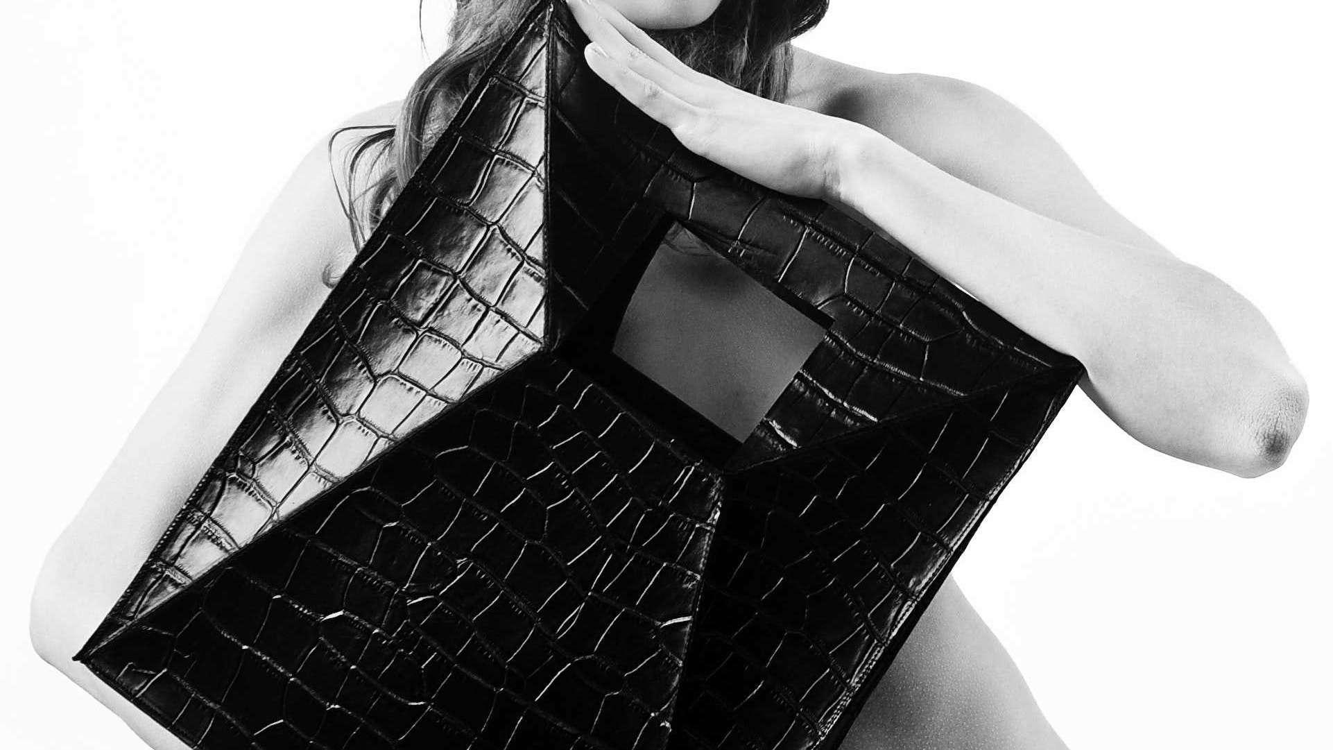
04 UI DESIGN2 0 2 2 D E S I G N P O R T F O L O Y I - H S I N L E E 2021
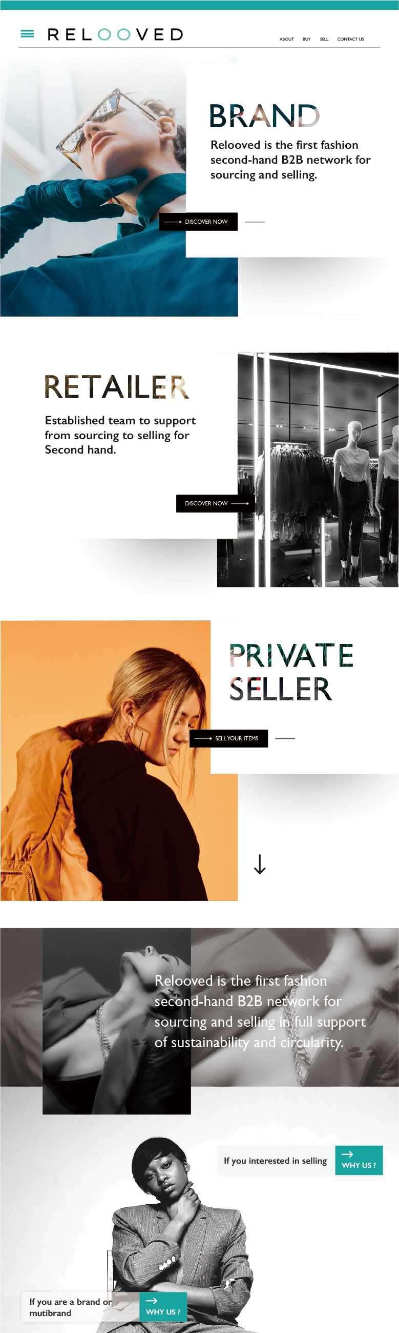
04 UI DESIGN2 0 2 2 D E S I G N P O R T F O L O Y I - H S I N L E E
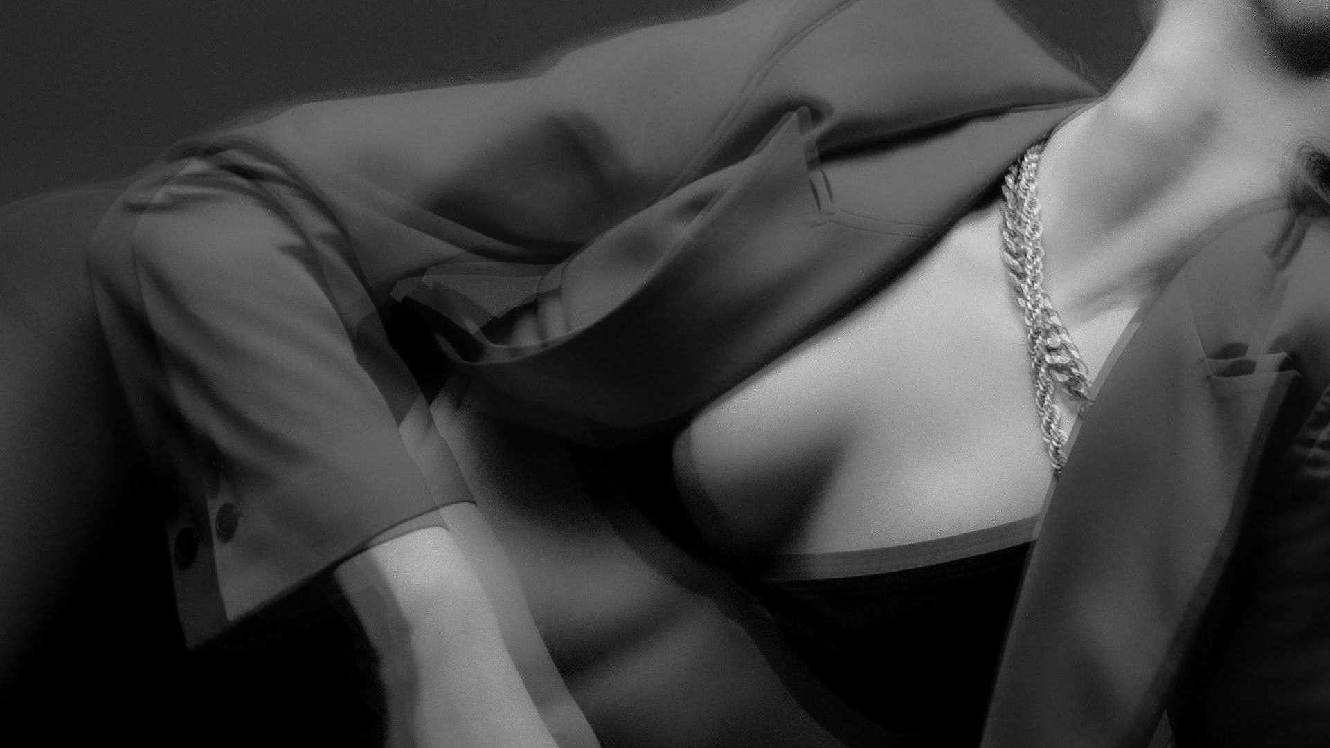
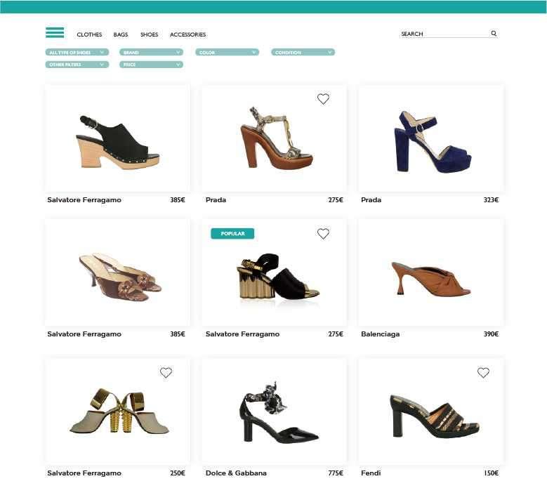
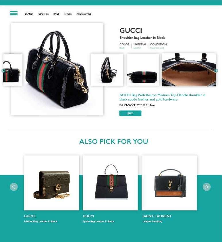
04 UI DESIGN2 0 2 2 D E S I G N P O R T F O L O Y I - H S I N L E E
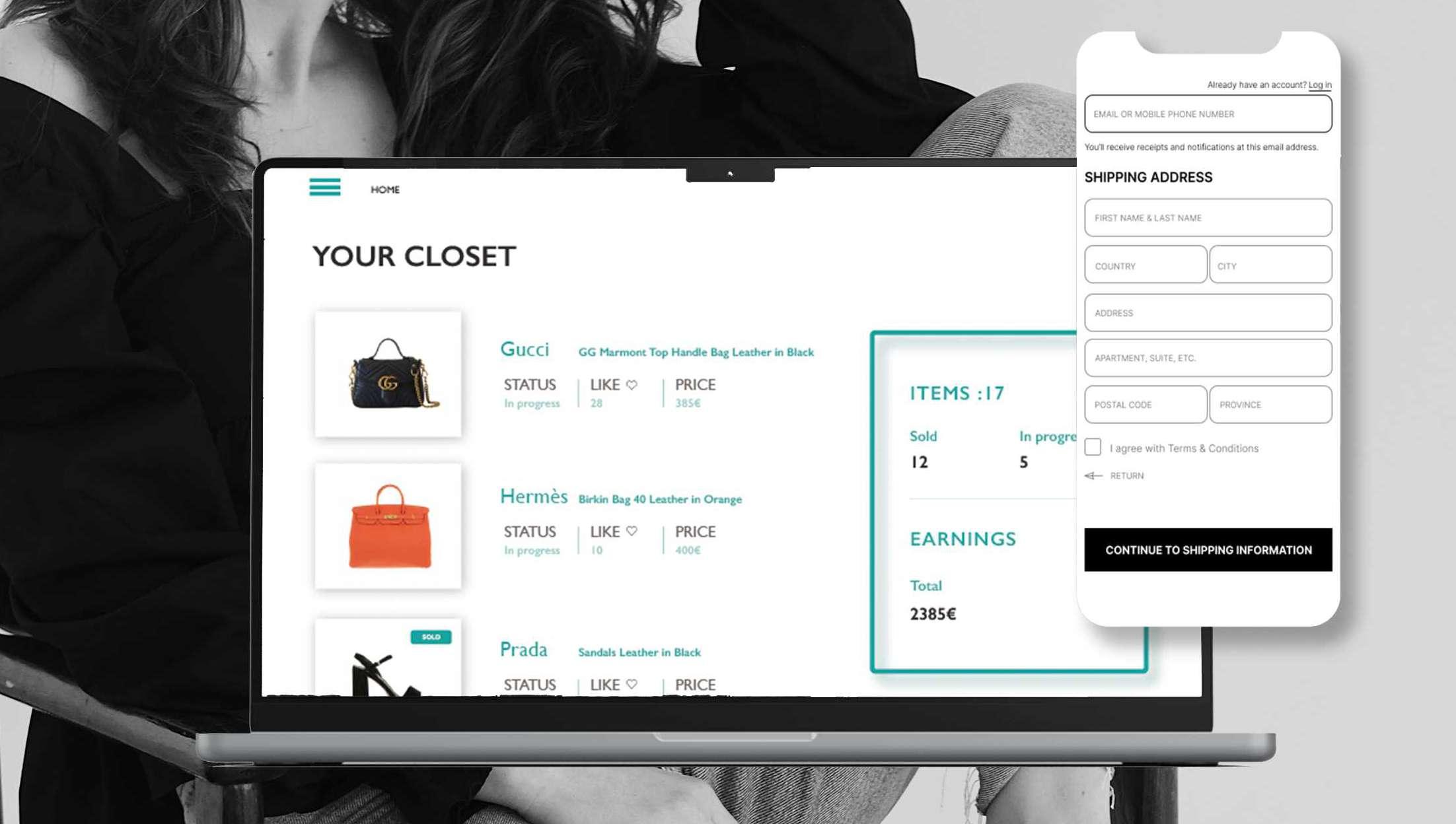
04 UI DESIGN2 0 2 2 D E S I G N P O R T F O L O Y I - H S I N L E E
Other5
05 OTHER2 0 2 2 D E S I G N P O R T F O L O Y I - H S I N L E E
05 OTHER2 0 2 2 D E S I G N P O R T F O L O Y I - H S I N L E E