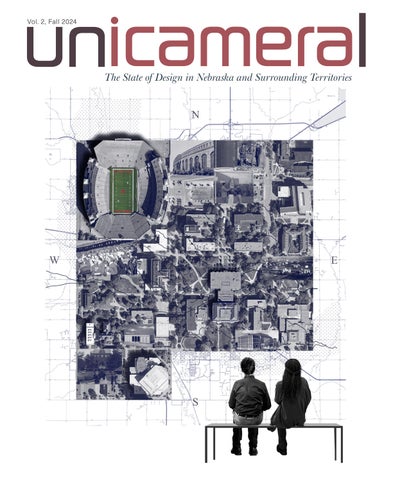
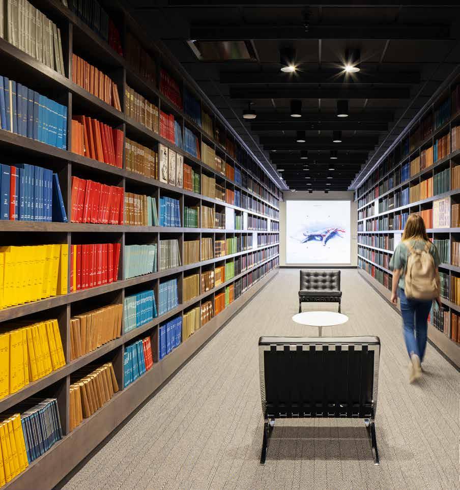
The State of Design in Nebraska and Surrounding Territories
Have no fear of perfection— you’ll never reach it.
Salvador Dali
A defining element of the State of Nebraska is the fact that our state government consists of a single or unicameral legislative body. It is something that is unique to our state alone in the great diversity of the United States of America. Throughout Nebraska’s history, our small population has made it necessary to work together and think differently. Therefore, the idea of a design publication for the State needs to be one that blurs boundaries and breaks down traditional formations with a singular disciplinary focus.
This design publication will also look to engage across the traditional categories of academic faculty, professional practitioners, and the students that ultimately enter these worlds after they have completed their period of study and internship. The publication will occupy a middle ground that takes the worlds of magazines and journals and combines them. It will be formed to create a unified creative team comprised of members of the University of Nebraska, College of Journalism and Mass Communication, the Johnny Carson Center for Emerging Media Arts, the College of Architecture, and members of the State of Nebraska’s diverse design profession.
Unicameral will combine the public outreach and the audience of a magazine and merge it with the focus of a journal. Its aim is to provide a window into Nebraska’s design culture, work(s), ideas, and personalities that create and define our communities, urban spaces, workplaces, and homes.
EDITOR IN CHIEF Thomas J. Trenolone, FAIA
ART DIRECTOR Encarnita Rivera
ASSOCIATE EDITORS Sidney Renelt, Elena Garcia Tapia
CONTRIBUTING EDITORS Kate Brashear, Tristan Brickman, Grace Carlson, Karolayn Chavez Loor, Clara Hetherington, Cort Johnson, Michael Leiting, Alex Martino, Zitlalic Parra Valencia, Carlos PerezMadrid, Blake Phillips, Reid Shubert, Audrey Huse, Louis Khu
COPY EDITOR Kathryn Ineck
AI ILLUSTRATORS Karolayn Chavez Loor, Michael Leiting , Zitlalic Parra Valencia, Reid Shubert
EDITORIAL SUPPORT Danette Hunter
EDITORIAL OFFICE: University of Nebraska-Lincoln, College of Architecture
400 Stadium Drive, Lincoln, NE 68588
PHOTOGRAPHY OF PROJECTS
Madeline Cass, Corey Gaffer, Tom Kessler, Dan Schwalm
COVER ART
Zitlalic Parra Valencia
ACKNOWLEDGEMENTS
University of Nebraska-Lincoln, College of Architecture; Kevin Van Den Wymelenberg , Ph.D., Dean, University of Nebraska College of Architecture
David Karle , Associate Professor and Director of the Architecture Program, University of Nebraska College of Architecture Professional Advisory Committee
Sarah Thomas Karle , Associate Professor and Interim Director of Landscape Architecture
Lindsey Ellsworth-Bahe , Associate Professor and Director of the Interior Design Program
Zhenghong Tang , Professor and Director of the Community & Regional Planning Program College of Journalism and Mass Communications ; Shari R. Veil, MBA, Ph.D., Dean; Adam Wagler, Associate Dean for Academic Programs
Barnhart Press ; John Barnhart, President
HDR (The Great Plains Studios) ; Matt Whaley, Managing Principal
AIA Nebraska · AOI · DLR Group · GreenSlate Development
HDR (The Great Plains Studios) · IIDA Great Plains Chapter
LEO A DALY · Nebraska Masonry Alliance · Noddle Development Company
RDG Planning & Design · Ronco Construction · TACKarchitects
Tom & Amy Trenolone · Whiting + Turner
By supporting Unicameral these groups and individuals attest to their belief in the power of design and its importance in creating great environments, places, and products in the great state of Nebraska and surrounding territories. This publication would not exist without their passion and commitment to great design in the middle of everywhere.
Thank you for continuing to make Nebraska a great environment to practice and create.
To the students, professionals and faculty of Unicameral—thank you.
Printed by Barnhart Press, Omaha, Nebraska.
Editorial
By Thomas J. Trenolone
TWO IS A WONDERFUL NUMBER – ODE TO DESIGN STORYTELLERS
According to numerology, the number two is significant. It is often associated with harmony, balance, cooperation, diplomacy, and relationships. Each of these elements was instrumental in forging our first issue of Unicameral. In a short time, Unicameral has helped to teach lessons vital to the sharing of ideas and design. Foundationally, the students that make up our writing staff are taught to share stories that focus on the people, the places in which they practice, and the projects they design here in the great state of Nebraska.
I have been fortunate to be able to follow a path that allowed me to practice two of my loves, those being design/architecture and storytelling. I think that this can be attributed to Architectural Record I was first introduced to Architectural Record in my sophomore year in high school when an architect working with my father heard that I was interested in studying architecture in college. The issues were hand-me-downs, never the most current year or month, but they exposed me to a bigger world. In the 2006 movie, The Devil Wears Prada, Nigel, a.k.a. Stanley Tucci, has a moment when he shares the importance of all design media. In his case it was about fashion, but you could interchange architecture, interior design, and landscape architecture just as easily. He says, “You think this is just a magazine? Hmm, this is not just a magazine, (as he flips quickly through the pages) this is a shining beacon of hope.”
Architectural Record became an inspiration for me as a high school kid in Longview, Texas, and I am forever grateful to the wonderful editors that over the years have sought out and curated the great stories of architecture and design happening around the world. I remember my first time visiting the offices in New York (2006) to meet with thenEditor-in-Chief, Robert Ivy. I was a little taken aback by the humble office space of the great Architectural Record; it was not what I was expecting. I imagined all the greats that have walked their halls or maybe sat in the chair I was sitting in. I still feel that same sense of awe when I visit today. In this day of social media and endless digital content, I think we often forget the wonderful debt of gratitude that we as designers owe to the journalists and writers that help tell our stories to the world.
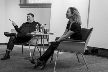
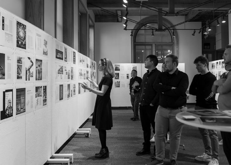
The world has changed a great deal since my introduction to Architectural Record in 1986. I have utilized my love of journalism to meet some of my design heroes, some are the best in the world, others the best in town. Regardless, I find their stories inspiring and I leave each interview with a greater understanding of our great profession. At the vanguard of the design storytellers have been the great men and women at Architectural Record The leaders have changed over time: Cathleen McGuigan followed Robert Ivy, and now Josephine Minutillo has taken helm of magazine. We were so fortunate to welcome Josephine to Lincoln to sit in on a review of this year’s issue. It was an honor to have such an accomplished design journalist here to provide her insight and lessons learned with our contributing writers and staff.
Now, we at Unicameral are not comparing ourselves to Architectural Record, we wish Record continued good fortune as a “shining beacon of hope” for future architects and designers. We at Unicameral do hope that students here in Nebraska find inspiration in our storytelling as a catalyst to follow their passion and become architects, interior designers, landscape architects and urban planners. We hope that this magazine helps to tell the stories of Nebraska designers and share the great work that they are doing here in the middle of everywhere.
Josephine Minutillo, Editor-in-Chief, Architectural Record , guest speaker spring semester.
KATE BRASHEAR
With Omaha as her hometown, Kate is a current graduate student in the Master of Architecture program at the University of Nebraska-Lincoln. In 2023, she received her Bachelor of Science in design with a specialization in environmental studies. Through her studies, Kate has developed a passion for addressing the topics of sustainability and social justice through design. She is a proponent of engaging community projects which seek to actively improve the neighborhoods they are a part of. She is also an advocate for women in architecture and the promotion of diversity and inclusion within the profession. In her free time, Kate enjoys playing with her dog, Biscuit, furthering her online shopping addiction, and sleeping as much as possible. When she’s not asleep, Kate also loves listening to 70s music, rewatching Mamma Mia , and redecorating her apartment.
TRISTAN BRICKMAN
Tristan, now a master’s student in architecture, first developed his love of design in his high school’s STEM academy in Papillion, Nebraska. His interests in drawing, wood working, crafts, and science made this academy the perfect fit, and would later propel him into his passion for architecture and design. Since first arriving in the architecture program, his favorite design topics have changed over the years; he has recently taken up an interest in biophilic design, sustainable design, and community impact. His favorite design processes and methods include hand sketching, study modeling, and rendering. When outside of work or class, his favorite free-time activities include graphic design, drawing, video games, playing soccer, and spending time outdoors. Tristan looks forward to entering the design disciplines, creating impactful work, and progressing in his craft.
GRACE CARLSON
Grace is currently pursuing her Masters of Architecture degree at the University of Nebraska-Lincoln. She started out in the College of Engineering, quickly realized her passion for the design process, and ultimately changed her education path. In addition to the design process, she enjoys the collaborative nature of the discipline, constantly learning from those around her and finding new outlets for inspiration. Outside of school, she enjoys teaching dance lessons, attending concerts, wakeboarding at the lake, and of course cheering on the Huskers. In the future, Grace is looking forward to becoming a licensed architect and having the opportunity to travel internationally.
KAROLAYN CHAVEZ LOOR
Karolayn Chavez is an international student from Ecuador. She is the first generation to earn a bachelor’s degree and is the first person pursuing a master’s degree in her family. Over the past two years, she has been employed by GKG Architects, a New York-based firm, where she has taken on a role encompassing design, the creation of construction documents, and handling submittals and request for information (RFI) responses. Karolayn aspires to secure her architecture license shortly after completing her studies. Her interest in architecture was sparked by her first trip to a foreign land, where she found herself staring at a city’s architectural pleasure from a bird’s-eye view. This experience informed her lifelong commitment to the field. When she is not in school or at work, she enjoys traveling to new countries, trying new foods, taking part in extreme activities, and engaging herself in the world of books. Her life philosophy is based on two mottos: “If you can dream it, you can achieve it,” and “live life to the fullest.”
ELENA GARCIA TAPIA
Elena is a design coordinator at HDR and associate editor of the Unicameral Design magazine. In 2023, she graduated from the University of Nebraska-Lincoln with a Bachelor of Science in design with high distinction. Originally from Mexico City, she credits the contrasting experiences of growing up back-and-forth between the biggest city in North America and the suburbs of west Omaha as the origin of her fascination with the built environment. Receiving an equal combination of her mother’s artistic ambition and her father’s analytical thinking, she knew from a young age that architecture would be the perfect outlet for her inquisitive nature. Her creations often express elements of vernacular design and rely heavily on the importance of perspective. In her free time, Elena enjoys reading, drawing, and spending time with her parakeet, Yoshi.
CLARA HETHERINGTON
Clara is a fifth-year Masters of Architecture student at the University of Nebraska-Lincoln. After a quick year in chemical engineering, she decided architecture was the path for her and completed her undergraduate degree here in 2023. Originally from Omaha, Clara spends a lot of weekends hopping back and forth from Lincoln to see family and friends. Clara’s passion for art fueled her decision to begin an architectural career. She finds excitement in architecture as it provides the opportunity to fuse creative passion with technical and problem-solving skills. When not doing homework, Clara loves to read, draw, and go fishing with her dad.
CORT JOHNSON
After attending Millard North High School, Cort Johnson joined the Navy at 18. After basic training, he was assigned to the USS George Washington (CVN-73) where he served in Yokosuka, Japan for four years. During this he became a Navy Diver from graduating Naval Dive and Salvage Training Center, Panama CIty, Florida. Time spent diving and working down under provided many great opportunities for him to delve into his love of adventure and exploration. While in Japan, he looked to the mountains for adventure, often climbing up and snowboarding back to base, or diving offshore and spearfishing for dinner. After an honorable discharge, he began school at University of Nebraska at Lincoln’s College of Architecture. Currently, Cort spends most of his time outdoors, whether it’s in the blind, on a boat, on a peak, or underwater. Along with this, he is working on his licensure to practice architecture to design the future.
Louis is a native of Omaha and grew up between Midwestern and Thai cultures, which helped shape his passion and drive for architecture. His desire to explore the possibilities of design has led him to the University of Nebraska -Lincoln. He holds a Bachelor of Science in design for architecture and anticipates completing his master’s degree in the spring of 2024. Louis aims to collaborate with designers across the country to continuously innovate architecture and health standards while exploring other design avenues such as graphic design and film. In order to achieve success, Louis believes in taking calculated risks, constantly pushing himself beyond his comfort zone. Returning as a senior contributing writer for Unicameral has allowed him to explore design through another medium, opening doors to new interests.
Michael is a fourth-year architecture student at the University of NebraskaLincoln with the intention of pursuing dual-master’s degrees in Architecture and Community and Regional Planning. Born in Iowa but raised a Cornhusker, his love for architecture began when he learned that designing his mother’s future home would be the quickest way to becoming the favorite child. Competing with his three sisters and two dogs, Michael hopes to employ logical planning with his creative design in the field of sports venue architecture. He believes that this specialized field will be the most rewarding career path forward in helping people to realize their vision.
ALEX MARTINO
Beginning his architectural journey at the University of Nebraska-Lincoln after moving from a suburb of Dallas, Texas, Alex Martino thrives in challenging problem-solving situations and highenergy environments. He is currently enrolled in the master’s program at the College of Architecture, completing his bachelor’s in architecture in May of 2023. Alex’s curiosity in design focuses on the advantages of different structural types and materials, recently enjoying working with mass timber products and understanding their environmental implications. Alex enjoys traveling and visiting new cities and destinations, especially where he can either surf on a beach or snowboard in the mountains. The majority of Alex’s schedule outside of school, work, and studying is devoted to practicing drums or playing shows with his metalcore band.
ZITLALIC PARRA VALENCIA
Zitlalic was born in Mexico and raised in Grand Island, Nebraska. Currently, she is a sixth-year Master of Architecture student at the University of NebraskaLincoln, where she also received her Bachelor of Science in Design in 2022. In 2023 she was awarded the W. Cecil Steward Architecture Fellowship, which highlights her commitment to sustainable and environmental causes. Additionally, Zitlalic has previously contributed as a research assistant to Professor Sarah Karle, collaborating on the New Deal Prairie State Forestry project. Currently, Zitlalic is an active member of the Dean’s Student Advisory Board for the ‘23-’24 academic year. Outside of her architectural pursuits, Zitlalic’s passion is centered around healthy living and learning new things. She enjoys picking up new hobbies, watching documentaries, and playing all kinds of sports.
LOUIS KHU
MICHAEL LEITING
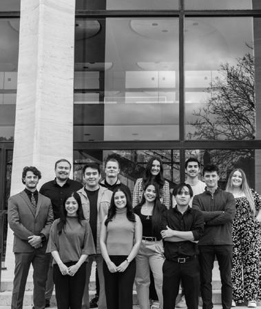
Unicameral staff, Fall Semester 2023.
Carlos is a sixth-year Master of Architecture student at the University of Nebraska-Lincoln, where he also received his Bachelor of Science degree in design. He is a firstgeneration Hispanic student from Grand Island, Nebraska. His parents both originally immigrated from different parts of Mexico and later met in Nebraska. Carlos has been a college ambassador for five years and was also a peer mentor for incoming architecture students. He dedicates his pastime to mostly playing video games, but also enjoys watching sports and designing outside of school. He likes to compete and video games give him a good outlet to focus that energy. Once a PlayStation fanboy (because of better exclusives) he now plays mostly on PC. He hopes to become a licensed architect and to help rejuvenate his hometown Hispanic community through design.
BLAKE
PHILLIPS
Blake is a sixth-year Master of Architecture student at the University of Nebraska-Lincoln, where he also received his undergraduate degree. He is originally from Omaha and is a first-generation college graduate. Blake is passionate about sustainable design and historical preservation, appreciating architecture’s ability to both preserve the past and push for a better future. Upon graduation, he plans to stay in the Omaha area and aspires to work on local projects that can make an impact in the community he grew up in. Starting in the summer of 2024, Blake will begin working for LEO A DALY as an architectural designer with a focus on healthcare.
Sidney holds the role of an associate editor for Unicameral Design magazine and serves as a design coordinator at HDR Omaha. She recently completed her undergraduate studies at the University of Nebraska-Lincoln, earning a Bachelor of Science in design. Sidney’s roots trace back to a small lake town in Minnesota, where her upbringing was steeped in outdoor activities such as canoeing, hiking, and camping. These experiences from her childhood remain activities she still enjoys doing to this day. Sidney views design as a constant journey of learning and self-improvement. She finds inspiration in the idea that design allows individuals to continually enhance their knowledge, enabling them to contribute to the betterment of the world. These ideals align with Sidney’s passion for creativity with her dedication to creating a more harmonious and sustainable world. In Sidney’s free time, she enjoys going on walks and playing with her dog, Summit.
A lifelong resident of Lincoln, Nebraska, Reid developed an interest in the built environment from an early age. Influenced by this fundamental interest in architecture, he also possesses an affinity for design processes in other industries such as footwear, automotives, and video games. He has spent the past five years working at Sinclair Hille Architects, diversifying his knowledge in multiple project scopes, most notably commercial, education, and adaptive reuse. Outside of the studio, Reid can be found either on a run, traveling the world, walking his chocolate lab, Remi, or with his family and friends cheering on their favorite sports teams.
Madeline Cass is a local photographer whose ongoing support and contribution to Unicameral builds our momentum.
Mad Cass is a multidisciplinary artist based in Lincoln, Nebraska where she earned a Bachelor of Fine Arts in studio art with an emphasis in photography from the University of Nebraska. Her work primarily centers in and around photography, poetry, artist books, painting, and drawing, often blending the line between several of these disciplines. Her work has been exhibited nationally and internationally. Her book, “How Lonely to be a Marsh,” was featured at Fotobokfestival in Oslo, and has been collected by institutions such as The Museum of Modern Art Library, The National Gallery of Art Library, The Getty Research Institute Library, and The Museum of Fine Arts Houston’s Hirsch Library. Her photography has been published in the following list of selected publications: The New York Times, The Washington Post, Wall Street Journal, and National Geographic
https://www.madelinecass.com @madelinecass
Photographer
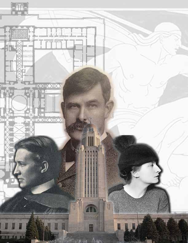
Nebraska is a level country and its capitol should have some altitude or beacon effect.
HILDRETH MEI È RE, Muralist of Nebraska’s State Capitol
BERTRAM GROSVENOR
GOODHUE, Architect of Nebraska’s State Capitol
THOMAS ROGERS KIMBALL , Commission’s Professional Advisor
LEO A DALY
Bryan Solko Architect, BVH
Bill Deroin Design Principal, HDR
Melissa Napo Architect, DLR Group
Kelley Dreyer Architect, Multistudio
Jeffrey L. Day Architect, Actual Architecture Co.
Stacy Feit Architect
Scott Lafferty Student
Cole Wycoff Design Principal HDR
Michael Hamilton Design Principal, HDR
Tom Trenolone Design Director, HDR
Elena Garcia Tapia Student
Brandy Nguyen Student
Todd Moeller Architect, APMA
Megan Lutz Architect, APMA
Jeffrey Dolezal Architect TACKarchitects
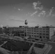
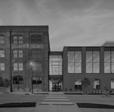
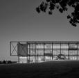
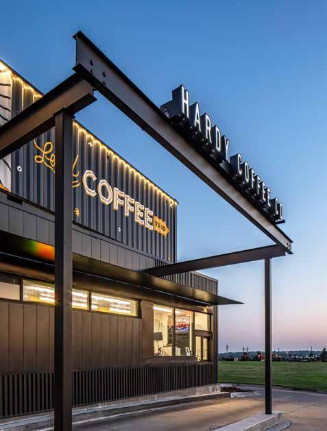
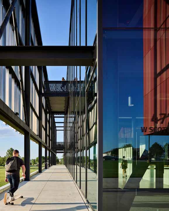
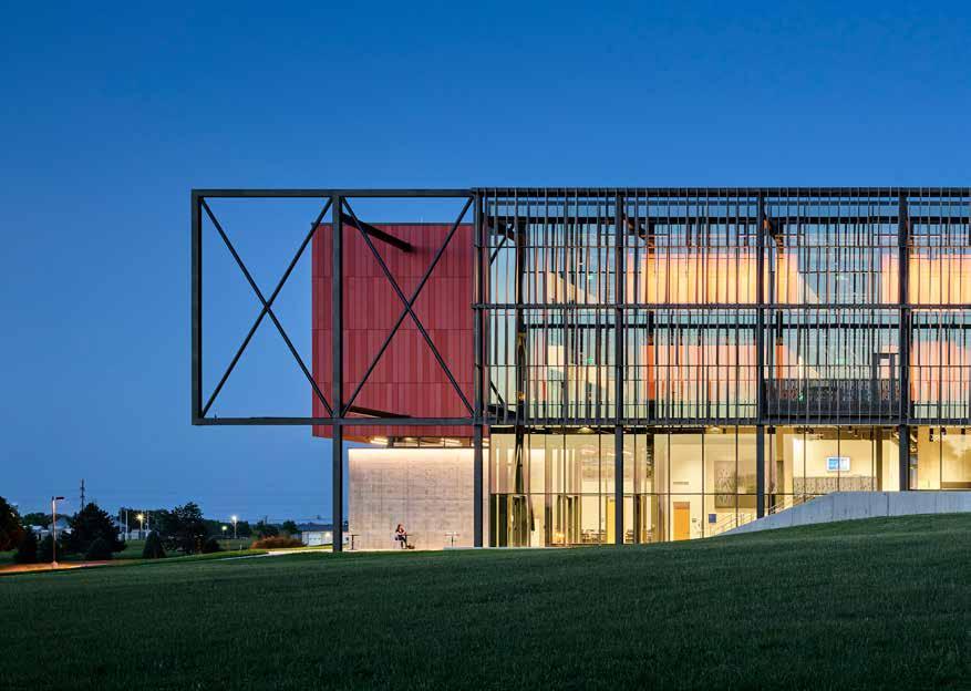
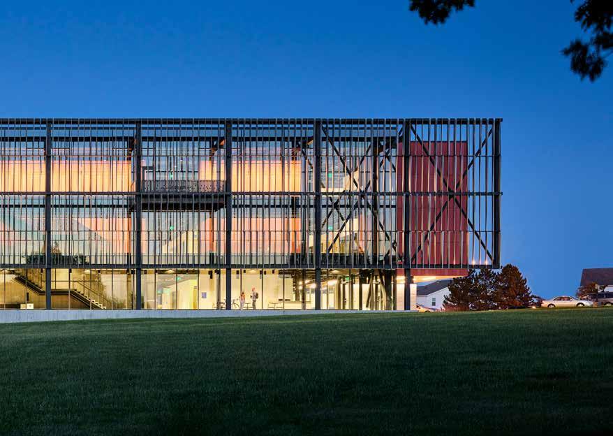
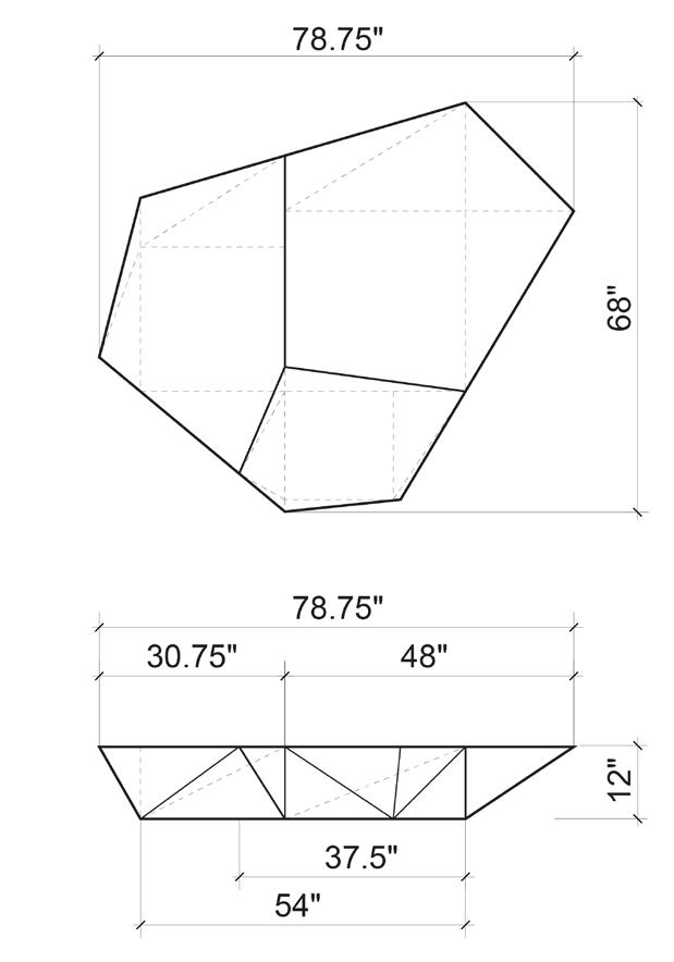
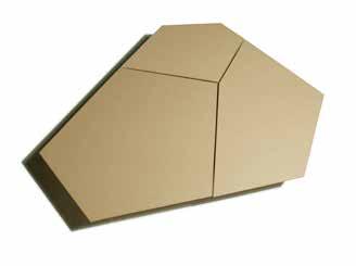
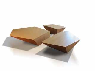
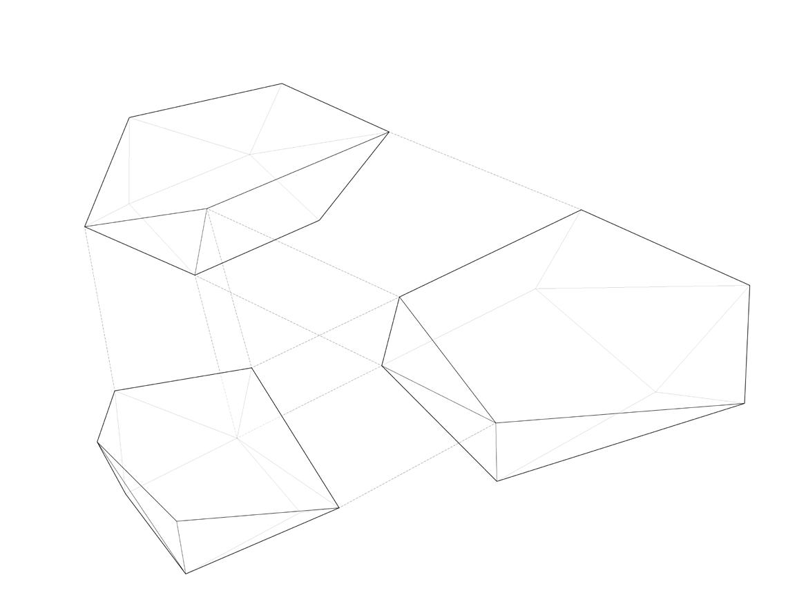
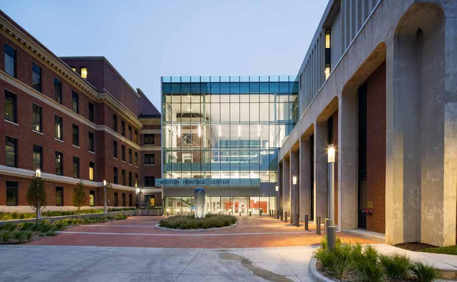
National Bank of Commerce
Downtown Monument
By Elena Garcia Tapia
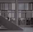
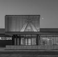
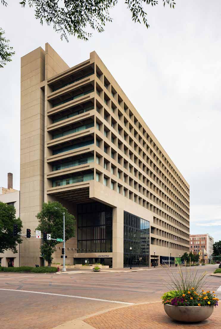
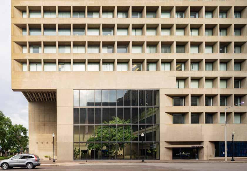
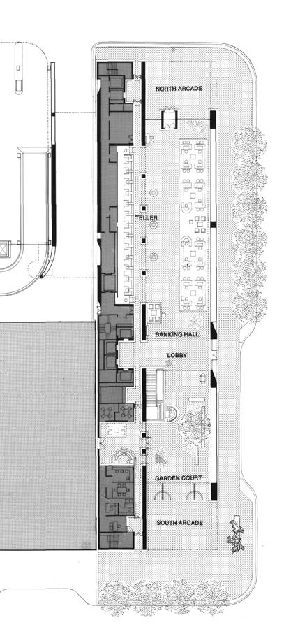
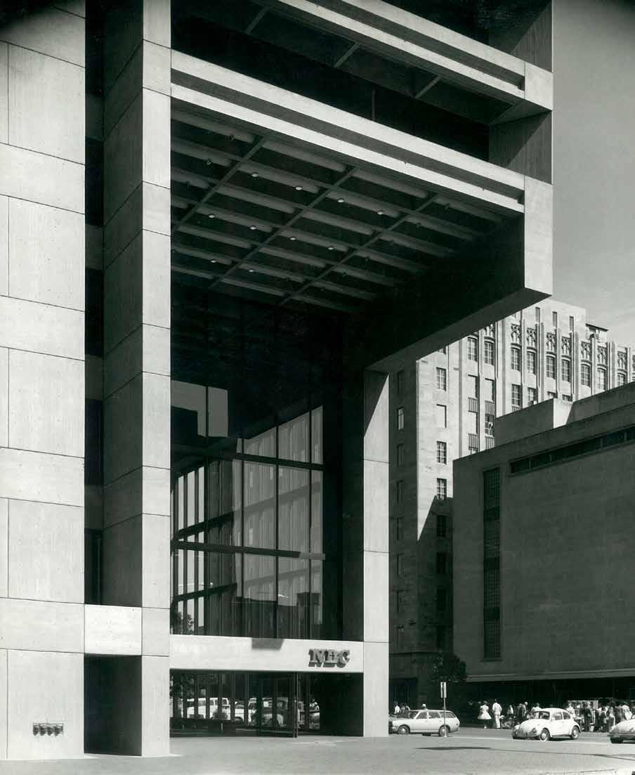
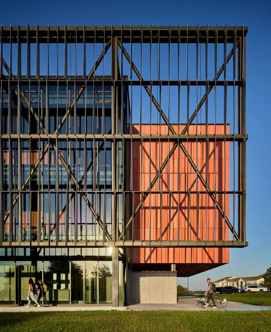
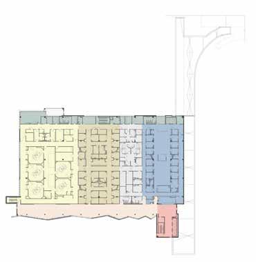
The National Bank of Commerce building in Lincoln, Nebraska was the 2022 recipient of the AIA Nebraska 25-Year Award. This building has been applauded as one of the most significant works of architecture in the state of Nebraska due to its unique structure and modern appearance.
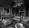
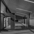
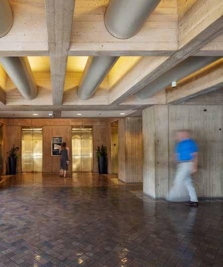
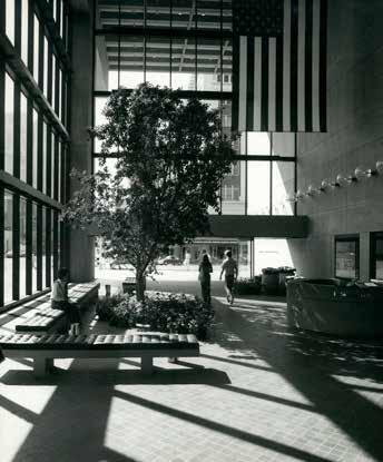
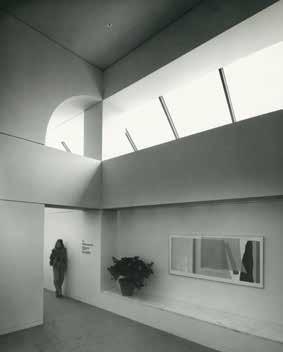
The elevator lobby preserves the original details.
The story of the building began when the National Bank of Commerce, a bank deeply dedicated to the downtown Lincoln district and the local community, needed a space that embodied their dedication to community involvement and service. As a result, the NBC building was meticulously planned to optimize its location without disrupting the urban surroundings. The design was highly attuned to the site’s characteristics, with its height intentionally aligned with the structures across the street, and aspects of energy efficiency and neighboring architecture—as well as modern architectural explorations—playing an important role in this harmonious addition to the cityscape.
Architect James Ingo Freed of I.M. Pei & Partners (now Pei Cobb Freed & Partners) was the lead designer of the building and worked in conjunction with associate architects Davis/Fenton/Stange/ Darling of Lincoln, Nebraska (now Davis Design). Schematic design proposals were presented to the client in March of 1973 and were ultimately approved; after that, construction of the building was finally completed in May of 1976.
Initial discussions with the client and architects helped determine that a symbolic element would be important to the building’s design and that it should
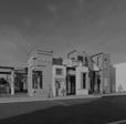
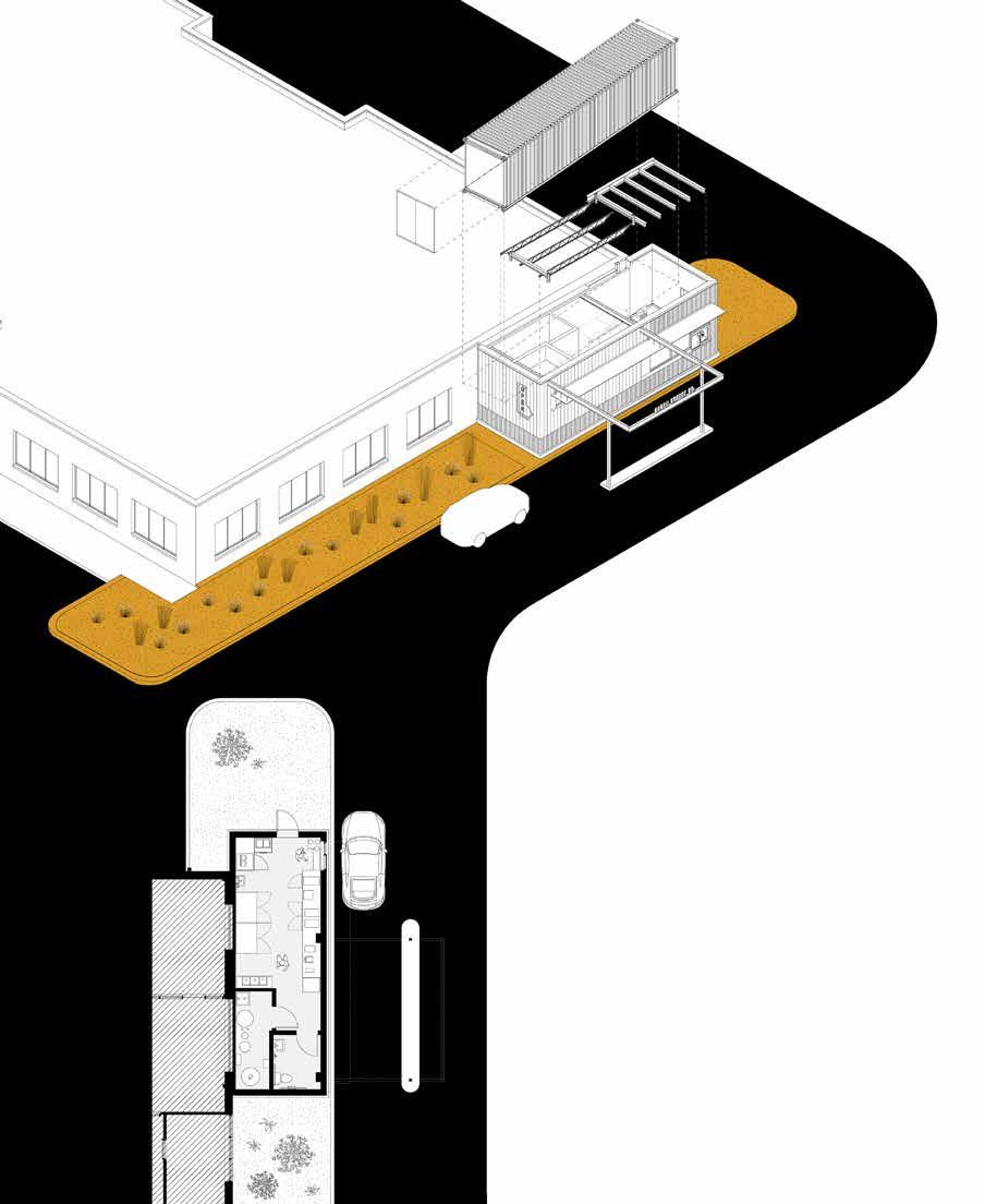
provide space for bank, tenant, and public use. The building sits on a site 300 feet long and 72 feet wide: a long and narrow site next to some of the busiest intersections in the city of Lincoln.
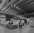
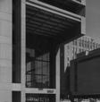
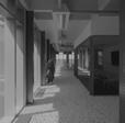
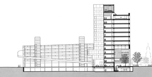
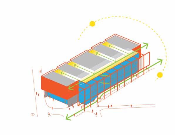
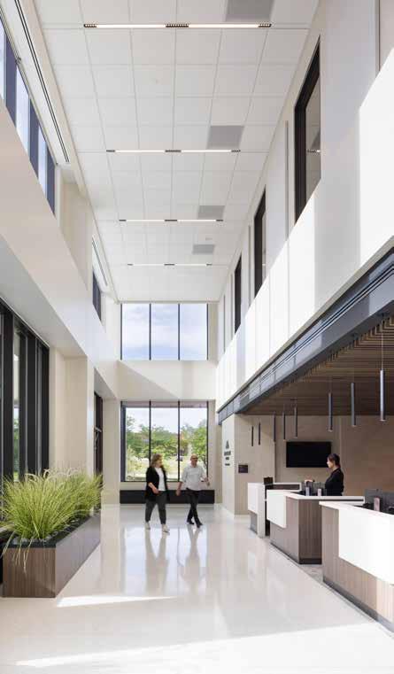
To accentuate the significance of the downtown’s crossroads, the National Bank of Commerce building seamlessly integrates the city’s corners into its architectural design. As a result, three identifiable entries work to open the building to Lincoln’s principal commercial street that leads towards the University of Nebraska-Lincoln. The building’s southern entrance extends over the sidewalk to create a space that blurs the boundary between interior and exterior. This arcade area, measuring thirty feet in depth and sixty feet in height, not only renders the building highly visible, but also extends a welcoming invitation to the landscaped indoor plaza.
Three of the seven floors dedicated to banking operations overlook the interior garden courtyard situated in the southern arcade. This cavernous
Drawing by Pei Cobb Freed & Partners.
Section looking north
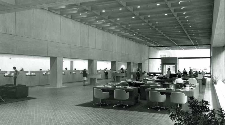
entrance is reflected on a smaller scale on the north face of the building, providing visitors with access to the bank. These arcades have architectural concrete coffered ceilings that run through the length of the building with exposed metal tubes of HVAC, lighting, and fire protection components integrated within them. This same concrete is used for interior walls, the information desk, bank teller counter, check writing desks, and planters. A third entrance situated midway along the eastern façade leads tenants directly towards a reception desk that directs them to the elevators for access to the office spaces above the bank.
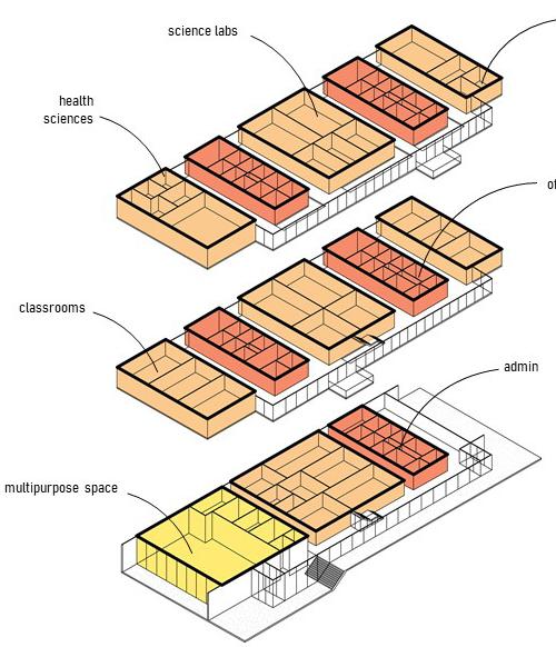
Levels six through ten house typical office floors with a net square footage of 102,000 square feet, and the eleventh floor contains a skylit corridor leading to the boardroom and cafeteria. This topfloor dining area has become a familiar spot for business lunches and local service club meetings, expanding the building’s public use throughout its towering height.
The building boasts a gross area of 309,576 square feet and stands at a height of 148 feet 6 inches, excluding the mechanical penthouse.
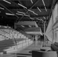
The southern and northern arcades of the building. The indoor courtyard space is located in the south while the north arcade provides access to bank facilities.
MONUMENTAL CONSTRUCTION
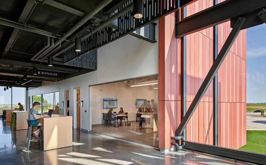
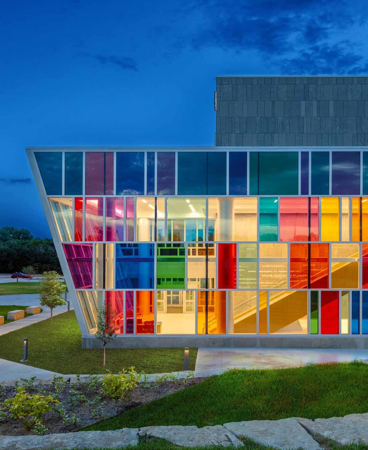
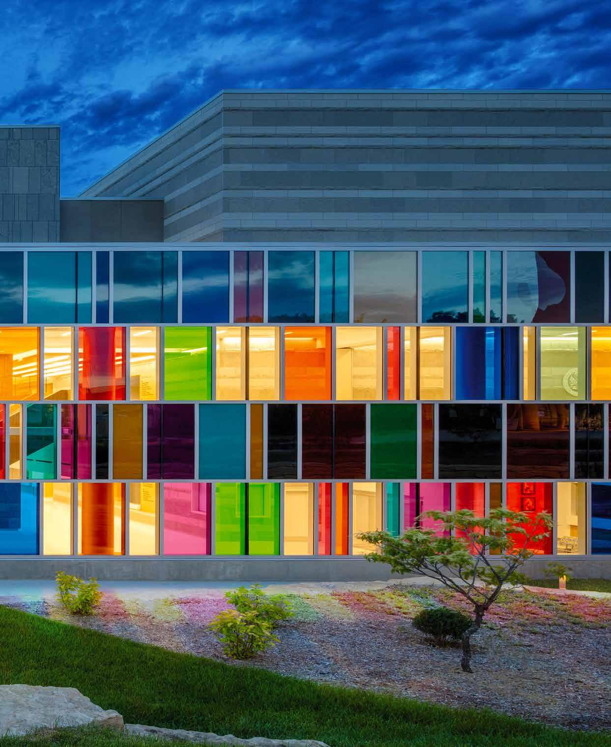
The National Bank of Commerce is constructed of reinforced, poured-in-place concrete adorned with its iconic façade of 93 windows—one for each county in Nebraska—and a subtle Nebraska shape. The clear glazing is framed in bronze-color hard coat anodized aluminum, with operable panels arranged in a grid on the eastern façade. The building is supported on the west by its supporting core that facilitates vertical circulation through the narrow building. The structure opens itself up on its northeast and southeast corners by way of two massive, cantilevered structural beams, providing clear emphasis and hierarchy to the entry sequences.
Over time, the building has remained a focal point for community activity. Its open interior allows for local and student art to be displayed and hosts performances by music students year-round. The building is also used to host various receptions and events, including political rallies. For many, the National Bank of Commerce building impresses with its ability to not only function as initially intended, but also for remaining a central hub for almost 50 years.
Pei Cobb Freed & Partners were determined to embody NBC’s commitment to the city of Lincoln and its communities through architectural design. What may have been a less-than-ideal site was otherwise transformed with the clever approach taken by the designers that facilitates activity for tenants and the public to bring life into the heart of Lincoln.
Original ground floor drawing by Pei Cobb Freed & Partners.
DESIGNER GENERATOR PROMPTS / INPUT
Reid Shubert ChatGPT Midjourney
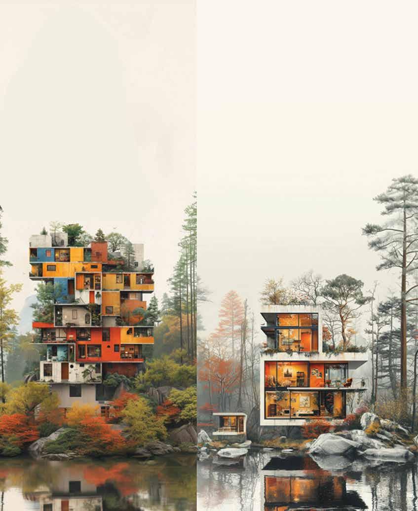
1. Summarize a house from author’s viewpoint of individualism; 2. Summarize an apartment from author’s viewpoint of communalism. /Imagine: House emphasizing personal identity, uniqueness, creativity, reflects artistic vision & specific needs. Building showcases innovative designs & materials, celebrating human diversity, challenging conventional norms. /Imagine: Apartment prioritizing community interaction & shared experiences, promoting social connectivity through communal spaces. Sustainability & resource sharing are emphasized, fostering a sense of belonging & mutual support among residents.
THIS OLD HOUSE IS ALL I HAVE
By Elena Garcia Tapia
American Individualism and Identity Through Ownership (or lack thereof)
Foundations of the World
The American dream: a stable job, a house in the suburbs, brand new car, private lawn, white picket fence. This image is the embodiment of the American individualist lifestyle. According to Hofstede’s cultural dimensions theory, the United States of America is considered the most individualist country in the world, grouped along with other countries of the Anglo Cluster like Canada, Australia, and England. Individualism, as suggested by its name, revolves around the individual and the freedom to be different. In U.S. American society, people often think in a “me” mindset, not so much “we.” Members of these societies prioritize looking after themselves and their direct family members. Collectivist societies, on the other hand, are all about the group or the whole. These societies value an internal hierarchy, in which people belong in groups that take care of each other in exchange for loyalty.
While collectivist societies celebrate the importance of community, they are also known to lack economic growth and advancements in quality of life. Studies in economics show that the desire to stand out fosters rapid innovation and the efficient exchange of ideas. This could be the reason as to why the USA has remained one of the most advanced countries in the fields of medicine, technology, and entertainment compared to collectivist societies that are held back by their distaste, or perhaps even fear, of nonconformity and breaking from tradition.
Need for Space
The 1950s marked one of the greatest instances of mass exodus in the USA: a social phenomenon in which many Americans, specifically white middle- and upper-class Americans, opted to live in private suburban developments in hopes of fleeing the congested public of the urban center. The nuclear family demanded its own space to inhabit, in houses situated close enough to create the illusion of community while keeping everyone on their own turf.
The spreading of suburban communities and private ownership is now reflected in the establishment of ex-urban centers and landscapes that prioritize the automobile over the pedestrian. In Omaha, the 72 nd and Dodge intersection is a fascinating case study of people claiming space for themselves, despite it not being designed in their favor. Here in Omaha, no one walks anywhere; they drive everywhere. Therefore, rather than protesting downtown or near the mayor’s office, Omahans find it is more effective to demonstrate at the point in which thousands of cars drive through every day: the corner of 72 nd and Dodge. The demonstration of community in an area that is nearly desolate of culture is ironic at best but highlights the exact problem we have of designing with disregard to community.
The contrast between urban landscapes and architecture here and in collectivist—often developing—societies is day-and-night. You might have heard the story of the “unfinished” housing units in developing countries. Concrete rebar sticking out from the top of a house is a symbol of community, as the visible bars imply that an additional unit is to be added as the family grows and the elders get older. Many suburban dwellers might not be open to the idea of sharing their forever home, not to mention the legal consequences they could face due to policies that essentially discourage the development of familial community.
Luxury of Privacy
The “white flight” phenomenon and urban sprawl not only weaken the development of community, they also perfectly encapsulate America’s extreme attitude in attributing individual success to traits of the actor rather than attending to contextual factors. In a way, this allows for higher-class Americans to justify inequality in our society. Alienating communities through private ownership and redlining leads to the lack of a holistic community, causing us to live in cities made up of separated groups who refuse to mix. Our individualistic society is also not experienced in the same way by different groups. People who rely on collectivism out of necessity for support are forced to leave their communities to succeed—a hefty price to pay to become an integrated member of American society.
However, to many underserved individuals, the goal of leaving your community to own a private home seems a near-impossible task. As living costs rise and wages barely keep up, the establishment of suburban living has backfired on society, and even the financially stable are starting to pay the price. From the 1960s until now, the average price of a home has shot up 114%, while wages have only increased an average of 6.9%.
To many, private living is out of reach, and many young Americans have already accepted the fact that they will likely never own a home. While social housing projects have sprung up around the country, they are outpaced by the speed in which private homes sprawl across our rural fabric. The cause-and-effect relationship between ownership and status exemplified by private living continually widens the gap between the poor and the poorer. Our approach to individualism has unfortunately evolved to something like this: you are what you own (or what you don’t).
Search for Balance
In the contemporary context, mixed-use developments, multifamily housing, a growing emphasis on improved public transportation, and the concept of the 15-minute city are highlighted as initial steps towards building a more integrated society. They allow for greater connection between different groups, and address issues of access to amenities to displaced communities. Obviously, these ideas are not the magic cure; external factors beyond the scope of architecture are to be addressed. However, these ideas underline a core message: designing with communal interests in mind can yield substantial benefits.
This essay is not a wholesale resentment of individualism but rather raises the following questions: Why has design worked to emphasize material possessions in place of prioritizing human needs and fostering a sense of community? Does the architectural education play a part in perpetuating a culture of individualism? Is there the possibility of breaking away from this approach without discouraging expression through design and aesthetics?
Designed space demands to be occupied. It is hard to tell if individualism affects the way we build, or if the way we build fuels an individualistic attitude. Maybe it’s both at the same time. Perhaps it is possible to have a society of innovation without isolating the individual.
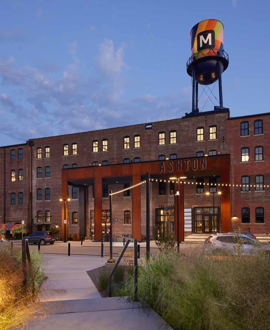
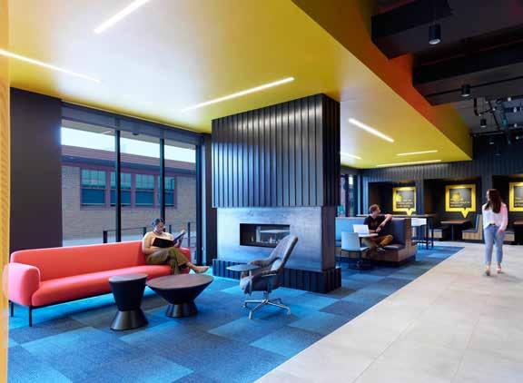
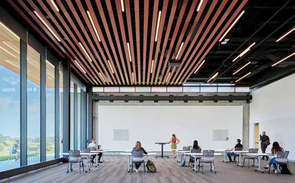
Millwork Commons Crafting Community
By Kate Brashear
The public space within Millwork Commons becomes the heart of the neighborhood, promoting inclusivity, engagement, and equity.
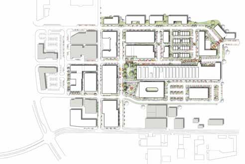
Since its construction in 1893, the Nicholas Street Historic District has served as an industrial island residing in Omaha’s North Downtown. Despite renovations and reprogramming throughout the 1900s and early 2000s, the district remained largely isolated from the otherwise lively and interconnected downtown atmosphere. However, APMA’s design for Millwork Commons, a dynamic neighborhood centered around tech, art, design, and growth, seeks to revitalize the historicallyoverlooked area. Given the firm’s proximity to North Downtown, Megan Lutz, partner at APMA, describes Millwork Commons as a passion project in which nearly all employees are actively involved, whether that be through design and planning or simply by visiting and engaging with the space.
APMA, in partnership with Black Dog Management and Bluestone Development, has played a major design role at every stage of the project. From master planning all the way down to experiential graphics, the firm has showcased its ability to formulate and execute its visions from start to finish. At a larger scale, APMA worked collaboratively to analyze feasibility and potential design options for the proposed site. Given its designation as a brownfield, intensive coordination was involved regarding the balancing of logistics with the overarching vision for the project. From there, construction phasing was strategically planned to provide previews of future work in addition to gathering community support and interest. The Ashton, previously a millwork factory, is a featured historic building within the project which acts as a microcosm of the larger ideals for the neighborhood.
Being the first newly developed building to open, the Ashton sought to attract local retail with large followings in an effort to increase foot traffic and community engagement. Currently, Nebraskanative businesses such as Coneflower Creamery,
Archetype Coffee, Kros Strain Draft Works, Sweet Magnolias Bake Shop, and a variety of others maintain retail space within the building.
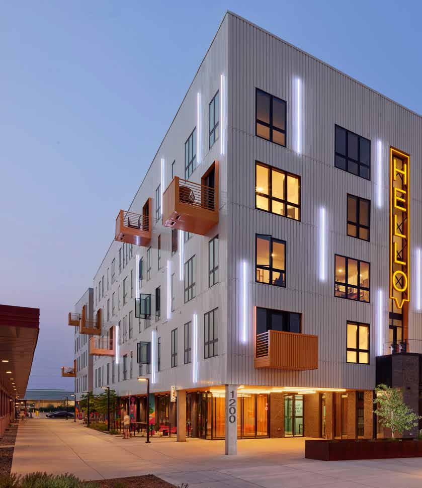
Retail design throughout the Ashton centers around the creation of a central corridor, otherwise known as the Dock. This corridor serves as a public community hub for the neighborhood and its residents, especially in the winter months. After the opening of the Ashton, APMA continued to lead the next design steps for other buildings in the neighborhood including the Mastercraft, Hello Apartments, and a series of ongoing developments. While each of these projects cater to unique needs and programs, every element of the design is geared towards the creation of an ecosystem which features tech, showcases nonprofits, and provides artists with opportunities for work and collaboration.
Aside from the built architectural features of the neighborhood, landscape and urban planning played a crucial role in the iterative design process. As one of the lead designers for the project, Megan Lutz’s keen interest in public and urban space greatly influenced the trajectory of the proposal. Lutz advocates for understanding the experiential quality of public areas through the analysis of leftover space between buildings. Largely as a result of this inspiration, Millwork Commons prioritizes the inclusion of a public greenspace, referred to as the Prairie. This greenspace, developed alongside Olsson, features native ecosystems within the Missouri River Valley including flower beds, grasses, and other pollinatorfriendly plantings. Each of these design additions aids in the promotion of sustainability, open public space, and increased community and activity.
Given APMA’s high proportion of women designers, Lutz also explained how the firm’s gender parity has influenced the thinking around the operation of public space. While women of all ages behave and interact with public space in a unique way, the vast majority of urban design operates with the assumption of primarily male occupants. Taking inspiration from Vienna’s “gender mainstreaming” strategy, a tool used to achieve gender equality in society based on equal structures, settings, and conditions for both women and men, Lutz explained that many of the goals for the Prairie centered around an empathetic approach to design. After analyzing aspects of safety, inclusion, and comfortability, the project designers used their research to directly
inform the park’s design. Some examples of how this manifests includes the prioritization of benches with protection toward the back. The use of retaining walls and plantings behind seating provides a sense of safety and enclosure for visitors. Additionally, increased sightlines, adequate lighting strategies, and movable furniture allows for transparency and agency with how occupants interact with the Prairie itself. In doing this, the public space within Millwork Commons becomes the heart of the neighborhood, promoting inclusivity, engagement, and equity.
Looking at the project comprehensively, the concept, design, and execution of Millwork Commons provides a thriving new community within the previously isolated North Downtown neighborhood. While the district still maintains its industrial roots, it has now been expanded to feature and encourage collaboration between the art, tech, design, and non-profit industries. Increased investment in local business and connectivity has served the needs of pedestrians, businesses, and residents alike. All of these features synthesize to provide residents with a creative, engaging space which preserves integral pieces of Omaha history through means of innovative, urban, adaptive reuse.
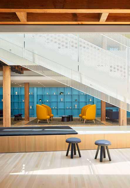
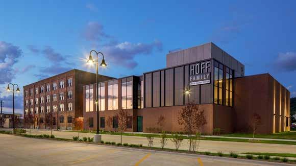
Hoff Family Arts and Culture Center
Evolving Industrial into Artistical
By Alex Martino
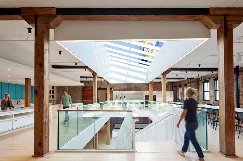
The Hoff Family Arts and Culture Center is home to Pottawattamie Arts, Culture and Entertainment (PACE), a collection of artistic groups that share a large facility combining an adaptive reuse building with contemporary new construction. PACE is comprised of a variety of visual and performing arts that have a shared mission to enrich, inspire, and energize the community in and around Council Bluffs, Iowa. The facility features the 280-seat Schlott Performing Arts Center and a variety of artist studio spaces, classrooms, galleries, rehearsal spaces, and offices for five organizations that occupy the space: it also supports traveling art exhibitions and public involvement.
The complexity of the required needs for the variety of tenants proposed a necessary and large collaborative effort between the designers
and occupants. APMA was the architecture firm that drove this cooperation, working with many design consultants, facility leaders, and users to create a well-functioning and impactful space. The lead project architect, Todd Moeller, discussed how the project developed with many iterations in the beginning planning phase and described the process as continuously evolving and pulling in different people with expertise to assist in the design process. The Iowa West Foundation is a philanthropic organization that greatly contributes to the Council Bluffs community, such as advocating for the public, for art, and for development of the city’s infrastructure. During the ideation, the project considered including housing and a train museum, ultimately deciding on creating the nonprofit organization, PACE, based
on the benefits that the organization provides to the community. The project was going to feature a black box theater, which then evolved into a proscenium theater that supports performances like live orchestra, dance productions, and theater groups. The Hoff Center is also home to Kitchen Council, a food startup incubator that features a commercialgrade kitchen which serves as the preparation area for the café and catered events that are hosted within the Hoff Center. Classrooms for culinary art students are available, as well as an area for food startups to increase success for market entry.
The mixture of program spaces required many design meetings between the architects, design consultants, and facility managers to navigate the wide variety of client needs. Todd described how diagrams, sketches, and 3D models were highly utilized throughout the design meetings to create iterations of programmatic arrangements. Many options for room adjacencies were explored to create the intricate and flexible interior environment that was required to meet all the client’s needs.
When the design team learned that the American Midwest Ballet was going to be a tenant of the space, a proscenium theater was required. This mandated an addition to the existing historical building because a proscenium theater needs
adequate ceiling height and open space between the structures, which was not available in the Harvester II building.
The Harvester II building was originally constructed in 1894 by the McCormick Harvesting Machine Company. Council Bluffs, Iowa was chosen to be the site because of the high number of railroads that terminated in the city, making it an excellent place for transferring and distributing goods. The Harvester II building was listed on the National Register of Historic Places in 2012 and is located directly west of the Harvester Artist Lofts, which is in the Harvester I building that was built in 1888 and served as an International Harvester Warehouse. The Harvester II building was chosen to be the site of the Hoff Center because of its adjacency to the Harvester Artist Lofts which features affordable studio apartments and space for artistic commercial space such as a hair salon, guitar studio, and a florist. This block is a thriving location for artists to be surrounded by the necessary space and equipment to develop and grow their art career with a large community of similar interests.
The renovated space celebrates the original wood beams, brick walls, and wood floors that create a utilitarian aesthetic of industrial space
that is combined with contemporary materials and the showcase of modern art. This contrast displays a marriage of old-world charm with contemporary elegance that produces a beautiful space for weddings, meetings, and events. APMA was able to successfully preserve the building’s history and original aesthetic, as well as provide a multifunctional space that supports the variety of art mediums and their required equipment. The addition effectively complements the historic building by respecting the building’s proportions and scale through exterior alignments and a clear distinction between old and new. A successful contrast in the use of materials between the original building and the addition is apparent, but harmonized using similarly-colored brick that is more planar and modernized on the addition. The expansive use of glazing on the addition contrasts with the arched punch windows of the Harvester II building, which highlights the satisfying and repetitive geometry of those windows.
The addition’s interior is arranged around the proscenium theater, which features an extensive fly system for rigging theatrical props and equipment, such as lights and curtains, which extends above the proscenium to allow for full flying heights of the stage sets. The Hoff Family Arts and Culture Center’s program arrangement is balanced throughout both sides of the building and creates an efficient and functional interior to be utilized by a full range of artists and performers.
Through the extensive and highly-collaborated design phases, APMA provided a strong community of artists with a facility to showcase and strengthen their expertise in an appealing and captivating space. Respecting the historical value of the original building and introducing a valuable building addition, Alley Pointer Macchietto Architecture, alongside many design consultants, created a destination for creativity and artistic expression within the growing community of Council Bluffs, Iowa.
LOST IN THE WRECKING BALL
By Blake Phillips
DESIGNER
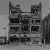
I was walking along N Steet in downtown Lincoln, through masses of Husker faithful on my way to the first home football game of the season. The excitement was palpable. Despite starting the season with a 0-2 record, fans were excited to see Head Coach Matt Rhule’s first home game. Even with the excitement in the air, I couldn’t help but look at the massive crater at 10 th and N, which used to be the historic Gold’s Department Store. The story behind its demolition is a sad and all-toocommon story in Nebraska—one that has haunted our cities for years.
Part 1: What We’ve Lost
The north portion of the Gold’s building, which is being redeveloped into a hotel, was built in 1924. As the company expanded, there was a large addition added to the southern portion of this historic building, which has now been demolished. Prior to the 1960s, when Lincoln’s Gateway Mall was constructed, the downtown Gold’s Department Store was the largest hub of commerce in the area. In 1964, Gold & Company merged with a larger department store from Omaha: J.L. Brandeis & Sons. After the merger, a new Brandeis store opened in Lincoln’s Gateway Mall, but the downtown location remained in operation. By the end of 1980, the downtown Gold’s
GENERATOR PROMPTS / INPUT
Reid Shubert ChatGPT Midjourney
Our Vanishing History
Department Store had closed its doors. The property was then sold and renovated for office tenants but by 2020, it sat mostly vacant. Its primary tenant was the State of Nebraska which had held offices in the historic building for over 28 years.
What makes the demolition of the Gold’s Building so tragic is that it was completely preventable. There were already plans to redevelop the historic building into one of the largest apartment projects in downtown Lincoln’s history. Tax increment financing (TIF) funding was already approved, and the payback period was extended to 20 years. Gerard Keating—a Nebraska native and the original developer behind the project—gave several reasons why the proposal fell through. He stated that Lincoln’s refusal to relocate a bus transfer station from the southeast corner of the building as well as the National Parks Service’s refusal to
Extract the 10 most prominent words from this essay and summarize; demolition, historic buildings, preservation, nebraska, adaptive reuse, architectural heritage, urban development, cultural loss, sustainability, responsibility Input: /imagine: demolition, historic buildings, preservation, nebraska, adaptive reuse, architectural heritage, urban development, cultural loss, sustainability, responsibility AI VISUAL
administer historic tax credits to help fund the addition of windows along the south façade were the primary hurdles that prevented the project from moving forward. Because of this, Keating ultimately sold the Gold’s Building to another developer who decided to demolish the southern portion of the building and redevelop the northern portion into a hotel. With the project and TIF funding already approved, it’s sad to see how small decisions on the local and federal levels caused large portions of a historic building to be demolished. What’s worse is that developers are sometimes forced to threaten the city with the demolition of a historic building in order to be considered for the funding needed to save it.
The Gold’s Building is just a recent example of a phenomenon that has become commonplace in Nebraska. Perhaps one of the most egregious and well-known cases of historical building demolition in Nebraska is Jobbers Canyon Historic District. This district was located in Omaha between 8th and 10th Streets, from Farnam Street to Jackson Street, along the riverfront. It consisted of mostly six- to eightstory, brick warehouses constructed in the early twentieth century for companies in the agricultural equipment and wholesale food industries. At the time, Omaha was beginning to emerge as a major center of commerce. These warehouses represented an important era of growth for the city and were a significant fixture of Omaha’s riverfront.
underway. Ultimately by the summer of 1989, Jobbers Canyon was gone, and it is still known as the largest historic district to ever be demolished. What made the loss of Jobbers Canyon sting even more was when ConAgra announced that it was moving its headquarters to Chicago in 2015. ConAgra directed the largest demolition of a historic district to make way for its new suburban campus, only to abandon it less than 30 years later. What’s ironic, is that ConAgra decided to move into Chicago’s Merchandise Mart—a large Art Deco warehouse facility along the Chicago riverfront. In the wake of ConAgra’s departure, the city of Omaha spent roughly $400 million on riverfront revitalization which included the redevelopment of the Gene Leahy Mall, Heartland of America Park, Lewis & Clark Landing, and the Mercantile District which, in some ways, is trying to emulate the industrial architecture of Jobbers Canyon. It’s encouraging to see Omaha make an effort to revitalize its downtown and riverfront, but it’s also hard to forget what was lost and think about what could have been if Jobbers Canyon had never been demolished.
What’s worse is that developers are sometimes forced to threaten the city with the demolition of a historic building in order to be considered for the funding needed to save it.
Jobbers Canyon was not known by this name until shortly before it was demolished. In 1986, the City of Omaha Planning Department submitted Jobbers Canyon for historic designation, which it received in 1987. Shortly after this, ConAgra began discussions with local leaders regarding a new headquarters for the company. For context, in 1986, Enron moved its headquarters from Omaha to Houston, Texas. This recent departure of a major corporation made local leaders desperate to keep ConAgra, a Fortune 500 company and major employer, in Omaha. ConAgra proposed its new headquarters on the site of the newly designated Jobbers Canyon. Omaha did little to fight against the demolition of Jobbers Canyon, and the city even began negotiating buyouts with building owners. Advocates for historic preservation within the city of Omaha resisted the move and launched several lawsuits as demolition was already
Part 2: Monuments to the Past
Along with what seems to be a predisposition towards demolishing historic buildings, Omaha has several notable monuments to the architecture of the past. One of these is located on the edge of the Gene Leahy Mall, not far from the former site of Jobbers Canyon. Referred to as “The Arch,” this monument is actually two arches that were rebuilt from the former United States National Bank building that was located at the corner of 12th and Farnam Streets. The bank was built in 1887 and was a beautiful example of Richardsonian Romanesque architecture. After its demolition, The Arch was reconstructed in 1979 near the location that the original building once stood.
Another example comes from the Medical Arts Building, an art deco skyscraper designed by Thomas Kimball, which was demolished in April 1999
to make way for the First National Bank Tower. For many years it housed offices for doctors, dentists, and specialty shops. Part of the building’s terracotta façade is preserved within the atrium and lobby of First National Bank Tower with several other pieces on display at Lauritzen Gardens.
One final example can be seen in the parking lot of Omaha’s Henry Doorly Zoo. “Infield at the Zoo” is a memorial to Omaha’s historic Johnny Rosenblatt stadium which opened in 1948 and hosted the College World Series from 1950 to 2010. It was ultimately replaced with Charles Schwabb Field (formerly TD Ameritrade Park) and was demolished in 2012. Most of the historic stadium is now a parking lot for the zoo, but the original location of home plate along with the iconic Rosenblatt scoreboard sign is preserved in a small, kid-sized T-ball field.
While the preservation of these elements from demolished historic structures is admirable, for me it leaves a bad taste in my mouth. The attempt to preserve architectural history in this way seems too little, too late. I’ve only scratched the surface of the historically-significant buildings that have been demolished in Nebraska’s history: while many of the cases discussed were located in Omaha, this doesn’t mean that it hasn’t taken place in cities and towns throughout the state. To me, these stories speak to a culture that tends to value the cost and convenience of new construction far more than its own history.
Part 3: Toward a Better Future
The good news is that there is a solution to this problem. With architects around the world pushing for more sustainable designs and building practices, adaptive reuse has gained a lot of traction. Simply put, adaptive reuse is one of the best architectural solutions to climate change. While the immediate reaction by some is to push for innovative new building technologies, in reality, the greenest building is the one that people choose to preserve. According to the EPA, it takes over 65 years for a new, energyefficient building to offset the amount of energy it takes to demolish an existing building. Thus, it could be argued that the most environmentally-friendly and historically-conscious way for architects to operate is to find ways to reuse old structures for new purposes.
Two good examples of adaptive reuse in Nebraska are Nelson Mandela Elementary School and the Kimpton Cottonwood Hotel. Nelson Mandela Elementary is located at 30 th Street and Curtis Avenue in North Omaha. It was once Blessed Sacrament Catholic Church and School, but was
According to the EPA, it takes over 65 years for a new, energy-efficient building to offset the amount of energy it takes to demolish an existing building.
sold and given a new life as a public elementary school whose mission is to bridge learning and achievement gaps and to “provide quality instruction that demonstrates all scholars can learn and develop academically, emotionally, socially, and physically.” The Kimpton Cottonwood Hotel located at 36 th and Farnam Streets was originally named the Blackstone Hotel. It hosted several U.S. Presidents and even claims to have been the birthplace of the Reuben sandwich. The Blackstone Hotel eventually closed down and found new life as an office building and the headquarters of Kiewit. When Kiewit moved its headquarters downtown, the building once again became a hotel and is now a cornerstone of the Blackstone neighborhood.
Sometimes it may be easier and cheaper to demolish and build new, but in doing so we lose a large part of a city’s culture and history and we harm the environment. Demolition and construction account for a large part of global emissions related to the built environment. We should be cognizant of this as we move forward and show restraint when it comes to demolishing old and potentially historic buildings. As Uncle Ben is famously attributed to have told Spiderman, “With great power comes great responsibility.” In this case, the responsibility falls on architects, developers, and public officials in Nebraska and beyond to protect our historic structures and offer an alternative solution to wasteful demolition.
University of Nebraska-Lincoln Tectonics of Reuse
By Zitlalic Parra Valencia
I had the opportunity to interview Scott Lafferty, a recent University of Nebraska-Lincoln graduate. In 2021, he completed his bachelor of science in design in architecture at UNL and in 2023, he earned his master’s degree in architecture. Scott’s roots trace back to Omaha, Nebraska. Growing up, he was a major Husker Football fan, making UNL an obvious college choice for him. His passion for architecture was kindled by his fascination for LEGOs as a kid as they allowed him to build and create.
During his last year in the master’s program, Scott pursued a thesis for which he won the Cunningham Award. Throughout his time at UNL, Scott participated in the American Institute of Architecture Students (AIAS) program for a few years. He also served as a graduate learning assistant for multiple Professors, including Zac Porter, Sharon Kuska, and Roark Congdon. He also took on the role of a graduate teaching assistant for Roark’s course: Computer Applications in Design. In his third and fourth years of undergraduate studies, Scott completed Undergraduate Creative Activities & Research Experiences (UCARE) for Professor Zac Porter.
Not only was Scott involved within the college, but he also accumulated a remarkable array of accolades. His project, alongside team members Patrick Pineda, Caroline Goertz, and Trey Erwin, won first place in the AIAS Central States design competition. Furthermore, his “A Conversation of Residential Modernism” drawing earned finalist recognition for the 2022 Krob One Drawing Challenge. In 2023, Scott received the prestigious Cunningham Award for his exceptional thesis entitled “Tectonics of Reuse: a Material Exploration of Deconstruction and Reconstruction in Architecture,” thus ending his studies at UNL.
In the last year of the Master of Architecture program, students are able to continue their studio courses or embark on a thesis project. A thesis is a year-long, extensive research endeavor delving into any area of interest within the design field, guided by a faculty advisor. To facilitate their progress, students engage in regular weekly meetings with their advisor. At the end of the academic year, students present their research project to faculty, peers, and the general public. An award of distinction, The Cunningham Award is presented to the most outstanding thesis project at the end of the academic year.
As he described his thesis, I was truly impressed by the extensive effort he dedicated to his research. Scott’s thesis focused on the deconstruction and reconstruction of architecture, challenging our conventional perspective on the construction of buildings.
“The typical building will be built for 20 to 50 years. The building is often destroyed and tossed in a landfill,” explained Scott. This has a significant negative impact on the environment. “Six hundred million tonnes of waste was generated by the deconstruction of buildings in 2018. That was five years ago. That number has only grown since then,” stated Scott. His thesis tackled the issue of waste generated by buildings reaching the end of their lifespans. His innovative solution involved a new idea of “deconstruction,” a method involving the selective dismantling of buildings for reuse or recycling. This approach would enable the disassembly of buildings piece by piece, allowing their components to be repurposed for other projects.
To support his ideas, Scott developed “The Atlas of Deconstructed Tectonics,” which explored various aspects of buildings suitable for deconstruction, including structural elements, brick walls, stud composition, infrastructure, and more. Scott emphasized the significant waste stemming from infrastructure materials and ensured it was a key part of his research. Therefore, he would have a solution not only for building waste but infrastructure waste as well.
His innovative solution involved a new idea of “deconstruction,” a method involving the selective dismantling of buildings for reuse or recycling.
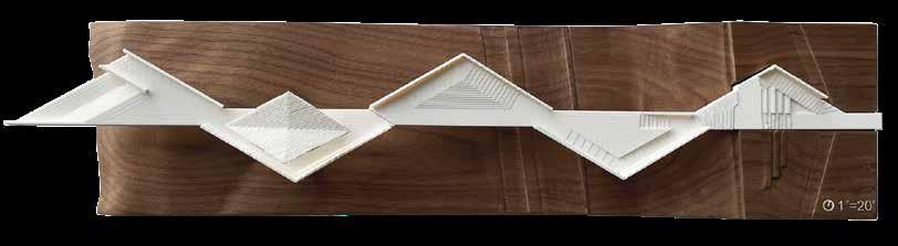
South Elevation
Fragment model showing a connection detail focused on reconnecting various structural fragments on the interior of the building.
Model exploring various details joining vertical exterior fragments to one another as well as an approach to detailing how the fragments can be tied back to the building as exterior screening elements.
Model showcasing an approach to detailing by joining two vertically stacked fragments as an exterior face of the buildings design.
Throughout his research, Scott created high-quality models that played a crucial role in illustrating his methodology.
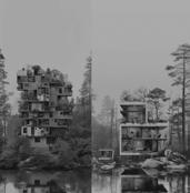
Scott’s thesis challenged the conventional approach to deconstruction and reutilization by exploring “larger-scale deconstruction.” This involved finding ways to extract larger sections from buildings for reuse rather than deconstructing them brick by brick. Scott mentioned that “the current process for taking apart buildings goes from large scale back down to the unitized system. So you’re taking a brick wall back down to the individual brick to reuse that individual brick. My thesis began to challenge that, and I started to think about where you can challenge the scale of the current process of deconstruction. How can you extract larger chunks from buildings for reuse instead of brick by brick?” To achieve this, Scott began by designing four specialized machines, two for infrastructure and two for building deconstruction, that helped aid in the process of large-scale deconstruction.
Throughout his research, Scott created high-quality models that played a crucial role in illustrating his methodology. He modeled out a bridge to represent his infrastructure deconstruction research in addition to a large chunk of a building that focused on the application of deconstruction. His meticulous modeling approach included casting large stone pieces out of ROCKITE, 3D printing, and even casting individual bricks, which he stacked to simulate full-scale building construction and deconstruction. These models offered a tangible representation of his concepts and material characteristics that drawings and digital simulations often fail to capture. Scott also mentioned that the models and machines “provided a way to show how the methodology works.”
Scott’s research spanned the fall semester, with the spring semester dedicated to applying his findings to a design project. In the spring semester, he examined a selection of small towns and identified various buildings within them. He then used this data to create a theoretical site where he could implement his first-semester research findings. Scott addressed why he chose to design with a
hypothetical site by saying that “this project was focused more so on the process and the reuse of larger chunks of buildings. So to curate the direction, a hypothetical site and narrative was generated.”
Scott then deconstructed the buildings within his theoretical site into multiple chunks and tectonics, as it was outlined in the previous research from the first semester. These pieces were able to be collected and stored within the small town for reuse. Next, he developed a comprehensive community program, which included a cafe space, community event space, and back-of-house facilities. By integrating tectonics from various building sources, he created a captivating building with intricate interiors and an interesting exterior façade that expressed the various materials’ ages and characteristics.
To ensure precise placement of these tectonics, Scott explored metal detailing techniques. His dedication to the project and attention to detail truly transformed the buildings, giving them new life while preserving their materiality, age, and unique characteristics.
When asked: “What is something valuable you learned during this project?” Scott answered, “Adjusting the outcomes as you’re moving through the year-long project. You have to let the project take you where it wants rather than forcing it in a straight line. Design isn’t point A to point B; you’re going up and down, and there may be some unforeseen hills.” Not having a clear end goal was also challenging for Scott, as the deliverables would change weekly.
Scott expressed his gratitude to his faculty advisor, Zac Porter, for guiding and challenging him throughout this rewarding journey.
SGH Concepts and Dri-Design Competition
(UN)Veiled–Oldfather Hall SGH Concepts and Dri-Design Competition
Louis Khu
Originally from Mexico City, Elena Garcia Tapia spent most of her life in Omaha’s Millard area. From a young age, she developed a keen awareness of the diverse approaches different countries take toward the built environment. This ignited her fascination with architecture, which would allow her creative side to flourish as she engaged in numerous artistic pursuits during her childhood. However, Elena’s logical and problem-solving nature was equally strong. It was during her middleschool years that she decided architecture was the perfect blend of her creative and logical side.
Brandy Nguyen, originally from Saigon, Vietnam, relocated to Lincoln during his upbringing, initially pursuing business studies. After a year, he realized this wasn’t his true calling. After some self-reflection, he recalled his childhood memories of constructing blanket forts and the joy of figuring out how they fit together. This reflection led him back to his genuine passion.
In their quest for architectural education, both Elena and Brandy chose the University of Nebraska at Lincoln, their local option. Though they shared the same studio class before their fourth year, they were more like acquaintances. However, their shared aesthetic preferences and architectural backgrounds led to a successful partnership. Together, they won the prestigious Award of Excellence in the annual SGH Concepts and Dri-Design Competition within the College of Architecture. Today, Elena is s a Design Coordinator at HDR in Omaha and is on a path to further her education with aspirations of becoming a licensed architect while Brandy is pursuing a dual degree program at Columbia University in New York, aiming for a Master of Science in historic preservation and a Master of Architecture.
Preserving History, Embracing Innovation
Initially, Elena and Brandy considered Cornhusker Plaza as their project site, but the challenges of finding its original drawings and files led them to explore Oldfather Hall. After a thorough examination and analysis of the building, they realized it was the ideal location for their fourthyear studio project. “When we went to Oldfather, we instantly realized that there was more potential for improvement here.” Not only would this be an adaptive reuse project, but it would also set them apart from students working on entirely new building proposals. Brandy noted that other students were hesitant to choose this building, providing an exclusive opportunity for Elena and Brandy to create a compelling design celebrating the juxtaposition of old and new.
Their (UN)veiled proposal centers on the concept of privacy, where the public realm begins at ground level and gradually becomes more private as you ascend. In their own words, one of their main project goals is to “maintain, expose, and enhance the beloved historical elements of Oldfather’s exterior façade and interior finishes.” Transparent materials act as veils, creating flexible spaces that can adjust privacy levels. Additionally, they celebrate the historical structure by selectively exposing and enhancing Oldfather’s exterior façade and interior finishes. This includes the
preservation of the building’s materiality and unique terrazzo flooring. The current occupants of the space made a specific request for renovations to preserve the building’s “1960s charm.” However, Elena and Brandy noticed that the building had an austere and meditative quality, almost evoking a “ghostly” or even “haunted” ambiance. To capture the essence of the 1960s, they seamlessly blended interior materials that were soft, translucent, and fluid with modular, rectilinear, and glossy elements, creating a unique “hauntology ” rooted in that era. Incorporating large glass components, modern HVAC systems, advanced lighting fixtures, and wood accents introduced a deliberate sense of contrast. These juxtaposing elements were skillfully employed to both separate different functions within the space and merge the refurbished second and third floors into a distinctive entity, setting them apart from existing historic university areas and contemporary campus developments.
Their project goal is to find a balance between what is retained and what is subtracted from the building. “You must think about what you’re taking away and what remains. It’s not like a whole subtraction, but rather a very selective process.” The existing user circulation posed a challenge, leading to the design of two new modes of vertical circulation to facilitate interaction within new collaborative programs.
To capture the essence of the 1960s, they seamlessly blended interior materials that were soft, translucent, and fluid with modular, rectilinear, and glossy elements, creating a unique “ hauntology ” rooted in that era.
Programmatic diagram
1
This physical connectivity raised concerns about acoustic disturbances and fire safety, which they addressed using curtain systems. Smoke curtains and acoustic curtains enclose the atrium, isolating noise and foot traffic as needed while maintaining openness at other times. The mental connection between spaces is tackled through transparent barriers, both inside and outside the building. The “unveiling” of the building’s façade at the second and third floors revealing a glass skin is a prominent feature. Interior barriers are a mix of flexible, movable, and translucent materials, creating adaptable spaces with customizable privacy. In terms of environmental impact, they emphasize that building reuse is more effective in minimizing site impact and greenhouse gas emissions compared to constructing a new building. This project reflects their commitment to adaptive reuse and provides students with a collaborative, multi-purpose learning and study space.
Elena’s experience with this adaptive reuse project shifted her perspective on architecture, emphasizing the value of revitalizing existing structures. “It’s always like thinking about a new building as a very flashy thing. But then you realize that sometimes, that’s not necessary. And it’s okay to have something that’s not brand new.” Brandy believed that the Oldfather Hall was a comparatively easy project given that their peers picked buildings with more difficult existing conditions. “Good design does not always have to strive to reinvent the wheel. If your primary concern is good design that makes a practical difference and has a logical reasoning behind it, you shouldn’t be ashamed to pick a building that seems a bit easier because the devil is really in the details. And there is room for creativity everywhere, especially in the details.” Elena and Brandy’s achievement of the Award of Excellence in the annual SGH Concepts and Dri-Design Competition serves as a testament to the idea that architecture doesn’t always necessitate a completely new, ground-up design. Their method, focused on preserving iconic and historical elements within existing structures while minimizing the impact on the site, reflects their deep respect and passion for the built environment. It emphasizes the notion that intricate details can convey as powerful a message as any new project from scratch.
Section
DESIGNER GENERATOR PROMPTS
Michael Leiting ChatGPT Midjourney
Extract the 20 most prominent words from this essay and summarize. Input: /Imagine: interstellar, movie, architecture, architects, engineers,deign, collaboration, vision, credit, structural, architectural, complexity, visibility, contribution, masterpiece, creative, spectacle, collaborative, appreciation. AI VISUAL
END CREDITS
By Louis Khu
Undoubtedly, the movie Interstellar stands as one of the most remarkable sci-fi films of our generation. Its greatness is not solely attributed to the directorship of Christopher Nolan, but also owes much to its original soundtracks, talented cast, and well-crafted production sets. Among its great features, the main theme has etched itself as one of the most iconic and recognizable piano pieces from cinema thanks to German composer Hans Zimmer. Through collaboration with VFX (visual effects) supervisors Paul Franklin and Andy Lockley, the team managed to create scientificallyaccurate depictions of blackholes that enhance the story’s immersion.
Consider for a moment what would become of this cinematic masterpiece without the brilliance of its musical composers and visual effects. Would it still have left a long-lasting impression on our culture? One could argue that the movie’s engaging plot would continue to captivate sci-fi enthusiasts, yet there would undoubtedly be moments where the absence of the genius behind the music or the lack of high-quality set designs might hinder its ability to evoke the desired emotions or maintain immersion. So, it becomes evident that the credit for the movie’s success should extend far beyond Christopher Nolan, no matter how gifted he may be. In essence, it takes a symphony of talents from various disciplines to bring a film like Interstellar to life, and each contributor deserves recognition for their valuable contributions.
This concept is similar to the world of architecture, where architects often receive the most credit for iconic buildings, with little acknowledgment toward the minds behind the structural integrity, mechanical systems, and interior designs. The truth is: design talent and complexity apply to all of these disciplines of the built environment. So, how is it that architects are often given the most credit for something that relies heavily on collaboration?
Within the realm of a movie production team, we can draw a parallel where the architect takes on the role of the director, orchestrating the grand vision. The structural and mechanical engineers are the cinematographers, capturing the essence of this vision with precision, while the interior designer functions as the production and set designer, creating the atmosphere that completes the cinematic experience.
The Guggenheim Museum Bilbao is conceptually an architectural masterpiece designed by Frank Gehry. However, the immense challenge is to make these irrational and unconventional forms come to life. Architects like Gehry push the boundaries of design, but it is equally important to recognize the vital role of structural engineers, such as Hal Iyengar, who meticulously engineered the museum’s steel framing, transforming it into what can be described as a “metallic flower,” an artistic marvel in its own right, visible within the museum’s interior. Though Iyengar has received multiple awards and honors from the American Institute of Steel Construction, his name is hardly attached to the Guggenheim Museum. This raises the question: if architects receive more credit because they conceive of the design, does this imply that they inherently contribute more than other professionals involved?
Architects like Gehry push the boundaries of design, but it is equally important to recognize the vital role of structural engineers, such as Hal Iyengar…
Architects push the boundaries of form, while engineers provide the technical solutions to turn those visions into reality.
The age-old rivalry between architects and engineers has always been the same old story; a tug-of-war between visionary ideas and practical considerations. Historically, many early architects were more similar to today’s civil engineers than they were architects: certain calculations had to be made to ensure the building was functional and could withstand a variety of loads while remaining functional. People like civil engineers work in the background to improve society, but they rarely receive credit for their efforts. It’s similar to the movie, The Dark Knight, in which Batman does all the dirty work, while Harvey Dent gets all the credit.
So, does the architect’s creative vision automatically mean they should receive the most credit? In the public eye, the work of the architect is front and center as the face of the design. It is often perceived that when a building succeeds, the architect is responsible, regardless of its structural complexity. However, when the building collapses, the engineers are to blame. Consider mechanical engineering, most people don’t ponder how the air moves around until the system breaks. It’s a case of being taken for granted: appreciated only in its absence. Perhaps engineers are underappreciated because they don’t seek attention? Similar to a structural foundation, do engineers enjoy a supporting role to the team?
Many of the most iconic architectural wonders in the world are celebrated not only for their structural elegance but also for their striking visibility. To say that engineering lacks visibility compared to architecture is an oversimplified notion that simply isn’t true. Engineers deserve recognition and appreciation for their valuable contributions, just like architects. When you delve into the realm of architecture, you encounter awe-inspiring structures like the Eiffel Tower, the Sydney Opera House, and the Burj Khalifa,
all of which are not just beautiful but also prominently visible landmarks. However, it’s essential to recognize that these architectural marvels wouldn’t stand without the engineering expertise that supports them. Engineers ensure that these structures are not only visually appealing but also structurally sound. The symbiotic relationship between architecture and engineering is a collaborative process where each discipline relies on the other’s strengths. Architects push the boundaries of form, while engineers provide the technical solutions to turn those visions into reality. Without the structural ingenuity of engineers, architectural masterpieces would remain dreams on paper.
So, the next time you watch a good movie, take a moment to appreciate the details, the dedication of those working behind the scenes, and the collective effort that transforms a script into a cinematic spectacle. Just as in the world of architecture where engineers are the hidden heroes, in filmmaking there are countless individuals working diligently to bring stories to life. While the directors and actors often steal the spotlight, it’s important to recognize the critical contributions of the entire crew, from the cinematographers and set designers to the costume artists and editors. By doing so, we gain a deeper appreciation for collaborative efforts in all aspects of design.
Hardy Coffee Co. Espresso on the Expressway
By Tristan Brickman
TACKarchitects, founded by Chris Houston, Rebecca Harding, and Jeff Dolezal in 2011, prides itself on embodying a truly collaborative design environment, one that brings back a true studio atmosphere into the workplace. Jeff explained, “You should be in a collaborative environment, that design really matters, and we should be pushing our clients from a design perspective as far as their budget, and as far as they’re willing to go and sometimes further.” TACK values having room to be more creative than the industry has allowed in the past. This is made apparent in the way their interior space is formatted. Within their collaborative space are close—but neatly organized—desks to foster collaboration and discussion. Private conference spaces, a lunch-and-learn presentation space, and material library can also be found in close proximity to work stations. A set of stairs directs circulation to a lofted lounge space featuring comfortable seating for a relaxing environment. From my tour around the studio space, it is clear that TACK values a sense of home, comfort, and flexibility around the workspace.
Hardy Coffee Co. has a history of working with TACK at their other locations, featuring interior renovations and improvements. Hardy’s new drivethrough, located at South 144th Street and Meadows Boulevard in Omaha, adheres to a similar design style found at their other locations. An industrial aesthetic (bricks, corrugated metals, exposed ductwork, and black materials) is the theme that comes to mind. This new location off 144th was Hardy’s first leap into a drive-through coffee experience, and they were hoping to renovate an existing bank while taking advantage of its canopy for a drive-through location. The location being right off 144th allows for a lot of vehicular attention, which would become a main driving design choice later.
It effectively grabs attention from the highway, while sticking to the industrial aesthetic that the coffee chain is known for.
The coffee stop was originally supposed to be made from shipping containers, as they are affordable and already structured, but budget constraints meant that they would have to frame the kiosk traditionally within the canopy footprint instead. To achieve a similar aesthetic to an industrial shipping container, corrugated metal was applied to the exterior. Instead of becoming a conditioned space, a shipping container was used as large signage for attracting vehicular attention. It is internally lit with a glass window so that it can act as a “beacon” for those on the road in the dark. With the yellow, black, and white designs on the shipping container, it acts as a grand advertising billboard that stands out from everything around it.
I had the opportunity to see the drive-through for myself, and from my own experience driving past, I found that it grabs attention effectively with large lettering and contrasting colors that draw your eye. As a bonus, the three-dimensional shape of the shipping container allows for advertising on the short ends that face further down the street. The design choice to make the building’s finish look like a shipping container felt cohesive from a distance and created a contrast with the adjacent buildings. Additionally, Hardy Coffee’s signature aesthetic is present, with exposed structure, dark metals, and neon lights all present.
TACKarchitects brought life to a once grungy, uninteresting lot through the compact design of this attention-grabbing drive-through. It effectively grabs attention from the highway, while sticking to the industrial aesthetic that the coffee chain is known for. The drive-through’s upper shipping container pushes the project further into something new and unique in contrast to the area around it, while also raising itself above the street and making itself more of an inviting and interesting presence to the customer.
IT’S RAINING MEN
By Kate Brashear
Architecture’s stormy relationship with equality
DESIGNER GENERATOR PROMPTS
AI VISUAL
and
Karolayn Chavez ChatGPT Midjourney
Input: /Imagine: It’s raining men facing male dominated challenges and systemic discrimination in architecture, advocating for gender equity, representation,
fair compensation for women in the field.
In the architectural fabric which adorns our cities, there is a hidden thread of inequality which weaves its way through the profession. While the field boasts groundbreaking innovations and design masterpieces, a glaring truth is veiled in secrecy: women are too often confined to the sidelines, their voices muted amidst the noise of maledominated legacies. From drafters to principals, these disparities continue, casting a long shadow over the discipline. While it would be ignorant to dismiss the historical success of the profession, we must acknowledge the harsh realities of topics like inequitable compensation and sexual harassment when examining its treatment of women. As these issues persist over time, it will become crucial for current and future generations to ignite a dialogue which challenges the foundation of architecture itself.
As highlighted by Allison Arieff’s article “Where Are All the Female Architects?” a major obstacle facing women in architecture today is the severe lack of representation when it comes to leadership positions, senior management, university administration, tenured professors, or really any upper-level roles within the design field. However, before we dive into this issue of rampant underrepresentation, let us first review a sampling of some of the most successful female designers throughout history.
Denise Scott Brown is highly awarded for her work as an architect, planner, urbanist, and educator. However, she is most often referenced in conjunction with her husband, Robert Venturi. Ray Eames is also widely recognized to be influential within the world of architecture, alongside her husband, Charles Eames. Lella Vignelli has been honored in collaboration with Massimo Vignelli. Alison Smithson worked with Peter Smithson, Aino Aalto with Alvar Aalto, Liz Diller with Ricardo Scofidio, Aline Saarinen with Eero Saarinen, Carme Pigem with Ramon Vilalta, Billie Tsien with Tod Williams, Marion Weiss with Michael Manfredi, Mary Jane (MJ) Long with Sandy Wilson, Jane Drew with Maxwell Fry, and the list goes on. Time and time again, when women in architecture are recognized for their efforts, it is in collaboration with a male partner. With frequency, the works of these women are incorrectly attributed to their male counterparts as a result of both conscious and subconscious biases. In doing this, these women conduct their work without the fame, praise, or glory that is seemingly exclusive to male designers. As of 2023, Kendall Nicholson in “Where Are the Women?” notes that Zaha Hadid, Yvonne Farrell, and Shelley McNamara remain the only women to win the Pritzker Architecture Prize without a male partner.
The list of women who have won with partners is not much longer, consisting of only Kazuyo Sejima, Carme Pigem, and Anne Lacaton.
Further exacerbation of this issue is caused by traditional family roles and maternity leave, highlighted in Condé Nast’s “Here’s Why Architecture Needs Better Parental Leave Policies.” The decision to start a family proves to be a major hurdle in the continued success of women in architecture. Limited workplace flexibility, required time off, and lack of paid maternity leave force women out of the profession. Furthermore, many women face a salary decrease after having children, while men typically see a salary increase. These factors, along with many others, result in two-thirds of high-earning positions being fulfilled by primarily white men according to Nat Barker on “Women Make up Just One in Five Top Positions at Biggest Architecture Firms.” When looking at the world’s 100 largest architecture firms, this statistic is worsened, with only 20% of senior roles belonging to women. Nearly 50 of these firms had no women in upper management whatsoever. At this rate, true gender parity in compensation will not be achieved until 2222, likely even longer for women of color and women belonging to other marginalized groups.
After learning this information, you may be asking, “Why don’t more women speak up and advocate for equal pay in the workplace?” and “Isn’t unequal pay illegal?” In response, I would argue that both historically and presently, women who advocate for themselves are systematically punished. In addition to the decades-long culture of preventing salary transparency, fighting for equal compensation often brings about legal fees, job loss, and an unfairly-damaged reputation, resulting in a cyclical process which enables continued inequality in the workplace. Given the mountainous battle of gender equity issues already faced by women in the profession, the vast majority of female architects simply do not have the means or the willingness to risk further alienation and ridicule.
While issues of leadership, opportunity, compensation, and recognition are enough to give any woman pause, one of the most detrimental issues within the discipline is sexual harassment. Despite recent advances made by activist groups and women’s rights organizations, sexual harassment, both outright and implied, runs rampant within the fields of architecture and construction. To have Arieff put things in perspective, one of the most high-profile firms in the world today, Bjarke Ingels Group, employs only four female partners and maintains the website url: big.dk. While this signifies both the firm’s
On average, Black women make 37% less and Latina women make 46% less than their white, male colleagues for the same work as showcased in “Architecture’s Great Injustice” by Jeanne Gang and US News and World Repor t.
Worldwide, one in five women report they would not encourage a woman to start a career in architecture, signifying that current inclusion efforts are failing catastrophically, as showcased by Tether.
acronym and its location, Denmark, the brazen joke is a symbolic representation of the attitude and atmosphere which await women entering the profession. Recent sexual harassment claims against Richard Meier, David Adjaye, and the Bartlett School of Architecture further showcase the wide-reaching extent of this issue, affecting some of the most well-known names in the field. In fact, negative encounters with sexual undertones are almost a guarantee, as 72% of women worldwide report having experienced sexual discrimination or harassment during their career in architecture. This number is nearly double the average across all other occupations as showcased by Meaghan O’Neill in “MeToo, Gender Bias, and the Leadership Gap in Architecture.”
Unsurprisingly, O’Neill highlights that construction and its related fields are reported as the third worst sector for sexual harassment, topped only by the military and entertainment industries. While this issue seems to be addressed with increasing frequency, social protests like that of the #MeToo movement have appeared to worsen the conditions for women in architecture. Since the #MeToo movement, there has been an increase in the exclusion of women in the workplace, with 21% of men reporting that they are more reluctant to hire women than in previous years, according to “Results of the 2016 Women in Architecture Survey Revealed,” by Bruce Tether. This worsening environment provides larger implications regarding the ability of firms to accept blame and take accountability. Time and time again, rather than enacting systemic change, senior leaders choose to brush off and work around issues of inequality. This unwillingness to change, while not universal, paints a damning picture of institutionalized discrimination and a profession which seeks to both defend and protect its worst perpetrators.
Despite the aforementioned inequities, many within the field still seem unaware or unwilling to acknowledge the connection between these shortcomings and dwindling retainment numbers for female employees. While each year there is increasing support for women pursuing careers in STEM, we fail to address the underlying issues which actively create male-dominated professions.
Rather than simply encouraging women to pursue these fields, we need to reexamine and restructure the workplace to allow for systematic change. Without significant adjustments to the hierarchy and organization of our systems, we are perpetuating a culture of toxicity and discrimination. Worldwide, one in five women report that they would not encourage a woman to start a career in architecture, signifying that current inclusion efforts are failing catastrophically, as showcased by Tether.
Without meaningful and lasting adjustments to the inherently male culture that architecture has created, women in the field will forever be fighting this uphill battle. Because of this, it is up to us to determine the legacy of this profession. Increasing inclusion of women in the workplace does not damage the integrity of the discipline, rather, it provides a more knowledgeable and diverse range of talents to draw from. As more women come to the forefront of the field, it is clear that the skills of women work to enhance user-based design through the use of a more empathetic, compassionate point of view. As architecture aims to both serve and reflect society, women are a crucial element of making this ideal a reality. It is because of this that current generations have the responsibility to determine whether architecture retains its reputation of exclusivity and elitism, or if it will instead be recognized for its ability to adapt and embrace diversity, change, and social progress.
Michael Robinson Photography and William Hess Photography
Southeast Community College
Small Town Marvel
Reid Shubert
Thus, the team was challenged to produce a facility that ... “fostered community to the extent that students would want to stay on campus, engage their peers and faculty in a meaningful way outside of class.”
I had the privilege to sit down with Bryan Solko of BVH Architecture and Kelly Dreyer of Multistudio and discuss their completed work on Southeast Community College’s new Academic Excellence Center in Beatrice, Nebraska. Bryan is a Principal at BVH Architecture and has been with the firm for 17 years, working on a myriad of projects where he has been able to further his appreciation of sustainable and net-positive design. Kelly Dreyer is an Associate Principal at Multistudio. Working at the firm for the past 15 years, Kelly has been an invaluable asset to the firm due to his limitless creativity and ability to digest a project’s complex problems into easily understandable design solutions.
Working from a distance, the two firms developed an immediate rapport over their shared values of developing high-performing spaces through a process that heavily emphasizes design. Southeast Community College is a commuter college that successfully focuses its efforts on educating the communities of Lincoln, Milford, Beatrice as well as many of the surrounding areas, through 15 different county learning centers—some up to an hour’s drive from the nearest campus.
Kelly and Bryan heavily emphasized SCC’s desires for this building. The president of the college, Dr. Paul Illich, had expressed to them the difficult reality of actually creating a sense of community within a campus comprised of many commuter students. It can’t be stressed enough how influential the sense of community was to this project. Thus, the team was challenged to produce a facility that, according to Kelly, “fostered community to the extent that students would want to stay on campus, engage their peers and faculty in a meaningful way outside of class.”
Another challenge that the team actually perceived as an opportunity was the lack of context in the surrounding site, as the Excellence Center was meant to serve as a catalyst for future expansion into the college’s master plan.
In order to meet these challenges, Kelly discussed the beginnings of their program studies. Their team began by looking at the secondary and tertiary spaces within the building. They wanted to create a new building typology that could engage the environment in a different manner. To do so, they began with their interior program and worked outwards. Rather than focusing on the classrooms themselves, they started focusing on interstitial spaces and how they could create moments of serendipity or other engagement. For instance, all faculty offices are placed along the corridor and have a full glass partition. There are also many hands-on learning spaces. Through the use of transparency, they hoped to create instances of intrigue in students who may not be taking the courses that they observe. Along with the multiple spatial types designed for the students, the team was also tasked with considering how
they might engage the local community, as the college envisioned the facility open between 6am to 10pm, and wanted it to be a hub of activity for as much of the day as possible. To do so, the sense of community was, again, the primary consideration for the space. They produced a multidisciplinary space that was located at the end of the building, forcing visitors to travel through the entire facility before arriving at their function, potentially creating more interaction.
Controlled daylighting was another driver of the project, most prominently seen in the western façade’s scrim. The team had a goal of being able to provide controlled daylighting to all of the primary occupied spaces. In order to accomplish this, the classrooms were all faced inwards to maximize the surface area of the classrooms that could be flooded with controlled daylighting from the adjacent atrium.
The scrim is constructed with bent aluminum plates and became a requirement after early, unsuccessful attempts were made to adjust the future master plan, by placing the Excellence Center at a different orientation on the site. The team ultimately relented and decided that the building needed to be at a north and south orientation. Thus, the scrim became a primary element of the building that was seen as a way to assist the building to meet multiple objectives the team had created for it, most importantly the reduction of solar heat gain and energy consumption. The team wanted to meet the 2030 architecture challenge’s standards at the time of design, which was reducing a building’s energy consumption by 70%. Through Grasshopper they were able to control multiple variables that would allow them to create an elegant and random structure, as well as manipulate that structure to mitigate light in a very intentional manner.
Working within a budget is always a challenge on any project, even one that’s appropriate to the building type. The material palette within the building and at its exterior was seen as another opportunity to simplify the design and provide durable, 100-year materials, while simultaneously cutting cost. The Excellence Center features a terracotta-colored fiber concrete panel, paired with exposed structure, exposed concrete, and glass—that’s it. The interior contains entirely exposed ceilings, giving the building that houses many STEM program facilities an almost necessary industrial quality. Due to these efforts, the project came in under budget, allowing the college to afford alternates that had been set aside. The team was most excited about the ability to provide a roof structure that could be outfitted in the future with solar panels, allowing the college to further progress the building towards a net-zero facility in the future.
Now a couple of years past the project’s completion, Bryan and Kelly reflected upon its success and both architects echoed that they felt one of the most crucial reasons the Excellence Center is viewed as a success is because they were working with a client that was a visionary and had completely bought into the project. “When you have a client that is willing to think outside the box and consider new things they may not have thought of before, it allows for a wonderful collaboration between the user and the design.” Even after its completion in 2020, the Excellence Center currently has a growing list of 12 awards. Alongside the 2023 Excellence in Design— Architecture Honor Award from AIA—Nebraska, it also received the 2022 Chicago Athenaeum Award. Continue to keep an eye out for this project: there is a good chance you may see more achievements added to its list.
DESIGNER GENERATOR PROMPTS
Reid Shubert ChatGPT Midjourney
Summarize the essay to a 2 sentence prompt for an image generator. Input: /Imagine: Explore the evolution of sneaker technology, from functional origins in the 1860s to modern innovations like Nike’s Adapt with automatic laces. Capture key moments, iconic designs, and technological advancements. AI VISUAL
SOLE STRUCTURE
By Reid Shubert
It’s not difficult for one to find themself ensconced in the greed of American consumerism. After all, everyone needs a hobby to dump their money into. This concept can only be understood by someone who has truly convinced themself the newest collectible or tech item will finally complete their life. As a recovering consumerist myself, my product of choice is sneakers.
Created in the 1870s, the design of sneakers was originally rooted in function, where it found itself utilized for various sports, predominantly tennis. It wasn’t until the jogging craze of the 1970s that sneakers began to explore their place in pop culture. Here, we also find the impetus of sneaker technology, most notably in the first track shoe: the Nike Cortez. Released in 1972 during the Summer Olympics, the Cortez was an immediate hit. Featuring a sleek and simplistic design built for distance road running, the shoe was more comfortable and more durable for the wearer than other products on the market.
Alongside running shoes, basketball shoes have also influenced popular culture through products such as Converse All Stars and Nike Blazers. However, arguably the most quintessential moment in all of sneaker history was in 1984 when Nike signed a deal with Michael Jordan. Nike heavily marketed the upcoming Air Jordan 1, and in October of 1984, Jordan took to the court wearing a predominantly black-and-red color scheme. At the time, the NBA had a strict code mandating footwear to be 51% white, thus banning Jordan from playing in the shoes. Nike responded by adding more white panels to the shoes, but not before making a TV commercial to market the incident. Controversy began to spark rumors surrounding the shoe, and in April of 1985 the Air Jordan 1 was released with unprecedented success.
It’s difficult to fully appreciate the quality and function of the shoes we wear every day without fully reviewing the technologies of the past. Up until the last 10 years, the biggest challenge facing footwear designers has been to develop a shoe with an upper material that is durable, breathable, and flexible on the foot. In the 1970s, Adidas developed mesh technology, allowing sneakers to become lighter and more breathable. This change came at a key time,
when shoes like the aforementioned Nike Cortez were mostly made of leather.
Later in the decade, Nike would develop its flagship technology by building on the ideas of former aerospace engineer, Marion Franklin Rudy. Rudy conceived the groundbreaking idea of placing tiny air bags in the soles of shoes to soften the impact. Thus, Nike Air was first introduced in the Nike Air Tailwind in 1979. The design of this shoe contained a single plastic chamber in the heel, slightly smaller than a deck of cards, that was visible through a “window” on either side of the shoe. The innovation of Air technology continued through the 1980s and ‘90s with multiple releases of the Nike Air Max line, culminating with the release of the Air Max 2015, featuring the first fully exposed, full-length Air sole. Air technology became increasingly important in the brand’s running shoes throughout the 1980s, as researchers from the University of Tennessee discovered that athletes used less energy when running in Nike Air products compared to when running in other running shoes. The ability to create footwear that objectively assisted athletes would later become a key battleground for shoe brands on an international level.
The ‘90s and early 2000s would largely see improved usage of previously-developed technology such as Asics Gel, a material used to maximize cushioning. Enhanced use of mesh and early forms of today’s synthetic materials provided improvements by minimizing the amount of panels and seams used in the upper of a shoe. Past this point, there was no substantial advancement until 2011 when Adidas released the first fully-synthetic shoe. The AdiZero Crazy Light components, comprised of synthetic plastic-based materials, allowed for a significant reduction in weight and provided greater durability than that of nylon or canvas. This type of technology has now become the industry standard across multiple companies when developing basketball shoes.
Running in tandem to Adidas’s efforts in producing a fully-synthetic shoe, Nike had also been developing a revolutionary synthetic upper that could be light, sustainable, and nearly seamless. In 2012, Flyknit technology debuted on the Lunar Flyknit Trainer
HTM (which stands for Hiroshi, Tinker, and Mark, three legendary Nike designers who have influenced sneaker culture since its inception) alongside the Flyknit Racer. Flyknit has become ubiquitous throughout Nike’s entire footwear lineup, however when it was first envisioned, the brand set out to produce a high-performing shoe while reducing manufacturing waste. Creating lightweight yet sturdy athletic shoes had consumed the entire footwear industry for decades. As far back as the late 1980s, Nike had experimented with an ultra lightweight mesh shoe called the Sock Racer, but it wasn’t sturdy enough to provide performance support for athletes. Then in 2008, Nike unveiled its Flywire technology, a close precursor to Flyknit. This technology utilized high-strength threads with minimal weight that act like cables on a suspension bridge, delivering engineered support where needed. The Nike Flyknit breakthrough grew out of innovative thinking which led Nike’s team of computer programmers, engineers, and designers to re-engineer knitting machines in an effort to enhance the production of a sneakers upper. This process has accounted for an 80% reduction in Nike running footwear that utilizes Flyknit, as they are built with 35 fewer pieces than Nike’s most popular running shoe, the Pegasus.
Where Nike succeeded in developing the industry’s first successful knit upper, Adidas succeeded in creating the industry’s first midsole that provided excellent cushioning as well as excellent energy return to runners. In 2013, Adidas released its Boost technology in the Energy Boost. Working with the world’s largest chemical company (Badische Anilin- & Sodafabrik), they developed a product made from thermoplastic polyurethane (TPU). Each Boost midsole is built out of hundreds of individual foam capsules that are blow-molded together. Unlike traditional Ethylene Vinyl Acetate (EVA) midsoles, TPU is more durable, maintaining its responsiveness while also being less susceptible to hot and cold temperatures.
Upon the release of this revolutionary technology, other companies scrambled to develop a similar or better product to bring to market. Adidas boasted that their Boost product delivered an 80% return in energy, (80% being the return of potential energy put into the shoe) while traditional EVA foam shoes only returned 50% to 60%. It wouldn’t be until 2016 that a true competitor would emerge.
During the 2016 Summer Olympics, Nike released the Vaporfly 4%, which was built using a TPU midsole named ZoomX that also boasted an energy return of 80%. However, with this shoe Nike one-upped Adidas as they had developed another groundbreaking technique. Within the shoe’s
midsole, they had placed a carbon fiber plate that had been scientifically proven at the University of Colorado-Boulder to improve a runner’s efficiency by 4%. The lab identified three processes in which the shoes improved a runner’s gait. First, runners’ ankle mechanics improved. This is due to the curved carbon-fiber plate, as it stabilizes the ankle and reduces rotational force, which is the work your calves would normally have to do. Second, runners lose less energy because of the plate’s ability to keep their toes straight. This improvement allows them to work and waste less energy because they are running by flexing. Finally, the ZoomX foam used in the midsole has two unique properties,: a high level of compliance (cushion) and a high level of resilience (the material springs back to its original shape), allowing the shoe to provide the aforementioned 80% return in energy. The use of the carbon fiber plate sparked worldwide controversy, and the specific prototype shoes worn by Eliud Kipchoge in his 2019 worldrecord marathon (1:59:40) were even banned by World Athletics (running’s governing body) from professional competition giving the historic feat an asterisk in the record books. However, this unprecedented accomplishment prompted the body to create regulations in regard to the “supershoes” companies were beginning to develop. Since then, we have seen nearly every running shoe company release a racing shoe with a carbon fiber plate in it and athletes are continuing to run faster on a marginally-even playing field.
Looking toward the future, the world of sneakers only continues to grow more and more exciting. Sneaker culture continues to be embraced by new generations of kids powered by sports, fashion, and technology. The sneaker resale market was valued at $10 billion in 2022 and 10-year projections show it reaching a $50 billion market by 2032. Advancements in shoe technology have brought pop culture icons from the past to life. For example, in 2016, Nike brought one of the most iconic shoes in history to life. The Nike Mag was popularized in the movie Back to the Future II, most notably for its “power laces” as stated by Michael J. Fox. The shoes possess automatic laces that can be loosened or tightened by concealed buttons near the top of the shoe or controlled remotely from an app on your phone. Nike has since released dozens of iterations of this technology, under the name Adapt, in various lifestyle and basketball shoes. Additionally, footwear will only continue to increasingly influence young minds as technology has finally given us shoes that are guaranteed to make a kid run faster and jump higher.
Omaha Police Department
Protecting Those Who Serve
By Blake Phillips
When you approach the building, one of the first things you will notice is the large eave that forms a covered plaza at the building’s entrance. As you get closer, you’ll notice a concrete seating wall and a strip of landscaping surrounding the plaza. All of these measures are meant to create an environment that is both inviting to the public but also one that provides a sense of security for officers. The public area of the West Precinct features floor-to-ceiling glass, but the rest of the facility features high windows in order to eliminate sightlines of interior work while still allowing officers to benefit from interior daylighting. This is in stark contrast to the Southwest Precinct, which opened in 2016. While very transparent and inviting to the public, the full-height windows on the Southwest Precinct made some officers feel unsafe. By blocking direct views of interior work within the building, the West Precinct hopes to be able to eliminate the anxiety felt by many officers about being “targeted” while on the job.
The Omaha Police Department prioritizes “community policing,” and to support this approach in the West Precinct, the city aimed to construct a cutting-edge facility that would accommodate its growing police force while also allowing a place for community involvement. Inside the public-facing area of the West Precinct, you’ll find a large waiting area with high ceilings and warm wooden finishes. Directly off of the waiting area, you’ll find a large community room that was intended to double as an area for public meetings and officer training . Training is frequent in the West Precinct, as it houses both the police department, led by Captain Mark Matuza, as well as the traffic unit and Emergency Response Unit (ERU), led by Captain Mark Desler. From a design standpoint, the community room was well executed, but these lofty aspirations of community involvement are currently being held back by staffing shortages, a problem currently faced by police departments across the country.
From landscaping to window location, it’s clear that the safety and comfort of the officers of the Omaha Police Department’s West Precinct were at the forefront of its design.
GARAGE
PLAZA
RAIN GARDEN
COMMUNITY CENTER
OFFICE
Captain Desler pointed out that there will oftentimes be no one staffing the front desk in the public area of the station unless there is an injured officer who is unable to carry out his regular duties: in this instance, the officer can be assigned to the front desk. Desler also said that even if there is an officer staffing the front desk due to injury, they will often spend about half of their week at physical therapy or doctor’s appointments. This greatly limits when these areas can be open to the public, as they cannot leave these areas unsupervised. Without someone staffing the front desk, members of the public must be buzzed in and supervised by an officer. Despite staffing issues, Captain Desler seemed overall very happy with the facilities and was even hopeful that the new state-of-the-art facilities would put the West Precinct in a good position to compete for the limited talent in the region and help them resolve their current staffing issues. Navigating the fine line between community engagement and police safety is difficult and often contradictory, but the design team seems to have found the middle ground. Should staffing issues no longer be a problem, the community room could eventually be used to host meetings and foster dialogue with the public.
Functional elements not typically seen by the public, such as wide hallways meant to prevent blockading as well as distress call buttons hidden throughout the facility, provide an additional layer of security should something go wrong. Hardened CMU walls create a protective shell around the building’s perimeter and provide security for officers from ballistics and other potential threats. Interior spaces feature industrial finishes that are intended to be easy to clean and durable enough to withstand everyday abuse. Interior windows are utilized to allow increased daylight penetration and to create open sightlines for increased security. Forethought was also given to how the facility might change or increase capacity as time goes on. Multipurpose rooms are designed to be flexible enough to accommodate multiple types of training. Conference rooms and command offices share the same dimensions in order to accommodate staff growth over time. Additionally, the male and female locker rooms are separated by a large storage room in order to accommodate future staff growth.
Stacy Feit, an architect on the project, was proud of how the design team handled challenges throughout design and construction. She said, “We had a great team of designers and decision-makers. We did programming through CDs in a very short time frame so that the building could be open for a scheduled recruit class graduation. In order to meet our aggressive design schedule, decisions had to be made rapidly. The team did a great job with that.” Feit also mentioned how important it was to get regular input from police officers into the design of their spaces. She said, “We had a Deputy Chief, a member of the Police Officer Union, and a member of the Uniform Patrol Bureau at all of our regular meetings. Police Chief Schmaderer was involved in key decisions as needed. We also brought in leadership from the traffic and emergency response units while designing their specific areas.”
The Omaha West Precinct is a prime example of user-centric design. The design team carefully considered the needs and concerns of police officers as well as the community. By striking a balance between aesthetics, security, flexibility, and community engagement, they have designed a facility that can adapt to the ever-changing demands of law enforcement while also helping to foster a connection between the police and the public they serve.
It appears that architects are currently facing a diminishing level of appreciation in today’s society when compared to their historical status.
If you google “why are architects,” the top results are “paid so little,” “arrogant,” and “pretentious”: overall, not a great impression. Unfortunately, there is a noticeable lack of understanding within communities regarding architects’ important role. This situation often leads to architects being overshadowed by other professionals, such as engineers and construction crews (who also do a great job; this comment is not meant to belittle their work). It seems as if we could be the first profession to go, if people had to eliminate one out of the three. This essay will explore the reasons behind this perceived decline in value.
Architects have been a constant presence throughout history. Their importance dates back to ancient times. Initially, without formal licensing, architects were responsible for creating homes, community gathering spaces, monuments, and more. These individuals would meticulously consider elements like circulation, passive solar strategies, cultural significance, and aesthetics without a formal education. For the majority of the time, this knowledge was gained through trial
DESIGNER
GENERATOR PROMPTS
Michael Leiting ChatGPT Midjourney
and error and through apprenticeships. During the 18th and 19th centuries, the architecture field began formalizing by introducing licensing and educational processes. This transformation paved the way for a more structured and regulated profession, which is something we’re used to today. Throughout history, architects have consistently enjoyed high regard within society.
One notable architect from ancient times is Imhotep. Imhotep demonstrated remarkable talent during the 27th century BCE by conceiving and realizing the iconic Step Pyramid of Djoser at Saqqara. This high regard for architects endured over the centuries as architects continued to leave impactful imprints on the architectural landscape. Notable figures such as Filippo Brunelleschi, renowned for his masterpiece, The Duomo, and Christopher Wren whose legacy is forever tied to St. Paul’s Cathedral on Ludgate Hill crafted architectural marvels that have withstood the test of time and show the importance of architecture throughout the centuries. In more recent times, architects like Frank Lloyd Wright celebrated for the organic and groundbreaking Fallingwater, and Zaha Hadid whose innovative Heydar Aliyev Center captivates the imagination contributed to the evolution of architectural design.
Architects have always played a pivotal role in shaping societies, influencing cultures, and contributing to the evolution of architectural design. Their legacy is a testament to the artistry, vision, and timeless contributions of the field. This essay starts to question if this high esteem towards architects is an idea still upheld.
Extract 20 most prominent words from this essay then summarize. Input: /imagine: architects, appreciation, society, role, history, perception, evolution, profession, public, work, education, design, contribution, value, awareness, field, community, misconceptions, undervaluation, recognition AI VISUAL
In architecture, a significant challenge often discussed is the combination of demanding work hours and relatively low starting salaries. Architecture can feel like a round-the-clock commitment, with many architects finding it difficult to leave their work behind when they leave the office. Some even need to extend their working hours past the typical 9-to-5 schedule to accommodate the needs of clients and partners. This continuous workload can contribute to the all-too-familiar issue of burnout, which is widely disliked. Why do we often find ourselves bringing work home and putting in such long hours? Is it driven by our innate pursuit of perfection? Our profession often requires us to be subject to scrutiny from everyone in the room, which, I believe, makes individuals put in extra effort to minimize imperfections.
Unfortunately, I believe this mindset begins during college. In college, we want our work as students to be “perfect,” but perfection is a non-existent concept. We place such high importance on the quality of our work because (a) it affects our grades, which are essential for graduation, and (b) our whole future career depends on it (at least that’s what it feels like). These anxiety-inducing beliefs drive students to pursue perfection, often leading to long hours of work.
This situation is both a blessing and a curse. On the downside, it teaches us that long, demanding hours are normal, which may start to interfere with a healthy work-life balance. On the upside, it teaches us valuable lessons about the importance of highquality work. It also instills a strong work ethic, which I believe enhances the value of our profession.
Another issue that worsens this situation is the lack of awareness among the general public about our field. This lack of knowledge can result in the underappreciation of our profession. I once talked with a professor who commented on our profession’s current stance by saying, “Only 1% of the general public may ever need to directly work with an architect, but 100% will experience our work.” This quote has remained with me ever since.
Architects play an important role in the functionality, safety, and aesthetics of a building. We consider aspects the general public does not consider regarding a building. A world without architects would not only physically affect spaces but also have a profound emotional impact on societies. The latter is not thought about as often.
Why is it that the general public does not understand what we do or how important our roles are within the world? I’ve pondered this question throughout the entirety of my architecture education. I’ve come to realize that it comes down to a couple of reasons. One, as I mentioned earlier, is that not everyone will necessarily have the need to interact with or hire an architect. This creates a gap between our profession and the general public. Another reason is the ever-evolving nature of our field. The tasks architects perform have transformed significantly over the years. In the 1980s, it heavily involved manual drafting and physical drawing. Contrast that with today, where we rely extensively on technology for design, and our focus has shifted towards intricate detailing, construction documents, and client collaboration. Although people often associate architects with being skilled drafters, the reality is that drawing is just one aspect of our multifaceted, daily routine. This rapid evolution within our profession makes it difficult to convey to the general public what we truly do, resulting in a disconnect and, at times, a lack of appreciation for our work.
In conclusion, the diminishing level of appreciation for architects in modern society, as discussed in the introduction, is a matter of concern. The perception of architects as being underpaid, arrogant, or pretentious, combined with a lack of public awareness about our essential roles, has contributed to the undervaluation. As we’ve explored in this essay, the factors contributing to this decline in appreciation are multifaceted, from societal misconceptions to the ever-evolving nature of the profession. However, it is crucial to acknowledge that architects play a pivotal role in shaping the built environment, enhancing our quality of life, and leaving lasting legacies for future generations. There are steps we can take within the field to change this perception and undervaluation. One approach is to begin educating people about the diverse aspects of our work from an early age. Architecture isn’t just about design; it teaches effective communication, time management, and organization. There’s so much that can be learned from our profession. To bridge the gap, we must maintain an ongoing dialogue with our communities and share the broader scope of what we do.
Only through this awareness can we reverse the trend and ensure that architects receive the recognition and value they truly deserve in today’s world.
NorthStar Foundation Expansion Building Bright Futures
By Kate Brashear
Omaha’s NorthStar Foundation, located near the intersection of Ames Avenue and North 52nd Street, is an all-male, after-school and summer program designed to increase on-time high school graduation rates. NorthStar primarily serves North Omaha’s school-aged boys, who often face significant barriers to academic success. As stated by the foundation, “By providing structures of support for young men before they experience disengagement from school, NorthStar guides young men throughout the critical transitions into middle school and high school.” With a focus on student-centered academic and social-emotional development, NorthStar has continually grown and expanded since its creation in 2014. Given the organization’s success and need for increased services, HDR was hired to design two new additions to NorthStar’s existing Academic Development Center.
Michael Hamilton, design principal at HDR, describes the project as a community-based design which focuses on providing engaging space which allows for the inclusion of younger elementary students as well as older high school students. To achieve this, the proposal focused on designing a south addition which acted as a high school wing, and a north addition which created six new classrooms. The design process for fully understanding these spaces began with general programming. Hamilton explains that, by actively engaging with administrators and students at NorthStar, the design team was able to better comprehend the occupant needs and desires for the space. Scott Hazelrigg, President of the NorthStar Foundation, expressed his desire to create an architectural feature which acted as a disrupter. Rather than following conventional standards for education design, Hazelrigg advocated for the inclusion of something unexpected, allowing the students to feel a direct connection to a space that is unique and different. This concept of the disrupter manifests throughout the design in a variety of moves, particularly, the hanging of a small plane from the ceiling of the
3
4
5 Learning Stair
6 Gallery
cafeteria. This provided not only a unique interior feature, but a direct representation of Hazelrigg’s background at the Strategic Air and Space Museum in Omaha.
Conversations with the NorthStar team also brought about the idea for one of the central design features: a learning stair. The learning stair provides open areas which act similar to an auditorium in its ability to provide meeting and gathering spaces as well as a central, social hub for students and administrators alike. The stair itself has a sustainability component as it utilizes a bamboo material. It also maintains a powder-coated blue guardrail which follows the NorthStar branding as well as providing a visual ribbon which connects the stair and the second level. For those requiring more private, secluded spaces, a mindfulness room was proposed for the space beneath the stairs. The room maintains dark lighting, comfortable and moveable furnishings, and a sheltered location to enhance its calming atmosphere.
While the design intentions for the additions were clear from the beginning, the project posed a series of challenges as the work progressed. The first challenge revolved around the narrow limitations of the site, being bound by a property line on the west and an existing drive on the east. As a result of this condition, the north addition was restricted to a slender, strip-like shape which creates a very thin building envelope. While width was restricted throughout the structure, this form provided a key opportunity to draw in daylight from both the west and east. Proper daylight harvesting alongside extensive glazing allowed natural light to filter deeper into the floor plate with circulation space acting as a means for diffusing direct sun. Furthermore, the narrow condition of the building provided the creation of a building envelope which appears to launch off the ground toward the north. This symbolic gesture was maintained along the interior with the creation of a long, landscape stair which mimicked the existing building form. With treads roughly three feet in depth and five inches in height, the stair created a low, sloping condition which represents a similar gestural profile. Following this theme, LED lights were also installed which had a more chaotic positioning along the south side and became more linear as they extended to the north. This reinforced the overarching design motives of creating the holistic illusion of launching toward the north direction.
As a whole, the dedication to strong, gestural design ideas as well as the creation of custom, workable spaces is present throughout this project, despite minor issues throughout construction. Given the increasing popularity of the NorthStar program, the building additions provide much-needed academic and social spaces which cater to the needs of both administrators and students. The collaborative design process utilized by project team members further enhanced the space by incorporating the unique personality and atmosphere of the organization. The building itself, as well as the dedicated members of the foundation, will allow NorthStar to further enact its mission of improving community outcomes and changing the lives of those historically underserved.
Mid-American Energy Adventure
Above the Current
By Carlos Perez-Madrid
The Mid-American Energy Adventure project is one of the more challenging outdoor recreation planning endeavors for the Omaha and Council Bluffs region. It seeks to bring new opportunities to an area otherwise unused, better serving both communities. By providing lively and exciting activities to the marsh area along the Missouri River, HDR plans to revitalize this “Urban Wilderness.”
I talked with Cole Wycoff, Design Principal, at HDR’s Lincoln office about this project.
Upon talking to Wycoff, it was clear that he was proud of the work that his team accomplished with the planning for Mid-American Energy Adventure Tower. Acquiring the Mid-American Energy Tower project for Southwest Iowa Nonprofit for Collective Impact (SINC) was not quite a straightforward path. Initially, the project was handled by another
design firm in collaboration with HDR’s engineering department. Not gaining substantial momentum, it was ultimately picked up by HDR’s architecture branch and taken on a new form.
Working with Wycoff are James Wingert, structural engineer, Tim Williams, design architect, and Tom Trenolone, project principal. This project was brought to fruition primarily because of the team’s collaborative effort. The design process took place in the midst of the COVID-19 pandemic when meetings were held virtually. Support came from SINC, the owner of this venture who secures funding for projects toward the betterment of the Council Bluffs Community, along with the owner’s representative who manages the project, and the city of Council Bluffs, who will ultimately oversee operations.
Situate climbing wall on vertical core
Split core, maximizing climbing area
Elevate program above floodplain
Integrate adventure program elements
Wycoff highlighted that the process for a project of this size and stature remained inclusive for all parties involved in the design process. The work was presented in a way that welcomed dialogue, criticism, and analysis. The design approach was a result of balancing the needs of the community with the engineering struggles that had to be overcome.
Although construction has not yet started at the time of this writing, it warrants attention to an area that will give people new opportunities to explore and embrace the beauty of the Missouri River. It’s important to emphasize that the team did a tremendous amount of work to reduce the impact on the site as much as possible. Initially, the site was on the same level as the floodplain. Prior to HDR’s intervention, there were different types of amenities located on the same grade. As planning progressed, it became obvious that constructing at the same grade of the floodplain was not optimal, as the structure could risk getting flooded. The solution then was to centralize all the amenities into one location and lift the program above the ground. These decisions were driven by constraints and ultimately led to a design in which the structure could be utilized year-round, including when the area is flooded.
The elevated walkways are a key component in this project and give the project its distinct character. Not only were they used to provide access throughout the environment, but the paths are in line with the trees so users can directly engage with the native landscape. This detail is crucial to providing visitors with a place to connect with the landscape, which would otherwise be impossible were it not for the raised walkways.
What’s also important to note is that the pathways form a hex pattern that allows for other programs to be added in a similar manner and join the tower. This gives the site potential without having to go through all the challenges from the initial planning stage. The tower is composed of two cores strategically separated to give the climbing wall more surface area. Alongside the standing platforms will be a simulated caving / spelunking area and a 480-foot ride that will glide visitors through breathtaking views of the surrounding area.
There has been a shift to utilize design as a tool to compliment the outdoor experience, and the Mid-American Energy Tower provides the perfect opportunity to make the most of that drift. During the design process, the team discussed the exploration
of a folly, or a ruin of some sort. It gave the project a sense of uncertainty that complemented its natural evolution. As Wycoff mentioned, these challenges could be interpreted in one of two ways; they can either hinder the design, or they can become opportunities to elevate the final master plan. Ultimately, the team solved the requirements of complex concerns that came with this unique site. HDR’s conceptualization of this project is an impressive accomplishment given that numerous project objectives were achieved in a time where communication was limited.
I have high hopes for this project. It could become an amazing attraction that would allow users to experience this “urban wilderness.” The MidAmerican Energy Adventure Tower sets out to create an experience for the communities of Omaha and Council Bluffs inspired by the natural environment along the Missouri River.
Bellevue Sustainability Learning Lab Sustainability in Action
By Zitlalic Parra Valencia
This facility exhibits a forward-thinking approach that I believe offers immense benefits to students and future generations, providing exceptional learning opportunities. MICHAEL HAMILTON
I had the opportunity to interview award-winning designer Michael Hamilton for the Bellevue Sustainability Learning Lab project. As a design principal, Michael is instrumental in shaping the project’s vision and overseeing its complete execution. Hamilton is a UNL alumnus and has contributed to the academic field by teaching courses at UNL in the past and participating in various reviews. Although he is originally from Omaha, his life journey has taken him beyond Nebraska to locations such as North Carolina, Louisiana, and Toronto, Canada. He has dedicated 13 years of his career to HDR. His favorite aspect of being an architect is witnessing the projects being built through.
HDR is a globally-renowned, engineering and architecture firm with over 200 offices and 12,000 employees. It ranks as number two in the Top 100 Global Architecture Practices. It was originally founded in Omaha, Nebraska by H.H. Henningson and then later added leading team members Willard Richardson and Chuck Durham. Henningson, Durham, and Richardson was established, later being shortened to HDR. The company’s core values are; Live the Network, Hold Ourselves Accountable, Design Smart, Listen First, and Push Boundaries.
HDR is a collaborative firm that brings in specialists from various disciplines. There are lighting specialists, graphic designers, lab specialists, marketing professionals, and more. This breadth of expertise makes their projects stronger and more remarkable.
The Bellevue University Sustainability Learning Lab, located in Bellevue, Nebraska, received an AIA Architecture Honor Award. This 7,000-square-foot lab resides on Bellevue University’s campus. The project was partially funded by the Nebraska Environmental Trust. This trust is meant to fund projects that foster awareness through educating the next generation of students and the general public on the principles of preserving and restoring natural environments. The
HDR team consisted of Andy Gorham: Landscape Architect; Neal Suntken: Project Manager; Tim Hemsath: Project Architect; and Michael Hamilton: Design Principal. The project also worked with the lighting team and a lab specialist.
Bellevue University had previously engaged HDR to develop a comprehensive master plan for their campus. Part of this plan involved a redesign of their science labs. These labs were envisioned with a “science on display” theme to make the scientific work transparent and visible to passersby. The science labs project was made to teach students about sustainability and highlight its importance. To achieve this, the design incorporated glass-walled classrooms, allowing activities within the labs to be observable from the corridor. The success of the science labs, driven by the “science on display” concept, prompted the university to further collaborate with HDR. As a result, HDR was contracted to design the Bellevue
Sustainability Learning Lab, strategically positioned adjacent to the science labs. This sustainable education facility would carry forward the innovative and transparent design principles established in the science labs.
The sustainability lab consists of a greenhouse, an attached head house, and landscaping elements including native plantings, limestone seats, and an algae pond. The incorporation of native plantings “provides faculty and students a place where they can experiment with plant material and soils,” explained Hamilton. The algae pond provides a space where the students can “learn about the benefits of algae and how you can turn algae into energy,”Hamilton continued. This facility exhibits a forward-thinking approach that I believe offers immense benefits to students and future generations, providing exceptional learning opportunities.
The greenhouse is a pre-engineered building because of the technical elements that go with it. Rough Brothers, Inc designed the greenhouse for this project and the HDR structural engineering
team developed the foundation. Greenhouses are of significant importance in agriculture and horticulture as they create controlled environments for year-round plant cultivation. They protect against unfavorable weather and enable the efficient production of a wide variety of crops and plants. The head house is attached to the greenhouse, it serves as a more utilitarian part. This area has storage for tools and mechanical equipment. He explained that since nothing could really be done to the greenhouse, they wanted to do something special with the head house. The roof of the head house “has a midcentury modern roof form where it cantilevers to the west to create an intermediate zone,” stated Michael. The underbelly part of the roof is another area where the team could have a little fun. While the head house is constructed of concrete blocks, the underbelly of the roof is cladded with wood. This was done “so that the soffit of the form became kind of this warmer space for people,” he explained.
West Elevation
North-South Section
There were many positives that stemmed from having previously worked with the university. Michael stated, “Having been familiar with the campus, it was easier to incorporate the greenhouse into the campus circulation.” When asked if there were any challenges faced during the process Michael responded that “no, it was pretty smooth sailing,” something we all hope for with every project we work on. “It was sort of a fast process since this project is on the smaller scale,” he claimed. The relationship between the client, designer, and contractors also made the design process go smoothly as they already had a working relationship in the past with the master plan and science labs.
This project demonstrates the beauty and innovation of greenhouses while highlighting the significance of providing accessible, sustainable education to students. This effort contributes to a brighter future and an enhanced environment. Despite its smaller scale, the project is a visually-stunning structure and serves as a model for what greenhouses could be.
North exterior view of the greenhouse portion.
DESIGNER GENERATOR PROMPTS
Michael Leiting ChatGPT Midjourney
Extract the 20 most prominent words from this essay then summarize. Input: /Imagine: interplanetary, architecture, design, conditions, environment, form, function, human-centered, engineers, space, structures, possibilities, earth, future, materials, challenges, physics, sustainability, mankind. AI VISUAL
INTERPLANETARY ARCHITECTURE
By Cort Johnson
As humankind moves closer into the final frontier, the limitations of the human condition change drastically. Architecture on Earth is limited by its physical constraints, after printing costs, where new forms are afforded by current technological advances. To design in a different atmosphere with different physical limits is to redesign the possibilities of form and structure. These environments aren’t quite sunny California, and their rain may be acidic; they also might even smell odd, but they’re ripe with possibilities. With an architect who understands these environments, they only grow. At the moment, design for these conditions solely serves the purpose of their mission as well as providing life-support for their inhabitants. These artificial environments often rely on function, where form/design is primarily put on the back burner. Interplanetary Architecture (IA) looks to incorporate human-centered design into these engineered areas, becoming the missing link between form and function in the New Space Age. IA may be the most important role in the future of an ever-changing field in architectural design. Currently there are several different design competitions such as Blank Space Project and MIT’s Space Resources Workshop where architects/designers rely on their understanding of these conditions to investigate the shape that future architecture will take. Famous architects have also developed amazing structures with IA in mind, such as Étienne-Louis Boullée’s monument proposal for Sir Isaac Newton. Artists including James Turrell and Norman Foster have also created projects playing with light, earth, and logistic analyses. The future of architecture will fall into the hands of an Interplanetary Architect. But what constitutes this as a professional field? To begin answering this we must look to the past.
Recently in April 2023, SpaceX launched its first (unmanned) Starship flight test, where five of all 32 rockets, as well as the “flick” maneuver, brought
To design in a different atmosphere with different physical limits is to redesign the possibilities of form and structure.
the short mission to an end. Though Mother Earth has sent her children into the stars before, this was our first big attempt to find another roost. Humankind is moving closer to achieving our goal. Unfortunately, there’s no looking to the future if you don’t understand the past. Vitruvius believed that a halfway-decent building required three things: strength, beauty, and utility. Strength and utility mainly drive the function of a project, where beauty incorporates the human condition. IA relies heavily on strength and utility, often relying on alien environments to supply beauty. One of the earliest examples is Newton’s Cenotaph, created by Étienne-Louis Boullée in 1784. Lying comfortably on a pedestal is a monumental and massive spherical rooftop, holding an empty void where perforations in the façades recreate the night sky. Frank-Lloyd Wright’s Falling Water (1935) is another great example, showing how a structure can meld with the earth around it, working in unison with its surroundings and melting into the environment. Lastly, Turrellean design incorporates the way light flirts with interior spaces while suppressing senses and creating alien spaces. All of these examples challenge our phenomenological experiences and throw their users into other-worldly environments. Interplanetary Architecture has played an
One method demonstrated by MIT and NASA utilizes 3D printing to cut down costs while using the native landscape to maximize building potential.
important role in modern architecture, providing new ways to look at how to manipulate the built environment with the materials provided in the direct area.
Today, there are several different ways in which we express our interest in design among the stars. Several different competitions are held every year which keep us interested in creation in the new world. At the moment, space travel is extremely expensive. It costs an arm and a leg just to get a pound past the stratosphere. Given these constraints, buildings may be made of locally-sourced materials. The high cost of an interplanetary payload forces designers to reconsider their approach to designing in different places. One method demonstrated by MIT and NASA utilizes 3D printing to cut down costs while using the native landscape to maximize building potential. Other methods require using simple tools to mold the landscape to burrow underneath the surface where radiation and the elements cannot reach. Let’s look at what it takes to live on Mars.
For an architect to design, they usually need to have an in-depth understanding of the chosen site, as well as the constraints set forth by it. What does this mean? Different places may have odd conditions. Some may be boiling hot; others may have frozen seas of methane. It’s crazy out there, for sure. Creating habitats subjected to interplanetary conditions requires critical thinking and in-depth knowledge of physics, engineering, and environmental hazards. While the function of these spaces greatly supports the health of its users, it offers new and exciting possibilities for habitat structures. Mars provides conditions which will challenge architectural design and offer new, unique implications. The gravity on Mars is about 38% of Earth’s, meaning structures can stand taller and cantilever further. With low density winds averaging 1 to 4 meters/second (about 2 to 9 mph) an overall reduction in expected lateral loads provides enhanced form designs.
Future interplanetary sites will require a team of architects who possess the knowledge of both human-centered design and intermediate physics/ engineering. Though a team of architects and engineers may work together, a firm outfitted with knowledgeable Interplanetary Architects will surely alleviate logistical demand while offering advanced methods and techniques for thought-provoking design in habitats. Critical thinking methods, site recognition, material application, structural and mechanical engineering, physics, architectural theory in design, and a full comprehension of the conditions provided are only a few of the several traits an Interplanetary Architect must possess to be successful in this field.
Implementing sustainable design in harsh environments requires a skilled professional to introduce mankind into an entirely new environment while incorporating native materials and still feel familiar. To safely push mankind into the future by sewing the tapestries of utilitarianism and human-centered design: these are the missions of an Interplanetary Architect. Mankind has always looked to the stars for answers to life’s questions. Designers have used inspiration from other worlds to create breathtaking modern marvels. Architecture as a profession is derived into countless disciplines, interplanetary will be the cornerstone of the future of design. Merging physics with architecture will open doorways.
Bruce Niedermyer Landscape Architect RDG
Salvador Lindquist Landscape Architect / Professor
Doug Bisson Urban Design and Planning Principal HDR
Sean Kelly Student
Bessey Ranger District Narrative Trail Guide
By Tristan Brickman
A vast hybrid landscape formed of an undulating terrain of trees and grassy sand resides just west of Halsey, Nebraska. The Bessey Ranger District at the Nebraska National Forest is one of the largest hand-planted forests in the western hemisphere at around 20,000 acres of hand-planted forest. Originally formed from an experiment conducted by the University of Nebraska-Lincoln’s Dr. Charles E. Bessey in 1902, this land was intended for supplying timber to its region in central Nebraska.
More than a century later, the forest remains. While the awe-inspiring location makes a fantastic recreation destination for all things
outdoor, its significance is lost to those unfamiliar with the history of the site and what it means to be a hybrid landscape.
Salvador Lindquist, ASLA, Landscape Architect and Assistant Professor of Landscape Architecture at the University of Nebraska-Lincoln, guided his fourth-year landscape architecture students in addressing this issue. With the goal of creating trails that embody different narratives of the Bessey Ranger, students were first tasked with researching five key aspects of the area: ecology, environment, history, recreation, and management. Lindquist explained, “We probably spent at least
Project
Professor: UNL Assistant Professor of Landscape Architecture, Salvador Lindquist, ASLA
Team: Sean Kelly, Jace Armstrong, Jake Essink, Olivia Berck, Stella Lepkowski, Josiah Nolting, Dennis States, Alyssa Winkelman, Wijdan Almamari
half of the studio just on research. Yeah, that was a big part of it.” This research played a pivotal role in understanding their site and making design decisions moving forward.
Designing the trails meant understanding what effect juxtaposing the environments of grassland with forest had on the user. Sean Kelly, one of the design students on the project, provided his insight as to what these were. “So, it’s very unique in the sense that when you’re in the forest, you feel kind of closed in, aware of your surroundings. And then when you step out of that threshold, out of the boundary of the forest into the grassland it becomes surreal where you can see for miles. You can see the other towns and what the native sandhills in that sense are.” The weaving between the two environments works as a change of mood, pace, and views for the user as they shift between conditions for the senses. To keep this condition from disappearing, tactics like prescribed burning and management of the invasive eastern red cedar trees would be used. By keeping the existing edge of the forest defined, it’s showcasing the fact that it’s too organized to be completely natural.
The narrative and story of the site is preserved through thoughtful management practices such as this. The six trails proposed in the project would be individually defined by certain parts of the whole narrative or story of the land. These trails have separate uses and functions, teaching about specific and important concepts in conservation and management, but when combined they emphasize the importance of the Bessey Ranger District as a site of rich history and research. The Bessey Archery Range, Tree Line, Fire Tower Trail, Windmill Trails, Nursery Loop, and Middle Loop Water Trail would each feature their own characteristics and activities and work together to inform and teach visitors.
Bessey Archery Range funds conservation through hunting license sales while also relating to the land’s Indigenous heritage through bow hunting. The Middle Loop Water Trail allows visitors to get up close and personal with water habitat and species conservation, while the Tree Line holds the previously mentioned sense of contrasting dense forest and tame fields. It also serves as a “fire break” to help minimize spreading
in the chance of a wildfire. The Nursery Loop introduces guests to the concepts of deforestation and afforestation. The Fire Tower Trail runs past the historic Scott Lookout Tower and uses signage to inform visitors about controlled burning for land management, while the Windmill Trails guide the user towards each of the iconic windmills on the property, which are used for surface water for livestock to drink.
Trail Guide for a Hybrid Landscape, though a theorized project, still holds a great deal of value to the park and its ecosystem. Nebraska National Park has access to the plans should they ever consider new ideas about the future of the park. The trail design suggested provides breathtaking scenery and immersion in the natural world and creates an environment for learning and growth for its visitors. When combined, the whole trail system tells an important story about how the forest came to be, and what it stands for moving forward.
DESIGNER GENERATOR PROMPTS
Extract the 10 most prominent words from this essay then summarize. Results: video games, environment, architecture, virtual reality, perception, criticism, language, exploration, control, inspiration.
Input: /Imagine: video games, environment, architecture, virtual reality, perception, criticism, language, exploration, control, inspiration AI VISUAL
Zitlalic Parra Valencia ChatGPT Midjourney
VIRTUAL REALMS: EXPLORING VIDEO GAME ENVIRONMENTS
By Carlos Perez-Madrid
The hidden language each video game provides to guide its user is what makes these environments so fascinating.
Video games have had a tremendous impact on media culture since its inception. I’ve personally been a fan of video games since the very first time I was ever introduced to Super Mario 64 on the Nintendo 64. Most people remember experiencing the world of Mario in 3D for the first time ever. Even though there were only 15 levels in the game, each one had its own unique environment that players could spend countless hours exploring, from frozen biomes with penguins all over the place to a fortress of lava that brought danger from every direction, this game had something for everyone to enjoy. I spent days in each level looking through every nook and cranny the game had to offer. It was at this point for me that I fell in love with experiencing environments. Fast forward eighteen years later and I’m graduating with a Masters Degree in Architecture, and that passion from when I was a kid still drives my obsession with the world around us.
In 1958, Tennis for Two, created by a physicist named William Higinbothom, is recognized to be the first video game ever created. However, more people are familiar with the household classic Pong
released by Atari in 1972, as it was the first game released to garner large-scale attention due to its simplicity in gameplay. Now it’s 2024 and video game developers are pushing in every way to get the player as close to the virtual environment as possible. This is usually through the means of virtual reality or some sort of sensory feedback, but that doesn’t mean players need these to experience other realities. However, with all this investment in video game technology, it seems like video games still receive the criticism of being too childish. This stigma has never really dissipated due to all the media scrutiny gaming has received over the years. Articles have tried to defame the reputation of video games with its main argument claiming video games make players more violent. However, over time these claims have been disproven by lawyers and psychologists.
Besides being called too childish, it seems like video games have this aura of not being acknowledged as anything other than a hobby. It seems like every time I’ve brought up video games in a professional setting – or even as a student –
there’s a loss of enthusiasm that I receive anytime I mention it. This has always been so odd to me as it seems like the connection between the video game environment and the built environment are one and the same. In both worlds you’re trying to navigate a user through an imagined environment and give cues in the environment to guide a user along a path without the need of explicitly saying “this is where you need to go.” Ideally, in both cases the goal is to get the user from point A to point B through paths that are implied so the user can explore the environment as they go. As someone who studies architecture and avidly plays video games, this connection is obvious, yet it seems as though it doesn’t hold its merit to others.
The hidden language each video game provides to guide its user is what makes the environments so fascinating. There are certain strategies that game developers use to help inform players without telling them directly. It’s a language that people who play video games inherently pick up. To visualize this, there’s a small docuseries on YouTube called Gaming for a Non-Gamer by the user Razbuten. The concept is about a man who is familiar with gaming who decides to perform an “informal experiment” on his wife. She is tasked with playing a range of video games to explore on her own without any direction whatsoever. Her only gaming experiences to this point have been casual multiplayer games like Mario Kart. In general, as a newcomer she experiences a whole host of issues that most players don’t usually encounter. Actionable controls were difficult to maneuver and sound signals to be used as directional guides weren’t inherently apparent.
With this very limited experience, Razbuten decided to expose his wife to The Legend of Zelda: Breath of the Wild (BOTW). Those who are familiar with video games know that this is arguably one of the greatest video games of all time. The game came out for the Switch in 2017 and it was a massive success: it won game of the year and its recent successor, The Legend of Zelda: Tears of the Kingdom, looks to win this year’s game of the year. To anyone who isn’t familiar, BOTW gives very little direction on what a player should do as the game encourages players to find their own path for objectives. At the beginning of her playthrough, Razbuten’s wife was exposed
to a common enemy in the game. These are simple encounters the game uses to familiarize the players with the combat system. Players are exposed to sticks early on as very basic weapons to defend themselves, however there are better options that players can find on their own. Weapons in this game have a very limited durability and usually break in combat, leading the player to constantly be on the lookout for more weapons. After exhausting the limited arsenal exposed to her at the beginning, Razbuten’s wife quickly found herself unarmed and in need to defend herself. In a forest nearby she finds sticks with which to defend herself and aware that she needed to explore the forest for more robust options. Finding herself at cliffside with two large boulders at the edge she crushes the enemies at the bottom. In the end, she is equipped with better weapons. This sequence of actions is a result of the game’s forgiving nature allowing users to explore options and benefit from trying different methods. The concept guided an inexperienced user through an unfamiliar environment to ultimately come out on top, and this experience is the very essence of what video games inspire players to do: go for small moments of triumph and be rewarded with large victories.
As a quick shout-out, I highly encourage anyone who does play video games to try the video game Control. I personally believe it to be the best example of a virtual environment that is both inspiring and engaging for designers and nondesigners alike. I look to video games as inspiration sometimes when I find myself lost on what to do for a project. The environments provided by games allow designers to consider possibilities of projects that are out of this world.
“You appreciate Nebraska when you have left it, and
Sandhills ,your old neighborhood. " you suddenly get a yearning for the
DICKCAVETT,AMERICANTELEVISIONPERSONALITY
University of North Dakota Road to Success
By Sidney Renelt
Serving as the “gateway” to campus, University Avenue’s redesign set to enhance the aesthetic quality and improve safety of the campus for visitors and students.
University Avenue, the gateway to the University of North Dakota (UND), plays a crucial role in shaping its campus environment. Recognizing its significance, UND and the city of Grand Forks aimed to enhance the street’s aesthetics, safety, and connectivity to the city of Grand Forks. In response to this, RDG Planning & Design, UND’s on-call firm for landscape architecture, joined forces with AE2S, UND’s appointed civil engineer, to collaborate with the university, the city of Grand Forks and numerous dedicated faculty and students to transform these aspirations into a reality.
Bruce Niedermyer, PLA, ASLA, LEED AP, the project landscape architect based out of RDG’s Omaha office, was at the forefront of this transformation and identified several concerns related to the original design of University Avenue. Aesthetically, the streetscape lacked the visual appeal needed to infuse vibrancy into the area; safety was also a pressing issue, as the absence of a raised median and a web of 29 crosswalks along the corridor made crossing the street hazardous for pedestrians. With these implications in mind, the redesign team set out to create an area within the campus that met the sought-after goals.
Upon Niedermyer’s initial visit to UND’s campus, he was captivated by the timeless beauty and elegance conveyed through the university’s use of Gothic collegiate architecture, and it was evident that any redesign of the university’s primary gateway should accentuate the already existing architectural charm of the campus.“Architecturally, there was significant effort in finding those moments of important architectural character on campus and emulating them within the built environment,” emphasized Niedermyer. These architectural elements, seen within cheek walls, running bond patterns and arches typical of collegiate Gothic architecture, were meticulously replicated in various elements of the newly designed streetscape, such as the patterns on the planters within the street medians and fence, which now serves as a university standard and elements of the campus signage. To respect the architectural characteristics of the existing campus, RDG aditionally took thoughtful measures to protect the already-existing mature trees that lined the street.
RDG also worked to visually celebrate the rich community that exists within the campus fabric. The landscape architecture team collaborated with RDG’s experiential graphic designers and lighting design team to create 12 light columns representing either various colleges on campus or cherished traditions. These light columns act as visual narratives, depicting the essence of the university: including imagery from the aerospace college – one of UND’s most notable programs – and the eternal flame, a symbol that deeply resonates with university alumni and students alike. These illuminated structures narrate the university’s story, creating a collective appreciation for its history and culture. They also serve to introduce much-needed lighting and establish a sense of safety and comfort for pedestrians and motorists using the space. Overall, the illuminated columns significantly contribute to the project’s primary objectives of elevating the avenue’s aesthetic quality and safety while offering a captivating and thoughtfully enhanced street experience.
Improvement of safety was a pressing concern for the redesign of University Avenue. Because the street is occupied by a large presence of both foot traffic from university students and automobile traffic, the design solutions needed to improve ease of travel as well as comfortability for all users. One substantial improvement involved making the presence of the median more significant. Improvements to the median enhanced the overall aesthetic quality of the streetscape and contributed to a safer and more controlled environment. The initial median required people to cross the street at sporadic and uncontrolled points, leading to potential negative outcomes. “Without any real barrier,” stated Niedermyer, “students were crossing all over the place, and that was a hazard.” Raising the median and reducing the number of crossing points instills a calmer and more controlled atmosphere. Importantly, the design also makes crosswalks more apparent through the utilization of unit pavers, which stand out against the traditional concrete sidewalk. Additionally, most of the crosswalks now have crossing signals as an additional traffic-calming measure.
RDG also emphasized safety improvements through the reconfiguration of traffic flow. Dedicated bus and bike lanes enable bicycle circulation without pedestrian conflict on sidewalks. Niedermyer expressed that the improvement of safety was one of the most impactful elements the redesign has had on the overall campus environment in terms of the safety and well-being of the site’s users. “I think it really has improved safety,” emphasized Niedermyer. “You go out now and drive through or walk on campus and traffic is much calmer. Everyone respects student life more as they are coming through here.”
Conclusively, the redesign of the streetscape aimed to connect the University of North Dakota campus to the community of Grand Forks. Niedermyer deemed this an extremely influential aspect of the streetscape redesign. “I think it really helps people think about the fact that they’re on campus and helps them to connect to the really impressive existing architecture.” This newfound connection to the campus has allowed residents to take pride in the crucial role the university serves within their community.
In their efforts to improve UND’s University Avenue, the university and the city of Grand Forks expressed the primary objectives of enhancing the street’s overall aesthetic quality and safety and establishing a better sense of connectivity to the city. Niedermyer described effective collaboration and strong relationships within this project as important factors that led to favorable outcomes. “We’re all doing our best to make the right decisions, yet some things are out of our control. Being able to build those relationships that can help guide those conversations is important.” The project’s success stands as a testament to the power of meticulous planning, effective collaboration and attentive consideration for the aspirations of those who are most impacted by a design, and a reminder of the profound impact that designers can have on the people and places they serve.
Custom fencing that speaks to the collegiate gothic aesthetic was developed and has now become the campus standard.
If a city isn’t growing, it’s dying.
Omaha Urban Core Strategic Plan
The City Reborn
Reid Shubert
The Omaha Urban Core Strategic Plan is a forwardthinking proposal for the urban core of downtown Omaha. It contains 10 catalyst projects that have been identified to spark growth within the city and its core in an effort to achieve the 30-30-20 goal set by the team. The team wanted to grow the city’s core by 30,000 employees and 30,000 residents in 20 years. I spoke with two members of the project team, Doug Bisson and Tim Williams, both of HDR.
The project was originally created by the Omaha Chamber of Commerce back in 2010, with preliminary discussions happening even earlier. Like any city’s chamber of commerce, they are always looking to increase the economic viability of Omaha. In this case, they highlighted the need for a redesign of the Omaha master plan from the early 2000s, specifically centered around the city’s downtown and adjacent areas. They understood that Omaha is competing with other cities around the Midwest such as Kansas City and Oklahoma City for jobs, residents, and opportunities. As Williams put it, “if a city isn’t growing, it’s dying.” More recent studies have highlighted Omaha and Lincoln as being incredible places to live for attending college, but both cities lack the ability to hold on to young adults, thus creating what has been coined as a “Brain Drain” effect. To address this issue, the Chamber formed an Urban Core Committee, mostly comprised of the CEOs within the study area boundaries—spanning from midtown to downtown Omaha and engaged HDR’s Urban Planning Department. After nearly a decade since the project’s impetus, it was finally time to put pencil to paper.
The committee’s main initiative outside of the 30-30-20 goal was to identify how they could create new development land. Bisson informed me, “all of the work was focused on identifying what could be a catalyst, or doing smart things that
opened up additional land so that we can create rooftops or spaces for new employment.” Aside from development opportunities, the committee also needed to consider other factors that these catalyst projects would passively influence or require to function at a high level such as, multi-tiered mobility as “great cities can’t survive by the car alone,” Bisson stated. Thus, walkability, cycling, and the addition of the streetcar project were all considered. Additionally, they acknowledged how all of these factors would undoubtedly set the tone for the architectural projects to come in the future, and hope that their plan would encourage a high level of design, greater density, and greater mobility than the city has seen without these solutions.
HDR took the lead on creating workshops to engage city involvement in an effort to begin to formulate and strategize a solution to meet the team’s goals they had laid out for themselves. One of the greatest challenges of the project was a logistical one: HDR needed to design a holistic vision for a city that was engaging, but also immediately understandable. To do this, HDR created the largest 3D model of Omaha that exists, which also contains parts of Council Bluffs. To do this, they utilized various programs such as Rhinoceros®, Grasshopper3D, open source GIS data, and Python scripting. The model holds every building and street with accurate topography, spanning across nearly five square miles. This tool assisted the team in proposing some very accurate— admittedly wild—ideas.
The plan has been fairly well-received by the public, and multiple catalyst projects are currently underway in some capacity. Project NExT through University of Nebraska Medical Center(UNMC) is an ongoing growth of their campus and research facilities announced to move forward in the
Right: New Lid constructed over I-480 containing programmable park space for neighborhood activities. Mixed-use development overlooks new public space. Below; Farnam Street with streetcar, enhanced streetscape amenities, and new mixed use development.
summer of 2022. In early 2022, Mutual of Omaha announced—alongside the mayor—plans for a new, 44-story tower right at the heart of the city. Construction on the Omaha Streetcar started in September of 2023 and will connect midtown to downtown with potential for future expansion. The original Omaha Civic Auditorium site is currently in the works with a developer and architect to be a lowto mid-rise, mixed-use space potentially consisting of apartments, offices, a fitness club, and hopefully a much-needed grocery store for the downtown residents. There is also developer interest in the removal of the 30th Street ramps that would bolster the Midtown Crossing neighborhood with future residents and additional retail.
The city of Omaha is also partnering with the city of Council Bluffs through a consulting team that is engaged at looking at two of the final projects listed. Council Bluffs is highly interested in being connected to the job base of Omaha and needs to redevelop the west end of their city to do so. In order to do this, the consulting team is currently looking at the feasibility of a pedestrian bridge crossing the Missouri River that would also consist of an additional line for the streetcar to bring people into a future, redeveloped neighborhood that is currently the Dodge Park Golf Course. With the streetcar, the redevelopment has the potential to become a dense, mixed-use, walkable urban neighborhood, whereas without it, the development would likely become a typical car-dominated area with a completely different feel. One of the best parts of this project is the adjacency the new bridge would have to the existing Bob
Kerrey Pedestrian Bridge. This new bridge would create a two-mile loop through Omaha and Council Bluffs—great distance for most ages and abilities— contrasting with the less-desired, out-and-back route.
Published in 2021, the Urban Core Strategic Plan has been continuing to make ripples within the urban fabric of Omaha and will continue to do so for years to come. As stated previously, there are already a few of the catalyst projects that have broken ground with more soon to follow. This will only continue to influence the urban core of Omaha, allowing developers, architects, and planners to work as a cohesive unit around this collective vision to provide everyday users with more enjoyable spatial experiences that they can navigate around the city to through various modes of transportation.
Grasshopper model aerial view looking southwest.
Council Bluffs River’s Edge Braiding a River Landscape
By Sidney Renelt
From the Ice Age, when glacial activity carved out the bluffs of the Loess Hills, to the “Big Muddy,” which has flowed through the valley for centuries, the landscape of Council Bluffs has long been in a constant state of transformation. The landscape existing around River’s Edge Park has sparked redevelopment of the area. Phase 4 is currently underway to establish itself along the Missouri River on the Council Bluffs side, with the main goal being to attract more visitors and foster a deeper connection to nature. Upon completion, this phased project will feature a play garden, a treetop walk with elevated pathways connecting to the Bob Kerry Pedestrian Bridge, the MidAmerican Adventure Tower with exhilarating rock climbing, caving, and roll gliding experiences, and the SINC South Pier, which offers an above-water experience extending beyond the river’s edge. Tim Williams, architect and design principal at HDR’s Omaha branch, was one among a team of many individuals who helped to curate the overall vision of the SINC South Pier.
The changes that have occurred within the landscape create an east bank condition of coexistence and access to natural elements. “The overall goal of the pier was to get people close to the water,” explains Williams, as the existing levee makes it challenging for people to experience the shoreline up close. To address this, Williams, along with a team of landscape architects, architects, and structural engineers, designed the pier to offer opportunities for education, play, activity, and interaction with the natural environment.
Williams mentions that the inspiration for the overall idea of the pier came to him on his day off. “I immediately hopped onto my computer and called an emergency meeting,” exclaims Williams, describing his eureka moment. Williams wanted to ensure that the pier offered more than a straight path with a prescribed experience for visitors. This led to the development of a weaving, braidlike form. “We wanted to create two experiences: one, a straight line between points a and b, and two, a braided pathway with points of interest along the way on the return.” This weaving design
The interwoven paths reference the river’s braiding, an incident when the current flow divides the channel into a series of braided bars by accumulating large amounts of sediment.
creates pockets of space that serve as nodes where programmatic elements are integrated. As one engages with the beginning of the pier, the landscape and paths seamlessly merge, creating an inviting threshold. Contemplative space with native plantings intentionally blurs the boundaries between natural and built and allow for one to fully engage with their natural surroundings. Inclusive playscapes and canopies promote physical exercise, play, and wellness. As visitors reach the edge of the Pier, they are rewarded with an expansive view of the Omaha cityscape and an extended connection with the river as they hover 20-feet past the river’s edge.
Highlighting the importance of this landscape, various elements of the environment were additionally used as inspiration and can be seen replicated in the form and materiality of the pier. The interwoven paths reference the river’s braiding, an incident when the current flow divides the channel into a series of braided bars by accumulating large amounts of sediment. The repeated lifted walls and canopy reference the blue heron, a species commonly found in this area. Materials such as Corten steel, concrete, and wood are to be incorporated to quietly respect the structure of the nearby railroads and bridges. The landscape holds crucial importance to this project, and it was vital to impose coexistence without confrontation. To protect the landscape, a minimally invasive structural approach was necessary and was achieved by the 300-foot structure using a modular and repeated system to rest upon a mere four columns.
History has shown us that the landscape that exists along the shoreline of Council Bluffs is ever-changing. The SINC South Pier will serve as a monument to both the river’s past and future, reflecting the changes that have shaped its current state and allowing people to witness its ongoing transformation. While the current date of completion is unknown, Williams mentions that momentum to the implementation of the pier is underway. Once completed, the SINC South Pier will offer spaces that promote education, health, and wellness, allowing the visitors to spend time immersing and enjoying themselves within the landscape.
THEY’RE AS HARDWORKING AS A FARMER IN PLANTING SEASON
By Alex Martino
DESIGNER GENERATOR PROMPTS
Parra Valencia ChatGPT
These barns show years of heavy usage embedded with a long history that has shaped the culture of rural America.
Extensive rows of corn, long stretches of open road, an abundance of farming equipment, and numerous agricultural structures are seen while driving along Nebraska’s Interstate 80. Between the far-spread and few “large” cities of Nebraska, the history of midwestern agriculture is exposed to and appreciated by busy travelers heading to their next destination. Expansive fields of corn and soybeans flourish in the hot summer sun, flowing in the consistent gusts of wind which drift semi-trailers to either side of the lane. Dirt roads that run perpendicular to the Interstate are spotted every mile or so, with trucks and tractors sometimes being spotted traveling these backroads, living out the long days of maintaining a farm, and often headed in the direction of a wooden pole barn that has stood its ground for many years, serving the land surrounding it. These barns show years of heavy usage embedded with long history that has shaped the culture of rural America. These wooden structures best tell the story of the hard-working farmers, not through deterioration but the longevity of the barns which stand boldly amongst the equipment, livestock, and crops that they house year after year.
The structures, often simple in form, are characterized by their homogeneous materiality of weathered wood and the strategically-placed openings that serve a variety of functional purposes, such as ventilation. The repetition of structural elements that define the building’s shape create an apprehensible rhythm through the structure, which is exemplified in the interiors by the wooden rafters that span over the columns, creating harmony between the material and integrity of the building. The beauty of these barns lies within the repetition of the wooden members that create the strong sense of place that describes the expanses of farmland between Nebraska’s population hubs.
Heavy timber construction continues to be present throughout Nebraska, continuing the tradition of providing rural areas with agricultural structures, as well as filling city blocks with stick frame houses or commercial dwellings. As the construction industry evolves, the advances in technology combine with the beauty and sustainability of natural materials, allowing the utilization of wood products to evolve and support numerous building typologies and aesthetics. Recently, the uses of wood has begun to shift towards producing mass timber elements, which provide structural qualities to buildings that have not been achieved before. Longer spans and taller buildings are being produced with entirely wooden structures, which are replacing steel and concrete in many building typologies, effectively creating less carbon emissions due to construction.
This evolution from single-member wood structures to mass timber components is displayed by a Nebraska-born company: Timberlyne. Starting out of Wayne, Nebraska, and designing wood post and beam sheds and barns, Timberlyne has expanded its production into multiple types of wooden structures, including mass timber elements. Mass timber is described as engineered wood products that are fabricated from sawn timbers to produce a variety of building components such as cross laminated timber (CLT), glulam (glued laminated timber), laminated veneer lumber (LVL). CLT is the most popular and versatile, being comprised of dimensional lumber that is adhered in layers that run perpendicular to one another, creating large slabs of wood that have a high degree of structural integrity. CLT is often used for floors, walls, and roof slabs due to its planar geometry. These CLT slabs are most often bonded by adhesives, but also can be adhered by wooden dowels or by nails. CLT slabs are created by highly precise fabrication processing plants
With the construction industry producing roughly 30-40% of the world’s carbon emissions, it is vital for designers, manufacturers, and industry leaders to continue to explore new methods and materials that reduce the carbon footprint of the built environment to maintain a healthy environment for future generations.
that utilize vacuum formers or hydraulic presses to laminate the layers together, and robotic CNC (computer numeric control) machines to cut slabs to length or create openings and angled edges. Mass timber products are fabricated off-site and organized in strategic stacking orders on trucks to transport the elements to the site for assembly. This process allows mass timber buildings to be roughly 25% faster to construct than concrete buildings and require around 90% less transportation traffic. This is attributed to the environmentally-friendly qualities of mass timber, along with the offset of carbon emissions that are reduced due to using wood because of its natural ability to sequester carbon.
Timberlyne has always prided itself on sustainability practices, achieving them by using the only major building material that is renewable and evolving their fabrication techniques throughout the years to produce buildings that reflect a sustainable form of construction. Timberlyne began over seventeen years ago as a small business formerly called Sand Creek Post & Beam that produces barn kits that express rural heritage. Husband and wife team Len Dickinson and Jule Goeller started the company in their house, soon expanding to a small office and warehouse in Wayne, Nebraska, where their designs quickly spread across the Midwest. In 2010, Timberlyne acquired Texas Timber Frames, and moved to Boerne, Texas in 2013 to a 9,000 square-foot office space with a three-building production facility. The once-small Nebraska business quickly expanded its reach all around the states to provide beautiful and sustainable buildings of all types including homes, barns, and large commercial facilities.
Timberlyne is supplying Omaha’s first commercial mass timber structure, the 1501 Mike Fahey Complex that is located within the developing Builder’s District, neighboring the Kiewit Headquarters. This project is a 115,000 square foot complex that encompasses mostly office space with about 14,000 square feet of streetlevel space for retailers, restaurants, and other commercial uses. The structure is comprised of a hybrid between glulam columns and steel beams. The use of mass timber offsets a portion of the carbon emissions created by the construction process and creates a precedent for future large commercial projects within the Midwest.
Timberlyne demonstrates the determined and hard-working culture of rural heritage through their ambitious timber fabrication and design company that started as a diligent small business in their home garage. They have made a large impact on the timber construction industry of the U.S., producing over 10,000 homes and buildings across many states, and furthering the exploration of more sustainable materials such as mass timber. They believe in the practice of utilizing renewable materials to promote environmental health and contribute to the global objective to strive for reaching carbon neutrality in the future decades.
With the construction industry producing roughly 30-40% of the world’s carbon emissions, it is vital for designers, manufacturers, and industry leaders to continue to explore new methods and materials that reduce the carbon footprint of the built environment to maintain a healthy environment for future generations.
Nebraska the Good Life
Allie Smith Interior Designer DLR Group
Jennifer Ankerson Interior Designer Leo A Daly
Jessica Langenfeld
Interior Designer TACKarchitects
Laura Franzleubbers Interior Designer HDR
Mattie Purcell Student
Katrina Stoffel Interior Designer APMA
Katie Williams Student
Catalyst Farnam Hotel
A Cosmopolitan Catalyst
By Louis Khu
You don’t need a title to be considered a very valuable player.
KATRINA STOFFEL
Returning Home and Making an Impact
Katrina Stoffel, a graduate of the University of Nebraska at Lincoln, embarked on her journey in the architectural industry, specializing in interior design. Alongside her husband, Matt, Katrina made the bold decision to relocate to New York, where they both found employment in architectural firms. However, their lives took an unexpected turn when Matt’s organization began to part ways, plagued by issues stemming from differences between its partners. At the same time, Katrina was expecting their first child. The pressure of securing new employment, finding a new place to call home, and preparing for the arrival of their first child forced them to make a significant, life-altering choice.
They made the executive decision to return to Katrina’s hometown in Nebraska: “So, we came back. Big fish, small pond. And we told ourselves, let’s go make an impact in our community.”
During this challenging time, Katrina’s mother played a crucial role in helping raise their child. Drawing from her own upbringing, where she was supported by her extended family, Katrina was determined to share a similar experience for her child. This decision ultimately led her to Alley Poyner Macchietto Architecture (APMA), a firm that, at the time, did not have an established interior design department.
Despite her background working as an architect at her previous firm, APMA recognized the potential in taking a chance on Katrina, making her one of the first interior designers to join the firm. Today, the firm thrives with a team of 12 talented interior designers. In a remarkable achievement, APMA received the prestigious 2023 AIA Firm of the Year Award, which prompted Katrina to reflect on the firm’s distinctive qualities, commenting: “The way that we prioritize our community, we prioritize our people. Egos left at the door.” She emphasized the importance of prioritizing the community and the people within the organization, fostering a culture of humility. In this inclusive environment, everyone can contribute, regardless of their job title. When asked about the distinction between architects and interior designers, Katrina maintained a clear perspective on how titles should not dictate a person’s capabilities, regardless of qualifications and regulations. Katrina believes that titles should not limit individuals and that anyone can achieve greatness when they set their mind to it. “You don’t need a title to be considered a very valuable player,” she asserts. “You just don’t get that anywhere else.” Her vision is for interior design departments to be integrated within architectural firms, emphasizing the need to promote collaboration and utilize individuals’ strengths.
Embracing the Past: A Glimpse into Alley Poyner Macchietto
Nestled within the historic walls of a century-old Ford warehouse, APMA passionately embraces the principles of historic preservation and repurposing. Evidence of the building’s storied past can still be appreciated near the entrance, where preserved column capitals express an ornate charm, gradually becoming more decorative as you venture into the main office space. In the lobby, situated below a towering atrium, you’ll find captivating art displays, the result of fruitful collaborations with Omaha’s local artists.
APMA operates on an open floor plan, intentionally designed to minimize physical barriers between employees, fostering an atmosphere of collaboration. With a steadfast commitment to community-based architecture, the firm boasts a team of experts spanning a diverse array of market areas. Notably, one of the firm’s standout features is its encouragement of professional growth and adaptation. Rather than pigeonholing employees into a single project type for their entire careers, APMA harnesses individual passions and evolving skill sets to the fullest. The firm’s culture pivots around flexibility, ensuring that the work environment caters to everyone’s unique needs, whether time-related or accommodating remote work arrangements.
The beauty of the creative process is its inherent “messiness.” Regardless of their roles or titles, team members readily assume responsibilities, contributing to the development of the firm’s collective talent pool. This helps foster a dynamic team that is knowledgeable in navigating code compliance and constructability challenges across a wide spectrum of project types. Utilizing an array of cutting-edge technological tools, APMA excels in effectively communicating design concepts to clients. Leveraging augmented reality techniques, the firm empowers clients to comprehend and experience spaces like never before. In addition, 3D- printed models of classrooms have been employed to vividly convey spatial designs to educators. They believe that physical models serve as a valuable tool for comprehending intricate details and spatial studies. Ingrained in the firm’s core is a commitment to preserving and celebrating its heritage, underscoring the firm’s enduring legacy of authenticity, creativity, and community engagement
Where Mystery Meets Science
In collaboration with The Getty’s Group from Chicago, the Farnam Hotel recognized the potential to transform an old office building into something truly exceptional, which they aptly named Catalyst. They initially engaged The Getty’s Group with the intention of including a signature cocktail bar in the design. However, they felt that their vision wasn’t fully materializing with Getty’s, leading them to seek out the expertise of Alley Poyner Macchietto Architects. Aside from being more locally accessible, APMA had extensive experience in designing bars and possessed
the creative talent to craft something surreal. The clients placed a significant amount of trust in APMA, providing the design team with ample creative freedom for the project, both in terms of storytelling and concept development. The process commenced by addressing a fundamental question: “What is a catalyst?” According to Katrina and her team, a catalyst is a pivotal moment where two elements intersect. These fundamental concepts are thoughtfully interwoven into the design. For example, a wall adorned with geologically- and chemically inspired artifacts or the interconnected triangle-shaped light fixtures
serve as tangible representations of this interplay. The design ingeniously combines an otherworldly ambience with scientific elements. During a visit to Catalyst, I personally experienced what Katrina had described. Stepping into the space, you’re immediately enveloped by a mysterious atmosphere, one that feels unfamiliar and almost ethereal, as if you’ve entered a realm of enchantment. The triangular fixtures, highlighted with curry-yellow accents, seem to float above, conjuring a sense of runic symbols or the outcome of a magical incantation. Your gaze naturally drifts to the wall of fascinating artifacts, where science
seemingly melds with magic. These intriguing and peculiar objects evoke associations with biology and chemistry. The subtle contrast of blue in the velvet sofas against the curry-yellow and wood accents throughout creates a visually stunning effect. In the end, this design culminates in an amazing post-dinner experience, particularly at night. The central elements of the triangles and artifacts emit a soft glow, ensuring that they don’t distract guests from the enjoyment of a drink and engaging conversations. As Katrina aptly puts it, “People are drawn to the mystery of witchcraft, but it’s essential to strike a balance with the scientific.”
Able Transport Solutions In the Driver’s Seat
Reid Shubert
Once you pull that veil off, you have to deal with whatever bones you’re given.
This past year, TACKarchitects’s work for Able Transport Solutions was recognized with the Interior Design Excellence—Project Award from the International Interior Design Association Great Plans Chapter. I discussed this accolade with founding partner Jeff Dolezal as well as Aaron Gall and Jessica Langenfeld. Aaron and Jessica are graduates of UNL’s College of Architecture, Jessica filling the role as TACK’s first interior designer. Jeff provided me with some background on the firm: at its inception in 2011, the founders “wanted to establish a studio that denounced the conservative dogma one may have found in a traditional architecture office in Nebraska.” The term “tack,” was chosen for its use as a sailing term, meaning to course correct in relation to the wind. In the industry of design, this metaphor speaks for itself. The founders quite simply wanted to get back to the fun of architecture, the fun one might recall from school; meaning that “you should be in a collaborative environment where design really matters.” Over a decade later, the firm continues to push their clients to the edges of their comfort zones (and budgets) and beyond. TACK believes that it’s their job to educate their clients as to what design is all about and what the furthest potential of a client’s design could be. When approaching a project, the firm doesn’t utilize a singular formula, rather they react to site, culture, and client, amongst many other factors. Additionally, TACK has started to enter into real estate development, a field that is not necessarily the norm for an architecture firm of its size. TACK owns a few properties around the city of Omaha and enjoy being their own client, as one would.
Due to an existing relationship, TACK was asked to interview for the role of architect for the interior renovation of Able Transport Solutions’ new main office building. The project was mainly centered around a complete overhaul of the existing interior and some exterior work to reskin the entire building. Originally, the building was a Baker’s supermarket built in the ‘40s, but prior to renovation, the facility was an adult care center comprised of hallways that created a maze and established an environment where one could not easily run away.
Aaron informed me that the project had a large amount of demolition equating to a complete gutting of the facility. The owner also wanted to open the ceiling to reveal parts of the existing structure, however that proved challenging as the existing conditions revealed poor duct runs and hanging insulation, creating undesirable environments. They were working with a problem that didn’t have an end in sight; “once you pull that veil off, you have to deal with whatever bones you’re given.” In order to address this problem, the design team began to purposefully select where they would open the ceiling up by understanding the existing mechanical, electrical, and plumbing runs. TACK also wanted to expose the existing CMU structure to continue to add another industrial element into the space. Jessica spoke of an effort to sandblast the CMU in hopes to leave it entirely exposed. However, the wall ended up being painted, as preliminary attempts to sandblast the CMU didn’t deliver the desired result.
When discussing the ideal function of the space outside of the traditional requirements of offices and conference rooms, Jessica spoke of the client’s desire for an open office that could successfully operate where many dispatchers would be on the phone most of their day. “We didn’t want it to look like a cube farm, we didn’t want old fashioned cubicles or tall walls, so furniture became a big part of the project.” Steering away from any solution that might include tall partitions, Jessica worked with an office interiors supplier to develop a workstation that would function in an appropriate manner to fit the client’s needs while also adhering to the design team’s desired aesthetic. Able Transport has experienced such growth that the project was lightly phased. The interior consists of two sides; each is fully furnished due to the team’s foresight of future pricing increases. One side is fully utilized while the other sits ready for the company’s future expansion.
Due to the current office climate, I pressed Aaron and Jessica about Able Transport’s work culture: whether or not the company utilized a hybrid work model and whether the societal shift had affected the project at all, since the design process occurred during the COVID-19 pandemic. They informed me that the owner knows her employees’ jobs are highly stressful and she wanted to provide them with as many workplace incentives and amenities as possible as a continued effort in providing a tranquil work environment. Those amenities include a fitness center, oxygen bar, and other perks that truly go above and beyond what one might encounter in a standard office setting. A unique aspect of the project was the heavy emphasis on branding and theme throughout the space. The client loves the shade of blue used for the company’s branding, and pushed the design team to incorporate as many references to the trucking industry as possible. For instance, when you enter the building you are
met by a reception desk that resembles a flatbed trailer, and the entire interior contains large super graphics of various truck types and other imagery related to the brand. Materiality also played a large part in the project, as the team utilized metal mesh screening on the exterior of the building to emulate a truck grille and also incorporated the corrugated steel pattern one might find in a shipping container throughout a couple of the offices. The team mentioned the design process behind ensuring the branding wouldn’t be perceived as exaggerated, stating that they deconstructed images to collage them together in order to create a more artistic application rather than a simple image.
Floor Plan
3-4-5 Table
Uptown Geometry
Elena Garcia Tapia
The 3-4-5 Table is a three-part prototype modular furniture piece created for a house in Chicago. Designed by MOD Furniture—a furniture studio jointly run by Actual Architecture Co. and Min Design—the table is a manifestation of geometric complexity merged with practical considerations, inspired by the architectural elements of Actual’s Bucktown House project. Named after its unique geometry, the table is made up of three separate pieces, each with four-sided bases and five-sided tops. The table is designed to have an angular form that relates to the house’s permanent millwork, with a white oak veneer tying the design to the overall visual language of the home.
The table’s design is unusual, with squares, pentagons, and triangles combining to form a harmonious yet elaborately shaped structure. The difficulty was to find a way to reconcile structural constraints that prevented the implementation of extremely acute angles while ensuring the table’s stability. The table is intended to function as an adaptable piece of furniture, and while it primarily serves as a table in the main living room, its unique design allows it to be utilized
in various spaces throughout the house. When disassembled, the largest section of this piece functions as a coffee table while the smaller pieces move about and function as cocktail tables.
The process of creating this table involved close collaboration with a fabricator. Jeffrey L. Day, FAIA, principal at Actual Architecture Co. and lead designer for the 3-4-5 Table project, worked with staff member Michael Harpster through a combination of digital and physical study models, subsequently generating detailed drawings complete with dimensions for fabrication. Andy Colley, fabricator at Colley Furniture Studio, was then tasked to utilize these drawings to craft the table, efficiently working with medium density
fiberboard, hardwood, and veneer. Day credits much of the table’s functional success to Colley’s ability to interpret and translate the project’s precise geometries and tolerance limits. This collaborative partnership between Day and Colley exemplified the artistry of transforming a conceptual masterpiece into a tangible work of art.
The 3-4-5 Table is an example of how intricate geometries and functional concerns can coexist in furniture design. The table succeeds in maintaining both structural integrity and visual intrigue to become a one-of-a-kind masterpiece. Its quality of mobility through disassembly highlights Day’s overarching goal of producing furniture that seamlessly blends geometry with adaptability.
Exploring Minimalism vs. Maximalism in Design: Celebrating simplicity in minimalist architecture and extravagance in maximalist creations across various creative disciplines.
LESS OR MORE: MINIMALISM VS. MAXIMALISM
By Karolayn Chavez Loor
Two conflicting yet compelling ideas have stood the test of time in the industry of artistic and creative expression: minimalism and maximalism. While minimalism promotes simplicity, clarity, and the “less is more” philosophy, maximalism celebrates complexity, excess, and the “more is more” approach. Despite their apparent contradictions, these design paradigms have influenced various disciplines significantly. This essay explores how minimalism and maximalism have emerged as distinct trends in architecture and other industries, highlighting their complexities and interactions within each field.
Minimalism is a design concept that favors simplicity, clean lines, and the reduction of the unnecessary. It is often associated with the “less is more” ideology. Architects such as Mies van der Rohe and Tadao Ando are known for their minimalist designs that prioritize functionality over decoration. Van der Rohe displays his minimalist principles in the Barcelona Pavilion, located in Barcelona, Spain. The absence of traditional walls
and a seamless flow through space contribute to the minimalist feel of the pavilion, creating an almost sculptural-like quality. Ando demonstrates the same principles through the Church of the Light, located in Ibaraki, Japan. This concrete building features a minimalist concept of two angled enclosed masses, one for the chapel and the other for a Sunday school addition, intercepted by two angular structures that direct circulation. The most iconic feature of this church is the crossshaped perforation at the end of the chapel, which allows for natural light to penetrate the building and emphasize the contrasting relationship between light and shadow. Ando and van der Rohe’s works represent the essential principles of minimalism and have left an impact on the world of minimalist architecture, pushing designers and architects to follow in their footsteps and pursue a road of simplicity in their own work.
On the other hand, maximalism celebrates excess, eclecticism, and a “more is more” attitude. Maximalist architecture is bold and extravagant,
with elaborate details, intricate ornamentation, and a combination of conflicting materials and styles. With their remarkable and unique designs, architects such as Antoni Gaudí and Frank Gehry have pushed the frontiers of architectural maximalism. Gaudí’s most iconic work is the Sagrada Família Basilica, in Barcelona, Spain. The church’s design consists of sculptural elements, detailed facades, and an extensive amount of Catholic symbolism. In Los Angeles, California, Gehry explored the maximalist approach through his design of the Walt Disney Concert Hall. This building features a complex, sculptural exterior characterized by sweeping, curvilinear forms. The interior of the concert hall continues the maximalist theme with its intricate design of dramatic staircases, curved walls, and an adorned ceiling, creating intense spatial complexity. Gaudí and Gehry’s work are characterized by an innovative approach that embraces aesthetic diversity.
However, designers extend their influence far beyond design, permeating various fields with their distinct concepts. In music, minimalism’s repetitive patterns create hypnotic and contemplative compositions, while maximalist music revels in elaborate arrangements and dense instrumentation. One example of maximalist music would be Ludwig van Beethoven’s (Choral). Beethoven’s innovative use of orchestration, harmony, and structure in this symphony is considered groundbreaking. This resulting sound is a good example due to its complexity, historical significance, and enduring impact on the world of classical music. However, ambient music, such as Brian Eno’s critically acclaimed 1978 album Ambient 1: Music for Airports , emphasizes creating atmospheric soundscapes with minimalistic elements. Ambient music often features long, sustained tones and slow chord progressions, in
turn creating an auditory sense of spaciousness.
In the tech sector, some designers prioritize simplicity and ease of use in user interface design (think Apple), but maximalist tech companies frequently provide an overwhelming number of features and options (like Window’s infamously complex operating system.) In literature, minimalism’s concise language and brevity evoke powerful emotions as observed in the Japanese haiku, while maximalist literature, like the Russian classics of Fyodor Dostoevsky, explores complex narratives and intricate prose. Cuisine sees minimalism in the simplicity of ingredients and presentation and maximalism in intricate, multiingredient dishes and molecular gastronomy. The list goes on, but the point is that both concepts add depth and character to their respective fields, illustrating the diversity of creative expression across various disciplines.
Both proposals provide two distinct principles for design, yet minimalism and maximalism have found a home in many professions beyond that. The interaction of these contradicting ideas creates an intricate framework for creative expression, allowing individuals to find their place within its spectrum. It’s hard to imagine a world without these two concepts, as the world would lack personal expression and creativity. While having both may appear chaotic or unstructured at first, their coexistence can generate a greater tolerance and understanding among people with unique design preferences. Our job as designers is to learn from this relationship to create environments that respond most beneficially to the needs of those we are designing for.
A world without minimalist and maximalist design concepts would lack personal expression and creativity.
If
art is to nourish the roots of our culture, society must set the artist free to follow his vision wherever it takes him.
President John F. Kennedy, Remarks at Amherst College, 1963
Omaha VA Ambulatory Care Center
Honor in the Details
By Blake Phillips
After several years of scrupulous design and construction, the Omaha VA Ambulatory Care Center was finally opened to the public in August 2020. The $86 million project, the first of its kind, was funded through a public-private partnership as a part of the 2016 CHIP IN for Vets Act, which allowed donors to pool their money with Veterans Affairs funds in order to help improve facilities for our country’s veterans. Not just a healthcare facility, it’s a symbol of duty, honor, and sacrifice, which artfully blends architecture, engineering, and deep symbolism to provide cutting-edge care for the approximately 40,000 veterans it serves.
From the very beginning, the Omaha VA Ambulatory Care Center was envisioned as a veteran-centric facility, intended to place the experiences and needs of veterans at the forefront of its design. One of the most visually striking features of the project is the “ribbon wall” along the building’s western façade. The colorful rectangular sections of the curtain wall are meant to symbolize the service ribbons given to service members for acts of valor during their service. The team decided to utilize a colored laminate instead of stained glass in order to reduce costs and be able to meet federal blast requirements while maintaining the aesthetics and symbolism intended in the design. There was great care taken in locating the colored laminate to make sure that no one service ribbon was given precedence in the design, but that the “ribbon wall” remained an abstraction of them all.
Inside the facility, you will find a continuous limestone wall, meant to resemble the layers of dirt brought home on veterans’ boots after their time in the service. This wall also serves as a transition between the public waiting areas and the private healthcare environment. The solid wall not only has symbolic significance but it is meant to provide a sense of security and protection for veterans during their most private and vulnerable moments. This limestone wall turns the corner and continues down a large public hallway that connects this new outpatient clinic to the original 1940s-era VA hospital. During certain times of the day, sunlight will pass through the “ribbon wall,” and this hallway, which displays the seals of all six military branches, will be washed in colorful light.
Another signature element of the design is the “flag wall” which spans across the clinic’s north façade. This glass curtain wall stands 50 feet high and stretches over 200 feet wide. The undulation of the wall is meant to represent an American flag rippling in the wind. The custom undulation of this wall along with its stringent blast requirement, made it a unique design challenge. The early involvement in the design of the “flag wall” from McCarthy, who acted as Construction Manager at Risk, and from AWS, the curtainwall subcontractor, was key to its success.
The “flag wall” and the continuous limestone wall frame a large, open waiting area on each floor. These waiting areas were some of the first spaces discussed in “volumes meetings,” which brought the whole team together to focus on design and the user experience. This building utilizes PACT (Patient-Aligned Care Team) units, which will typically have a separate waiting and check-in area for each unit. Instead, the design team recognized the need for waiting areas to sometimes double as social spaces. Jennifer Ankerson, interior designer at LEO A DALY, said “When the team was studying the VA, they recognized the fact that the veterans would gather with each other before and after appointments. They might have like a 10 o’clock appointment, but they’re gonna get there at eight just to go talk to their friends, and they’re gonna stay till three… So having a shared space that is not always shared with everybody, but also can share daylighting was a really important piece of it.” The lighting within the waiting areas was a big consideration as well. The design team opted for a recessed, linear lighting system, which they designed to mirror the geometry of the outer “flag wall.” Small details like the interior lighting as well as the team’s effort to design for the user experience are what elevate the Omaha VA Ambulatory Care Center from a good project to an exceptional project.
Staff Support Space
Primary Care Clinics
Patient Waiting
Entry Lobby & Reception
Dedicated Veterans’ Collaboration Zone
When design challenges arose on this project, Jennifer said that trust and strong relationships between the people working on this project were key to its success. She said “Heritage Services (a major project donor), LEO A DALY, and McCarthy– that relationship was key. Because the better we work together as a team, the better the project will turn out.” It’s also evident that everyone involved with the project cared deeply about what it meant, both practically and symbolically, for the veteran population it serves. Ankerson told an emotional story about her neighbor, Bob, a Marine who served in Vietnam: Ankerson, who was very close with Bob, often discussed her work on the project with him and asked for his input during the design process. Jennifer and Bob looked forward to walking through the space together but, as the project was being constructed, he unfortunately passed away. Ankerson wanted to do something special to honor Bob and asked the contractors at McCarthy, many of whom were veterans themselves, for help. With McCarthy’s help, Ankerson was able to hide a picture of Bob behind a seal of the Marines. Ankerson said “As emotional as it is, I always kind of giggle at it because he would have loved it…It was such a neat thing to be able to do. It also just kind of pushed us even further with honoring [the veterans]. I think that is part of it. We have to be empathetic designers.”
Being able to honor one service member in such a special way is admirable, but what’s even more powerful is how the design team was able to create a lasting symbol to honor all veterans, past, present, and future. This facility will serve as a model for future VA facilities and demonstrate the benefits that public-private partnerships can have on future projects. The collaborative efforts of all involved in the project have set the standard for a veteran-centric approach to healthcare, and have created a truly special place that serves as a testament to the honor and sacrifice of our veterans.
Staff Support Space
Specialty Care Clinics
Patient Waiting
Entry Lobby & Reception
Operating Suite
Pre-Op & Recovery
Radiology
Monument Health Cancer Institute Sanctuary of Healing
Elena Garcia Tapia
The field of healthcare design has steered toward a path in which buildings are no longer purely functional, but rather exceed expectations in function and aesthetic to create havens of comfort. The Monument Health Cancer Care Institute in Rapid City, South Dakota embodies this ambition through a meticulous focus on patient experience and needs.
Laura Franzluebbers, the project’s interior designer based out of HDR’s Omaha office, aptly sums up the overall goals of the facility by stating, “The idea was creating a space that is not just a healthcare facility but a sanctuary of healing and hope.”
This project was divided into an addition phase followed by a renovation phase. The initial addition phase introduced a new entrance, admit area, gift shop, and healthcare-specific spaces such as a pharmacy, radiation suite, conference rooms, and 24 private infusion rooms. The renovation phase focused on oncology services, with medical and radiation oncology exam rooms and procedure rooms being the biggest targets for improvement.
Upon arriving to the addition, patients are welcomed by a naturally-lit entry sequence that leads them to a variety of supportive amenities. These facilities went beyond the simple, with services such as a salon, prosthetic and wig display with private fitting, patient resource area, and comfortable waiting lounges providing personalized care experiences to help patients maintain dignity and well-being. Yet, the ambition of this design went beyond just offering patients with supportive amenities.
Considering that the healthcare environment can be unpleasant and stressful, the client’s goal was to create a warm and relaxing atmosphere for patients who frequently spend extended stays in the facility. To achieve the goal of creating a welcoming ambiance, a consciously-curated color scheme consisting of natural greens, blues, and soothing neutrals was essential in elevating the restorative experience. The rich warmth of wooden accents played an important part in material curation, as seen through the wood ceilings that draw visitors through the various spaces within the building.
Dan Schwalm
Elements of feature lighting work in tandem with accented ceilings and organically-patterned carpet to differentiate patient waiting areas from paths of circulation and areas of specialized medical function. Furniture selection also plays a significant role in the design, with consult rooms throughout the two floors decorated with lounge furniture to foster a relaxed atmosphere. The medical and radiation oncology departments are each defined by their own color and supported by team huddle rooms, characterized by a custom graphic of rolling hills representative of the expansive South Dakotan landscape.
The infusion rooms on the second level of the addition further celebrate the building’s context by providing patients with views to the outdoors, and utilize the project’s natural palette to complement the natural experience. Diffused acrylic sliding doors are found in each infusion room, allowing patients the option to open or close off their space as they please. Consultation rooms scattered throughout both levels of the facility minimize patient movement and create a more comfortable and private space to share sensitive information. Through operable partitions and material transitions, the project provides patients with a sense of place and flexibility to curate a more personalized experience.
To support a true patient-centric philosophy, Franzluebbers also recognized the importance of dedicating spaces specifically for staff utilization. The allocation of a tumor boardroom creates an opportunity for dedicated oncologists and physicians to easily share knowledge with colleagues across the country, ensuring that the most effective treatments are being administered. Additionally, the placement of different programmatic elements allows efficient transportation to and from staff and patient areas. On the first floor, blood draw rooms sit close to the testing lab, and nurses’ stations spread throughout the second level are immediately adjacent to infusion rooms. These thoughtful considerations allow the Monument Health staff to operate efficiently and effectively, ultimately contributing to an enhanced patient experience. Buildings are more than just spaces that one occupies. They hold the power to dramatically impact the physical, mental, and emotional wellbeing of a person. From the meticulous selection of soothing color palettes to the conscious choices of materiality and thoughtful integration and placement of program, Franzluebbers and the rest of the design team created an environment within the Monument Health Cancer Institute that provides patients with a critical sense of comfort during times of uncertainty. 1 Vestibule 2
Children’s Hospital & Medical Center, Hubbard Center for Children
Colorful Care: Designing for Pediatric Healthcare
By Zitlalic Parra Valencia
I had the opportunity to interview Laura Franzluebbers, an interior designer at HDR, who played a pivotal role in the collaborative design of the Hubbard Center for Children. Laura’s roots trace back to a farm near Dodge, Nebraska, a small town with a population of 600. She pursued her passion for architecture at UNL’s College of Architecture, where she graduated in 2010. Throughout her career, Laura has remained deeply connected to her Nebraska upbringing. Laura has been with HDR for eight-and-a-half years. When asked about her favorite job aspect, she said, “I love the challenge of creating positive and memorable experiences within the interior environment. It’s very rewarding to see a project come together, see users live in the space, and feel the benefits.”
HDR’s project for the Children’s Hospital & Medical Center, Hubbard Center for Children won Best in Show in the IIDA Great Plains Chapter. The project is an expansion to the existing Children’s Hospital on 84th and Dodge Streets. The expansion doubled the size of the current hospital, which was running out of space to accommodate all their patients. The project aimed at creating a welcoming and childfriendly environment within a hospital setting. This expansion added 17 operating rooms, a 20-room emergency department, an imaging center, a NICU and PICU, a 32-bed cardiac care center, an on-site outpatient pharmacy, and a rooftop helipad.
Hospitals can be quite scary places: Laura and her team tried to eliminate the fear-based perception when designing this children’s hospital. Their main goal in the interior department was to “make a very positive experience for the children and make it childlike, not childish.” This ensures the center
welcomes children of all ages (birth to age 18). Laura mentioned that “You don’t necessarily ever want to be a patient if you can help it. But how can we make this a better and more positive memory for the kids?” Making the hospital a more positive environment would help make doctor visits less intimidating for the patients and their families.
Each patient floor has an associated shape and color. The complexity of the shape increases as you ascend into the higher floors. For example, the second floor has circles, while the seventh floor has hexagons. Laura explained they tried to “pick shapes and colors appropriate for the different age ranges.” The team met with different focus groups, from different ages, to discuss the graphics and whether they thought they were appropriate for their age group. Not only did each floor have a dedicated shape but each floor also stuck to a monochromatic color scheme to make it more comforting.
Intuitive wayfinding was something the team wanted to successfully accomplish. To achieve this, they
decided to incorporate a color transition on the floor, which connects with the ribbon floor pattern already present in the existing spaces. The floor design is a significant element of the project: it features a meandering ribbon pattern with various shapes interspersed throughout. Laura elaborated on this by saying, “Children use it like hopscotch where they are either walking on the line like a balance beam or hopping on the shapes, so they’re able to interact with the space in that way.”
The graphic design team also played a massive part in the wayfinding of the design. The shapes have a sketch quality that “reflects more of the children’s spirit and kind of that playful nature, that sense of discovery,” explained Laura. The sketch-like quality of the shapes enhances the space’s inviting atmosphere and adds a creative touch.
The interior team collaborated with the lighting group to enhance the various spaces. The lighting group was able to customize the lighting scenario in different rooms. For instance, in the CT room, the lighting design creates an immersive experience and can be adjusted to display a spectrum of colors. Another notable example is the ultrasound room, where both the interior and lighting teams were dedicated to crafting an immersive atmosphere. In the ultrasound room, a starfield ceiling is featured, pulsating and changing colors to create a captivating ambiance. The wall graphic has a Northern Lights theme, which includes dark, soothing colors, making it suitable for an ultrasound environment. Laura highlighted that the primary goal was to ensure the comfort of the patients so that “if a patient is scared they can really just escape to a different place with all of these pieces working together.”
The interior complements the exterior. The exterior of the building features dichroic fins, which are glass elements that produce a shimmering and colorful effect. The interior team wanted to reflect this playful element on the interior, hence the wide variety of color selection. Laura and her team faced the challenge of having to work around the existing lobby space. Their goal was to guide people from the existing entrance to the Hubbard Center.
This project is the first integrated project delivery (IPD) in Nebraska. This was a new process for everyone involved. This allowed for trade partners to be engaged early on in the project. The design process was very collaborative across the entire team. Laura mentioned that there is a long list of team members who collaborated on this project; pertaining to architecture/interiors are
the following: Bryan Nielsen, Project Manager; Michael Hamilton, Design Principal; Andrew Portis, Kendra Thompson, Project Architects; Laura Franzluebbers, Jessica Doolittle, Interior Designers; Lisa Lyons, Lighting Designer; Matthew Delaney, Graphic Designer; and Nick Zuniga, Signage & Wayfinding.
Overall, this hospital expansion creates a welcoming and enjoyable space for families, transforming an otherwise scary environment. The interior design team, in collaboration with other teams at HDR, have thoughtfully crafted a child-friendly experience, paying meticulous attention to every detail. This expansion serves as an inspiring model for future hospitals, offering a new perspective on healthcare facilities by making them inviting, comforting, and less intimidating for patients.
UNMC Leon S. McGoogan Health Sciences Library
Beyond the Books: Innovation Through Preservation
By Kate Brashear
The Leon S. McGoogan Health Sciences Library resides on the University of Nebraska Medical Center’s Omaha campus. The library itself maintained a temporary residence for over four decades in various locations before being permanently relocated to UNMC’s Wittson Hall. Here, the library was placed in a three-story, modern addition which accommodated the needs of faculty and students until recent years. Today, the space acts as one of the nation’s major health sciences libraries, providing crucial information and literature to students, faculty, staff, health professionals, and state residents. However, with over 50 years of history behind it, UNMC looked to HDR to provide a much-needed renovation and reprogramming of the space to accommodate increasing usage demand. In 2022 alone, the library saw 81,882 visitors, processed 17,440 study room reservations, and fulfilled 8,968 academic articles. William DeRoin, Associate, Design Principal at HDR, explained that the project team analyzed this information and used it as a guiding factor in the updated library design proposal.
The project itself began with the goal of downsizing the existing library collections to remove outdated, unrelated, and unused titles. In doing this, floor space dedicated to storage could be simultaneously reduced and repurposed. While typical library programming consists of extensive book stack allocation, the HDR redesign aimed to maximize space centered around focus and collaboration. DeRoin explains that a key feature of the design was the joining
of collection storage and circulation space via the reutilization of a central circulation corridor. In doing this, the library showcases the existing physical collections without the need for separate storage areas. These changes increased both floor-plate efficiency and available square footage for study rooms and other collaboration spaces. Furthermore, the removal of book stacks within the space allowed for the introduction of natural light. As archived books typically cannot be exposed to UV light, the reorganization and reduction of the collection provided ample opportunities for the removal of precast panels which were subsequently replaced with curtain wall glazing. However, DeRoin notes that a large part of the success of the “circulation spine” is due to the dedication and investment of the UNMC team. Working collaboratively with HDR, the client sourced archival medical imagery to create engaging interior graphics. The client also facilitated organization and book placement throughout the circulation corridor as a means of finalizing the vision proposed by DeRoin and his team. Another focus of the design proposal was prioritizing the grand stair which connects the various levels of the library. By encouraging circulation through the stair, the goal for the space was to become much more engaged and activated by its occupants. This was achieved by
providing interactive, social spaces which not only accommodate, but enhance occupant use.
In addition to these programmatic goals, DeRoin explains the team’s desire was to celebrate the history of the structure without compromising the provision of modern solutions. The modern, comprehensive vision for the McGoogan Library was realized throughout the design and construction process; the team also faced a series of challenges which forced several reexaminations of the project. Given the historic nature of the building, existing structural elements required updating and renovation to meet current capacity needs. Many of these changes arose as a result of updating the 1970s architecture to accommodate the more stringent building requirements of today. DeRoin further explained that building code and energy code brought about the need for design changes and a full thermal envelope improvement. Additionally, ADA compliance needed to be reevaluated and addressed to create a universallyaccessible space.
Overall, the design for the McGoogan Library was fully realized due to the combined efforts of the HDR project team as well as UNMC students, faculty, and staff. Through the prioritization of collaborative, social spaces and the integration of natural light, the space has taken on a new life. The focus on a central, connective stair as well as modern glazing makes use of the existing historical structure while also providing an innovative, refreshing new aesthetic. All of these features merge into one cohesive space which aims to enhance the experience of its occupants and allow for the execution of the McGoogan Library’s mission of “Connecting the past, informing the present, building the future, and inspiring excellence in education, research, and patient care through information.”
The focus on a central, connective stair as well as modern glazing makes use of the existing historical structure while also providing an innovative, refreshing new aesthetic.
Storm Lake School District
Bright Horizons
By Sidney Renelt
Nestled within the rural landscape of Northwestern Iowa lies Storm Lake, a serene lake community. Notably, Storm Lake stands out as Iowa’s most diverse town, with 86.4% of its school district students identifying as non-Caucasian. This cultural diversity, combined with a rapid influx of students, necessitated the construction of a new elementary school. For this community, creating a united and positive learning environment that would help set the educational foundation for ages ranging from pre-kindergarten through first grade was crucial.
In pursuit of this vision, the Storm Lake School District partnered with DLR Group with a primary mission in mind: create an environment that calls to energize, inspire, and ignite young minds to a lifelong love of learning. Allie Smith and Melissa Nappo were amongst two key individuals who played pivotal roles in shaping this transformative educational space. Smith serves as the lead interior designer, while Nappo contributes as a lead architect. Collaborating with the Storm Lake School District, the educators, and the community at large, DLR Group pinpointed essential design objectives driven by those who would be most impacted by this space.
Left; Storm Lake students at the entrance of the building.
Among the initial insights, a critical need emerged: to break down the school’s design to create an atmosphere that felt more intimate. This decision was motivated by the elementary school catering to over 1,000 diverse early childhood students. Breaking down this larger population aimed to facilitate effective student-teacher interaction while ensuring a high-quality educational experience, as well as fostering a stronger sense of connection and comfort within the learning environment. Additionally, the planning and execution of the construction phases needed to be carefully orchestrated to meet the community’s needs. The first phase, comprising of 68,000 square feet, accommodates 304 kindergarten students. The second phase, which will serve Storm Lake’s first grade population, is currently under construction. And lastly, the final phase is designed to house Storm Lake’s pre-kindergarten students. Upon completion, the elementary school will encompass a total area of 133,000 square feet.
DLR Group set out to establish a strong connection between the school and the local community by incorporating identifiable features rooted in the town’s identity. Given Storm Lake’s status as a lake
community, where everyday activities often revolve around the presence of the lake, integrating these aspects into the elementary school generates enthusiasm and allows students to relate to familiar town elements. Nappo aptly sums it up by saying, “The outdoors are calling,” describing the overarching goal of infusing these community characteristics into the school’s design.
This approach also offers clear orientation cues for the students. The layout of the building was thoughtfully divided into three distinct learning modules, each tailored to a specific age group. This breakdown served a dual purpose; it transformed larger spaces into smaller, more identifiable areas and facilitated wayfinding for students. The completed phase, which caters to kindergarten students, serves as the “lake” of the school, distinguished by its vibrant blues and purples. The other sections will draw inspiration from the lake’s various features, such as the “shore” for first-grade students and the “hill” which will be designed for pre-kindergarteners. This “outdoor is calling” motif extends its influence to shared spaces within the school. Students can embark on a “hike” through long corridor spaces or explore the “lighthouse,” where they encounter specialized learning areas like STEAM spaces: there, the merging of colors into a vibrant rainbow spectacle symbolizes the unity of diverse minds coming together into one shared learning area.
The color palette and material selection create a sense of place within a seemingly large area for young children, but also creates an environment that excites these young minds as they enter the space, creating a desire to go to school and expand their knowledge. Collaboration with administration played a pivotal role in shaping these spaces. “We worked very closely with admin on what they wanted these spaces to be,” adds Smith. “They wanted spaces to be bright and colorful to get those little kids excited for school.”
The utilization of furniture also aided in creating an adaptable atmosphere to generate positive learning experiences amongst students. Recognizing that learning is a dynamic and evolving process, the introduction of a diverse range of furniture underlies the idea that the learning environment itself should also be dynamic. Throughout the spaces of Storm Lake Early Elementary School, students can be seen wiggling and fidgeting in bright chairs, exploring the grass-textured seats, or collaboratively engaging over shared learning tables. These pieces of furniture serve as more than
just seats or tables; they are active learning tools meant to engage and inspire young minds. Smith deemed the process of collaboration and utilization of the furniture amongst faculty and students as an aid to the success of the utilization of these furniture components. “We had test classrooms sent out to the school and they were able to ‘test drive’ their classes,” mentions Smith. From these discussions, Smith, amongst other members of the DLR Group team, were able to have candid conversations regarding the educators’ preferences or concerns to ensure that the furniture selected most positively benefited the students.
The layout of each of these spaces was intentionally designed to encourage collaboration and inspiration. Among the new additions to the school district, art studios and collaborative areas within
each wing have brought an exciting dimension to learning with the Storm Lake School District. Smith notes, “These different hands-on spaces did not exist anywhere in the school district before, so this is their first experience with these types of spaces.” This transformative addition to the school district has also created opportunities for the cross-pollination of ideas and subjects in a merged learning environment. Operable garage doors that exist as the wall between the STEAM lab and media center help foster these collaborative interactions. They also provide a means to showcase ongoing learning and creative projects, allowing students to observe and draw inspiration from their peers. The incorporation of these garage doors has also helped to reshape the way curriculum is delivered at the school. Smith explained how teachers will try
Above; Operable garage doors connect the STEAM space and library.
Right; STEAM teacher Jacquie Drey participates in an engaging acticity with students.
to plan activities in the STEAM lab that align with the subjects that they are teaching. “We can create these great spaces,” adds Nappo, “But it really comes down to the quality of the educators that they have in the building, and they have a really great staff at Storm Lake who is extremely passionate.”
The passion amongst these educators can be seen in their desire to accommodate the diverse range of students within the school. Given the significant non-Caucasian representation in the school, bilingual teachers are utilized to eliminate any language barriers. The wayfinding and signage that exist within the school are also multi-lingual. Furthermore, in terms of accessibility under the Americans with Disabilities Act (ADA), the entire school is thoughtfully designed on a single floor, ensuring high accessibility to all areas of the school, making it easily navigable for individuals with ADA concerns. The strategic placement of resource rooms allows for close access to other classes, simplifying transportation and efficiency, promoting inclusivity among students with varying learning needs. The school also offers a variety of spaces to cater to different learning preferences, including semi-private and group areas, providing students with options to tailor their learning experiences.
It’s a big task and a lot of work. But with all of that time and effort that your team spends, once you finally see it come to life, there is no better feeling.
ALLIE SMITH, Associate Interior Designer
In the heart of rural communities, schools hold a special place. Storm Lake Early Elementary School is no exception, and the heartfelt appreciation received by DLR Group serves as a testament to the profound impact that purposeful and considerate design, tailored to the needs of a community, can bring. “What I learned from this job is that when you have a district that it is passionate, it really makes all the difference,” reflects Smith, acknowledging the positive partnership between DLR Group and the Storm Lake community united in their shared commitment to creating a thriving educational environment.
Both Smith and Nappo affirm that the tremendous effort and dedication invested in crafting something of such profound significance within a community is extremely rewarding and fulfilling. “It’s a big task and a lot of work,” adds Smith, “but with all of that time and effort that your team spends, once you finally see it come to life, there is no better feeling.” Storm Lake stands as a radiant source of inspiration, guiding the way for the educational journeys of today’s young learners and of generations to come, serving as a testament to the power of a community that cares deeply about the experience of every child who walks through Storm Lake Early Elementary School’s doors.
DESIGNER GENERATOR PROMPTS
Input:
design in architecture, emphasizing its benefits for mental well-being and proposing greater collaboration and understanding among stakeholders.
Karolayn Chavez ChatGPT Midjourney
/Imagine: Biophilic
AI VISUAL
Symbiotic Spaces
By Tristan Brickman
Essentially my whole life up to this point, I’ve always found myself involved with outdoor-related activities, sports, and events. It could be biking, swimming, camping, hiking, or soccer; it didn’t matter. That’s because being outside was the common denominator and although I never thought to ask myself what drew me to it; I didn’t need to know. Why is this? My experience of nature tells me that there is something indescribable and unique about nature and our exterior environments that draws us in, although it is difficult to pinpoint exactly what this is. Later I would find out that this feeling or behavior is called biophilia, our inherent drive to be in nature. That being said, I find it ironic that we stray further and further from it, especially when it is something that tends to bring us mental, emotional, and spiritual calmness. Perhaps it is because of our need for comfort and regulation, which can be easily provided by a conditioned space with walls that provide a sense of protection between us, the elements, and our peers. It could also be the density and organization that it provides us, allowing us to have order in a seemingly-chaotic environment. However, our pursuit of these amenities and more comfortable lifestyles has driven us out of the places we were meant to be in. As a result of spending more and more time away from nature (or things that remind us of nature) we have become more anxious, stressed, and irritated.
Living a comfortable life in personal spaces with food, water, air conditioning, and other luxuries means that we have to earn an income that supports our lifestyles. This requires many of us to work in an indoor environment that is tailored to our specific jobs, tasks, and basic human needs. In a space so conditioned and regulated, we remain physically comfortable but as we become stressed or anxious, we are retained in the indoor environment. Without access to something that provides us comfort, familiarity, and mental relief, we suffer in the long-
term, and so does our work and the businesses we work for. This begs the question of why we do this to ourselves and why we haven’t done more, especially if there could be positive impacts on all of us. Money is a common culprit, as it usually is in most projects. While I cannot get in the heads of CEOs, founders, or company leaders, I would assume that there is a hesitance to “waste” money on elements that seem purely aesthetic or without function. This ties in with the second culprit, which is the lack of awareness, benefits, and knowledge of what these elements do and how they could improve business in the long term.
There is also a common misconception that biophilic design is just getting adequate sunlight and setting plants in corners or on desks. While doing so is better than having nothing at all, biophilic design digs far deeper than small, indoor plants and fake foliage. Do you see lone trees and plants outside on marble tables next to staplers and stacks of paper? Hopefully not. Instead of using plants as a last-ditch effort to add green to a space, designing to create a sense of outdoor environment is a far better approach. We must remember that plants are more than just a color. They also have scent, contain patterns, show movement, cast shadows, and have tactile qualities that draw our attention into a whole experience. Using these qualities, we can emulate or mimic what nature
Without access to something that provides us comfort, familiarity, and mental relief, we suffer in the longterm, and so does our work and the businesses we work for.
does in our built environment, all without needing a real plant in sight. Even better, we can integrate all of these elements into our design, creating a true sense of the outdoors within our indoor spaces.
In my opinion, designing in this way is what separates good from great architecture, and it should be integrated in a way that subtly (or not strikingly) reminds us of our surroundings and where we come from. One of my favorite examples of this is inside La Sagrada Familia by Antoni Gaudí in Barcelona, Spain. While I have not visited the destination, it is definitely on my bucket list for future travels. The grand columns of the interior split near the top, like a tree in its environment, while the textured ceiling reminds me of a massive forest canopy, or even stars in a night sky. Stained glass projects colorful light onto the trunk-like columns and is reminiscent of water reflections and foliage. In fact, the website for the temple mentions that Gaudí was an “observer of nature” and used nature as a reference for his work. Work like this, to me, provides a sense of calm familiarity and comfort that I hope to see achieved in our future built environments.
Stephen R. Kellert, a Yale sociologist famous for his work on biophilic design, is a great resource when looking into biophilic design techniques and methods. He attempted to break down and systemize biophilic design into something transmittable into architecture and design techniques. He eventually came up with the idea to split biophilic design into three parts: “Kellert sought to systematize Biophilic Design according to three categories: Direct Experience of Nature; Indirect Experience of Nature, and Experience of Space and Place, which led to a series of suggestions aimed at helping designers to incorporate the human affinity with Nature into the built environment.” Using Kellert’s research and the research that followed, a greater understanding of biophilia is being achieved; with it comes new inventions, products, and information sharing.
One resource that comes to mind when thinking about applications of biophilic design is the firm Terrapin Bright Green, a biophilic and sustainable design consultation group. Terrapin Bright Green states, “We believe that reconnecting people with the environment will lead to a healthy, prosperous, and regenerative future for all. We leverage highperformance design, whole systems thinking, and research in biophilic design, bioinspired innovation, and ecological design to make this goal a reality. This breadth of work and experience enables us to develop creative, impactful solutions for our clients.” Terrapin publishes articles, using scholarly sources
and data, specifically addressing biophilic design topics such as natural patterns, biophilic economics, and specific materials among other related topics.
One publication found on Terrapin Bright Green I have found useful is their article entitled “14 Patterns of Biophilic Design.” This article examines and explains 14 different patterns found in nature that can be applied to our own work to practice biophilic design. For example, dynamic and diffused lighting creates effects in nature by casting different shadows and lights at different times of the day. The article then describes the important factors in replicating this effect in the built environment, as well as design considerations that should be taken into account. In this case, using lights that change hue and brightness to mimic our circadian rhythm, our natural biological clock, can be especially important for those who spend much of their time in one room for extended periods of time. Consultation and information sharing services, like the ones Terrapin Bright Green provides, lay the groundwork for designers to better comprehend and apply biophilic design in their own practice. With increased exposure and impact comes the possibility for more innovation in tools and equipment, as well as new design strategies to address healthy living in our built environment.
While biophilic design has become increasingly popular over the past few decades, there are still a disproportionate number of buildings that require a better connection to nature and the outdoor environment. I suggest we need greater transparency between researchers, businesses, designers, and everyday people about what biophilia is, what research is being done, and how we are impacted by it over time. Looking at my own experiences in the outdoors through the lens of design, I am starting to better understand what nature brings to the table in terms of health, livability, and comfort in our built environments, but it makes me wonder why we lost touch with it in the first place. Whatever the answer is, we need biophilic design, and we need more.
2023 UNL Interior Design Winning Capstone Project
Wandering Minds
By Elena Garcia Tapia
The prevalence of work-related travel is an expected outcome of our hyper-connected world. From freelancers to remote workers to mobile workers, the need for a “home away from home” is necessary now more than ever.
Unfortunately, many short and extended-stay lodging options offer only the most basic amenities and often lack the foundation to create a sense of community, be it permanent or flexible.
Mattie Purcell, recent graduate of UNL’s interior design program and winner of the 2023 Interior Design capstone project award, approached her capstone studio knowing that her project would center itself around the hospitality sector. Through a month-long research process, she discovered that the normalization of work-related travel is hardly reflected or supported within hospitality design. While some travel for fun, those that consistently travel out of necessity demand space that is more inviting and conducive for their health, thus, Purcell proposed an extended-stay hotel that utilizes informed design choices to positively impact the mental, physical, and social well-being of workers on the go.
The Modern Nomad — named appropriately after its target demographic — is an extended-stay hotel that offers areas of productivity, socialization, and leisure that are otherwise less developed in a typical hotel. Located in downtown Boston, Massachusetts, the project emphasizes the significant impact that the interior has on creating a sense of community and culture. The hotel accommodates workers that plan to stay for a few days to a few months at a time.
The existing building, currently consisting of tenant spaces, was chosen by Purcell for its open interiors that followed a consistent 10-foot by 20-foot grid allowing for maximum flexibility when devising the design. Boston is both historical and modern, offering its 20 million annual tourists a walkable and entertaining experience. The abundance of history, culture, education, and public spaces in the city as well as the building’s
proximity to restaurants, attractions, and the city’s urban core makes it the ideal point of convergence for people traveling for work and school.
The ground floor offers communal space and provides visitors with coworking areas. For the eating area, Purcell opted for a food hall in place of a restaurant, arguing that restaurants are too formal in function whereas a food hall provides a more casual atmosphere. An integrated market area provides guests with convenience while allowing for a greater source of income for the hotel and works to bring the city of Boston into the building. Areas of coworking and flexible space create community-centered programs that invite guests, locals, and tourists inside to experience the building. Refreshing materials such as genoa oak wooden floors, colorful patterned wallpaper, and elements of plant integration further enhance the informal and welcoming atmosphere of the ground floor.
The upper levels alternate in program, with the odd levels acting as “rejuvenation” floors and the even levels as “activation” floors. The rejuvenation levels
Fresh and neutral tones are found within the material palette of the first floor.
offer coworking spaces and open circulation, with one-bedroom apartments along the eastern and western edges of the building to create a program of extended-stay use. A central lounge area and personal “focus pods” provide guests with a variety of acoustical zones and acts as a barrier between the apartment areas.
The activation levels are more focused on guests intending to stay for a shorter period. The central core of these floors offers a grand lounge space that creates a buffer between the eastern and western sides of the floor, where studios and “sleeping pods” are located. A yoga studio and gym, respectively on the southern and northern ends of the floor, introduce elements of movement to support the physical well-being of guests. Both the studios and the one-bedroom apartments on the different floors provide guests with ample living space, a full-service kitchen, a full bathroom, and access to natural light.
The sleeping pods found on the activation levels function most like a typical hotel room, however,
the lack of windows on the eastern and western faces of the building encouraged Purcell to take the sleeping pod design a step further. Within the sleeping pod rooms, Purcell introduces tunable lighting to the design. Tunable lighting allows guests to tweak the color temperature of the room and align periods of darkness and lightness to their personal schedule and support their circadian rhythm. Visitors affected by jetlag, or those that work remotely and report to countries in different time zones can utilize tunable lighting to their advantage.
Purcell’s dedication to incorporating her research into her project is reflected through materiality and program. Implementation of the WELL Building Standard® and the creation of atmosphere and environmental consciousness were the main drivers behind material selection. These values are exemplified through the utilization of materials free of toxic chemicals, wall types that meet suggested STC ratings, asthma- and allergy-friendly paint, as well as exposure to nature through operable windows and a lightwell. The lightwell running from
The market and shared space located on the ground floor of the building.
Typical Floor Plan
the top floor of the building to the ground floor addresses the “right to light” WELL® standard, outlining that access to natural light is critical for health and well-being due to its effects on visual comfort and other physiological benefits. Purcell credits this plant-covered lightwell implementation as a quick architectural exploration that further integrates biophilia into her final design and tackles the issue of the building’s existing condition of only having windows on the northern and southern faces of the building.
The Modern Nomad brilliantly incorporates research into the design process to create a project that addresses an issue often overlooked in the hospitality sector. Purcell’s explorations of the WELL Building Standard®, as well as research of precedents and typologies, helped her devise a project that supports the physical, mental, and social well-being of the modern worker. The alternating programs of rejuvenation and activation along with meticulously selected materials work with biophilic elements to create a cohesive project that responds to our needs in an era of hybrid workspaces and nomadic employment.
Section
Right; Sleeping pod with adjustable lighting. Below; Typical one-bedroom apartment.
The Future of Nature Integrated in the Urban Environment Biophilic Classrooms
By Alex Martino
Katie Williams is currently a fourth-year interior design student at the University of Nebraska-Lincoln. She was awarded the 2023 International Interior Design Association (IIDA) Student Award for the Great Plains Chapter for her project, entitled “The Future of Nature Integrated in the Urban Environment,” which features a biophilic classroom design. Katie is expected to graduate with her Bachelor of Science in interior design in May of 2024, which will be her second bachelor’s degree. Katie made a career pivot in 2021 to pursue her desire to become an interior designer. She originally graduated from Iowa State University in 2014 with a major in apparel merchandising, design, and production. She previously worked as a buyer of merchandise for the apparel store, Von Maur in Davenport, Iowa and then became a sales manager at Anthropologie in Omaha, Nebraska. With a degree and experience in the fashion industry, her design aesthetics followed her into her current career path of becoming an interior designer where she can utilize her past skill set to inform her projects’ design principles. Katie is currently an intern for DLR Group, a design firm that was founded in Omaha in 1966 and has 30 locations across the United States and around the globe. Katie is also a student member of the American Society of Interior Designers (ASID) for the Nebraska/Iowa Chapter.
Katie was encouraged to submit her project “The Future of Nature Integrated in the Urban Environment” for the IIDA student award by her supervisor at DLR Group who was fond of her recent
school project. At first, Katie was skeptical about submitting, but through the encouragement and interest of her internship, she took a chance and submitted the project. This was her interior design studio’s first project of her third year, fall semester: a mega studio of her entire interior design class of over 30 students. The studio was led by Kendra Ordia and by Emily Drummy, who was Katie’s immediate instructor. The studio was taught in person at the College of Architecture and students worked on individual projects throughout that semester, but shared ideas and questions with fellow students. This award-winning project features a biophilic classroom design for elementary students in Lincoln, Nebraska. Katie’s design blurs the threshold between interior and exterior environments, providing a safe space for children to reduce stress and improve mental health by being connected to a natural environment.
Katie’s design process began with a research phase into biophilic design, and its benefits to the users. From this research, she was able to identify the interior and architectural elements of a classroom that can be enhanced by providing natural materials as well as color palettes, daylighting, and organic forms to the space. The classroom features seven main programmatic components: a drop zone or entrance, an office, bathroom, classroom, work zone, flex space, and a wraparound perimeter deck. Aside from the office and restroom that have enclosed walls, the other five zones have blurred boundaries that flow into one another, and each represents a
Katie described her use of programmatic diagrams to iterate different adjacency arrangements to create an interior that can be understood by the elementary students while promoting safety and visibility.
distinct outdoor environment. Students are guided on a journey through different “outdoor” environments as they circulate the classroom throughout the day for different activities, promoting engagement and conscious presence. Katie described her use of programmatic diagrams to iterate different adjacency arrangements to create an interior that can be understood by the elementary students while promoting safety and visibility. Floor and wall material changes, as well as furniture arrangement, create the boundaries between each space and resemble the different environments of the interior. The project’s material selection resembles a natural environment, while also avoiding harmful products that have chemicals that can’t be utilized indoors and that are environmentally conscious. The project brief describes the site to be on a school property that is in a lower-income area, which commonly lacks accessibility to nature and parks. With this in mind, Katie’s concept was to provide a classroom setting that allows the children to experience nature and benefit from the stress reduction that a natural environment provides. Natural sunlight was important
for creating the biophilic atmosphere, which was incorporated through the use of adequate windows, and which also provided views to the exterior landscape, further strengthening the children’s connection to nature. Organic forms with curved corners and surfaces were expressed throughout the design, such as portal windows, circular tables, and natural edges that further blurred the boundary to the exterior. A large wraparound deck extends the classroom past the shell of the interior, which can be utilized as work zones or play zones.
The biophilic classroom successfully portrays the need for connection to the exterior environment and proposes strategies that extend nature into an interior for both physical and mental health improvements. The project identifies important aspects of nature that need to be expressed within an interior space using natural elements and crafting organic forms. The threshold between interior and exterior is first questioned and then improved by blurring the boundary and extending the natural environment into the space.
DESIGNER GENERATOR PROMPTS
Reid
Summarize the essay to a 2 sentence prompt for an image generator.
Input: /Imagine: Silhouette overlooking an urban landscape that has negative effects of traditional design, emphasizing environmental harm, social injustice, and community displacement caused by gentrification. Show the contrast between current design practices and the need for sustainable, socially responsible alternatives, conveying skepticism about the industry’s willingness to change its profit-driven mindset.
Shubert ChatGPT Midjourney
AI VISUAL
BEYOND THE BLUEPRINTS
By Sidney Renelt
I commence this writing by transporting you back to my eighth-grade English class, where our teacher, Mrs. Ziebarth, assigned us the task of delving into Ray Bradbury’s renowned 1952 science-fiction short story, “A Sound of Thunder.” Since my 13-year-old self has already done the dirty work of reading it, allow me to offer you the condensed “SparkNotes” version: the story introduces us to Eckels, its central character, who harbors a lifelong dream of hunting a Tyrannosaurus Rex. Eckels decides to embark on a time-travel journey to an era where he can fulfill this desire. However, upon his return to the present, Eckels realizes that he has unintentionally stepped on a butterfly. As the pieces of the puzzle fall into place, he realizes that this reckless action has forever altered the course of evolution and natural development. This event alludes to the “butterfly effect” phenomenon, where a seemingly small action can set off a chain reaction with far-reaching consequences: “It fell to the floor, an exquisite thing, a small thing that could upset balances and knock down a line of small dominoes and then big dominoes and then gigantic dominoes, all down the years across Time.”
Our present world, grappling with critical social, global, and environmental issues, continues to bear the weight of our architectural decisions.
I often reflect upon this story in the context of design and the implications it can have on the world. Our traditional approach to architecture has been largely centered on the aesthetics and functionality of individual buildings and their immediate communities. While these considerations are undoubtedly important, they are no longer enough. History shows us that design movements have held the power to profoundly shape our social and environmental fabric. Consider the concrete Brutalist movement existing from the 1950s to the 1970s. While its architectural significance is undeniable, its legacy is marred by environmental challenges. The extensive use of cement, a major component in concrete, has generated considerable amounts of CO2 emissions. Additionally, the difficulty in recycling concrete has also been impactful, as demolition of these structures generates massive waste. The trend towards building large, sprawling single-family homes within the late 20th and early 21st centuries has also been criticized for its environmental impact. Often referred to as “McMansions,” these homes require more resources to build and maintain, consume more energy, and contribute to suburban sprawl. These movements are two of many that stand as reminders of the unintended, long-lasting effects of our design choices.
But the story does not end there. Our present world, grappling with critical social, global, and environmental issues, continues to bear the weight of our architectural decisions. The redevelopment of New York City’s The High Line is often complimented for its stunning adaptive and sustainable makeover of a neglected urban space. Yet, it also sparked a surge in property values that pushed out long-standing residents and businesses due to gentrification. Negative design consequences can also be seen scattered throughout California’s picturesque cliffs, where homes focused on mere aesthetics have disregarded the implications of their placement, leading to an increased risk of natural disasters and ecological disruption through soil erosion, landslides, and habitat displacement. Furthermore, design features within our urban environments that target vulnerable and marginalized populations-
-such as anti-homeless benches--symbolize a disturbing trend within our cities and hold negative societal implications.
Regardless of how intentional or unintentional these negative design consequences may be, it becomes abundantly clear that our role as designers carries with it an immense responsibility. This role goes beyond blueprints, actively shaping communities, lifestyles, and environments. So, I pose the question: How can we reconfigure the way we think about architecture to shift our focus from the immediate building to the way of life it fosters and to its impact on the world? A daunting task, as designers are often tossed numerous hurdles, such as schedule pressures and budget constraints. However, a shift in mindset is not just desirable but essential. The world’s battles are creating urgency in the need for change. We must look past the immediate consequences and start to understand the long-term effects our designs will have on the world over time.
There are numerous small decisions that architects can make within their daily practice that help contribute to the betterment of the world. For example, using locally-sourced materials not only reduces environmental impact but also supports local economies. Actively engaging with communities throughout the entirety of a design process ensures that designs meet the needs and reflect the values of those they are designing for. Mindfully incorporating energy-efficient designs also helps to minimize energy use. Additionally, a commitment to ongoing education and staying informed on innovative design solutions fosters a culture within the design industry that is open to evolution and that is deeply invested in the long-term wellbeing of the planet.
In line with these individual practices, The Massive Change Network, co-founded by Bruce Mau and Bisi Williams, is advancing these principles on a larger scale. This platform advocates a profound shift in perspective, moving from designing based on human-centered design to designing based on life-centered design. They raise fundamental questions that challenge the status quo of the design industry and compel people to reevaluate the impacts of their designs. Additionally, standards such as the Leadership in Energy and Environmental Design (LEED) were founded to establish measurable qualifications for sustainable design. The LEED system is holistic in that it does not look at one building element, but rather looks at the big picture, factoring in all critical elements to create the most efficient building possible. Advances in material technology, such as self-healing concrete that uses bacteria to cure limestone, have also made remarkable contributions
to efficient and ecologically-responsible architecture. Furthermore, the widespread use of artificial intelligence in our society offers the ability to assess social, environmental, and demographic features of a location, providing designers with vital insights into the specific needs of a region.
Real-world applications of these principles are already making waves. Examples of affordable and sustainable housing are becoming more prominent, such as the Via Verde designed by Dattner Architects, which offers sustainable, healthy, and affordable housing to residents within the South Bronx. Similarly, the Bullitt Center in Seattle has gained recognition as one of the greenest commercial buildings in the world, designed to be completely self-sufficient and carbon neutral. And the innovative Bosco Verticale in Milan, a set of residential towers that incorporate more than 700 trees on their façades, blends urban living with forest ecology, combating air pollution and promoting biodiversity.
It is an exciting era to be entering the field of design. Advancements in technology and a heightened awareness of our influence present us with the opportunity to craft some of the most efficient and positively impactful built environments to date. Often, it’s tempting to downplay the impact of our decisions. As designers of the built world, this is the exact mindset that we must avoid. Our individual design decisions may not seem like they are impactful enough to affect the planet at large, but as Eckels’s story shows us, even the smallest actions can have profound effects. We must embrace our role in shaping the way of life on Earth and recognize that any step toward designing a better world is a step in the right direction. We stand on the brink of designing a world that generates positive flutters throughout our environment. I believe that the future of architecture must not solely rely on mere structures but should be defined by the positive implications that these structures can have on the world. So, I conclude this writing by quoting the words of Jan Gehl, a Danish architect and urbanist: “First life, then spaces, then buildings–the other way around never works.”
Advancements in technology and a heightened awareness of our influence present us with the opportunity to craft some of the most efficient and positively impactful built environments to date.
The life of a designer is a life of fight against the ugliness.
This publication was made possible with the generous support of the following individuals and organizations;