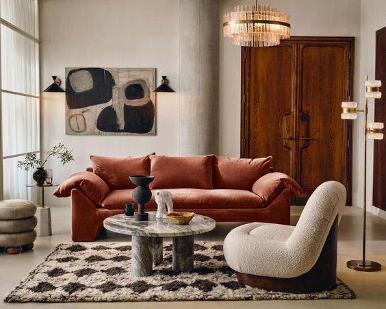
This living room design is inspired by Soho Home aesthetics, focusing on warmth, comfort, and a mix of textures. The palette features warm neutrals with dark orange as an accent for energy and depth. Layered materials like wood, velvet, linen, boucle, and marble create a rich, inviting atmosphere. Lighting is key, with a wide ceiling light, a Soho House-inspired arched floor lamp, wall sconces, and a table lamp for warmth. Two dark-toned Etsy paintings serve as statement art, complementing the cozy, neutral scheme. Patterns are minimal, appearing subtly on cushions, the rug, and framed wallpaper behind the sofa. The sofa itself is a deep-seated, dark orange piece, selected for its comfort and to incorporate a jewel tone. The total budget for the project was £7,000, and careful attention was given to achieving the Soho Home look with affordable elements. Overall, the room is designed to feel layered, comfortable, and welcoming, perfectly capturing the essence of Soho Home style.
MOOD BOARD
2
4
5
6
7
1. Lenor Sofa by Barker and Stonehouse
. Oxley Coffee Table by Soho Home
3. Arches Amber Rug by The Rugs Warehouse
. Maya Accent Chair by Oliver Bonas
. Console Table by Sklum
. Keysburg Table Lamp by Sklum
. Ceiling Lamp by Zara
8. Sand Wallpaper by Rebel Walls 9. Curved Floor Lamp by M&S
10. Wall Lamp by Zara
11. Wall Art - Unique Artwork By Anne 12. Cushion by John Lewis 13. Cushion by H&M
14. Cushion by John Lewis
CONCEPT:
03. JAPANDI HOUSE
In this Japandi abode, every corner is an oasis of tranquility and a tribute to the pursuit of joy and serenity. Our surroundings have the power to shape our emotions and influence our state of mind, and this design embodies the essence of that truth. Here, beauty is not just a visual delight, but a calming force that invites you to find solace in the present moment.
Zen style is a Japanese-inspired minimalist approach that emphasizes simplicity, naturalness, and tranquility. Zen philosophy is reflected in the design elements, which prioritize a calm and peaceful environment that promotes relaxation, reflection, and mindfulness. This style is characterized by the use of natural materials, clean lines, and neutral colors that create a serene and uncluttered space.
Minimal Japandi Furniture
Natural & Organic Textures
Nude Color Palette
04. SHARON`S HOUSE
CONCEPT:
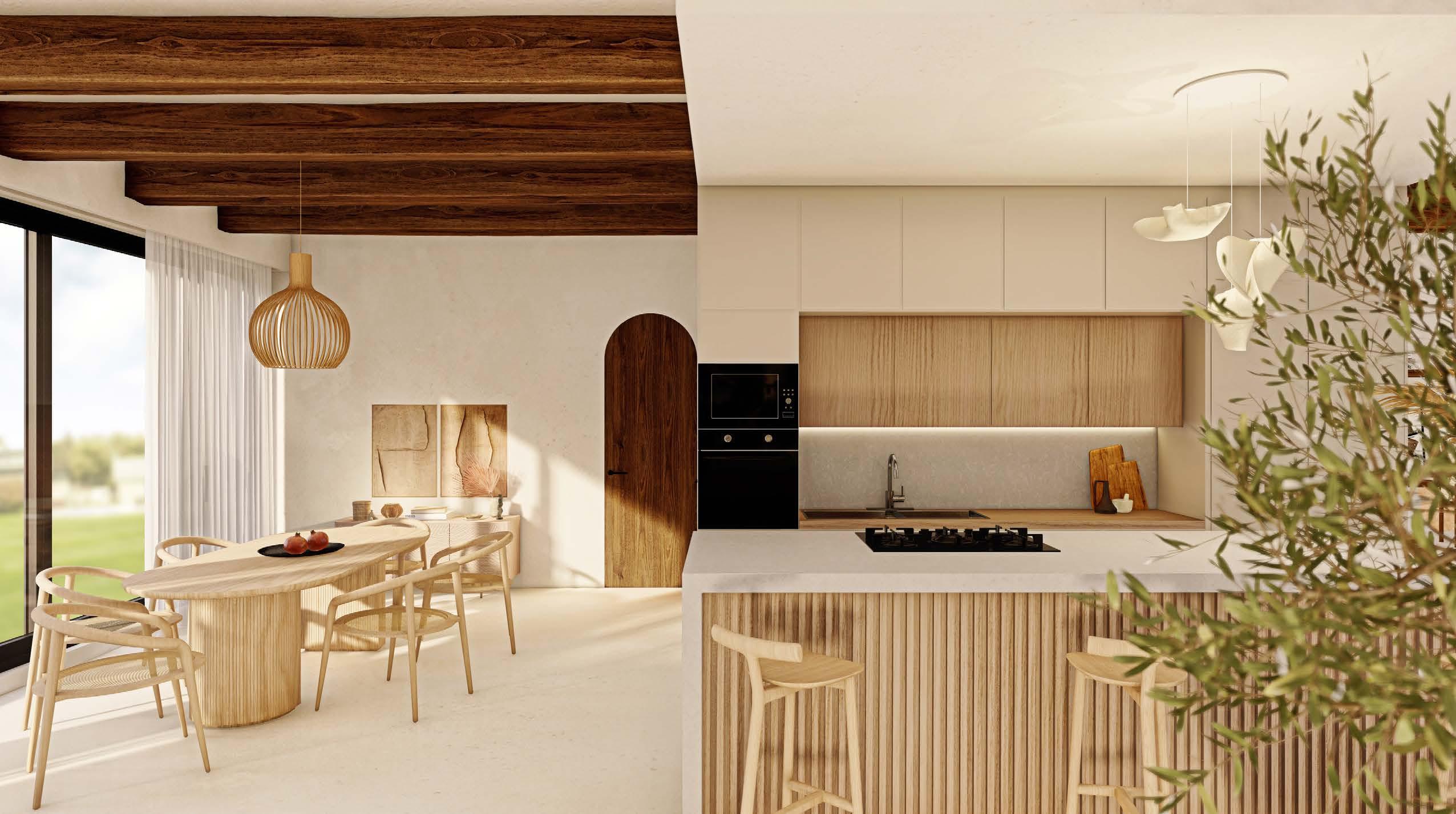
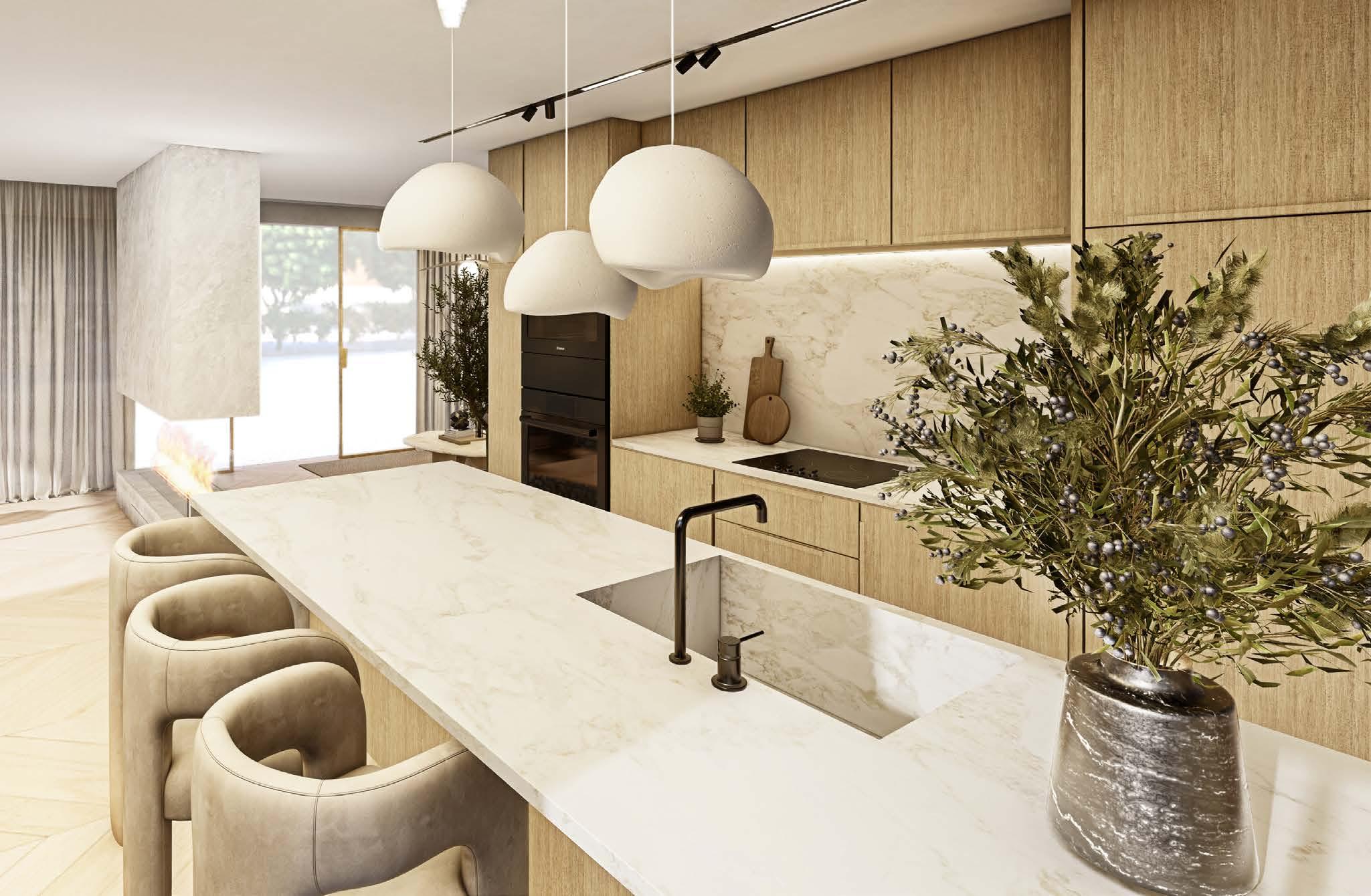
In the heart of the Netherlands, I designed a unique home that blends modern hotel luxury with the calming simplicity of Japandi style. The homeowners wanted a space that felt both elegant and serene, combining the chic feel of an upscale hotel with the comfort of a peaceful retreat. Achieving this balance was a challenge, particularly in maintaining both glamour and minimalism. I introduced satin brass metal and marble to add a touch of luxury, while organic forms and earthy materials preserved the Japandi essence. A warm palette of rust tones on neutral backgrounds brought vibrancy without losing the calm atmosphere. Another challenge was working with the large windows, which required thoughtful layout planning. The result is a stylish yet tranquil home that perfectly balances hotel chic with Japandi simplicity, creating a modern, serene living space.
TECHNICAL DRAWINGS
BUILT PROJECTS
* The following projects were completed during my time at WhiteRhino Design Group, where I contributed as part of the 3D Visualization team.
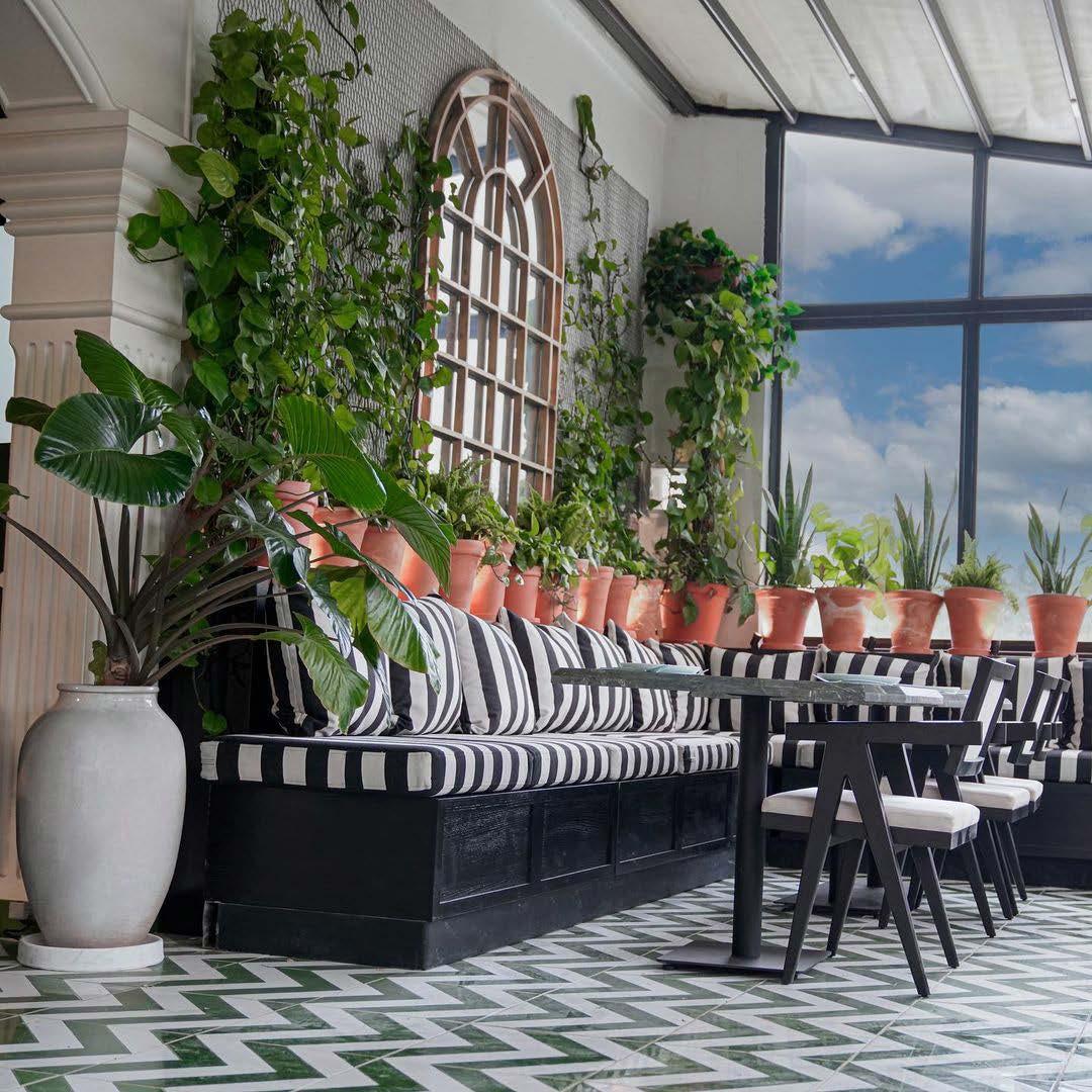
HAVANA RESTAURANT - TEHRAN
PHOTOS OF THE BUILT PROJECT
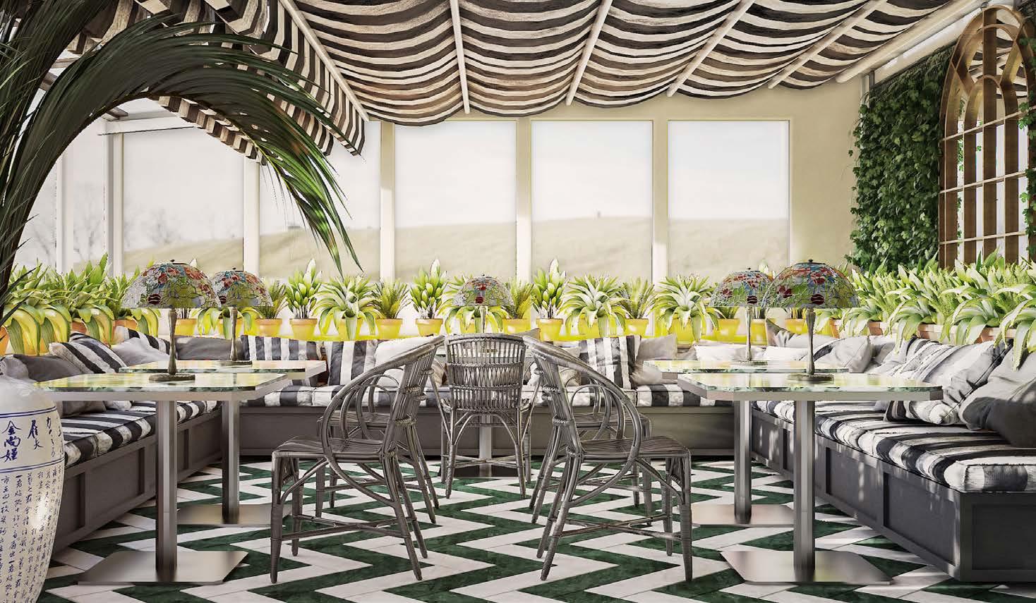
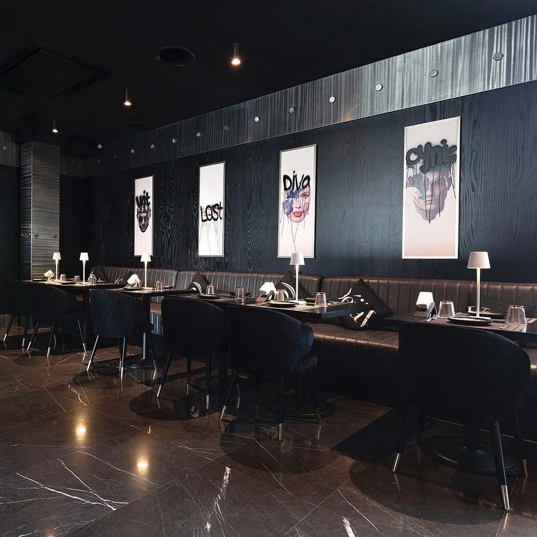
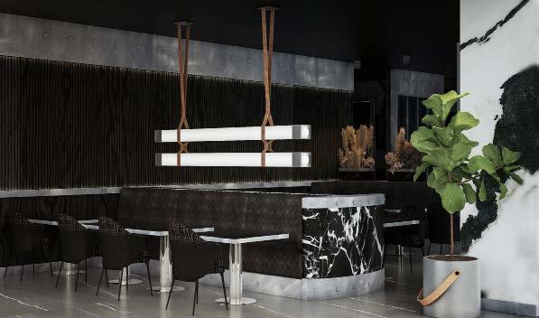
THE D PROJECT CAFE - TEHRAN
RENDERS OF THE PROJECT
PHOTOS OF THE BUILT PROJECT
DÉJÀ VU RESTAURANT - TEHRAN
PHOTOS OF THE BUILT PROJECT
ACADEMIC PROJECTS
CONCEPT:
05. MULTI-SENSORY CENTRE FOR THE VISUALLY IMPAIRED
This project is the thesis research done for the master`s degree. In this study, the main objective was to redesign a cultural centre with multi-senory approach for the visually impaired people. Through the design of an environment that accommodates the limitations and special needs of the visually impaired, this thesis aims to encourage them to participate in cultural and artistic activities, as well as to interact with others. Therefore, visually impaired people can not only create more artwork but also gain a deeper understanding of art. Using multisensory methods to evoke other senses, such as touch, hearing, smell, and taste, was the most important design strategy.
Therapeutic Garden Including Rosemary, Chamomile, Echium, Santolina, Flax
Pampas Grass (Stimulates Touching Sense)
Berberries Plant (Stimulates Tasting Sense)
Contrast in Color Palette Design For All Senses Scan to watch the project`s walkthrough animation
MULTI-SENSORY DESIGN PLAN
Bird`s atrium designed with a walkway over the running water channel
Library`s reading salon designed with acoustic considerations
Space distinction through contrast between yellow, black, and grey colors
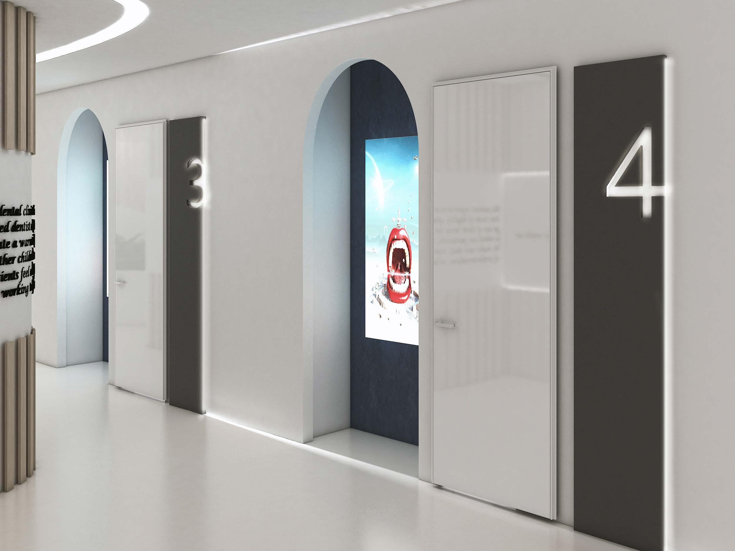
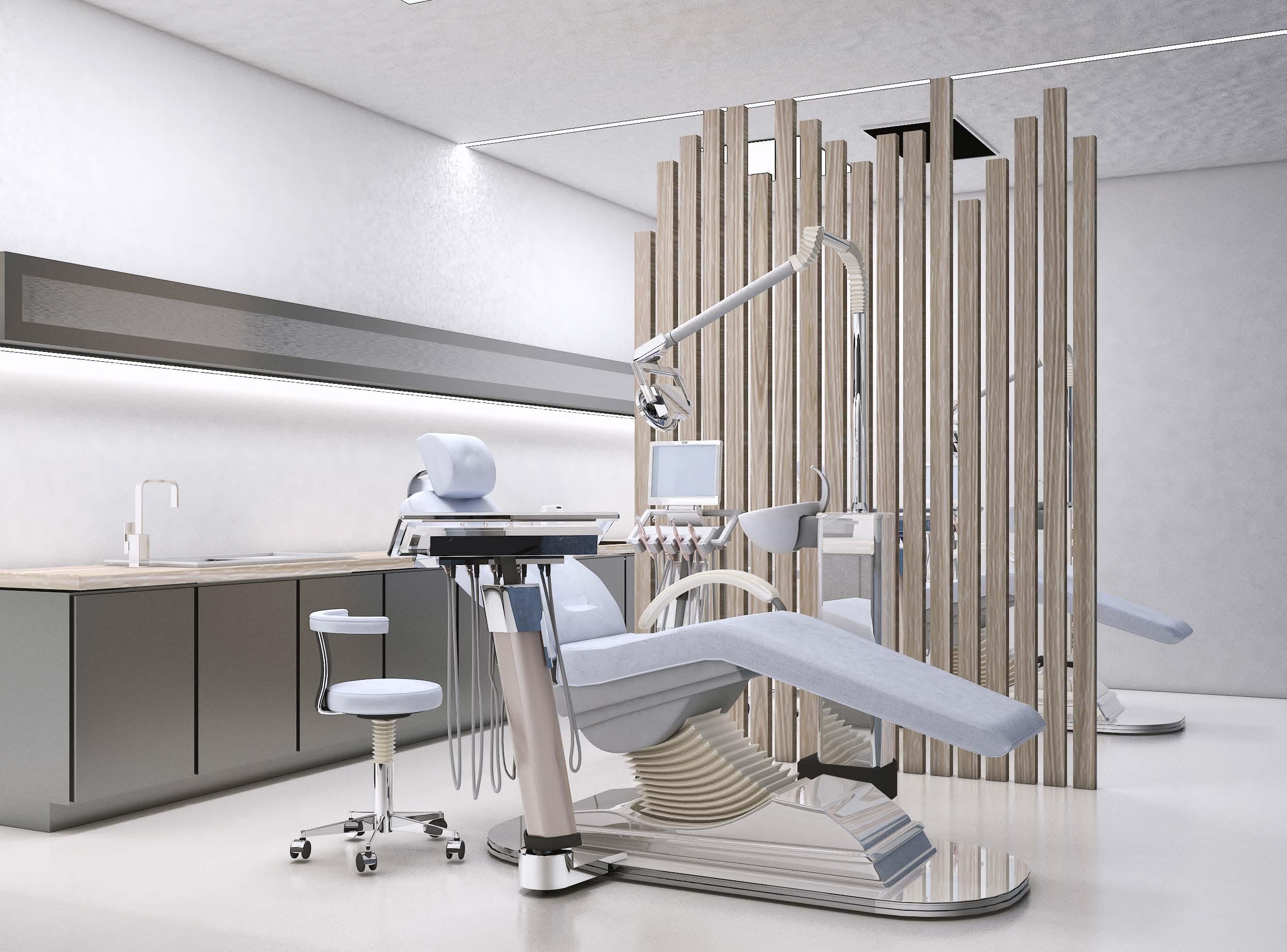
06. BIOPHILIC DENTAL CLINIC
CONCEPT:
Biophilia is the humankind’s innate biological connection with nature. Biophilic design can reduce stress, improve cognitive function and creativity, improve our well-being and expedite healing. Biophilic design is the designing for people as a biological organism, respecting the mind-body systems as indicators of health and well-being in the context of what is locally appropriate and responsive. The other concept of the design is using curved lines. Recent research done with images shows that we think that furniture with an organic look, and rounded forms, is more relaxing than angular designs. Humans are more drawn to curved elements mainly because sharp, edgy elements are perceived as being a potential threat.
SMILE, YOU ARE DESIGNED TO!
FURNISHING PLAN
07. AVAND TABLEWARE STORE*
CONCEPT:
The project site is located within a hotel in Tehran. The site has two floors, each with a floor area of 306 square meters. By dividing the objects based on their purpose, we tried to create proper sectioning in the store design. We used a combination of gray and pink tones for our color palette. Color gray offers a suitable platform for displaying dishes in different colors and shapes, while pink adds femininity, happiness, and playfulness. There are five main sections in the store: tableware, cooking utensils, baking utensils, decorative items, and luxury tableware.
In collaboration with Farnaz Ghotbi
BRAND DESIGN CONCEPT:
The brand name “Avand” has been carefully chosen for our kitchenware products. In Persian, “Avand” refers to a vessel or container, symbolizing practicality and functionality, which perfectly aligns with the purpose of kitchenware. The logo is designed to reflect the essence of a kitchen store, with spoon and fork elements subtly incorporated to represent the products we offer. Pink was selected as the primary color in our branding identity to evoke warmth, creativity, and a welcoming atmosphere. It connects to the idea of a vibrant and inviting kitchen space, where cooking becomes a joyful and inspiring experience.
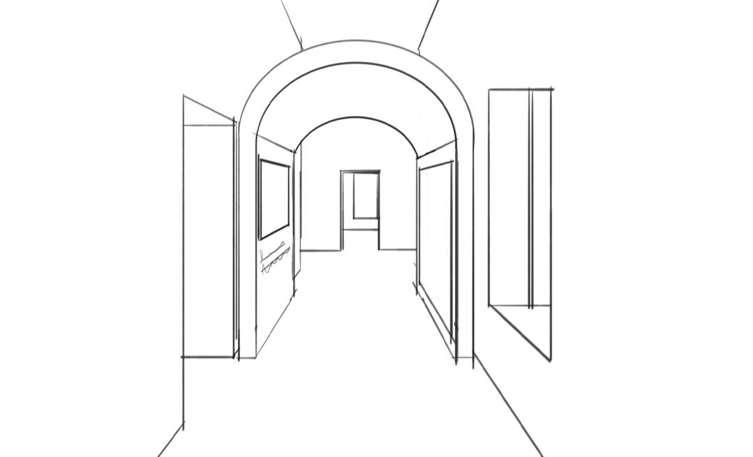
08. UNIVERSITY’S ART GALLERY
CONCEPT:
The purpose of this project was to design a space for displaying student`s artworks in Tehran University of Art.
The design objective was to seamlessly integrate the rich historical backdrop of the university›s Qajar-era building with the vibrant expressions of modern art created by today`s students.
Since this building has a historical date, the most important consideration in designing the gallery was to avoid causing damage to it. Thus, all platforms for displaying artworks were designed so as not to damage brick walls in any way.
The exhibition features two-dimensional objects such as paintings, prints, graphics, and posters, as well as three-dimensional works such as sculptures, clothes, art installations, and models. In order to display each of these objects, different stands have been designed.
This building is characterized by yellow brick walls, high ceilings, rooms connected with one another along the hallway, and numerous windows.
CONCEPT BOARD
3D Arts
2D & 3D Arts
Entrance, Lockers Area, Reception
2D Arts
DESIGN SKETCHES
Photography Section
Exhibiting 2D Arts
Gallery Entrance
Exhibiting Installation Arts
Multi-Purpose Section
Exhibiting 2D & 3D Arts
Excited to bring my creativity to your team. Let’s connect!