Due to previous experience in park design projects, also involved in community engagement initiatives for education projects such as PMQ Seed and Jockey Club.
Branding and Spaces
Also participated in designing spaces for various local brands, such as Black Sugar, NOC, LifeTasticHK, and more.
Tony Ip Green Architects.
Architectrual Designer.
Various type projects involved
April 2020Dec 2022
Cooperate with different parties to complete the design project from furniture, facade, lobby lounge, office, school interior design, and even large-scale children play area of the public park. Handle the design package and communicate with clients and stakeholders.
Mobile: 852- 68070982
Branding and Visual.
Engaged in planning and production with a PR company, involved in designing and creating the client's unique brand image, including venue design, posters, online advertisements, book layout, and communication efforts.
Participated in Children Play Area Design
Involved in concept design, Lyaoout Planning, 3D visualization, detail design, graphical presentation, client meeting, and public engagement of a 7800 s.q.ft Playground Design.
Collaborating Parties: DLN: Chows Architects.: Tiu King Leng Fire Station-cum-ambulance Depot, Tsuen Wan Riviera Park
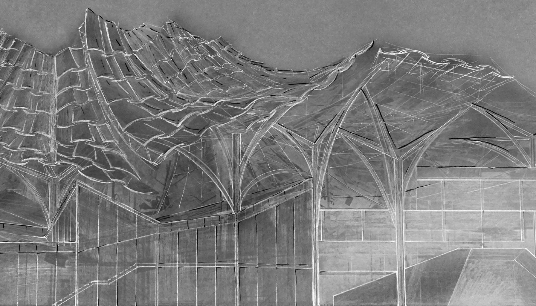
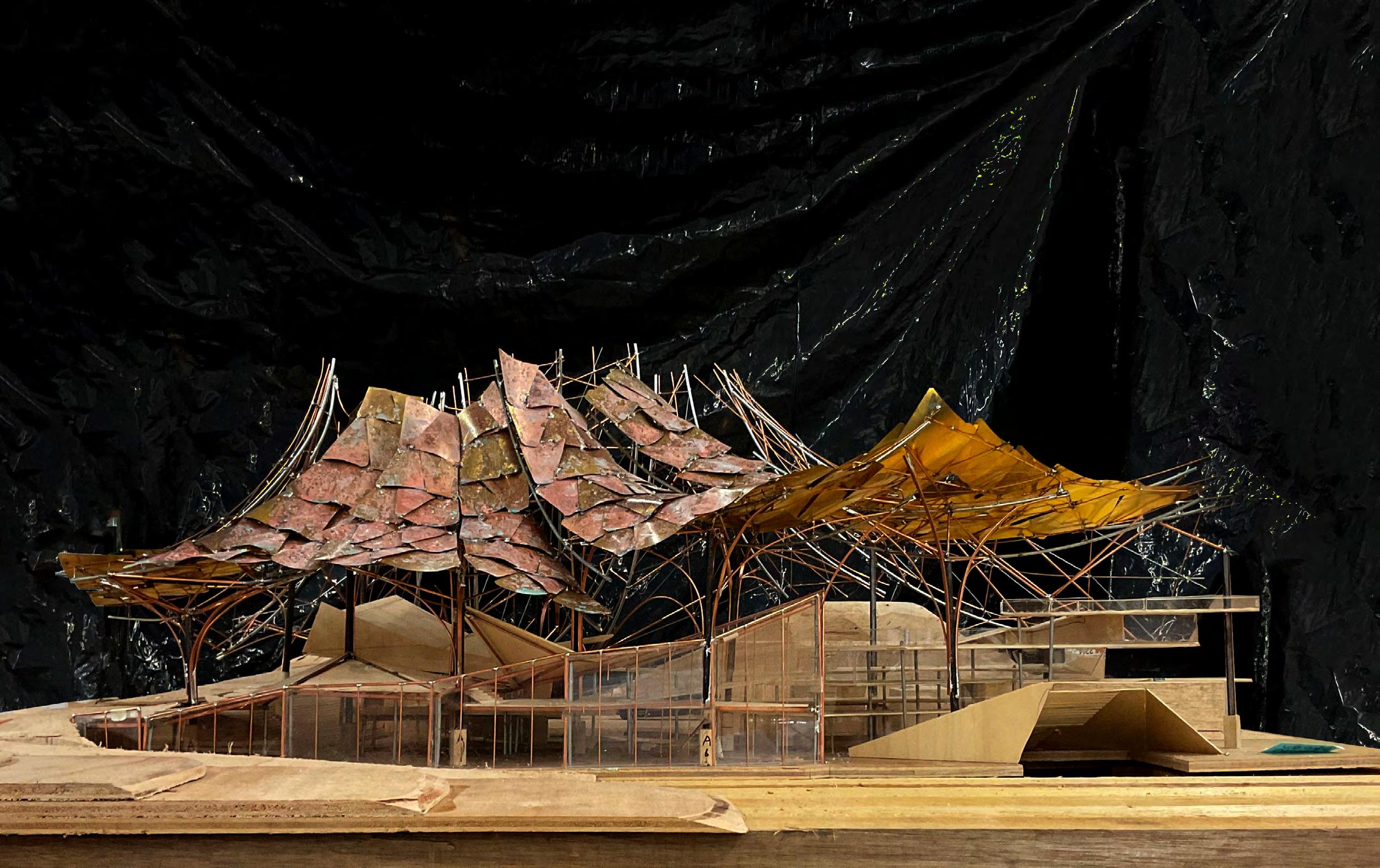
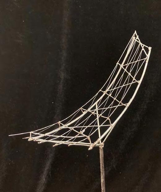
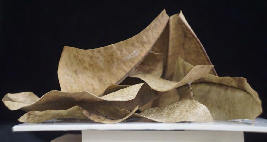
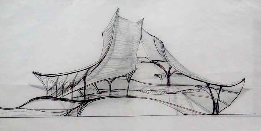
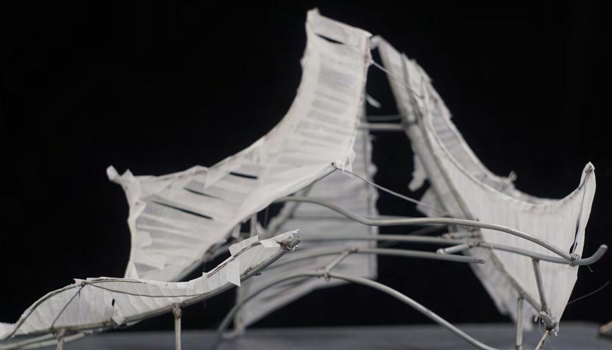
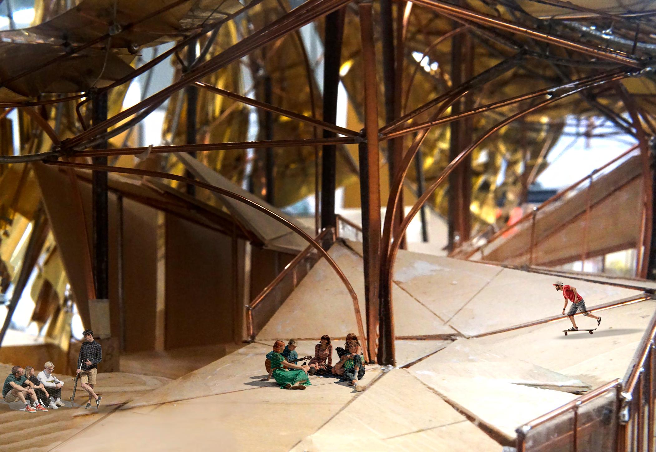
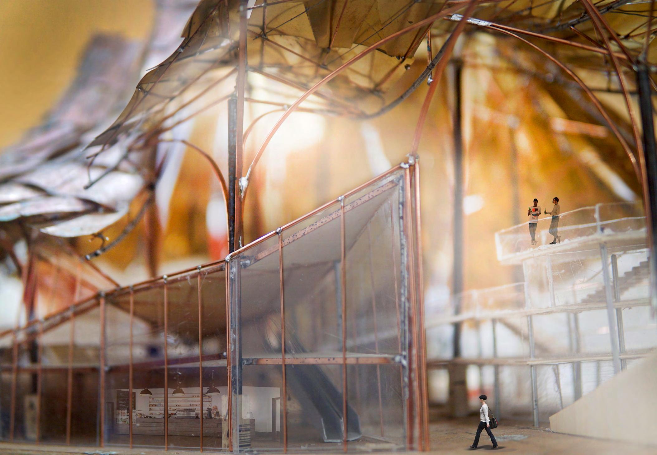
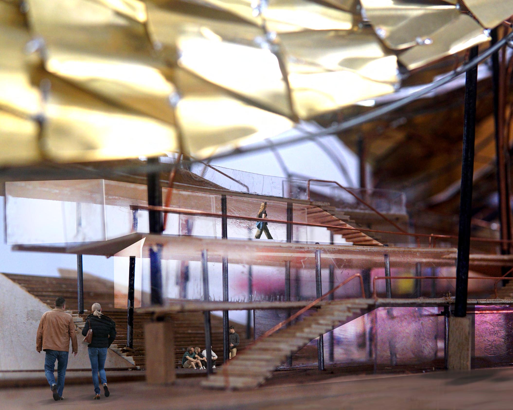
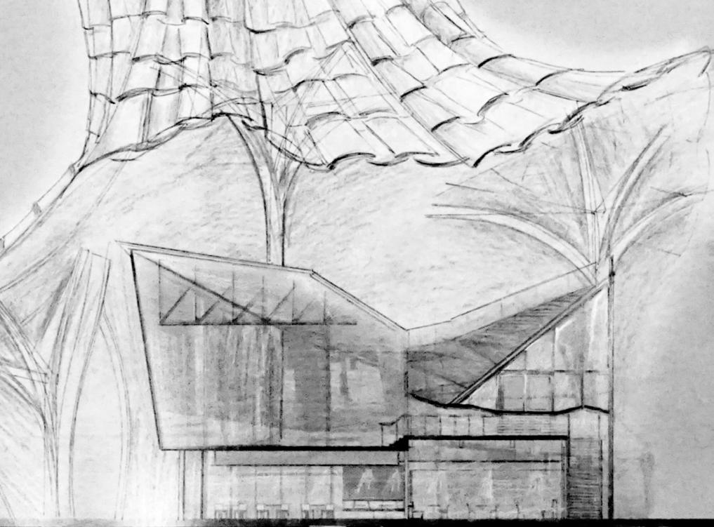
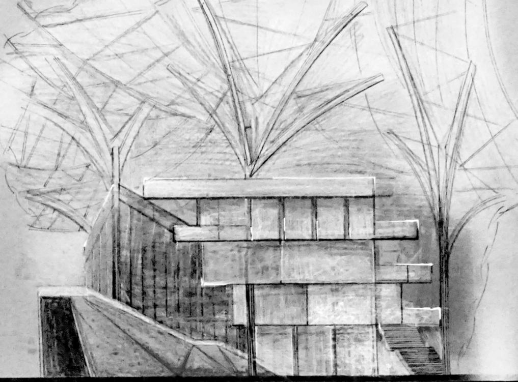
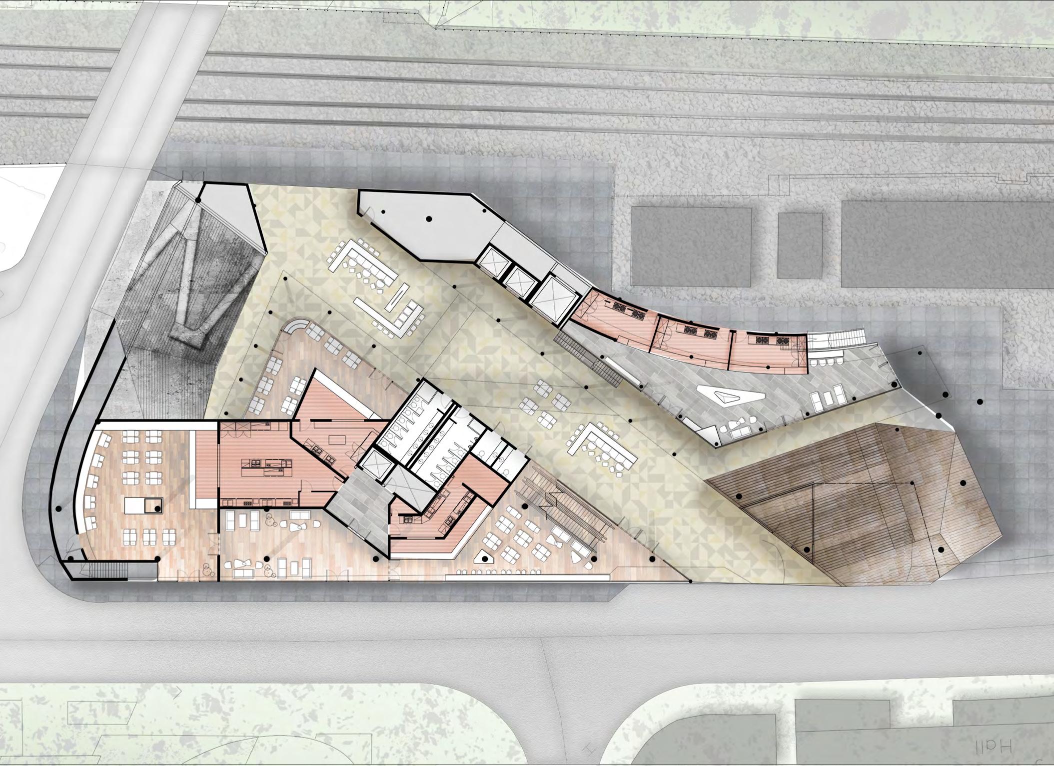
The project is a multi-purpose facility building located on a university campus, with food at the core of its main functions. It includes various types of restaurants, bars, a supermarket, and provides more diverse social spaces for students to break away from their mundane academic routine. This not only creates a more fun and enjoyable experience for students
but also offers them a different nightlife experience at the Chinese University of Hong Kong.
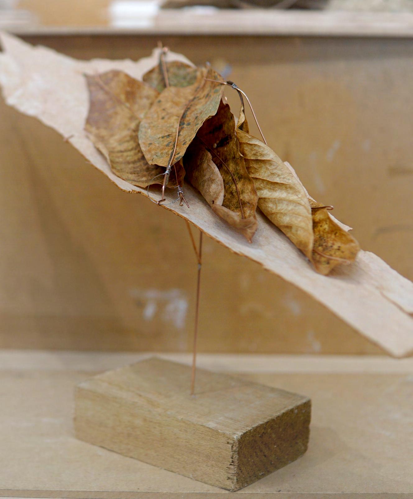
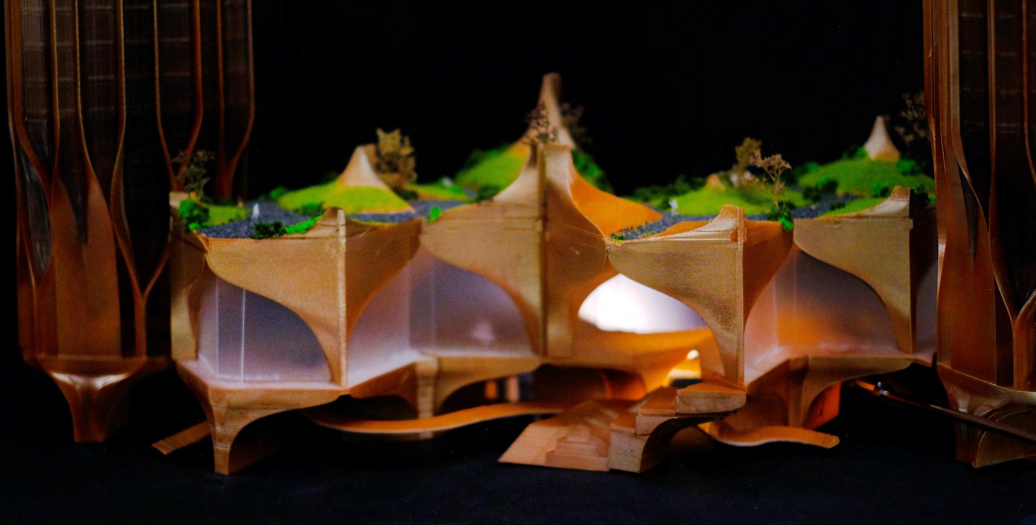
The design concept for this project is called “Wavy Leafscape”. It takes inspiration from the mountainous terrain and geographical location of the university, with different leaf shapes and colors used to connect various spaces within the building. The design creates a visually engaging and interactive experience for pedestrians as they walk through the space, with changes in the colors and shapes of the leaves signifying transitions from one area to another. The overall effect is akin to being in an amusement playground which will claim this as” Playscape”.
The design concept also includes various gathering points for students to dine, chat and socialize. The open spaces provide opportunities for different types of activities, including sports and other events. This not only enhances the functionality of the building but also fosters a sense of community and encourages social interaction among students.
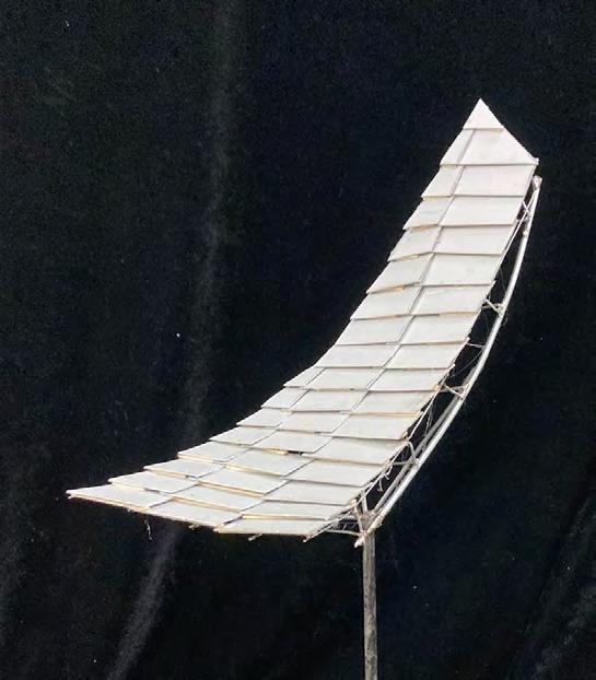
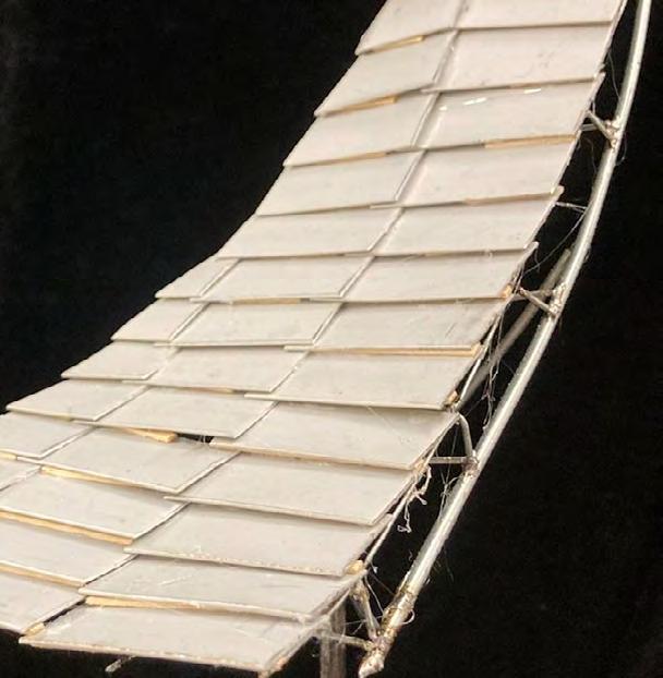
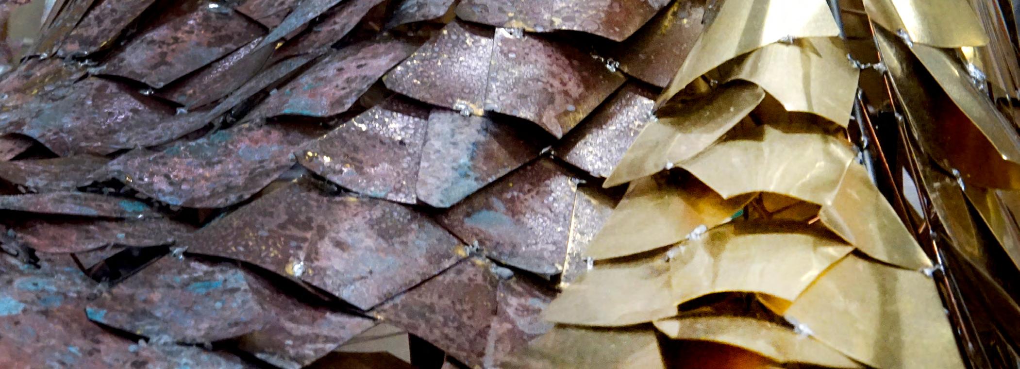
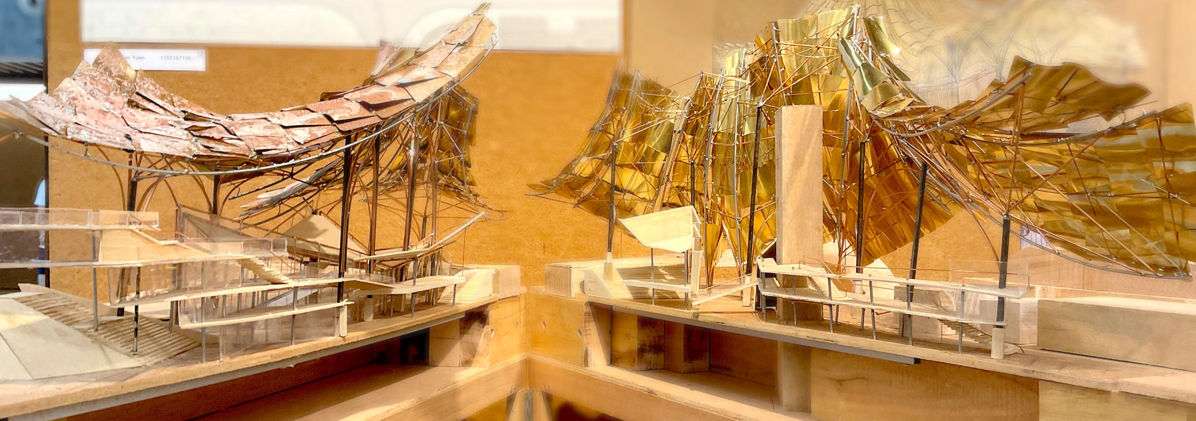
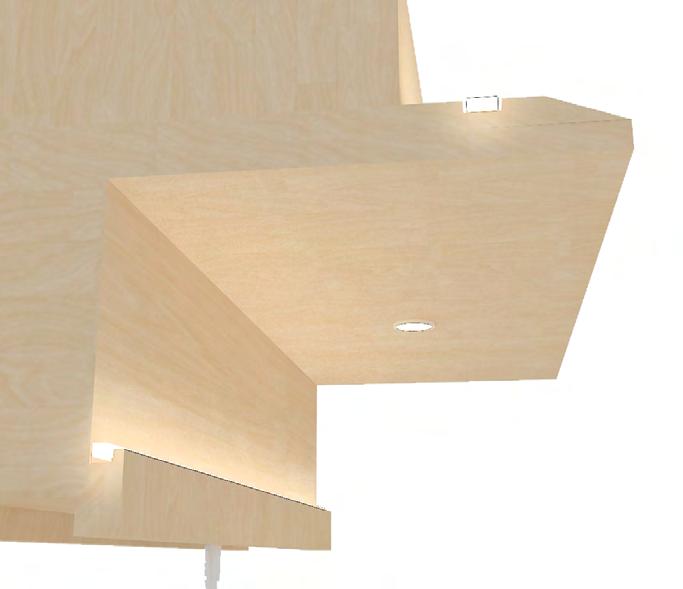
The ceiling system of the design takes inspiration from traditional Chinese roof brick system, with a customized modular system of bricks applied to create an organic-looking ceiling. The use of copper-colored materials creates a reflective surface that changes with the weather, adding to the dynamic feel of the space.
QR code for a short clip about the project
Rough, Energetic
This building at the Chinese University of Hong Kong offers a visually engaging and interactive experience for students, with various spaces for dining, socializing, and activities. The design takes inspiration from the natural surroundings of the university, and the use of traditional Chinese brick designs and copper materials adds to the dynamic and lively feel of the space. We hope this design can be a social hub that provide more and more interaction with the people in the campus.
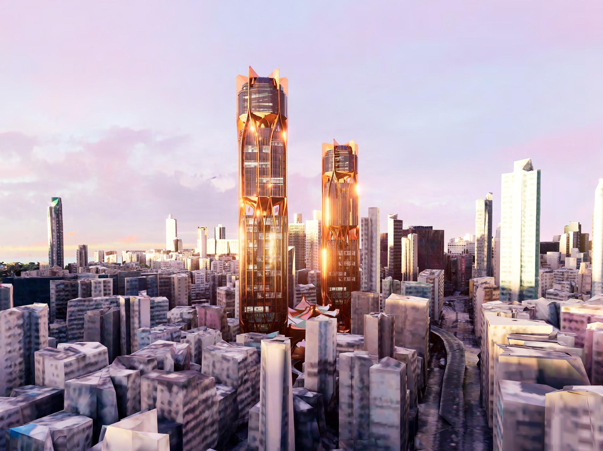
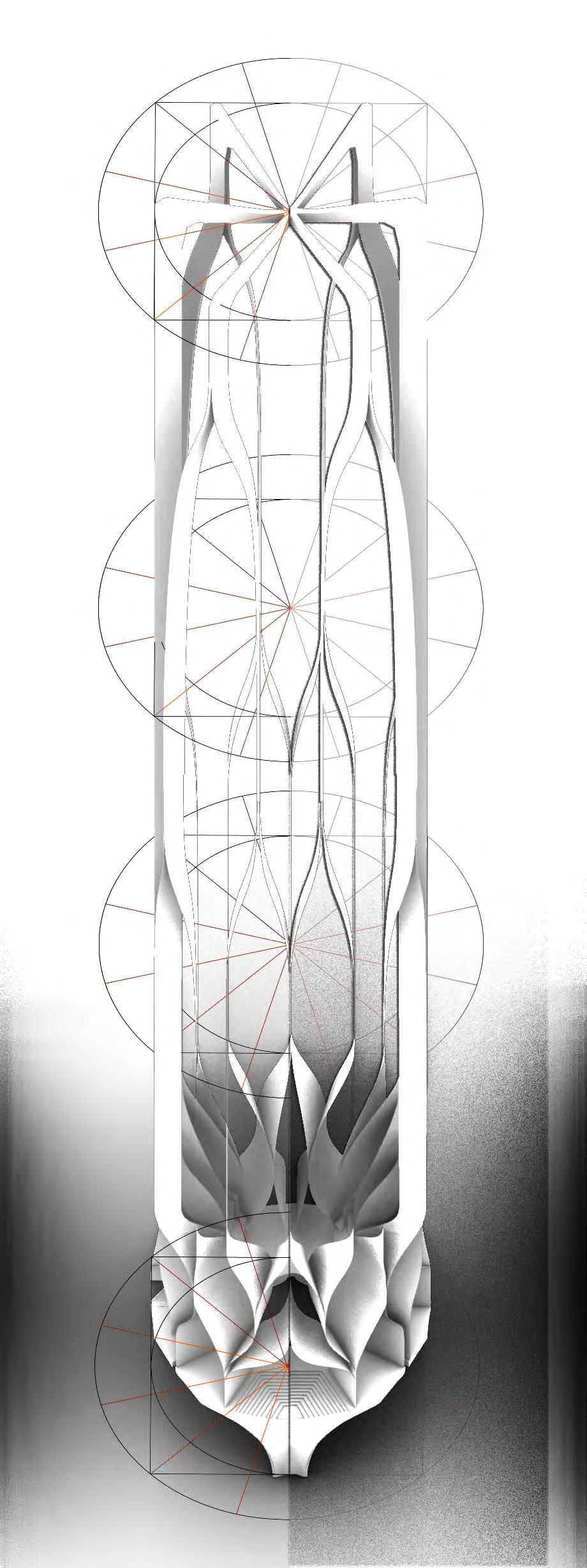
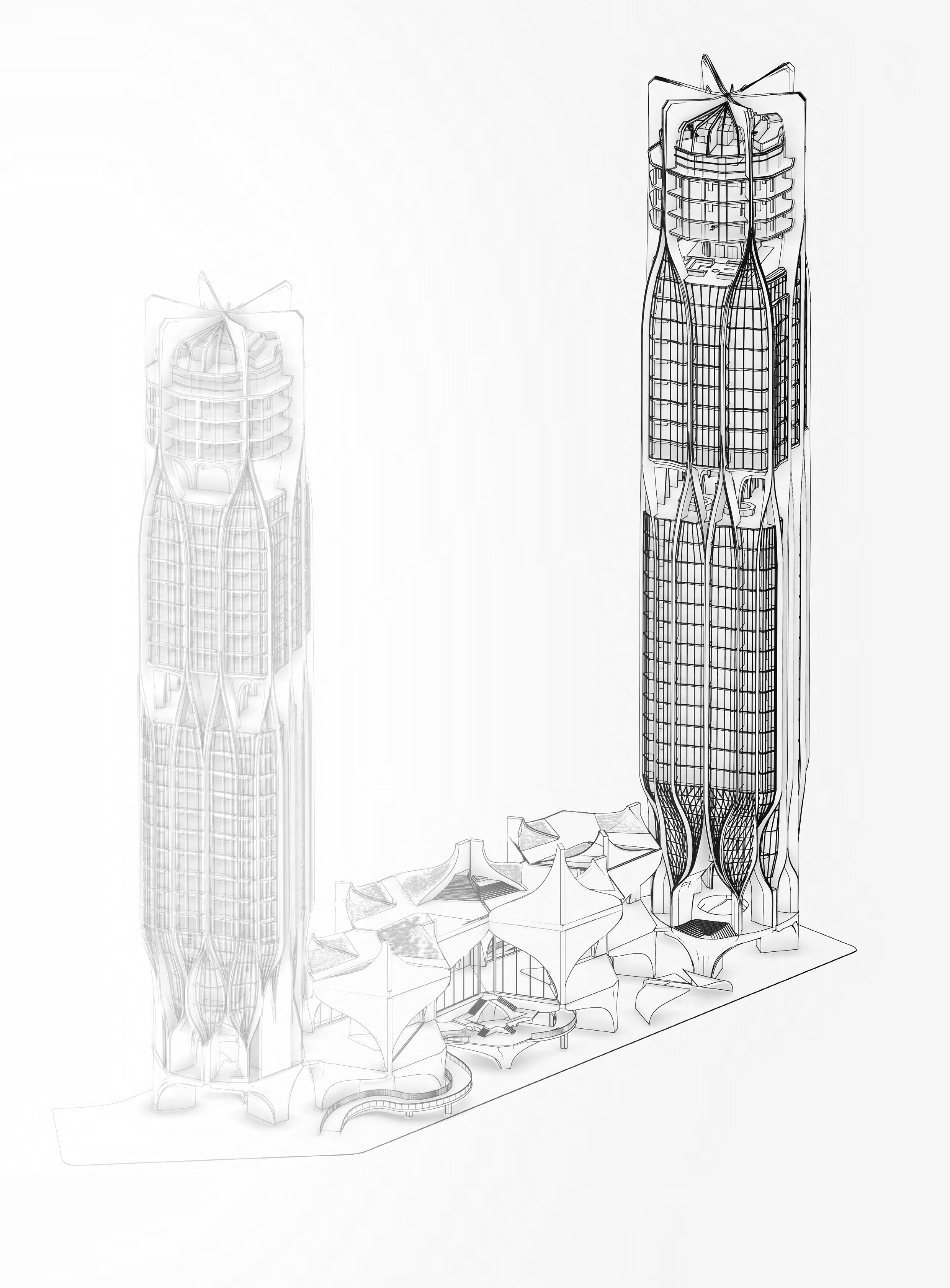
The TARA
Exploration of biological geometry
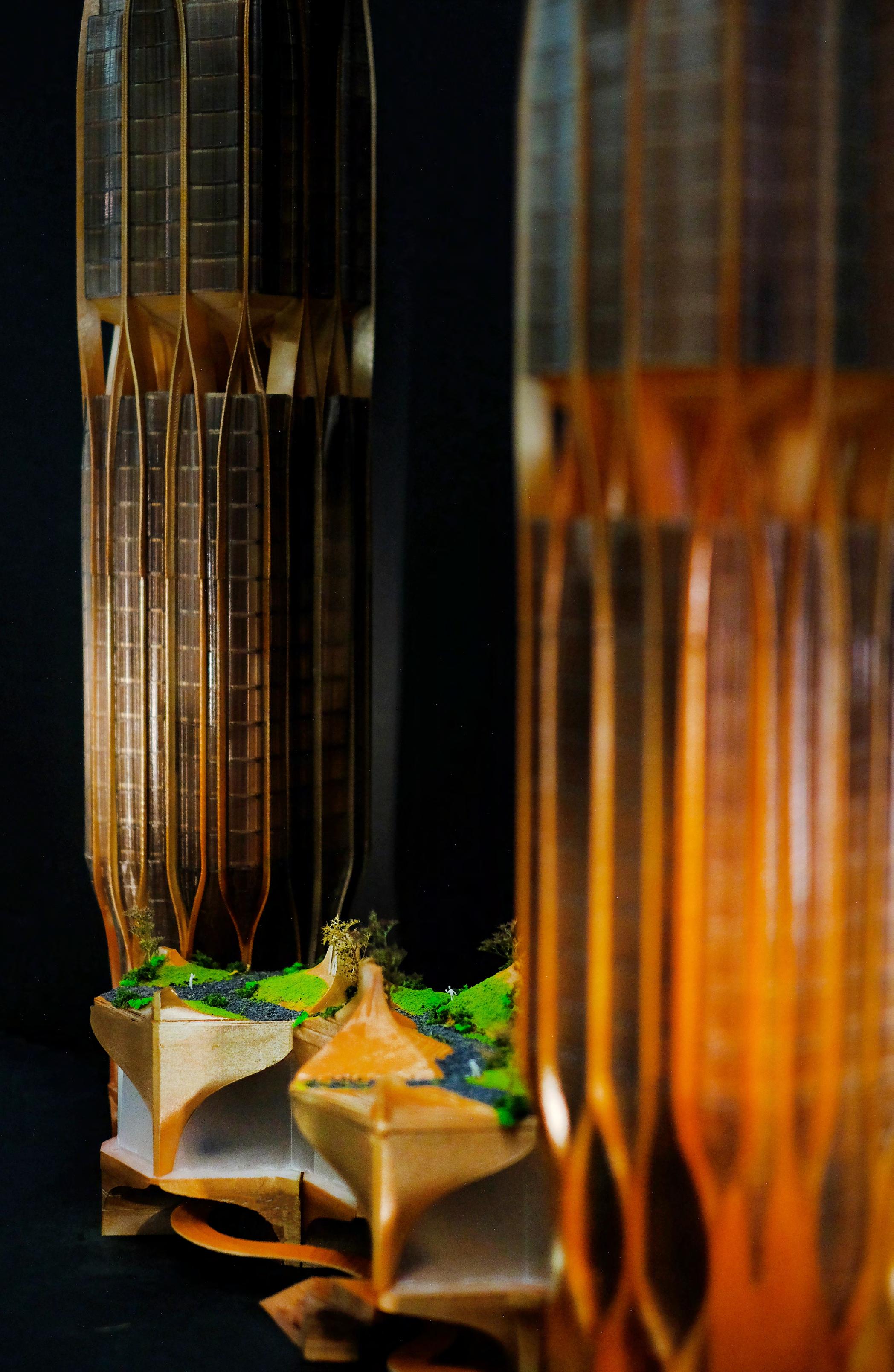
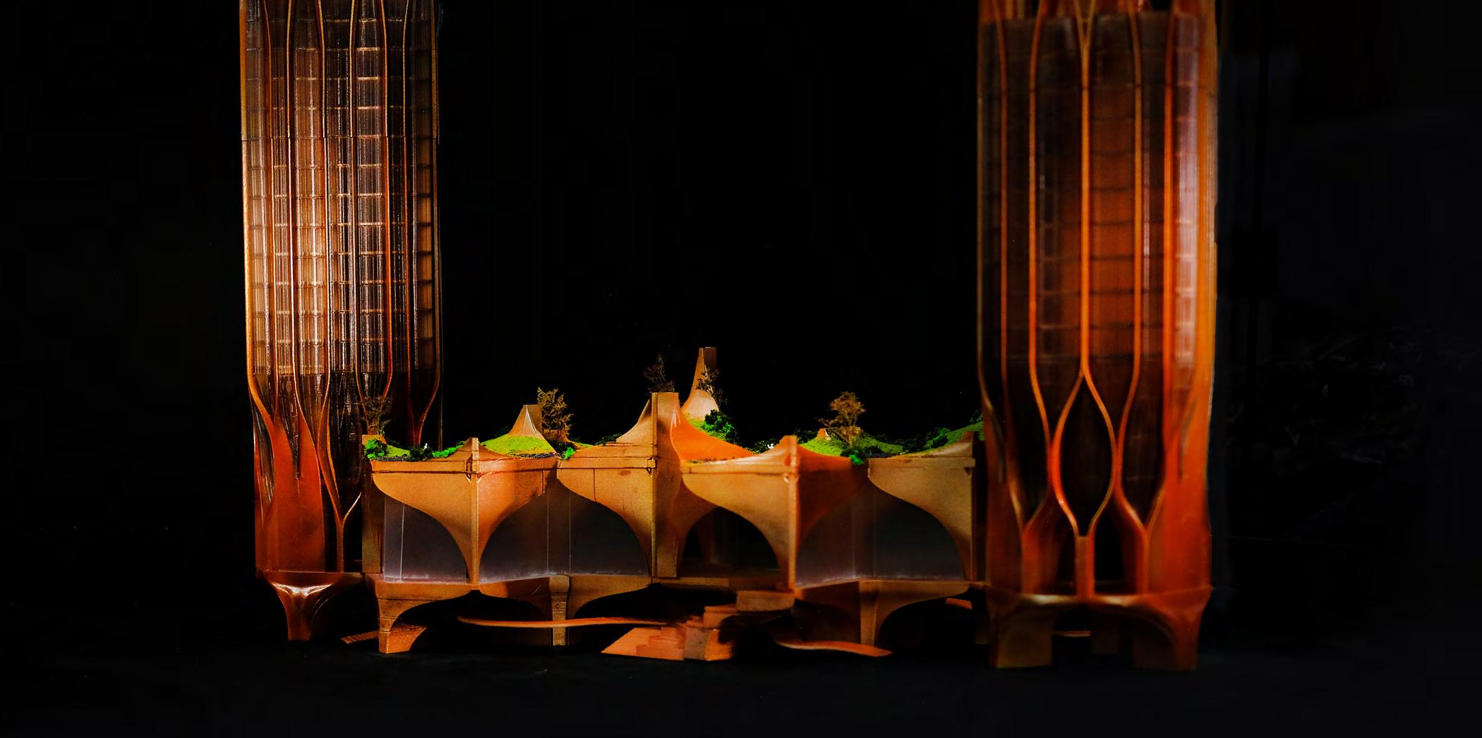
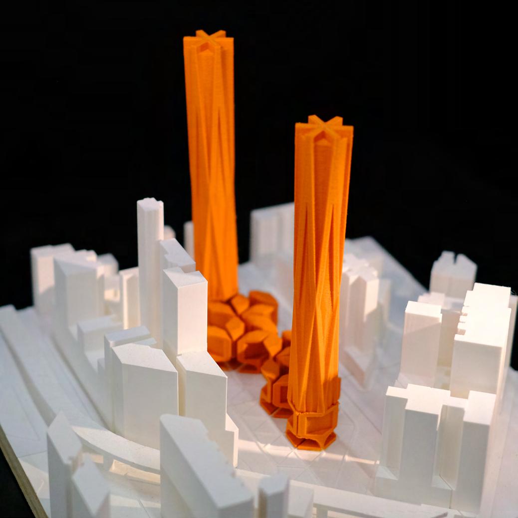
The relationship between private commercial land and public spaces plays a crucial role in urban space planning. Unfortunately, in Hong Kong’s older districts, commercial spaces and outdated urban regulations have resulted in a lack of green areas and pockets of respite, leading to narrow streets and limited opportunities for citizens to enjoy urban exploration.
However, considering that most of the land use in Hong Kong’s urban areas is designated for residential use, particularly in prime central locations, there is an opportunity to propose a transformative concept.
The hypothetical proposal involves repurposing the ground levels of residential buildings into public spaces through collaboration with private developers. These spaces would serve as inviting spots for people to pause, relax, and rejuvenate
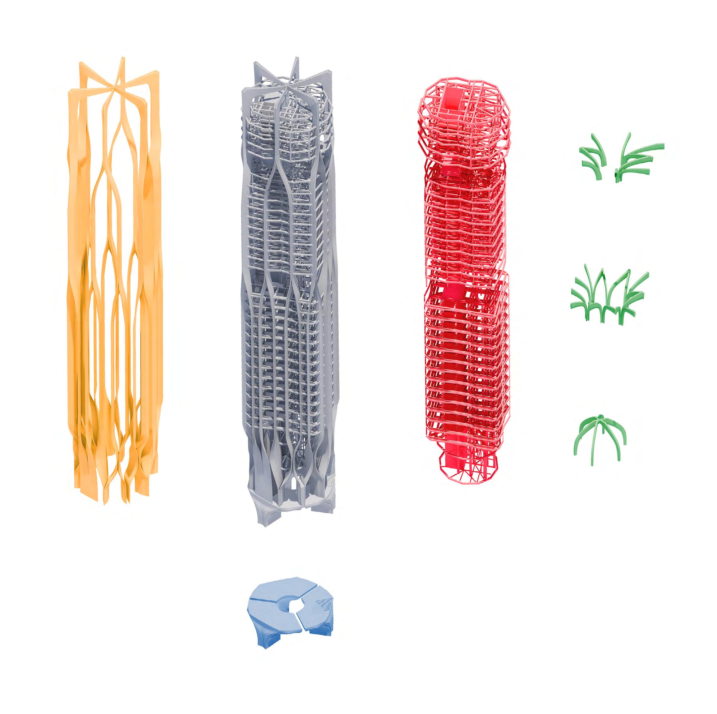
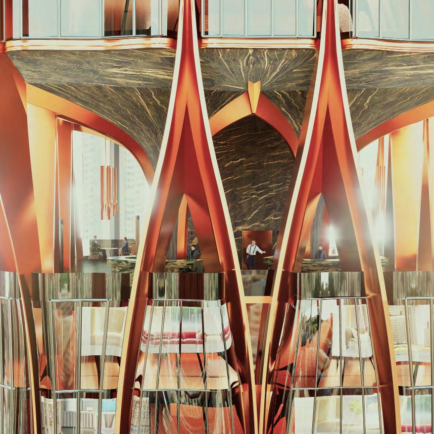
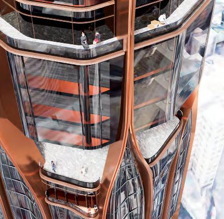
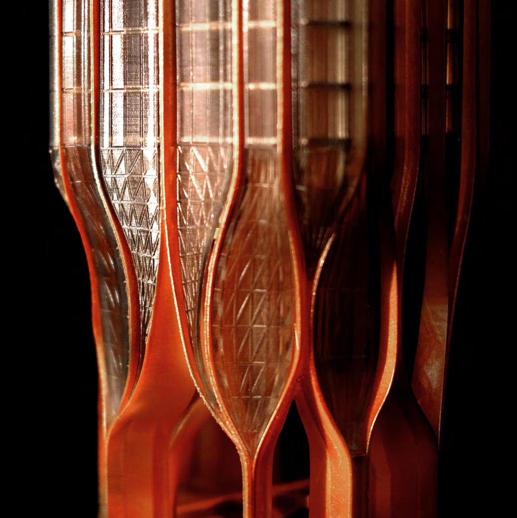
within the bustling streets. To achieve this vision, residential building designs would incorporate minimal ground contact and a supportive exoskeleton structure, reminiscent of tree trunks, enabling the construction of buildings over 120 meters tall.
Exo-Skeleton
Strength Structure from the fundation with less support.
The design focuses on the building’s structure, which requires sufficient support to hold up the building itself. The direction of the design means making the space below the building available to the public, and minimising the use of pillars and other structures above to create a larger, more flexible space. As a result, the design employs an exoskeleton as the main structural element, putting the focus on the design and deriving its logic from the growth patterns of living organisms – a concept called fractal.
The hope is for the shape to resemble the organic form of a plant, to offer a vibrant and energetic image, in contrast to the many boring, box-shaped buildings.
This concept is not limited to a single location but rather designed as a modular system adaptable to various scenarios and areas. It is envisioned that the proliferation of such public spaces throughout the streets would create a network of interconnected public realms, enhancing the urban fabric and fostering a sense of unity throughout the city. The project is aptly named “The Tara,” drawing inspiration from the Taraxacum genus, commonly known as dandelions. Just as dandelions disperse their seeds far and wide, the concept aims to permeate the entire city, revitalizing it with a harmonious blend of energy and serenity.
For this case, the block can only fill the horrizontal hexagon grid which can generate a more dynamic block pattern.
In addition, another pursuit in this design is to achieve a growth-like and unique textural quality in the building’s form, akin to living organisms. Various plant growth forms, from their structural compositions to evolutionary processes, were referenced as inspiration. Through these plantbased references, the design explores different aspects, including spatial distribution, the reshaping of spatial perceptions, as well as the formal compositions derived from the structures of diverse plant branches and nodes.
Redefine & Reform Tradition
Exploration of the traditional wood structure and extension
The traditional technic and craftsmanship are very easy be forgot and ignored. So many traditional designs were not fully developed, or they do not have a deeper exploration and discovery of the design, even they do not know where the core value of this design is. However, many of the old technic is easy and direct to achieve the requirement and fulfill the function of the users and even the designer can use and apply the
local material on it cleverly which is no need to spend the extra cost for building the similar function design. Reform the tradition is not freeze or keep everything. The integration of the value and function, it‘s called “Reform”. We have to redefine and rethink what new idea and application can help us to redevelop the traditional design which can extend and pass those classical to future.
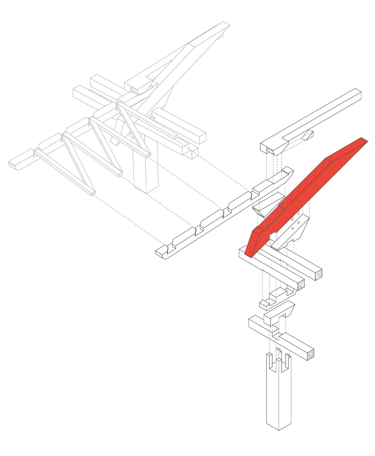
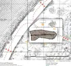
Structural Diagram
From the Starting point of this project is looking for some hybird-architecture in Hong Kong which is combined new and traditional archiectural form.
After that we tried to explore the traditional Chinese architectural structure “Dou gong“, the Bracket complex. And we also do some
analysis of the application of the force and the assemble method.
The outcome is we found the core of the wooden structure is using the simple physic “action and reaction pair“ to achieve the design.
The diagrams are showing the difference in between the force application in 2 main wood structures “Dou Gong“ & “Chuan Dou“.
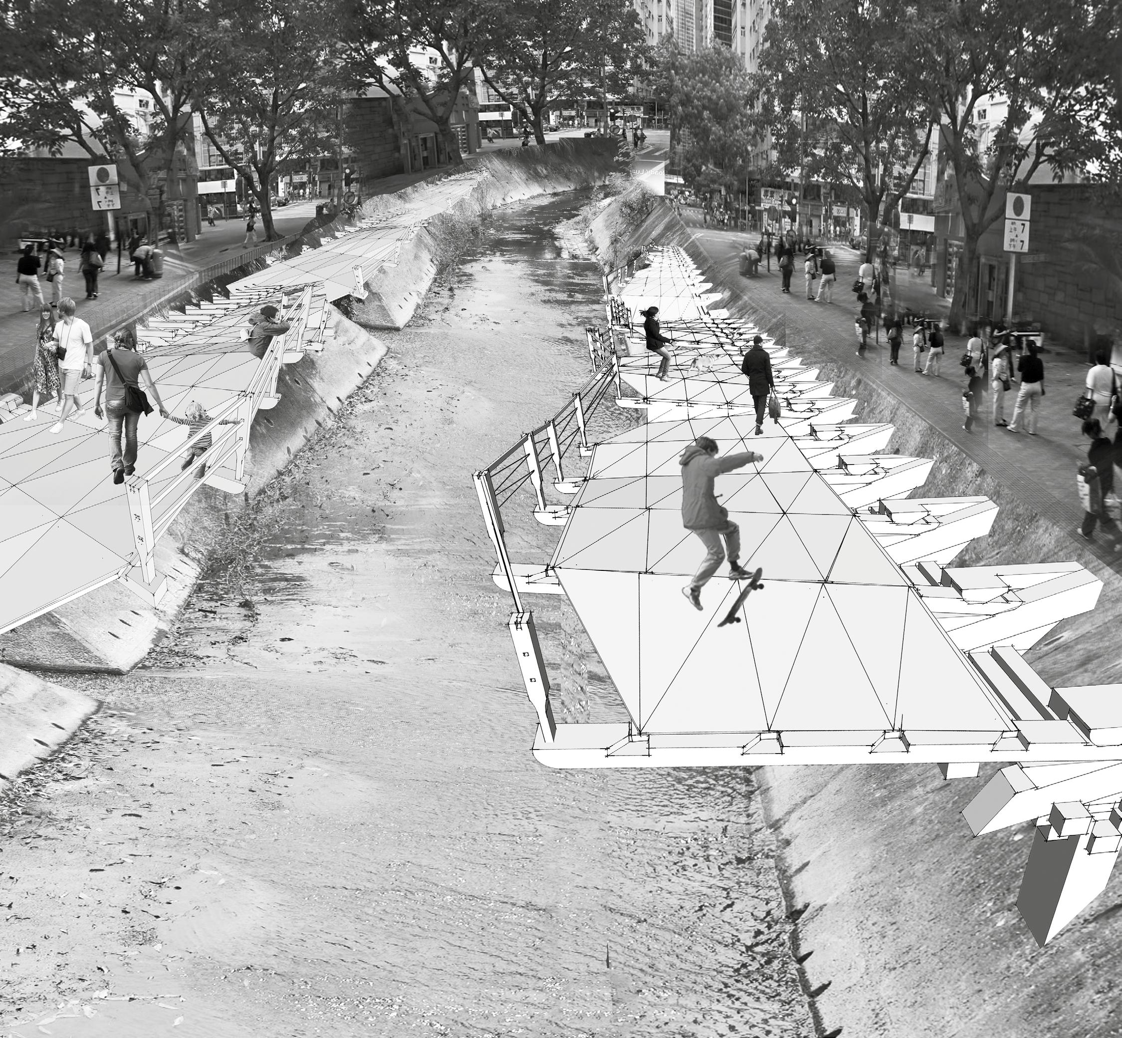
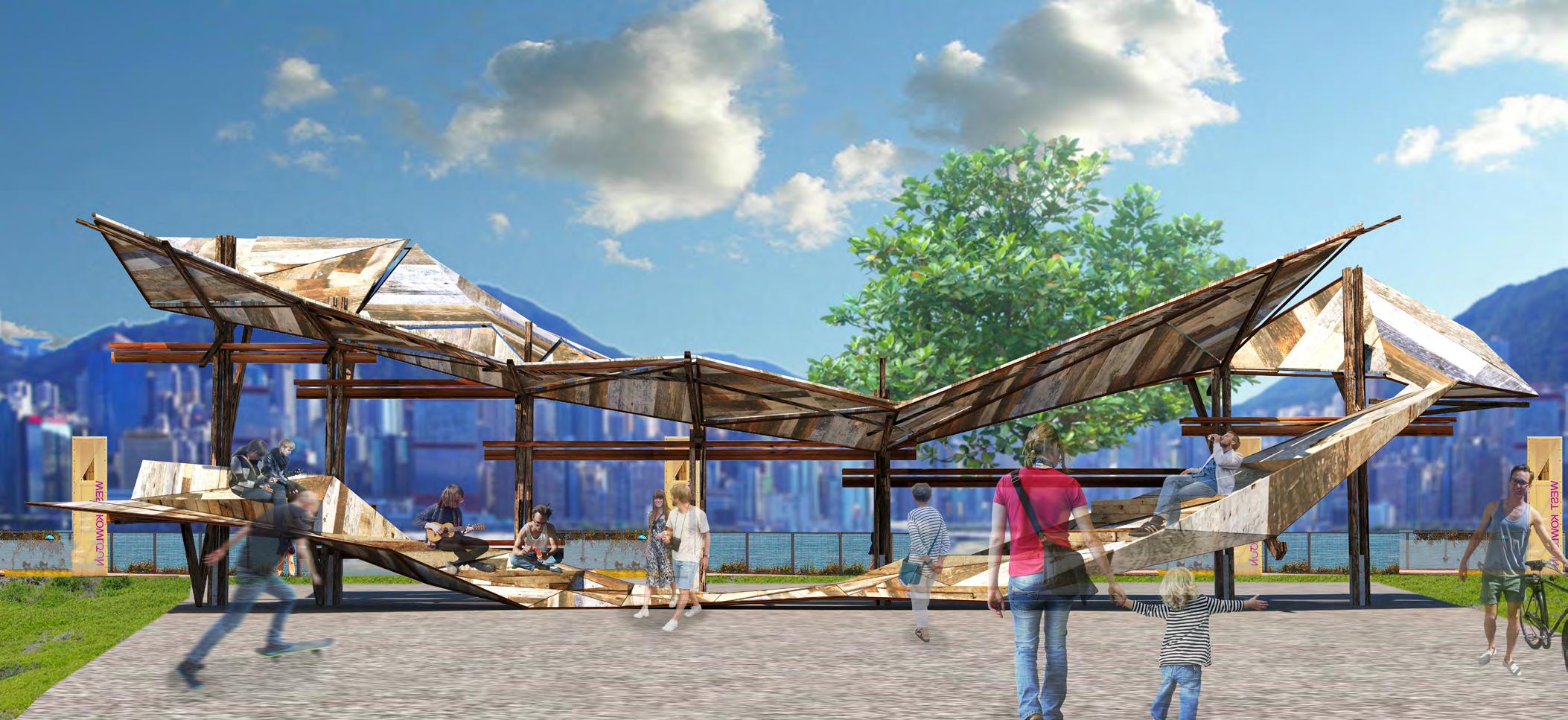
The structure dougong and the typical type of the Chinese wooden architecture style and showing how the interlocking system and the joint system can transform the traditional style into the new type structure for the landscape. The pinned up research is showing the technical model and the function of this technical model.
Final a large collage of the system applied on the riverside is showing what the system can help people to improve the living quality.
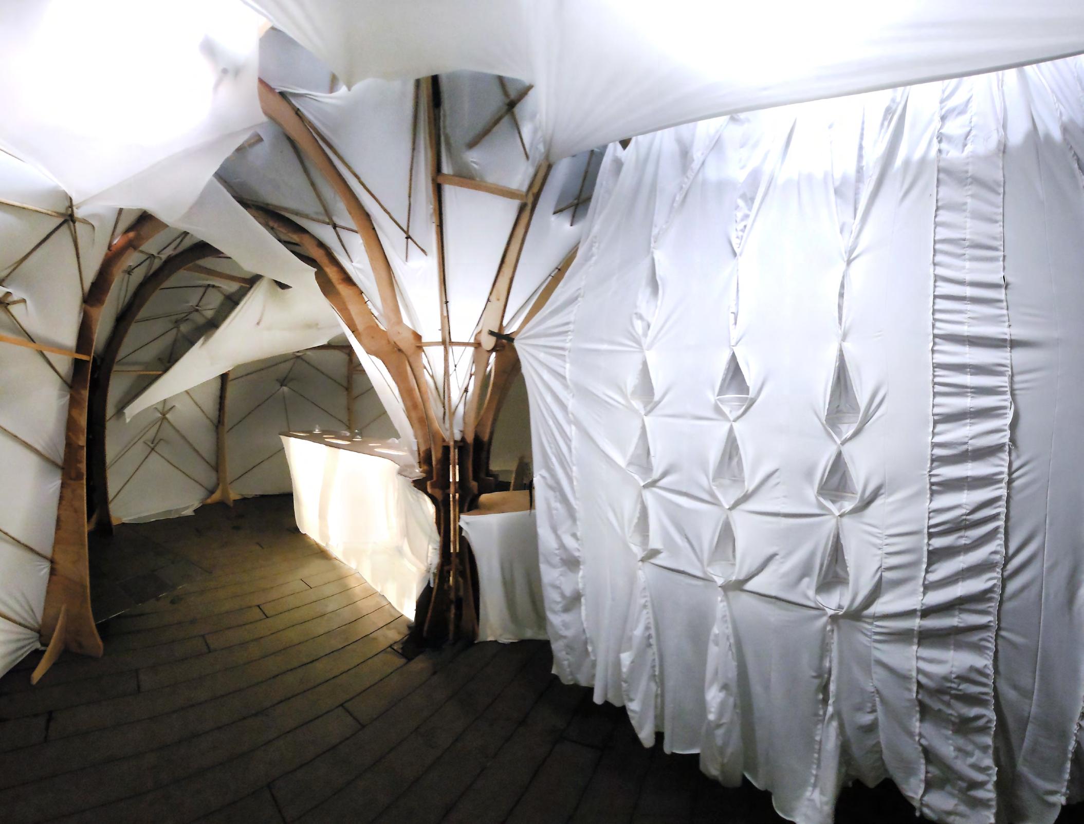
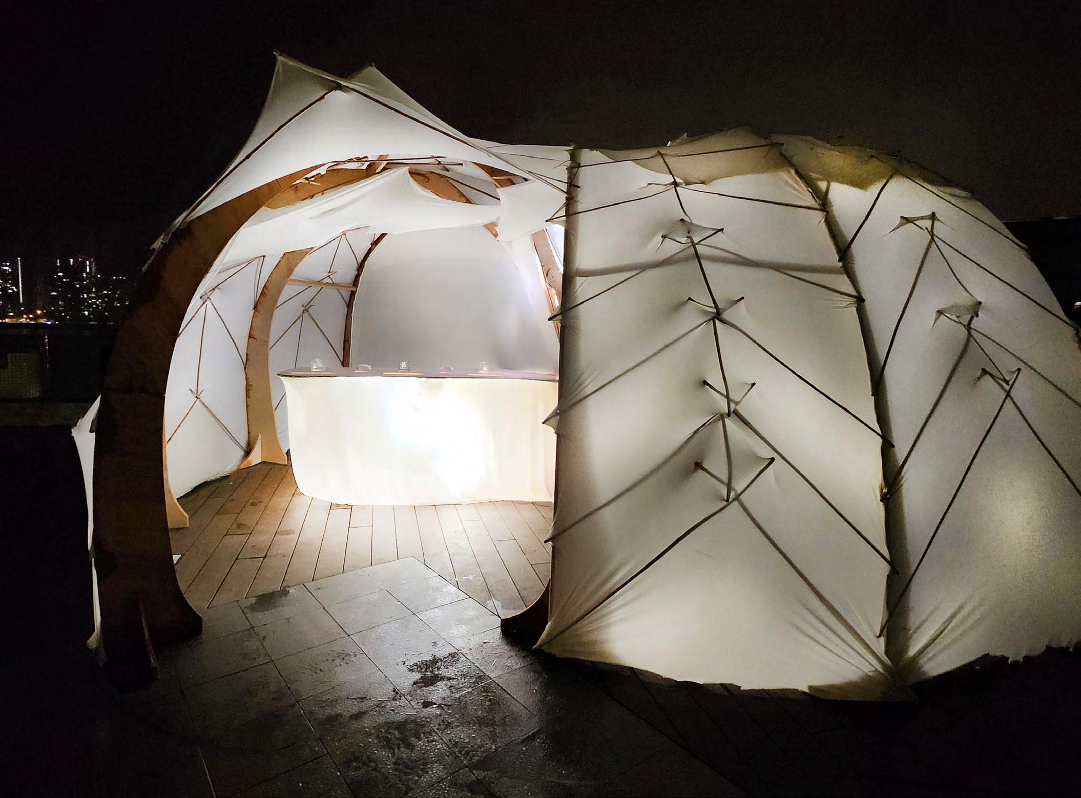
Application: Extend the harbour side create more space
As based on the modular system of the traditional Chinese wooden frame construction, the design of the pavilion is efficient and ready for easy and quick set-up, dismantling and relocating processes. Reclaimed lumbers are used for environmental consideration.
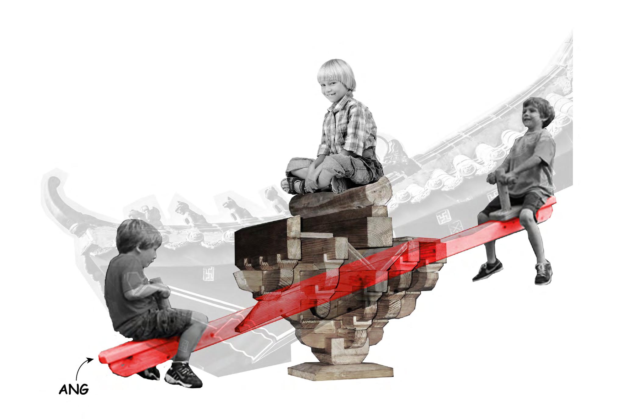
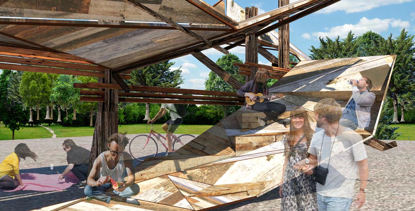
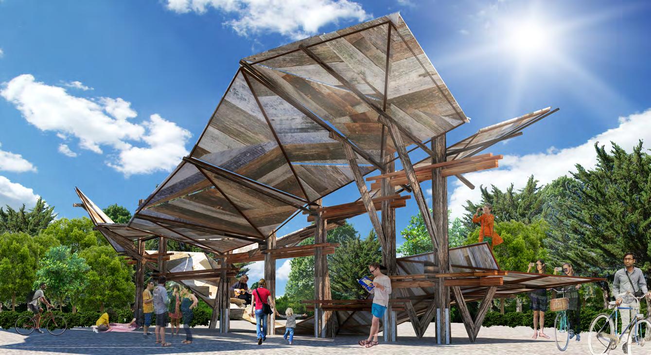
Application: Free Standing Pavaillion
The traditional Chinese wooden frame construction (as well documented in Yingzao Fashi) has its own distinctive architectural values of the East. The modular, structural counterbalance (i.e. the ang system) and roof layering system of this Chinese practice are re-visited and transformed according to modern architectonics, resulting in a unique form and aesthetics, which have their roots in both East and West traditions. The ‘Glocal’ Pavilion is thus iconic, with profound cultural/historical roots.
By the design methodologies of re-interpretation of traditional Chinese practice and synthesis of Eastern and Western design approaches, the Pavilion embraces cultural diversity and aesthetic unity, which well reflects the cultural character of ‘unity in diversity’ of modern Hong Kong. The Pavilion thus creates an ideal cultural/architectural landscape for people of different backgrounds to interact, share stories and cultivate identities/sense of belonging of Hong Kong.
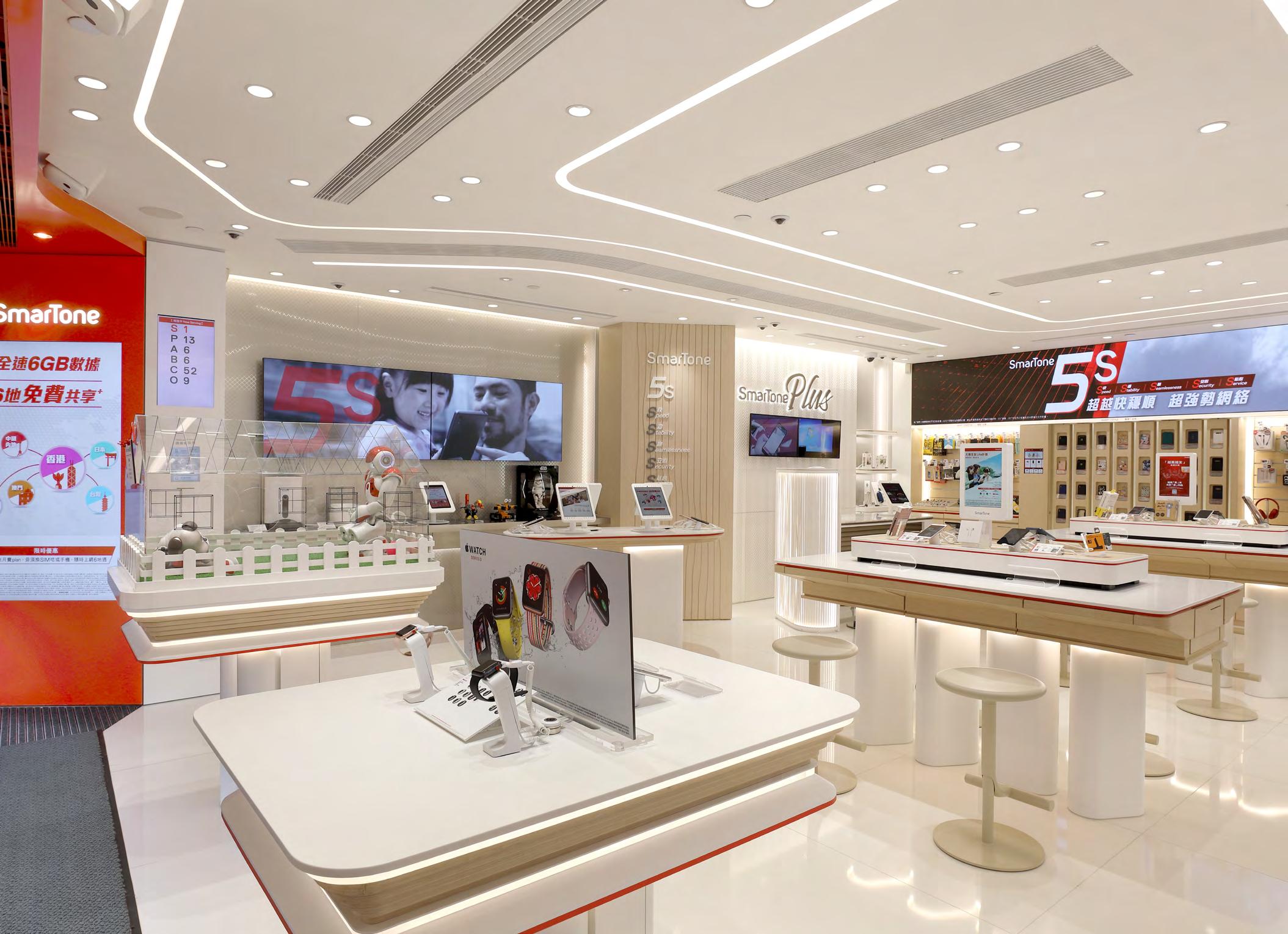
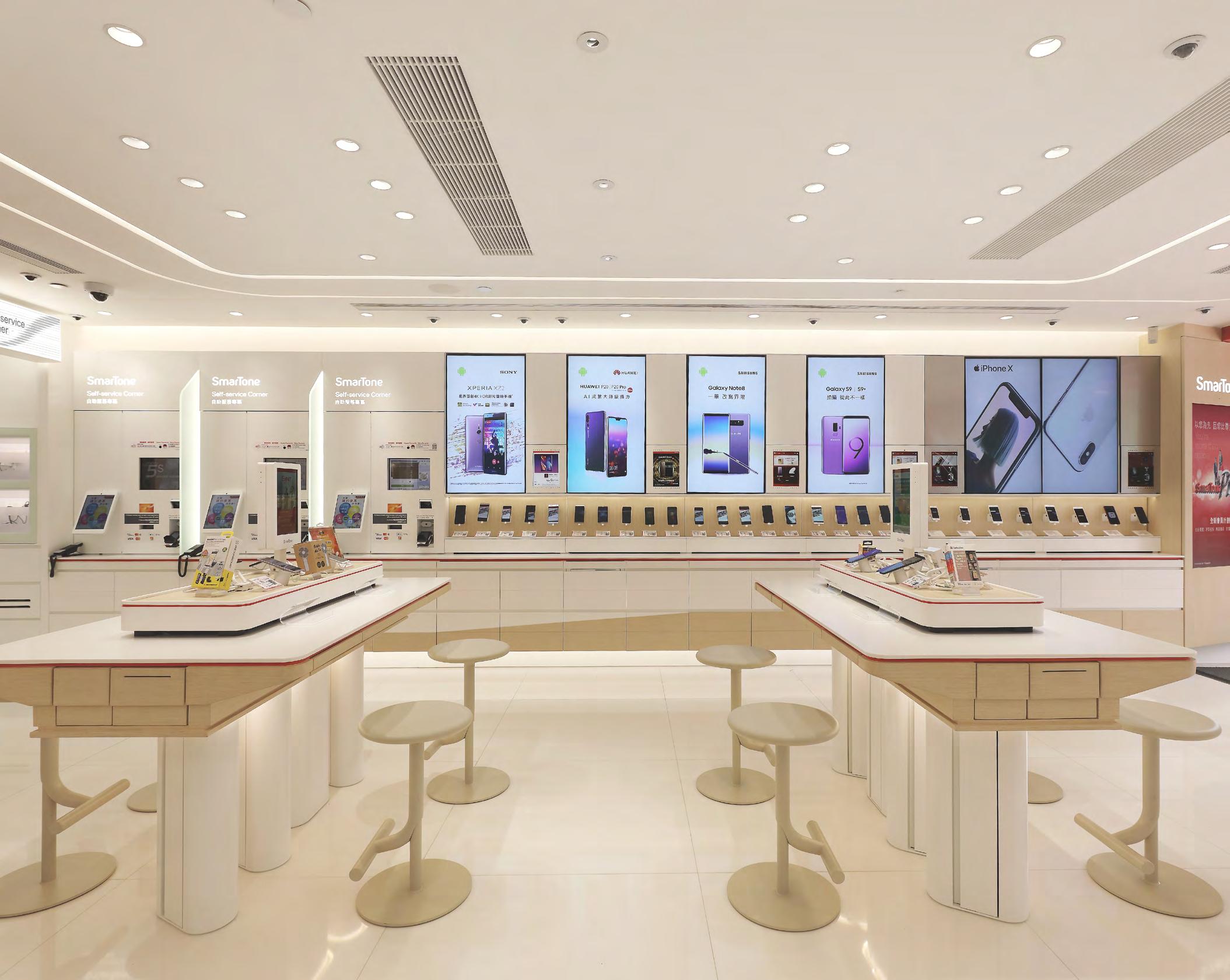
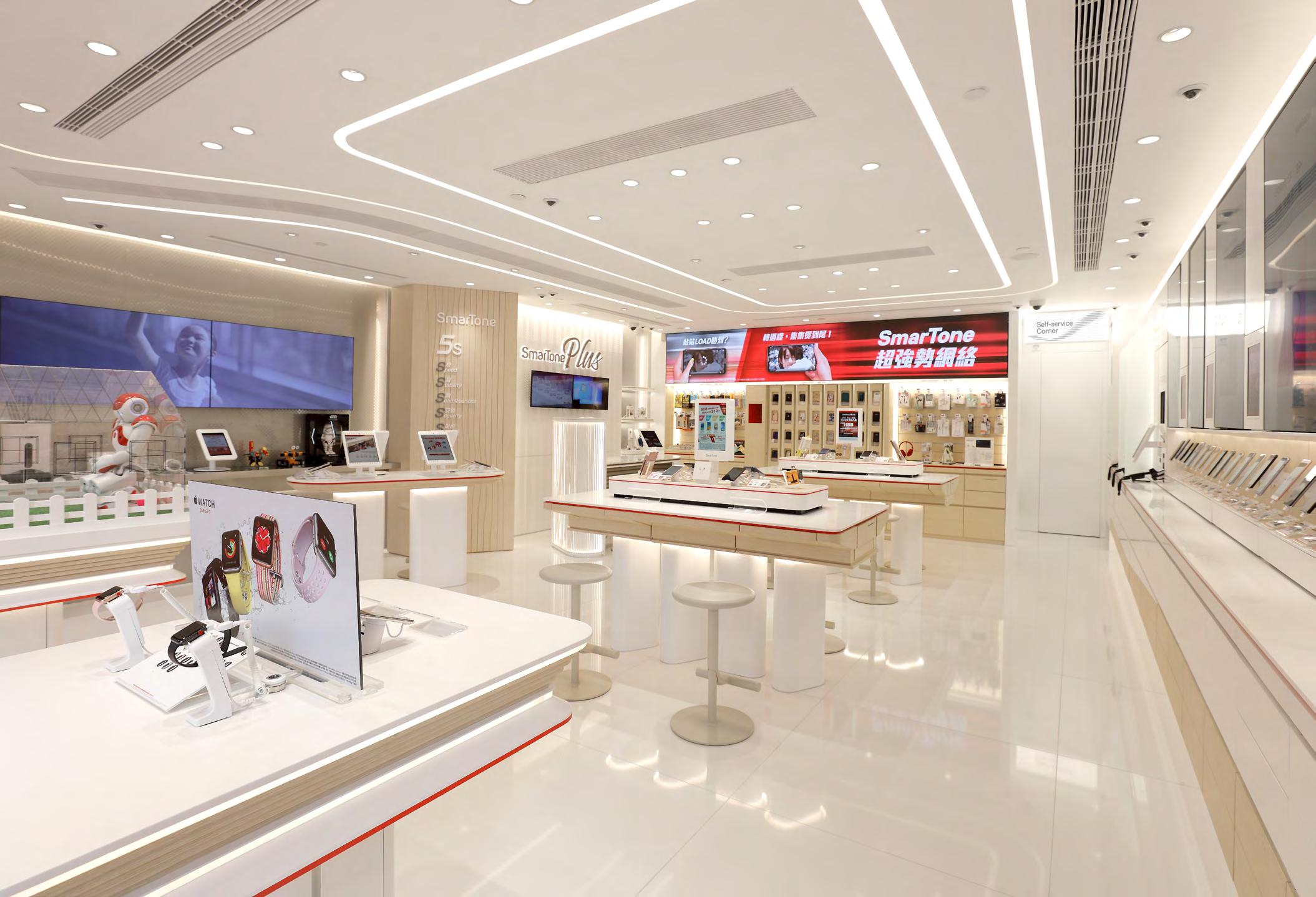
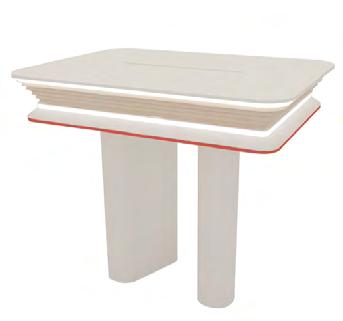
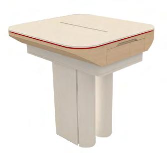
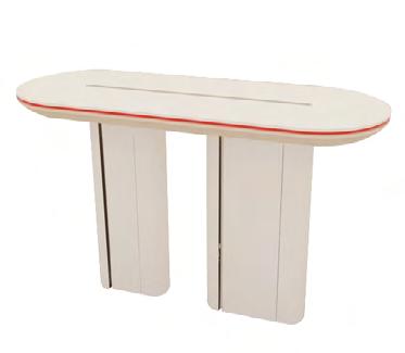
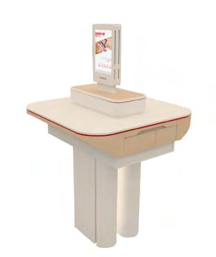
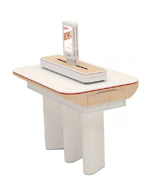
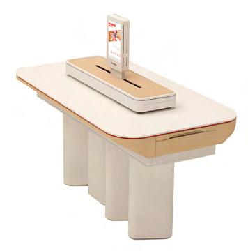
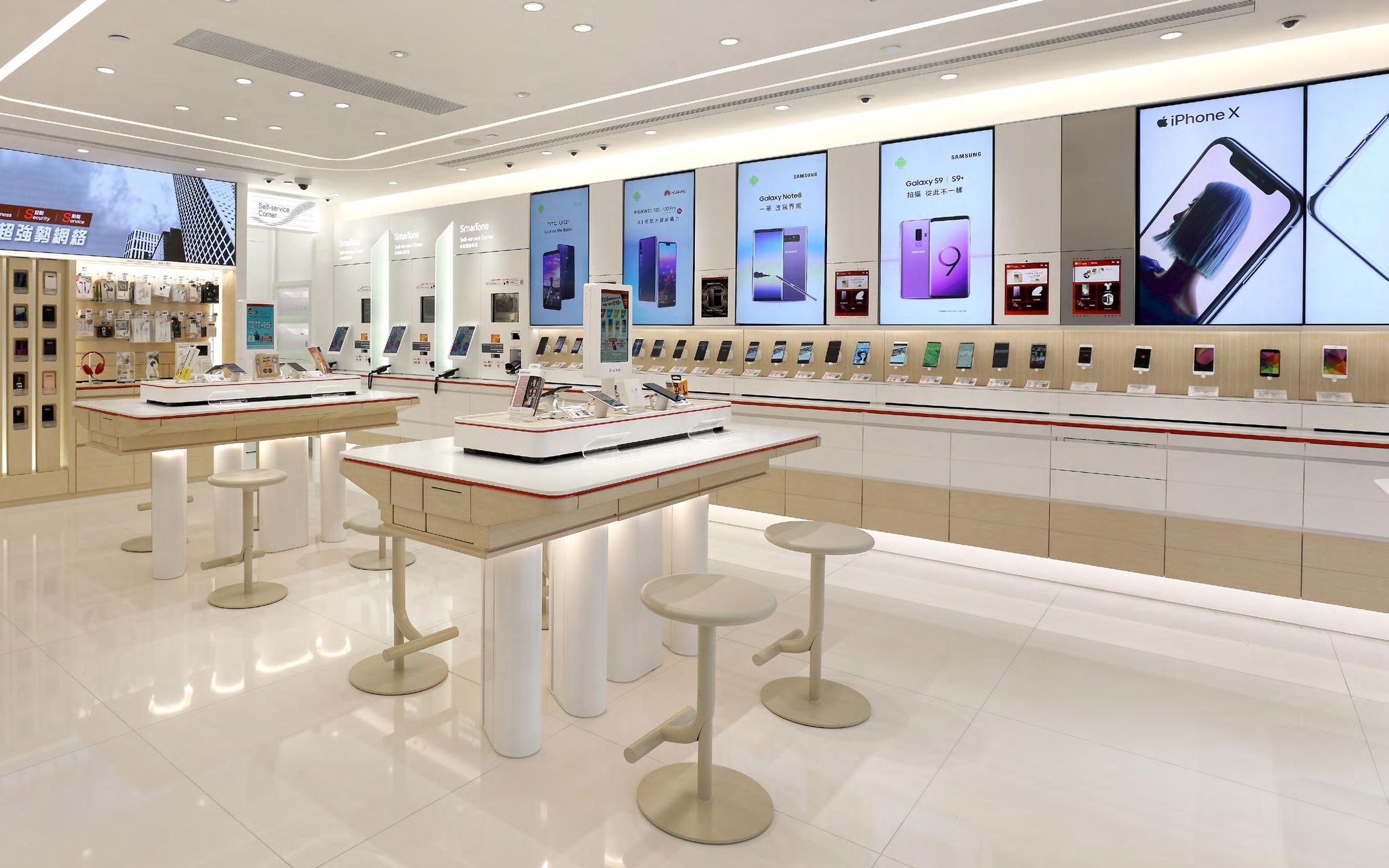
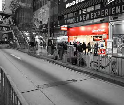
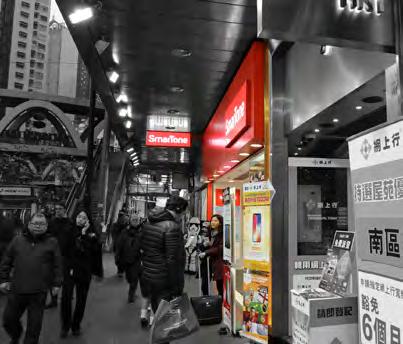
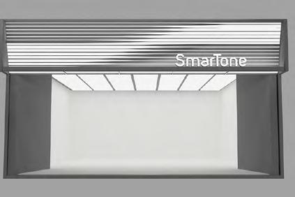
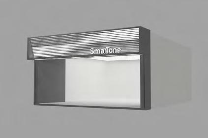
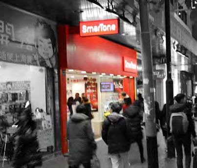
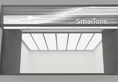
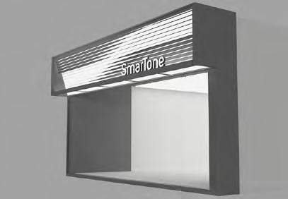
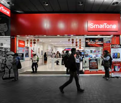
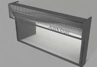
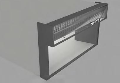
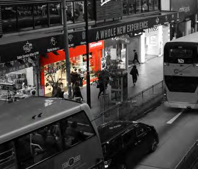
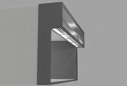
Twisting the Motion of Speed
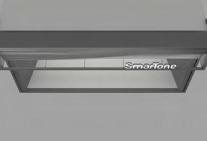
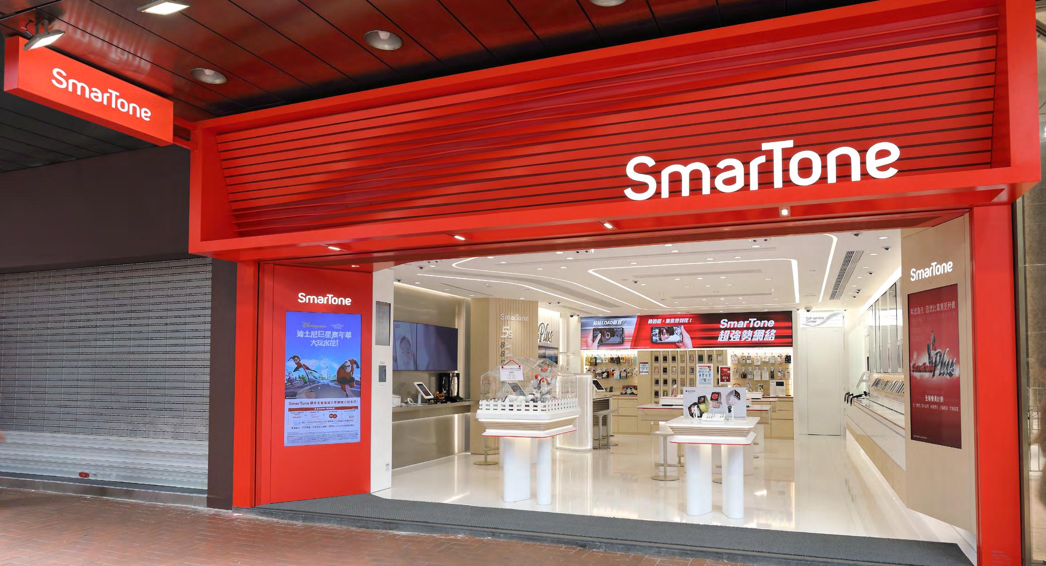
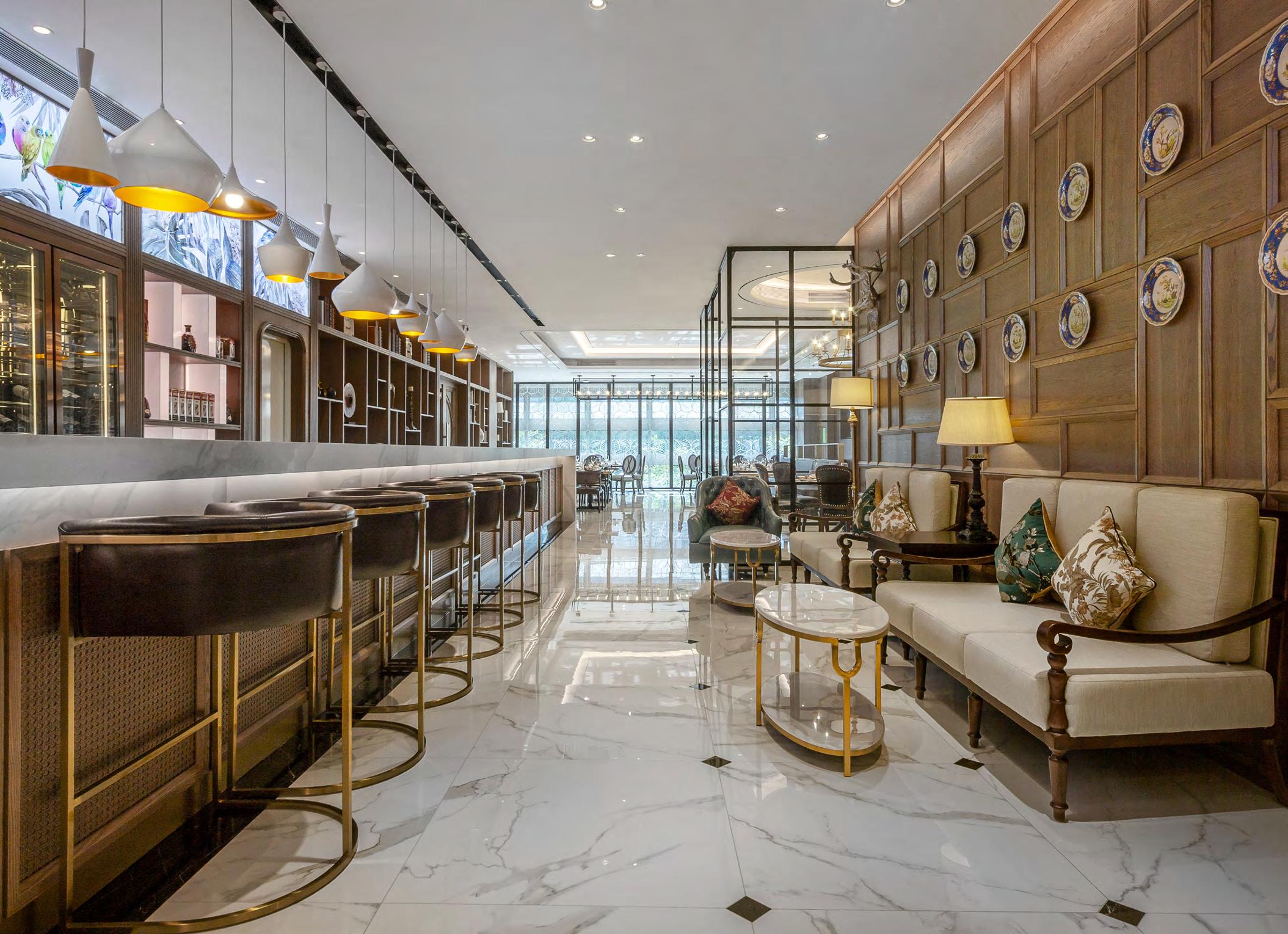
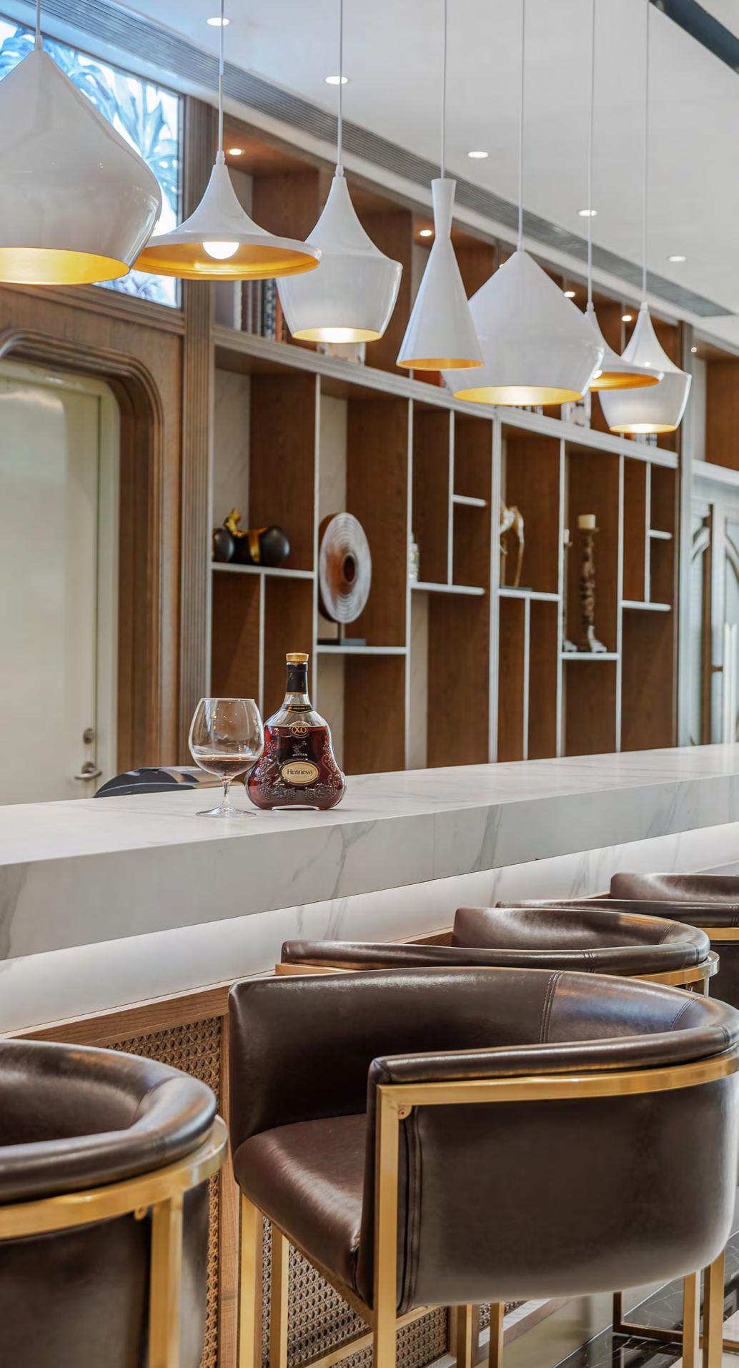
The late 2017, Smartone started the rebranding project for the new promotion strategy and image design which included the store design. The first scheme of the shop design is a concept store to promote the new design which is far different from the old scheme. In the new scheme, the requirement is needed to create a high-tech feeling with humanity,
We defined the requirement into few parts, “form and shape”, “Colour & Material”, “Feature part”, we have to stand out each part and we also need to make it connected. In terms of the Form and shape, The curvy and organic shape is creating the high-tech feeling, so we have the touch-ups on the detail like the table edge, the stands of display area, the panel area design.
Also, we have to use the graphic design to help us showing the promotion infomation, the signage, the secondary colour we added on the design, both of them we need to redesign from the graphic design guideline.
the keywords we have is “fast”, “speedy”,” homie”,” high-end”. So in the design we trying to create a new image to smartone.
The late 2017, Smartone started the rebranding project for the new promotion strategy and image design which included the store design. In the new scheme, the requirement is needed to create a high-tech feeling with humanity, the keywords we have is “fast”, “speedy”,” homie”,” high-end”. So in the design we trying to create a new image to smartone.
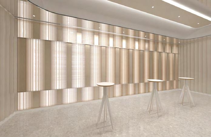
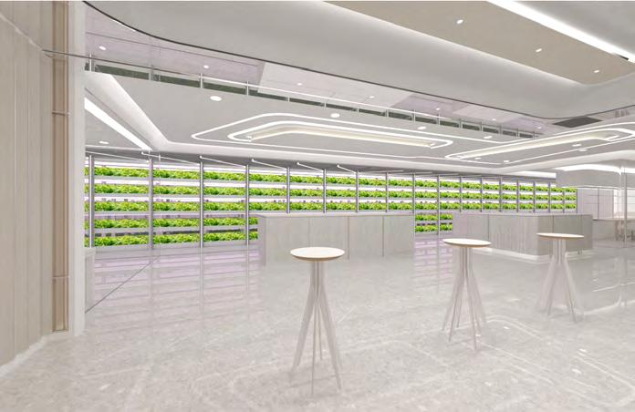
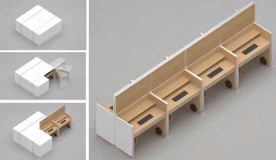
Pandora’s Box
Exploration of Transformation of the space
About:
“Open up Pandora’s box”
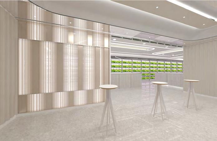
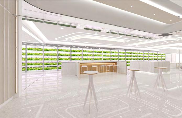
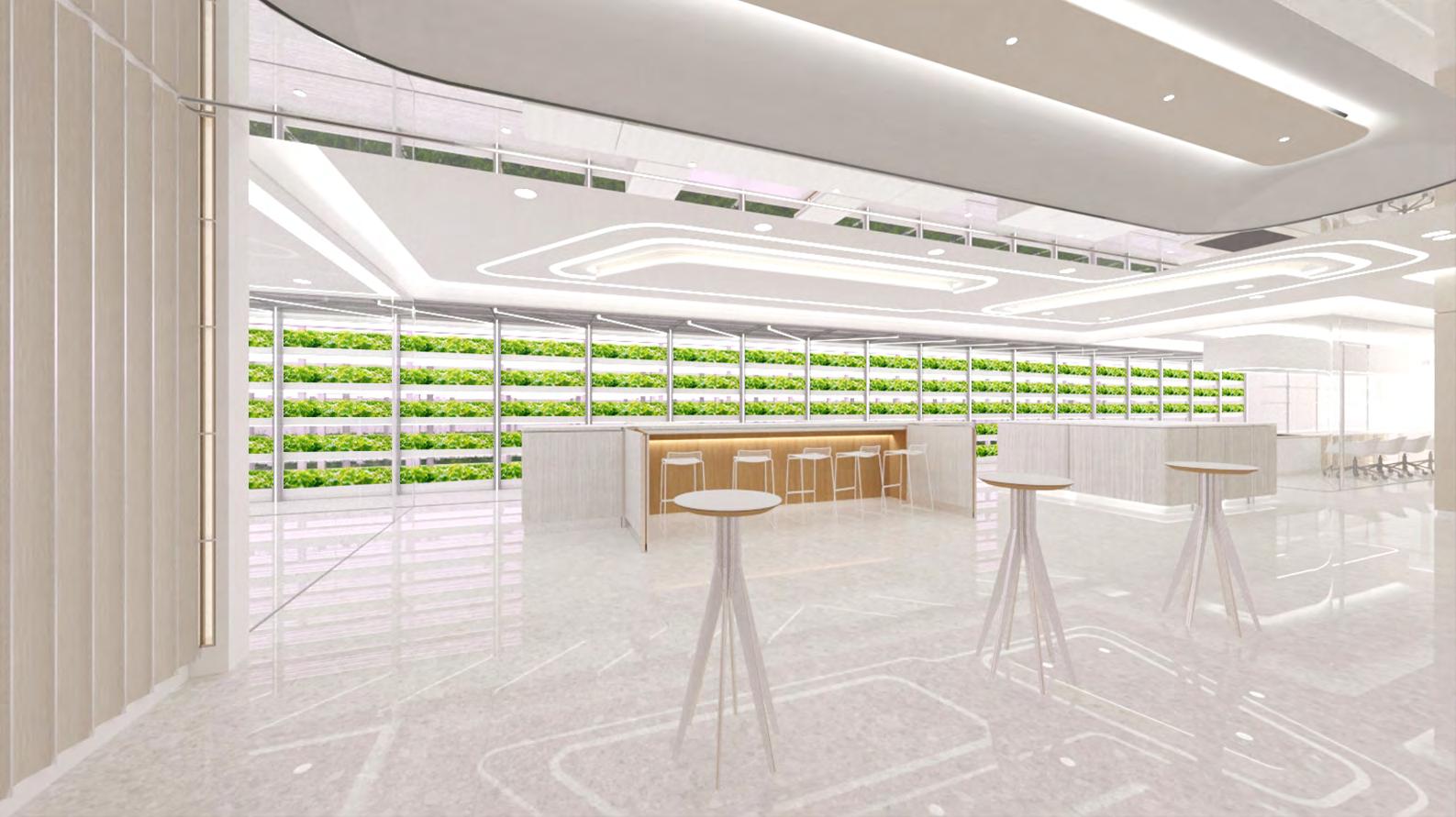
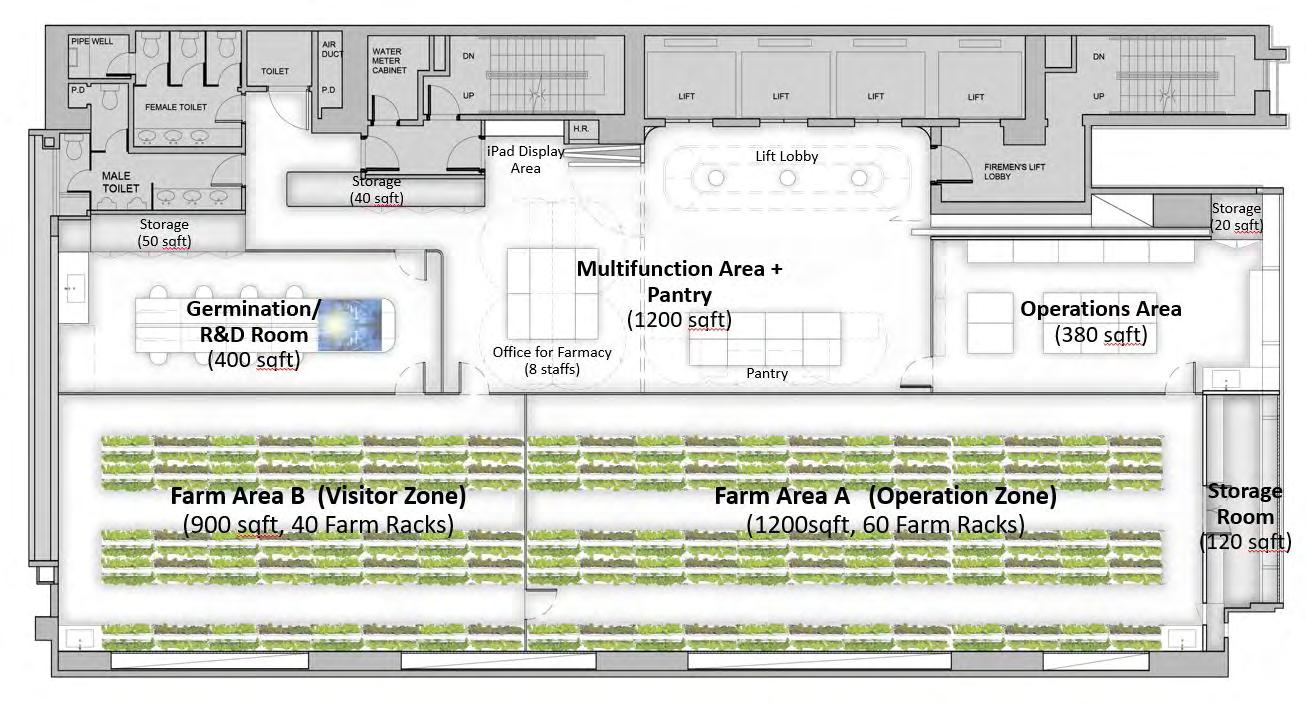
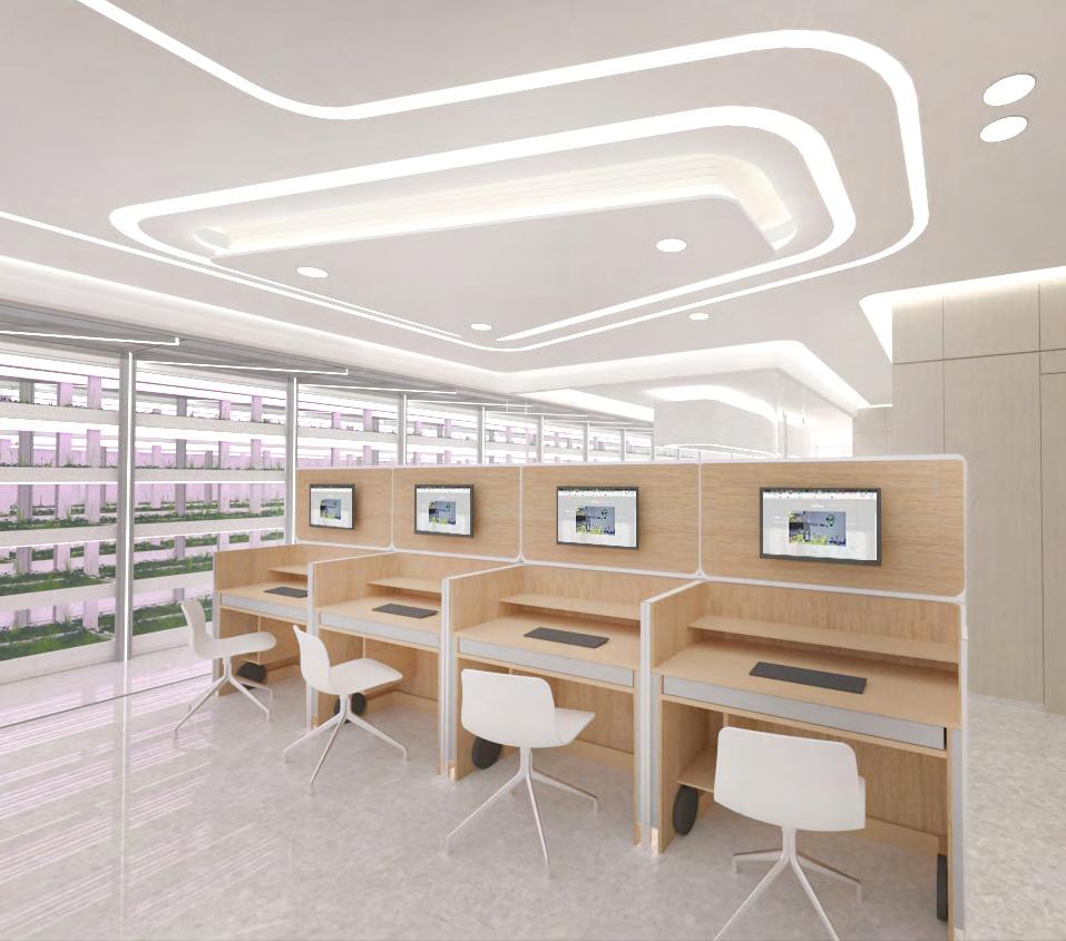
Smart Green Space aims to provide a unique experience for their visitors/ customers by enabling them to handpick the freshest, premium quality, and nutrient rich green produces.
Farm Area with full-height glass
enclosure is located at the center to showcase the new type of farming and bringing a new type of lifestyle to the public. The design concepts of “Futuristic” and “Immaculate” are adopted to strengthen the Brand image.
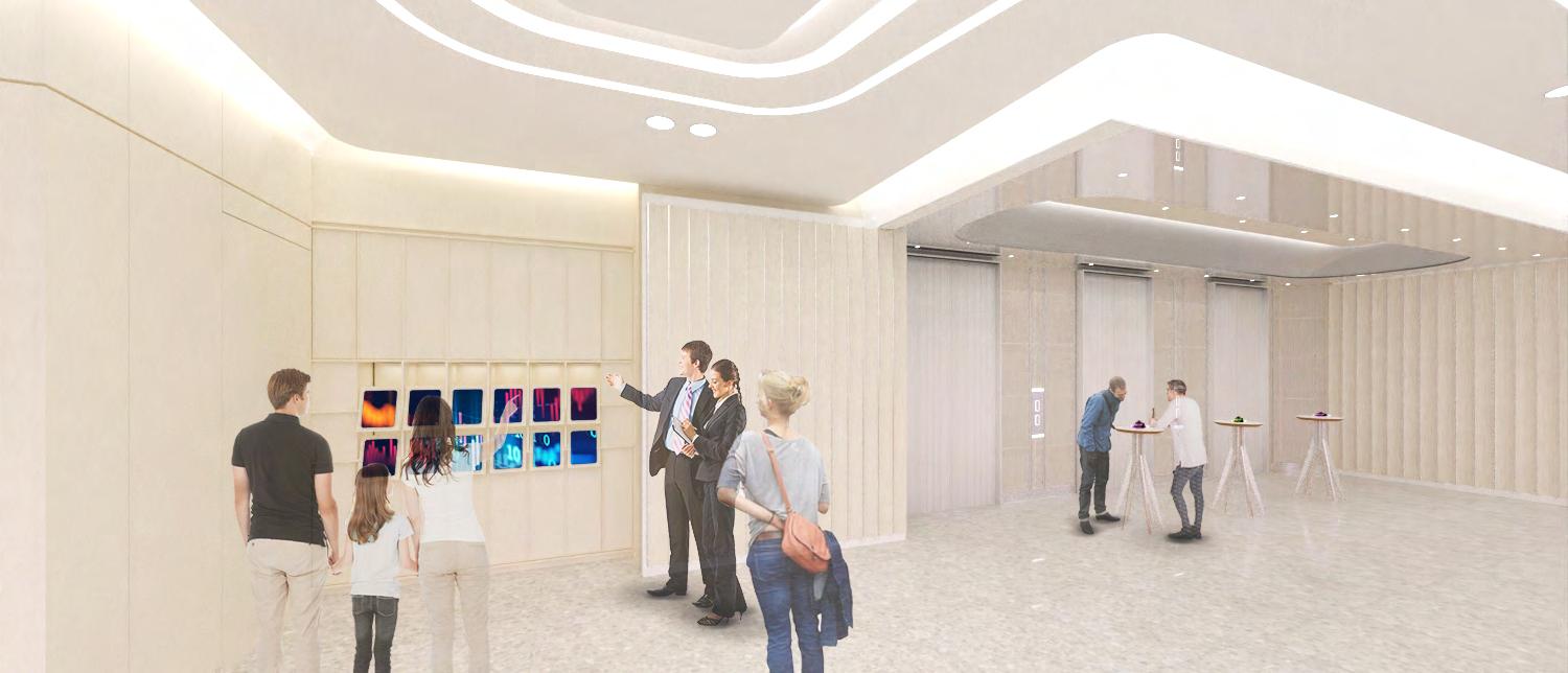
User Exprience
Since the victors won’t usually access the space, I designed the dramatic spatial changing effect by using the entrance gate, mobile furniture, and changes of lighting to create a unique experience.
We also design mobile furniture to engage the user to interact with the interior space. They can explore more fun elements from moving the object, changing their view.
The spatial planning & infra-structure provision are “Smart elements ready ” to cater for User’s future development.
The color scheme of the design mainly used palm white, metallic colour to represent the cleanliness and youthful spirit of the image and Farmacy.
The high contrast of black and white is introduced to create visual impact infographic on the glass wall and along the visitor journey.
Material selection:
We would apply the green material on different area that people can touch, feel and enjoy the space with green material, we hope the visitors can understand the green lifestyle is also interesting and meaningful from the feel and touch in the space.
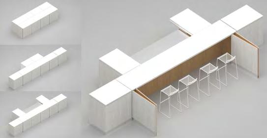
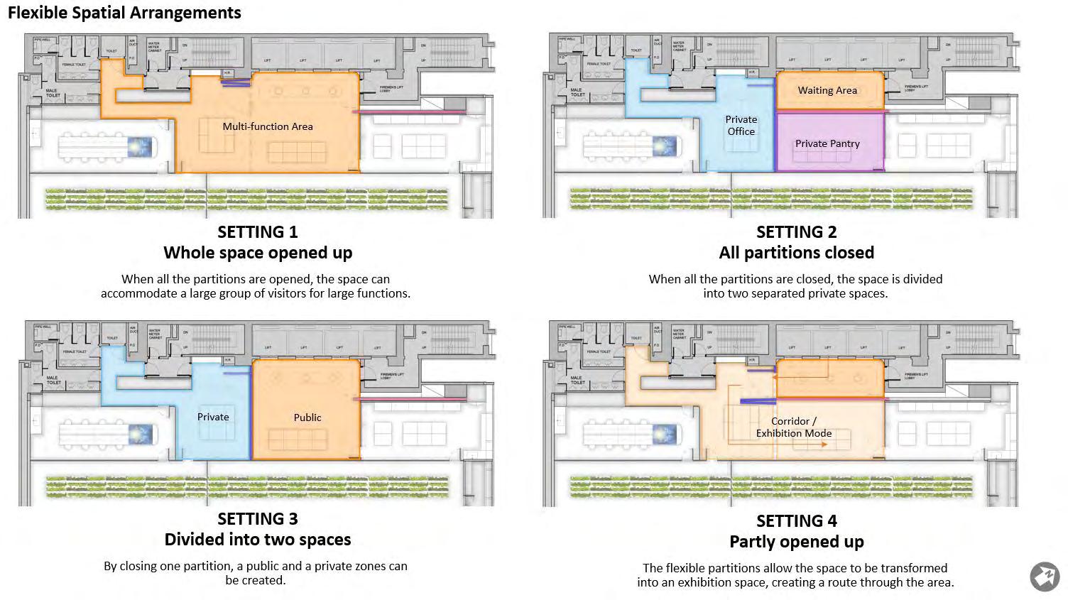
To maximize the functionality and flexibility of the space we designed the movable furniture to let it transform. We provided 4 different settings of different scenarios that the client will happen in the space. Also, we designed the program (gallery, private party, lecture, meeting space and etc) in a space that the users can transform the furniture function to create the space they want.
1.Entrance & Smart Play space
To giving them the first impression and the first activities the vistors can get one ipad from the smart cabinet. A mini game will happen here to interact with the vistors.
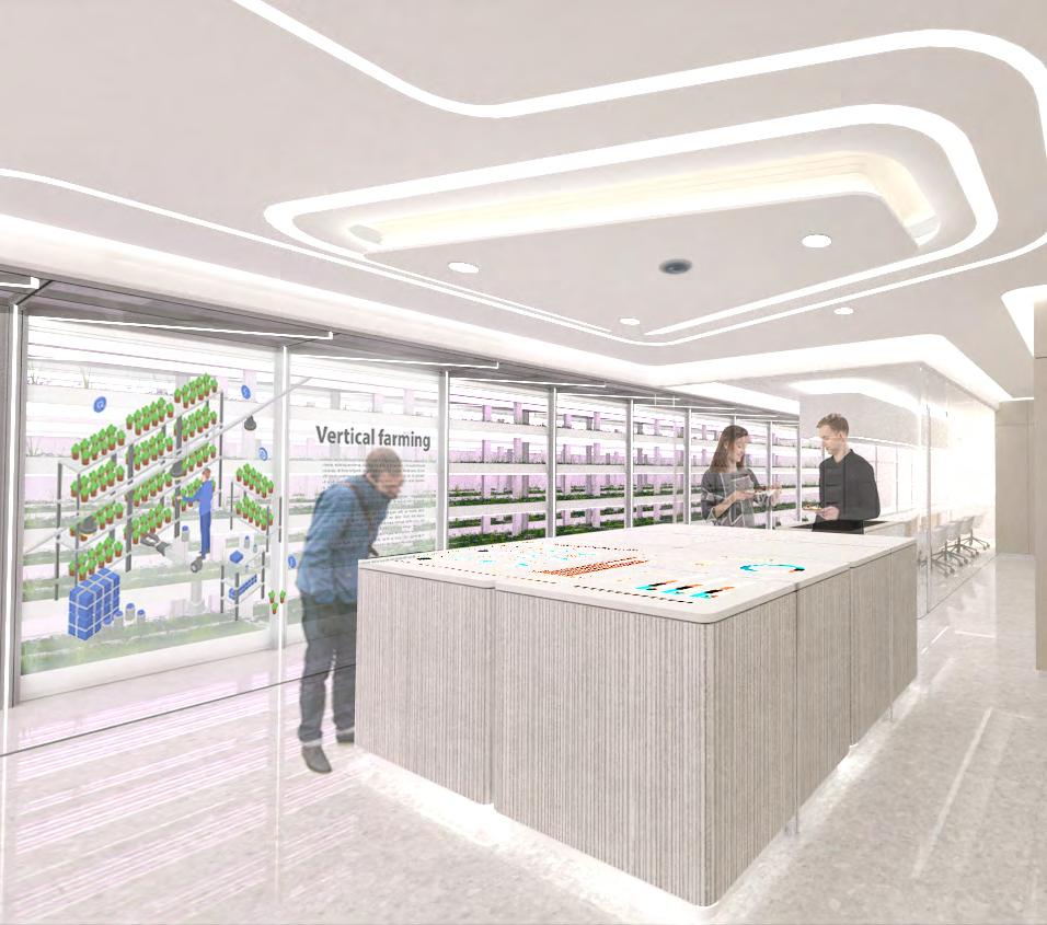
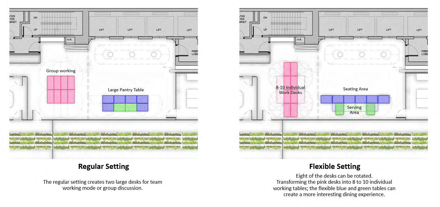
2.3. Smart table and office area
The smart desk can be the projection desk to show the infographic about the farm situration and the introduction. When they are not working, the desk can be transform into the office area.
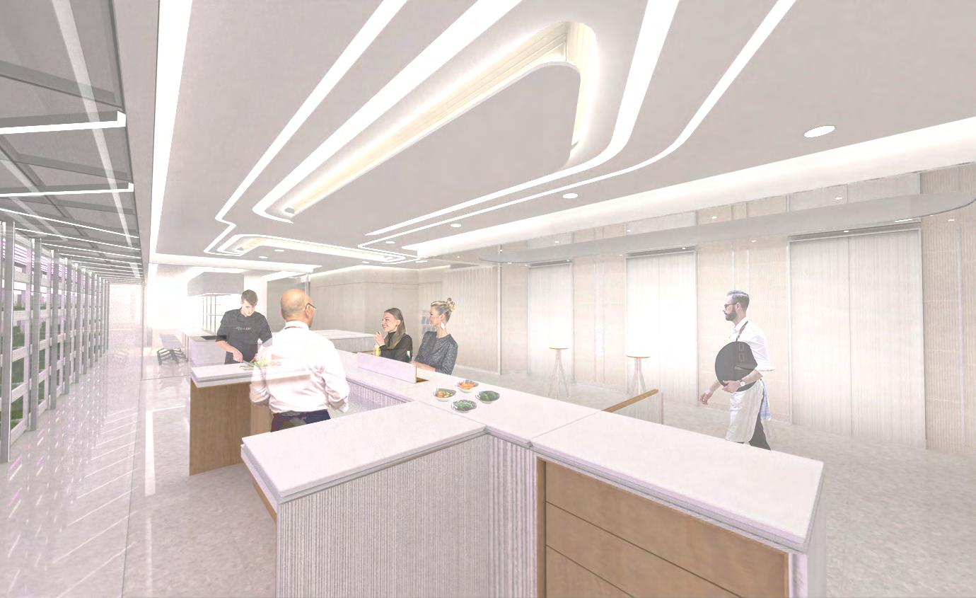
4.Mini Bar / Kitchen
We hope the pantry area can serve the mini dishes for visitors taste the fresh, enjoy the “Farm to Table” life style.
The Reception desk can changed into farm promoting area, dinning area, tasting area, that to attract people to enjoy the activities in the space.
Beyond the Experience
Spatial Design to discover the happiness
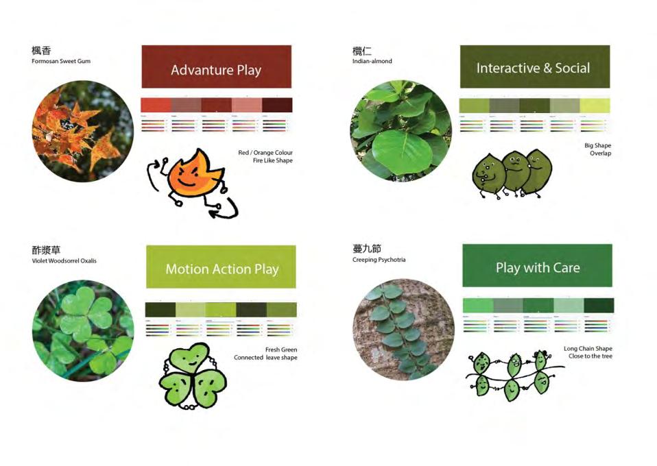
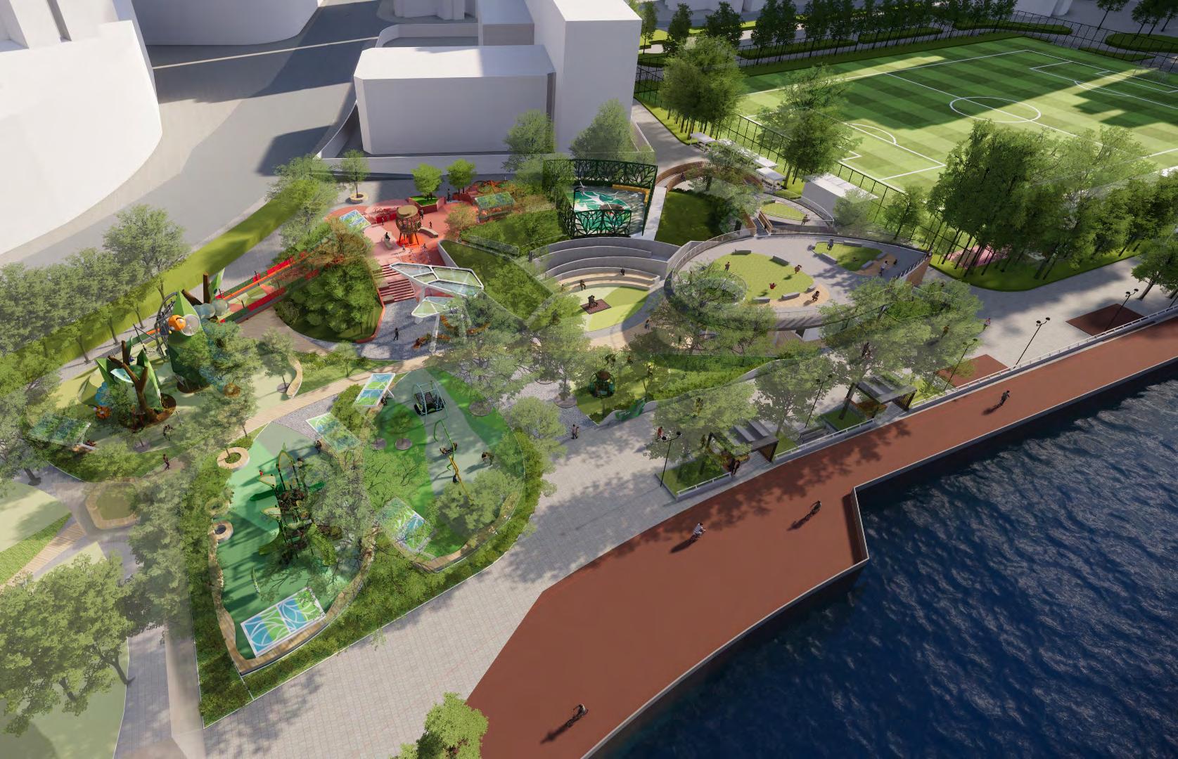
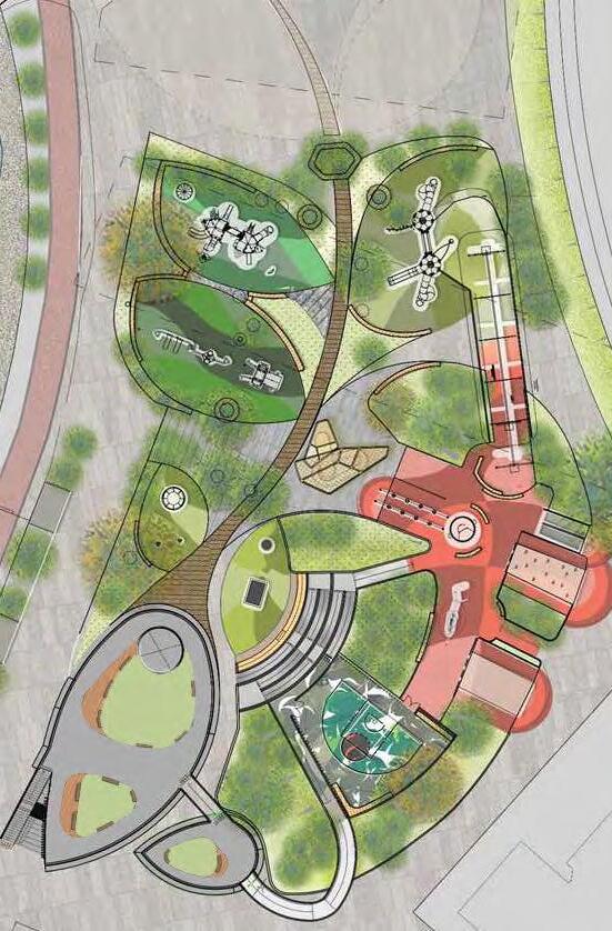
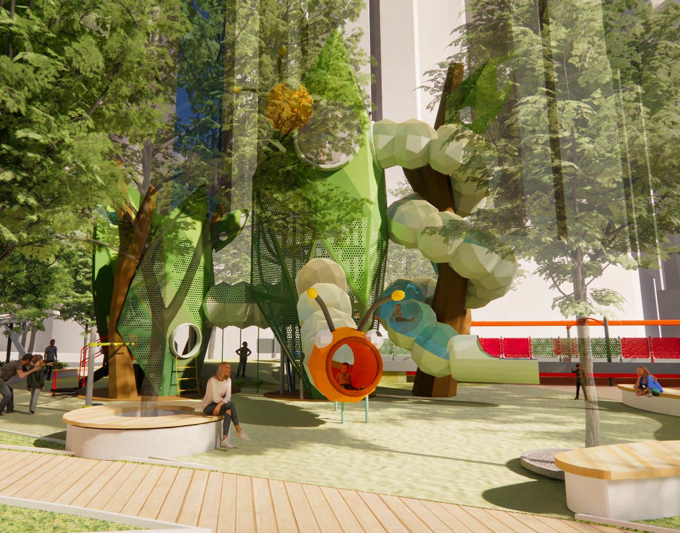
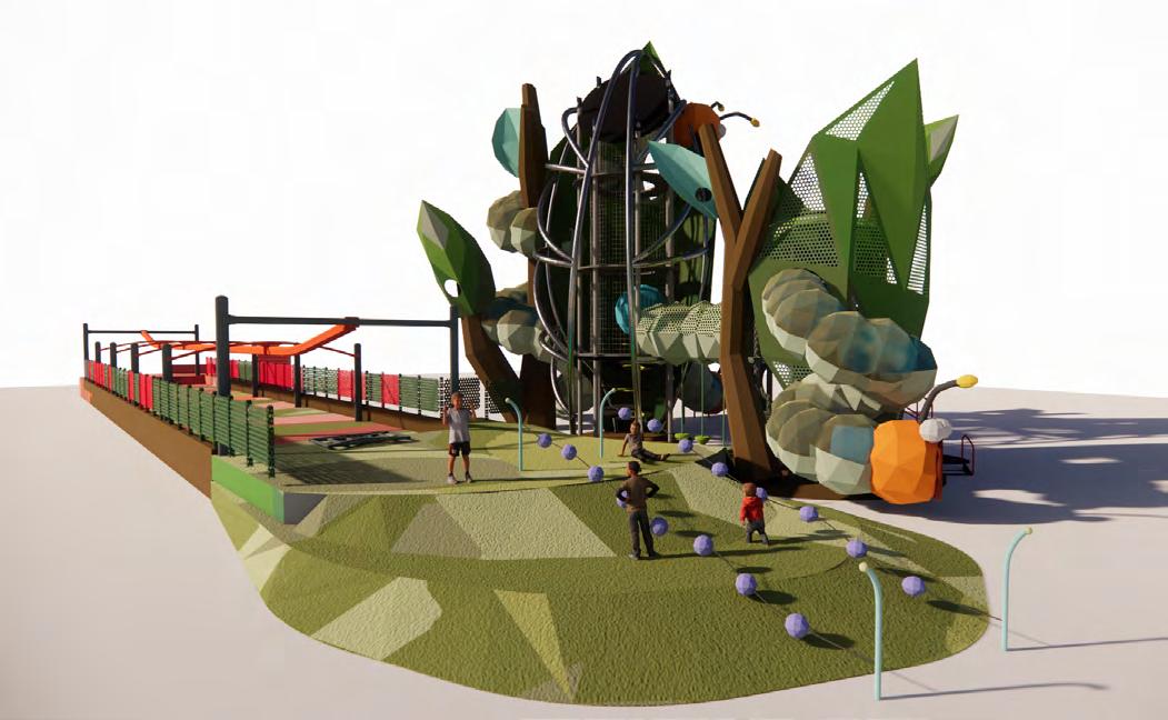
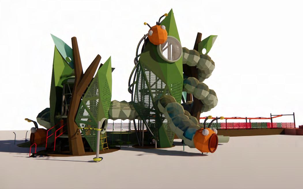
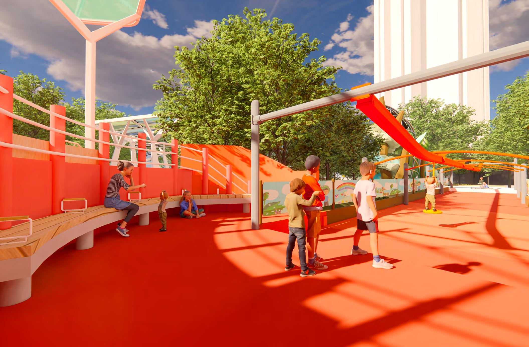
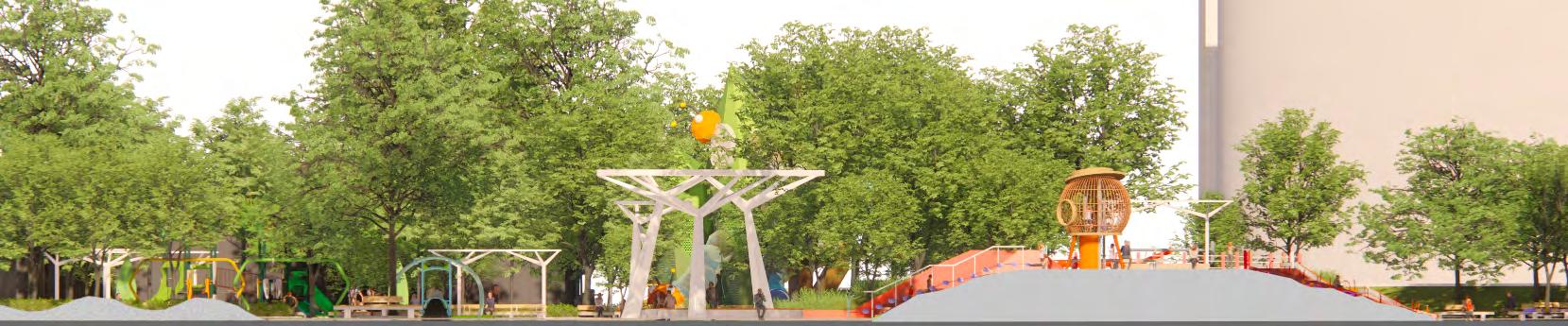
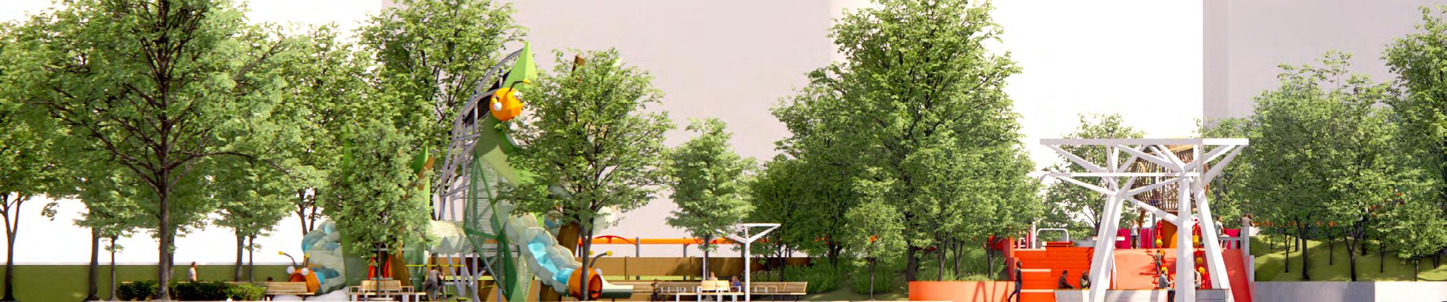
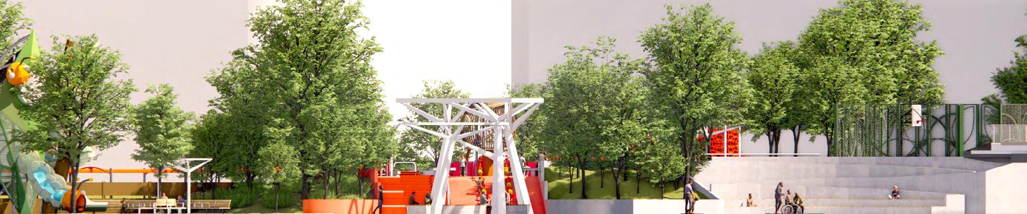
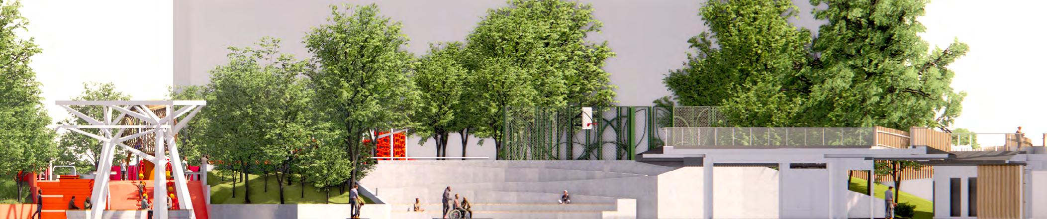
Wan harbor front area to recreate the new image for the communities. In the design scheme, we followed the previous “leaf“ theme as the backbone that developed the new design for the play area. And the requirement excited, inclusive play items for the kids who will come to our play area.
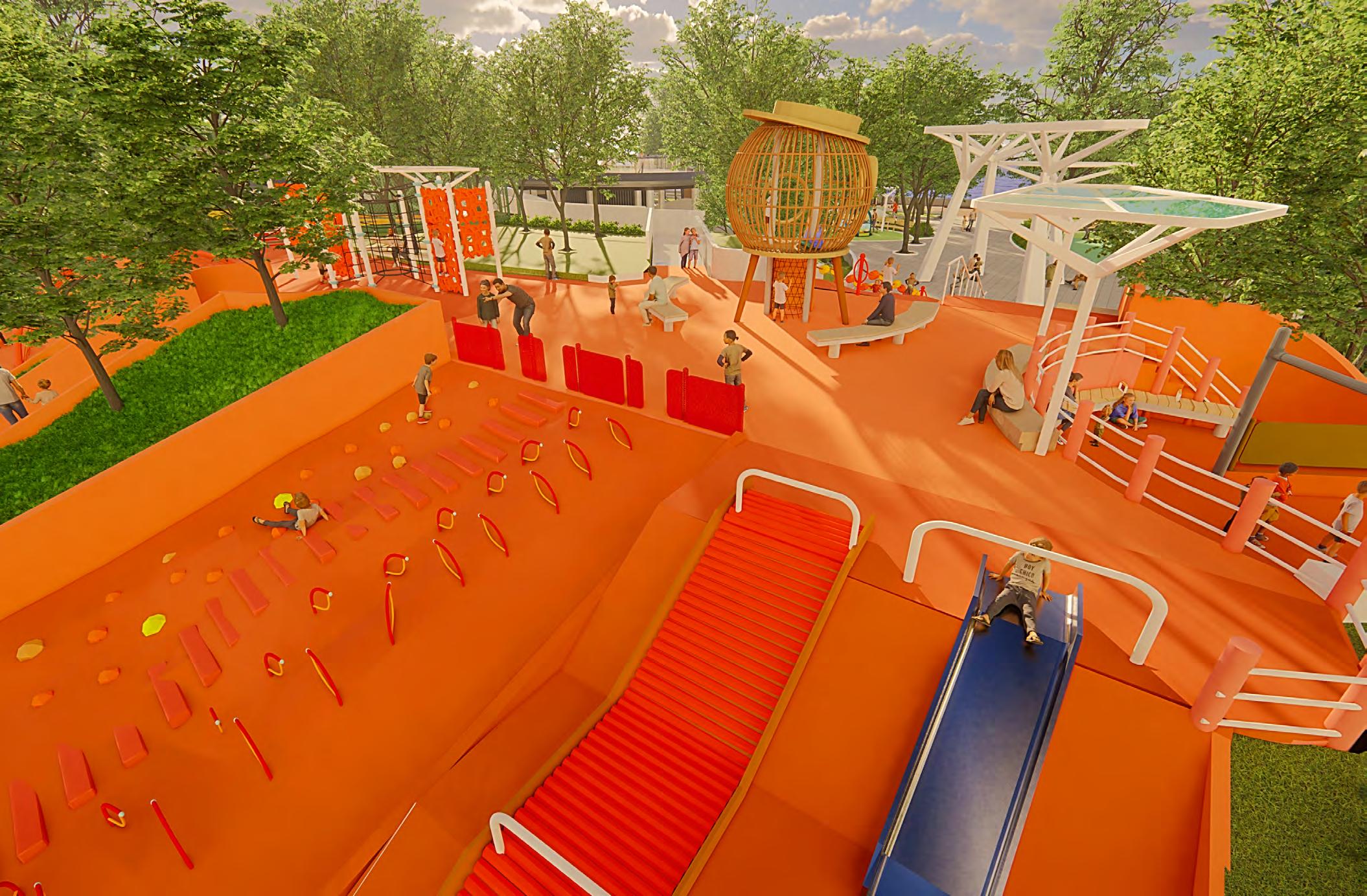
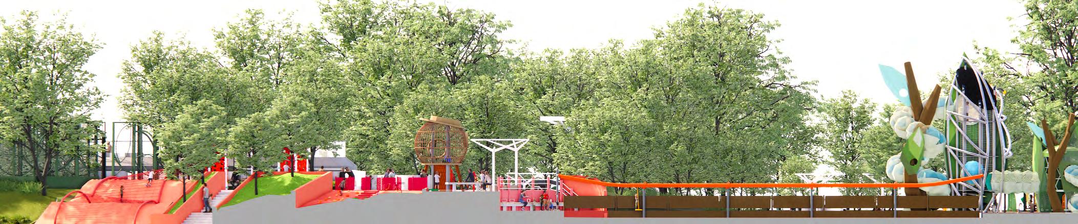
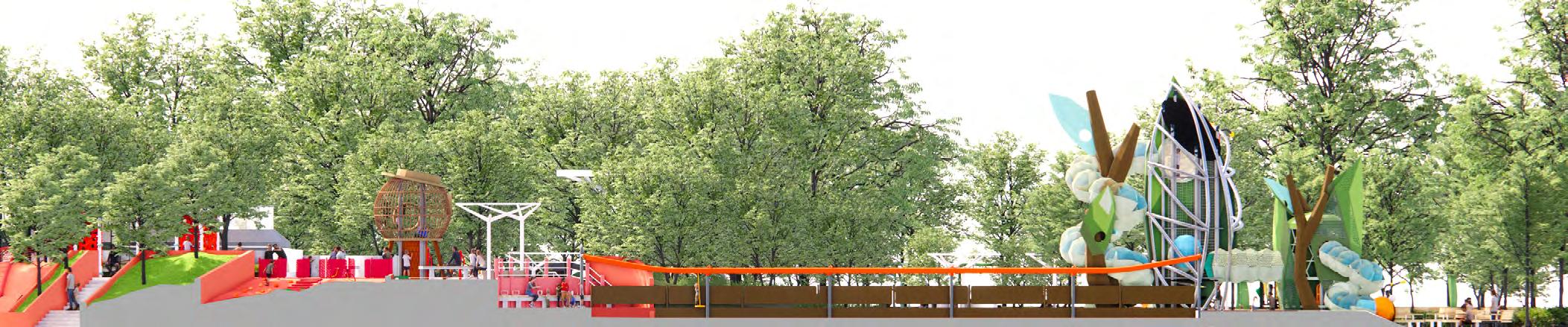
As we aim to preserve the park's existing trees, the layout updates are limited. Our primary task is to introduce a diverse range of recreational spaces. Additionally, we incorporate the waterfront theme of Tsuen Wan, which revolves around "leaves." The park's design concept revolves around the themes of "plant growth" and "branching patterns," with each recreational area designed in leaf shapes and organized based on their specific functions, such as swings, rotations, trampolines, and more. A prominent wooden deck serves as a central pathway, allowing visitors to stroll through the entire recreational zone.
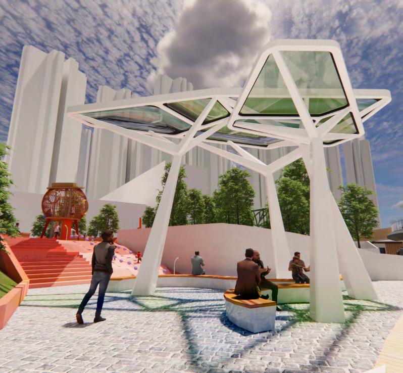
In line with our commitment to environmental conservation, the park’s design also emphasizes the promotion of eco-friendly practices. To this end, we have planned a pavilion at the park’s core, serving as a gathering spot and a tranquil retreat for visitors. This unique pavilion incorporates an innovative technology called AIPV, harnessing solar energy and converting it into electricity to
partially power the park. Inspired by the growth patterns of plants, particularly the intricate structure of lotus leaves, the pavilion stands as an eye-catching landmark at the park’s center, symbolizing our dedication to sustainability.
One of the park’s iconic attractions is a 10-meter themed slide, creatively designed as a dual tower with interactive elements inspired by caterpillars and leaves. What sets it apart is its integration with track-ride amusement equipment throughout the park, forming an exciting play experience. Children can effortlessly move from one area to another without any breaks, enjoying a seamless journey of play and exploration.
In the motion active zone, our goal is to encourage children to move freely and actively participate in play. Through a variety of spaces and facilities, we aim to enhance their physical coordination skills. Additionally, we have taken into consideration the needs of parents by incorporating designated areas for supervision and relaxation. This ensures that everyone can not only have a joyful play experience but also find suitable spaces to rest when needed.
Review & Rebuild the Memories
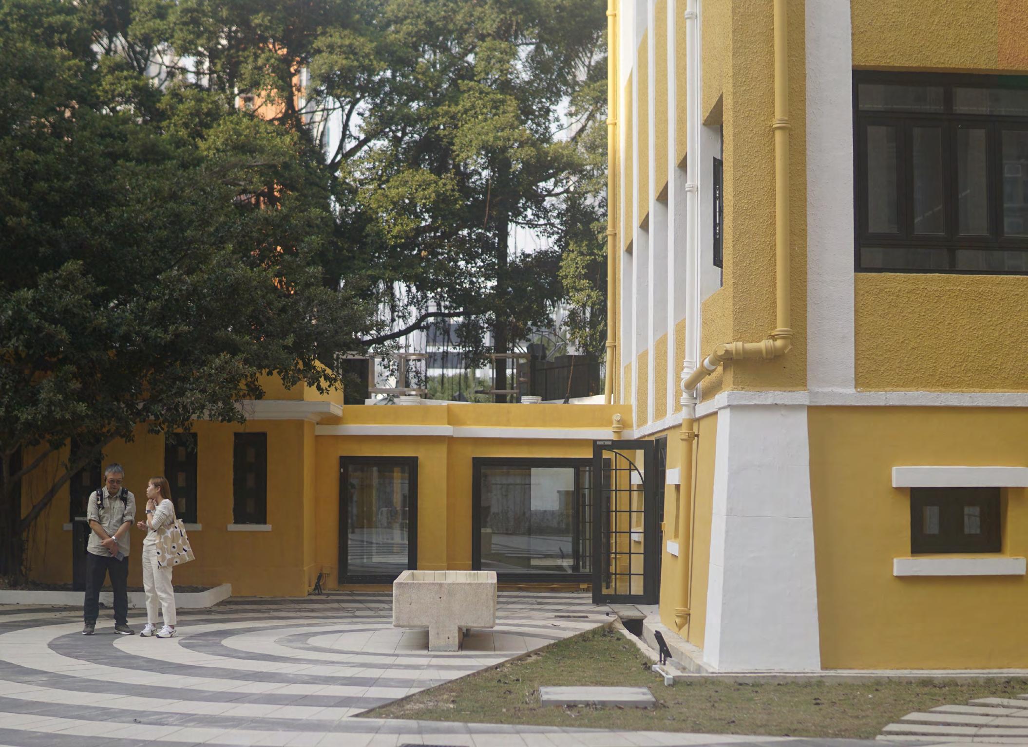
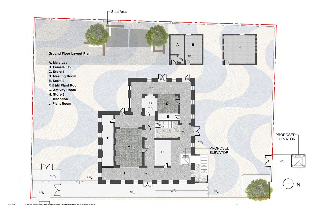
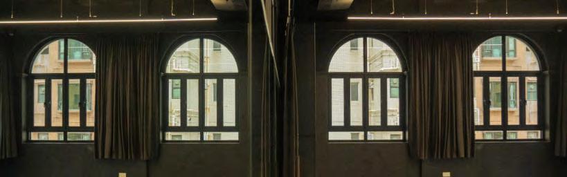
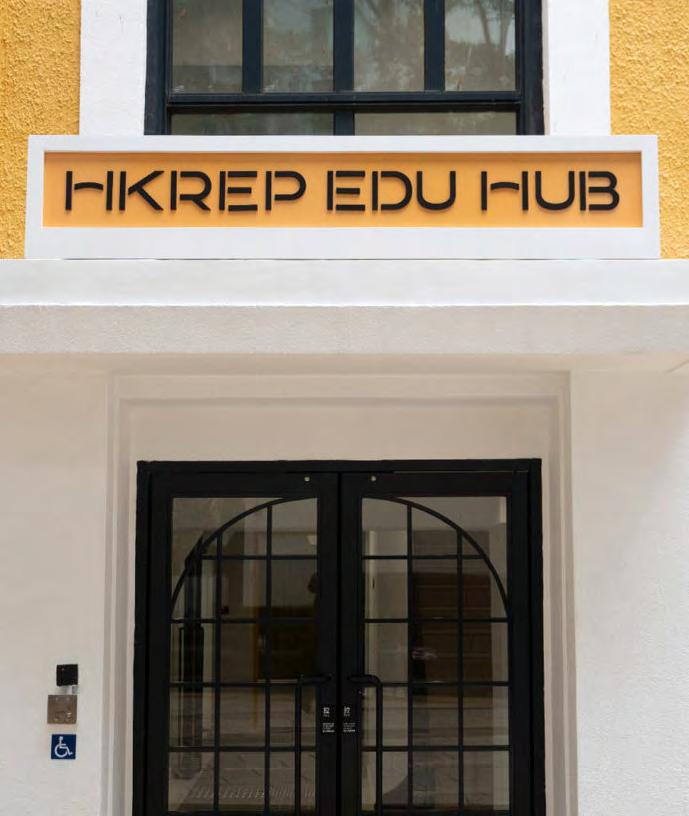
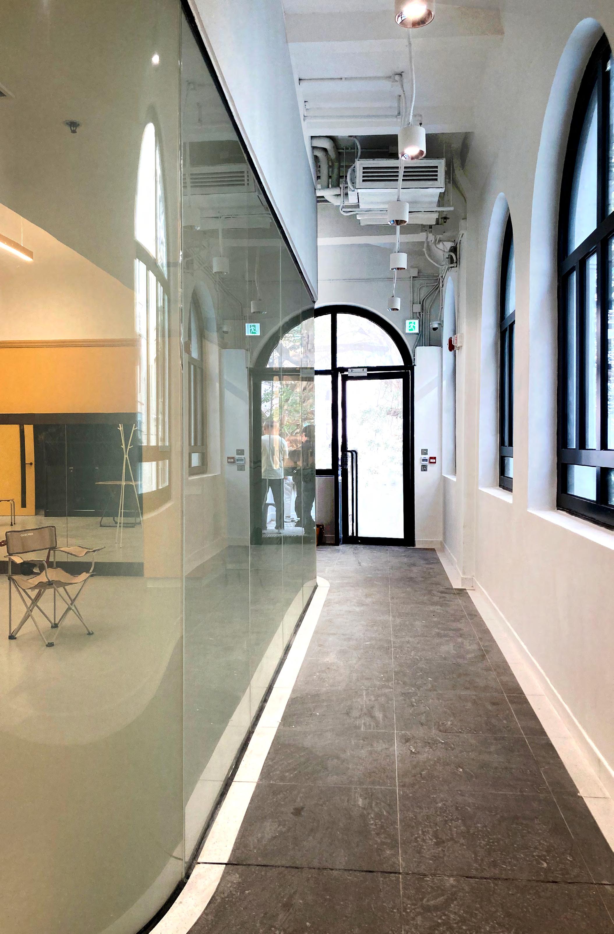
Portuguese Community Schools, Inc., Escola Camões, located on Kowloon’s Cox’s Road, is a Grade II historic building that has undergone renovation and is now leased to the Hong Kong Repertory Theatre for use in their drama education programs.
With the Hong Kong Repertory Theatre taking over, we as the
designer revitalized this vacant old building, which had been unoccupied for 12 years, by giving it a fresh coat of Portuguese yellow paint. After its official reopening, the building exudes a long-lost vitality, fueled by the passion of the theater staff and students for the stage.
In addition to preserving the historically significant elements, suitable new facilities were added to meet the needs of the modern era.
Prior to the Hong Kong Repertory Theatre’s acquisition of Portuguese Community School, they conducted research on the building’s architectural history and discovered that the rooftop had been damaged, possibly during World War II, resulting in leaks. Therefore, they decided to incorporate a new creative idea during the revitalization process by transforming the rooftop into a skylight.
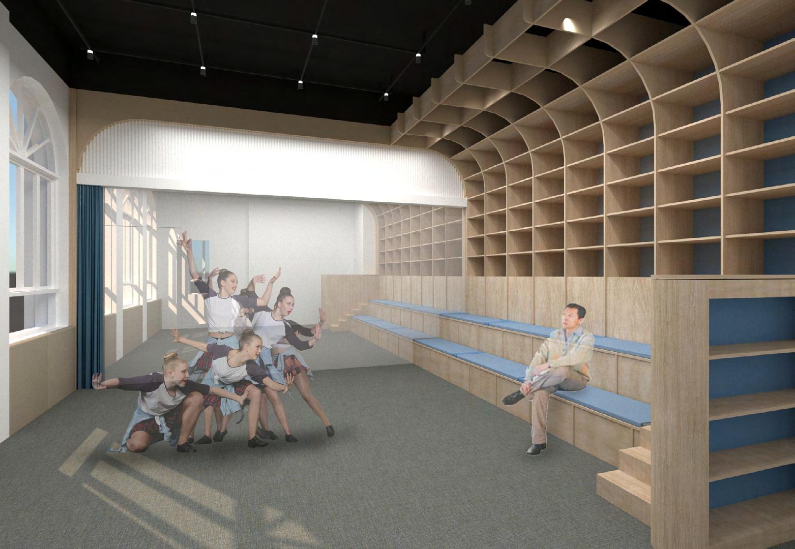
In the overall interior design, the most emblematic architectural shape of the building, the arch, serves as the focal point of the design. It is incorporated in various ways, from the curved edges of the room’s exterior walls to intricate placements on the ceilings.
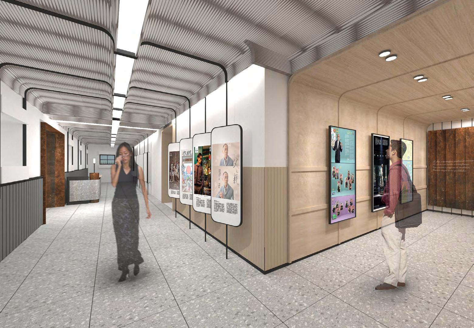
In the underground exhibition area, the arch design serves a dual purpose. Firstly, it functions as a window to allow natural light into the space. Additionally, the black-framed design will serve as a display cabinet in the future, resembling a stage box. This display cabinet will showcase the evolution of theatrical forms throughout different eras, providing the audience with a more visual understanding of theater.
Shifting the Edges
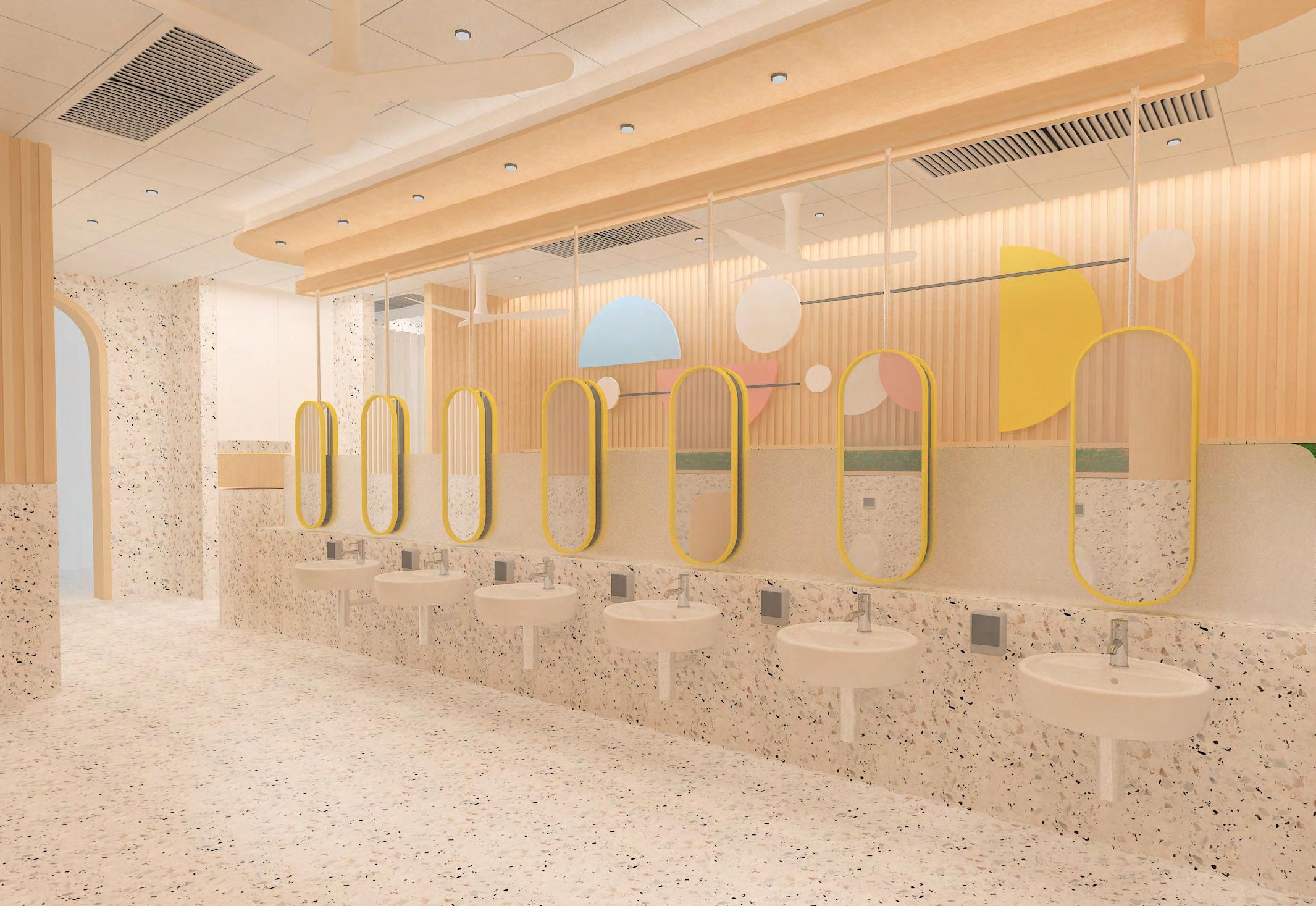
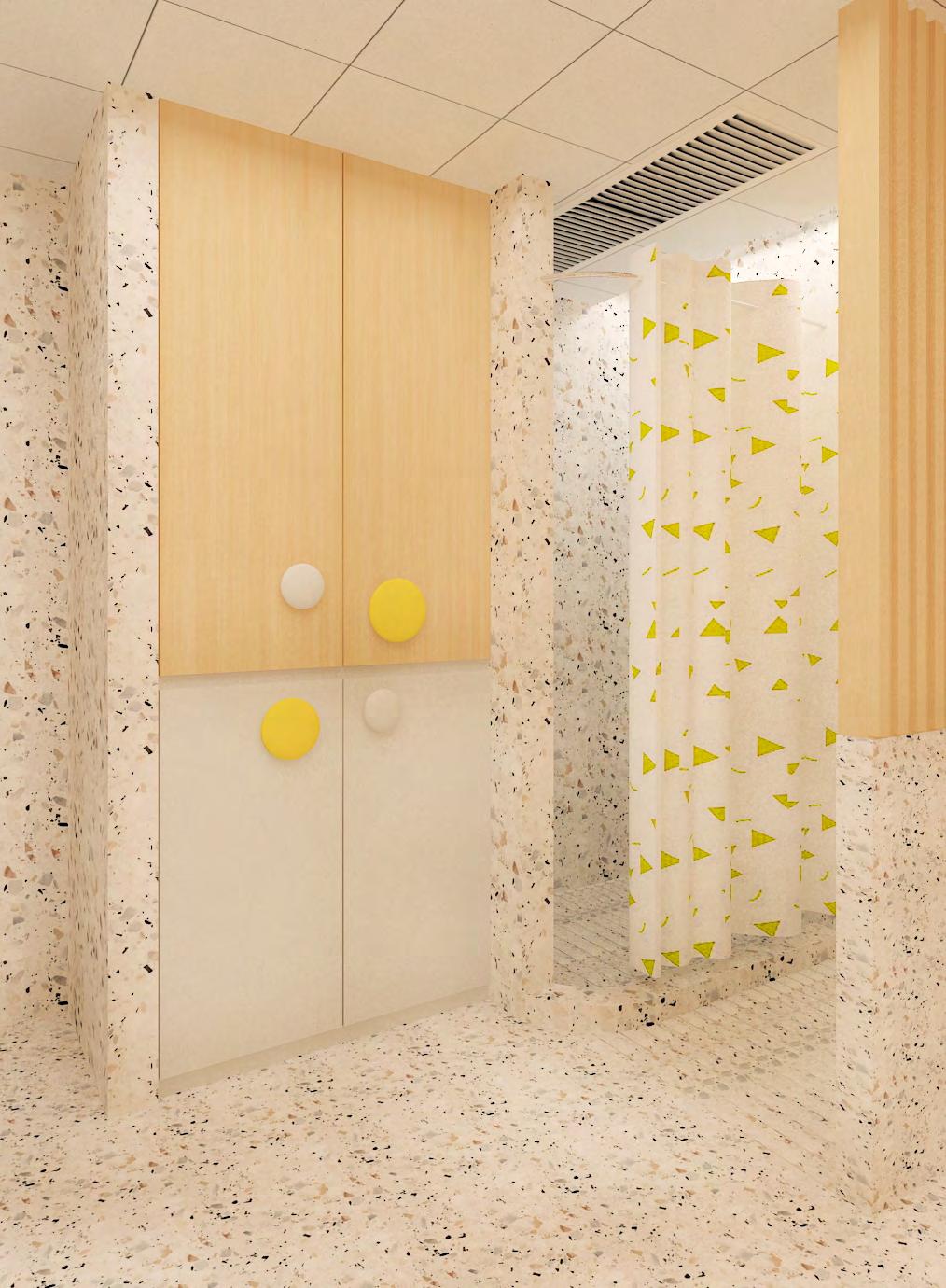
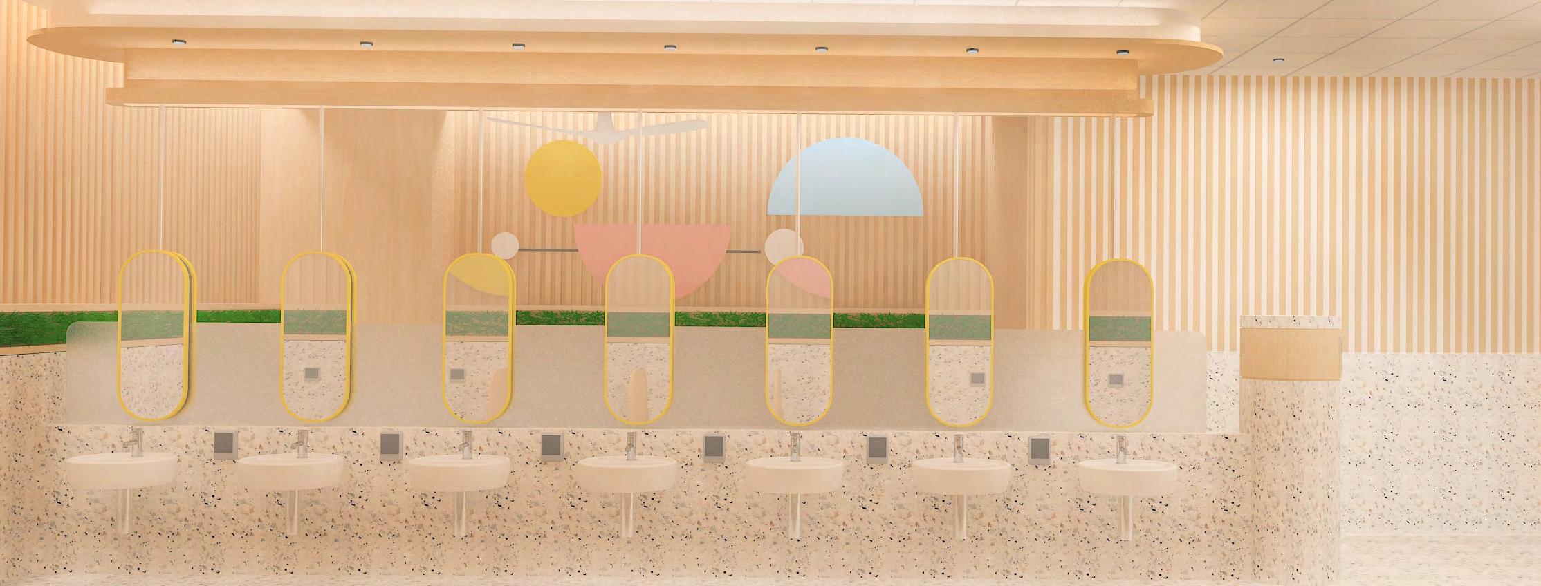
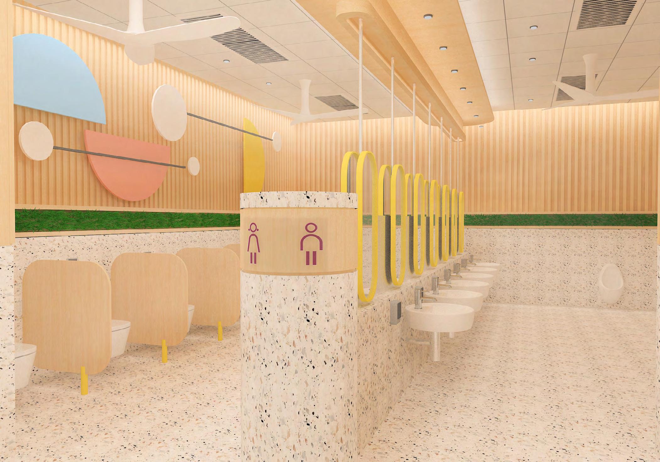
Washroom of St. James Settlement Belcher Kindergarten
James Settlement Belcher Kindergarten, Wan Chai
This is a toilet renovation project in a kindergarten, also one of the branches for testing the new design theme is suitable to put into the whole kindergarten construction design. The design approach is mainly using the geometric shape to create the design concept, and the material and overall feeling should be harmony, warm and energetic.
The main design feature in the space is a shelter in the middle of the site which is creating the atmosphere is exploring and finding something interesting.
The shelter area can also bring a cozy feeling to the kids which is let them feel like walking into a safe house. We hope that the children can learn how to clean and how to go to the toilet with fun.
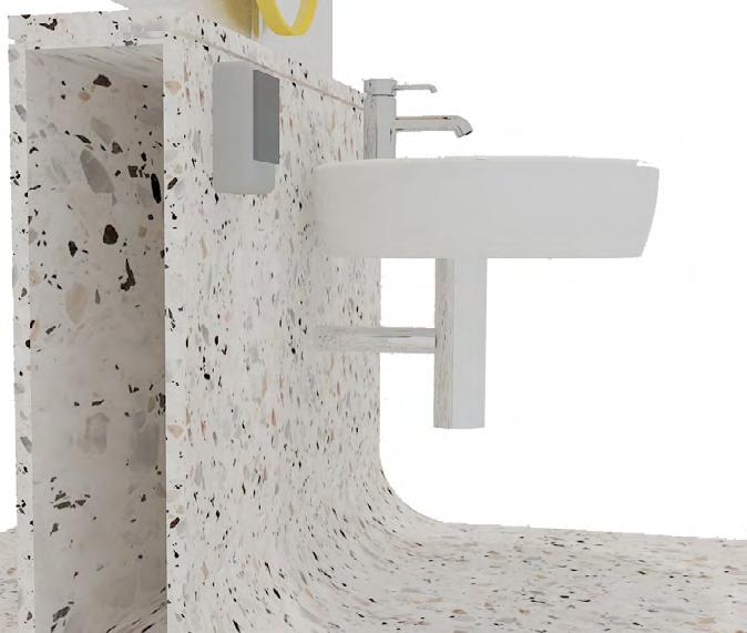
The main tone we want to create is warm and energetic, so the material combination we selected is terrazzo, wood and one key colour for the main identity.
Terrazzo: we used the custom-made colour stone, the chips are green, white and yellow with various size, the base colour is rice white. The overall feeling of the terrazzo is warm with jumpy colour, the high contrast colour doesn’t make it feel dirty.
Yellow Powder coating: The main identity colour is bus yellow, which is high saturation and created a warm and energetic feeling.
Green Deco: We added the green plant deco to create the highlight in the space.
Wood finish: to create the warm and clean feeling, we chose the washed ash wood veneer finish as the shelter, partition and the top of wall part.
The main identity colour is bus yellow, which is high saturation and created a warm and energetic feeling.
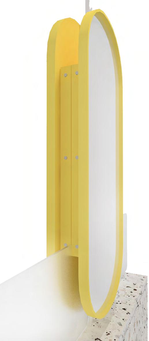
The design language we applied in this project is repeating the oval shape, we mainly applied on the mirror, partition, the shelter, and the door design.
Using different size, distance to create the variety and the visual interest.
We using the column as the spatial partition to divide the boys’ and girls’ area. We don’t use the full height wall to make is separate rather than applied the
frosted glass, mirror and the column. The advantage of the design will not block the lighting and the open area can help the space feel bigger. Besides, one more practical reason it can help the teachers monitoring the students prevent the happen made and teach them how they clean more efficiently.
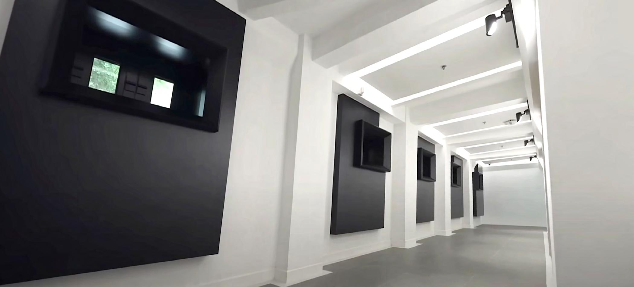
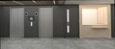
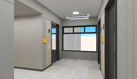
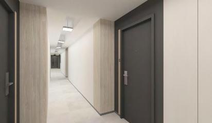
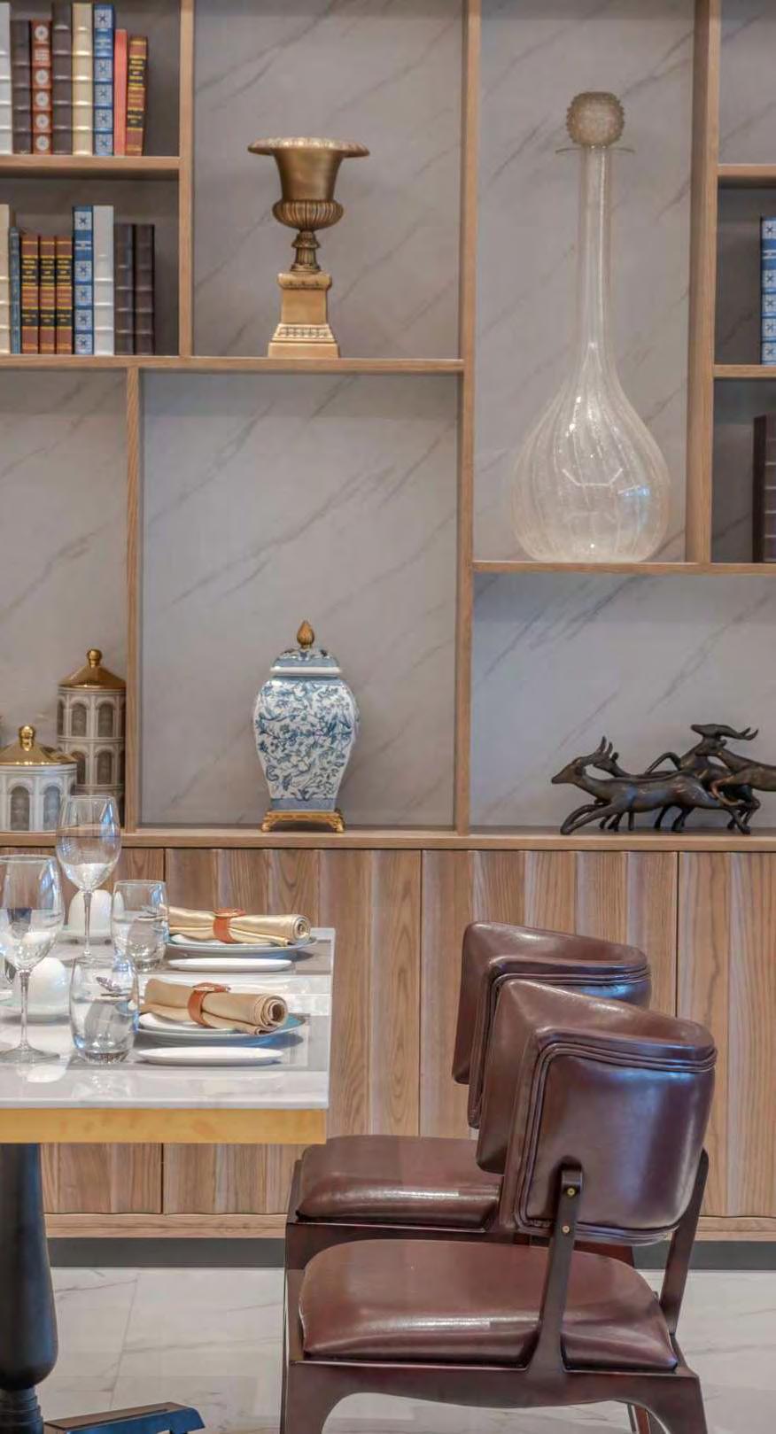
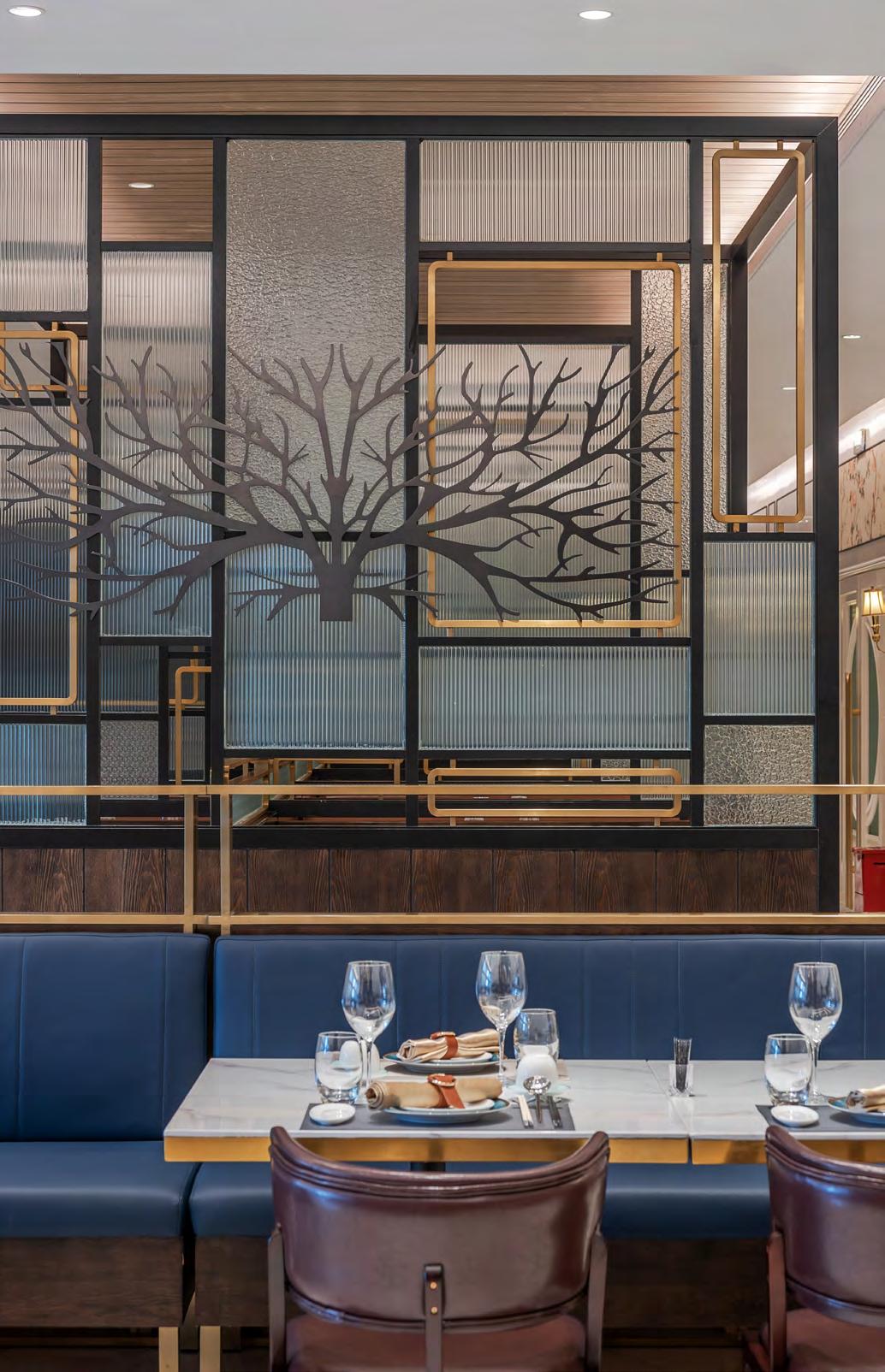
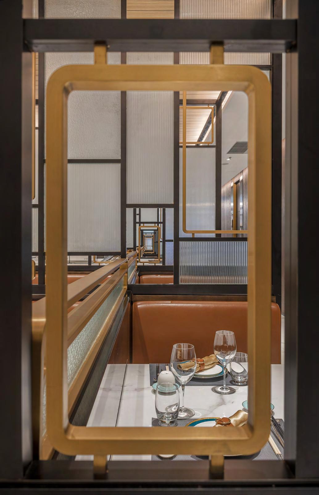
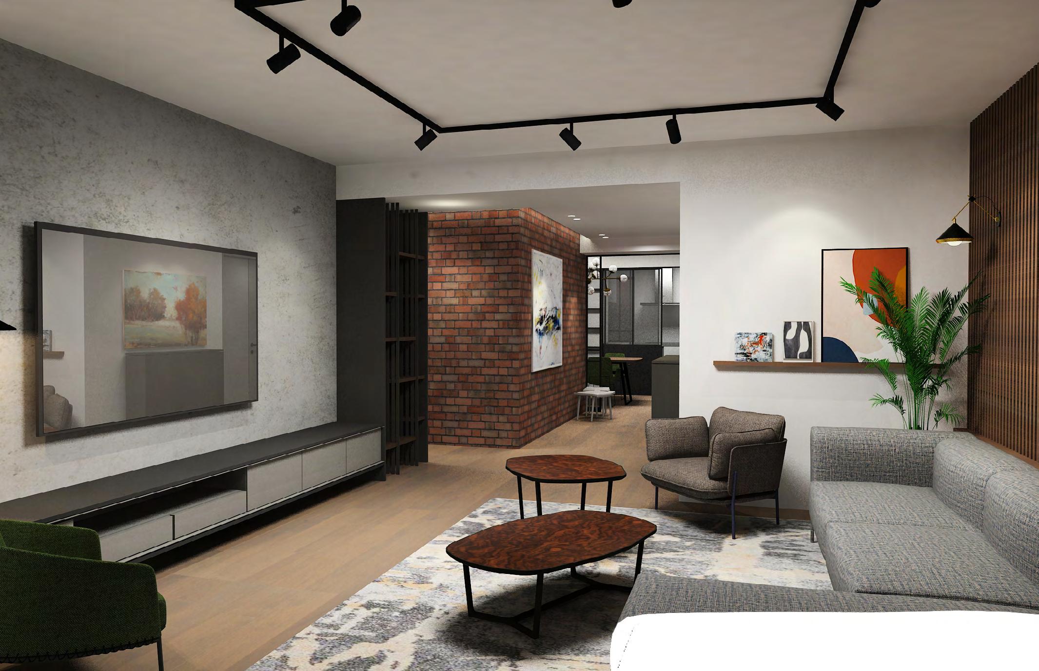
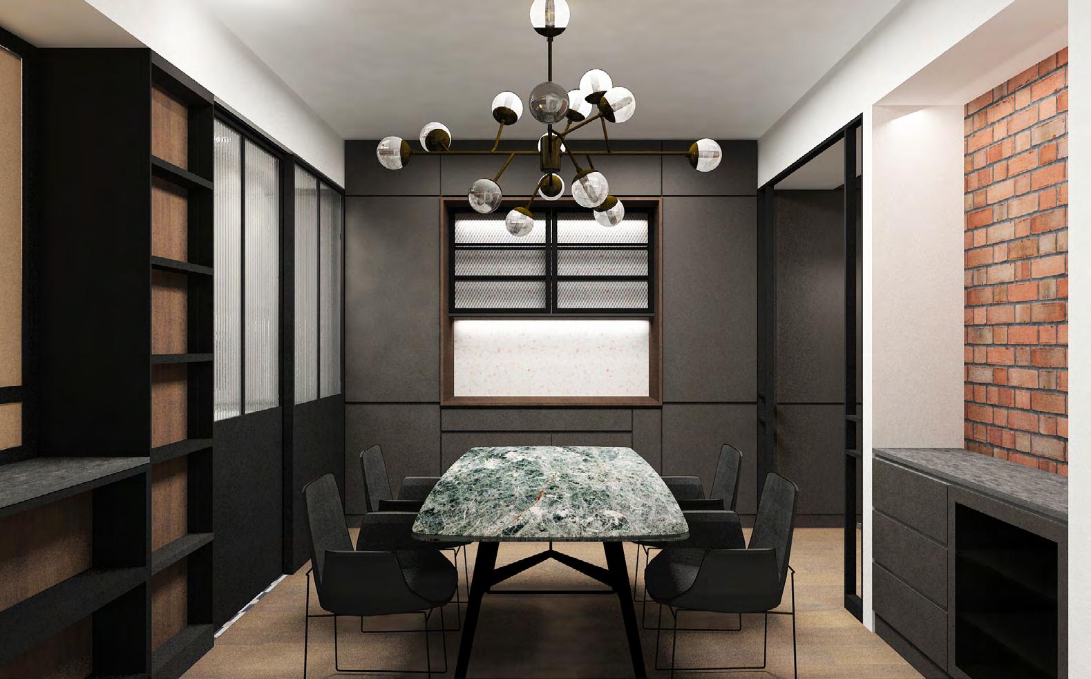
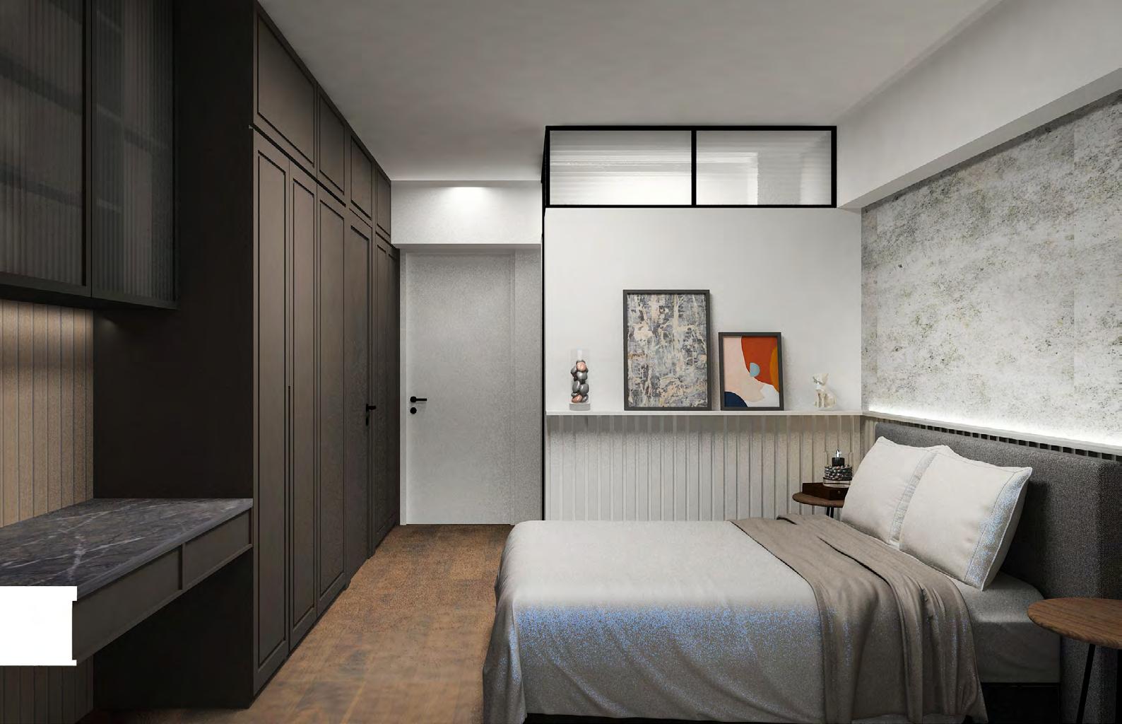
Formal Energetic
This project is a collaboration with the architectural firm DLN, where our role involves designing the interiors of the residential area and developing the wayfinding system. We have also contributed ideas to enhance the overall design of the fire station.
The design concept revolves around capturing the vitality and
This is a toilet renovation project in a kindergarten, also one of the branches for testing the new design theme is suitable to put into the whole kindergarten construction design. The design approach is mainly using the geometric shape to create the design concept, and the material and overall feeling should be harmony, warm and energetic.
The main design feature in the space is a shelter in the middle of the site which is creating the atmosphere is exploring and finding something interesting. The shelter area can also bring a cozy feeling to the kids which is let them feel like walking into a safe house. We hope that the children can learn how to clean and how to go to the toilet with fun.
leisure of firefighters, shaping the atmosphere accordingly. We have utilized sophisticated colors and robust materials to create a harmonious blend of coarse and intricate details throughout the space, adding depth and character.
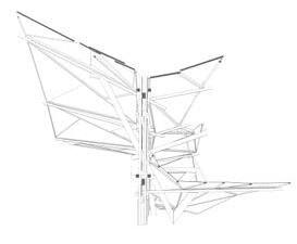
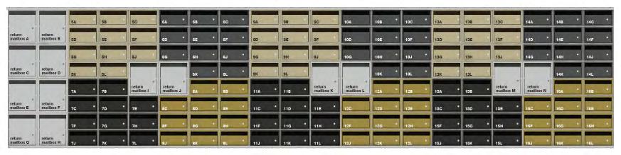
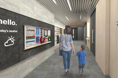
This design is not only from the perspective of interior design, but another task is to design a wayfinding system, and this system is not only for the residential part, but for the entire fire station space. And the entire fire station needs to have a clear and yet consistent with the overall image of firefighters a kind of system. It also needs clear guidance so that future modifications and continuation can be organized in a format. Therefore, the presentation and adjustment of information needs to achieve an easily handled result.
Tunga
Tunga
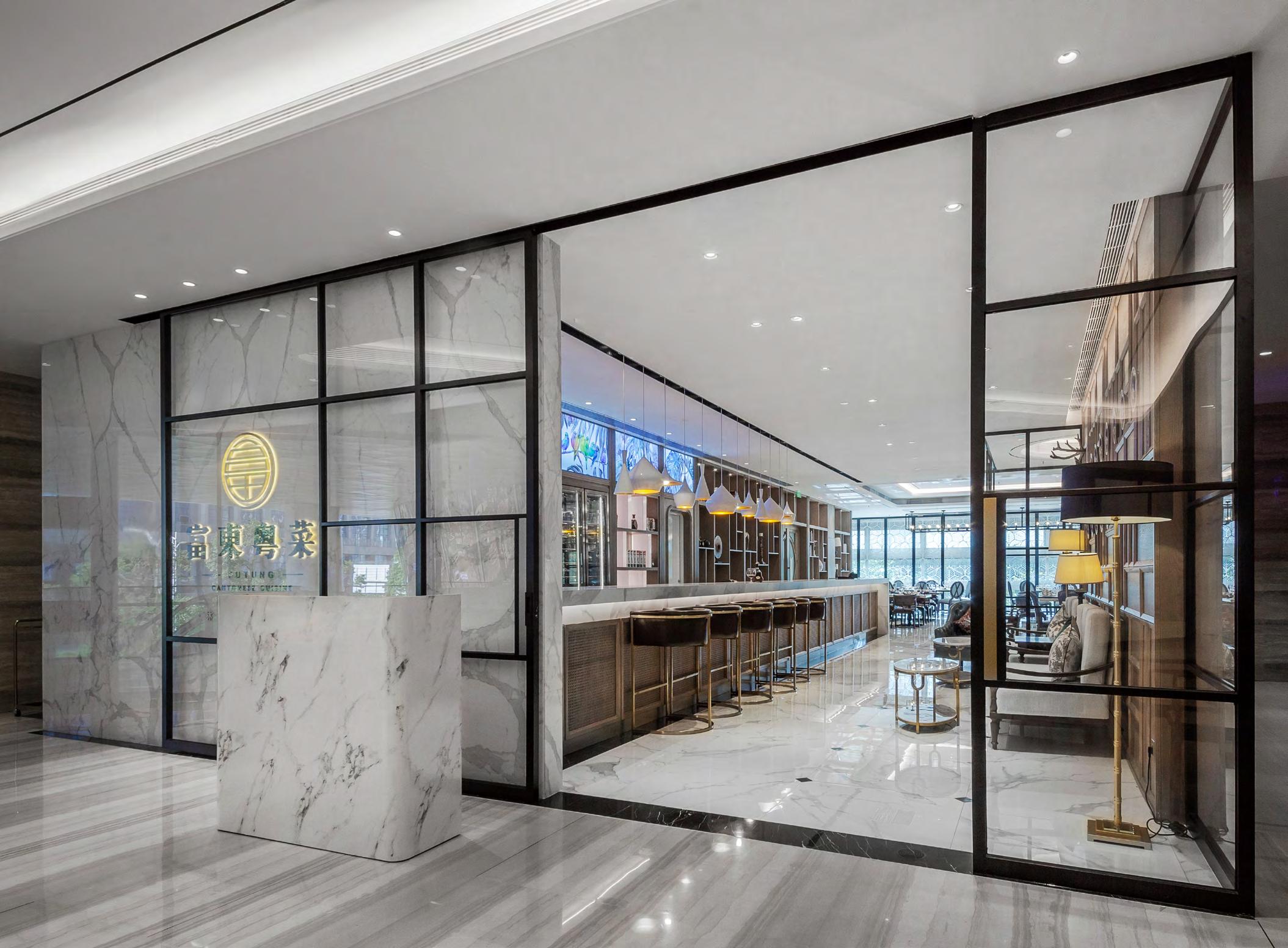
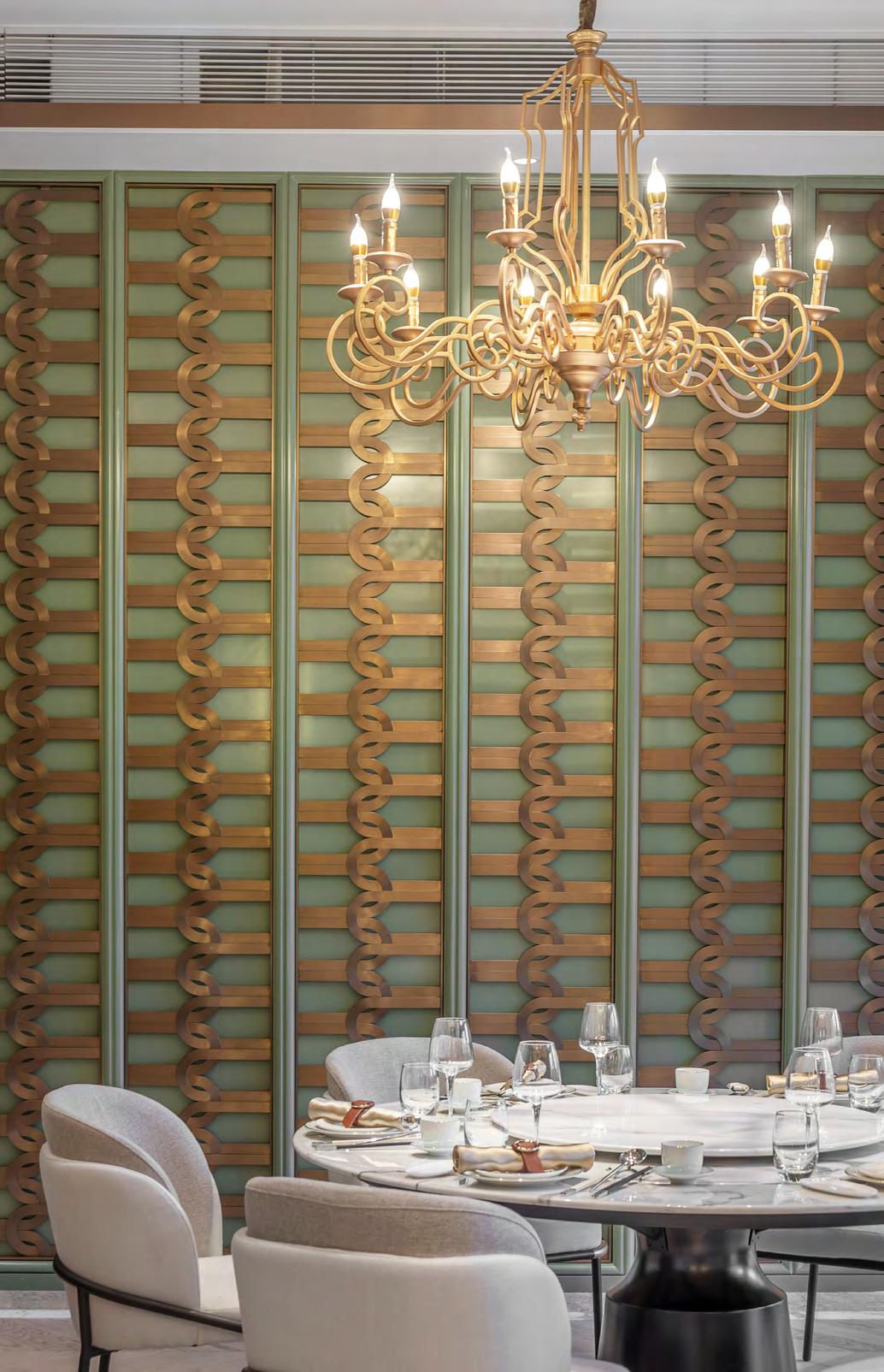
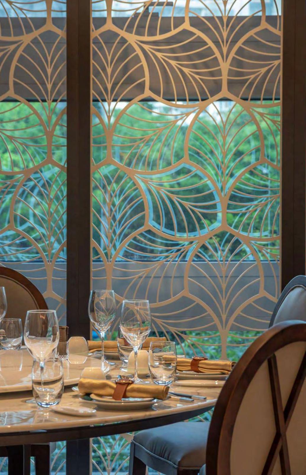
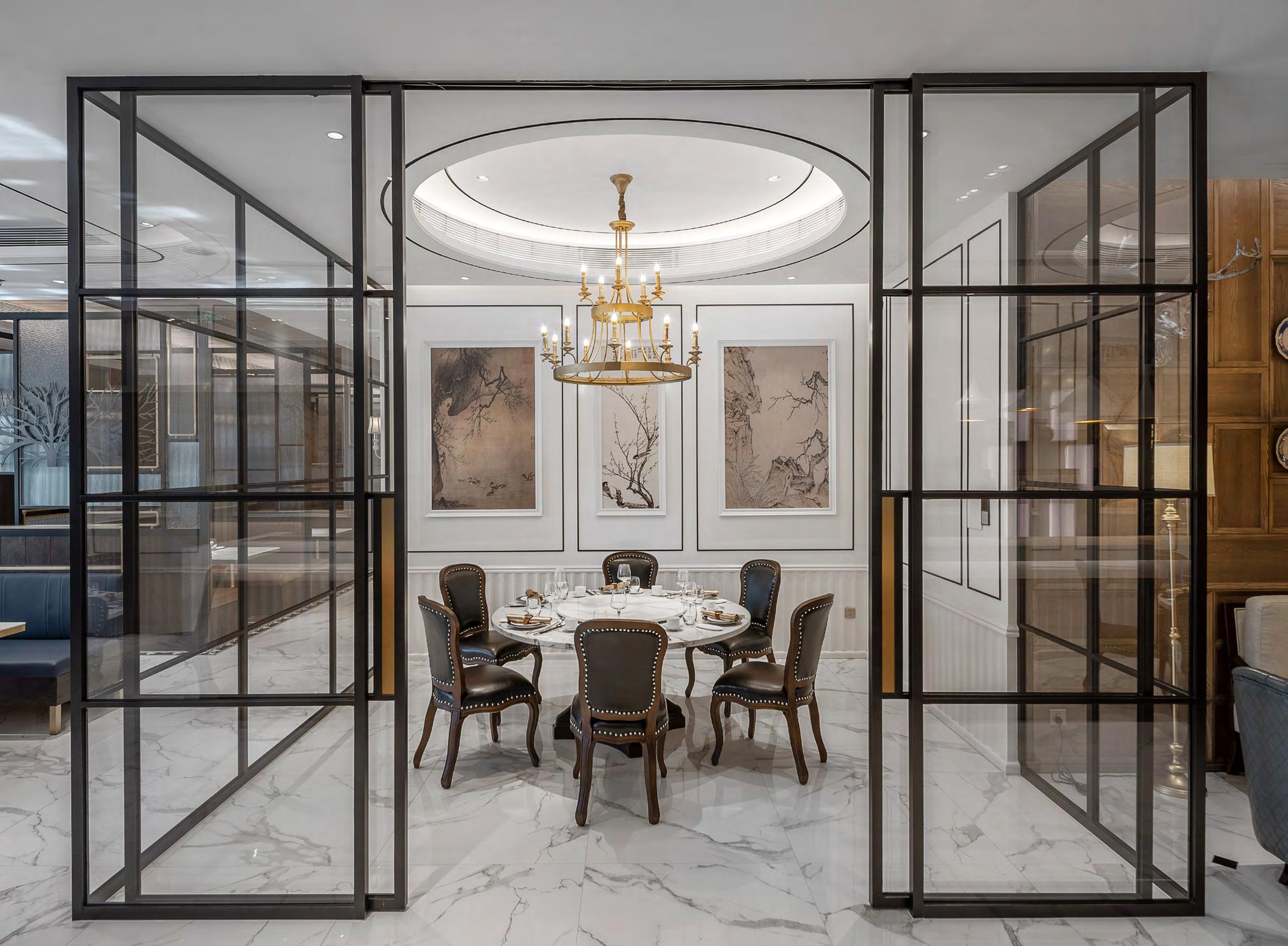
Rethinking the traditional elegance
Futong Cantonese Cuisine, is the typical Chinese restaurant, and we suggested rebuilding the image of the branding and the typical” Chinese restaurant” feeling. We hope the restaurant can provide the special dining experience, so we suggested the 80s colony style which is
mixed the western element into the traditional Chinese elegant high-end design, can fill into the space.
From The Beginning The Colony style which is mixed 80s Chinese elegrant vintage and the western modernism in the entrance area. The material conbination we applied is the walnut finish on the feature wall with the random size square frame. The white marble with the black marble dot on the ground is creating the high contrast in the visual.
We designed the highlight with the bronze metal in the bar chair and the bar counter stand. Both of the materials are creating the sensational elegrant feeling for welcoming in the entrance area.
Elegant, Tradition, Details Project Keyword
Glamorous Loft Luxury & Roughness
The dark red brick wall is the most original and the raw material which is the main character in this design which is creating a strong warm and industrial feeling. The black iron frame we also selected one with the hairline finish to be the highlight.
Cement wall, charcoal finish, draw grey and the dark walnut
This is a residential design project. The client requested the design main tone should be surrounding a brick wall and all materials applied should be creating a luxury and identical space. Also, the client hope for some texture added to the space to show the roughness
but it has to look fine. The material selection and the combination which is important in the spatial atmosphere. The loftstyle in spatial planning is the main concept and the luxurious elegant feeling is showing in the detail design.
can also is a good choice to showing the RAW and contrast. The walnut stripe feature wall with the vintage style lighting created the industrial feeling but the bronze touch up also bringing the luxurious in detail.
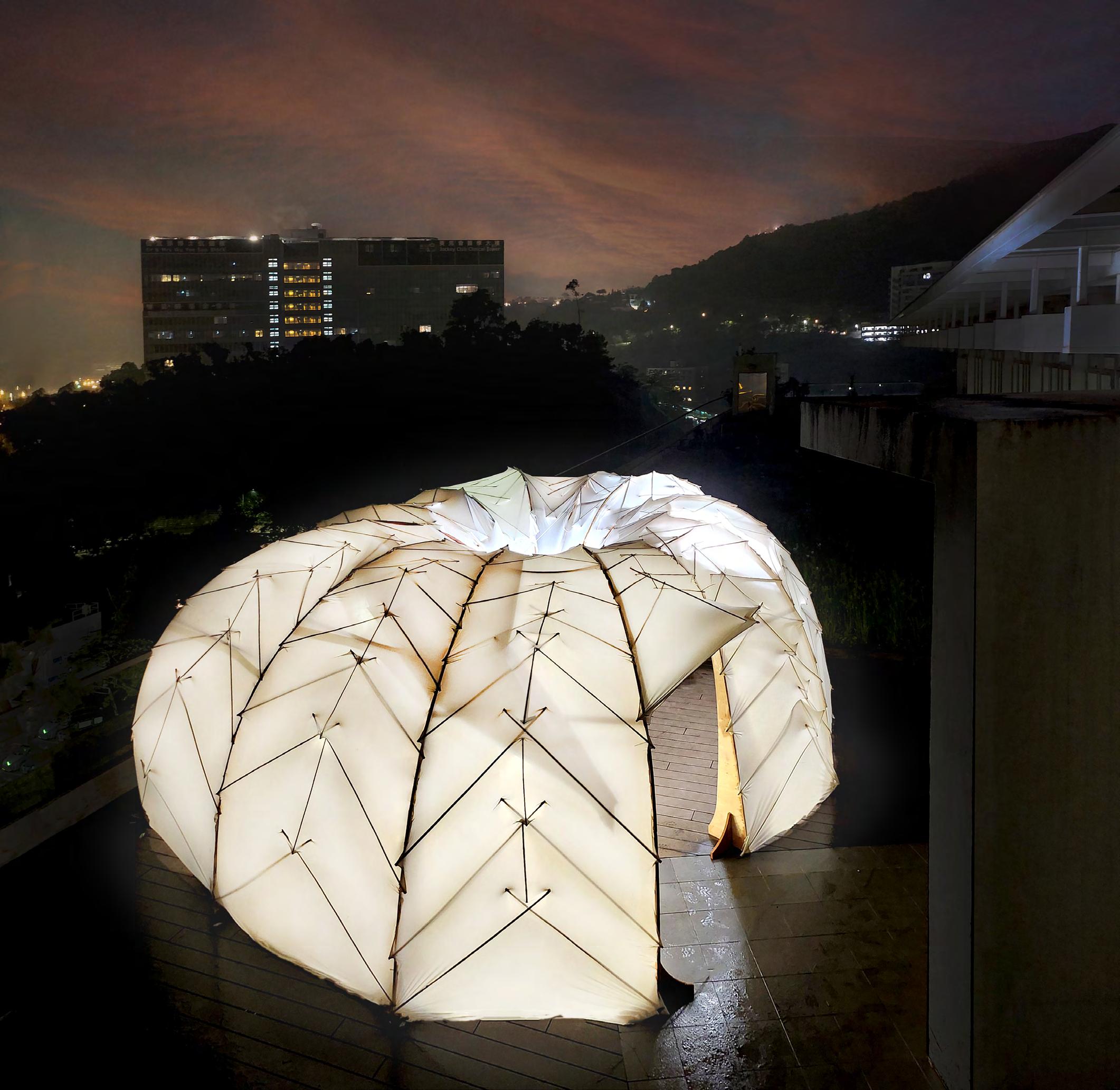
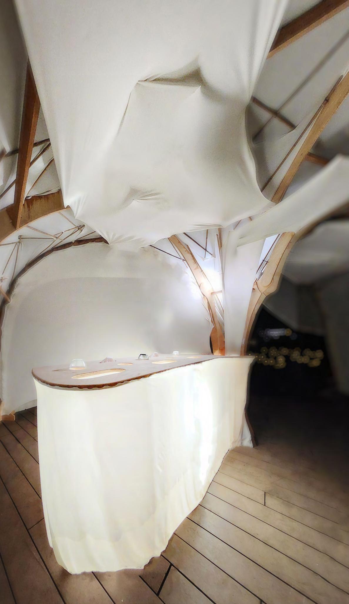
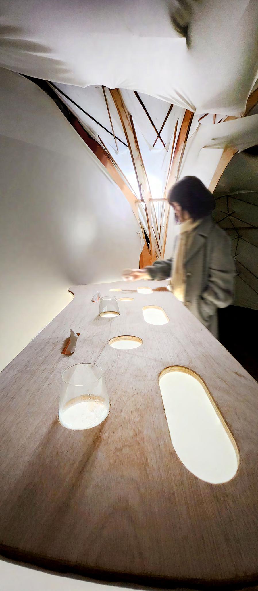
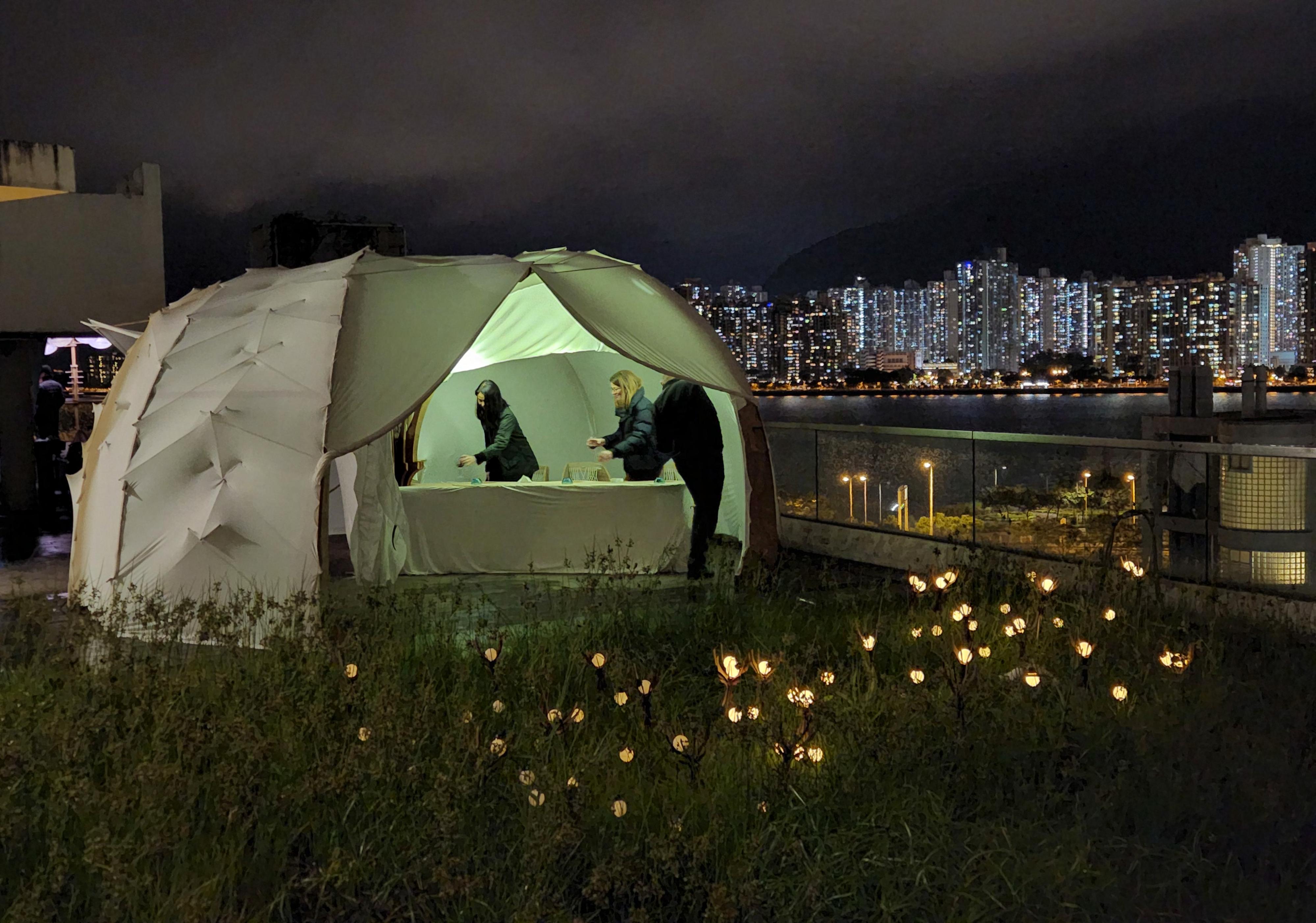
Gather Arc
Recreate the dining experience from moving
After we confirmed the site for the pavilion design, our team embarked on a collaborative process of design simulation and thinking. We explored different possibilities for the project, including testing various design options to determine the best function and dining experience for the pavilion.
ods, we evaluated different scenarios to develop a holistic understanding of the pavilion’s potential uses. We considered the size and layout of the space, the type of activities that could take place within the pavilion, and how the pavilion could be integrated with its surroundings.
The pavilion design for this project was created with the aim of showcasing different dining experiences by incorporating different motions by people. The design allowed users to interact with the space and the programme, creating a dynamic and engaging dining experience.
The pavilion was divided into three different sections, each offering a unique dining experience. The first section was designed as a welcoming area, where users could enjoy a starter and a welcoming drink. This space was designed to be open and inviting, creating a relaxed atmosphere for users to begin their dining experience.
The second section was a snack area, where users could enjoy a light snack before moving on to the main course. This space was designed to be more interactive, with a variety of seating options and unique features that allowed users to interact with the space and programme.
The final section was the fine dining area, where users could enjoy a more formal dining experience. This space was designed to be more intimate and sophisticated, with a high-end design that reflected the quality of the cuisine being served.
As users moved through each section of the pavilion, they would
experience different spatial qualities and unique features, such as changing lighting, seating options, and soundscapes. The design of the pavilion allowed users to interact with the space and programme, creating a dynamic and engaging dining experience that was truly unique.
Overall, the pavilion design was created to showcase different dining experiences by incorporating different motions by people. The three different sections provided users with a range of dining options, each with its own unique spatial qualities and features. The design allowed users to interact with the space and programme, creating a dining experience that was both engaging and memorable.
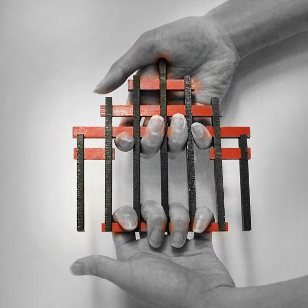
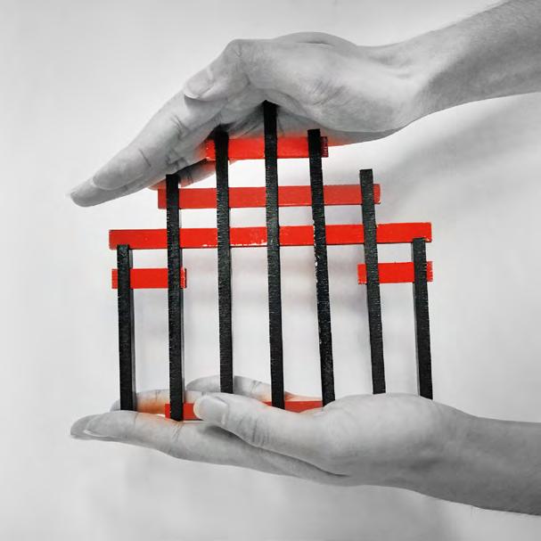
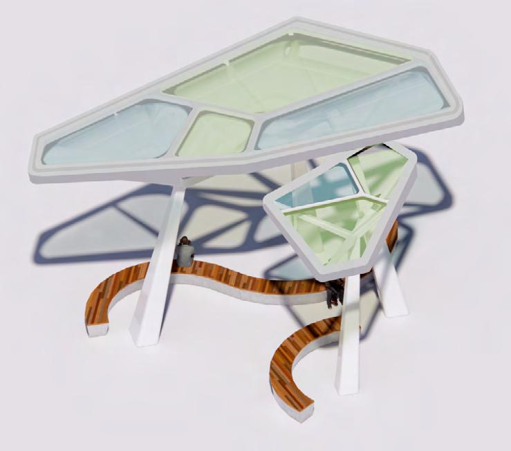
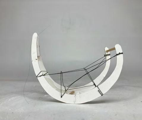
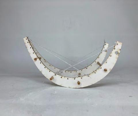
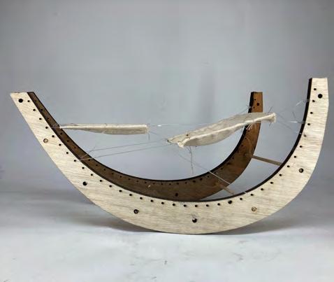
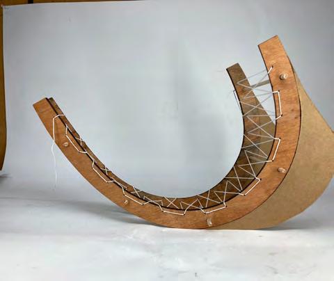
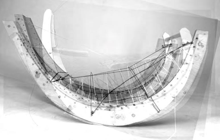
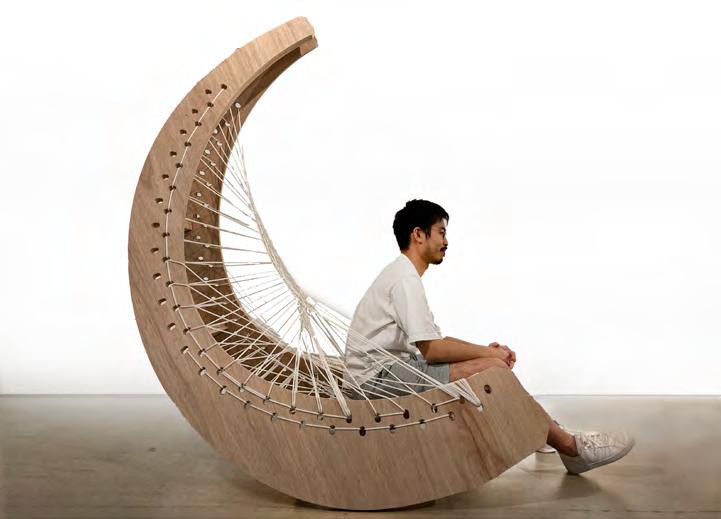
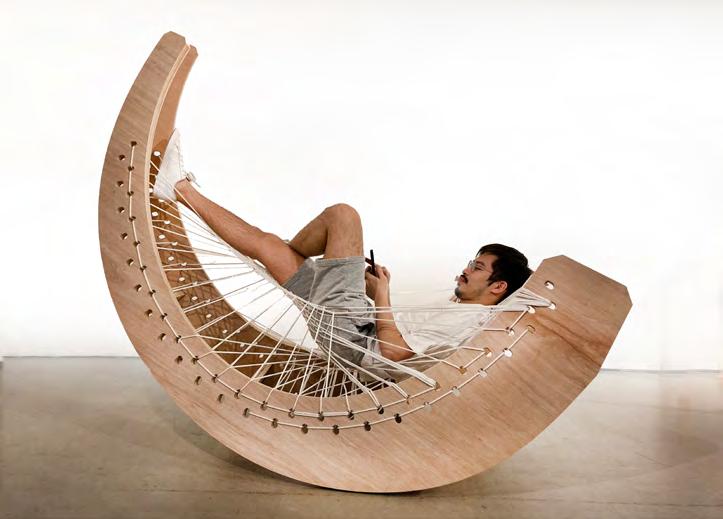
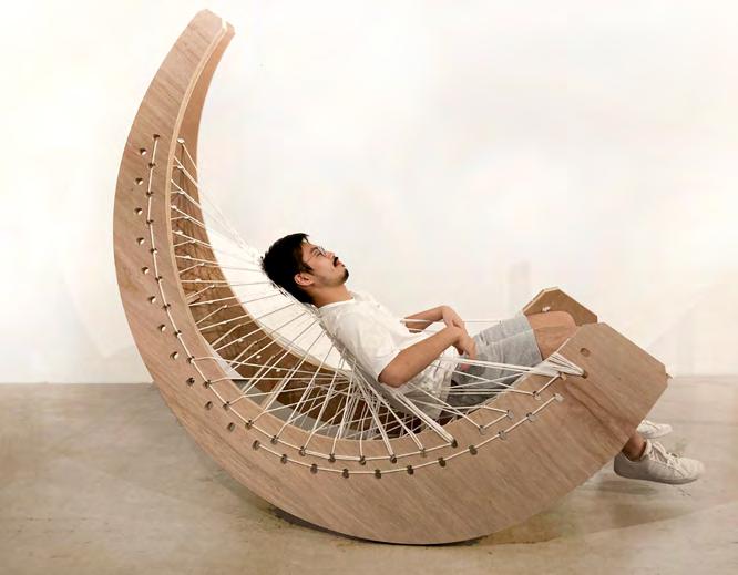
Shake & Wave
Test of action and reaction
Our design is a large arcshaped rocking chair that has undergone testing and sketching to explore different possibilities for its function and how it can connect with previous designs. The rocking chair features a curved seat and backrest that follows the shape of the arc, providing a comfortable and supportive seating experience.
The arc form of the chair creates a unique and visually appealing design that can add a modern touch to any space. Additionally, the rocking motion of the chair can be both relaxing and soothing, making it an ideal addition to a living room, bedroom, or outdoor patio.
During the testing phase, various materials and finishes were considered to ensure the chair is durable and aesthetically pleasing. The chair was also tested for stability and ergonomics to ensure it provides a comfortable and safe seating experience.
In terms of how the chair con -
nects with previous designs, it may be a continuation of a larger furniture collection or a standalone piece that incorporates similar design elements. The curved form of the chair could be used to create a cohesive aesthetic with other furniture pieces, or it may stand out as a unique statement piece in a room.
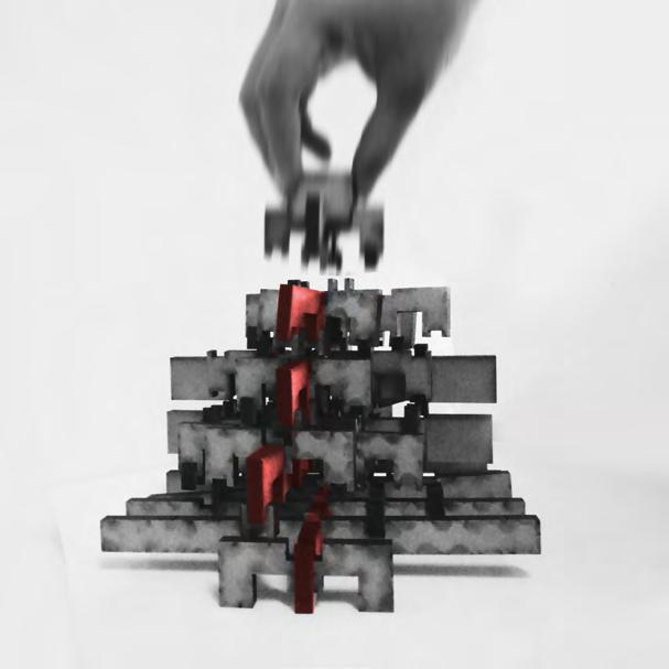
After the sketches, your team proceeded to test different methods to optimize the ergonomic and functional design of the rocking chair. The goal was to ensure that the chair was not only aesthetically pleasing but also comfortable and safe to use. The testing process may have included evaluating the chair’s stability, weight capacity, and overall user experience.
Once the testing phase was complete, the team likely made adjustments to fine-tune and enhance the design. This may have involved making changes to the chair’s dimensions or materials to improve its performance. Scale models may have been used to test these adjustments before imple-
menting them on a full-size chair.
Through this iterative process of testing and refinement, your team was able to create a rocking chair that not only looks great but also meets the needs of its users. The chair’s unique arc shape and comfortable design make it a standout piece that can add both style and function to any space.
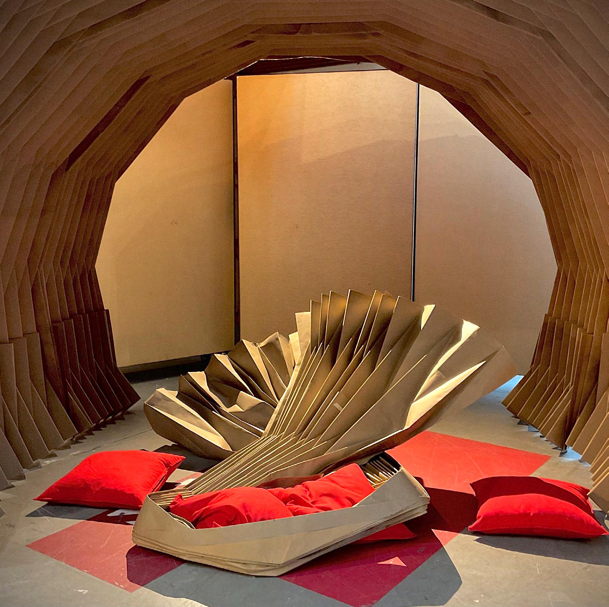
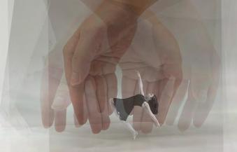
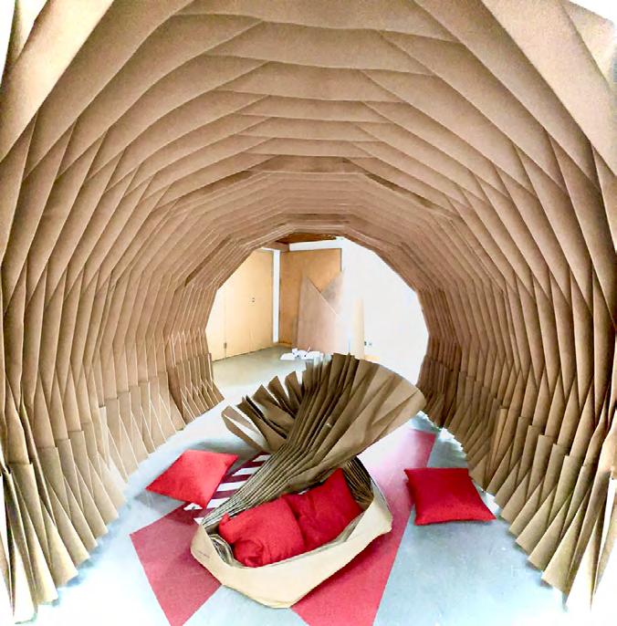
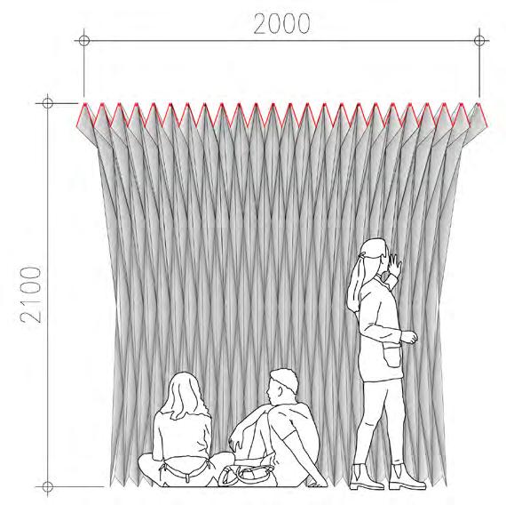
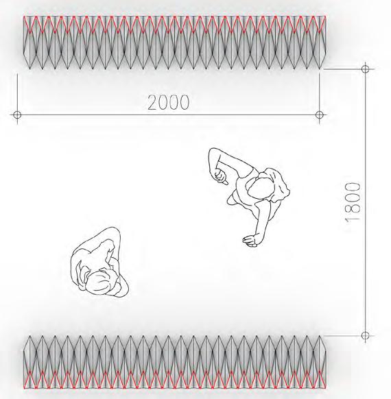
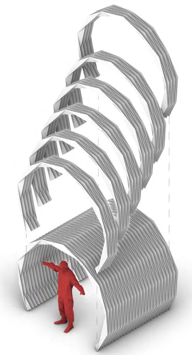
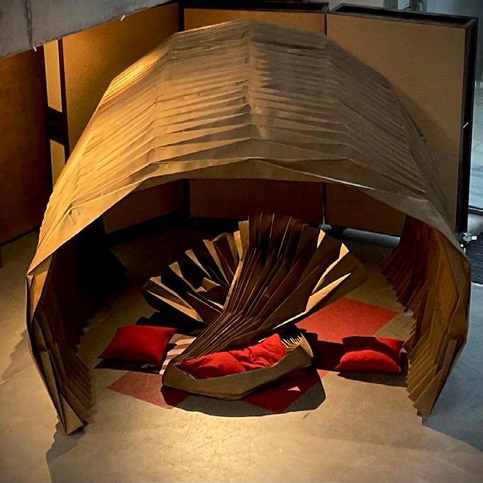
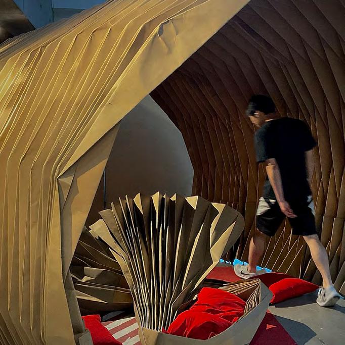
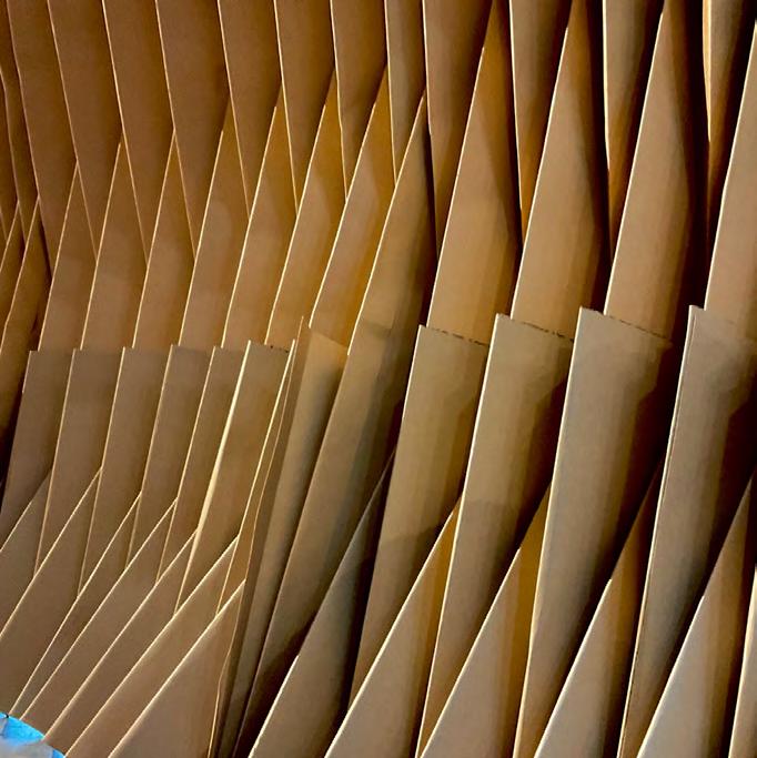
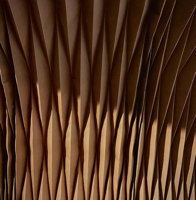
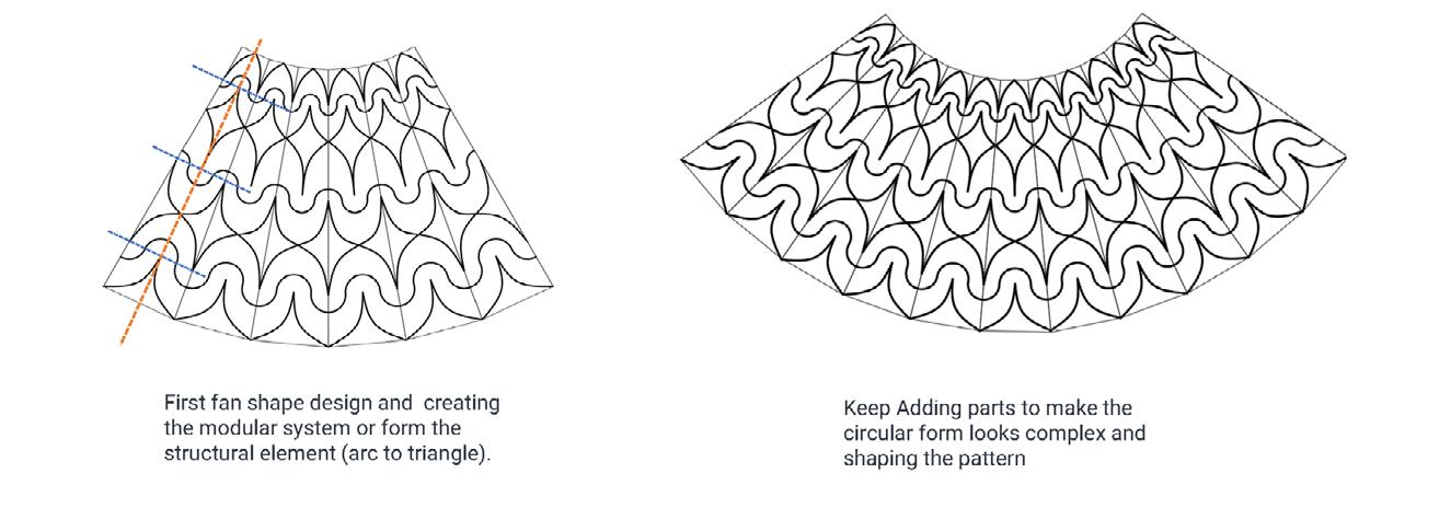
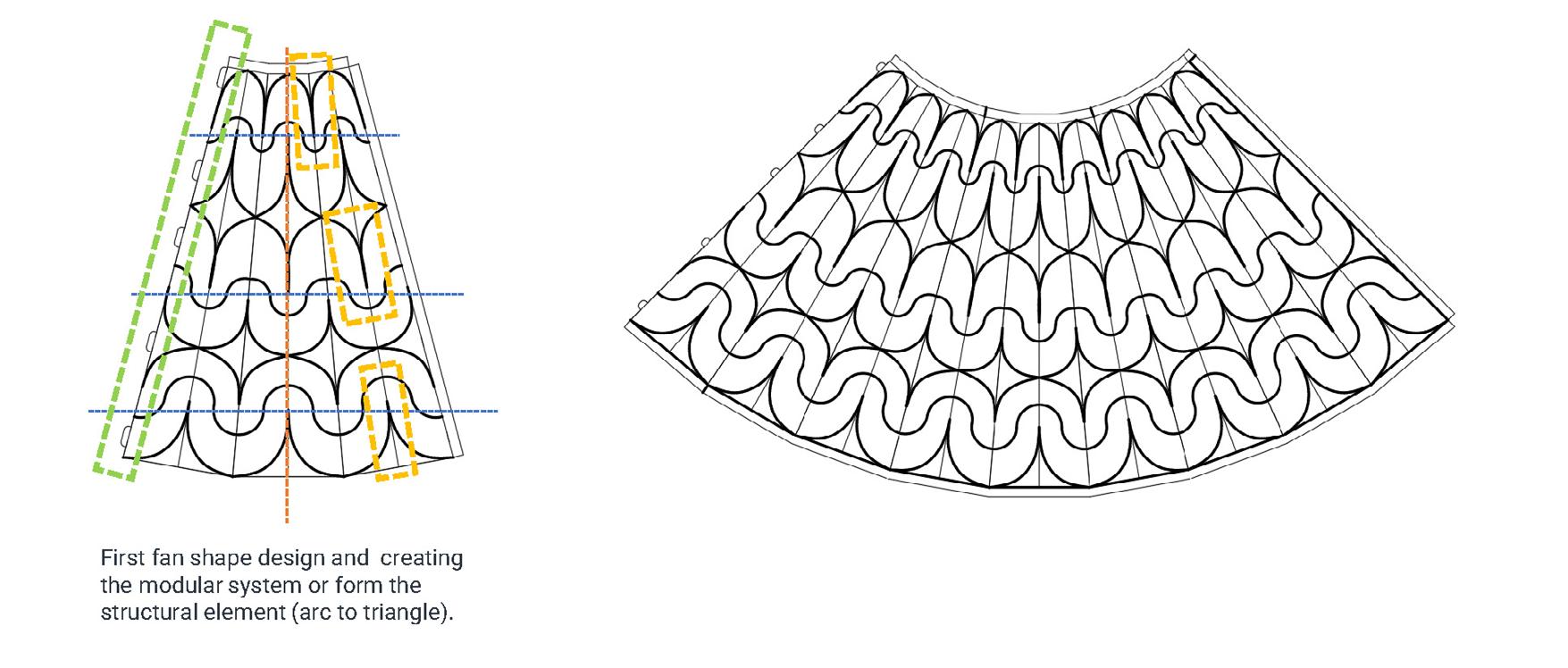
Fold and Flow
Spatial exploration of the paper and structure
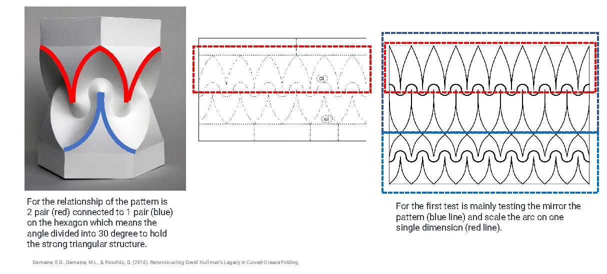
The larger the ratio, the more circle the shape. The final ratio that we chose is 1:4 (Width:Length, a:b). The ratio we chose demonstrates a more solid and nicer arc to accomodate the dancers. We also decided to increase the thickness of the paper to 450G with the final dimensions of the paper as (6.0m x 1.2m, Length x Width)
origami and Japanese culture. Origami, with its use of imagery, blank spaces, and repetition, can depict a vivid visual narrative. Our creative design not only represents a sense of adaptability and diversity but also establishes a spatial rela-
This results in a dynamic and ever-changing space, reminiscent of a living organism. We hope that the audience who experiences this space can perceive the harmonious interplay between transformation and stability. Within the space, dancers have the ability to adapt different modules of varying lengths, enveloping their bodies and becoming integral to their movements. This transforms the surrounding objects into elements that shape their dance. These dynamic forms can change fluidly, reflecting the flow of the performance and expressing a range of shapes, including soaring, contracting, pausing, and advancing.
tionship connected to structural fluidity and movement within the tunnel space. We have derived inspiration from origami models, incorporating the concepts of fluidity and entanglement.
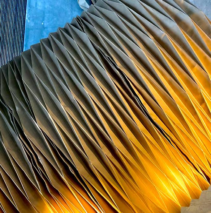
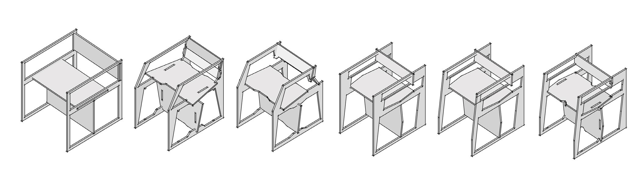
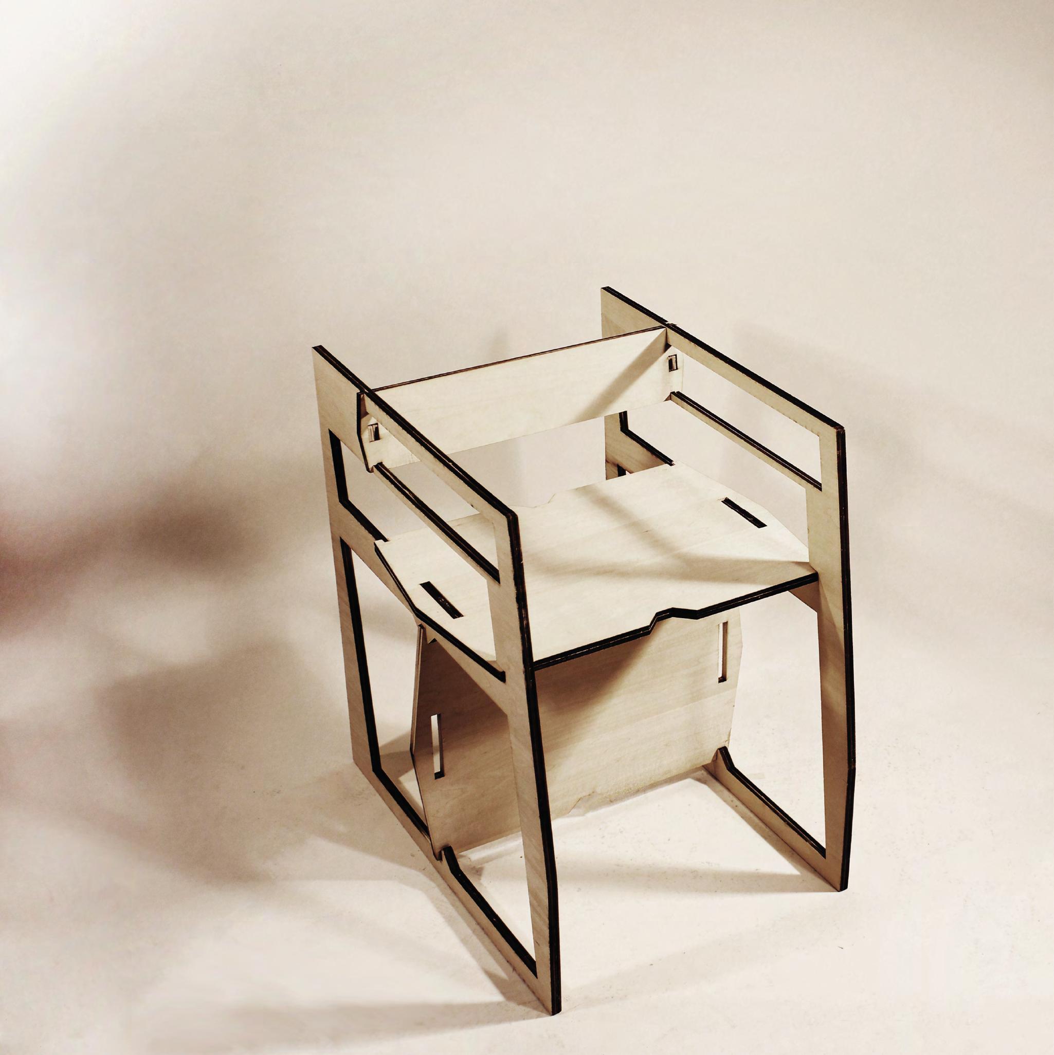
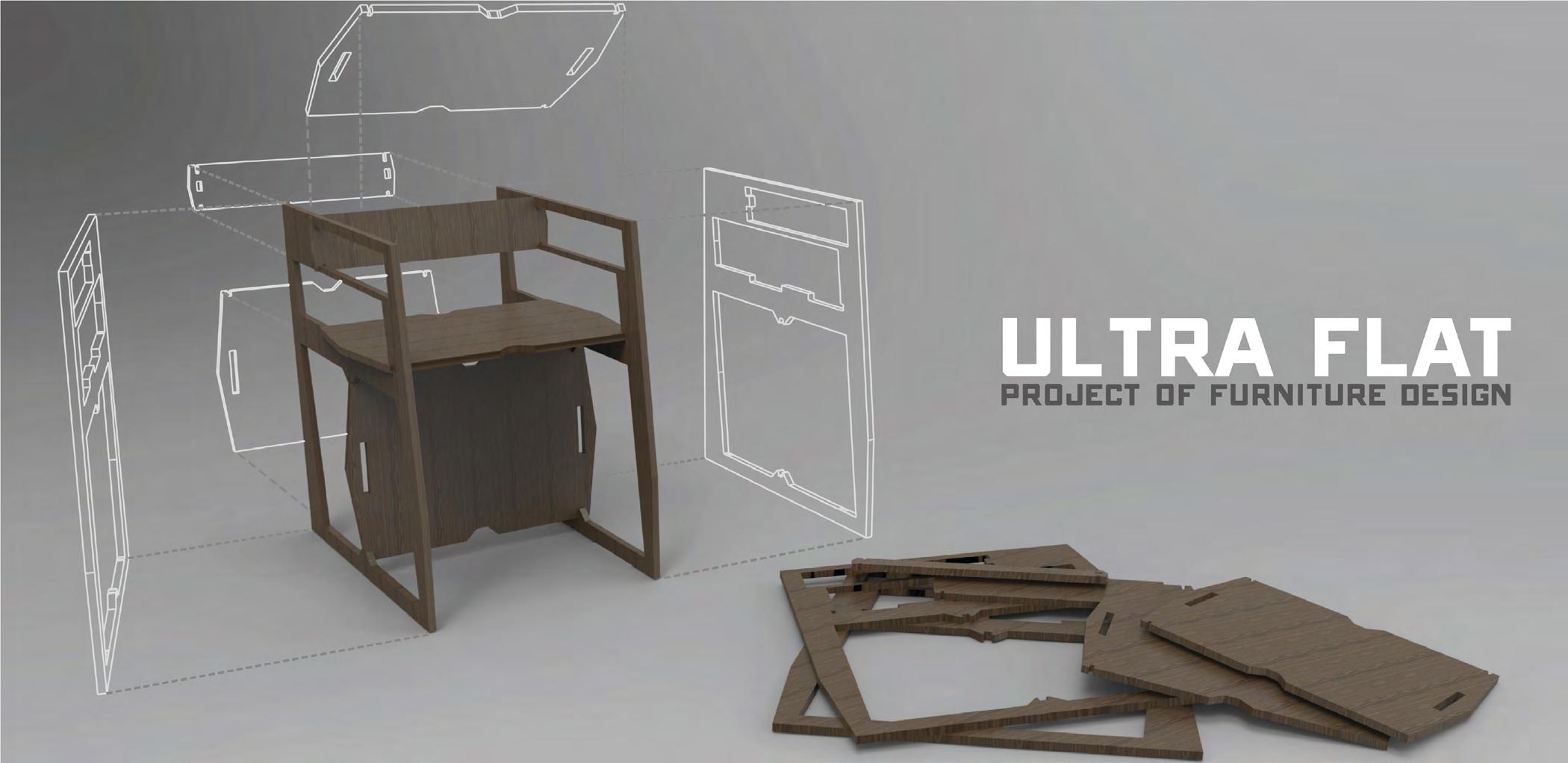
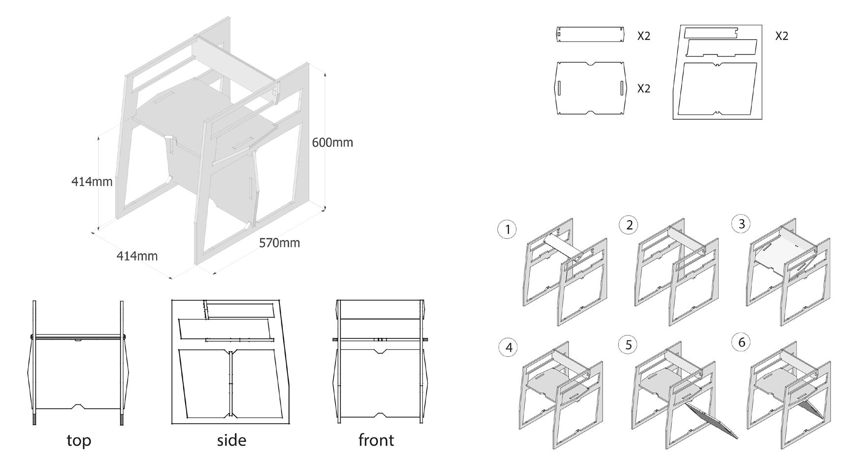
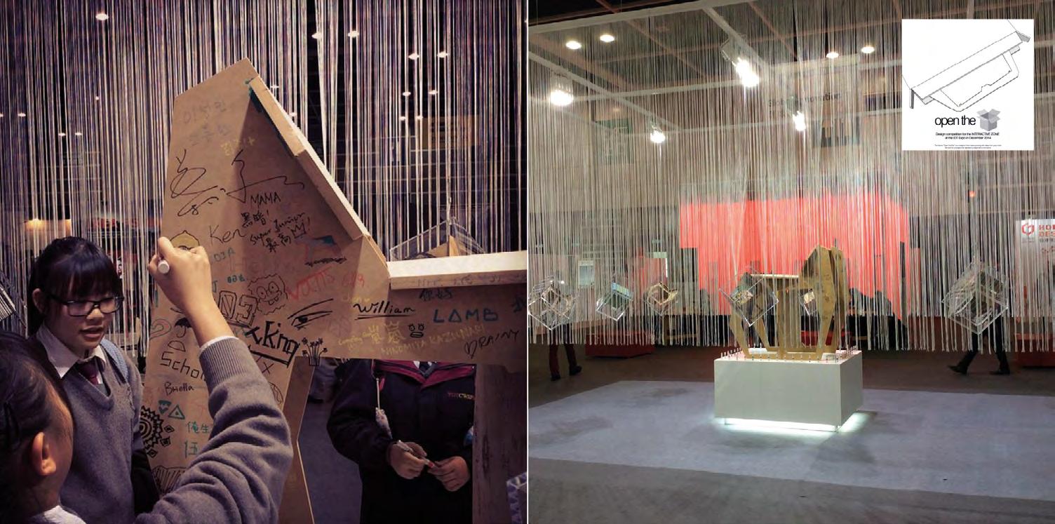
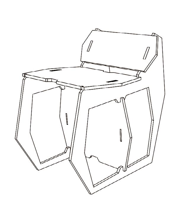
ULTRA FLAT Squeezing the Size of Materials
Our design is a large arcshaped rocking chair that has undergone testing and sketching to explore different possibilities for its function and how it can connect with previous designs. The rocking chair features a curved seat and backrest that follows the shape of the arc, providing a comfortable and supportive seating experience.
The arc form of the chair creates a unique and visually appealing design that can add a modern touch to any space. Additionally, the rocking motion of the chair can be both relaxing and soothing, making it an ideal addition to a living room, bedroom, or outdoor patio.
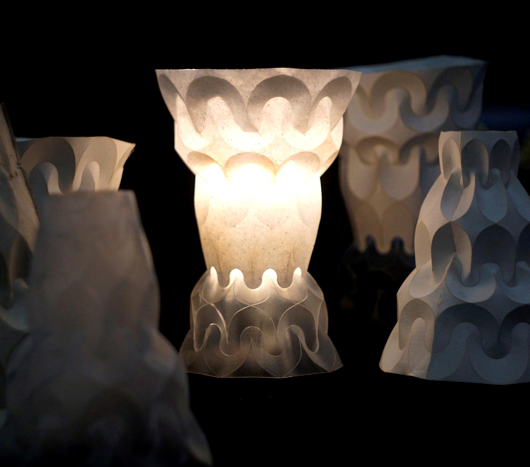
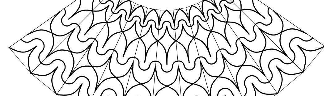
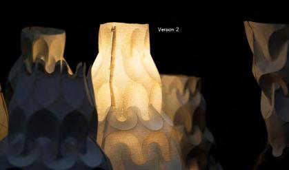
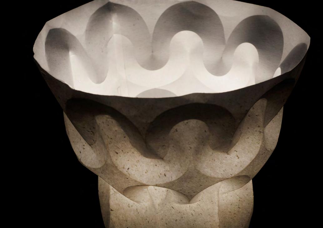
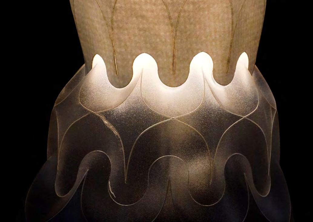
Light Blossoming
Lighting Design to explore the Shade and Bright
& Structure exploration (Group)
The design of this lighting fixture takes inspiration from specific chapters of “The Tale of Genji” to delve into the interplay of light and darkness. However, rather than adhering to the traditional Japanese origami’s straight folding system, I have explored a sturdy and
lightweight structure using a Western-style embossed folding technique. This unique structure is based on the research of mathematician D. Huffman and has been reimagined to embody feminine qualities, reminiscent of the graceful unfolding of a blossoming flower.