Ink Used for Printing the 1893 Embossed Columbian Exposition Envelopes
Peter Thy and Gry Hoffmann Barfod
Introduction
The preparations for the World’s Columbian Exposition started in the late 1880s, when Chicago, in competition with several major cities, won the rights to host the exposition to celebrate the 400th anniversary of Christopher Columbus’ arrival in the New World in 1492. The temporary fairground and buildings were constructed along the city’s southern lakefront area, today known as Jackson Park.[1] The planning and construction were a national community effort that involved civic, financial, engineering, agricultural, manufacturing and liberal arts organizations. The exposition finally opened its doors to the public on May 5 and stayed open for half a year, closing on Oct. 31, 1893. The exposition had been an astounding success, measured by attendance and financial results and did have long-term effects on the development of American industry, architecture and the arts.
The United States Post Office Department was also taking part in the celebrations. Apart from opening a temporary post office on the fairgrounds, a 15-subject adhesive postage stamp series was issued commemorating the landing of Columbus in the Americas, depicting various events during his journey.[2] These stamps were printed by the American Bank Note Co. and were made available from nationwide post offices on Jan. 2, 1893, as well as later on the day of opening at the World’s Fair Post Office Station.[3] The Columbian adhesive issues were removed from sale on April 12, 1894, and the remaining stamps were destroyed by burning.
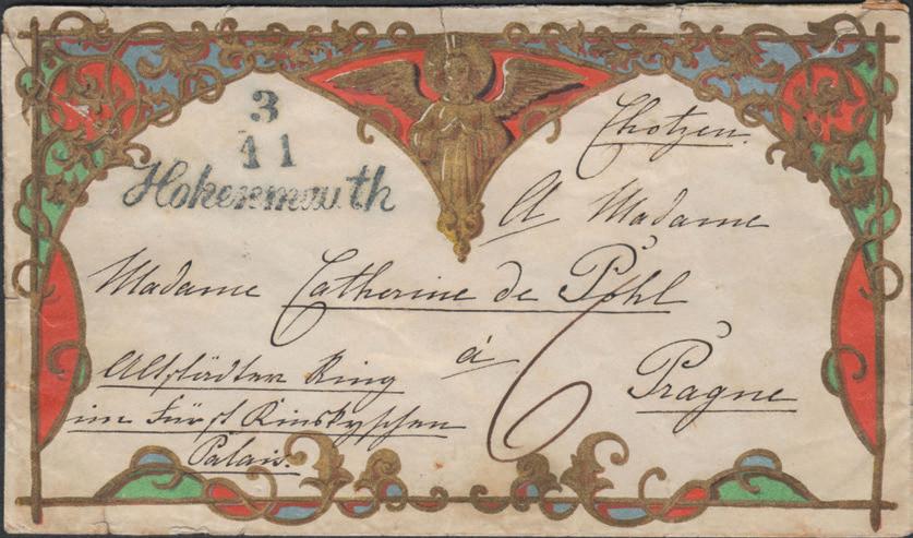
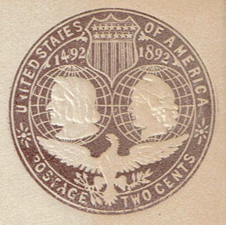
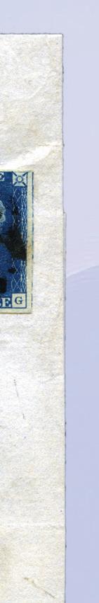
In addition to the adhesive stamp series, the USPOD also issued a set of stamped envelopes that are the subject of this study (Figure 1). The production of the Columbian Exposition stamped envelopes was ordered by the USPOD in December 1892.[4] The Plimpton Manufacturing Co. and Morgan Envelope Co., Hartford, Conn., were – without competition – given the contract.[5] The plan called for the preparation of a special set of envelopes that would stand out compared to the standard post office envelopes. This would include specially watermarked cream-tinted paper, embossed stamps of designs and colors as directed by the USPOD and the use of the then-eight standard envelope sizes.[6]
The stamped envelopes were originally scheduled to be released after Jan. 1, 1893, but due to several delays it was not until early March that the envelopes
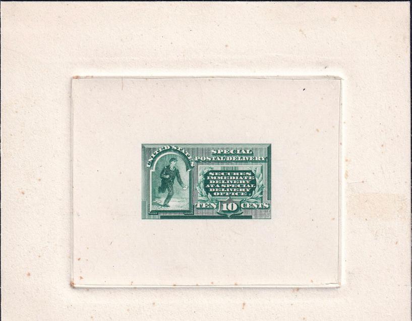
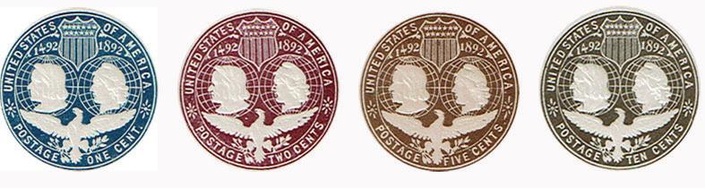
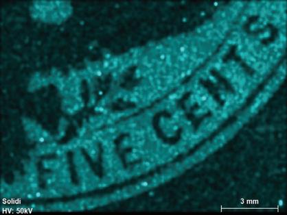
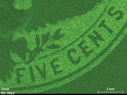
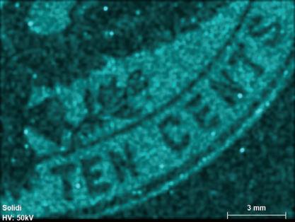
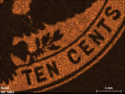
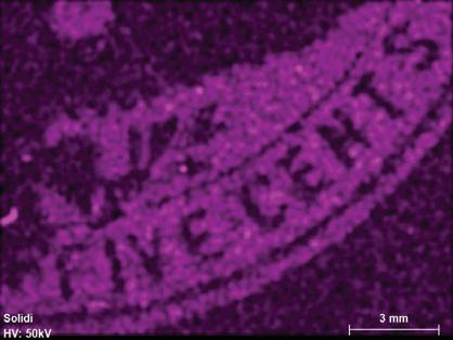
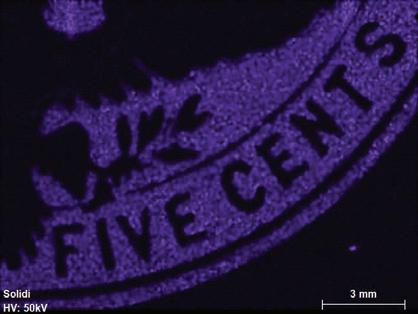
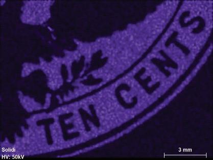
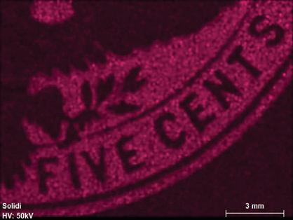
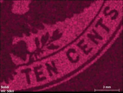
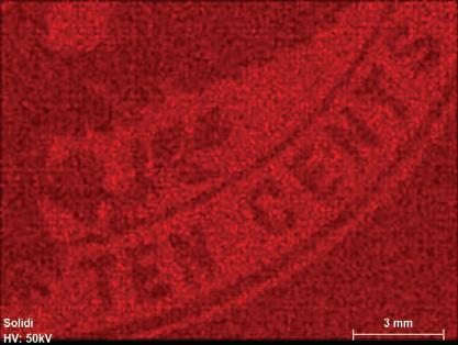
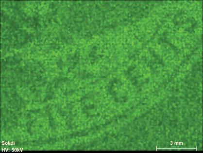
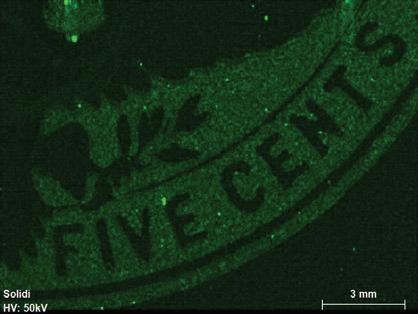
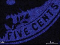
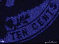
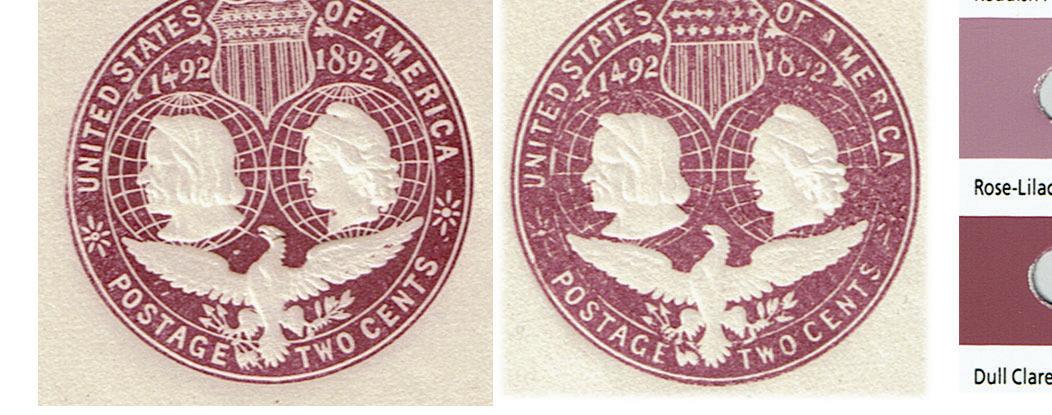
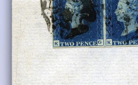
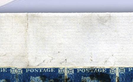
Figure 1. The four stamp imprints examined in this study: 1 cent - deep blue; 2 cents - violet; 5 centschocolate brown; 10 cents - slate brown. Color scheme after the Scott Catalogue (2001)
started being distributed to nationwide post offices. An additional printing was made in January 1894 to use the remainder of the specially watermarked paper.
This paper was speci fi ed to be a mixture of high-grade white linen and domestic co tt on rags in the proportions of 35% linen to 65% co tt on produced as laid watermarked sheets of 22½ by 30 inches, or in that proportion. The watermark was placed with regular intervals on the dandy roll showing profi les of Columbus and Liberty, the years 1492 and 1892, and a portion of a belt with a buckle.
The planned embossed design consists of a “ … circular stamp, considerably larger than the stamps on the then current series of stamped envelopes, bearing as the principal features profiles of Columbus and Liberty above the figure of an eagle with outstretched wings and surmounted by a shield like that used in the arms of the United States.”[7] The working dies used for embossing were produced by the contractors based on a 2¢ master die from which intermediate dies for the other denominations were produced and subsequently transformed into working dies. Considerable philatelic research has been done on the transitions of die essays, master die, denomination-specific hub dies and working dies. It has been shown that 31 different working dies can be identified on the eight different envelope sizes.[8]
The color scheme for the envelopes was not speci fi ed by USPOD instructions, except by a statement in the original 1892 order stating “ The envelopes are to be embossed with stramps of such designs and colors as the Department may adopt ... ” [9] However, re fl ecting the general observations by collectors, Thorp (1954, page 175) writes “ We have listed many shades of stamps but it is quite true that there are many more which will delight the specialist. Mr. A.G. Chapman, our associate editor, notes ‘light’ and ‘dark’ shades of the ‘red-violet’ exist and ‘reddishbrown’ and ‘dark-brown’ (of the fi ve cent stamps) are also known. By the same token there are shades of color of the ten cent stamps formerly listed as ‘dark brown’ and ‘slate.’ Still others are known, all of which are collectable and a delight to the specialist but of such profusion as to be impossible to detail in catalogue listings.” There are also a couple of envelopes that have been described as errors of color (2¢ dark slate and 5¢ slate).
A total of 107.8 million Columbian stamped envelopes were produced, of which 8% were 1¢, 91% were 2¢, 0.7% were 5¢ and 0.2% were 10¢ envelopes (United Postal Stationery Society, 2012). Thus, considering the large quantities of the 2¢ envelopes, it is not surprising that substantial variation in the violet color can particularly be found for this denomination (UPSS, 2012).
The goal of this study is to determine the inorganic compositions of the inks used for printing the Columbian Exposition envelopes to better understand the different pigment components used for making the inks and, particularly, to understand the considerable variation in color and shading observed. It is our hope that this will add to our already considerable understanding of the production of the envelopes (Perry, 1940, 1955; Ellis and Maisel, 1974).
1. Analytical Methods
Representative envelopes with fresh-looking imprint colors were selected for each of the four denominations (Figure 1) with the purpose to characterize the inorganic components in the inks used for the different imprinted stamps. To achieve this, bench-top X-ray fluorescence (XRF) techniques were applied, given that this method allows for non-destructive, spatial and elemental distributions to be recorded at pixel-level resolutions. An M4 Bruker Tornado Micro-XRF was used to obtain these elemental distribution maps and area compositions (Haschke, 2014) of the imprinted stamps and associated papers.
The imprinted stamp areas were cut from the envelopes by avoiding the glued areas of the back flap and the reverse paper parts. The result was that only the embossed stamps with their 0.13-0.14 mm-thick paper foundations were analyzed. The inked paper pieces were placed on standard laboratory cellulose filter paper and positioned directly on the movable chamber table made of polyethylene terephthalate (PET) plastic. The paper composition was studied using a similarly cut square from the 1¢ envelope. Because of the thin ink layer and envelope paper, the X-rays will penetrate down into the underlaying filter paper and PET table, causing a significant, but unknown, dilution to the signals, although this dilution may be considered relatively constant.[10]
The present study was done under vacuum conditions (~20 mbar) without observing significant curling effects on the thin paper sheets. This contrasts with the studies of Thy (2019) and Thy and Barfod (2023), who analyzed whole uncut stationery and observed significant curling of relatively thick stationery items (cards and registration envelopes, with internal glue and some also with linen enforcements), despite sturdy PET plastic sleeves (Mylar) during examination with cut-outs for the areas of interest. The benefit of using sample chamber vacuum is that low atomic number elements can be better detected. The choice between analyzing under vacuum or in air for large pieces of postal stationery is a matter of the availability or rarity of the pieces in question. The Columbian envelopes analyzed here are reasonably abundant and inexpensive, allowing for trimming
of items to a smaller size to reduce the effects of vacuum on the paper material. This contrasts with the procedure used by Thy (2019) and Thy and Barfod (2023) who analyzed rare essays and unique trial printings.
Fluorescence radiation was generated at a voltage of 50 kV and a current of 600 μA from a rhodium (Rh) tube, which is optically focused to a spot size of 20 μm and detected by a silicon drift detector with a pixel acquisition time of 15 milliseconds.[11] No filters were used. The elemental distributions were collected in a lower-right area of the embossed stamps covering the denominations, while the combined bulk ink and paper compositions were obtained from multiples of five from areas of about 4 mm2 just above the word “CENTS” (compare to Figure 1). The resultant elemental distribution images were collected in triplicates at an overlapping distance of 14-20 μm. The detected X-ray emission lines used were for high intensities at the K or L levels (Table 1). Elements with atomic numbers (Z) below 11 cannot be detected with the micro-XRF, leaving out the important elements C, N, H and O that are the building blocks of organic material such as paper, glue and varnish (oils).
Table1.PrincipalX-RayEmmissionLinesatKandLLevelsinKeV ElementLinePredictedAver.SD KeV1cent2cents5cents10centsPaper
Observed(KeV)Comment KeV
13 Al K 1.4871.4991.5091.4891.5291.5191.5090.016
14 Si K 1.7401.7391.7491.7691.7991.7640.026Neardetectionandbroadpeak
15 P K 2.0132.0092.0692.039Neardetectionandbroadpeak
16 S K 2.3082.3292.3292.3492.3592.2992.3330.023Notquantified
17 Cl K 2.6222.7092.7092.7092.7192.6992.7090.006
19 K K 3.3143.3393.4593.3393.3893.3810.057Neardetectionandmostlybroadpeak
20 Ca K 3.9173.7993.6993.6993.7093.6693.7150.056
22 Ti K 4.5114.4884.4884.488MaybeoverlappingwithBaL
23 V K 4.9524.8584.8684.863Lowenergycomparedtoexpectation
24 Cr K 5.4155.4185.4485.4385.4430.015Broadpeak
25 Mn K 5.8995.8985.9185.908
26 Fe K 6.4046.3986.4286.4186.4186.4160.013
27 Co K 6.930MaybeoverlappingwithFeK
29 Cu K 8.0488.1188.0988.108
56 Ba L 4.6514.4884.4884.488OverlapwithTiK.Notquantified
82 Pb L 10.55210.57710.67710.59710.65710.6270.048
Aver. - average. SD - standard deviation for more than two determinations. Empty field - not visually detected or observed.
Quantification was done using standard-less models for total counts and is reported, as obtained, as oxide weight percentages, including paper background, or as normalized to 100% excluding paper. Oxides and elements not mentioned were either below detection limits or not detected.
Figure 2. Energy spectra as KeV (kilo-electron-volt) for the four different inks and the background paper used for embossing the stamps on the Columbian Exposition envelopes: A, as total counts where the spectra separation is caused by differences in count time, and B, as counts per second unifying the background for the five spectra. cps – counts per second.
2. Results
Summaries of the resulting energy spectra are shown in Figure 2 as total counts for scanning over multiple areas of about 4–8 mm2 for both combined ink and paper areas and for pure paper areas only. Figure 2a (top) is as the obtained counts while Figure 2b (above) is as counts per second (cps); both shown versus emitted energy as KeV (kilo-electron-volts). The specific X-ray emission lines used are given in Table 1 as visually identified from the graphs and as supported by instrument software interpretations and expected energy values.[12]
There is a reasonable correspondence between visual identified element lines and their expected energy values for the most dominant metallic elements of Mn,
Ti, Fe, Cu and Pb (Table 1); however, some metallic and non-metallic elements, although software detected, cannot with confidence, be visually identified (P and Co). A further group of metallic and non-metallic elements expected to form aluminosilicate compounds (Al, Si, K, Ba and Ca) are likewise variably detectable together with elements likely forming various salts such as chlorides, sulfates and carbonates (S, Cl, K, Ca and Ba) (Table 1). The identification of specific lines is often complicated by peak overlap or partial overlap. Examples include Cl Kα and Rh Lα, where the latter appears as a shoulder on the high energy side on Cl Kα. A further example is a Pb Mα line that may appear as a shoulder on the high energy side of S Kα. Further, the lines for Ba Lα and Ti Kα narrowly overlap and can only be separated by the machine software (Haschke, 2014). Another complication is energy shifts toward higher values than expected seen particularly for Cl and S (Table 1). Such shifts are attributed to matrix effects, caused by scattering of radiation in different backgrounds[13] and are, if predictable, corrected by the machine software (Jenkins, 1974; Pessanha et al., 2009; Haschke, 2014; Bowers, 2019), but not if a visual interpretation is applied like for Figure 2. There further is what appears to be a repeating peak at 11.94 KeV for the violet 2¢ spectra (Figure 2) that cannot be identified. This peak is about where Br Kα (bromine) would be expected, but lacks any supporting L lines. Likewise, a peak also for the 2¢ denomination between K Kα and Ca Kα is positioned near the expected position of Sn Kα, but cannot be supported by a corresponding Sn Lα line.


Co KαFe Kα
K Kα
Co Kα
Cl Kα
S Kα
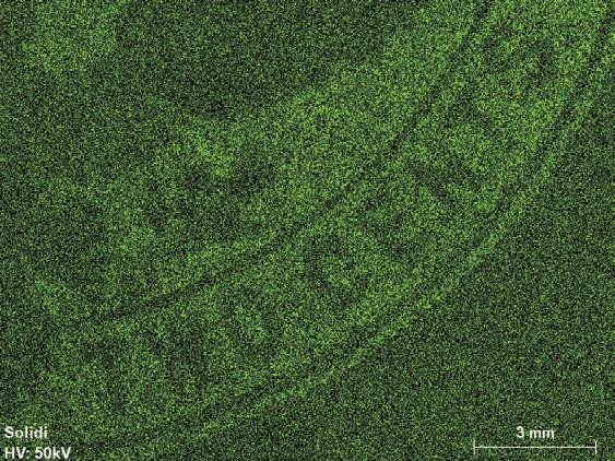
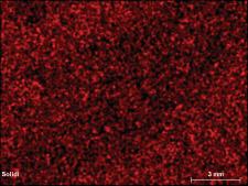
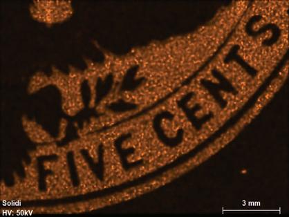
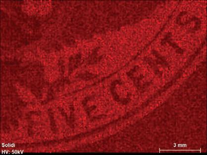
Figure 3. Kα elemental mapping for the blue 1¢ denomination for detectable peaks (Co, Fe, Cl, K, and S). Scale bar is 3 mm.
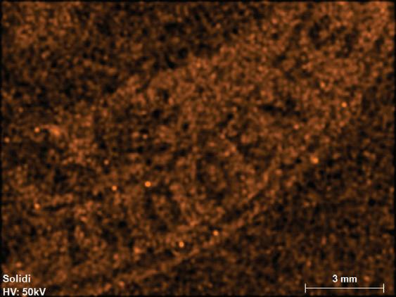
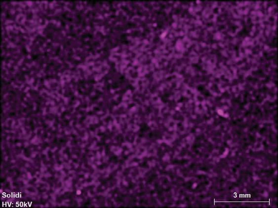
Figures 3-6 show the results of elemental mapping on pixel levels over areas including the denominations (about 200 mm2) for each of the four embossed stamps, including not only inked parts and also backing paper, but without sealing gum. These allow for identification of elements that are included in the ink that therefore stand out by their higher intensities relative to their background intensities from the envelope paper.
The first order observation is that the four inks used can be grouped into two groups. Those in the first group include the blue 1¢ and the violet 2¢ inks characterized by a simple elemental makeup and synthetic pigment origin. The second group includes the chocolate brown 5¢ and the slate brown 10¢ inks that show complex elemental makeup indicating an earth-type material such as clay mixtures.
The 1¢ blue ink is characterized dominantly by iron with minor amounts of cobalt and potassium near detection level (Fe, Co and K, Figure 3).
The 2¢ violet ink is characterized dominantly by aluminum and lead with trace amounts of phosphorus, potassium and sulfur near detection levels (Al, Pb, P, K and S, Figure 4).
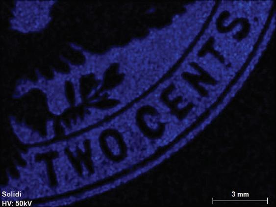
Figure 4. Kα or Lα elemental mapping for the violet 2¢ denomination for detectable peaks (Pb, K, Al, P, Cl, and S). Scale bar is 3 mm.
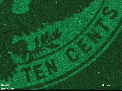
The chocolate brown 5¢ ink is made of a mixture of 10 detectable elements of which barium, phosphorus, lead, titanium, vanadium and sulfur appear in the highest concentrations (Ba, P, Pb, Ti, V and S) and silicon, aluminum, chromium, manganese and iron occur in smaller concentrations (Si, Al, Cr, Mn and Fe, Figure 5).
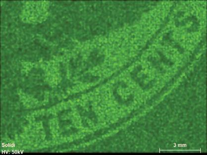
The slate brown 10¢ ink shows similarity to the 5¢ chocolate brown ink, with the same 10 detectable elements, but with some changes in relative concentrations. Silicon, barium, lead, titanium, vanadium and iron dominate (Si, Ba, Pb,
V Kα
Kα
Kα
Ba Lα
Kα
Kα
Kα
Pb Lα
Si Kα
Kα
Kα
Si Kα Al Kα
Ba Lα
Kα
Pb Lα
V Kα Cr Kα
Figure 5. Kα or Lα elemental mapping for the chocolate brown 5¢ denomination for detectable peaks (Si, Al, Ba, P, Pb, Ti, V, Cr, Mn, Fe, Cl and S). Scale bar is 3 mm.
Figure 6. Kα or Lα elemental mapping for the slate brown 10¢ denomination for detectable peaks (Si, Al, Ba, P, Pb, Ti, V, Cr, Mn, Fe, Cl and S). Scale bar is 3 mm.
Ti, V, Fe and S), while aluminum, phosphorus and manganese occur in minor concentrations (Al, P and Mn, Figure 6).
No other elements were detected in amounts sufficiently enough to visually stand out relative to the background envelope paper. This means that the elements present in the paper, because of their ubiquitous presence and because of the by far dominating paper volume fraction, will not be seen on the elemental scanned ink area images. As will be discussed, the elements calcium, chlorine and sulfur (Ca, Cl and S) are present in the paper, but only in the ink in trace amounts, if at all.
Table2.BulkCompositionasExpectedOxidesandforChlorineasAtomicProportionfortheFourDenominationsandPaper
ElementANOxide
NAVSTDAVSTDNAVSTDAVSTD
Aluminium13Al2O3* 0.11311.69 * 0.0364.37
Silicon14SiO210.0333.37ND
Sulfur16SO3* 0.0757.78 * 0.397 48.14
Chlorine17Cl50.0540.0085.580.54150.2130.01625.850.582
Potassium19K2O
Calcium20CaO50.1500.02015.532.34350.1470.01117.850.565
Titanium22TiO2
Chromium24Cr2O3
Manganese25MnO
Iron26Fe2O350.5420.10456.0510.76050.0140.0021.650.056
Copper29CuO
Barium56BaO
Lead82PbO50.0180.0062.140.207
Sum0.966100.000.825100.00 AN-atomicnumber;Oxide-typicaloxideswiththeexceptionsofClgivenasatomicproportion;N-numberofdeterminations;AV*-calculatedbasedonrelativepeakcountingrate.
5Cents10CentsPaper
NAVSTDAVSTDNAV STD AVSTDNAVSTDAVSTD
* 0.56012.47*0.36511.23
* 0.0303.86 Al2O3
50.4450.9699.910.96950.3101.1579.561.157SiO2 * 1.12625.06*0.89427.52 * 0.24131.06 SO3
50.3000.2346.680.23450.2941.6429.041.64230.2510.01032.312.618Cl ND40.0110.1250.330.125K2O 50.2130.3384.750.33850.2971.4569.151.45630.2540.03332.776.211CaO 50.1480.2083.300.20850.0900.6612.770.661TiO2 50.0120.0510.270.05150.0230.0810.690.081Cr2O3 50.0800.1111.780.11150.0410.1131.270.113MnO 50.3710.3418.260.34150.3031.7619.321.761Fe2O3 50.0100.0550.230.055NDCuO 50.6831.04915.201.04950.3691.55011.351.550BaO 50.5430.65312.090.65350.2521.1107.771.110PbO 4.491100.003.249100.000.776100.00
average;STD-standarddeviationformorethattwodeterminations;ND-belowlowerlimitofdetection(>0.01%).
The embossing technique used to print the stamps produced a thin surface layer of ink on the envelope paper with little bleeding from the ink areas normally recorded by the elemental distribution maps of Figures 3-6. The elemental combinations reflect the color of the pigment used in the printing ink. X-ray emission counts collected over up to five times multiple areas of 4-6 mm2 can be used to evaluate the bulk compositions of surface ink, the penetration depth of the X-rays into the envelope paper, as well as the diluting effects of the cellulose filter paper and plastic foundation. The results of such an exercise are summarized in Table 2 for the four inked areas and the corresponding envelope paper. Here, the percentages of the inorganic components amount to 1-4%, while the remaining > 90% come from the organic paper and plastic components. Because the inorganic components were very low, amounting to less than 4% for the ink
Volume 104, Number 2 Collectors Club Philatelist
areas, and less than 1% for the paper areas, care must be exercised due to a high uncertainty (~1%) when interpreting the bulk compositions normalizing to 100% given in Table 2.
Because the elemental maps are mixtures of ink and envelope paper, the issue naturally is to identify which of the observed elements reside in the inks or in the paper, or perhaps in both. This task is not simple, as will be illustrated by the distribution of chloride in the 5¢ and 10¢ envelopes (Figures 5 and 6).
3. Discussion
The micro-XRF technique detects the surface and penetrates down into the foundation. A maximum penetration depth into the paper is estimated to be around 0.30 mm.(9) Thus the X-rays will penetrate through the 0.14 mm envelope paper and into the cellulose filter paper and possibly the plastic foundation. Because the latter two components are made from nearly pure cellulose and polyethylene terephthalate (PET) plastic, respectively, their effects will mostly be strong dilutions of the signals.
Figure 7. Details of low-energy spectra below 8 KeV for the four different inks and the envelope paper. Lead (Pb) and copper (Cu) are shown in Figure 2 at energy levels higher than 8. Note the small peak for argon at around 3 KeV illustrating that this spectrum was, in contrast to the other spectra, obtained in air. CPS - counts per second; KeV - kilo-electron-volt.
3.1 Paper Preparation and Composition
The envelope paper contains only a few inorganic components, amounting to a total of 0.75% of the total mass. Only aluminum, chlorine, calcium and sulfur were detected in about equal amounts (Table 2, Figure 7). The total amount of measurable inorganic components in the paper is 0.98% by weight, with the remaining 99.02% being organic material, mostly cellulose. When the inorganic components are recalculated to 100% by weight, it amounts to 24% Al2O3, 25% SO3, 25% Cl and 26% CaO (Table 2). The allocation of chlorine is uncertain, but may appear as various salts, including calcium chloride (CaCl2) or calcium chlorate (Ca[ClO3]2), and thus reducing the amount of CaO as previously listed.
The official USPOD specifications for the envelope paper required high quality, as employed for the finest cotton envelopes in use at the time, except that the paper was to be cream tinted and contain a special watermark.[14] It is further specified the use of the “... best grade of white linen and the best grade of white domestic cotton rags, in the proportions of 35 percent of linen and 65 percent of cotton, excluding all other material except the necessary coloring matter, ...” (Ellis and Maisel, 1974, page 23). High-grade dry cotton rag would probably contain about 90% pure cellulose and similar grade linen would contain 60% to 90% cellulose (Hunter, 1978). This would make the specified mixture of the two components between 90% and 75% pure cellulose. The remaining 10% to 25% would be made up of other organic components, such as lignin, in addition to an inorganic component measured by the ash content that may on a dry basis be around 5%.[15] Although there is no information on the content of cotton ash in the existing database,[15] it may, however, be reasonable to expect that the inorganic composition would show some similarities to what is observed in ash produced from the waste of cotton ginning[16] for which the main inorganic components are SO3 (4%), P2O5 (10%), SiO2 (23%), CaO (7%), and K2O (13%).[15] Of these oxides, however, only sulfur and calcium are detectable in the energy spectra for the envelope paper (Figure 7), suggesting that the remaining observed components (Al2O3 and Cl) must have had different origins.
The USPOD specifications further detail the paper production by writing “... in the process of manufacture, the rags ... shall be washed and beaten in the washing engines not less than a total of sixteen hours; and the paper shall be made in a Fourdrinier machine, and be sized by being run through a tube of animal sizing of best quality, and shall be loft dried.” These specifications reflect standard procedures at the time for paper production (Sindall, 1908; Weeks, 1916; Hunter, 1978).
The initial processing at high temperature of the linen and cotton rag[17] mixture involved the lengthy boiling and beating (maceration) of the rags into a soft, fine particle pulp, often by adding various salts of soda or lime (caustic soda, carbonate of soda or milk of lime). The requirement of restricting the boiling time to less than 16 hours is because extensive boiling would result in shorter cellhouse fibers and thus lower the quality of the paper product.
Often a glue mixture of resin (organic compounds made of building blocks of C5H8) and alum (aluminum sulphate) was added to the paper pulp to enhance the boiling process (Hunter, 1978, 428ff; Holik, 2013). If the aluminum sulfate is retained in the pulp, acids are formed, and an acidic paper will result with potential for long-term decomposition and browning. Bleaching at this point was done by adding chlorine in aqueous solutions in the form of hydrogen peroxide to brighten or whiten the pulp. This appears to have been done for the envelope paper, although the product has not been thoroughly rinsed, leaving at least some chlorine and lignin in the paper (Figure 7).[18] The long-term effect of residual chlorine in the paper is to cause acidic reactions with browning and embrittlement of the paper (foxing), particularly as results of exposure to light, to polluted air or moisture.
Thus, the paper the Columbian Exposition envelopes were made from was acidic, as demonstrated by its contents of Al and S (alum), Ca (caustic lime or similar) and Cl (bleaching) (Figure 7).[19] Students of these envelopes are certainly aware of their potential for paper discoloring (cf., Figure 8).
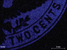
Figure 8. A 2¢ error impression in chocolate brown that should have been used for the 5¢ envelope. This color error has not previously been described. Note slight toning of right half without affecting ink color.
The required paper preparation method mentioned in the postmaster general’s specifications refers to machine production, as opposed to hand-making. The mechanical cylinder machine, known as the Fourdrinier machine, was first introduced in the United States in 1829 at a paper mill in Hartford, Conn., and by the end of the 19th century was widely in use to accommodate the expanding need for paper (Weeks, 1916; Hunter, 1978). The machine was operated by a continuous rotating web of woven wire partially submerged in floated pulp, forming a fine paper mat that, as it was being led away and pressed, was then passed under a “dandy roll,” from which the watermark was impressed in the semi-formed paper (Williams, 1990). Eventually, it was dried, forming a continuous roll of paper and, from this roll, sheets of the prescribed dimensions would be cut to the USPOD specifications (22½ by 30 inches).
A final requirement was that the paper should be coated, by running it through a tube containing animal-derived clean gelatine solution and should finally be naturally dried. This process is referred to as “sizing” and has the
96 www.collectorsclub.org March-April 2025
purpose of reducing the dry paper’s tendency to absorb moisture, thus allowing inks and paints to remain on the surface of the paper and to dry without bleeding or smearing. The gelatine is a protein derived from hoofs, hides and horns of animals, hence the reference to animal sizing (Sindall, 1908).
There is little doubt that the printing and folding of the envelopes may have been performed by the two principal contractors using a complex mechanical machine able to combine printing and folding in one operation and that could, under optimal conditions, produce 5,000 stamped and folded envelopes per hour (Towle, 2012). However, nothing appears to be known about who supplied the paper sheets from which the blanks for the production of the envelopes were cut (cf., UPSS, 2012). The Hartford area where the contractors were located had, by the late century, developed into a regional district of printing and papermaking, with paper mills located along the Connecticut River where water was plentiful and shipping easily accessible (Munsell, 1870; Logan, 1921; Valente, 2010). By the turn of the century, paper manufacturing had seen a boon in response to a massive growth in printing in the northwest United States. Mechanical moving wire procedures for paper making had been developed. Also, wood and straw pulp had been introduced with the result that rag paper production had declined and was taken over by wood-based paper (Valente, 2010). The USPOD, in 1893, still insisted on the use of rag-based paper for the Columbian Exposition envelopes at the same time as the American Bank Note Co. used wood-based paper for producing its related adhesive stamps (White, 1983). The reason was that cotton fibers were stronger than wood fibers and did not wet as quickly if the envelopes were exposed to extreme weather conditions. This was not as critical for adhesive stamps (Dan Undersander, personal communication, September 2014).
Table3.SimplifiedInkCompoitionCorrectedfortheEffectsofPaper ElementANOxide
1Cent2Cents
Analy.Corr.%Analy.Corr.%
Aluminium13Al2O30.1130.10213.930.0360.0145.21
Silicon14SiO20.0330.0334.45
Sulfur16SO30.0750.3970.21882.88
Chlorine17Cl0.0540.213
Calcium20CaO0.1500.0557.530.147
Titanium22TiO2
Iron26Fe2O30.5420.54274.090.0140.0145.18
Barium56BaO
Lead82PbO0.0180.0186.72
Sum0.9660.731100.000.8250.263100.00
%Paper30%70%
AN-atomicnumber;Oxide-typicaloxideswiththeexceptionsofClgivenasatomicproportio 100%.
ly.Corr.%Analy.Corr.%Analy.Corr.%Oxide
0360.0145.210.5600.52514.750.3650.32714.59Al2O3
0.4450.44512.500.3100.31013.84SiO2 3970.21882.881.1260.84723.770.8940.59126.37SO3 2130.3000.294Cl 1470.2130.297CaO
0.1480.1484.170.0900.0904.01TiO2 0140.0145.180.3710.37110.410.3030.30313.50Fe2O3
0.6830.68319.160.3690.36916.43BaO 0180.0186.720.5430.54315.250.2520.25211.25PbO 8250.263100.004.3893.562100.003.1752.243100.00Sum 70%20%30%%Paper
2Cents5Cents10Cents venasatomicproportion;Analy.-asanalyzed;Corr.-correctedforpaper;%-normalizedto
3.2. Adjustment for Paper Contribution
Because the X-rays penetrate through the ink film and into the underlying envelope paper (and possibly deeper), the investigated single-layer embossed envelope cuts were placed on pure cellulose filter paper directly on the chamber stage made from PET plastic. This neutral “padding” had no impact on the compositional results except for a dilution effect.
Given the known composition of the envelope paper and the respective solid fractions (Table 2), the bulk ink compositions can be adjusted for the effect of envelope paper. The adjusted results are given in Table 3. It is a fair assumption that the chloride and calcium content dominantly reside in the paper. Based on this assumption, the unknown variable in the calculations, that is the relative proportions of paper and ink, can be estimated. By using trial-and-error calculations, a 20-30% envelope paper proportion can be estimated for the 1¢, 5¢ and 10¢ envelopes with only the 1¢ envelope still retaining a small amount of calcium in the ink. The exception, however, is the 2¢ envelope that would require a much higher paper component of 70% to deplete the chlorine and calcium content (Table 3).
Although sulfur would have been expected to have resided in the paper, this is only the case for the 1¢ envelope. For the other three envelopes, a significant proportion of sulfur remains in the ink. A particular issue is the 2¢ envelope, for which the main inorganic component actually is sulfur, with subordinate amounts of aluminum, iron and lead. Another observation, perhaps unexpected, is that aluminum is a minor component of all the inks.
The adjusted ink compositions, excluding the paper contribution, is given in Table 3, together with the new adjusted total mass of inorganic components.
98 www.collectorsclub.org March-April 2025
3.3. Ink Used for Printing
3.3.1. 1¢ Blue
By far the most dominating element in the 1¢ adjusted blue ink is iron. Minor amounts of soil/clay-related elements (Al, Si and Ca, Table 3) are also present, together with traces of cobalt and potassium, as detected by the scanned maps (Figure 3).
An inexpensive and widely used pigment for producing a blue color was synthetic ferric ferrocyanide, also known as Prussian blue and chemically by the general formula Fe7(CN)18 or, if specifying the valences of iron, as Fe+34[Fe+2(CN)6]3
The pigment Prussian blue is an insoluble strongly colored pigment that tends towards black and dark blue associated with the charge transfer energy of electrons between Fe+2 to Fe+3 in the crystal structure. The result is absorption of orange-red light with the reflection of blue light as a result (Underwood and Sullivan, 1915; Weber, 1923; Berrie, 1997). The small amount of detected potassium can be attributed to potassium salt used in the manufacturing of Prussian blue (e.g., Underwood and Sullivan, 1915; Figure 3 and Table 3).
The intense color of Prussian blue may have required a whiting medium added to the ink to archieve the required color intensity. Typically, this would have been done by adding, for example, zinc or lead white. However, it is possible that a low-cost natural aluminum-silicate, like kaolinite (Al2Si2O5(OH)4), was used with the same basic effect. This would explain the small amounts of detected aluminum with silicium (Figure 3 and Table 3), the latter resulting from an incomplete separation of quartz from the raw natural material.
The remaining calcium, after correcting for the effects of the envelope paper could be related to the addition of lime (CaO) or carbonate (CaCO3) for whiting purposes, but are probably best attributed to an incomplete removal of the paper fraction. Lastly, the detection of trace amounts of cobalt (Figure 3) is likely to result from an addition of a drier in the form of a vegetable oil laced with cobalt as was commonly done (Underwood and Sullivan, 1915; Wiborg, 1926).
In summary, the bulk chemical composition for the blue 1¢ embossed stamp suggests the use of a synthetic Prussian blue pigment with added low-cost natural kaolinite for whiting purposes.
3.3.2. 2¢ Violet
The bulk composition of the 2¢ violet ink is quite different from the other stamps. The first observation is that only a few elements are detected (Figure 4) and that most of these can be eliminated or significantly reduced by subtracting the envelope paper background (Table 3). This leaves only sulfur (~ 82%) as a major component, along with small amounts of Al, Fe and Pb. The total corrected residual solid is very low (~0.3%) and a high proportion of envelope paper (70%) is required to adjust chlorine and calcium to zero (Table 3). The
obvious conclusion, based on these observations is that the pigment used for the embossing of this envelope was organic in origin and thus would only leave few – if any – traces when analyzed by the X-ray fluorescence method. Thus, the XRF method is admittedly poorly suited for studying the pigment used in the ink for the 2¢ stamp.
The most likely pigment used was of vegetable origin and extracted from the roots of the perennial madder plant (Rubiaceae family) widely grown in Europe and also in America for commercial purposes. The extracted dye from the roots is used to color fabrics in pink, purple and red shades. To use this dye for printing purposes (referred to as “lakes”), the coloring agent (alizarin, C14H6O4) needed to be precipitated onto an inert and transparent carrying agent, typically aluminum hydrate (Al2[OH]6) or mixtures of aluminum hydrate and aluminum sulfate [Al2(SO4)3] (Underwood and Sullivan, 1915, page 81; Schweppe and Winter, 1997).
The role of the small amount of detected lead (Figure 2 and Table 3) is uncertain. It is possible that it was added as white lead (mixture of lead carbonate and hydroxide) to function as a carrier, together with aluminum hydroxide. Another possibility is that it was added as a coloring modifier in the form of red lead oxide (Underwood and Sullivan, 1915; Weber, 1923). The trace amounts of phosphorus and potassium (Table 4) may have originated from the organic source for the main pigment.
Considering the very small amount of inorganic residue (~0.3%) it is probably not wise to place too much emphasis on the relative amounts detected and calculated (Figure 4; Table 3).
3.3.3. 5¢ and 10¢ Brown
There are many similarities between the inks used for the two high-denomination envelopes. Both ink areas have a high residual inorganic content (2.2-3.6%) after the removal of 20-30% envelope paper to eliminate chlorine and calcium (Table 3); the highest amount for both values being for the 10¢ envelope. The elements detected by scanning the ink areas (Figures 5 and 6) includes four groups: (1) earth material related Al, Si, P and K; (2) transition metals Ti, V, Cr, Mn and Fe; (3) heavy elements Ba and Pb (Figures 2 and 7); and (4) high concentrations of sulfur remaining for both denominations after the corrections for paper contributions (Table 3). A prominent presence of lead is seen for both 2¢, 5¢ and 10¢ denominations, manifested by both L and L peaks (Figure 2).
The presence of both silicate and oxide compounds points toward an earth pigment. Likely candidates are umbra, ochre or sienna and their calcinated byproducts. These are natural weathering deposits containing high amounts of iron and sometimes manganese hydroxides (Helwig, 2007). These types of pigments are described by Underwood and Sullivan (1915, page 61) as being cheap and of “ ... practically no value as typographical ink pigments and very little value as plate ink pigments on account of their hardness ...” The natural weathering deposits are typi-
100 www.collectorsclub.org March-April 2025
cally made of oxidized iron deposits, including ferrihydrite (goethite, FeOOH), clays and iron oxides, such as hematite (Fe2O3). Pigment preparation involves the removal of quartz and other silicates, followed by calcination in a furnace and grinding to a fine size. The final result will thus contain mostly iron and some remaining silicate minerals (Al, Si and K) in addition to several transition elements in small or trace concentrations, as found in iron oxides, including Ti, V, Cr, and Mn (Figures 5 to 7). The most common used of these pigments are burnt sienna that typically has an orange-brown color. The iron content of natural raw iron oxide material may vary widely from 60% to 95% (Helwig, 2007) and thus suggest a significant number of other components in the pigment used to reach an Fe2O3 concentration of 10-14% (Table 3).
Three elements are further common for the two high denominations as lead, barium and sulfur appear in relatively high concentrations (Figures 5-7; Table 3). The mass proportions of these three oxides are relatively similar for the two envelopes (SO3 0.41-0.49; BaO 0.33-0.30; and PbO 0.26-0.21, respectively for 5¢ and 10¢ envelopes). Calculated on an atomic basis, the proportions are S 0.61-0.68, Ba 0.25-0.22 and Pb 0.14-0.10. This suggests that these three elements result from the addition of the same modifiers to the pigments and in largely the same proportions for the two denominations.
Both Pb and Ba often function as a white dilution pigment used to adjust the tint of the pigment, in this case probably burnt sienna. Lead is often used in the form of white lead; a mixture of lead carbonate and hydrate (PbCO3 and PbCO3 H2O). Barium sulfate (BaSO4) is likewise used as a whitener often mixed with ZnS and referred to as lithophone (Feller, 1986; 86). Zinc white (ZnO) is another widely used whitener (Kühn, 1986). However, the lack of detected zinc suggests that barium sulfate was used perhaps combined with white lead, or their synthetic equivalents. Lead could further have been added as red lead (Pb3O4) to modify the shade of the brown pigment, although this is rather unlikely considering the chocolate brown color (Fitzhugh, 1986). The most likely and cheapest solution is that the burnt sienna pigment was modified by a mixture of barium sulfate and white lead
It is nevertheless noteworthy that the detected mass proportions of Pb-Ba-S poorly support this interpretation and instead predict an atomic Ba-S proportions of around 1:2 instead of the 1:1 predicted for barium sulfate. The reason for this discrepancy is not clear, but may be related to the very low bulk inorganic fraction detected (2%-4%) of the total mass of the ink and even much less for the envelope paper (< 0.5%). This consequently results in a poor precision of the analytical and modeled results.
A final issue is the cause of the distinct different nuances of brown used to print these two envelopes. The only difference between the two values is that the detected intensity of iron is highest for the ink used for the 10¢ stamp (Figures 5 and 6). This difference amounts to a higher iron content of about 30% for the 10¢,
compared to the 5¢ stamps, with other heavy elements, as expected, correspondingly decreasing in concentrations (Table 3). This means that the source of iron in the ink was dual and suggests that an amount of the blue ink used for the 1¢ envelope ink may have been added to the 10¢ ink giving it a slate/maroon-brown shade (Figure 1).
4. Production and Color Variation
The envelopes were produced by cutting blanks from rectangular piles of sheets made from rag paper using manually positioned, size-specific cutting forms (referred to as knifes or dies) and aided by a hydraulic press (UPSS, 2012). Due to the need to preserve paper, the rectangular format of the sheets and the orientation of the watermark support wires of the dandy roll, the blanks were mostly cut with the watermark in four different diagonal positions (about 40-45o), irrespective of size, either facing up or down and normal or inverted (all as seen from the front of the envelopes).
Embossing presses and envelope-folding machines for producing stamped and gummed envelopes had, by the turn of the century, evolved into high-speed, automated wonders that would imprint the stamp and fold and gum the envelope in complex mechanical operations (Scientific American, 1852; Collins, 1906; Easton, 1949; Benjamin, 2002; Towle, 2012). All that was required, under perfect circumstances, was for an attendant to feed the envelope blanks into a guided position and another attendant to retrieve the products for drying and packing. The machines were able to operate at high speed, imprinting and folding about 5,000 envelopes per hour (Benjamin, 2002; Towle, 2012). There are, however, indications, as will be suggested, that the production of the Columbian envelopes were split into two steps: embossing and folding. Needless to say, the operations were not always perfect; the ink reservoir had to be refilled, the dies had to be cleaned if over-inked, press operated without inking or without paper and the operation stopped if something malfunctioned, such as a misplaced, missing or jammed envelope paper. These kinds of imperfect operation events have often produced plenty of misprinted and misinked Columbian envelopes.
The first production step was the embossing of the envelope blanks in the upper right corner. This was done by machine positioning the paper blanks and required separate adjustments for each of the eight envelope sizes. The upperright corner positions were between an upper soft plate and a lower recessed steel working die inked on the upper face, but not over-inked into the recessed parts. This would result in an embossed imprint on the underside of the paper as fed with the images (like Columbus and Liberty) and text all as white un-inked protruding parts with the rest being inked (Scott Catalog, 2001, pp. 292-293).
Not only does this require an exact envelope positioning, but also an automatic cleaning and inking of the working die after each imprint. The not-uncommon finds of albino imprint and backside inverted printing are the result of operations
either with lack of inking or the operation without paper and subsequent lack of cleaning. The find of envelopes with both albino imprint and a back inking, often relatively shifted, suggest that the envelopes were produced by multiple operations without intermediate folding of the envelope. Therefore, the operations were done in two steps: first embossing and then folding, probably, respectively attributed to the two companies holding the contract.
Further typical printing errors included over-inking, irregular ink transfer and, in rare cases, printing with the wrong ink. These latter errors of color include 2¢ envelopes printed in either chocolate brown (Figure 8) or dark slate and 5¢ envelopes printed in slate brown. Although these color errors rarely occur, they are easily explained.
All Collectors Club presentations are currently held online, via ZOOM, beginning at 5:30 p.m. (Eastern). Although there is no cost, pre-registration is necessary.
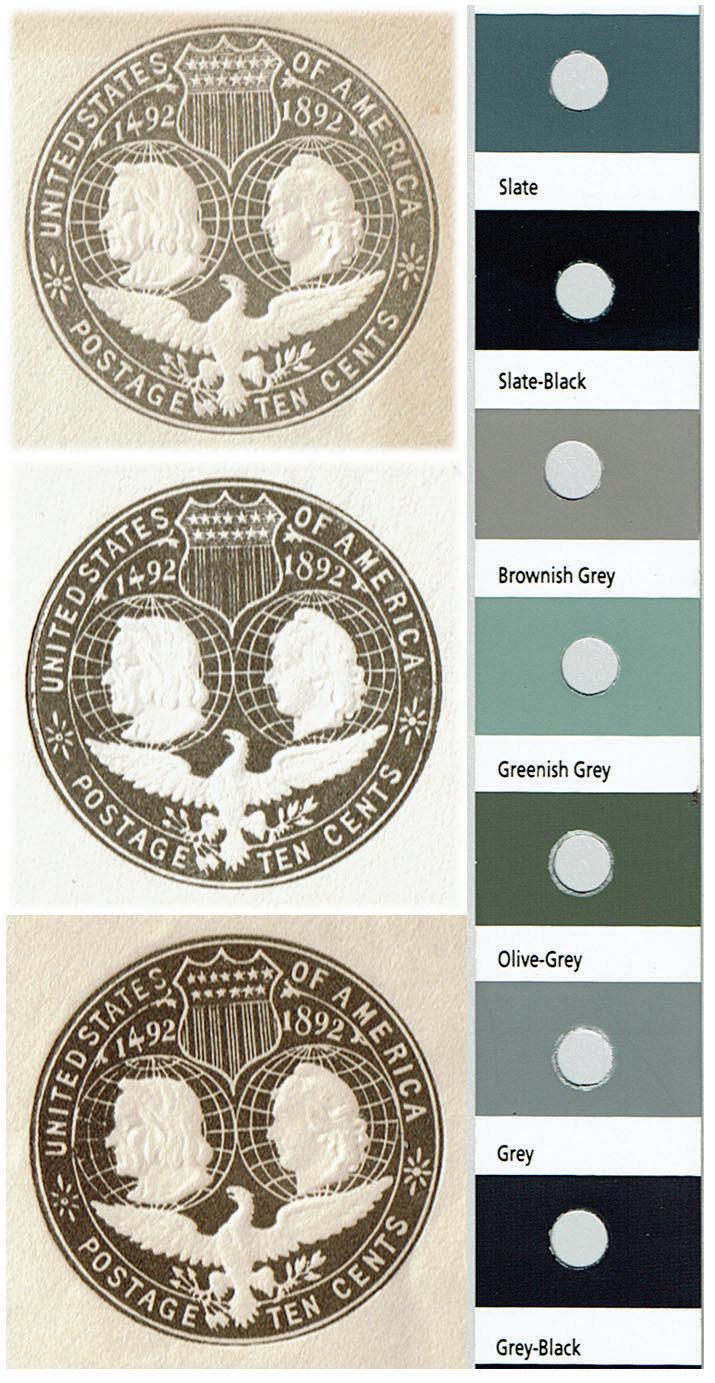
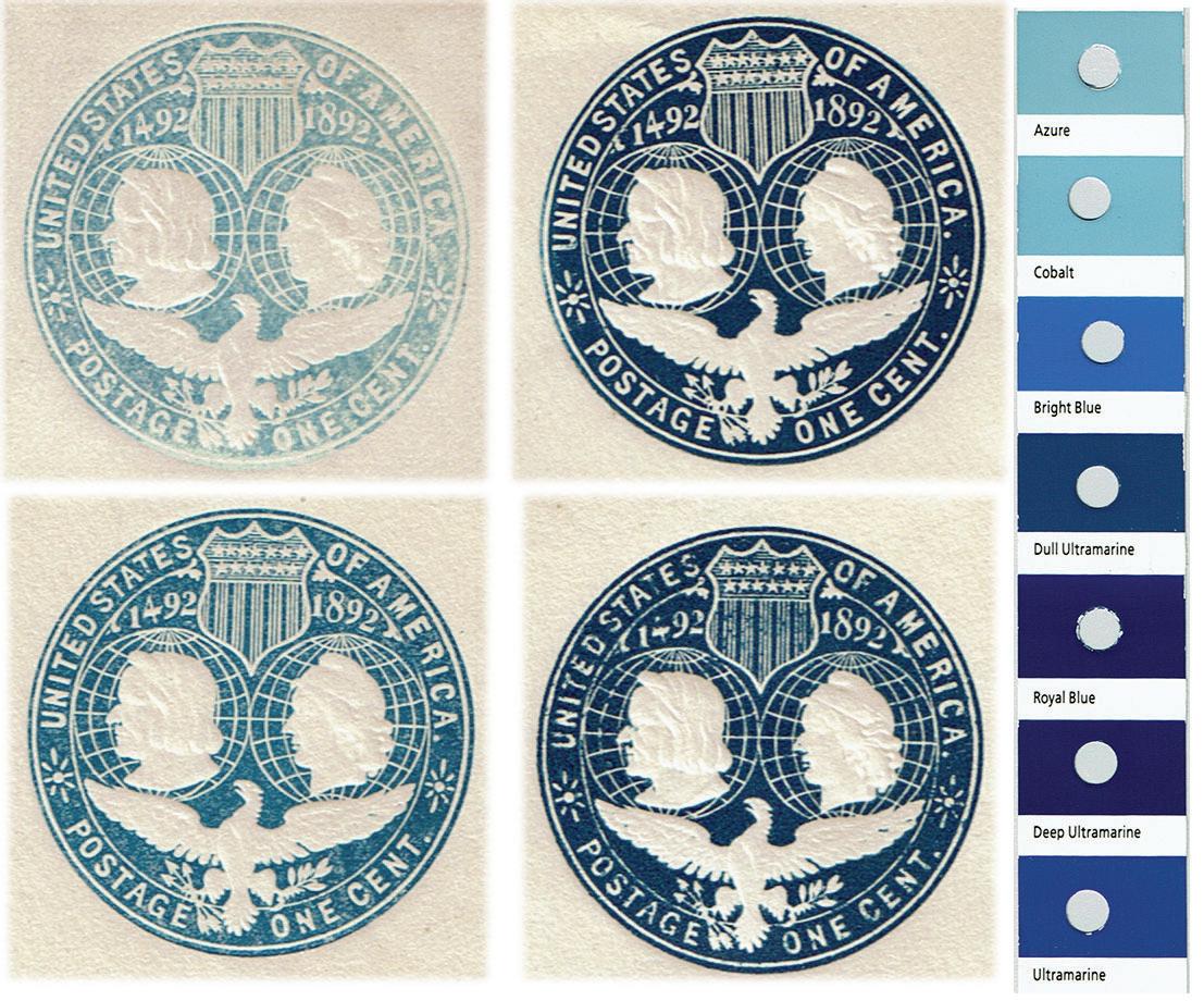
Figure 9. Representative shades of the blue 1¢ embossed stamp imprint. A and B are under-inked; C is correctly inked; and D is overinked. To the right is an appropriate sequence of the Stanley Gibbons color guide.
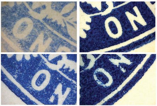
Figure 10. Enlargements of the same stamp imprints as shown Figure 9. A and B are underinked, C is correctly inked and D is overinked.
Figure 11. Representative shades of the violet 2¢ embossed stamp imprint. A-C are caused by underinking; E is correctly inked and D and F are overinked. Note the different tints for the two over-inked examples D and F reflecting two different inks. To the right is an appropriate sequence of the Stanley Gibbons color guide.
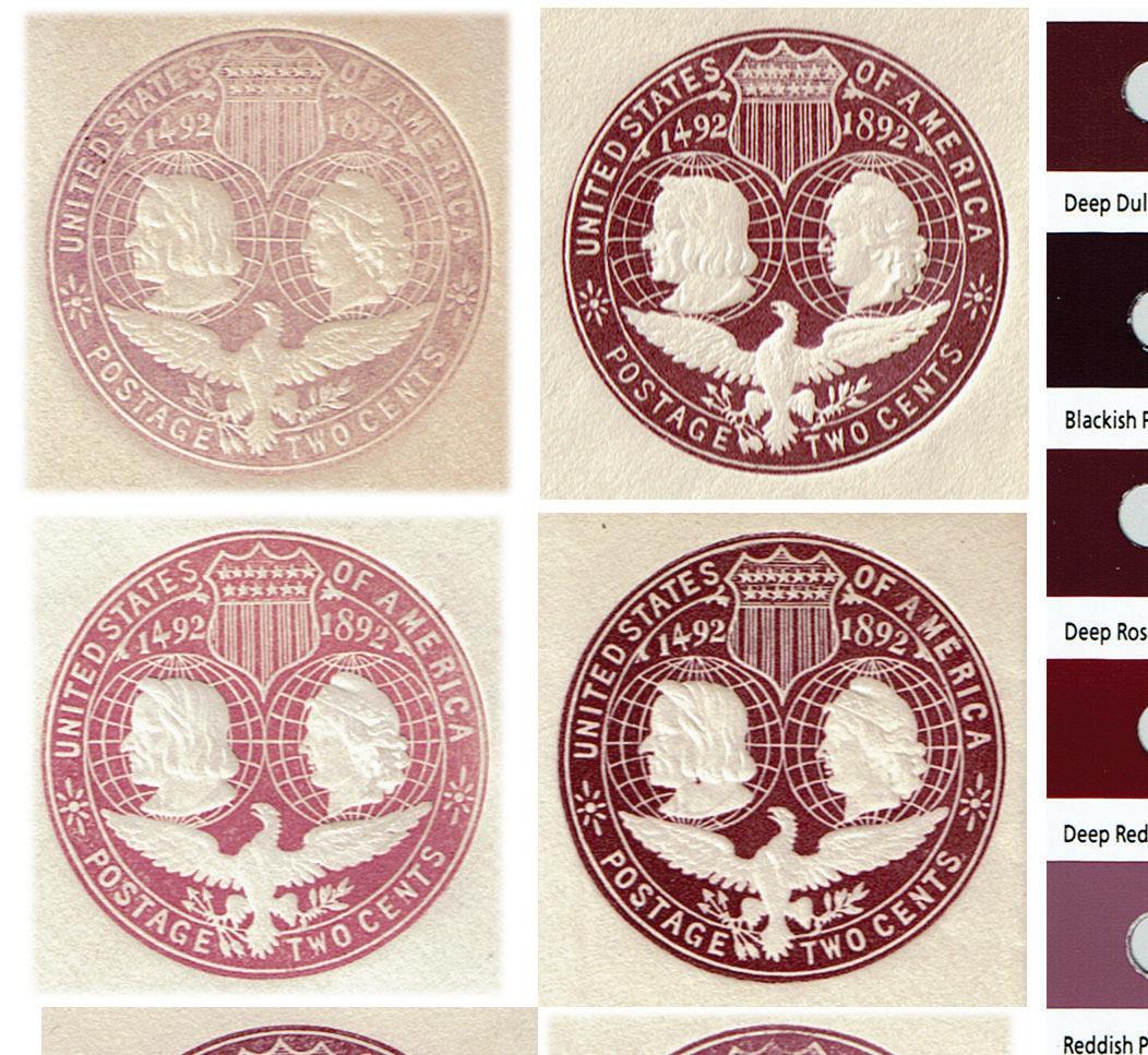
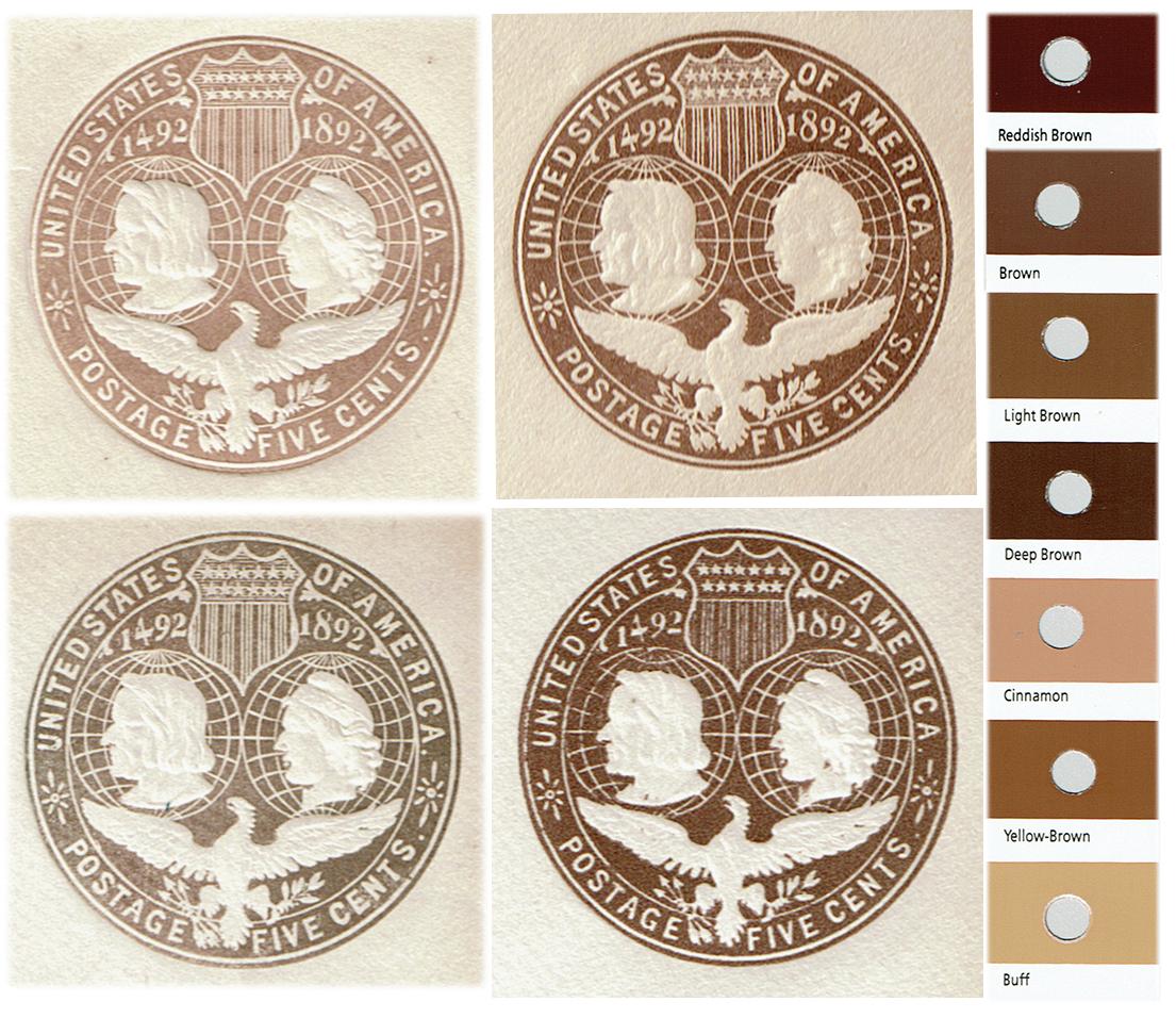
Figure 12. Representative shades of the chocolate brown 5¢ embossed stamp imprint. A and B are caused by underinking, C is correctly inked and D is overinked. To the right is an appropriate sequence of the Stanley Gibbons color guide.
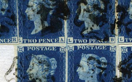
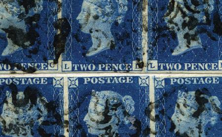
More commonly seen color variation is various shade variants for all denominations. Figure 9 shows four representative bluish impressions for the 1¢ envelope, ranging from azure to blue and deep ultramarine (compared to the Stanley Gibbons color guide). Microscopic close-up images of the same imprints of Figure 10 reveal they are the result of underinking (Figure 10a) to overinking (Figure 10d). The underinking is manifested in shades of a mixture of white and ultramarine. Overinking is clearly seen by a narrowing of the white parts of the impression remaining, but still the ultramarine ink color. In some cases, ink bleeding into the white paper parts can be seen.
Figure 13. Representative shades of the slate brown 10¢ embossed stamp imprints. A and B are caused by underinking and C is correctly inked. To the right is an appropriate sequence of the Stanley Gibbons color guide.
Images of the color variation for the purple[20] 2¢ impressions are shown in Figure 11 as six representative shades from rose-lilac to deep reddish purple. Of these, only Figure 11F results from overinking and still retain a reddish-purple shade approaching that shown in Figure 11B. This observation suggests variations in the original inks used for printing the 2¢ envelopes, as predicted from the large number of envelopes produced.
Figure 12 illustrates four representative shades for the 5¢ impressions, ranging in shades from cinnamon to grayish brown, yellow-brown and brown. Only the imprint of Figure 12D shows some signs of being overinked. The shades for the high-denomination 10¢ imprints are illustrated in Figure 13 as three representative impressions varying from grey to slate and greyish black. Overinked impressions have not been observed during this study.
5. Summary
The embossed Columbian Exposition envelopes were produced as part of a standing contract with the USPOD by the Plimpton Manufacturing Co. and Morgan Envelope Co., Hartford, Conn. In contrast to the adhesive Columbus envelope series that were printed at the same time by the American Bank Note Co. on wood-based paper, the envelopes were – as required by the USPOD – printed on high-quality, rag-based paper. The source of the paper is not known, but it is unlikely to have been manufactured by the envelope contractors.
The study of the inorganic component of the envelope paper confirms that this was a rag-based paper and in addition indicates the use of chlorinated bleaching agents and the addition of alum and milk of lime or chalk to enhance the pulp preparation (the addition of Cl, S, Al and Ca). The residual chlorine and sulfur in the paper causes, when exposed to sun (temperature) and moisture absorption, acidic reactions and browning of the paper. This is commonly observed for many envelopes and also manifested as an overall increase in fluorescence when exposed to ultraviolet light (Pedersoli et al., 2000). These procedures indicate an attempt to cut corners to reduce expense, although this, however, may have been common practice at the time.
Attempts to reduce expenses are also seen in the choice of some of the pigments for the embossing inks. The 1¢ envelope is inked in a blue color interpreted to have been based on a synthetic Prussian blue pigment (Fe) to which was added small amounts of kaolinite for whitening purpose (Al, Si, and K). The detection of small amounts of cobalt is attributed to the use of a drier as a vegetable oil laced with cobalt (Co). The ingredients used for the blue ink were easily available and at the time relatively inexpensive.
The reddish ink used for the 2¢ envelope was an organic pigment, judging by the detected very low inorganic solid component. The most likely source would be a pigment derived from a vegetable dye extracted from the roots of the perennial madder plant and precipitated probably on aluminum hydrate or sulfate.
106 www.collectorsclub.org March-April 2025
This type of pigment is referred to as a lake or Madder lake (Al, S and Fe). The small amount of observed lead could have been added as white lead to the aluminum carrier but could also have been added as red lead as a coloring modifier. It is nevertheless important to realize that the micro-XRF method is poorly suited for studying lake pigments made of mostly organic compounds.
The brownish inks used for the high-denominated (5¢ and 10¢) envelopes shows similarities pointing toward an earth type of pigment, such as burnt sienna, containing various weathered silicates (Al, Si, P and K), oxides and hydroxides (Ti, V, Cr, Mn and Fe). The presence of lead and barium, together with sulfur, is interpreted to have been added as white dilution compounds to adjust the tints of the pigment in the form of a mixture of white lead and barium sulfate. The difference between the inks used for the two high denominations is that a component containing high iron was added to the 10¢ ink suggested to be a batch of the blue ink used for the 1¢ envelope producing the slate brown tint.
All four denominations show considerable shade variations attributed either to the use of several ink batches or to underinking. The latter results in a visual mixture of the cream white paper and the underinked original tinted ink that can explain most of the shades observed for all envelopes. The exception for this is for some of the 2¢ envelopes that suggests several slightly different ink batches were prepared for the production.
Although they were commonly available and inexpensive, the use of natural earth materials as pigment and modifiers in inks was not without problems, since their preparations required special attention. Hard solid grains of silicate and oxide are variably present in the source material and need to be removed or pulverized to a very small size. With this failing, as is often the case, fine hard grains will erode the steel dies and may have been a contributing factor to the frequent need to replace or repair the working dies.
Acknowledgements[21]
The micro-XRF analyses were done at the Department of Geoscience, University of Aarhus, Denmark. The American Philatelic Research Library kindly provided literature sources.
References
Benjamin, M.H., 2002, The History of Envelopes 1840-1900, Envelope Manufacturers Association and EMA Foundation for Paper-Based Communications, 2002.
Berrie, B.H., 1997, “Prussian blue,” in (FitzHugh, E.W., Ed.) Artists’ Pigments. A Handbook of Their History and Characteristics, Volume 3, pp. 191-217, National Gallery of Art, Washington and Oxford University Press.
Bowers, C., 2019, “Matrix effect corrections in X-ray fluorescence spectrometry,” Journal of Chemical Educations 96, pp. 2597-2599.
Collins, A.F., 1906, “A new steel-plate printing and embossing machine,” Scientific American, Nov. 10, page 347.
Easton, J., 1949, Postage Stamps in the Making (F.J. Melville), rewritten and completed, Faber and Faber, London.
Ellis, F.L., and Maisel, W.H., 1974 “U.S. Commemorative and Special Printed Envelopes: 18761965,” American Philatelist, April-May-July 1974 (Volume 88), pp. 311-336, 403-528 and 615-626, reprinted 1976 by W.H. Maisel as booklet, Lutherville, Md.
Feller, R.L., 1986, “Barium sulfate - natural and synthetic,” in (Feller, R.L. Ed.) Artists’ Pigments. A Handbook of Their History and Characteristics, Volume 1, pp. 47-64, National Gallery of Art, Washington and Oxford University Press.
Fitzhugh, E.W., 1986, “Red lead and minium,” in (Feller, R.L. Ed.) Artists’ Pigments. A Handbook of Their History and Characteristics, Volume 1, pp. 109-140. National Gallery of Art, Washington and Oxford University Press.
Haschke, M., 2014, Laboratory Micro-X-Ray Fluorescence Spectroscopy. Instrumentation and Applications, Springer, Cham.
Helwig, K., 2007, “Iron oxide Pigments,” in (Berrier, B.H., Ed.) Artists’ Pigments. A Handbook of Their History and Characteristics, Volume 4, pp. 39-109. National Gallery of Art, Washington and Oxford University Press.
Holik, H., 2013, Handbook of Paper and Board, John Wiley, ProQuest Ebook Central, https://ebookcentral.proquest.com/lib/ucdavis/detail.action?docID=1161328
Hunter, D., 1978, Papermaking. The History and Technique of an Ancient Craft, Dover Publications, New York (First published by Alfred A. Knopf, 1943).
Jenkins, R., 1974, An Introduction to X-Ray Spectrometry, Heyden, London.
Kühn, H., 1986, “Zinc white,” in (Feller, R.L. Ed.) Artists’ Pigments. A Handbook of Their History and Characteristics, Volume 1, pp. 169-186. National Gallery of Art, Washington and Oxford University Press.
Logan, J., 1921, “The Beginnings of the Envelope Industry in Hartford, Conn.,” Chapter VII, Red Envelope, October 1921, No. 14, pp. 3-32, Plimpton Manufacturing, Hartford, Conn, available from Google Books.
Munsell., J., 1870, Chronology of Paper and Paper-making, Fourth Edition, J. Munsell, Albany, N.Y., available from Google Books.
Pedersoli, J.L. Jr, Ligterink, F.J. and Di Pietro, G., 2000, “Browning of paper,” Papier Restaurierung 1, Supplement, pp. 47-54.
Perry, T.D., 1940, Guide to the Stamped Envelopes and Wrappers of the United States, Dietz Press, Richmond, Va.
Perry, T.D., 1955, “U.S. Envelope Stamps. Master Dies and Hubs,” The American Philatelist, January 1955, pp. 247-259.
Pessanha, S., Guilherme, A. and Carvalho, M.L., 2009, “Comparison of matrix effects on portable and stationery XRF spectrometers for cultural heritage samples,” Applied Physics A Materials Science and Processing, 97, pp. 497-505.
Schei, L.A., 1992, “A new classification of the Columbian Envelopes,” The American Philatelist, May 1992, pp. 440-452.
Schweppe, H. and Winter, J., 1997, “Madder and Alizarin,” in (FitzHugh, E.W., Ed.) Artists’ Pigments. A Handbook of Their History and Characteristics, Volume 3, pp. 109-142. National Gallery of Art, Washington and Oxford University Press.
Non-bylined, 1852, “Hill’s embossing press,” Scientific American, Vol. VII, No. 26, March 13.
Scott Publishing, 2001 (and recent editions), Specialized Catalogue of United States Stamps and Covers, Scott Publishing Company, Sidney, Ohio.
Sindall, R.W., 1908, The Manufacture of Paper, Archibald Constable, London, available from Google Books.
Thorp, P.H. (Ed.), 1954, Thorp-Bartels Catalogue of the Stamped Envelopes and Wrappers of the United States, Prescott Holden Thorp, Netcong, N.J.
108 www.collectorsclub.org March-April 2025
Thy, P. ,and Barfod, G., 2023, “The inks used for printing and overprinting the 1886-89 British Bechuanaland postal cards: Implications for understanding the Watson Post Cards,” London Philatelist 132, pp. 421-438.
Thy, P., 2019, “The vermilion ink used by McCorquodale for the 1889-90 British Bechuanaland registration envelopes,” Collectors Club Philatelist Vol. 98, pp. 84-98.
Towle, R., 2012, “US Stamped Envelope Production 1900-1964,” Power Point Presentation, APS Stamp Show, Sacramento, Calif., or https://www.collectorsclub.org/united-states-stampedenvelope-production-during-the-mercantileinternational-envelope-era-1907-1964/ Undersander, D., 2003, Catalog of United States Stamped Envelope Essays and Proofs, United Postal Stationary Society, Norfolk, Va.
Underwood, N., and Sullivan, T.V., 1915, The Chemistry and Technology of Printing Inks, Van Nostrand, New York.
United Postal Stationery Society, 2012 (Undersander, D., Ed.; also 2018 edition), 19th Century Stamped Envelopes, Lettersheets, and Wrappers of the United States, UPSS, Redlands, Calif.
Valente, A.J., 2010, Rag Paper Manufacture in the United States, 1801-1900: A History, with Directories of Mills and Owners, McFarland, Jefferson, N.C.
Weber, F.W., 1923, Artists’ Pigments; Their Chemical and Physical Properties, Van Nostrand, New York. Weeks, L.H., 1916, A History of Paper-manufacturing in the United States, 1690-1916, Lockwood Trade Journal Co., New York, Available from Google Books.
White, R.H., 1983, The Papers and Gums of United States Postage Stamps 1847-1909, Philatelic Research Ltd, Germantown, Md.
Wiborg, F.B., 1926, Printing Inks. A History, Harper, New York. Williams, L.N., 1990, Fundamentals of Philately. Revised Edition, American Philatelic Society, State College, Pa.
X-Ray Data Booklet, 2005. Center for X-Ray Optics and Advanced light Source, Lawrence Berkeley National Laboratory, Tables 1-3 (pdf format), https://xdb.lbl.gov/xdb.pdf
End Notes
1. “World’s Columbian Exposition,” accessed July 2024, https://en.wikipedia.org/wiki/World%27s_ Columbian_Exposition and “The 1893 World’s Fair,” accessed July 2024, https://worldsfairchicago1893.com
2. “Columbian Issue,” accessed July 2024, https://en.wikipedia.org/wiki/Columbian_Issue and “Smithsonian National Postal Museum, Columbian Exposition Issues (1893),” accessed July 2024, https:// postalmuseum.si.edu/exhibition/about-us-stamps-classic-period-1847-1893-american-bank-notecompany-1879-1893/columbian
3. An 8¢ stamp was added on Jan. 1, 1893, necessitated by a decrease in the registration fee from 10¢ to 8¢.
4. The narrative of the production is based on summaries and transcriptions of official U.S. Post Office documents and from the philatelic press given by Ellis and Maisel (1974).
5. James Logan writes in 1921: “In 1874 Hon. Marshall Jewell, of Hartford, Conn., was the Postmaster General and he induced the Plimpton Manufacturing Co. to bid on the contract for supplying the Government with stamped envelopes and newspaper wrappers then held by George H. Ray (of New York City). The Plimpton Mfg. Co., being the lowest responsible bidders, were awarded the contract. Realizing the size of the contract and their inadequate facilities they felt they must have assistance in carrying it out and arrangements were entered into with the Morgan Envelope Company, of Springfield, Mass., by which the two companies, while each conducted its regular commercial business as a separate corporation, joined forces in executing the contract with the Government which they held continuously against all bidders for the following thirty-two years, or until 1906” (Logan, 1921, 11-13).
6. A total of 25 different envelopes exists, based on sizes and denominations.
7. Based on Mekeel’s, Dec. 21, 1892, as quoted by Ellis and Maisel (1974, p. 331).
8. See Perry (1940, 1955), Thorp (1954), Ellis and Maisel (1974), Schei (1992), Undersander (2003) and UPSS (2012) for details.
9. Several trial essays and color essays exist as listed by Undersander (2003): 1¢ - red, dark green, slate and black; 2¢ - violet, black, brown, green and dark purple; 5¢ and 10¢ envelopes are not known as color essays. None of these essays bears USPOD approval markings except for a 2¢ brown imprint reading “... ink for 10 c ...”
10. Penetration depth was estimated by Thy and Barfod (2023, note 14) by detecting the signal for chloride (17Cl KeV 2.62) using a layered package of standard laboratory filter papers (composed by near pure cellulose) and a layer of PVC plastic film (with Cl). With one layers of 0.15 mm thick filter paper, the chlorine signal was reduced to 30% of the original and with two layers the Cl signal was eliminated completely, although small counts of Kβ could still be detected.
11. https://www.bruker.com/en/products-and-solutions/elemental-analyzers/micro-xrfspectrometers/m4-tornado.html (accessed September, 2024).
12. X-Ray Data Booklet, 2005, Center for X-Ray Optics and Advanced light Source, Lawrence Berkeley National Laboratory, Tables 1-3 (pdf format), https://xdb.lbl.gov/xdb.pdf
13. “That means the measured element intensities depend not only on the measurement conditions and the element weight fraction itself but are influenced also by all other elements in the sample” (Haschke, 2014).
14. “The paper of these envelopes is to be of the same quality and weight as is prescribed for first-quality envelopes in the regular contract, but is to be cream tinted and to bear a special watermark.” (Ellis and Maisel, 1974, p. 21).
15. Phyllis2. Database for the physico-chemical composition of (treated) lignocellulosic biomass, micro- and macroalgae, various feedstocks for biogas production and biochar, https://phyllis.nl/ (accessed August 2024).
16. Cotton ginning is the mechanical separation of cotton lint from seed and hull.
17. Linen is produced from the flax plant’s long strong fibers being formed into yarn and fabric. The flax fibers were often mixed with cotton and wool to obtain properties suitable for specific purposes. Cotton is shorter fibers from the cotton plant’s fruit capsules from which fabric is produced. The two components have different properties with the linen more durable and water resistant than cotton.
18. Chlorine compounds brighten paper fibers and react with lignin to produce dioxins and other toxic pollutants. Use of chlorine or chlorine dioxide bleaching have therefore today been phased out in the U.S. in favor of non-chlorine bleaching methods. http://www.conservatree.org/paper/ PaperTypes/CFDisc.shtml#:~:text=Not%20only%20does%20chlorine%20get,that%20cause%20 paper%20to%20deteriorate
19. Alum is Al2(SO4)3 and caustic lime is Ca(OH)2. The latter may have been used instead of caustic soda, since sodium is not detected. Inserting a 10 mm2 piece of envelope paper in about 10 ml of water and continuously measuring over one hour the development in pH of the water, using a pentype meter recorder, caused one unit increase in acidity after which the pH stabilizes.
20. The color of the 2¢ imprint is traditionally referred to as violet in the United States. However, violet is not part of the British Stanley Gibbons color scale that uses purple instead. Violet is defined by a specific spectral wavelength (380 and 435 nanometers). Purple is a mixture of red and blue. Violet tends to be used for bluer hues and purple for redder hues. The present authors’ color perception sees the 2¢ color as being purple.
21. The first author’s contact information is P.O. Box 73112, Davis CA 95616, USA; pthy@ucdavis. edu, Gry Hofmann Barfod can be reached by writing to Cobb Meadow Research, Rockport ME 04856-6116, USA; gryhbarfod@gmail.com.
110 www.collectorsclub.org March-April 2025
•
• Excellent consignment conditions, free of any additional costs (‘flat fee all-inclusive’)
• Send us your material free of charge as a parcel with DHL or Fedex
• Very strong international client network
• International auctions 3 times a year
• Reasonable commissions for the Brokerage of consignments
Book Reviews
Scott 2025 Specialized Catalogue of United States Essay and Proofs, perfect-bound, 152 pages, plus cover, 8½ by 11 inches, Amos Media, $49.99, ISBN 978-0-89487-741-4, available either from Scott at a discount (as an Amos Advantage member) or from several different supply dealers.
The 2024 edition of the Specialized Catalogue of United States Essays and Proofs marked the first time listings for these items were removed from the Specialized Catalogue of United States Stamps & Covers. Although many collectors and dealers will likely still be concerned and – probably a bit sore – that these important listings were removed from the annual Specialized, it still ranks as an important stand-alone volume.
The biggest change from last year’s volume is the size. The 2024 inaugural version was in the smaller, “pocket-sized” format (six by nine inches). The new edition returns to full 8½- by 11-inch pages. While I kind of liked the smaller format last year, I ultimately found it wasn’t as easy to use, so I welcome this return to a full-size page.
As with the first edition, there are no discernible changes from the listings, as they appeared in the Specialized (which is a good thing). There are a few additions here and there of different essays and proofs, as well as value changes where necessary.
However, there are several pages of new listings for stamp issues of 1996-97, including Atlanta Olympics, Olympics Centennial and Dinosaurs! Although I may have missed a news story, I’m not aware of the origin of these colorful and unique bits of archival philately, nor is there any mention in the catalog. But, as we know, there are always new finds out there.
Initially, after significant pushback last year from collectors and dealers alike, there was discussion of returning this section to the Specialized, but that’s apparently not happening – or at least not for another year.
The essential problem here is that I – and anyone else who already has an interest in essays and proofs – would seek this volume out, but there’s little chance that collectors would make a chance discovery of proofs and essays, as they used to do by stumbling upon the listings in the Specialized. Thus, with no organization or specialty journal to promote essays and proofs, they will likely continue to exist semi-anonymously in the philatelic psyche.
Proofs and essays already suffer from being invisible to most collectors, who neither understand their significance nor have the opportunity to see their beauty.
tflli
Almost invariably, when I sit down with a collector or customer and show them a few proofs, they are struck not only by their beauty, but by their affordability as well. They are further dumbfounded when they learn that despite their affordability, most proofs are considerably scarcer than their regular postage counterparts. But I digress.
Having proofs and essays in the Specialized is natural; removing them further reduces their visibility from the average collector. This is a real shame and a problem I feel still needs to be addressed by the editorial staff at Scott.
That said, if you either already have an interest in proofs and essays, or are even a bit curious about them, I’d recommend you pick up a copy of this catalog.
— Wayne L. Youngblood
Scott 2025 United States Pocket Stamp Catalogue, spiral-bound, 426 numbered pages, plus cover, 6½ by 9 inches (including binding), Amos Media, $49.99, ISBN 978-0-89487-743-8, available either from Scott at a discount (as an Amos Advantage member) or from several different supply dealers.
With the continued absence of the hardcopy 2025 Scott Specialized Catalogue of United States Stamps & Covers (and Volume 1a of the Standard Catalogue, for that matter), this volume takes on more significance with collectors and dealers than it normally would.
The spiral-bound volume, which lays completely flat when open, has always been useful, but the catalog is limited in its scope (by design) for specialized information. Among other things, it functions as a checklist. Still, it contains more updated valuing information than the 2024 Specialized and features listings for stamps released through Aug. 16, 2024 (the 10-stamp Autumn Colors issue). The catalog also has listings for back-of-thebook stamps through Special Handling (QE prefix), as well as computer-vended
120
www.collectorsclub.org March-April 2025
stamps, Carriers and federal duck stamps, all presented in a straightforward, easily accessible manner.
While its size (6½ by 9 inches and about an inch thick) is hardly a “pocketsize,” this useful little volume easily fits into a briefcase, satchel or purse and is handy for meetings or stamp shows.
— Wayne L. Youngblood
Scott 2025 Specialized Catalogue of United Nations Stamps, perfect-bound, 164 pages, plus cover, 8½ by 11 inches, Amos Media, $49.99, ISBN 978-0-89487-742-1, available either from Scott at a discount (as an Amos Advantage member) or from several different supply dealers.
Although I am not a specialist in the area of United Nations, I appreciate having the separate volume dedicated to this collecting area. Like the essays and proofs volume, while I am unable to see any real difference between listings in the Specialized and this volume (listings, including proofs and most minor varieties have been covered for some time), I find that handling and viewing the listings is far easier in the standalone volume.
Further, like the essays and proofs catalog, the third edition of this work returns to the full 8½- by 11-inch pages and contains listings for all U.N. stamps released by all three offices through July 20, 2024.
As mentioned with the appearance of the first edition of this catalog, my own speculative opinion is that most U.S. specialists are grateful for the reduction in size of the U.S. Specialized catalog (more than 130 pages), and U.N. specialists are glad they do not have to purchase the entire Specialized for just the U.N. listings they need.
— Wayne L. Youngblood
Franco Filanci and Domenico Tagliente, Classici d’Italia, Catalogo di Posta e Francobolli [Italian Classic Stamps-Postal Philatelic Catalogue] Volume 1, Softbound, 256 pages 8 by 11½ inches, in Italian and English, replete with color illustrations, perfect binding, € 40 plus shipping and handling. Orders: via email to info@laserinvest.com
This is the type of catalog we were all waiting for many years: accurate and realistic evaluations of stamps and bi-lingual – Italian and English – with a heartfelt and be fi tt ing dedication “To the memory of the Friend and Academician Roy A. Dehn and his teachings.”
In their extensive and well-calibrated preface, the authors visit in great detail what they feel are the shortcomings of traditional philately: without hair on their tongues they tell you what they think without sugarcoating it. The following is a clear example of what they want to communicate to philatelists.
“This is not a new catalogue: it is the first part of a completely new catalogue, or rather a compendium of stamps, postal stationery and postal history. It abandons certain incongruities of philatelic tradition to be grounded in postal reality and commercial logic, which are fundamental in our world. Philately remains the most widespread form of collecting, but it is no longer that of the 19th and 20th centuries. The scope has become too vast to encompass everything; therefore, while the total number of collectors may not have decreased significantly, those who collect a specific period or aspect of a country have decreased significantly. Stamps that were once insufficient for everyone are now more than enough, sometimes even abundant even when being meticulous about quality … If philately is to maintain its position in the new millennium it ought to become part of the larger history of human communication.”


The ultra-sensitive aspect of market prices has been challenged by inflated catalog prices, weak retail market, pandemics and consequent blues of the global economy, which have undermined the confidence of many collectors who looked at stamps as an investment. Their Waterloo has caused serious damage to the collectibles markets with philately in the forefront. Undoubtedly, a lesson has been learned. Now the evaluations and prices are more realistic and will lead the market to a recovery from “artificial” and inflated evaluations aimed at pleasing the so-called investors.
122 www.collectorsclub.org March-April 2025
The preface is a must-read as it will place the reader on the best seat for enjoying and learning from this volume, which gains tremendously from the important and essential postal history facets.
The authors are firm in believing that postage stamps are part of postal history, not vice versa: “The starting point of this catalogue is represented by a Postal Philatelic Lexicon drawn up as a veritable vocabulary, synthetic but complete, as well as precise, and in an exhaustive form.” If you have doubts about the status of a stamp, check out the existing data before using a conflicting terminology.
Italian free franking (franchigia) is examined in great detail and by compartment: Mayor’s Franking exemption had its ups and downs and was discontinued in 1874, but reinstated in 1877. Mayors were exempted only in 1962, as long as the mail was sent to governmental offices and institutions. In 1975, correspondence sent from one mayor to another was exempt from postage; this privilege was short-lived. Franchigia was eventually extended to mail from army members and prisoners of war. Mail to members of the Italian armed forces paid the basic tariff.
Among the special postal services, we find the collection of bills, receivables and “I owe you” notes for a third party. “IOUs” date back to the early 1300s. Many European crowned heads, including King Victor Emmanuel II, got into trouble quite a few times for having signed too many of them.
With the unification of Italy in 1861, the post office was seen by the government of the day as a source of income, rather than one of indebtedness and inefficiency. New services were introduced to increase the revenue and one of these innovations placed the post office as intermediary in the collection of receivables.

Beginning on Aug. 1, 1889, Italian postal authorities took advantage of their vast network of post offices by offering a special service to creditors, usually banks or credit institutions that needed to cash promissory notes and bank drafts. For this purpose, Form 489 was duly filled with the relevant information and mailed using a special envelope (Requisition 490). When this was done, the post office at the other end was automatically mandated with the collection of the bill or bills listed on Form 489; in the event of non payment the post office was required to go through the necessary red tape to make the insolvency of the debtor official – and legal (as was required by Italian law). This duty was normally performed by a bailiff, or in his absence by a notary or a municipal secretary, and consisted of serving a formal written notice of protest to the debtor. In so doing, the instrument of credit would become legally enforceable with no need of further litigation and/or court action.
This book benefits from two full pages entirely devoted to correct postal tariffs from 1863-1967, regarding Italy proper and her colonies, as well as San Marino; the tariffs for mail to foreign destinations is also included.
Part Two gives a splendid example of the authors’ ability to explain complex developments and new postal achievements using plain language that does not leave readers with too many questions. By the 1300s, the couriers roles and routes were able to satisfy the ever-growing demand for an efficient postal service, which was facilitated by experience and regularity. The demand was overwhelming and new postal stations were added to accelerate delivery. As a result, “emperors, kings, popes, grand dukes and bankers appropriated the new communications technology and entrusted it to master couriers.” By the 1850s, innovations, such as postage stamps, postal sheets – precursors of postal stationery – and prestamped envelopes were introduced to a public with great postal appetite.
The postal progress in the various states of the Italian peninsula and related islands is examined in separate encyclopedic chapters. This is no small achievement, as it will make the reader more conversant with what was undoubtedly an intricate situation, where the best of catalogs had hardly traversed certain aspects, this volume, with its many illustrations and effective prose, hit the mark.
As the unification of Italy became a reality on Jan. 1, 1861 (Laws of Dec. 17, 1860), the new kingdom found itself with some 1,600 busy post offices to serve a nation with almost 75% of citizens illiterate. Meanwhile, on Jan. 1, 1861, new stamps were released with the embossed oval cameo of the king wearing an earring – a trend introduced in Europe during the late 1500s. Actually, men wore earrings since biblical times, and even Julius Caesar, Shakespeare and Francis Drake wore gold earrings. King Charles I wore an earring with a large pearldrop pearl.
To avoid protests from the population of the former Kingdom of Naples, whose currency remained in grana and tornesi, a new set was introduced in the Neapolitan Provinces. These stamps featured the oval cameo of King Victor
124 www.collectorsclub.org March-April 2025
Emanuel II; the Bourbon tariffs remained unchanged, even after the introduction of the Italian lira.
During the London 1862 Exhibition, an Italian high-ranking official by the name of Costantino Perazzi had the opportunity to meet the top brass of the printers Thomas De La Rue & Co., which at that time was managed by the two sons of Thomas. He was impressed with the De La Rue products and, on his return to Italy, he promptly informed Finance Minister Quintino Sella, who had plans to establish an Italian Security Printing Plant. Among the many achievements of the De La Rue operation, it was learned that – in 1855 – the company had started printing postage stamps, and in 1860 became entrusted with the printing of banknotes.
The rapport of the Italian government with De la Rue was very constructive and, apart from the 1863 most impressive definitive series, the ambitions Sella had longed for became reality with the acquisition of equipment from De La Rue. Additionally, in 1865, inks to produce top-quality stamps, training of Italian staff and a supply of overprinting plates were provided by De La Rue.
A set of 12 postage due stamps for all uses was issued on Jan. 1, 1870. They were the first postage due stamps issued by any country; the low denominations were discontinued after the 5¢ postage due stamp was approved. The 10 lire denomination was actually used for internal accountancy purposes.
Despite advice from Empress Eugenie and important ministers of France, Napoleon III decided to challenge the ambitions of German counterparts and ignited the Franco-Prussian War and Bismark’s disdain. Rome was the Savoy’s dream; Napoleon III was defeated and captured. Rome suffered the breach of Porta Pia and, on July 2, 1871, Victor Emmanuel II was greeted by the Romans. That day, with the installation of the Piedmontese sovereign at the Quirinale, Rome officially replaced Florence as the capital of the Kingdom of Italy.
In 1874 Italy introduced postal stationery; the following year Italy issued a set of eight official stamps and two official postal cards. After the death of King Victor Emmanuel II in 1878, his son became King Umberto IV. In 1875, the Kingdom of Italy became a founding member of the Unione Generale delle Poste, later renamed Universal Postal Union (UPU).
Due credit must be given to the authors and publishers of this catalog for great attention to details that are brought to the attention of the readers by high-quality photography of varieties. This catalog was planned as the international version of Novellario and Maillenial with a good number of English translations to share crucial information with the ever-increasing number of keen collectors of Italian area philately and postal history. To this end, the ambitious project benefits from very good pagination and the great mastery of the subject matter gained during a lifetime of philatelic research and publishing. This innovative project will hopefully continue with similar volumes to follow.
— Giorgio Migliavacca