BRAND GUIDELINES
We are Arctic Dreams
This publication has been developed to guide users of Arctic Dreams’ visual identity on how to use the company’s logos and graphic material. This reference guide aims to guarantee consistency with the corporate image conveyed internally and externally that Arctic Dreams has been building.
Vision
To dish out scoops of happiness that help people chill their minds and feed their souls. We’re here to mix sweet treats with sweet vibes, using the magic of CBT to make feeling good as easy as grabbing a cone.
To build a world where self-care tastes like your favorite flavor and everyone’s serving up kindness—to themselves and others.
To spread the joy and to keep it real. Our brand is all about sharing kindness and building connections while also sharing CBT-inspired tips to help you feel your best.
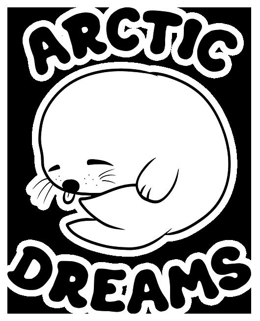
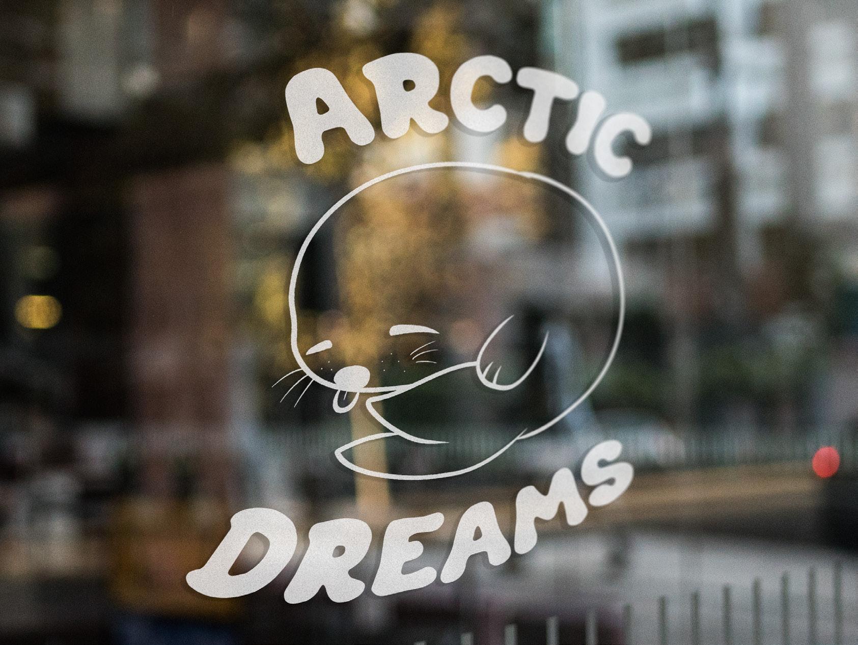
Logo
A company’s logo expresses its identity, personality and values. This identity is accentuated by the quality of the various graphic elements that reinforce it.
To preserve the integrity of the Arctic Dreams brand, its use must be managed through the standards set out in this guide.
Typography of the logo must always contain a white stroke of up to 6pt,
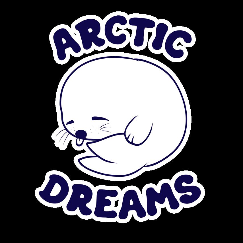
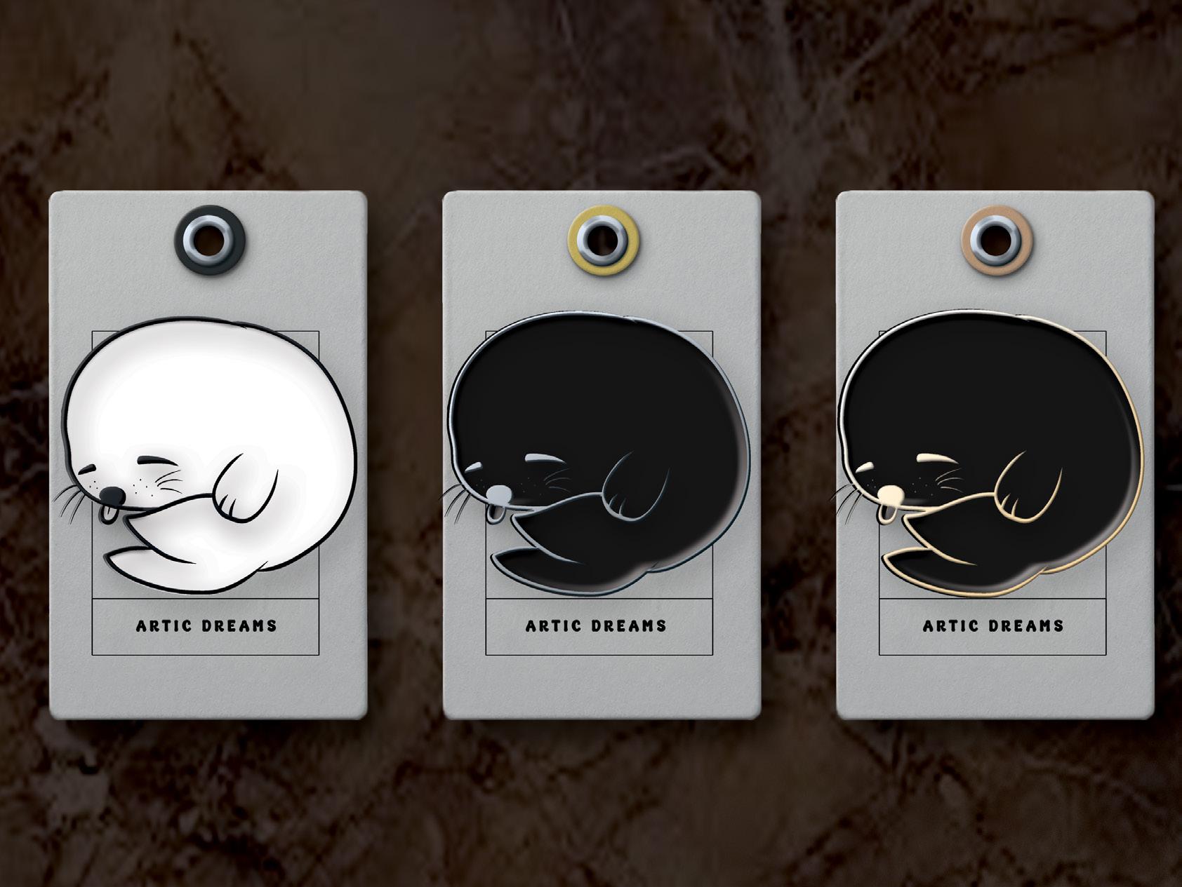
Colour – positive version
Proscribed uses

The core components of the logo form an indivisible whole: symbol, colours, proportions and positioning of its different elements must not be modified in any way.
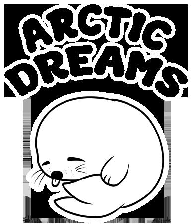
Black – positive version
The Arctic Dreams logo must be used in black only when production constraints do not allow the use of colour.

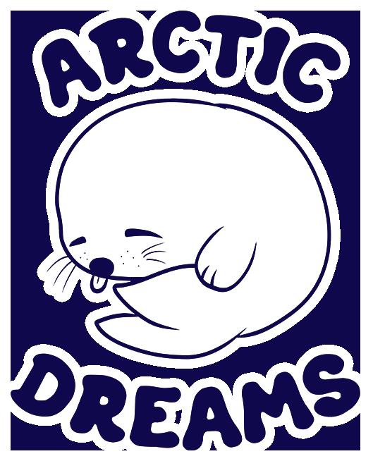
Negative version


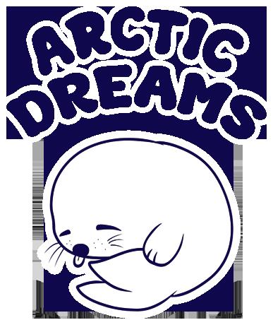
Arctic Dreams
Buffer Zone
To optimize its presence in any given space, the logo must include a buffer zone, i.e., a minimum area of protection, free of external graphic or textual elements.
The size of this area is based on a relative measurement, which can be applied in any context, and is equal to half the height of the letter “c” inside the word "Arctic Dreams".

Minimum Size
A minimum size for usage of the logo must be determined to ensure optimal visibility. The Arctic Dreams logo must measure at least 1 inch wide (2.5 cm).
Colours
The official corporate colours for the visual platform, i.e., for all graphic elements used in support of the logo, are Dark Blue, Black, and White. Technical specifications are detailed below.
Primary colours
This is intended for use as the logo.
#0f084c
RGB 15, 8, 76 CMYK 100%-99%-27%-47%
#000000
RGB 0, 0, 0 CMYK 0%-0%-0%-100%
#ffffff
RGB 255, 255, 255 CMYK 0%-0%-0%-0%
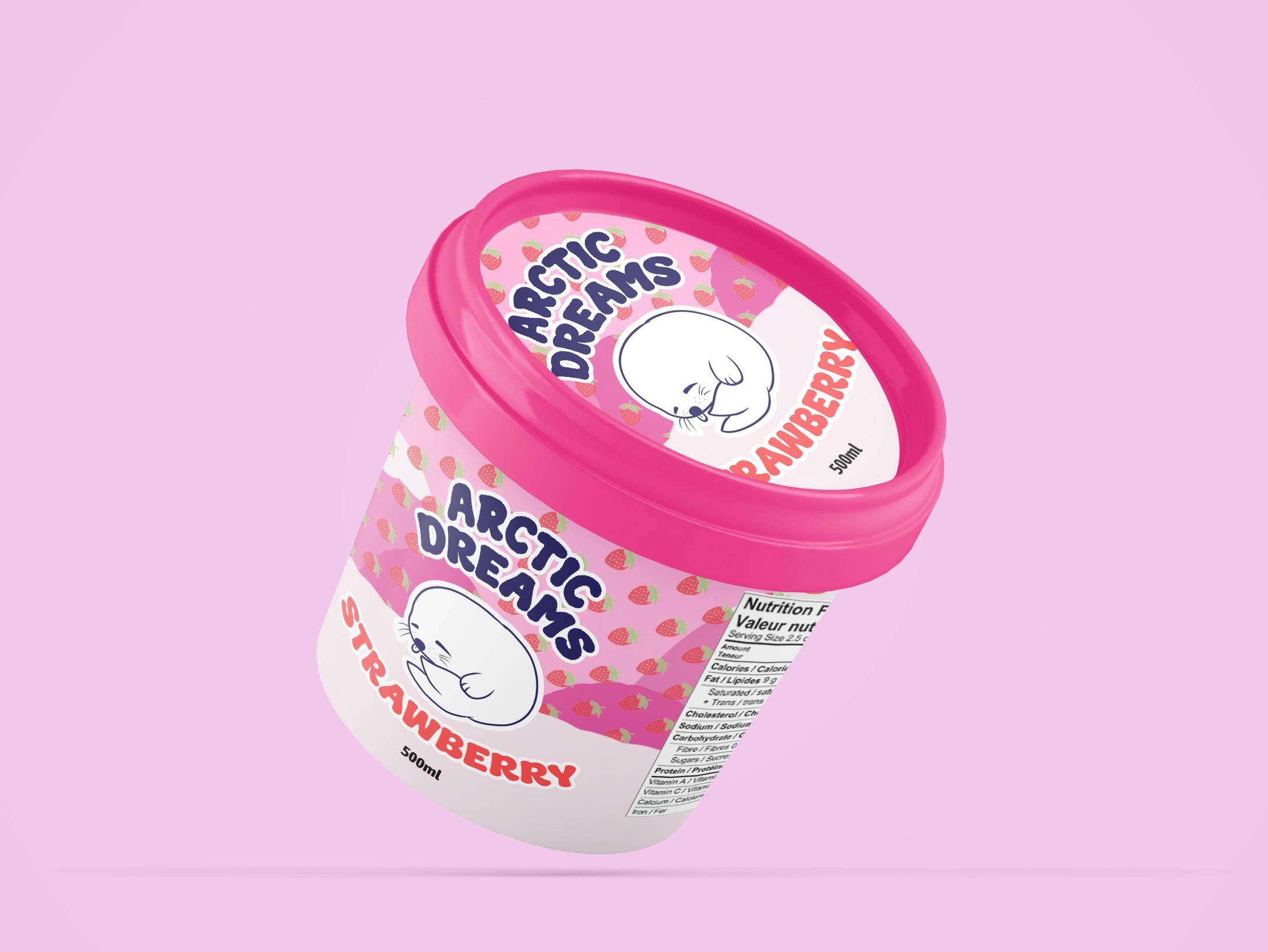
Secondary colours
Any colour intended for the flavor of ice cream will be applied as secodary colours.
Typography
The official typefaces to be used in corporate and marketing communications, for printed or electronic documents, are Super Creamy and Asap Condensed. Produced by fsuarez913 and Omnibus-Type.
This is intended for use as the logo.
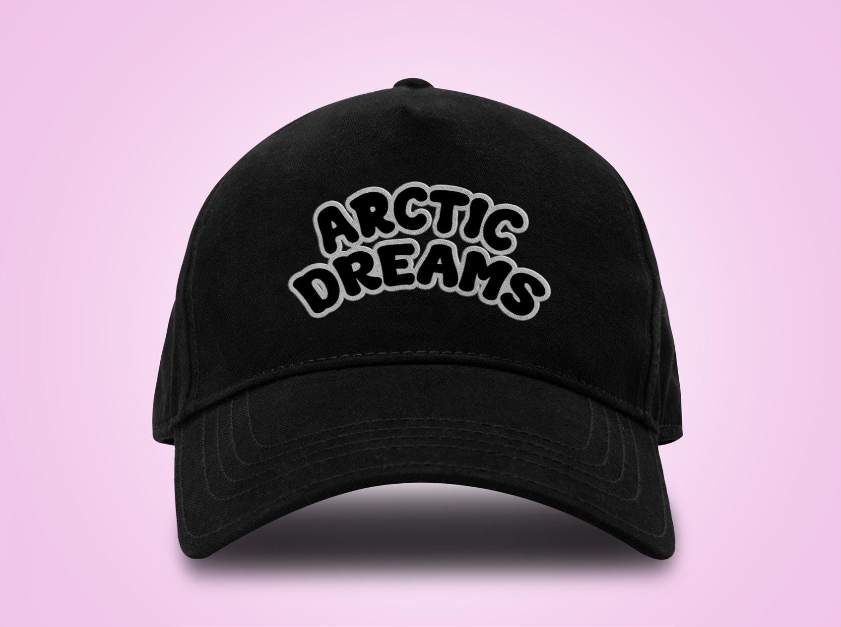
Super Creamy
This provides specific information about the product, such as its volume.
Graphic elements
All graphic elements to be drawn.

This is the maskot of the brand. It can be trimmed as long as its face appears.
Aforementioned colours only for the stoke. Otherwise, can be used without any stroke.
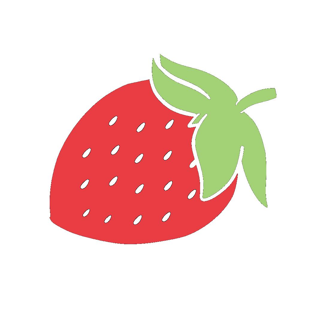
Graphic element to only be used in the packaging. Type of fruit varies on the flavor. Never has a stroke.
Applications
kiarap_designs@hotmail.com