
2023
COMMUNITY CONSOLIDATED SCHOOL DISTRICT 21 BRANDING GUIDELINES July
Table of Contents 1. Brand Basics………………………………………………………..Page 4 2. Brand Voice……………………………………………………….…Page 10 3 Visual Elements Page 16 4 Resources Page 56 1
Introduction and Contacts
The importance of brand consistency
Maintaining a strong and recognizable brand is a key component to CCSD21’s reputation. This guide has been created to make it easier for you to correctly and regularly represent the CCSD21 brand when you develop communications and/or event material
How to use this guide
Brand Basics - This section highlights the basic elements of our brand
Brand Voice - This section covers what the CCSD21 voice is and sounds like
Visual Elements - This section provides concrete direction on how to use specific components, such as logos, photography and typography
Resources - This section includes a list of resources and contact information to help you.
2
3
BRAND BASICS
4
Mission
A Mission Statement is a brief aspirational sentence or two that clearly describes the values our organization aims to provide students. It explains why we exist and our purpose. This statement is not intended to be used literally in communications Instead, it is the prevailing thought behind every communication
Ensure engaging, innovative, equitable and safe learning experiences for every student, every day.
5
Brand Personality
Our brand personality should shine through in everything we do and say.
A brand’s personality represents the characteristics or traits that people associate with our district It helps shape the way people feel about our district It helps define the “look and feel” or how the district comes across at a personal and emotional level
CCSD21’s brand personality is made up of nine words/phrases:
Equity
Whole Child
Engagement
Stewardship
Continuous Improvement
Trust & Respect
Partnership
Accountability
Growth Mindset
6
Brand Narrative
Our narrative is the story we want to share. It’s the story we want to tell others about our district at every opportunity through our voice and visuals. It's the proof points that we are living our
Mission Statement Think of it as the who, what, when, why and how of our district Here are some helpful examples:
Equity - We believe in equal opportunity and experience for all students
Whole Child - We recognize both academic and non-academic needs
Engagement - We value others' voice and input to involve stakeholders
Stewardship - We use our resources wisely
Continuous Improvement - We provide programming to challenge growth.
Trust & Respect - We demonstrate trust & respect.
Partnership - We work with others to be responsive to changing needs.
Accountability - We ensure students are ready for success
Growth Mindset - We provide a mindset of growth
7
Tagline
The CCSD21 tagline helps unify us.
The tagline is a short, memorable description that distills our brand narrative into a memorable message that’s meaningful across all departments and schools It acts as our catchphrase
Empowering
every student, every day.
Note: Please do not modify or create another tagline for the district. You are free to use a tagline for your own school
Hashtag
The CCSD21 hashtag helps unify us and creates a searchable way to find our content on social media The hashtag identifies our brand into memorable word(s) that’s meaningful across all departments and schools
#21Learns
8
9
BRAND VOICE
10
Brand Voice
The CCSD21 VOICE expresses how we want to sound to others. We choose our words deliberately and craft our message to express our brand.
Our BRAND PERSONALITY is what we’re like just like a person’s personality
For example: BMW is a sophisticated, upper-class brand while Toyota is an economical, practical brand
CCSD21 brand is: friendly, inviting and educated
CONTENT is the message – the points we want to make within a message to inform and encourage readers to take action Content can be anything from informing parents of test requirements to encouraging parents to attend an event
TONE is the variation of voice we use depending on the audience and medium. For example: United Airlines is a professional tone of voice while Southwest Airlines is known for their humorous tone.
CCSD21 tone is: down-to-earth, easy to understand.
11
How to put the CCSD21 brand voice into practice by placing our personality traits into your writing.
Personality Trait #1 - Friendly
● Use friendly, personalized, plain language when possible
● Use easy to understand, simple sentences
● Be transparent and open with text
● Avoid acronyms and scholarly language
Personality Trait #2 - Inviting
● Look for opportunities to convey inclusion
● Use encouraging, aspirational words and phrases.
● Write from a place of warmth.
Personality Trait #3 - Educated
● Write from experience with facts, not opinions.
● Write with professionalism
● Be thorough so questions are answered within your message
12
How to combine brand personality with brand narrative
Personality Trait #1 - Friendly
● We attract, nurture and retain great staff.
● We understand the needs of both elementary and middle school students
Personality Trait #2 - Inviting
● Our teachers care about the students We are here to empower students to succeed
● We treat all students as individuals, with unique skills, talents and challenges
Personality Trait #3 - Educated
● CCSD21 is planning to transfer $20 million from its education fund into the operations and maintenance fund. This money will be transferred into the capital projects fund, as required by law, for use to complete projects as part of the 10-year facilities and maintenance plan.
● A competitive boys volleyball program will be introduced across CCSD21 middle schools beginning with the 2023-2024 school year.
13
Additional guidelines for building our brand voice
Write in a way that’s friendly, casual and conversational.
DON’T: It is important to attend your student’s parent teacher conferences.
DO: Come join us!
Use contractions:
DON’T: We are handing out flyers
DO: We’re handing out flyers
Use active voice instead of passive voice
DON’T: The calendar can be found
DO: You can find our calendar
Use more inclusive language, like: we, us, our instead of students, teachers, etc.
DON’T: Community Consolidated School District 21 stands by administration values.
DO: We stand by our values.
Avoid acronyms (if possible) and formal language.
DON’T: The characteristics of a PLC include…
DO: The Professional Learning Community is …
When sending long messages, break it up with headlines, subheads or bullets
DON’T: The characteristics of a PLC include creating a helpful and positive environment; being open minded and developing positive relationships; and communicating effectively with others
DO: The characteristics of a PLC include:
● creating a helpful and positive environment;
● being open minded and developing positive relationships; and
● communicating effectively with others
Use examples or quotes to help clarify or add transparency.
DON’T: The principals at the elementary schools deepen their partnerships with families by doing…
DO: “I look forward to deepening my partnership with our families,” said Twain’s principal.
Edit your message and read it aloud. If it sounds unnatural, it needs to be revised.
14
AP style guide suggestions on common words, phrases and sentences
Titles
Use lowercase letters when not used with an individual's name
(Ex The assistant superintendent of student services and safety is here all day )
Use uppercase letters when used with an individual’s name
(Ex John Smith, the Assistant Superintendent of Finance and Operations, is here all day )
Acronyms
Community Consolidated School District 21 can be shortened to an acronym
DON’T: display like this: CCSD 21
DO: display like this: CCSD21 or D21
Spelling
There are two ways to spell kindergartners We will use one version so we are consistent throughout the district.
DON’T: spell kindergarteners
DO: spell kindergartners (less one “e”)
Departments
When listing departments, use lowercase letters when it stands alone. (Ex. There are several departments at CCSD21.)
Use uppercase letters when naming a specific department (Ex The Communications Department is located on the 2nd floor)
Dates
When listing dates for an event or calendar, use the following format:
DON’T: July 10th, 2023
DO: July 10, 2023
Order
When listing a sequence or grade level, use the following format:
DO: 2nd grade or second grade
If there are other questions on how to spell, write or phrase something, contact the Communications Department
15
VISUAL ELEMENTS
16
Logos
The district and school’s identity is established through the appropriate use of logos. A logo serves to identify messaging with a graphic “signature” of the organization. Try to place the logo at or near the bottom of the page Never recreate our logos Use only the official logo files from the Communications Department
District Logo
The district logo represents the district as a whole It’s used in all communications (internal and external) and acts as an umbrella under which all other school identities fall The circle represents the world, both the global influence on our society and the impact our students and staff have on the future The lower portion of the logo represents an open book, indicating that we are lifelong learners, continuing to acquire knowledge throughout our lifetimes.
Download the district logo here.
2- or 4-color logos

1-color logo

17
Logo Usage
DON’T: Place too many objects near each other that may make your design difficult to read or understand.

DO: Allow for enough space around the logo so that text, photos or other items are not competing with one another for the reader’s attention.
DON’T: Crop, stretch or squeeze the logo so that it displays differently than the examples above
DO: Maintain full logo and original proportions when adjusting the size of the logo Dragging the logo from one of the corners will allow for proportional resizing


18
DON’T: Place the logo atop of other items that either block out the secondary image or create a busy visual whereby the photo and logo compete with each other
DO: Ensure that the logo is legible and that the transparent logo version is used when layered atop of other images. You may place it on a background image if it’s simple with uniform colors. If not, place the logo over a square solid, single color box.


19
Brand Colors
The district’s primary colors are blue, yellow and white. The exact colors are listed below and should be used when creating marketing materials as well as for embroidery of clothing or soft goods CCSD21 district blue, yellow and white are the foundation of our palette and should be used prominently through all communications
When using the district’s colors, it’s important to use the specific color codes that correspond with those used within our logo
*Gray was recently added to expand the range of colors
#FFCC00 C:0 #000033 C:94 R:225 M:19 R:0 M:88 G:204 Y:99 G:0 Y:43 B:0 K:0 B:51 K:65
Yellow Blue
#11-0601 C: 0 #939799 C:0 R: 255 M: 0 R:128 M:0 G: 255 Y: 0 G:128 Y:0 B: 255 K: 0 B:128 K:50
White Gray*
20
Secondary Colors
In addition to the brand colors of the district, a secondary color palette introduces a bright, fresh set of options that are helpful in extending the primary palette. Green, red and light blue are accent colors and can be used to highlight key information Secondary colors should only be used sparingly; they can act as pops of color to help create a hierarchy and emphasis, and can be used within graphics and diagrams
Dallas Green Scarlet Light Marine Blue Purple

PMS: 375C PMS: 200C
PMS: 283C PMS: 2592C
Always use color purposefully, keeping in mind the proportions shown in the chart below
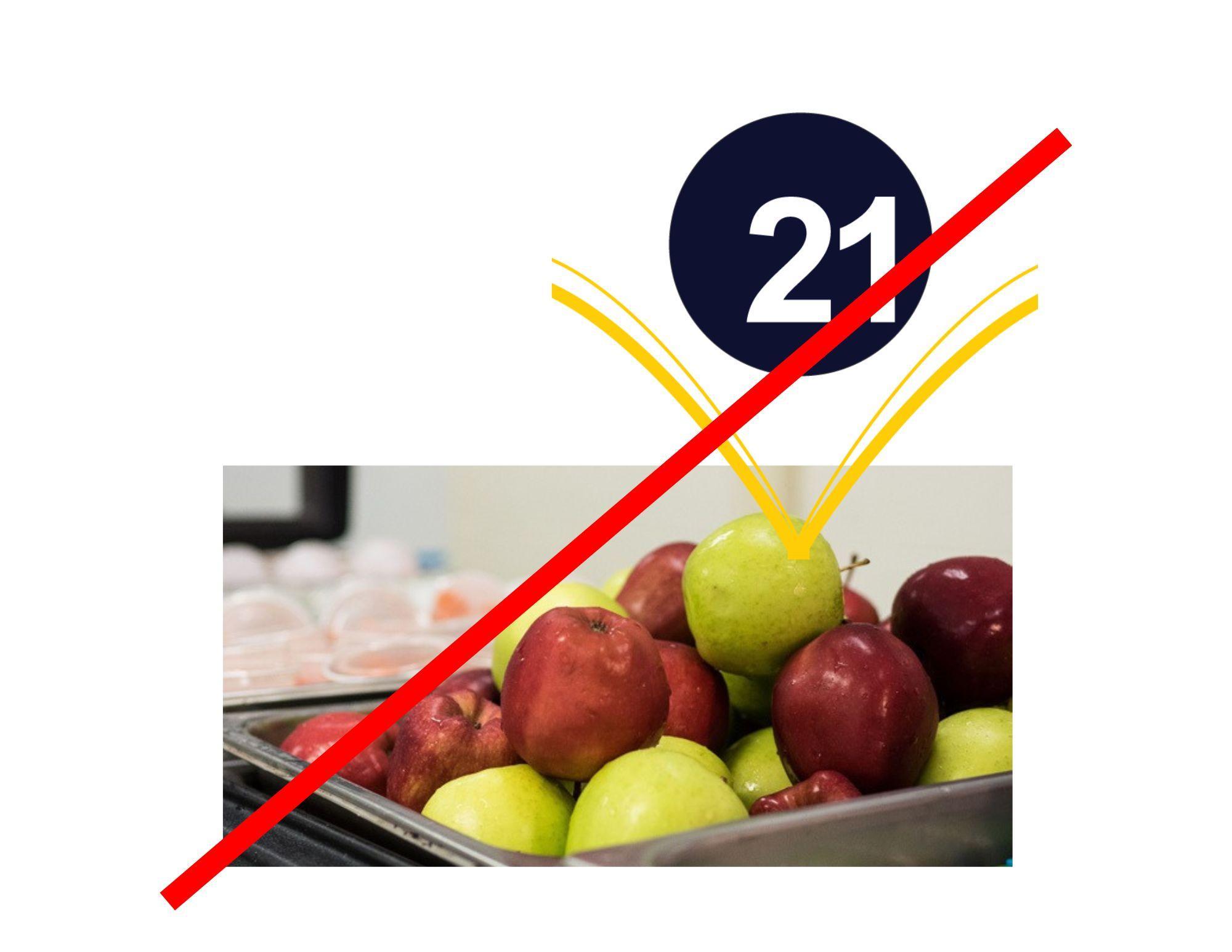
The following graph depicts the relative ratio of color usage within the district color palette

21
Professional Development Logo
When creating material for Professional Learning, please use the following logo(s). They can be accessed here. This ensures that our material is branded and identifies the material as “sanctioned” professional development When possible, place this logo at or near the bottom of the page Never recreate our logos Use only the official logo files from the Communications Department


22
Full color Black & White
Family Learning Logo


When creating material for Family Learning activities/events, please use the following logo(s). They can be accessed here. This ensures that our material is branded and identifies the material as “sanctioned” family learning events When possible, place this logo at or near the bottom of the page Never recreate our logos Use only the official logo files from the Communications Department
 Full Color Black & White
Spanish version
Full Color Black & White
Spanish version
23
Russian version
75-Year Anniversary Logo
On July 1, 1948, CCSD21 was formed. Thus, on July 1, 2023, we celebrated our 75 year anniversary and will celebrate it throughout the 2023-2024 school year. Logos can be accessed here


24
School logos & colors
School logos are specific to each school to identify each brand. They should be treated in the same manner as the district logo. Proportions should not be changed, the artwork should not compete with any other text or images, nor should the colors be changed By maintaining consistent use of these logos and mascots, stakeholders will be able to clearly identify CCSD21 schools and our brand Never recreate our logos Use only the official logo files from the Communications Department Logos can be accessed here
25

26

27

28

29

30

31

32

33

34

35

36

37
Typography/Typefaces

Typography is an essential element of the CCSD21 brand identity. When used consistently, it unifies messaging and creates familiarity within our content. PLEASE ONLY USE TWO (2) TYPEFACES WITHIN YOUR DESIGN
Primary typeface
Our primary typeface for the district and school brands is Arial
AaBbCcDdEeFfGg...
When Arial is not available, use Calibri AaBbCcDdEeFfGgHh
When an elegant look is required or you’d like to add some flair or need to have some copy stand out, use Brittany. (This might only be available in CANVA.)
When Brittany is not available, use Dancing Script AaBbCcDdEeFfGgHhIi…
…
38
Font Style
While typography or typeface is the name of the typeface we will use, font refers to the style of the typography. There are several different fonts for each typeface. You may use as many fonts within the typeface as you want
For example:
Arial
Arial Bold
Arial Italics
Calibri
Calibri Bold
Calibri Italics
Dancing Script
Dancing Script
Dancing Script
Dancing Script
39
Secondary typeface
When writing copy for a report, designing a flyer or creating any kind of marketing material, please use these suggestions for headings and hierarchy:
Here are a few simple steps to define your hierarchy
● Body text: Increase or decrease the text size until it’s comfortable to read For this example, let’s set it at 22pt
● Primary heading: 180–200% of the body text, between 40–44pt
● Secondary heading: 130–150% of the body text, between 29–33pt
Also consider a tertiary heading and caption text
● Tertiary heading: 100–125% of the body text, between 22–28pt

● Small text / captions: 70–75% of the body text, between 15–17pt
In most cases, paragraph spacing should be equal to the body text, so if the body text is 16pt, then the paragraph spacing is 16pt.
● In design applications and CSS this is the equivalent of setting margin-bottom of paragraphs to 16pt.
● In a Pages/Word document, set the ‘After paragraph’ value to the size of your body text.
Line spacing should be set somewhere between 120–160% of the text size As a rule, the smaller the text, the more generous the line spacing needs to be to give each word room to breathe
40
Tip: You should be able to fit a sideways ‘h’ between the lines without it hitting the tops of d/b/t’s (ascenders) or the bottoms of p/q/y’s (descenders).
If the body text is 22pt, then the line-height of that text should be between 26–35pt.
● In a Pages/Word document, the line-height will be set in decimals, with 1 2 being equal to 120% of the text being edited
The measure is the length of a line of text Long lines of text are difficult to read, with shorter lines being easier The ideal number of characters per line is 65–75 The measure should be defined by the width of the body text rather than headings or subheadings
Tip: A line of upper- and lower-case letters and numbers is 62 characters, a simple way of finding a comfortable measure
When you’ve worked out where 65–75 characters is on a line, reduce the width of the column of text until that is about to wrap, you should find the measure is comfortable.
AaBbCcDdEeFfGgHhIiJjKkLlMmNnOoPpQqRrSsTtUuVvWwXxYyZz0123456789
41
Photography
Photography is an important and strong method for creating an emotional connection to our audience. It provides a platform to engage and reflects the district’s (and school’s) personality.

Google Photo Library
Students, teachers, classrooms and buildings can access photos from the photo library here. The photos are organized by year, then school, then event. If you don’t have access to this folder, please request it from the Communications Department The photos are typically tagged with “OK to use” when permission is granted by parents of students If there is no “OK to use” on the name of the photo or you are unsure about whether there is parent permission, do not use it
Original Photography
When original photography is needed, we recommend contacting the Communications Department Their expertise in lighting and composition is essential for creating dynamic and engaging images Discussing the project ahead of time with the creative team can help focus the direction of the photo shoot.
42
Selecting images
Always select photos that reinforce our district and school brand. Images should convey student and staff engagement that is authentic and creates an emotional connection with our audience. Look for photos that are warm and full of engaging energy. Also, make sure that photos have adequate image resolution


43
Color correction


Lighting is a critical component in good photography. When images are overly dark or dull in color, it may be necessary to make some easy adjustments by doing the following:
● Lighten the highlights
● Increase the contrast
● Boost the color saturation
Before After 44
Cropping
Look for ways to add interest in photos by cropping. Tighter cropping allows the viewer to focus on the subject matter more quickly and eliminates unnecessary, distracting elements within the photo.


Before After 45
Videography
Video is an important and more powerful tool to communicate messages. When shooting video with your phone, be sure follow these simple tips:
● Set up iPhone (iPhone 8 or later) to 4k at 60 fps (When in video mode, in the upper right hand corner of your screen, change your settings to 4K at 60 frames per second)
● Set Android to 4K
● Record the video horizontally
Other helpful tips:
● Edited video should be under 2:00 minutes
● Please identify those who are speaking with proper titles
● Always add the CCSD21 logo at the end
Original Videography
When original videography is needed, we recommend contacting the Communications Department. Their expertise in lighting and composition is essential for creating dynamic and engaging video storytelling. Discussing the project ahead of time with the creative team can help focus the direction of the video shoot.
46
Flyers
Each school has a set of four template designs that can be used when creating flyers. They are branded with your logo and colors and are listed in CANVA here.


 Flyer #1
Flyer #2
Flyer #1
Flyer #2
47
Flyer #3
Flyer #4 - For longer flyers, you can use this template as a guide. Page


48
1 Page 2
Programs
When designing a program for a school performance, please use the following template so as to keep our look and feel consistent throughout the district. Please be sure to PRINT out the programs for attendees QR codes are ok to use, but PRINTED copies are more meaningful and last longer If you need help with this or would like us to create another style or design, please contact the Communications Department

49
Google Slides
When making a slide presentation, please use the attached template as your guide. This ensures that our presentations look like they are coming from the same family. Always add our logo and tagline in the footer

Cover page
Other Slides

50
Please make sure to use the most current letterhead which lists the current board members and their titles. Use the template below to guide your writing. Contact the Communications Department for the most current letterhead

Letters
51
ParentSquare
ParentSquare posts should follow the same format as general communications for the district. Keep text simple, warm and friendly. Add bullets and links when text is too lengthy. Here are some examples of good messages
52
Social media
Each school has a set of template designs that can be used when creating social media posts. They are branded with school logos and colors and are listed in CANVA here.


53
Websites

It’s important to keep the website up-to-date and fresh with current content. It is the number one place that people go to to look for information about our district. The website is the place where content can be more detailed and lengthy while keeping in mind our tone and voice The content should continue to be warm, friendly and simple Eliminate orphan pages and extraneous links Keep content engaging and the navigation easy


Use the same guidelines for photography, videography and other media assets, including graphics as well Sharp, rich, engaging imagery works best

54
Other Communication Pieces
For other marketing material, such as postcards, brochures or other promotional pieces, contact the Communications Department for assistance and guidance.
55
RESOURCES
56
Communications Department
District 21 Community Service Center and Administrative Office
959 W. Dundee Road
Wheeling, IL 60090
Cassandra Young
Director of Communications
cassandra young@ccsd21 org
847 520 2728 - office
224 434 9836 - district cell
847 922 6837 - personal cell
Andrew Steckling
Communications Specialist andrew.steckling@ccsd21.org
847.419.3063 - office
847.636.6266 - cell
Marlen Rojas
District Receptionist marlen rojas@ccsd21 org
847 520 2738 - office
Sofia Horwitz D214 Student Intern sofia horwitz@ccsd21 org
57

