{ HOME FRONT }
Hue shy?
With advice from local interior designers, there’s no need to fear color. Try one of their favorite shades to update your home this spring.
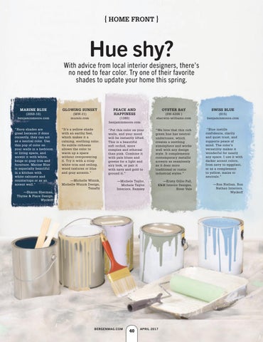
MARINE BLUE
GLOWING SUNSET
(2059-10) benjaminmoore.com
(MW-31) muralo.com
“Navy shades are great because if done correctly, they can act as a neutral color. Use this pop of color on your walls in a bedroom or living space, and accent it with white, beige or gray trim and furniture. Marine Blue is especially beautiful in a kitchen with white cabinets and countertops or as an accent wall.”
“It’s a yellow shade with an earthy feel, which makes it a calming, soothing color. Its subtle richness allows the color to warm up a space without overpowering it. Try it with a crisp white trim and ceiling, wood textures or blue and gray accents.”
“Put this color on your walls, and your mood will be instantly lifted. This is a beautiful soft orchid, more complex and ethereal than pink. Combine it with pale blues and greens for a light and airy look, or pair it with navy and gold to ground it.”
“We love that this rich green hue has neutral undertones, which creates a soothing atmosphere and works well with any design style. It complements contemporary metallic accents as seamlessly as it does more traditional or rustic industrial styles.”
—Michelle Winick, Michelle Winick Design, Tenafly
—Michele Taylor, Michele Taylor Interiors, Ramsey
—Kristy Gillio Fall, K&M Interior Designs, River Vale
—Sharon Sherman, Thyme & Place Design, Wyckoff
PEACE AND HAPPINESS (1380) benjaminmoore.com
BERGENMAG.COM
BERG.0417.homefront2.indd 40
40
OYSTER BAY
SWISS BLUE
(SW-6206 ) sherwin-williams.com
(815) benjaminmoore.com
“Blue instills confidence, clarity and quiet trust, and supports peace of mind. The color’s versatility makes it wonderful for nearly any space. I use it with darker accent colors, from navy to eggplant, or as a complement to yellow, maize or neutrals.” —Ron Nathan, Ron Nathan Interiors, Wyckoff
APRIL 2017
3/20/17 4:07 PM