&Arts Architecture
PLUS: SOUTHERN GEM
BEAUTIFULLY ARCHITECTED




PLUS: SOUTHERN GEM
BEAUTIFULLY ARCHITECTED






44 THE NEW REVIVAL
A trio of seasoned design experts constructs a Georgian home in a reimagined way for a Raleigh family of four.
56 MODERN MINDSET
One designer creates an organic modern masterpiece in Greensboro, North Carolina.


66 BEAUTIFULLY ARCHITECTED
In an area rich with extraordinary architecture, four standout homes in the Triangle deserve recognition.

18 ART + DESIGN
Pairing art with play, Artish Studio creates interactive pieces that encourage creativity.
22 ARCHITECTURE
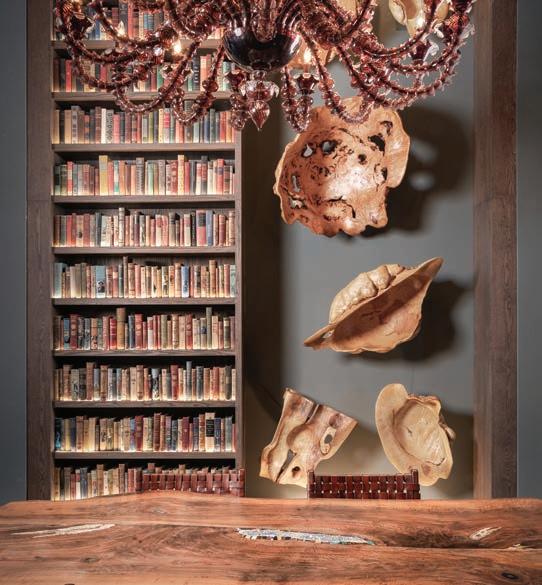
An architect and a designer create a onestory dwelling with a modern industrial aesthetic in downtown Hillsborough.
28 MARKET
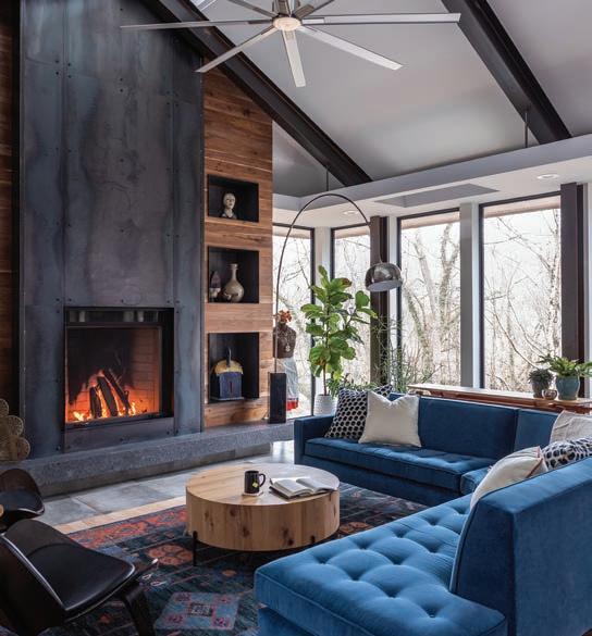
Art takes the everyday and translates it into something evocative, and these products are speaking our language.
34 FIELD TRIP
A true hidden gem, Greenville, South Carolina, is quickly becoming a popular southern destination.
38 DESIGN BOARD
Designer Beth Sink shares a recently designed living room featuring a mix of old and new.
40 PALETTE
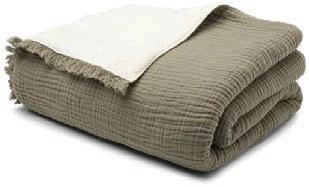
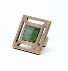
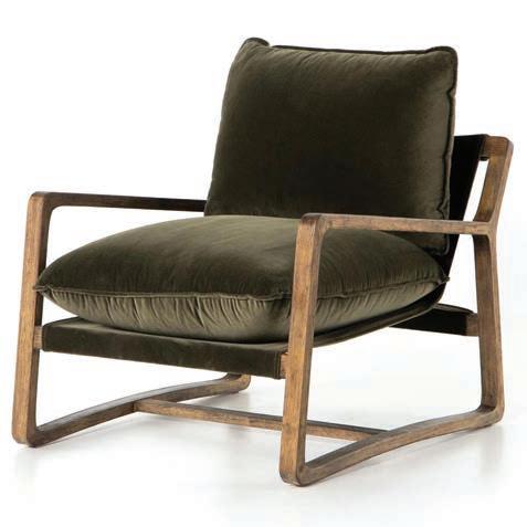
Warm and comforting, the vintage hue of olive green imparts a perfect note of earthy elegance.
80 LIVABLE LUXURY
Endless luxuries abound in a model home nestled into nature at Shadow Creek Estates.
82 VINTAGE REVIVAL
Kelly Schupp
A Forever Finish
84 ULTIMATE OUTDOOR LIVING
Chris Jones
Ready, Set, Pool
86 OUTDOOR OASIS
David Payne
Sourcing Solitude
12 FROM THE EDITORS
88 ARTS & EXHIBITIONS
SPOTLIGHT
OOur annual Arts & Architecture issue is always one of our favorites. There’s something alluring about a home that looks to artwork for its inspiration for design, or interior design that uses architecture as its most dominant influence. And oftentimes there’s a coupling of both, resulting in a home that is stunning to admire inside and out.

This issue is no different. Our editorial team pored over submissions, trying to find that perfect balance between art and architecture, or the seamless mix in between. Lucky for us, there is no shortage of impressive art collections and jaw-dropping architecture in the Carolinas. In fact, the growth of these two elements in residential has grown exponentially; so much so that we faced a really difficult decision: choosing which projects exemplify that positive trend the most and how to showcase them best.

In the end, we hope our selections bring our readers a sampling of everything you want to see in an Arts & Architecture issue—architecture ranging from traditional to modern, and art that genuinely inspires.
We hope you love reading this issue as much as we loved producing it. Enjoy!
Blake Miller and Anne Marie Ashley Co-Editors-in-Chief
CO-EDITORS-IN-CHIEF
ANNE MARIE ASHLEY
BLAKE MILLER
ASSOCIATE EDITOR
KARIN SIMONEAU
ART DIRECTOR
LINDSAY RICHARDS
PUBLISHER
MICHAEL KOOIMAN
ASSOCIATE PUBLISHER OONAGH MURRAY
WRITERS
CHRISTINA SPRATT SPENCER
DANA W. TODD
JILL WALDBIESER
PHOTOGRAPHY
STACEY VAN BERKEL
MARK HERBOTH
KEITH ISAACS
DUSTIN PECK
STERLING E. STEVENS
SALES
SUE MOONEY
JESSICA SCHELL
PRODUCTION COORDINATOR
SHELLEY KEMPER
PRODUCTION SUPPORT
STACY LONG CATS UP GRAPHICS
CONTRIBUTORS
CHRIS JONES
DAVID PAYNE
KELLY SCHUPP
PHONE
704-585-8025
facebook.com/TriangleHDD

@homedesigndecor_triangle

All contents copyright 2023, Curated Media, LLC No part of this publication may be reproduced in whole or in part without the express written consent from publisher. Mention of any product or service does not constitute endorsement from Home Design & Decor® Magazine. The information contained in this publication is deemed reliable from third party sources, but not guaranteed. Curated Media, LLC does not act as an agent for any of the advertisers in this publication. It is recommended that you choose a qualified remodeling, home furnishings or home improvement firm based on your own selection criteria.
Curated Media, LLC, d.b.a. Triangle Home Design & Decor® Magazine, will not knowingly accept advertising for real estate which is a violation of the Fair Housing Act. All real estate advertising in Maps Media, Inc., d.b.a. Triangle Home Design & Decor® Magazine, is subject to the Fair Housing Act which states “We are pledged to the letter and spirit of U.S. policy for the achievement of equal housing opportunity throughout the nation. We encourage and support an affirmative advertising and marketing program in which there are no barriers to obtaining housing because of race, color, religion, sex, handicap, familial status or national origin.”
Curated Media, LLC, d.b.a. Triangle Home Design & Decor® Magazine, does not act as an agent for any of the realtors or builders in this publication. It is recommended that you choose a qualified realtor to assist you in your new home purchase.




 WRITTEN BY KARIN SIMONEAU
The conviction that “everyone is an artist” is what propelled designer Abby Ross and her partner, architect and designer Courtney Evans, to form Artish Studio. In the studio, the duo creates products that are interactive, flexible, and built with modular pieces, allowing everyone to channel their own creativity.

The pair met when Evans fabricated and installed a custom steel feature in Ross’s home. They reconnected at a design party one evening and found themselves sharing ideas about sculptures and furniture they wanted to create. “That was the moment we decided to collaborate,” recalls Ross. “We know that change is inevitable—that moods, styles, and needs evolve—and we also know that people are inherently creative and dynamic.” It’s that change and desire for personal expression that drives the design and function of each object produced at Artish.
Their first product, Stones, allowed pieces to be fit together to create unique artwork every time. “This was our launch into the ‘furniture you can play with’ concept,” explains Ross. Next, they developed a series of eight steel wall art kits that were
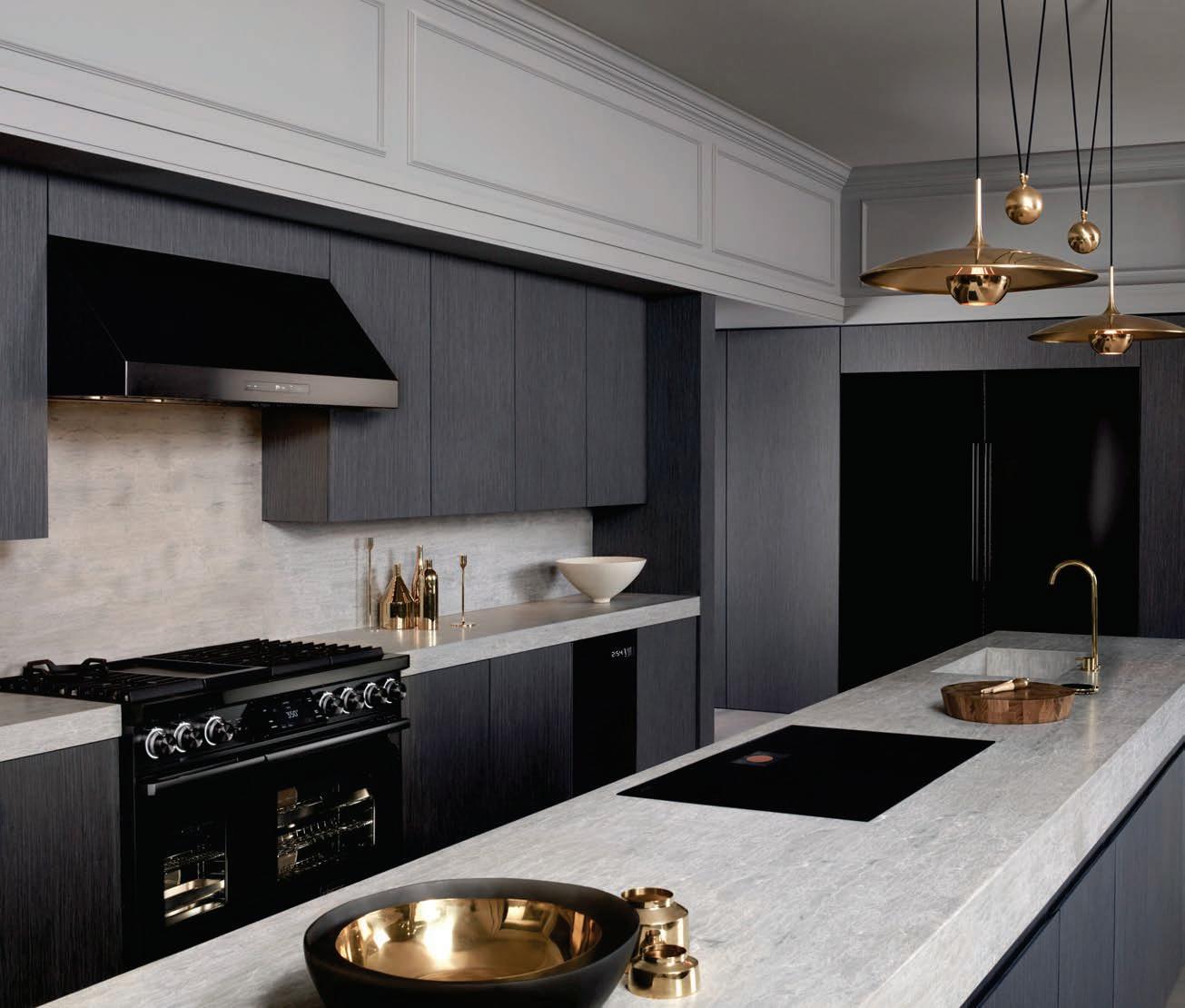
We also carry Century Furniture, Sherrill, Temple, Taylor King, Wesley Hall and more!!

reversible, interchangeable, and magnetic. Totem, Chill Pill, and Wifi have pieces that can be rearranged to create myriad looks. Over time, the designs became more functional while still maintaining a sculptural and playful quality. Stax bookshelves can be personalized with colors and configuration, while their sconces are customizable through different bulbs, cords, or even magnetic hooks and shelves.

The studio produces a new limited-edition collection every year, their latest being the MoNO Collection, featuring two chairs, an ottoman, a bench, and a mirror, all made of recycled aluminum.

Many products, in fact, are formed from recycled metals and built to last. “We want to create pieces people don’t get tired of and throw into a landfill,” says Ross. “We aim to create with sustainability in mind.”
Forever playing with materials, form, and color, Ross and Evans thrive on creating objects that are simultaneously accessible and cut through fast-paced design-trend cycles—always revisiting their philosophy of “form, function, and play.” u


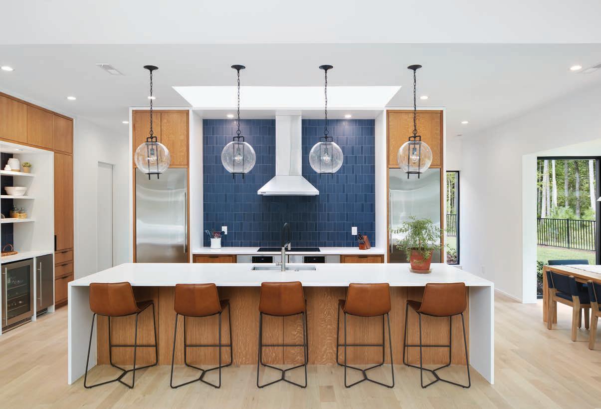
"The home is modern in design but has a midcentury flair. The vibrant combination of blue and orange seemed perfect and coincided with the client’s personality, so we ran with it,” says Branch of the great room.
 TEXT BY BLAKE MILLER
Architect Sophie Piesse had a challenge on her hands. She was tasked with creating a modern, industrial, one-story dwelling on a steep, wooded 0.6-acre lot in the historic district of downtown Hillsborough. Not only would the architect have to overcome the landscape of the lot in her architectural plans, but she would also have to adhere to the guidelines set forth for all historic homes in the district.
“On a steep lot, [designing a one-story home] can be tricky, but it gives a wonderful tree house feeling off the south and east sides of the home,” she says. And while some architects might view the historic requirements restrictive, Piesse embraced them, allowing them to influence the architecture and materials.
To achieve the homeowners’ modern industrial aesthetic, Piesse utilized steel and wood accents with pops of color on the exterior and interior. “The home has a quiet entry from the street,” she says. “You get a hint of the color, the materials, and the style, but then you enter it and the main space opens up in every direction and definitely
ARCHITECT SOPHIE PIESSE AND DESIGNER LAUREN BRANCH BRING ONE COUPLE’S DREAM OF A MODERN HOME IN THE WOODS TO FRUITION.

hits that wow factor.” Inside, the open floor plan features pecan and walnut wood accents—sourced from trees cut down during the home’s construction—on the fireplace cladding, entertainment mantel, kitchen island, dining table, and primary bedroom headboard wall. “I love the fearless color use—splashes of orange that carry from the outside in, playing off bold blue inside and out,” she says.


The homeowners also enlisted designer Lauren Branch of Kèfi Home Interiors to work on the furnishings. “Given that there was one great room that included the kitchen, dining, and living rooms, we wanted to create a space that was contiguous in style and color, modern but welcoming and warm,” says the homeowner. With that direction, Branch coupled the contemporary architecture of the home with organic wood finishes as well as vintage and secondhand items to add warmth.


Wood from the leftover two-hundred-year-old pecan tree on the property was used to construct a feature wall in the primary bedroom. Branch then enlisted local woodworker Christian Fittro of Board & Batten to create the floating side tables. The Hinaki pendant lights from Trig Modern were chosen by the client.

The dining table made by Raleigh Reclaimed is crafted from the twohundred-year-old pecan tree on the property and sits atop a vintage 1950s rug. In the family room, a large, curved velvet sofa with midcentury legs by Room & Board provides “a lovely softness to the room and helped to bring in some balance with all the straight lines,” adds Branch. With the help of Piesse and Branch, the home is exactly what the homeowners envisioned. “They love the home and tell me every time we talk,” says Piesse. “It is so important to exceed clients’ expectations and create something that they truly love living in, and it was a joy to create this together.” u
ABOVE: Branch kept the primary bath clean and simple by using Stone Talk tile on the flooring, as well as on the back shower wall and wainscoting, in three similiar but different shades. The Barclay Lydia Slipper Tub offers a soothing respite while a Flock of Light chandelier by Moooi hangs above.

BOTTOM: Branch added a small reading nook to the left of the fireplace. The large floor-to-ceiling window and added cushion make it a relaxing spot to read or nap.



ART TRANSLATES THE EVERYDAY INTO AN EVOCATIVE EXPERIENCE, AND THESE PRODUCTS ARE ANYTHING BUT LOST IN TRANSLATION.


 PRODUCED BY ANNE MARIE ASHLEY
WRITTEN BY CHRISTINA SPRATT SPENCER
Libertine designer Johnson Hartig brings his fashionably inventive genius to Schumacher in a cheeky new collection. Channeling his signature witty-yet-soulful style, Hartig imbued his designs with a playful “more is more” anthem and wrapped them in an exhilarating cocoon of colorful wallpapers, textiles, and trims. fschumacher.com
This debut collection of imaginative tableware and accessories from Stockholm-based design house Hem elevates the function of everyday through collaborative and progressive designs by Supergroup, Fabien Cappello, and Jonah Takagi. Inspiring the spirit of joyful living, each piece speaks to the designer’s strengths, like Guadalajaran-based Cappello’s unique interpretation of salt and pepper grinders with a funky Mexican craft slant, or Takagi’s brutalist architecture-inspired vases. Invigorated colorways only accentuate these truly unique interpretations. hem.com

An heirloom art form started during the Great Depression, these uniquely intricate one-of-a-kind wooden puzzles are packaged without accompanying imagery for a uniquely challenging experience. Originally commissioned for legendary tycoons like Carnegie and Rockefeller, the cherished New York hand-cut and hand-painted works are designed to be framed and appreciated when assembled, including your very own interpretations of Warhols and Harings. parpuzzles.com


Handmade with time-honored, hand-applied metalsmithing techniques in solid brass construction, Modern Matter’s designer collaborations are signature to each’s distinct and thoughtful architectural takes on design. An exotic and dynamic melding of classic and modern design principles, Young Huh’s newly launched Jeweled Enchantress and Across the Pond pieces emphasize the incorporation of wanderlust, nature motifs, color play, and pattern. modern-matter.com

An inspired marriage of the loosehanded illustrations of European Kraak ware and the timeless tradition of blue-and-white Delftware informs this fresh translation of painted ceramics by Haand. Handmade in North Carolina with care and intention, and rooted in the lighthearted nature of doodles and cartoons, this collection aims to inspire hope and delight in the intimate function of the everyday. haand.us

Artist and self-proclaimed “visual problem-solver” Abel Macias is known for his bold, playful, and uplifting approach to creating visually curious, vivaciously colorful, and vibrantly spirited works rooted in his heritage and Mexican folk art. His latest collection with Schumacher features panel set wallcoverings inspired by colorful Otomi embroidery and desert landscapes in his signature whimsical illustrative style. fschumacher.com


Beloved footwear design house Stubbs & Wootton has launched an exclusive line of sumptuous slippers in collaboration with the Metropolitan Museum of Art. The collection showcases British interior designer and illustrator Luke Edward Hall’s work through reimagined embroidery on handcrafted velvet, depicting commanding portraits of Ming dynasty porcelain and amphorae of the Greek and Roman galleries, Queen Elizabeth I, and beloved van Gogh stilllife paintings. Classic form paired with classic art gives new meaning to Art is Life. store.metmuseum.org


Recalling a charcoal she made in 1916, Georgia O'Keeffe later wrote, “I have made this drawing several times—never remembering that I had made it before—and not knowing where the idea came from.” These drawings, and most of O’Keeffe’s works in charcoal, watercolor, pastel, and graphite, belong to a series of the American modernist's lesser-known works on paper. Released in conjunction with an exhibition at MoMA, Georgia O'Keeffe: To See Takes Time highlights the drawings of an artist better known as a painter and reunites many serials for the first time, including charcoal flowers of the 1930s, portraits of the 1940s, and aerial views of the 1950s. moma.org


Charleston-based interior designer Megan Molten teamed up with lighting design house Mitzi to create this bright and feminine tastemaker series of their newest lighting collection. Imbedding her designs with natural materials like glass, terra cotta, rattan, and seashells, Molten’s seven collections feature a coastal nod with a clean aesthetic, like Maisie, which features table lamps and pendants/flush mounts with a ceramic ruffle wave-inspired design. mitzi.com


Famed decoupage artisan
John Derian is lauded for his interesting, colorful, and even vintage designs that have been transferred to everything from textiles to paper goods.
In his upcoming spring collection, Derian will release paper matchboxes saturated with antique imagery pulled from his vast collection.

johnderian.com

Since the 1990s, artist Greg Domres has been innovating an art form called stemming, where chenille stems, often used in crafting, are combined to form detailed, whimsical, and sometimes complex pieces of art. Images range from landscapes to abstract and everything in between. thestemist.com



 TEXT BY BLAKE MILLER
Charleston, South Carolina, gets all of the attention. And while it’s certainly worthy of praise, too often Greenville gets overlooked, which is exactly what makes this gem of a town even more endearing. Once known for textile manufacturing, over the last decade Greenville has quickly become a popular southern destination due to its impeccable farm-to-table dining, its emerging breweries and distilleries, and a lively, walkable downtown.
Notably added to the landscape, the new 187-room Grand Bohemian Lodge Greenville is an architectural masterwork from the Kessler Collection that seamlessly blends into its natural environment. With its proximity to Falls Park on the Reedy, the hotel’s architecture—aptly named “Parkitecture”—is a nod to other national parks and lodges. The interiors pay homage to the spirit of Greenville and the indigenous people who once lived there, using cedar and regionally sourced stone accented with geodes and jade throughout.
After checking in, head to Group Therapy Pub & Playground for an exceptionally playful and fun afternoon of

craft cocktails, ax throwing, and movie-themed miniature golf (think Titanic, E.T., Jaws, and more, with each hole designed by former Disney set designers). Enjoy a pre-dinner cocktail and nosh on small plates on the outdoor balcony of Between the Trees, the Grand Bohemian’s steakhouse. Tucked high in the trees above the falls, the patio feels like an elegant treehouse.


Next, Uber to Mr. Crisp, where a bartender will mix up artisan cocktails like Benne & the Jets—a delicious brown-butter washed bourbon mixed with sesame gardenia, Amaro di Angostura, Bénédictine, and cherry bark vanilla—served in a classic midcentury-modern glass. Chefs here source some of the freshest seafood in South Carolina for Mr. Crisp’s fare, including its raw oyster offerings. Sample several kinds before digging into a whole fried snapper with masa crust, pumpkin-seed mole, and a touch of pico verde and lime. u
Artwork played a major role in the Grand Bohemian Lodge Greenville’s interior design, with many pieces throughout the hotel sourced from owner Richard C. Kessler’s $2 million private collection. Paintings and sculptures depicting Native American life (such as the one in the photo, right), are curated in every corner of the hotel. There's even an impressive fourteen-foot-tall bronze statue of a warrior on horseback.

GREENVILLE HAS QUICKLY BECOME A POPULAR SOUTHERN DESTINATION DUE TO ITS IMPECCABLE FARM-TO-TABLE DINING, ITS EMERGING BREWERIES AND DISTILLERIES, AND A LIVELY, WALKABLE DOWNTOWN.Grand Bohemian Lodge Greenville
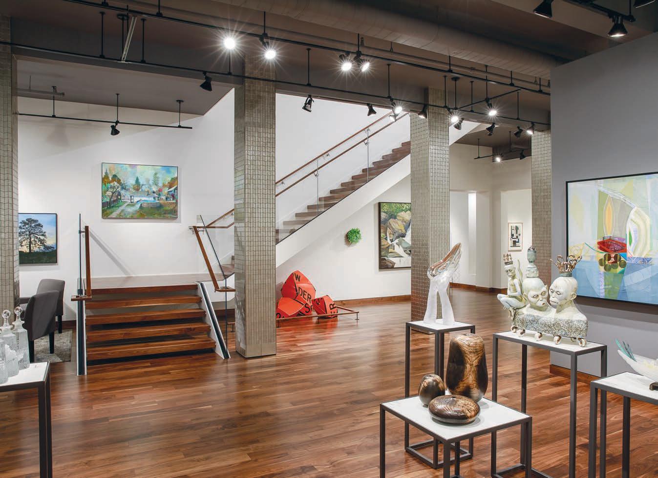
MOMENTUM GALLERY offers a curated collection of museum quality works that celebrate material-based traditions rich in this area and reflect a contemporary aesthetic in harmony with our natural surroundings.





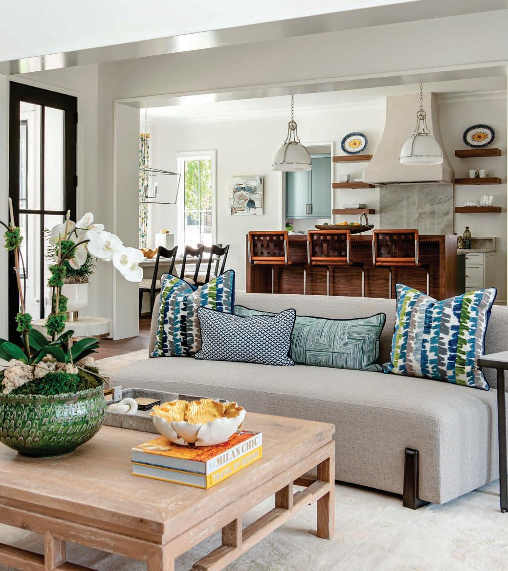
After years in the corporate world, Beth Sink, owner of Claude & Coy Interiors, decided to chuck it all and follow her heart into interior design. “My style is a combination of traditional and modern,” she says, “and Claude & Coy’s interiors are approachable, colorful, happy, comfortable, and, most of all, lovable.”


This recently designed living room was a mix of old and new, “which is kind of our MO,” laughs Sink. Her client wanted lots of texture, so Sink combined materials like velvet, grasscloth, and burl wood. “We started with her grandfather’s sofa, which is covered in a Lee Jofa green velvet that I couldn’t get off my mind. Our client gravitated toward blues and whites too, so I knew I wanted that palette for the locally sourced club chairs,” she says. “I have had more direct messages about this fabric than anything in my portfolio! We went with Josselin in Lagoon by Brunschwig & Fils, and it has proven to be a hit!”
As for the walls, Sink “grew up with grasscloth and I honestly want to put it everywhere,” she says. Luckily, her client loved it, too. For Sink, it’s a simple way to add warmth and texture to any room. She rounded out the space with a few antiques from Carriage House, including the sunburst mirror.





 PRODUCED BY ANNE MARIE ASHLEY
WRITTEN BY CHRISTINA SPRATT SPENCER
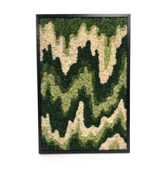
The subdued sensibility of this sophisticated green has a distinguished earthy familiarity. It ranges in tone from a deep mossy note that is luxuriously rich to a tranquilly muted mist of gossamer gray that is anything but drab. This warm and comforting vintage hue laced with chocolate brown maintains a tension of temperature with a versatile range of amber cast to briny cadet undertones. Pairing well with nature’s neutrals like umber, slate, pistachio, and alabaster, tastefully inconspicuous becomes invigorated with accents of vermillion, deep plum, marmalade, lilac, aquamarine, and chartreuse.




ALL-STAR COLLABORATORS CREATE MAGIC TOGETHER AS THEY REBUILD A STUNNING GEORGIAN HOME FOR ONE RALEIGH FAMILY.
In the living room, designer Katherine Connell let the lady lead, creating a feminine feel to a beautiful room. A chandelier from Visual Comfort adds drama, and drapery hardware was created by Louise Gaskill. The sofa and chairs are from Hickory Chair.

WHEN BUILDER JOHN SANDERS was approached by a local couple to build the classical home of their dreams in a reimagined way, he was eager to step up to the plate. The family had recently purchased a ranch home that they planned to tear down, and they hoped to rebuild a Georgian masterpiece in its place with the help of Sanders.
“After listening to what they wanted, I suggested we bring in Carter Skinner as the home designer, Frank Liggett as the landscape architect, and Katherine Connell as the interior designer,” recalls Sanders. “These clients needed something that functioned for a family of four with two very active boys, as well as for entertaining. It was a small, in-town lot, so we all had to be very thoughtful about the spaces and work together to create the perfect outcome.”
“Some of the Georgian-style elements that the homeowners brought to me for inspiration included a lot of symmetry, transoms, a semi-circular front porch, and classical details inside,” explains Skinner. He adds that his great rapport with Connell made it much simpler, as they’ve worked together numerous times.
“I am to the point now where I can usually anticipate how Katherine might want to design a room, so I already know what size to scale a living room, or what a dining room design must accommodate.” The symbiotic relationship between the home designer, the builder, the interior designer, and the landscape designer was integral to creating a flawless project that everyone enjoyed working on from start to finish.
Panel moldings and case openings, mantle work, and even a fully latticed breakfast room swathed in bold blue paint, along with French doors, grand staircases, and a graceful flow from room to room were all part of the combined vision of the team. “Even though a typical Georgian can be compartmentalized, this open floor plan is airy and bright, and Katherine made the rooms cheerful,” says Skinner.
Though challenges were few, it’s easy to assume there were none. “Carter created a floor plan that flows well,” says Sanders. “It has large, spacious main rooms with cozy nooks for a bar, a wine cellar, and a mudroom, all perfectly situated where you would want them.” Connell adds that “the goal was to resurrect a home that looks like it’s been here forever,” and Sanders agrees

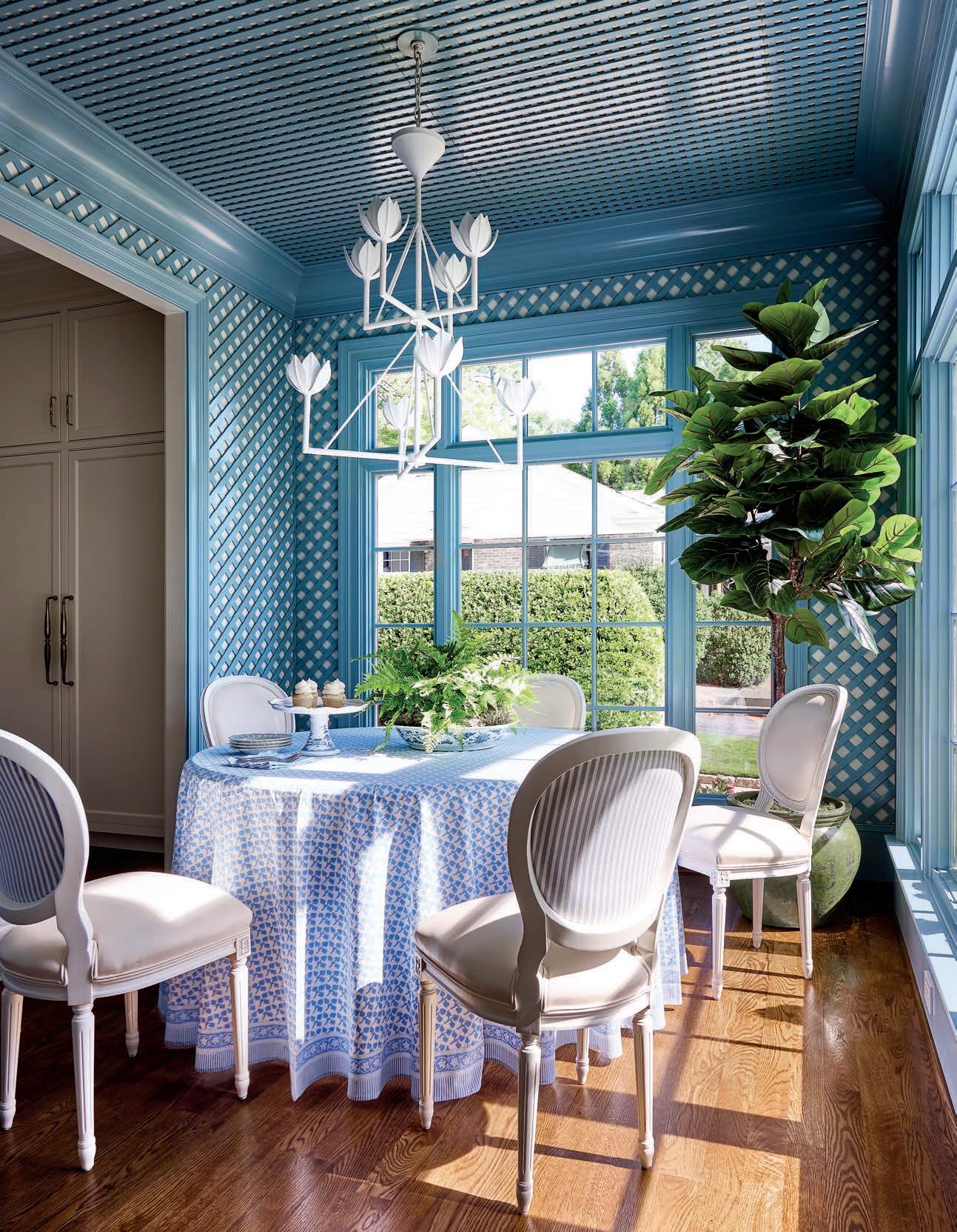
In the primary bathroom, Asian Statuary marble throughout lends a clean, spa-like vibe. A pink vanity stool from One Kings Lane offers a feminine touch and is accompanied by cabinet hardware from Alno. OPPOSITE: In a bold design vision for the breakfast room, the team worked together to create an outdoor porch inside, complete with custom-cut lattice work painted in Sherwin-Williams Languid Blue. The breakfast table is from Hickory Chair and the white Visual Comfort chandelier invites a garden feel.


that it was achieved. “We used a smallersized brick, had the windows made to a historical standard, and used heavy modulation blocks in the interior and exterior trim to make it look different than what everyone else was doing.”

When it came to the interiors, Connell took cues from the homeowners’ existing collections and personal hobbies. “My clients had beautiful family pieces that we knew needed to be incorporated into the design, and they love to hunt for unique art and antique furniture and accessories,” she says. “They have young children, but they wanted beautiful spaces that could also take the daily

wear and tear of family life. With a house full of boys, we chose to skew feminine, especially in the living room.”
The latticed breakfast room was a true group effort, as Sanders explains. “This room was a collaboration amongst trade professionals at the top of their games, from the shared vision between Carter and Katherine to our carpenters’ precision in hand-cutting and laying lattice. We wanted it to look like an old, enclosed porch from the outside with tremendous detail. It’s one of my favorite spaces.”
In the dining room, a tie with the primary bedroom for Connell’s favorite

The dining room features stunning de Gournay wall panels coupled with draperies made with Cowtan & Tout fabric. The chandelier is from Visual Comfort and the rug is from Eatmans Carpets & Interiors.
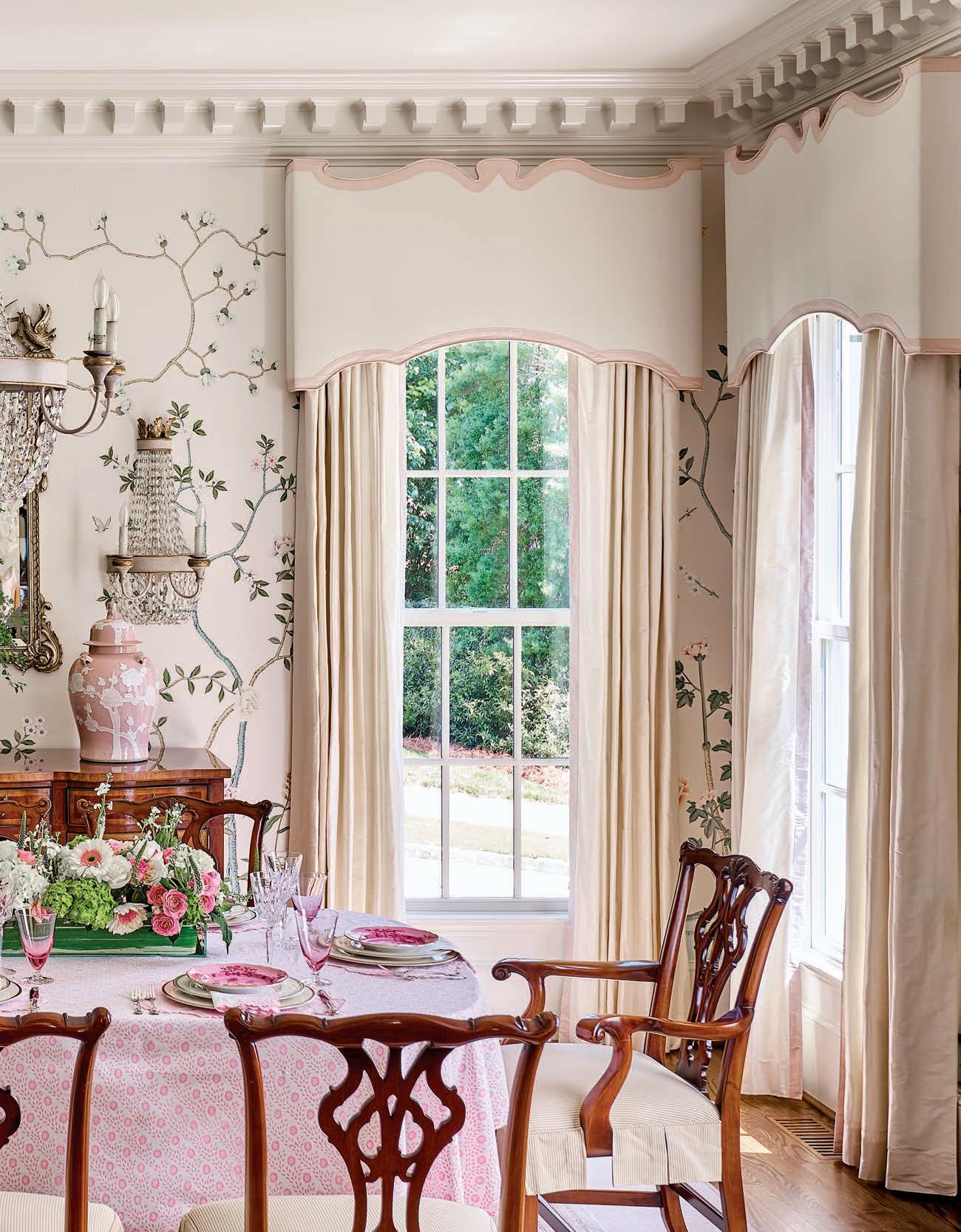
space, beautiful de Gournay silk paper lines the walls while heirloom case goods from the wife’s father’s family fill the space, lending a special sentimentality to the room. “I love the primary suite, too,” says Connell, “because oftentimes this room gets pushed to the back burner, but my clients knew they wanted a retreat, and it is stunning!”
“We go into each project with two simple goals: build a home that will last for generations and listen to what the homeowner really wants and needs,” says Sanders. “These clients were ideal in that they did their homework and were contemplative in the design process, making them a joy to work with over the years.” u

Schumacher chinoiserie wallpaper creates an Eden retreat in the primary suite while lighting from Visual Comfort adds a little drama.


With its wall of white stone and its oversized wooden door clad with custom hardware, the entry inspired the rest of the home’s design. The luxury of a long, skinny lot and single-story construction allowed residential designer Kim Carlson to go long and sprawl out.
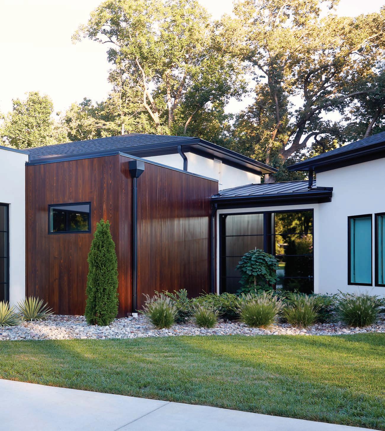
IIT’S HARD TO IMAGINE, but this organic modern masterpiece of a home, with its white stone and Ipe wood-clad exterior, walls of windows, and custom detailing inside and out, all started with the front door. Just the front door.
As inspiration, the homeowner showed her builder at Wolfe Homes a single photograph of an entryway. It’s what residential home designer Kim Carlson, who drew up the plans for the Greensboro home, describes as “midcentury-modern California with stone.” “She really loved the entry, and that was it,” says Carlson, who has made over-the-top entrances a hallmark of her business, Kim Carlson Designs. “Rarely do I get a client who says, ‘Come up with ideas and show me what you got’ the way this one did.”
Of course, there were other issues to work around, such as how to fit 8,500 square feet onto a single level without it looking monolithic, and how to take in the majestic views of the nearby PGA golf course without sacrificing privacy.

To tackle those and other issues, the homeowners enlisted interior designer Stephanie James, whose work they had admired at a show home three years prior. “She showed up at my store and said, ‘I was saving your card. Would you do my house? I can’t think of anybody else I’d want to have,’” recalls James.
James, who co-owns Allen + James Home in High Point and has made a niche for herself in
Family dinners are a frequent occurrence, and James loved bringing in the cayenne color of the velvet fabric on the dining room chairs as a “surprise element.” The homeowners waited a full year to get the Dune wall panels by Studio A, which were brand new to market. The rug is by Mastour.


contemporary design, began working before they even broke ground. She knew that with the home’s clean modern lines and large scale, they’d need natural, organic materials to soften it up. The wood on the exterior helped to break up all the white concrete and stone. “It added a different layer and ended up being one of the best parts of the house,” says James.
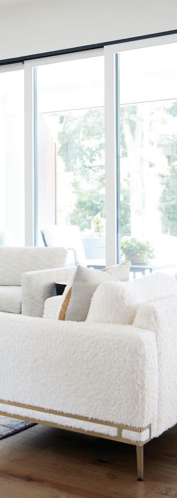
Inside, she used a similar palette of warm tones and textures to offset the hard surfaces and angles. “It has an organic, modern, luxe feel mixed with pretty gold and bronze finishes,” says James. “This house needed that because it’s all windows, and the light shows everything. So it’s got to be right.”

Her eye for detail came in handy when the homeowner decided to add mirrored windows for privacy, which made the interior lighting seem a bit darker. “We had to get lighter tile than we’d originally selected for the music room,” says James.
Everything in the house is custom, from the front-door hardware, designed by James, to the stain on the cabinets
ABOVE: Because the kitchen is a central gathering point, the owners requested a scullery and a wall behind the range for pots and pans to keep the look as clean as possible. James used contrasting stains to make the upper cabinets pop.

BELOW: The white stone wall outside the music room brings the outside in and breaks up the walls of glass windows. The bench is by Rene Cazares and the occasional chairs are by Thayer.

The home office shows how neutrals can be feminine. The chair is a Kravet fabric that has an Art Deco feel. The credenza and desk are by South + English. The wall art is a print from Charles Harold Company, a photograph of a piece of fabric. The homeowners’ request for no abstract art threw James out of her comfort zone and forced her to explore other options.

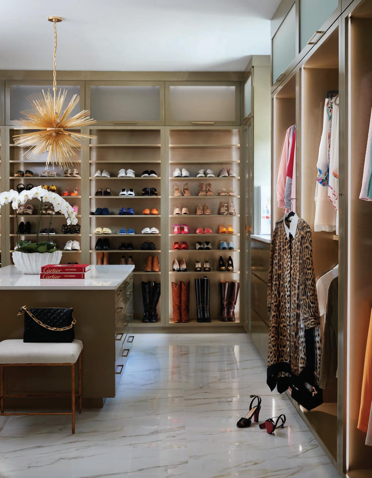
in the primary bedroom’s walk-in closet. “I got spoiled with all the beautiful finishes in the furniture industry,” she says. “I wanted to bring that to the cabinets.”
Having previously worked in the furniture industry, and with High Point Market in her backyard, James knew the most current designs, and she frequently shops European markets, so when this client gave her the creative license to do so, “we pulled in things you don’t normally see,” she says.
The result is a truly unique living space that perfectly suits her client’s needs—a majestic entryway with a towering wall of white stone included. “They were blown away with their house,” she says, “and that made me happy.” u
ABOVE: For the bed’s headboard, James said she wanted something “low and fabric” with more of a midcentury-modern vibe.

LEFT AND BELOW: The primary bath design was inspired by The Dewberry, a hotel in Charleston the homeowners frequent, so they can experience hotel-quality accommodations all the time. The light fixture above the bathtub is by Circa.

OPPOSITE: The walk-in closet is about twice the size of the primary bedroom, according to James, and perfecting the champagne finish of the cabinetry took a lot of effort. The floor is the same tile as the primary bath, and the light fixture is by Circa from Hudson Valley Lighting.


THE TRIANGLE IS BLESSED WITH A VARIED LANDSCAPE OF TRULY SPECIAL ARCHITECTURE; SO VARIED THAT WE DIDN’T HAVE ROOM TO SHOWCASE ALL THE STUNNING SUBMISSIONS WE RECEIVED FOR THIS ANNUAL EDITION. AS SUCH, WE’VE COMBINED A FEW STANDOUTS WORTHY OF PRAISE IN THIS SPECIAL FEATURE.
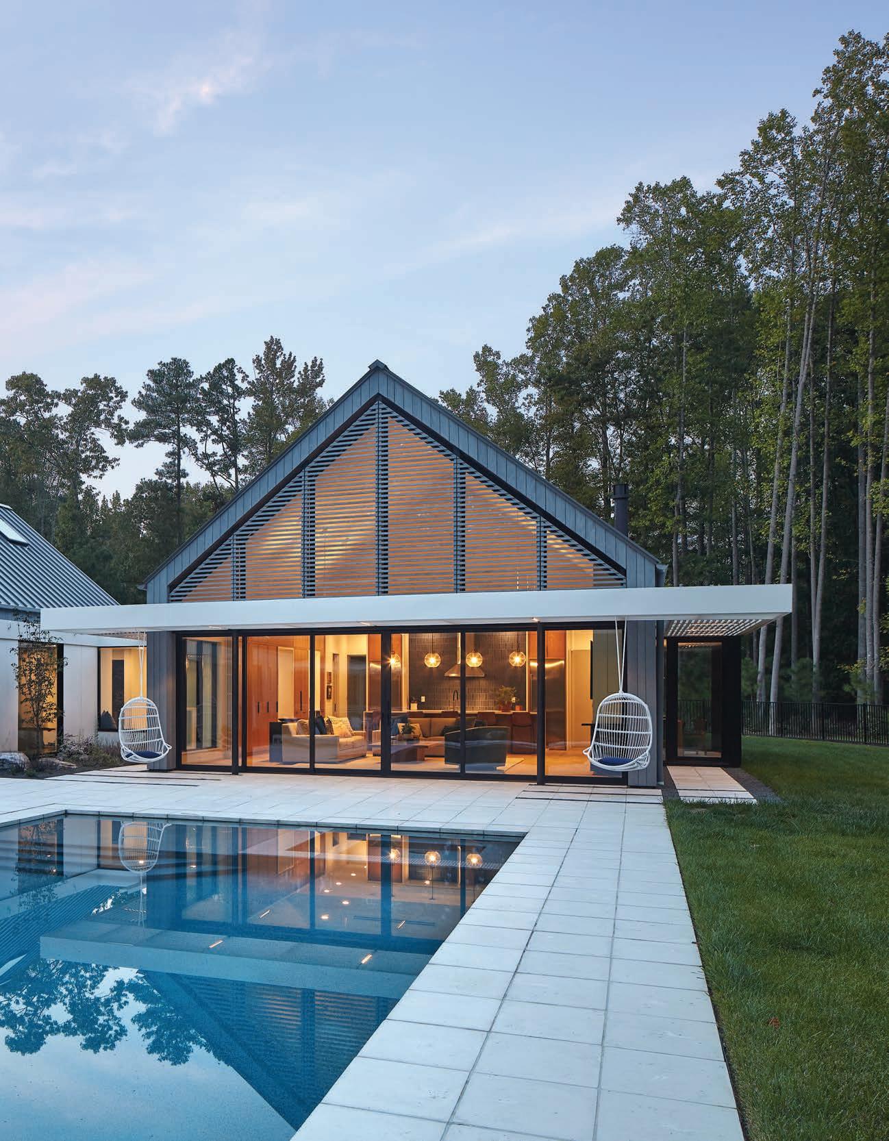

WWHEN THE DOMECKS RETIRED, the empty nesters found themselves using only a handful of rooms on a regular basis. So they enlisted ThoughtCraft Architects to construct a home more conducive to their new lifestyle.

“This new home is intended for their grown children to gather, and overall connects the owners with the outdoors throughout the day,” says architect Jason Hart, founding partner of ThoughtCraft. To achieve this, the home was divided into four pavilions: sleeping, living, storage, and working/recreation. Each section is clad with charred wood siding and is linked with a connecting hall with white panels. “This change in materials, while moving between daily routines, provides a heightened awareness of transition,” explains Hart. “Pocket gardens weave in and out between pavilions of the home, allowing the homeowners to connect with the landscape as they transition from space to space.”
ThoughtCraft combined the couple’s differing aesthetics by introducing modern details to a traditional gable roof and centering the pool on the living pavilion. The result of the painstaking design process is a home in which the Domecks live and love every square inch.

OOLD HOMES HAVE A CHARM that’s hard to duplicate, so when homeowners asked builder John Sanders to fully renovate and add on to their 1930s Tudor home in a coveted Raleigh neighborhood, he fully understood their directive to maintain the original structure. The family also wanted to create an outdoor oasis that included a covered porch, a raised patio, and a pool complete with a pool house.
“The homeowners wanted to keep the charm, but modernize,” explains Sanders. “We added an attractive front side-loading garage, an open kitchen, and a larger family room. Small privacy walls were added to hide the driveway area as well.” A pea gravel driveway edged with cobblestone was designed to complement the Tudor style.
Home designer Carter Skinner drew plans for the renovation, editing the previous home addition that had eight-foot ceilings to be a utility entrance from the new garage instead. “It was a pivotal part of the design process,” says Sanders. “His design allowed the entertaining spaces and other primary rooms in the home to remain unaffected while also benefitting from higher ceilings.”
The backyard oasis includes a cedar shake-sided pool house that pulls in the charm of the original home, and high ceilings painted black, along with dark trim, to modernize it.


AAS A HALLMARK OF THEIR DESIGN philosophy, Arrowhead Designs strives to use natural materials and focuses on connecting interior spaces with the outdoors—a perfect solution for these Durham homeowners seeking a new build that had the patina of age. “The exterior of the home embraces weathering, and part of this project was seeking materials that gracefully age,” explains architect Jesse White.
The long, narrow, urban lot holds the new 2,000-square-foot home built with reclaimed or natural materials at every turn. The team chose reclaimed local brick from an old mill building for the lower level and added a contemporary vibe to the top level with thermally modified ash wood boards mounted vertically in a modern gable form.


“These ash siding boards will silver with time, giving the aged look the homeowners wanted,” says White. Painstaking efforts were also made to achieve integrated sustainable systems like radiant floors, photovoltaic panels, and high-efficiency appliances and fixtures. “The homeowners really wanted to showcase extreme energy efficiency and craftsmanship,” says White. “They brought so many nice finishing touches to the home that honestly made it a joy to watch being constructed.”

WWHEN COMMERCIAL BUILDER Mike Iovino of August
Construction Solutions and his family were ready to find a new home more fitting of their lifestyle in 2019, he decided to make his first foray into residential building. He hired architect Robby Johnston of The Raleigh Architecture Company to design it. Having built for the likes of Patagonia and Urban Outfitters, Iovino felt confident he could tackle it.
With a location in Cameron Village, designing a modern home on an understated scale was important, and a task that Johnston and his team eagerly tackled. “We wanted to reduce the weight of the facade to help sync the home with the scale of the neighborhood,” explains Johnston. His team designed the home with a cantilever—a rigid structural element that is supported at only one end—which drove the format of the rest of the home. “Part of what makes the home visually complex is that from different angles, you see one, two, or three stories. The cantilever allowed the living spaces to expand out and over the backyard and pool area,” says Johnston.
The previous seventy-year-old home gave way to an extraordinary feat of architecture and engineering that is not only sustainable—a hallmark of The Raleigh Architecture Company—but also the perfect size and scale for the Iovino family and the neighborhood. u
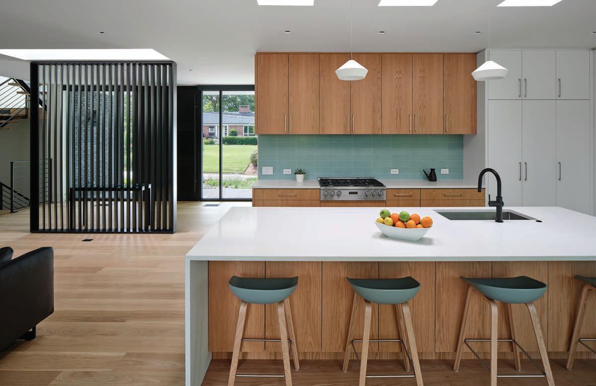

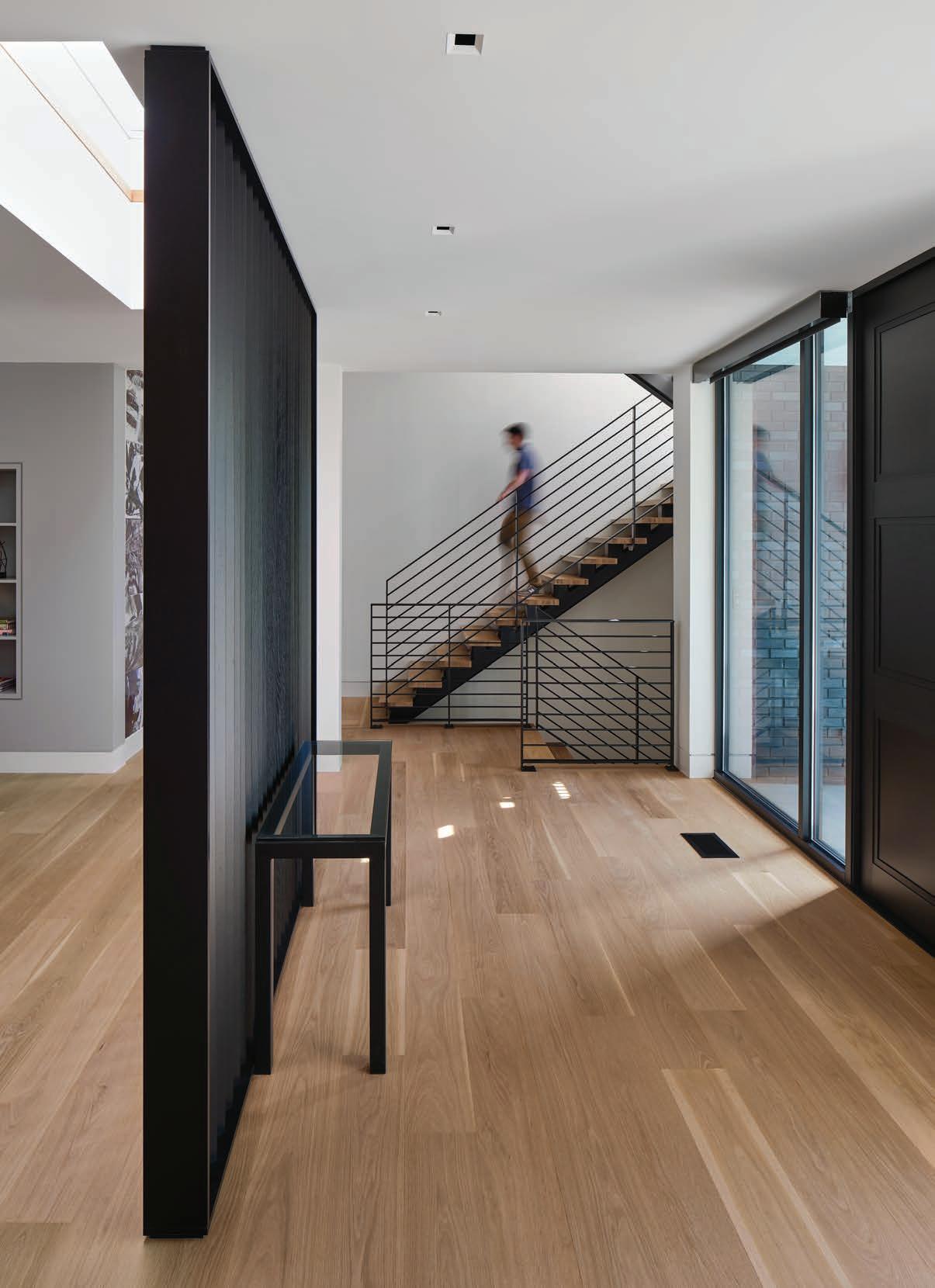
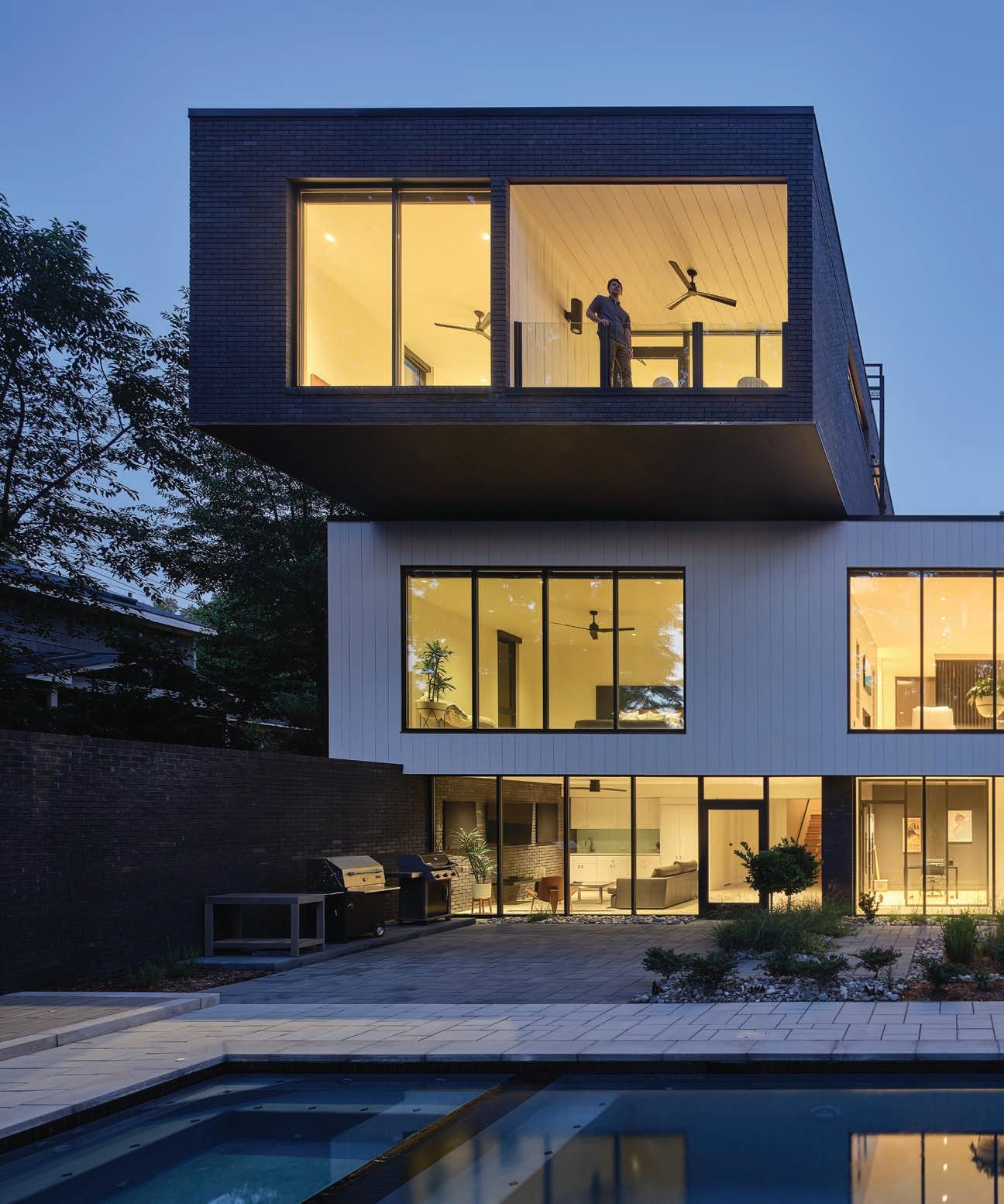

"PART OF WHAT MAKES THE HOME VISUALLY COMPLEX IS THAT FROM DIFFERENT ANGLES, YOU SEE ONE, TWO, OR THREE STORIES. THE CANTILEVER ALLOWED THE LIVING SPACES TO EXPAND OUT AND OVER THE BACKYARD AND POOL AREA." —ROBBY JOHNSTON, THE RALEIGH ARCHITECTURE COMPANY



 WRITTEN BY DANA W. TODD
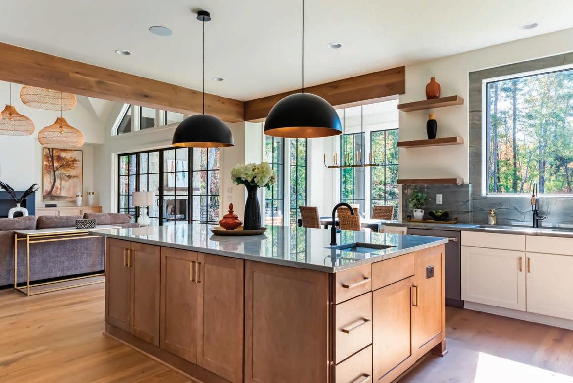
There is growing evidence that green spaces reduce anxiety and generally improve our well-being. What if you could multiply that effect by designing a home filled with endless luxuries blended with the soothing influence of nature—rolling hills, open spaces, and mature trees? That combination of nature and luxury is at the heart of the newest custom home community in north Raleigh.
Loyd Builders is exclusively developing and building thirty-one custom homes on generous homesites surrounded by the natural beauty of unspoiled land in Shadow Creek Estates.
Several homes are already under construction in this high-end community, including the spec home at 4836 Parker Meadow Drive, which Loyd Builders is designing with expansive main-level living, a multigenerational design, and extensive outdoor-living elements. Lavish features are abundant in this 7,000-plus square-foot home with six bedrooms, six full baths, and three half-baths.
“This spec home is an example of the type of legacy homes being built throughout Shadow Creek Estates,” says real estate
broker Christina Valkanoff. “We have sold more than 50 percent of the homesites so far, and people are excited about this highly desirable location that is secluded, nestled into nature, and just minutes from the area’s top attractions.”
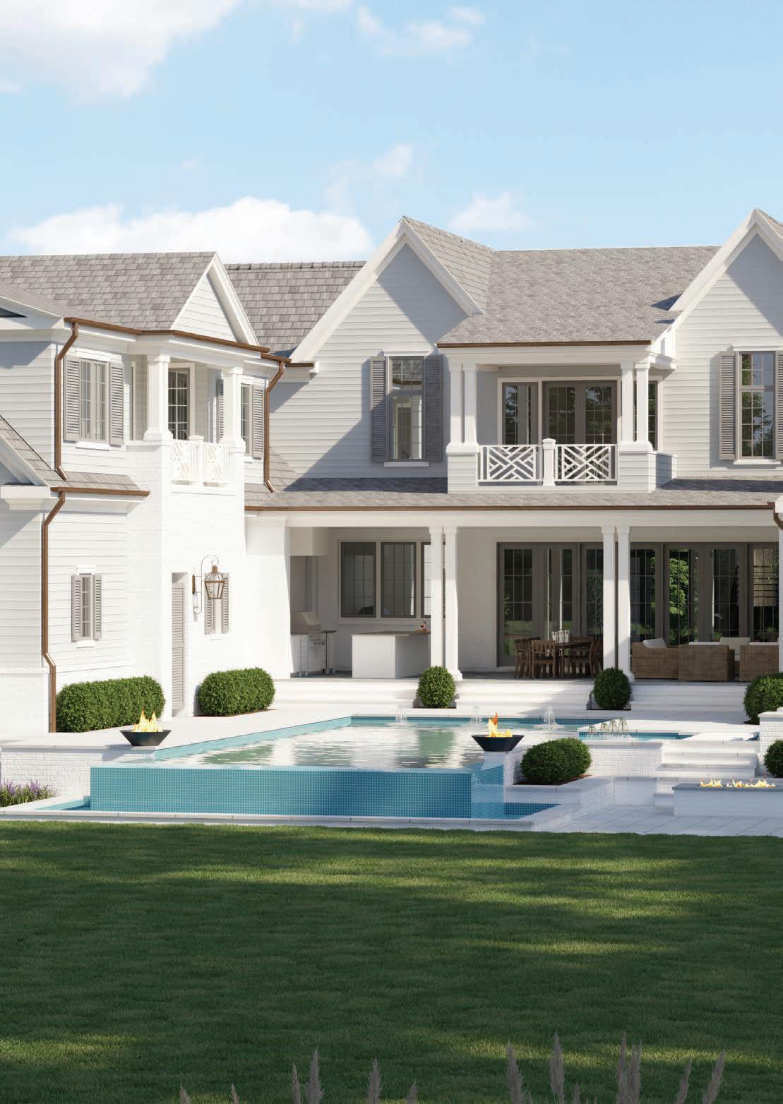
The design and building team uses the highest quality exterior materials such as brick, cedar siding, slate, and copper. The spec home features a horseshoe drive and a separate side-load driveway beside a four-car garage, providing plenty of parking options. Continuing to the backyard built for entertaining, an infinity-edge saltwater pool with lily pad stepping stones leads to a sunken firepit with a spa and outdoor shower nearby. A covered porch with marble floors contains an outdoor kitchen and woodburning fireplace where a homeowner can remotely control phantom screens and in-ceiling heaters.
Luxuries abound in the sprawling U-shaped interior of the home. “The layout is traditional but modernized for today’s lifestyle,” says Valkanoff. On the main level, a large kitchen with double islands has an adjacent scullery and butler’s pantry with double wine cellars, all with Sub-Zero and Wolf
appliances. The large family room features a floor-to-ceiling fireplace made with dramatic black marble with white veining. Nearby is a separate dining room with a coffered ceiling, an art gallery, and a home office surrounded by windows. Designed for easier and more efficient living, the home features double appliances and double laundry rooms. The primary suite bathroom has innumerable custom touches, including a freestanding tub, a steam shower, and heated bathroom floors. Separate stairway access from the primary suite to an in-law suite with a balcony overlooking Honeycutt Park makes this a truly generational home.
An eye-catching floating staircase leads to the second floor, which has a custom wood coffered ceiling that commands attention. Three additional bedrooms with en-suite bathrooms surround a centralized game room with a wet bar and balcony overlooking the pool.
“This legacy home is where luxury meets livability,” says Valkanoff. “Prospective homeowners should come and see this home’s fine finishes, materials, and craftsmanship in person to experience what Shadow Creek Estates living is all about.” u

“THIS LEGACY HOME IS WHERE LUXURY MEETS LIVABILITY.”
—CHRISTINA VALKANOFF
IF THERE’S ONE THING WE LEARNED FROM THE PANDEMIC, IT’S THAT SUPPLY CHAIN CHAOS AND INFLATION ARE NOT GOOD FOR SHOPPERS WHO ARE TRYING TO BUY NEW, REASONABLY PRICED FURNITURE IN A PRACTICAL TIME FRAME.

Homeowners began to consider upcycling readily available furniture, either inherited from family members, found in a local antique or consignment store, or sourced from Facebook Marketplace. At Rail & Stile, we breathe new life into vintage furniture through our professional lacquering process, and we see homeowners excited about rediscovering what has been right in front of them all along.

Unlike today’s disposable society, vintage and antique furniture was made to last. It often has good bones and a sturdy structure but needs a little TLC to make it shine in a modern home. Lacquering older furniture preserves its sentimentality and character while also personalizing it for your home. And repurposing furniture is simply a sustainable choice for our planet.
The cool thing about lacquering an older piece of furniture is that a color can be matched from sources like Sherwin-Williams paint samples, a fabric swatch, or even tiles. Lacquering is best done by experienced professionals using pre-catalyzed nitrocellulose lacquer appropriate for older furniture that has years of oil and dirt buildup. The professionals at Rail & Stile perform multiple stages of
prep work and several layers of lacquer application to make an old piece look new again. When we custom lacquer a piece of furniture housed in our 10,000-square-foot showroom, or one that is brought to us by a customer, the result is a statement piece with a forever finish that provides long-lasting beauty.
.
Lacquered furniture is popular because of its smooth, glossy finish and its ability to stand up to the daily demands of family life. An eye-popping color in an ultra-sleek finish can take a functional piece of furniture from dated to charming. Complete the look with “jewelry” by re-lacquering the hardware, or choose new hardware from one of our suppliers.
Along with coordinating white-glove delivery directly to our customers’ homes, we provide additional services such as assisting customers in choosing furniture, paint color, hardware, and accessories like glass tops and refreshed upholstery.
Whether your style is Traditional, Neo-Classic, Hollywood Regency, Palm Beach Chic, Midcentury Modern, or Grandma Chic, you can’t go wrong with upcycling vintage or heirloom furniture. With infinite color and customization options, you’ll end up with a high-quality eye-catcher that will enhance your home’s decor. u


“AN EYE-POPPING COLOR CHOICE IN AN ULTRA-SLEEK FINISH CAN TAKE A FUNCTIONAL PIECE OF FURNITURE FROM DATED TO CHARMING.”
DON’T LET TODAY’S CHILLY WEATHER MAKE YOU FORGET THAT THE WARM (LET’S FACE IT, HOT) DAYS OF SPRING AND SUMMER ARE RIGHT AROUND THE CORNER. IT’S PRACTICALLY POOL TIME ALREADY
If you’d love to create an outdoor living experience that includes a beautiful backyard pool but are feeling a little overwhelmed about all the choices, let me help. Here’s what you need to know to choose the right type of pool for your family and your space.
There are two types of pools of primary interest to homeowners: fiberglass and concrete. What is right for you depends on several factors: your budget, your available time for design and installation, and the aesthetic you are striving for.
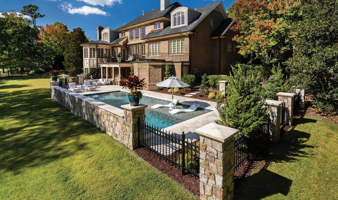
Pros and Cons of Fiberglass Pools. With quick installation and very little maintenance, many homeowners choose fiberglass pools when they want an accelerated backyard project that is durable for many years. Some high-end manufacturers offer a lifetime structural warranty on fiberglass, so it may be a good choice for an active family that needs a quick turnaround but also a resilient product. Today’s pool suppliers have expanded the array of color choices, so homeowners are not limited to white or blue interiors. The biggest downside of fiberglass pools is that they are not readily customizable, although most premium producers have modern features such as tanning ledges. Features like infinity edges are not possible or practical, but one supplier we recommend, Thursday Pools, provides a beach-entry option. Fiberglass pools are limited in size to approximately a maximum of forty


feet long and sixteen feet wide since they must be moved into place by truck traveling over highways and secondary roads. They also are limited to the manufacturer’s available shapes.
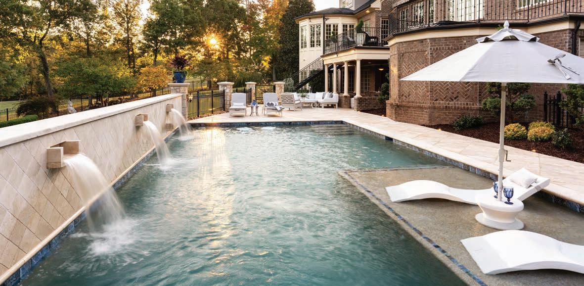
Pros and Cons of Concrete Pools. When you want a fully customizable experience, a concrete pool is the way to go. Homeowners can imagine all sorts of creative shapes that we can bring to life, adding customized tile and special features such as champagne spillovers from the spa to the pool, infinity edges, and Lautner edges, where the water level is at patio height for a modern look. For homeowners who want to take their pool design to the next level, a customized concrete installation is the way to do it. The biggest downside is the higher cost of building and maintaining a concrete pool, as the plaster needs refinishing every ten years on average. This cost is offset by the range of customizations possible to tailor the pool and surrounding patio and hardscaping to a homeowner’s exact specifications.
Whether you choose a fiberglass or concrete pool, we completely automate features and maintenance through our smartphone app. Unlike others, Godfrey & Jones provides complete hardscaping, landscaping, and outdoor living services with our pool installations, and we pride ourselves on fast turnaround for project completion.

If a new pool is simply a treat for your family, a place to gather with friends, a new way to exercise, or a place for relaxation, now is the time to get started on a project that you’ll be able to enjoy by summertime. u

“NOW IS THE TIME TO GET STARTED ON A PROJECT THAT YOU’LL BE ABLE TO ENJOY BY SUMMERTIME.”

A Raleigh family recently faced this dilemma and called on Home & Garden Landscapes for help. They loved their backyard patio, they adored their neighbors, and they couldn’t imagine living in a different neighborhood. There was just one problem: every time they tried to enjoy their backyard patio or entertain outside, they felt totally exposed. The original trees planted more than fifteen years ago were showing signs of disease, and the other landscaping was so sparse, the family had no privacy.

“Over the years, the landscape changed,” says the homeowner. “We needed screening from the neighbors and we wanted to make the yard pretty. We spend lots of time outside, and we wanted to create a restful and private place to enjoy in the middle of town.”
Home & Garden Landscapes did the installation in a neighbor’s yard down the street, and when the homeowner saw the results, she called us asking for a solution to her issue. Since she was anxious for privacy, we decided to create an instant, mature screening solution for the backyard, implementing the entire process in just two weeks.
We planted a primary layer of eighteen-foot Robin holly bushes to screen the backyard from view. Then we layered
in groups of camellia sasanquas and dwarf needle palms in a secondary arrangement. The addition of more camellias and palms, along with Otto Luyken laurel and climbing Carolina jessamine around sitting areas like the patio and the pergola, provide a rich, abundant look. These plants also bring color to the landscape in both the winter and spring. Staggering heights add privacy to not only the ground level sitting areas but also to the back porch, which is about one-and-a-half stories high.
By incorporating mature trees, the family had instant privacy, solitude, and seclusion in just two weeks. “We were anxious for privacy and loved the fact that Home & Garden Landscapes knew how to quickly source trees. We also love the layered look and how the company used some of our existing plants and transplanted them into more appropriate places for better visual impact,” the homeowner says.

“There is a balance between privacy and beauty with a new, lush garden. Since Home & Garden Landscapes sources nationwide, we do not have the ‘typical’ look; instead, we have a custom-designed feel to our backyard.” u

“THERE IS A BALANCE BETWEEN PRIVACY AND BEAUTY WITH A NEW, LUSH GARDEN.”
—RALEIGH HOMEOWNER
21C MUSEUM HOTEL DURHAM
Through May 2023
21cmuseumhotels.com
This We Believe explores the power and evolution of belief systems—religious, political, and economic—and how adherence to and rejection of these ideologies has influenced our current global culture of divisiveness and polarization. From the imagery of disillusionment and protest by ROBIN KID, Kota Ezawa, Claire Fontaine, Stephanie Syjuco, and others, to revelations of historical complexity by Titus Kaphar, Kapwani Kiwanga, and Kara Walker, to visions of transcending binary definitions of identity by Yinka Shonibare, CBE RA, and Zak Ové, the artworks in this exhibition question and critique unalloyed allegiance to creed or country.
NORTH CAROLINA MUSEUM OF HISTORY
Through February 26 ncmuseumofhistory.org
From international superstars like Emmylou Harris, Dolly Parton, Rosanne Cash, Shania Twain, and Taylor Swift to contemporary North Carolina artists like Rhiannon Giddens, Rissi Palmer, and Kasey Tyndall, The Power of Women in Country Music highlights the past, present, and future of country music’s greatest female trailblazers. This empowering exhibition is amplified with a special concert series, an author series, and family events and activities.


CRAVEN ALLEN GALLERY
Through March 4
cravenallengallery.com
A comprehensive selection of paintings by artist Beverly McIver, Passage spans more than thirty years and follows McIver through the most pivotal moments in her life. It reflects the passage of time and its effects on McIver as an artist, a sister, a daughter, and a friend. Passage surveys McIver’s most recent paintings and archival works complementing the museum's retrospective of her career, Full Circle Uniting all her paintings are McIver’s unmistakable brushwork, expert use of color, and unflinching gaze.

