SKETCHBOOK
LETTERED For letterer and designer Claire Coullon, her sketchbook is a constant companion in a life full of travel and new adventures.
W
hen I was younger, my family moved around for my dad’s work, so travel has always played an important part in my life. After university in the UK, my boyfriend and I drove around Western Europe, ending up in Brussels where we lived and worked for a year. Since then, we’ve continued living in different places for either a few months or a few years, travelling in between. Being able to switch between living at a fixed address and moving around is a great way to keep things versatile and fun, by avoiding too much routine. As both an English and French native speaker, most of my lettering and typeface design projects revolve around those languages, but I’ve also worked a lot with Czech and some other European languages. I like diacritics so I find accent-heavy languages fun to work with, as it’s interesting figuring out how to design accents in keeping with the lettering approach. Language has come into play more with the typeface design work I’ve done than with lettering, although I’m sure this will change as I do more lettering in different languages. My lettering projects for clients tend to focus on custom logotypes. The style varies—I do a lot of script designs that are more casual and informal, as well as more classically inspired elegant scripts, sans serif designs, slab serifs, traditional serifs and of course designs that draw from many different styles. Overall, regardless of style, the designs are generally clean and simple while keeping hold of the warmth of hand-made lettering. Part of the simplicity is due to the nature of the logo. For instance, a logo must function at very small sizes and on different materials without distorting, and simplicity plays an important part in a logo’s ability to be instantly recognised. But I generally prefer subtlety in design, anyway—working importance into the smallest details rather than crowding ideas into a more complicated form. The other lettering projects I work on (either for clients or for myself ) involve packaging, stationery, book design and occasionally advertising. Depending on the context, the lettering style will be more or less elaborate and generally varies more than in my logotype work.
VIEW CLAIRE’S LETTERING PORTFOLIO coullon.com
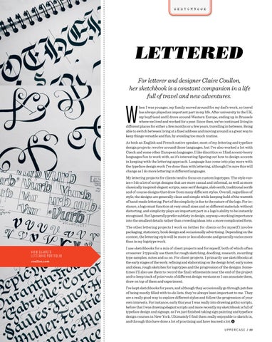
I use sketchbooks for a mix of client projects and for myself, both of which often crossover. I typically use them for rough sketching, doodling, research, recording type samples, notes and so on. For client projects, I primarily use sketchbooks at the early stages of the work: refining and elaborating on the design brief, early notes and ideas, rough sketches for logotypes and the progression of the designs. Sometimes I’ll also use them to record the final refinements near the end of the project and to keep track of print-outs of different design versions so I can annotate them, draw on top of them and experiment. I’ve kept sketchbooks for years, and although they occasionally go through patches of being mostly filled with to-do lists, they’ve always been important to me. They are a really good way to explore different styles and follow the progression of your own interests. For instance, early this year I was really into drawing gothic scripts, before that I was drawing elegant scripts and more recently my sketchbook is full of typeface design and signage, as I’ve just finished taking sign painting and typeface design courses in New York. Ultimately I find them really enjoyable to sketch in, and through this have done a lot of practising and have learned a lot.
U P P E R C A S E / 89