illustration ©2008 Nick Cardy, Aquaman ™ and © DC Comics © DC Comics
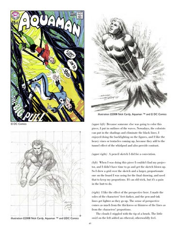
(upper left) Because someone else was going to color this piece, I put in outlines of the waves. Nowadays, the colorists can put in the shadings and eliminate the black lines. I enjoyed doing the backlighting on the figures, and I like the heavy vines or tentacles coming up, because they add to the tunnel effect of the whirlpool and also provide contrast. (upper right) A pencil sketch I did for a convention. (left) When I was doing this piece I couldn’t find my projector, and I didn’t have time to go and get the sketch blown up. So I drew a grid over the sketch and a larger, proportionate one on the board I was using for the final drawing, and used that to keep my proportions. It’s an old trick, but it’s a pain in the butt to do. (right) I like the effect of the perspective here. I made the soles of the characters’ feet darker, and the pen-and-ink lines get lighter as they go up. The sense of perspective comes as much from the thickness or thinness of the lines as from the characters’ proportions. The clouds I stippled with the tip of a brush. The little swirl on the left added an ethereal, otherworldly feel.
illustration ©2008 Nick Cardy, Aquaman ™ and ©DC Comics 40