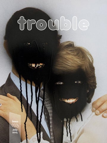
trouble
Taking Centre Stage in Bendigo Launching 2015 Key features include: • • • • •
Largest dedicated auditorium in Central Victoria 960 seat theatre Professional team on site Generous foyers linking to tranquil outdoor spaces Suitable for performance, expos and conferences
For future bookings, general information, technical specifications and status updates please visit our website: www.ulumbarratheatre.com.au Email ulumbarra@bendigo.vic.gov.au Phone 03 5434 6006
La Trobe University Visual Arts Centre 121 View Street Bendigo, VIC, 3550 +61 3 5441 8724 latrobe.edu.au/vacentre
DARREN WARDLE: Head Case, to 10 August BUEN CALUBAYAN: Idiot Knows No Country, to 3 August La Trobe University Visual Arts Centre 121 View Street, Bendigo, VIC, 3550 T: 03 5441 8724 121 View Street E: vac@latrobe.edu.au Bendigo, VIC, 3550 W: latrobe.edu.au/vac +61 3 5441 8724 Gallery hours: Tue – Fri 10am-5pm. Weekends 12-5pm latrobe.edu.au/vacentre La Trobe University Visual Arts Centre
Image: Darren Wardle, Head Case Study 12, (detail) 2014. Courtesy of the artist & Fehily Contemporary, Melbourne.
we’re all about the ear COMMUNITY RADIO FOR CASTLEMAINE AND BEYOND
www.mainfm.net 03 5472 4376
FEATURES
(07) COMICS FACE Ive Sorocuk (10) THE MADNESS OF ART Jim Kempner (12) UNDER CLOTHES: 350 YEARS OF UNDERWEAR IN FASHION
Steve Proposch
(18) ALL DAY ADALITA Social Work (22) HEAD CASE: THE ART OF DARREN WARDLE
Dr Vincent Alessi
(28) TRUE NORTH AND DEEP BLUE: INTERVIEW WITH EMILY FERRETTI
Naima Morelli
(38) JULY SALON Jumpin’ (46) ACTEASE Courtney Symes (52) MELBURNIN’ Inga Walton (64) GREETINGS FROM HINDUSTAN FINAL EPISODE: NOT A MONSOON WEDDING Ben Laycock
COVER: Tony Garifalakis, Mob Rule (Family) 2014. Enamel on C Type print, 60 cm x 40 cm. Courtesy of the artist and Hugo Michell Gallery © the artist. Mob Rule, Art Gallery of New South Wales, AGNSW Contemporary Projects, until 21 August 2014 - artgallery.nsw.gov.au/exhibitions/tony-garifalakis/ CONTRIBUTORS Ive Sorocuk, Jim Kempner, Naima Morelli, Dr Vincent Alessi, Courtney Symes, Inga Walton, Ben Laycock Issue 114: JULY 2014 trouble is an independent monthly mag for promotion of arts and culture Published by Trouble Magazine Pty Ltd. ISSN 1449-3926 Find our app at the AppStore follow us on issuu or twitter, or subscribe at troublemag.com READER ADVICE: Trouble magazine contains artistic content that may include nudity, adult concepts, coarse language, and the names, images or artworks of deceased Aboriginal or Torres Strait Islander people. Treat Trouble intelligently, as you expect to be treated by others. Collect or dispose of thoughtfully. DIS IS DE DISCLAIMER! The views and opinions expressed herein are not necessarily those of the publisher. To the best of our knowledge all details in this magazine were correct at the time of publication. The publisher does not accept responsibility for errors or omissions. All content in this publication is copyright and may not be reproduced in whole or in part in any form without prior permission of the publisher. Trouble is distributed online from the first of every month of publication but accepts no responsibility for any inconvenience or financial loss in the event of delays. Phew!
Reproduced with the permission of the Sidney Nolan Trust / Bridgeman Images
art comedy series
season 2, episode 11: Bite The Hand Where is the Murphy painting? How much is none of your goddamn business? Jim is starting to feel slap happy!
4
back to back
special episode: Charlie Hewitt on Painting “There’s something about a paintbrush that scratches an itch,” says artist and MoA co-producer Charlie Hewitt in this revealing and intimate interview. Charlie opens his studio to explain his process as he works on number of canvases. “It’s feral, done mostly by myself,” he says. “It’s so full of promise. It’s constantly telling me that I’m close … taking me to a point where there can be some kind of relief from all the experiencing, to something called completion.” visit: themadnessofart.com/
Under Clothes 350 YEARS OF UNDERWEAR IN FASHION
Steve Proposch
Cage crinoline, Unknown, ca.1868. Museum no. T.195-1984. Š Victoria and Albert Museum, London
4
Lingerie came out of the closet in the 1980s, when Jean Paul Gaultier dared to suggest that underwear could be outerwear and put a bra onto the catwalk. These days underwear is everywhere, beamed at us incidentally on thirty foot high billboards that tell us to buy more of it, in fashion shows, shopping centre displays, all over the media, music clips ... I dare say it is more difficult to avoid the sight of someone else’s underwear in western society today, than it once was to catch a stolen glimpse of it. Be that decadence or development of the human condition is a debatable point might form another, but a new International exhibition originated by London’s Victoria and Albert Museum should, at least, offer much-needed depth and breadth to the general dialectic. Undressed: 350 years of underwear in fashion aims to reveal some of the history of undergarments through the V&A’s apparently vast collection of underwear, which includes one of the earliest known bras, and undergarments worn by Queen Victoria herself. According to the V&A: “Women’s underwear served two purposes in the 18th century. The first function, carried out by the shift or smock, was to protect the clothing from the body, in an age when daily bathing was not customary.”1 It’s second purpose was to mould the body of the wearer into a “fashionable shape”, providing some structure and a frame for the gown to be pinned to. In Victorian society it was often the structures worn under the clothes that gave the fashion its form. “Gone were the flamboyant fashions of the mid-1830s with the huge balloon-like sleeves, large bonnets and trailing ribbons. Dress of the late 1830s and 1840s was characterised by its drooping shoulders, long pointed angles and low pinched-in waist. These low-waisted dresses required long, heavily-boned corsets to give them their shape.”2 Sometimes called ‘a pair of bodys’ or ‘stays’, corsets have been worn since the late 16th century in Europe, and the history of this one garment alone could form a fascinating study. Much has been written on the detrimental effects of corsetry and ‘tight lacing’ techniques, but as the V&A write in their article Corsets & Crinolines in Victorian Fashion, “Photography, paintings and fashion plates are very posed and often picture people in their Sunday best. Although obviously corsets and heavy petticoats were worn, corset lacing was probably loosened and petticoats left off for more ordinary wear.”
Under Clothes / Steve Proposch
4
“... moralists, publicists and satirists were often out to condemn the fripperies of fashion and tended to focus on the most extreme situations.” Crinolines introduced new technologies such as spring steel hoops (June 1856) that were lighter and more flexible yet strong enough to “support the skirts and create the desired bell-shaped effect. The fashion was so popular that Punch nicknamed the crinoline craze ‘Crinolinemania’.” While contemporary stories abounded of women “being unable to fit into carriages or through narrow doorways“, sweeping delicate china from shelves as they turned, and, most frequently and terribly, catching sparks from open fires (“a situation not helped by the wearing of highly flammable fabrics such as muslin and silks”) the article is quick to remind us that while many of these stories had a foundation of truth, “one should bear in mind that moralists, publicists and satirists were often out to condemn the fripperies of fashion and tended to focus on the most extreme situations” thus the tales were frequently exaggerated. Over the centuries there have been different versions of the fashionable body, from voluptuous to slim to distorted waspish waists and exaggerated buttocks, but the study of underwear is relatively modern. In a video from the V&A entitled Underwear: From corsets to bullet-bras and back, exhibition curator Eleri Lynn offers a brief history of shapewear, “starting with the hourglass and S-bend forms – and steel and whalebone engineering – of Victorian and Edwardian corsets, carries on through the breast-flattening bandeau bras worn by 1920s flappers, the New Look underwear of Christian Dior, the conical bullet bras of the 1950s and concludes with the arrival of Lycra in the 1960s and the renaissance of corsetry through the new popularity of burlesque.”3 The exhibition is accompanied by a gorgeous illustrated publication from the V&A entitled Underwear: Fashion in Detail, by Eleri Lynn. The book contains a number of detailed illustrations of the objects in the show. Undressed: 350 years of underwear in fashion, Bendigo Art Gallery, 9 July – 26 October 2014 - undressedbendigo.com The Victoria and Albert Museum - vam.ac.uk
FOOTNOTES 1. Interactive: Side Hoop Underskirt and Linen Shift, 18th Century: http://www.vam.ac.uk/content/articles/i/ interactive-womans-side-hoop-and-shift-1700s/ 2. Corsets & Crinolines in Victorian Fashion: http://www.vam.ac.uk/ content/articles/c/corsets-and-crinolines-in-victorian-fashion/ 3. Underwear: From corsets to bullet-bras and back: https:// vimeo.com/20552707 IMAGE PREVIOUS SPREAD: Madonna’s Blond Ambition Corset: http://en.wikipedia.org/wiki/ User:11JORN/Sandbox2#mediaviewer/File:Madonna%27s_Blond_Ambition_Corset.jpg
Fashion photograph, Lilian Bassman, 1948. Museum no. PH.14-1986. Š Victoria and Albert Museum, London
a SOCIAL WORK interview
Adalita’s All Day Venus proclaims the triumphant return of rock chic from a rock chick. The first official single from the album, ‘Warm Like You’, is detuned guitar nirvana (see what I did there). Adalita has said of the album: “I think it’s about growing up ...” We took that as a cue. Time to do some Social Work.
4
Which member of your family influenced you the most? I would say my mum. She’s a pretty strong woman. But my sister is pretty damn cool too. We had a lot of fun hanging out as kids. How similar are your political beliefs to those of your family? Pretty much the same. All lefties. Do you have a favourite family story? Wild blackberry picking and catching taddies in summer at our local river in Geelong when I was a child. What do you hope for? An end to animals being used for experimentation. An end to factory farming. An end to abuse of animals. What do you think is your main purpose in life? To be true to myself. Make art. Be true to the art. Do you think things happen for a reason? I think you can think that. Life is what you make it. What beliefs do you have that you think will never change? To be kind. To always try to do the right thing. To speak up. Say your truth. Do you believe in the supernatural? I believe in mystery. Is any religious text important to you? I don’t read any formal religious text but I feel an affinity with buddhism. Have you ever come close to dying? No. What do you like the best about your body? I like my eyebrows. Always have. What do you think would be the best thing about being the opposite gender? Feeling the masculine drive. Is there anything you find irresistible? It’s gotta be any sort of baby animal. I’ve never seen one in real life but I reckon a baby sloth would be pretty amazing to hold. What is stopping you? Only ever myself.
All Day Venus is out now. Get it on iTunes Adalita is touring Australia throughout July. See tour dates Or listen to ‘Warm Like You’ on Soundcloud Artist site - adalita.com
THE ART OF DARREN WARDLE Dr Vincent Alessi
‘Would you prefer to have your work thought beautiful or interesting?’ So asked David Hockney of his contemporary Larry Rivers. If a similar question was put to Darren Wardle it may well read ‘would you prefer to have your work thought beautiful or repulsive?’ > Head Case Study 11 (2014). Courtesy of the artist and Fehily Contemporary, Melbourne
y d u t S e s The Ca a e r a s e s Hou n a i p o t u lesson in r e v e n n o i t aspira e h t d n a met ” s n i u r “ t resultan . t f e l e r a t tha
Of course such questions are not always meant to be answered definitively. They are more statement than question and speak of the complexity and challenging nature of particular practices. Darren Wardle makes art that lives within this uncomfortable space, often oscillating between the extremes of beauty and ugliness. Known for his majestic psychedelic exterior and interior architecture paintings the viewer is seduced on the one hand and left isolated and running for the exit on the other. His paintings depict the familiar but reveal the hidden – that which we prefer not to see – all at the same time. They ruminate on the notion of the modern architectural ruin: physical and metaphorical. They celebrate high modernism in order to comment on the world in which we currently live: high consumerism. They are a visual representation of the fine line between utopia and dystopia where a slippage from one to the other is only a matter of inches. They are real and unreal. So what should one make of this new body of work? Wardle is not known for portraiture; his raison d’etre has been the built environment. However, if one looks beyond the surface, makes a leap just as the artist has, then these portraits, ranging from the grotesque to the curious, make perfect sense. They are not of themselves portraits of a sitter; Wardle has not met any of his subjects. They are, instead, part of an ongoing fascination and exploration of the collapse of the modernist ideal and promise of a utopian ever after. Just like the rest of his practice, the Head Case Studies, are views of modern day ruins – failed plastic surgery, scars from random attacks, blood-splattered faces on violent sports fields and the pursuit of beauty in both young and old. The genesis of this series, both its title and conceptual framework, can be found in two key moments: post war America and current day Australia. The first moment is the Case Study Houses; an architectural program sponsored by the American publication Art & Architecture, which extended invitations to leading modernist architects to design new inexpensive and efficient homes to cater for the post-war housing boom in America. These homes purposefully adopted a high modernist aesthetic – minimal, clean lines, open spaces and functionality – married with the demands of an increasingly new America focussed on consumerism, massproduction and affordability. The program was moderately successful; only nineteen of the thirty-six designs were ever built and of those not many were to become the basis for future housing developments. The Case Study Houses are a lesson in utopian aspiration never met and the resultant “ruins” that are left. The second moment was an innocuous walk through a park taken by the artist on the way to his studio. Crossing paths with a young man whose head was framed with modern medicine’s scaffolding, a halo brace screwed into his skull, Wardle was both fascinated and repulsed. However, in that moment what was visible was how the figure could be used in his paintings to extend his idea and exploration of the modern ruin. The human body in decay, repair and restoration was no different to the interiors and exteriors Wardle had painted for over a decade. Head Case / Dr Vincent Alessi
4
The sociologist Keith Hetherington observed that only “when such novel commodities, architectures and confident expressions to the idea of progress fall into ruin and decay does their initial promise reveal its hollowness and its frailty.”1 While this comment refers to architecture and urban design its sentiment can be seen in Wardle’s first four Head Case paintings, which are based on sourced images of people post reconstructive and plastic surgery. These portraits, including images of actor Mickey Rourke and rock-star Gene Simmons, are the physical human embodiment of the architectural ruin. They reveal the pursuit of perfection, beauty and ever-lasting youth, which like buildings that fail or decay, is often unrealised and as Hetherington points out hollow and frail. The pursuit of beauty and youth is an idealised notion that has now become commonplace in the world in which we live. There is a demand for the new and the ageless, whether that is on a Hollywood casting couch or in the sprawling new suburbs populated with MacMansions or in countries which have joined the chorus of the new world economy. This quest is driven by the promise of perfection, of utopia, of success in all measure and often sought without thought of failings and consequence. This is perhaps no more uncomfortably and grossly captured by Wardle than in Head Case Study #13. Attractive and innocuous this study in green and pink of a young girl with rosy cheeks reveals upon closer investigation one of modern life’s truly bizarre and for some, disgusting, events: the child beauty pageant. A practice which embodies all that is seen as bad in human behaviour – narcissism, manipulation, selfishness – it has at its core the aspiration of beauty and perfection and the need for reconstruction and falsification to reach the stated objective. Wardle’s young girl elicits all of these qualities seen in her sinister pursed lips, intense dagger-like eyes and over-applied make-up which would be out of place on an adult let alone a girl in her first decade of life. While images of purposeful reconstruction and manipulation are palatable as modern-day parables for the folly of seeking an idealised dream, how does one reconcile portraits of violence? Do these images celebrate violence on the sport field, condone and excuse domestic violence or seek to find pleasure in the voyeuristic gaze aimed at those who have suffered from accidents? They are, as Wardle himself would admit, slippery in justification. However, they are by no means unique within art history, which has always depicted and aestheticized the grotesque and violent but always in an allegorical context. The black-eyed and scarred figures in Head Case Study #6 and Head Case Study #9, or the serene looking face of a young girl with a lacerated nose in Head Case Study #7 speak loudly of the ongoing violence in our world but make comment beyond these atrocious acts. Like Wardle’s interiors, such as the recent Banana Republic (2014), they speak of a world in flux and in decay. The damaged faces are no longer depictions of human wreckage but rather are monuments of ruin and destruction: morally, physically and structurally. These portraits sit side by side with Wardle’s recent interiors, based on the graffitied and derelict decommissioned high school in one of Melbourne’s poorest postcodes, as a comment on the outcome for communities when they are left behind, when social structures fracture and people become isolated in a world that promotes itself as connected. Head Case / Dr Vincent Alessi
4
Like van Gogh’s bedroom or Vermeer’s domestic interiors or Bacon’s tormented portraits or Parr’s fascination with his own, Wardle’s paintings are part of the long-standing tradition of interior spaces and portraits, which represent an overtly psychological space. Remaining steadfast in his commitment to the absence of the human figure in his architectural paintings, Wardle does not want to direct any particular narrative. His paintings are purposefully open-ended ensuring discomfort and forcing the viewer to imagine what has been or will come, a quality also true of the Head Case Studies. While they may be graphic in their depiction of blood, bruises and repaired faces, there is no indication of what has actually happened. This is left to the viewer to bring along based on their own biases, narratives and histories. Wardle plays the role of a reflector of experience rather than the indicator of experience. While there are endless parallels and links between what can only be described as two parts of Wardle’s practice – his well-known interiors and exteriors and these relatively new portraits – they are technically steps apart. Still beautifully painted the Head Case Studies do not have the same sharpness of his other works. It is as though Wardle has decided to layer these images with a diffusing filter, taking the edge off the otherwise confronting content. They are quick paintings, sometimes leaving the burnt umber background visible and the head decapitated from its body. Partly due to the commitment to expediency as a rule within this series, conceptually this strategy further emphasises that these are not portraits but rather musings on the precarious space between utopia and dystopia. They are images, which remind us that we live in a world in flux, that the line between the real and the unreal is much closer than we think. That our pursuit for the unique and the ideal has become bastardized and as such has slipped closer to ruin. That in beauty there can also be banality. This collection of paintings challenge both those who know Wardle’s practice well and those who have only recently discovered it. They play in a space that is uncomfortable, confrontational and contradictory. They ask much of the viewer, as all good art should. Head Case Study #12, which depicts a young girl peacefully asleep, perhaps synthesises all of the aims and ideas present in this exhibition. On the one hand it is beautiful and seductive and fosters feelings of empathy, warmness and care while on the other it is unnerving and challenging, prompting us to question whether it is an image which should be the subject of high art. It is a work, which one finds hard to walk away from and asks both of the artist, and us, do you prefer your art beautiful or repulsive? Dr Vince Alessi Curatorial Manager Ian Potter Museum of Art, University of Melbourne
FOOTNOTE: 1 Keith Hetherington, “Memories of Capitalism: Cities, Phantasmagoria and Arcades”, Journal of Urban and Regional Research, vol. 29, issue 1, March 2005, p. 191 Originally published (2014) as the catalogue essay for Darren Wardle, Head Case, curated by Dr Vincent Alessi, a La Trobe University Visual Art Centre Exhibition, La Trobe University VAC, Bendigo (VIC) until10 August 2014 latrobe.edu.au/vac < Head Case Study 5 (2012). Collection of Anthony Soriano Jr., DC, USA
TRUE NORTH AND DEEP BLUE
an interview with Emily Ferretti by Naima Morelli
Those who think that pure painters are almost extinct in the contemporary art landscape should meet Emily Ferretti. This young artist ignores the prophets of doom who proclaim the death of painting, working relentlessly in her shared warehouse studio in Northcote, Melbourne. The magic of Ferretti’s paintings is that they seem delicate and fragile at first glance, but with time and further observation they develop strong and imminent qualities. In some canvases the landscape and objects depicted within it look very defined. In other paintings the subjects are closer to abstraction. Despite Ferretti’s Italian heritage, her work seems to belong to some cold and meditative North European clime. Emily’s frosty palette and her predilection for the colour blue go beyond her art. The first thing people notice about her are probably her bright blue eyes, matching a very white skin and raven hair. When I visited her studio she almost deliberately wore a blue petroleum jumper. The studio, ça va sans dire, had a blue and icy hue. As with many Australian artists, Emily Ferretti began her career by exhibiting in artist run spaces prior to being chosen by a commercial gallery. In Emily’s case, that gallery was Sophie Gannon. It meant acceptance in the commercial art environment, which was a wonderful thing, but how might she also continue challenging herself and her practice? Ferretti’s answer was to stay connected to her roots via other means. There are not many “pure painters” who could make it on the board of the ultra-conceptual WestSpace, for example, but Emily is one of them. Similarly, few could blend so perfectly into that contemporary art temple up on Gertrude Street (Gertrude Contemporary) where Emily had her studio for a while. Such venues are the staple traditions of inner Melbourne’s emerging art culture. I wondered, from where did this penchant for all things grass roots spring ... Were you born in the countryside? E.F. In the countryside, yeah. I was born in a place called Gisborne, which is about an hour from Melbourne. It’s north west, near the mountains. I grew up there until I was twenty and then I moved to the city to attend TAFE, and then VCA [Victorian College of Arts]. Do you think your childhood is still part of your work? E.F. For sure. We were on a very isolated farm, so that’s a reason why I like the work of folk artists so much. I feel I have an insight into their art. The country must stay with you subconsciously. I’m also drawn to things that have a lot of patterns. Leaves and plants have a lot of room to make them abstract, compared to very rigid like buildings. I feel that I can play with organic things a lot more. I pick things where there is a bit of pattern involved and I pull that stuff out. < Gesture 3 (Barn) (detail), 2014, oil on linen board, 42x32 cm
4
When did you realize you wanted to be an artist? E.F. I was always making things as a kid. I can’t say I was one of those people who wanted to be an artist since they were five, not at all. In high school I was always quite creative though. I liked art subjects. In year eleven I went to a TAFE college for an open day and I saw the artist studios. I loved the idea that someone had a space just to make art. Being a very sheltered girl from the country and coming to Melbourne I was thrilled by the local art scene. The artists all had the cool hats and the cool jumpers and I was like: “That’s amazing!” I was excited by their lifestyle and their art and I wanted to be one of them. Then I realized that painting didn’t come so easily and I had to work quite hard. I was not a great drawer, but I think I did improve quickly. The more I looked at art the more I got into it. The more I got into it the more I felt in love with it. What has been your experience with art school? E.F. TAFE taught me everything I know, it really matured my skills. We did drawing sessions, three, four drawings every day, lots of paintings and technical stuff. The teachers were there all the time, and they were really into making paintings. A lot people studying at TAFE became really confident painters. After that I went to VCA, which was good but more theoretical. We didn’t have any drawing classes because they expected us to be up to that level already. We did art history and a lot of conceptual art, video, new media subjects. They also taught us about practice and how to make a living as an artist after art school. Does your current work look similar to the work at the beginning of your career? E.F. My old work looked much lighter. I used very light washes. Now it’s a little bit denser, especially the work with a lot of blue and a lot of deep colour. It’s slightly more abstract now compared to what it used to be. But the themes have always been the same, they have always been domestic objects and sport. That’s my world. No humans, I don’t have any portraits. Just scenes and objects. They say what I want to say more than humans do. Although usually I pick most of the objects from my house, so you can tell someone has been there. There are people around but they are not in the paintings. Did you start with painting or did you experiment with other media in the past? E.F. I did more sculpture early on, actually. At TAFE II was into sculpture. I think I’m better at painting though. I do a lot of drawings but I never take them as seriously as I do painting. I think painting does what I want to do. I have tried some installations with pictures, and building things, but I always feel like I’m forcing something and that’s not coming out. I’d rather just make a picture.
Emily Ferretti / Naima Morelli
4
“TAFE taught me everything I know, it really matured my skills. ... The teachers were there all the time, and they were really into making paintings.” I see some photos on the table – do you often start painting from photographs? E.F. A few years ago all of my work was based on photos, but now it’s just imagination. I’m more confident now, and I can paint without pictures, but the initial idea is drawn out by looking at a lot of images, to get me thinking about what I want to do. I start to visualize an image in my mind. My process is the same for all the paintings. I usually have to think about the size of the painting and it takes me sometimes many days. When I start working on a piece, the idea for the next painting often springs up halfway through it. The first picture will bounce something off for the next picture. Things flow. Then I usually try four of five different compositions. It may take a few months to come out. It just works along in my head for a while, but the actual painting process is quite quick. So you don’t make preparatory sketches… E.F. Sometimes. They are very small, just to think about where to put things. Usually I start straight on the canvas, I like to take a bit of a risk. Often I do small versions of my idea using little canvases instead of paper. If they come out well I do a bigger version. Often these small ones work well because they are very spontaneous and they eventually become my work. I’d rather do that than do paper work and think of them as a mere step. Do you do studies for the palette before starting to paint, or you experiment straight on canvas? E.F. Colour for me is very intuitive. For most paintings I probably start with a pale colour and then I will move just slightly in different directions. I’m never bold, never very flat, never very intense. I like to be more natural. I think also the weather is influencing me sometimes. When it’s bright and beautiful I feel more inclined to put more bright things on. In winter it’s always these dark things coming out. Not consciously, but I’m not one of these artist who, without their palette ready they wouldn’t begin to put the paint on. I will never be like that, so that’s why I get colours that I can never replicate.
NEXT SPREAD: Mountain Bridge (detail), 2014, oil on linen board, 42x32 cm. Emily Ferretti / Naima Morelli
4
Gesture 5 (Keep), 2014, oil on linen board, 42x32 cm
Gesture 2 (Heart), 2014, oil on linen board, 42x32 cm .
So your work is tending more and more toward abstraction? E.F. Yeah I think so, I guess in ten years it will be just very abstract. I’m not going the other way. Things are not getting tighter, they are getting looser. Maybe it will look like Rothko or something, you never know! What feedback do you usually get from your audience? E.F. In general people say my paintings are beautiful and nice to look at. When I had the studio at Gertrude Contemporary I was surrounded by artists doing very conceptual work. They don’t necessarily have a lot of people up there doing painting. Many artists are doing sculpture and installation. So I got a bit stuck in between the traditional and the contemporary. Some people react very well to my practice. Some other people maybe think it’s a little bit boring and old fashioned. That’s because at the moment they want to see paintings pushed beyond an image. I always feel pulled to be more innovative, but then I tell myself: don’t worry, do what you want to do. Do you think it’s more difficult for an artist to work with painting nowadays, compared to the past? E.F. Yes and no. I think that if you are doing paintings in the world of commercial galleries it’s great, but if you want to be curated in a big show at the NGV and be given the ability to do something more innovative, then it’s much better. So I’m always in between. I feel happy on one hand, and on the other hand I think I want more of the critical stuff. It’s harder to be a painter and it’s easier to be a painter. It depends on which world you want to fit into. If you want to fit into both I find it’s very difficult. For me it was very good to get into Gertrude Contemporary, because that’s a world that is very different from the traditional, so I was happy to have that. Do you have a routine or special time during the day where you put all your energies into painting? E.F. Well, I’m not doing any part time thing at the moment, my art is my main job. I’ve been trying to live for a few years as a full time artist, just to put all I can into the work. I’m working six days a week. 9.30, 10 o’ clock usually I have a run before I get here. I do some running, do some sport, then get to the studio and do maybe three hours in a block, and after that I break because I don’t work big hours, and then I do another three hours in the afternoon, maybe four o’ clock, and then I go home. I don’t like to work at night. I like to watch movies and relax. Usually the first thing I do is come to the studio and there will be a picture set up, half started. I look at it and I can see the fault, so I know straight away what the next step is. Usually it is just about seeing with fresh eyes again.
Emily Ferretti / Naima Morelli
4
“... the first thing I do is come to the studio and there will be a picture set up,half started. I look at it and I can see the fault, so I know straight away what the next step is. Usually it is just about seeing with fresh eyes again.” Are you interested in exhibiting also outside of Australia? E.F. For sure. It would be great to have a dealer overseas and go live somewhere else for a while and show my work over there, and get new influences. Also, if you make it abroad you are more desirable in Australia. The few big artists who went to America to live come back here as superstars. But there are not many Australian artists that go overseas and make it really big. Australia is so far away and I think it’s very difficult for people here to take risks and go live somewhere else and make their work. It is also very expensive to send the work over. So everyone waits. We wait and wait. I’m not a good traveller, personally, I’m not very good at planes. I don’t love moving around, and I get homesick. So it’s challenging mentally to think of doing that. I need a reason. I did a residency a couple of years ago, which was good because I came back refreshed. But even then, I still painted pictures from my memory, rather that painting what I had in front of me. I didn’t feel that the things I was seeing were linked to me. That makes sense to me in some way. ... Painting is a lot about home for me, and my home is here. Emily Ferretti: One To Another, Chapter House Lane, 3 July – 3 August 2014. Chapter House Lane is a non-profit, contemporary art gallery that hosts exhibitions in disused city spaces in Melbourne. Their primary location is a walk-by window space situated alongside Melbourne’s St Paul’s Cathedral chapterhouselane.org.au West Space - westspace.org.au | Gertrude Contemporary - gertrude.org.au | Artist site - emily-ferretti.blogspot.it
Naima Morelli is a freelance ar ts writer and journalist with a par ticular interest in contemporary ar t from Italy, the Asia Pacific region and ar t in a global context. She is also an independent curator focusing on Italian, Indonesian and Australian emerging ar tists. At the moment she is working on a book about contemporary ar t in Indonesia.
july salon
Alison BENNETT, Shifting Skin. Image courtesy of the artist. Shifting Skin, Swan Hill Regional Art Gallery, Swan Hill (VIC), 18 July to 24 August swanhillart.com
Hendrick Goltzius (Dutch, 1558-1617), after a painting (1588) by Cornelis Cornelisz van Haarlem (Dutch, 1562-1638), The dragon devouring the companions of Cadmus (1588), engraving; first state, image (sheet trimmed to image) 25.1 x 31.7 cm, (Gift of Dr. J. Orde Poynton, 1959). Radicals, Slayers and Villains, Noel Shaw Gallery, First Floor, Baillieu Library (Building 177), The University of Melbourne, Swanston Street, Parkville (VIC) - library.unimelb.edu.au/radicals
1.
1. Michele WINSOR, Winter. Winning entry, 2013 Kyneton Daffodil & Arts Festival, Art Photography Prize. Kyneton Daffodil and Arts Festival 2014 Entries close 15 August 2014 - kynetondaffodilarts.org.au 2. Will NOLAN, Will You Remember Me 2014, Archival inkjet print, 52 x 65 cm. Where to Now, FELTSpace, Front Gallery, 12 Compton Street, Adelaide (SA), 2 – 19 July - feltspace.org
2.
july salon
3. Tony ALBERT, No place warrior 2009, watercolour on paper, 76 x 57 cm. State Art Collection, Art Gallery of Western Australia. Purchased through the TomorrowFund, Art Gallery of Western Australia Foundation, 2010 ’25 Years of the AGWA Foundation’, Art Gallery of Western Australia, 21 June – 1 Dec 2014 artgallery.wa.gov.au 4. Ricky SWALLOW, Untitled drawing (Monkey reading) 1998 watercolour on paper, 29.1 x 38.6 cm. State Art Collection, Art Gallery of Western Australia Gift of John McBride AM, 2007. © Courtesy the artist and Darren Knight Gallery, Sydney. ‘Animal Ark’, Art Gallery of Western Australia, 7 June – 19 October 2014 - artgallery.wa.gov.au
ACTease DATELINE: JULY 2014 by Courtney Symes
Having spent most of my childhood years growing up on Norfolk Island in the South Pacific, I was excited to discover that one of the National Gallery of Australia’s latest exhibitions, Atua: Sacred gods from Polynesia (until 3 August) focuses on Polynesian culture; in particular the significance of their gods. >> IMAGE: Warrior Chief Te Rauparaha, fixed in his canoe, Maori, Aotearoa New Zealand, southern Polynesia c 1835, wood, 43.5 x 50 x 32.5 cm. National Gallery of Australia, Canberra.
ACTease / Courtney Symes
4
The Polynesians were an adventurous bunch. Over the course of the last 3000 years, they travelled thousands of kilometres to settle many islands throughout the Pacific, including western Polynesia (Tonga and Samoa), the Cook Islands, the Society Islands including Tahiti, the Marquesas Islands, followed by Hawaii and Aotearoa New Zealand. One fascinating aspect of Polynesian culture is their ‘Atua’, or their gods. Oral records reveal that when a new island was settled, one of the first things the chief would do was to set up a sacred enclosure for his atua, which accompanied him. “Atua were part of life on every level of society, and most atua were represented by an artwork,” says Michael Gunn, Senior Curator of Pacific Art. There was a hierarchy in Polynesian society, and the ancestry of the aristocracy (the ariki) could be traced “back to the moment when one of their ancestors made love with a god…For aristocrats to maintain their semi-divine status, they needed the atua and their presence, located in art objects that became the focus of their power”. Atua were also used to help make decisions when it came to conflict and warfare. Often the enemy would set out to seize the atua during a raid on the opposition, as without their atua they would lose their will to fight. There are even stories that “Some societies thought that Western explorers or traders visiting in ships were atua. Women in their hundreds would swim out to the ships so that they could make love with an atua–to the astonishment of the sailors. The women would climb up the anchor chains, crawl through gun ports and climb the rigging, with the beleaguered captain hard put to regain control of his ship and his men”. The arrival of missionaries saw the conversion of Polynesian people to Christianity, ultimately leading to the demise of many atua. This exhibition includes pieces from over 30 museum collections around the world. The collection is certainly impressive. I was most fascinated by the beautifully intricate objects that were carefully crafted from natural materials, such as wood, stone and natural fibre and fashioned with simple tools. “The exhibition explores the relationship between atua and art, between spirits and sculpture, between gods and priests, between women and men. It looks at some of the most unique works of art in the Polynesian world and tries to make sense of an enduring mystery surrounding religious objects and their association with belief in gods,” says Gunn. My personal favourites were the intricately carved Pole club – apa’apai (probably 18th century), wood and marine ivory that greets visitors at the exhibition entrance, and the Maori storehouse outer threshold – paepae 19th century wood. This exhibition presents a rare opportunity for viewers to experience an extensive collection of unique treasures of cultural and historical significance.
ACTease / Courtney Symes
4
Another of our closest neighbours, Bali, has been the source of inspiration for NGA exhibition, Bali: Island of the Gods. This exhibition celebrates the rich, colourful culture of one of our closest Asian neighbours through a diverse collection of works, including textiles, paintings, sculpture, as well as ritual objects and architectural pieces. Bali has the largest Hindu community outside of India, and is influenced by Hindu festivals and celebrations. The exhibition features beautiful examples of geringsing – a type unique Indonesian textile only created in one village in east Bali. “Through double ikat, the most complex of techniques, both the warp and the weft threads are separately tied into the designs, which only become evident when interlaced during the weaving process.” Beautiful painted hangings displayed in temples and shrines that feature imagery from Hindu legends and symbols are also featured in the exhibition. “Included in the exhibition are two fine ider-ider, narrow valances illuminating scenes from the great Hindu epics that decorate the eaves of open air pavilions: one ider-ider from the collection of the late Professor Anthony Forge is over 17 metres long.” A variety of sculptures are also included in the exhibition – ranging “from overtly Hindu images, such as the god Vishnu mounted on his vehicle the giant Garuda bird, to ferocious guardian creatures whose destructive powers balance the benevolence of other deities to maintain cosmic order”. This exhibition proudly proves that there is more to Bali than the beach and Bintang. • Atua: Sacred gods from Polynesia & Bali: Island of the Gods, National Gallery of Australia (NGA), Parkes Place, Parkes Canberra, until 3 August 2014 - nga.gov.au
Walking is an everyday activity that is often overlooked, so I was intrigued by M16’s exhibition, Wanderlust, which draws inspiration from walking. The exhibition features work from eleven emerging Canberra artists, including: Kate Barker, Hannah Bath, Alexander Boynes, Chris Carmody, Amy Dunn, Shellaine Godbold, Annika Harding, Elena Papanikolakis, Jacklyn Peters, Fiona Veikkanen and Jonathan Webster. Works are varied and showcase a variety of mediums from painting and drawing to more contemporary media. It is fascinating to see how the artists tackle this topic. “The act of moving through space is made visible in abstract and sometimes more representational ways, but is always very personal” in Shellaine Godbold, Elena Papanikolakis and Jonathan Webster’s paintings and drawings. The local neighbourhood is the focus for Fiona Veikkanen and Jacklyn Peters, who “have used walking around their suburban neighbourhoods as a starting point for surprising works based on feelings and observations about these familiar routes”.
ACTease / Courtney Symes
4
< Christopher Carmody, Urban Dismount 2014, digital print.
The way walkers move through space interests Chris Carmody and Annika Harding. “Carmody is interested in keep clear signs painted in the streets, and how walkers respond to these, while Harding investigates how signposted directions influence and frame bushwalkers’ experience of landscapes.” Some of the artists observe walkers: “Hannah Bath’s drawings remove the beautifully detailed walkers from their environment, Amy Dunn’s shadowy figures move through a mysterious and haunting landscape of light and dark”, while Alexander Boynes and Kate Barker have chosen to explore walking in groups: “Boynes’ works explore diaspora and migration, figures unravelling and reforming as they move through space. Barker explores marching, an activity with a long tradition which disciplines individuals’ movements to become unnaturally in unison.” Also at M16 this month, Tony Dalla Venezia presents an inaugural collection of pen and ink line drawings: “The intricate meanderings are the result of letting the mind and hand wander freely”, and Emma Le Strange explores: “Taking figures in unusual poses and reinterpreting them in soft pastel with high contrast” in her latest exhibition, Never Without. Le Strange’s works offer a unique interpretation on anatomical drawing. • Wanderlust, Detail & Never Without, M16 Art space, 21 Blaxland Crescent Griffith, until 6 July 2014 - m16artspace.com.au
The National Portrait Gallery exhibition, Beauty and strength: Michael Riley (until 17 August) is a beautiful collection of black and white portraits from indigenous artist, Michael Riley (1960-2004). Riley created these images between 1984 and 1990 and “they stand as an intricately connected group portrait of the vibrant urban-based Indigenous arts community in Sydney’s inner-west at a formative moment”. I am particularly drawn to Riley’s clever use of light and shadow falling across the faces of portraits of Telphia 1990, Darrell 1989, Kristina 1986, Delores 1990 and Kristina 1984. • Beauty and strength: Michael Riley, National Portrait Gallery, until 17 August 2014 - portrait.gov.au
Courtney Symes is a Canberra-based writer, small business owner, and mother. When she’s not writing, you will find her enjoying a run around one of Canberra’s beautiful parks and seeking out Canberra’s best coffee and cheesecake haunts with the family. Read more at alittlepinkbook.blogspot.com.au
DATELINE: JULY 2014
Inga Walton
The depth, diversity and size of the University of Melbourne’s museums and collections, some dating from the earliest years of the institution’s establishment in 1853, will be in focus during its biennial Cultural Treasures Festival (26 – 27 July, 2014). Of great cultural significance and including individual heritage objects, the official number of University collections now stands at thirty, with a further eight sub-collections that are managed by other collections, or sit within ‘parent’ collections. An integral part of this year’s program, Radicals, Slayers and Villains: Prints from the Baillieu Library at the Noel Shaw Gallery (until 3 August, 2014), is curated by Kerrianne Stone, the Curatorial Assistant of Special Collections (Prints). Image: Pieter Claesz Soutman (Dutch, c. 1580-1657), after a painting (1616-18) by Sir Peter Paul Rubens (Flemish, 1577-1640), Sennacherib, King of the Assyrians (c. 1636), (detail) etching; second state, sheet 37.9 x 47 cm, (Gift of Dr. J. Orde Poynton, 1959).
4
The Baillieu Library Print Collection has developed over time to comprise over 8,000 items dating from the late 15th century to the 21st century, and with a particular strength in European old masters. It owes much of its scope to the English-born doctor (John) Orde Poynton, AO, CMG (1906-2001), who donated some 3,000 prints and 15,000 books from 1959 onwards, the year the library was completed. J. Orde Poynton was a pathologist who joined the British Army in World War II, and was captured by the Japanese in 1942. He became one of the many POWs incarcerated at the infamous Changi Prison, which led to him being brought to Australia to recover from its privations. Poynton reportedly packed up portions of his gift to the Baillieu in cartons intended for blood transfusion bottles, and that, coupled with his profession and experiences in the war, act as something of a metaphor for the often lurid and gruesome contents of the present exhibition. The donated prints are believed to have been the passion of his father, Frederic John Poynton (1869-1943), who was noted for his study of rheumatism in children, and was elected president of the British Paediatric Association (BPA) in 1931 (now the Royal College of Paediatrics and Child Health). The elder Poynton was awarded the Dawson Williams Memorial Prize for founding the Heard Homes for convalescent rheumatic children in London, and maintained a firstclass cricket career for Somerset County between 1891 and 1896. In seeking to build a collection in which all printing techniques would be exemplified, the majority of the works were purchased between 1924 and 1939, a proportion from well-known dealers in London. Many of the works were vetted by experts at the British Museum such as A.M. (Arthur Mayger) Hind (1880-1957), Keeper of the Department of Prints (1933-45), whose specialty was in Italian engravings. The book collection was the principal focus of J. Orde Poynton, particularly the thenneglected areas of Greek and Roman classics. Stone has brought together sixty-six works and twelve illustrated volumes replete with provocative scenes of degradation, revenge, despair, violence, institutionalised torture, corruption, heroism and a deeply ambivalent relationship on the part of the individual towards contemporary society. She makes the point that the exhibition terminology is flexible, and will probably be determined by the attitude of the viewer, “...we have applied the categories of ‘radical’, ‘slayer’ and ‘villain’ loosely. It soon becomes apparent that may of the individuals depicted here transcend such terms and are complex in both context and perceptions”. The emphasis is on controversial mythological, Biblical and historical figures whose (often invidious) exploits have challenged the status quo, and helped shape world events and perceptions across many centuries in the development of Western art and culture. These particular characters, and the dramatic potential their lives encompassed, have inspired artists, appealed to their patrons, and captured the imagination of the wider public throughout the ages, resulting in a proliferation of interpretations. Melburnin / Inga Walton
4
The exploits of women – as moral exemplar, feared aberration, fraught object of desire, and cautionary tale – are prominent in the exhibition. Eric Gill’s elegant and voluptuous engraving Eve (1926) is unambiguous in its erotic content, placing the snake (traditionally identified as Satan) directly between her legs. The deeply religious Gill (1882-1940) converted to the Roman Catholic faith in 1913, but was notorious for his bizarre personal morality. He documented his obsessive sexual life, which he appeared to rationalise as being ‘an aspect of God’s glory’. This encompassed numerous extramarital affairs, including incest with his sisters and his two eldest daughters. The imagery of the serpent, and its association with female sexuality, is reiterated with the suicide of Cleopatra (VII Philopator) on August 12, 30 BC, a perennially popular subject for artists. In his work Cleopatra With Two Asps and Cupid (c.1510-30), Giacomo Francia (c.1486-1557/67) depicts the doomed queen as a Venus-like figure toying with the instruments of her death in a forest landscape, as the classical god dances beside her. Bartolomeo Coriolano (c.1599 -c.1676) delivers his rendition of the notoriously awkward mother-daughter dynamic in Herodias and Salome with the head of St. John the Baptist (1632), and its messy denouement. Predatory figures of authority menace the unsuspecting wife of Joachim in Susanna and the two elders (c.1508) by Lucas van Leyden (c.1494-1533). Van Leyden positions the two men in the foreground, exploring the moment of stillness and conspiratorial silence prior to their accusations against Susanna, as related in the Septuagint (LXX) or anagignoskomena Book of Daniel: 13. In an incident related by both the Roman historian Livy (Titus Livius Patavinus) and his Greek counterpart Dionysius of Halicarnassus, Lucretia, the loyal wife to Lucius Tarquinius Collatinus, was raped by Sextus Tarquinius, the third and youngest son of the last King of Rome, Lucius Tarquinius Superbus. The dramatic Lucretia’s suicide (1541) by Enea Vico (1523-67) captures the moment immediately before the stoic Roman matron dies by her own hand, after telling her father and husband how she came to be defiled. This event (c.508 BC) is credited with inspiring the revolution that overthrew the monarchy and established the Roman Republic. Christoffel van Sichem, the elder (1546-1624), the patriarch of a family of printmakers, completed his woodcut Judith with the head of Holofernes (c. 160010) after a painting (now lost) by Hendrick Goltzius (1558-1617). The stalwart, pious and beautiful widow declared, “Listen to me. I am about to do something that will go down through all generations of our descendants” (Book of Judith, 8:32), and certainly countless artists would agree with that assessment. Here Judith has emerged from the tent of the Assyrian general, his headless corpse still emitting blood, as the maid stands ready with a sack for the trophy of her mistress. Another woman whose anger found its mark was (Marie-Anne) Charlotte de Corday (d’Armont) (1768-93), to whom the writer Alphonse de Lamartine (1790-1869) devoted a book of his Histoire des Girondins (1847), Melburnin / Inga Walton
4
and gave the posthumous nickname “l’ange de l’assassinat (the Angel of Assassination)”. Corday was a member of a minor aristocratic family who came under the influence of the Girondins, whose prominent politicians had been forcibly expelled from the National Convention, 2 June, 1793 by sans-culottes activists for their alleged ‘counter-revolutionary’ activities. Corday believed that the revolution was being hijacked by extremists, leaving France vulnerable to invasion and civil war. The personification of these excesses, she felt, was Jean-Paul Marat (1743-93), a journalist and radical Jacobin whose faction had played a leading role during the Reign of Terror (1793-94). Corday gained entry to Marat’s home claiming to have knowledge of a planned Girondist uprising. Owing to a debilitating skin condition, Marat conducted most of his affairs from his bathtub, and it was there that Corday stabbed him in the chest. Printmaker, painter and draughtsman Pierre Louis (‘Henri’) Grevedon (17761860) produced portrait likenesses of famous political and society figures, and his Charlotte Corday (1823) came at a time of strong royalist and anti-revolutionary sentiment. Despite Corday’s position as a ‘radical’, her actions in murdering Marat made her story suitable for pro-royalist propaganda, as a courageous woman who sacrificed herself for France. At her trial Corday was unrepentant, saying, “I knew that he [Marat] was perverting France. I have killed one man to save a hundred thousand”. It did not save her, however. Corday was convicted and guillotined the same day, 17 July, 1793, four days after Marat was killed. Another virtuous but ultimately expendable French heroine, Saint Joan of Arc (c.1412-31), features in Jeanne au secours du roi (Joan of Arc coming to the aid of the king) (1656). It is one of several plates Abraham Bosse (c.1602-76) produced for Jean Chapelain’s poorly received epic poem La Pucelle ou la France délivrée (The Maid of Orléans, or France Delivered) (1656). Criminals and degenerates who prey on he innocent and naïve appear throughout the works of satirist and social critic William Hogarth (1697-1764). Hogarth achieved widespread recognition for his sequential series of works addressing moral issues and the consequences of depravity. A Harlot’s Progress began as a series of six paintings in 1731, sadly destroyed by fire at politician William Beckford’s Fonthill House in 1755. They survive as engravings (1732), and depict a young woman, Moll Hackabout, who arrives in London from the country seeking employment as a seamstress, but becomes a prostitute. Her arrival in London (1732) shows the notorious and pox-ridden brothel-keeper Elizabeth Needham inspecting the young woman before her inevitable downfall. The Four Stages of Cruelty (1751) warns against immoral behaviour and society’s neglect of the underprivileged and indigent. By explicitly addressing the impact of the cycle of impoverishment, betrayal and brutality in the life of the fictional Tom Nero, Hogarth seeks to remind those in power of the easy (Arthur) Eric (Rowton) Gill (English, 1882-1940), Eve (1926), wood engraving; impression 32 of 50, block 23.7 x 11.7 cm, sheet 35.9 x 21.3 cm, (Purchased, 2012). Melburnin / Inga Walton
4
progression from childish thug to abuser and convicted murderer in the absence of intervention. Having encouraged his pregnant lover, Ann Gill, to rob and leave her mistress, Nero then murders Gill when she meets up with him. Cruelty in perfection (1751) shows Nero being apprehended at the scene, the goods Gill had stolen lie on the ground beside her; her neck, wrist and index finger are almost completely severed. The text beneath the plate reads,
To lawless Love when once betray’d. Soon Crime to Crime succeeds: At length beguil’d to Theft, the Maid By her Beguiler bleeds.
Arguably the most captivating, malevolent, capricious, utterly narcissistic, destructive and non-conformist figure in the history of art and ideas is the Devil himself; Satan the fallen, Beelzebub, the dragon, the ancient serpent, Shaitan, the arch-manipulator, the architect of war and dissent on earth. “Satan rises again in the exhibition, appearing in many deceitful guises. This prince of darkness, originator of evil, is the ultimate villain; conversely he is also a charismatic, radical figure”, Stone comments. The arresting engraving Several demons (1575) by Cherubino Alberti (1553-1615) is derived from the Sistine Chapel fresco The Last Judgement (1536-41) by Michelangelo. It shows a grotesque figure with the ears of a donkey and a snarling face, his corpulence encircled by a serpent, abetted by two demons. John Martin (1789-1854) was a Romantic painter, engraver and illustrator commissioned by the American publisher Samuel (Septimus) Prowett to illustrate John Milton’s Paradise Lost (1667) in 1823, which resulted in forty-eight mezzotint engravings produced between 1823 and 1827. The almost science fictional element visible in Satan presiding at the Infernal Council (1825) looks not too dissimilar from a cosmic TED talk, where his throne sits atop a black sphere apparently floating within the space. It bears a resemblance to the artist’s earlier work Belshazzar’s Feast (c. 1821), depicting the Biblical episode from the Book of Daniel, which won the prize for Best Picture when exhibited at the British Institution in February, 1821. Here we see the debate amongst Satan’s ‘Stygian Council’ in the chamber of ‘Pandæmonium’ (at the beginning of Book II of Paradise Lost). A rotunda is filled with throngs of adoring acolyte fallen angels gazing upwards at their semi-nude and strident leader who is crowned and robed. Another interpretation of Paradise Lost, this time by Charles Grignion, the elder (1721-1810), after a design by Francis Hayman, RA, depicts the prideful, vain and envious angel departing from the gates of Hell for his flight through Chaos. Sin and Death free Satan from Hell (c.1749-60), show Satan’s daughter Sin, portress of the gates, accompanied by her ‘Hell hounds’. Her offspring Death, Cherubino Alberti [called Borghegiano] (Italian, 1553-1615), after detail from the Sistine Chapel fresco The Last Judgement (1536-41) by Michelangelo (di Lodovico Buonarroti Simoni) (Italian, 1475-1564), Several demons (1575), engraving image 31.1 x 20.9 cm, sheet 32.5 x 21.5 cm, (Gift of Dr. J. Orde Poynton, 1959). Melburnin / Inga Walton
4
Melburnin / Inga Walton
4
clutching his spear and wearing a coronet, looks on admiringly as the door is rent aside. Der Tod als Erwürger (Death as the slaughterer) (1851), a confronting work by Alfred Rethel (1816-59), alludes to the cholera epidemic that ravaged parts of Europe in the early 1830s. Musicians flee in dread from the gallery of a gracious home, clutching their instruments, when Death crashes the function. He mocks the guests by playing his bone violin as he coolly stalks the floor: a dark, destructive force subduing all in his wake. The work serves to illustrate the stark dichotomy of the verses from Sirach (41:1-2),
O death, how bitter is the thought of you to the one at peace among possessions, who has nothing to worry about and is prosperous in everything, and still is vigorous enough to enjoy food! O death, how welcome is your sentence to one who is needy and failing in strength, worn down by age and anxious about everything; to one who is contrary, and has lost all patience!
Radicals, Slayers and Villains is the inaugural exhibition following the refurbishment of the gallery space, which pays tribute to the generous benefactor for whom it is named. Mrs Noel Shaw (née Henderson) completed a Diploma of Social Studies at Melbourne in 1942, and maintained a life-long association with the University. In 2011 she made a substantial gift for the redevelopment of the Baillieu Library, but died in March the following year before work was completed. A participant in White Night Melbourne in February with her work The Skies Are On the Ground (2014), and the Melbourne Music Video Festival in March, artist Freya Pitt has contributed Between This Breath and the Next (2014). Using images taken from the selected prints, the three-minute digital animation screens in an ante-room adjacent to the Gallery. Andrew Brown has also produced an animated piece using material from the exhibition which plays in the main space. To coincide with the annual Melbourne Rare Book Week (17-27 July, 2014), the Baillieu will be borrowing a copy of the two-volume Gutenberg Bible from the John Rylands Library at the University of Manchester. This particular copy was acquired from the dispersal, in 1892, of the famous library at Althorp, the Spencer family seat in Northamptonshire, assembled by collector and Whig politician George John Spencer, 2nd Earl Spencer (1758-1834). Spencer has his own connection to Australia, as First Lord of the Admiralty (1794-1801), when Sir Joseph Banks (1743-1820) used his influence to convince him of the importance of an expedition to chart the coastline of New Holland.
Alfred Rethel (German, 1816-59), block cut by Gustav Richard Steinbrecher (German, 182887), published by Julius Buddeus, Der Tod als Erwürger (Death as the slaughterer) (1851), woodcut, block 31 x 27.6 cm, sheet 49 x 37.3 cm, (Purchased, 1984). Melburnin / Inga Walton
4
As a result, Captain Matthew Flinders (1774-1814) was given command of the Investigator and set sail in January, 1801. (Spencer Street in Melbourne, and formerly the station, was named for John Charles Spencer, the third Earl (17821845), Chancellor of the Exchequer from 1830 to 1834). Another ‘radical’ who irrevocably changed the world, Johannes Gensfleisch zur Laden zum Gutenberg (c.1395-1468) was the first person to create moveable type in the 1450s, and the practical system which allowed the mass production of printed books. Since that time, the print medium has been a powerful tool for the proliferation and dissemination of ideas, particularly those espousing a radical political, religious or social viewpoint. Gutenberg’s inventions sparked the information revolution that would lead to the Renaissance and the Enlightenment, after which ‘knowledge’ became so much harder for those in authority to stifle. Acclaimed for its high aesthetic and technical quality, the Gutenberg Bible (also known as the 42-line Bible) survives in fortyeight substantially complete copies, one of which will be arriving shortly. The exhibition, In the Beginning: Gutenberg’s Bible, will be displayed in the Dulcie Hollyock Room on the Ground Floor (18-27 July, 2014). Radicals, Slayers and Villains, Noel Shaw Gallery, First Floor, Baillieu Library (Building 177), The University of Melbourne, Swanston Street, Parkville (VIC) - library.unimelb.edu.au/radicals | University of Melbourne Cultural Collections unimelb.edu.au/culturalcollections | Melbourne Rare Book Week - rarebookweek.com | Artist site - freyapitt.com Radicals, Slayers and Villains will tour to three regional galleries in Victoria, beginning at the Art Gallery of Ballarat (25 October, 2014 – 18 January, 2015) - artgalleryofballarat.com.au
Inga Walton is a writer and arts consultant based in Melbourne who contributes to numerous Australian and international publications. She has submitted copy, of an inceasingly verbose nature, to Trouble since 2008. She is under the impression that readers are not morons with a short attention span, and would like to know lots of things. < William Hogarth (English, 1697-1764), Cruelty in perfection (1751), (Plate 3 from series The four stages of cruelty, 1751), engraving; third state, plate 38.5 x 32 cm, sheet 66.6 x 47.5 cm, (Purchased, 1995).
FINAL EPISODE: Not a Monsoon Wedding
words & pics by Ben Laycock
It’s not unusual for an Indian family to invite a thousand guests to a wedding, and that’s just for the bride. The groom has a separate party with another thousand. Our mob have adopted the thoroughly modern practice of combining the two, so we have two thousand guests. I kid you not! The wedding takes place in a dedicated wedding arena that is half the size of a cricket pitch and exposed to the vagaries of the weather. Luckily the weather is not so vague around these parts. There is the wet season and the dry season. Anyone daft enough to opt for a monsoon wedding is doing it because they are in a hurry (and we all know why). The guests file in and register their presents with the cashier, who duly notes in a ledger exactly who gives what. This is vitally important. When the time comes to reciprocate, it is essential to give something of commensurate worth. By the end of the night the couple is glistering with bling. Forget toasters and steak knives, Indians crave gold. Gold earrings, gold nose rings, gold ankle bracelets, gold chains, gold watches. In Australia we have superannuation. Over here they have gold. You never know when you may have to flee for your life: best to keep your meagre savings on your person. I even saw peasants tilling the fields with gold earrings glinting in the sun. Well, they could hardly leave it back in the mud hut with the hessian sack for a door, could they? The people with the most gold are the fishwives, flashing rows of sparkling teeth as they haggle and cackle and fillet the fish, and anyone else looking for trouble. The poor couple are ensconced in the middle of the stage and must greet and exchange pleasantries with all the guests, who have dutifully formed a long queue snaking around the arena. This is after a full week of rituals at all hours of the day and night. Marriage Indian style is a marathon effort, not for the faint hearted. The arena is ringed with kitchens and manned by an army of cooks, who are making thousands of japartis and tending rows of silver urns. The urns are steaming with exotic dishes that fill our nostrils with mouth-watering sensations. After all, we are here to eat.
4
image source: http://en.wikipedia.org/wiki/South_Asian_wedding#mediaviewer/File:Indian_wedding_Delhi.jpg
4
The decorations are all rather tawdry, with lots of tinsel and tickertape and ice dolphins and mantelpieces adorned with an odd collection of objet d’art that look like they come from the op shop. The music is altogether underwhelming. We were expecting Ravi Shankar on his 12-string sitar. We get recorded western pop music that no one dances to because we are all having dinner. They even play, Down Under just for us, so we have to stand up and pretend to sing along, ‘we come from a land down under’. After we finish our lovely dinner and have a brief chat with the semicomatose couple, we all go home. Somehow l find myself getting all wistful for the good old Bogan wedding, finishing up with the traditional all-in-brawl. After another few days of archaic rituals the newlyweds fly home to Canberra, no less, and live happily ever after.
THE END binsblog.wordpress.com
Greetings From Hindustan / Ben Laycock
¢