Brand Playbook Version 1.0
Contents Brand Platform Brand Story 2 Brand Promise 3 Brand Personality 4 Target Audiences 5 Brand Guidelines Logos and Marks 7 Brand Typography 25 Brand Palette 30 Brand Photography 34 Brand Shapes 37 Brand Illustrations 38 Partner Marketing 42
Brand Platform
Use the Brand Platform to guide communications decisions, focus marketing efforts and consistently tell Manitoba’s tourism story.
1
Travel Manitoba Brand Playbook


Brand Story


The brand story connects Manitoba’s tourism brand to travellers through shared values and aspirations. Use it to inspire copywriting and creative.


OUR BRAND STORY
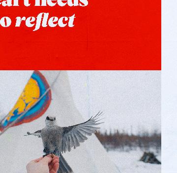
Whatever your heart needs right now, follow it to Manitoba. There are countless stories and experiences that get our hearts beating. They will make your heart beat too.


Your heart needs travel. It doesn’t matter where you’re from or your age or ability, your heart needs travel. So follow it to the middle of Canada. Here, a 100-mile-wide sunset over a mirror lake makes everything else disappear. Here, a rib-crushing hug chases the cold from a winter day. Here, a fiddle contest gets your toe tapping. Here, the rhythm of a jingle dress dance comforts your spirit.
Every heart needs something a little different, but the power in all of these moments calls us to venture forward.
Cross an ocean, travel inland, travel north. Add a stop in Manitoba on your Canadian vacation. Meet your family and friends here in the middle of the country.
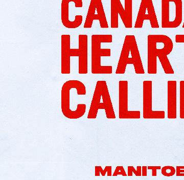
Whether you’re a local or a visitor, Canada’s heart is calling.
2 Travel Manitoba Brand Playbook
Brand Promise
Use the brand promise to quickly explain the kind of travel that can only be found in Manitoba.
OUR PROMISE TO TRAVELLERS
In Manitoba, we know the longing for travel is felt in the heart. So when your heart needs quiet, or when it needs to race, sing or reflect, follow it here to the middle of Canada.
Whether you’re a local or a visitor, Canada’s heart is calling.
3 Travel Manitoba Brand Playbook
Brand Personality
Channel the following attributes in marketing and communications to connect with travellers on a deeper level.
MANITOBA’S REFLECTIVE SIDE:
We are generous: You’ll see it in the “Let me take you there and show you” attitude of locals and the sense of pride alive in the rural and remote corners of the province.
We are adventurous: You’ll find it in our 100,000 lakes, 30+ species of sport fish and an evening sky filled with ducks and birds on their migratory paths across the province.
We’re full of surprises: You’ll get a new perspective when you explore our Francophone communities, quirky pop-up markets and vibrant arts and culture scenes.
We are wise: You’ll feel it in the Indigenous ways of knowing and traditional teachings, our connection to the land and our careful stewardship of wildlife and the land.
MANITOBA’S FUN-LOVING SIDE:
We are welcoming: Join us at a social, at the cottage, or at an event; there is no pretense here. We love to share what we have with visitors.
We are fun: We take our travel product seriously, but we don’t take ourselves seriously. We like to have fun and laugh together; there is a lighthearted energy in Manitoba.
We are passionate: Our determination and love for our province fuel theunconventional and extreme experiences you can only find here — like our winter activities.
We’re for families: Many of our destinations are accessible to grandparents and young kids. There’s also a good chance our fellow Canadians have family in Manitoba.
4 Travel Manitoba Brand Playbook
Target Audiences
Two types of travellers are most likely to be drawn to Manitoba:
Authentic Experiencers and Cultural Explorers. These personas are based on Destination Canada’s Explorer Quotient® (EQ) framework.

AUTHENTIC EXPERIENCERS
Authentic Experiencers enjoy our vast natural settings and charming local culture and hospitality. Spontaneous, independent and open-minded, they are eager to learn about our world through wilderness excursions (paddling, hiking, hunting and fishing) and cultural discoveries (festivals, fairs, museums and community explorations).
CULTURAL EXPLORERS
Appreciative of museums and galleries, Cultural Explorers also wish to interact with locals. Active participation is what drives them. They want to know what it’s like to live as we do by joining our festivals. They want to engage with wildlife in its natural element. Not wishing to be tourists, they’d prefer to feel like short-term residents of Manitoba.
5 Travel Manitoba Brand Playbook
Brand Guidelines
Follow these guidelines when expressing the Travel Manitoba brand through visuals. They provide insight on brand elements and hierarchy, and they can help create a strong, consistent and differentiated identity.
6
Travel Manitoba Brand Playbook
Logos and Marks
Logo Family
PRIMARY LOGO
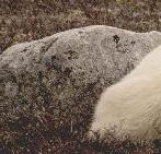
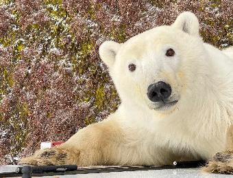
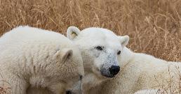
Our primary logo was constructed with soft corners and wide letterforms, and it's set in a bold red that radiates the warmth and energy of our province. A polar bear silhouette illustrates our unique tourism offering and the curiosity and courage inherent in travelling to this vast, wild place.
This logotype is the primary representation of our brand and should be used in most circumstances where space and legibility allow.
7 Travel Manitoba Brand Playbook
Full Colour Reversed
STACKED TAGLINE LOCKUP
When space allows, add the Canada’s Heart is Calling tagline to the primary logo for additional clarity or to reinforce our brand message.
If the tagline is clearly stated in the main content of an application, the primary logo would likely suffice. If not, use the logo and tagline lockup to share the brand message or provide a call-to-action.
→ Keep legibility top of mind when using this logo in small applications. Find detailed guidelines on using logos at small sizes on page 15.
8 Travel Manitoba Brand Playbook
Full Colour Reversed
Reversed
HORIZONTAL TAGLINE LOCKUP
When there’s plenty of horizontal space in an application, use the horizontal tagline lockup to enhance legibility.
→ Keep legibility top of mind when using this logo in small applications. Find detailed guidelines on using logos at small sizes on page 15.
9 Travel Manitoba Brand Playbook
Full Colour
STACKED LOGO
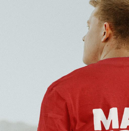
For unique creative applications, such as apparel or merch items, consider using a stacked version of our primary logo. Only use this logo version when communicating with Manitobans and Canadians who already know the correct spelling of our province’s name. Steer clear of using this logo in any materials intended for Americans or international audiences, as it may cause confusion.
10 Travel Manitoba Brand Playbook
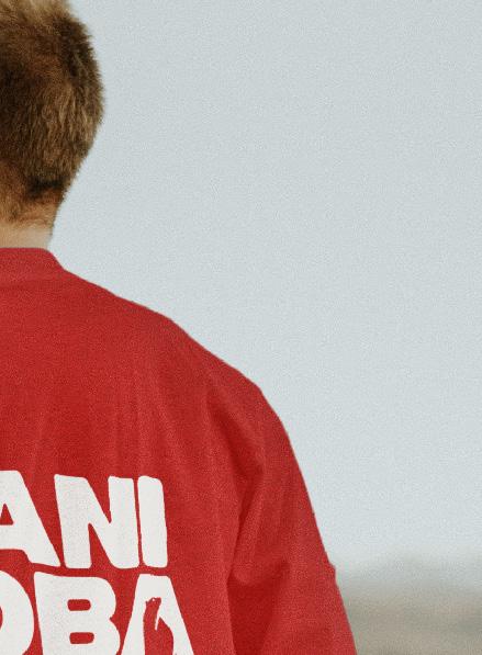
Full Colour Reversed
Here’s an example of how you can apply the stacked logo to merchandise geared to locals. The stacked logo acts as a large graphic treatment.

11 Travel Manitoba Brand Playbook
CORPORATE LOGO
Use this logo when representing the Travel Manitoba corporate brand. Apply it to corporate communications where space and legibility allow.
12 Travel Manitoba Brand Playbook
Full Colour Reversed
Full Colour
Primary Logo Supplementary Badges
STACKED HUNT FISH LOGOS
Hunt Fish MB is an essential sub-brand that lives within our brand ecosystem. This unique logo treatment illustrates our love of the rugged outdoors and wildlife.
Primary Logo
Use the isolated logo as the primary mark within the Hunt Fish MB logo suite. It is the most recognizable brand identifier.
Supplementary Badges
When communicating with American or International audiences, use a supplementary badge featuring the full name of our province. This version is helpful for folks who aren’t familiar with the abbreviation MB.
Reversed
Primary Logo Supplementary Badges
13 Travel Manitoba Brand Playbook
HORIZONTAL HUNT FISH LOGO
Use the horizontal version of the Hunt Fish logo when space allows, such as on website banners, video title cards or merchandise with vertical size constraints.
Reversed
14 Travel Manitoba Brand Playbook
Full Colour
SAFE AREA & MINIMUM SIZE
Safe Area
No matter which logo you use, give it a buffer zone that’s free of text and graphics. The buffer zone should be equivalent to the size of the M in the logotype.
Minimum Size
For legibility, set the logo at an optimal size in print and digital applications. When scaling the logo to a small size, make sure all type is easy to read.
There’s one exception to this rule: in digital ad applications where space can be extremely limited. Use a version of the logo that is appropriate for the space available. Maintain as much brand recognition as possible.
Safe Area
Safe area surrounding logo = M in logotype
Minimum Size
On screen: 120px
In print: 1.5"
On screen: 110px
In print: 1.25"
On screen: 150px
In print: 1.75"
On screen: 250px
In print: 3"
15 Travel Manitoba Brand Playbook
Don't scale or resize any aspect of the logo independently of the whole.
Don't apply any effects (such as outlines, gradients or drop shadows) to the logo.
Don't substitute any logo fonts.
Don't alter the logo colours.
Don't place the logo on low-contrast background colours.
LOGO "DON'TS"
Take great care to use our logo thoughtfully. The examples on this page illustrates how the logo should not be used.
While we’ve shown just one version of the logo in these examples, follow these rules with our entire logo family.
Don't skew or distort the logo.
Don't place the logo on distracting or overpowering backgrounds.
Don't stretch or compress the logo. Be sure to scale it proportionally.
16 Travel Manitoba Brand Playbook
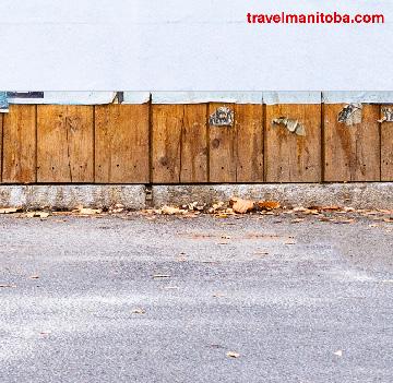
USING THE LOGO WITH PHOTOGRAPHY
Use careful consideration when placing our logo on top of imagery. Always create sufficient contrast between the logo and the background image. The examples on this page outlines some best practices to achieve high contrast and legibility when pairing our logo with photography.


The reversed logo is placed inside a horizontal bar set in the primary brand red.
The full-colour logo is placed on an image that organically creates high contrast between the logo and background.


A light gradient feather is added from the bottom edge of the application, creating additional contrast.


A dark gradient feather is added from the bottom edge of the application, creating additional contrast.


The reversed logo yields the highest-possible contrast against the background image.
In this case, ensure the primary brand red is present elsewhere in the application.
17
Manitoba Brand Playbook
Travel
Supplementary Marks
Our identity suite contains a variety of supplementary marks and graphics to help support our logo family and create a consistent visual theme.
MB AVATAR
The MB Avatar is the most compact representation of our brand and is designed for use at small sizes. Choose this mark as a brand identifier in applications where size greatly impacts recognition and legibility, such as social avatars or our website favicon.


18 Travel Manitoba Brand Playbook Reversed
Full
As an Avatar
Colour
As a Favicon
MB BADGE
The MB Badge contains letterforms from the logotype and a location pin containing a north star shape, — a visual thread used in other supplementary brand elements. Choose this mark when you need a responsive version of the primary logo.
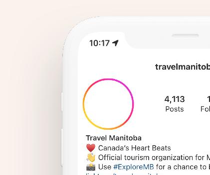
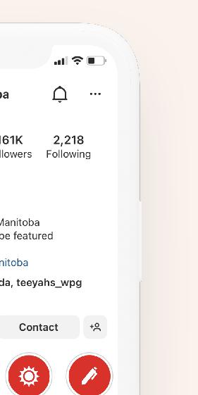
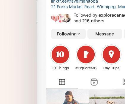
You can also use this mark to reinforce the brand in special applications: highlighting a truly Manitoban moment on Instagram, embroidering a patch on apparel, or creating a visual thread to carry the brand through long-form publications.
Only use the MB Badge when the primary logo or lockup is present elsewhere or in situations where the brand is clearly identified, like social media.
19 Travel Manitoba Brand Playbook
Full Colour Reversed


Brand Playbook 20 Travel Manitoba
LOCATION PIN
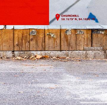
You can isolate the location pin from the MB Badge and use it as an independent graphic element. Treat it like a standalone icon or place it on photos or video footage to indicate an iconic or emotional experience.
Coordinates
Draw attention to a real Manitoba experience by placing the location pin alongside the destination’s name and corresponding coordinates.
21 Travel Manitoba Brand Playbook
Full Colour Reversed FALCON TRAILS RESORT 49°42'16.3" N, 95°11'34.7" W
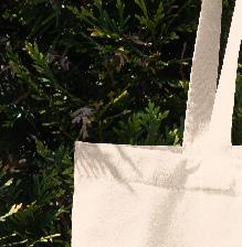
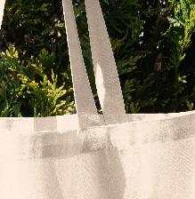
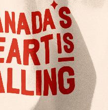
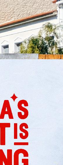
TAGLINE TREATMENT
We’ve created a special treatment to draw attention to our brand tagline: Canada’s Heart is Calling. It visually tells our brand story. Use this treatment at larger sizes and in unique applications, such as murals and large decals.
22 Travel Manitoba Brand Playbook
TAGLINE TREATMENT IN USE
When using the tagline treatment, pair it with a logo or supplementary mark. Hierarchically, make the tagline the hero and the logo a secondary visual element.
In this demonstration, the primary logo would be present on the reverse side of the tote pictured.


23 Travel Manitoba Brand Playbook

24 Travel Manitoba Brand Playbook
Brand Typography
Primary Typeface
NEUE HAAS UNICA
With its wide variety of weights, Neue Haas Unica is a versatile type family that can accommodate all brand communications — from digital to print, in headings, as body copy and more. Described by type enthusiasts as “Helvetica with a soul,” Neue Haas Unica maintains a sharp, clean aesthetic and just enough personality make it warm and approachable. Highly legible at all sizes, it acts as a perfect complement to our display font, Vesterbro.
Alternate Typeface
If Neue Haas Unica is unavailable, Arial may be used in its place.
Extra Black
For use in long-form copy and body text
For use in headings, pull quotes and emphasis
For use in bold statements or headings at large sizes
25 Travel Manitoba Brand Playbook
Aa AaBbCcDdEeFf AaBbCcDdEeFf Aa AaBbCcDdEeFf AaBbCcDdEeFf Aa AaBbCcDdEeFf AaBbCcDdEeFf Aa AaBbCcDdEeFf AaBbCcDdEeFf Aa AaBbCcDdEeFf AaBbCcDdEeFf Aa AaBbCcDdEeFf AaBbCcDdEeFf
Regular Black
Medium Bold Heavy
When used at large sizes, display typography should entice readers and establish a mood. With its friendly, organic shapes and supple curves, Vesterbro does just that. Use this font sparingly and treat it as a graphic element. It can add interest to type-heavy documents and large-scale applications.
→ For legibility purposes, don’t set Vesterbro at sizes lower than 15pt. See the following page for tips on how to effectively pair Vesterbro with Neue Haas Unica.
For use at large sizes only (15pt and higher)
For creating emphasis when paired with Vesterbro Poster
26 Travel Manitoba Brand Playbook
Display Font VESTERBRO
AaBbCc DdEeFf AaBbCc DdEeFf Poster Poster Italic 01234567890!@#$&↑↓*{: 01234567890!@#$&↑↓*{:
Use Vesterbro in large headings to emphasize a message, create visual interest and draw readers in.
Combinations and Hierarchy
USING DISPLAY TYPOGRAPHY
This page shows the brand typography and hierarchy in action. Note the size and weight relationships between our brand typefaces and the flexibility of type styling within our brand.
Due to the size limitations outlined on the previous page, there may not always be a place for Vesterbro in brand applications. Therefore, when type size is limited, let the versatile weights within the Neue Hass Unica family do the heavy lifting (like in the content-heavy sections throughout this document).
Use italics to bring attention to specific content.
What your heart finds here stays with you forever.
Aut at omnitatur simus dis eostece puda et ad quiam fugiat volupta tem quidundae natem reium quia vel et quia.
Ibus, cus que nimaior itatem alibus, sum nem. At as as repe quia sim sus, sus et elest, voluptate pa doloreius que cus, quae pro officia voluptatis nobiti rest haribea sint volupic te etur aut que ducipiciam quae nonserum sitatium fuga. Em hiti corum ex. To et officimus, cullit quodipsam et eos rento voles ma nonem untiam quiat odit, culparum veliquo ides alis aut.
Expliqui duciisit idemolo reptam, core sunt, sunt atquiaturi ut harchil leniscilla que excernatus moluptam solupta tquasi reiun de llatiusandi nullupt atectota volent
Follow your heart to the centre of Canada.
Acias etusam sitas estruntotat poreperum
facipsam harum alignia sumquo eossit rercien ectasin te etur aut que. Rumque dolor repudam, quo tes sequis aliquid quos velitis sequo el magnimet ex.
Keep legibility in mind when using display type in small applications like pull-quotes or call outs.
27 Travel Manitoba Brand Playbook


28 Travel Manitoba Brand Playbook


Brand Playbook Travel Manitoba 29
Brand Palette
Primary Colours
Our primary colour palette reflects our province’s warmth, energy and welcoming spirit.
Use the two reds in this palette to establish and maintain brand recognition in all communications materials.
PANTONE 185 C serves as our primary colour identifier and has a place in all full-colour logo variations.
PANTONE 7628 C may be used sparingly as an accent colour.
COLOUR USAGE
When using our brand palette for digital applications, use only the RGB or hex values listed in this section. For print applications, use PANTONE or CMYK values.
PANTONE 2028 C
CMYK 0 90 100 0
RGB 214 36 0
#d62400
PANTONE 7628 C
CMYK 25 100 95 30
RGB 133 0 0
#850000
30 Travel Manitoba Brand Playbook
SECONDARY & NEUTRAL COLOURS
Our secondary colours complement the energy and richness of the primary palette. The vibrant and deep shades of each hue create a robust suite of colours with several high-contrast options.
Use these colours to supplement the primary palette. Lead with the primary brand red to create consistency and recognition across all applications. Neutrals support both primary and secondary colour palettes.
Use Pantone 439 C for setting long-form copy. It offers sufficient contrast against light backgrounds for better legibility.
COLOUR TINTS
Use tints in applications where you need a wide range of colours to communicate ideas or data. Use tints ranging from 20% to 80% of any secondary brand colour to expand on this palette when needed.
31 Travel Manitoba Brand Playbook PANTONE 1225 C CMYK 0 25 100 0 RGB 252 190 34 #ffbf0a
PANTONE 1375 C CMYK 0 48 100 0 RGB 247 153 40 #ff9900 PANTONE 2301 C CMYK 50 20 100 0 RGB 145 166 33 #91a621 PANTONE 7741 C CMYK 85 32 100 20 RGB 38 110 38 #266e26 PANTONE 319 C CMYK 73 5 27 0 RGB 28 181 191 #1cb5bf PANTONE 7474 C CMYK 85 40 43 10 RGB 0 112 125 #00707d PANTONE 270 C CMYK 40 38 5 0 RGB 153 153 194 #9999c2 PANTONE 2082 C CMYK 68 78 34 15 RGB 97 69 107 #61456b PANTONE Warm Gray 11 C CMYK 60 60 65 30 RGB 79 69 64 #4f4540 PANTONE 439 C CMYK 65 65 65 65 RGB 41 36 33 #292421 White CMYK 0 0 0 0 RGB 255 255 255 #ffffff PANTONE 719 C (20%) CMYK 0 4 5 0 RGB 250 242 237 #faf2ed
Vibrant Shades
Neutrals
Deep Shades
SECONDARY COLOUR COMBINATIONS
Pair our brand’s secondary colours to create complementary colour combinations. Combinations are best made between the vibrant and deep version of each hue or in tandem with a light neutral background.
TERTIARY COLOUR COMBINATIONS
Combine primary and secondary colours to generate even more creative colour combinations.
Use caution when creating these combinations. Make sure the colours complement each other, there’s sufficient contrast between elements, the text is legible and the final product is still aesthetically pleasing.
Secondary Combinations
Tertiary Combinations
32 Travel Manitoba Brand Playbook
ACCESSIBILITY AND COLOUR
Not all colour combinations are accessible. The content’s legibility depends on the size of the text and graphics and the contrast between foreground and background colours.
When choosing colours for text treatments or small illustrative elements, use high-contrast colour combinations.
When creating illustrations or graphics, you can use low-contrast combinations if the elements are large in size or are not essential to comprehend the content.
Avoid combining colours that cause visual vibration or yield very low contrast ratios.
Always accessible
These types of colour combinations have a high contrast ratio. Use them for text and graphics of any size.
Accessible in graphics only
These types of colour combinations have a low contrast ratio. Use them only for illustrations or graphics.
Not accessible, do not use
These types of colour combinations have very low contrast ratios or cause visual vibration. Never use them.
33 Travel Manitoba Brand Playbook
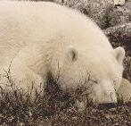
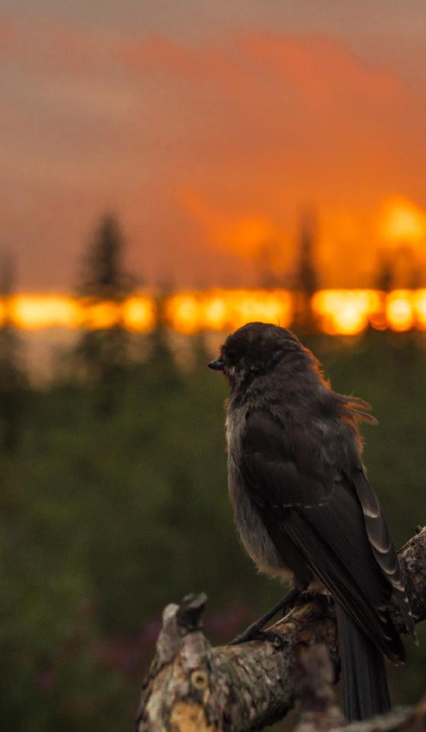
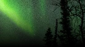
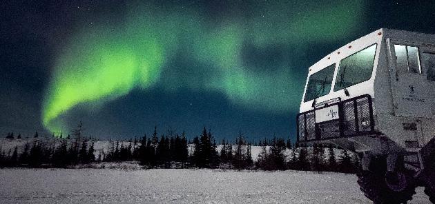
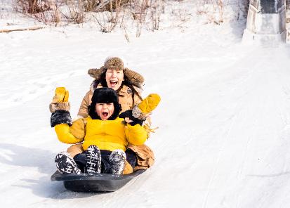
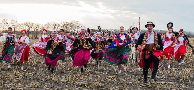
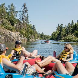
Brand Photography
Photography is a great way to convey emotion and authenticity while showcasing our tourism offering.
Our photography comes from many sources — professional photographers, influencers and everyone in between. We have a robust and eclectic image library at our fingertips.
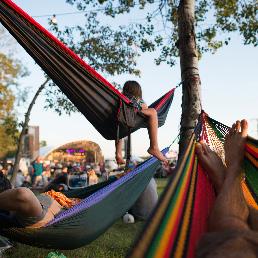
ICONIC EXPERIENCES
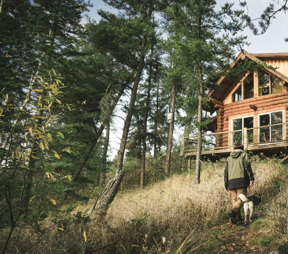
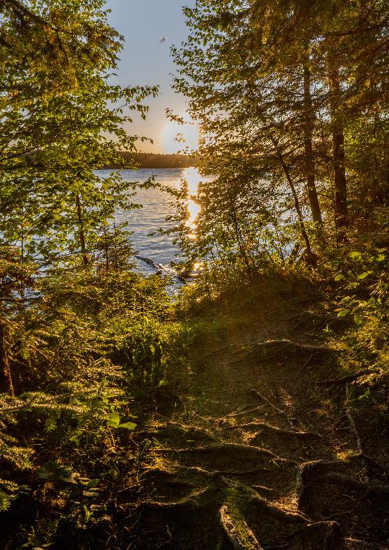
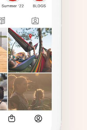
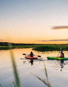
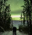
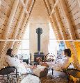
Make beautiful, in-situ, professionallyshot images your primary choice in most advertising and communications materials. These images illustrate the iconic experiences travellers from across the globe can expect to have in Manitoba. Whenever possible, use images that include people. It will enhance our welcoming, heart-driven brand aesthetic.


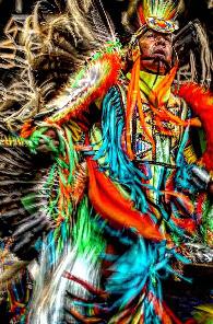

34 Travel Manitoba Brand Playbook
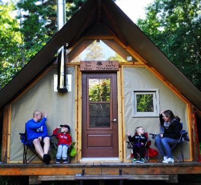
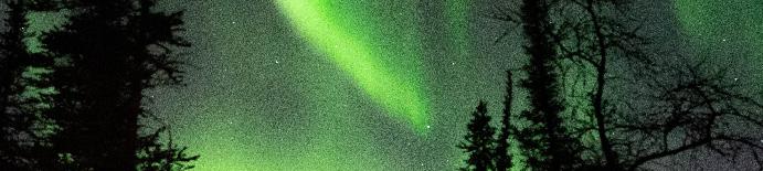
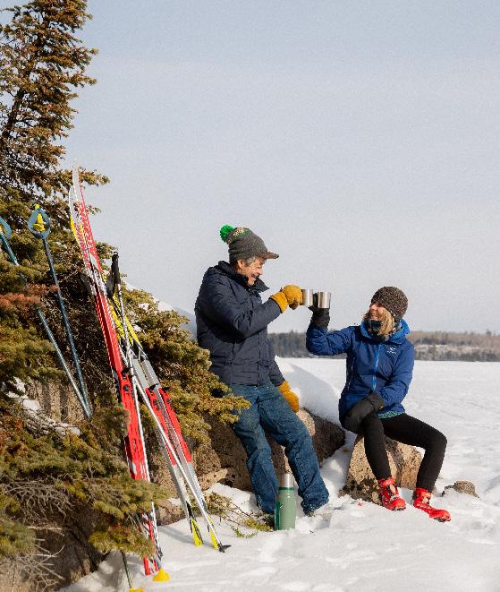
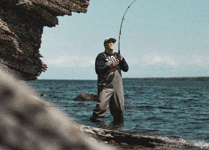
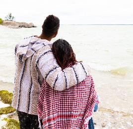
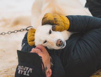
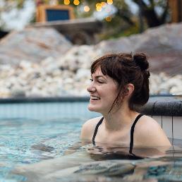
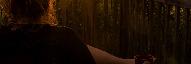
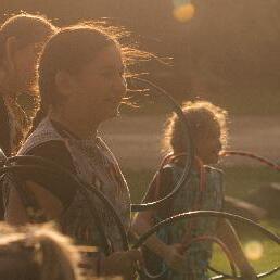
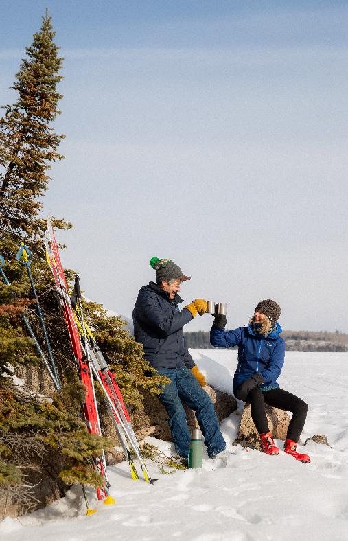
FOCUS ON EMOTION
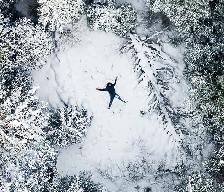
Balance our iconic photography with real, raw and emotive images. This style of photography creates a sense of warmth and familiarity, visually calling travellers to take in all our province has to offer. The focus in these photos is less on a specific location or experience and more on the feelings these experiences conjure within us.
Due to their candid nature, these images are best used on social media or in longer-form editorial pieces alongside iconic brand shots.


35 Travel Manitoba Brand Playbook


Travel Manitoba Brand Playbook
Brand Shapes
PROVINCE
Use the stylized shape of our province to overlay or frame photography. It adds depth and interest to a layout. For horizontal layouts, extend the left side of the province to cover the spread. The province shape should always cover the vertical height of the layout. Never rotate or flip the shape.
BAR & BOX
Bars and boxes add hierarchy and interest to layouts. Use them to frame photography or add visual emphasis using our primary colour. Extend the shapes across spreads or use them in a checkerboard pattern.


37 Travel Manitoba Brand Playbook
Icon
Used to quickly communicate a simplified location, activity, or emotion at small sizes.
Spot Illustration
Used to communicate a single, distinctive place, activity, or emotion at medium sizes.
Brand Illustrations
OVERVIEW
Our brand illustrations showcase Manitoba’s notable locations, exciting experiences and iconic sights in a flexible and engaging way.
Distill the elements into a simple icon or scale them up to create a more complex composition.
Scene Illustration
Used to communicate a theme using abstract renderings of places, activities or emotions at large sizes.
38 Travel Manitoba Brand Playbook
COMPONENTS
We use a set of simple components to create consistency across all brand illustrations.
Geometric Shapes
Geometric shapes form the basis of our illustration system. Combine them to represent a range of places, objects and ideas.
Natural Shapes
Natural shapes, such as flowing waves, bring life to a composition.
Components used as building blocks to create icons
Icons combined and layered to create a spot illustration
Spot illustrations combined to create an editorial or abstract scene illustration
39 Travel Manitoba Brand Playbook
COMPOSITIONS
Whether you're building an icon or composing a scene, follow these illustration guidelines to create consistency across all branded materials.
Grid
Regardless of the size or format of your composition, always start with a 1:1 grid to fill your space.
Structure
Use angles and layered shapes to create continuity between the grid cells. Break the cells of the grid into small pieces to add interest to the scene.
Setting & Activity
Portray a setting or activity within each cell.
Subject Matter
Add recognizable subjects to each scene, bringing the illustration to life.
40 Travel Manitoba Brand Playbook
Lake Winnipeg City Life Red River Tundra Shield Fields Beach
ADDING COLOUR
Choose colours that reflect the reality of the subject or place — it will help audiences comprehend the setting or activity. Use colour in creative ways to add interest where needed.
High-contrast colour combinations can draw the eye to one area of the composition.
Because the illustration system uses layers of colours, the combination you choose for one scene may flow into the next, impacting your colour choice.
In all brand communication, legibility is key. Remember to follow the accessibility guidelines on page 35.
Monochromatic
Using colors of a single hue.
Opposites
Using a neutral and a secondary colour to create high contrast.
Complimentary
Using two colors that are on opposite sides of the color wheel.
Continuation
Continuing the colour from one cell or scene into the next.
Creative
Getting creative with colour choices!
41 Travel Manitoba Brand Playbook
Partner Marketing
Putting it all together
Partners can align their marketing materials with the Travel Manitoba brand. By following the standards outlined in this toolkit, you can leverage the brand's equity while helping us convey it consistently. We invite you to use heart-based messaging to help amplify Manitoba’s brand. However, please do not use the tagline “Canada’s heart is calling” in any form without obtaining permission from the Travel Manitoba team.


PHOTOGRAPHY
Does the photography depict an immersive experience? Is the style of photography appropriate for the application based on the different categories outlined in this guide? Have you put the traveller in the scene?
MESSAGING
Is the copy warm and welcoming? Is it striving to make an emotional connection? Are you speaking directly to the traveller?
TYPOGRAPHY
Does the text have a clear hierarchy? Are all fonts and sizes legible?
COLOUR
Have you used colour sparingly? Do the colours complement the photography?
LOGO
If you've used Travel Manitoba logo, have you chosen the best one for the size of the application?
42 Travel Manitoba Brand Playbook
heart's calling is making your heart quiet. Follow the pale sun to a remote corner of a frozen lake. Let every noise fade away, apart from the swish of skis on fresh snow. Join us in the peace of Whiteshell Provincial Park. What your heart finds here stays with you forever.
Our
USING THE LOGO IN CO-BRANDED MATERIALS
In print applications, place our logo in the bottom left corner. Place partner branding in the bottom right.
On websites, our logo should be placed in a secondary position, such as the top right or in the footer of the web page.


43 Travel Manitoba Brand Playbook
Print application Website applications
in bottom left corner
in
corner
in website footer
PARTNER LOGO PARTNER LOGO
Logo
Logo
top right
Logo