
Introduction
Hello, I’m Toni —an innovative designer enthusiastic in building enriching user-centric experiences. Captivated by the incorporation of design and technology, I stay motivated to constantly test these boundaries by developing design involving corporate identity, and publication. With design being so versatile, I’m overly passionate about improving the education space, empowering creators and communities, cultivating meaningful relationships, and advocating for personal development.
1 2 3 4 BABBEL INTERACTIVE Interactive Interface & Installation TREK Mobile Application & Logo FORCURA Multimedia Design & Event Branding CURECIPE Corporate Identity & Web Design Contents


5 6 7 8 BAXTER DOG FOOD Corporate Identity THROUGH THE LOOKING GLASS Publication & Illustration WORLD ARTS FILM FESTIVAL Corporate Identity & Web Design WINDMILL COFFEE COMPANY Corporate Identity & Case Study


DESIGN ASSETS INTERACTIVE INSTALLATION AND INTERFACE User Interface Installation Display Babbel Interactive 1
This interactive interface is crafted with the tools to have practical, everyday conversations and interactions with people of other cultures, and language within an airport setting. We believe the sooner you begin to speak a new language, the sooner you’ll open yourself up to a world that’s bigger, richer and more inspiring. With our technology, individuals will be able to play games and converse face-toface with people who speak completely different languages. Babbel interactive allows users to become multilingual conversationalists fast and in real-time.

How do you like I am good, but a bit tired. Hello, how are you?


In two screens, the user will be directed to choose which language they would like they speak and which language they would like to learn. By clicking each orange dot, the user can explore not only the language, but where that language is spoken. It also showcases the dialect of each language, such as Spanish which is spoken in both Spain and Mexico.


The home screen serves as an introduction to the interface. Through multiple screens, the process and reasoning is explained and cultural and language awareness is introduced to the user.
HOME SCREEN
1 2
CHOOSING YOUR LANGUAGE
3 4 SINGLE VS. MULTIPLAYER After choosing your language, you have the option to learn languages individually or with the partner across from you. If no partner is active, the interface will automatically go to the single player option. CHOOSING GAMEPLAY • Fill-in-the-Blank • Trivia • Draw-it (Multiplayer) • Converse (Multiplayer) Interactions/AnimationBrand Research Design Interface CONCEPT DESIGN Font & Layout Exploration PROCESS TIMELINE User Experience/Flow


EXAMPLE OF GAME INTERFACE (DRAW IT) PLAYER ONE PLAYER TWO31 42


INTUITIVE DESIGN
The end outcome of this installation would be for strangers to be able to fully communicate through intuitive games and translation. It also promotes learning new language by installing Babbel for future use.
ENGAGEMENT Clear insight allowing a variety of people to use and engage.
OUTCOME
Creating an experience for users to easily navigate and complete.

EXPERIENCE Allows people to learn and correspond with individuals of different backgrounds and culture. Trivia
USER FLOW Welcome ScreenSingle Player Multiplayer Choose Language 01 02.1 * For each game x10 02.2 02 Fill-in-the-Blank Correct Incorrect DrawConverseTriviaFill-in-the-Blankit
The user flow allows for the user experience to be clear and easy to navigate. By laying out a user flow, all aspects of the installation can be outlined before going into the design of each page.
Trek is the ultimate guided mobile application for the outdoor guru. You can discover the best trails for hiking, running, kayaking, or camping right around your doorstep. Trek can help you find your way. With an emergency guide directly in the application you have the ability to set up safety partners to track your location and be updated if you haven’t finished the trail in an alloted period of time. ASSETS MOBILE APPLICATION TRAIL RATED. KIND Trek Mobile Application Logo Design
ECOLOGICALLY

DESIGN
2


HOME MAP
TRAILS PAGE
LOADING SCREEN
Each trail on the map has an individual map page. Information including trail ratings, difficulty, address, and weather conditions are found here.

The loading screen features the logo and serves as an introduction to the application interface. The steps animate to show the loading process.

The map serves as the home screen for the application. Here, you can see where you are currently located and the local trails near you.


PAGE

Trek safety partners allows friends to access the users location on a trail. Even without cell service, friends will get a notification if user has not finished the trail in an alloted period of time. START THE TRAIL When starting the trail, the user can track distance traveled. speed, time, heart rate (with smart watch integration) and location on the map.


REMINDER
Once starting a trail, a “reminder” is shown. This reminder serves as a safety feature in order for the user to understands the specs of the trail.
SAFETY PARTNERS

Video Editing and Animation Internal Shirts and Goods Banner Design Visual PhotographyPresentations

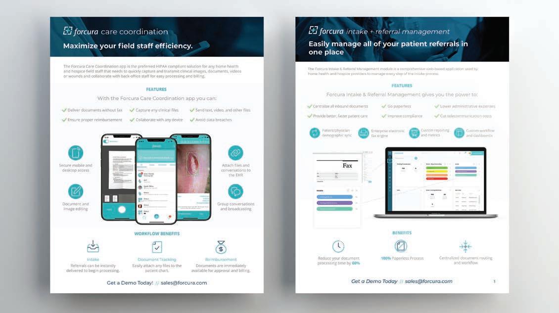
Forcura, a leading healthcare technology company headquartered in Jacksonville, Florida, facilitates continuity of care via technology, analytics and a deep commitment to enabling better patient care. The Forcura suite of tools is powered by Forcura Connect, a proprietary framework for standardizing interoperability and integration among post-acute health care organizations, physicians, electronic health records (EHRs) and other supporting technology vendors.
DESIGN ASSETS MULTIMEDIA BRANDING & DESIGN Event Branding Trade Booth Design SalesPublicationCollaterral Whitepaper Design Video & Animation Mural BannerIllustrationDesign Forcura + Innovate Jax + 3
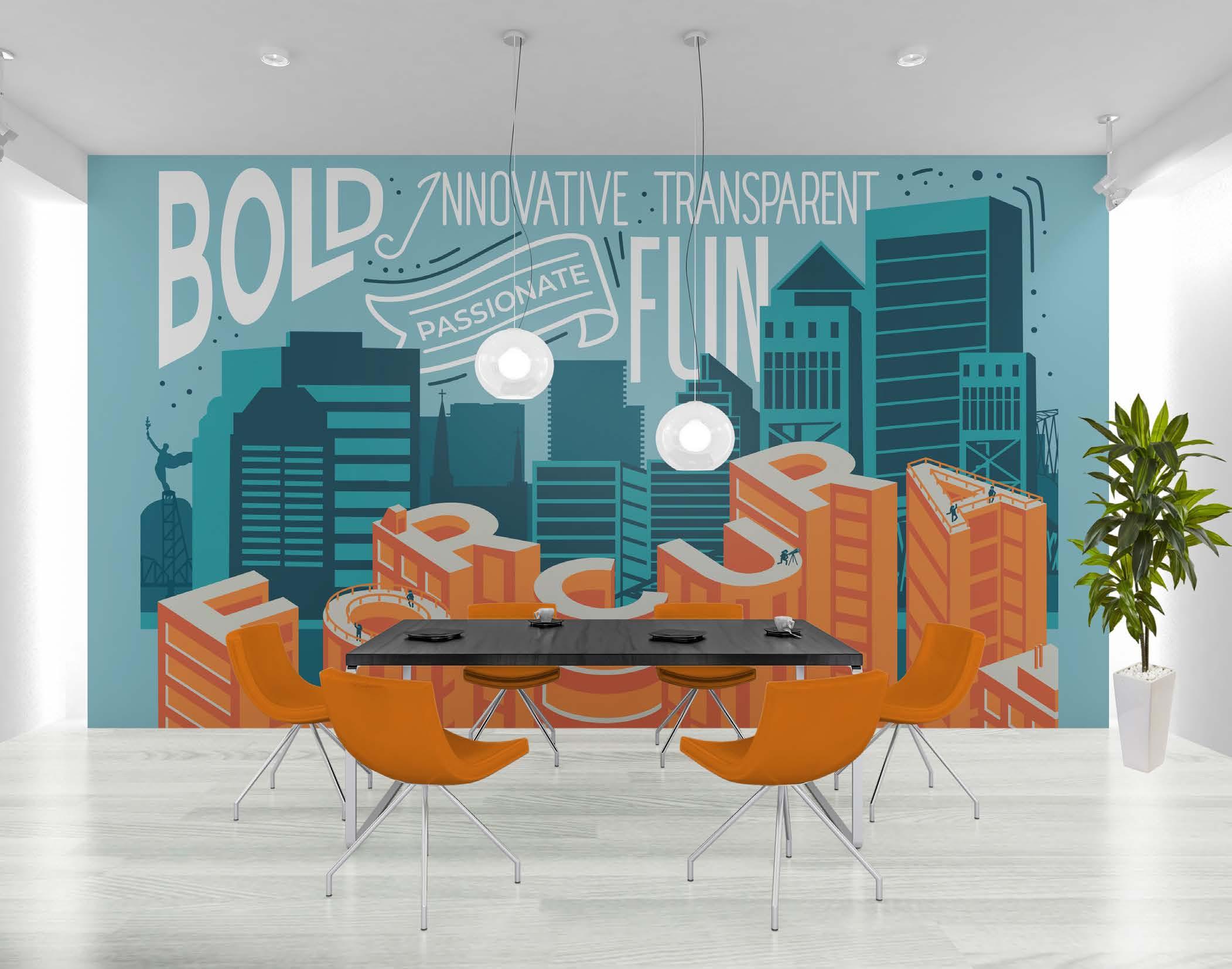


The Innovate Jax podcast and event, developed by Forcura, will introduce Jackson ville change-makers who are propelling our city into a new realm of sophistication. The goal is to connect individuals to the people who are leaving their mark on our city today, in hopes that they inspire to leave your mark tomorrow. The event that kicked off the podcast took place on June 27, 2019. Forcura has received awards for Fastest Growing Company for the fourth consecutive year, Best UI/UX Design in SaaS, and Best Places to Work by Inc. Magazine. JAX
ABOUT INNOVATE


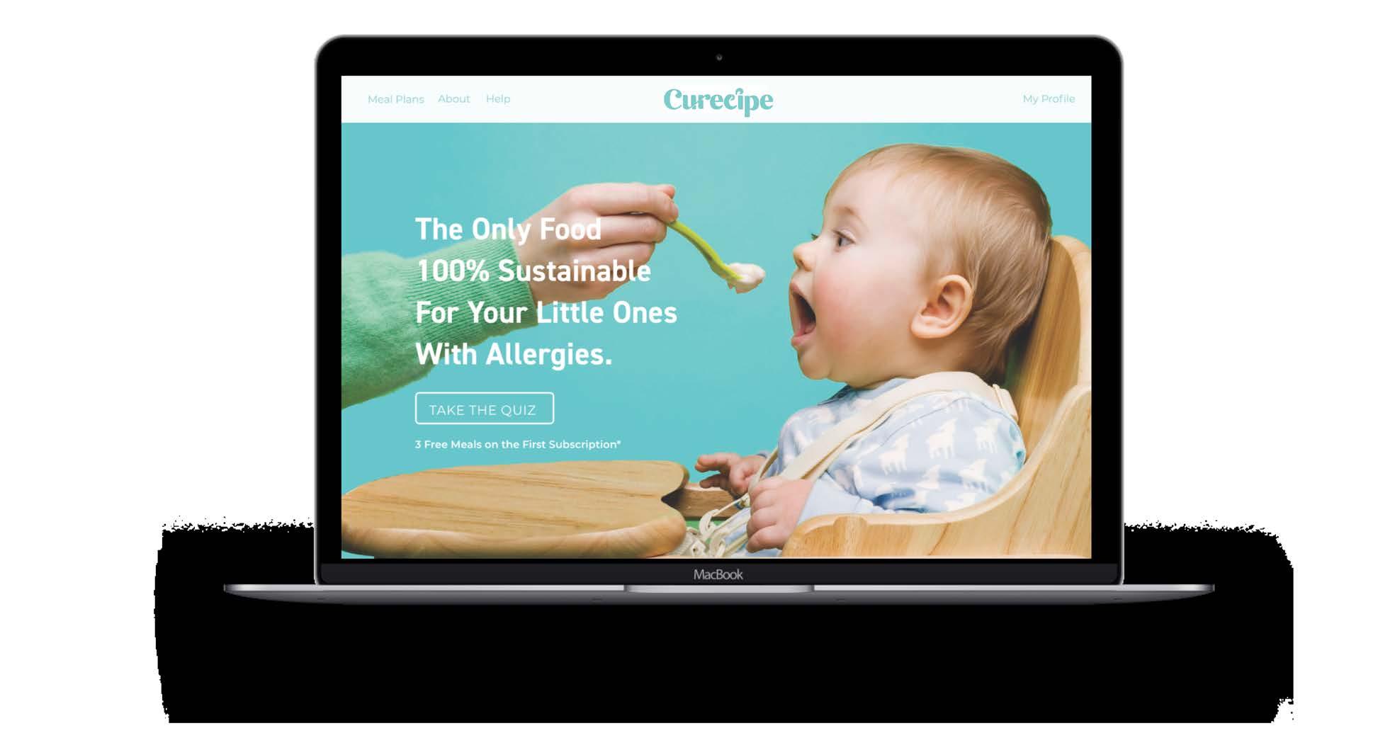
Curecipe (Cure-recipe) is an allergy-aware baby food subscription service. Allergies are growing problem, as 6% of children have food allergies by the time they are three years old. Curecipe allows parents to fully customize their babies food through an online questionnaire. They can order meals to be directly delivered to their home weekly, biweekly or monthly. Safety and accuracy of the food is Curecipe’s number one priority, making it the only baby food branding guaranteeing little one’s safety. IDENTITY & WEB DESIGN
DESIGN ASSETS CORPORATE


Curecipe Baby Food 4 Logo Design Baby Food Website/OnlinePackagingQuestionnaire Baby Bottle Packaging Safety Food SubscriptionCardBox

BRAND ELEMENTS


TYPOGRAPHY DIN 2014 Nickainley NOPQRSTUVWXYZABCDEFGHIJKLM abcdefghikllmnopqrstuvwxyz PRIMARY PACKAGING COLORS SECONDARY MARK CLEAR SPACE


The logo symbolizes the organic and interconnectivity that Curecipe represents. Often a subliminary mark is used of a safety pin to represent not only safety, but for a traditional depiction often used with baby diapers.


What’s Included IN YOUR BOX Made Custom for Clark No Peanuts No Soy Your Subscription Ships Every 2 Weeks See your account details at // www.curecipe.com What’s Included: 2 Mixed Berries & Grain 2 Blueberries & Banana Apple & CarrotsChicken2CranberriesPineapple&Banana2SweetPotato&PeasBeef&Potato&RedBeets&RoastedChicken The users fully customize the subscription box for their child includ ing the customization of which allergies the child has, how often they need the box delivered, and whether they want the food to be mixed, sweet or savory. On the right, the quick tip card shows which foods can be found in the box and includes what allegies the child has. Below, the subscription box and packaging paper is shown. THE SUBSCRIPTION BOX


THE WEBSITE

The Curecipe responsive website can be shown below. This website serves as the main platform for the brand. Throughout the site, the user can learn more about meal plans, about the brand, and receive help through a customer service portal. Before subscribing, the user will go through a questionnaire that fully explores the customization process for the child’s allergies. Once meals are chosen, the user can choose how often they need the food delivered: monthly, weekly, or biweekly.


Video Editing and Animation Internal Shirts and Goods Banner Design Visual PhotographyPresentations

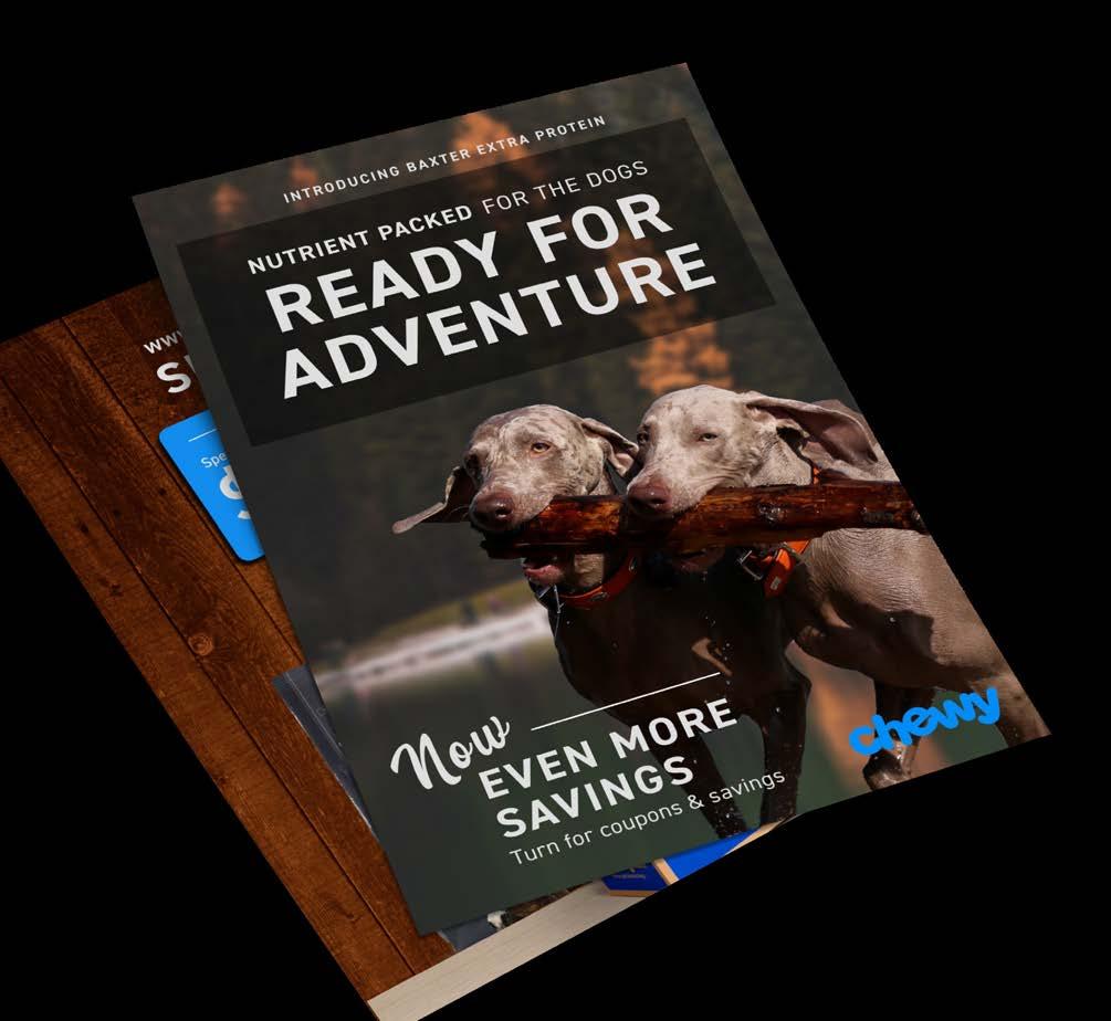
Baxter is a provider for organic, grain-free, non-gmo, and sustainable dog food and products. Developed in Seattle, Washington, Baxter is perfect for the athletic dog, as it provides energy through added vitamins, such as omega 3 and probiotics. The duck symbolizes the energy behind water fowl hunting dogs. It provides a unique approach to dog food branding and representation of the company.
DESIGN ASSETS CORPORATE IDENTITY & PACKAGING Corporate Identity Can Packaging Dry food Packaging DogSalesWebsiteCollateralBonesPackaging Baxter & Company 5
BRAND ELEMENTS

TYPOGRAPHY AMERICAN BREWERY Lato nopqrstuvwxyzAbcdeFGhijklm UuVvWwXxYyZzLlMmNnOoPpQqRrSsTtAaBbCcDdEeFfGgHhIiJjKk SECONDARY LOGO MARKS PRIMARY PACKAGING COLORS PRIMARY BRAND COLORS


The primary logo mark for Baxter and Company is a geometric duck. Each piece of the duck is colored in with a shade of blue representing water. The duck symbolizes the waterfowl dog which needs high-protein, sustainable dog food to perform at a high.


Baxter wants every dog to remain active and healthy. Therefore, the slogan is “Live Energetic”. The marketing collateral is shown below including flyers and electronic billboard. The imagery includes athletic working dogs.

MARKETING COLLATERAL

On the right, you can see the development of Baxter’s

STATIONARY

A modern spin on a classic novel, Through the Looking Glass by Lewis Carroll. Written in 1871 in England, Kepler STD serves as the elegant, English display font choice. For the body copy of this pub lication, Adobe Caslon Pro is used at 11pt. An illustrated cover was created showcasing Alice looking into a mystic, intriguing world. Gold foiling was incorporated, directly relating to the elegance of history of this book.
DESIGN ASSETS PUBLICATION & ILLUSTRATED COVER Through the Looking Glass 6 THROUGH THE Publication Illustrated Cover


But the little men only looked at each other and grinned. They looked so exactly like a couple of great schoolboys, that Alice couldn’t help pointing her finger at Tweedledum, and saying ‘First‘Nohow!’Boy!’ Tweedledum cried out briskly, and shut his mouth up again with a snap.
AUTHOR NAME 34 Lewis Carroll Just then flew down a monstrous crow, As black as a tar-barrel; Which frightened both the heroes so, They quite forgot their quarrel.’ ‘I know what you’re thinking about,’ said Tweedledum: ‘but it isn’t so, ‘Contrariwise,’nohow.’ continued Tweedledee, ‘if it was so, it might be; and if it were so, it would be; but as it isn’t, it ain’t. That’s logic.’ ‘I was thinking,’ Alice said very politely, ‘which is the best way out of this wood: it’s getting so dark. Would you tell me, please?’
.825” INSIDE MARGIN When considering the inside margin, you must make sure the text doesn’t slip into the binding area by being too close to the edge.
ADOBE CASLON PRO 11pt, 14pt Leading 6” 9” 1” INSIDE MARGIN 1.125” OUTSIDE MARGIN When considering the outside margin, you must account for the readers thumbs holding the book. They should be able to comfortably read without moving their thumbs down the page.
‘Next Boy!’ said Alice, passing on to Tweedledee, though she felt quite certain he would only shout out ‘Contrariwise!’ and so he did.‘You’ve been wrong!’ cried Tweedledum. ‘The first thing in a visit is to say “How d’ye do?” and shake hands!’ And here the two brothers gave each other a hug, and then they held out the two hands that were free, to shake hands with her. Alice did not like shaking hands with either of them first, for fear of hurting the other one’s feelings; so, as the best way out of the difficulty, she took hold of both hands at once: the next moment they were dancing round in a ring. This seemed quite natural (she remembered afterwards), and she was not even surprised to hear music playing: it seemed to come from the tree under which they were dancing, and it was done (as well as she could make it out) by the branches rubbing one across the other, like fiddles and fiddle-sticks.‘Butitcertainly WAS funny,’ (Alice said afterwards, when she was telling her sister the history of all this,) ‘to find myself singing “ HERE WE GO ROUND THE MULBERRY BUSH.” I don’t know
PUBLICATION This 9”x6” book was set primary font, Adobe Caslon Pro. When considering margins and placement of text, it was important to recognize room for binding and thumb space. Other factors include the elimination of widows and orphans and proper hyphenation.


DESIGN ASSETS CORPORATE
& WEB DESIGN ExhibitionPosterWebsite PinsTicketsBadges World Arts Film Festival 7
The World Arts Film Festival highlights the creativity of a new generation of filmmakers inviting both established masters and first-time directors. As part of our global educational outreach, the festival brings diverse groups of filmmakers of all ages and backgrounds, including those with special needs, to meet and mentor each other and their audiences through this new venue. Created by individuals in New York, Los Angeles, and Jacksonville, and supported by a growing network of advisors around the world, the festival is dedicated to a global message of inclusion through the arts and education. IDENTITY
The logo represents an abstracted version of a film reel. Bright colors of purple and pink are used throughout the brand. Paint markings and smoke are represented to incorporate the movement of “film”.

TYPOGRAPHY Baskerville Serial Bold Montserrat UuVvWwXxYyZzLlMmNnOoPpQqRrSsTtAaBbCcDdEeFfGgHhIiJjKk AaBbCcDdEeFfGgHhIiJjKk LlMmNnOoPpQqRrSsTt UuVvWwXxYyZz SECONDARY LOGO MARKS PRIMARY COLORS
BRAND REPRESENTATION


Current Brand ResearchAnalyze:What is Currently Working? Font/Style Treatment (Moodboard) Wireframes Interactions/Animation Site Map Consolidation Develop Abbreviated Thumbnails Design Web Pages Responsive Testing/ Quality Assurance


Windmill Coffee Company has integrated wonderful developments to hand-crafted coffee and cocktails in London, England. They strive to create great tasting coffee, while using only eco-friendly working machines. The brand centers around the ref erence to a windmill, which provides an environmentally efficient way to distribute power and energy. The reference to a windmill also alludes to the energy factor coffee provides to our guests. The rustic branding aesthetic represents the history and story behind coffee culture in London marking back to the 17th century.
DESIGN ASSETS CORPORATE IDENTITY & PACKAGING Windmill Coffee Company 8 Case Study Logo Design Cold Brew Bottle Packaging Coffee Beans Packaging Website Homepage Design Punchcard Design Menu StationaryDesignDesign

The moving ‘windmill’ represents sustainable eco-friendly brewing that long-lasting used

energy. Two additional logo marks are
for subtle, yet distinctively representation throughout the brand. PRIMARY LOGO MARK TYPOGRAPHY AMERICAN BREWERY Lato nopqrstuvwxyzAbcdeFGhijklm UuVvWwXxYyZzLlMmNnOoPpQqRrSsTtAaBbCcDdEeFfGgHhIiJjKk SECONDARY LOGO MARKS PRIMARY BRAND COLORS PRIMARY PACKAGING COLORS
BRAND ELEMENTS
provides


