2 minute read
Premier Healthcare


plan legend: duration: 12 weeks semester of completion: Spring 2020 project location: Chicago, Illinois programs + techniques: revit, photoshop, lumion address: 875 N. Michigan Ave., 14th floor, Chicago, IL 60611
• Include check-in “ringer” buttons for visually or physically impaired individuals, these buttons provide the impaired with staff help to their desired location.
Advertisement
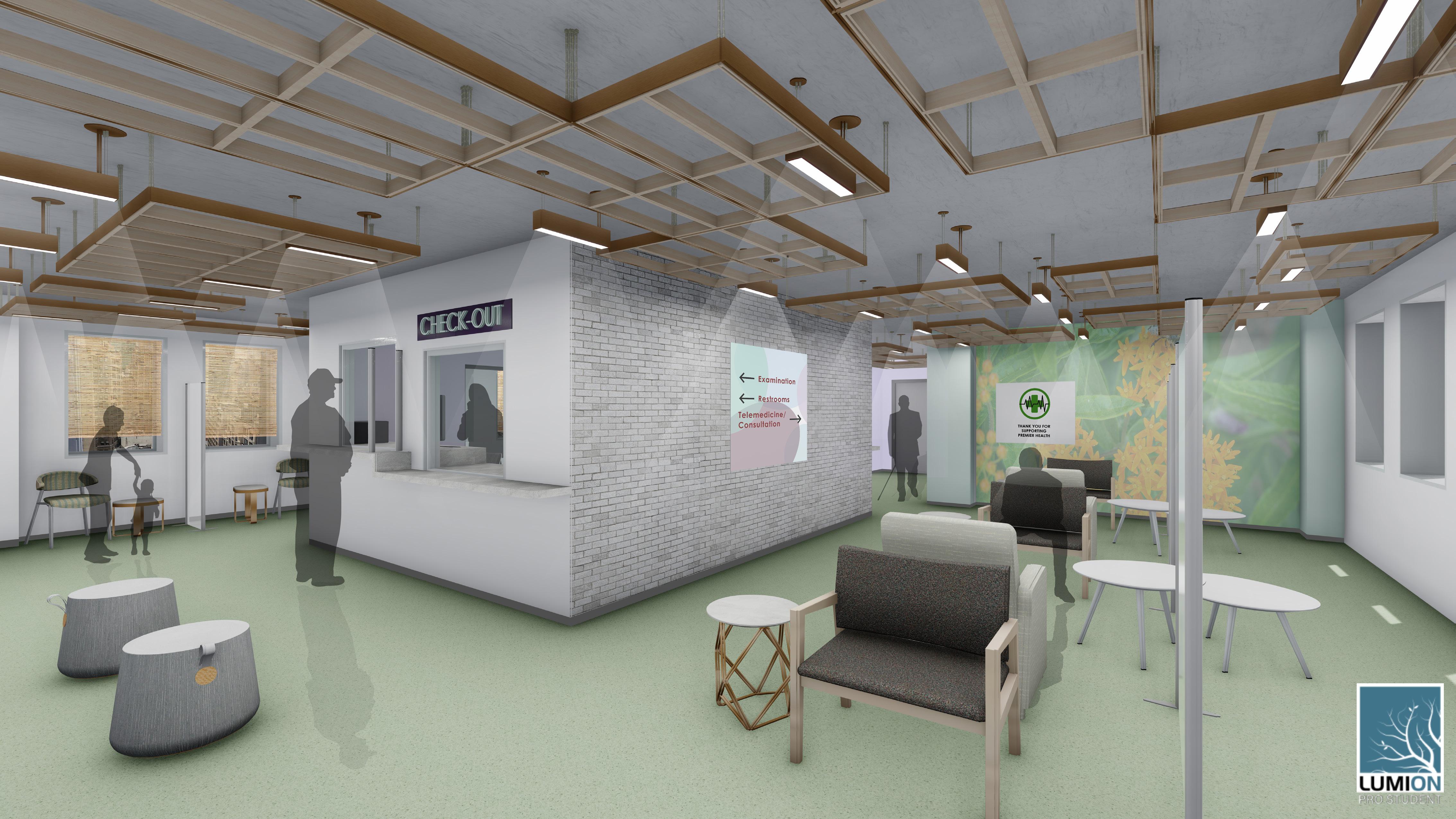
The Premier Healthcare Clinic is located in Downtown Chicago, inside the former John Hancock Building, occupying the 14th floor. The clinics main focus is on the care of its patients; the layout is characteristic of comfortability , and respect this project began weeks before the global outbreak of the Coronavirus. Due to the nature of the world and overall mental well-being of those in the midst of this pandemic, the responsibility and care of designing a space to reach many was imperative.
The color palette showcases the bright and airy graphics within the clinic. The color coding of the public spaces help patients to navigate through the space and maintain patient confidentiality the maximum desirable views were taken advantage of for patients to feel comfortable and happy.
Anxiety can be a common response when in clinical spaces; therefore, the design mimics restorative healing processes and induces an individual’s sense of calm the clinical space follows a natural and simplistic design that focuses on natural light as a healer.
Room numbers are illuminated for simple wayfinding.


Windows are frosted glass for privacy and dispersed sunlight penetration.

Completing this project while remote during the outbreak of coronavirus gave me a unique understanding of the imperative nature of clinics, as well as healthcare spaces in general.
This project allowed me the opportunity to understand the importance of considering the needs of others in design.

MERCHANDISE/ SHOWCASES
The starting point was to generate preliminary bubble diagrams to look at and analyze every overall plan to find the best option.
ENTRY/ EXIT
CASH WRAP/ COFFEE AREA
GIFTS
MERCHANDISE/ SHOWCASES
ENTRY/ EXIT
CASH WRAP/ COFFEE AREA
GIFTS
SALES FLOOR
SALES
FLOOR semester of completion: Spring 2020 duration: 3 weeks project location: Not Specified programs + techniques: revit, photoshop, lumion

ENGAGEMENT RINGS
SEATING
ENGAGEMENT RINGS
The focus of this project was to design a jewelry store that focused on sustainability lab-grown gems and diamonds used within the store over natural gems and diamonds.
The interiors of the store are meant to entice an invitation to enter. The design was kept colorful and simple, the division of the store was designed for ease of wayfinding.
The store is meant to engage young professionals, families and couples through its bright and inviting atmosphere By creating an inviting space, customers will have the opportunity to take a moment to enjoy browsing, or take a seat.
MANAGER OFFICE
DIAMONDS
JEWELRY
MANAGER OFFICE
DIAMONDS
SEATING
ADA
NON-SELLING/ EMPLOYEE ENTRANCE
ADA

ENTRY/ EXIT
NON-SELLING/ EMPLOYEE ENTRANCE
JEWELRY
ENTRY/ EXIT
Joy can boost the body’s wellbeing and resilience by helping to prevent sickness. The longer days of spring bring more hours of sunlight each day which affect individuals positively, as of serotonin of happiness and energy to those affected. Joy is an emotion that can be different for all people, these individuals can vary in how joy affects them; therefore, these circular and rectilinear shapes are used to support all
This project was completed fully remotely. This project encouraged my ability to learn more about the digital software i had been taught in school, thus further honing my skills

An additional small project assigned on top of Bijoux, was the design of a pendant light to use as part of the interior. The “flower” pendant was designed specifically as the centerpiece of this joyful jewelry store.