


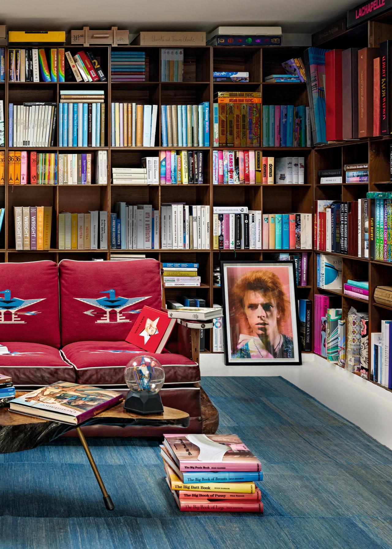
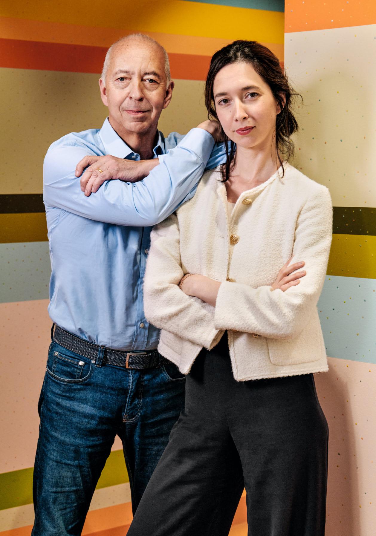
as we approach our 45th anniversary as a family-run publishing house, it’s a privilege to continue this joyful journey with you.
In the pages ahead, we showcase our current Limited Editions, the pinnacle of our program. These collectible books, prints, and artworks are extraordinary feats of craftsmanship, produced and bound in our bookbindery in Northern Italy.
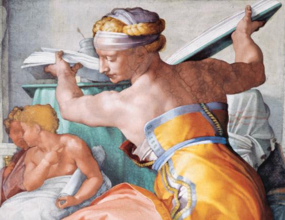

We didn’t invent extra-large-format folio books, but with the publication of the Helmut Newton SUMO in 1999, we revived this rare species, creating a modern success story for an artisan technique that has been cherished by bibliophiles for over 500 years.
Over the past 25 years, scores of Collector’s Editions and Art Editions have seen the light of day. Thanks to you and the free-spirited artists who have entrusted us with sharing their work and vision with the world, we continue to honor and drive forward the tradition of bookmaking.
Peace, Marlene and Benedikt Taschen


Interview by Tim Marlow, Director of the Design
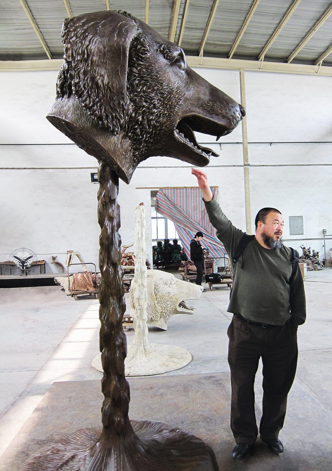
Ai Weiwei viewing the finished Circle of Animals sculptures at the production facility.
Tim Marlow We’re here tonight because of a limited edition, which hovers somewhere between jewelry and sculpture: Ai Weiwei’s Zodiac Charms. There is an edition of 48 of the complete set of 12 golden charms, and then there’s an edition of 99 of each of the single charms on a necklace. But let’s start with the zodiac itself—we’ll get to jewelry in a minute. When did you first engage with the zodiac signs? Was this something, as a very young child, that was always present in your life?
Ai Weiwei Well, I grew up in a communist society. Almost none of the people in our generation can remember our birthdays. Of course, we know which year, but we don’t know the exact date because anything very personal or private was considered as some kind of bourgeois idea. Regarding the zodiac signs: the concept came from even before the Tang dynasty, from when we have the first sculptures of the 12 animals—actually 11 real ones and one mythical animal, which is the dragon. And I would say China always had this kind of culture trying to give characters to people born in very different times. That has a very strong tradition, we always think there is a meaning beyond our understanding. So each individual has their zodiac sign.
TM Your work around the zodiac heads, the sculptural Circle of Animals , started back in 2010, if not before.
AW The idea came to me around 2008 or 2009. China had this nationalist impulse that they wanted to buy those artifacts, a set of heads from an 18th-century zodiac fountain looted by French and British soldiers from the Old Summer Palace in Beijing during the Second Opium War. They were being auctioned in France, and some people thought they were some kind of Chinese treasure and tried buying them back. I think they beat a very high price. It’s a lot of discussions that my work relates to, a very interesting story, which has become a national debate. Are those artifacts Chinese, although they were actually made by an Italian designer and cast by a French craftsman? So it’s a bit of a complicated story, but my work always relates to both
the individual sense of value and also to the political argument. So by 2010, I started to design a group of sculptures, the Circle of Animals, which I first showed in 2011…
TM Here in London, at the Somerset House, wasn’t it?
AW And before that in front of the Palace Hotel in New York City. At that time, I was in detention. So it was really hard for me to imagine if that happened or not. Then we showed it in London in 2015; that was after I got my passport back and I could come to the Royal Academy show. The Circle of Animals has probably been the most popular public sculpture, showing in over 40 cities.
TM Was that what made you think of creating the zodiac in jewelry, that it proved so popular?
AW One day Marlene Taschen had the idea to say: Why don’t we make some jewelry? I loved the idea. Jewelry is something I always appreciate; I’m a collector of Chinese jade. You wear the jewels, collect them, give them to loved ones, pass them on to another generation. These things stay forever. We don’t have such a long time to stay on the planet, but those pure gold objects, they are handled by different generations and each carries a different story. So I was very much into this project, and the zodiac was the perfect subject. When we were doing the designs for the charms, I took a long, long time to go through the details—how to make them more handmade, not industrial, but rather to sculpt them carefully and to really work with a goldsmith, you know, a specialist from Germany. This is what you can call a long-time effort.
TM So you made oversized versions of the sculptures in the original fountain in bronze, and then smaller ones in gold. And now you’ve produced them again on an intimate scale, as jewelry. You’ve made something tiny from something that you made larger than the actual thing. The whole thing is a kind of exercise in scale, among other things.

AW Yes, and the scale is very much related to our attention, how much we are looking at things, and what kind of value we draw from our objects. You know something: in size, it may be small, but it’s not small. It can be as big as a universe; it really comes from our emotions. So as jewelry, of course, we want to make it very small so you can relate to its very essential information and you can even hide it, so it becomes very private. I think that is an important quality, to have something you can show to people, or not show.
TM I remember you saying that the original zodiac heads in the palace fountain were for the very elite. They weren’t seen by many. They were only seen by the people who lived there and the visitors. Your versions that toured the world, in 40 different countries, became much more open and democratic, and you put them in a circle so people could walk between them, or into them. I was struck by the fact that the jewelry is, of course, private and intimate. But it’s a similar thing about enclosure, isn’t it? You have this kind of intimate relationship with it, as well as looking at it from afar, if someone else is wearing it.
AW The Zodiac Charms are more like a personal statement. It’s not a precious stone, but rather they relate to the individual character to have a meaning. I think the narrative is very strong in this set. The zodiacs are interesting because it’s a circle, but that circle accepts very different characters altogether. In the Chinese tradition, we appreciate every one of them. There is a strong wisdom about, you know, that there’s nothing good or bad. People always ask: Is that good or bad? We don’t have that kind of idea. We think everything has its own character, which is so special. The one next to it can never really replace it. So I like the idea. It’s quite a democratic idea.
TM The idea that there’s no judgment but everything is personal is great. I googled your date of birth. You’re a rooster: fire, the male impulse, young, stubborn, aggressive, fighting for a purpose, reliable. The early morning cockerel. I mean, it’s not a bad description of you, but did that as a child in any way frame your sense of self? Of course, we know these things, you can’t possibly have characteristics that are shared by everyone born in a year. But how people perceive themselves through their zodiac signs is an interesting phenomenon. Did you take that on board as a child? Did you feel like a rooster sometimes?
AW Well, when I was a child, we didn’t discuss those matters until much later. They have since become popular in China. Everybody started to talk about them. We often say the rooster likes to start an argument and also can somehow predict the future. And I tried to raise some roosters in Portugal, but we had a fox visitor. Just in one night 11 roosters disappeared. So in our zodiac circle we don’t have a fox.
“You wear the jewels, collect them, give them to loved ones, pass them on to another generation. These things stay forever. We don’t have such a long time to stay on the planet, but those pure gold objects, they are handled by different generations and each carries a different story.”
Ai Weiwei
TM Seven of the original sculptures from the Old Summer Palace survived, and you modeled your work after them, and then you reconstructed the other five from your imagination and from looking at the seven that existed. These are now the basis of an exquisite set of jewelry. Do you think it’s possible for us to determine which you made and which were based on the original stone sculptures, or does this now feel fully reclaimed as an Ai Weiwei work? And the found idea has gotten less and less.
AW This is a good point. One of the seven is a tiger. But a Western sculptor, they didn’t know what the tiger looks like. So they made the tiger more like a bear. I did a lot of adjustments; I really resculpted each of them. And some are very charming, like the rabbit or the rat. They are very beautiful. But for some we had to do adjustments and my creatures are really based on classics of Chinese motifs. They had to have the same kind of style and feeling as the other existing seven. So, it’s almost impossible to tell. But the dog really comes from the dog I had. I had an English cocker spaniel, a lovely dog. So I modeled that dog.

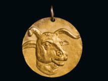

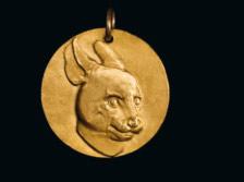



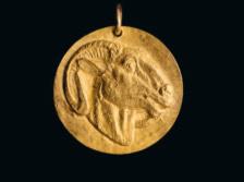


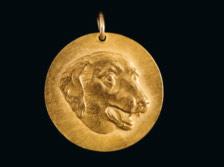

Ai Weiwei and TASCHEN present an unprecedented fine art jewelry collaboration following the success of the artist’s Papercut Portfolio. With the Zodiac Charms, Ai returns to his seminal 2010 work Circle of Animals/Zodiac Heads, an exploration of history, authenticity, and cultural dialogue. In this new, exclusive jewelry version on the theme, he turns to the multifaceted personal meanings the Chinese zodiac has held over the centuries. Each charm has been sculpted by the artist based on its appearance in the earlier work and hand-cast in 999 pure gold.
TM That’s wonderful. So the dog will sell out and the rooster is going to sell out very quickly. We can see that. One of the things you’re doing with the zodiac heads is looking at value, aren’t you? It’s about what is valued culturally, what is valued economically?
AW Yes, I think most of our judgments are about value. And even when there’s a big political debate, we all can somehow measure it by looking at the value and who is profiting and who is losing. Value is so much related to all human activities. And with jewelry, I think that comes to a very personal level. Personal objects on the basis of pure gold. You know, the Chinese always think the gold has to be very pure. I get to a different level when we look at those pieces, since they are not just art. Yes, they have a strong art quality in there, but also with a lot of personal emotions. And that is very important.
TM Ever since I’ve known you, you have you been fascinated by different modes of making. It’s not that you personally carve everything so exquisitely. I know you have the facility to do various things, but you’ve always been interested in the different traditions, the stone-carving tradition in China, the marquetry and woodwork, and so on. How was it, just take us through the process, working with a goldsmith in Germany to make this. It’s a beautiful, exquisite process, isn’t it? You were quite involved.
AW Yes. Before I could start doing that, we had to really study scenes and motifs from Greek and Roman gold coins. There are a lot of existing examples. Some are truly impressive. So you have to really try to make something which reflects the skills of how to make gold and how to make it a less industrial-looking, more handmade quality. And that is interesting because we are living in a world where everything is being made like an iPhone or something. It’s all industrially made. That means things don’t have a special quality to them, because there’s no mistake. But mistakes are so important in our life and our society. They identify us and make us say: yes, we are equal, but we are not the same. We’re all different. So I think those qualities gradually disappear with the same kind of education, same kind of value judgment, and even politically and socially. It’s very hard to raise different voices today. But that has a potential for danger, because as human beings, as a fast-developing society, we should encourage people to be different. We should encourage people to have fantasies or to think differently, not just to hold the same measurements, which I think would not be a healthy society. So maybe I made it too complicated. But yeah, that’s how I feel.
AI WEIWEI. ZODIAC CHARMS 12 zodiac animal charms available; limited edition of 99 copies, each signed by Ai Weiwei. Hand-cast in 999 pure gold; on a red silk string, packaged in a clamshell box with a booklet each €/£/$ 2,950
The Art Edition Necklace, limited to 48 copies, is sold out.
TM As you were talking, I was struck by the fact that you’re right about the impersonal nature of so much that’s made. But, of course, the component parts in an iPhone 14 are made of different materials, and they’re manufactured or made by different people in different places. Then they come together. And that idea about specialization: on one level, it’s fragmented. On another level, as human beings, we need specialization, we need expertise. In some ways that should be celebrated. I like the tension in your approach as an artist, where you clearly have worked with and revere the expertise of stone carvers or goldsmiths, but you also have this capacity to synthesize, to bring things together. Do you see it in those terms?
AW I think as an artist you’re also a craftsman, because you like the craftsmanship. Then you think that enables you to achieve something different. But I don’t know if today’s audiences have that much patience. So even something very special may not be recognized as special. Still the effort should be put there because that’s what makes it worth making something.
I think today we only give value to something that is very useful or easy to use. But in ancient times you can say people reserved the highest judgment on craftsmanship for objects that were useless. This is a completely different idea. So they must serve some meaning beyond our understanding of a purpose, or be really subversive. That’s why this idea attracts me so much.
TM I suppose in contemporary life now, that’s the difference between art and design. Design is seen as a lesser phenomenon because it has a functional purpose, whereas art is in many ways a rumination on the grand scheme of things.
Just finally, because this is a brief but intensive conversation: the Zodiac Charms are very much rooted in Chinese history and tradition, but you’ve worked with a European goldsmith in Germany. You still have a studio in Berlin, but you’re now increasingly in Portugal, where you’re building a new studio. Does it matter where you are when you make things? Do you still feel the need to be rooted in China? Do you ideally want to go back to a Beijing studio, or does none of this really matter? AW I’ll tell you: my best condition is when I get lost. I don’t feel I belong anywhere, but, unfortunately, I still feel I’m alive. And you’re either in this hotel or in that airplane? So it’s just about how to spend the rest of the time, you know? It’s very simple.

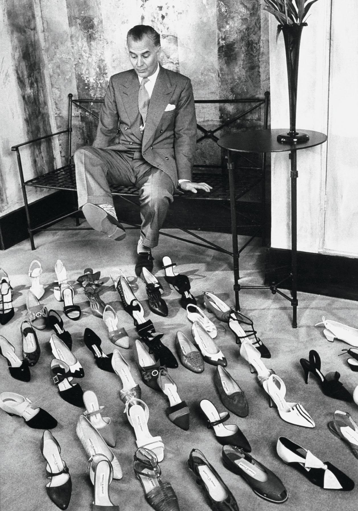
No shoe desigNer today is as influential and culturally recognizable as Manolo Blahník. While not strictly a character in the pop culture giant Sex and the City, the shoe creator’s name was so often cited that he has become as synonymous with the show as its cocktail-swilling, fashion-obsessed characters. Sarah Jessica Parker said of the designer: “Manolo makes the perfect heel. There’s something about what his heel does for the slightly forward pitch of a woman’s body that is really superior. He just makes you look sexier.”
Manolo Blahník was born in 1942 in the Canary Islands to a Czech father and Spanish mother. After formal schooling in Switzerland and France, Blahník moved to London in 1969 and soon entered the fashion field. There he met American editor Diana Vreeland and showed her his portfolio of clothing, accessories, and theater sketches. She was especially impressed with his shoe designs and encouraged him to focus on footwear. Over the next decade, Blahník’s career took off. He opened his eponymous firm; designed shoes for leading British creators such as Ossie Clark, Jean Muir, and Zandra Rhodes; and sold his footwear in America at Bloomingdale’s.
Although Blahník never worked as a shoemaker, he became a dedicated, self-trained technician. In addition to drawing each of his labeled creations, Blahník handcrafts and carves the wooden lasts onto which he molds the uppers, and personally oversees the production of his ready-to-wear designs. This singular and painstaking approach has inspired an unrivaled, fanatical following—despite minimal stores worldwide and Blahník’s aversion to turning the company into a large corporate engine like similar luxury brands, his shoes fly off the shelves, often overnight. Embracing a range of styles from the curved Louis heel of the 18th century to vertiginous stilettos, the Blahník silhouette is always elegant, and his fabric and ornament choices are a balance of lushness and refinement. He dabbled in men’s footwear and made platforms during the 1970s but soon abandoned those efforts. Instead, he revived the sleek heeled pump, the shoe that remains his hallmark.
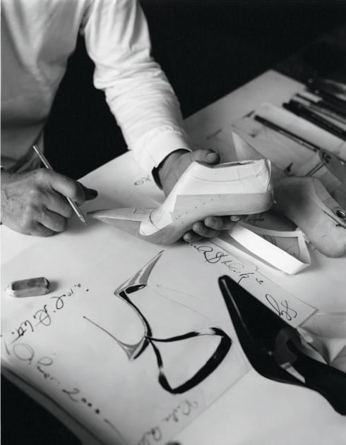
The Spanish designer sketches while holding a last. Michael Roberts, 2007. © Michael Roberts / Maconochie Photography

Opposite: Manolo Blahník poses with his creations in his salon. Ian Cook for LIFE, 1988.
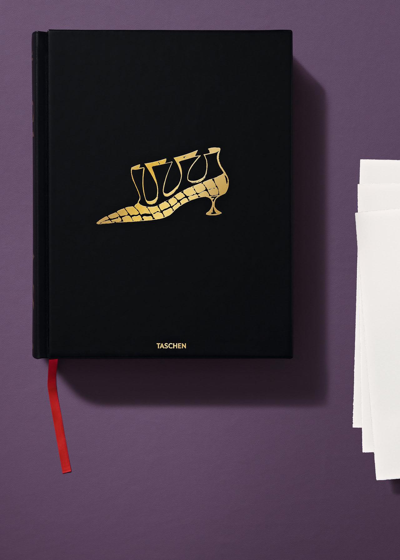
SHOES A–Z. THE COLLECTION OF THE MUSEUM AT FIT
Manolo Blahník Edition of 1,000 copies
Hardcover in slipcase, both leather-bound with gold foil embossing, red gilded edges, 532 pages, 26.2 × 33.6 cm (10.3 × 13.2 in.)
€/£ 750 / $ 850
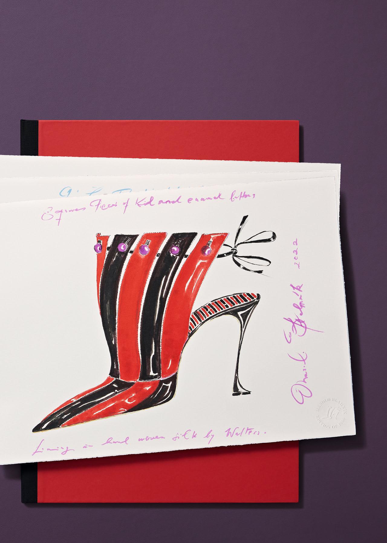
With three numbered art prints by Manolo Blahník, h 42 × w 29.7 cm (16.5 × 11.7 in.), created exclusively for this edition with a hallmark stamp. The 6/8 color drawings are printed on 100% cotton paper by Fabriano, and are housed in a luxury portfolio with gold foil embossing and a ribbon closure.
Step inside one of the world’s most enviable closets to celebrate the empowering, sensual, playful, and practical shoe. Hundreds of groundbreaking designs, ephemera, and sketches are featured in this volume, a follow-up to Fashion Designers A–Z, from the most coveted labels such as Louis Vuitton, Salvatore Ferragamo, Chanel, Gucci, Yves Saint Laurent, Roger Vivier, Christian Louboutin, and more.

“Bond, you see, is a kind of present-day survival kit. Men would like to imitate him—or at least his success—and women are excited by him.”
Sean Connery

XXL
JAMES BOND. DR. NO
Collector’s Edition No. 501–1,962
Hardcover in slipcase, 492 pages
29 × 44 cm (11.4 × 17.3 in.)
€/£ 750 / $ 850

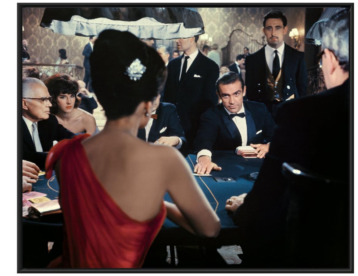
“Orson Welles always said there were two great
entrances in cinema—Omar Sharif in Lawrence of Arabia, and Ursula Andress in Dr. No
.”
Terence Young
By Paul Duncan
Author iAN FlemiNg created fictional spy James Bond in 1952, published the first novel, Casino Royale, the following year, and wrote a new novel each year thereafter. Fleming had been a spy during World War II, and then a newspaperman, so he based his stories on both his insider knowledge and on real-life incidents—the verisimilitude of the details gave an additional frisson to the action and drama of the plots.
The James Bond novels were immediately successful in the UK, touching a chord in a generation of Britons who had lived through the war and wanted a more exotic international lifestyle rather than the austerity measures at home. It took a little longer for the novels to catch on in America, but their sales received an incredible boost in early 1961, when President John F. Kennedy listed From Russia, with Love as one his favorite novels. It was only natural that such a charismatic character as James Bond would be adapted to other media like TV, comic strips, and film. Fleming, with his characteristic attention to detail, vetted each potential suitor, and sold the rights multiple times, but writers, directors, and producers failed to crack the specific code that would translate Fleming’s words on the page to images on the screen. After a failed attempt to make a film with Ivar Bryce, Kevin McClory, and Ernest Cuneo, and a heart attack that left him with mounting medical bills, Fleming let producer Harry Saltzman option the Bond film and television rights.
Although Harry Saltzman had the option on the movie rights to seven of the nine published James Bond novels, the clock was soon ticking down and his option was running out because he did not have the money or the backing of a studio to make the films happen. Cubby Broccoli did not have the money either, but he did have viable connections with the Hollywood movie men operating out of New York. In mid-June 1961 they decided to combine forces to make James Bond movies together.
In the early 1960s, the traditional path for independent producers was to have a script with a star or stars attached, and to present that package to a studio for financial backing. Such had been the case for Cubby Broccoli and Irving Allen, under their Warwick Films banner, when they had the world’s top film star, Alan Ladd, signed for three movies and received backing from Columbia Pictures to make The Red Beret (1953), Hell Below Zero (1954), and The Black Knight (1954). The financial successes of those three movies ensured that further package deals with Columbia followed. Likewise, Harry Saltzman had a Ben Hecht script with Katharine Hepburn attached when he secured backing from MGM (for American distribution) and Romulus Films (for the UK market) for The Iron Petticoat (1956). The failure of that movie, which also starred Bob Hope, stopped Saltzman’s future movie plans with Ben Hecht, but he continued producing the successful TV series Captain Gallant of the Foreign Legion in Italy and North Africa.
On June 21, 1961, Harry and Cubby walked into a meeting with the top executives of United Artists in New York with no script and no star attached. What was unusual about the producers’ pitch, and showed their chutzpah, was that they were not trying to find financing for one movie, but for a series.
By a happy coincidence, David Picker of United Artists had already tried to buy the rights to the James Bond books, so he was very familiar with the property and eager to pursue it. But why should United Artists work with Harry and Cubby? Firstly, and most importantly, the producers had the rights, although, unbeknownst to United Artists, Harry and Cubby only had 24 days left to activate their option before it lapsed. Also, Cubby had a wealth of experience making action-adventure films in exotic locales, and Harry had just overseen the artistically successful Woodfall films Look Back in Anger (1959) and Saturday Night and Sunday Morning (1960), featuring edgy and fascinating modern men. Within an hour a deal had been struck for a series of films, which was sealed with handshakes all around. (The contract would be signed 10 months later, after the movie had been filmed—United Artists did business on the strength of their word.)
The producers left the building with the money to pay for the first script to be written, and to pay for their lead actor, whoever that may be.
Over the course of preproduction and production of the first film, Dr. No, Harry and Cubby had to learn how their partnership would work. They were completely different personalities. At home, when Harry wasn’t on a telephone trying to close a deal, he always had his head in a book. When he went out, he liked to visit the theater and eat at the best restaurants—he had acquired a refined taste for these activities during his formative years in Paris as part of Colette’s circle of friends. At work he was brusque, but full of ideas. Ursula Andress, who played Honey Ryder, remembered, “I liked Harry, with all his producer’s attitude. He was nice.”
In contrast, Cubby was much more of a people person—many of the crew had worked on Warwick Films, and Cubby knew them from Pinewood and on location. He was, more often than not, a serene and mediating presence. Cubby would think first and talk later, whereas Harry was the opposite: he would talk first and think later.
There was an inevitable clash of personalities. Director Terence Young remembered, “We had at one time, I think, five different scripts on Dr. No.” These scripts were an attempt to solve the problem of translating Fleming’s novel into film language. How do you take Fleming’s minute descriptions of cigarettes and cars and tailoring, and background information on history and geology and scientific advances, and turn them into images? “Finally, Cubby Broccoli nearly killed Harry, I mean physically. He got in a rage, and Cubby’s a very quiet, tranquil man, but by God he was inflamed, and he said, ‘Look, we’ve paid all this money for this James Bond book and we’re not using a word of it. Harry, if it’s bad, it’s your fault.’ He blamed Harry, because Harry was in charge of the script.”
Harry and Cubby agreed on a budget with United Artists of just over $1 million, which had a completion bond provided by Film Finances Limited. As soon as shooting began in Jamaica, it became clear that the cost of the hotels, and the delays due to inclement weather, meant that the budget was insufficient for the film they were making.
After a settling-down period, the producers began working more as a team, playing to their strengths. Jerry Juroe, the director of
European publicity and advertising at United Artists, recalled, “If you had Harry Saltzman as a partner, you didn’t have to be aggressive. Cubby was the good cop. Harry was the bad cop. As long as Cubby had Harry to be heavy, he didn’t have to be, and he would step in, usually after you were totally beaten down by Harry, and you would agree to what they both wanted.”
Although the producers had different methods of operation, Harry and Cubby had the same attitude—they believed in and supported their cast and crew.
Terence Young schooled Sean Connery in the ways of bespoke tailoring and the life of an upper-class public-school man of the world so that he could portray James Bond on the screen. They spent a week in Jamaica before shooting began, discussing the character of Bond while walking around golf courses. “It is important to understand,” Cubby explained, “that we never intended to play Sean Connery exactly as Fleming’s Bond. The whole point about having Sean in the role, with his strong physical magnetism and the overtones of a truck driver, was that it thrilled the women, but, more important, young men in the audience could feel that there was a guy up there like them.”
The script had elements of humor in it but, during the shoot, lines were ad-libbed and rewritten as Bond’s character was shaped and built by Connery and Young.
Likewise, the director and producers gave production designer Ken Adam the freedom to experiment with his sets, to use new materials, to make the sets bigger, to use more stages at Pinewood. A bigger set means more expense to build it, and to strike it (take it apart) afterward. New scenes were added, requiring additional (unbudgeted) sets, and since the unit ran out of time in Jamaica, additional (unbudgeted) sets were built in Pinewood to cover the missing scenes.
These creative freedoms were also extended into postproduction with Peter Hunt’s editing and Norman Wanstall’s soundscapes.
Throughout it all Harry and Cubby protected their crew and absorbed the pressure from Film Finances and United Artists because they believed in the project. They had found a way to translate Fleming’s words on the page into images on the screen, but would the public embrace it? Cubby explained, “A producer starts out on any picture
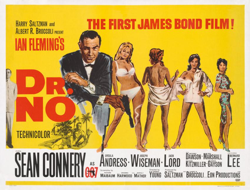
Mitchell Hooks, a well-known illustrator of paperback covers, drew James Bond and the women he encountered for the UK Quad poster of Dr. No, released October 5, 1962.
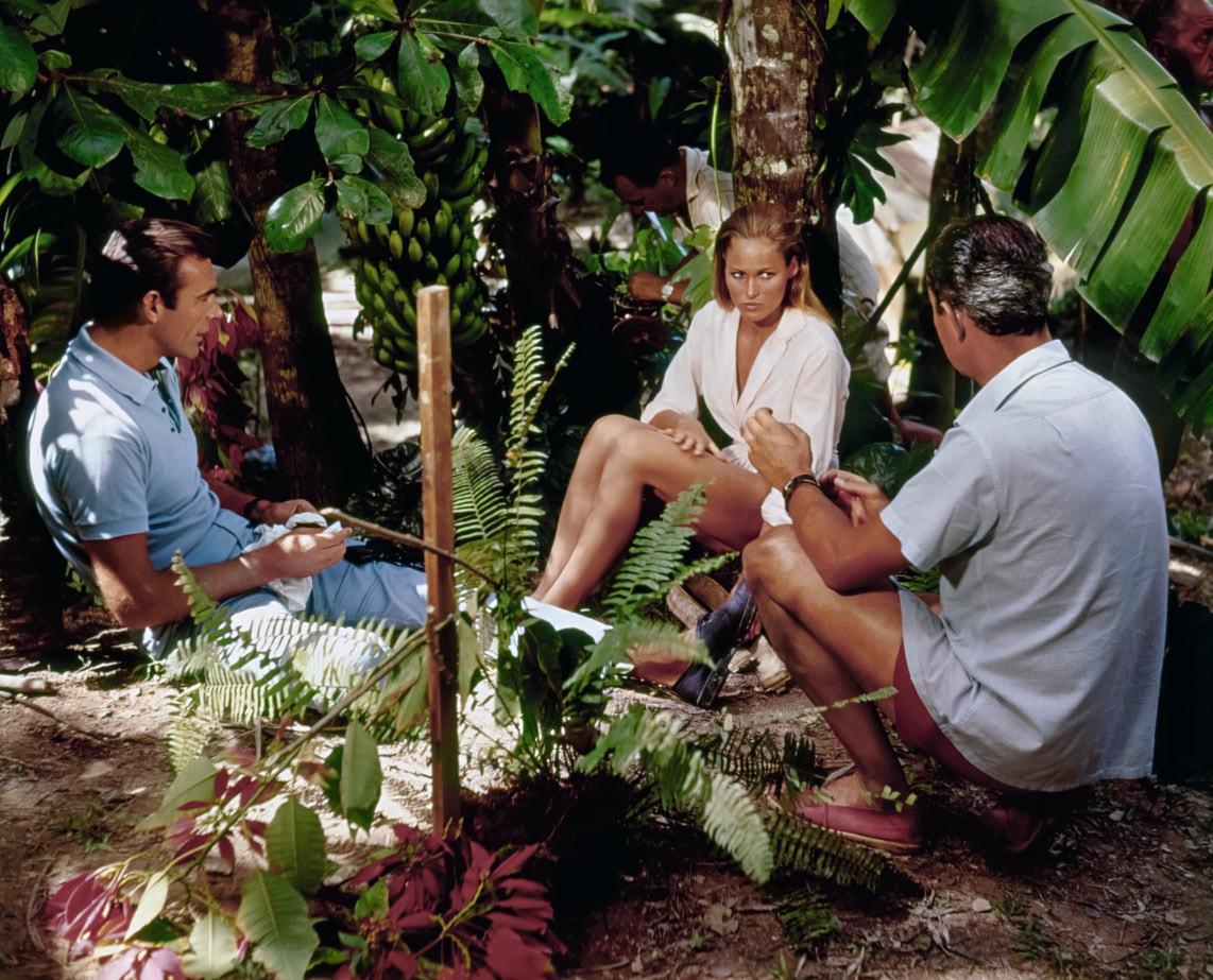
Opposite: Terence Young (right) talks through the intimate scene with Connery and Andress above the falls.
© Jerry Ollinger’s
hoping it’s going to be great, but with an uneasy gut feeling that maybe he could be wrong.”
Once a movie is completed, it is released territory by territory around the world. Producers are like cornermen during a boxing match, sending their fighter out round after round, cheering him on, working on him between rounds, in the hope that he’ll come through in the end. If the critics don’t think the film is a knockout, then maybe it will win at the box office.
Dr. No opened in the UK at the London Pavilion on October 5, 1962, with all the publicity materials confidently declaring that it was “The First James Bond Film!”
“We broke every record known,” Harry remembered. “We made £69,000 the first week, and we held the record for 11 years. We played 24 hours a day at £1 per ticket. They never saw such business, and the most surprised was United Artists. To them, it was a ‘B’ picture.”
United Artists, who had already agreed to finance the second film to the tune of $2 million, thought there was money in the series, but in the UK and Europe, not in America—in their opinion Americans would never watch a film starring an unknown British truck driver speaking in an accent they did not understand. Bud Ornstein and Jerry Juroe, from United Artists’ UK operation, told their American bosses that the film was a big hit, but head office was not inclined to back up their relatively small investment with a wide American release when they had big-budget films like Billy Wilder’s Irma la Douce,
John Sturges’s The Great Escape, and Stanley Kramer’s It’s a Mad, Mad, Mad, Mad World to promote that year, each of them headlined by major Hollywood stars. United Artists had different priorities to those of the producers.
The producers supported the European releases by supervising the dubbing—Harry went to Paris, and Cubby to Rome—before shooting began on the second James Bond movie, From Russia with Love, at Pinewood Studios on April 1, 1963. The following month Dr. No opened in America. Cubby remembered that “Variety, which knows more about movies and trends than any other showbiz journal in the world, declared: ‘As a screen hero, James Bond is clearly here to stay. He will win no Oscars but a heck of a lot of enthusiastic followers.’ Other papers across the country echoed the general approval. Bond was on his way to capturing America.”
Dr. No made a healthy profit in America and laid the groundwork for the series. From Russia with Love made more money, and then Goldfinger, the first in the series to feature American locations, made the big breakthrough, riding on the wave of the British cultural invasion of America in the mid-1960s. Although they had achieved phenomenal success, Harry and Cubby continued to fight for bigger budgets, to push for better ideas, to fill the screen with movement, to excite the audience with visual wonders, and to entertain with witty dialogue. They were the first custodians of the James Bond film adventures, a series that has thrived for 60 years, amassing multiple generations of enthusiastic followers along the way.
FEW LEFT
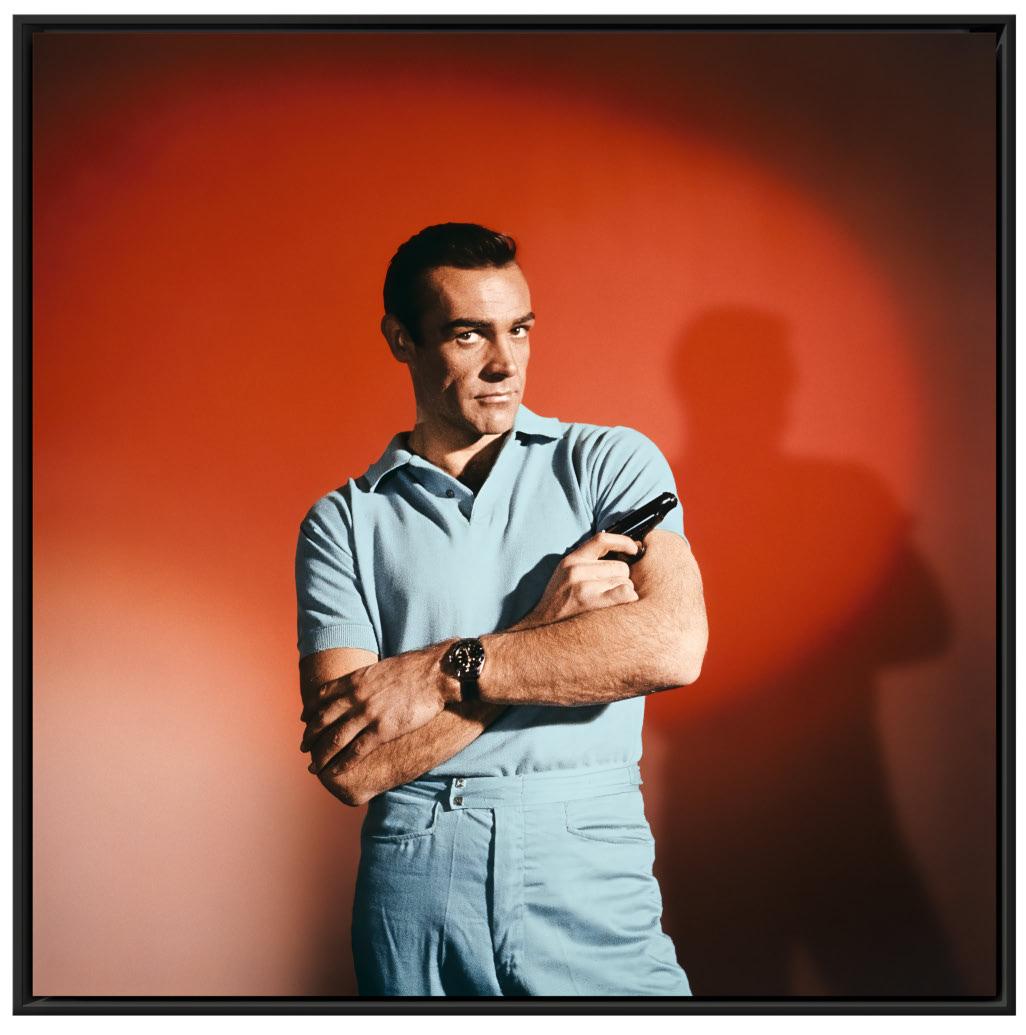
“James Bond was one of the first cool people in the pictures. There was a lot of cool in these films.”
Terence Young
€/£ 1,500 / $ 1,750

Ken Adam at his home desk, from the Lines in Flow installation at the Bigger than Life exhibition, 2014. Photo: © Boris Hars-Tschachotin, “THIS IS THE WAR ROOM” (2017). Film still by Andreas-Michael Velten.
WiNNer oF tWo Academy Awards, two BAFTAs, and the Art Directors Guild Lifetime Achievement Award, and knighted for distinguished services to film, Sir Ken Adam is widely acknowledged as the world’s most influential production designer. This signed Collector’s Edition is realized in collaboration with the Deutsche Kinemathek, which was honored with Adam’s personal archive in 2012, and is illustrated by hundreds of sketches and photographs, many of them never published to this date.
Whether in the sprawling extravagance of You Only Live Twice ’s volcanic lair, or the unassuming simplicity of the sinister anteroom in Dr. No, Adam’s designs were indispensable to the look and feel of seven of the early James Bond films. In The Ken Adam Archive, his artworks are carefully complemented by a wealth of behind-the-scenes photographs, documents, and archival material on the films, courtesy of EON Productions.
Not only did Adam craft the space stations, bunkers, and laboratories of 007’s villains, he was responsible for many of his memorable
vehicles, as whimsical as they were menacing: from the amphibious Lotus Esprit in The Spy Who Loved Me to Goldfinger ’s gadget-laden Aston Martin DB5, the ultimate combination of futuristic weaponry and tongue-in-cheek wit.
The book also recalls, through a series of illuminating interviews between Adam and author Sir Christopher Frayling, the highs and lows of his close but tumultuous collaborations with Stanley Kubrick— including the design of the War Room in Dr. Strangelove—alongside many more standout moments from his career. Steven Spielberg called the War Room “the best set in the history of the movies.”
Accompanied by authoritative essays and introductions from Frayling, who is also Adam’s biographer, The Ken Adam Archive reflects upon the life and work of the German-British refugee and fighter pilot who would go on to realize a celebrated career in production design, spanning seven decades and over 50 films.
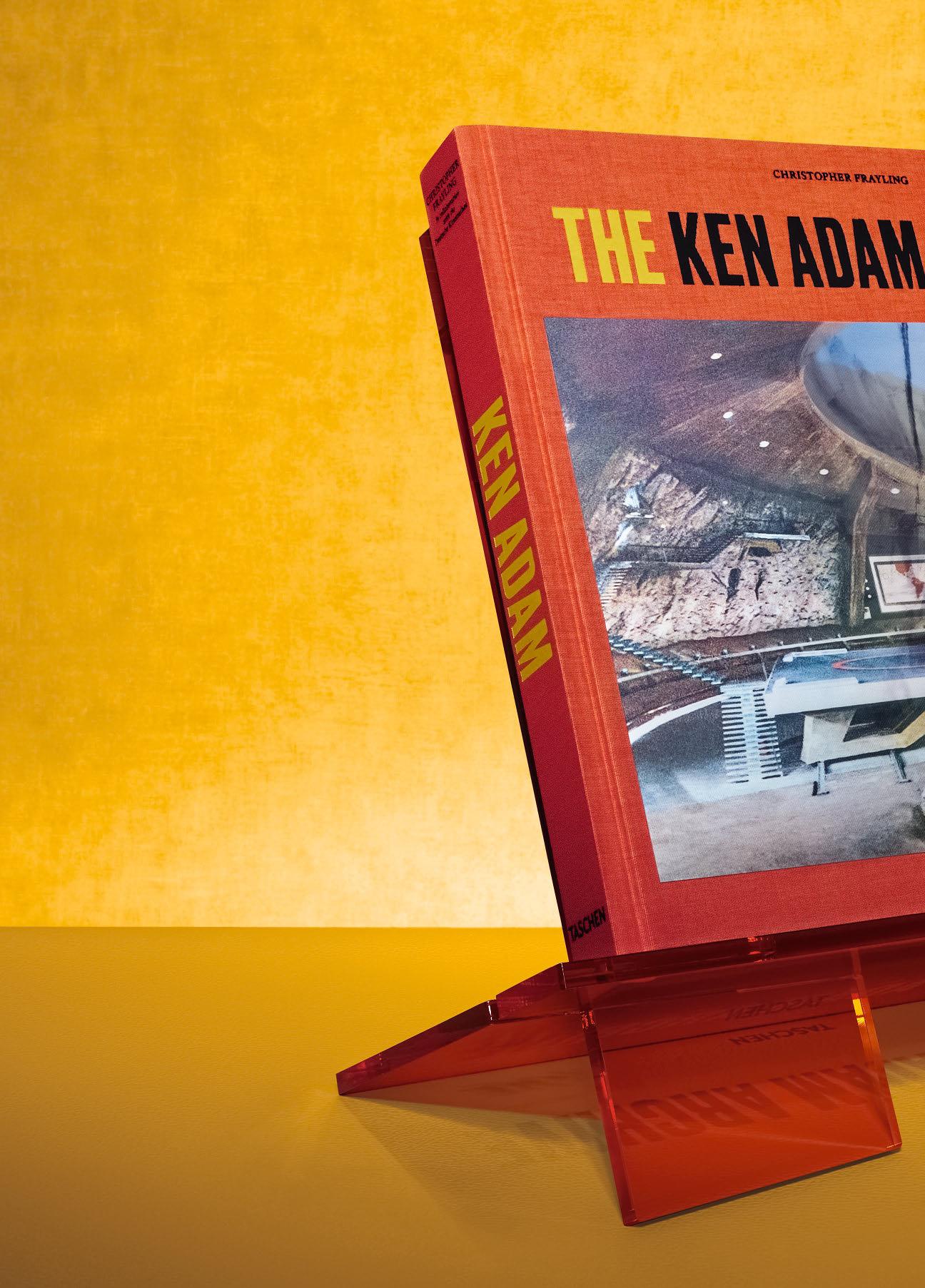
“A suitably colossal tome to mark the mind behind the most ambitious film sets ever built.”
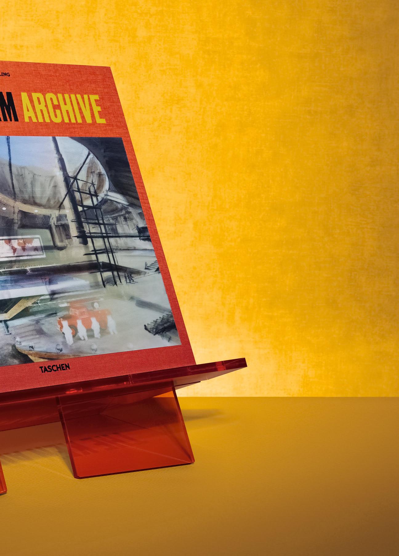
THE KEN ADAM ARCHIVE
Collector’s Edition of 1,200 copies
Hardcover bound in iridescent bicolor fabric with tipped-in, four-phase lenticular, 360 pages 36 × 36 cm (14.2 × 14.2 in.), with acrylic, engraved bookstand
Signed by Sir Ken Adam €/£ 850 / $ 1,000

“…a super-deluxe retrospective of Frazetta’s career in comics, art, illustration and advertising.”
“People say Frank freezes the image, but Frank sees everything. He freezes the image; he’s also the loosest guy I ever saw. Frank can have a character standing like he’s moving, which is hard, because most guys’ standing characters are stiff. Frank doesn’t just freeze the moment; Frank is the moment.”
Ralph Bakshi
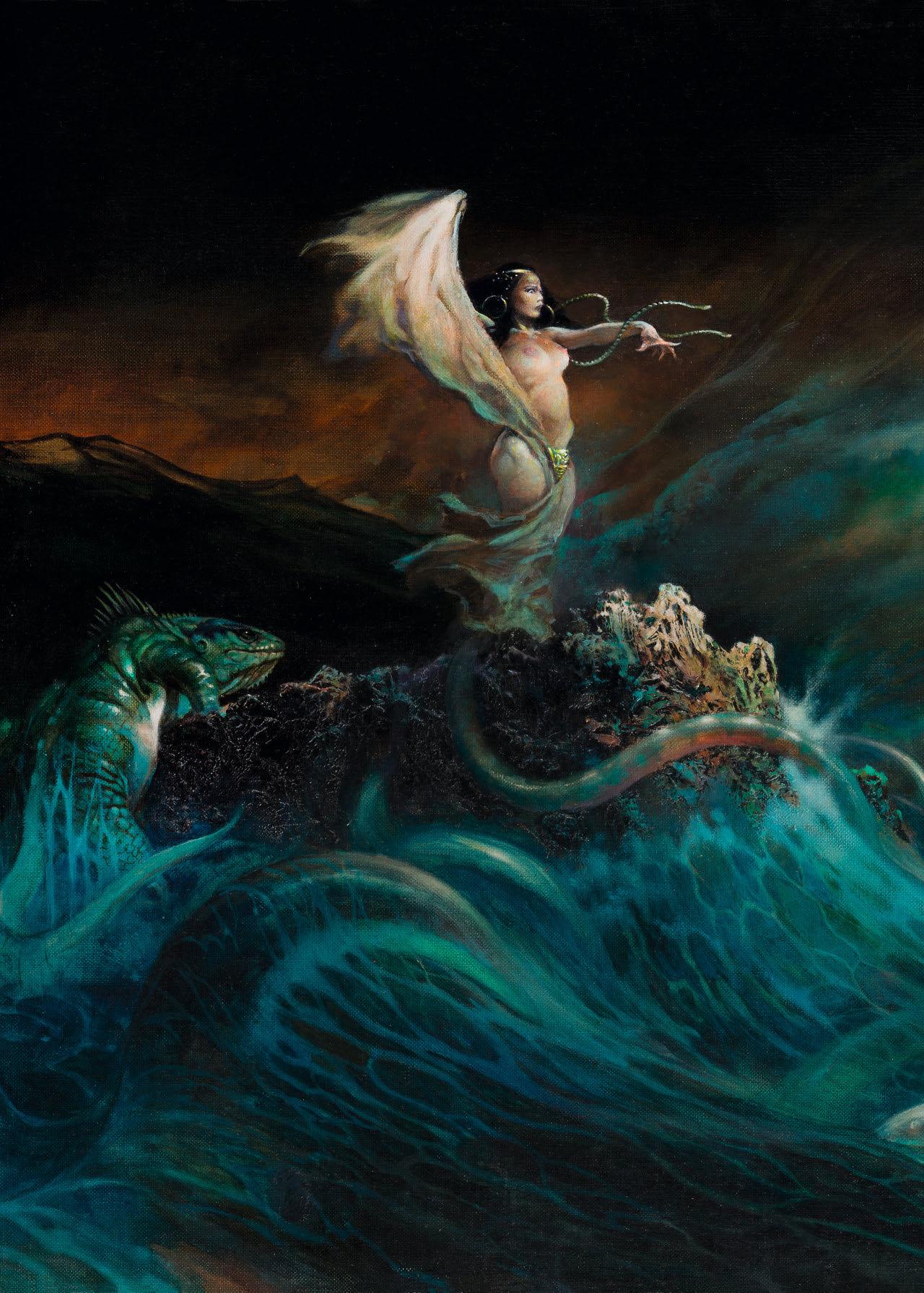
Previous spread: Sea Witch, for the cover of Eerie No. 7; later repurposed for the cover of Seademons, 1977, by Lawrence Yip. Oil on Masonite, 1966.
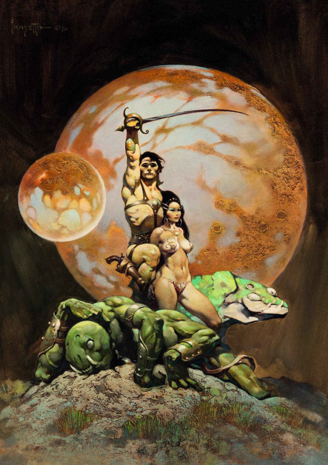
Opposite: Princess of Mars, repaint of Frazetta’s cover for the Nelson Doubleday Book Club edition of A Princess of Mars, the first of Edgar Rice Burroughs’s 11 Martian novels. John Carter, Earthman of Virginia, is seen here with Dejah Thoris, the Princess of Helium. Oil on canvas, 1970. Courtesy of Heritage Auctions and Edgar Rice Burroughs Inc.
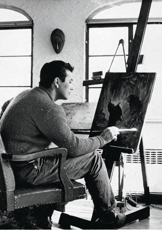
Frank Frazetta has reigned as the undisputed lord of fantasy art for 50 years, his fame only growing in the years since his death.
Born to a Sicilian immigrant family in Brooklyn in 1928, Frazetta was a minor league athlete with movie star looks and phenomenal talent. His comic career began at age 16, leading him to the infamous EC Comics, then to Tarzan and Conan paperback covers. He redefined both characters, explaining, “I’m very physical minded. In Brooklyn, I knew Conan, I knew guys just like him.” He used this firsthand knowledge of muscle and macho to redefine fantasy heroes as more massive, more menacing, more testosterone-fueled than anything seen before. As counterbalance he created fantasy women, with pixie faces and voluptuous bodies, thick-thighed, full-breasted, heavy-buttocked, yet still believably real. Add in the action, the creatures, the twilit worlds of haunting shadow and Frazetta’s art is as addictive as potato chips.
Realized in collaboration with the Frazetta family and top collectors, this monograph is the biggest and most complete ever produced on the artist.
2023 Will Eisner Comic Industry Award for Best Archival Collection/ Project—Comic Books
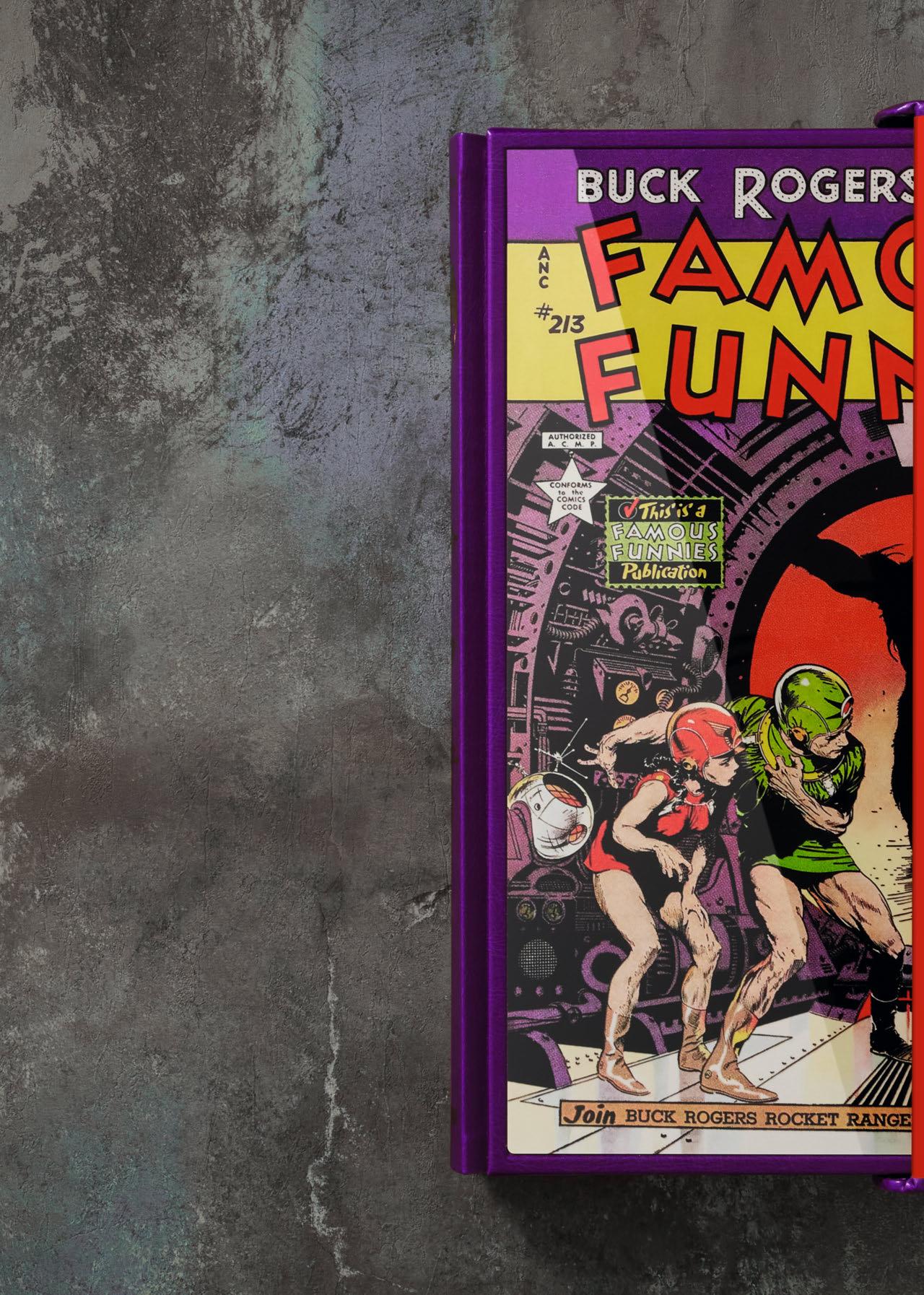
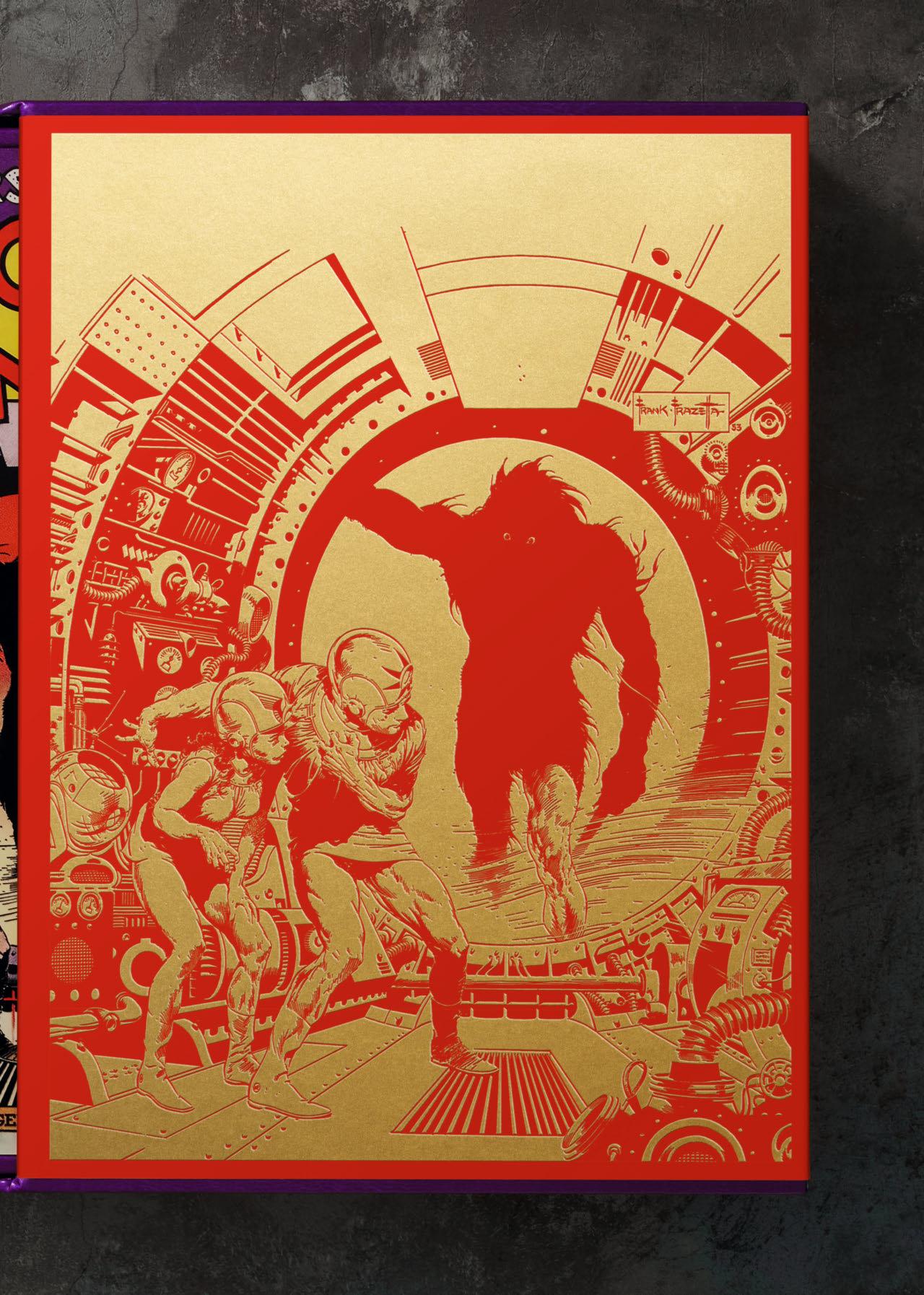
THE FANTASTIC WORLDS OF FRANK FRAZETTA Collector’s Edition of 1,000 copies
Aluminum print cover tipped into a vegan leatherette-bound spine, foil embossing, and housed in a velvet slipcase, 468 pages
29 × 39.5 cm (11.4 × 15.6 in.)
€/£ 500 / $ 600



creativereview.co.uk

BABY SUMO FEW LEFT
HR GIGER
Collector’s Edition No. 201–1,200
Hardcover with fold-outs in clamshell box, 400 pages
36.7 × 50 cm (14.4 × 19.7 in.)
Numbered and signed by Carmen Giger / HR Giger Estate
€/£/$ 1,250
Art Editions No. 1–200 are sold out.
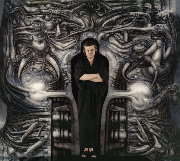
Enter a world of haunting power and dark psychedelia with this tribute to the biomechanic visions of HR Giger. This volume spans the artist’s painting, sculpture, film work, iconic album covers, and unique artist’s museum, with seven foldout spreads, an essay by Andreas J. Hirsch, and an extensive biography based on Giger’s own writings. HR Giger in the passageway of Passagen-Tempel (Eingangspartie), 1975.
Photo: Roland Gretler.
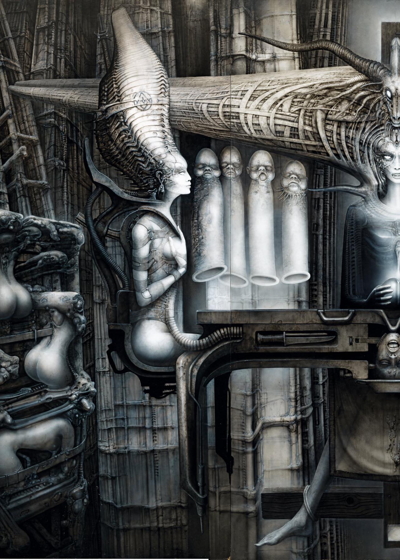

“Since choosing to pursue art, it has been like an LSD trip—with no return. I feel like a tightrope walker and no longer differentiate between work and leisure. I suddenly realize that ‘making art’ is a vital activity for me to keep from going insane.”
HR Giger
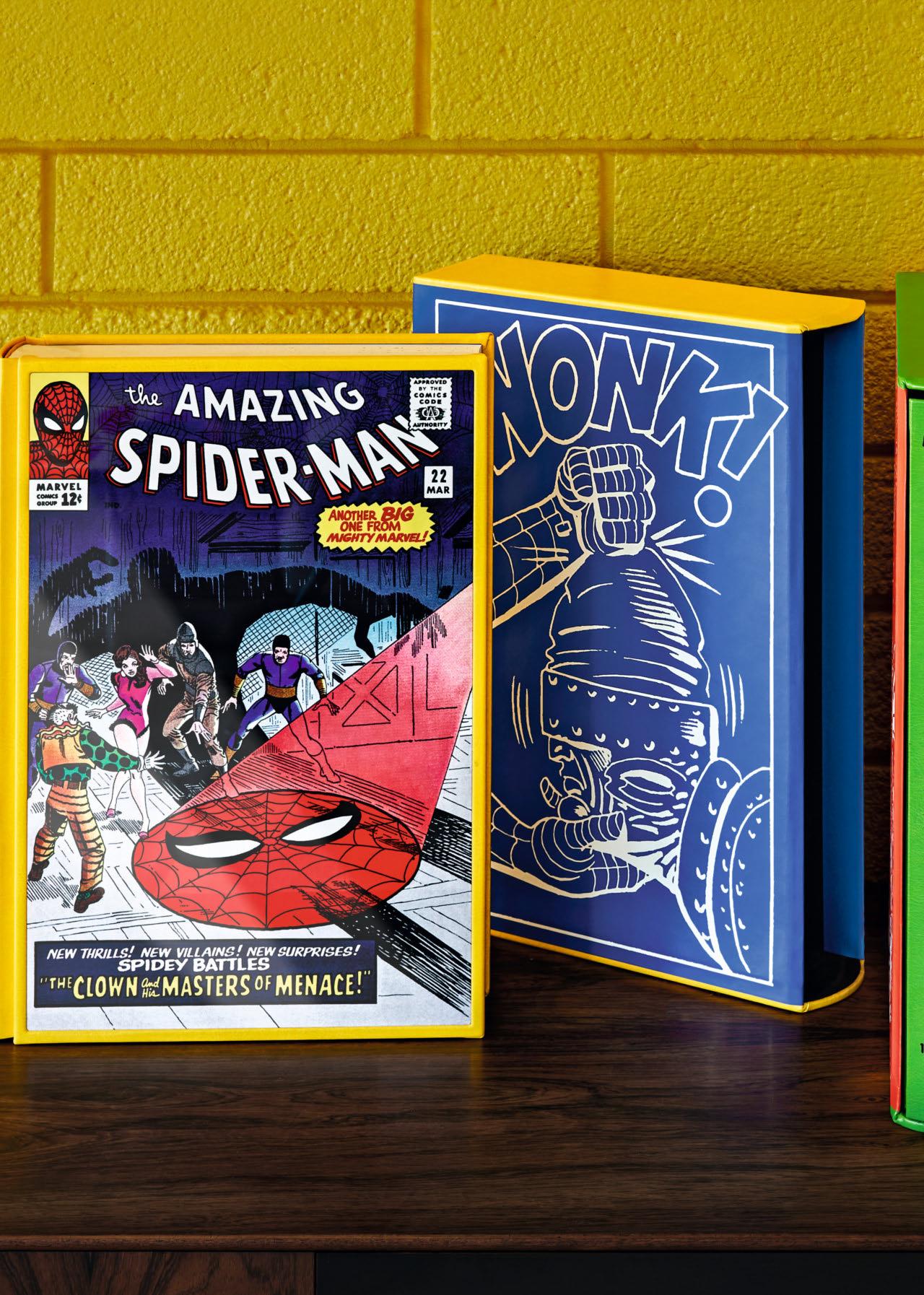
See the most pristine pedigreed comics like never before

XXL
MARVEL COMICS LIBRARY
Collector’s Editions of 1,000 copies
Aluminum print cover tipped into a vegan leatherette-bound spine, foil embossing, and housed in a slipcase, 626–706 pages
28 × 39.5 cm (11 × 15.6 in.)
SOLD OUT
SPIDER-MAN
Vol. 1: 1962–1964
€/£/$ 850
FEW LEFT
AVENGERS
Vol. 1: 1963–1965
€/£/$ 750
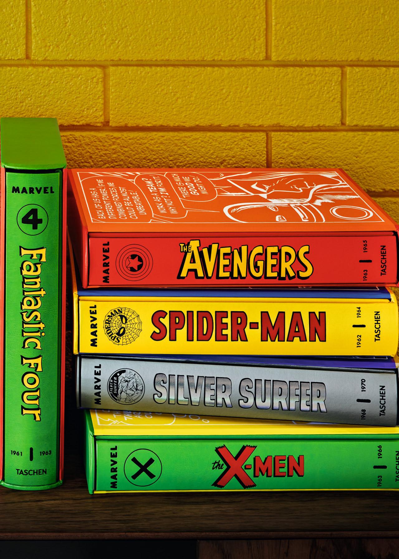
FANTASTIC FOUR
Vol. 1: 1961–1963
€/£ 500 / $ 600
X-MEN
Vol. 1: 1963–1966
€/£ 500 / $ 600
SILVER SURFER
Vol. 1: 1968–1970
€/£ 500 / $ 600
SPIDER-MAN
Vol. 2: 1965–1966
€/£ 500 / $ 600
Coming soon: AVENGERS
Vol. 2: 1965–1967
HULK
1962–1966
the iNterestiNg thiNg about history is that you rarely know it’s happening when it’s happening. Something momentous and worldaltering and culture-defining can sneak past you, and it’s only decades later when you realize that you were there when everything changed.
I don’t mean huge events like war or elections or the first iPhone release that dominate the news cycle. I mean shifts in fashion, fads, and fancies, those seemingly inconsequential pop culture moments that seem like nothing more than a fun and pleasant diversion at the time, a silly but enjoyable treat that you take for granted, but then, maybe 20 or 30 or—gasp—50 years later, you realize were a BIG DEAL. That the world as you know it would not look or feel the same if they hadn’t happened. Movies and music and, in this case, comic books figure pretty prominently in this. I liked the Smiths and the Cure and Radiohead when their new albums were coming out, but I never realized I’d one day hold them in such high regard that I couldn’t imagine life without them. Ditto movies like Jaws or Alien or A Nightmare on Elm Street or Blade Runner. Of course, cinema and music already had been granted the seal of approval—pop culture allowed to be art, allowed to be taken seriously.
Steve Ditko’s splash pages were most often a sneak preview of the interior action, but on a handful of occasions, he would deliver a wonderfully abstract
piece of art, like this one from Amazing SpiderMan No. 37 showing Spider-Man (sans mask) contemplating the cast of characters being drawn into his web of destiny.
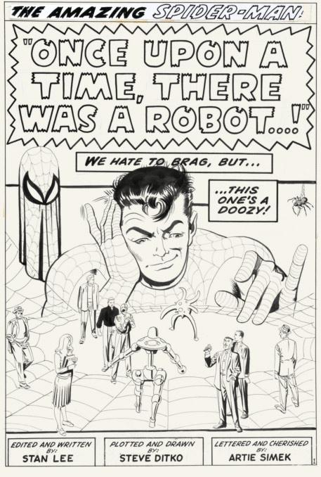
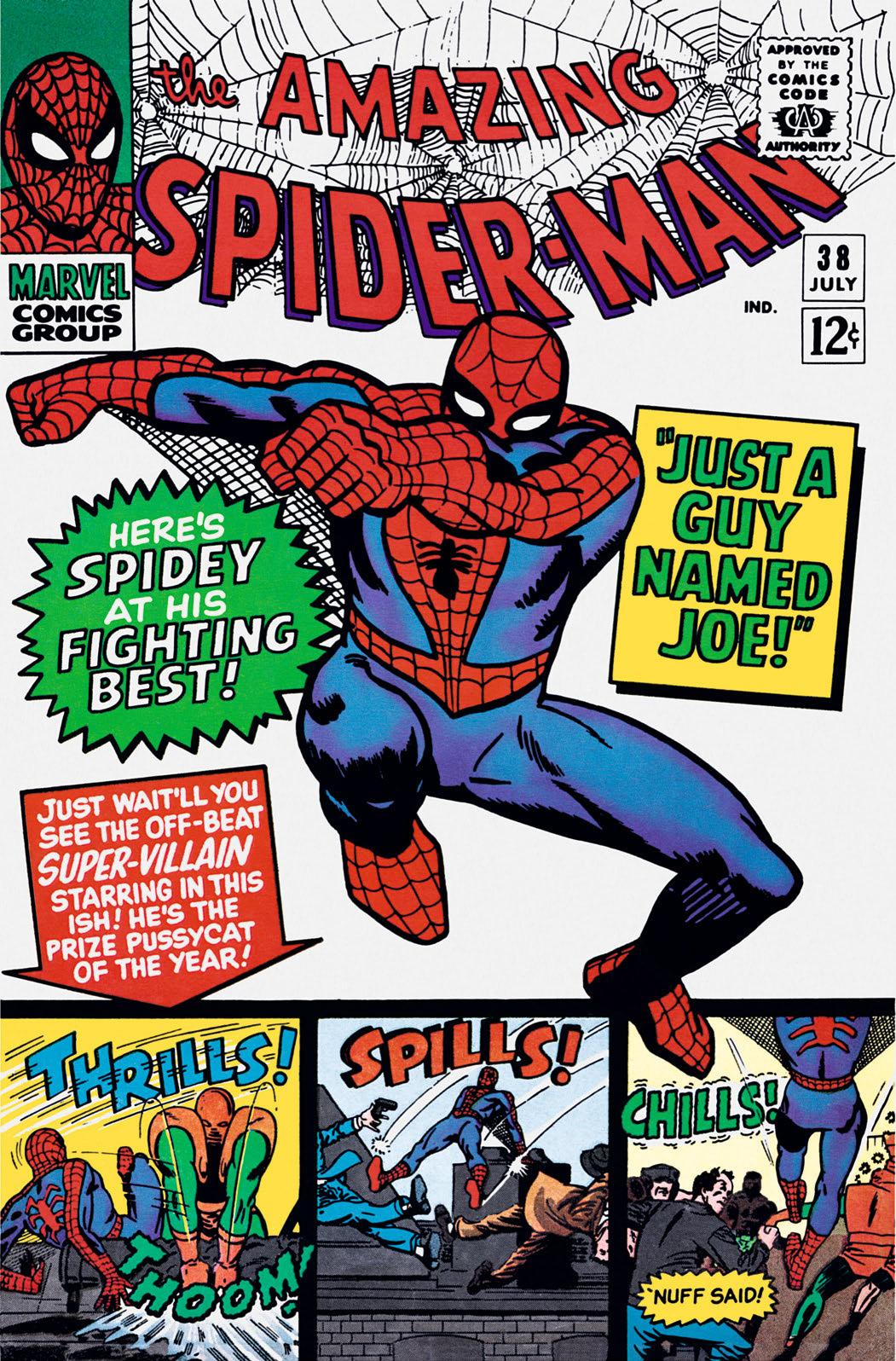
But comics? That’s something of a recent development. Back in the 1960s they were strictly kid stuff. Adults were mainly embarrassed to admit they enjoyed them and kids, well, who listens to kids? But a revolution was occurring, and it’s easy enough to make the case that the earliest key figures in this cultural revolt were to be found working for the recently rebranded Marvel Comics. There were probably a handful of prescient souls who realized something major was happening when the Fantastic Four appeared in 1961, taking that first tentative step away from the square-jawed, handsome, superficial, four-color superstars that came before. And once that door was opened just a crack, Spider-Man was allowed to swing through it, and the game was changed forever. In that one issue of Amazing Fantasy No. 15, and the subsequent 38 issues (and a couple annuals) of Spider-Man’s self-titled book, Stan Lee and Steve Ditko changed nearly everything. A teen as the hero, with no friends, living with his aunt! What was happening here? Add to that list Peter Parker’s unsuccessful and clumsy attempts at romance, his struggling with bullies at school, and taking those first tentative teenage steps into the adult world of the workplace, and you have something unique and unprecedented in comic book form. Nothing about the soap opera elements that Stan and Steve introduced had been seen before. Nothing about it felt like it should be a success when we’d previously thrived on a diet of superstrong aliens or science heroes or vengeful orphan billionaires.
And he was skinny! He was a kid with glasses (and not ones he wore as a disguise like that Super Fella on the other side). Another real milestone is that Stan wrote him with a sense of humor. There had been other wise-cracking heroes in the past, but I don’t think anyone had combined the melodrama and misery in a character’s life with a breezy smart-aleck commentary when in action. Ditko gave Spider-Man the full face mask, designed (as he told me at the one brief face-to-face I had with him) to hide the fact that he was still in his teens. He felt that the henchmen and gangsters he routinely confronted would have been emboldened by that. So it wasn’t just to preserve Parker’s real identity, but also to prevent mobsters from going in strong, confident they might have more of a chance. The mask does, though, give Spidey a potentially sinister air, which may well be (and I’m hypothesizing here) why Lee gave him so many one-liners. But certainly I think Lee’s in-fight dialogue added immensely to the appeal. As a kid I found the lines actually funny (they maybe haven’t aged too well), but also they seemed to make Spider-Man even more likeable and relatable—we didn’t just want powers, we wanted to be cool and funny—and, of course when contrasted with the thought balloons, we could admire how Spidey, often exhausted or on the brink of defeat, kept up this wisecracking front to avoid letting his foes know how close they might be to triumph.
“A chance for readers to own some of the most influential comics of all times in modern editions.”
Comics Beat
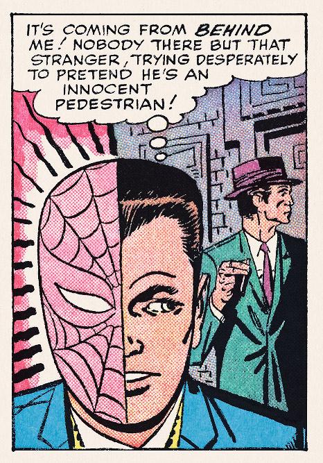
Ditko’s novel approach to contrasting the great power of Spider-Man with the great responsibility of Peter Parker was the “half mask” visual, usually indicating the triggering of his Spider-Sense. Many comic readers of the time took the visual literally, requiring Stan to have to explain the concept in the letters pages.
I first encountered Spider-Man—and Marvel—in the original form, actual U.S. comic books, which I found for sale in a local “junk” shop. Amongst the beaten-up furniture, ugly old vases, and chipped porcelain figures of clowns or dogs was a big pile of secondhand, pre-loved comic books. Most were versed or torn, some had no cover, and all of them had a big “3” scrawled in marker somewhere on the front. They cost three penny each, and you could return them and get a penny back. I never did. In my first haul I got a coverless Fantastic Four No. 3, a few beat-up issues of Tales of Suspense, and a very distressed looking Amazing Spider-Man No. 38. (I still have that coverless Fantastic Four in my collection today!) A few years later, the whole run was to be reprinted in a slightly larger, black-and-white format with the title The Mighty World of Marvel with gifts included in the first few issues. That helped me fill in the gaps in those early sagas that I had thrilled to in my patchy collection. It wasn’t until the early 1970s that legitimate American copies started creeping into the UK and could be bought at the newsagents. There was such a feeling of excitement in catching up with the newest stories (I think Amazing Spider-Man No. 118 was the first to come over). What heaven it was to be alive back then.
Back to what I said at the start—let’s look at the massive change that this book brought about, its significance as a pinnacle of pop culture—when you lay out and list the many unique components that add up to everyone’s favorite wall-crawler, and the special ingredients that were so fresh and so new, with hindsight you realize, of course, it was revolutionary. And after they had bedded down the nerdy wall-crawler, after they had settled into the rhythm of the stories and Lee had grown more confident that his gamble was paying off, while Ditko matured stylistically and arrived at the peak of his artistic prowess, well we really, really should have known that nothing in the world of comics would ever feel the same again. But mea culpa: I didn’t. I was too busy just enjoying it. As the saying goes, “We didn’t know it was a Golden Age.”
So now, aided by hindsight, let’s revisit and re-appreciate some of the work so lovingly republished in this book.
Neither Stan nor Steve were new to the game when they created Spider-Man. Stan had been working for the company for close to two decades when it was known as Timely or Atlas Comics, and Steve’s first published work was 10 years back. So they knew what they were doing and had enjoyed some success together already in the first 14 issues of Amazing Adult Fantasy (the Adult in the title was to denote that the stories were a little more sophisticated than most of the fantasy and sci-fi stuff on the market). But although not a beginner, I think it’s apparent that Ditko really developed and grew as a storyteller and artist on his long runs on Amazing Spider-Man and Dr. Strange in Strange Tales. Around issue No. 5 and 6 Ditko had really settled in and began to lay out his pages and draw with a fluidity and confidence that was uniquely his. By the time he hits the 20th issue, the first reproduced in this edition, he’s in a league of his own.
Ditko, famously a student of early Batman artist Jerry Robinson and an admirer of the great penciler Mort Meskin, has a style quite different from any of the other early Marvel titans. Jack Kirby’s pages exploded with energy and power, the action sequences bordering on brutal. The figures seem to leap off the page. Don Heck also presented a more masculine art in my opinion. Thicker set, chisel-jawed men, sophisticated and beautiful women: his pages felt more Madison Avenue Mad Men than Madison Avenue Marvel. Ditko’s elegant compositions and uncluttered finishes have, at the same time, a more cartoony and more poetic feel. But the big advantage Steve had over just about any other comic book artist of his generation was his character portrayals. He could do all the other stuff, his action scenes were superlative and unmistakably enhanced by his artistic DNA—but I believe it’s the character work that really stands out. The expressions of joy or anguish on each and every face, the body language, and, as always, those magnificently expressive hands.
“This latest release is a treasure trove for fans of the iconic web-slinger, offering an immersive journey back to the swinging ’60s.” The Sun
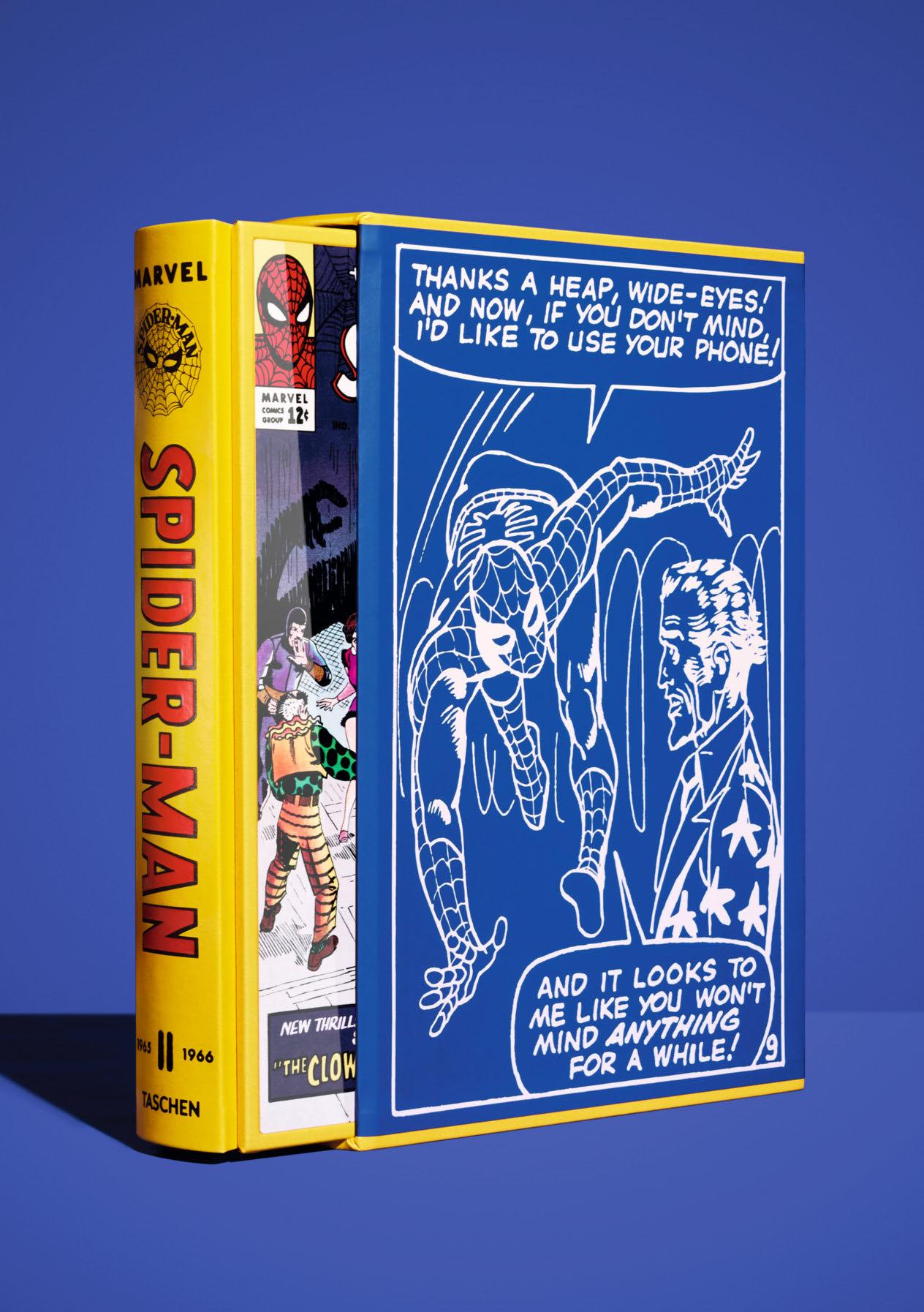
XXL
MARVEL COMICS LIBRARY. SPIDER-MAN. VOL. 2. 1965–1966
Edition of 1,000 copies

“A fascinating journey into the Disney universe through rare archive footage and backstage footage of the studio…a bible for (older) children.”
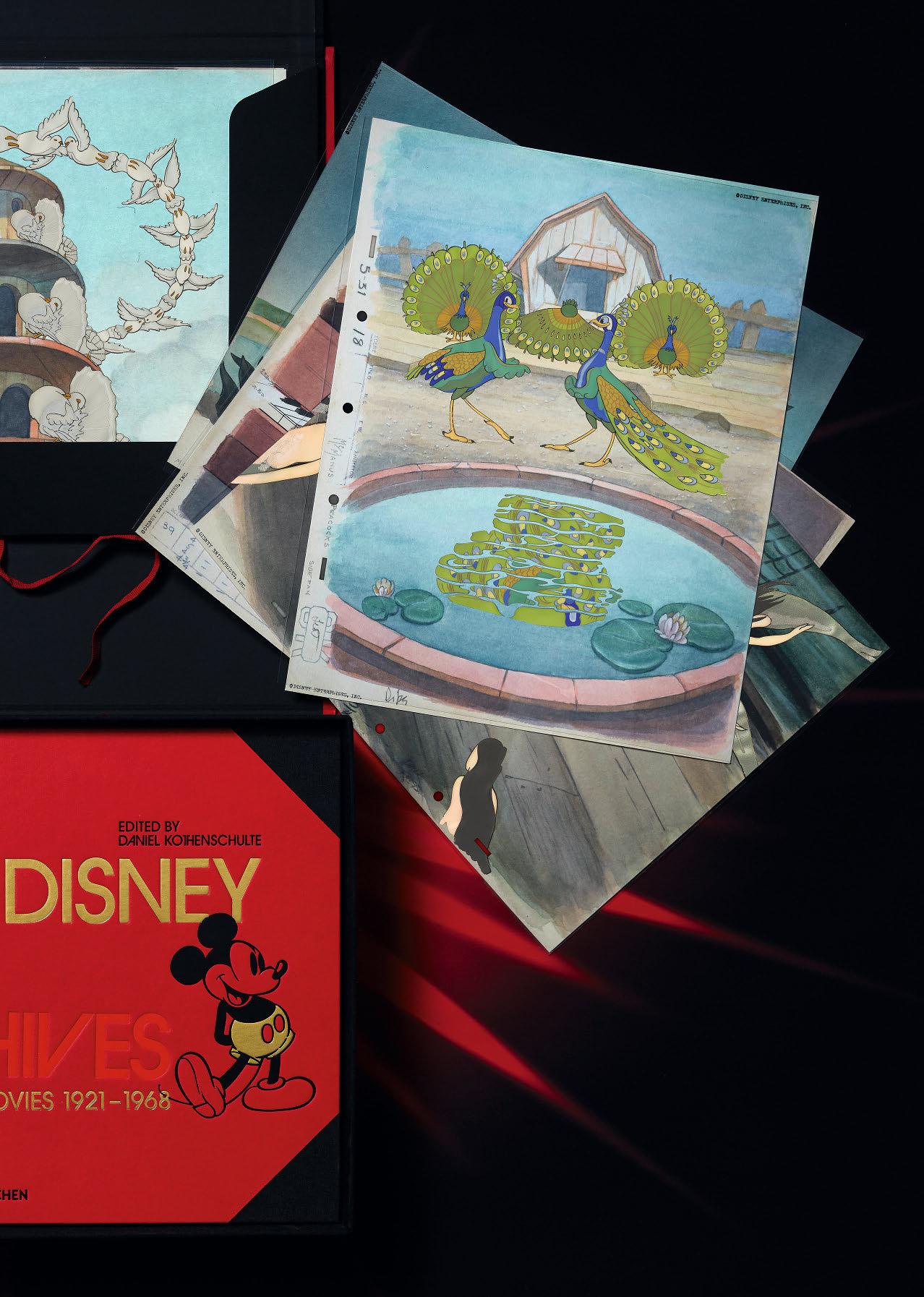
THE WALT DISNEY FILM ARCHIVES. THE ANIMATED MOVIES 1921–1968
Art Edition No. 1–2,500 Hardcover in clamshell box, 620 pages
41.1 × 30 cm (16.2 × 11.8 in.)
With portfolio of 5 cel setups, h 37.6 × w 30 cm (14.8 × 11.8 in.) and h 30 × w 36.3 cm (11.8 × 14.3 in.), and 64-page facsimile of ”The Sorcerer’s Apprentice” storyboard from Fantasia, 30 × 37 cm (11.8 × 14.6 in.)
€/£ 600 / $ 750

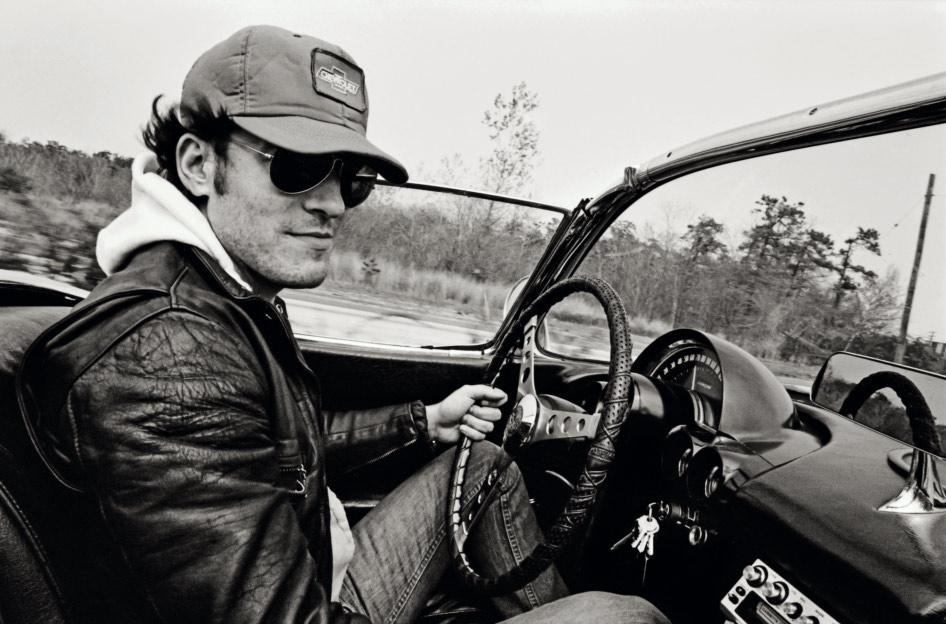
“[Goldsmith] captures The Boss at a pivotal moment in his career…compiling those never-before-seen images into a fascinating new photo book.”

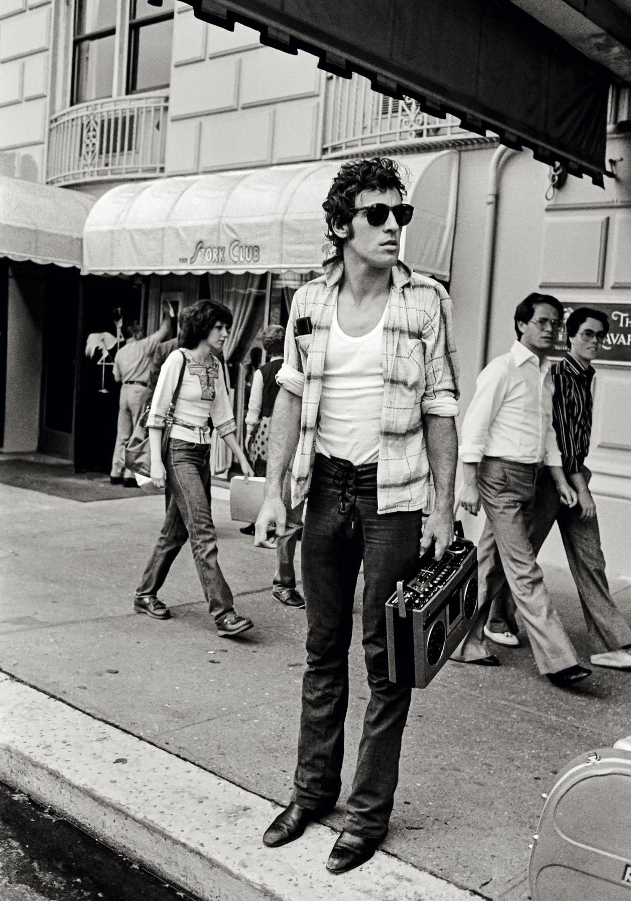
“An intimate peek at the hustle and hungry heart of Springsteen, and his band.”
Opposite: New York, 1978.
Performing with mic stand, 1978.
i WAs FortuNAte to witness some of the writing, recording, album release and tour of Bruce Springsteen and the E Street Band’s Darkness on the Edge of Town.
The people who first realized that Bruce was a poet and spiritual revolutionary were his E Street “band of brothers”: Steven Van Zandt, Clarence Clemons, Max Weinberg, Danny Federici, Roy Bittan, and Garry Tallent. All accepted rigorous requirements and demands placed on their time because they saw Bruce as a powerful, lyrical advocate for those who feel flawed. This did not mean that he too didn’t struggle with his own demons or have episodes of self-doubt. The Boss’s work ethic stimulated each individual’s will, and everyone went all out to do the best he could. It also helped that Bruce could melt ice with his humor.
Darkness was written at a house on Telegraph Hill Road, Holmdel, New Jersey; and in a room at the Navarro Hotel on Central Park South in New York City. Most of the album was recorded at The Record Plant on 44th Street. Bruce broke up the intensity and focus of work sessions with walks or a movie. Visible in some of the photographs here is his bandaged hand which came from hitting a wall in frustration at not being able to manifest in recording what he could hear in his head. Something William Wordsworth said aptly described Bruce: “a poet is someone who is affected more than other men by absent things as if they were present.”
We started doing shoots for publicity purposes shortly before the album was finished. I thought that having studio portraits ready which could be considered for magazine covers would help get the record press. Bruce was clear that he did not want “smiley” photos as they wouldn’t reflect the tone of the album. He knew what he was comfortable wearing. He knew his hair and that it was better to shoot when it was dirty. He let me make some images of him in a studded leather jacket that was mine, but took it off within minutes as it really did not “fit” who he was. I find it hilarious that this jacket is now in the Rock and Roll Hall of Fame as Bruce Springsteen’s—the jacket I wore for 10 years, and was worn by him for less than 10 minutes. Bruce had a following on the East and West Coast, but when the tour came to theaters in the middle of the country, it did not sell out. I remember one show in a hall that held about 300 where an audience
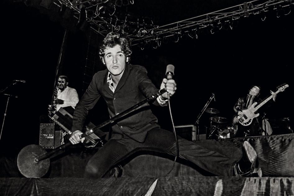
“These photos remain a record of a time when I truly played for my life, night after night.”
Bruce Springsteen
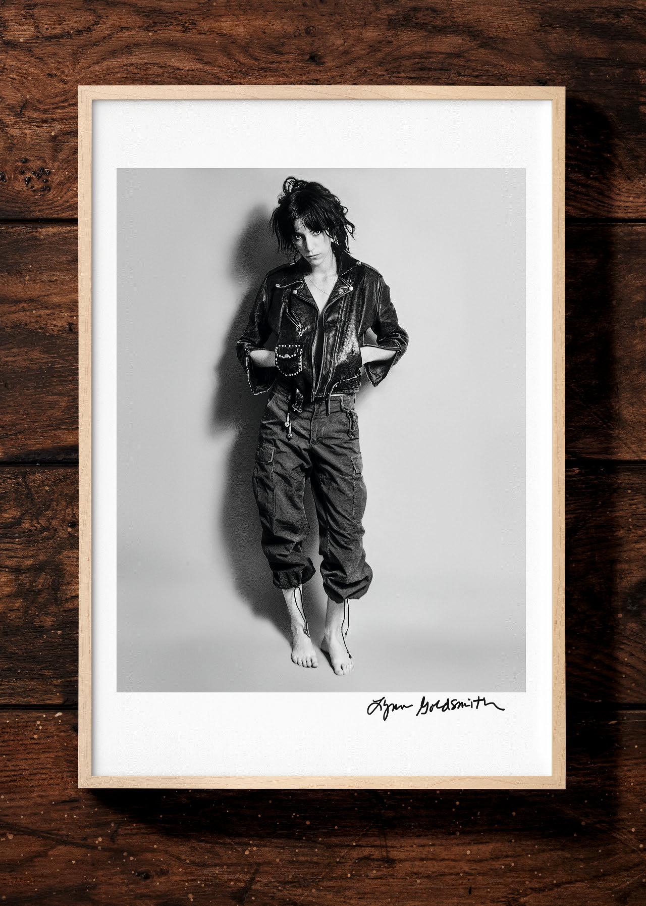
LYNN GOLDSMITH.
BRUCE SPRINGSTEEN & THE E STREET BAND
Collector’s Edition No. 201–1,978
Hardcover in clamshell box, 364 pages 26.9 × 37.3 cm (10.6 × 14.7 in.)
Signed by Lynn Goldsmith €/£ 600 / $ 750
of three people showed up. Springsteen and the E Street Band played for them like it was a sold-out house. They gave everything they had to every performance, no matter how small the venue or number of people in attendance. It was as if their lives depended on it. Sound checks could go on for up to four hours, with Bruce walking every corner of the concert hall to make sure no seat had a blocked view and that the sound would fill the room like blood in their ears, that it would find their pulse. The care and attention which went into what happened on stage every night was made by a man on a mission to provide a vehicle for change—in himself as well as the concertgoers. Bruce threw himself into work with a passion, as if that could save him from the depressions which continued to invade what others thought was a life made of dreams come true.
After the show, after fans had been met and autographs signed, we’d get on the bus and head to the next town. Bruce would listen to the playback of the evening’s performance and go over with the band what could be improved. He’d listen to what he had said to the audience and spend time on the bus writing, perfecting his stories and coming up with performance ideas that enhanced the tales he had to tell. Every show was unique. There was a plan, a set list, but each moment was open for spontaneity. The band of brothers were ready for any musical or physical changes—adding to the ‘play’ Bruce provided by jumping off speakers or running into the crowd. Even the lighting tech had to see his work as an integral part of the experience because nothing was programed; follow spots had to move to where the action was. Everyone had to be ready to propel themselves into the moment to truly rock the hearts of their audience.
Bruce, the band, his team, transformed the crowd into a cult of believers in the power of rock and roll to change lives for the better. When you bought a ticket, it wasn’t just to go to a concert; it was to have a positive life experience. I saw firsthand how Bruce and the E Street Band dedicated their bodies, pulled notes out of the air, left everything on the stage to create a musical performance that suggested the failures and glories of being human. I hope you find these photographs as evidence of that experience.
By Lynn Goldsmith

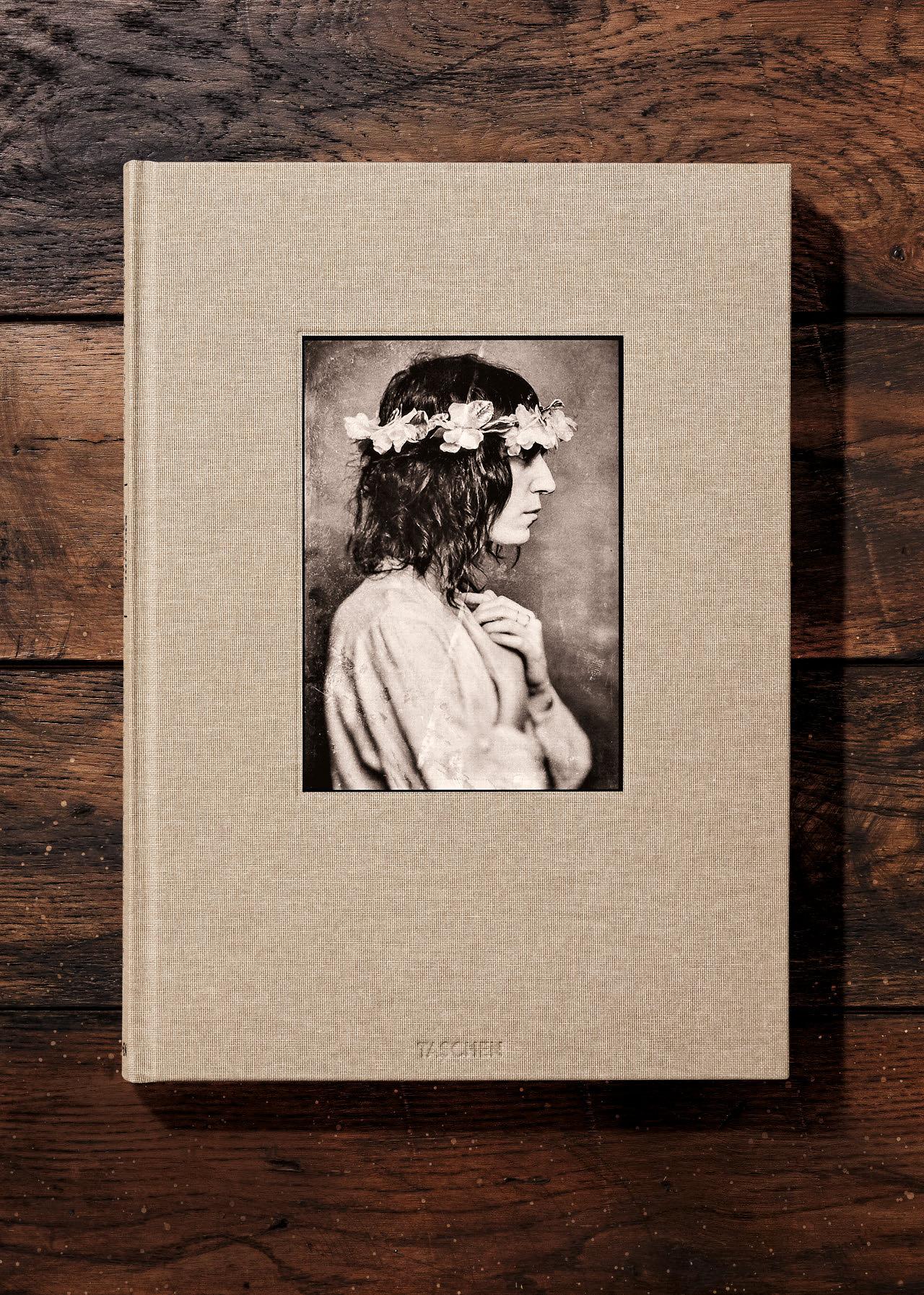
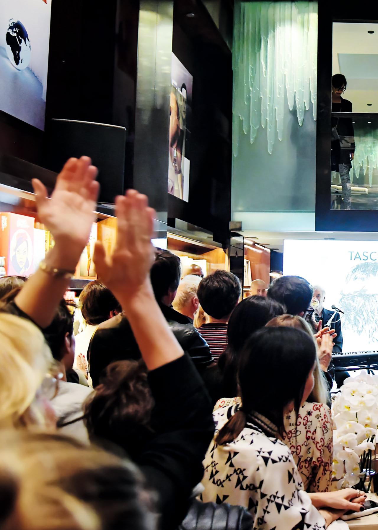
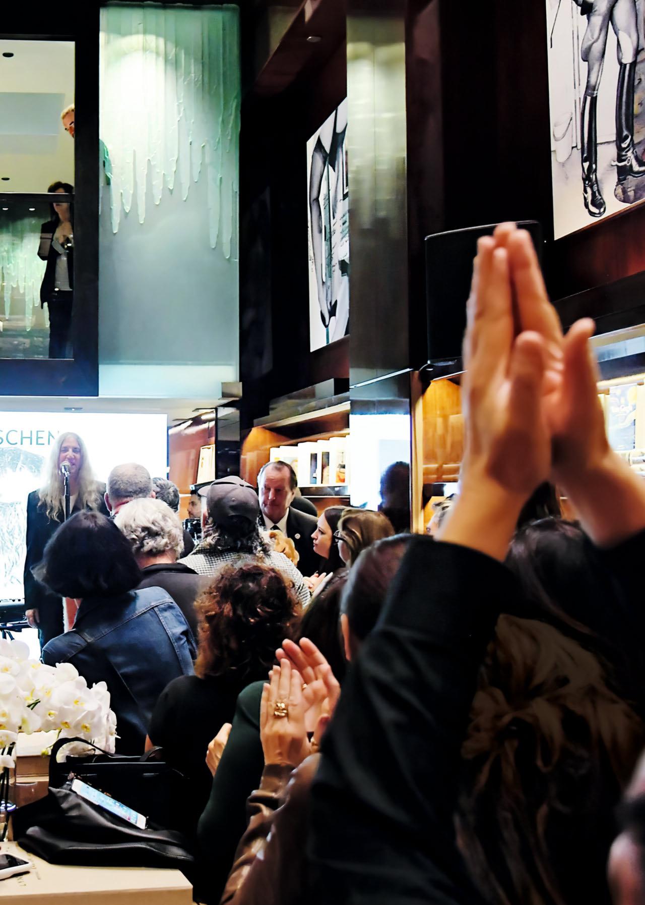
Guests were surprised with a special live performance by Patti Smith at the launch of her book at our store in Beverly Hills in 2019. Joined on stage by her longtime bandmate Tony Shanahan, Smith ended her set with her best-known hit “Because the Night” from the album Easter, referenced in the book title.
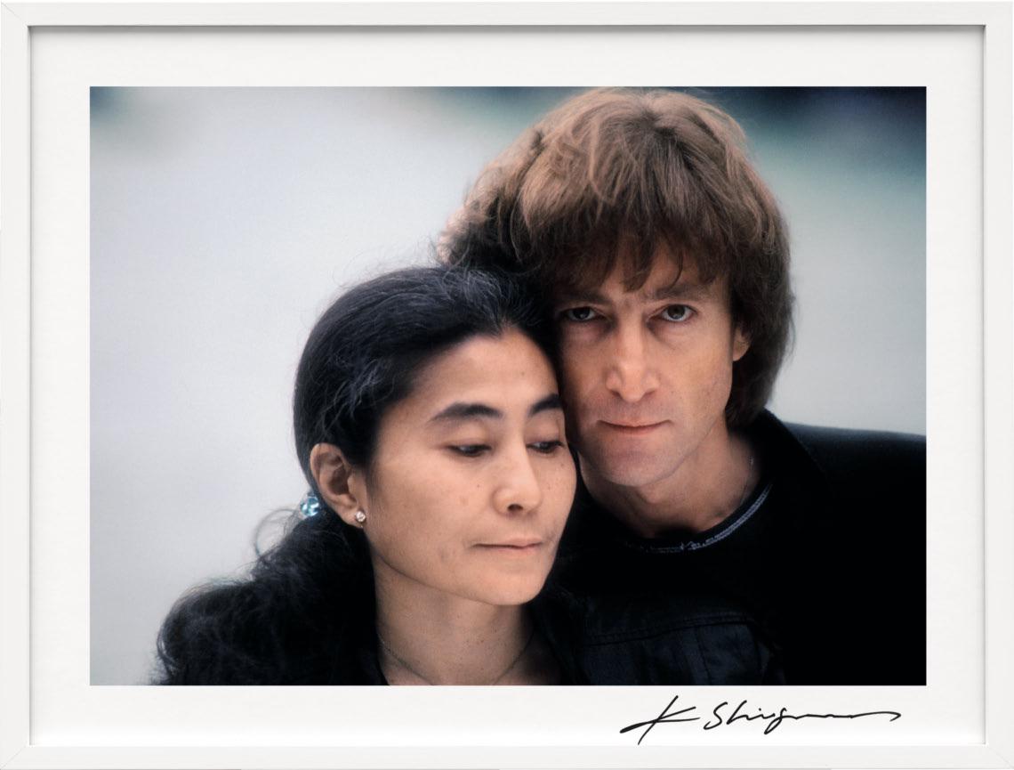
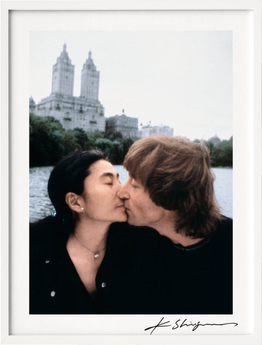
“Shinoyama’s ability to capture Lennon and Ono in a subtle and candid manner provides an intimate glimpse into the couple’s later period in 1980.”

XXL
KISHIN SHINOYAMA.
JOHN LENNON & YOKO ONO.
DOUBLE FANTASY
Collector’s Edition No. 251–1,980
Hardcover in clamshell box, clothbound, 174 pages, 31.2 × 44 cm (12.3 × 17.3 in.)
Signed by Yoko Ono and Kishin Shinoyama
€/£ 750 / $ 850

“…an intimate, in-depth look into the couple’s creative process.”

Edition No. 1–125
€/£ 1,500 / $ 2,000

Edition No. 126–250
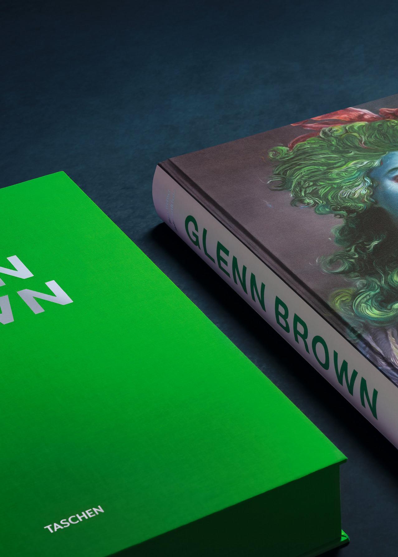
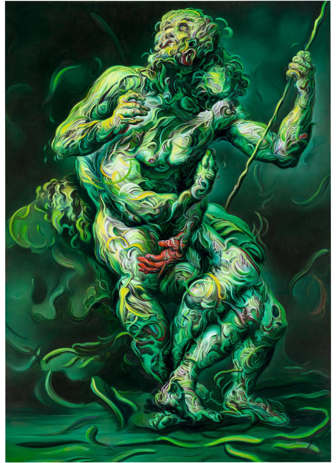
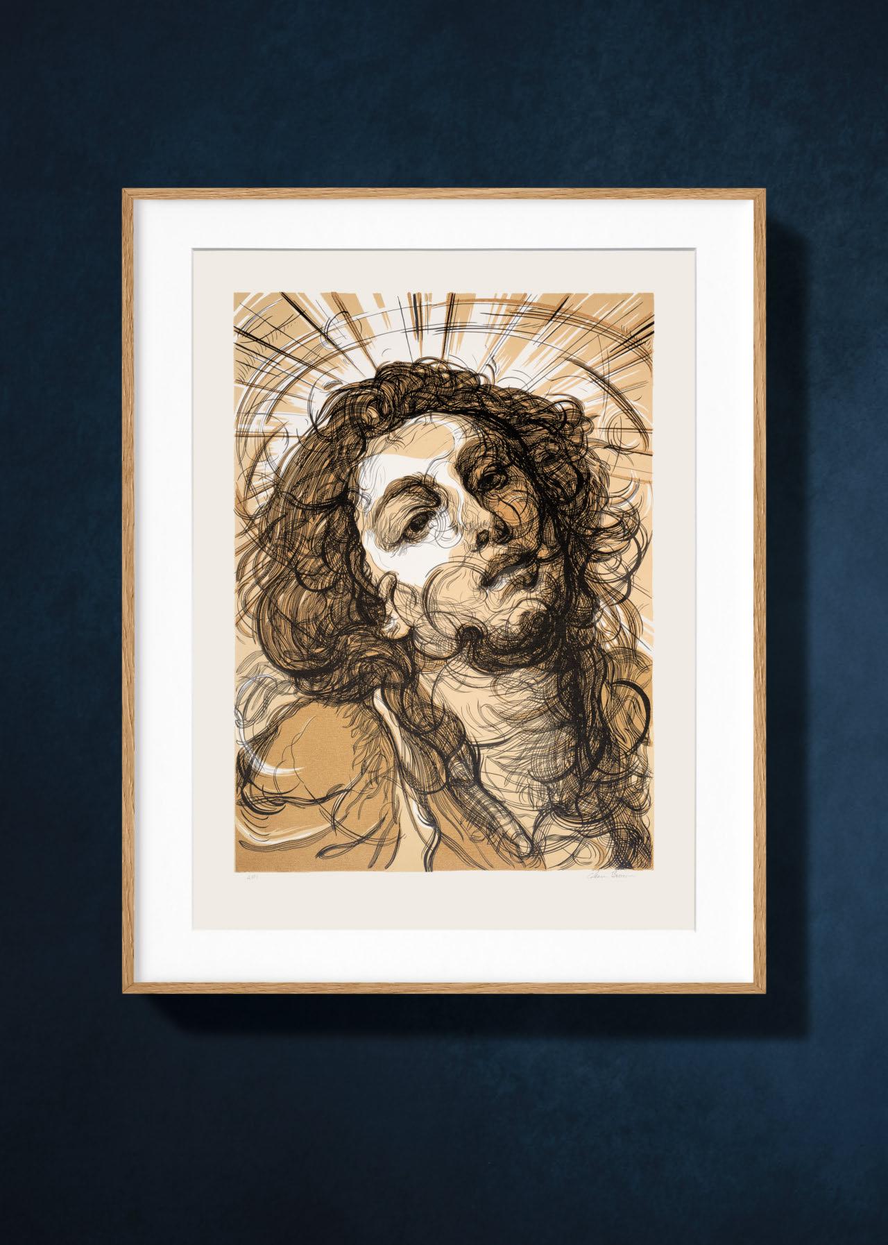
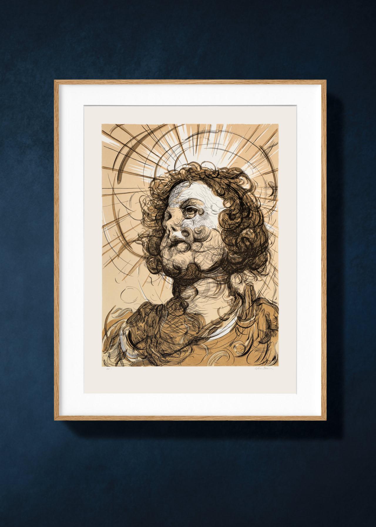
“Paint is the crusty residue left after the relationship between the artist and their model is over. It is all there is left of real love, so I paint that.”
Glenn Brown

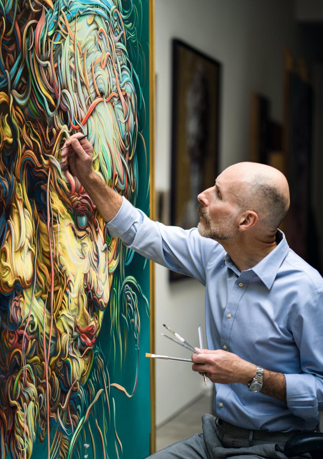
Opposite: Glenn Brown in his studio working on Doggerland, Shoreditch, London, 2023. Photo: Edgar Laguinia.
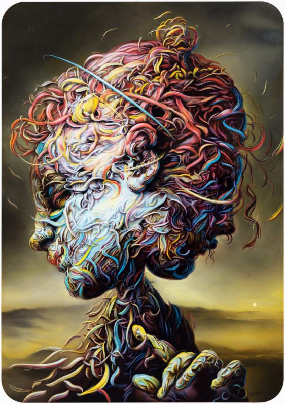
We’ll Keep On Dancing Till We Pay the Rent, 2022. Oil on panel. Photo: Rob McKeever/ Courtesy Gagosian.
gleNN BroWN stANds at the window of his kitchen in Suffolk, absorbed in the task of peeling an orange. Typically dressed in a tweed jacket, cardigan, and silk tie, with a short, trimmed beard, you would be forgiven for mistaking him for a collector or a connoisseur of art, rather than a working painter. There is also something of the prelate, or ascetic about him. You might imagine Brown, later in life, portrayed with the sharp, noble features of a cardinal or monsignor sculpted by Gianlorenzo Bernini.
To meet the Glenn Brown is not to step into one of Brown’s paintings—a Glenn Brown; an often bizarre, topsy-turvy world of unsettling distortions and painstakingly rendered painterly visions. He is not one of those artists who seem, at least on first encounter, inseparable from their work.
Instead, you encounter a middle-aged, tallish, well-dressed and keenly intelligent person: argumentative, yet gentle and considerate in manner. Brown lives with his husband, Edgar Laguinia, who he married in 2018. They are in the habit of restoring period houses—an early Georgian house in Suffolk, and a late Georgian house in Marylebone, London. Brown’s studio near Old Street in London, by contrast, is a large modern building with raw concrete brutalist pillars in the basement and a Corian kitchen island that doubles as a worktable. A black Joe Colombo plastic trolley serves for his painting materials, and a simple office chair on wheels enables him to glide from painting to painting as he works. He uses very little paint in his paintings, and saves Bonne Maman jam tops for his paints, bottle caps for his turpentine. He keeps late hours, painting into early in the morning listening to Radio 4, Gilles Peterson, Montserrat Caballé, David Bowie and a changing supply of obscure young bands.
Never knowingly in a hurry (although artists are often good at concealing hard work, Brown in particular), he is always willing to discuss his paintings and sculptures, as well as those of other artists—often after a benign pause, in which, like a Buddhist monk, he
seems to wait in case the answer would emerge of its own accord, or that you might like to answer the question yourself…
The connection between the Glenn Brown and a Glenn Brown, between the artist and his art, might at first be difficult, impossible even, to fathom. The artist has said: “The paintings make me, as much as I make the paintings.” This dialogue between art and artist—arm’slength, and yet mutually formative—mirrors the dialogue his paintings stage between past and present. You are just as likely to encounter Brown’s paintings in a traditional museum of historical art as in a contemporary white box. And yet he is hardly an anachronism—his paintings reflect the latest technology, and are utterly devoid, as is Brown himself, of nostalgia. In any age Brown would have been a painter of modern life.
We are standing in an exhibition of Abstract Expressionism at the Royal Academy, looking at a painting by Clyfford Still. He is a great painter, I am arguing. Brown is giving me a long, blank look. The same happens in front of Barnett Newman. We arrive at one of Willem de Kooning’s Women paintings, and Brown says that the violence is the best part of the image. “I do have to pick you up on that,” interjects a passing woman. It was the violence of the brushstroke, Brown quickly replies, rather than the implied violence towards women. And yet, as he says later, the woman was entirely right—the two are linked. The “abstraction” of the Abstract Expressionists is the best part of their work—the subject matter and the claim to spirituality, the numinous, “oceanic” feeling of their painting is, he says, simply not very convincing.
It is telling that the artists Brown decided to appropriate might well have agreed. Even Frank Auerbach, despite his seriousness and the long labor of making a work, seems to hold something in reserve and establish an intellectual distance between himself and the painting, and the painting and the sitter. Rather than an artist or example to criticize, Auerbach is for Brown a kindred spirit—someone who thinks constantly about the task of painting, as well as being absorbed in the technical challenges of making a work of art.

This might be what sets Brown aside from others who appropriate the past, out of a spirit of criticism, or disavowal. Brown’s relationship to the past art he appropriates is not cynical; it is based as much on belief as the copyists of past times, who worked in the museums that were established for their training as artists. Like those copyists, and all other artists who looked to the past for inspiration (for in truth “appropriation” is the way art has always been made—the 1980s simply came up with a new word and value for it), Brown is concerned directly with how images work—how they hold our attention, and change (if ever so slightly) our minds. It is hands-on art history…
In the library of a great English house, in front of a roaring fire, we are looking through drawings in albums and stored in boxes. Brown is looking carefully at a Rembrandt drawing, leaning so close that I worry his pocket handkerchief might touch the surface. After a short while he talks about how Rembrandt and other great draftsmen knew how to draw your eye to the most important part of the image by not giving you enough information, creating a sort of vagueness to excite your curiosity. It was a deliberate vagueness, Brown later says, a consciousness of the sort of tricks that an artist might deploy to direct the viewer’s attention in a certain way.
This openness to the past is mirrored by the degree to which his own work is open to interpretation, rather than being in any way didactic, or political, or telling you what to think. It is as if the paintings themselves, like their maker, are pausing to listen to your inquiring gaze, giving you a moment to order your thoughts before revealing more of themselves. The often spectacular titles of his paintings are the best evidence of this—they focus attention, rather than direct it towards a particular meaning.
Glenn Brown would be the last person to tell you what his art is actually “about.” And the more you look at and appreciate the depth of his interest in the history of painting, and the boldness and technical brilliance of his appropriations—done with a sort of strutting panache, an 18th-century rock ’n’ roll—the more you see the connections between the Glenn Brown and a Glenn Brown, the more they become one.
“It is as if the paintings are pausing to listen to your inquiring gaze, giving you a moment to order your thoughts before revealing more of themselves.”
John-Paul Stonard
Searched Hard for You and Your Special Ways, 1995. Oil on canvas mounted on
board.
Opposite: Bring On the Headless Horses, 2020. Oil and acrylic on panel. Photo: def image/Courtesy Galerie Max Hetzler.
€/£ 2,500 / $ 2,750
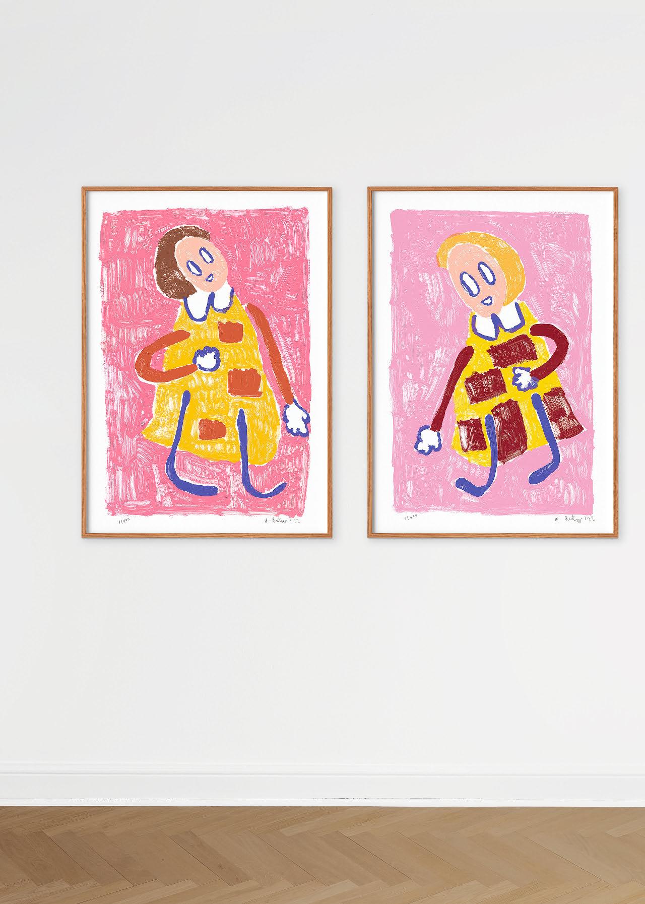
Edition of 100 each
Six-color screen print on handmade Somerset cotton paper (300 gsm), h 100 × w 70 cm (39.4 × 27.6 in.)
Numbered, signed, and dated by André Butzer
€/£/$ 5,000
Also available as a set of all four screen prints:
Untitled I–IV, 2022
Edition of 100 per print
€/£/$ 18,000

“Titian said painting is about flesh and water, and I say it is about flesh and lemonade.”
André Butzer
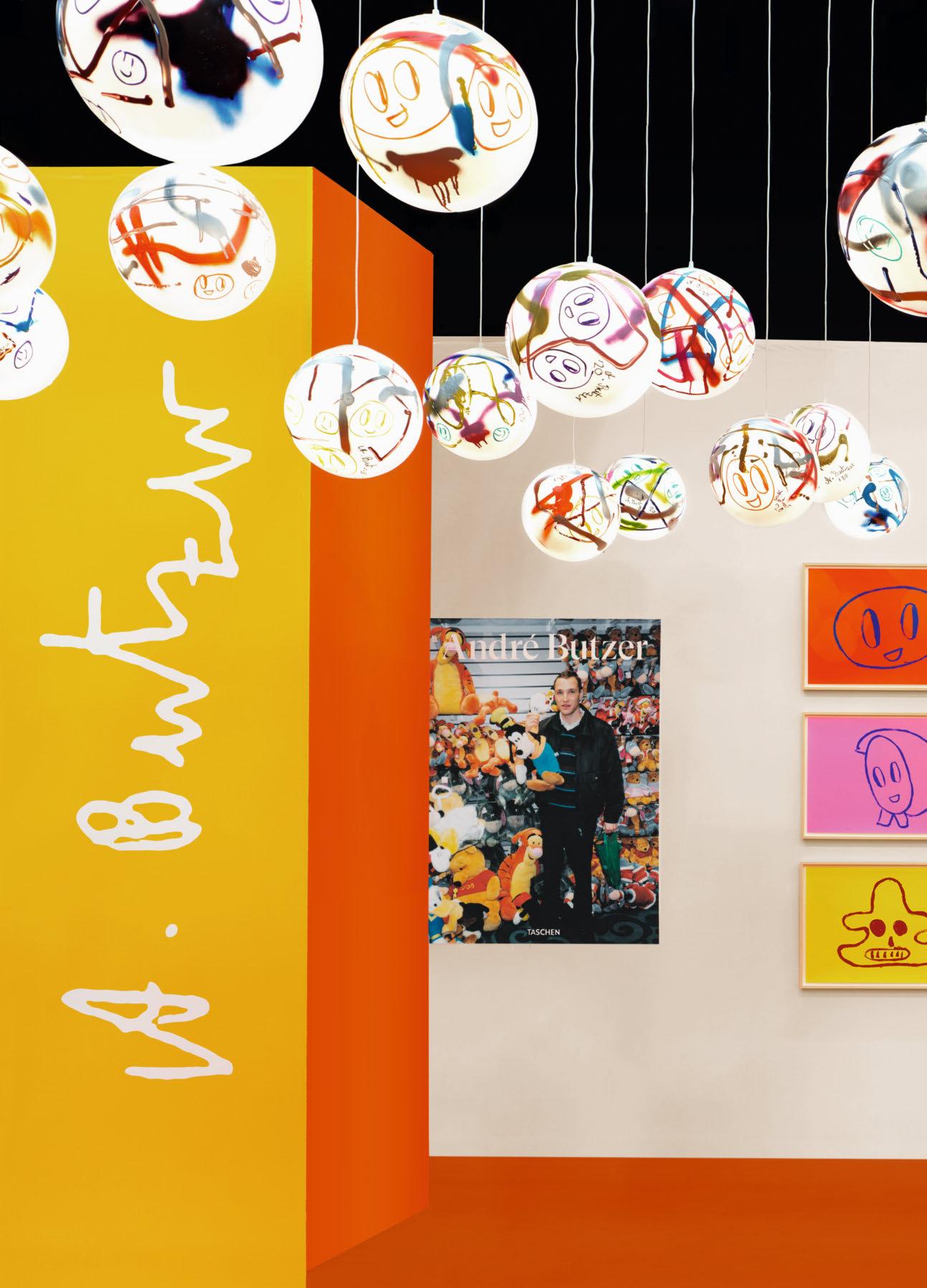
1–3, 2021 €/£ 7,500 / $ 9,000 SOLD OUT
4–6, 2021 €/£ 6,000 / $ 8,000

Edition of 75 each Set of three two-color screen prints on handmade Hahnemühle paper (300 gsm), each h 50 × w 70 cm (19.7 × 27.6 in.)
Numbered and signed by André Butzer
Art Editions No. 1–100 (Pendant Light, above) and 1–25 (Overpainted Cover, right, not fully pictured) are sold out.
7–9, 2021 €/£ 6,000 / $ 8,000
“I know the book is going to last 100 years, at least.”
David Hockney

DAVID HOCKNEY. A BIGGER BOOK
Collector’s Edition No. 1,001–10,000
Hardcover, 498 pages
50 × 70 cm (19.7 × 27.6 in.)
With a 680-page chronology book and an adjustable bookstand designed by Marc Newson
Signed by David Hockney
€/£ 4,500 / $ 5,500
Art Editions No. 1–1,000 are sold out.


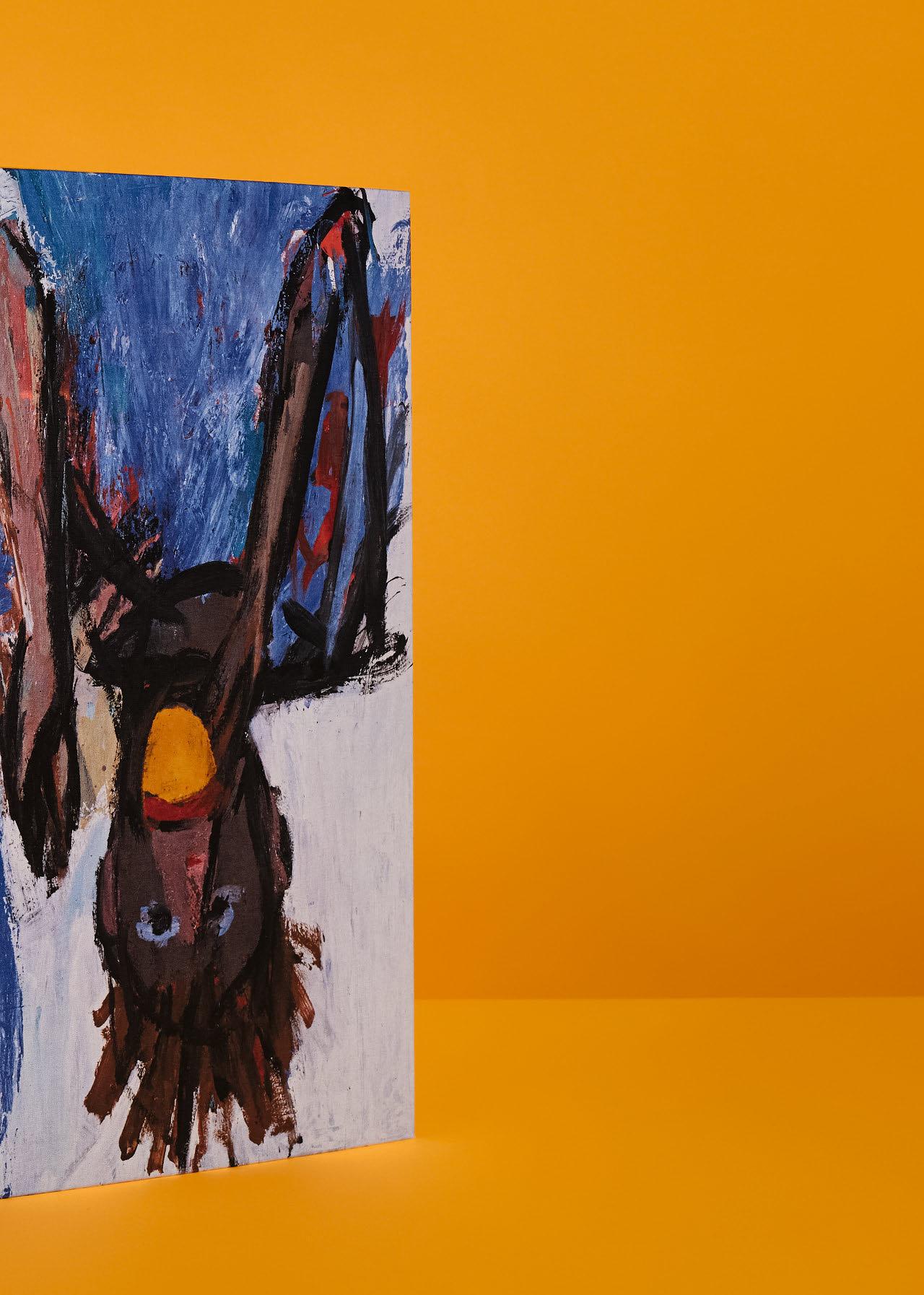
“An overview in which the art of Georg Baselitz is portrayed more emphatically and in greater detail than ever before.”
Designers Digest
XXL
GEORG BASELITZ
Collector’s Edition No. 126–1,125
Hardcover in clamshell box, 604 pages
33 × 44 cm (13 × 17.3 in.)
Numbered and signed by Georg Baselitz
€/£ 1,500 / $ 1,750
Art Editions No. 1–125 are sold out.
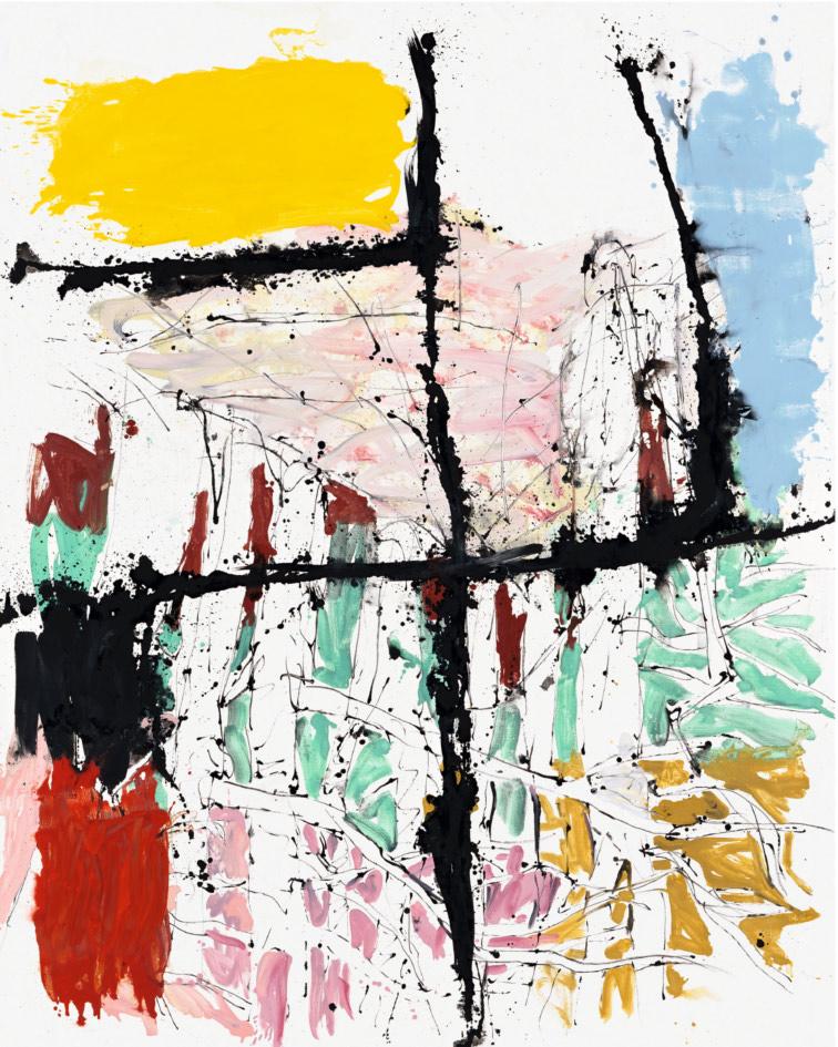
Sandteichdamm etwas heller, 2008. Oil on canvas.
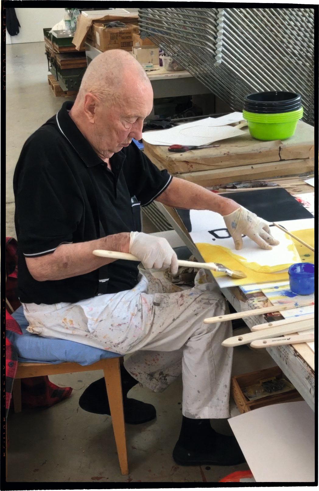
Opposite: Georg Baselitz painting one of 25 covers for an Art Edition of his TASCHEN book, 2022. This Art Edition is sold out.
“I always want to present people with something crazy— that’s certainly my intention. I don’t want to keep still.”
Georg Baselitz
ProverBiAlly kNoWN For the audaciously simple but game-changing strategy of painting the motif on its head, Georg Baselitz has been a consistently challenging artist since the start of the 1960s. His work is always highly charged but surprisingly diverse, beginning with the existential figures of paintings such as The Big Night Down the Drain, famously removed from his first solo exhibition for indecency, and the series of “Heroes” that portrayed disabled and exposed figures in a destroyed landscape. More and more, the picture space itself became fractured, and by the end of the decade the artist fully turned the world upside down: trees, factories, eagles, or nude self-portraits actually painted on their heads. This allowed him to freely paint and to engage with conceptual color schemes or off-beat themes, such as men eating oranges, memories of Soviet propaganda paintings, or more recently so-called remixes in a reengagement with his own earlier work as a dialogue in time. Already a master of drawing, woodcut, and engraving, from 1980 on Baselitz also created rough sculptures
hewn from wood with axe and chainsaw, then adding bronze to his materials in the late 2000s.
This oversize and most in-depth monograph on the artist’s oeuvre features large-format reproductions of more than 400 works in all media plus installation shots and portraits along with texts that approach the subject from different perspectives: a portrait of the artist and his dark sense of humor by long-time connoisseur Richard Shiff, an essay on his formation and development as a painter by critic Jonathan Jones, on the sculptural work from his scandalous success at the Venice Biennale 1980 by art historian and curator Eva Mongi-Vollmer, on his artistic strategies by art historian and curator Carla Schulz-Hoffmann, a collection of small literary texts relating to the artist’s use of myth and history by author and director Alexander Kluge, and a studio conversation with the art journalist Cornelius Tittel. Statements from the artist through the years and an illustrated biography complete this unprecedented survey of Georg Baselitz’s work.
JULIAN SCHNABEL
Art Edition
Hardcover, 572 pages
25 × 33.4 cm (9.8 × 13.1 in.), accompanied by a set of three skateboards, printed, individually skated, hand painted, and signed by the artist, each 80 × 61 × 6.4 cm (31.5 × 24 × 2.5 in.)
€/£ 3,500 / $ 4,000
Four Art Editions available, each with 75 sets:
Blind Girl/Cadmium Red, 2023
Blind Girl/Deep Cobalt Violet, 2023
Blind Girl/Lemon Yellow, 2023
Blind Girl/Lido Blue, 2023
Julian Schnabel makeS art out of life, finding his materials in the fabric of the everyday. He uses broken plates as an improbable picture ground; he paints on velvet, market stall covers, army tarps, kabuki theater backdrops, and boxing ring floors, found surfaces that lend their own rich history to the artist’s exploration. A figurehead for the return of painting after his overnight success with a first New York solo show in 1979, he has since worked in a wide variety of media: making sculptures that transpose his pictorial forms into space as raw, seemingly time-worn artifacts; directing award-winning movies that paint portraits of artists and other subtly heroic figures; and even building his own dream of a Venetian palace in New York.
“I want my life to be in my work, crushed into my painting like a pressed car. If it’s not, my work is just some stuff,” Schnabel has said, and this urgency permeates his œuvre, no matter what means or media the artist chooses.
The Julian Schnabel monograph, created in close collaboration with the artist, shows his work in all media—paintings, sculptures, films. Texts have been contributed by his friends and collaborators, including Laurie Anderson, Éric de Chassey, Bonnie Clearwater, Max Hollein, Donatien Grau, and Daniel Kehlmann.
For this limited and numbered Art Edition of 75 copies, Schnabel has added an exhilarating new layer to one of his most monumental bodies of work, the Big Girl/Blind Girl series from 2001: transposing the paintings onto a triptych of skateboards. Each of these three-board sets, which come with the monograph, is printed, individually skated, hand painted, and signed by Julian Schnabel.
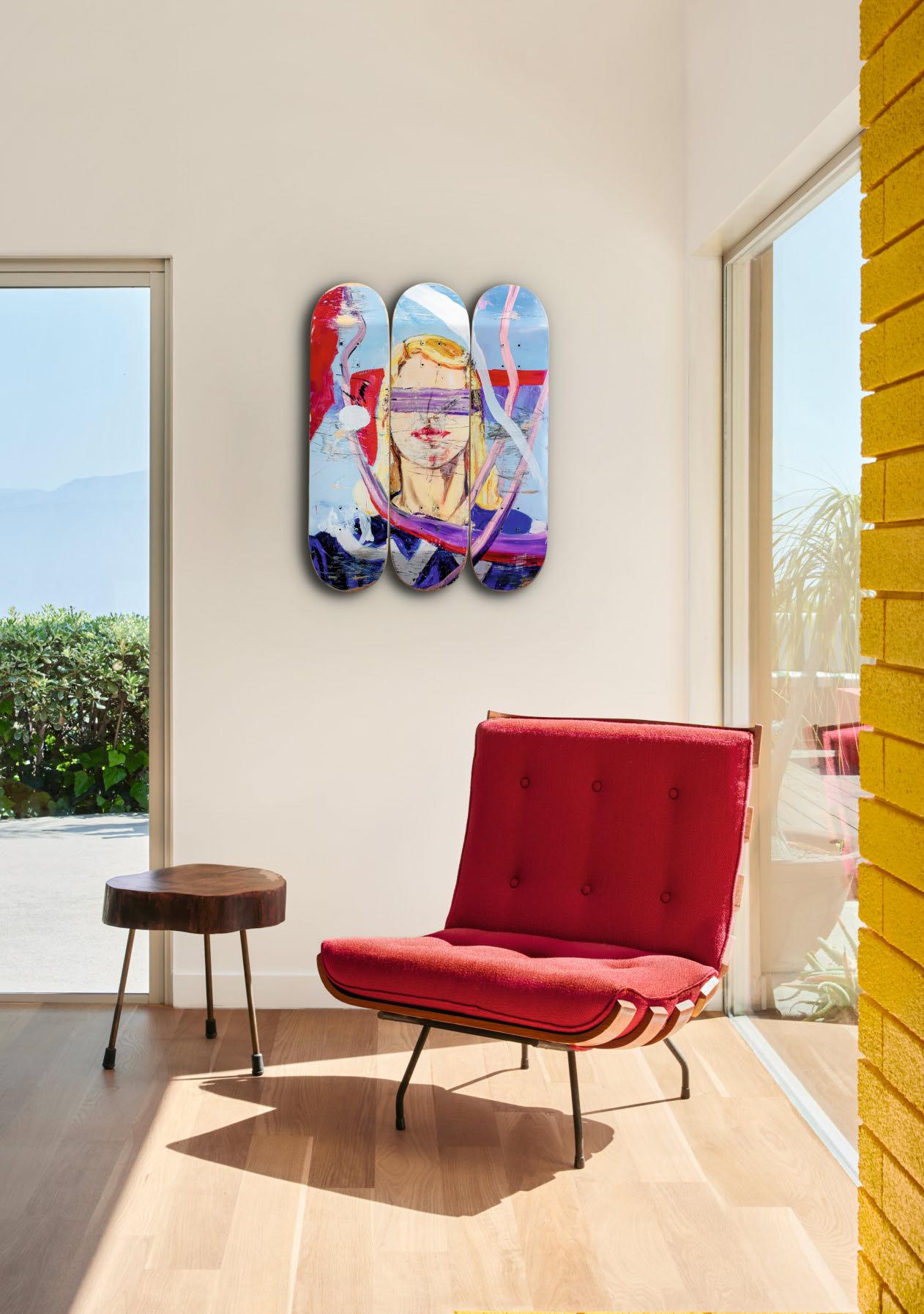
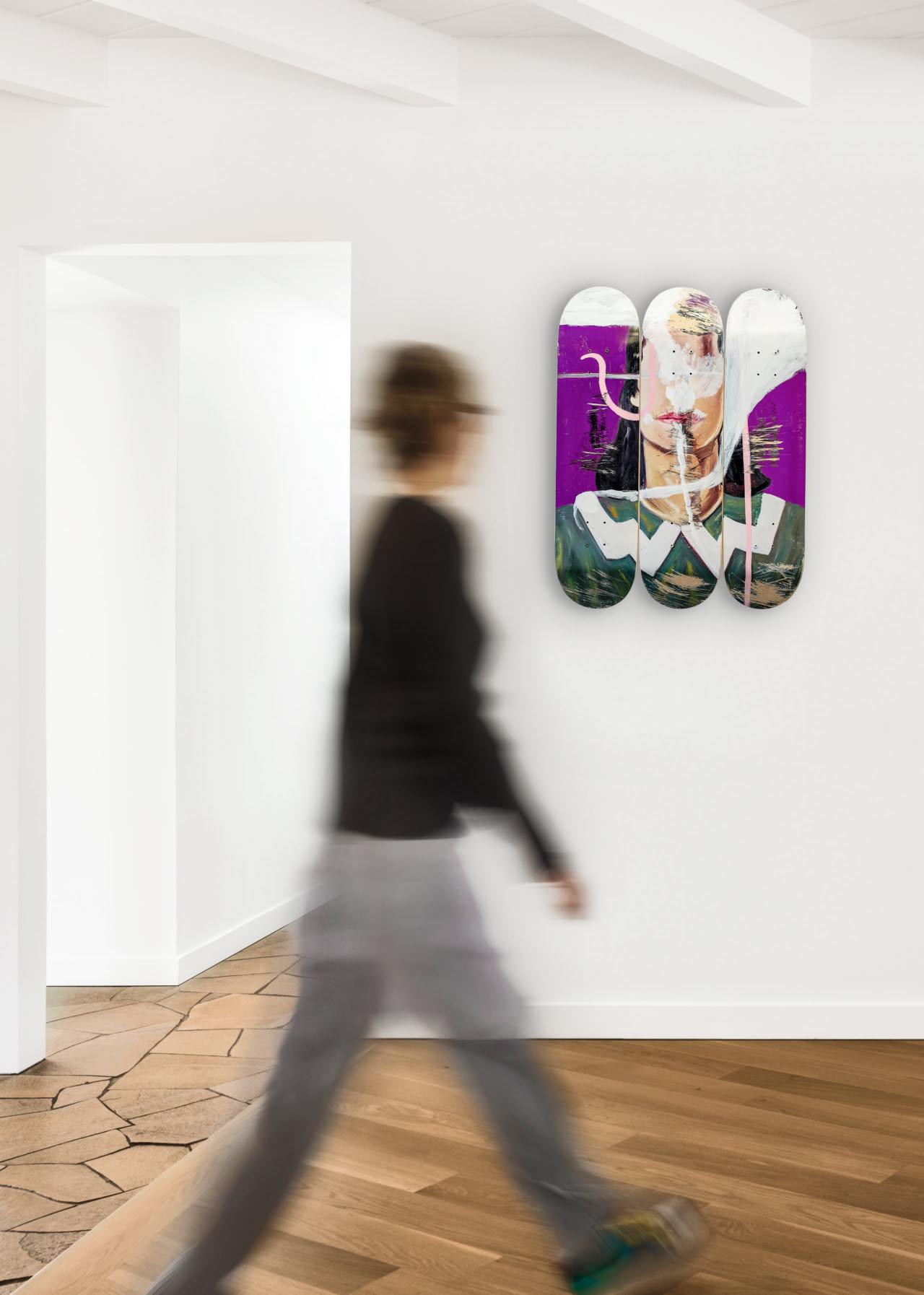
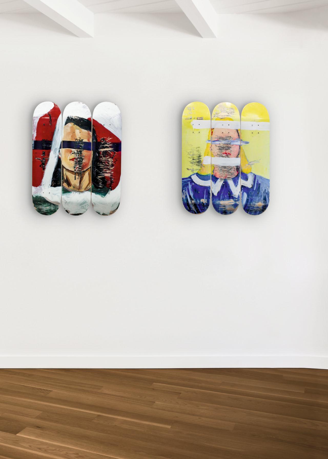
“The approach and application of the printing is what distinguishes a print from all other prints and speaks to the history of printmaking, making a mark or inter vention on a preexisting image changes its meaning. In pursuit of that, and for the love of skateboarding and the freedom it represents, skating an image is a way to commandeer painting and printmaking with the physical disruption that is another form of automatic drawing. The results preserve the surprise of the accident.”
Julian Schnabel

Kevin McCoy
Quantum, 05-02-2014 21:27:34
Processing, GIF
Namecoin, N2nunKeYiYeqDCunDzJ3EQQh1fbAawegPW
© Courtesy of Kevin McCoy
In the long timeline of art, there are a small community of works that serve as genesis blocks to their own chain of art history. They become historical forks in cultural direction; forks that usher in new movements which, block by block, mint by mint, establish new art histories. Often unknown at the time, these works close chapters on the art histories that came before, while anchoring a new flourishing of artistic creativity. They occupy an important position: they came first. Pulsing with color, a raw beacon to a new era, Kevin McCoy’s Quantum (2014) is such a work. Minted by the artist on May 2, 2014 21:27:34—or more precisely, Namecoin Block 174923—the idea of NFT art quietly dawned. What a noise it makes today.
Beyond its status as one of the earliest of these records, Quantum’s aesthetics, its medium, and its creator provide us a lens through which to analyze and lay out not just the early history of NFTs and their prehistory, but also a deeper understanding of what NFTs are. As with the genesis of any idea or movement, one can also read into it the longer history of this act of creation. What drove McCoy to transition his long-standing digital practice onto the blockchain? Why was an artist whose work sits in the collections of the MoMA and the Metropolitan Museum of Art exploring an obscure and highly disruptive technology more popularly associated at the time with darknet marketplaces? The conclusions offered will reflect on the nature of NFTs, practically and theoretically, and how the early history of this still-fractured movement provided the conceptual and literal framework for one of art history’s profound technological breakthroughs.
Aur A, CommerCe, And dIgItAl Art
The answer lies in Kevin and Jennifer McCoy’s (his collaborator and wife) medium of expression: the pixel. They are digital artists, creative hackers who were early explorers of computers, code, and the new compositions and criticisms these systems could create. Digital art around the turn of the 21st century occupied an anxious position within the dual arenas of art: the public and the private. While it was respected curatorially in public institutions, in the private spheres of commerce, digital art lay victim to its very nature. Both immaterial and infinitely replicable, only major institutions and the most adventurous of collectors collected digital art. Digital artists and creators were the outcasts of the art market; simply put, they were not getting paid.
Why was this? In his well-known essay of 1935, Frankfurt School thinker Walter Benjamin (1892–1940) addressed the loss of the “aura” of original artworks in the era of mechanical reproduction. Writing on the advent of photography and film, his work foregrounded the development of a tiered system in which reproducible images or media were not deemed to have the same aura of authenticity, or inherent cult value, as unique works of art. The rise of the internet, in which the very idea of the original was lost among “a universal fungibility of things” (to take the words of Benjamin’s contemporary Theodor Adorno [1903–1969]), further complicated the question of whether digital art ever held the aura of originality. It is a blockchain’s base characteristics, its ability to make an immaterial work of d igital art provably ownable and therefore communally (and artificially) scarce, that reinjects this promise of aura in the fabric of the digital object. As critics such as Brian L. Frye and Adam Geczy

have argued, blockchain technology reshrouds digital artworks in a new kind of aura: the aura of ownership or clout. Before minting Quantum and his two following NFTs, Cars (2014) and Primordial Loop (2014) at the Seven on Seven Conference, McCoy realized this, in what he calls “the fundamental shift that Bitcoin creates”: the “magic alchemy” by which “everything is open-source and transparent […] and yet there is still undeniably this idea of specific ownership.” This combination of the public (democratic) and private (economic) lives of a digital artwork solves for the Web 1.0 utopian goals of free circulation of images and culture, while Web3 now reestablishes the individual (in this case, the digital artist) as the locus of economic centrality. Digital artwork can now be shared and owned at the same time. While Benjamin saw an artwork’s reproducibility as the loss of the aura of the original, the “exhibition value,” to use Benjamin’s term, or virality of NFTs within contemporary media in fact works to install greater aura around the original. Retweets are
consensus, likes are confidence. Clout is attention. And yet this is no panacea, for the aura of d igital art is now challenged not by the virality of reproduction, but by the intimacy of price.
The birth of NFTs came out of a century of exploration and experimentation regarding how an (increasingly dematerialized) artwork can be owned and exchanged: the central question that drove McCoy to develop his “monetized graphics.” The blockchain made possible a process that artists of all mediums have been attempting to implement for decades: one in which the provenance of even the most immaterial conceptual and digital works could be traced and verified, and the sales of future works controlled.
The importance of ownership and trade in art have historically been encapsulated in several important conceptual artworks predating the blockchain. In 1924, Marcel Duchamp (1887–1968) played with the nature of certification as art in his Monte Carlo Bonds, which took the form of a legal document entitling owners to collect shares in the
artist’s gambling enterprise. Subject to further study in the chapter “On Chain,” Yves Klein’s (1928–1962) Zone of Immaterial Pictorial Sensibility (1959) pushed this relationship into the arena of the absurd, asking collectors to buy a portion of empty gallery space in exchange for gold. They would in turn receive a “receipt” (a check) for the work. In 2017, the work would be re-created on the blockchain by Mitchell F. Chan, making it one of the earliest NFT works. In the 1960s, as the art object further dematerialized, artists focused less on Duchampian gesture and more towards the practicalities of ownership. Sol LeWitt (1928–2007) and Lawrence Weiner (1924–2021) worked to devise certificates of authenticity to verify the ownership of their increasingly immaterial works. Even as recently as 2011, Rafaël Rozendaal devised an art website sales contract, loosely inspired by the iconic dealer Seth Siegelaub (1941–2013), to formalize his practice of selling web-based artworks as registered domain names. One of the key promoters of conceptual art in the 1970s, Siegelaub devised his Artist’s Reserved Rights Transfer and Sale Agreement in 1971, with the help of lawyer Robert Projansky. According to the agreement, artists would receive a percentage of profits from future sales of their works. The paper, which predated NFTs by over 40 years, would become a conceptual and historical touchstone for artists’ fight to ensure their equity; its practical legacy remains much harder to ascertain.
These attempts to verify the ownership of conceptual artworks and safeguard the economic interests of artists were important predecessors to the technological innovations of art on the blockchain. The amalgamation of the d igital art object and the certificate of authenticity into one singular crypto token alleviated the issues of catalog records being lost (or falsified) and the secluded backrooms of the international art market paying little attention to royalties. Using smart contracts—the automatically executed agreements embedded in non-fungible tokens—this entire process becomes exponentially
more secure and largely permissionless. With each m int, catalogues raisonnés are being immutably built in real time. Authenticity certificates are only lost if the artwork itself is lost: on the blockchain, they are firmly bound together. Today, NFTs have hard-coded into their smart contracts the creator’s explicit wishes, including royalties from all future sales of their NFTs, a practice much harder to enforce in the non-NFT art market.
Up to October 2022, over $1.8 billion in royalties have been paid out to NFT creators on-chain. And while 80% of resale revenues are made by just 482 artists or projects, the long tail of the distribution curve is also very meaningful to many working artists. To understand the long-term economic import of NFTs for an artist, one can look at the case of Warhol’s secondary market. Through publicly available data one can estimate that if Warhol were an NFT artist with a 10% NFT royalty then the annual revenue for his foundation would rise from $20.8 million to $90.6 million—with no extra costs. The issue though is that “royalties aren’t a primitive that inherits the same onchain permanence,” as many in and outside the NFT space believe. For clarity, it must be understood that blockchain-based royalties are not currently enforceable at the smart contract level and only across a platform that facilitates them. Tyler Hobbs’s QQL (2022) was the first major NFT project to prevent transacting on 0% royalty fee marketplaces at the smart-contract level, showcasing that artists also have the power and ability to program their NFTs to only be transacted on royalty-paying marketplaces. Throughout 2023, an ideological and capitalist battle has waged as platforms compete for market share, showing how expendable NFT royalties can ultimately be. This being said, as the social consensus around royalties crystallized within NFT art communities, time and again artists have mobilized to protect these rights. For a new generation of digitally native artists, struggling with high-rent costs, less physical space to create, and an increasing
Opposite: Beeple
Everydays: The First 5000 Days, 02-16-2021 05:58:01
Cinema 4D, Octane Render, Adobe Photoshop, Ethereum, 0x2a46f2ffd99e19a89476e2f62270e0a35bbf0756, 40913
Courtesy of Mike Winkelmann
Refik Anadol
Machine Hallucinations: Coral Dreams 11-29-2021, 22:57:11
AI Data Paintings, Sculptures Algorand, GG3CTXNG6G7AQ45SQC B5SSAXG5HUTVH3TPLWWAPDVDD5Y46E 4TQ2NQI4RI, 447756598
Courtesy of Refik Anadol
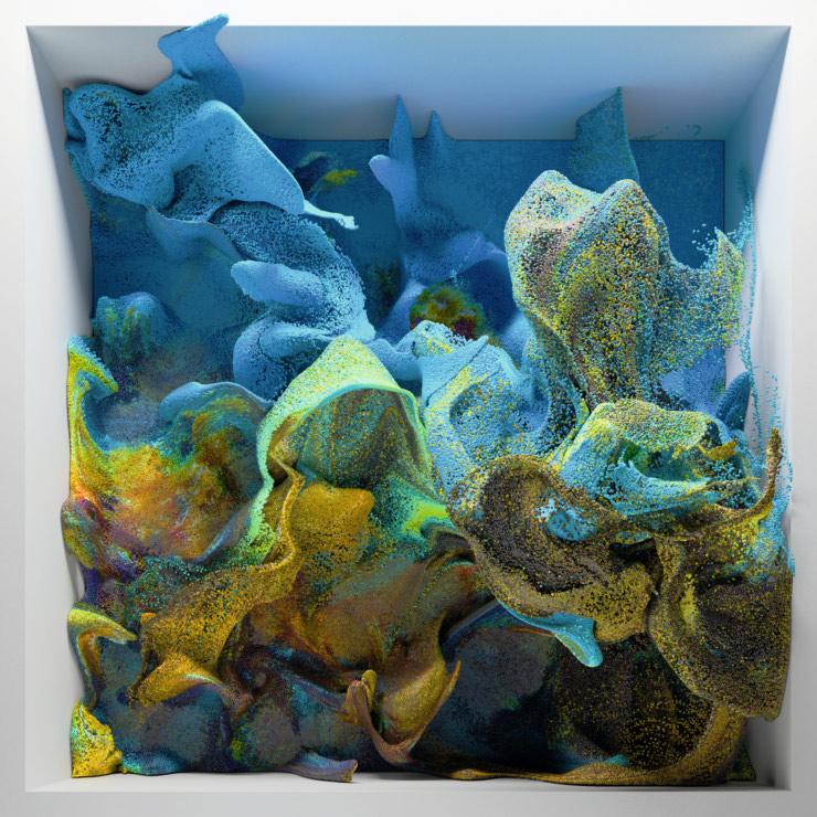
“This book is the first major survey publication on blockchainbased art and the wider on-chain cultural ecosystem.”
Robert
Alice
portion of their cultural life shaped online, the long-term art-historical and financial incentives (though not without their challenges) baked into creative digital production are just starting to be understood.
mIntIng Quantum
At the arts organization Rhizome’s annual Seven on Seven conference in New York in 2014, McCoy and his collaborator, the technologist Anil Dash, demonstrated the system they had created, called Monegraph, for registering digital artworks on an early blockchain called Namecoin—the first prototype for what NFTs would become. Like many instances in the early history of NFTs, the room bristled with a mixture of skepticism, misunderstanding, and genuine excitement. During the presentation, the pair minted Primordial Loop, which Dash purchased for the few dollars he had in his pocket. Quantum, along with a second work, Cars, had been minted the evening before. It was a GIF McCoy had made using the coding language Processing and selected from his archive as a test before the demonstration during the actual conference.
It is crucial to recognize that the first public demonstration of this new technology was to perform a sale and transfer of a work from one party to another. NFTs are not to be seen as a wholesale recalibration of digital art from the perspective of quality. They are transparent engagement of a digital artwork with the marketplace, where the dynamics of a work’s purchase and trade are synonymous with its medium. This first demonstration of a proto NFT showcased the technology’s commercial aura, and to a degree its cultural flavor: Primordial Loop was a GIF work from Jennifer and Kevin McCoy’s project Maintenance Web (1997). The speculative net art project presents the fictional scenario of a gardening spaceship, the Green Field, with a focus on the cataloging of the ship’s content and biographies of its crew. In this context, Primordial Loop was selected by McCoy specifically to inflect ideas around provenance, archiving, and science fiction within the context of the blockchain.
Quantum: lookIng ForwArd to nFts And BACkwArd to Computer Art
What of Quantum itself? Formally, the work foregrounds much of what would become central to the aesthetics often associated with NFTs. Rippling out and in like a beacon or network, it is a work about creation; a “mandala for a new age,” in the words of the critic David Greer; a work that captures the spirit of a blockchain network itself, expanding and contracting as the world processes the place they want to give this contentious new technology. Its pulsating ever-changing rhythms of color prefigure the generative, code-based works that now sit at the cutting edge of the NFT space, and encapsulate in no small part the palette of this new movement. Bold, brash, unfiltered acid
green vibrates into cool blue; flat aggressive reds bleed into fluorescent pinks in a hexadecimal celebration of digital color. Pixelated, low-fi, and continually looping, the work speaks not just to the processes of algorithmic art but also the GIF art and glitch art movements that would be some of the first to onboard into the NFT space—led by the likes of XCOPY, Sarah Zucker, and Nicolas Sassoon. Indeed, the arbitrariness with which McCoy chose Quantum as this first of records hints not just at the future irreverence of the NFT community, but equally at the humble nature of the blockchain. Aesthetically and culturally agnostic, blockchains are no gatekeepers to culture, simply a record of it, moving the levers of historical and cultural permanence rightfully into the hands of artists, to accommodate their most flippant of whims. While Quantum looks forward, it also looks back to the legacy of computer art that McCoy would have encountered while studying Integrated Electronic Arts at New York’s Rensselaer Polytechnic Institute between 1990 and 1994. The early pioneer that Quantum refers back to most unmistakably is John Whitney Sr. (1917–1995), and specifically his Permutations (1968). Much like other early technologists-cum-artists such as A. Michael Noll, Ken Knowlton (1931–2022), Georg Nees (1926–2016), and Frieder Nake, Whitney’s work prefigured much of the formal aesthetics and code-based craftsmanship of contemporary NFT practices. Indeed, it is important to note the model of technologist-cum-artist was also complemented by a number of artist-as-technologists such as Lillian Schwartz, Grace Hertlein (1924–2015), and Vera Molnár. The musicality and the rhythms of Quantum speak closely to the early visualizations by Whitney who, like many of his contemporaries, explored aesthetic innovations in computer graphics based around harmonics, symmetry, mathematics, and color. This legacy of formal exploration still resonates in the practices of many NFT artists today, which can also be seen at times to prioritize process over concept while fetishizing technical ability.
Opposite: Larva Labs
CryptoPunk #8252, 06-23-2017 18:42:09
Generative pixel art
Ethereum, 0xb47e3cd837ddf8e4c57f05d70 ab865de6e193bbb, 8252
Courtesy of Larva Labs LLC

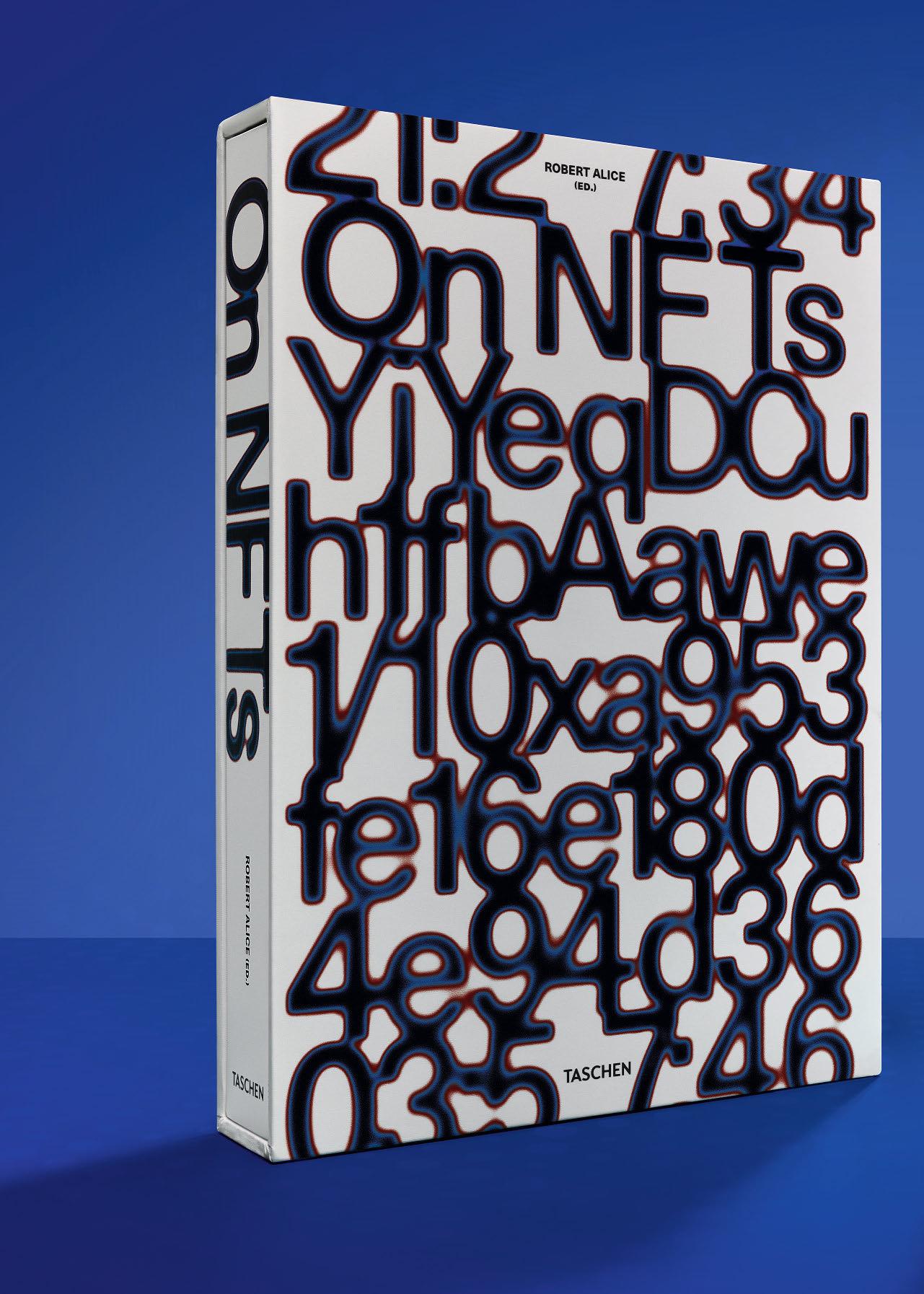
ON NFTs
Collector’s Edition
No. 1–2,500
Hardcover volume in slipcase, 604 pages
36 × 50 cm (14.2 × 19.7 in.), with a 24-page booklet, 21 × 29.7 cm (8.3 × 11.7 in.)
€/£ 750 / $ 850
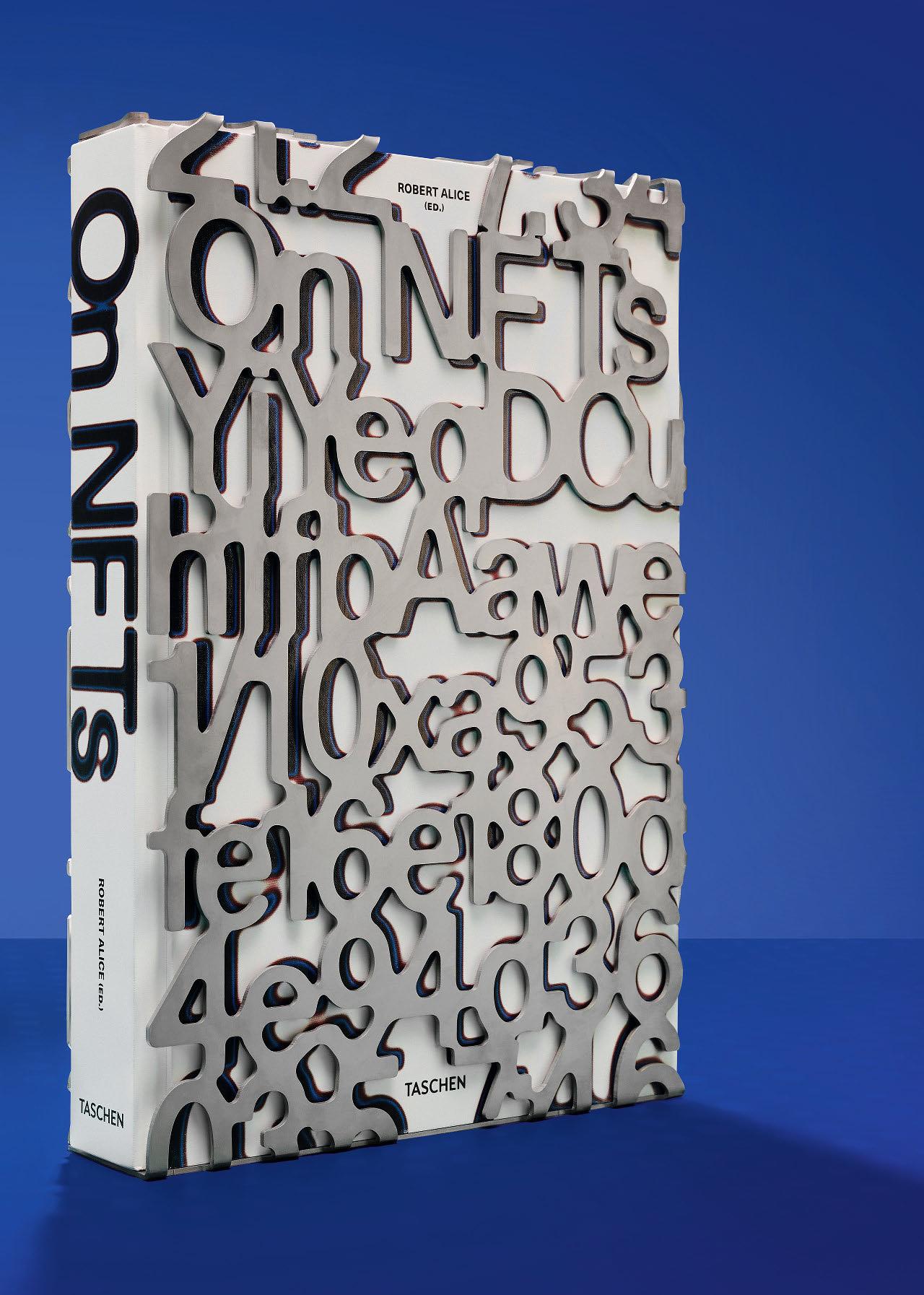
ON NFTS
The Hard Code Edition No. 1–600
Numbered and housed in a stainless steel slipcase designed by ZAK Group €/£ 1,500 / $ 1,750
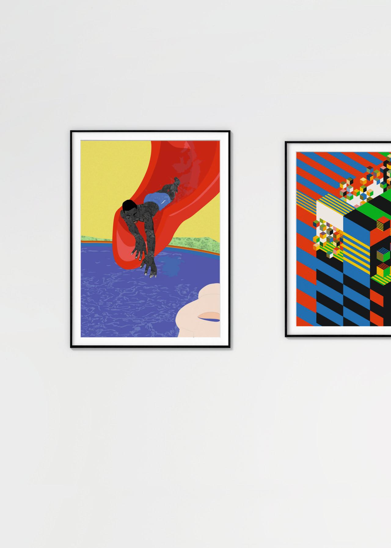
Art Edition Osinachi
The Other Pool Day, 2023
Edition of 100 copies
NFT; pigment print on Hahnemühle paper, h 63.3 × w 46.3 cm (24.9 × 18.2 in.), numbered and signed by Osinachi, and the book in a stainless steel slipcase designed by ZAK Group
€/£ 2,250 / $ 2,500
SOLD OUT
Art Edition Dmitri Cherniak
Ironic Dessert, 2023
Edition of 100 copies
NFT; pigment print on Hahnemühle paper, h 55.8 × w 55.8 cm (22 × 22 in.), numbered and signed by Dmitri Cherniak, and the book in a stainless steel slipcase designed by ZAK Group
€/£ 4,000 / $ 4,500
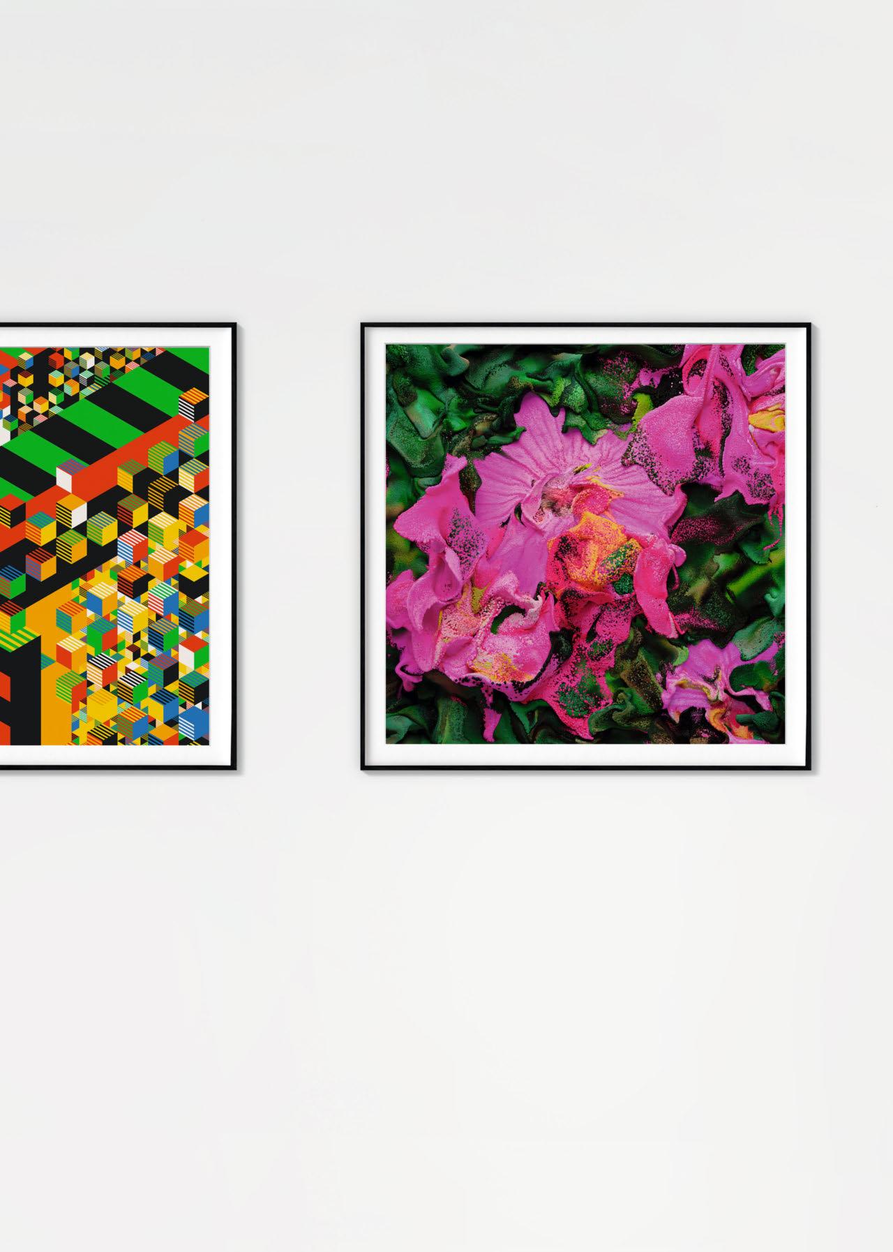
SOLD OUT
Art Edition Refik Anadol Machine Hallucinations –Perennial Dreams, 2021 Edition of 100 copies NFT; pigment print on Hahnemühle paper, h 55.8 × w 55.8 cm (22 × 22 in.), numbered and signed by Refik Anadol, and the book in a stainless steel slipcase designed by ZAK Group
€/£ 4,000 / $ 4,500
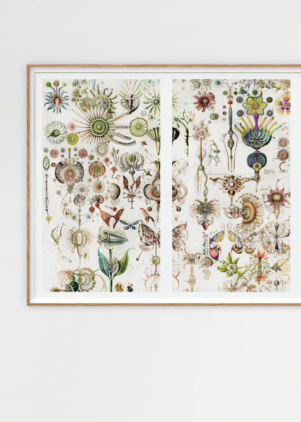
Art Edition Sofia Crespo {{floral automata_1236}}, 2023 Edition of 100 copies NFT; four pigment prints on Hahnemühle paper, sheet size each h 93.5 × w 54.2 cm (36.8 × 21.3 in.), overall size h 93.5 × w 216.8 cm (36.8 × 85.2 in.), numbered and signed by Sofia Crespo, and the book in a stainless steel slipcase designed by ZAK Group €/£ 3,000 / $ 3,250
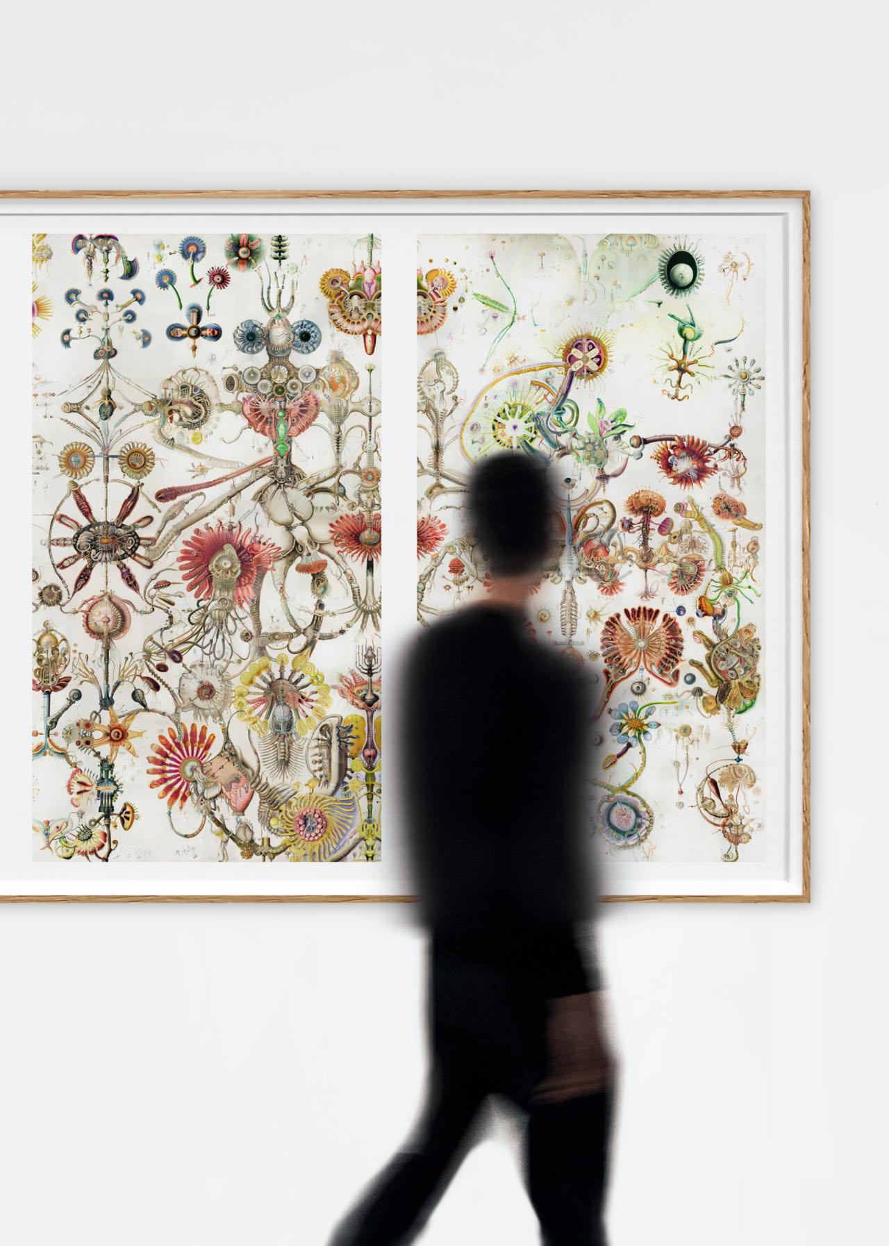

“The modern Michelangelo: A new, magnificent volume celebrates the life’s work of product designer Marc Newson.”
Traveller’s World
Alison Castle considers the designer’s opus

mA rC A nd I were both living in Paris when we were introduced to one another by our mutual friend Richard Allan, circa 2000. I had just seen Marc’s Ford 021C concept car at the Centre Pompidou and, having been lucky enough to inspect it up close, had been blown away by it. I wanted to get inside and drive it right onto the street. It seemed like the future of automotive design was right there in front of me—an audacious and beautiful rethinking of the concept of the automobile. (Alas, the 021C, though perfectly suited for production, was too bold for its time. Perhaps for any time.) We became friends and I have since followed Marc’s career closely, attending milestone events over the years as I watched his importance and his influence grow to extraordinary proportions.
Marc Newson needs no introduction, and accordingly, this book will jump right into the good stuff without any further preamble than this note. Flip through these pages and you’ve got your introduction. (If you crave them, details, biographical and otherwise, are covered in the appendix.) While not a catalogue raisonné, this book exhaustively covers the vast number of things he has designed (so far) over the span of his four-decade career. The works are arranged by category and each description is replete with quotes and anecdotes from Marc himself. Wherever possible, I tried to let Marc do the talking, so in a sense, this book is something like an autobiography and I its ghostwriter.
Art Edition print of a peony blossom, based on Newson’s design for his cloisonné works for Gagosian, first exhibited in 2019. Printed on Hahnemühle Photo Rag paper (308 gsm), paper size h 28.7 × w 35.8 cm (11.3 × 14.1 in.).
© Marc Newson
Opposite: Speedboat AQUARIVA 2010, for Riva/Gagosian.
© Marc Newson
This project has been a lot of work and all of it has been fun because Marc is fun. But Marc is also serious, and deadly so, when it comes to his work and getting it right. For all of his casual charm, he’s a monster at the drawing table, in the best possible way. He has the kind of eye I’ve rarely encountered—that is to say, one that can focus on granular details while completely filtering out everything else. He notices everything but carefully chooses what to retain. He’s constantly drawing in his notebook, fleshing out ideas and looking for the most compelling solution to a given problem. His curiosity is absolutely boundless. Though Marc is almost entirely self-taught, the scope of his expertise—the result of dogged experimentation and an unflagging willingness to fail—is unequaled.
You will be drawn to the pictures, but please don’t forget to also read this book. It is in the story of each project that its magic becomes most apparent. You will appreciate each work even more when you know what went into it and the lengths to which Marc went to achieve the result. More often than not, something that seems simple will reveal itself to have been the fruit of a Daedalian effort.
Welcome to the labyrinthine world Marc Newson has created. It’s a wonderful place to get lost.
Book excerpt: author note by Alison Castle, New York, 2024

XXL SOLD OUT
MARC NEWSON. WORKS 84–24
Art Edition No. 1–125
Hardcover in handmade leather case, 496 pages
29.2 × 39 cm (11.5 × 15.4 in.)
Accompanied by a print of a peony blossom (see p. 98).
Book and print signed by Marc Newson
€/£ 4,500 / $ 5,000
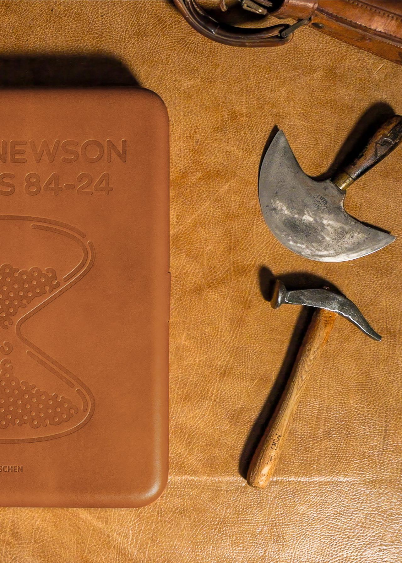
“The book offers a fascinating look into Newson’s body of work over the last 40 years…readers can expect a visually enthralling evolution from his curious beginnings to his beloved culminations… an indispensable addition to any creative library.”
Flaunt

w Ith A vA luABle insight into the works and mind of Japanese architect Shigeru Ban, author Philip Jodidio explores long anticipated completed buildings, new projects, and a future outlook of the studio Shigeru Ban after TASCHEN has followed his career from the beginning. This monograph is a journey through the years and evolution of an architect who made a name for himself with true architectural marvels that cannot be surpassed in innovation, elegance, and sensibility. Next to early buildings deploying paper tubes as structural elements, as well as houses that challenge as fundamental an idea as walls, like the Curtain Wall House in Tokyo and the Wall-Less House in Nagano’s countryside, we see plenty of recent versatile projects. View a two-story penthouse on top of a 140-year-old New York City landmark cast-iron house, the Swatch/Omega Campus in Switzerland, and La Seine Musicale, a concert hall inserted into an overall master plan conceived by Jean Nouvel for the island Île Seguin in France. Ban’s work is characterized by a quest to understand buildings and a commitment to save and use otherwise discarded materials, which led him to inventive solutions and to claim the material paper as the staple for several of his projects. Along with this ambition, Ban gave a face to Japanese architecture while staying in touch with his unique architectural handwriting, allowing him to create a magnitude of projects worldwide. The Pritzker Prize-winning architect’s notoriety hasn’t kept him from devoting his talent and innovative ideas to those needing help. He has built shelters for refugees in Rwanda and Sri Lanka, and utilized his paper tube structures to quickly erect emergency accommodations in Fukushima and Ukraine in times of crisis. With his problem-solving, generous, and elegant approach, Shigeru Ban coins humanitarian architecture and keeps pushing the boundaries of his trade.

Shigeru Ban portrayed in the meeting room on the third floor of the Three Walls house, one of the earliest buildings of Ban’s career and his office space in Tokyo ever since, 2011. © Shigeru Ban Architects
Opposite: Mount Fuji World Heritage Center Fujinomiya, Shizuoka, Japan, 2014–2017. © Hiroyuki Hirai


“I am not a form-making architect but, instead, a form-finding architect.”
Shigeru Ban

XXL SOLD OUT
SHIGERU BAN.
COMPLETE WORKS 1985–TODAY
Art Edition No. 1–200
Hardcover volume with a wooden custom-built 3D laser-cut cover resembling the roof structure of the Swatch/Omega Campus in Biel/Bienne, Switzerland, in clamshell box, 696 pages 30.8 × 39 cm (12.1 × 15.4 in.)
Print of the sketch Bamboo Gridshell Roof, 2023, on 305 gsm Hahnemühle Photo Rag Ultra Smooth, in a portfolio h 29 × w 37.4 cm (11.4 × 14.7 in.)
Signed by Shigeru Ban
€/£ 1,750 /$ 2,000
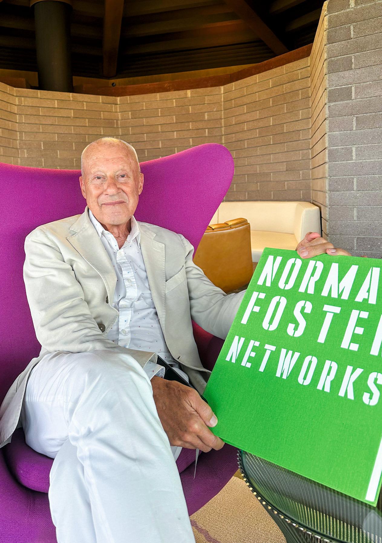
Opposite: Norman Foster at Chemosphere House, Los Angeles, 2023. © Norman Foster/ TASCHEN
Concept sketch of 30 St. Mary Axe seen behind St. Helen’s, Bishopsgate, London, 1999. © Norman Foster
wIth A CAreer spanning continents and over six decades, the work of the renowned architect Norman Foster is nothing short of extraordinary. His creative innovation and holistic approach have made him one of the world’s most influential and well-known architects. From the Apple Park campus in Cupertino, California, to the Reichstag in Berlin, the enclosed court of the British Museum in London to the Millau Viaduct in France, with his practice of Foster + Partners, he has created celebrated landmarks that stand out for their inventive modernity and for what he calls “a sustainable approach to the design of the built environment.”
This is the first time Foster’s complete body of work has been published in one edition on such a grand scale. Author Philip Jodidio gives a rare insight into the inner workings of the architect’s creative practice and details the personal approach to his work, his inspirations, the link between art and architecture, and the significance and correlation to his other passions, such as being an avid aviator.
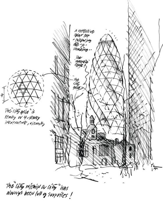
Encompassing a lifetime of achievement and originality, this monograph is divided into two volumes: The first presents his architectural œuvre and is filled with numerous unpublished images and sketches handpicked by Foster from his archives. Paired with nearly 1,000 illustrations, the second book contains eight essays he wrote explaining his sources of inspiration.
Aside from the 1999 Pritzker Prize, Norman Foster has won the American Institute of Architects Gold Medal for Architecture, the Royal Gold Medal for Architecture, and the Gold Medal of the French Academy of Architecture. This is a magnificent visual journey not only through significant buildings of our time but also into the mind of a genius.


“A major retrospective.”
Limited two-volume edition in a custom-designed slipcase that folds into a bookstand.
With a one-meter-wide print of a drawing signed by Norman Foster.

XXL FEW LEFT
NORMAN FOSTER
Art Edition No. 1–300
Hardcover, two volumes in a custom-designed slipcase which folds into a bookstand, 1,064 pages
30.8 × 39 cm (12.1 × 15.4 in.)
Print of a drawing by Norman Foster picturing the upcoming multifunctional community and business center InnHub in La Punt, Switzerland.
Printed on 305 gsm
Hahnemühle Photo Rag Ultra Smooth, in a portfolio h 38 × w 100 cm (15 × 39.4 in.)
Signed by Norman Foster €/£/$ 3,000

“ TASCHEN comes through with Gio Ponti…think of it not as a book but as a vehicle for an incredible journey.”
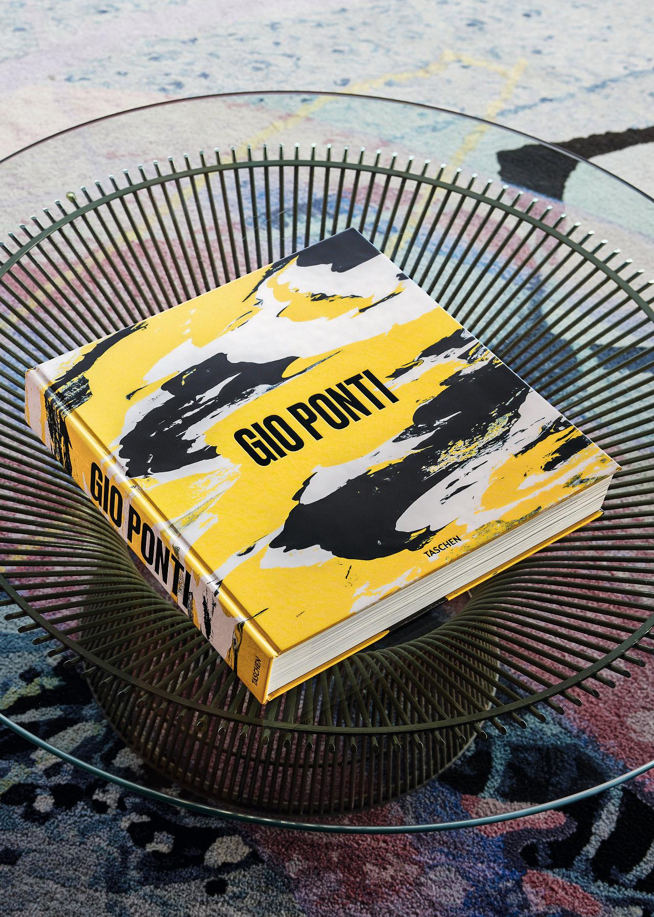


Salvatore Licitra, Stefano Casciani, Lisa Licitra Ponti, Brian Kish, Fabio Marino, Karl Kolbitz Hardcover, 572 pages 36 × 36 cm (14.2 × 14.2 in.)
Art Edition No. 1–1,000
Exclusive table designed by Gio Ponti, 56.5 × 56.5 × 38 cm (22.2 × 22.2 × 15 in.)
Hand-painted steel grid in yellow, blue, and white with a glass top and copper-colored steel legs. Each coffee table is made entirely by hand.
Four art prints, drawings for ocean liner interiors, each h 40 × w 40 cm (15.7 × 5.7 in.). Inkjet printed on 305 gsm Hahnemühle Photo Rag Ultra Smooth €/£ 3,000 / $ 3,500
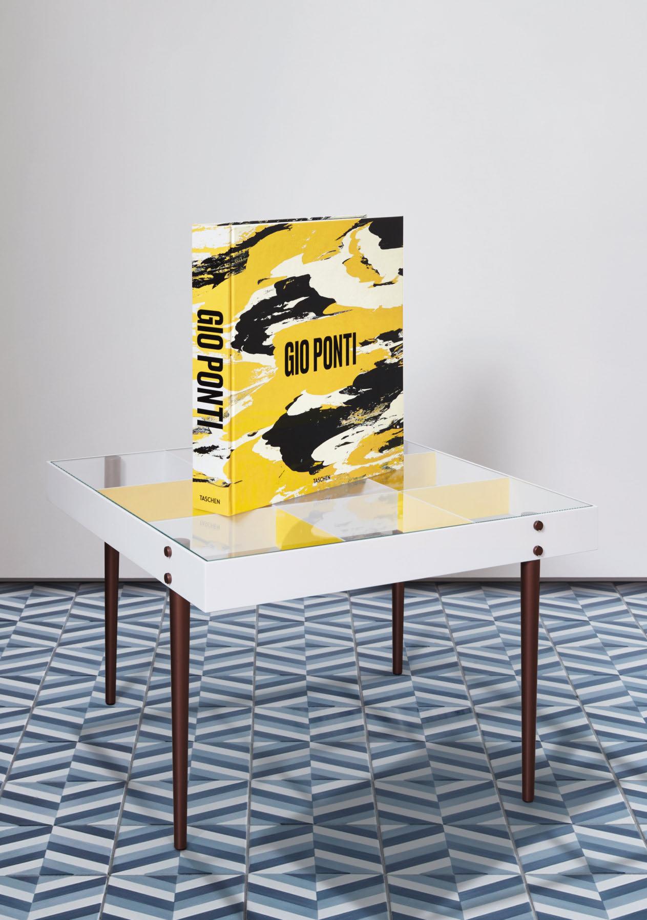
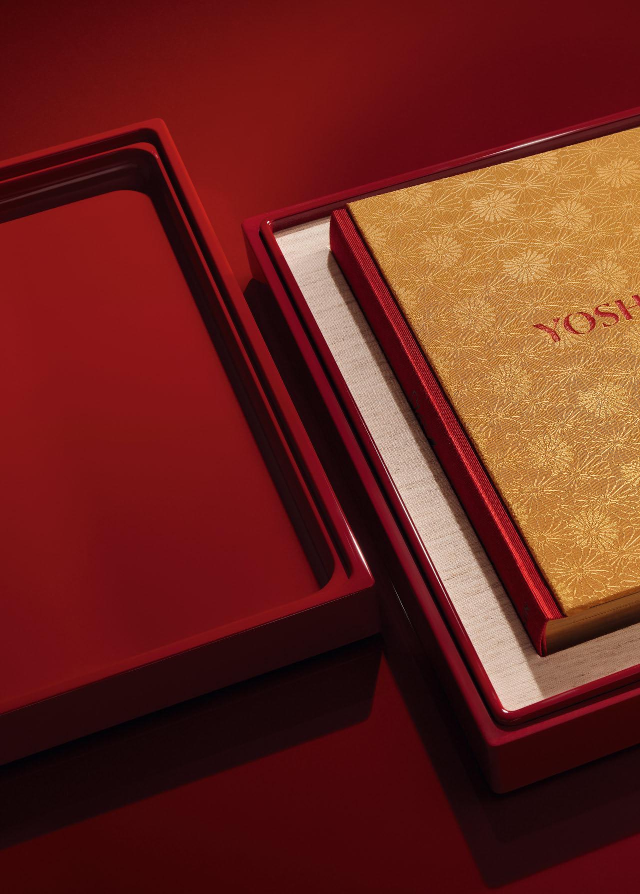
YOSHIHIRO NARISAWA.
SATOYAMA CUISINE
Collector’s Edition of 1,000 copies Hardcover, printed with 6 colors and varnish, Bodonian binding in different Japanese fabrics, book block with gilded edges, in a gloss lacquered box, 416 pages 40 × 33 cm (15.7 × 13 in.)
Signed by Yoshihiro Narisawa and photographer Sergio Coimbra
€/£/$ 1,250

By Yoshihiro Narisawa
Kombu storage, Okui Kaisedo, Tsuruga, Fukui prefecture. Kombu grows for two years in the sea, and is then aged for a number of years in the cellars, after all of which the moment arrives at last when it can be soaked in water to make dashi soup. It is an ephemeral yet elegant plant, and the kombu tradition, dutifully continued by specialized
merchants, has succeeded in bringing carefully harvested good-quality kombu into all the cultural centers of Japan. Japanese cuisine is the only one to use kombu dashi as a base. And the people of Japan have, for over 1,000 years, depended on the seaweed in order to produce the special flavor of umami.
Photos © Sergio Coimbra

I lIke to call my style of cooking Innovative Satoyama Cuisine. It’s difficult to find an equivalent word for satoyama in Western languages. Translating literally, sato means a village or community and yama means forest. Japan is an island country, and approximately 67 percent of its land mass is covered by forests. The people of Japan have always coexisted with their surroundings by making the best of nature’s blessings, and as such satoyama is the embodiment of sustainable living whereby people coexist with the natural world in a symbiotic relationship.
There is only limited space for cultivation in Japan since areas of land are often surrounded by mountains or stop short at the sea, and what fields there are have been largely used to grow rice. At the same time, the natural bounty of the sea has been harvested and other sources of food gathered from the forests. We cut trees only as needed, and collect just enough wild vegetables for the family to eat. This was the way we maintained our forests for centuries.
For the Japanese, humankind has always been part of nature. The culture of satoyama is based on using only what is needed from nature, and to do so effectively while tending the sources in an appropriate manner, and at the same time seeing that a healthy environment is sustained. The leaves of trees absorb carbon dioxide and generate oxygen as part of the process known as photosynthesis, which is essential for life on this planet, just as much as water. The roots of trees act like filters, adding nutrients to the water. This mountain water will ultimately reach the sea, further spreading its richness. Forests provide food for the animals that live in them, and healthier forests support a richer range of biodiversity. As such, forests are a barometer of life.
I examine this aspect of Japanese culture that is rooted in nature through my own lens and express it in the form of cuisine. My style of cooking is thus the reconstruction of satoyama cuisine.
Aside from virgin forests, of which there are extremely few left on the planet, the vast majority of forests are now maintained by human beings. However, as soon as people affect an area of forest in one way or another, the natural balance of its ecosystem may become unsettled and they must then continue to maintain it. If this is not done, trees can grow too much in places and prevent the sunlight from reaching the forest floor, and if there isn’t enough sunlight the other plants, fungi, and insects will die, birds and animals will disappear, and the forest will perish.
We must all recognize the importance of forests and find a way to coexist with them that is sustainable. For even now, forests continue to disappear.
So, as a chef, what can I do?
Yoshihiro Narisawa opened his first restaurant in Kanagawa in 1996, moving to Tokyo in 2003. After pursuing a connection with French cuisine, Narisawa went on to develop his “Satoyama” style.
After 25 years in the coffee business, Sergio Coimbra became the world’s leading culinary photographer, working with names such as Massimo Bottura and Heston Blumenthal.
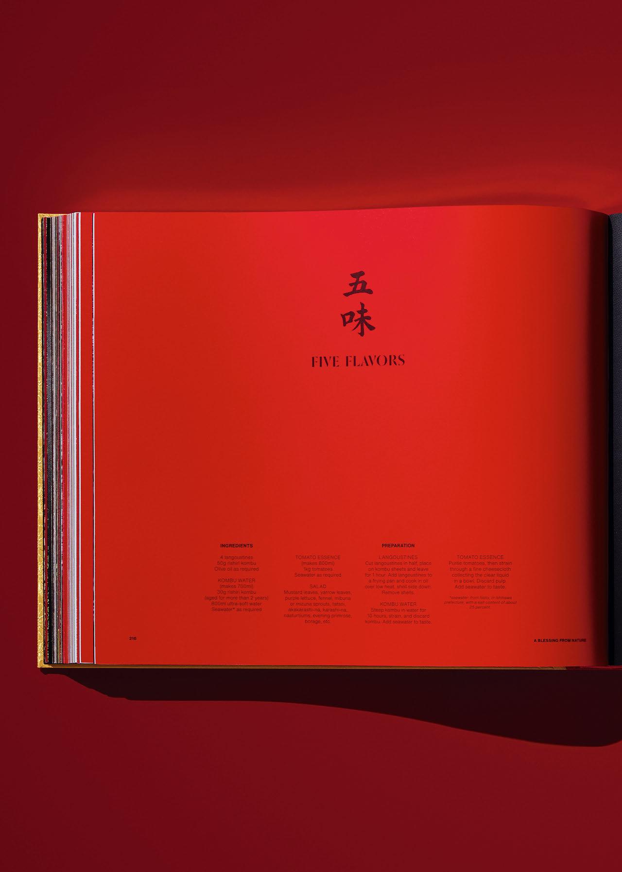
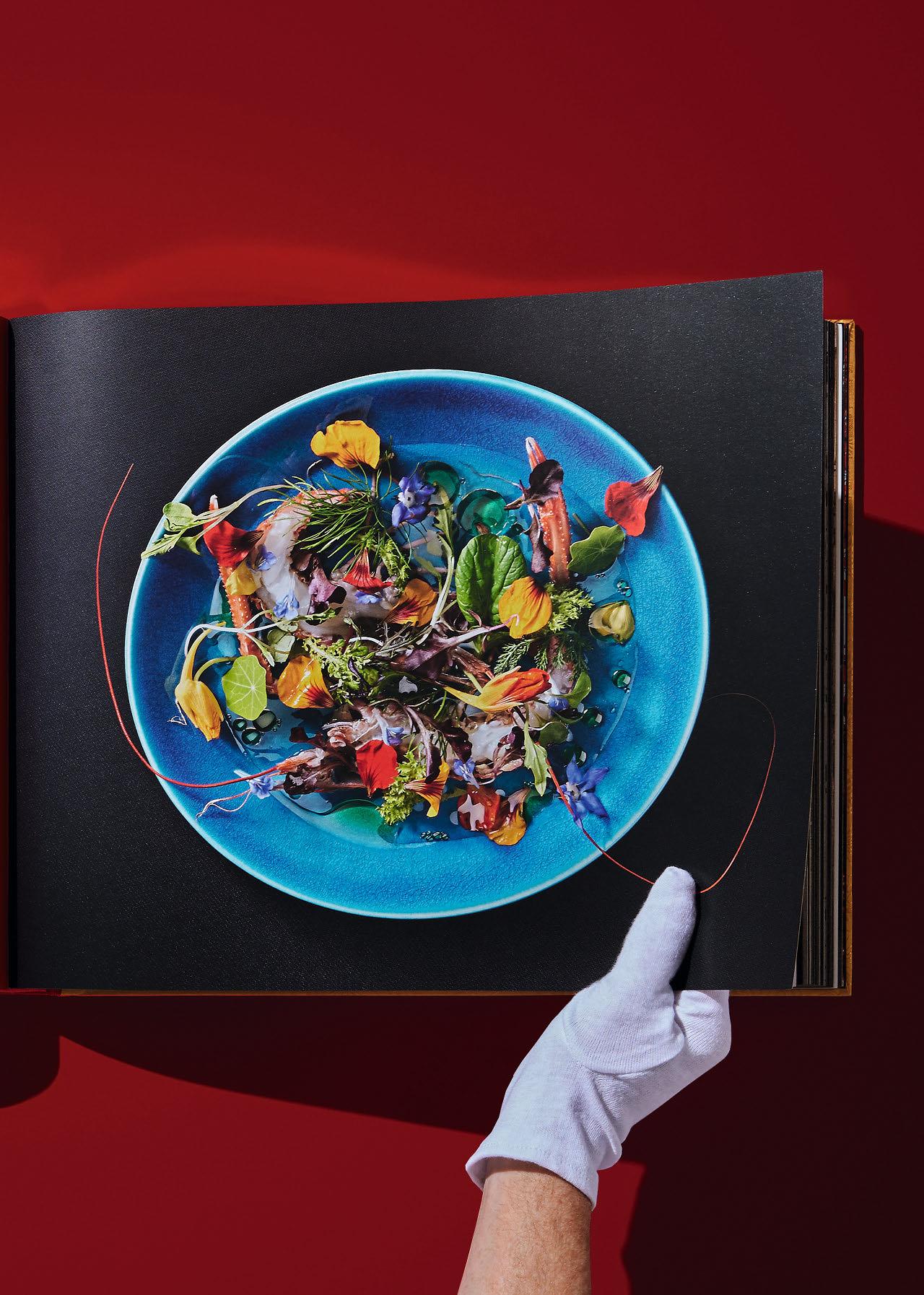
“Everything inspires me— the wind in my face, the noise of a brook, the temperature I feel on my skin.”
Yoshihiro Narisawa

“The definitive history of the designer’s unique fusions of poetry and practicality…chock full of stylish photography from Yuriko Takagi.”
Hypebeast
ISSEY MIYAKE
Collector’s Edition of 1,000 copies Hardcover, each with Miyake’s own ‘inkan’—a traditional Japanese seal equivalent to a signature and used in daily Japanese life for all official paperwork.
The book is presented in an original book bag, designed by the Miyake Reality Lab, with folded shapes and pressed foil techniques from the 132 5. ISSEY MIYAKE project.
514 pages, 36 × 36 cm (14.2 × 14.2 in.)
€/£/$ 1,000
“I believe there is hope in design. Design evokes surprise and joy in people.”
Issey Miyake
Christo and Jeanne-Claude L’Arc de Triomphe, Wrapped exhibition
The wrapping of Paris’s Arc de Triomphe de l’Étoile in cloth for 16 days, realized in September 2021, was first conceived by Christo and JeanneClaude in 1961, but only achieved after their deaths in 2009 (Jeanne-Claude) and 2020 (Christo). Issey Miyake enjoyed a long,
close friendship with the two and decided to create an exhibition during the project. Plans began for its implementation in the winter of 2021 with Pascal Roulin, the video director. This powerful exhibition allowed the audience to experience, through realistic video and dynamic spatial design, the conception and execution of L’Arc de Triomphe, Wrapped

Opposite: Flying Saucer 1993 design/ Spring-Summer 1994 Collection From the Issey Miyake Making Things exhibition, Fondation Cartier pour l’art contemporain, Paris, 1998. Photography: Raymond Meier.


“Each of our projects is like a slice of our life, myself and Jeanne-Claude. And the journey is so exciting, it is an adventure in the real world.”
Christo

CHRISTO AND JEANNE-CLAUDE.
L’ARC DE TRIOMPHE, WRAPPED, PARIS
Collector’s Edition No. 501–2,500
Hardcover in slipcase with a 24 × 24 cm (9.4 × 9.4 in.) swatch of the original silver fabric, 480 pages 29 × 27 cm (11.4 × 10.6 in.)
Signed by Wolfgang Volz
€/£ 350 / $ 450
Art Editions No. 1–500 are sold out.
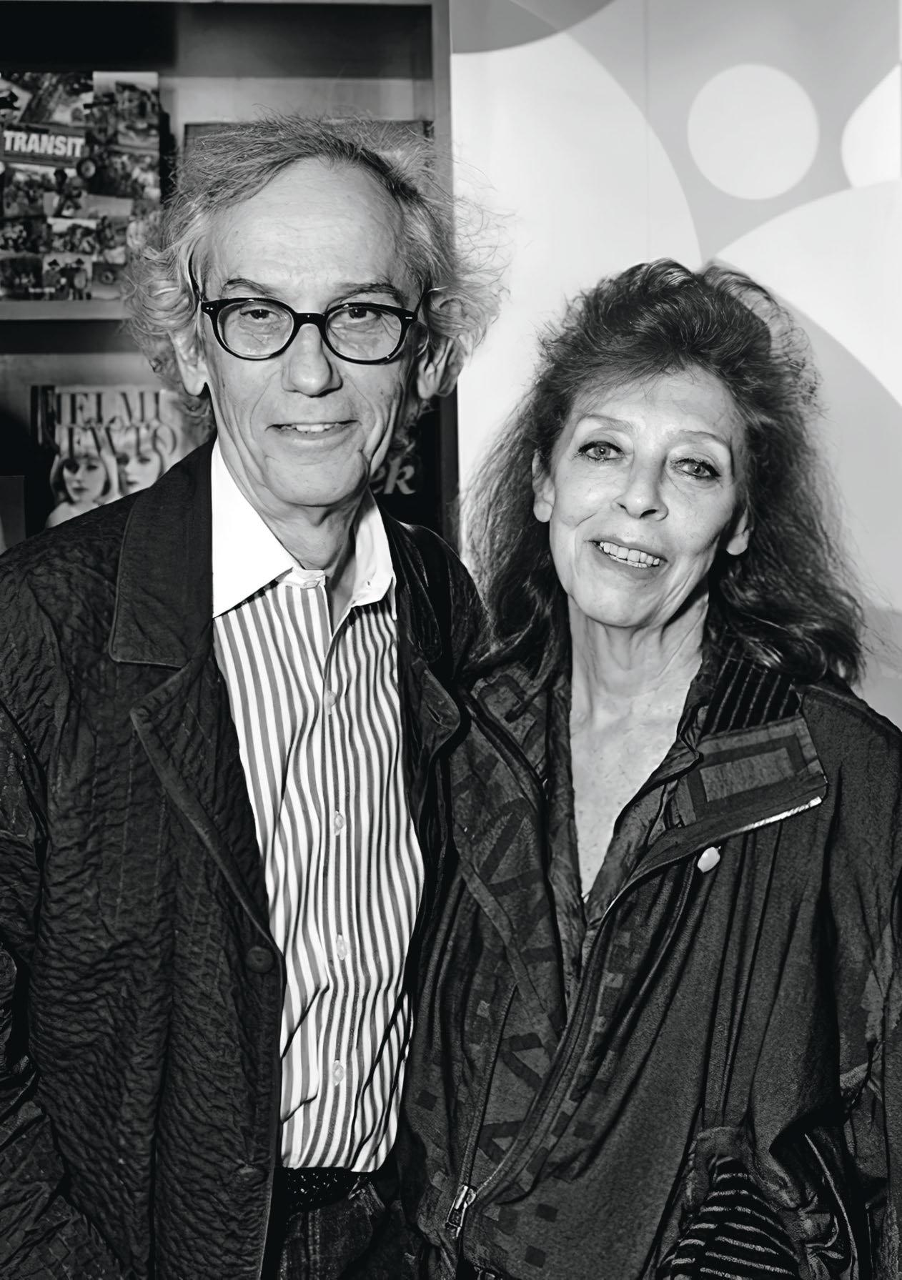
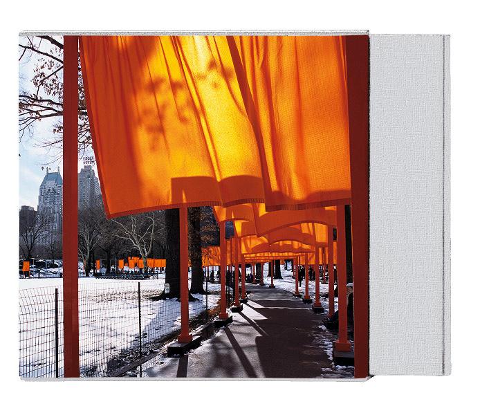
THE GATES. NEW YORK CITY 1979–2005
Collector’s Edition of 5,000 copies
Hardcover in slipcase, with piece of original fabric, 968 pages 29 × 27 cm (11.4 × 10.6 in.)
Signed by Christo, Jeanne-Claude, and Wolfgang Volz
€/£ 1,000 / $ 1,250

WRAPPED TREES. BASEL 1997–1998
Art Edition No. 1–1,000
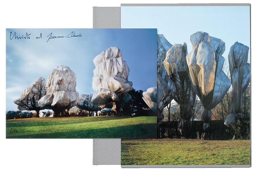
With cibachrome print and piece of original fabric, 136 pages
23.5 × 30 cm (9.3 × 11.8 in.)
Signed by Christo, Jeanne-Claude, and Wolfgang Volz
€/£ 600 / $ 750
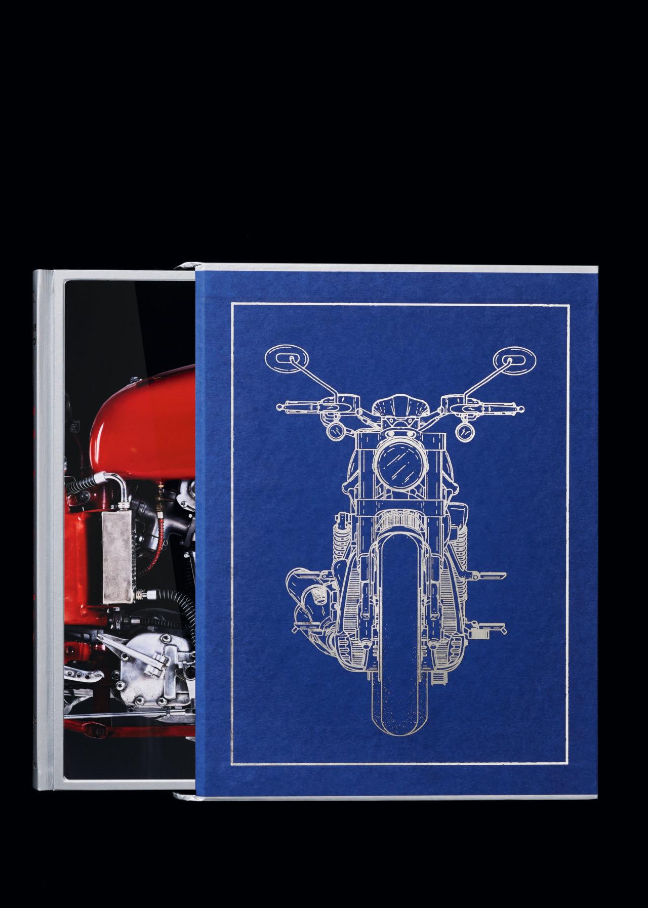
“A must. This double volume presents motorcycling treasures from all eras.”
Wiener Zeitung
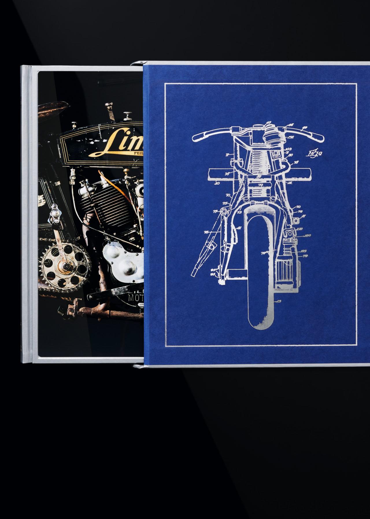
ULTIMATE COLLECTOR MOTORCYCLES
Collector’s Edition of 1,000 copies
Hardcover, two volumes, each in a slipcase, aluminum print covers tipped into a leather-bound spine, foil embossing, silver book edge, 940 pages


“ARNOLD celebrates the
moving image
superstar
through the work of the many still photographers who have turned their lens on him, including some of the foremost practitioners of the art.”
Capitello Edition No. 101–500
With a Capitello bookstand designed by Studio65 in hand-finished soft polyurethane
€/£/$ 3,500
Art Edition No. 1–100
Dye-sublimation print on ChromaLuxe aluminum panel with floating frame, ready to hang, h 172 × w 122 cm (67.7 × 48 in.)
Signed by Annie Leibovitz
With a Capitello bookstand designed by Studio65 in hand-finished soft polyurethane
€/£/$ 15,000
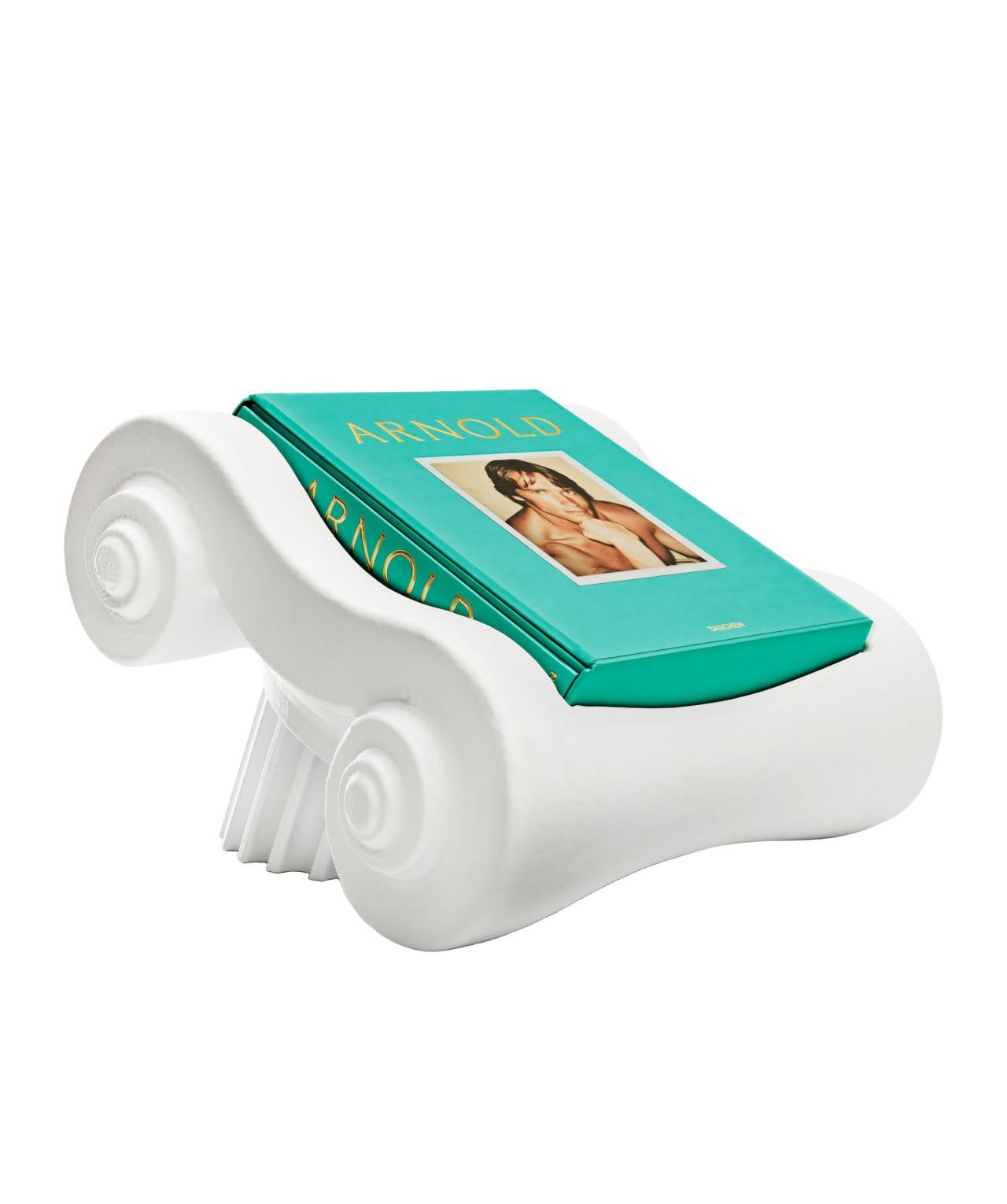

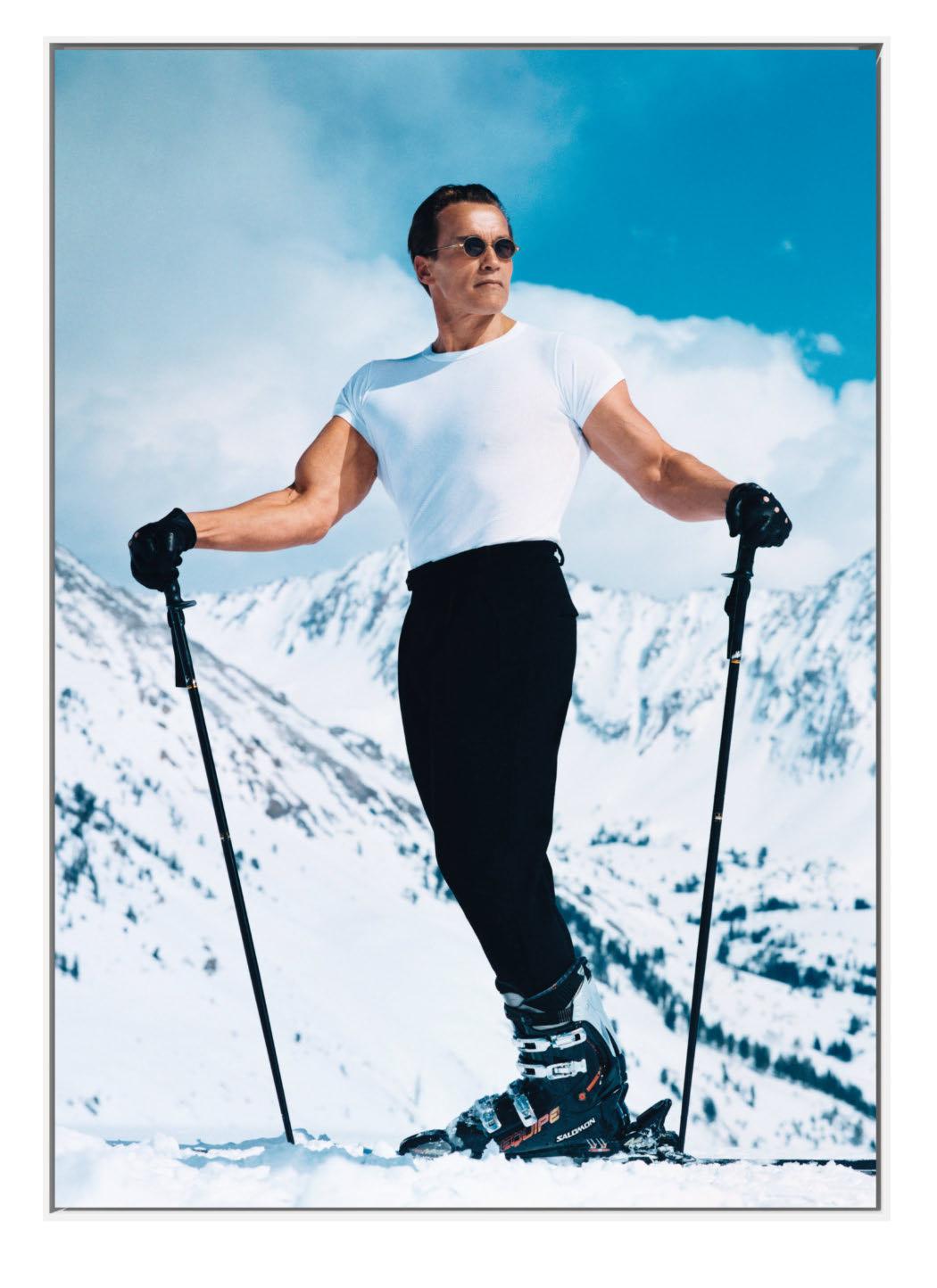


501–1,947

“Where my drive came from and why I was different from my brother and from all the other boys in my town, I cannot tell you. I was simply born with the gift of vision.”
Arnold Schwarzenegger

ARNOLD Collector’s Edition No. 501–1,947
€/£/$ 1,500
Each edition includes the 334-page hardcover with ChromaLuxe aluminum print cover, in slipcase, 34.3 × 46.2 cm (13.5 × 18.2 in.), plus a 556-page companion volume, and is signed by Arnold Schwarzenegger.
A dazzling statement of a collective identity: hip-hop jewelry from the 1980s to today
“Every culture celebrates its creative contributions in its own ways. Black culture goes above and beyond. Going big is just how we roll. It’s Black swag, African American to the bone. We learn from each other and incorporate those lessons into our personal style. This is true of our music, our dance, our sense of fashion…and our jewelry.”
Ricky
Walters aka Slick Rick
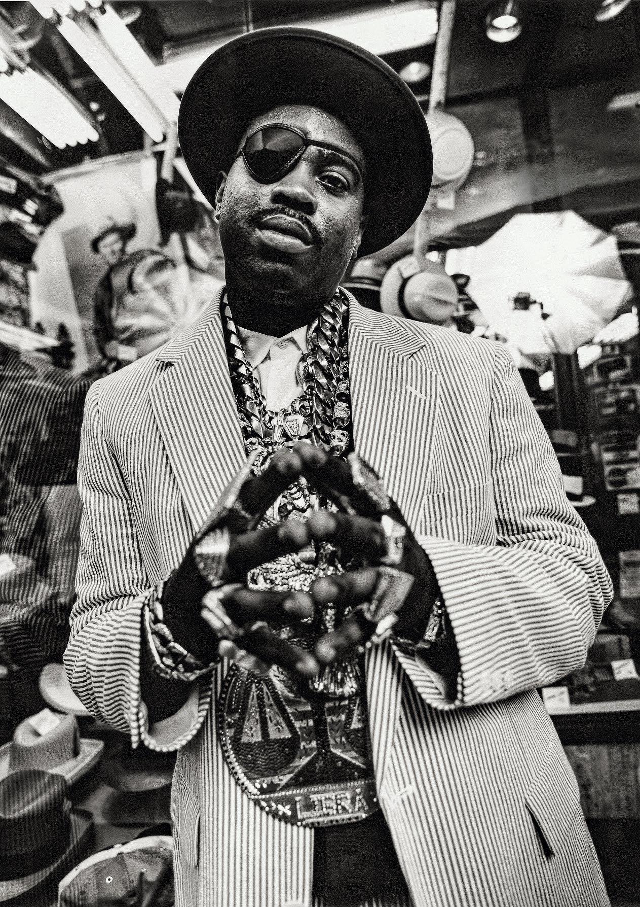
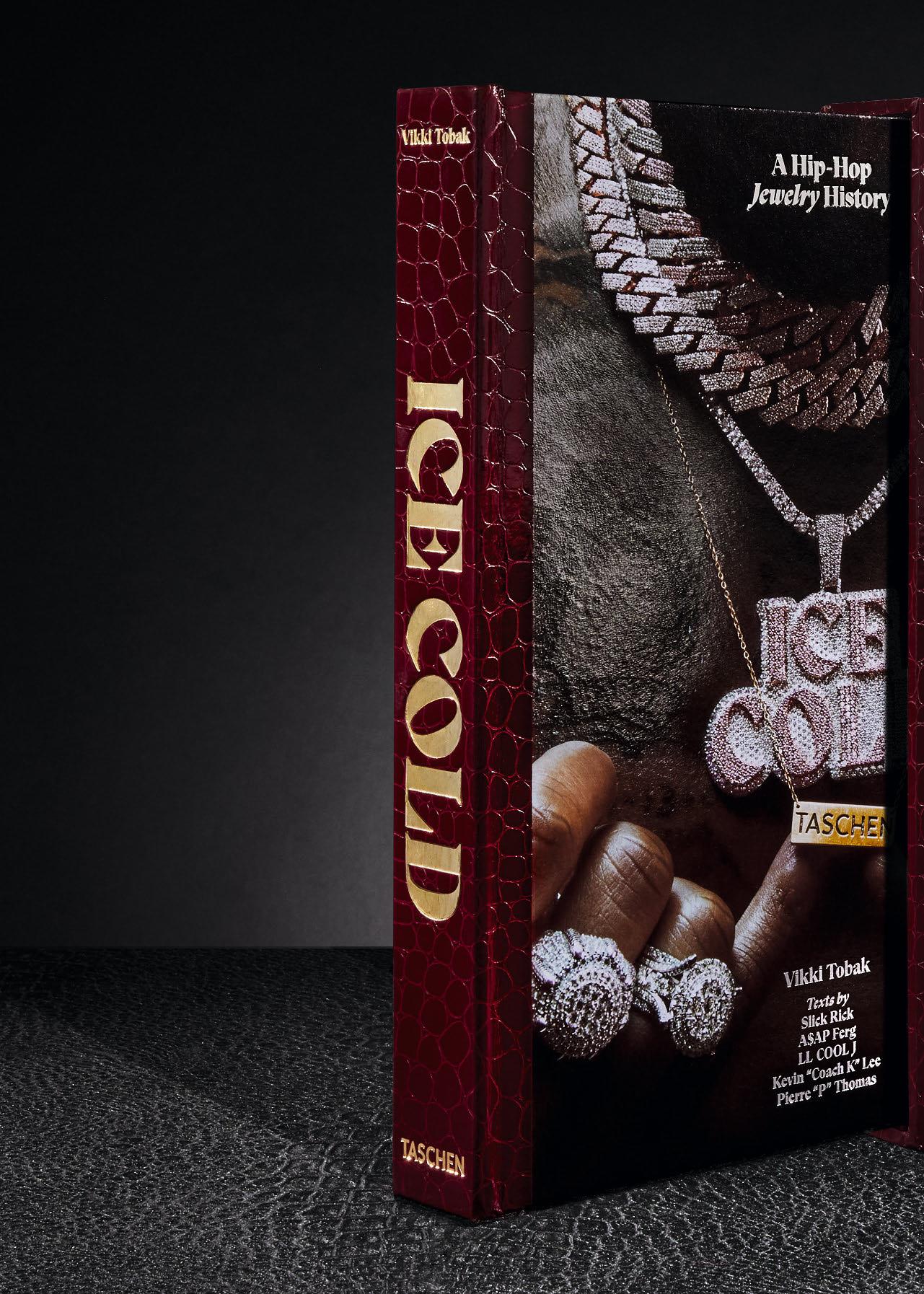
“Hip-hop, jewelry and identity…Ice Cold explores the enduring relationship between two creative fields.”
COLD. A HIP-HOP JEWELRY HISTORY
Hardcover volume in a slipcase, 388 pages, 25 × 34 cm (9.8 × 13.4 in.)
Art Edition with two prints (see pp. 142–143)

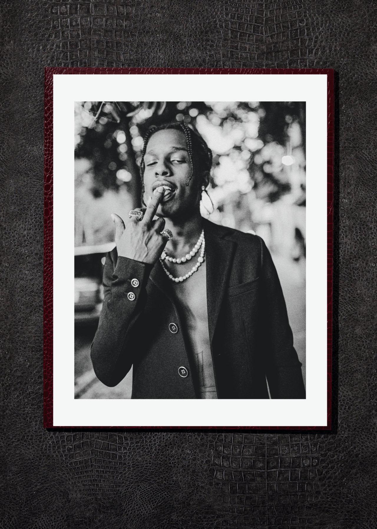
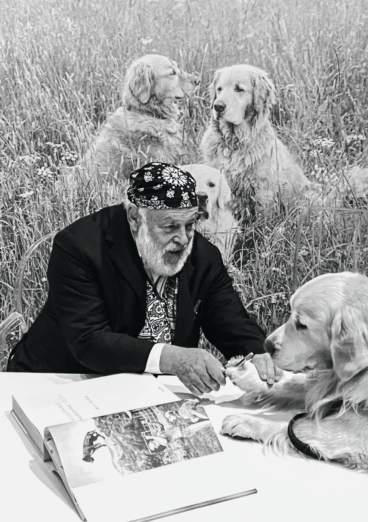
BRUCE WEBER. THE GOLDEN RETRIEVER PHOTOGRAPHIC SOCIETY
Hardcover in slipcase, 520 pages 28 × 35.5 cm (11 × 14 in.)
Art Edition with two prints (see pp. 146–147)
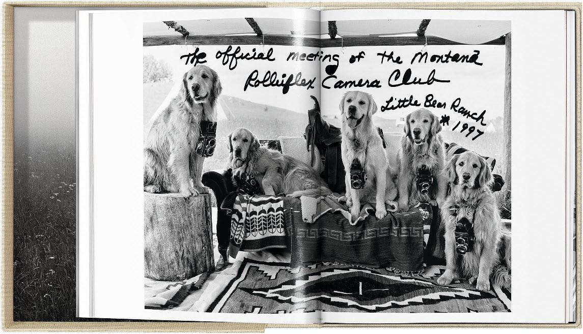
photogr Apher And FIlmm Aker Bruce Weber is associated with a wide array of imagery: humanist portraits of artists, actors, and athletes; fashion spreads charged with emotion, irreverence, and nostalgia; lyrical tributes to eroticism and an arcadian vision of the American landscape. All these things—and golden retrievers, too. Since the very beginning, Weber has been accompanied on his travels by a pack of these benevolent canines, who have populated his photographs for fashion campaigns, prominent magazines, and the pages of his personal scrapbooks in equal measure. The Golden Retriever Photographic Society is Weber’s first career-spanning collection of these photographs, one he describes as his most personal.
In the introduction to the monograph, Weber remarks, “People sometimes say to me, ‘In my next life, I want to come back as one of your dogs.’” Paging through this volume, we understand the sentiment. For five decades, these golden retrievers have been foils for Weber’s imagination, storybook characters in the expansive life he has created with his wife, Nan Bush. This book celebrates the human-animal bond, illuminating how connection to one’s pets can fuel creativity, provide companionship, and foster an abundance of joy.


“This book is dedicated to the indigenous peoples of Brazil’s Amazon region. It is a celebration of the survival of their cultures, customs, and languages. It is also a tribute to their role as the guardians of the beauty, natural resources, and biodiversity of the planet’s largest rainforest in the face of unrelenting assault by the outside world. We are eternally grateful to them for allowing us to share their lives.”
Sebastião Salgado and Lélia Wanick Salgado
se BA st I ão sA lg A do tr Aveled the Brazilian Amazon and photographed the unparalleled beauty of this extraordinary region for six years: the forest, the rivers, the mountains, the people who live there—an irreplaceable treasure of humanity.
In the book’s foreword Salgado writes: “For me, it is the last frontier, a mysterious universe of its own, where the immense power of nature can be felt as nowhere else on earth. Here is a forest stretching to infinity that contains one-tenth of all living plant and animal species, the world’s largest single natural laboratory.” This connection to nature is echoed in Renzo Piano’s bookstand design, of which he says it “is the simplest way to have the book in levitation. You do not even see the bookstand, you just see the book held in the air firmly. The open pages look like an albatross while flying.” Made from mild steel with powder-coated painting, threaded central rods, and rubber adjustable feet, the lectern was designed for the Amazônia project.
Salgado visited a dozen indigenous tribes that exist in tiny communities scattered across the largest tropical rainforest in the world. He documented the daily life of the Yanomami, the Asháninka, the Yawanawá, the Suruwahá, the Zo’é, the Kuikuro, the Waurá, the Kamayurá, the Korubo, the Marubo, the Awá, and the Macuxi—their warm family bonds, their hunting and fishing, the manner in which they prepare and share meals, their marvelous talent for painting their faces and bodies, the significance of their shamans, and their dances and rituals.
Sebastião Salgado has dedicated this book to the indigenous peoples of Brazil’s Amazon region: “My wish, with all my heart, with all my energy, with all the passion I possess, is that in 50 years’ time this book will not resemble a record of a lost world. Amazônia must live on.”

SUMO
SEBASTIÃO SALGADO. AMAZÔNIA
Sebastião Salgado, Lélia Wanick Salgado
Collector’s Edition No. 401–2,400
Hardcover volume, 472 pages 70 × 50.5 cm (27.6 × 19.9 in.)
€/£ 3,000 / $ 3,500
Art Editions No. 1–400
Each with a gelatin silver print on Ilford FB warmtone paper limited to 100 copies
Signed by Sebastião Salgado, with a bookstand designed by Renzo Piano
€/£ 7,500 / $ 8,500 each
Art Edition No. 1–100
Adão Yawanawá in a headdress of eagle feathers. Village of Nova Esperança, Rio Gregório Yawanawá Indigenous Territory, State of Acre, 2016
h 37 × w 50.5 cm (14.6 × 19.9 in.) on 50 × 60 cm (19.7 × 23.6 in.) paper
Art Edition No. 101–200
Young Hatiri Suruwahá bathes in a backwater of the Pretão stream. Suruwahá Indigenous Territory, State of Amazonas, 2017 h 37 × w 50.5 cm (14.6 × 19.9 in.) on 50 × 60 cm (19.7 × 23.6 in.) paper
Art Edition No. 201–300
Marauiá Mountain Range. Yanomami Indigenous Territory. Municipality of São Gabriel da Cachoeira, State of Amazonas, 2018
h 34 × w 51.3 cm (13.4 × 20.2 in.) on 50 × 60 cm (19.7 × 23.6 in.) paper
Art Edition No. 301–400
The paraná connecting the Rio Negro with the Cuyuní River, State of Amazonas, 2019 h 34 × w 51.3 cm (13.4 × 20.2 in.) on 50 × 60 cm (19.7 × 23.6 in.) paper
“Genesis honors its biblical antecedent…there could be no more powerful reminder of all that we stand to lose.”
GENESIS is sebastião salgado’s love letter to the planet. It is the result of an epic eight-year expedition to rediscover the mountains, deserts, and oceans, the animals and peoples that have so far escaped the imprint of modern society—the land and life of a still pristine planet. The Genesis project, along with the Salgados’ Instituto Terra, is dedicated to showing the beauty of our planet, reversing the damage done to it, and preserving it for the future.
On over 30 trips—by foot, light aircraft, boats, canoes, and even balloons, through extreme temperatures and in sometimes dangerous conditions—Salgado has created a collection of images showing us nature, animals, and indigenous peoples in such intense beauty it takes our breath away. The reach is truly global. Through Salgado’s lens, one discovers the animal species and volcanoes of the Galápagos; the penguins, sea lions, cormorants, and whales of the South Atlantic; Brazilian alligators and jaguars; and African lions, leopards, and elephants. We travel over icebergs in the Antarctic, the volcanoes of Central Africa, the ravines of the Grand Canyon, and the glaciers
of Alaska. We encounter the Stone Age Korowai people of West Papua, nomadic Dinka cattle farmers in Sudan, Nenets and their reindeer herds in the Arctic Circle, as well as the Mentawai jungle communities on islands west of Sumatra.
In characteristic monochrome, Salgado’s painterly notes are perfectly tuned to these sublime scenes, capturing sweeping aerial panoramas as much as the most intricate details and textures, from a reptilian skin to the fur coat of the Nenet people of northern Siberia. The exquisitely reproduced images are arranged not by theme but rather conceived as a journey around the globe, immersing them in Salgado’s vision of the Earth’s mesmerizing scale, order, and beauty.
This two-volume SUMO-size edition is designed and edited by Lélia Wanick Salgado and numbered and signed by Sebastião Salgado. Quarter-leather bound, it is presented with a bookstand in cherry wood veneer designed by Tadao Ando and a clothbound caption book explaining each stunning shot.


Marine Iguana, Galápagos, Ecuador, 2004
Art Edition No. 301–400

SUMO
SEBASTIÃO SALGADO. GENESIS
Edited by Lélia Wanick Salgado
Collector’s Edition No. 501–3,000
Two hardcover volumes, 704 pages
46.8 × 70 cm (18.4 × 27.6 in.)
Signed by Sebastião Salgado, with a bookstand designed by Tadao Ando
€/£ 3,500 / $ 4,500
Two Mursi Women, Omo Valley, Ethiopia, 2007
Art Edition No. 1–100
Art Editions No. 1–400
Each with a gelatin silver print on Ilford FB warmtone paper limited to 100 copies
h 24.5 × w 33.5 cm (9.7 × 13.2 in.) on 30 × 40 cm (11.8 × 15.6 in.) paper
Signed by Sebastião Salgado
€/£ 8,500 / $ 10,000 each
Art Edition No. 401–500 is sold out.
North of the Ob River, Yamal Peninsula, Siberia, Russia, 2011
Art Edition No. 101–200
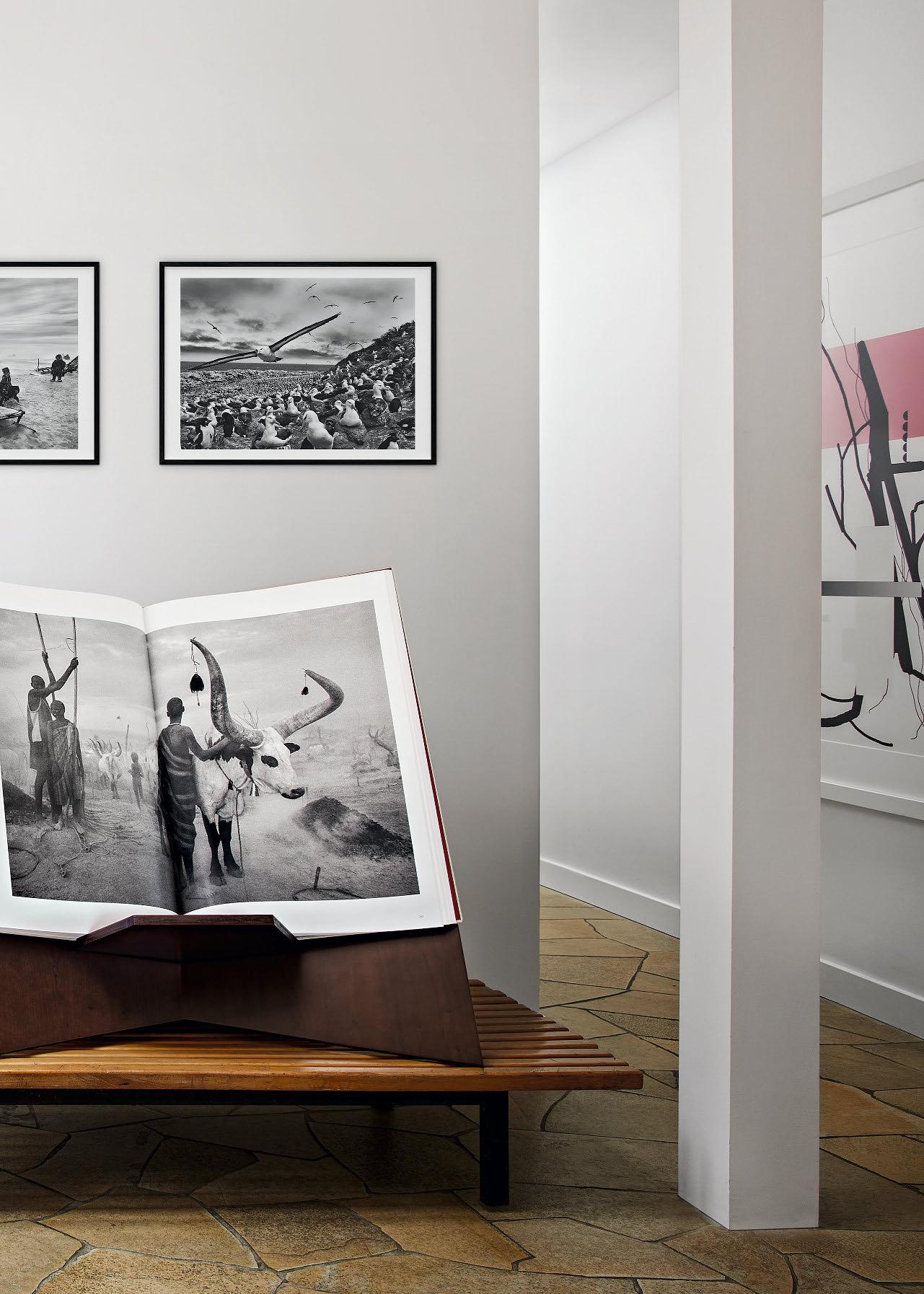
Black-Browed Albatrosses, Falkland Islands, 2009
Art Edition No. 201–300
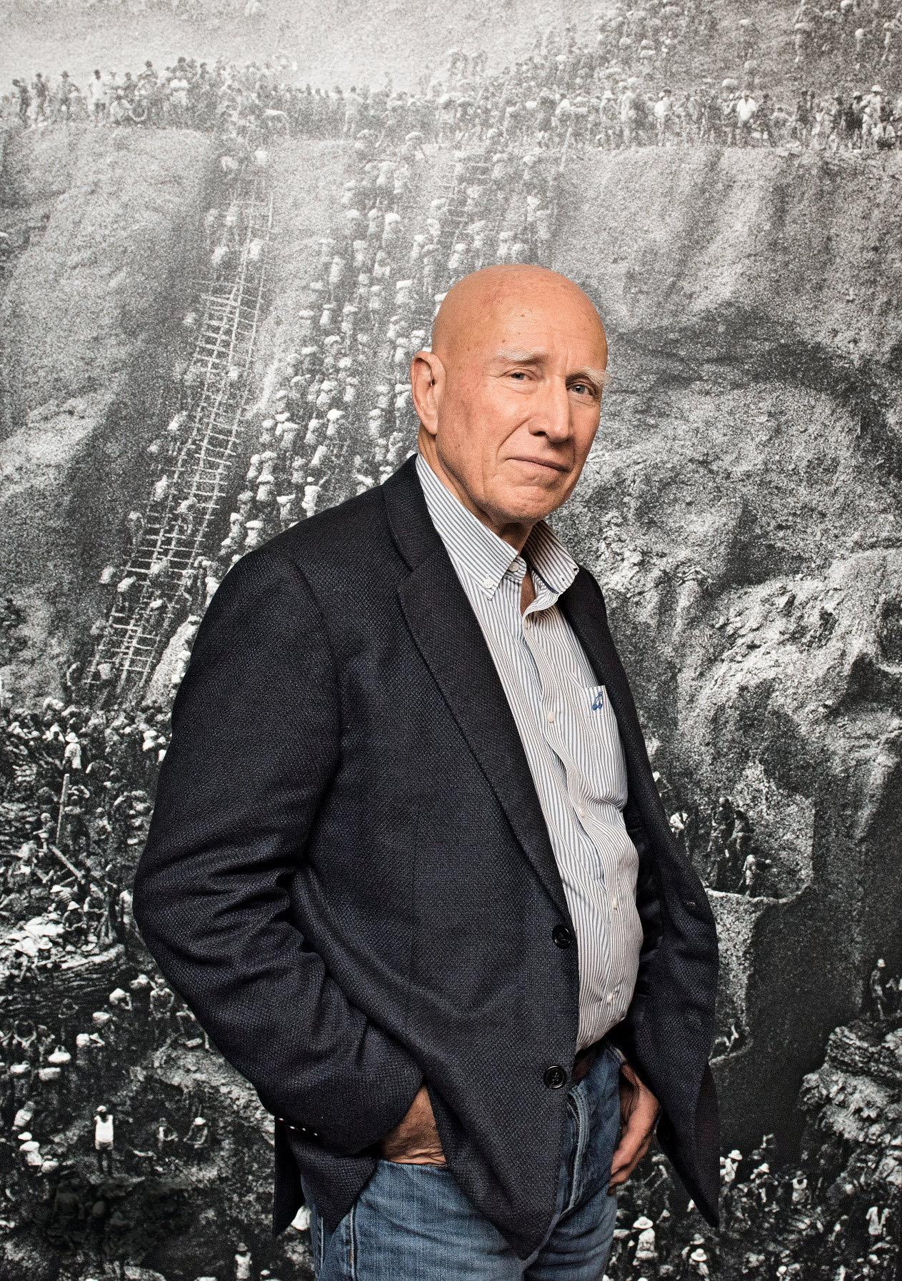
XXL
SEBASTIÃO SALGADO. GOLD
Collector’s Edition No. 101–1,100
Hardcover in clamshell box, 196 pages
45 × 41 cm (17.7 × 16.1 in.)
Signed by Sebastião Salgado
€/£ 800 / $ 1,000
Art Edition No. 1–100 is sold out.
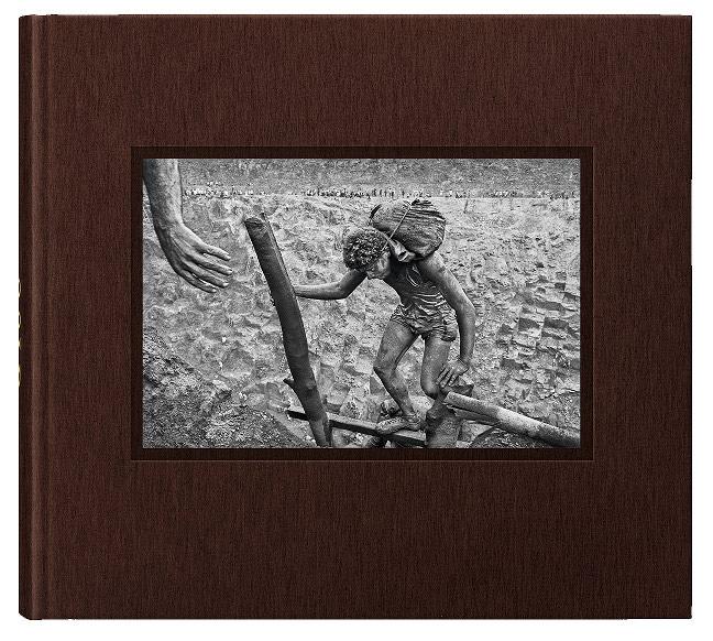

XXL
SEBASTIÃO SALGADO. KUWAIT. A DESERT ON FIRE
Collector’s Edition No. 101–1,100
Hardcover in clamshell box, 188 pages
45 × 41 cm (17.7 × 16.1 in.)
Signed by Sebastião Salgado
€/£ 1,000 / $ 1,250
Art Edition No. 1–100 is sold out.
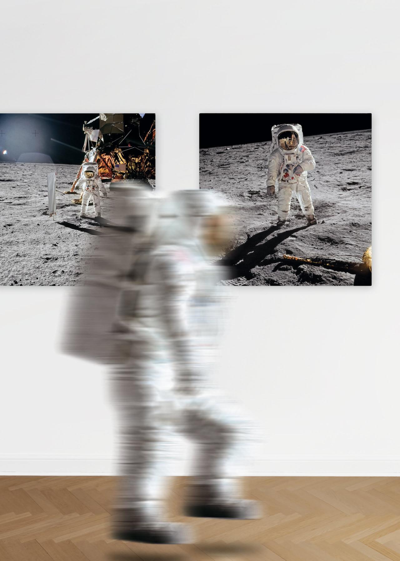
OUT SOLAR WIND COMPOSITION EXPERIMENT Edition of 75
h 101.6 × w 101.6 cm (40 × 40 in.)
€/£ 5,000 / $ 6,000
€/£ 5,000 / $ 6,000
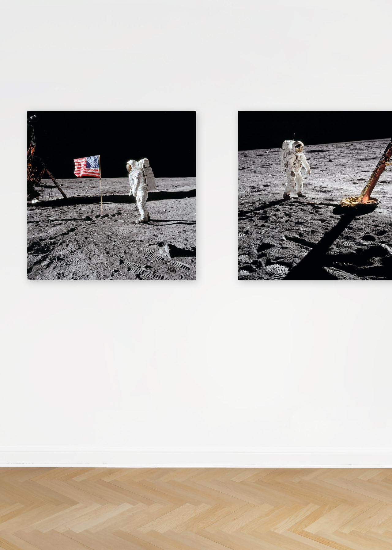
€/£ 5,000 / $ 6,000
Limited edition of 1,000 dye-sublimation prints on ChromaLuxe aluminum panel, ready to hang.
EARTHRISE SEQUENCE
Edition of 150
Diptych, h 80 × w 240 cm (31.5 × 94.5 in.)
€/£ 6,500 / $ 7,500
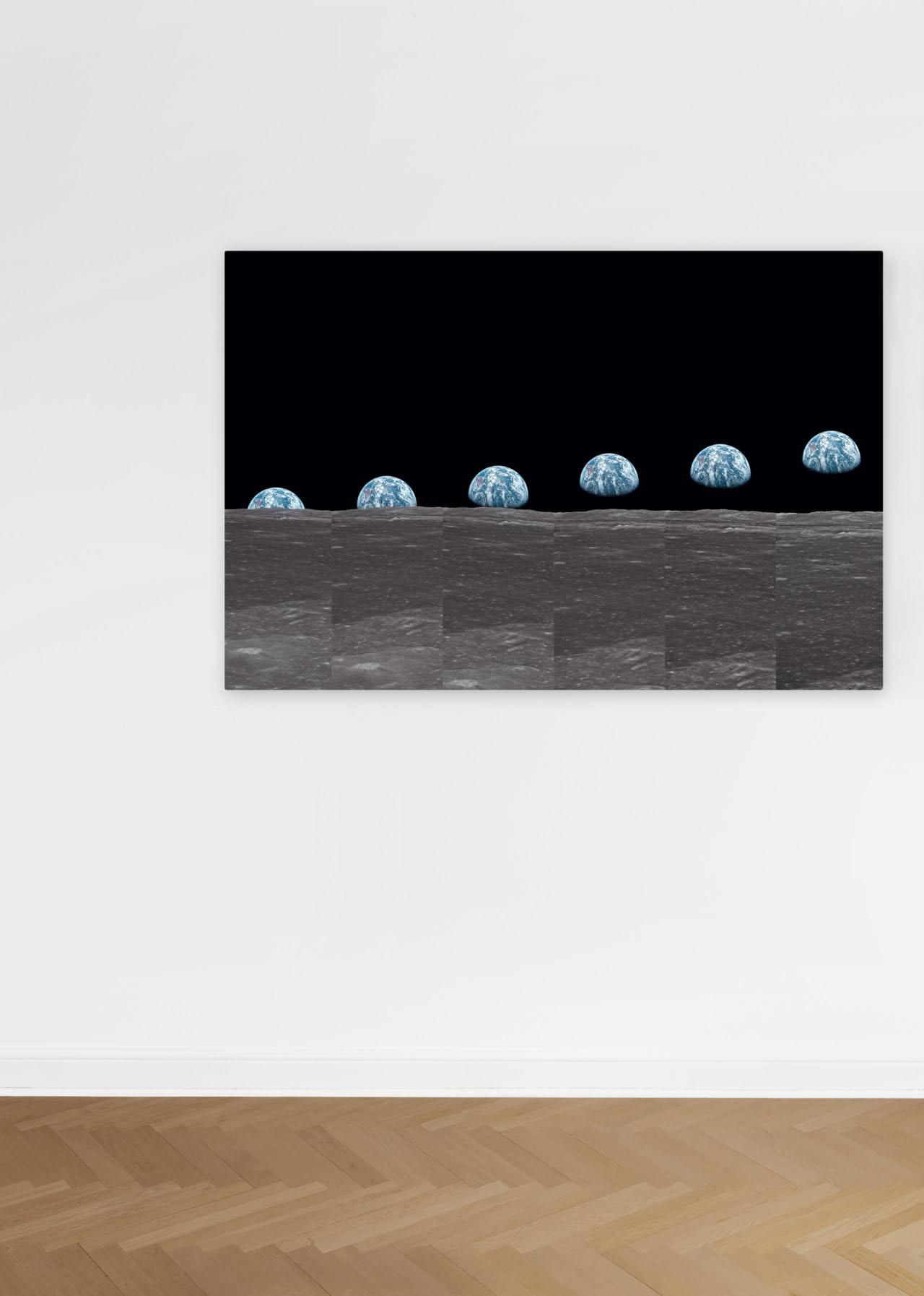
On July 20, 1969, the world was transformed as Neil Armstrong and Buzz Aldrin took their first steps on the Moon. Revisit the momentous Moon landing of the Apollo 11 mission with TASCHEN’s exclusive fine art prints signed by Buzz Aldrin on the 50th anniversary in 2019.

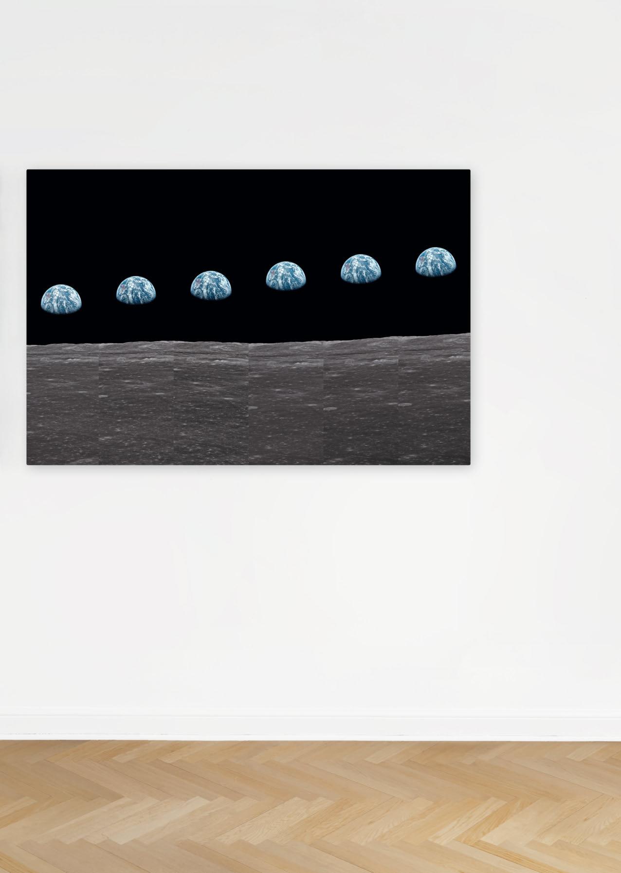
Each authorized, limited edition print is signed by Buzz Aldrin.
From the limited edition of just 12, one for each astronaut who has walked on the moon, only two issues of the Lunar Rock Edition of Norman Mailer’s MoonFire—designed by Marc Newson—are available today. Each book is contained in a case inspired by the Apollo 11 LEM (Lunar Excursion Module)—its surface an actual 3-D topography of the Moon —and comes with a unique piece of lunar meteorite.

Unique Lunar Rock Edition No. 1,967
NWA 5153
Type: Basalt-Bearing Mingled Feldspathic Breccia
Discovery site: North West African corridor near the Moroccan / Algerian border
Size: 38 × 27 × 23 mm; weight: 41.88 g
Price on request

NORMAN MAILER, MARC NEWSON. MOONFIRE, LUNAR ROCK EDITION
Aluminum case with lunar rock in capsule and framed print, 32.5 × 40 cm (12.8 × 15.7 in.), hardcover volume with 4 fold-outs, 348 pages
36.5 × 44 cm (14.4 × 17.3 in.)
Each book is contained in a LEM-inspired case whose surface is an actual 3D topography of the Moon made from a single piece of aluminum (size: 523 × 596 × 347 mm, weight: 22 kg), and is accompanied by a separately packaged piece of lunar rock.
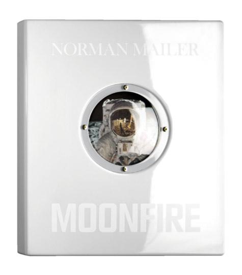
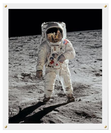

Unique Lunar Rock Edition No. 1,968
NWA 4936
Type: Lunar Feldspathic Breccia
Discovery site: Siskou, Morocco
Size: 69 × 42 × 17 mm; weight: 91.26 g
Price on request

The ultimate collectible, published in a limited edition of 10,000 numbered copies in exactly half the size of the famous 1999 original.
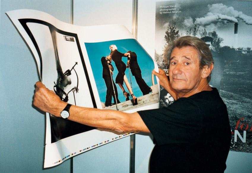
the helmut newton sumo was overwhelming in every respect: a 464-page homage to the most influential and controversial photographer of the 20th century, and a book that broke records for weight, dimensions, and resale price.
Helmut Newton (1920–2004) always demonstrated a healthy disdain for easy or predictable solutions. SUMO—a bold and unprecedented publishing venture—was an irresistible project. The idea of a spectacular compendium of images, reproduced to exceptional page size and to state-of-the-art origination and printing standards, emerged from an open, exploratory dialogue between photographer and publisher. With its awe-inspiring weight of around 35 kilos, its unusual concept, and its flawless technical production, the book set new standards.
Published in a limited edition of 10,000 signed and numbered copies, the first SUMO sold out soon after release and quickly multiplied its value. As a worldwide publishing sensation, the book took the art monograph genre to an entirely new level and is today found
Helmut Newton checks a printing sheet during the Frankfurt Book Fair, 1999.
Opposite: Elizabeth Taylor, Vanity Fair, Los Angeles, 1989.
in numerous important collections around the world, including New York’s Museum of Modern Art. Legendary SUMO copy number one, autographed by over 100 of the book’s featured celebrities, also broke the record for the most expensive book of the 20th century, selling at auction in Berlin on April 6, 2000, for 620,000 German marks. Revisiting the original SUMO and edited by June Newton, this edition was created on the centenary of Helmut Newton’s birth and TASCHEN’s 40th anniversary. Shrunk to exactly half the size of the famous 1999 original, the “BABY SUMO” is no less glamorous: with more than 400 breathtaking images, reproduced and printed to the latest standards, it still has all the scope of a private exhibition of photographs. It is likewise published in a limited edition of 10,000 copies and comes with a detailed booklet documenting the making of this major publishing event. Philippe Starck has once again designed the accompanying bookstand, this time including a pedestal, as an ideal way to display the volume.

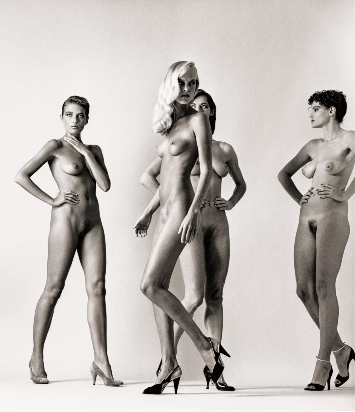
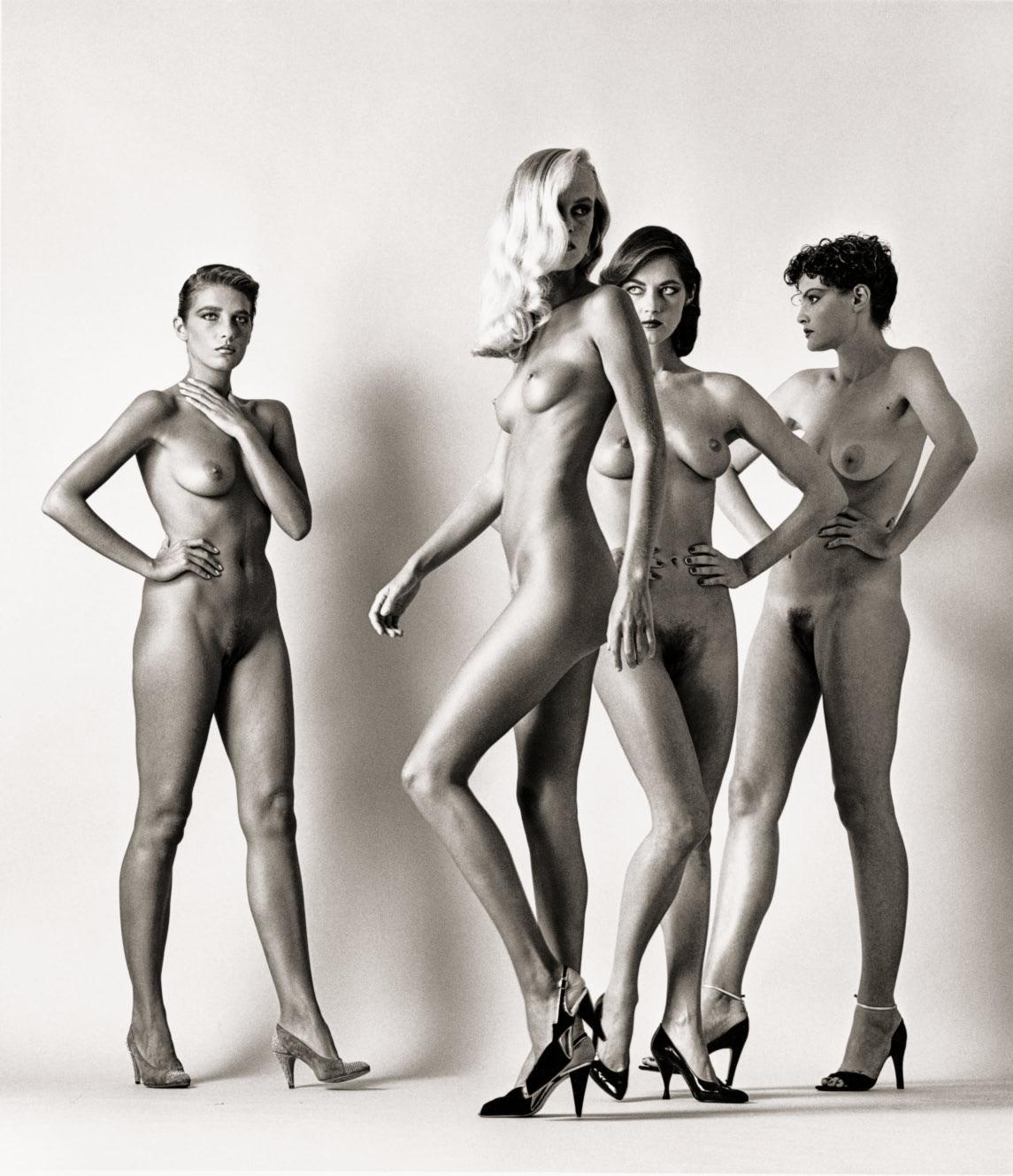
HELMUT NEWTON. BABY SUMO
Edited and revised by June Newton Collector’s Edition of 10,000 numbered copies Hardcover, 464 pages
35.8 × 50 cm (14.1 × 19.7 in.)
Height of book on stand: 74 cm (29.2 in.)
€/£ 1,250 / $ 1,500
BABY SUMO comes with a bookstand designed by Philippe Starck, including a pedestal and a booklet documenting the making of this legendary publication.
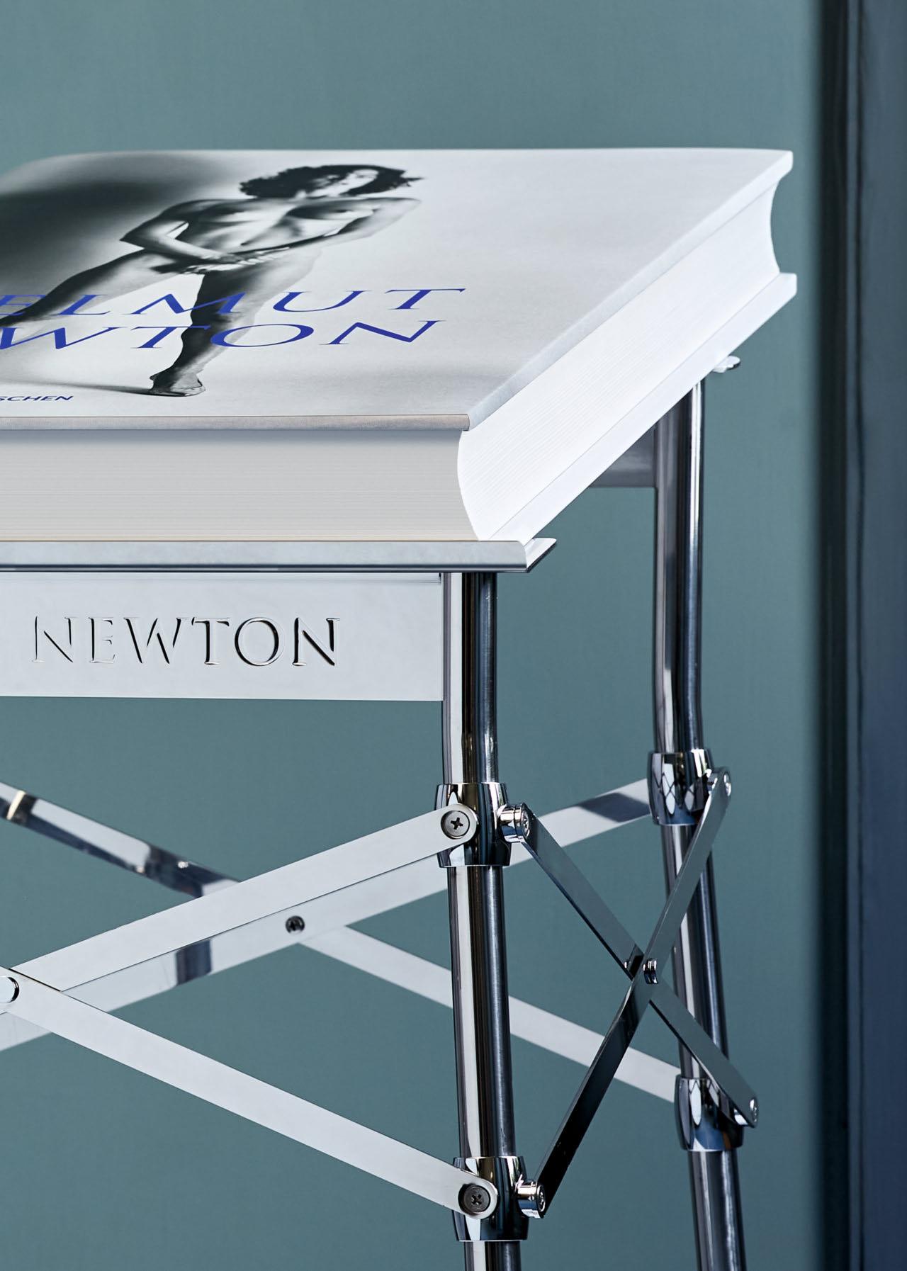


“Shot in von Unwerth’s cheeky, sensual style, Heimat is a visual delight.”
Women’s
Wear Daily
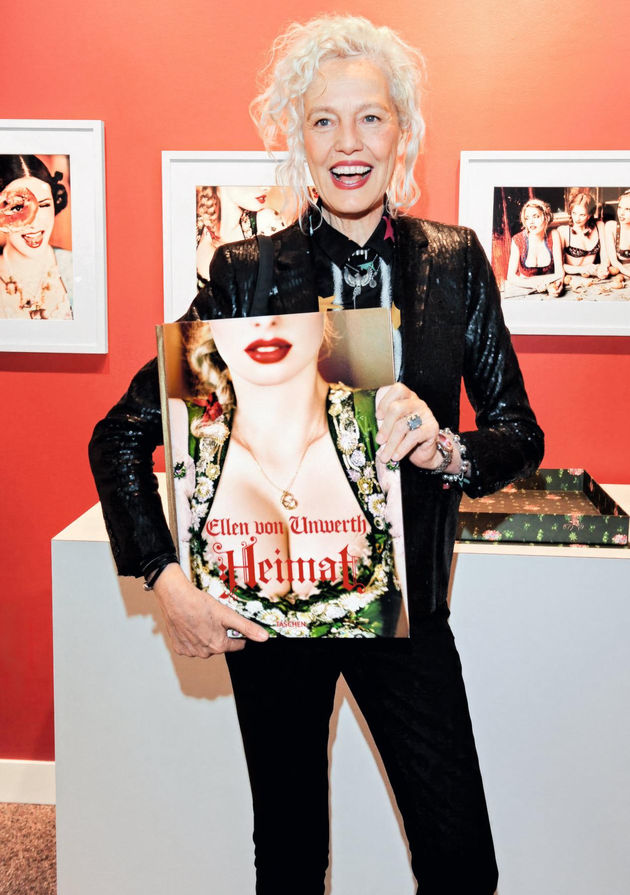
A place of alpine forests. Emerald lakes. And beautiful, snow-dusted peaks. A land where cowbells tinkle in meadows. Where days pass at a more natural pace. And where village girls Hilda, Traudel, Heidi, and their friends enjoy a quiet life of country pursuits. Join their idyllic adventure. Set foot on a journey of joy.
Viva Bavaria!
XXL
ELLEN VON UNWERTH. HEIMAT Collector’s Edition No. 401–1,900 Hardcover in clamshell box, 454 pages 33 × 44 cm (13 × 17.3 in.)
Signed by Ellen von Unwerth €/£ 750 / $ 1,000

Edition of 100 each C-print on high-reflection Fujiflex paper in portfolio, each 35 × 45 cm (13.8 × 17.7 in.)
Art Edition No. 301–400 is sold out.
Over 300 of the greatest portraits of our time, printed big and bold
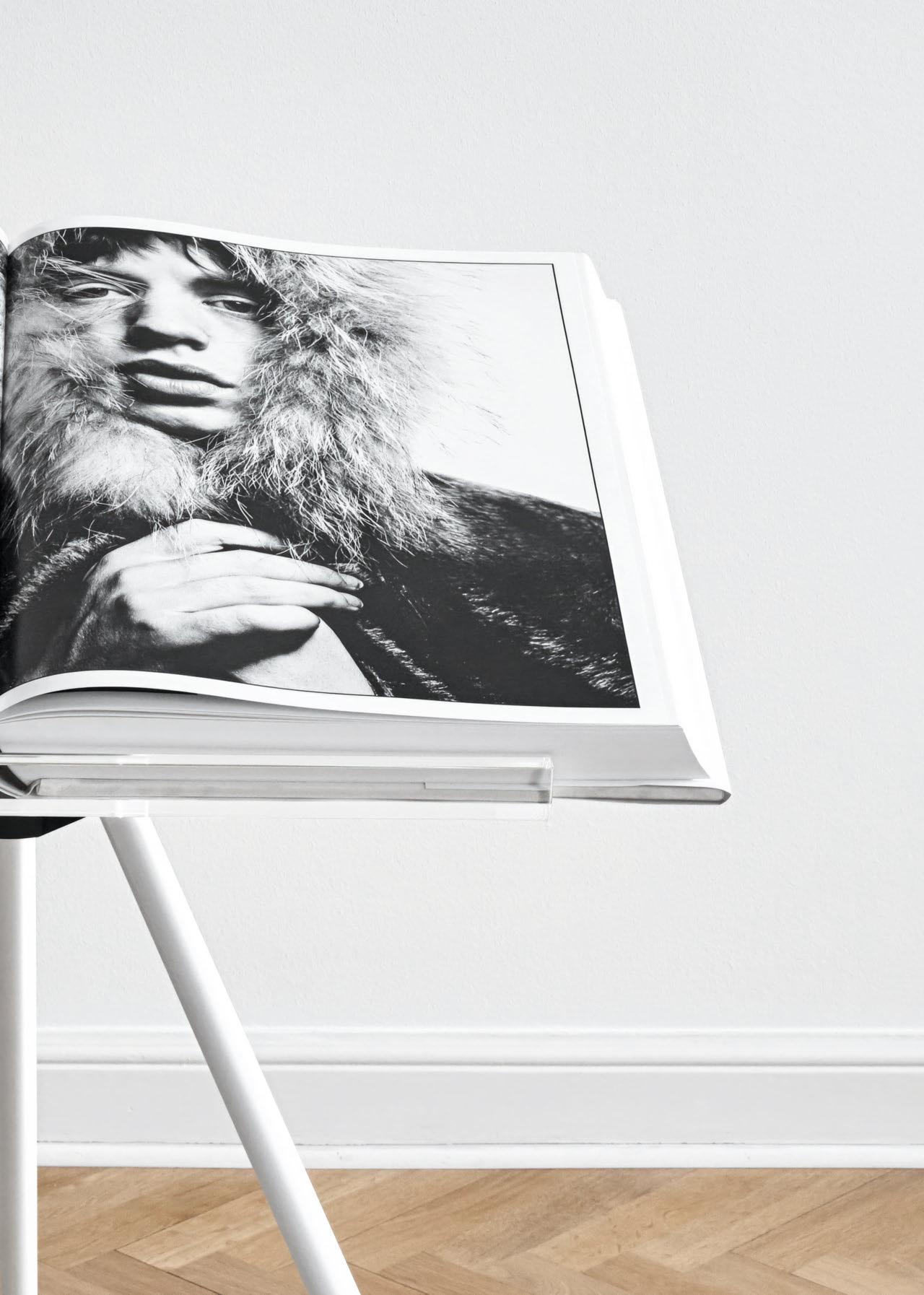
SUMO
DAVID BAILEY
Collector’s Edition No. 301–3,000
Hardcover, 440 pages 50 × 70 cm (19.7 × 27.6 in.)
Each edition comes with a bookstand designed by Marc Newson and a set of four book jackets featuring John Lennon and Paul McCartney, Jean Shrimpton, Mick Jagger, and Andy Warhol.
Signed by David Bailey
€/£ 2,500 / $ 3,000

€/£ 10,000 / $ 12,500
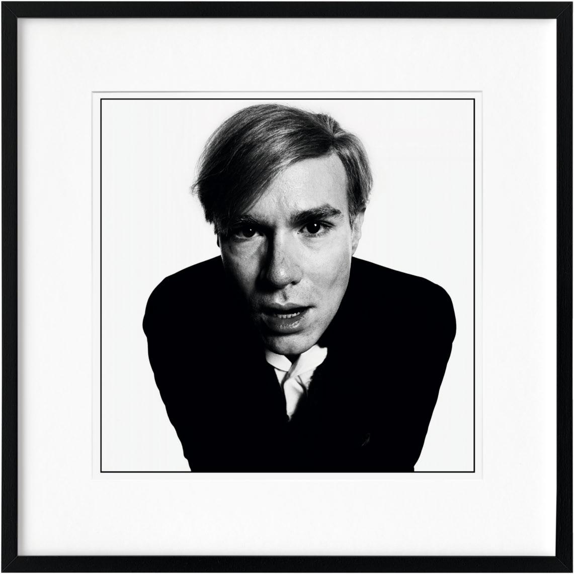

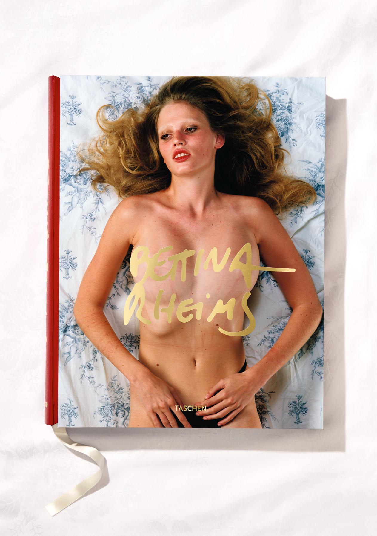
“Feminine nudes of erotically provocative beauty.”
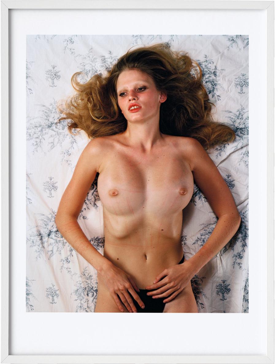
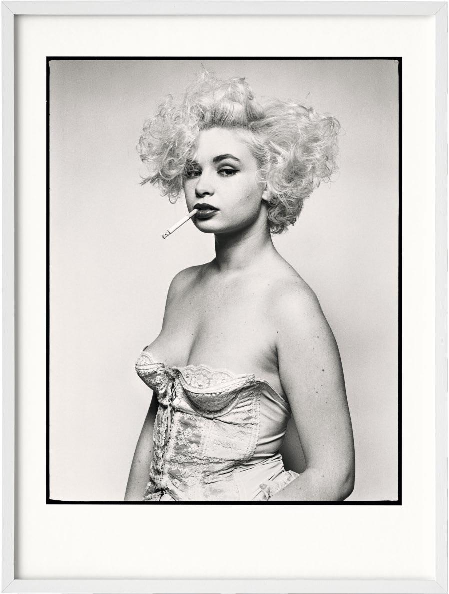
Edition No. 101–200
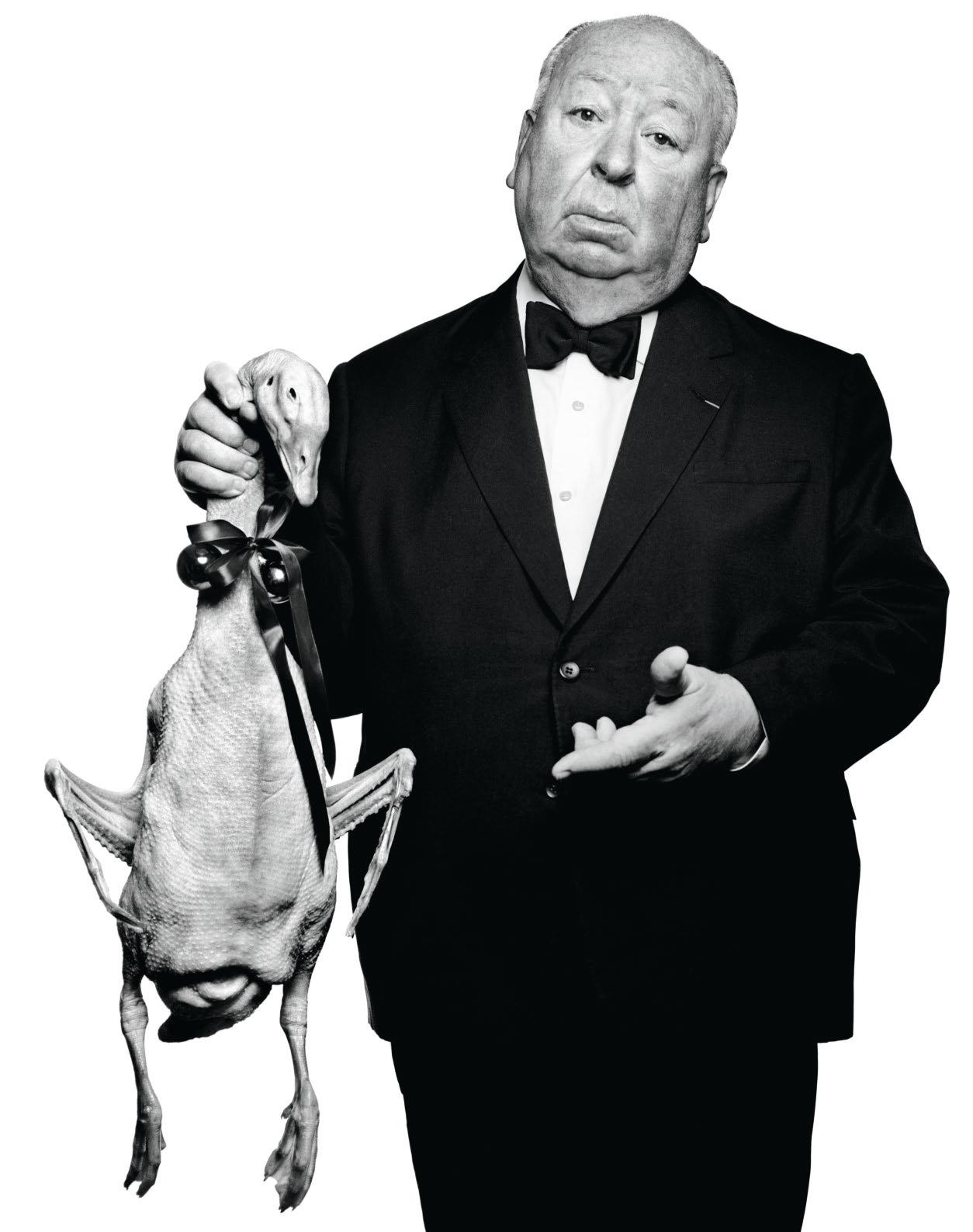
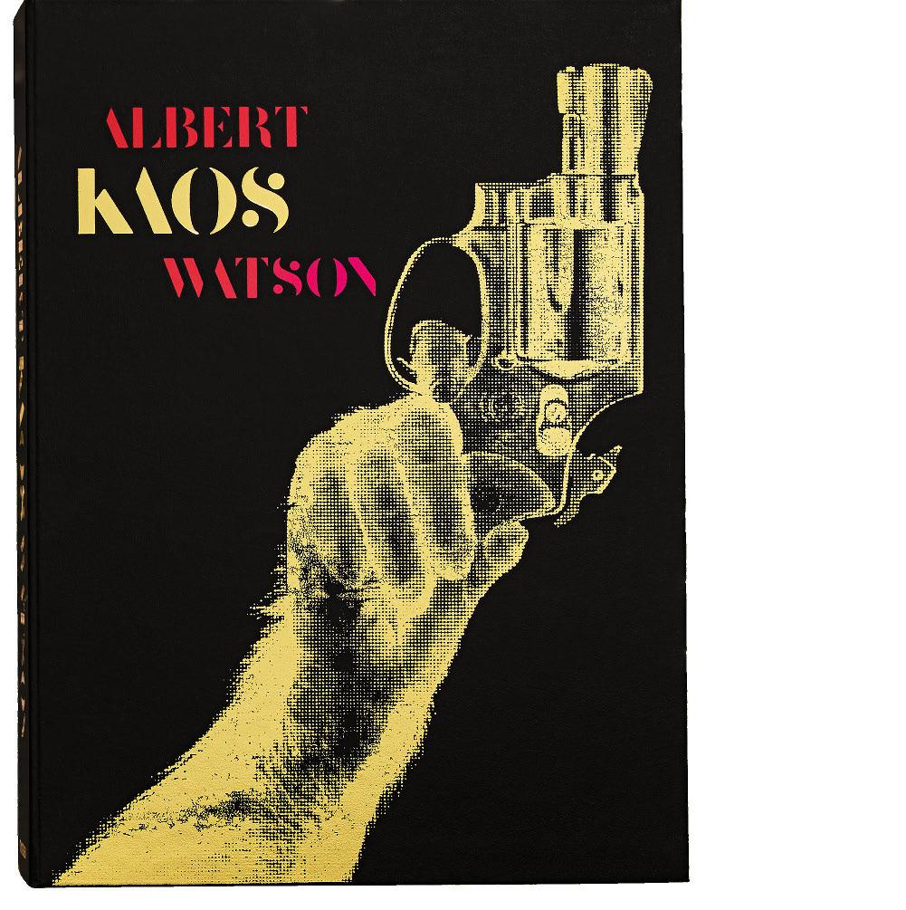
“Watson deftly combines
innovative thinking
with
a mastery of technique, making his work a visual symphony of rhythm, compositional harmony, and tonal melodies.”
ALBERT WATSON. KAOS
Collector’s Edition No. 201–1,200
Hardcover with faux chimpanzee fur fitting, in clamshell box, 408 pages
37.2 × 50 cm (14.6 × 19.7 in.)
Signed by Albert Watson
€/£ 2,000 / $ 2,500

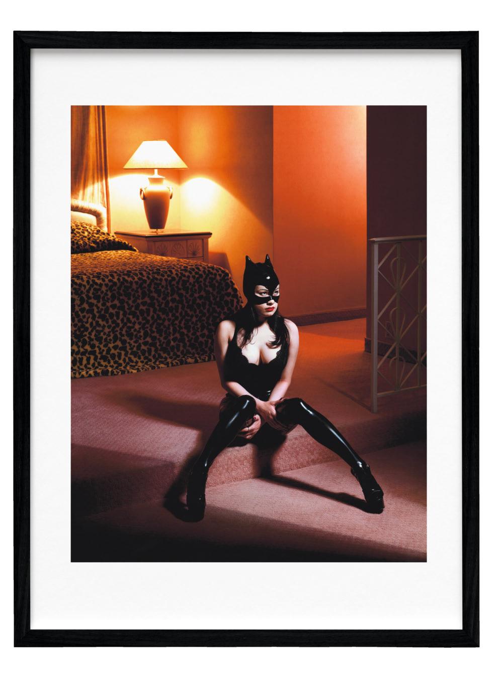

“I like the idea that you can leave the book open to a page and let it stand for days and then change it.”
Annie Leibovitz
Annie Leibovitz guides us through her SUMO
mA kIng thIs Book was not something I knew that I wanted to do. But one day I received a beautiful letter from Benedikt Taschen. It wasn’t an e-mail or a fax. It was hand-delivered. Benedikt said that he wanted to do a book with me and he asked if we could have lunch. When we met, he said that he wanted to do a large book. I had just finished a limited edition of very large prints, so I was feeling more open to this idea than I might have been in the past. Seeing those pictures big had been a revelation. As I thought more about what Benedikt was suggesting, I realized that it wasn’t really a book at all. It was more like an installation. A piece of sculpture.
I was intrigued. But what photographs would work? They had to look good in a big size, obviously, and they had to stand on their own to a certain extent. The pictures couldn’t depend on what came before and after them in the sequence as much as they do in other books. I like the idea that you can leave the book open to a page and let it stand for days and then change it. It’s a collection of prints, although there are rhymes in the pagination. There are riffs. The first two pictures, the portrait of Queen Elizabeth and the photograph of Richard Nixon’s helicopter lifting off from the White House lawn after Nixon had resigned as president, were placed where they are because I began thinking of them as bookends for my entire career. The pictures demonstrate the evolution of my style.
I started out as a black-and-white reportage photographer. That’s what I was doing at the White House in 1974—covering something that was unfolding in front of me. I was a young kid when I took that picture. The session in Buckingham Palace in 2007 was completely different. It was a carefully planned set-up situation that involved coordination and timing. It’s a color photograph shot with a digital camera. The Nixon picture is something of an anomaly in the book because it wasn’t staged. Reality is often stranger than fiction. That’s always in the back of my mind. My set-up pictures are loosely based on some kind of reality. I borrow elements from real life.
There are several pictures of large groups in the book. I dislike taking photographs of groups, which in the long run are kind of anti-portraits unless there is a very good reason to put the people together. I’d much rather be taking an individual portrait. That being said, I’ve done a lot of groups for one reason or another and I ended up being very happy with what happened to them here. Printing the pictures big transformed them. The photograph taken for the 90th anniversary of Paramount Pictures in 2002 has 94 people in it. When it ran in the pages of Vanity Fair, you couldn’t really see anyone. The people were too small. That was a shame because they are interesting, important people, many of whom wouldn’t be around much longer. It was an extremely well-executed sitting. Since we had choreographed everything with stand-ins the day before, the photograph itself took only a matter of minutes. It was great to see that picture come to life.
Sometimes photographs don’t fit into the camera frame. That’s true of the picture of the cast of The Sopranos. We were able to spread it out here. And we could use all of the portrait of Cindy Sherman. When it ran in the magazine, it was a double-page spread. You couldn’t see how long the lineup of women was. Years after I took that picture, I went to photograph Claire Danes and I said how glad I was to meet her. She said, “Oh, we’ve met before.” I couldn’t for the life of me remember where, and then she said, “I was on the end of the Cindy Sherman photograph and you cut me off.”
The pictures from my book Pilgrimage might seem strange choices for this book, but even though the Pilgrimage photographs have no people in them, to me they are still portraits. The people are gone now, but their presence resonates. Elvis’s TV set with the bullet hole in it is near the picture of Donald Trump. There’s something about power and anger going on there. Virginia Woolf’s desk is near Joan Didion’s portrait. That desk says something about art. Art is messy. And it’s hard.
“This isn’t one for the shelf—left open at any page, it becomes a work of art in the room.”
ANNIE LEIBOVITZ
Collector’s Edition No. 1,001–10,000
Hardcover with a tripod bookstand designed by Marc Newson. Available in one of four different covers, 476 pages 50 × 69 cm (19.7 × 27.2 in.)
Signed by Annie Leibovitz
€/£/$ 7,500
Art Edition No. 1–1,000
Keith Haring (contact sheet), New York City, 1986
Archival pigment print, h 51 × w 51 cm (20 × 20 in.)
Signed by Annie Leibovitz
€/£ 8,500 / $ 10,000
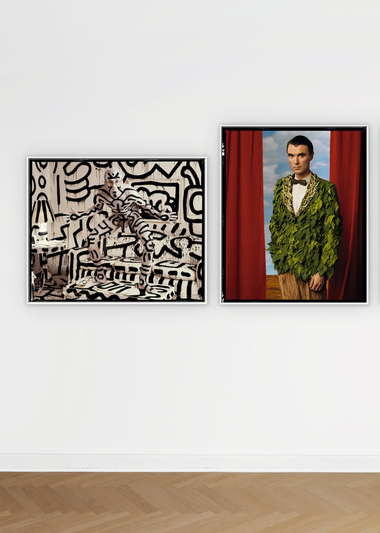
Keith Haring, New York City, 1986
h 50 × w 61.3 cm (19.7 × 24.1 in.)
Art Edition No. 1–1,000
Byrne,
Art Edition No. 1–275
XXL
ANNIE LEIBOVITZ
Hardcover in slipcase, 556 pages
27.1 × 37.4 cm (10.7 × 14.7 in.)
Four Art Editions of 2,000 numbered dye-sublimation
ChromaLuxe aluminum prints, framed and ready to hang
Signed by Annie Leibovitz
Each Art Edition is accompanied by a numbered book in a slipcase.
€/£/$ 1,500
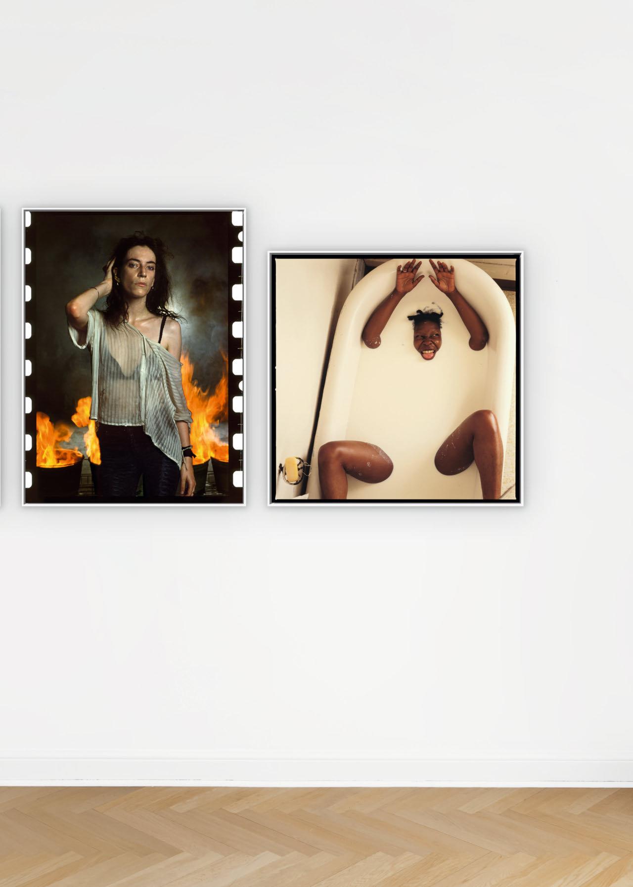
“A formidable photographic journey through our cultural history.”
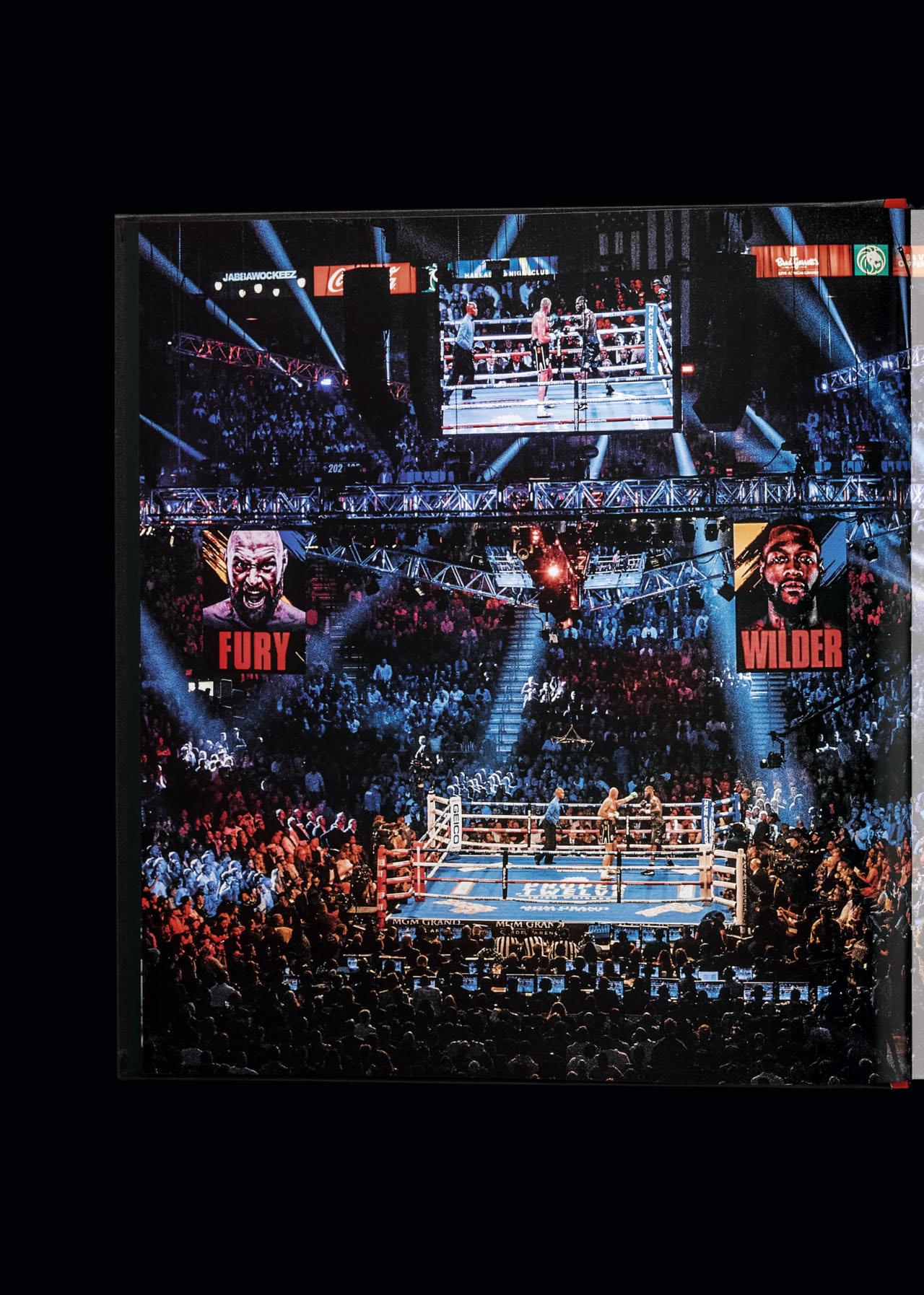
Collector’s Edition of 1,000 copies
1,000 / $ 1,250
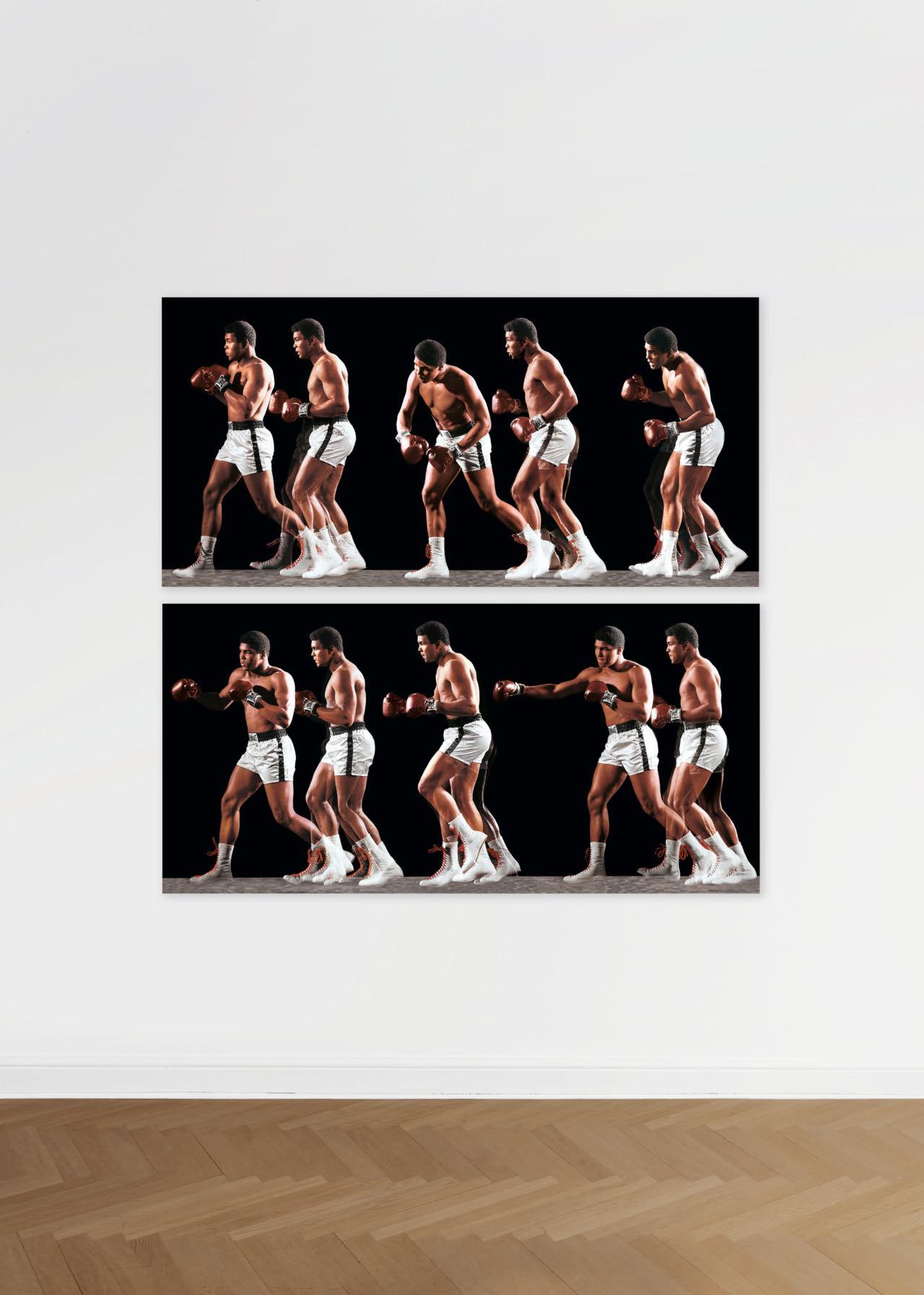
ALI INVENTS THE DOUBLE-CLUTCH SHUFFLE, 1966
Edition of 40
Two panels, each h 80 × w 165 cm
(31.5 × 65 in.)
Signed by Neil Leifer
€/£ 7,000 / $ 8,000
by

Classic photographs, each in an edition of 40 signed dye-sublimation prints on ChromaLuxe aluminum panels, ready to hang.
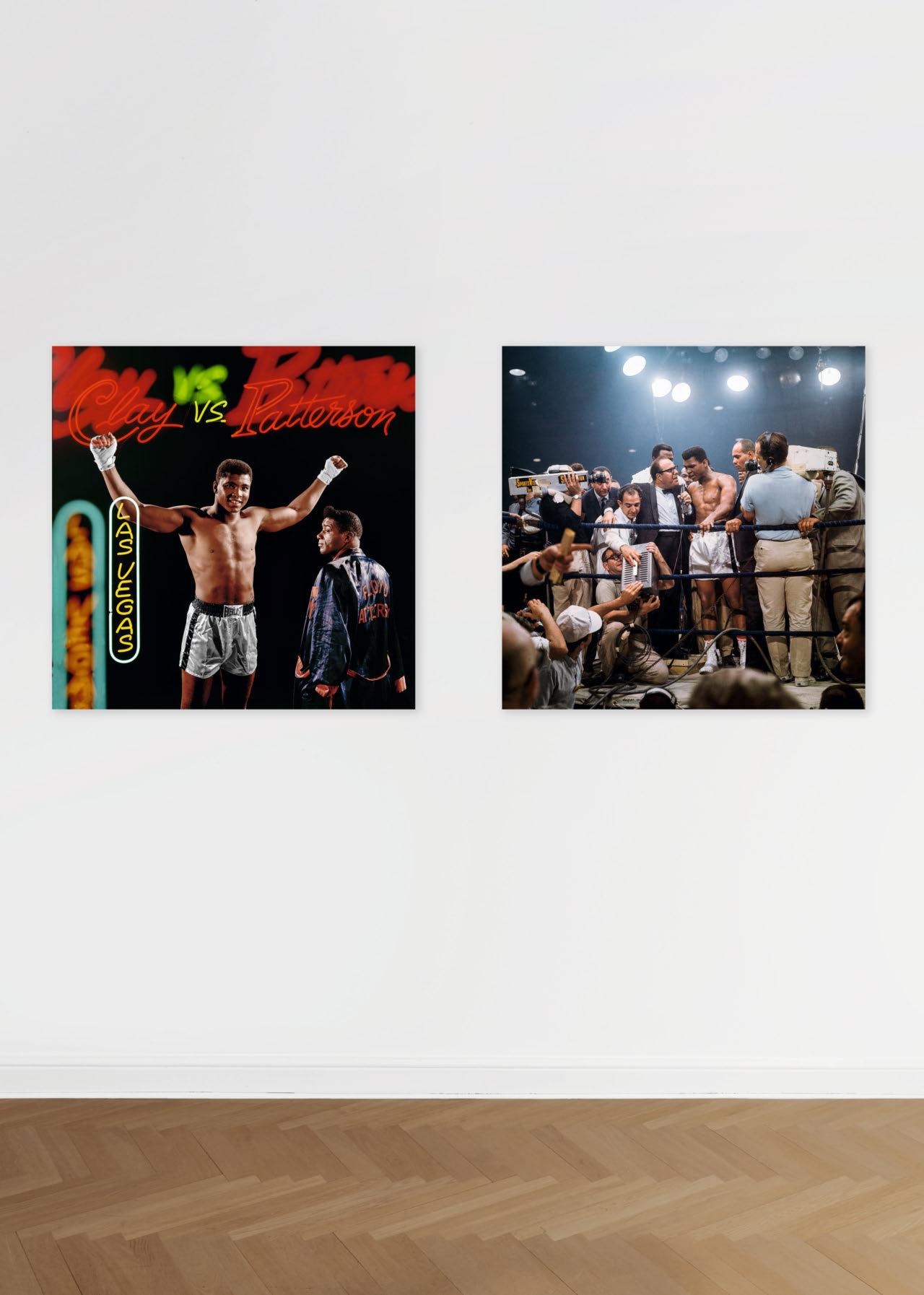
Powerful, nuanced, and adept at finding openings others would never see: the unmistakable Leifer touch!
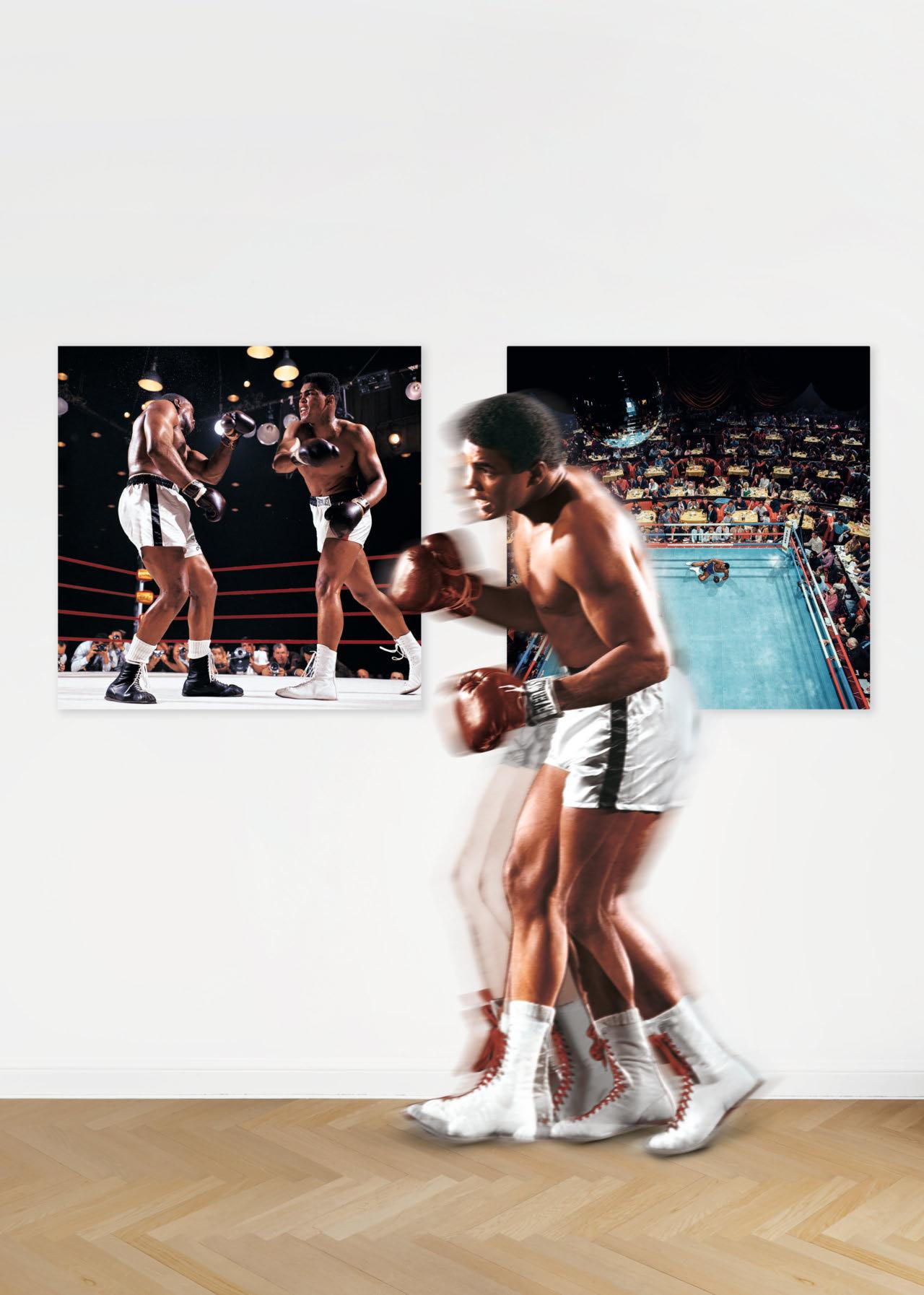
Edition of 40 each h 100 × w 100 cm
(39.4 × 39.4 in.)
Signed by Neil
€/£ 3,500 / $ 4,000 each
“Tender and sometimes tongue-in-cheek take on New York.”

E. NEWMAN Collector’s Edition No. 301–1,000 Hardcover in slipcase, 236 pages 30.5 × 44 cm (12 × 17.3 in.)
Signed
by
Marvin E. Newman
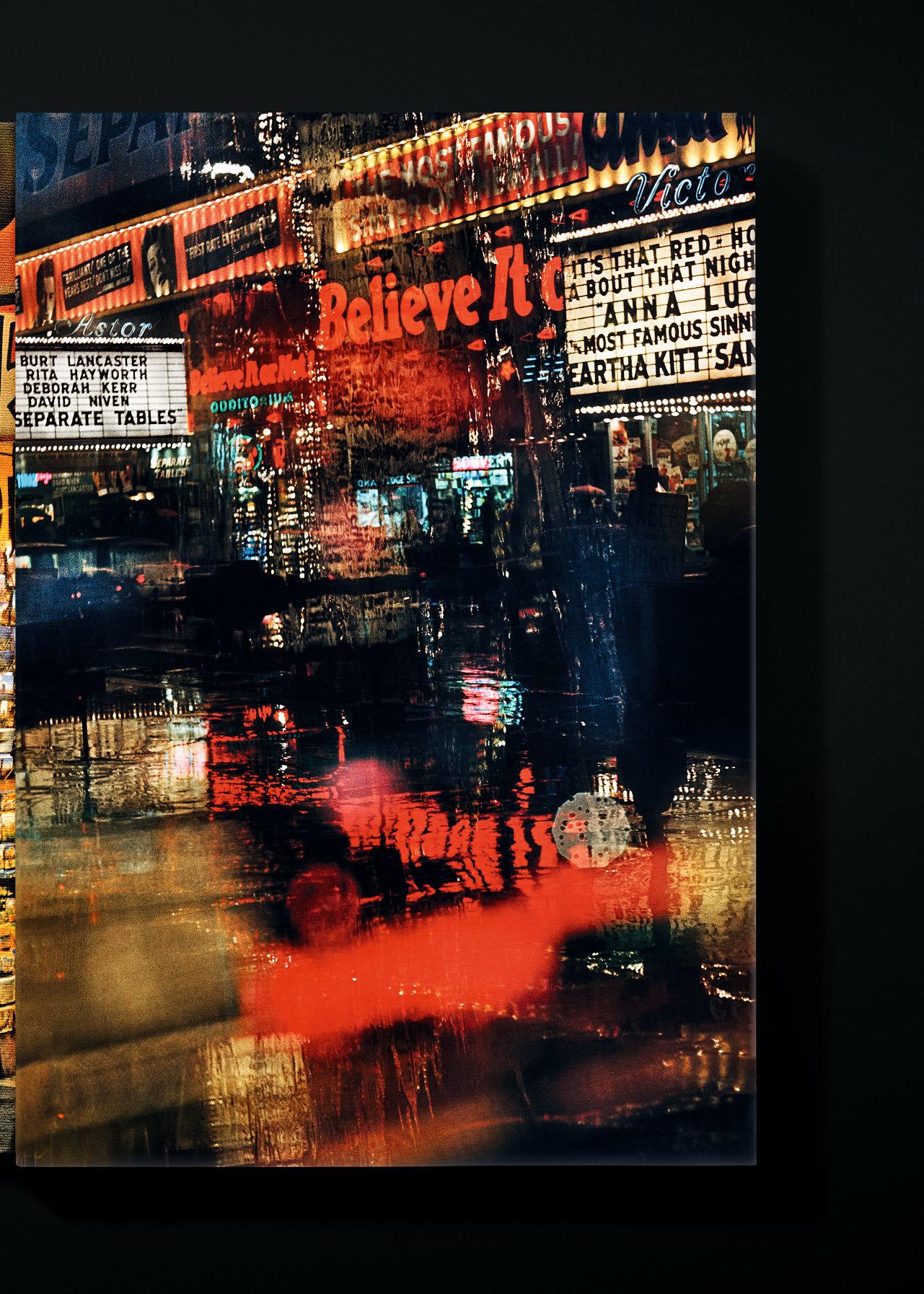
In 1952, AFter becoming one of the first ever recipients of a Master of Science degree in Photography at Chicago’s Institute of Design, native New Yorker Marvin E. Newman returned to his hometown. Like many artists before, he set about chronicling the city. Unlike his predecessors, Newman chose color photography as the preeminent medium for capturing the people, landmarks, chaos, energy, and unique experience of 20th-century New York, and its emergence as the self-proclaimed “Greatest City in the World.”
Lauded by the likes of Eastman House, the MoMA, and the International Center of Photography, Newman’s images remained, up until now, largely undiscovered beyond a prestigious collector and gallery circle. After featuring Newman in New York: Portrait of a City, TASCHEN’s Collector’s Edition of some 170 pictures from the late 1940s through to the early 1980s is the first monograph of the artist’s career. Newman passed away in 2023 at the age of 95.
The volume includes vivid tableaux across New York, as well as top shots from his sports photography portfolio for the likes of Life, Look, and Sports Illustrated, and images from the Midwest; Chicago; a vintage 1950s circus; a legalized brothel in Reno, Nevada; Las Vegas; Alaska; and the West Coast. From Times Square to Wall Street, Newman’s vivid, original photographs offer fresh perspectives on familiar New York landmarks but, above all, a unique sense for life in the city and for the drama, extremities, and complexities that weld New York to so many hearts. Beyond New York, Newman applies the same flawless technique and humanist sensibility to other locations across the United States, providing memorable images that leave their mark on the eye and the soul.
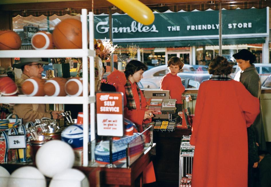
Kansas, 1954.

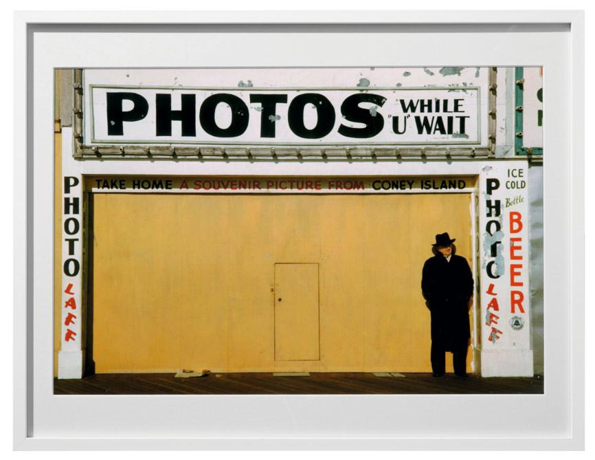
“My photographs will live on after me. Everything I wanted to put in a photograph is here.”
Marvin E. Newman
Art Edition No. 1–75
Coney Island, 1953
Pigment print on Platine
Archival Fibre Rag paper, h 30.5 × w 45.6 cm (12 × 18 in.) on 38 × 50 cm (15 × 20 in.) paper
Signed by Marvin E. Newman
€/£ 1,500 / $ 2,000
Art Edition No. 76–150
Broadway, Believe It, 1958
Pigment print on Platine
Archival Fibre Rag paper,
h 45.6 × w 30.5 cm (18 × 12 in.)
on 50 × 38 cm (20 × 15 in.) paper
Signed by Marvin E. Newman
€/£ 1,500 / $ 2,000
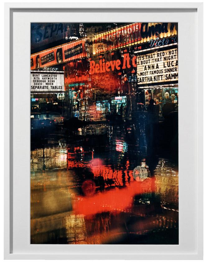

Art Edition No. 151–225
Broadway, 1954
Pigment print on Platine
Archival Fibre Rag paper, h 45.6 × w 30.5 cm (18 × 12 in.) on 50 × 38 cm (20 × 15 in.) paper
Signed by Marvin E. Newman
€/£ 1,500 / $ 2,000
Art Edition No. 226–300
42nd Street, 1983
Pigment print on Platine
Archival Fibre Rag paper, h 30.5 × w 45.6 cm (12 × 18 in.) on 38 × 50 cm (15 × 20 in.) paper
Signed by Marvin E. Newman
€/£ 1,500 / $ 2,000
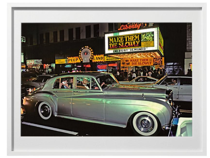

In 1960, photogrApher William Claxton and noted German musicologist Joachim Berendt traveled the United States hot on the trail of jazz music. The result of their collaboration was a collection of photographs and recordings of legendary artists as well as unknown street musicians.
This Art Edition revives the fruit of Claxton and Berendt’s labors, Jazzlife, in one exclusive multimedia tribute, abuzz with the
William Claxton, Sunset Marquis Hotel, Hollywood, 1998.
Opposite: Mahalia Jackson performing in her home on Chicago’s South Side, Illinois. © William Claxton
energy of jazz and the excitement of their original journey. Signed by the artist, the book is accompanied by both a digitally remastered CD from Joachim Berendt’s original jazz recordings and a stunning portfolio of four signed ultrachrome prints. The images, also signed by Claxton, capture Ray Charles, Stan Getz, the George Williams Brass Band, and the Metropole Café on Broadway in New York, making for a stunning collection of the faces and places at the forefront of jazz.
“It is actually Mahalia Jackson’s fault that the white world has taken any notice of gospel music.”
Joachim Berendt
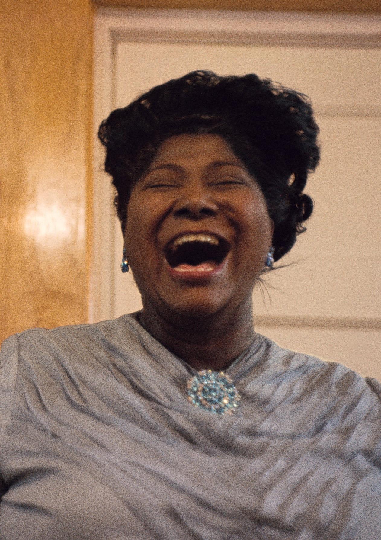
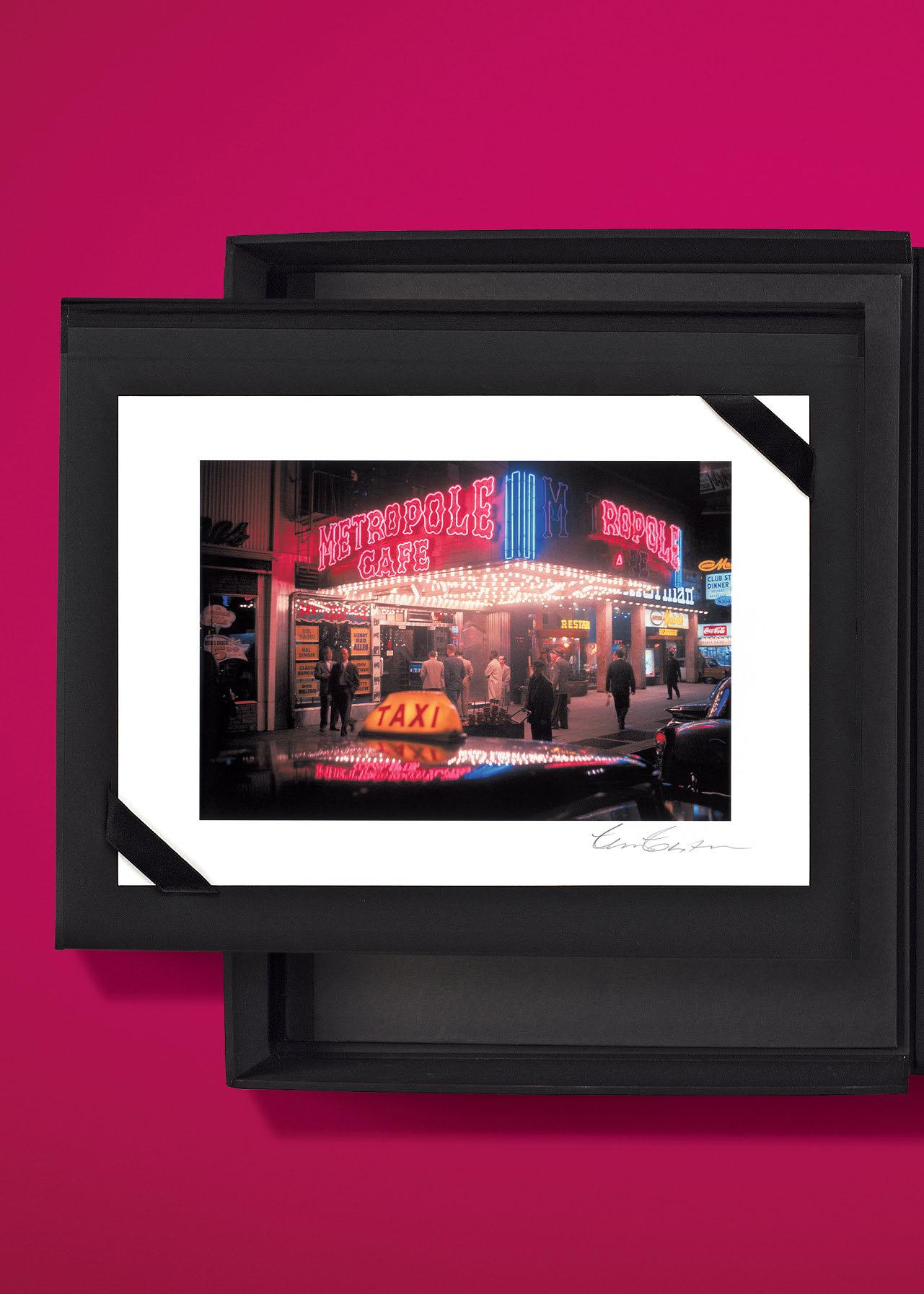
XXL FEW LEFT
WILLIAM CLAXTON. JAZZLIFE
Art Edition No. 1–1,000
Hardcover in clamshell box, 696 pages
29.1 × 40.7 cm (11.5 × 16 in.)
With four ultrachrome prints in portfolio, each h 50 × w 60 cm (19.6 × 23.6 in.), and remastered CD of Joachim Berendt’s original jazz recordings
Signed by William Claxton
€/£ 2,000 / $ 2,500
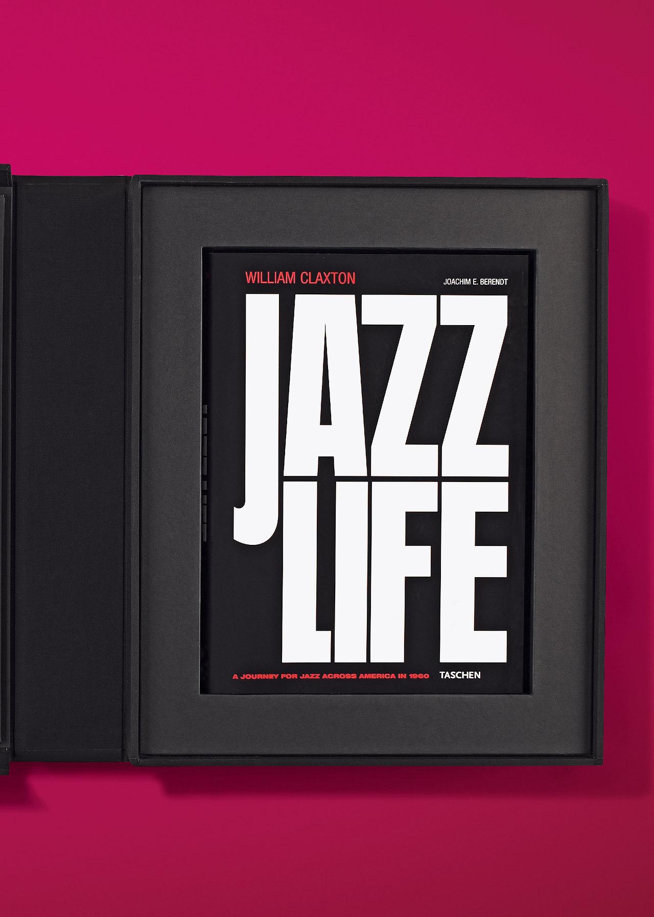
“Jazzlife is surely the most thorough and imaginative visual record of American jazz at mid-century that we’ll ever see.”
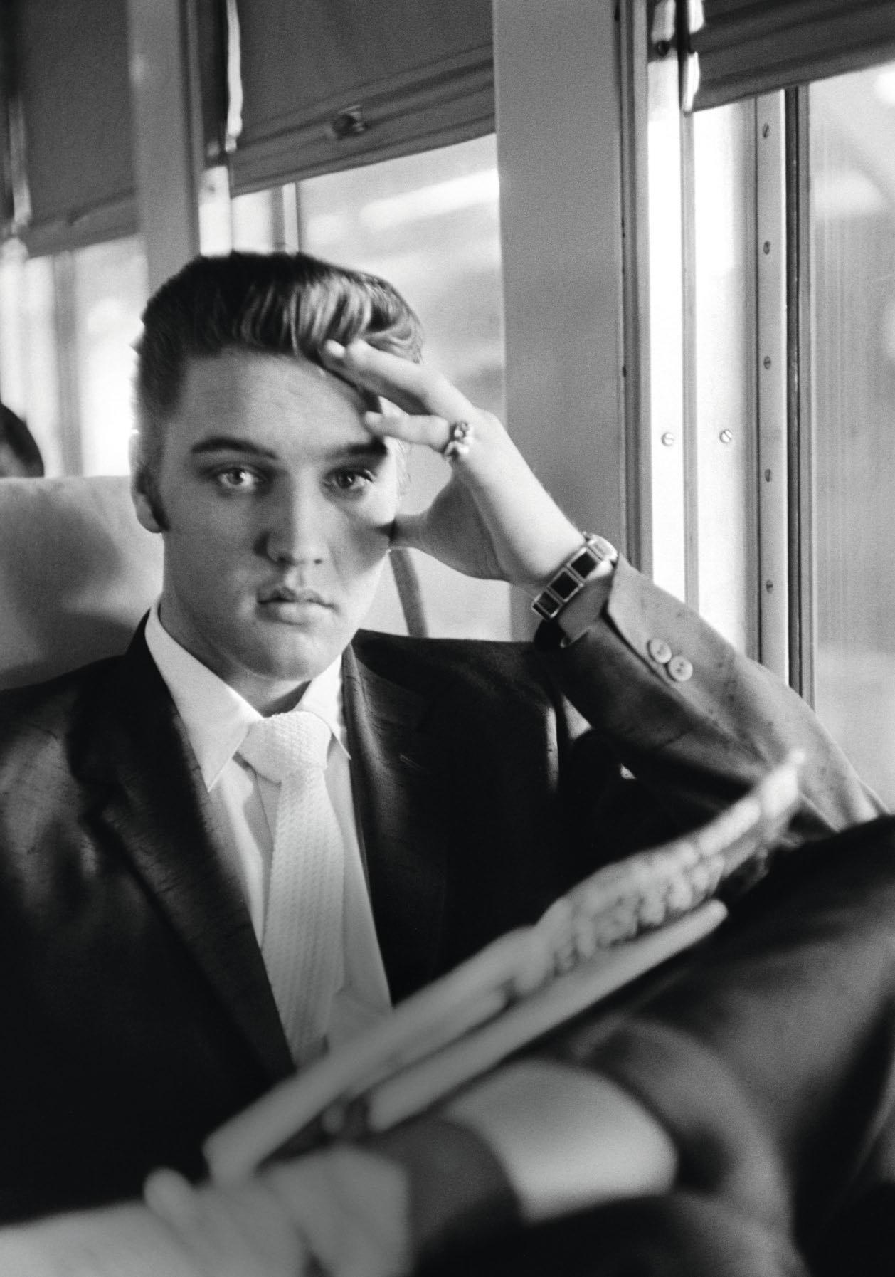
“…an extraordinary archive of a time, a place and the single person who defined it. Their fly-on-the-wall intimacy is testament, too, to the convergence of two relatively shy individuals.”
XXL FEW LEFT
ALFRED WERTHEIMER.
ELVIS AND THE BIRTH OF ROCK AND ROLL
Collector’s Edition No. 251–1,957
Hardcover in clamshell box, letterpressprinted chapter openers, 418 pages 31.2 × 44 cm (12.3 × 17.3 in.)
Signed by Alfred Wertheimer
€/£ 1,250 / $ 1,500
Art Editions No. 1–250 are sold out.
“Elvis who?” was photographer Alfred Wertheimer’s response when, in early 1956, an RCA Victor publicist asked him to photograph an up-and-coming crooner from Memphis. Little did Wertheimer know that this would be the job of his life: just 21 years old, Elvis Presley was—as we now know—about to become a legend. Trailing him like a shadow, Wertheimer was given unlimited scope to get up close and personal with Elvis; even as the singer was seducing young women in dark hallways, he allowed the photographer to record his every move. Wertheimer took nearly 3,000 photographs of Presley that year, creating a penetrating portrait of a man poised on the brink of superstardom. Extraordinary in its intimacy and unparalleled in its scope, Wertheimer’s Elvis project immortalized a young man in the very process of making history. (Just a month after he shot Elvis recording the “Don’t Be Cruel”/“Hound Dog” record, it became the first ever to top all three Billboard charts.)
This Collector’s Edition of just 1,706 numbered copies (No. 251–1,957) signed by Wertheimer brings together his most remarkable Elvis shots from 1956, along with a selection of his historic 1958 pictures of the star being shipped off to an army base in Germany. Though many of Wertheimer’s photos of Elvis are among the best known, nearly half of the photographs in this book have never been published before. Each chapter is illustrated with an original poster created for this book by Hatch Show Print, one of the oldest letterpress print shops in America. In business since 1879, Hatch printed posters for vaudeville, circuses, and entertainers on world tour in the early 20th century; and created many of the powerful woodblock images that helped define the look of country music in the 1940s and rock and roll (including many early Elvis posters) in the ’50s. Fans of photojournalism, portraiture, and, of course, the King himself will covet this collector’s volume.

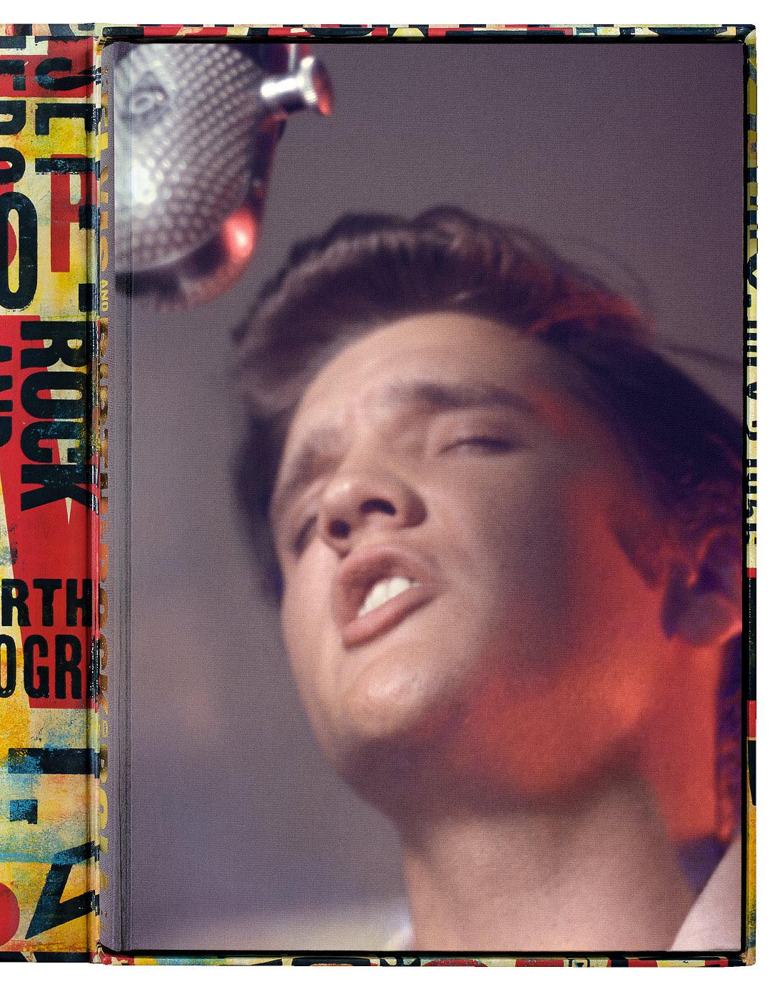
“That hair! Those hips! Elvis Presley in the prime of his life and the beginning of his career.”
10 Magazine

DAVID LACHAPELLE. LOST AND FOUND. GOOD NEWS
Art Edition No. 1–500
Hardcover, 554 pages in total
27.8 × 35.5 cm (10.9 × 14 in.)
Two volumes with three signed prints on Canson Baryta paper, in a box with fold-outs
€/£ 2,000 / $ 2,500

“An
engrossing collection of LaChapelle’s lurid, explicit, and hyperreal collages of fine art and pop culture.”
Miami New Times
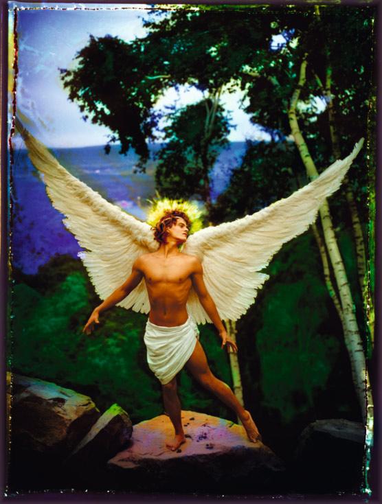
Archangel Uriel, 1985
h 40.5 × w 30.7 cm (16 × 12 in.)
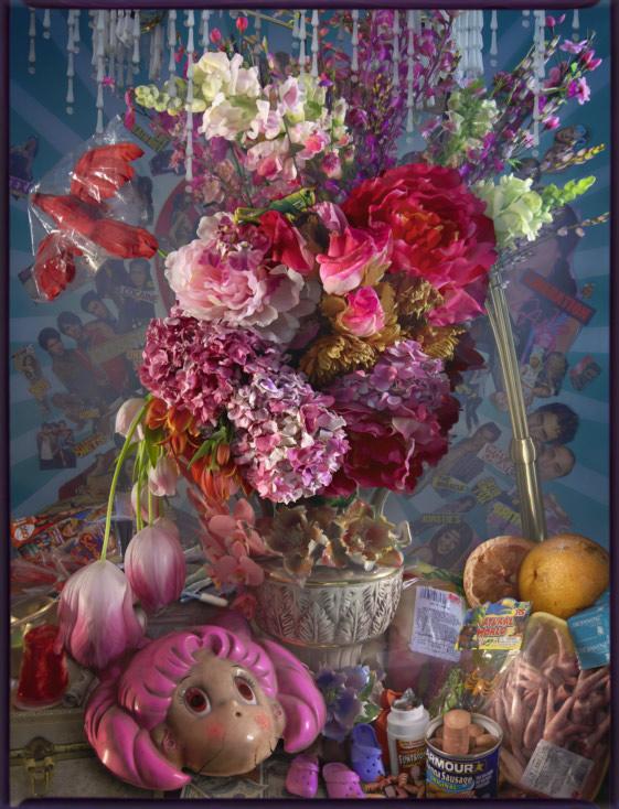
Earth Laughs in Flowers. Rite of Spring, 2008–2011
h 40.5 × w 31 cm (16 × 12.2 in.)
“LaChapelle’s photos, as blinding as they are, have a penetrating force… our fantasies and derangements have risen to the surface, where LaChapelle was looking for them all along.”
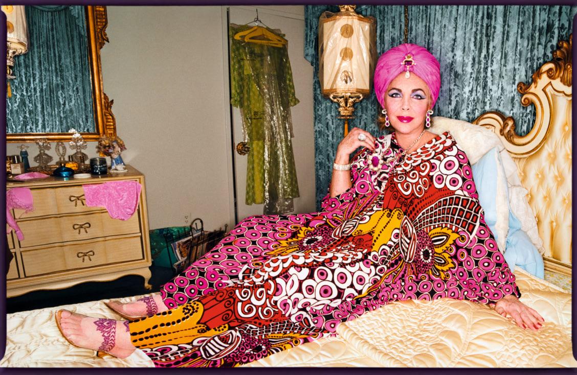


“…a stunning collection of stories seemingly frozen in single moments.”

€/£ 4,500 / $ 5,000

“…a vibrant tome…it’s supernatural panoramas are the definition of eye candy.”
Architectural Digest
Take an epic journey to the Himalayas’ most remote treasures
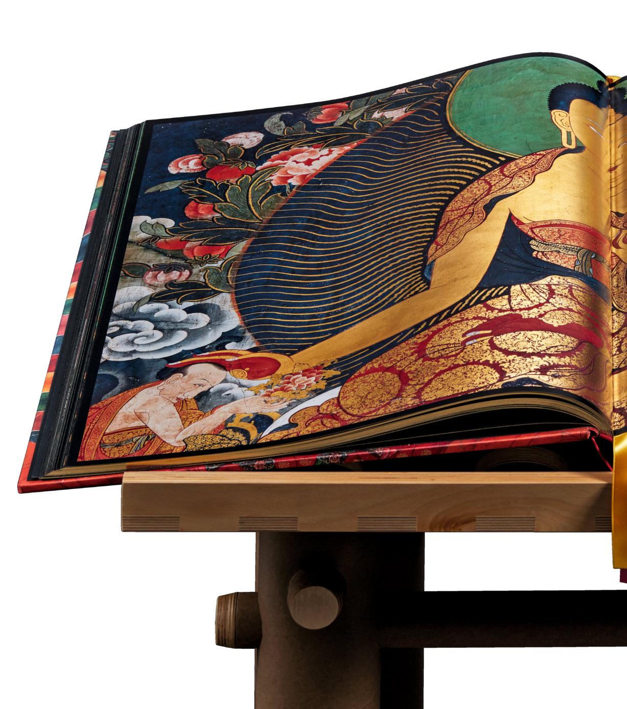
Only 918 copies, each signed by His Holiness the 14th Dalai Lama
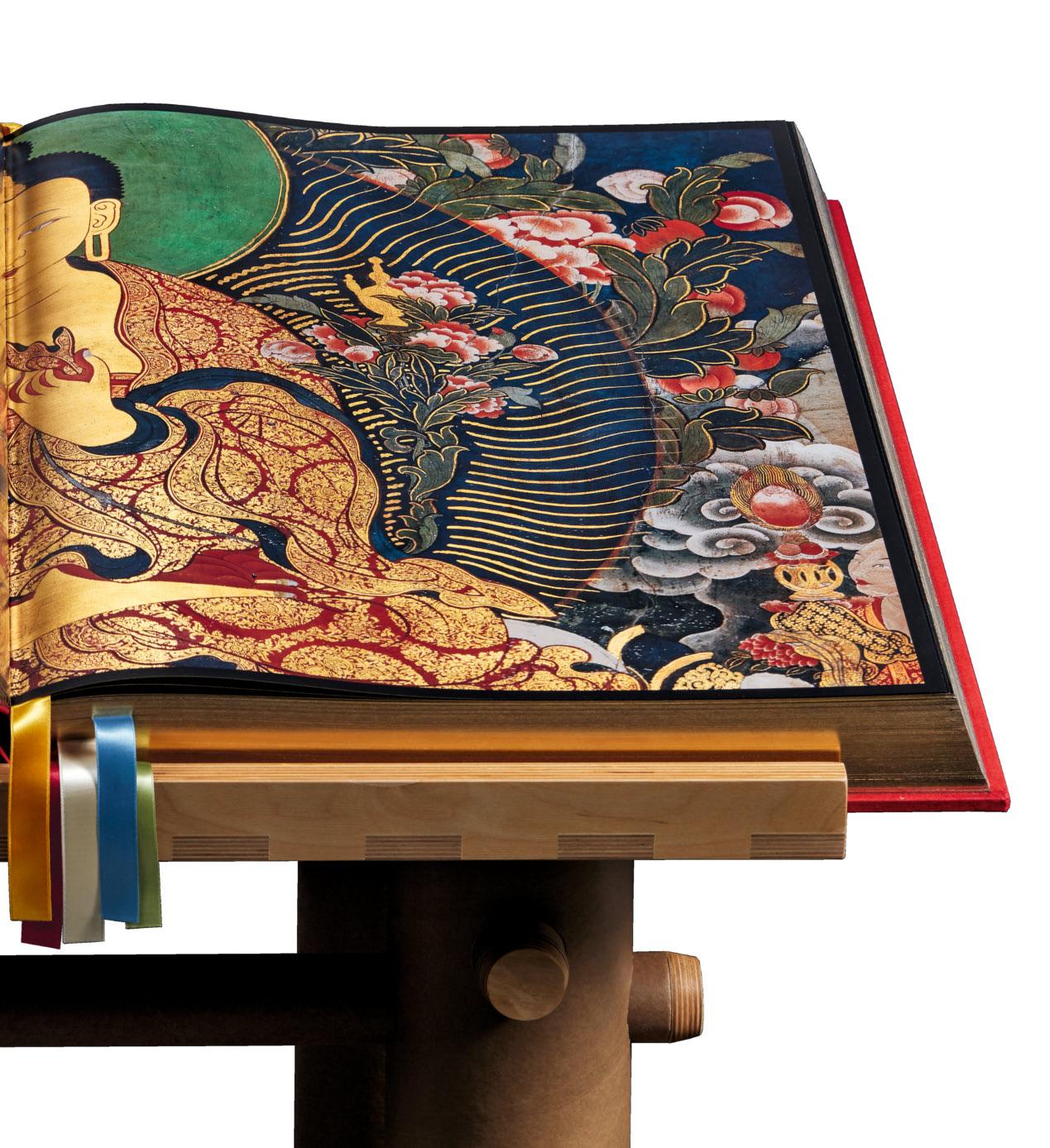
SUMO FEW LEFT
LAIRD. MURALS OF TIBET
Hardcover with six fold-outs, companion book of 528 pages, and bookstand designed by Shigeru Ban, 498 pages

Laird


His Holiness the
Opposite: His Holiness the
and
hIdden AmIdst soArIng snowy mountains, deep valleys, and desolate deserts are some of the greatest treasures of Buddhist culture and Tibetan heritage. For more than a decade, photographer Thomas Laird traveled the length, breadth, and far-flung corners of Tibet’s plateau to capture the land’s spectacular Buddhist murals in all their sublime vastness, intricacy, and their spiritual, emotional, and psychological enrichment.
Deploying new multi-image digital photography, Laird compiled the world’s first archive of these artworks, some walls as wide as 10 meters, in life-size resolution. This breathtaking publication assembles Laird’s portfolio in extra-large format with six fold-outs, printed in five colors including gold. Featuring complete murals as well as copious details, it immerses readers in these precious, extraordinary masterpieces.
In recognition of this World Heritage landmark and preservation of Tibetan culture, His Holiness the 14th
Dalai Lama has signed all copies of this Collector’s Edition. In the 528-page scholarly companion book, Buddhist writer and academic Robert Thurman takes us through this transcendent journey with detailed text on the murals’ spiritual significance while captions from experts Heather Stoddard and Jakob Winkler shed light on the storylines and artistic context of each image. As His Holiness the Dalai Lama has himself explained, these murals are not just objects of beauty, but serve as points of reference and guidance for practitioners of Buddhism, yoga, and meditation, as well as for anyone seeking to incorporate mindfulness into their daily life. Binding contemporary photographic technology with ancient traditions, this book is at once a majestic art piece, a major milestone in the appreciation of Buddhism, a precious monument to Tibetan culture, and a vital source for the contemplative arts and sciences.



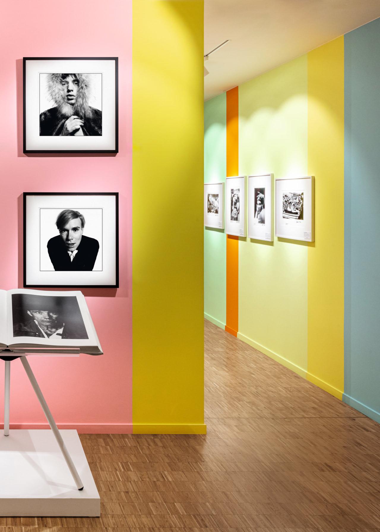
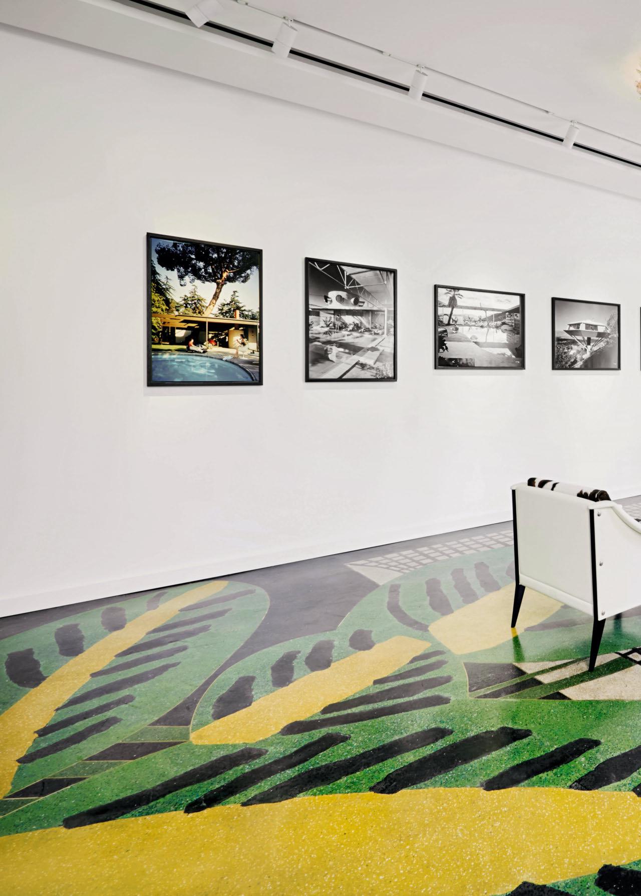

Charles de Cordier Hello, Sander, could you tell us a little about yourself and what you do?
Sander Bierens I am the owner of Bierens Debt Collection Lawyers and our firm specializes in commercial debt collection and financial disputes. What I am very proud of is that we are the first firm in the Netherlands to be ranked at the highest level of corporate social responsibility. For me, the client satisfaction and employee satisfaction are the most important KPIs (Key Performance Indicators). We are a family business. My father started it in 1952, and I took over in the mid-1990s. Now we are doing business with a great many clients worldwide, and we also have different offices all over the world: Veghel, Amsterdam, Antwerp, Düsseldorf, Barcelona, and New York. In addition to being a lawyer, I am a passionate art lover.
CDC What was your very first TASCHEN book that you can recall?
SB My first TASCHEN book was a Claude Monet monograph, and I remember being impressed by it and also being very enthusiastic to read it. This book is the very reason I became an art collector and why I have become a very passionate art lover. After reading it the first time, I read it again and again—I couldn’t put it down. It was the start of a new part of my life.
CDC Do you remember when and where you bought it?
SB I bought it in Veghel, the town where I live, and I took it with me to Cannes, where we were on holiday with my wife and two young children. That was back in 1996, if I remember correctly.
CDC What drew you initially to start collecting TASCHEN books and how has your collection evolved over time?
SB My TASCHEN collection started with the books of Impressionists and Post-Impressionists. Then it evolved more to Abstract Expressionism and later to Pop Art. Now I am completely into Pop Art. I mainly collect Andy Warhol, Roy Lichtenstein, Tom Wesselmann, Robert Rauschenberg, Keith Haring, David Hockney. TASCHEN offers a lot of art which I’m very interested in. Apart from that, TASCHEN also offers a variety of nice sidesteps: books on artists or topics that I don’t necessarily know, but which always catch my attention somehow. I start a little investigation: Who is the artist and why did TASCHEN decide to publish a book on this artist? That’s a nice thing, because it makes me discover new artists or artistic developments.
CDC What was your first TASCHEN Limited Edition?
SB My first TASCHEN Limited Edition was the one on Jeff Koons. In those days I was not really aware of the difference between the Collector’s Editions on the one hand and the so-called Art Editions on the other. So I bought the Collector’s Edition. The Art Editions come with a little extra, it could be a print or a photograph, for example,
in the case of the Jeff Koons it came with a drawing printed in silver foil. It’s a pity I didn’t buy this edition back then. Now it is sold out for a long time already and hard to find. But luckily soon after I decided to always pick the Art Editions and I’ve never regretted that. The artworks are all over the office here, as you can see.
CDC Can you share some of your favorite TASCHEN editions and the stories behind them?
SB Some of my favorite Limited Editions are the Marilyn Monroe from de Dienes, I am a huge Marilyn Monroe fan. We are here in a 1950s diner, so it’s very fitting. I also love DC Comics, because I am a big comics fan, as you can see from our office too. So I was very happy when I saw that TASCHEN published these large DC books. Another one I particularly like to mention is the book on Warhol and Basquiat. It actually is a diary of Andy Warhol, how he first met Jean-Michel Basquiat as a sort of friend/competitor. Later he became quite jealous of Basquiat’s big success. I like this book because of the stories behind it, and the same goes for the Some Like It Hot edition. Whenever I go to California, I always want to visit the hotel where they made the recordings for the movie back in those days: Hotel del Coronado in San Diego. Actually, there are too many favorites to mention.
CDC You mentioned DC Comics as well. They mean something special to you, isn’t that right?
SB Yes, that is right indeed. You can find a lot of super heroes in our office, life size, but also super hero toys, and plenty of books on them, hundreds of books. We also always give TASCHEN comic books as special gifts to clients, and also to our employees, because the super heroes are, in fact, what we represent. They represent our core values: justice, integrity, and a commitment to win.
CDC You also mentioned you have a book-spinner in the entrance hall with TASCHEN books. Can you tell us something about this spinner?
SB In our reception hall, we have a TASCHEN spinner filled with TASCHEN monographs on painters, architects, photographers, and so on. Whenever we welcome a new client in our office, the first thing we do is let them pick a book from the spinner. We let them choose and ask why they picked this specific book. This always is a nice kind of start to a meeting: it breaks the ice and we have a nice discussion about art and the person behind the client.
Sander holds his very first TASCHEN book, a monograph on Monet, in the American diner of the Veghel office.
CDC With TASCHEN covering such a wide range of subjects, do you focus on specific themes in your collection?
SB In my collection, I focus on painters and more specifically on Pop Art painters but also on photography and architecture. I am also very curious whenever a new title is launched. It is interesting to see which artists or topics are chosen.
CDC How do you approach the presentation, preservation, and displaying of your Collector’s Editions and your books in general?
SB Preservation may tend to be challenging sometimes because I want to keep the books in mint condition. When I started many years ago, I just wanted to read the books and take them with me and show them to other people too. Now I prefer to keep them as mint as possible. That is why when I buy a Limited Edition, I also buy the smaller non-limited book with it. This way I have the best of both worlds: the Limited Edition which I try to keep in the original box and also the affordable copy which I can have fun with.
CDC You have display cases and shelves in your office and you also show framed prints, is that right?
SB We do have a lot of framed prints in the office, yes, this way everyone can enjoy them. I also had a case built for the Limited Editions, which are safely presented behind glass. I am very careful with my books.
CDC What Limited Edition is currently still on your wish list?
SB Currently on my list are some of the David Hockney Art Editions. Originally, my Pop Art collection was more oriented toward American Pop Art. It is only later that I added David Hockney to my collection and therefore I missed some of the earlier Hockney Art Editions that TASCHEN came out with. I’m very proud though to have the set of four Art Editions on the Normandy theme.
CDC What is your favorite TASCHEN moment or TASCHEN experience so far?
SB By far my most favorite TASCHEN experience was being invited to the headquarters. I had the chance to meet and greet André Butzer and visit the large art collection in the publishing house. Being there and talking to the Head of Production, Frank, and understanding how the Hockney edition on Normandy was made, for example, was
really impressive and fascinating. Also the dinner afterwards, at the restaurant where Benedikt Taschen likes to go, and having a meter of sausage are memorable moments. That was a very, very nice day.
CDC What makes collecting TASCHEN Editions exciting or attractive to you?
SB What I like about the new editions is the surprise. Any day I could get an email from the TASCHEN team in Brussels with something new to discover.
CDC Have you met with fellow collectors?
SB During TASCHEN events you meet other passionate collectors. It is always nice to get to know people who are as excited about art or TASCHEN Limited Editions as I am. We exchange thoughts and I try to understand the preferences and reasons why they collect. In my professional work I don’t meet that many people with the same sort of interest in art.
CDC Which artists, dead or alive, would you like to meet in person?
SB If I could meet any TASCHEN artist, dead or alive, in person, it would without a doubt be Tom Wesselmann, because he is number one on my list. Apart from him, I would also love to meet Andy Warhol and Robert Rauschenberg, of course, and also David Hockney.
CDC Which book would you like TASCHEN to publish?
SB If TASCHEN were my company, I would for sure publish a book on Tom Wesselmann, because he’s just my favorite artist. TASCHEN already has published a book on his work, a long time ago, but this time I would make it the largest and most complete Tom Wesselmann book to exist. That would be so great.
CDC And then our last question. As a dedicated collector, what advice would you give to someone who just started collecting TASCHEN books?
SB As a collector, I would advise young or new collectors to preserve the books very well, to keep the Limited Editions mint in their box and at the same time to buy the non-limited book to enjoy. I would also advise everyone to subscribe to the newsletter so that you stay tuned in to everything TASCHEN is producing.

On one of the floors of Sander’s office, opening a display cabinet where he keeps a selection of Limited Editions. Hanging on the wall to the left, a selection of framed Art Edition prints.
Opposite: The collector in the lobby of the Veghel office, with the XL-sized 75 Years of DC Comics and 75 Years of Marvel in his hands and firstedition copies of Marvel and DC Comics books in the background.
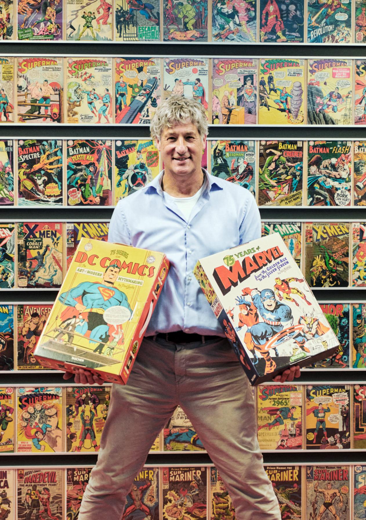
“If you decide to invest, choose appreciating assets and global heritage value.”
on TASCHEN Limited Editions
All prices are correct as of August 2024 and may change without prior notice. Please check taschen.com for the latest status. For sold-out titles, we list prices according to the last copy sold by TASCHEN, which might be less than current market value.
This edition is sold out. Please register your interest in this title on our website’s waiting list so we can inform you if anything similar comes up.
FEW LEFT
Still available, but most likely not in stock anymore in every TASCHEN store. We expect the title to be sold out in the near future.
The mighty giants of our program tower at 70 cm / 27.6 in. or 50 × 50 cm / 19.7 × 19.7 in. square.
A SUMO after taxes: 50 cm / 19.7 in. tall.
Not far behind their BABY SUMO cousins, XXL books stand at a minimum of 39 cm / 15.4 in. tall or wide.
A little more compact, XL books are at least 34 cm / 13.4 in. tall or wide.
Please treat your book kindly. Avoid exposure to direct sunlight and humidity and do not display open books for an extended period of time. The condition of a book is integral to its value and prices for mint copies can far exceed those for copies in good or fair condition. Books with vintage TASCHEN casing can also achieve a significantly higher sum at resale, so keep the original presentation packaging.
Any questions? Our team will be happy to help you. Please contact collectors@taschen.com.
Time to thank a valued client? Whatever the occasion and whoever the recipient, our corporate gifts team can help you. Please contact corporate@taschen.com
