20 minute read
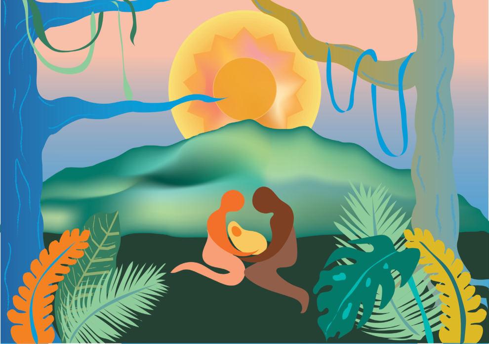
Dreams - ‘Four elements’, 2021

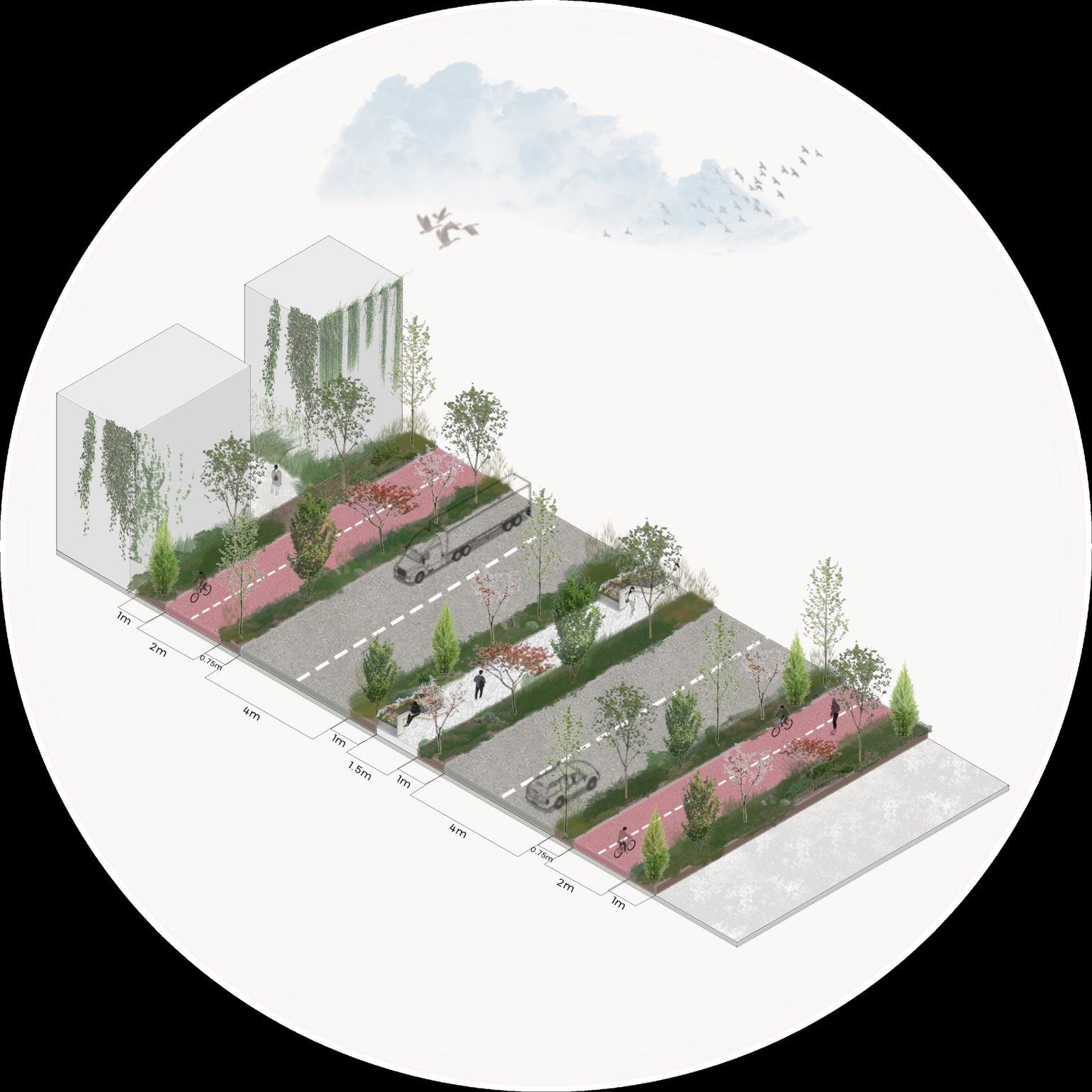
Central core of the trail
Vacation Houses Ka mchiya
Advertisement
General information:
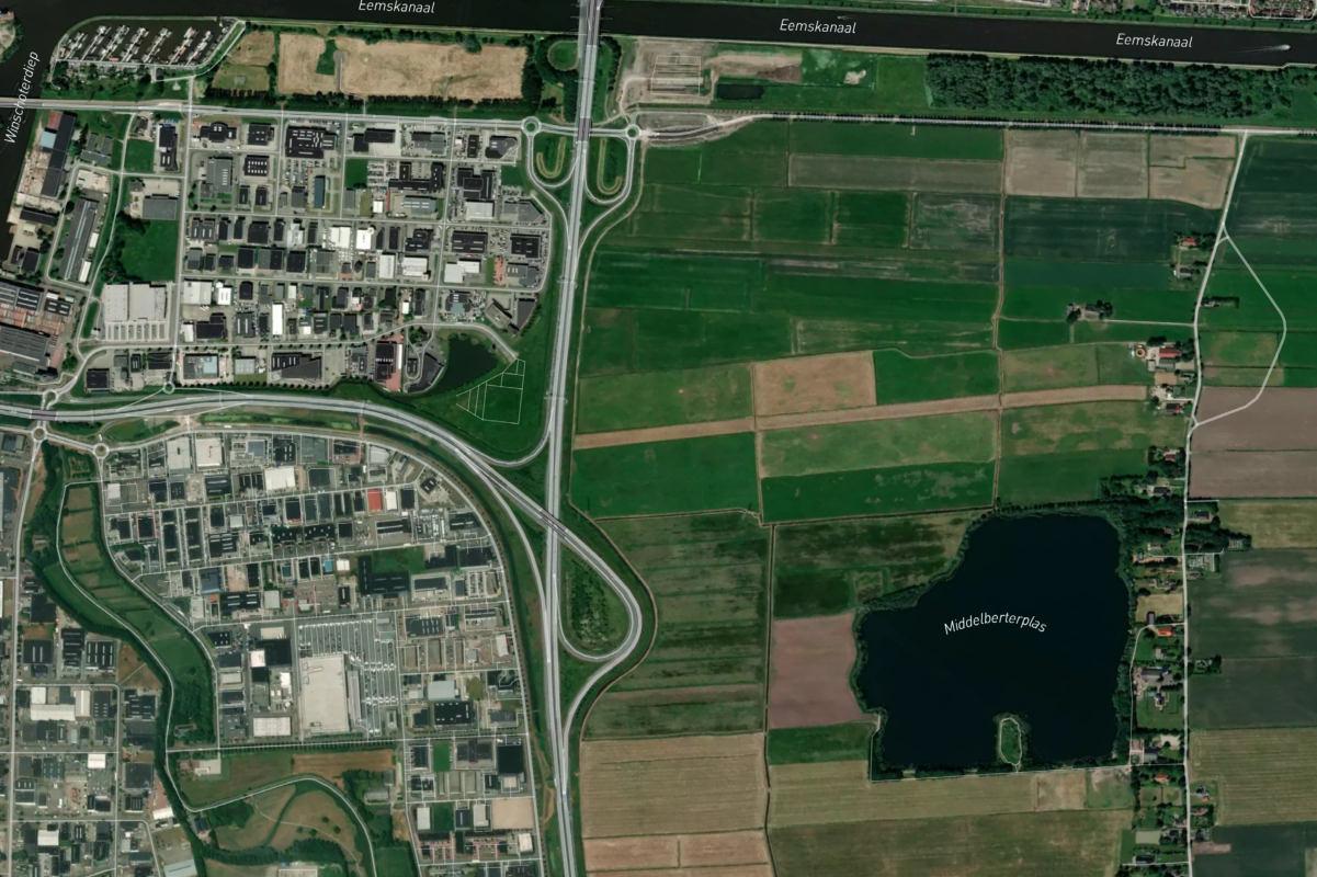
Location: Kamchiya, Varna region , Bulgaria Area: 2100 Sq.m. Climate: Temperate Authority: UNESCO Year: 2021
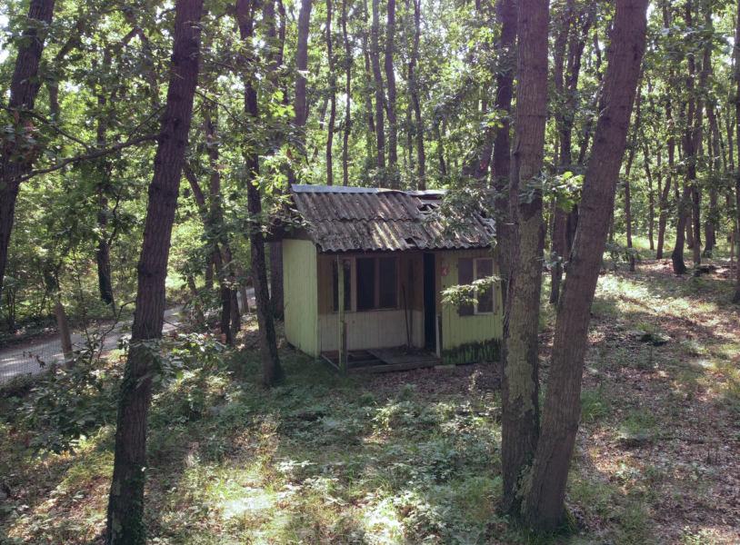
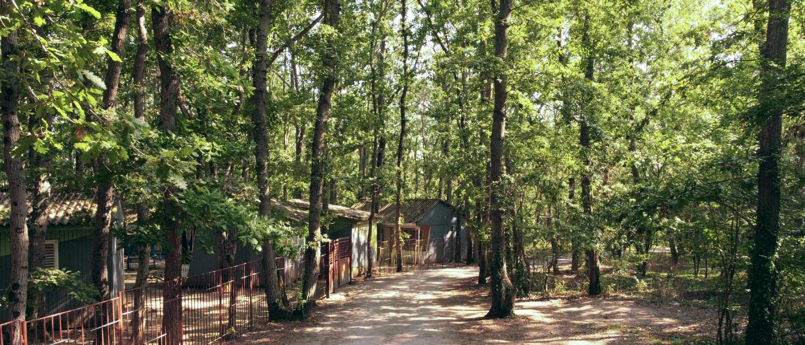
Design brief: This project takes place in Kamchiya , Bulgaria. A beautiful region with longose forests by the seaside, which I found problematic because it used to be a holiday place thirty years ago, but now only some parts are renovated and used , while others - abandoned. The aim of this project is renovating an abandoned site, turning it into a vacation spot like it used to be.

SITE ANALYSIS


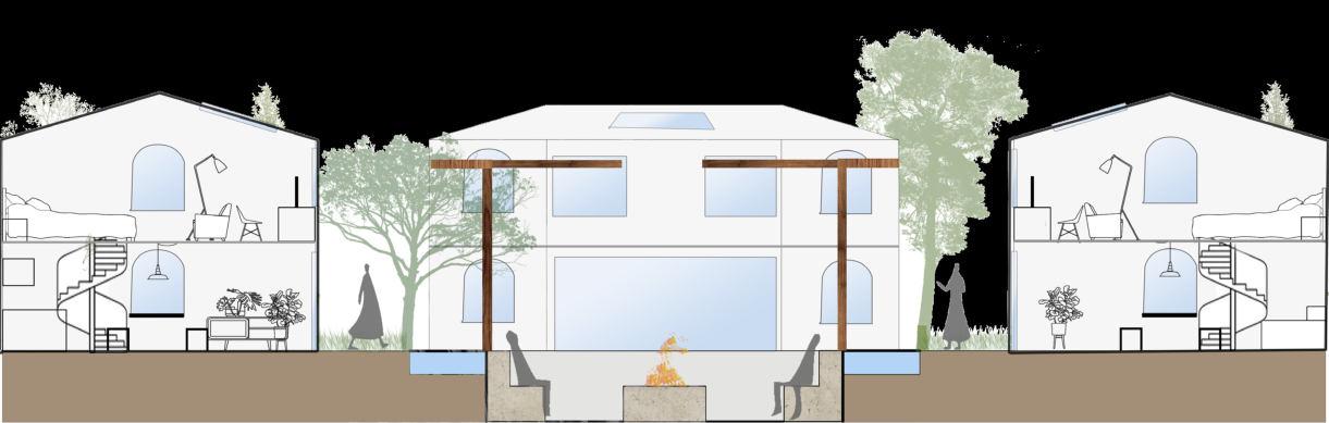
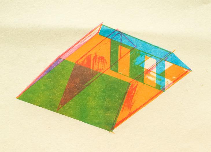
This vacation house project was inspired by the idea of symmetrical devision of space. The idea developed from an equilateral triangle with three houses around each of its sides.
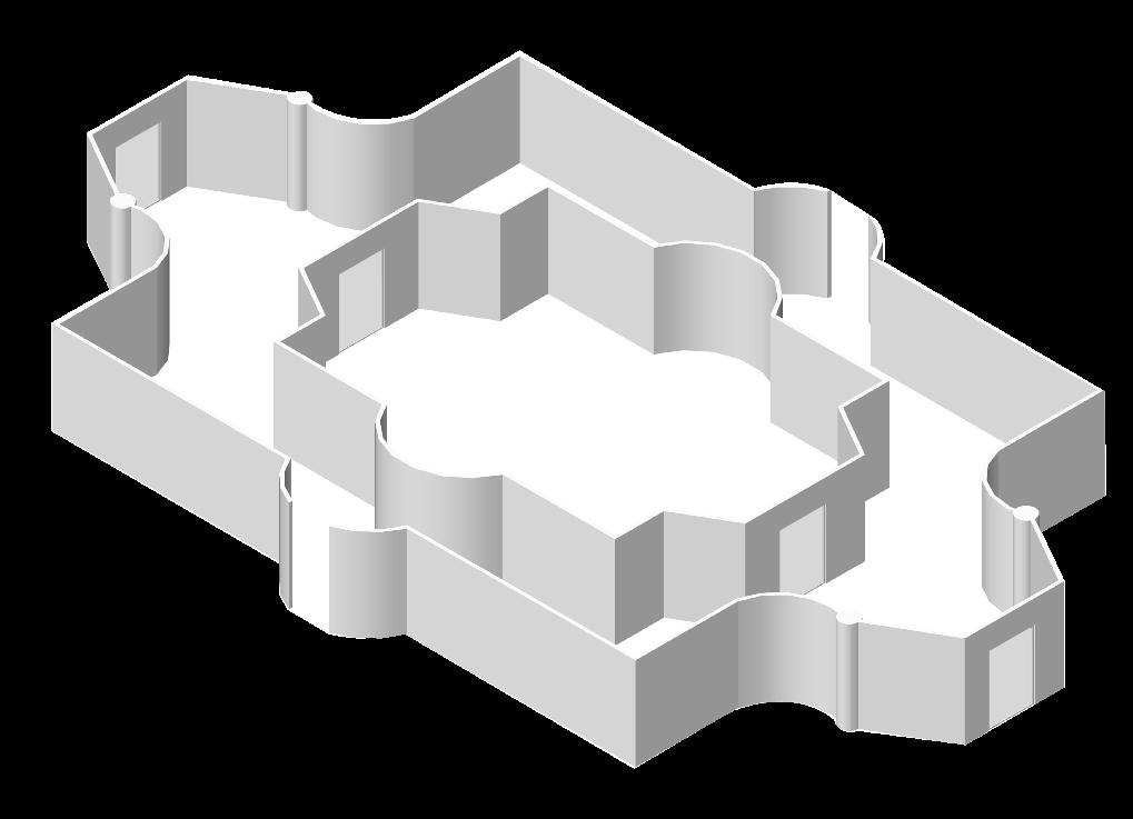
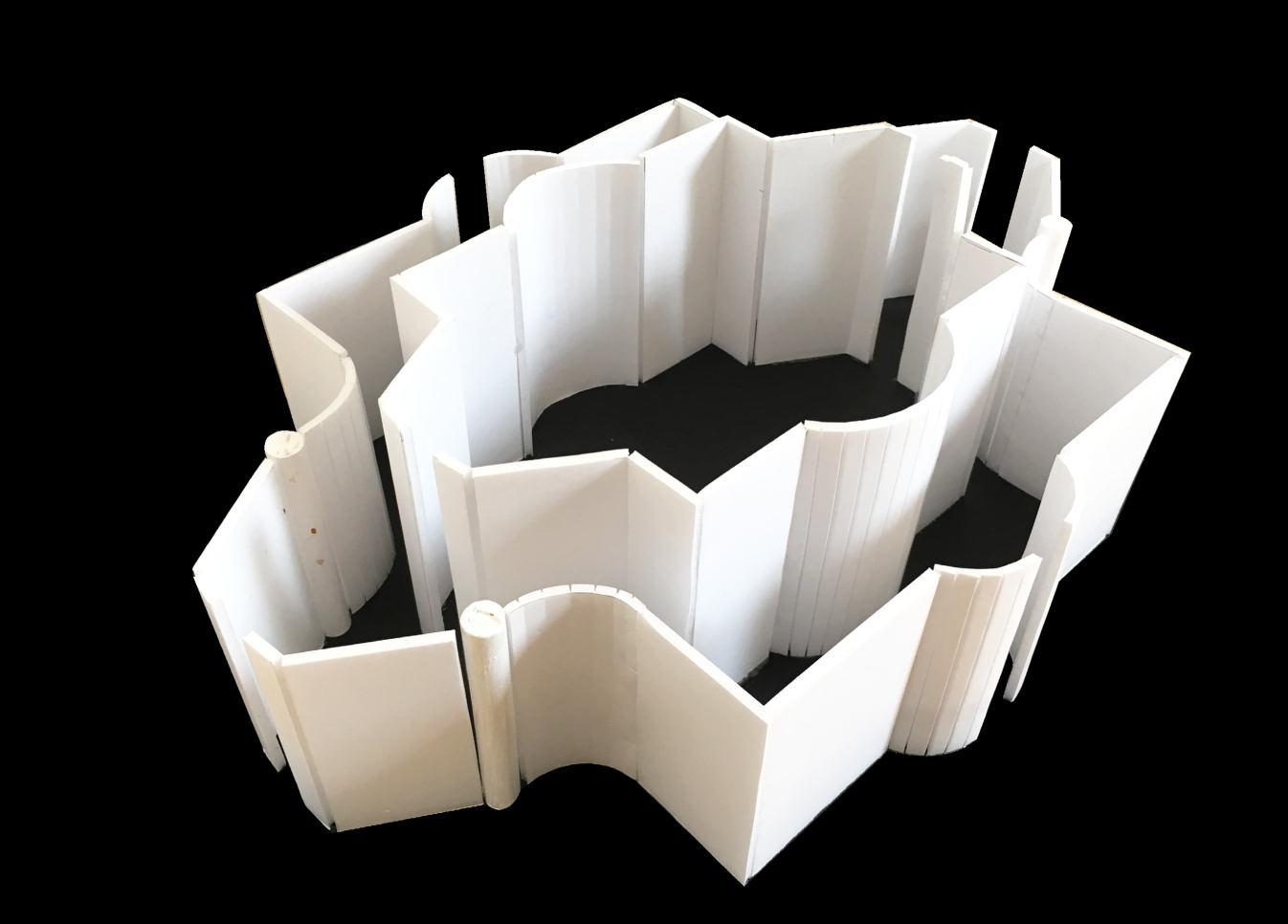
The area of the complex consists of three vacation houses, in whose centre are situated important external elements serving as a bonding point and gathering spot. The movement is curved circulation , as well as linear from the houses to the common central point.
The triangle with the length of its equal sides (3m each) gives the opportunity for building space to be created in the form of a trapezoid. Thus, the spaces are symmetrically situated from each other.
The exterior elements are the following: 1. Fire pit 2. Surrounding circular path 3. Three benches 4. Three bridges over water pond 5. Circular water pond 6. Green path 7. Greenery (Forest)

First conceptual drawing Movement
Isometric view of the vacation houses area

The site area is approximately 42m length by 24m height and will encompass the three vacation houses complex, as well as a parking lot with a security cabin and a place for eating and buying food for convenience of the visitors. The rest of the field is kept green , as most of the forest region is protected by UNESCO, so it is of great importance to preserve the unique nature in Kamchiya.
Ground Floor Zoning

First Floor Zoning Site Zoning

Vertical Zoning
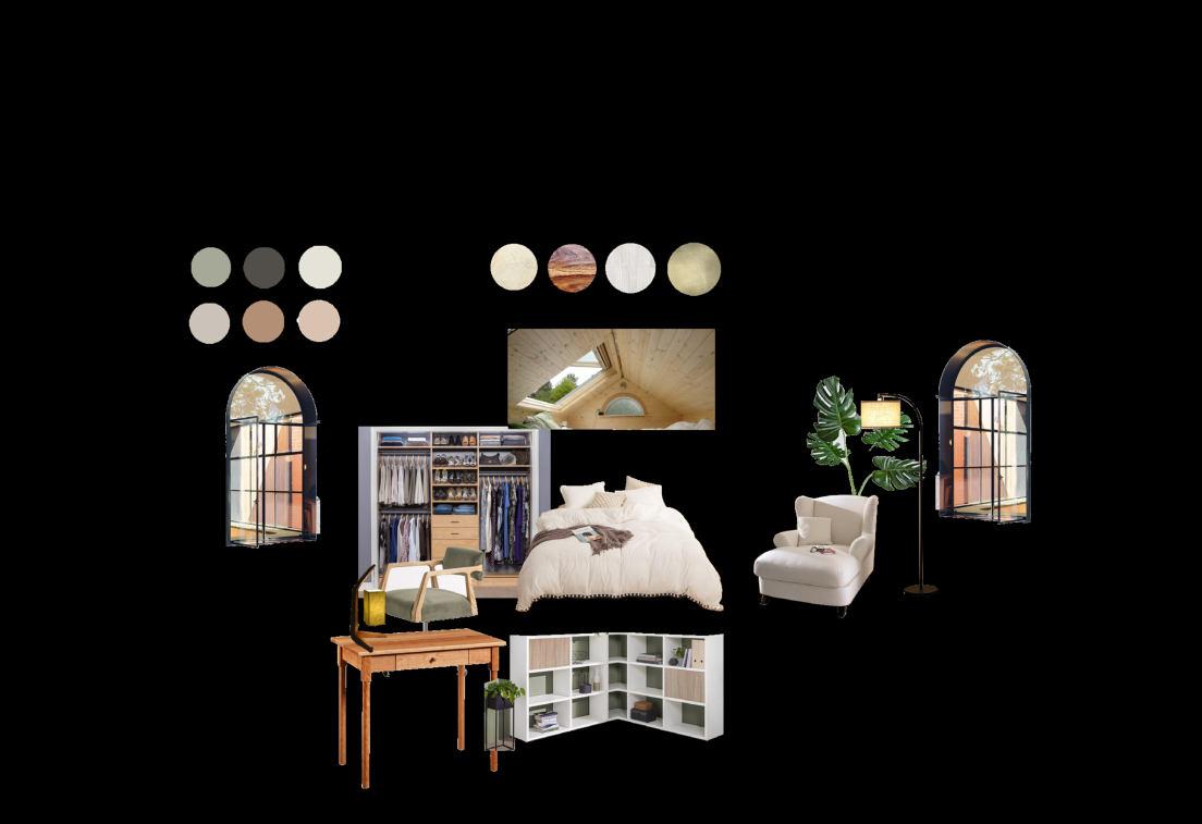
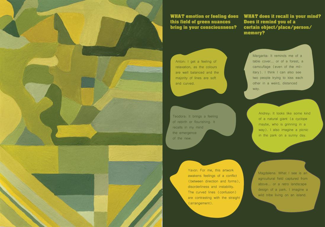
Mood boards
After developing the proper zoning of the Interior spaces, I chose what style to use and based on that I selected the type of furniture. The style is a hybrid between Scandinavian and contemporary, while the general theme is inspired by the natural surrounding. The most fitting choice to me was the use of organic materials, similar to the local (not the local , as they are protected by UNESCO). The colours used are natural and warm , earthy nuances. Based on this information , I created 4 mood boards, 3 for the Interior and 1 for the Exterior look.


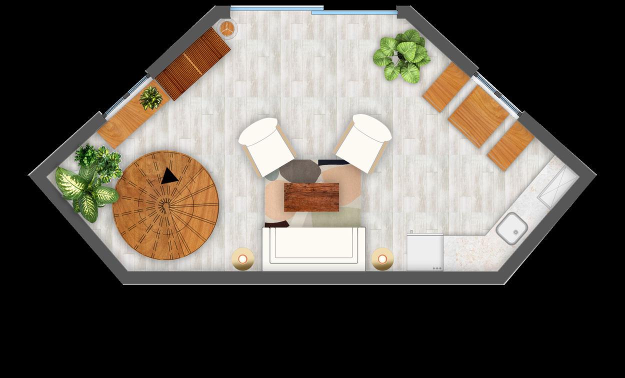
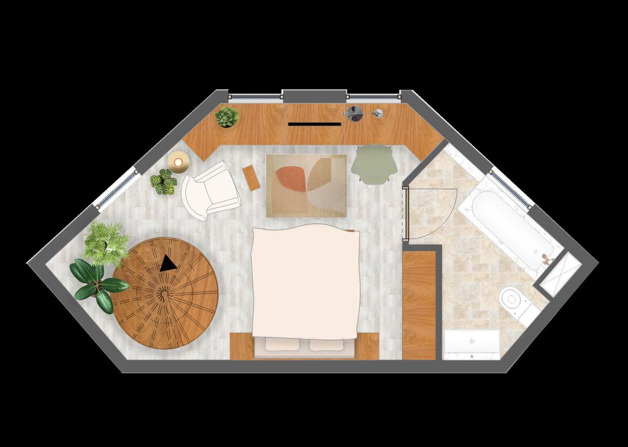
Ground floor First floor


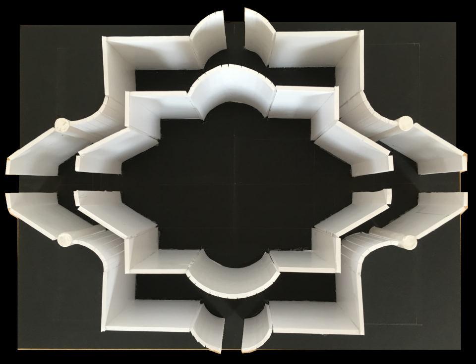
The outside area provides the visitors with a common circular space in the centre (4,75 m radius). In the exact centre, there is a round fire pit, surrounded by stone benches that follow the shape. The outer torus (behind the benches) is filled with water. After this, there is path connecting all the spaces, leading to both way to the inside, as well as the outside. The benches are sheltered by a circular pergola , with whole in the middle that is made to prevent the fire heat heating up the structure. Materials mood board


Floor pla ns Light plans

Grand Floor Plan Positioning from 4 to 6 light sources in a space is necessary as it gives the possibility to alter the atmosphere at any given point of the day.
Grand Floor Lightning Plan

Exterior Part
It is important for the houses to integrate within the surrounding forest. The exterior elements will be build only around and within the already existing trees. In reality the exterior may not look as precise and ‘clean’ as in the renderings, as this is the only way to make it without harming or cutting down any of the trees.


Interior Part
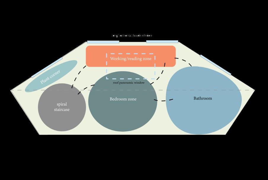
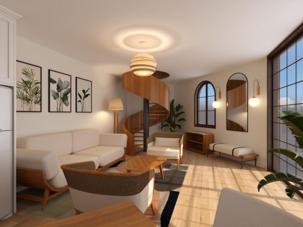
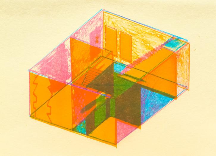
The frontal view of the Ground floor displays the symmetry in the composition of the living area , as well as part of the kitchen and dining zone on the left and the round staircase on the right.
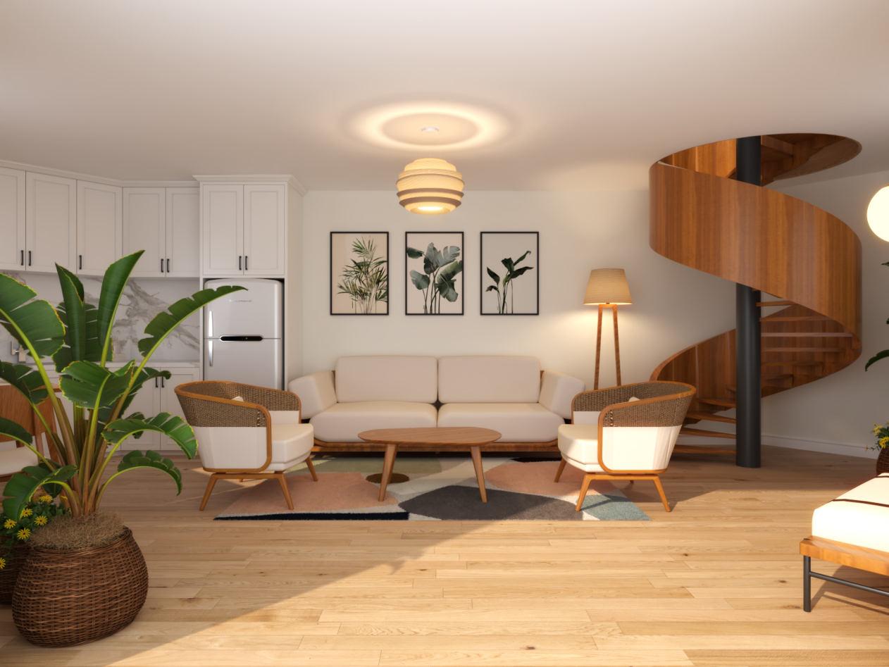
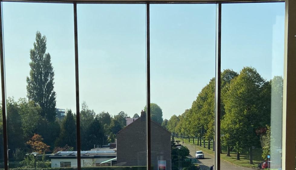
The access to the Ground floor is through glass sliding doors, which provide plenty of natural light during the day and a beautiful view to the common zone outside.


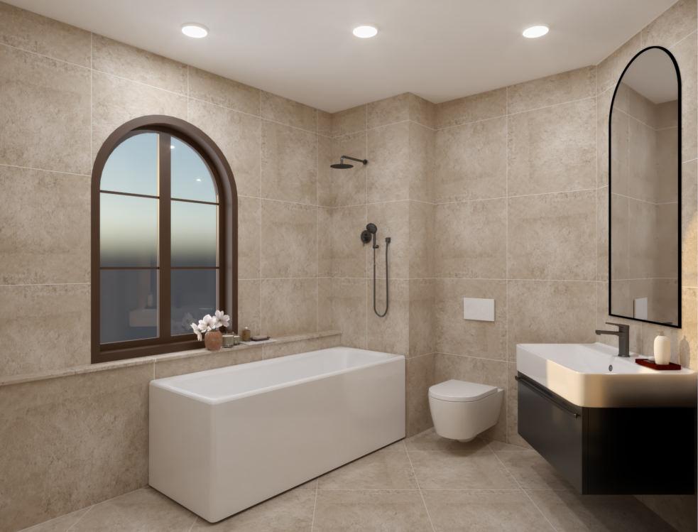
Besides providing the Bedroom zone with an abundance of natural light during the day, the rooftop window also provides the guests with a stargazing view at night.

General Info
Location: Groningen , the Netherlands Area: 25 Sq.m. Client: Blad Media Year: 2021
Design Brief The main challenge of this project was to renovate a limited office space in such a way that it combines a lot of different functions without looking overwhelmed. The client had a specific task of being able to invite guests and change the atmosphere from working during the day to relaxing and gathering with friends in some evenings. Some of the furniture pieces are specifically designed to look minimalistic but still perform dual function. The project let me discover that flexibility and simplicity are important factors when designing a small space.

Photographs of the existing space

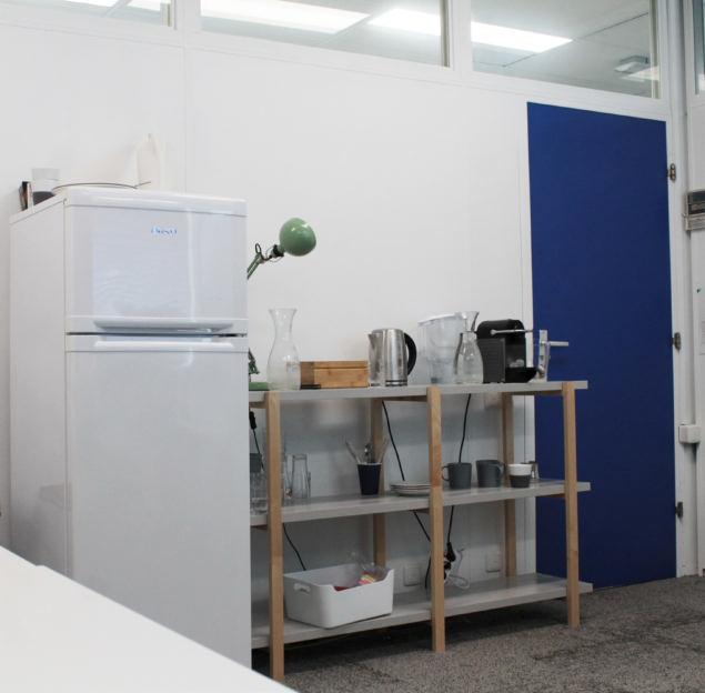


1. 2.
4. 3.
5.
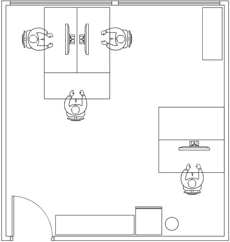
Existing space Proposed floor plan & interior elements 1. Flexible wall - writing board and TV screen 2. Common working desk 3. Relaxing and reading zone with 2 armchairs and a library 4. Semi-bar/eating table/stand-work table 5. Pantry with cupboards and shelves
Based on the client’s wishes I came up with the idea of combining the furniture items, so they can take less space but still provide him with the needed functions.

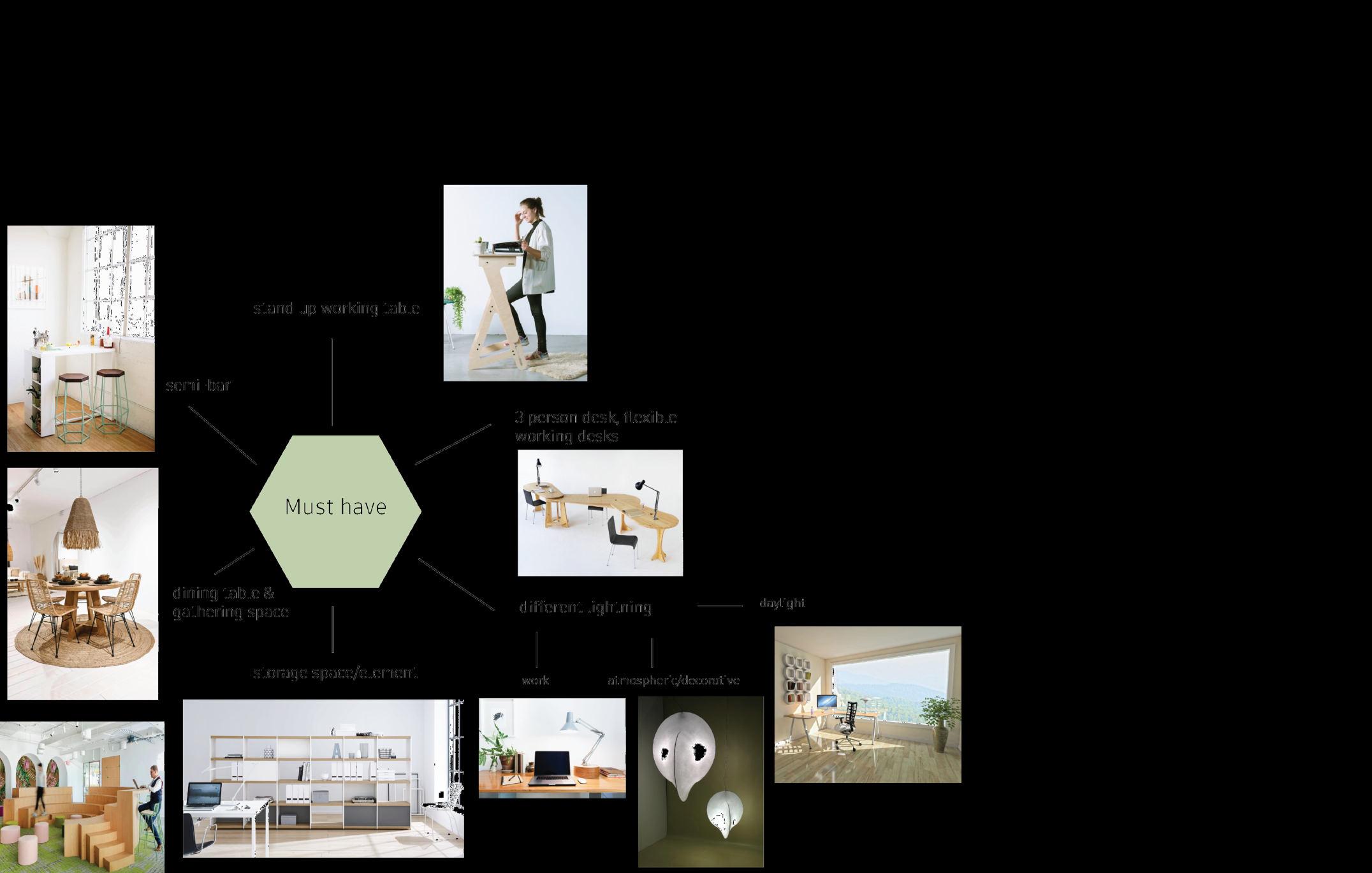
Must have

Materials and colours mood board


The preference of the client was to have more soothing colour scheme and plenty of plants. My solution was a colour scheme of warm and harmonious dark brown and rose pink nuances and hanging plants over the main light sources. To give the possibility for presentations I positioned a flexible wall with a writing board and a large TV screen.

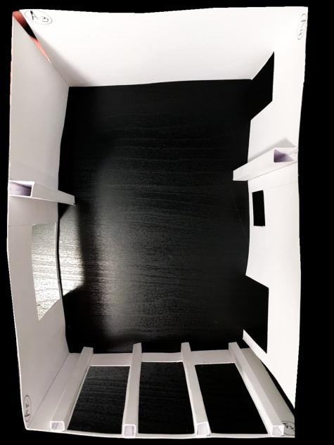
Lou nge Design for Theatre ‘De Lawei’
General Information
Location: Drachten , the Netherlands Area: 60 Sq.m. Client: Representatives of theatre ‘De Lawei’
Design Brief This is a collaborative project done with my friend and colleague Veralinde Jelsma , visual designer, as part of our off-course in our second year at Academy Minerva. The aim of the project was to create a site-specific artworks in the lounge for the visitors (anything from painting to installation). Upon visiting the building , Veralinde and me explored the space and concluded that it lacked the right furniture and colour scheme inside. We also wanted to come up with an idea how to use the upcoming light in a creative, scenographic manner. That is why we decided to renovate the Interior design. The project is currently on its way to production. Our idea was to attract visitors in visually pleasing and cosy setting.


Existing space
Our main concept is COMFORTABILITY

Proposed warm shades, fitting the rest of the interior (tempera)


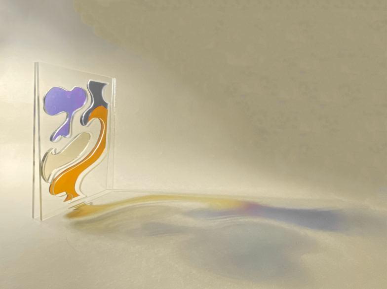
Plastic prototype of the changed windows. We wanted to create colourful , abstract shapes on the glass that transform the afternoon sunbeams into a performative piece of light on its own! Wood and textile prototype of the sitting object. Painting of the windows + sitting objects


We tried colour combinations inspired by the seasons (autumn/spring).

Warm and cold colour combinations

Floor plan of the space with the sitting objects
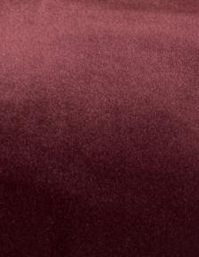
Velvet textile for the sitting objects Laser cut prototype Interior renderings
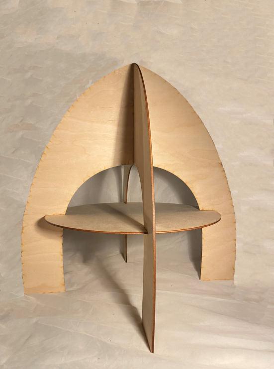


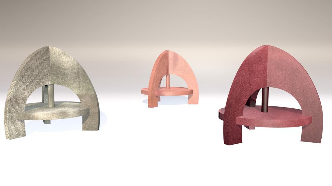
Final two proposals for the outlook of the sitting objects

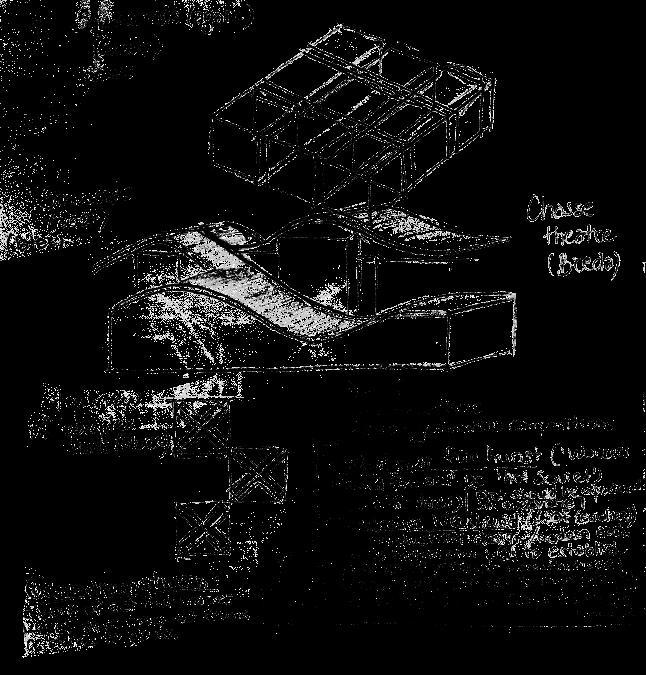
Gallery Project
General Information
Area: 320 Sq.m. Year: 2020
Design Brief This is an idea I came up with after getting inspired by some pavilion projects and experimenting with scale models myself.

The gallery has the notion of an enclosed space inside an enclosed space, so to say a ‘room in a room’.
The structure is in the style of Modernism , but it also contains fragments of Eclecticism , because of the combination of pillars from the Classical era (Greek and Roman architecture) with the sharp, minimalistic and simple forms of Modern and Postmodern eras. Floor plan

Isometric tempera painting

The space, created between the bigger and the smaller enclosed spaces is a circular corridor, which will be the space for painting exhibitions and artworks that can be hanged on the walls. Meanwhile the inner room has the purpose of being the room for sculptures and installations.
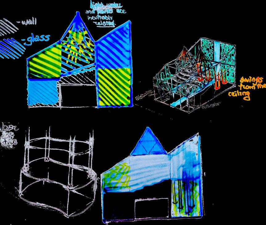
Canteen Academy Minerva
General Information
Area: 81 Sq.m. Year: 2019 Location: Academy Minerva , Groningen , the Netherlands
Design Brief This project is a school assignment from the First year with the task to redesign the canteen in Minerva academy. The new design should be accessible to the students of Minerva and public visitors. My choice is to turn the space into a Greenhouse. The interior aims to make people aware of the fact that natural environment can be created in a small space, situated in the city centre. The ambience is about spiritual harmony and ‘purification’, contemplations and tranquillity. The process went from research on the style of the architect (Piet Blom) to a closely related structure at the end. Objective view of the Canteen - model , floor plan and perspective drawing Research sketches on the style and forms of the academy


Sketches of the design idea


3D Renderings


Exhibition Catalogue for Fine Arts Graduates, Academy Minerva
Design Brief This project is a collaboration with a friend and colleague of mine, Teodora Obushtarova , graphic designer. Together, we created the Graduates booklet of their first exhibition. The catalogue consists of 113 pages in total , as the participants of the exhibition were more than 60.
Teodora made the front and back cover and most of the layout for the booklet, while I made the photographs of all artworks and the painting for the cover.

Scan to view the booklet Painting for cover page (tempera)


Riso Print Posters & Experiments
Design Brief These are some try outs in riso printing. By additive colour mixing , creating different layers with riso inks gives rise to the appearance of various new shades.


T-shirt Design for UNICEF Team , Groningen
Design Brief This design was assigned by UNICEF Team to volunteering designers with the theme of ‘children’. My design was chosen to be printed out on a t-shirt.

Proposed design T-shirt outcome


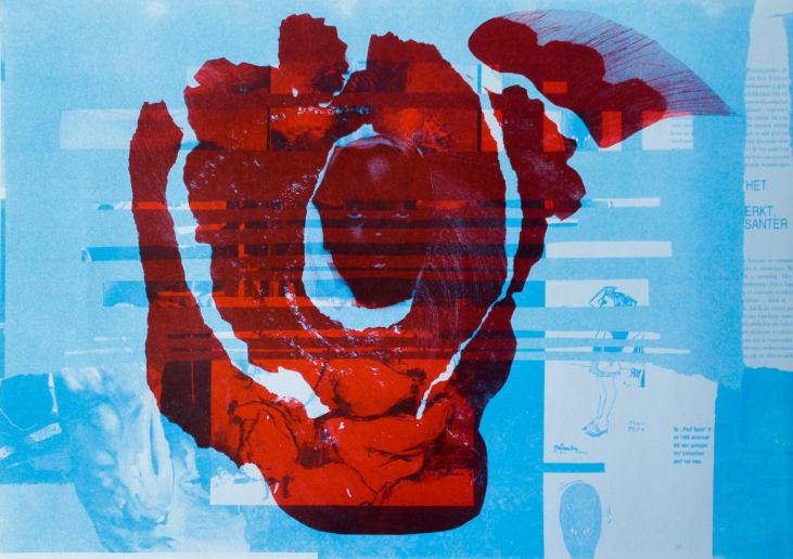
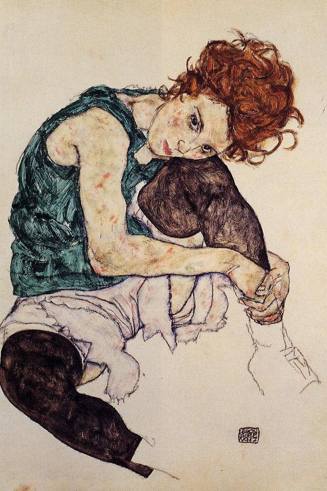
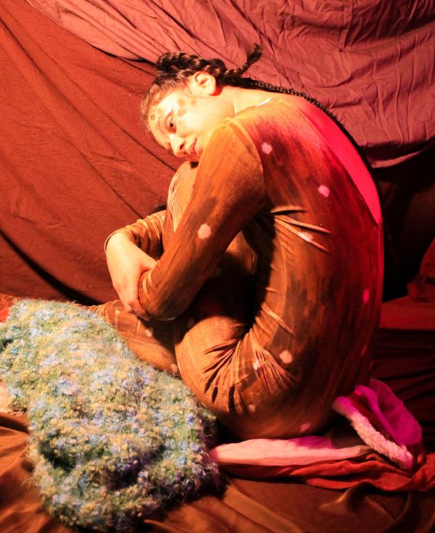
‘Sitting Woma n With Legs Drawn Up’
Design Brief The melancholia in her expression made me think of where she may belong , where she would like to belong. The fragile and neglected look of the woman are reflected in the Soviet kitchens in the backgrounds. Her state, as well as the spaces may show lack of care and call for our help, but at the same time she looks comfortable in them , just the way they are. Both the interiors and her don’t answer to our expectations: ugliness and grotesque in shapes and places, in which we are used to seeing beauty and feel comfort.


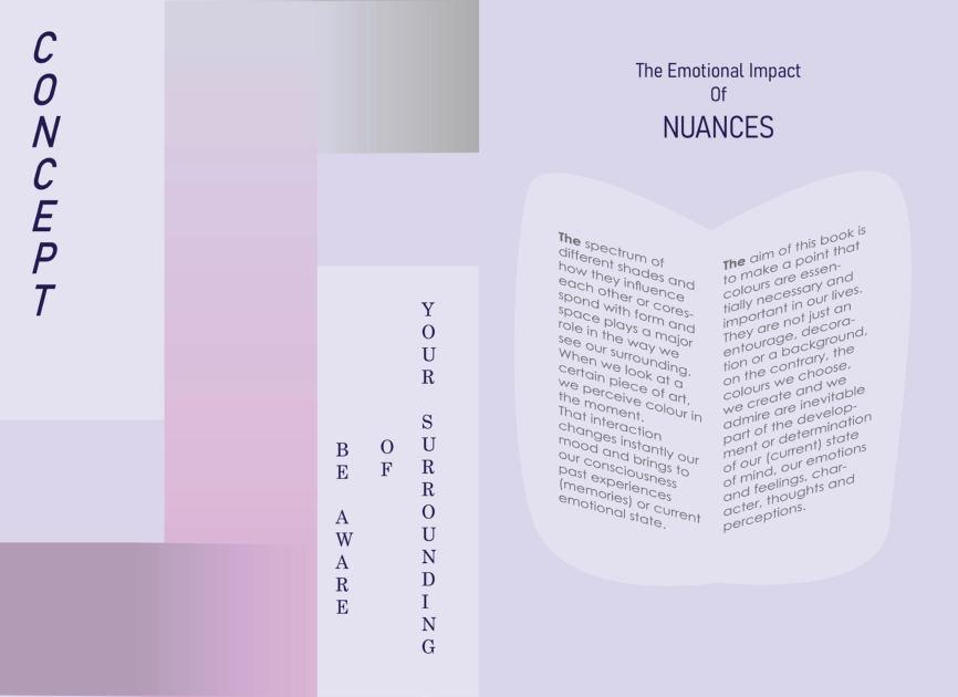
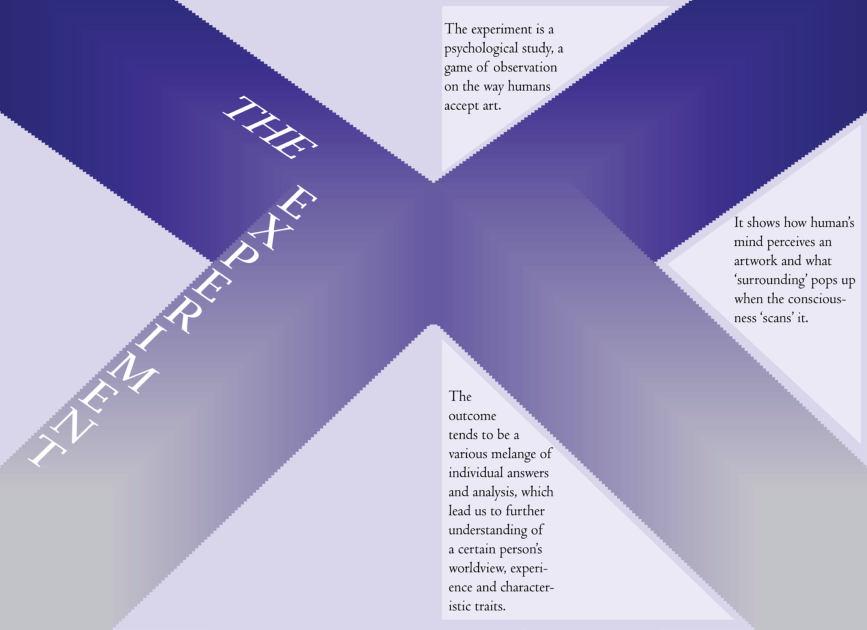
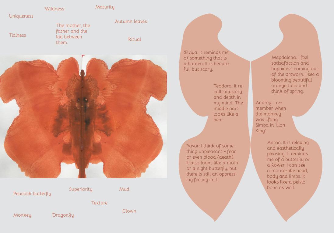
Design Brief Graphic design task from my first year at school. We had to create a booklet based on an individually chosen topic. I chose a theme that proves (by interviewing people in the book) that what we perceive from colours forms important conclusions of our essential understandings in life.


Abstract Compositions
Design Brief In these tempera paintings I explore the possibilities of geometric compositions. How can I combine vertical , horizontal and diagonal lines, so to create static or rather dynamic compositions. What do I achieve with the use of harmonious or contrasting colours and their combinations. Where is the centre, what is the background? How do we perceive these? I have been doing this as design exercises since 2018.


Short Stories
Design Brief I created these series of photographs in the 2nd semester of my 2nd year as part of my off-course. The task was to make detailed pictures from the city centre and combine some of them so that they tell a story.


‘Toy Love Story’


‘Travel to Japan’
Festival Worteldagen , Installation
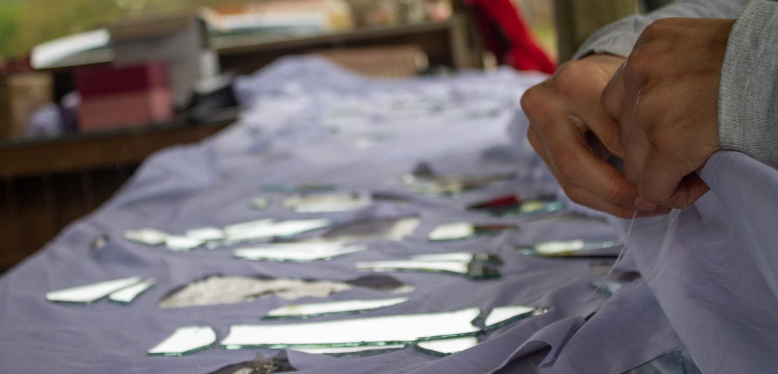
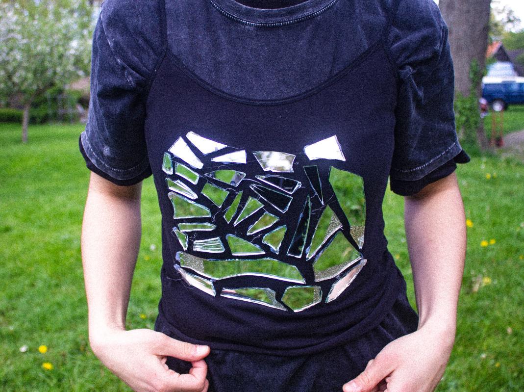
Design Brief This festival took place in April 2021 in Norg , the Netherlands. The idea , proposed to us, the students, was to create a performance inspired by the location in which each of us was situated. I was in the forest part. I had three days, in which I created an illusory installation - a long sheet covered with mirrors and holes in the same shape. It was installed between three trees , overlooking a bridge over a river. The idea was that people would watch my performance through it, but they will be constantly confused of what exactly they are seeing - front or back, reflections from the mirror pieces or the performance through the holes, thus being unable to fully see me.


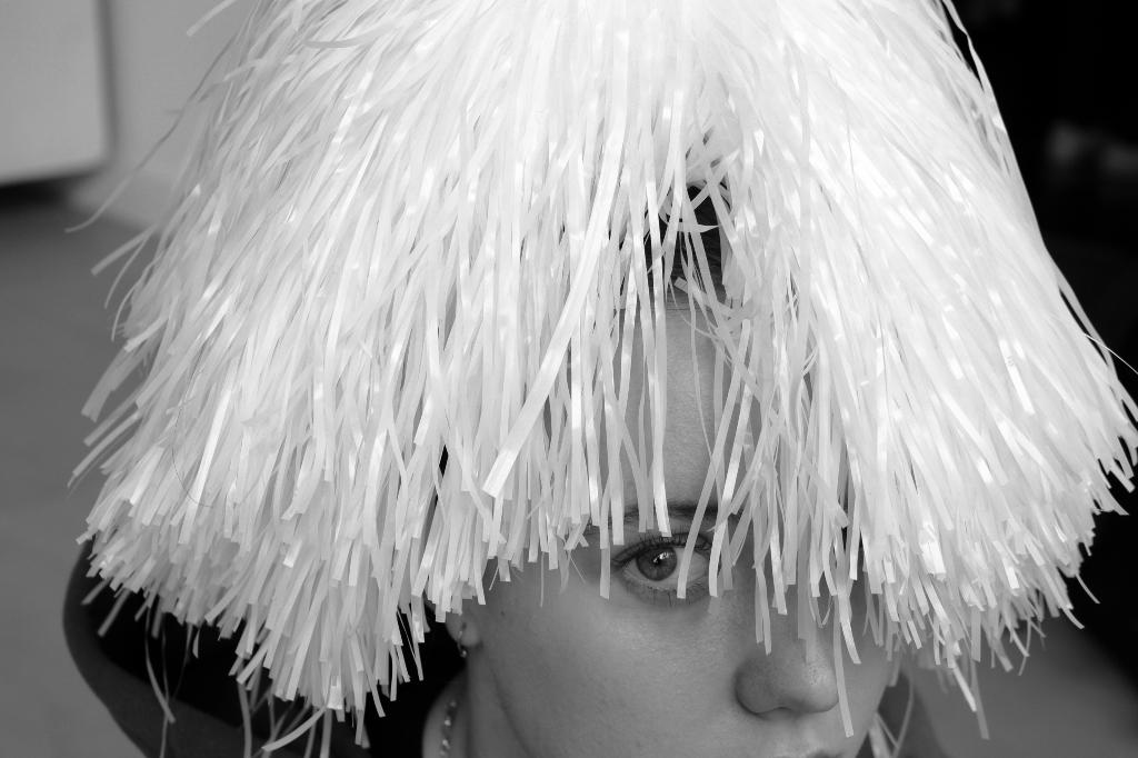
Emotion
Design Brief An experimental photo session , taken as part of my off-course this year (3rd year), inspired by the opera from Kurt Weill “Rise and Fall of the City of Mahagonny’ written by Bertolt Brecht.

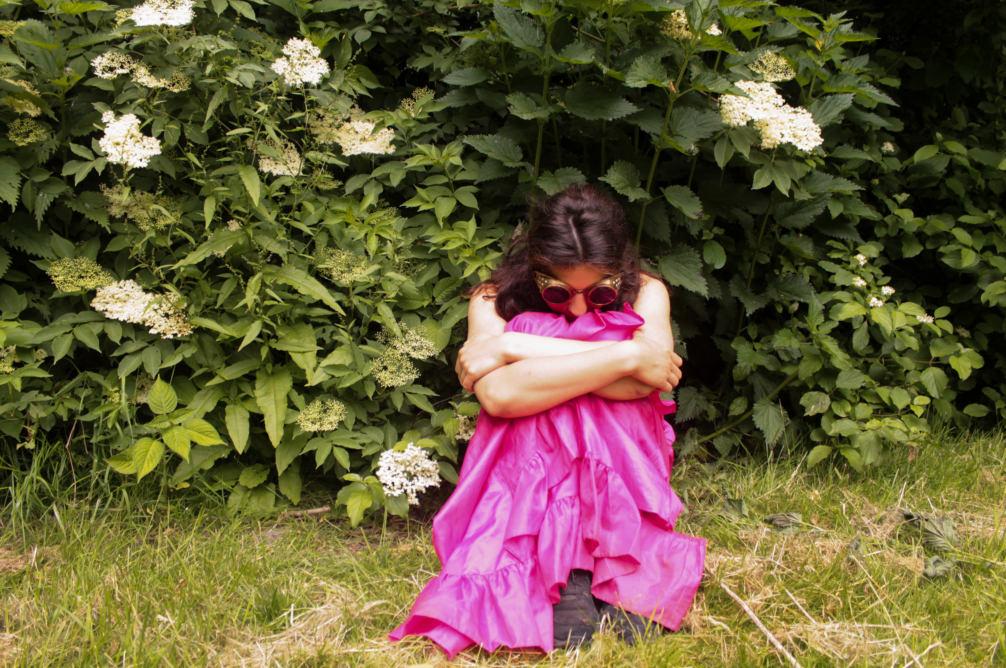
Bee in a Bush
Design Brief This photo session is inspired by the appearance of contrasting colours in the background and the foreground from the costume of the model.


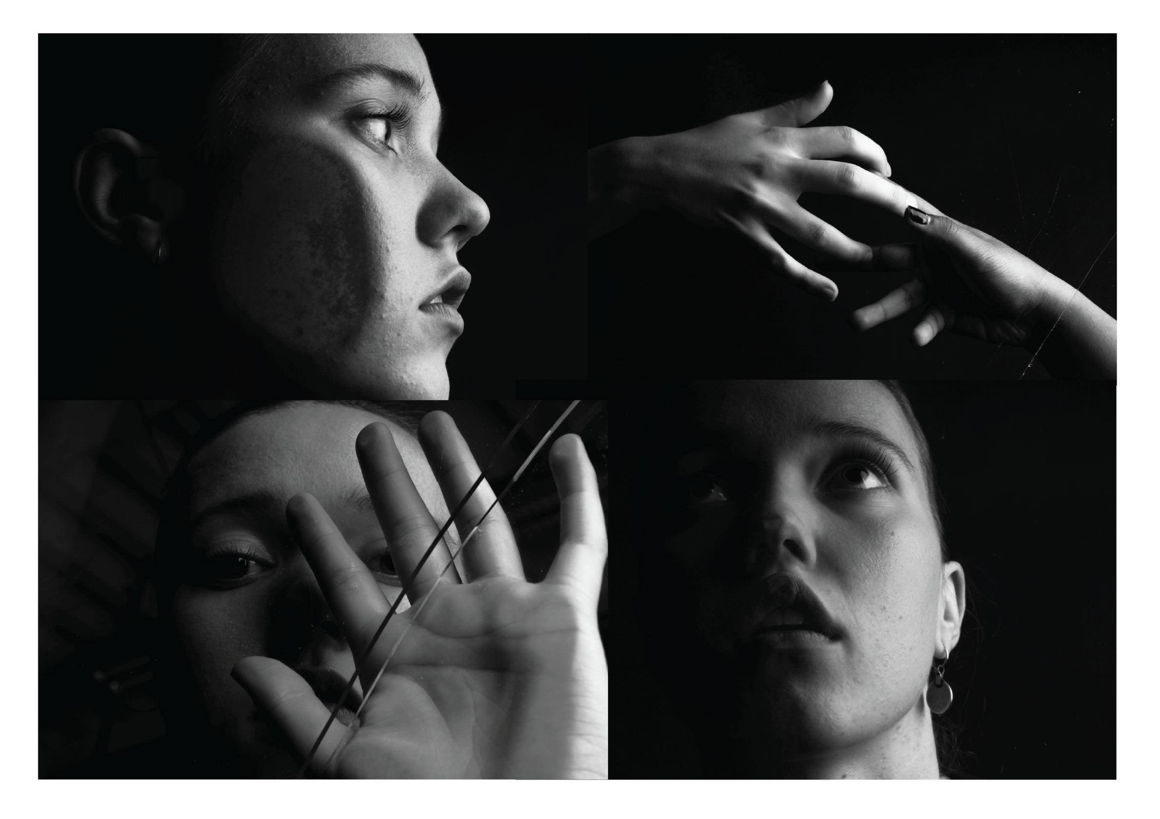
Smal l Steps of Rebell ion
Design Brief This experimental photo session aims to capture the specific aura of the character.


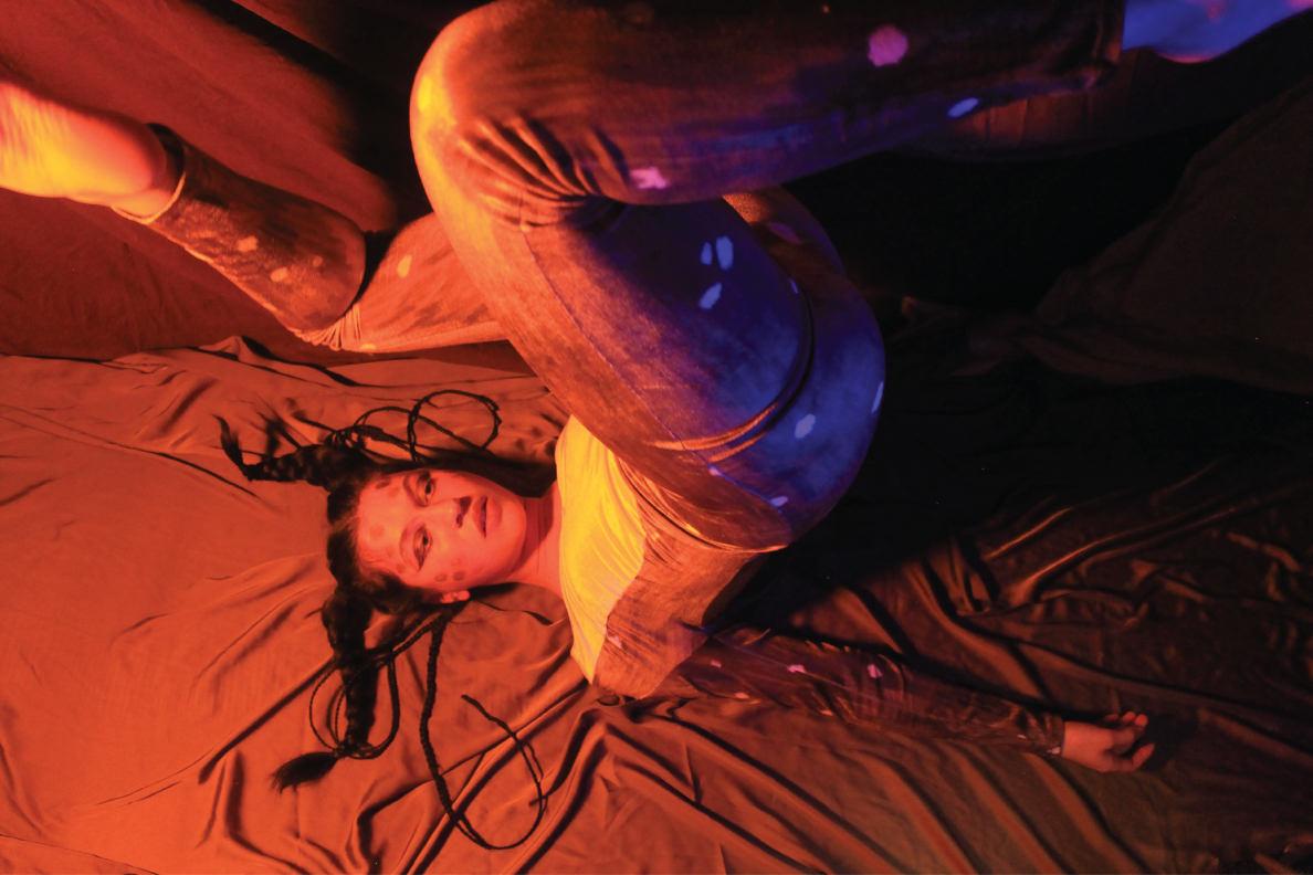
Roe Deer
Design Brief An experimental photo session with light that aims to show some of the stages from the life of the roe deer.


Short movies
Design Brief These 3 videos are part of either individual or collaborative projects. By clicking on the video or scan the QR code you will be redirected to each one of the videos.

‘Juste un autre jour’ This is a short collaborative film , inspired by the French New Wave. The video includes two scenarios of the daily life of three contrasting characters. Four students participated in the production of this project. Director of photography: Julie Tuinman Screenwriter and editor: Sverre van der Velde & Veralinde Jelsma Video editor: Theresa Konova
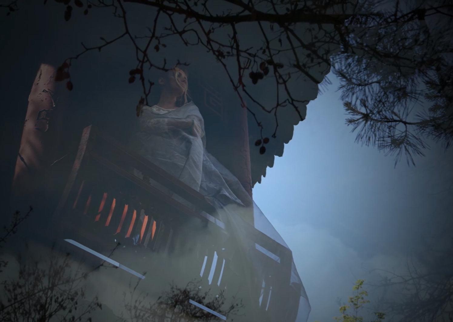
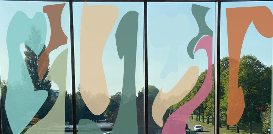
Dreams - ‘Four elements’
This is a short movie, fully produced by me. It was part of a group project for an installation with the topic of ‘Dreams’. It is inspired by the movie ‘Dreams’ by Akira Kurosawa. It depicts the natural rituals of the four elements - wind , water, earth and fire. Music: Wybe Wersma Costume & set designer: Theresa Konova Screenwriter: Theresa Konova Director of photography: Theresa Konova
th.konova@gmail.com