The Brand
A brand is a graphic system, centered around a symbol, that identifies a person, product or corporation.
There are various types of graphic brand designs. The design will depend on many factors such as the target group of the product, the longevity of the company and the industry where it operates.
Choosing the right design will help your product or business by making a direct association between the symbol and your values and mission.
Most successful companies nowadays are those that have a clear purpose. Whether it is helping reduce food waste or advocating for local producers, they market themselves by linking their success stories and the advancement of their causes.
A graphic brand should reflect its values. Most times the representation of values is subjective so the chosen brand elements will be entirely at the discretion of the owner.
There are, however, some brand traits that are perceived by many people as having certain values. In the first chapter of this book we will learn about building a brand and in the second we will walk through the checklist for choosing the perfect sign for your business. Brand design
is closely related to the industry where it operates.
The brands of different industries have certain similarities that may help recognize a brand by association to the economic sector that it serves.
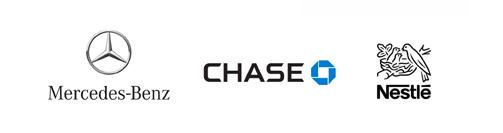
Banks
Restaurants
Cars
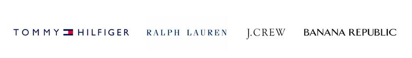
Apparel
Types of brands
According to Spanish branding guru Norberto Chaves (follow him on foroalfa.org), there are six types of brands, divided in two groups. Watch the video in Spanish here. The figurative rely more or less on a symbol that identifies the brand and the textual rely on a typographic representation, which means that the written name is the main part of the brand.
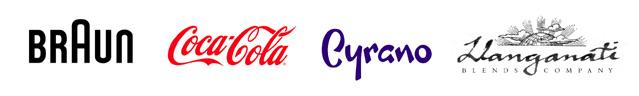
The three Figurative brand types are:
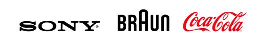
Logo with symbol: the most common. Both elements have enough recognition to identify the brand, together or separate
Lone Symbol: a brand so recognizable that can be represented by a symbol alone
Logo-symbol: both logo and symbol are one unit that cannot be separated
The three Textual brand types are
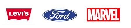
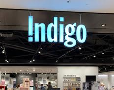
Pure logo: a typographic representation of the written name. Usually a unique font or a modified font
Logo with accessory: logo has an accessory that goes together but is not recognizable by itself
Logo with background: logo is inscribed in a background that would not be recognizable by itself

Choosing a font
A typeface is a style of lettering, such as Times New Roman, which can include variations such as Bold or Italic. Each variation is called a Font.
Different typefaces are used for diverse purposes. Each one has a character that is associated with its use. Each of those characters can also vary according to weight (light, regular, bold) and width (condensed or regular). The most distinguishable feature is their type. There are four general types of letters:
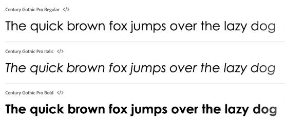
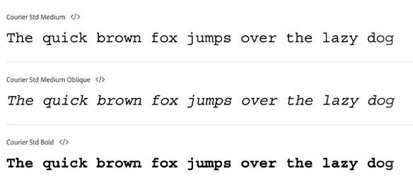
• Sans Serif typefaces make headlines and infrastructure signs easier to read. Sans Serif fonts are preferred in places where understanding what is written is critical and the size of the letter will be large, such as railroad tracks and stations, airports or highways.
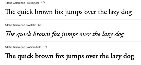
• Serif or Roman fonts are Classic letters that were used from early printing press times to print large texts and are easier to read in paragraph form. Serifs are small strokes at the end of each letter that were intended to smooth the edges of letters chiseled in stone.
Aa
Sans Serif Aa Serif
• Slab Serif fonts make serifs intentional and are often used in posters because of their high readability.
• Script typefaces are based on the continuous stroke of handwritten letters. Use of stock fonts should be cautious, since they intend to reproduce handwriting but don’t have the uniqueness of the human touch. Script fonts should be designed by hand for best results. Depending on the chosen font, they could look more formal.
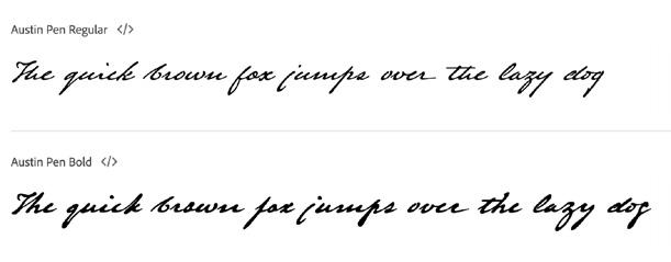
• Unique fonts can be specially produced to create a brand. These fonts generally become symbols themselves. They can be regular typefaces or specially designed scripts. Free script fonts are hand-written fonts that are associated exclusively with a brand. They do not follow any of the regular typeface rules but rather create their own.

Aa
Aa Script Free Script
Slab Serif
Choosing your brand’s colors
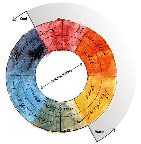
Colors have many categories that work in several levels. Colors can be primary (red, blue and yellow) or secondary (purple, green and orange). They can be more or less intense, creating colors like violet, light blue or pink.
Colors also have what is known as “temperature” ranging from warmer red, orange or yellow and cooling down towards green, blue and purple.
Color has the capacity to influence mood. Blue lights have been used to deter criminal activity by its association to Police, pink paint has been used to tame inmates in prison due to its calming effect and orange has been used in fastfood restaurants to nudge fast turnover times.
Choose your brand’s colors after finding your purpose, creating your concept, stating your mission and determining the mood of your storefront. To find out how, refer to The Storefront Mastery playbook, available here.
Color as brand
Strong associations between a brand and a color can allow the color itself to be the sole brand identifier.
Examples such as Coca-Cola red or T-Mobile magenta can be a guide. Those brands that rely on color as an identifier must be brands with very high recognition that people already associate with the color.
On the road to the ideal brand-color association, it’s never too early to start creating the link. Begin now.
Notes on choosing a color
Color works different on a screen than it does when printed. Colors on screen are made up of combinations of Red, Green and Blue, known as RGB and colors in print are made up of combinations or Cyan, Magenta, Yellow and Black, or CMYK.
It’s very likely that the color you choose on a screen will look different when printed. Always make color proofs before you print and adjust as necessary, to make sure the color you see on screen is the one you will get when your sign is printed.
Printers have tools like the Pantone Color Guide that can help you choose the color that most accurately represents what you see on screen.
The Sign Types of Signs
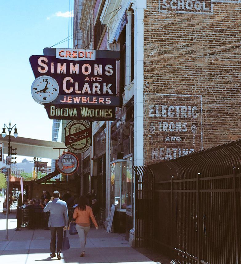
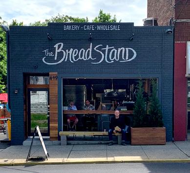
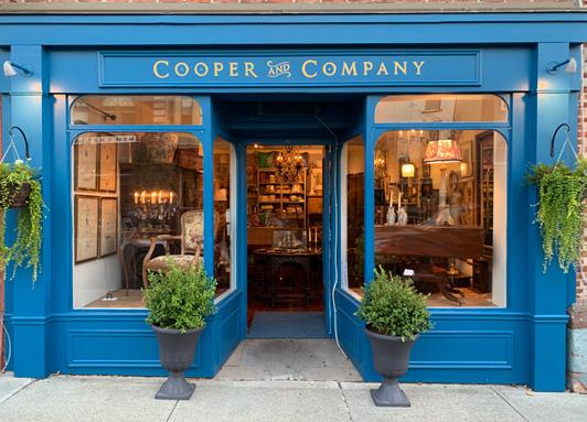
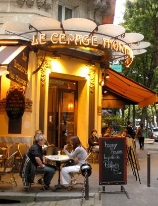
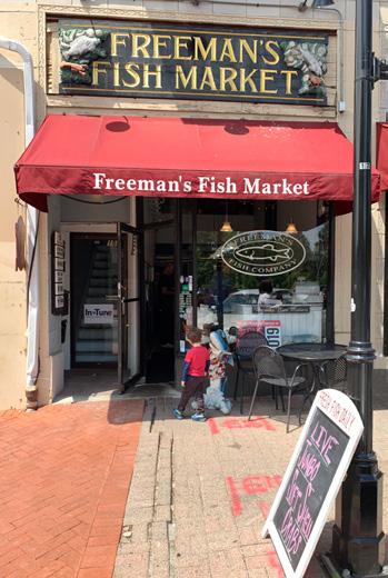
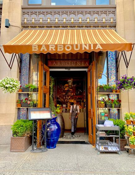
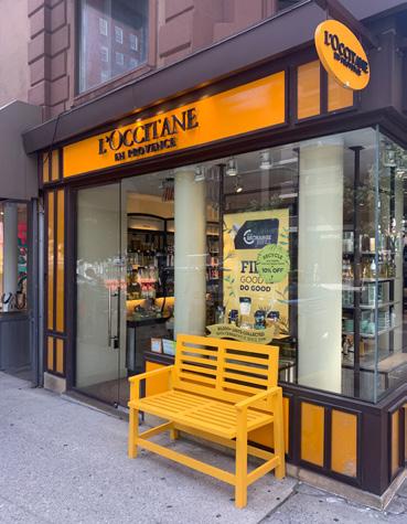
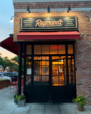
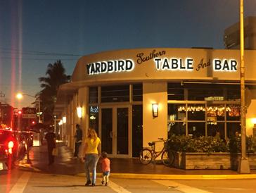
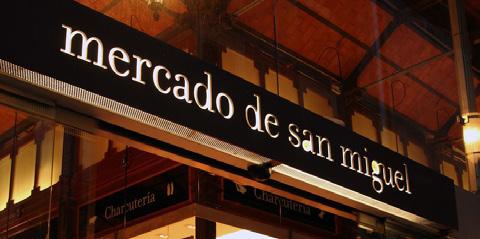
The commercial facade is the first and most complex sign. It consists of every element of the store’s frontage: entrance, display, sign, awning and others. Branding can be applied in large format, painted all over the facade or it can just be in a small sign. In any case, the entire storefront acts as a sign and every element should be displayed accordingly.
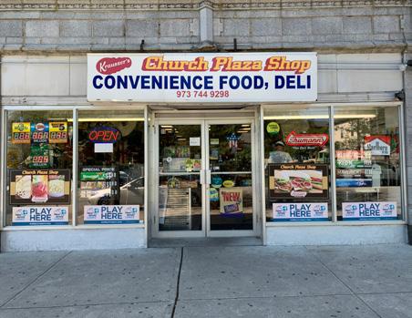
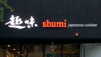
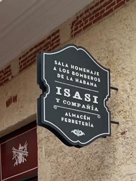
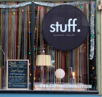
Flat signs can be fixed to or painted over the storefront. They can be made of different materials and are usually painted over a shaped support.
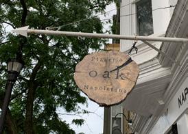
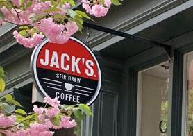
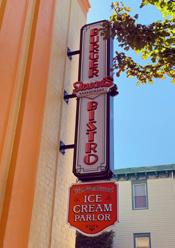
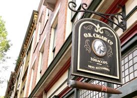
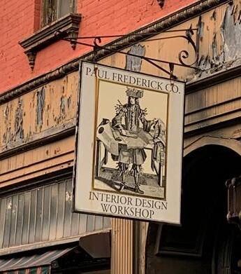
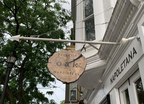
Blade signs are usually flat, could have some degree of relief and are mounted perpendicular to the storefront wall. These are the most pedestrian-friendly signs because of their size, height and mounting, which allows pedestrians to see them as they walk.
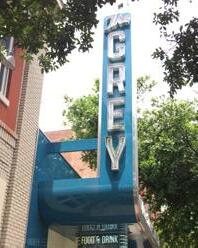
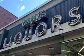
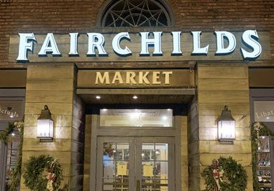
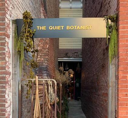
Block letter signs are 3-dimensional displays where the brand is made up of extruded blocks. These may be illuminated from within, back lit or by an external source. Block letter signs can be mounted directly on walls or on a flat support that is itself mounted on a wall.
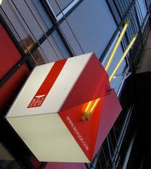
3-D signs are figurative and range from a simple rectangular block to any object that represents the brand, in addition to the name and symbol. They may be illuminated by an external source, back lit or from within.
Awnings are shade elements mounted on the storefront wall, right above the entrance, and are meant to create an enclosure right at the store’s entrance and protect from the sun and rain. They can be operable or fixed and are a valid support for your brand.
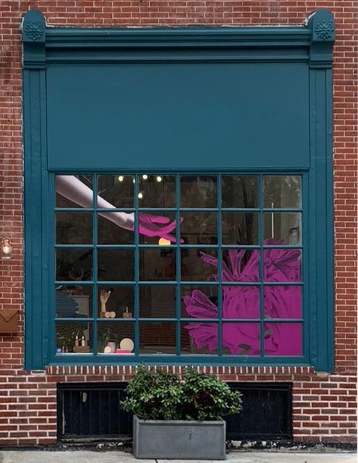
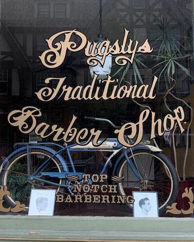
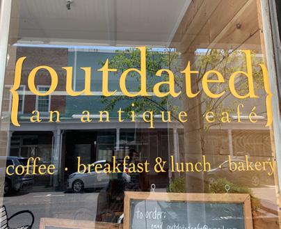
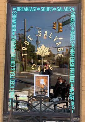
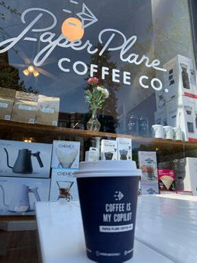
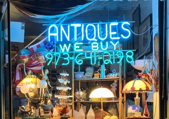
Decals and painted glass work the same way and are similar.
Self adhesives are easier to implement since they can be plotted on and fixed on the glass. Painted techniques are a traditional trade, with its own identity and pride and are applied on layer after layer, often starting with gold for the letters and ending with black for the background.
Both painted glass and decals create a foreground-background effect on the storefront glass that can frame some internal elements or obscure others so that you control what is highlighted through the transparent parts of the storefront.
Lighting
There are several ways to make sure your sign stays visible through all hours of the day. Lighting ranges from the conventional external source to more creative LED projection screens over the entire storefront.
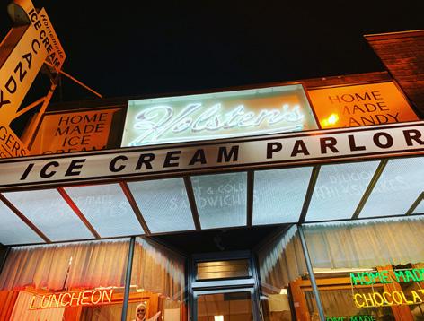
Back lit signs have light, usually neon or LED, installed on the back of the sign, pointing toward the surface where it is mounted, illuminating it. By shining light on the support wall, the sign stands out.
External light sources are installed near the sign on the same wall. The design of fixtures can be classic or modern, depending on the mood of the store and local guidelines.
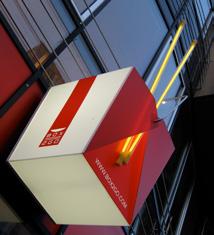
Glow box signs have an internal light source. They range from 3D sculptural representation of the brand or an element of the business to simple cutout sheet steel with the light shining through.
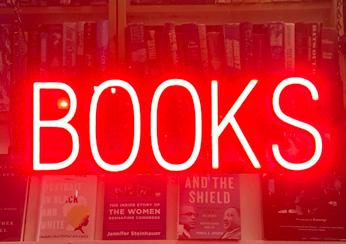
Neon. Usually looks dated to its golden age, but it can work if the message is right and the design is kept subtle.
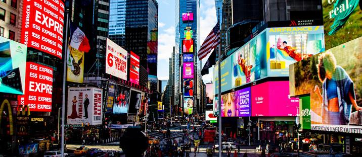
Honorable mention of LED facades that transform the entire storefront into a screen. Still expensive, they can be found in buildings in global cities such as Tokyo, Seoul or New York.
Materials
Wood is the preferred material for blade signs. Along with wrought iron, it was the material of choice historically as branding evolved in cities in previous centuries. It is easy to brand and engrave with laser plotters.
Metal is also a traditional material. Iron can produce heavier, traditional looking signs and tin produces good looking signs that can be printed or branded with laser plotters to look very modern
Mixed signs can be made in many materials. Check for any compatibility issues and make sure the hardware for hanging, stabilizing, framing or fixing is strong and delivers the wind and load resistance, as well as damage from the elements.
Also be sure to check your local regulations for hanging signs as well as for bringing any elements out to the sidewalk.
You can create a painted sign over your storefront wall, block letters fixed to the facade or hand paint the entire commercial frontage. Flat signs or blades can be just a flat sheet of tin, a block of wood or they can be a sculptural, handmade, beautiful sign that shows your brand.
There is no limit to your creativity while designing a great sign. The only limit should be the size of your store. Proportions should always be respected.
That said, signs have to reflect what you are selling, how you are selling and what you want to say. Being a small business these times means becoming the first and most vocal advocate for what you are selling, for your supply chain and your strategic partners. Be sure to represent them, and yourself, well.
Right Sizing
Proportions are tricky. You want your sign to be seen but you want your entrance funnel to be the most attractive part of the storefront. Signs too small or too big will either fail to grab attention and identify your brand or distract from the display and entrance.
A general rule of thumb is to have the sign be between 1/7 and 1/8 of your first story. As with any other rule, this one can be broken if it benefits your brand.