15 minute read
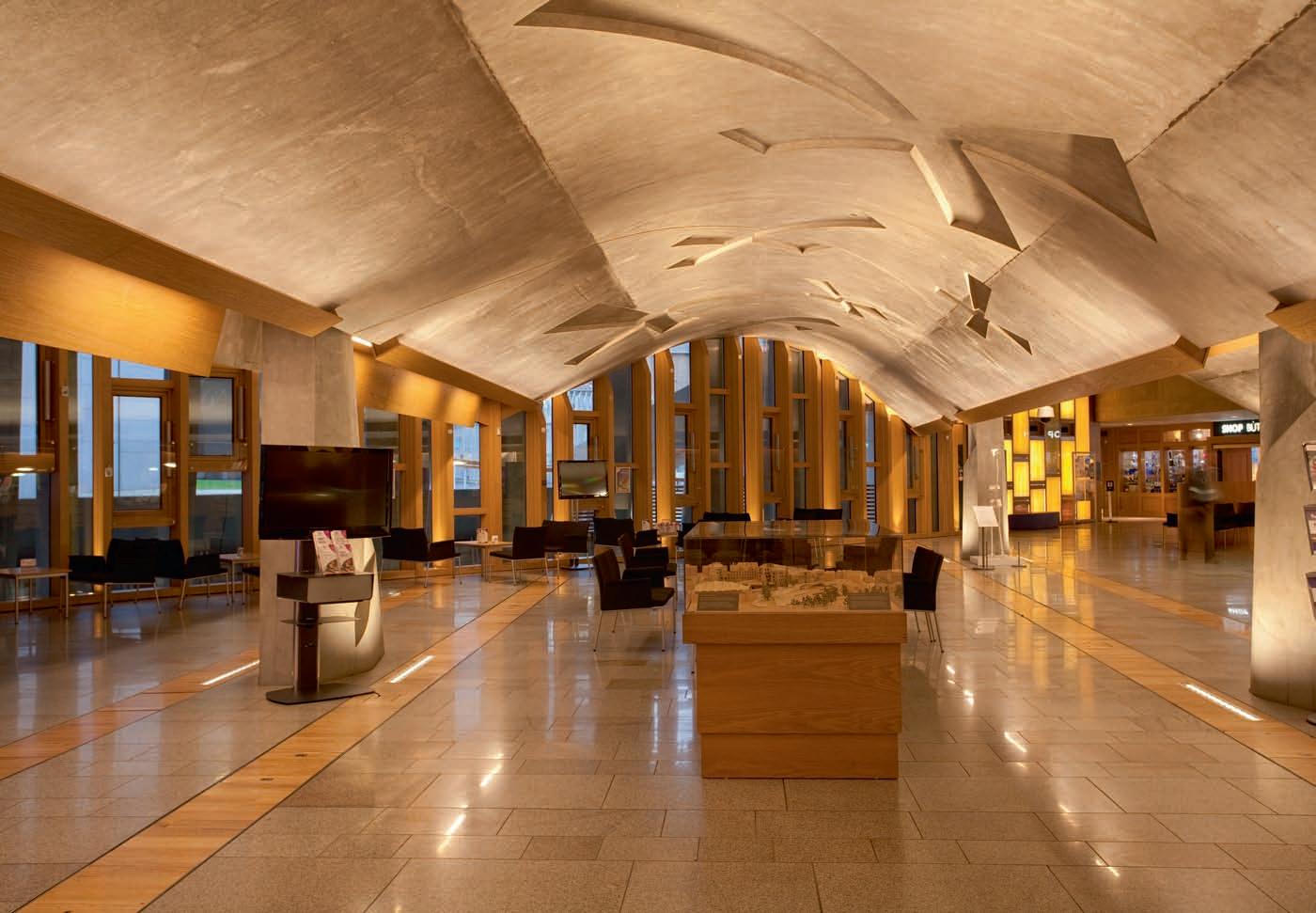
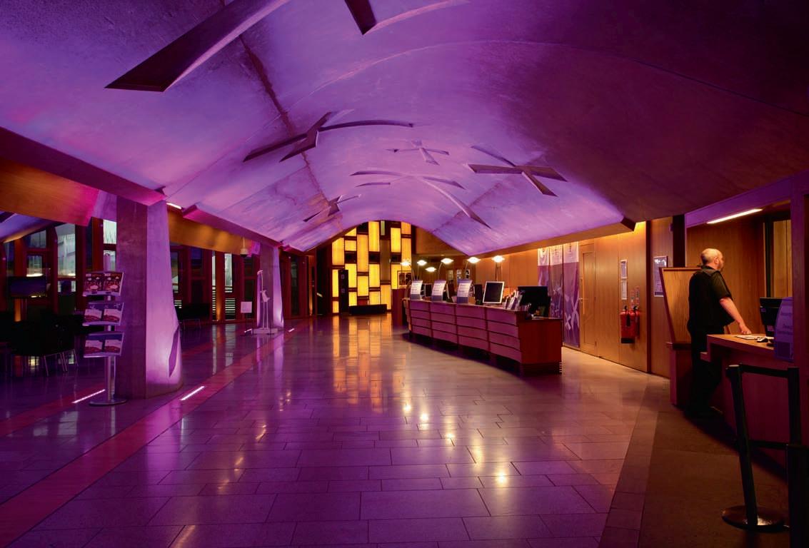
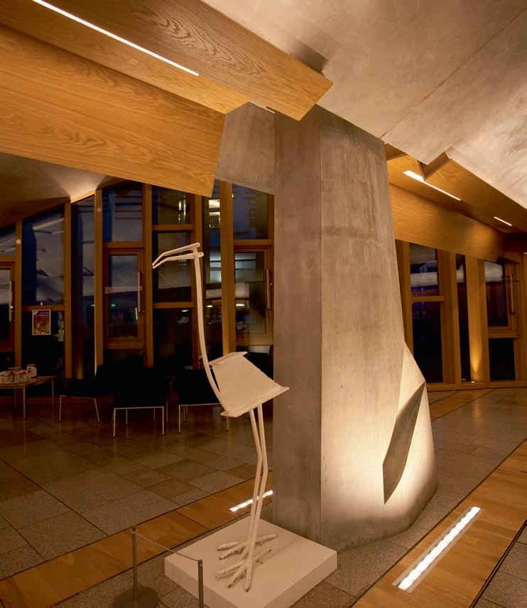
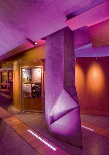
Scottish Parliament Main Hall


ORDER OF THE DAY
KSLD integrates lighting into new timber coves creating a warm and welcoming scheme for The Main Hall at the Scottish Parliament building.
Advertisement
The Main Hall in the Scottish Parliament building is the primary public space within the complex. Apart from being the principle meeting point and reception, The Main Hall also hosts a programme of exhibitions and events. As per the original architectural intent, this is a transitional space before continuing into the very brightly lit debating chamber above. The preexisting lighting scheme was based on track mounted spotlights set into the lowest point of the concrete vaults, the lit result from this was uneven and caused glare problems for many visitors, particularly those with visual impairments. Generally the users noted that the experience of the space was gloomy. The lighting scheme put together by KSLD provides lighting to the concrete vaults and accents the sculptural 'flame' columns and warm timber surfaces. During the project the team reviewed the architect's original visuals for the space and found it was clear that upward lighting was intended, however the LED technologies which make this simpler to achieve were not available when the building was constructed. Besides the warm white lighting, KSLD incorporated a parliamentary purple scheme to enhance the space during events. Lighting is integrated within new timber coves with detailing following on from the existing architectural pallet. Although it is now a warmer and more welcoming space, the architect's intent of a visual progression has been maintained. www.kevan-shaw.com
Project Details
Scottish Parliament Main Hall, Edinburgh, UK
Client: Scottish Parliament Corporate Body Lighting Design: KSLD Lighting Suppliers: Lumenpulse, Zumtobel, Mike Stoane Lighting, Architectural FX, L&L Luce&Light, Applelec
pics: paul Karalius
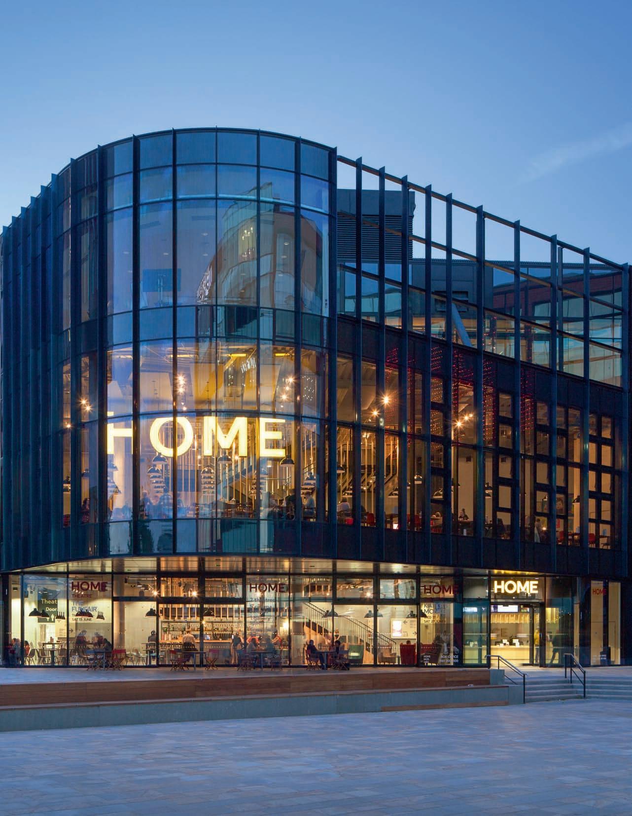
BRINGING CULTURE HOME
New cultural hub HOME, is finding its place in Manchester's city centre through thought-provoking and innovative productions, exhibitions and film. mondo*arc takes a look at how Mecanoo and BuroHappold Engineering worked to bring this new venture alive.
As one of the host venues for this year’s Manchester International Festival (MIF) and co-producer of festival performance Neck of the Woods, HOME is the latest cultural destination to hit the streets of one of the UK’s most vibrant cities. Featuring international contemporary art, theatre and film, HOME is a bold new centre that commissions, produces and presents a provocative year-round artistic programme and is a space in which artists can create work that interrogates and illuminates our existence and experiences today. Having received a cool £25m investment - with contributions coming from Manchester City Council, the Arts Council England Lottery funding and fundraising including £250,000 from Garfield Weston Foundation and £150,000 from The Granada Foundation - the new space forms the cultural heart of the First Street Redevelopment project in Manchester and it is anticipated that the venue will attract half a million visits a year, making significant economic and social impact to the local and regional economy. The overall design for HOME was led by Dutch architectural practice Mecanoo, while Wates Construction led the design team, which included BuroHappold Engineering, Concrete Amsterdam, Space Group and Charcoalblue. HOME features a 500-seat theatre; a 150-seat flexible theatre; a 500m², four-metre high gallery space; five cinema screens; digital production and broadcast facilities; as well as a café
bar and restaurant. With its roots in two of Manchester’s best-loved cultural organisations, Cornerhouse and the Library Theatre Company, HOME will inherit and build upon these artistic legacies, with artistic directors Sarah Perks, Walter Meierjohann and Jason Wood leading a dynamic in-house team, while working with international networks, curators, designers, playwrights, directors and artists to commission, guide and produce the yearround programme. Commenting on the direction of this new cultural hub, Dave Moutrey, Chief Executive, said: “We’ll be a 'home' for everyone, staging challenging and critically engaged art, yet connected with our city. We exist to produce outstanding art, create unforgettable experiences, develop skills and make a difference to people’s lives.” The ‘home for all’ ethos is reflected in the building’s characteristics. Its striking exterior acting as a beacon, while welcoming public spaces and social areas designed in such a way that HOME is inviting to all - a place for making, meeting and socialising. For Mecanoo, working alongside
Identity was key when designing HoMe's exterior. At night, the internal glow from the various floors creates an inviting and warm feel - drawing visitors in.
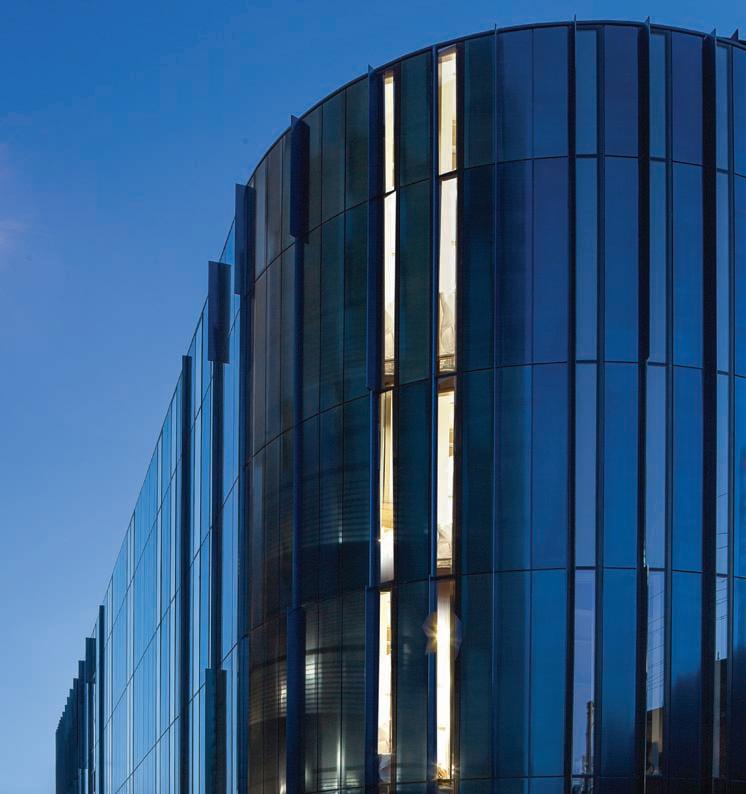
BuroHappold Engineering, identity was key. From the outside, the building’s triangular shape and rounded corners create a strong visual identity. The building, which connects the First Street zone with the city centre, is carefully positioned in its surroundings while visually distinct from the adjacent, commercial developments. The glazed façade, adorned with irregularly spaced fins, opens up where public areas are located, giving the building a varied and dynamic appearance. The iridescent façade reflects the surrounding city and skies, its colour changing from black to blue
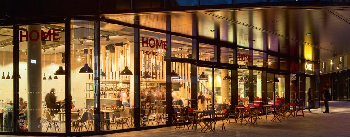
to green depending on the weather. Mecanoo partner Francesco Veenstra commented: “We tried to perforate the façade as much as possible to let daylight into the building, especially in the main entrance.” At night, the building comes alive with help from 65, five-metre Aurora LED strips, neatly tucked in all the way around, illuminating the building’s exterior. At the same time, from inside the lighting acts very much as an attractor at night - the building viewed as a lantern - creating a warm and inviting quality throughout. Putting the visitor at the heart of the project, BuroHappold provided multidisciplinary engineering solutions from the ground up. Partner Mark Phillip explained why it was so exciting to be part of the project: “HOME provides a fantastic new cultural hub for Manchester’s community and through the building’s design, this vision has really been brought to life.” “HOME is quite a demanding space where a lot happens in a small area,” added Laura Phillips, Head of Lighting at BuroHappold. “The material palette adds a lot of drama to the space and from a lighting perspective provides challenges in terms of sufficient visual brightness and bringing out the inherent qualities of the materials used. With the use of the building always in mind, we played with the idea of light and dark. Different lighting languages help to define the different uses and assist with visually organising the space.” The relationship between natural and artificial light at HOME was, of course, a key consideration as Phillips went on to explain: “Sunlight is allowed into the building in a controlled way and adds drama and visual interest to the various spaces. The lighting was mindful of the transmission from inside to out, where people would be leaving the theatre environment to move outside and so, to help with this, the lighting is at a slightly higher level at the entrance spaces.” A series of sensors have been fitted at HOME to respond to daylight levels - increasing and decreasing the artificial lighting accordingly. Veenstra commented on the use of daylight in the space: “We deliberately opened up the southern corner to let as much daylight through as possible. The brief was to create an open appearance when you’re looking out from the building, but also when looking into it. It’s not pretentious… The quality of daylight comes from a large window format, four-metre high pieces of glass, at 1.5-metre intervals. The daylight then falls into the deepest part of the floor, reducing the amount of artificial light needed.”
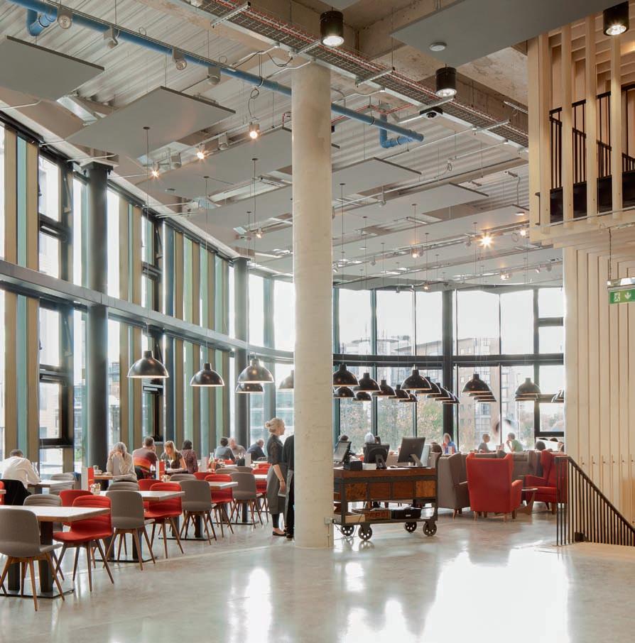
the staircase is pivitol to the flow of HoMe. Making use of raw materials including wood and steel, it is lit with Whitecroft and Illuma fixtures.
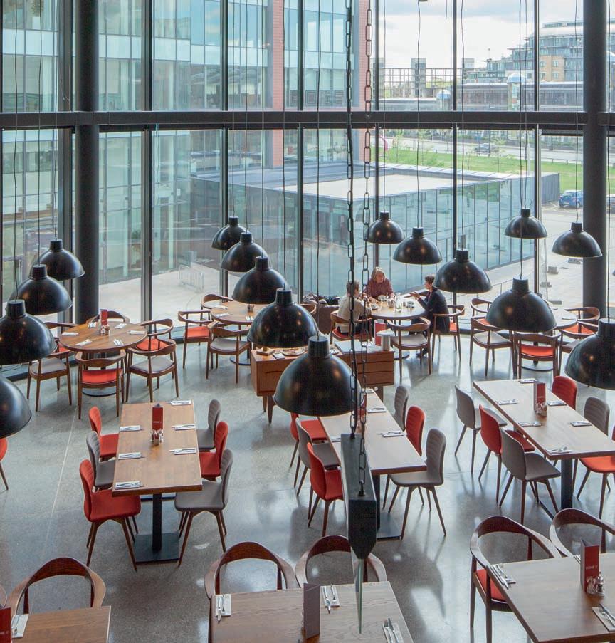
Inside, intimacy is key with the triangular floor plan allowing for a series of unique rooms inhabited within the three corners, including one of the five cinemas. On entering HOME, a combination of suspended and recessed Whitecroft fixtures; suspended Illuma Concepta fixtures; Chelsom decorative glass black pendants; and Inspired By Design bespoke decorative lamps, work within the urban living room layout to instil a sense of warmth. Very raw materials have been used as much as possible at HOME. Wood and steel are the main ingredients and part of this is a large central wooden stairwell, which acts as the main circulation route through the building - helping to create a strong sense of identity, as Veenstra explained: “For such a dense building, inside we introduced this big staircase bringing people from the ground floor, through the first and up to the second. Covered in wood, which will colour in time through exposure to daylight, it becomes the heart of the building.” The stairwell makes use of suspended Whitecroft Mirage SX and Illuma Concepta fixtures all the way up - connecting the different aspects of the venue: gallery (also on the ground floor and featuring ERCO Optec fixtures), theatres one and two (featuring GDS Blue Dome and Pro 1, 4 & 8 Cell fixtures) and cinema. According to Veenstra, The decision to use suspended lighting fixtures, rather than hiding everything away, came from the idea of using the building as a machine. Mecanoo’s Ernst ter Horst explained further: “It’s an honest approach that keeps costs down while achieving so many goals. The concrete is exposed and celebrated and the lighting really helps with this.” The bars and restaurant are located in the areas in between, some of them cleverly integrated into the characteristic stairwell; the restaurant is an essential part of the integrated art and culture concept, with high floor-to-ceiling windows - Chelsom glass black pendant lights and custom made fixtures from Inspired By Design, again create an airy and inviting space. As you move up to the second floor, the roof terrace offers a view onto the square - the rugged concrete floors and part of the walls
the first floor restaurant is an essential part of the integrated art and culture concept. chelsom Glass black pendant lights and bespoke pendants from Inspired by Design create a striking yet warm feel.
contrast with the warm oak of the bar. With the lighting more or less replicated on each floor of HOME, Phillips told mondo*arc of HOME's lighting brief: “The space was to feel pared back, yet warm and comfortable so lighting was important to create warmth and to direct visitors on the use of different spaces. Early on in the process we established the importance of vertical illumination to key surfaces in order to create a sense of enclosure and comfort to the bar lounge areas.” Horst adds to this: “The Cornerhouse wasn’t about having fancy lighting features, it was about being honest and appropriate lighting - we didn’t want HOME to be glaring – but still get warm lighting, a nice downwash on the timbers. The fixtures point to the plywood to celebrate the material and shiny concrete floor - celebrating the palette of materials and elements we have in the building. It has been kept very simple from an architectural point of view, but also from a light point of view.” Summing up the experience of HOME and the challenges the BuroHappold team faced, Phillips concluded: “Brainstorming ideas

with Mecanoo was really great fun and then seeing those ideas come together on site was very satisfying. It was important to consider the technical requirements, especially for darker spaces such as the cinema and theatre where there are changes of level, but this did not drive the design. We looked to create the right quality of lighting for how people will use each space, then looked at how the spaces could be stitched together with down lighting and wall washing to provide continuity and assist with orientation.” As remarked by Councillor Rosa Battle, Executive Member Culture and Leisure Manchester City Council: “The opening of HOME marks the newest high-profile addition to Manchester’s renowned cultural scene - a scene that brings with it huge economic benefits and is a big part of what makes the city a place that people want to live, work and invest in." www.mecanoo.nl www.burohappold.com
Project Details
HOME, Manchester, UK
Client: Manchester City Council Architect: Mecanoo Lighting Design: BuroHappold Engineering - Lighting Group Design team: Wates Construction, Concrete Amsterdam, Space Group & Charcoalblue Multi-Disciplinary Engineering: BuroHappold Engineering Project Management: MACE
lighting sPecifieD
Aurora LED strips Chelsom Glass black pendants ERCO Optec fixtures GDS Blue fixtures GDS Pro 1 Cell fixtures GDS Pro 4 Cell fixtures GDS Pro 8 Cell fixtures Illuma Concepta fixtures Inspired by Design bespoke decorative fixtures Whitecroft Lighting ACF Duralite fixtures Whitecroft Lighting Mirage MX24 fixtures Whitecroft Lighting Mirage SX fixtures Whitecroft Lighting Mirage LED fixtures Whitecroft Lighting LDR LED fixtures Whitecroft Lighting Mirage MX20 fixtures Whitecroft Lighting Stiletto 5 fixture Whitecroft Lighting Duo2 Linear fixtures Whitecroft Lighting Cascade Louvres Whitecroft Lighting Sentry fixtures Whitecroft Lighting Florin E3 fixtures Whitecroft Lighting Mirage LED IP65 fixtures Whitecroft Lighting Radial fixtures Whitecroft Lighting Hygiene fixtures Whitecroft Lighting Kolo IP65 fixtures Whitecroft Lighting Centurion PP65 fixtures
Pics: Dev Ambardekar

UPBEAT UPCYCLING
A small eatery with a mezzanine in Bengaluru, Lemirado designed by Kamat & Rozario Architecture diligently reuses and recycles wood and metal scrap to put together an eclectic global aesthetic. Devyani Jayakar revisits the creative journey.
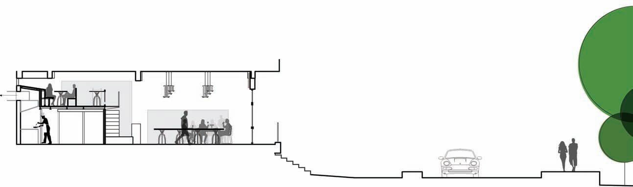
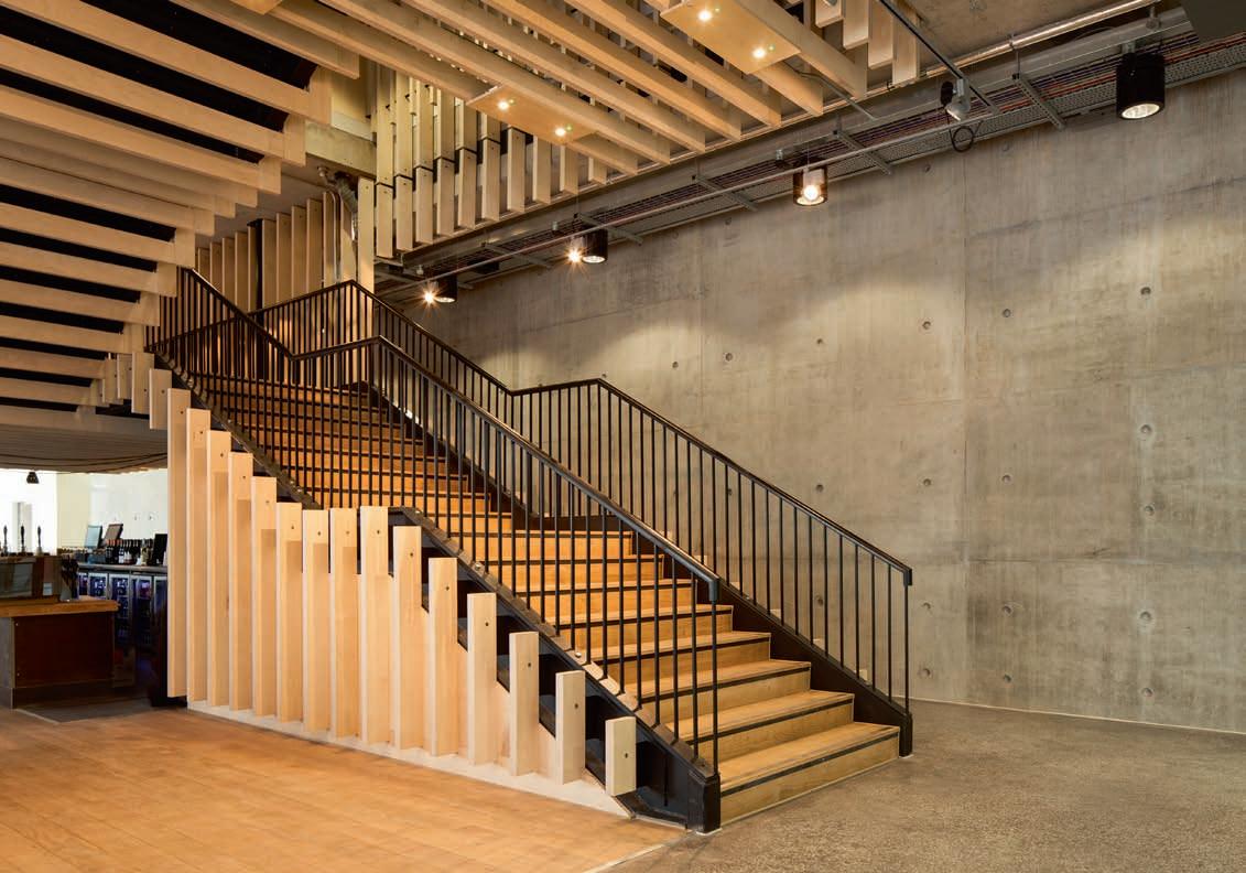
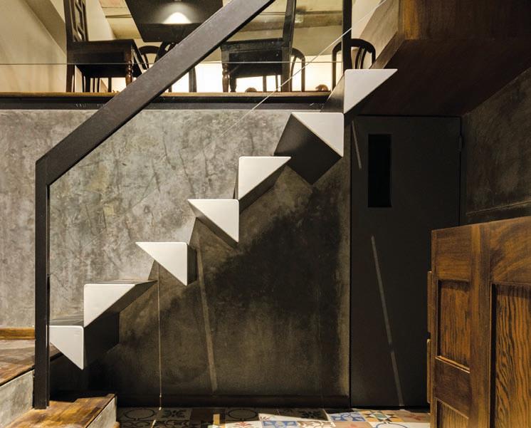
‘What does that mean?’ might as well be one’s reaction on hearing the name of this restaurant in Ulsoor, Bengaluru. Yet it makes complete sense on being informed that it is an acronym derived from the names of some of the greatest artists in the world - Leonardo Da Vinci (Le), Michelangelo (Mi), Raphael (Ra), Donatello (Do). Since local artists are routinely invited to exhibit their works here on a large white wall, the connection between art and an eatery becomes less tenuous. “Lighting was a very important aspect of the design process, and the narrow linear space needed to be well lit at all times of the day. From the start of the design process, the need to incorporate the dense green patch across the street became very important to us,” says architect Smruti Kamat Rozario. Thus, the front façade is kept totally transparent, to bring in the greenery which was almost at eye level. By doing so, the space inside is filled with soft natural light throughout the day, and the long linear white walls reflect this daylight deep into the space. The ceiling and the remaining walls are left a bare grey, thereby creating a strong contrast with the white surfaces. “During the day, the space feels bright and airy owing to the natural eastern light from the front façade,” says Kamat Rozario. A sprawling ‘communal table’ grabs attention within the small narrow space, measuring barely 10 feet x 36 feet. Is such a large piece of furniture counterintuitive in such a small space? Is its scale all wrong? No. Kamat Rozario explains that it was actually a solution. While such a decision would normally be ill-advised, here it made good sense. “We wanted to enable something mundane to trigger a conversation with a stranger, which is more likely if people are sitting at the same table, than if the tables are apart. Moreover, one big table was actually a space saving device, since we would have had to waste space for circulation around smaller tables, which we could ill afford. It also became the best way to have as many covers as possible in the small space available,” she says. The flooring, in contrast to the simple expanse of the table, has a busy pattern on the cement tiles. While the front of the rectilinear volume is dedicated to customers, the kitchen is neatly tucked in the rear below the mezzanine, behind the staircase. The curiously sculptural staircase is a nod to the ‘special something’ which was on the client’s wish list. “We concealed a metal plate in the wall for support and then used a jumble of triangles on the sides of the treads,” says Kamat Rozario. Painting them white has resulted in an eye-catching abstract composition which hugs the wall and veers upwards at an angle, with the wooden handrail appearing to float above, together with the glass which is suspended from it. The furniture has been created from teakwood, salvaged from old furniture owned by the client. “We let the carpenters do what they could,” says Kamat Rozario. This has resulted in dissimilar chairs and boards of different length for the tables. Similarly, the light fixtures are a result of
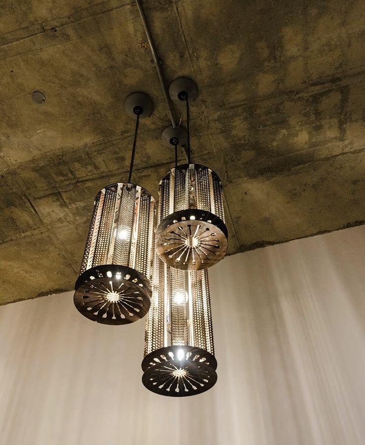
experimentation with discarded materials. Designed from the clutch plates of old trucks and sold by weight in a scrap yard, Kamat Rozario was inspired by the potential she saw in them. “It was rather like a treasure hunt,” she says. Connected by perforated sheets and suspended by heavy-duty metal wire, the end products consist of cascades of three raw metallic cylindrical forms at different heights. Casting a dappled pattern of light and shadow on adjacent surfaces, the clusters are cleverly positioned between the two floors of the eatery so they are visible from the street outside, catching the eye of people driving past. “It ensures that a bare, empty volume is not all that can be seen. The space comes alive after sunset. The metallic hanging lamps cast interesting patterns on the walls and ceiling,” says Kamat Rozario. On the mezzanine level, there is no false ceiling due to a height constraint. Surface mounted lights are positioned exactly over the centre of the tables for maximised functionality. “The visual language has an industrial appeal, since we have used outdoor lights in this space. LED lamps were used for all fixtures,” says Kamat Rozario. If one has to get a lesson in reusing and recycling materials in a creative manner to create a design with character, it is this. The sensibility which dominates is one of upcycling, of the transformation of waste materials, useless and unwanted products into new products for better environmental value. www.kamatrozario.com
PROJECT DETAILS
Lemirado Restaurant, Bengaluru
Architect: Kamat & Rozario Architecture Project Team: Smruti Kamat-Rozario, Lester Rozario, Neethi Dorairaju, Vishus Narayan, Bhavna Thyagarajan