042 043
04.01 Adso
Foundry : Bureau des Affaires Typographiques Location : Paris, France URL : www.batfoundry.com Font : Adso Font Styles : UltraLight, UltraLight Italic, Light,
Light Italic, Regular, Regular Italic, Medium, Medium Italic, Bold, Bold Italic, ExtraBold, ExtraBold Italic Year : 2010 Design : Bruno Bernard URL : www.brunobernard.com
042 Folio : NeoThorn S10 Regular (14 pt) Headline : NeoThorn S10 Regular (27 pt) Subhead : NeoThorn S10 Light (10 / 12 pt) NeoText S10 (9.5 / 12 pt) Column : NeoText S10 (9,5 / 12 pt) Margin : NeoThorn S10 Light (8,5 / 10 pt) NeoText S10 (7,5 / 10 pt) Type Caption : NeoThorn S10 Light (7 / 8,5 pt)
Adso is a typeface I’ve been working on since 2005, and that has just reached an end. It is an attempt to render the modernity and rationality that blackletters actually had during the Middle Ages. A long time ago I was struck by the contrast between the omnipresence of blackletters in our environment and their troubled reputation. How come the same writing could be chosen to set the title of internationally notorious newspapers, and then to be tattooed on the body of the whole world bad boys? How come the same writing could carry so contradictory connotations? I discovered that blackletters history was highly eventful. But the important thing is that originally, Gothic art has been designed to promote a new way of thinking, based on analysis and classification. Blackletters were at the time expressing a new will to communicate with clarity and rigour. Unfortunately they have sometimes been used with misguided intentions after the Renaissance. The result of this is that today’s readers see notions like rebellion and aggressiveness in blackletters while they’re originally meant to be the opposite. Adso is designed to retain the main characteristics of blackletter attractiveness, and to add a touch of sweetness and clearness. So that it becomes again peaceful and familiar to us, as it once was centuries ago. Its full development includes a six-weighted font family, roman and italic styles, and a whole lot of OpenType features.
043 Specimen : Adso
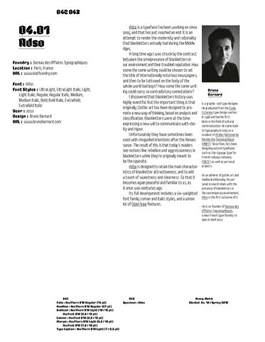
Bruno Bernard is a graphic- and type designer. He graduated from the École Estienne type design section in 1998 and had his first kicks in the field of cultural communication. He came back to typography in 2005 as a resident of Atelier National de Recherche Typographique (ANRT). Since then, he’s been designing custom typefaces such as the signage type for French railway company (SNCF) as well as personal projects. As an admirer of gothic art and medieval philosophy, his personal research deals with the presence of blackletters in the contemporary environment. Adso is the first outcome of it. He is co-founder of Bureau des Affaires Typographiques, a new French type foundry to open in April 2010.
Heavy Metal Slanted #No. 10 / Spring 2010