Every worker gains equity and dignity in the workforce through access to high opportunity and quality employment.
BRAND PLAYBOOK PAGE 6
1.2 OUR VISION
OUR PROMISE

BRAND PLAYBOOK PAGE 7
We’re helping people discover their potential, determine their career destination, and get there faster and more confidently through a guided and supported path.
THE ACTIONABLE PROMISE WE MAKE TO WORKERS AND DELIVER ON EVERY SINGLE DAY: 1.3 OUR PROMISE
OUR BELIEFS
WHAT DO WE BELIEVE IS TRUE ABOUT THE WORLD? WHAT CHANGES ARE WE WORKING TOWARD?
Workers, especially those beyond traditional college age, need faster and more nimble alternatives to the four-year degree.
By putting information into the hands of workers, we promote a sense of empowerment, respect and ownership, which drives both career and personal fulfillment.

Rapid reskilling needs to serve the whole person’s needs—financial, emotional, practical—and not focus on skills alone.
The shifting employment landscape means that high-growth opportunities are in reach for even more people, and unlocking that potential is an imperative for economic and earning equity.
By focusing our efforts to meet workers where they are, we give them the tools, resources, and support they need through living-wage gateway jobs in in-demand industries.
BRAND PLAYBOOK PAGE 8 1.4 OUR BELIEFS
OUR VOICE
Listeners
We understand where workers are coming from and that everyone’s journey is different.
Supportive
We’re helpful, encouraging, and empathetic.
Vibrant
We’re lively, dynamic, energized, and hopeful.
Optimistic
We’re motivational, confident about the future, and we believe everyone deserves access to better jobs.
Accessible
We’re succinct, jargon-free, and forthright.
Informed
We’re experts in upskilling, reskilling, and career navigation, and we’re realistic in our approach.

BRAND PLAYBOOK PAGE 9
THE TONE AND PERSONALITY WE SEEK TO STRIKE WITH OUR MESSAGING, CONSISTENT ACROSS CHANNEL AND MESSENGER: 1.5 OUR VOICE
ERIC
MERIT AMERICA GRADUATE, IT SUPPORT


The following visual guidelines for the SkillUp brand identity exist to ensure brand consistency across various print and web materials.
The logo should always be scaled uniformly and sized appropriately to maintain consistency, clear readability, and visual hierarchy.
PRIMARY LOGOMARK
Clearance
Minimum clearance around the logo should be measured by half the overall logo height.
Minimum Size
The logo should not be used below the minimum scale guidelines, which ensure integrity and readability.
Logomark height
= 1/2 height
Minimum width = 100px
BRAND PLAYBOOK PAGE 11
2.0 LOGOMARK
Monotone Marks
An all-white monotone version of the logomark may be used on our primary colors and secondary colors, as well as appropriate photos, imagery, and patterns as needed.
Social Icons/Favicons
This icon’s purpose is to maximize recognition, and readability in the context of small-screen applications


For social, we should default to a Peacock Blue background.
For favicon, we should default to white background with brand colors.
It should not be paired or used as a lockup with the official logo, nor should this ever be used as a substitute for the logo.
Inverse Mark
The inverse version of the logomark may only be used on top of our SkillUp Peacock Blue solid or patterned backgrounds. This is the only time the inverse version may be implemented.
BRAND PLAYBOOK PAGE 12
2.1 ADDITIONAL MARKS & USAGE
All logomarks should always be used in a way that prioritizes consistency and readability to maintain brand integrity.
INCORRECT USAGE OF THE LOGOMARKS:
DO NOT
• Reverse the logo.
• Apply additional colors that are not specific to our color palette or color combinations.
• Rotate any single part of the logo.
• Stretch or alter the proportions of the logo.
• Change the arrangement of the logo.
• Apply gradients, shadows, or other effects.
BRAND PLAYBOOK PAGE 13
2.2 INCORRECT USAGE
PRIMARY COLORS
The primary palette consists of SkillUp’s teal with peacock blue. These colors should be used as a foundational element of design, with secondary colors encouraged.
SU Peacock Blue
RGB: 6, 51, 71
Hex: #063347
CMYK: 97, 72, 49, 46
SECONDARY COLORS
The secondary palette relies on a tint of teal, as well as some vibrant fun colors to add energy and joy to our palette.
SU Teal Tint
RGB: 136, 206, 209
Hex: #88ced1
CMYK: 45, 2, 19, 0
SU Marigold
RGB: 254, 202, 103
Hex: #feca67
CMYK: 0, 22, 69, 0
SU Tomato
RGB: 255, 105, 105
Hex: #ff6969
CMYK: 0, 74, 50, 0
SU Teal
RGB: 153, 157, 168
Hex: #009da8
CMYK: 80, 18, 35, 0
SU Pear RGB: 133, 183, 105
Hex: #85b769
CMYK: 52, 9, 76, 0
SU Berry
RGB: 197, 158, 216
Hex: #c59ed8
CMYK: 22, 40, 0, 0
BRAND PLAYBOOK PAGE 14
2.3 SKILLUP COLOR PALETTE
DISPLAY/HEADLINES
Our display typeface is Garnett Bold. It is designed for impact and punch.
BODY COPY
Our body copy is Apercu, this can be used for body copy/all functional scenarios. We are using a Regular and Black weight.
BRAND PLAYBOOK PAGE 15
2.4 SKILLUP TYPOGRAPHY
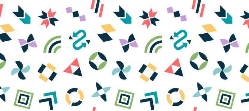
We use our SkillUp symbol library built from simple geometric shapes to breathe life into designs. These graphic symbols have been designed to represent core values of the brand: motion, support and growth. These symbols can be used on their own, in a repeated manner, or featured together to support the design and/or message.
MULTI-COLOR SYMBOLS


SkillUp’s primary symbol library is the multi-color version that relies on the use of the peacock blue paired with our range of secondary colors.


BRAND PLAYBOOK PAGE 16
2.5 SYMBOL LIBRARY
SkillUp offers secondary symbol libraries that feature two variations of our symbols in peacock blue: a solid version and an outlined version. These symbol variations may be employed in various contexts, including patterns or background elements, whenever a more simplified and minimalist approach is desired.


Note on Outlined Symbols
The outlined versions may only be used in the context of our brand patterns (see pg. 18) for instances when we want to optimize overlaid copy legibility. The solid versions—multi-colored or single color—should be the go-to libraries for all other design elements.
SOLID SYMBOLS OUTLINE SYMBOLS
BRAND PLAYBOOK PAGE 17 2.5 SYMBOL LIBRARY
Our symbols come together to create custom SkillUp patterns that add dynamic background movement and color to designs.
Branded patterns help reinforce our visual identity and create a consistent brand experience across different touch-points, and facilitate cohesive design execution.


These patterns can be used in a wide range of applications, such as social media, packaging, website backgrounds, stationery, and marketing collateral. Their versatility allows for consistent visual representation across different mediums and platforms.

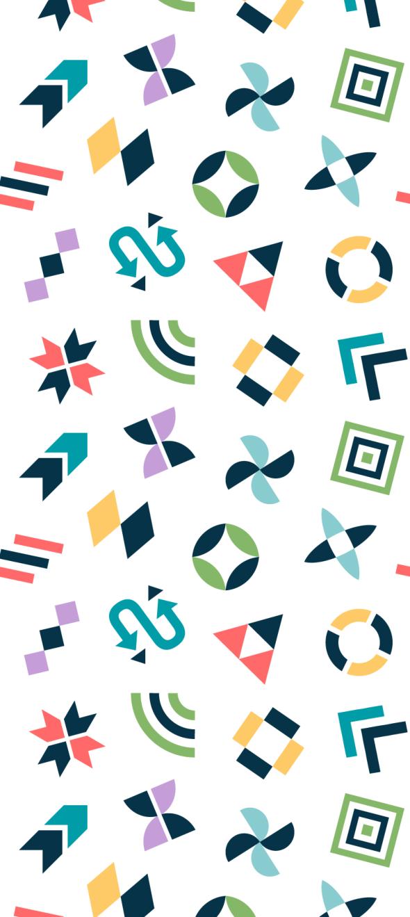
May be used at various opacities to ensure legibility in design.
May be used at various opacities to ensure legibility in design.
May be used at various opacities to ensure legibility in design.
Outlines on Various Colors
May be used on any of the primary or secondary color backgrounds. This is the only instance when a background color may be interchangeable with the entire palette range; all other patterns stay have a designated background color.
BRAND PLAYBOOK PAGE 18 2.6 PATTERN LIBRARY
Full-Color on White BG
Full-Color on Peacock Blue BG
Bi-Color on Teal BG
PRODUCT PATTERNS
SkillUp also has a series of product patterns that may be used in specific instances. These nine patterns feature one of three of our symbols, each in the brand colors of peacock blue, teal, and pear.


With a transparent background, the patterns can be resized and moved to feature the main symbol within the context of the overall design.

BRAND PLAYBOOK PAGE 19 2.6 PATTERN LIBRARY
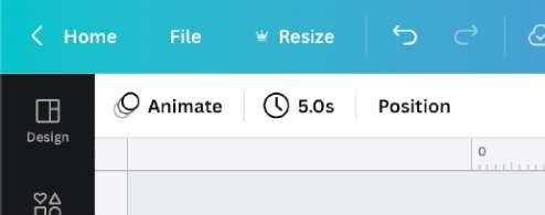
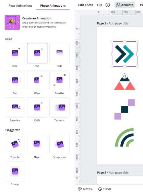
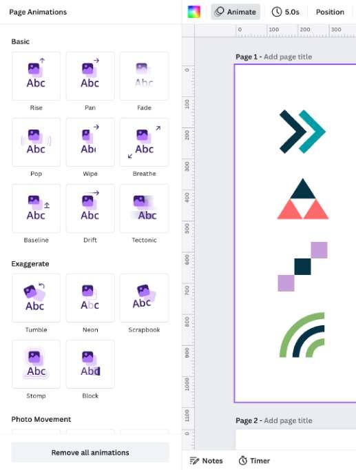
Animation serves as a powerful tool that aligns with SkillUp’s themes of motion, momentum, and upward mobility.
By incorporating dynamic movement into our designs through Canva’s animation capabilities, we visually represent our commitment to progress and growth, and can take our digital designs to the next level. For some specific examples of our symbols in motion, please navigate to this link.
Here are Canva’s animation features and considerations to ensure this tool is being leveraged in the best way for our brand.
Intuitive and Accessible
With just only a few clicks, you can easily add custom animations to our brand symbols and text, saving time and effort in the animation process.
Brand Consistency
Animation Styles
Canva offers a selection of 14+ premium animation styles to choose from allowing you to add motion to different parts of your design and create dynamic visual effects.
Canva ensures brand consistency by allowing you to apply animations consistently across our designs, whether it’s to a single element or all elements on the page. This helps maintain a unified visual identity and reinforces brand recognition.
Custom Controls
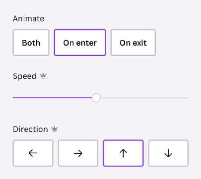
After a style is selected, further custom aspects can be adjusted, such as speed and timing. Further customization may be added through key frames.
Supported Formats
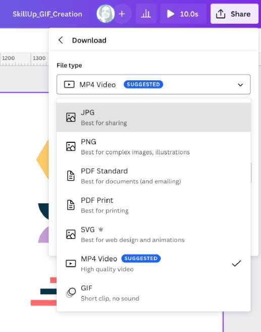
Canva allows you to download your animated designs as GIFs or video formats, providing versatility in sharing your animated content across various platforms and channels.
BRAND PLAYBOOK PAGE 20 2.7 ANIMATION CONSIDERATIONS
ANIMATION BEST PRACTICES
To maintain SkillUp’s brand consistency and visual narrative when implementing animation and motions, please follow these guidelines.
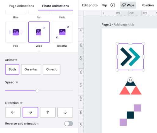
• Choose animation styles that reflect SkillUp’s lively, energized, and hopeful qualities. Suggested options on Canva include: Rise, Pan, Baseline, Tumble, and Pop.
• Use different animation styles for different shapes within the same design to leverage variety in dynamic movement. This adds a playful energy, but make sure the styles and customizations are similar in speed and intensity.
• Keep animation speeds, especially for social posts, at around 50% or 5 seconds from start to finish per page or frame to leverage consistency and keep the viewer engaged.
• For a single page animation, use “On enter.” For multiple pages, use “Both.”
• Make sure the direction chosen aligns with the same side of the page or frame the symbol or text is closest to.
DO NOT
• Use abrupt or aggressive animation styles that may be overwhelming to the viewer. Options to avoid include: Neon, Stomp, and Disco.
• Mix animation styles that clash or are too different in speed and intensity. When in doubt, simple and subtle is preferred, and less is more.
• Change the custom speed or intensity controls to be too slow or too fast, or exceed 5–10 seconds for a single element or page animation.
• Add animations to anything that is not from our symbols library or large text headlines.
BRAND PLAYBOOK PAGE 21 2.7 ANIMATION CONSIDERATIONS
DO
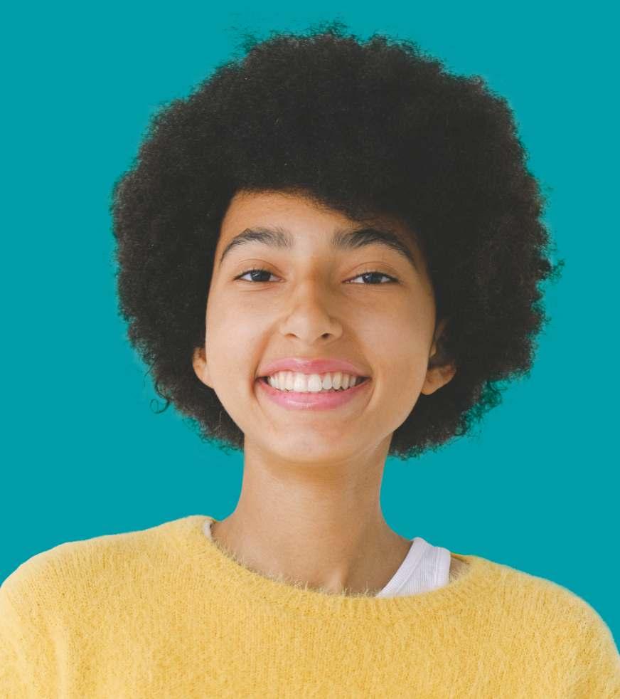
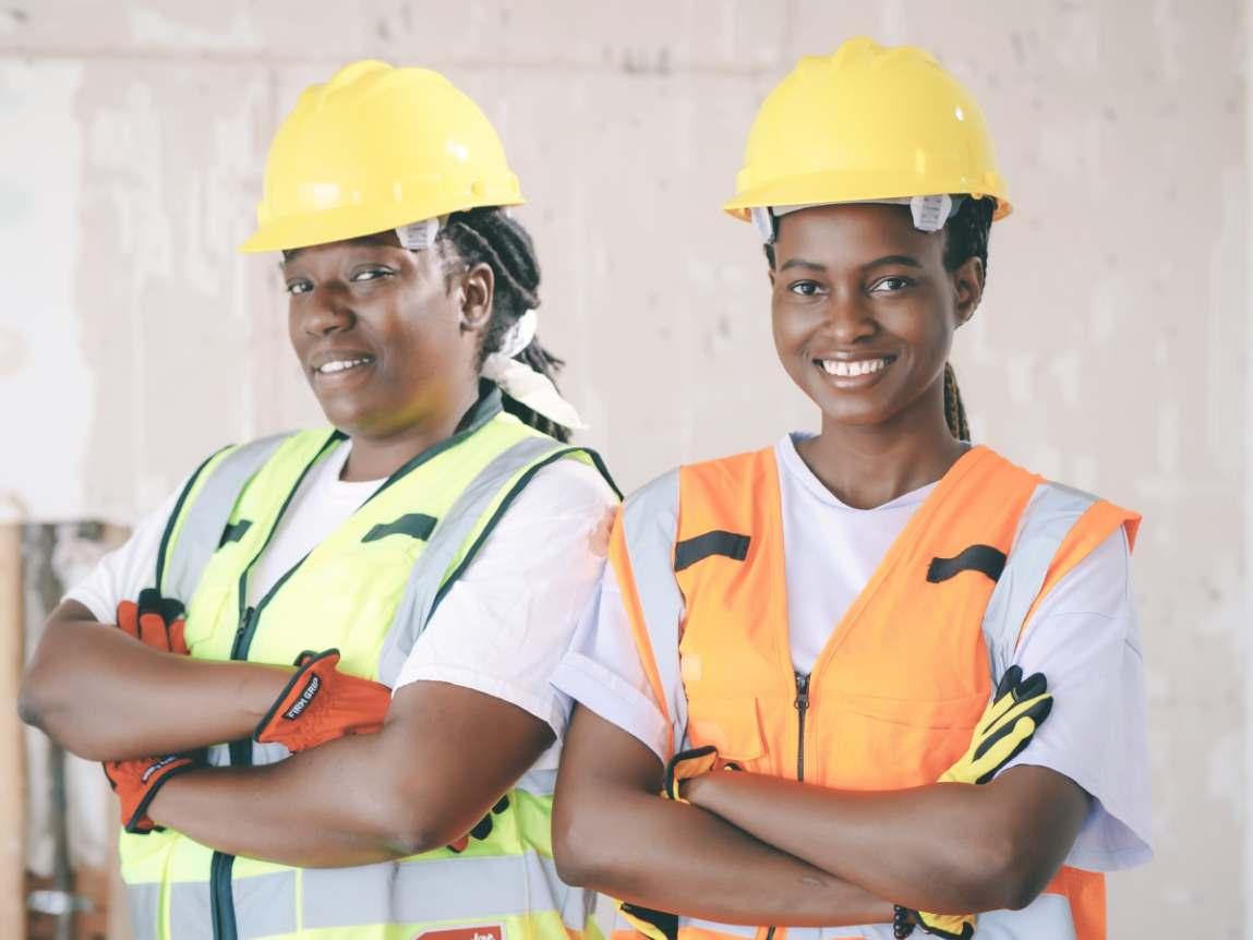
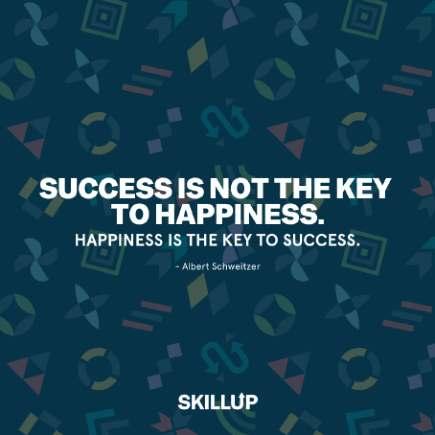
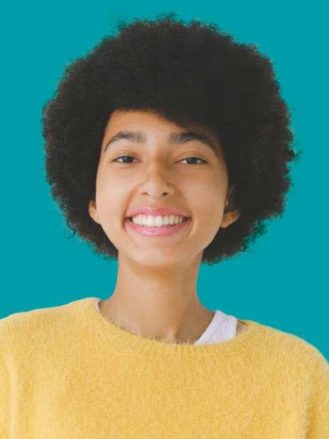
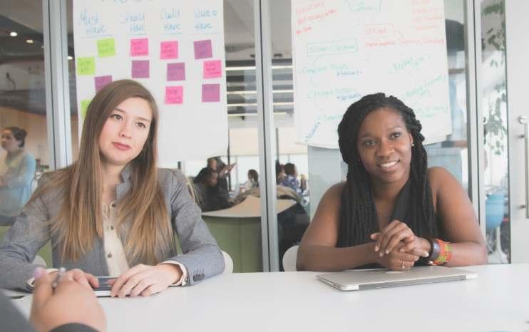
Our brand’s photography style is inspired by a matte, editorial look and feel that exudes an optimistic and visionary quality.
A consistent photography editing style helps establish and maintain a strong brand identity, enhances recognition and recall, ensures visual cohesion, aids differentiation, and supports brand storytelling.
Our matte editing style allows the composition and subject of the photograph to take center stage, enhancing the emotional impact of the image. The focus remains on the story being told, drawing attention to the intended focal point or main subject matter.
The muted colors, soft tones, and subdued highlights create a refined visual appeal that resonates with a high-end editorial feel.
Subject Matter
Take and choose photos that feel authentic and true to SkillUp’s values and audience. They should feature specific individuals or workers, moments of active collaboration or interaction, and people engaged in a work environment. Avoid using photos that feel overly staged or posed.


BRAND PLAYBOOK PAGE 22 2.8 PHOTOGRAPHY GUIDELINES
HOW-TO EDIT PHOTOS
Make these adjustments in any photo-editing program (Photoshop, Canva, etc.) to achieve SkillUp’s consistent matte style across both stock and original photography:
(+) Increase Exposure , (-) Decrease Contrast
Start by adjusting the exposure and contrast of the image until it matches the “After” example on the right.
(-) Decrease Shadows
Slightly decrease the shadows to deepen the darker parts of the photo that lightened up from the above adjustments.
(+) Increase Blacks , (-) Decrease Whites
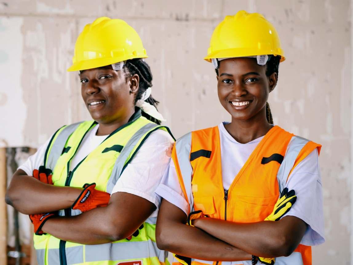
Experiment with subtle fine-tuning of the blacks and whites in the image as needed.
(-) Decrease Sharpness
Decrease the sharpness of the image to create a subtle soft and muted look. We want to avoid harsh edges. This may also be referred to as “Texture” or “Clarity” within different photo-editing programs.
(-) Decrease Saturation
Slightly reduce the overall saturation of the image. Aim for a subtle and slightly desaturated look while not completely losing the range of color.
(-) Decrease Shadows in Tone Curve Adjustment
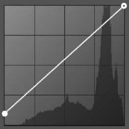
Utilize the tone curve tool (if available) to soften the shadows by moving the lower left point of the curve up (see left). This will enhance the matte appearance, giving the image a dreamy, optimistic quality.
Note on Photo Editing
There are no definitive values to increase or decrease by as each photo will have a unique “before” starting point. Experiment with the steps on the left as needed until you reach the final desired effect, shown above.
BRAND PLAYBOOK PAGE 23 2.8 PHOTOGRAPHY GUIDELINES
Before After
GRADIENT OVERLAY


In certain instances, a color gradient may be used to overlay photos. This adds visual interest and enhances the depth, dimension, and dynamic qualities of our designs.
Using a distinct gradient overlay in SkillUp’s brand colors consistently across various touchpoints creates a recognizable visual signature. Applying the gradient to a photo or image also improves legibility when overlaying text and graphics by creating necessary contrast.
Gradient Usage Considerations


Gradients should be overlaid in a way that suits the specific photo. While the gradient can start or emerge from any of the four sides of the image, make sure the most opaque part of the gradient is not covering or hiding any individuals’ faces.
The gradient should not take up more than 50% of the photo. Text, logos, and symbols should be placed on top of the most opaque part of the gradient to maximize readability.

When there are multiple photos in the same design, use a mix of images with gradients and without

BRAND PLAYBOOK PAGE 24 2.8 PHOTOGRAPHY GUIDELINES
Primary Colors
It’s important that our primary brand colors are always represented. There should never be an Instagram viewport without these colors.
Secondary Colors
Instagram is a great place to inject some of our secondary colors. These will add warmth, vibrancy and energy to the feed.
Display Font
We use our display font for punchy statements, quotes and header styles, and use our body copy for more utilitarian posts. We want to inject personality into social, and our typefaces are a great way to do that.

Photography
It’s important for our brand to showcase photographs of people. We want the brand to feel human. Ensure images of workers are peppered throughout the social feed. At least 50% of the feed should be photographs of people.
BRAND PLAYBOOK PAGE 25 2.9 SOCIAL VISUALS
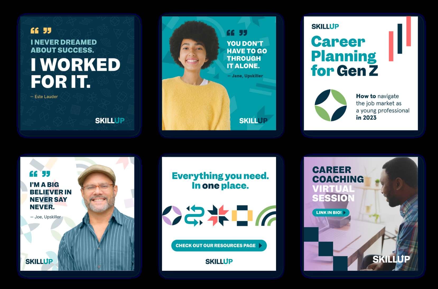
Consistent use of visuals in social media establishes a unified brand identity, fosters on-going recognition, and effectively communicates values and messaging to the audience.
Follow these guidelines for the creation of graphic visuals to ensure brand consistency.
When creating a graph/chart, use our display font for headers and call outs, and body copy for everything else.
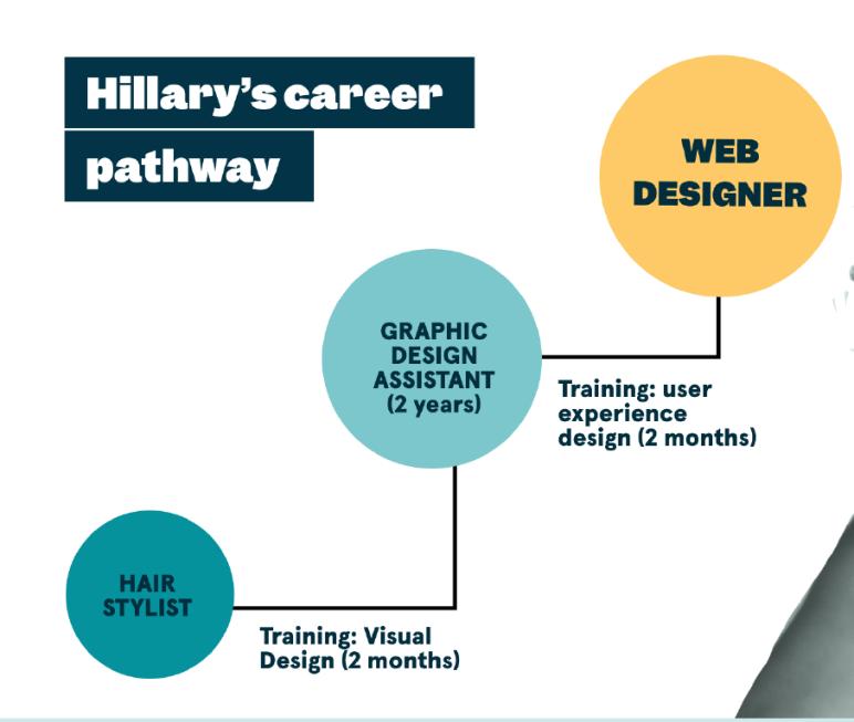
Default to using primary colors, but feel free to pepper in secondary colors to highlight things.
Always try to simplify everything using basic solid colors in bar charts/pie charts. Never use outlines or colors that do not represent the content.
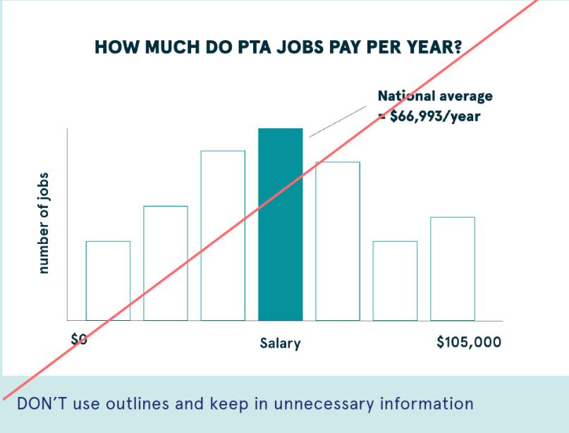
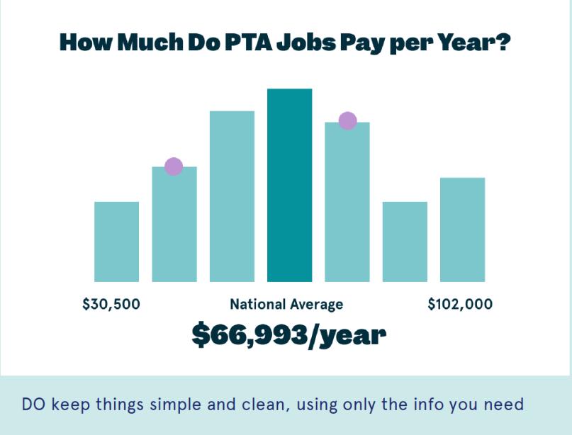
BRAND PLAYBOOK PAGE 26
2.10 GRAPHS & CHARTS


BRAND PLAYBOOK PAGE 27 2.11 SKILLUP VISUAL OVERVIEW
Please contact our marketing team at marketing@skillup.org for any additional needs.