THE HOW-TO MAGAZINE
A PR I L 2021 | S I G N S H O P.CO M
E XPER I EN C E
SIGN BUILDER
ILLUSTRATED
VINYL
GRAPHICS
CHANNEL LETTERS: COFFEEHOUSE SIGNAGE
SIGN DISPLAYS:
LEARNING ABOUT SYSTEMS
CONTENTS APRIL 2021
HOW-TO COLUMNS
21
FORMING A DECISION
By Scott Walton Choosing the right material impacts signage.
VOL. 35
NO. 309
24
DEPARTMENTS
4
Cover Photo: Bucknell Publications, Print & Mail Dept./Mactac.
6
12 38 40
EDITOR’S COLUMN
Editor Jeff Wooten gets into the teamwork concept and shares how a design firm brought companies together for one recent project.
IN THE INDUSTRY
Window graphics are installed at Bucknell University, YESCO puts up a new sign at the historic Laws Railroad Museum, and a transit van is rebranded for senior citizens in need.
SIGN SHOW
The newest products and services from sign manufacturers.
SBI MARKETPLACE
Advertisements and announcements from the sign trade.
SHOP TALK
Ronnie Blair speaks with a consultant to find out why one’s business success comes down to how well their employees perform.
6
FEATURES
24 28 32 35
signshop.com
A LEARNING EXPERIENCE FOR THE COMMUNITY
By Jeff Wooten A community’s learning center brings new technology to recreate some older art.
THE ABSOLUTELY KOOLEST KOALA SIGN
By Jeff Wooten Imagine Factory creates kid-friendly sculpts—such as a custom koala—for pediatric dentist offices.
DRIVING DESIGN
By Ashley Bray Cushing launches a new in-house design division.
THAT ILLUMINATING AROMA
By Jeff Wooten Brewing up a new set of illuminated signs for a cozy coffee shop. April 2021
Sign Builder Illustrated
1
April 2021, Vol. 35, No. 309 Sign Builder Illustrated (ISSN 0895-0555) print, (ISSN 2161-0709) digital is published by Simmons-Boardman Publishing Corporation
Subscriptions: 800-895-4389
EXECUTIVE OFFICES
President and Chairman Arthur J. McGinnis, Jr. Group Publisher Gary Lynch 88 Pine Street, 23rd Floor, New York, NY 10005 Office: 212-620-7247; Cell 646-637-5206
EDITORIAL
Editor Jeff Wooten 323 Clifton Street, Suite #7, Greenville, NC 27858 212-620-7244 jwooten@sbpub.com Managing Editor Ashley Bray 212-620-7220 abray@sbpub.com Contributing Writers Ronnie Blair, Scott Walton
ART
Art Director Nicole D’Antona Graphic Designer Hillary Coleman
PRODUCTION
Corporate Production Director Mary Conyers
CIRCULATION
Circulation Director Maureen Cooney mcooney@sbpub.com
ADVERTISING SALES Sales Manager David Harkey 212-620-7223 dharkey@sbpub.com
Sign Builder Illustrated is published monthly. All rights reserved. Nothing herein may be reproduced in whole or in part without written permission of the publisher. To purchase PDF files of cover and layouts or hard copy reprints, please call Gary Lynch at 212-620-7247 or e-mail glynch@sbpub.com.
2
Sign Builder Illustrated
April 2021
signshop.com
EDITOR’S COLUMN
AGENDA
BY JEFF WOOTEN
Note: Due to COVID-19 concerns, all events listed below are subject to change. Please check each show’s Web site for any cancellations or reschedulings that may have taken place after press time.
APRIL 2021 APRIL 7-9:
The International Sign Association wil be going online this year with ISA Sign Expo 2021 — Virtual, an event that will allow a broader segment of the industry to participate in the show. (signexpo.org/Virtual2021)
JULY 2021
Teamwork Triumphs
JULY 21-24:
Building and managing a multi-company project.
4
Sign Builder Illustrated
April 2021
The first phase is programming, which involves fact-finding and laying out the ground rules. Then they go through two design phases—schematic design and design development. “In schematic, we’re coming up with initial design options,” says Kiper. “In development, we’re refining the selected option and playing that out in the full complete system.” They draw up construction documents detailing and dimensioning every single nut and bolt on the sign and send that out to bid. Once awarded, they meet with the fabricator(s), review shop drawings and material samples, and oversee installation. Cardosi Kiper worked early on with the South Bend municipality to obtain approvals where the signs were sited, as well as for a community development along a side street that had its own sign policies. Kiper finds it beneficial to get this taken care of early on in the design process. “If you sit down with municipalities and review with them what we’re thinking about before sending over the drawings, often times, we find they’re going to be more receptive to providing a variance or permit,” says Kiper. Read our article on page 24 to learn how the assembled team brought this multi-component project to fruition.
JEFF WOOTEN Editor, jwooten@sbpub.com
OCTOBER 2021 OCTOBER 6-8:
PRINTING United Alliance, which brings together the largest and most diverse audience in the printing industry, will be taking place in Orlando, Florida. (printingunited.com)
OCTOBER 25-29:
The 2021 LightFair architectural and commercial lighting conference and tradeshow, which will be incorporating new safety protocols and specific mitigration measures, will be happening at the Jacob K. Javits Center in New York City, New York. (lightfair.com) Photo: Boardwalk Design, an Icon Sign Company.
P
roject management can be a key challenge for shops—especially when working with or bringing onboard other fabricators/installers. On page 24 (“A Learning Experience for the Community”), we detail a big signage project for the recently relocated Robinson Community Learning Center in South Bend, Indiana that featured the involvement of multiple companies. Cardosi Kiper Design Group out of Chicago, Illinois was not only in charge of designing all the various signage outside and inside this facility (including the recreation of a long-recognizable, yet weather-worn community-based art mural), but they also selected various sign specialists to make their vision a reality— APCO Signs (interior signage/wayfinding), Boardwalk Design (interior branding); iZone (mural panels); Provis Graphic, LLC (building letters and logo); and Valley City Sign (exterior signage/bracketry). Ted Kiper, co-founder of Cardosi Kiper, says that choosing multiple companies with different fabrication techniques for projects comes down to pinpointing what the firms specialize in and what is appropriate for the client’s budget. “Very rarely do we sit down and just say, ‘Everything is going to be built by ‘X!’” he says. “We treat it like how a building is built. There are a lot of trades that go into its construction, and that’s very similar to the sign fabrication process.” In the early stages, Cardosi Kiper breaks projects like this down into phases.
The Mid-South Sign Association’s SignConnexion event will be occurring at the Ross Bridge Golf Resort in Birmingham, Alabama. (midsouthsign.org)
signshop.com
IN THE INDUSTRY The Weis Center for the Performing Arts and its colorful window graphics.
WINDOW GRAPHICS INSTALLED AT
BUCKNELL UNIVERSITY
S
TOW, OHIO—In celebration of the thirtieth anniversary of Bucknell University’s iconic Sigmund and Claire Weis Center for the Performing Arts, members of the university’s Publications, Print & Mail Department wanted to do something that was larger than life. Located on Bucknell’s campus in Lewisburg, Pennsylvania, the architecturally striking, 1,200-seat Weis Center for the Performing Arts plays host to professional and campus music, dance, and theatre events, as well as lectures, convocations, and other functions. The team decided to commemorate the honorary milestone by installing graphics on the Weis Center’s 20 windows, each measuring 65-by-75 inches 6
Sign Builder Illustrated
April 2021
in size and covering a total of 677 square feet, with creative and visually stunning photographic images of season-featured Weis Center performers. Working on a recommendation from Lindenmeyr Munroe, a national supplier of wide format graphic materials, the team printed its photographic display on Mactac’s IMAGin WindowVIEW Perforated One-Way Visibility Window Film (WV139), a 6.0-mil intermediate soft white vinyl film with a black reverse side that features 70 percent print surface and 30 percent open perforation with a 1.4 mm hole diameter for one-way visibility. By choosing the WV139 film, the window graphics offered a colorful and engaging welcome for those outside the building,
while continuing to provide those on the inside the ability to see out. The Bucknell Publications, Print & Mail Department team designed and printed these graphics in-house using the university’s Roland VersaCamm 540i wide format eco-solvent printer. After thorough research and a smallscale trial installation, four university employees completed the entire install in just three-and-a-half days. Because of the exceptional design, print, and installation on display at the venue, this project was awarded the Association of College and University Printers (ACUP+) Gold medal and Best-In-Show award. “Initially the graphics were only insignshop.com
CREDIT UNION EMC SUCCESS
D
tended to be up for one year, but because of the project’s great success, we print and install new WindowVIEW perf graphics on the Weis Center every year,” says Tom Lydon from Bucknell University’s Publications, Print & Mail Department. “Additionally the rest of the campus departments have also requested graphics.” The Marketing & Outreach Director for the performing arts center adds, “Our patrons have been impressed— stunned even—by the visually impactful window graphics. We often see patrons and campus visitors stopping to gaze at the windows and take pictures. “This is exactly the kind of interaction we were hoping to achieve.” signshop.com
ANVILLE, ILLINOIS—Riverways Federal Credit Union has been serving its members in and around Rolla, Missouri since 1959. After rebranding, the organization decided to replace an aging brick monument sign at its Rolla location with a Watchfire Signs electronic message center as a way to keep the community updated about its many services. Springfield Sign of Springfield, Missouri handled its implementation and installation. The new double-sided sign features all-aluminum framing and a two-tone green acrylic face that is backlit to make it visible any time of the day or night. The Riverways identification is made from fabricated steel I-beam with channel letters creating the logo. The four-by-seven-foot 10mm message centers are located above the logo at the apex of the sign so that its dynamic messages are highly visible. The Rolla sign was so successful that the credit union deciced to install an identical sign at its Cuba, Missouri location. “The signage and branding is equally important for a small location like this,” said Trey Watts, vice president of sales for Springfield Signs. “In both locations, it’s important that the signage grabs the attention of passing motorists. These signs certainly do that.”
THE WINDOW GRAPHICS OFFER A COLORFUL, ENGAGING WELCOME FOR THOSE OUTSIDE THE BUILDING, WHILE PROVIDING THE ABILITY TO SEE OUT. April 2021
Sign Builder Illustrated
7
IN THE INDUSTRY PUA AND IDEALLIANCE MERGE
F
YESCO INSTALLS NEW SIGN AT
RAILROAD MUSEUM
S
ALT LAKE CITY, UTAH—YESCO, the one hundred-year-old company known for creating, repairing, and maintaining internationally recognizable signs, recently completed the installation of a new billboard for the historic Laws Railroad Museum and Historical Site located in Bishop, California. This new billboard sign is located on Highway 395 and replaces a worn-out version that had been standing there for years. Donations of $13,000 to install a new billboard were made by the community, with matching donations provided by the Death Valley Conservancy. Founded in 1964, Bishop Museum and Historical Society, known as Laws Railroad Museum and Historical Site, is proud of their partnership with the County of Inyo. As one of the oldest non-profit foundations in the Eastern Sierra, the Laws Railroad Museum and Historical Site is honored to preserve the history of the Owens Valley for generations to come. Museum volunteer Jay Smart was the organizer of the new sign program. “The old sign was about twenty years
8
Sign Builder Illustrated
April 2021
out of date,” he said, referring to the fading and dilapidated old sign (http:// bit.ly/3csx13e). With the help from fellow Board Member and Exhibits Manager Katie Olson, Smart recruited Maria Bucaro, graphic designer and owner of Bucaro Design, Inc., in Pasadena, California, and Ray Spencer, a former Walt Disney Imagineer, to help create the new design for this sign. Additionally the Laws Railroad Museum and Historic Site billboard includes historic design features. For example, the steam engine with Mount Tom in the background is almost an exact perspective of what waiting passengers at the station would have seen as the train pulled in. Meanwhile the 20-Mule Borax team is a homage to the Death Valley group that helped fund the project. According to Jeff Young, senior vice president and chief marketing officer at YESCO, the refurbishment of this historic sign was an amazing opportunity for his company. “It’s gratifying to be part of a project that will be seen and appreciated by visitors for years to come,” he said.
AIRFAX, VIRGINIA—PRINTING United Alliance and Idealliance merged the two organizations on March 1. The board of directors at each company unanimously voted in favor of the merger. Last year, SGIA and PIA officially merged to become PRINTING United Alliance, the largest, most comprehensive printing and graphic arts association in the country. This new venture with Idealliance, an industry association for print and packaging, will further support the organization’s investment into the long-term success and fortitude of the industry. “O ve r t h e p a st few ye a rs , PRINTING United Alliance has focused on bringing those efforts and institutions that are having the greatest impact in printing together under one roof,” said Ford Bowers, CEO of PRINTING United Alliance. According to Idealliance CEO Dick Ryan, “In partnership with PRINTING United Alliance, we aim to provide global standardization, training, and certification programs for the printing and packaging supply chain to all graphic communications professionals.”
signshop.com
Challenges present opportunities which leads to
Innovation
Innovation has been a core principle at SDS Automation since its founding more than 30-years ago. Together, SDS Automation and ISA are innovating how you experience Sign Expo 2021 • Live demonstrations • Fast, easy pre-approvals using YOUR files for financing • Book appointments in advance • Private breakout rooms
Visit the show page on our website to submit a demonstration file, see our booth schedule, pre-book an appointment and apply for financing.
sign.sdsautomation.com/ISA
ChannelBender® Series Automated Channel Letter Solutions
IN THE INDUSTRY INSTALLING NEW SAFETY SHIELDS
TRANSIT VAN REBRAND FOR
SENIOR CITIZENS IN NEED
P
AINESVILLE, OHIO—Avery Dennison® Graphics Solutions recently teamed up with Akron-based Repros Color to rebrand a retrofitted Lake County transit authority (Laketran) Dial-a-bus with MPI 1105 wrapping film to serve as the new Lake County Mobile Food Pantry. Since early January, the van has been visiting communities throughout the county to distribute 180 boxes of fresh produce to seniors in need each week (https://bit.ly/3aNqss8). Three Lake County senior services agencies worked together to secure food donations from the Greater Cleveland Food Bank, and each agency plays a role in taking reservations, sorting donations, and distributing the food. Every month, 720 households will receive over 22,000 pounds of fresh produce through the program, according to Laketran. “Food assistance remains a top need among seniors during the coronavirus pandemic and while there are over forty pantries throughout Lake County, this program is unique because it provides fresh produce,” explained Laketran CEO Ben Capelle. “We’re excited to be able to repurpose a bus to meet this community need. We have donations secured through
10
Sign Builder Illustrated
April 2021
April but anticipate the program will continue with the support of the Cleveland Food Bank.” “This was an exciting project for us,” said Repros Senior Account Manager Anthony LaGuardia, noting that vehicle graphics represent about a quarter of his company’s business today. “We’ve been doing vehicle wraps for Laketran since 2014, but most people [there] wouldn’t have known Avery Dennison was our film provider. Laketran came to us before Christmas and said, ‘We’ve got a cool project we’d like you to work on. Do you know anybody at Avery Dennison? They’re donating the [MPI 1105] film.’ “Avery Dennison knew they could trust us with the installation because they’d trained our installers. And now Laketran knew they could trust Avery Dennison because we work with their films every day. Plus one of our freelance installers [who also does design work] stepped up to create the design. It was a quick turnaround over the holiday break, but everybody did a really great job.” Avery Dennison Graphics Solutions welcomes opportunities where their employees and their products can make a meaningful impact and help others.
signshop.com
Photo (far left): © 2021 Avery Dennison Corporation. All rights reserved.
C
OLUMBUS, OHIO—Cameron Mitchell Restaurants has upgraded the guest safety partitions in their Mitchell’s Ocean Club restaurant with AMGARD™ SR Antimicrobial Acrylic Sheet, the nextgeneration in safety shields from Plaskolite, LLC, a North American manufacturer of plastic sheet products. Mitchell’s Ocean Club is owned and operated by Cameron Mitchell Restaurants. The independent, privately held restaurant group features thirty-six award-winning restaurants under fifteen different concepts. Mitchell’s Ocean Club is the flagship location of the OCEAN PRIME boutique collection of restaurants. “The AMGARD SR sheet was specifically developed for this type of application,” said Jim Szekeres, director of Construction for Cameron Mitchell Restaurants. “Installing new shields that are both antimicrobial and scratch resistant is an added measure to keep our associates and guests safe.” “Plaskolite began developing this ground-breaking sheet early in the pandemic to meet the needs of businesses who wanted to provide a long-lasting, scratch-resistant safety shield with an antimicrobial protected surface for their customers,” said Jim Richards, vice president of Industrial Sales.
SIGN SHOW
DIGITAL PRINTING EQUIPMENT/SUPPLIES Epson Releases Its First Roll-to-Roll Resin Signage Printers Epson’s new sixty-four-inch SureColor® R5070 and SureColor R5070L roll-to-roll signage printers with water-based resin ink consistently provide professional-quality wallpapers, fabrics, uncoated papers, and traditional signage at remarkable speeds. Both printers feature 1.5L ink packs for enhanced efficiency, while the SureColor R5070L includes 3L per color with hot swap technology that automatically switches from an empty ink pack to a new pack mid-print for uninterrupted printing. The SureColor R5070 and SureColor R5070L leverage six-color UltraChrome® RS Resin ink to produce excellent color consistency for repeat jobs, brand colors, wall tiling applications, and more. Delivering immediate lamination and high scratch resistance increases overall productivity, and userreplaceable 2.6-inch PrecisionCore® printheads offer convenience for self-serviceability and minimal downtime. Both printers include the new Epson Edge Print® enterprise workflow software for tracking jobs, managing variable data, and streamlining workflow integration. epson.com
ROUTERS/ENGRAVERS Trotec’s Speedy Laser Models Get an Upgrade Boost The updated Speedy laser engraver models from Trotec Laser, Inc., combine existing features—such as super-fast processing speeds; reliable, high-quality results; and the lowest cost of ownership—with more productivity-boosting features than ever before. The unique Ceramicore laser source (now available for 30- and 45-watt Speedy systems as well) provides a more stable laser beam with a small diameter and faster pulse rates; this allows Speedy systems to produce even the finest details at high speeds. The updated Speedy laser models also feature OptiMotion™, an innovative feature that boosts productivity by maximizing cutting speed at highest cutting quality. The operator needs to determine only the power and speed required to cut through the material or to vector engrave. OptiMotion then calculates the speed and acceleration required to achieve the best quality at the highest speed. troteclaser.com
VINYL/VINYL FILMS HP Recycled Satin Canvas: From Waste to Works of Art The award-winning HP Recycled Satin Canvas material, which is made 100 percent from recycled water bottles, is now available for Latex and Solvent printers. In addition to its environmental assurance, HP Recycled Satin Canvas, 3-in Core (Latex/Solvent) produces outstanding image quality and durable canvas wraps that resist edge cracking. Now print service providers utilizing Latex and Solvent printers can offer the benefits of this green canvas option. HP Recycled Satin Canvas, 3-in Core (Latex/Solvent) is not only the right choice for a variety of fine-art projects but for the environment as well. “[HP Recycled Satin Canvas, 3-in Core (Latex/Solvent)] builds on our commitment to develop more sustainable printing materials across all of our product lines,” says Kara Work, product manager for HP Large Format Media. “We strive to deliver products that achieve more with less environmental impact.” HPLFMedia.com
12
Sign Builder Illustrated
April 2021
signshop.com
SIGN SHOW SIGN BLANKS Signage Showcases the Wood Look Without the Maintenance Signage and display components traditionally made out of wood can be updated to benefit from the performance of architectural aluminum without compromising the classic details. Linetec’s wood grain finishes for aluminum present the natural look of real wood, while offering lower maintenance and greater longevity. Their specialty finishes for architectural aluminum products include more than fifty wood grain options of species and color along with textured grain patterns. These finishes can replicate expensive hardwoods like oak and walnut that may otherwise be cost-prohibitive for use in signage and displays. Durable and practical, Linetec’s wood grain finishes on aluminum deliver a consistent appearance and reliable performance. Unlike actual wood, aluminum signs and displays will not rot, swell, or warp. Scratch- and corrosion-resistant, these finishes provide durable protection from UV rays and are impervious to humidity and insects. Within its quality-controlled finishing facility, Linetec applies these coatings utilizing a powder coat sublimation process to meet or exceed the AAMA 2604 standard. At the end of their useful life (as either a sign or a display), the finished aluminum can be recycled. linetec.com/specialty-finishes/wood-grain
COMING SOON!
24v @ 276 LM/FT
QUATTRO
12v @ 222 LM/FT
TRIO
12v @ 157 LM/FT
DUO
12v @ 117 LM/FT
UNO
COMING SOON!
NANO
MORE LIGHT. LESS POWER. MORE PROFIT. MORE LIGHT. LESS POWER
OUR DUO .6W IS BRIGHTER THAN MOST .72W
LOWER SYSTEM COST
GET 100 MODULES ON 1 (60W) POWER SUPPLY
MENTION THIS AD FOR A SPECIAL OFFER Call: 800.793.4793 Email: sales@sfeg.com
HIGHEST LUMENS PER WATT
OUR LINE UP AVERAGES 150 LUMENS A WATT
14
Sign Builder Illustrated
April 2021
signshop.com
SIGN SHOW SOFTWARE-DESIGN/PRINT/ROUTER/ESTIMATING CorelDRAW Graphics Suite 2021 Powers Collaboration and Productivity in Graphic Design The new CorelDRAW® 2021 Graphics Suite doubles down on collaboration with access to next-generation tools that streamline the design and review processes. Boost productivity with a flexible design space that empowers users to take control of projects and assets. Advanced illustration and photo editing capabilities make it faster than ever for designers to achieve their unique creative vision. And as our definition of “workplaces” is continuously redefined, CorelDRAW.app™ is now touchoptimized and available as an all-new iPad app, giving graphics pros new options to be creative anywhere from virtually any device. Offering vector illustration, layout and typography, photo editing, and more, CorelDRAW Graphics Suite 2021 simplifies complex workflows and gives designers total control over how they create their best work—on Windows, Mac, Web, and mobile. A new dashboard in both CorelDRAW 2021 and CorelDRAW.app acts as a collaboration hub containing all design files in the Cloud, and in a click, displays a preview, the number of comments and team members, and project status. Share designs directly from CorelDRAW 2021 without having to open each file. Also reviewers and approvers can now comment on and annotate a document in CorelDRAW.app, with instant feedback appearing in the designer’s working file in the CorelDRAW 2021 application on their Windows or Mac system. Sharing notes and comments in real time eliminates slowdowns and accelerates approvals. Meanwhile advanced illustration features (such as new perspective drawing and enhanced guidelines) deliver stunning results in record time with precise layout capabilities and innovative tools that simplify complicated workflows. coreldraw.com
®
Premium Wall Fabrics & Canvas Series 7337/7338/7339 • Digitally printable acrylic-coated polyester • Both adhesive & non-adhesive-backed options • Three finishes: 049-Matte White, 004-Gold, & 007-Silver Lumina® by FDC products provide high quality, unique solutions with “Choices at a Great Value.” FDC Graphic Films, Inc. ships products to you quickly, in any size or quantity, with no upcharges, and without a minimum order requirement. You can “Count On Us.” Every day. Every order.
ORDER FROM YOUR FDC DISTRIBUTOR TODAY!
fdcfilms.com/7337
®
CHAT WITH US ONLINE
orders@fdcfilms.com
signshop.com
April 2021
Sign Builder Illustrated
15
SIGN SHOW VINYL/VINYL FILMS BrandArmor SafeWalls Wallcoverings are Now Certified Effective Against COVID-19 During these unprecedented times, keeping one's customers and staff safe requires a multilayered plan, beginning with securing your facility. With this in mind, BrandArmor® Technologies, LLC, now offers revolutionary, stain-free SafeWalls® polymer wallcoverings. Safewalls is the only commercial-grade, Type II wallcovering material certified effective against COVID-19. BrandArmor now offers these protective wallcoverings to a variety of industries, including healthcare, food service, hospitality, educational, retail, and other public-facing outlets. SafeWalls wallcoverings bring any graphic design or imagery to life—from murals and logos to patterns and photographs. It combines bacteria and virus resistance with a polymer finish's durability, all with beautiful custom designs. What sets SafeWalls apart is its groundbreaking BrandArmor+ polymer surface manufactured with safe, active antimicrobials. These antimicrobials inhibit the growth of 99.99 percent of microbes, bacteria, and viruses on the surface. Customers can rest easy as the antimicrobial protection embeds in the product and never wears off. And with FDA, EPA, and ISO approval, it’s safe to use in all environments. brandarmor.ink/safewalls
Quality products and trusted solutions since 1852 Stimpson has shipped over 150 billion parts including Eyelets, Grommets, Washers, Hole Plugs, Snap Fasteners, Vents, Clamps, Ferrules and many additional metal products. Grommets & Washers: Quality sheet metal, rolled
Hole Plugs: Standard, electrical knock-out, tubing,
rim, self-piercing, and oblong grommets as well as
and custom styles for a wide range of applications.
plain, teeth, neck, and spur washers. Many alloys and finishes available in stock. Eyelets: Stimpson GS®, tag, polybag, envelope,
Snap Sets: Available in brass, nickel, dull black, and
apparel, and shoe eyelets with various flange and
stainless steel, with screw studs or standard posts.
barrel styles and finishes. WE ALSO OFFER QUALITY ATTACHING TOOLING FOR THE PERFECT SETTING.
1515 S.W. 13th Court Pompano Beach, FL 33069 Phone (877) 765-0748 StimpsonCo |
16
Sign Builder Illustrated
April 2021
@stimpsonco
webstore.stimpson.com customer_service@stimpson.com www.stimpson.com
signshop.com
THE SCIENCE BEHIND CORAFOAM® HDU A CASE STUDY Abstract The specialized “continuous” manufacturing technique used to produce CORAFOAM® HDU has multiple benefits, from cell-structure to mechanical properties.
CASE STUDY INTRODUCTION TO CORAFOAM® High density CORAFOAM® is a sign substrate manufactured by DUNA-USA, originally created in the 1950’s for use as mechanical insulation for pipeline applications and other industrial applications. In the early 2000’s, DUNA developed the CORAFOAM® high-density line of polyurethane boards, purpose built to offer excellent carvability and surface finish characteristics for the signmaking, millwork, and carpentry industries.
CORAFOAM® APPLICATIONS 1. 2.
General Applications.
Signmaking, Pattern Making, Core-Material, Prop and Set Design Pieces bullet points
Additional Applications.
• Wood replacement for architectural elements • Thermoforming master models • Composite layup tools
WHAT IS CORAFOAM® HDU? CORAFOAM® is a closed-cell, rigid polyurethane foam insoluble by water and impervious to solvents. CORAFOAM® is also non-toxic, and it is compatible with a great variety of paints and primers, allowing for multiple aesthetic effects to be achieved. When used outdoors as a wood replacement for signage, it will last forever, and has a lifetime warranty by DUNA-USA.
THE “CONTINUOUS” PRODUCTION TECHNIQUE IS VERY DIFFERENT THAN OTHER MANUFACTURERS. WHAT IS IT? DUNA-USA produces high-density CORAFOAM® using a specialized “continuous” manufacturing technique. This technique involves a conveyor, approximately 100 feet long, and CORAFOAM®, starting in liquid form, which is then poured onto the moving conveyor while undergoing a chemical reaction and turning from liquid, into CORAFOAM®.
WHAT ARE THE ADVANTAGES OF DUNA’S SPECIALIZED CHEMISTRY AND CONTINUOUS MANUFACTURING TECHNIQUE? The main advantage of in-continuous technology is a dramatic increase of reproducibility of results, which translates to a high degree of consistency in terms of quality and characteristics. Additionally, the in-continuous process can be driven and controlled in real-time. The entire system is CPU-controlled thorough dedicated software, which automatically monitors all parameters, allowing for adjustment if needed during manufacturing. This is a powerful tool to ensure quality of the boards. By producing in a continuous process, the end-results are: • Average cell diameter is smaller and more evenly distributed, resulting in a more uniform consistency and smoother surface • The finished product is easier to finish, has increased durability, and less chance of voids than HDU produced in a discontinuous fashion. Proprietary CORAFOAM® formulation renders higher mechanical properties and higher durability compared to other HDU foams with comparable density.
Comparison of cellular size distribution 0,035 Type X Type Y
0,03
CORAFOAM® U 150 0,025
0,02
0,015
0,01
0,005
0
Figure 1: Comparison of cellular size distribution (microns) 0
10
20
30
40
50
60
70
80
90
100
110
120
130
140
Cell diameter (µm)
Average cell diameter of CORAFOAM® is 55 microns. Brand X has an average cell diameter of 65 microns, and Brand Y has an average diameter of 90 microns. The smaller cell size diameter makes for a smoother surface, which in the sign and millwork industries, can translate to not only less labor required for priming and finishing, but also less primer/coating to achieve a similar finish as competitive brands. Additionally, the smaller cell-size diameter allows for a higher degree of detail when routing or carving. In addition to more strength, higher mechanical properties can also provide better screw and fastener retention as evidenced in the chart and photo below.
Figure 1: CORAFOAM® HDU 15LB Produced In-Continuous
Figure 2: 15lb HDU produced with discontinuous technology (Brand X)
Figure 3: 15lb HDU produced with discontinuous technology (Brand Y)
Mechanical Properties Comparison Density
CORAFOAM® / DUNA
Brand X
Brand Y
Brand Z
Flexural Strength
15lb
928 psi
649 psi
487 psi
680 psi
Compressive Strength
15lb
638 psi
498 psi
510 psi
530 psi
Flexural Strength
18lb
N/A
928 psi
867 psi
980 psi
Compressive Strength
18lb
N/A
792 psi
856 psi
790 psi
Flexural Strength
20lb
1,450 psi
N/A
960 psi
N/A
Compressive Strength
20lb
1,044 psi
N/A
960 psi
N/A
CASE STUDY
Screw-retention force (Ibs) 140
133
120
103
100 80
60
60 40 20 0 CORAFOAM® 15Ib
Brand X
Brand Y
HOW CAN CORAFOAM® BE FABRICATED? CORAFOAM® can be cut with anything that can cut wood, including CNC machines, standard woodworking tools, and waterjet cutters.
WHAT ARE THE DIFFERENT DENSITIES CORAFOAM® IS AVAILABLE IN, AND HOW ARE EACH USED? CORAFOAM® is available in 4, 6, 8, 10, 15, 20, 28 and 31lb/ft³ densities. For signmaking, 15lb (CORAFOAM® U150) and 20lb (CORAFOAM® U200) are the most commonly used densities, with 15lb being the leader. 20lb DUNA (CORAFOAM® U200) will have a smoother surface, greater durability, and finish even easier than 15lb DUNA. Most often, customers choose to use 20lb DUNA as opposed to 15lb, when they desire a higher level of detail, or need particularly strong mechanical properties. The lighter densities are often used for oversize props and letters, and for interior signage or where the weight of higher densities might be prohibitive. Higher densities, such as 28lb and 31lb are frequently used for prototyping, thermoforming, and pattern making in automotive, marine, and aerospace applications, where metal is overkill, especially in the case of just needing to produce a few prototypes or a limited production run.
4210 FM 1405 Baytown, Texas 77523 Ph: 281-383-3862 Fx: 281-383-0115
5900 West 6th street 49431 Ludington, Michigan Ph: 231-425-4300 Fx: 231-425-4300
Toll Free: 866-383-DUNA www.dunagroup.com/usa info-dunausa@dunagroup.com
HOW TO
SUBSTRATES | BY SCOTT WALTON
Forming a Decision Choosing the right material impacts signage.
Photo: Plaskolite’s OPTIX SG acrylic sheet.
U
nderstanding the trends in plastics related to signage is critical when selecting the right product to enhance your brand. Acrylic, impact-modified acrylic (IMA), and polycarbonate may look identical to an untrained eye but knowing the differences will ensure the right material is chosen. Although these materials do share properties, key differences exist and should be reviewed. Considerations for sign applications are strength, ease of fabrication, aesthetics, and durability. Each sign application has unique requirements. Acrylic, IMA, and polycarbonate are UV enhanced and easy to clean. A sheet’s chemical resistance varies based on type, concentration, and duration of exposure. The location and use of a sign often dictates what chemicals it will be exposed to and which material provides better re-
signshop.com
sistance. Acrylic and IMA have a better chemical resistance to certain substances, and polycarbonate may be resistant to other chemicals. The sheet’s chemical resistance is a factor during routine cleaning. Care must be used when choosing a cleaner for the job, as solvent cleaners can attack plastics. A soft cloth and mild cleaner should be used for the substrates with mild dish soap and water being the best option. Thermoforming sheet material is common in the sign industry. Acrylic, IMA, and polycarbonate are easy to vacuum form using standard forming equipment. Prior to forming, polycarbonate must be dried, while drying is not necessary for acrylic or IMA. Polycarbonate has a shorter forming cycle because its higher softening temperature allows the part to “set up” faster—the formed part can be removed from the tool quicker.
Depending on the formed part design, automated vacuum forming equipment can achieve up to three times the throughput. In addition, IMA has excellent forming capability for difficult molds. While forming should be the main factor influencing material selection, cost should also be considered. Besides the initial cost of the material, additional fees may be incurred through shipping and potential damage of a finished sign while in transit. The sign material choice may influence the packaging design to reduce or prevent shipping damage or breakage. These savings can go right to the bottom line, especially if such damage leads to installation delays or multiple visits. Painting and screen printing have historically been the primary decoration methods. Today screen printing, while still common for large signs, is not typically April 2021
Sign Builder Illustrated
21
HOW TO
SUBSTRATES | BY SCOTT WALTON
used for custom or low-volume production due to high screen setup costs. But the advantages remain: the solvent inks are durable, there are little substrate limitations, and the colors are considered more robust. Historically digital printing was limited to flexible substrates for the graphic arts
industry. But as wide format printing expanded, so did the application of flatbed printers for rigid substrates (such as PVC, PETG, acrylic, IMA, and polycarbonate). Digital printing is trending toward latex inks and the commonly used UV-cured inks due to their lower environmental im-
pact. Latex inks are water-based and cure quickly with low heat to coalesce the latex and drive off water. Latex inks are primarily used with flexible substrates but also work well with rigid plastics. UV-cured inks have low solvent content and are cured by exposure to intense UV light rather than driving off solvent. These lamps consume a lot of energy and can increase the printing cost. Energy costs have led to more energy-efficient UV sources such as UV-emitting LEDs. UV-LED printers are in high demand due to lower operating costs for smaller format printers. LEDs are cooler than traditional mercury arc lamps and emit a narrower spectrum of UV. But, due to both, LEDs are believed to yield less robust prints than the warmer and wider UV spectrum of a mercury vapor lamp. While owners of UV-LED printers have seen savings in print costs, many have had issues with ink adhesion on rigid plastic substrates. This is not impeding the growth of these printers and ink formulations and curing technologies are continuously improving. Thermoformable UV-cured inks have recently emerged, an important technological advancement in sign decoration. Inks can be digitally printed before forming and eliminate setup costs, spray mask removal, air brushing, or vinyl lettering. Thermoformable inks must be flexible enough to support deep draws on sign faces made with rigid plastic substrates. The application of vinyl to the first surface of a sign face is another common decoration practice. Colored vinyl can be applied as a background color or light diffusing white with the message or letters cut out of the vinyl applied to plastic. Pre-printed vinyl can be applied to flat or formed signs. Digital printing on vinyl film allows for wide design versatility. With improvements in translucency and weatherability, flex face signage is now a material consideration for smaller pylon and box signs, historically a rigid substrate application. Scott Walton is national sign account manager for Plaskolite, LLC (plaskolite.com) in Columbus, Ohio.
22
Sign Builder Illustrated
April 2021
signshop.com
experience the future, we are
READY TO PRINT
Markets evolve, and so do customer expectations. As a focused driven provider of premium print and cut devices, no one knows this better than Mimaki. Lower your print costs, improve delivery times and achieve outstanding print results with the JV100 and UJV100!
Contact us for a demonstration info@mimakiusa.com
FEATURE SIGN SYSTEMS NAME BY JEFF AUTHOR WOOTEN
The art-inspired mural.
A LEARNING EXPERIENCE
T
he new Robinson Community Learning Center (RCLC) in South Bend, Indiana, has been an ongoing program in the community for twenty years now providing educational classes, enrichment programs, and even theater activities for all ages. The RCLC is an off-campus educational initiative that’s a part of nearby University of Notre Dame and is also a celebration of the people in the area. The RCLC recently moved one block north to a newly built facility. It also brought along a new logo and branding featuring colorful abstract figures raising their hands together that was developed by the University of Notre Dame’s Mar24
Sign Builder Illustrated
April 2021
keting and Communications department. The new learning center includes identification site signs at its corners as well as a wayfinding directional on the property. The main building sports sets of letters-and-logo on its exterior, as well as an attention-grabbing, grid-like artistic mural. Inside colorful branding is present throughout, and artwork from the mural has been incorporated into the ADA, wayfinding, and room identification signage. The company responsible for designing these signs, as well as selecting its various fabricators, was Cardosi Kiper Design Group, a communications design firm based in Chicago, Illinois that develops wayfinding systems, branding programs,
and theming and experiential graphics. “Our main markets include higher education and healthcare,” says Ted Kiper of Cardosi Kiper (which he co-founded with his partner Kim Cardosi). Kiper says that their firm is in the business of “building relationships” with their clients. “You always start on the first project by getting to know one another and hopefully bring the project in on budget and on time,” he says. “Then after the second and third projects, there’s a ‘trust factor’ established.” One of the clients they’ve built a trusting relationship with over fifteen years now has been the University of Notre Dame, which led to the RCLC project. signshop.com
Photos: Valley City Sign.
FOR THE COMMUNITY
Valley City Sign created an aluminum rail system that hosts each individual panel.
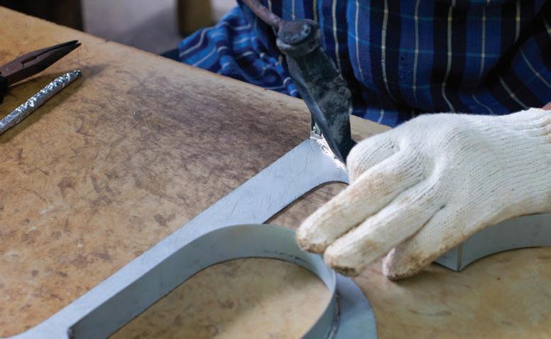
A community’s learning center brings new technology to some older art. The firm has worked on close to 150 oncampus projects for the university. Most have been academic-related, yet they have expanded to tackle athletics as well. For example, they completed a stadium enhancement at Notre Dame Stadium, which was also recognized by the Society of Experiential Graphic Design in their annual design competition. The Outdoor Mural. The new, grid-inspired mural is actually a reproduction of the themed artwork mounted outside the old Robinson Community Learning Center building. Locals have long recognized the mural as the most identifiable feature on its façade. signshop.com
Its creation was led by artist Bernard Williams, which saw him working with multiple classes of RCLC students to create artwork for each individual panel that would reflect a “thematic story of each of the students’ learning journey.” “Anytime you get to work with a fun, colorful brand and reproduce something that children have made, it’s not only rewarding for you professionally but also for your spirit, making you feel that you’re giving back a little bit too,” says Kiper. The original artwork was individually painted onto MDO marine-grade plywood panels. Over the years, moisture affected the surface of this material and caused it to warp. Add in the fact that the
original paint colors were fading due to exposure to the elements, and this made it apparent early on to Cardosi Kiper that they wouldn’t be able to simply transport these panels over to the new building. Kiper made the decision to digitally reproduce each panel, bringing them back to their original color. The designers also provided a texture to replicate the appearance of the original wood panels onto a new, weather-resistant substrate. His firm researched the University of Notre Dame’s Archives Department and discovered the original artwork and colors for the mural. They reimaged each panel’s artwork as a vector file in Adobe® Illustrator® and sent them to iZone Imaging of April 2021
Sign Builder Illustrated
25
Temple, Texas to reproduce using a highpressure laminate (HPL) process that would fuse the panels within an impenetrable melamine surface. “Their HPL material was going to be able to withstand the test of time with the sun and varied climates. It will hold the color well too,” says Kiper, noting his firm has worked with iZone for twenty years now starting with a successful trailways sign project. Interestingly, due to the size of the new RCLC building and its façade, the mural panel reproductions are actually slightly reduced from their original size. “Working with the architects early on, we calculated that the panels would need to be reduced in size by 5 to 10 percent from the originals,” says Kiper. Cardosi Kiper chose Valley City Sign of Comstock Park, Michigan to handle all the exterior installations (along with RWL Sign Company of Kalamazoo, Michigan). Eighty-four panels were directly shipped from iZone to Valley City Sign, and they 26
Sign Builder Illustrated
April 2021
created an aluminum rail system to place behind the panels. They fastened the panels in through the face using non-corrosive screws and bolted them to the wall. Next Valley City Sign placed a weather-resistant caulking behind the channels to avoid any water accumulating on the rails. “It was actually a square, hollowed tube channel, which prevented moisture from sitting in a U- or Lchannel,” says Kiper. “Then they mechanically fastened those back channels into the wall and then mechanically fastened the front panels into the front side of that channel. They then used their Elliott crane truck to lift the panels up in sections and install them onto the building.” Letters and Logo. Valley City Sign fabricated one set of non-illuminated channel letters-and-logo, a custom-illuminated monument sign, a set of “main entrance” non-illuminated channel letters, and an
on-property directional sign. The face-lit Robinson Community Learning Center lettering and logo found on the southwest side of the building measured nearly 100 inches wide-by-36 inches tall. These were produced by Provis Graphic, LLC, a wholesale manufacturer of low-profile, trimless, LED-illuminated letters and logos with U.S. headquarters in Minneapolis, Minnesota. These letters and logo elements were manufactured on Provis Graphic’s LaserLetter™ | Profile 11 translucent cast block acrylic platform with individually embedded LEDs. “The Profile 11 letterform platform features a crisp quality of light diffusion within a low-profile, facelit form factor (30mm or 1-1/8-inch-deep or less) where small face-letters or narrow font stroke and/or letter serif design requirements limit the possibilities of traditional channel letters,” says Kenan Hanhan, president and co-founder of Provis Graphic, LLC. “The LEDs are signshop.com
Photos (clockwise from top): Valley City Sign, Boardwalk Design, APCO Signs, and Valley City Sign.
Primary colors play a large part in the RCLC’s new branding. Clockwise from top: Building letters and logo, framed photos, interior wayfinding, and outdoor site sign.
completely sealed and protected from the environment with an IP 68 rating.” Kiper has known Hanhan since they both worked together on the aforementioned Notre Dame Stadium project. During the specifying process, Kiper knew the letters were going to need a very crisp look. “Typically when we do front channel letters, we don’t like that traditional kind of trim cap around the faces of the letters,” he says. “We wanted something like an acrylic face seated into the channel letter so that there’s no kind of trim on the face of it. The Provis letters allowed us to achieve that.” The custom, illuminated letters are attached to a raceway Valley City Sign built and mounted to the brick wall. Provis Graphic supplied mounting patterns printed on Blueback paper and mounting hardware (typically M4 threaded studs) with the signs. “While our partners’ signs are in production, we e-mail digital mounting patterns and electrical diagrams, so if they wish, they can begin pre-drilling and pre-wiring while the signs are in production,” says Hanhan. An interesting element here is the translucent vinyl used for the exterior daytime and nighttime-illuminated signs that help maintain the bright branding colors. Provis Graphic supplied this vinyl, manufactured by Oracal® in Europe, to Valley City Sign to make the rainbow of colors on the outstretched arms of the title characters stand out even more when they’re illuminated. Branding and Interior Signage. Primary colors play a large part in the RCLC’s new branding. These bright hues can be found in the outdoor logo mark, the mural art, and the directional, as well as the new building’s interior. Kiper turned to a couple of architectural and wayfinding specialists for the interior work. Boardwalk Design, Inc., a part of Icon Sign Company, out of Grand Rapids, Michigan, handled the branding and artwork. The company works on large and small theming, signage, and branding projects for clients throughout Illinois, Indiana, and Michigan. Here they provided the entrance sign, which consisted of polished stainless steel can letters and second-surface painted acrylic. signshop.com
Boardwalk Design also hung several art pieces provided by RCLC officials, as well as matted and framed photos related to the Learning Center and installed them alongside descriptor panels. Meanwhile APCO Signs of Atlanta, Georgia handled the interior signage program. (Note: Kiper has frequently called on APCO Signs for other projects, including prior work for the University of Notre Dame.) The outdoor mural art even found its way inside. Cardosi Kiper designed the interior signs to be a little bit more playful and complement the bright primary color branding. So they shrunk the mural artwork files down even more and infused them into the side panels of the interior wayfinding and room identifiers throughout the new building. “The goal was to tie the visual message from the outside to the inside by using the mural artwork,” says Ken Mettler, regional sales manager at APCO Signs. “At each door and wayfinding sign, the visitor is reminded of the artwork and community that has helped create this wonderful space.” APCO Signs installed a total of fifty interior signs onto painted drywall and glass throughout the learning center: Thirty-eight room ID signs (fifteen on glass), two projecting wall mount (PWM) signs, two directional signs (one on glass), and one evacuation map holder. “All but the two PWM signs were installed at standing height,” says Mettler. “Those signs were installed with 3M V2862H double-sided tape and GE clear silicone adhesive.” The company installed the two PWM signs by using a six-foot ladder and anchoring them to the wall using two #1024 X 3-inch toggle bolts per sign. The glass-mounted signs were installed on top of a piece of matte-white, pressuresensitive vinyl that APCO Signs cut to match the overall size of the sign it was being used with. “Instead of placing the vinyl on the room side of the glass, we decided to install the vinyl to the corridor side of the glass and [place] the sign on top on it,” says Mettler. “We feel that the 3M tape adheres better to the vinyl than it does to glass.”
CELEBRATING BEING YOUR AMERICAN LETTERING EXPERTS FOR 75 YEARS
arkramos.com April 2021
Sign Builder Illustrated
27
FEATURE CNC FABRICATION NAME BY JEFF AUTHOR WOOTEN
THE ABSOLUTELY
KOOLEST KOALA SIGN
et’s face it, a trip to the dentist’s office is sometimes not the most pleasant of experiences for a child (or possibly even the parent or guardian accompanying them). However there’s one custom shop that is making quite an impression filling the needs of this market. They are designing and creating colorful, kid-friendly props that are being installed inside and outside dozens of pediatric dental offices (and counting). These sculpts are making the check-up experience a little bit more of a “walk in the park” for kids. For example, this sign-and-prop company recently completed a friendly looking interior identity sign featuring a bit of “Down Under” iconography for one such dental practice—Kool Koala Pediatric & Adolescent Dentistry. This multi-compo28
Sign Builder Illustrated
April 2021
nent lobby sign is a perfect example of the animated type of offerings that this shop likes to produce. Imagine a Factory for These Jobs “From murals to monstrosities,” that’s the tagline for Imagine Factory, LLC, out of Sicklerville, New Jersey. This custom creative company is the brainchild of professional artist Steve Morrone who has put his skills to good use producing both hand-sculpted and machine-cut 3D props, displays, and signage that “boldly enhance” his clients’ visibility in the marketplace. Examples of his “murals” can be found as scenic backgrounds in commercial and residential spaces, while the “monstrosities” include a carved-out, twenty-footlong humpback whale wire-hung at a
large pediatric dental facility in Greensboro, North Carolina. There really is no project too big or too small for Imagine Factory to take on. Morrone’s shop works with many different types of media in many different types of finishing styles and techniques. “We focus mainly on themed environment design and fabrication,” he says, “and we can create anything that you can dream up.” A big advantage for Morrone is his artistic passion for bringing imagination and design into reality. “My best asset is my imagination and my ability to visualize a concept,” he says. The origin of Morrone’s working with scenic painting and props began at the annual Philadelphia Mummers parade, which he has been associated with for signshop.com
All Photos: Imagine Factory, LLC.
L
Imagine Factory creates kid-friendly sculpts—such as a custom koala—for pediatric dentist offices.
thirty-seven years now. This parade is held every New Year’s Day in Philadelphia and features 10,000 men and women who, as part of local clubs, dress up in elaborate costumes, perform routines, and create movable scenery. “This is the oldest parade in America,” says Morrone. “I’m actually part of the String Bands Mummers club and got my start painting large airbrushed backgrounds and dimensional foam props for this event.” Today Imagine Factory does custom work creating props and signage for several different types of clients—retail stores, casinos, amusement parks, museums, etc. “And yes, we still create parade floats for Mummers Parade—only bigger and better now,” says Morrone. As mentioned earlier, Morrone has really drilled quite a name for himself into the pediatric dental field by providing colorful, eye-catching sculptures— pieces ranging from Lego®-themed environments to friendly zoo animals to
cartoony railroad crossings—that can be found hanging on lobby walls or perched onto outdoor monument signs at these locations. “We make these offices look more like amusement parks,” says Morrone, noting that Imagine Factory’s first client actually was a children’s dentist office. “Using a theme or brand, we create many different types of custom-fabricated pieces to make it fun for the kids.” One piece of technology that has helped make producing these pieces much easier and much more efficient for Morrone has been the implementation of a ShopBot Tools CNC router at his shop. “When I first got into doing large 3D pieces, I was hand sculpting them out of foam. But bringing a CNC router onboard changed the game completely,” says Morrone. “With 3D modeling software and our modest three-axis ShopBot machine, we are able to accomplish great dimensional results through cutting and piecing things together.”
Brushing Up on the Koala Kare For the Kool Koala Pediatric & Adolescent Dentistry sign, Imagine Factory was hired to come up with an interior sign for their lobbies. (Note: Kool Koala has locations in Collingswood, New Jersey; Deptford, New Jersey; and a newer one in aptly named Bear, Delaware). The dental practice told Imagine Factory that, for this piece, they wanted some kind of Australian theme that would incorporate a koala bear into it. “They [told me that] they wanted us to ‘give them our best’ and ‘make it a wow!’” says Morrone. According to Morrone, the dental practice was very excited and eager to work with Imagine Factory since they were able to conceptualize quickly and share ideas back-and-forth. “This also makes our process flow when we get the creative freedom,” he says. Morrone finds that, even though his customers almost always give him such creative freedom to design and fabricate
Lasers. Materials. Expertise.
Trotec Laser USA Trotec Laser USA troteclaser.com engraving-supplies.com
signshop.com
April 2021
Sign Builder Illustrated
29
Morrone’s dental office sculpts do a great job attracting the attention of kids.
displays for them, it’s still always about keeping the integrity of a branded logo
that proves key for the final approved sign. In this case, he came up with the element of a sunglasses-wearing koala clinging to a toothbrush. Morrone exaggerated the bamboo motif by giving it dimension with 3D ShopBot CNC-carved foam. He added even more depth and extra “wow” by using faux-foliage to create a much more dramatic silhouette for the back-mounted LEDs to illuminate. “In fact, this created a much greater overall general effect,” he says. He used 3/4-inch PVC material for the sign background and the koala/ toothbrush figure and two-inch pink polystyrene foam for the bamboo frame. “Pink polystyrene foam provides easier smoothing on our end and makes it easier to brush on epoxy coating,” says Morrone. Imagine Factory router-cut the profiles for the sign’s background, the larger letters, and the koala/toothbrush. Morrone spray-painted the entire
background, the bamboo frame, and the letters separately. He then finished the look of the sign through a combination of spray painting and acrylic detailing. After painting all the pieces, Morrone then glued the faux-bamboo frame to the PVC and added the “Kool Koala” dimensional letters. He next applied the cut-vinyl “Pediatric & Adolescent Dentistry” letters to the piece. Then he printed out the koala-toothbrush image, wrapped the profile-cut figure with it, and attached this cutout to the faux-bamboo frame. Morrone used a U-stud bracket on the back of the koala so that it would “float” in front of the rest of the sign. “I then assembled white LED modules onto the back of the sign and next attached the faux-foliage also to the back of the sign making sure not to cover any of the LEDs,” says Morrone. Once that was done, Morrone mounted the finished sign to the wall using a wooden French cleat. “This allowed
There’s a ShopBot for every size project. ShopBot tools deliver professional speed, power, and accuracy at a fraction of the cost of big-iron CNC machines. Our tools are exceptional for an endless variety
ShopBot Desktop 24” x 18”
ShopBot Desktop MAX 36” x 24”
ShopBot Desktop MAX ATC 36” x 24”
of cutting, drilling, and carving operations – and have the ability to do so in an array of materials: wood, MDF, plastics, foam, vinyl, and non-ferrous metals, like aluminum.
ShopBot Buddy® 32” ShopBot Buddy® 48”
PRSstandard • PRSalpha 96” x 48” and larger
Learn more about the the full line of ShopBot tools at shopbottools.com Then give us a call at 888-680-4466 and we’ll help you choose the right tool for your interests.
30
Sign Builder Illustrated
April 2021
signshop.com
space to be able to hide the electrical wiring behind it,” he explains. The cool-looking Kool Koala sign was now ready to impress the children and their parents with its very inviting, very soothing appearance. Conclusion Morrone says that he has a “flair for the whimsical,” which might help explain his gravitation toward creating characters and stories with his sculpts. He has designed many original characters for his clients and even written his own children’s book, Gio and the Cookie Dough Monster (and is currently working on several other stories). As you can tell, Morrone’s Imagine Factory shop is really embracing this whimsical style with their bright, colorful, and fun custom creations. An example of Morrone’s router-cut animal “Every project is a gift and a learning scuplts atop a dental monument sign. AXYZ Trindent to Sign Builder Magazine Ad (US).psd @ 25% (AXYZ Trident CNC Router The most versatile machine on the experience make the Illustrated next one even better,” concludes Morrone. “Though do once wemarke, do it, RGB/8#) we make *mostly cus“I tell people, ‘Most of what we do, we have the ability to copy whatever we tom pieces. we’ve never done before.”
signshop.com
April 2021
Sign Builder Illustrated
31
FEATURE SHOP MANAGEMENT NAME BY ASHLEY AUTHORBRAY
DRIVING DESIGN
O
ne of the silver linings to come out of the COVID-19 pandemic is the ingenuity and creativity shown by sign shops across the industry. Over the last year, the industry has demonstrated resiliency and the ability to pivot in the face of never-before-seen challenges and change. Chicago-based Cushing & Co., is just one example of such a sign company. In fact, you may remember our interview with them from Episode 2 of our Shop Talk Podcast (http://bit.ly/3rHn3kY) where they talked about keeping employees on, applying for the PPP loan, and pivoting to COVID-19 products. The company didn’t stop there, however, and took advantage of the changing landscape to launch its long-planned inhouse creative division, Sepia Studio. 32
Sign Builder Illustrated
April 2021
A New Division Sepia Studio was established to address customer requests for a full-service graphic design and print experience, but it also filled a void not only in Cushing itself but the industry as a whole. “There really isn’t a go-between option for corporate America between in-house graphics or going to a big-time agency and maybe paying more than you want or being forced to make more commitments than you want,” says Joseph X. Cushing, executive vice president at Cushing. In addition to filling this niche, Cushing is hoping that the new division gets them a spot at the table much earlier. “To get put in front of the decision makers early is a crucial step in any business cycle,” says Cushing. “I think our best client is direct to corporate America rather than through
some sort of go-between contractor or another designer.” Managing Designer Amanda Eich and Design Director Julia Kaufman head up the all-new Sepia Studio. Eich brings over twenty years of design experience working with consumers and small businesses. Her work has appeared on the shelves of major retailers, including Target. “We love sharing a client’s story using the tools in our toolbox, which is a knowledge of good design, material applications, practical printing experience, and a track record of using marketing budgets efficiently,” said Eich, in a press release. Kaufman has worked over seven years as a freelance graphic designer and print professional and has been working at Cushing as Graphics Supervisor for several years. “Knowledge of the print industry can signshop.com
All Photos: Conor Harmon, Graphics Project Manager, Cushing.
Cushing launches a new in-house design division.
change the course of a design project for the better, and I plan to bring my print expertise to this new division,” she said, in a press release. Prior to Sepia Studio, Cushing offered design tweaks or help with simple design set-ups of products like fliers, brochures, and business cards. With the new in-house division, Cushing is now able to offer more. “I think now more than ever, we realize that we want to offer clients a full solution from the idea in their brain to the install on their wall,” says Kaufman. “The sky’s the limit on what we can do.” Serving Clients Sepia Studio’s initial design services include brand identity, marketing collateral, environmental graphics, and social media/ digital design. The new division is also offering subscription design services, which enable clients with more frequent design needs to more easily allocate their requests and budgets. For clients, it will operate like having a design partner on retainer for an ease of ordering and connecting with someone who’s more of a brand partner rather than just a freelancer or an agency. “These subscription services will allow the client to connect with us about monthly needs,” says Kaufman. “Sometimes the needs for small businesses pop up fairly often and asking someone to do something quickly for you is a lot easier when they are anticipating your needs.” Branding a Doctor’s Office Although Sepia Studio just got up and running at the start of the year, the division already has a number of projects under its belt, including a graphics roll-out for a new, contemporary OB/GYN office in Chicago. The office had reached out with emailed pictures of what they had in mind, and Eich and Kaufman say this was a great example of a client thinking they know what they want. When Sepia Studio reached back out with a design based on the office’s ideas, the client was underwhelmed and told the designers they had full reign to create something bigger. That was all Sepia Studio needed to hear. They created a larger, more in-depth design plan that included large window graphics, privacy graphics, and branding signshop.com
Sepia Studio covered the office’s alcove with its brand colors and a super-graphic of the address numbers.
graphics in the office’s alcove. The window graphics proved a bit challenging because they stretched across five window panels with mullions in the screen. Sepia Studio printed out a large icon of the office’s logo to stretch across the first two windows, and they printed the text element of the logo to place below that spanning three windowpanes. Additional graphics—including items like the logo, office hours, and contact information—were also provided for the door. Sepia Studio also provided graphics to spruce up the office’s alcove, which originally only included run-of-the-mill address numbers on the wall. “We just covered this little alcove with her brand colors and this super-graphic of the address numbers,” explains Eich, who says the client loved the result because it made the office easier to spot. All of the branded graphics were printed on 3M™ Controltac™ Graphic Film IJ180 using an Epson SureColor S80600L printer. The graphics were then contour cut and applied first surface to the windows. The doctor’s office also asked for privacy/shading graphics with the ability to still see out. “It was a little tricky. We did a
sample with varying gradients and varying levels of transparency, we put it on acrylic, and we took it out there and showed it to her,” says Eich. The doctor tested the visibility from outside and inside of the office before approving the film, which had a white transparency that started opaque at the bottom, faded up toward the midpoint, and was clear at the top. The privacy graphics were printed on the Epson SureColor S80600L printer using 3M™ Scotchcal™ Clear View Graphic Film IJ8150 optically clear vinyl with a 3M™ Scotchcal™ Optically Clear Overlaminate 8914 on top of it. The installation of all of the graphics was completed in one day, but the weather made things tricky since it was January in Chicago. “We had to sit on it for a couple of weeks until the weather got just warm enough, and we had only a fourhour window,” says Eich. “We told her to crank her heat the night before, and it worked out perfectly.” Tips & Techniques Eich and Kaufman have plenty of tips for designing print graphics. Design in CMYK. Kaufman says RGB is the name of the game for Web/mobile April 2021
Sign Builder Illustrated
33
products but that CMYK is ideal for print graphics. It’s always best to be sure you’re designing in the right format as it’s “difficult to translate something once it’s already been designed.” Always include a bleed.“Make sure the artwork stretches past that live edge,” says Kaufman. “Unfortunately walls are never straight, and human hands are cutting the paper, so a little extra bleed in the artwork can go a long way.” Know your medium.“You have to know what the end product is before you start designing,” says Eich, who warns that otherwise a design may not translate well on a certain medium, which could lead to a redo and an uncomfortable conversation with the client. Spell check. A misspelling or a typo can make a design “go from 100 to 0,” says Kaufman. “And there’s no such thing as reupload or repost. It is live and physical in your hands once it’s printed.” Eich says to ensure your clients check over the proof from the printer. “Someone told me years ago to take what you wrote and flip it upside down and read it that way because your brain dissociates what it should say, and you actually read the words individually, and you catch things that sound wrong or are misspelled,” she says. Design for scale. Both Eich and Kaufman say to pay attention to scale— whether you’re going from your computer screen to something much larger, like a wall graphic, or much smaller, like a business card. “Resolution can be a key factor here,” says Kaufman. “Something on screen to something twenty-feet wide can be a whole different ballgame if you’ve got a high-resolution photo versus a low-resolution photo.”
• Very fast turn around • Very competitive pricing • 8 standard sheet sizes • Any thickness to 24” • Custom bonding to any size
Designing for the Future Above all, Sepia Studio is looking forward to improving the design experience for its clients as well as positioning Cushing for the future. “I envision that what we will see in the market is not just Cushing printer, but Cushing the full-service brand partner that also can make the products that we’re designing and creating,” says Eich. “We want to be seen in the market as problem solvers and thought leaders who can show up in the beginning and help you work through whatever architectural or design challenge that you may have.” 34
Sign Builder Illustrated
April 2021
signshop.com
FEATURE LIGHTING NAME
BY JEFF BYWOOTEN AUTHOR
THAT ILLUMINATING AROMA Brewing up a new set of illuminated signs for cozy coffee shops.
All Photos: Bauer Sign & Lighting.
C
o f f e e - E at s - G o o d t i m e s.” This feel-good, welcoming sentiment also happens to be the branding slogan for Fiddleheads Coffee Co., a familyowned specialty coffee company with multiple cafés and artisan bakeries located across the state of Wisconsin. Their slogan showcases what they offer as well as what they’re passionate about—great-quality coffee, tasty baked goods, delicious entrees, friendly atmosphere, etc. “We have been operating for almost twenty-five years with a philosophy of being part of the community and sharing special moments with our customers,” says Jovana Cubric, vice president of operations at Fiddleheads Coffee. “Like a kitchen is the heart of home, we look forward to being the heart of the community we are located in.” The first Fiddleheads Coffee shop started up in Thiensville, Wisconsin back in 1996, and due to its popularity, the owners have expanded to several other cafés across the state since then. Each Fiddleheads Coffee location boasts a unique interior design that complements the host building and its surrounding community while portraying the shop’s brand through various details and materials.
signshop.com
Recently ownership made the decision to open two new locations in the state, both in pretty prominent spots. The first of the new cafés opened up late last year in a refurbished 1920s Mediterranean storefront with a spacious outdoor patio in the historic section of Shorewood, Wisconsin. This new location gives a nod to the look and feel of an old-world coffee house. “For a cozy and warm-feeling experience, walk inside the café where earthy tones complement the white marble tables, and our friendly baristas are serving our classic espresso drinks, small batch coffee, and fresh bakery and breakfast and lunch items,” explains Cubric. This past February, Fiddleheads Coffee also made the move into the downtown Milwaukee scene with its new “flagship” venue located on the ground floor of the brand-new, twenty-five-story, all-glass-exterior Milwaukee BMO Tower. This premier, multi-tenant combination of office workspace and retail shops was developed by Irgens Development Partners, LLC, and is currently adding a metropolitan, big-city style to the Milwaukee skyline. “From soft seating nooks to highend finishes, workspace areas, countertop seating, and visually intriguing
design, the in-house café experience at Milwaukee BMO Tower is sure to please both office tenants and walk-in guests,” says Cubric. While these two new locations have distinct differences, they do share similar exterior and interior signage styles—dimensional identity lettering, neon open signs, and an illuminated wall-mounted sign. Placing an Order for Signs Bauer Sign & Lighting Company, a full-service sign company with facilities in New Berlin, Wisconsin, was selected to fabricate and install various illuminated and non-illuminated signage for these two new Fiddleheads Coffee locations. The coffee shop is one of their legacy accounts (the company already completing a variety of prior work at several of their other locations). Dave Salkin, an account executive at Bauer Sign & Lighting, was searching through social media for possible project opportunities they could take on when he noticed Fiddleheads Coffee was posting construction updates about their two upcoming shops. “I happened to talk to them at the right time,” remarks Salkin. “They were just starting the process of looking for a vendor to fulfill their signage needs, and April 2021
Sign Builder Illustrated
35
Bauer Sign & Lighting also made a set of Fiddlehouse Coffee identity letters.
The finished “Coffee-Eats-Goodtimes” letter set features a combination of neon tubes and Edison-style light bulbs and was direct-mounted to the wall.
when I contacted them, they felt really comfortable with the work we did for them in the past.” Cubric agrees. “Bauer Sign & Lighting has been a great partner of ours for many years and has done a terrific job of custom projects,” she says. “Their team is very creative and responsive and has always done a great job with incorporating our idea and making the final product look exactly as we envisioned.” Illuminating Fabrication Details The exterior “Fiddleheads Coffee” letters and two neon “open” signs were designed to closely match their other locations, yet owners wanted the illuminated interior wall sign to work off their “Coffee-Eats-Goodtimes” slogan while still giving their customers a distinctive ambience from their other locations. Cubric informed Bauer Sign & Lighting designers that this sign would need to fit her coffeehouses’ branding and style. “We inhabit and restore historic buildings and have a strong appreciation for vintage items,” she comments. “We wanted to bring attention to this 36
Sign Builder Illustrated
April 2021
part of our branding while utilizing the softness of the antique brass color that can be found in various details throughout all our locations.” Bauer Sign & Lighting ended up designing, fabricating, and installing a total of six signs for the two new Fiddleheads Coffee spots—four for the Milwaukee BMO Tower location and two for the Shorewood store. The Milwaukee eatery features “Fiddleheads Coffee” white lettering above the front door, with a smaller, red-andblue “Coffee-Eats-Goodtimes” neon letter sign hand-crafted in a rectangular style underneath it. In Shorewood, this smaller neon sign features a blue circular border instead with “Fiddleheads” and “Coffee” in red and “Goodtimes” in blue in-between. The bigger, more elaborate “CoffeeEats-Goodtimes” letters featured on a main interior wall at both new cafés ended up being a little more complex. Bauer Sign & Lighting designers ended up working on about eight different logo iterations of the proposed interior set of channel letters before Cubric ap-
A smaller neon sign (this one circular and the other rectangular) is in the window.
proved them to proceed. The interior “Coffee-Eats-Goodtimes” channel letter signs are actually three separate letter sets formatted in different font scripts yet attached together through wiring. In total, the entire “Coffee-EatsGoodtimes” sign measures 64.9 inches in length and 48.2 inches in height. The top “Coffee” lettering measures 18 inches tall, the “Eats” lettering positioned partially underneath is 19 inches tall, and the “Goodtimes” letters stand 12.5 inches tall. These letters started off as a sheet of .063 aluminum that was sheered into strips and then hand bent and welded to the backer panel that had been cut out on one of the company’s routers. Both the exteriors and interiors of the three letter sets were painted using Matthews Paint MP21962 Plaque Gold Metallic paints. The “Coffee” letters are illuminated with single stroke Vanilla 3000 neon bent into the appropriate lettering shape. “We mounted the neon to the backer panels with standard glass standoffs,” says Jorsignshop.com
dan Bauer, operations manager at Bauer Sign & Lighting. The “Eats” and “Goodtimes” sections were illuminated with exposed, marquee-style 2W S14 LED Outdoor Edison Light Bulbs with a 2700K color temperature. None of these bulbs were available locally from their sign supply vendors, so Bauer Sign & Lighting ended up purchasing them online. (Note: The medium base sockets were purchased from Wensco.) The light bulbs featured in the “Goodtimes” letters were intentionally under-populated to mimic the appearance of an old-fashioned sign with the lights transitioning between on and off. “This [under-population] was a little different than what we’ve done in the past,” says Salkin. Cubric wanted this sign to provide soft lighting—which led to the idea of under-populating the bulbs for the “Goodtimes” letters. “By under-populating the bulbs in ‘Goodtimes,’ which is physically located lower on the wall, we felt that it provides a softer and warmer ambience for the customers sitting near it,” she explains. Bauer Sign & Lighting created a second surface that is a hair smaller than the original backer piece so that they could “drop the bulbs into” the sign. “Depending on the customer, some like this second surface sticking out farther so that the bulbs are even more exposed,” says Bauer. “We decided to hide the bulbs deeper into the letters, since the signs are located in high-traffic areas in the eatery. “This allowed all of the sockets to get screwed on and most of the wiring to be hidden.” Speaking of wiring, Bauer Sign & Lighting worked closely with the electricians on site in coordinating to make sure the wiring and power supplies/ transformers were accurately placed on the wall. “The letters are actually mounted to a firewall so we were able to swing it through,” states Salkin. “We made sure measurements were correct and spoton and left a pattern up there we could use later and that no one else onsite would touch.” signshop.com
Conclusion The entire project took three months for Bauer Sign & Lighting to build and install once they received the go-ahead. “There was definitely a lot of detail we had to follow to make this project successful,” says Salkin. “We had to match paints from original SherwinWilliams colors, as well as bring on the
original architect to be able to match the metal mullions inside the surrounding windows.” In the end, the message of “CoffeeEats-Goodtimes” comes across bright and clear at these two new Fiddleheads Coffee locations thanks to the ingenuity and illuminating solutions provided by Bauer Sign & Lighting.
April 2021
Sign Builder Illustrated
37
MARKETPLACE
STRAIGHT
TO YOUR
FOR ADVERTISING OPTIONS CONTACT:
INBOX
DAVID HARKEY (212) 620-7223
SBI Update, Sign Builder Illustrated’s e-newsletter, delivers the latest hot topics and news from around the sign industry right to your email.
WHAT’S THE HOT TOPIC THIS MONTH? Sign up at www.signshop.com to receive the newsletter and find out! fb.com/SBIMag @SBIMag Sign Builder Illustrated
38
Sign Builder Illustrated
April 2021
signshop.com SBI_ENewsletterAd_1-3Vertical.indd 1
8/18/20 4:29 PM
PRODUCT
Your Direct Source for Sign Information
PORTAL InfoDirect #
Receive vital product and service information from manufacturers and distributors by visiting www.signshop.com/product-portal
COMPANY
URL
PAGE
1
A.R.K. Ramos
www.arkramos.com
2
AXYZ
www.axyz.com
31
3
Biesse Amercia
www.biesse.com
22
4
Coastal Enterprises/Precision Board
www.PrecisionBoard.com
34
5
DUNA USA
www.dunagroup.com
17
6
DUNA USA
www.dunagroup.com
18
27
7
DUNA USA
www.dunagroup.com
19
8
DUNA USA
www.dunagroup.com
20
9
Duxbury Systems Inc.
www.duxburysystems.com
38
10
Echod Graphics
www.EchodGraphics.com
38
11
Elliott Equipment
www.elliottequip.com
11
12
FDC Graphic Films Inc.
www.fdcfilms.com
15
13
France Lighting Solutions
www.francelighting.com
14
14
J Freeman Inc.
www.jfreeman.com
34
15
Keystone Technologies
www.KeystoneTech.com
13
16
Mimaki USA
www.mimakiusa.com
23
17
Nova Polymers
www.novapolymers.com
18
Peachtree City Foamcraft
www.foamcraft.info
3 37
19
SDS Automation
www.sdsautomation.com
20
ShopBot Tools Inc.
www.shopbottools.com
30 C4
9
21
Signs365.com
www.signs365.com
22
SinaLite
www.sinalite.com
23
Southern Stud Weld
www.studweld.com
24
Stimpson
www.stimpson.com
16
25
Trotec
www. troteclaser.com
29
26
Watchfire Signs
go.watchfiresigns.com
C2
www.wilkiemfg.com
C3
27
Wilkie Mfg.
5 38
COMPANIES IN SIGN SHOW 28
BrandArmor Technologies, LLC
www.brandarmor.ink/safewalls
16
29
Corel Corp.
www.coreldraw.com
15
30
Epson
www.epson.com
12
31
HP
www.HPLFMedia.com
12
32
Linetec
www.linetec.com
14
33
Trotec Laser, Inc.
www.troteclaser.com
12
3 EASY
STEPS
signshop.com
1. Go to our website at, signshop.com
2. Click on our Product Portal box on the website
April 2021
3. Request info about advertisers & products
Sign Builder Illustrated
39
SHOP TALK EMPLOYEE RELATIONS
RONNIE BLAIR she says. “The trick is to make sure challenges are productive. They should be difficult, but not so overwhelming that people withdraw if they fall short.” Consideration Everyone feels the need to be recognized and valued, Wade says. Unfortunately, leaders and managers often spend so much time on toxic or poor-performing people that they neglect everyone else. “You can’t obtain and retain top talent if you don’t show them respect and consideration at every stage of the journey,” says Wade. “They must be recognized for good work, thought about for promotions, and reminded of how critical they are to the organization.”
The human needs that drive business success.
E
mployee performance, good or bad, usually can be traced to leadership—whether company leaders want to admit it or not, says Jeanet Wade, founder of the consulting firm Business Alchemist. “When teams break down and employees disengage, leaders and managers typically don’t question their own strategies,” she says. “Instead they blame the people assigned to carry out those strategies. If they are feeling charitable, leaders and managers say those people were bad fits. If they aren’t feeling charitable, they call them whiners, complainers, or failures. “But in about 80 percent of cases, I believe it’s not that the people are the wrong people for the job but rather that leaders aren’t prepared to handle what I call ‘human moments’ because they fail to understand and address these natural human needs.” Wade says there are facets of human
needs that leaders must take into account in order to expect teams to perform at the highest level possible.
Sign Builder Illustrated Magazine (Print ISSN 895-0555, Digital ISSN 2161-4709) (USPS#0015-805) (Canada Post Cust. #7204564; Agreement #40612608; IMEX Po Box 25542, London, ON N6C 6B2, Canada) is published monthly by Simmons-Boardman Publishing Corporation, 88 Pine St. 23rd Floor, New York, NY 10005. Printed in the U.S.A. Periodicals postage paid at New York, NY and Additional mailing offices.
Prices are subject to change.
Pricing, Qualified individual working in the sign industry may request a free subscription. Non-qualified subscriptions Print version, Digital version, Both Print & Digital versions: 1 year US/Canada/Mexico $50.00; foreign $99.00. Single Copies are $15.00 ea. Subscriptions must be paid for in U.S. funds only.
For Subscriptions, & address changes, Please call (US Only) 1-800-553-8878 (CANADA/INTL) 1-319-364-6167, Fax 1-319-364-4278, e-mail signbuilder@ stamats.com, or write to: Sign Builder Illustrated, Simmons-Boardman Publ. Corp, PO Box 1407, Cedar Rapids, IA. 52406-1407.
40
Sign Builder Illustrated
April 2021
Clarity In too many workplaces, Wade says, people are unsure what’s expected of them or how their jobs fit into a larger plan. “People on teams sorely need clarity or they’ll lapse into confusion,” she says. “Specifically team members must understand the purpose of the team itself, their role within it, the team’s outcome goals, and how their team fits within the larger organization.” Challenge Leaders and managers often are hesitant to challenge others, Wade says, not wanting to push people or make them uncomfortable. “But when we withhold opportunities that challenge people, we ultimately deny others an important human need,”
COPYRIGHT © Simmons-Boardman Publishing Corporation 2021. All rights reserved. Contents may not be reproduced without permission. For reprint information, contact: Gary Lynch, Publisher (212) 620-7247 or glynch@sbpub. com.
Jeanet Wade is the ForbesBooks author of The Human Team: So, You Created a Team But People Showed Up! (www. thehumanteambook.com), is a Certified EOS® Implementer, and is the founder of the consulting firm Business Alchemist. As a facilitator, teacher, and coach,Wade helps companies implement the Entrepreneurial Operating System (EOS), a set of business concepts, principles, and tools that help business owners and executives run more successful businesses. To read more of this article, please visit http://bit.ly/2OWUPE4. POSTMASTER: Send address changes to Sign Builder Illustrated, PO Box 1407, Cedar Rapids, IA. 52406-1407. Instructional information provided in this magazine should only be performed by skilled crafts people with the proper equipment. The publisher and authors of information provided herein advise all readers to exercise care when engaging in any of the how-to-activities published in the magazine. Further, the publisher and authors assume no liability for damages or injuries resulting from projects contained herein.
signshop.com
Photo: Shutterstock.com/ jaret kantepar.
Team Players
Confidence Confidence is fragile and can be easily shaken, Wade says, which is why it’s critical for leaders to instill confidence in their teams. People fearful about failing become hesitant, avoid difficult challenges, and are less productive. “But if you have confidence, even the hard stuff doesn’t seem so daunting,” says Wade. “When leaders, managers, or facilitators help build confidence in their teams, they can inspire others to achieve audacious, improbable goals.”
FORGED IN THE HEART OF AMERICA
WILKIE MODEL 52XLR Wilkie MFG, LLC. 2640 NW 2nd OKC, OK 73107 • 405-235-0920 • www.wilkiemfg.com