6 minute read
Technology Issues


A GUIDE TO DATA VISUALIZATION
By Olivia Kleiner
As the field of accounting merges with data analytics, creating sharp visualizations is essential to effectively working with clients. Concisely conveying solutions to clients has always been an invaluable skill for a CPA, but it has grown even more important as the role of accountants shifts to analysts. With the transformations in the profession, CPAs need to become well-versed in tools that summarize large data sets clearly – data visualization tools.
Data Visualization: The Basics
Data visualization involves taking large sets of data and summarizing them through graphs and other visual elements (Data Visualization Beginner’s Guide: A Definition, Examples and Learning Resources). Its ultimate goal rests in seeing trends and outliers in data easily – the audience can understand data at a glance. Instead of poring over a massive spreadsheet for analysis, users can immediately pinpoint what’s important through graphs and charts.
Several visualization tools exist for CPAs. The first will probably sound familiar: Excel. As any accountant worth their salt knows, it’s easy to create graphs in Excel. All it takes is inserting a chart based on the data. Another tool, Tableau, has become increasingly popular over the past few years. In contrast to Excel, Tableau describes its appeal on its website: “Leave chart builders behind... Interactive dashboards help you uncover hidden insights on the fly” (Tableau Desktop).
Unlike Excel, Tableau offers more types of visualizations that are live and interactive, taking data visualization to the next level. Lastly, Power BI, sold by Microsoft, consists of features similar to Tableau; Microsoft defines it as a “collection of software services, apps and connectors that work together to turn your unrelated sources of data into coherent, visually immersive and interactive insights” (Blythe and Sparkman). According to Tamara Scott, a research and content manager at TechnologyAdvice, Tableau better fits the needs of data analysts and Power BI suits a more general audience (Scott).
Examples of Visualizations
To show the capabilities of data visualization tools, a few examples from Tableau are provided below. Unless specifically noted otherwise, all visuals are created by the author of this article.
Here, it’s apparent at a glance that Massachusetts has the highest tax rate compared to neighboring states. This simple geographic visualization demonstrates where the company has the heaviest tax burden. In a presentation, the extraneous information (the Tableau interface) would not be included. In this instance, it’s shown to demonstrate the ease of creating the graph. By choosing one dimension for the column and one for the row, users can put together a slick presentation slide for analysis.
Tableau makes visualization intuitive through providing a pop-up with all of the recommended visualizations, as shown.
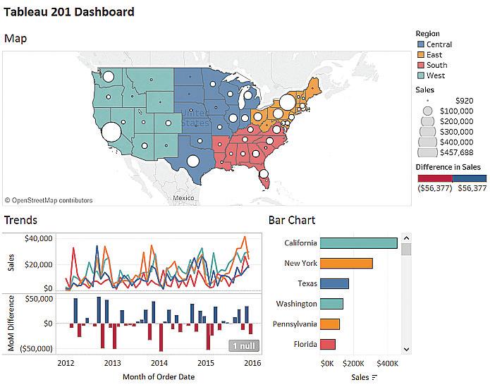
Hovering over a specific type gives an explanation of what data is needed for that particular visualization; in this particular example, it informs the user that scatter plots require two to four measures. Based on what types of data the user selects (whether dimension or measure), Tableau recommends the most effective visualization. The user can then choose the option they want and clean up the result as needed. Below are just a few examples of different visualizations in Tableau (Scott).
Best Practices for Visualization
Creating illustrations like graphs can seem daunting, but fortunately, the tools listed above make it easy. To create effective visualizations, leverage the following ideas for best practice.
•Keep things simple. Described as the “golden rule” of data visualization, keeping things simple is key to effective communication (10 Data Visualization Tips).
Avoid having every color of the rainbow on the graphs – remember that people should understand quickly, which won’t happen if they have to decode the visualization.
Fonts should be easily readable and colors shouldn’t be too similar. Avoid falling into the trap of using every option possible (Data Visualization Beginner’s Guide: A
Definition, Examples and Learning Resources).
•Label items clearly. A graph that only has the y-axis labeled is a graph that’s missing key information. Not only can a poorly labeled illustration be difficult to follow, it can also be misleading. Make sure the labels aren’t too wordy, either. Concise labels help avoid both of these problems (Data Visualization Beginner’s Guide:
A Definition, Examples and Learning Resources). •Begin with the end in mind. Know what the goal of the visualization is. Is it illustrating the geographic reach of a company or analyzing outliers in purchase orders?
Have a clear end game – it will make it easier to quickly select the best visualization.
•Make sure to choose the right type of visualization.
A graph can be a better illustration than a pie chart for survey results, especially when comparing two responses. A map that demonstrates different tax rates can be more effective than a graph. It all depends on the end goal (Data Visualization Beginner's Guide: A
Definition, Examples and Learning Resources).
•Use the data-ink ratio. This boils down to “show the data above everything else” and ties back to the earlier rule of “keep things simple” (10 Data Visualization Tips).
This includes avoiding visuals cluttered with special effects such as 3-D graphics. Cutting out unnecessary parts of the visualization, such as borders, makes a sharper visual.
•Be aware of the possibilities offered. Tableau isn’t just a visualization tool; it also provides tools for analytics and calculations. Doing basic research as to what each tool offers can be invaluable help later!
•Document steps if necessary. Through taking notes on what worked or what didn’t, users can create a handy guide to refer back to later. Instead of struggling to remember how to create a trickier type of visualization, a quick check of notes will suffice.
•Remember that many resources exist for assistance.
Help is only a quick Google search away. Forums and walk-through videos are available for almost every issue imaginable.
Best Practices in Action
Putting these tips into practice, the following graphs demonstrate the strengths and pitfalls of creating visualizations. Of these two graphs, one better encompasses the best practices of data visualization.
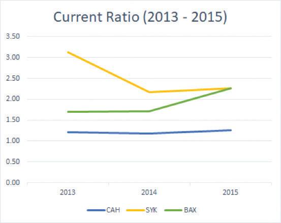
Keeping the best practices listed above in mind, the second graph (Current Ratio), created by Jermaine Phua, reveals itself as a better visualization. Although some of the differences are subtle, these small changes have a big impact.
Current Ratio has clearer labels (such as the key to the different colors at the bottom). Although the first graph is simpler, it lacks enough detail for deeper analysis. The second graph strikes the balance between detail and simplicity: it achieves the goal of being able to understand data at a glance.
Leveraging the Tools
Overall, leveraging these data visualization tools allows for clearer reporting and deeper insights. Although the tools may seem intimidating at first, most of them are intuitive to use and very user-friendly, especially Tableau.
As CPAs move into analytics roles, learning how to best leverage these visualization tools will be a worthy (and necessary) investment of time.
ABOUT THE AUTHOR: Olivia Kleiner is a student at the University of Texas at Dallas pursuing her Masters in accounting. She plans to work for the Government Accountability Office after graduation. She may be contacted at oliviabethkleiner@gmail.com. WORKS CITED “10 Data Visualization Tips.” International Development Research Centre, www.idrc.ca/sites/default/files/sp/ DocumentsEN/10-data-visualization-tips-en.pdf.
Blythe, Michael, and Maggie Sparkman. “What Is Power BI? - Power BI.” Power BI | Microsoft Docs, 3 Sept. 2019, docs.microsoft.com/en-us/power-bi/fundamentals/ power-bi-overview.
“Data Visualization Beginner's Guide: A Definition, Examples and Learning Resources.” Tableau Software, www.tableau.com/learn/articles/data-visualization.
Phua, Jermaine, et al. “Cardinal Health Inc., Stryker Corporation and Baxter International.” 4 Dec. 2019, Data Analytics for Accountants, University of Texas at Dallas, student presentation.
Scott, Tamara. “Power BI vs Tableau: A Data Analytics Duel.” TechnologyAdvice, 30 May 2019, https:/ technologyadvice.com/blog/information-technology/ power-bi-vs-tableau/.
Scott, Tamara. “Tableau 201 Dashboard.” Technology Advice, 30 May 2019, https://technologyadvice.com/blog/ information-technology/power-bi-vs-tableau/.
“Tableau Desktop.” Tableau, Tableau Software, www. tableau.com/products/desktop.
iStock.com/Natee127