4 minute read
Sairi Iida “The Human Condition”


Sairi Iida
Advertisement
The human condition is all the characteristics and experiences that compose the elements of human existence, which includes growth, internal conflicts, morality, and emotions. The human condition is universal; each person endures it. Therefore, the artworks exhibited portray the perceptions of the human condition through my lens. My exhibition mainly focuses on the emotions we humans feel as we go through multiple encounters as we grow. As the human condition and feelings are interrelated, I used characteristics such as growth and emotion as a motif throughout my pieces.
Initially, my concept was based on my self-interest and my coping mechanisms. When experiencing something, I would use my creativity as a gateway to confide my emotions. My artworks were influenced by my connotations of the human condition, executing my imagination hyperbolically. I often use colour as a motif throughout my pieces to portray certain feelings such as euphoria, anxiety, loneliness, and many others.
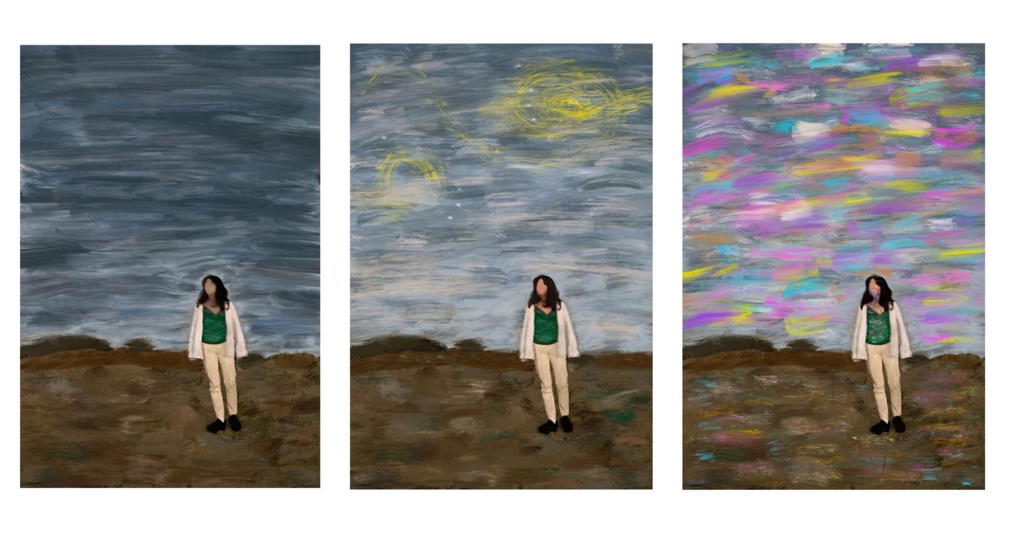
One of my artist inspirations for choosing colours is Ernst Kirchner; most of his artworks are inundated with abstract colours. As I did my artist studies to create my pieces, I drew interest in colour psychology. Colour psychology depicts how colours affect us and determine human behaviour. Therefore, I decided to use colour and expression as a bridge to unite each of my pieces to create harmony throughout my exhibition. Colours such as blue, yellow, purple, and green are evident in my artworks as they compliment each other but contradict the intention of my pieces' meanings. This can be seen through my work "彩" (2021). Based on the colours of the background, it sets the mood of the scenery and atmosphere. I also deliberately did not draw my model's face because I wanted to emphasize the colour psychology of my piece. I was also inspired by Ian Cumberland, especially his work "This Place We Call Home", 2019. His artwork encapsulates the mundane feeling of everyday life and represents the hyper-reality of being a human through a cruel lens. The inspiration can be seen through my piece "Uncertainty" and "Devoid of Colors" (2021). Both works highlight mental health with different approaches.
Furthermore, I used a range of mediums from digital art, photography, acrylic paint to paper mache; these mediums are employed for myself and the audience to acquire a more profound understanding of the human condition. For example, photography supports my theme and intentions for the exhibition because it captures authentic moments in my life that allude to the human condition. Thus, I chose artworks that capture the human condition to its fullest. I decided to indulge myself in various mediums because feelings fluctuate and cannot be depicted through a series. Hence, my artworks are intentionally inconsistent in style.
I decided to display my artwork in an intermittent scheme because of versatile emotions. I wanted to create a liberating experience with a sense of relatability for the audience to be immersed in feeling. Moreover, the audience should engage in my artworks by sensing each meaning of the motif used in my art. The arrangement of my artworks supports this because I made each piece prominent and accessible to the viewers' eyes.
In conclusion, my overarching theme: The Human Condition represents the characteristics and experiences that compose the elements of human existence. I have conveyed the intention by using colours as a motif throughout each artwork, and each sub-theme explores a characteristic of the human condition in one way or another. As the audience, I want them to feel a deep connection to my piece and understand them naturally as I believe that I depicted common themes throughout everyone's lives.
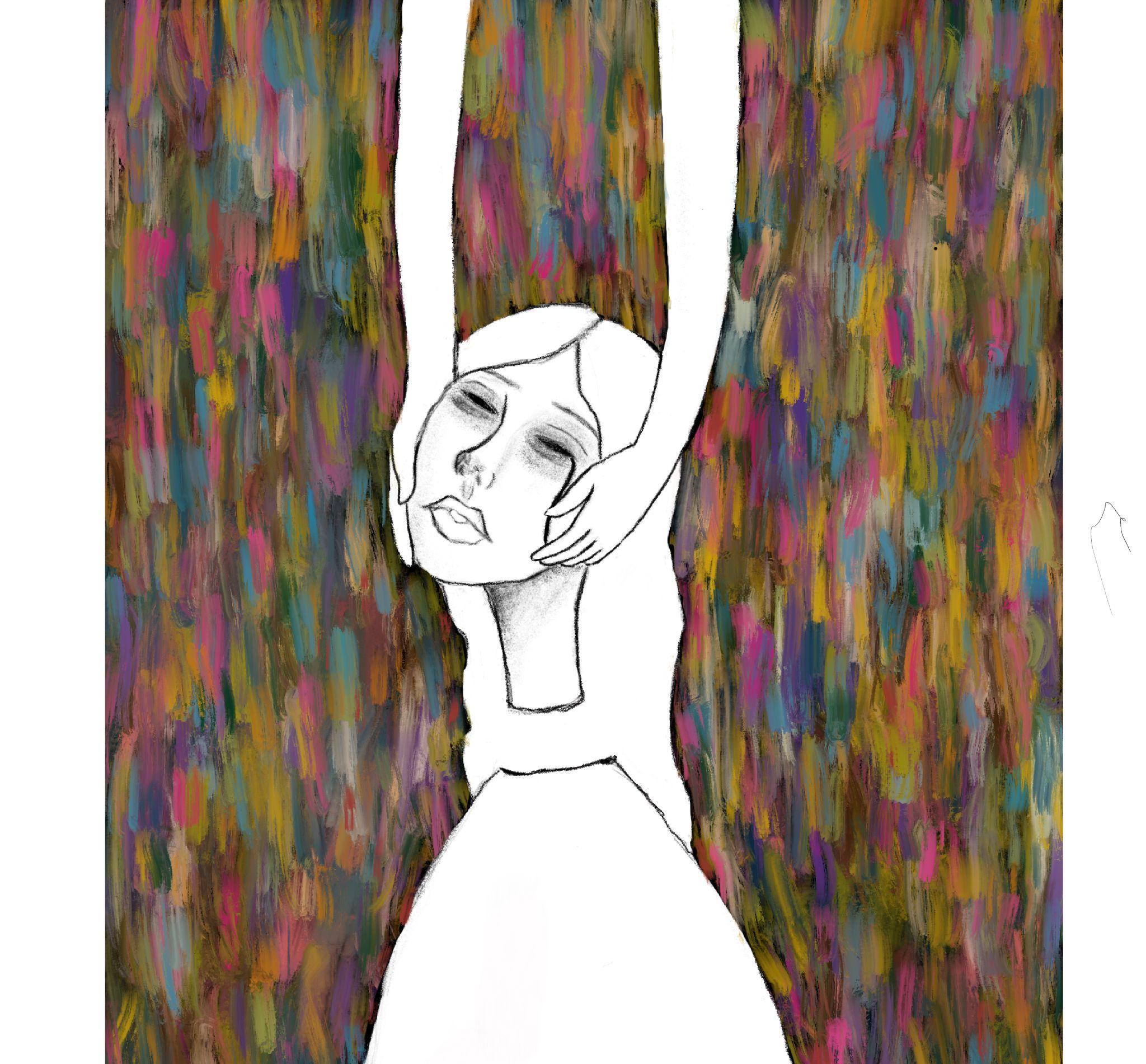
“Uncertainty”, 2021
As the world goes on, our minds are constantly thinking especially in this current climate. Sometimes we can feel overwhelmed, and exhausted. When this happens, we feel the urge to escape from reality to put things on hold. The intention of this painting is to represent emotions with bright and dark colors while the focal point is rather bland. The girl represents our mind and is to be taken metaphorically. With the arms raising her head, this portrays our inner emotions and the feeling of relief.
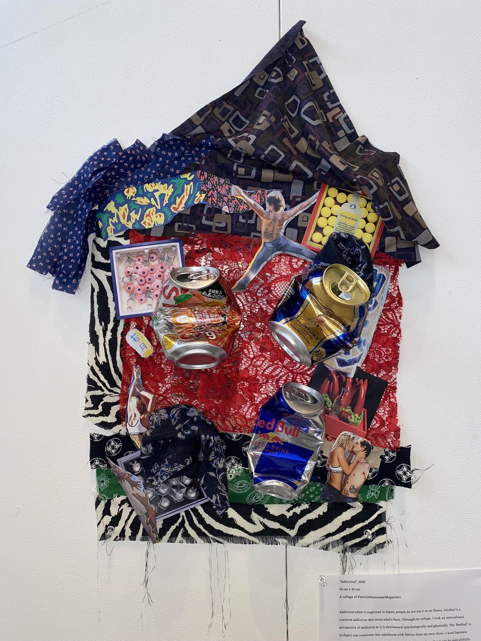
“Addiction”, 2022
Addiction often is neglected in Japan, people do not see it as an illness. Alcohol is a common addiction that many adults have. Through my college, I took an intercultural perspective of addiction as it is detrimental psychologically and physically. The ‘Red Bull’ is to depict our transition into adulthood with fabrics from my own closet. I used Japanese alcohol cans and magazine cuts of Western alcoholism to show that it can be seen globally.
“彩”, (2021) In media productions, the sky is often used to create the mood of the scenery and atmosphere. Referencing to Van Gogh and Kirchner’s work, the intention was to use colors as a motif to represent how nature can express emotions. I incorporated color psychology in this series to show how the same painting can be changed with different backgrounds. For instance, darker tones represent loneliness and brighter tones show hope. I deliberately did not draw the face so it can be left to the audience’s imagination.