RADAR / ROUNDUP
Clean Slate
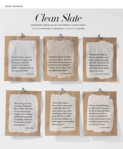
DESIGNERS WEIGH IN ON THE PERFECT WHITE PAINT. PRODUCED BY KATHRYN GIVEN WITH SARAH SHELTON / PHOTOGRAPHED BY DAVID PRINCE
“I tend to favor color in my interior design work, but my go-to favorite neutral is Decorator’s White by Benjamin Moore. It’s crisp and clean.”
“Pratt & Lambert Timidity is my No. 1 choice. My entire New York City apartment is painted in it, including the ceilings. It’s an elusive and beautiful khaki shade.”
“Wimborne White by Farrow & Ball is a true white with just enough warmth. I used it for my design studio and shop. I love that it feels bright, but not too stark.”
–JOE LUCAS
–THOMAS O’BRIEN
–SARAH BARTHOLOMEW
“For as long as I can remember, Benjamin Moore White Dove has been a mainstay for designers. It is a classic, soft hue that goes with everything, and we use it constantly for trim and cabinetry.”
“Even when using a base color, it’s important to define the story and point of view. I gravitate toward gray and creamy tones, like Dover White by Sherwin-Williams, to better support surrounding layers of color.”
“Farrow & Ball Pointing is perfect for living spaces. It’s the loveliest soft white that doesn’t read too austere or brilliant. It works well in modern and traditional applications as well as for trim!”
–BETH WEBB
–RAYMAN BOOZER
–ALISON PICKART
LX_COM31_Radar_Roundup.indd 36
3/27/20 3:37 PM