‘All the blues I ever dreamt of’ Alexandra Loske on the queen of colours
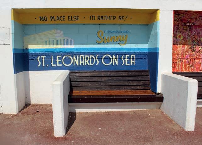
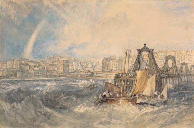
The past is a foreign country. In my case, quite literally so. I am writing this piece about the colour blue on a short break under the low, dull skies of Northern Germany, where I was born and grew up. The Rhine is a mighty river in these parts, yet it never inspired me. I’m not alone: the light of the Mediterranean was one of the main reasons why Northern European artists have always flocked to Italy and Greece. But, from an early age, I was drawn to somewhere closer to the Rhineland: England, with its watery fabric and everchanging skies. When I was in my early twenties, an admirer, knowing about my interest in British culture, sent me daily postcards of JMW Turner watercolours. Forty or so arrived, depicting mist, storms, rain and untamed water. I began to create my own image of England. It emerged from Turner’s hazy visions, Constable’s obsession with atmospheric conditions, and the many poets and writers who had managed to describe the same in words. Years later, working as a museum curator at the Royal Pavilion & Brighton Museums, I found myself glued to a small screen, watching an art auction at which Brighton Museum acquired a small watercolour painting: Turner’s Brighthelmstone, which depicts Brighton in 1824, seen from the sea, just off the nowgone Chain Pier, with the Royal Pavilion visible among the scramble of elegant Georgian houses. The sea is wild, and painted in deep – now somewhat faded – blues, suggesting the artist sketched the image while being tossed around in a boat, and the sky is filled with clouds that have just emptied themselves of rain and are parting over the town to reveal a lighter blue, and a faint rainbow. It reflected perfectly how I imagined England to be, before I lived here: buzzing with life, and framed by skies and sea. Landscape that tells story after story… and many of them in blue.
50
Our world is mostly blue Seen from space, our world looks like a blue, veined, glowing marble in a sea of dark infinity. In most of the world, what we see when we look up on a cloudless day is a bright blue sky, and at night the firmament often appears to be inky blue. One of the elements of life, water, although colourless, also appears blue to the human eye. The deeper the water, the deeper its hue of blue. We are surrounded by blue on a cosmic, all-encompassing scale. Blue is the most visible of colours to humans. Blues and purples form the largest part of our spectrum. When the sun is high in the sky, light gets scattered in all directions. Blue light is more likely to be scattered than red light because of its shorter wavelength, which is why we see the sky as blue. In many respects blue stands for distance. The further away objects are, the bluer they appear, which is something painters often utilise when attempting to create perspective and depth in a painting. But in the Western world blue is also associated with otherness and exoticism, because of the geographical distance of the raw materials needed to create blue paints and dyes. Indigo dye came from India, and the allure of cobalt blue in Chinese and Japanese porcelain created a craze for Asian ceramics for many centuries. Ultramarine: the bluest of blues In Medieval and Renaissance painting there was one blue that was the unrivalled queen of colours: ultramarine. This was a pigment with a name as romantic and exciting as the depth and quality of the colour it produced. It was the most coveted and expensive colour in art for hundreds of years, mixed only cautiously and sparingly with other colours by painters and often paired with gold leaf.