76
10 Rules of Color
8
Color Design Workbook
Think About Composition
Artists have been pursuing the ideal standard for proportion and composition since ancient times. The classical Greeks established the Golden Mean, also called the Golden Section or Golden Proportion, as a mathematical ratio and unifying force. The Golden Mean is a standard proportion for width in relationship to height in which the division of a given unit of length equals the ratio of the longer part to the whole. So, if the longer part is called x, and the shorter part 1–x, then 1–x is to x as x is to 1. The Greeks understood that a small part relates to the whole, both in life and art. Other creative scholars and practitioners employ their own methods. The selection and positioning of design elements, specifically the ratio of the individual parts to one another, is a matter of the designer’s personal judgment. Balance, symmetry, hierarchy, space, repetition, and rhythm are all organizing principles to be considered and used. Unquestionably, color affects all of these principles.
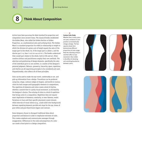
Contour Color Study Whether few or many colors are used, variations in composition can dramatically change a design. The four squares shown here demonstrate different proportions of color usage. Note the vibrating contours and their effect on eye movement. Also visible is the effect of vibrating and vanishing boundaries between colors.
Color can be used to make the eye travel, comfortably or not, and pick up information from a design. Transitions can be produced using line, shape, contours (edges of shapes), and motifs in various colors for both images and typographic elements in compositions. The repetition of elements and colors create a kind of rhythm, whether a smooth flow or a jerky visual movement, as dictated by the designer’s choices. The echoing of colors is a kind of repetition that brings unity to a composition. Repetition does not require exact duplication of elements; similarity, or near likeness, works. Variations in hues and their specific placement create interest, while intervals of visual silence (e.g., a dark solid-color background) between repeating elements provide rest stops for the eye. Areas of pure white and pure black boost impact and contrast. Some designers choose to disregard traditional ideas about proportion and balance in order to emphasize extremes of scale. This creates emphasis and communicates messages through exaggeration. Differences in the scale and proportion of a color can create a focal point in a design composition.
Text (SY)
Job:08-82654 Title:RP-Color Design Workbook #175 Dtp:116 Dtp:119 P Page:76