
ARCHIVES JOURNAL VOL 13 Nº1 | 2023 RADICAL UTOPIA
RMIT DESIGN


RMIT DESIGN ARCHIVES JOURNAL VOL 13 Nº1 | 2023 RADICAL UTOPIA
RADICAL
Editorial Board
Suzie
Michael
Mauro
Nanette
Liam
Christine
Philip
Brad
Robyn
Andrew
Catherine
Michael
Laurene
CONTENTS
VOL 13 Nº 1 2023
Design Stephen Banham Editors Harriet Edquist Sarah Teasley Editors of this issue: Harriet Edquist Helen Stuckey Assistant Editor Ann Carew RMIT Design Archives Copy Editor Róisín O’Dwyer
UTOPIA
Attiwill rmit University
Bogle Sydney, nsw
Baracco Baracco + Wright Architects
Carter Swinburne University
Fennessy rmit University
Garnaut University of South Australia
Goad University of Melbourne
Haylock rmit University
Healy rmit University
Leach University of Sydney
Moriarty Brighton, uk
Spooner rmit University
Vaughan rmit University 22 Clarence Chai at Crossley Street Sally Gray 04 Editorial Harriet Edquist and Helen Stuckey 08 Collage City: Melbourne Architecture in the 1980s Karen Burns 34 After Nightfall: Nightclubs in Melbourne from 1983–87 Timothy Moore 44 Melbourne House: The House of Hits 1980s Melbourne and the Early History of Australian Videogame Design Helen Stuckey
Contact
rmitdesignarchives@rmit.edu.au
www.rmit.edu.au/designarchives
Publication Sponsor
We acknowledge the people of the eastern Kulin Nations on whose unceded lands we conduct our business and we respectfully acknowledge their Ancestors and Elders, past and present.
issn 1838-7314 | Published by rmit Design Archives, rmit University.
Text © rmit Design Archives, rmit University and individual authors. This Journal is copyright. Apart from fair dealing for the purposes of research, criticism or review as permitted under the Copyright Act 1968, no part may be reproduced, stored in a retrieval system or transmitted by any means without the prior permission of the publisher.
Front Cover
Inflation nightclub interior, 1985, (detail)architects, Biltmoderne for Inflation Caberet Holdings, photographer John Gollings. ©2023 John Gollings. Back Cover
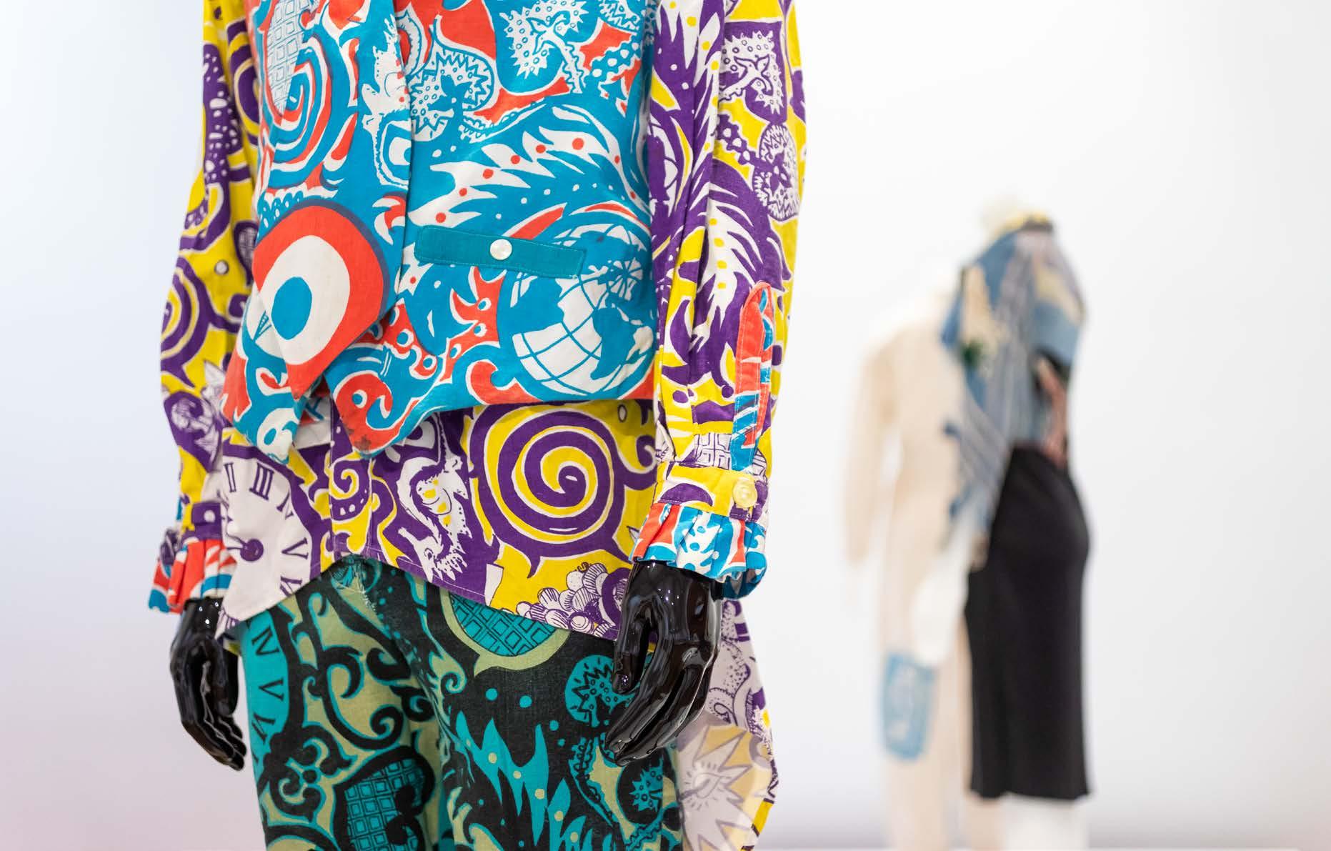
Four colour blocks of Indian snakes and ladders fabric, (detail) 1985 Plain Jane, Melbourne, fashion house; Gavin Brown, artist Courtesy of the artist
Inside Front Cover Bomb Jacket, 1980s
Gavin Brown, designer; Plain Jane, Melbourne, fashion house Collection of the designer

Photographer Tobias Titz
Inside Back Cover Silver crinkle earrings with painted stripes, (detail) 1982–3
Kate Durham, designer Courtesy of Jenny Bannister
Photographer Tobias Titz
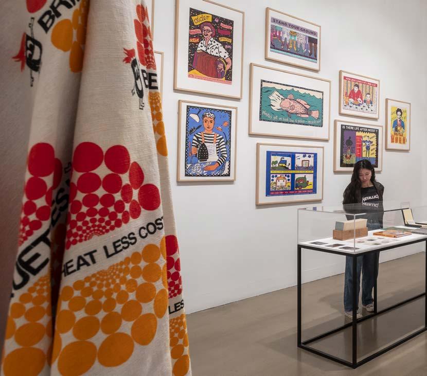
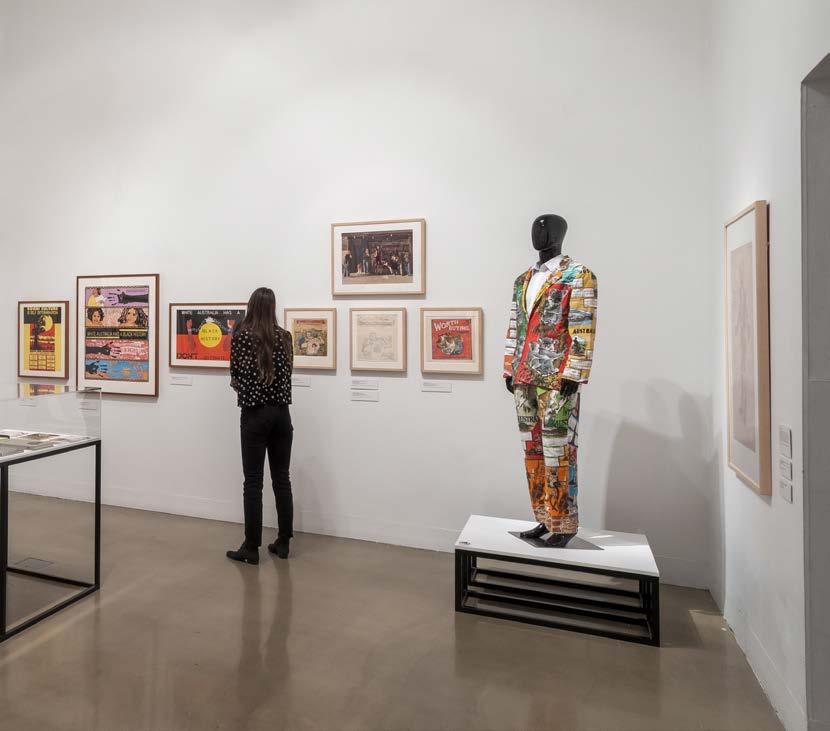
Below Installation View, Radical Utopia: An Archaeology of a Creative City, RMIT Gallery, 2023. Photographer Tobias Titz.
56 Computer Aided Design and Computer Graphics in 1980s Australia: Lyn
Sally Pryor and Andrew Quinn Melanie Swalwell 68 Making Experimental Workplaces: Backyard Press and Champion Books Marius Foley 80 Women's Work –Resistance Work: The political Graphics of Feminism in 1980s Melbourne Olga Tsara 96 Robert Pearce, the Fashion Design Council and the culture of Melbourne fashion Harriet Edquist 92 Exhibition Images Su san Cohn Tobias Titz 122 Exhibition Object Listing
Tune,
This issue of rmit Design Archives Journal accompanies the exhibition Radical Utopia: An Archaeology of a Creative City showing at rmit Gallery from February to May 2023. The seven essays included here, addressing some but not all of the themes covered in the exhibition, are supplemented by installation photographs and a list of works that provide an overview of the whole project.

4 rmit design archives journal Vol 13 Nº 1 (2023) EDITORIAL RADICAL
UTOPIA
The exhibition was inspired by the collections of the rmit Design Archives which is rich in material from the 1980s, a decade closely identified with the cultural phenomenon of postmodernism. Postmodernism generally, and the 1980s in particular, have been the subject of increasing investigation over the past decade and have spawned at least two major exhibitions: The Victoria and Albert’s Postmodernism: Style and Subversion 1970–1990 (September 24, 2011–January 15, 2012); and the National Gallery of Victoria’s Mix Tape 1980s: Appropriation, Subculture, Critical Style (April 11–September 1, 2013). Both exhibitions were primarily, though not exclusively, concerned with style. For the curators at the V&A: Postmodernism was an unstable mix of the theatrical and theoretical. It was visually thrilling, a multifaceted style that ranged from the colourful to the ruinous, the ludicrous to the luxurious.
While Mix Tape referenced fashion, furniture and music, its focus was on art:
Debates raged between those who saw a return to figurative painting and expressionism as an antidote to the cool cerebral conceptualism of the 1970s, and those who embraced postmodern and postcolonial theory as a challenge to existing formalist positions and nationalist narratives.
Radical Utopia sets a different course which is symptomatic of its archival origins. It is not a generalised snapshot of the ’80s decade or of postmodernism: its focus is on one city, Melbourne, and it is concerned with design, not art or music which are the most widely celebrated legacies of the 1980s. Being archives-based its interest is not the single art object at the end-point of a process of production and selection that is the purview of the art gallery. While such objects are included in the exhibition it is concerned rather with the cultural and intellectual infrastructure from which the works emerged. It has adopted this approach as a way to think about how cities such as Melbourne develop cultural identities; it is therefore propositional rather than declarative.
The exhibition is grouped into four themes: fashion and nightlife; architecture as idea; social and political protest; and the emergence of digital design. Each theme is represented by objects that demonstrate how their designers were engaged in critique of their professional boundaries, of design practices and technologies, and of social and political structures. There is an emphasis on collaborative endeavour, on the contexts of making (workshops and studios) of performance and communication (fashion parades, exhibitions, public protests), of conversation (publications, radio) and of sociability (clubs and events). In this way, the exhibition seeks to describe the conditions of an emergent culture, its infrastructural base.

In her opening essay Karen Burns notes: “State sponsorship of the arts brought Melbourne’s subcultures into the mainstream, enabling now long-standing businesses, creative careers, and buildings to prosper and forge the city we have today.” (11) This observation echoes the findings of the research undertaken for Radical Utopia Unfashionable as it may be, the government’s role as an agent of change in 1980s Melbourne culture forms one of the elements of its intellectual infrastructure and a number of the entities featured in the exhibition, such as the Fashion Design Council, were government funded. Burns also notes that individual expression in architecture, evidenced in exhibitions such as Architecture As Idea (1984) as well as magazines, radio and other forms of public debate, all illustrated in Radical Utopia “was a fierce rebuke to late modernism, rather than a forerunner of an emerging neoliberalism.”(12) This is an important observation because, while it goes to the heart of the proposition put forward in the exhibition it is not necessarily a shared view. For the V&A, which had reduced postmodernism to a global style, it was possible to kill it off by the end of the ’80s: As the ‘designer decade’ wore on and the world economy boomed, postmodernism became the preferred style of consumerism and corporate culture. Ultimately this was the undoing of the movement. Postmodernism collapsed under the weight of its own success, and the self-regard that came with it.
This is not what happened in Melbourne. Although it suffered the destructive recession of 1990–1991 “the framework of the city to come was already in place,” (19) as Burns points out, and the legacy of the ’80s was consolidated in the ’90s. Evidence of this can be seen throughout Radical Utopia, in fashion, architecture, public protest, personal computing, animation, and videogaming.
The essays in this volume provide a parallel and expanded view of the decade. The first three deal with the city, the next two look at the emergence of digital design in Melbourne and the final essays are case studies of the collective as a mode of design practice. Burns introduces the rising architecture of 1980s Melbourne as one undergoing a transformation from “technocratic problem solving to a conceptual medium.” (19) She details the expanding field of local discourse and the complex interweaving of the personal and the political in Melbourne architecture’s intense “associational culture.” (13) She sets the scene for understanding Melbourne’s design cultures both at the small-scale level and at the macro level of buildings produced by a progressive welfare state, the big urban moves that set the chessboard of the city to come, and the development of design strategies that shaped Melbourne architecture for years afterward.
5 rmit design archives journal Vol 13 Nº 1 (2023)
Opposite Installation view, Radical Utopia: An Archaeology of a Creative City, RMIT Gallery, 2023. Cohncave bowl, bracelets and earrings, designer Su san Cohn.
1. http://www.vam.ac.uk/ content/exhibitions/ postmodernism/aboutthe-exhibition, accessed February 27, 2023.
2. https://www.ngv.vic. gov.au/media_release/ mix-tape-1980sappropriationsubculture-critical-style, accessed February 27, 2023.
3. http://www.vam.ac.uk/ content/exhibitions/ postmodernism/aboutthe-exhibition.
It was a city ready for change. In her essay on the influence of fashion designer and entrepreneur Clarence Chai, Sally Gray echoes the general view that central Melbourne in the 1970s was backward and boring, hollowed out by the flight to the suburbs. Chai, whose unique fashion design business was a precursor to the Fashion Design Council’s 1980s call to “Revolt into Style,” established his shop and workshop in Crossley Street in 1974, living and working in the city and building a creative local community around him. Chai’s fashion design and that of designers like Jenny Bannister, whom he featured in his shop, were transformative; they took their cues from alternative cultures rather than mainstream fashion or Parisian haute couture. At the same time, as Gray notes, Chai and “others like him, were presciently engaged in changing patterns of urban occupation, residence, circulation, commerce, and cultural ambience.” (4) Indeed, it is the re-occupation and reanimation of the city and inner suburbs that unites the enterprises featured in this volume and in Radical Utopia.
Timothy Moore’s investigation of the city is more tightly focussed. He examines its culture through its clubs, as sites whose fleeting existence means that they are often overlooked in design history. Using Inflation, The Hardware Club and the Metro as his case studies, Moore argues that nightclub typology was “an engine for cultural production, a fulcrum of social and economic bonds, and…an architectural typology of constantly creative reinvention.” (37) He examines how club design situates the patron as performer, elevates and celebrates individual expression and makes them safe spaces for Melbourne’s subcultures and communities who were “more marginalised in the daylight.” (37) The three nightclubs surveyed by Moore were also sites of architectural invention: Built Moderne designed the interiors of both Inflation and The Metro while Jane Joyce designed the pop-up interior for the Hardware Club. Moore’s discussion of them is a timely reminder of how important interiors are to the life of the city and how important that they should be recorded.
The 1980s brought new opportunities to use computers in design, aided by the rise of personal computing and the impact of dedicated software for design. Melanie Swalwell shows how the convergence of computing and design transformed design processes and created new areas of design. She examines the work of Melbourne-based artist and designer Lyn Tune, an early adopter of cadcam (computer-aided design and computer-aided manufacture) who explored the intersection between digital design and the material object. And Swalwell shows how Sally Pryor and Andrew Quinn in the early 1980s produced pioneering work in 3D computer animation using the cad system on Swinburne University’s Engineering Department’s computers. Pryor and Quinn were subsequently hired by the growing American computer animation industry as no similar industry yet existed in Australia. For Swalwell, the work of Tune and Pryor in this era reveals “how Australia was positioned and saw itself globally and the significance of computers for the nation at what was a critical juncture in a globalising world.” (59)
Helen Stuckey’s history of early videogame designers and publishers Beam Software/Melbourne House is a case study of the new era of globalisation and born-digital design. As Stuckey reveals, in the 1980s this publishing company and design studio produced some of the most popular and highest selling games for home microcomputers in the uk and Europe. While generally overlooked in Melbourne’s design histories, these innovative practices uncovered in Swalwell and Stuckey’s essays are a timely reminder that digital design in all its formats was as dynamic and disruptive then as it is now.
The collective form of cultural production was a feature of 1980s Melbourne as small groups formed politically and socially engaged activist work practices in studios dotted around the inner suburbs. The poster was their most visible medium of expression. The centrality of the feminist collective poster presses of the 1980s is discussed by Olga Tsara who examines how they “provided an ideal production arena for a feminism that was becoming broader in its scope and radicalism.” (90) Sometimes government grants in arts and training were accessed, for example by Sybylla Press, Redletter Press, and Another Planet Posters to purchase presses. Women (and others) with shared values and causes were trained to use them. The expanded feminist agenda to create a better world for all addressed global issues such as apartheid, nuclear disarmament, environmental degradation and the rights and treatment of Indigenous Australians. As Tsara notes, one group, Jillposters, never applied for government grants and used the presses of other collectives. With a core aim to challenge mainstream media Jillposters “posted their work on the streets of Melbourne without permission” (90) never crediting the designer and only using the collective’s logo. Owning the means of production was also central to the work of Backyard Press. Established in the late 1970s but reformed as a government-funded cooperative in the early 1980s Backyard Press used the income from its print services for the live-music scene and activist groups to fund their associated collective Champion Books, which designed and published artists’ books. Marius Foley, an early member of the cooperative, recounts the workings of the two affiliated groups housed in their Greville St, Prahran premises. In particular, he focuses on the impact of the 1982 Victorian Government Cooperative Development Program (cdp ) for funding small collective self-managed workplaces. A recipient of a cdf grant, Backyard Press shifted from a self-managed collective structure working outside the mainstream to a formal cooperative business.
Together, these essays document the revitalisation of Melbourne and its close suburbs in the 1980s at a micro level. Their focus is not on the large economic, urban, institutional, and commercial agendas that forced change on the city, although Burns outlines some of these in terms of architecture. Rather, they detail the small studios and the creative interventions into the city fabric that gradually helped infuse life back into its streets and create a shared culture that has served Melbourne well over the ensuing decades.
Harriet Edquist and Helen Stuckey | Editors
6 rmit design archives journal Vol 13 Nº 1 (2023) EDITORIAL RADICAL UTOPIA

7 rmit design archives journal Vol 13 Nº 1 (2023)
8 rmit design archives journal Vol 13 Nº 1 (2023)
Collage City: Melbourne Architecture in the 1980s
 Karen Burns
9 rmit design archives journal Vol 13 Nº 1 (2023)

10 rmit design archives journal Vol 13 Nº 1 (2023)
Collage City: Melbourne Architecture in the 1980s
Karen Burns
abstract
The figure of Mad Max was often invoked in 1980s Melbourne. His leather clad figure and survivor battles channelled the city’s post-punk subculture. However, Melbourne was also powered by the less hip forces of a progressive welfare state. Architecture brings the dynamic of state and subculture into focus. The 1980s was a key decade for Melbourne architecture’s new identity as a knowledge-based practice, often asserted in opposition to mainstream professional production. The decade produced a network of exhibition venues, small magazines, and a culture of robust conversation that provided the base for architecture’s transformation from technocratic problem solving to conceptual medium. 1 This transition occurred in other global cities, notably in New York, where it is often
Melbourne, Subculture or Social Mainstream
retrospectively characterised as a mode of social withdrawal and architectural autonomy. Melbourne was distinctive however, for its social agenda. Buildings and design research played a key role in the Labor Government’s social project, as the Cain administration continued and expanded the reform of the welfare state begun under the conservative government of the late 1970s. Whilst the heroic figure of Mad Max was cherished as the emblem of the city’s artistic zeitgeist, architecture fashioned itself as the heir to a socially conscious European avant-garde. Across the 1980s, architectural subcultures and government contributed to the development of a long- standing culture that advocated for ideas over formal refinement, and for socially driven agendas and architectural projects.
When Melbourne painter Jenny Watson evoked the spectre of Mad Max to describe the condition of the artist in the mid-1980s she was also consolidating the image of 1980s Melbourne as a post-punk subculture. 2 However, the city was also powered by the less hip forces of a progressive welfare state and architecture brings this dynamic into focus. The confluence of state and subculture was vividly captured in another local magazine in 1984 when the design journal Crowd published a feature on Melbourne fashion and architecture. Their black and white photographs depicted male models wearing designer clothes as they perched confidently on the doorsteps, street fronts and fences of new terrace houses in Kay Street Carlton, homes recently completed for the Victorian Ministry of Housing by architects Maggie Edmond and Peter Corrigan.3 Buildings and shirts exhibited the same bold graphic style and the boundary between design, performance and architecture was blurred even further by the description of the houses as “agit prop tenements.”4
State sponsorship of the arts brought Melbourne’s subcultures into the mainstream, enabling now longstanding businesses, creative careers, and buildings to prosper and forge the city we have today. Although the city’s cultural renaissance began in the late 1970s, the election of the Labor Government in late 1982 secured progressive governance, including patronage of art and design. The story of 1980s Victoria challenges the historical master concept of neo-liberalism, so often used to narrate the global history of this period.5 Neo-liberalism is defined by the marketisation of all aspects of social life through a set
of economic policies and ideologies. Throughout the 1980s, the Victorian Labor Government applied Keynesian economic policies to stimulate economic growth as they endeavoured to help the state recover from the economic doldrums of the 1970s.6 Young creatives and auteur architectural practices were frequently beneficiaries of these schemes.7
Both the subcultures and the actions of government contributed to the development of a long-standing culture that advocated for ideas over formal refinement, and for socially driven agendas and architectural projects.8 This essay has been commissioned as an account of 1980s architectu re in Melbourne and of necessity it is partial. It is divided into three sections, with each segment focussing on a specific medium and the construction of a culture of ideas, through exhibitions, conversations and government-funded buildings. The essay’s title “Collage City” retrieves a key historical conceit of the period, one that distinguishes itself from the periodisation of history encapsulated in the concept of telling history through decades. Collage was developed as a key technique for design in 1980s Melbourne. Collage had its origins in social, political, and avant-garde movements but it came to typify a particular Melbourne approach to architectural design which persisted well into the first decade of the twenty-first century. Collage presents history in fragments and enacts the material process of subjective memory. This technique is an apt metaphor for remembering a decade that survives all around us, in important but frequently subterranean and fragmentary ways.
Preceding Pages Perspective of Frankston Public Housing, 1983–1985, project architect Maggie Edmond, Edmond & Corrigan, RMIT Design Archives, Edmond & Corrigan Collection, ©2023 Maggie Edmond. Opposite (detail) “New Order Goes Public”, Crowd Magazine, January 1984, author Ian McDougall, photographer Dominic Lowe, RMIT Design Archives, Michael Trudgeon and Jane Joyce Collection © 2023 Michael Trudgeon and Jane Joyce, and Dominic Lowe.
11 rmit design archives journal Vol 13 Nº 1 (2023)
“The Australian artist of the mid-’80s is a sort of Mad Max character, the nomadic warrior alone with him or herself against the Beckettlike dead landscape in a nuclear, post-Capitalist society.”
peer reviewed essay
Jenny Watson, Art & Text, 1984
Four Melbourne Architecture Exhibitions, 1979–1984
Architecture in 1980s Melbourne was acutely interested in discussing its historic and cultural place. Increasingly, curators and designers used exhibitions to explore ideas of period formation and group identity. The concept of the “decade” as a historical period has been traced to fin-de-siècle modernity but it was also used in the 1980s to conceptualise its own historical moment.9 Four exhibitions early in the decade sought to variously characterise the period. Some aimed to define and draw a line under the last decade; Seven in the Seventies (Monash University, 1981), others to diagnose the new cultural zeitgeist; New Classicism (Monash University, 1982) and others still to announce a new present; Four Melbourne Architects (Powell Street Gallery, South Yarra, 1979); and Architecture as Idea (RMIT University, 1984).10
Publicly funded university and independent state funded galleries directed by women largely developed architecture’s vibrant exhibition culture: with Grazia Gunn, then Jenepher Duncan in curatorial posts at Monash University, Denise Robinson followed by Juliana Engberg at the George Paton Gallery at Melbourne University, Christine Abrahams at the commercial Powell Street Gallery and a little later Rose Nolan at 200 Gertrude Street.11 Using innovative public displays in a range of photographic, installation, and drawing media, they devised concepts to analyse the present. Through exhibits, catalogues, and the creation of spaces, they deployed exhibitions to develop and communicate architectural knowledge.
The Seven in the Seventies exhibition described and brought closure to the work of the previous decade. The exhibition poster featured small black and white photographs of buildings in bush and landscaped settings. Landscape highlighted the environmental concerns of the 1970s, evident in site, climate and passive energy systems, such as buildings that internally controlled climate without using mechanical cooling and heating technologies. These environmental interests would soon be superseded by a concern with culture. The 1979 exhibition Four Melbourne Architects used four individual architectural firms to convey larger cultural shifts by marking out “some new directions in architecture.”12 This phrase evoked Robert Stern’s New Directions in American Architecture of 1977, a book that championed a uniquely American architecture of designs layered with historical quotation.13 Four Melbourne Architects arrived at the end of a decade in which the nation’s federal Whitlam Government had promoted a self-confident Australian identity. Architecture too, was beginning to assert its role as an expression of Australian culture.14 Only three years later, the Monash gallery’s New Classicism exhibition would displace this view of architecture as the pipeline of an authentic Australian culture. New Classicism presented local architecture as a cosmopolitan participant in global classical revivals. The medium of the architectural exhibition changed dramatically across these years. In Four Melbourne Architects the participants furiously remade the gallery rooms by covering walls in dense layers of cardboard models, collages of yellow tracing paper and
autobiographical ephemera. The exhibition was focussed on process not object, as if each architectural office had disgorged its messy workspace into the gallery. Critic Patrick McCaughey declared that it was an “anti-exhibition exhibition.”15 Seven in the Seventies had used the familiar form of black and white photographs of buildings, but New Classicism expanded the boundaries of architectural media, notably in Sue Dance’s display of a classical triumphal arch as a Warhol-like soapbox sculpture. By the time of Architecture as Idea in 1984, the fusion of media had reached full blast.
In parallel with smaller exhibitions at venues like the George Paton Gallery, Architecture as Idea worked at the nexus of architecture, art and design. The show was curated by the newly established firm Built Moderne, whose name seemed more like a New Romantic Band than a genteel architectural practice.16 In their work following graduation from rmit, Built Moderne cut their teeth on furniture design as well as set design, and notably devised the staging for the Fashion Design Council’s Fashion 84 parade at The Venue in St Kilda.17 In their Architecture as Idea exhibition, Howard Raggatt’s baggy, ragged Duchampian machine further claimed installation as a medium of architectural thought. Through its sheer range of media and interests Architecture as Idea refused the familiar coherency of visual, stylistic, or generational norms.
Dale Evans, one of the Built Moderne directors had gained a Diploma of Fine Arts from the Caulfield Institute of Technology before studying architecture at rmit. The range of media at Architecture as Idea was a visible marker of the driving force of the city’s art and design schools in urban cultural production. Although they were key incubators of Melbourne’s punk and post-punk culture, the city’s eleven art and design institutions were scattered across the city’s inner and middle ring suburban landscapes.18 The schools were physically accessible for a broader population. Australian art and design schools were key engines of innovation. Australian art institutions like their British counterparts emulated the reform of art schools initiated by Britain’s 1960 Coldstream Report. The art and design school was transformed from a craft training model to a liberal pedagogy of experiment, education in art history and art theory, and a cultivated individualism. The artist was transfigured from maker to thinker.19
Architecture as Idea fiercely asserted the notion of individual expression, free thought and the importance of the small independent producer, concepts that resonated across all the arts. In 1984, the partly-state funded Fashion Design Council which represented independent fashion design, proclaimed that Australian designers were “more or less freelance and independent...[with] a viability and manoeuvrability that would not be possible in Tokyo, Paris or New York.” (My italics.)20 In 1982, Ralph Traviato a member of the radical performance group Tsk Tsk Tsk explained in an essay in the cassette magazine Fast Forward, “To develop a style you just embrace your culture and accept it as part of yourself. Style is, therefore, political.”21 In architecture the mantra of individual expression was a fierce rebuke to late modernism, rather than a forerunner
12 rmit design archives journal Vol 13 Nº 1 (2023)
collage city: melbourne architecture in the 1980s Continued
of an emerging neoliberalism.22 As Patrick McCaughey noted in his Age newspaper review of Four Melbourne Architects: “The corporation architects may have looked more prominent in the ’70s, but they have wrecked cities and demoralised our old precincts. Their number and time are up. We cannot, literally, or spiritually, afford them anymore.”23
This turn to individual identity was also expressed in a new language of public emotion. British cultural theorist Raymond Williams had coined the term “structure of feeling” to describe emotions as part of cultural formations. He distinguished these structures from more formal cognition of a world view or ideology.24 The late twentieth century critique of architectural modernism was often cast in feeling terms. In 1979 the Royal Australian Institute of Architects (hereafter raia) issued a compressed version of Crisis in Architecture, an extraordinary professional selfcriticism first published by the Royal Institute of British Architects. In Crisis left wing journalist Malcom McEwan had declared, “The adoption of brutalist techniques and aesthetics (particularly in the use of concrete) in the massive developments of the 1960s contributed substantially to the development of the feeling that modern architecture was inhuman.”25 Literary critic Lionel Trilling had berated the tyranny of bureaucracy in his 1949 book
The Liberal Imagination: Essays on Literature and Society, declaring “Organization means delegation, and agencies, and bureaus, and technicians.” Trilling advocated instead for “the emotions and the imagination.”26 In 1970s and ’80s Melbourne, passion was a word that people regularly began to use about architecture. In part this was a new anti-professional ethos. In 1977, architects sitting at their drawing boards and reading the official raia journal, Architecture Australia, were suddenly exposed to this new affective turn with a building review headlined as “Passion in the Suburbs.”27 Years later, architect Julie Eizenberg recalled this structure of feeling, “the passion that people had about architecture. Which was interesting that I mean you know [sic] you could get into fisticuffs about architecture.”28
Talking Heads: Architecture’s Associational Culture
New ‘little magazines,’ many armed with funds from the Victorian Ministry of Arts or the Commonwealthfunded universities, were another strand of Melbourne’s burgeoning cultural infrastructure. In 1979, architects Richard Munday and Ian McDougall founded a new architectural journal Transition (active 1979–2000). The journal’s provocative sub-title was “Discourse on Architecture.” Munday and McDougall’s first editorial informed readers that Australian architecture was insufficiently intellectual or self-reflective. Globally architecture was shifting its identity from a profession driven by technical problem solving, to architecture as a discipline and conceptual medium. Architecture was fashioned as a knowledge-based practice.29
The broadside launched by McDougall and Munday was part of an on-going debate about architecture’s disciplinary identity. Dissatisfaction with the empirical, technocratic approach of modernism drove interest in the
human sciences of anthropology and psychology, notably in work on human-environment relations (prominent at rmit), models of participatory democracy in planning and architecture, and the turn to history and memory in architectural postmodernism. In London, New York and Melbourne, proximity to art schools and the art scene also forged a view of architecture as art.30
Small magazines were a potent medium of creative and political expression. They enabled cultural intervention by those with modest means and offered a form of cultural ownership outside the mainstream media or for architectural producers, beyond the reach of the raia journal, Architecture Australia 31
Transition emerged from an association with the Half-Time Club (active January 1979–1997). Melbourne architecture possessed an intense “associational culture”: a web of venues and clubs in which people met, fraternised, drank and debated.32 These networks spanned architectural students in their studios in Capel St, Hardware Lane, and Queens’ Street, to the shared architecture and design workspace at 15 Niagara Lane, to 2,000 architectural participants at the big public lecture series at Dallas Brooks Hall, to countless exhibition openings and bar room crit sessions. These venues offered key spaces for the performance and sometimes fractious production of architectural knowledge.33
Oral performance and debate were both social modes and knowledge practices. In the curatorial statement for Architecture as Idea, readers were entreated to attend to “Conversation, Debate and CONfrontation about aesthetics and the ideational dimensions of architecture.”34 At the fourth meeting of the Half-Time Club, the audience was instructed on the value of oral presentations by club members: “By intelligent discourse improve an individual’s ability to analyse and criticise architecture. Formation of architectural ideologies is also considered an essential aspect of the ‘club’.”35
Through these associations and events, oral pedagogy moved from the university design room studio into the broader architecture culture. The tradition of the “public crit” in which staff and students gathered around to discuss the work of one student had emerged from US and British art schools in the 1950s and 1960s.36 From the 1970s the Architecture Association (aa) school in London promoted design studios as participants in public dialogue in which their ideas would be “debated by opposing positions.”37 This pedagogy of self-improvement was promoted by Half-Time: “it is for their own benefit that members give talks” and “This is one of the primary aims of Half-Time.”38 Balancing the social and the pedagogical could be tricky, however, as evidenced by a legendary night planned for March 1978 at the Last Laugh performance venue in Smith Street, Collingwood, to discuss the formation of a new architecture collective. The schedule for the evening’s festivities planned a starting time of 6.15pm with the final event beginning at “12.30am–3am Drinking as preferred.”39 The evening ended in uproar after a carafe was thrown and the crowd was evicted onto the street.
13 rmit design archives journal Vol 13 Nº 1 (2023)

14 rmit design archives journal Vol 13 Nº 1 (2023) collage city: melbourne architecture in the 1980s Continued
Professional support, conviviality, conversation, and oral knowledge were also practices embraced by the Women in Architecture group (here after abbreviated as wia) founded in 1981. Feminism was one of the social justice movements that had emerged from the late 1960s. In the 1980s feminist ideas and practices were increasingly mainstreamed. wia was an inclusive organisation, offering a space for student graduates as well as registered women architects (of whom there were 110) who were “catching up” and “helping each other.”40 They issued a brochure in 1984 which documents their monthly events and their local and transnational networks. The July salon on motherhood “To Have or Not To Have and How” remains a depressingly familiar topic. wia helped drive greater consciousness around the marginalisation of women in architecture. Its founding member Dimity Reed was elected as the first woman president of the Victorian Chapter of the raia in 1984. At the end of 1981 the group was given scholarship funds from the national Institute for a survey of women architects (returned in 1983). In 1986, with funding from the Human Rights Commission, the national Institute would publish its first report on Women in the Architectural Profession 41 Other social justice movements of the late 1960s and ’70s expanded their spatial presence in 1980s Melbourne. ceres, an environmental education centre, community garden, and urban farm was established in East Brunswick in 1982. Indigenous community organisations set up in the early 1970s to provide self-determination, developed further in this decade. Notably Fitzroy’s Aboriginal Health Service (established 1973) began work on its larger site and new building at 186 Nicholson Street, Fitzroy, in 1991.42
Throughout the 1980s the Ministry of Housing produced housing for Indigenous Victorians. Tony Birch remembers his mother occupying a renovated house in Collingwood with a kitchen designed to her specifications.43 The queer dance parties hosted by university campuses in the late 1970s, notably at rmit’s Storey Hall, moved into inner urban loft spaces in Prahran, South Melbourne, and St Kilda.44 The late 1980s also produced public awareness around discrimination in these communities, with the Royal Commission into Aboriginal Deaths in Custody announced in August 1987. In 1989 acca (the Australian Centre for Contemporary Art) in South Yarra curated Imaging aids. These continuities and expansion defy neat periodisation by decades.
Melbourne architecture played a role in the Labor Government’s social agenda as the administration continued the reform of the post-war welfare state. Although this reform program had begun three years before Labor came to power, the new government continued and expanded these reforms. In the 1980s the key state architecture agencies—the Ministry of Housing and the Public Works Department—not only offered new building projects to in-house architects and private architectural firms, but its reformist agenda offered opportunities to rethink the modernist vocabulary of the building regime of the post-war decades. A potent confluence of forces enabled architects to work through the legacy of welfare state modernism and its architectural expression.
Opposite Women in Architecture, August 1984, publisher, Women in Architecture Association, RMIT Design Archives, Lecki Ord Collection

15 rmit design archives journal Vol 13 Nº 1 (2023)

16 rmit design archives journal Vol 13 Nº 1 (2023) collage city: melbourne architecture in the 1980s Continued
Collage City
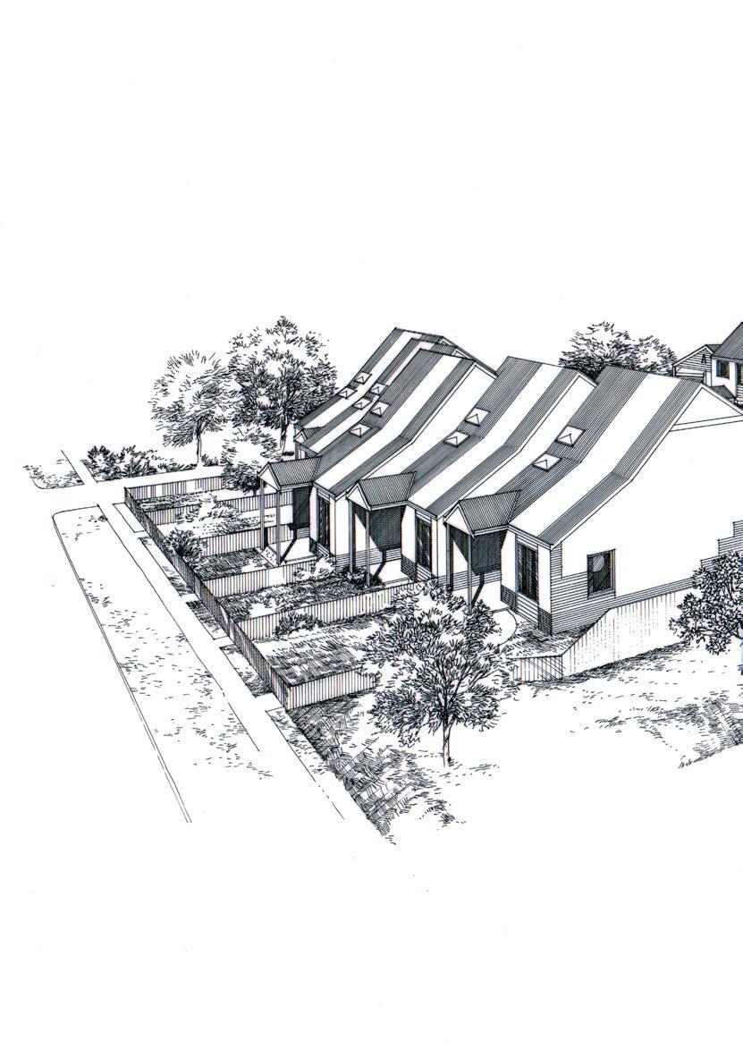
From the late 1960s and through the 1970s, Melbourne’s inner suburbs were riven with conflict and citizen action over state-driven demolition. Government agencies attempted to clear swathes of buildings to further infrastructure and housing commission projects.45 In the 1980s architectural design was a key element in the institutional rehabilitation of state actors. Renewal of the beleaguered Housing Commission had begun under the previous conservative government and the new housing minister, a young Jeff Kennett, was supportive. In the early 1980s it was decided to build new infill housing on the scattered blocks purchased for the previous demolition projects. In 1982 the Ministry of Housing’s Annual Report explained that a new approach would, “upgrade the quality of the local environment and increase the variety of public housing stock.”46 By November 1981 Edmond and Corrigan had been appointed as external consultant architects, agreeing to deliver a design and supervise construction.
Architect Dimity Reed was one of three commissioners (1978–1982) involved in renewing the organisation, but it seems that it was architect John Devenish—the Ministry’s new infill and rehabilitation manager—who initiated this model following his prior experience in government housing at Sydney’s Woolloomooloo. There were also precedents for employing private firms. The previous conservative Victorian Government of the late 1970s was reportedly motivated by an informal agenda to use public housing to boost private development and foster the construction and building industries.47 By mid-1982 the Ministry would declare that four private architectural firms had been employed “to develop new and innovative alternative scheme with a stringent cost limit” at Kay Street, Carlton.48 Across the 1980s, all four practices from the Four Melbourne Architects exhibition were awarded Ministry contracts, alongside at least ten other practices.49
In 1984 Devenish wrote of this new infill program: “Image is important. Designers are encouraged to relate the development to its context, and it is stressed, they should not be easily identifiable as public housing.”50 He declared, “A dramatic change of policy has replaced the paternalism of many public housing authorities throughout the world.”51 Architects working on the new infill social housing model used various design techniques to negotiate historical context. Key legacies of these experiments survive in many buildings and estates threaded through today’s inner and middle ring suburbs.
Edmond and Corrigan’s Kay Street terraces appear to be the first project completed under the new model. At two of these buildings at 75–79 Kay Street, Edmond and Corrigan used modest means to produce ornamental flourishes, notably in the multi-coloured brickwork, swaggering curved veranda canopies and inflected upper facades. The Kay Street homes were strongly represented in the Ministry’s internal and external publications. They featured in the Annual Reports and in a joyful photograph of kids and bmx bikes on the cover of the Ministry’s history of housing, That’s Our House of 1985.52 Devenish agreed with Edmond and Corrigan to split the cost for professional photographs
of the buildings, commissioned from Melbourne-based photographer John Gollings.53 The use of notable design practices also caused tension. in 1985 Dimity Reed observed that some “good and dubious housing resulted from the exercise” and she admonished: “It is a rare person who wants [a] toytown version of Luna Park.”54
Debates about a design appropriate for public housing turned around the value of ordinariness and the request that social housing quietly assimilate itself to the neighbourhood. Fellow architects Anne Cunningham and Ann Keddie reportedly expressed concern that the dynamism of the Kay Street homes made them too notable.55
At a later project by Edmond and Corrigan at Dandenong Road, Frankston (1983–85) the design flourishes were relegated to the upper parts of the houses and expressed in a sculptural curved roof that hunkered down over the units, gables and slender entry porches. With Maggie Edmond as project architect, the firm completed nine units for the modest budget of $430,000. Reporting on the occupants’ responses, Dimity Reed noted that the tenants, “like everything about it with the exception of the external colours” but were “amused rather than annoyed.”56
The participatory design approach developed in the 1970s was used by the Ministry in some of its 1980s projects.
Cunningham and Keddie’s public housing for single and elderly person units in Egan Street, Richmond (completed in 1990) was praised for this approach by the Victorian Chapter of the Australian Institute of Architects who awarded the project and commended its lack of “featurism.”
The jury reported:
The hidden advantages of the participatory design process used by Cunningham & Keddie were taken into account by the panel for this award. The architects have developed communication abilities and techniques for this process that the profession should be proud of. By working directly with the Ministry tenants (for almost 50% of the units), their client group developed as a core community.
Indeed, the jury reported, the Manager of the estate confided that the project was “the most problem free in settling in and maintenance.”57
Cunningham and Keddie quoted from vernacular housing typologies and used subdued ornamental flourishes. Many of these Ministry projects in Kay Street, Frankston and Richmond, worked to absorb and integrate historical references. By the later 1980s the Melbourne design approach would give way to a more radically disjunctive technique of collage. Collage aesthetics foreground process and non-linear relationships to source material and historic references.
Collage was a key technique of the twentieth-century interwar and post war avant-garde but returned from the mid-1970s and found subcultural expression in the pages of English punk fanzines which in turn inspired Australian examples.58 In early 1980s Melbourne, architect, designer and magazine editor Michael Trudgeon used a collage technique of cutting up architectural drawing conventions.59 Collage emphasised process. The cut and paste technique
17 rmit design archives journal Vol 13 Nº 1 (2023)
Opposite Photograph of Cafe Maximus interior, architect Alan Powell, unknown photographer reproduced in Architect, May 1989, RMIT Design Archives, Harriet Edquist Collection.
foregrounded qualities of immediacy and materiality. The overlapped parts of multiple images and texts, the torn edges and the non-linear mode of history mimicked a form of historical retrieval that was closer to memory than history. The collage technique promoted a more subjective and fragmented form of remembrance than earlier postmodernisms.
In 1985 Built Moderne’s interior for the Inflation nightclub brought the junkyard recycling aesthetic of Mad Max 2, the “emblem” of a “1980s zeitgeist,” to Melbourne.60 The interior looked as if Alice in Wonderland had fallen down a Mad Max rabbit hole. Biophilic furniture was shot through with pink tendrils. A steel plated fortified bar was decorated with spiky turret ends. Many surfaces were coated with distressed metal plates as the tough street aesthetic moved into the urban interior. The fragment motif could also be coolly quoted and elegantly transposed as it was in Alan Powell’s later Café Maximus in Acland Street, St Kilda, where collage fragments formed a jaunty terrazzo floor pattern and lightning fragments filled a large mural painting.61

As a drawing medium collage was used to question the rejection of utopian modernism in Howard Raggatt’s dynamic cultural mash up in the foyer upgrade at the Sutton Street Housing Commission tower, North Melbourne (1987). The ceiling was covered in Michelangelo’s Last
Judgement and at the centre of the space an over-scaled pylon column resurrected the reviled utopias of modernist infrastructure. Soon the jagged edges and cut-up technique of collage migrated from architectural drawing into built form. Edmond and Corrigan expressed their Athan House (1986) as a series of separate rooms conjoined by a spine, an arrangement that emphasised the singularity of the separate pieces. The collage technique came to define agnation of Melbourne building with the work of arm Architecture up and down the Swanston Street spine and mgs Architects in their brilliant Community Housing, Woodstock Street, East St Kilda (2006). Collage was a more intellectually rich medium for exploring architecture at the edge of transnational practice. Reception and replication played with themes of originality and memory in a late twentiethcentury global media culture.
From 1987 the Public Works Department (pwd) began to pursue the same procurement strategies used at the Ministry of Housing, resulting in private architectural practices producing projects in conjunction with the pwd This body of work needs excavating, not least because this archive promises to reveal more buildings by hidden women architects such as Deborah Havelka’s 24-hour Traralgon Police Station and Rachel Cole’s co-authored Badger Creek Primary School. In the 1980s the Cain Labor Government was already envisaging the city’s future development. Key

18 rmit design archives journal Vol 13 Nº 1 (2023) collage city: melbourne architecture in the 1980s Continued
Left top Elderly Persons’ Units, Egan Street, Richmond, 1989/1990, architects Ann Cunningham and Ann Keddie, reproduced in Architect, September 1990, RMIT Design Archives, Harriet Edquist Collection

Left bottom Sutton Street Foyer Collage, Ministry of Housing Tower, Sutton Street, North Melbourne, Howard Raggatt and ARM Architecture, photographer (attributed) Sally Newell, reproduced in Architect, May 1989, RMIT Design Archives, Harriet Edquist Collection © 2023 Howard Raggatt and ARM Architecture.
Right “New Order Goes Public”, Crowd Magazine, January 1984, author Ian McDougall, photographer Dominic Lowe, RMIT Design Archives, Michael Trudgeon and Jane Joyce Collection © 2023 Michael Trudgeon and Jane Joyce, and Dominic Lowe.
projects were already in place, with a projected National Tennis Centre, and a discussion beginning about the development of the Jolimont railyards (later Federation Square). The 1985 City of Melbourne Strategy Plan was already imagining the seeds of the Postcode 3000 plan with a strategy aimed at attracting residents to the cbd, which had a skeleton population of 2000 occupants and the nearest milk bar was some distance away in Richmond.62 The Cain Government was committed to other forms of modernisation that had spatial effects, particularly the reform of liquor laws that would reduce restrictions on serving of alcohol in restaurants. Even later reforms spurred Melbourne’s bar culture. The government ended the gender discrimination that restricted women’s entry to all areas at the Victorian Racing Club and the Melbourne Club. An overhaul of cultural institutions was begun with the 1985 State Library and Museum competition.63 The search for a major private tenant to anchor the government’s museum underground station was awarded to Daimaru development at Melbourne Central (1986–1991), a project generated from the flow of Japanese investment capital and design.64 Although the financial crash of 1990 produced large-scale economic devastation and decimated the construction industry, with high rates of unemployment propelling a Melbourne architectural diaspora across Australia and overseas, the framework of the city to come was already in place.
This brief essay has reconstructed the culture of ideas and the infrastructure that supported architecture’s shift into a distinctive knowledge-based practice. The development of a strong exhibition culture, small magazines and a vibrant practice of oral performance provided a base for architecture’s disciplinary transformation from technocratic problem solving to a conceptual medium. This transition occurred in other global cities, notably in New York, where it is often retrospectively characterised as a mode of social withdrawal and architectural autonomy.65 Melbourne was distinctive for its social agenda. Buildings and design research played a role in the Labor Government’s social agenda as the administration continued and expanded the late 1970s reform of the post-war welfare state. Architects, like other cultural producers in Melbourne cherished the independent producer. The distinction between mainstream and sub-culture was widespread and underpinned critical relationships to the dominant culture and its institutions. While the heroic figure of Mad Max was cherished as the emblem of Melbourne’s 1980s artistic zeitgeist, the architectural description of their new social housing as “agit prop tenements” provides another vision of culture as the performance of a socially conscious and politically driven project.
19 rmit design archives journal Vol 13 Nº 1 (2023)
Endnotes
1 A note on spelling. Several of the organisations and individuals in this period used variant spellings of their names. This essay cites the name that is consistent with the majority of the archival record extant in the years referred to in the essay. The Half-Time Club had later variant spellings, Built Moderne was the name in use from 1983–1984, but Biltmoderne was then used from at least 1985–1987. Dale Evans of Built Moderne later changed his name to Dale Jones-Evans.Philip Brophy, “Personality/ Fashion/Style Interview,” Fast Forward cassette magazine, 13 (October 1982) uses the terms ‘subculture’ and ‘underground’ and notes their divorce from the “social mainstream.” n.p.
2 Jenny Watson, “Urgent Images,” Art & Text, no.14 (Winter 1984): 69.
3 Thanks to Harriet Edquist for sharing this image which she discovered during the course of research. Ian McDougall, “New Order Goes Public,” Crowd Magazine (January 1984): 20-25. Crowd Magazine (1983–85) was founded by Michael Trudgeon, Jane Joyce, and Andrew Maine and received some government support.
4 McDougall, “New Order Goes Public”: 20.
5 See Florence Sutcliffe-Braithwaite, Aled Davies and Ben Jackson, “Introduction: A Neoliberal Age,” in The Neo Liberal Age?, ed. Aled Davies, Ben Jackson and Florence Sutcliffe-Braithwaite (University College London: UCL Press, 2021), 1.
6 Alistair Harkness, “Triumphant, Troubled then Terminal: An Examination of the Cain and Kirner Decade 30 Years On,” Labour History, no.30 (November 2013): 28.
7 Led by Premier John Cain (1982–1990) and then Premier Joan Kirner (1990–1992).
8 I thank the anonymous reviewer of the essay for this sentence.
9 Ian Jack, notes: “The fashion is relatively recent for slicing up history into ten-year periods, each of them crudely flavoured and differently coloured, like a tube of wine gums.” Ian Jack, “Downhill from Here,” London Review of Books, 31, no.16 (August 27, 2009): https://www.lrb.co.uk/thepaper/v31/n16/ian-jack/downhill-fromhere, accessed November 15, 2022. See Jason Scott Smith, “The Strange History of the Decade: Modernity, Nostalgia and the Perils of Periodization,” Journal of Social History, 13, no.2 (Winter 1998), 263–285.
10 Four Melbourne Architects included five architects. Maggie Edmond was unfortunately subsumed by her partnership with Peter Corrigan into the figure of one architect.
11 The Australian Centre for Contemporary Art (ACCA) should also be included in this list. 200 Gertrude Street was an independent gallery/studio space established in 1985 and funded by the Victorian Ministry of the Arts. See Karen Burns and Harriet Edquist “Women,
Australian Architecture and the Media” in The Bloomsbury Global Encyclopedia of Women in Architecture, 1960–2015, ed. Lori Brown and Karen Burns (London: Bloomsbury Publishing, 2023 forthcoming).
12 Norman Day, letter to John Andrews, August 7, 1979, quoted by Kirsten Day and Erin Campbell, Four Melbourne Architects (1979). “The Creation of Contemporary Perceptions for Australian Architecture,” Proceedings of the Society of Architectural Historians of Australia and New Zealand: 38 Ultra: Positions and Polarities: Beyond Crisis, ed. David Kroll, James Curry and Madeline Nolan (Adelaide: SAHANZ, 2022), 96.
13 Robert A. M. Stern, New Directions in American Architecture, rev. ed. (New York: George Braziller, 1977).
14 John Gardiner-Garden, “Arts Policy in Australia: A History of Commonwealth Involvement in the Arts,” Background Paper, No. 5, (Canberra: Department of the Parliamentary Library, Parliament of the Commonwealth of Australia, 1994).
15 Patrick McCaughey, “Architects Throw off the Greyness and Add Humour,” The Age, undated, quoted in Day and Campbell, Four Melbourne Architects (1979), 94.
16 Rather than a traditional architectural practice name derived from the family names of founding partners.
17 Robyn Healy, “High-Risk Dressing by the Collective Known as the Fashion Design Council of Australia,” in The Design Collective: An Approach to Practice, ed. Harriet Edquist and Laurene Vaughan (Cambridge: Cambridge Scholars Publishing, 2012), 154.
18 The schools were located in Prahran, Caulfield, Preston, Hawthorn, and the city (both RMIT and VCA) and at the teachertraining institutes that offered some art or graphic design training in Carlton, Hawthorn, Burwood, Rusden (Clayton North), and Toorak. See “National Design Education Survey,” Design World, no.7 (1985), 65–109.
19 See Nigel Llewellyn and Beth Williamson (ed.) The London Art Schools: Reforming the Art World, 1960 to Now (London: Tate Publishing, 2015). For the local impact of the Coldstream Report, see for example, Judith Buckrich, Design for Living: A History of ‘Prahran Tech’ (Windsor, Victoria: Prahran Mechanics’ Institute Press, 2007).
20 Established and led by lead by Kate Durham, Robert Buckingham and Robert Pearce. Quoted by Healy “High Risk Dressing”: 141.
21 Fast Forward cassette magazine, 13 (October 1982), “Personality/Fashion/ Style Interview Ralph Traviato,” 24.
22 Healy, “High-Risk Dressing,” 142, quotes Robert Buckingham “There was just a strong sense that fashion was just another way of expressing yourself.”
23 Quoted by Day and Campbell, Four Melbourne Architects: 89. Conrad Hamann writing for the Seven in the Seventies exhibition catalogue/ poster (1981) declared that each small practice was “distinctively individualistic in their approach.”
24 Raymond Williams, Marxism and Literature (Oxford: Oxford University Press, 1977), 132.
25 Malcolm MacEwan, Crisis in Architecture (South Melbourne: Royal Australian institute of Architects Practice Division, 1979), 16–17.
26 Sean McCann and Michael Szalay, “Do You Believe in Magic? Literary Thinking After the New Left,” The Yale Journal of Criticism, 18, no.2 (Fall 2005): 439, quoting Lionel Trilling’s 1949 preface to The Liberal Imagination: Essays on Literature and Society (Garden City, New York: Anchor Books, 1953).
27 Richard Munday, “Passion in the Suburbs,” Architecture Australia, 66, no.1 (February–March 1977): 52-61.
28 Peter Raisbeck and Kirsten Day, “Youtube Transcript Roundtable 3: Emerging Architectural Narratives and Heritage in 1970s Melbourne,” November 20, 2020, 37th SAHANZ Conference, Perth, quoted in Kirsten Day and Peter Raisbeck, “The Last Laugh and its Afterlife: Emerging Narratives in 1970s Melbourne Architecture,” Fabrications, 31, no.3 (2021): 350.
29 “Cynthia Davidson and Elia Zenghelis,” Log, 30 (Winter 2014): 83.
30 For anthropology see Architectural Theory Review Special Issue “Anthropology and Architecture: A Misplaced Conversation,” 21, no.1 (2017); for human-environment relations see Emina Petrović, Brenda Vale and Bruno Marques. “On the Rise and Apparent Fall of Architectural Psychology in the 1960s, 1970s and early 1980s.” In Proceedings of the Society of Architectural Historians, Australia and New Zealand: 32, Architecture, Institutions and Change, ed. Paul Hogben and Judith O’Callaghan (Sydney: SAHANZ, 2015), 480- 487, and for participatory and community architecture see Nick Wates and Charles Knevitt, Community Architecture: How People are Creating Their Own Environment (London: Penguin, 1987). Phenomenology continued to be a key influence. For phenomenology see “Bryan E. Norwood An Interview with Jorge Otero-Pailos,” Log, 42 (Winter–Spring 2018): 137-144.
31 See Matthew Worley, “Whose Culture? Fanzines, Politics and Agency” in Ripped, Torn and Cut: Pop, Politics and Punk Fanzines from 1976, ed. Subcultures
20 rmit design archives journal Vol 13 Nº 1 (2023)
Network (Manchester: Manchester University Press, 2018), 55.
31 Adrian Martin, The Mad Max Movies (Sydney: Currency Press, 2003), 56. In Melbourne, dissatisfaction with the Institute of Architect’s control of public discussion and the desire for new forums beyond the Institute rumbled through these years. This story is partly told in Raisbeck and Day.
32 The term “associational culture” is borrowed from Zoe Thomas, Women Art Workers and the Arts and Crafts Movement (Manchester: Manchester University Press, 2020). The emergence of Transition was noted in the February 1979 Half-Time Club meeting. See “‘Half-time’: A New Architecture Periodical. Speakers: Richard Munday and Ian McDougall.” Half-Time Club, Minutes, February 6, 1979, RMIT Design Archives. Peter Brew Archive.
33 Simon Naylor, “Introduction: Historical Geographies of Science–Places, Contexts, Cartographies,” The British Journal for the History of Science, 38, 1 (March 2005): 1.
34 Dael Evans, Architecture as Idea poster, RMIT Design Archives, Dean Boothroyd Archive.
35 Half-Time Club Minutes, April 3, 1979, RMIT Design Archives. Peter Brew Archive.
36 Elena Cripp, “From ‘Crit’ to ‘LecturePerformance’” in The London Art Schools, 134–139.
37 “Davidson and Zenghelis”: 78.
38 Half-Time Club Minutes, January 16, 1979, RMIT Design Archives. Peter Brew Archive.
39 Graeme Gunn, “The Gathering–Last Laugh,” March 20, 1978, Graeme Gunn archive, quoted Day and Raisbeck, “The Last Laugh and its Afterlife,” 343.
40 Invitation flyer to the first informal dinner, March 27, 1981, 8pm. Hand signed by Dimity Reed but the signatories are Dimity Reed, Jenny McNab, Leckie Ord, Maggie Edmond, Sue McFall. The invitation notes, “For some years the idea has been tossed around of forming a Women Architects Association.” RMIT Design Archives, Leckie Ord Archive.
41 A. Ian Ferrier, letter to Alexis Ord, November 11, 1981. RMIT Design Archives, Leckie Ord Archive, Box 3. File 1. Royal Australian Institute of Architects, Women in the Architectural Profession: A report by the Royal Australian Institute of Architects to the Human Rights Commission (Canberra: RAIA, 1986).
42 Victorian Aboriginal Health Service website: https://www.vahs.org.au/ about/#:~:text=The%20Victorian%20 Aboriginal%20Health%20 Service,needs%20of%20Victorian%20 indigenous%20communities.
43 Tony Birch, interviewed by Hilary McPhee and Rosa Simonelli, Fitzroy History Society Oral History Project, 2015-2017, November 4, 2016, https://oralhistory. fitzroyhistorysociety.org.au/wp-content/ uploads/2017/08/FHS-Tony-Birch-2016. pdf.
44 See Australian Queer Archives poster collection, https://queerarchives.org.au/ collections/posters/, A049, A050, A055, A079, A091, A093, A094, A0976.
45 See Renate Howe, David Nichols and Graeme Davison, Trendyville: The Battle for Australia’s Inner Cities (Clayton, Victoria: Monash University Publishing, 2014).
46 Report of the Ministry of Housing for the Year Ended 30 June 1982 (Melbourne, Vic: Ministry of Housing, December 1982)
47 This was an informal position rather than an overtly declared policy, according to Peter W. Newton and Marianne G. Wulff, “State Intervention in Urban Housing Markets: A Case Study of Public Housing Development in Melbourne, 1945–1980,” Urban Policy and Research, 1, no.3 (1983): 9.
48 Report of the Ministry of Housing for the Year Ended June 1982, 10, notes that the Kay Street Carlton redevelopment (where the Ministry owned fifty-five houses, three non-residential properties and seventeen vacant sites) had been planned and scheduled for completion 1982, but before the project was finished, a new initiative using private consultant architects was initiated.
49 This work awaits research.
50 “Victorian Ministry of Housing John Devenish: Style Replaces Stigma,” UIA International Architect, no.4 (c.1984): 20.
51 “Devenish: Style Replaces Stigma”: 20.
52 The 1981–82 Annual Report and the 1982–83 Reports featured photographs of 75–79 Kay Street.
53 John Devenish, letter to Maggie Edmond, May 11, 1983, RMIT Design Archives, Edmond and Corrigan Collection, Ministry of Housing Correspondence.
54 Dimity Reed, “Frankston Project Report,” Architect (November 1985): 7.
55 Conrad Hamann, Cities of Hope Re-membered Australian Architecture of Edmond and Corrigan 1962–2012 (Melbourne: Thames and Hudson, 2012), 115.
56 This project comprised seven 2-bedroom units, one 3-bedroom unit, one 1-bedroom unit together with nine carports.
57 “New Housing Awards,” Architect (September 1990): 8.
58 See Clinton Walker.com.au.
59 “Conversation Piece: Michael Trudgeon,” July 8, 2009, https://www.youtube.com/ watch?v=KAACq697TCY
60 Adrian Martin, The Mad Max Movies (Sydney: Currency Press, 2003), 1.
61 Debbie Lynn Ryan “50s in the 80s,” Architect (May 1989): 6-9.
62 The Melbourne City Council Strategy Report envisaged that around “8,000 dwellings could be added to the city” over next 10–15 years. See Centre for Public Impact, “Revitalising Melbourne’s City Centre from 1985,” September 2, 2019, https://www.centreforpublicimpact.org/ case-study/revitalising-melbournes-citycentre-1985.
63 “Revitalising Melbourne’s City Centre from 1985”.
64 Michael Berry, “Japanese Property Development in Australia,” Progress in Planning, 41 (1994): 153.
65 See for example Jeremy Till, Architecture Depends (Cambridge, Massachusetts: The MIT Press, 2009), 18–25.
21 rmit design archives journal Vol 13 Nº 1 (2023)

22 rmit design archives journal Vol 13 Nº 1 (2023)
Clarence Chai at Crossley Street

23 rmit design archives journal Vol 13 Nº 1 (2023)
Sally Gray

Clarence Chai at Crossley Street
Sally Gray
Danish urbanist Jan Gehl arrived in Melbourne in 1976. It was the first of many visits. Warned that Australia was backward and Melbourne “even worse,” he reflected later that: “The city was indeed boring and suffered quite a bit from the double impact of modernist planning and the automobile invasion.”1 From the early1980s intersecting initiatives by the Cain state government and the reconstituted Council of the City of Melbourne—influenced in part by Gehl’s urban renewal thinking—galvanised change in important ways. From “a completely boring, lifeless, uninteresting and nondescript office city,” it ultimately transformed itself, controversially perhaps, into one of the world’s so-called ‘most liveable’ cities.2 Late-1980s Melbourne was seen as a fashionably iconoclastic, design-aware, culturally innovative city with its own dynamic urban character.
Clarence Chai and Crossley Street as Precursors of the ‘Creative City’
Two years before Gehl’s first visit, emerging fashion designer Clarence Chai opened his small ‘alternative’ fashion business in Crossley Street in central Melbourne. In doing so he was activating processes and ideas, later influential in the way Melbourne transformed itself. These ideas included re-populating the city with both residents and niche creative businesses; revaluing and re-using existing city buildings; reanimating neglected parts of the central city and honoring the specificities of Melbourne’s built environment, including its small streets and lanes. Without being a conscious party to any of the public policies and developments, Clarence Chai was one of those creative precursors who collectively help transform cities.3From the early1980s there was recognition that small, niche creative businesses were vital to the vibrancy of a living city. From the mid-eighties, the Fashion Design Council (FDC 1983–1993), co-founded by Robert Buckingham, Kate Durham and Robert Pearce and supported by the Victorian Ministry for the Arts, fostered links between art, fashion, music and other aspects of urban creativity.4 According to photographer, writer, and acute observer of 1980s urban fashionability, Rennie Ellis, the fdc supported “fashion mavericks” who “mostly [worked] outside the system.”5
Arts and fashion creatives were encouraged to take up under-used spaces in Melbourne’s remaining heritage fabric. These developments in creative entrepreneurship were enhanced by reforms to Melbourne’s puritanical liquor laws and development of innovative approaches to dining and café culture, which encouraged different forms
of sociality and urbanity.6 There was a new embrace of the city’s unique built form, including its networks of lanes and arcades. As architecture academic Kim Dovey writes: “Conversion of sinister lanes into vibrant little streets” became a hallmark of Melbourne’s renewed urban identity.7 The prevalent “modernist planning” that Jan Gehl had decried included the demolition of heritage buildings— shamefully accelerated through the 1960s—to build modern office blocks and carparks. Central city retail and foot traffic had been in decline in the face of car-based culture and new suburban developments like Chadstone. Inner city job numbers had been shrinking since the mid-sixties.8 The centrality of the city had diminished, and rents were often temptingly cheap in beautiful nineteenth and earlytwentieth-century buildings awaiting demolition. So-called ‘creative types,’ like Clarence, recognised the charm of these undervalued properties. He rented under-valued retail space in central city arcades and streets from the early 1970s until the late 1980s, to run risky, at first minimally capitalised, creative businesses dealing in diverse aspects of style and fashion.
Clarence Chai was a pioneer of Melbourne’s ‘alternative’ youth fashion scene; a small-scale outsider to the mainstream fashion industry and a precursor to the collaborative creativity later associated with the FDC. He chose central city locations before it was fashionable and before notions of the ‘creative city’ and the urban ‘creative class’ had become current.9 As fashion scholar Laura Jocic, writes, Chai’s shop in Crossley Street was “one of the few alternative fashion outlets in Melbourne,” when it first opened in the early 1970s.10 Before there was government support for his kind of innovative creative entrepreneurship
Preceding Pages Installation view Radical Utopia: An Archaeology of a Creative City, RMIT Gallery, 2023. Clarence Chai garments in foreground
Opposite Clarence Chai and Jenny Bannister Sheiks nightclub, 1981
Photographer: Rennie Ellis Courtesy Rennie Ellis Photographic Archive
25 rmit design archives journal Vol 13 Nº 1 (2023)
peer reviewed essay

26 rmit design archives journal Vol 13 Nº 1 (2023) clarence chai at crossley street Continued
Clarence, and others like him, were presciently engaged in changing patterns of urban occupation, residence, circulation, commerce, and cultural ambience.
Style-setters: Clarence Chai and Paul Craft at Paraphernalia, 1970
Art and design trained at both rmit and Prahran Technical College, Clarence Chai started his first style-focused business in 1970, in the soon-to-be-demolished Metropole Arcade (completed 1891) in Bourke Street, with his then lover and business partner Paul Craft. Under the name Paraphernalia, they ran two adjoining shops; one selling vintage clothing and the other decorative arts and design, mainly from the Art Nouveau and Art Deco periods. The rent on the two shops was $15 and $10 respectively per week. Even then this was extremely cheap, due to the tenancies being shortened by forthcoming demolition. They were ahead of the market in their collecting and selling and amassed a significant collection of museum quality objects, some of which they loaned to the National Gallery of Victoria (ngv ) for two exhibitions: Did I Love a Dream (1972) and The Style of the Twenties (1973).11
Uninterested in the “modernising” impulse that was leading to rampant destruction of the built fabric of the city, they saw themselves as part of a stylish urban ambience within the central city’s architectural specificity. From penniless youths, they had become influential style-setters. As Clarence later observed:
We were in our early twenties, dressed in tat, with long hair. We were hoarding Nouveau and Deco, sitting on it with a long-term plan. We aspired to be like Butler and Wilson and Antiquarius [in London].12
Both had come from high-density cities (Singapore and London) before living in Melbourne. Their collecting and trading in decorative arts and vintage clothing was part of an informed nostalgia for late nineteenth and earlytwentieth-century proto-modernist and modernist design. Clarence Chai grew up in the compact urban setting of Orchard Rd Singapore, raised in one of the three-storey Straits Chinese-style shop-houses, then making up the urban architecture of Singapore. As a boy, at 56 Orchard Rd (now demolished as part of Dhoby Ghaut mrt Station), Clarence was entranced by a fashion production workshop located downstairs. He knew though, that despite his enthusiasm for dress and adornment, as far as his family was concerned, a career in fashion was out of the question.13 In 1963, his family sent him to Melbourne, aged sixteen, to complete his secondary education at Williamstown High School. He graduated in Graphic Design at rmit (1967) and was working for the design firm Emery and Waite when he met Paul Craft who had recently left London before completing his architectural studies at the Architectural Association. Craft had chosen to set out on the well-travelled queer trajectory of moving to another country; in this case as a “ten-pound-pom,” arriving in Melbourne in 1967.
Queer Intersections
Paul and Clarence met on the dance floor of the Thumpin’ Tum disco, Little La Trobe Street, in 1968 and shortly
afterwards Paul moved in with Clarence at the share house he rented at 445 Cardigan Street, North Carlton, with other young gay men; window dresser (later jeweller and artistic director of the Sydney Gay and Lesbian Mardi Gras) Peter Tully and window dresser (later set dresser and prop buyer for film and TV) Murray Kelly. Together they created a camp cultural scene in what became a renowned party house in which a network of Sydney and Melbourne creatives started their journeys into dressing-up, and art and fashion fame.14
Crossley Street 1974
In 1973 Clarence went to London for several months, scouting for stock for Paraphernalia. He saw a bigger world; met amazing people. One of these was Vern Lambert, the Australian-born proprietor of Emmerton and Lambert the influential vintage clothing business whose style and panache, and use of vintage fabrics for contemporary fashion, influenced many, including Anna Piaggi of Italian Vogue and Jenny Kee of Flamingo Park, Sydney.15 On arriving back in Melbourne Clarence had new energy and confidence:
I was also trying to find my own identity. I had more confidence in my own identity as Chinese. Before I was always negating it. Growing up in colonial Singapore we thought of ourselves as inferior. When I came back from London I had this new confidence about who I am.16 He decided to strike out on his own, creating a fashion business from scratch. “Having come back from London where they were using old fabrics,” he thought the fabric he had in his Paraphernalia collection would “lend itself to patchwork, and it drapes well.”17 He planned to make vintage-inspired clothing from these fabrics using his skill as a graphic designer and artist. In 1974 he separated from Paul and Paraphernalia and opened his solo business, Chai Clothing and Accessories, in two adjoining shops at numbers five and six Crossley Street. One was his retail space, the other a garment design and production workroom. An arched doorway joined the two. With the help of friends, he spent “about $2000 doing it up” in a copper and black colour scheme.18 Rent was $40 per week on each of the two shops; $80 a week in total. This remained the case for the period he was in Crossley Street between 1974 and 1979 before moving to other central Melbourne locations.19
Almost a Lane…
Crossley Street is small, both narrow and short, almost a lane. It’s often mistakenly called Crossley Lane. It runs between Bourke Street and Little Bourke Street at the “top end” of Melbourne’s cbd on the rise towards Spring Street and the Parliamentary zone. Historically it’s been a theatre, entertainment and restaurant district. The eastern end of Little Bourke Street has, since the 1850s, been the centre of Melbourne’s Chinatown; historian Weston Bate noting that Crossley Street was a “largely Chinese quarter, strong in cabinet making.”20 The street started its life as Romeo Lane, in the centre of mid-nineteenth-century Melbourne’s prostitution, drink and drug zone. As Bate writes in his study of the city’s lanes, “the most crowded and unsavoury” were located in Melbourne’s north-east corner.21 Romeo
27 rmit design archives journal Vol 13 Nº 1 (2023)
Opposite Clarence Chai’s home in Singapore 1950s Courtesy Sally Gray
Opposite
Clarence Chai and Marietta Marlow, Ragtimes fashion shoot
1978 Photographer: Rennie Ellis, Courtesy Rennie Ellis Photographic Archive
Left Marietta Marlow wears Chai razor-blade jumpsuit, Ragtimes fashion shoot 1978

Photographer: Rennie Ellis
Lane was changed to Crossley Street in 1876 in order to alter its tone, around the same time that Stephen Street was changed to Exhibition Street (1880) for similar reasons. Melbourne was entering its “marvellous” phase in the boom years of the 1870s–80s.22
Confident aspirations towards marvelousness were long gone by September 1974 when Clarence established Chai Clothing and Accessories in Crossley Street. European immigrants before and after the Second World War had built a certain cultural ambience in and around the top end of Bourke Street, Lonsdale and Exhibition Streets with their chic restaurants and cafes: Florentino; Pellegrini’s; Tsindos Bistro; Mario’s; The Latin; The Society.
However, very few people actually lived in the city centre. Between the 1960s and late-1980s the resident population in the city centre had dropped by more than half; it was not understood to be desirable to live in Melbourne’s central business district.23 The city was then in its socalled ‘doughnut’ phase—empty in the middle.24 Greville and Chapel Streets, Prahran; Lygon Street, Carlton; and Brunswick Street, Fitzroy, were where hip and fashionable things tended to be happening.25
Clarence was one of the few who chose to live in the central city, in Exhibition Street, a short walk from his Crossley Street premises, in the heart of Chinatown’s shops and restaurants. While he bought his daytime coffee at Pellegrini’s, his lunches and dinners were often at what he calls his:
[F]avourite, cheap Chinese café called Nam Loong,
around the corner in Russell Street. They made the best rice rolls filled with prawns or char sui. Another dish was their beef brisket stir-fried rice noodle with black bean sauce, capsicum and onions.26
Chic, Bohemian, Culturally Diverse
It may have been modest but there was a certain bohemian chic about the Crossley Street locale, with Pellegrini’s café located on its Bourke Street corner. With smart Italian décor, unaltered since its opening in 1954 by Leo and Vildo Pellegrini, Pellegrini’s café was a modish location in which to see and be seen in the 1970s. The Paperback bookstore was on the other corner at number 60 Bourke Street. Opened in 1964 it was a source of upto-the-minute fiction and nonfiction, often selling books otherwise unavailable in Australia. It was where the—later internationally renowned—queer artist David McDiarmid worked part-time when he was studying film design at Swinburne Technical College in the early-1970s and where they sold his handmade greeting cards.27 At the other end of Crossley Street at numbers 11–25, was Pellegrini’s larger more formal restaurant, Pellegrini’s Tavolo Freddo Cantina, located in the elegant blue-glaze-tiled Sapphire House built by Hurwitz Gems Pty Ltd in 1957. Max Hurwitz, who’d arrived from Hungary in 1939, was a manufacturing jeweller who employed, upstairs in the Crossley Street premises, jewellery craftspeople from Italy, Poland, Russia, Greece, and Latvia and diamond-setters from Germany and France.28
Clarence recalls diners and waiters at the Tavola Freddo
28 rmit design archives journal Vol 13 Nº 1 (2023) clarence chai at crossley street Continued
Courtesy Rennie Ellis Photographic Archive
Cantina being amazed by some of the happenings in and around his shop, just across the street:
They were amused by our clientele: From seeing Blondie [singer Debbie Harry] posing in Chai clothes for a photo shoot in the street, to seeing Olivia Newtown-John arriving in a limo to shop at Chai. Millionaires from cruise ships would stop by—the sugar daddies would buy for their mistresses.29

On the eastern side of Crossley Street was the nondescript row of odd coloured, tile-fronted, low-rise buildings, which housed Chai’s store and workroom at numbers five and six. The numbers on that side of the street run consecutively, not by odds or evens. Clarence remembers: “I just thought I’d picked the right location to start my shop.”30
As “creative city” theorists and advocates of the early 2000s like Richard Florida, Charles Landry and Marcus Westbury suggested, the presence of artists and other creatives tended towards aggregation; whereby other like-minded creative businesses and their customers are attracted to a given city or city precinct.31 Florida’s research indicated that along with creatives, urban gay communities and cultural diversity were factors associated with the evolving of ‘creative cities’ and precincts.32 Clarence Chai’s creative trajectory and the life of Crossley Street in the 1970s and 1980s can be speculatively framed by this ‘creative city’ thinking.
Gay men were certainly among Clarence’s customers. The gay newspaper Campaign ran several features on men’s fashion and style through the late 1970s, including a feature article in December 1977, featuring Chai among other
Melbourne and Sydney designers and retailers.33 A fashion spread in the November 1978 issue of Campaign noted that Clarence was: “well known as one of Melbourne’s most inventive dressers and his shop Chai reflects his taste for the unusual.”34 The same issue quoted Clarence on his own personal style: “For myself I like to be ahead, not just ahead but ahead of everyone else. I find that I get bored very quickly and I’m forever changing.”35
Gentlemen’s tailor Charles Maimone, serving some of Melbourne’s most elegant men, was at number 1 Crossley Street in the same row of small shops as Chai. He moved there two years before Clarence in 1972, when the Bourke Street building he’d been in since 1967 was sold. An opportunity to move to Crossley Street came up and he took it. As Maimone recalled in a 2019 interview: There was a tailor who wanted to retire and move back to Italy, so I offered him some money and he gave me the shop. I’ve been here since then. In the 51 years that I’ve been here the whole area has changed, with restaurants and cafes popping up everywhere. But my work hasn’t changed much over the years. My customers want the same quality as when I arrived in Australia, and I still do everything by hand, which doesn’t exist anymore. Not even in Italy.36
At the other end of the street on the same eastern side was Brenton Angel, jeweller, making handcrafted pieces in gold, silver and semi-precious stones. He recalled in 2018 that when he opened his first store in Crossley Street in the 1970s, “other designers soon followed, it was a creative hub for fashion designers and architects, surrounded by the Melbourne institutions Pellegrini’s and the Paperback Bookshop.”37
Adding to the street’s creative businesses was the Crossley Gallery at number four, in the same row as Clarence. It was run between 1966 and 1980 by the RMIT print-making teacher, Tate Adams, who remembered that when he opened the gallery, Crossley Lane (as he called it) was an obscure location. It was:
[H]ardly known to Melway, let alone the art public, but it was attractively situated in a mildly raffish part of town, around the corner from Florentino and the Job Warehouse and opposite Pellegrini’s.38
“Nowhere does one find so successful a combination of visual excellence and simple presentation as at 4 Crossley Street, Melbourne,” wrote The Herald’s art critic, Alan McCulloch.39 W. S. Liebermann visiting from MOMA in New York, in 1970, declared the Crossley Gallery to be “the most professional in Australia” and, according to art historian Jenny Zimmer, he “promptly bought a room full of prints.”40 Scholar of Australia-Asia relations, Alison Broinowski claims that Tate Adams was “one of the first collectors to put contemporary Asian art before the Australian buying public.”41
Job Warehouse: Mecca for Makers
Most significantly for a young fashion designer, planning to design and make one-offs and limited runs of special garments in his Crossley Street workroom, Job Warehouse was just around the corner, taking up most of the Bourke
29 rmit design archives journal Vol 13 Nº 1 (2023)
Street frontage between Crossley Street and Liverpool Street. Almost anyone who had anything to do with fashion and dress, or theatre and film in Melbourne, remembers the importance of Job Warehouse.
A Heritage Victoria document regarding Job Warehouse at 54–62 Bourke Street, boarded up since its closure in 2012 and currently under redevelopment, notes:
Several of the shops were occupied from 1956 by Jacob Zeimer, a post-World War II European migrant. He eventually owned the whole building, and Job Warehouse became well-known in Melbourne for its wide range of fabrics for home dressmakers, dress designers and theatre groups.42
Mr Zeimer, proprietor of Job Warehouse, was also Clarence’s landlord, as Clarence recalled:
He owned most of Crossley St. After a while he took a liking to me and one day Mr Zeimer said he would show me upstairs. He took me upstairs and let me fossick behind the counter. Next door his brother’s shop had all the accessories and trimmings. Everything was covered with a cloth and he wouldn’t let people look. I would be down on my hands and knees; everything would be covered in dust. You had to really get his confidence and he let me lift the cloth and look.43
A relationship of trust evolved:
Upstairs there was a lot of wool. Amazing fabrics. After a few more times he would let me go upstairs and leave me alone and I could take my time and bring down what I wanted. That was a big privilege.44
Chai Clothing and Accessories, Crossley Street

By the time Clarence began his fashion business he had already, through Paraphernalia, an established reputation as an inner-city retailer of innovative style. Clarence and the Chai shop were distinctive. He was, as he puts it, “the only Chinese designer in Melbourne.”45 One observer reported that the shop was sufficiently Chinese in appearance to be mistaken for a Chinese teashop.46 Clarence’s clothing designs were influenced by his renewed embrace of his Asian heritage: “I was starting to appreciate the cheong sam and unstructured kimono shapes,” he recalls of the time he was thinking of opening a fashion business.47 His visual enthusiasms included elements of his Straits-Chinese background and its Peranakan aesthetics:
I always thought the sarong kebaya was beautiful, especially the kebaya, and the kerongsang [the jewellery to close it]. I used sarong fabrics in my work. When I went to Singapore I would go to Arab Street and buy the Javanese floral sarongs. I also picked up the second-hand ones, so soft and beautiful when you wash them.48

clarence chai at crossley street Continued 30 rmit design archives journal Vol 13 Nº 1 (2023)
The Chai label catered to young, savvy, design-aware women and men. The store was gay friendly, the clothing often unisex. Michael Trudgeon, founder and co-editor of the Melbourne fashion, music, and style magazine Crowd, recalls that “Clarence’s store was magical and Clarence himself was very chic.”49 Other customers recall Chai Clothing and Accessories as a “tiny” shop, with racks of highly original clothing on each side.50 Clarence was an aggregator of creative energy and a collaborator with other young fashion and textile designers, organising joint fashion parades and stocking the work of Sydney and Melbourne designers: Jenny Bannister, Linda Jackson, Jenny Kee, Marietta Marlow, David Martin, Greg Mannix, Inars Lacis, Bruce Slorach, Sara Thorn, Studibaker Hawk, Kate Durham, Victor Wong, and others.51
As Michael Trudgeon put it: “there was a sort of collective atmosphere in the store,” a cultural space for the “likeminded.”52 Clarence organised joint initiatives like the November 1978 fashion parade at the Universal Workshop in Fitzroy to showcase the Chai label and the work of Jenny Bannister, Linda Jackson, and Jenny Kee. He created opportunities for aspiring set dressers, make-up artists, models, hairdressers, and photographers.
Changing Times, Changing Sensibilities
Clarence was a harbinger of the interconnected fashion, music and performance scene in Melbourne in the 1980s although he never really became part of it. He was included in the prescient Fashion 83 event at the Seaview Ballroom, organised by Party Architecture, where he presented garments which, like all of his work, were finely crafted. But, as he himself put it, his garments and models didn’t quite resonate with the more anarchic art/fashion interface of the emerging generation later associated with the Fashion Design Council.53 He was by 1980 a somewhat established fashion producer and retailer—although he was never part of the Melbourne fashion establishment. As he later stated, he’d never wanted to become mainstream:
I always wanted to keep it within my control and a bit more creative. Once you get bigger you have to water down your designs. You lose control, [I was interested in] friendship instead of in a big corporation—everything interconnected, rather than strangers coming in from outside. Everything all interconnected.54
Nonetheless with nine staff and overheads on two shops (see below), plus a production workshop, he wasn’t particularly attuned to the less business focused emerging art/fashion scene of the 1980s. As 1970s camp bohemia and vintage romanticism gave way to punk and postmodern art/music/fashion interfaces, it was a question of different music, different drugs, different aesthetics, different clothes and ultimately a different generation.
Young creatives who were art-school educated into postmodern philosophy shifted the urban fashion/music scene on its axis; in what fashion academic Robyn Healy called “bring [ing] the rabble together from different disciplines.”55 The “high risk dressing” of the fdc crowd was not something Clarence was attuned to, at this more established stage of his career.56 He was not a follower
of avant-garde art journals like Tension which covered fashion’s interface with contemporary art.57 As fashion became part of postmodern critical theory through the 1980s, Clarence was headed in a different direction. By the time curator Jane de Teliga, mounted her Art Clothes exhibition at the Art Gallery of New South Wales in 1980 and artist Maria Kosic, with the group Tsk Tsk Tsk, used imagery from L’Uomo, Vogue and L’Official for the performance work Asphixiation: “What is This Thing Called ‘Disco’?” at the George Paton Gallery in 1980, Clarence had closed his Chai premises in Crossley Street.58
Clarence Chai’s work in Melbourne occupied a transitional zone between the camp, 1970s counter-cultural tone— epitomised in the Spangles parade of vintage and contemporary fashion he had mounted with Paul Craft in 1974—and the postmodern sensibility expressed by many of the artists and designers who showed at Fashion 83 at The Seaview Ballroom, St Kilda. This was Clarence’s last significant fashion parade in Melbourne. His creativity and entrepreneurship had presaged a youthful, innovative, fashion scene and an urban centred sensibility—but he had divergent ambitions.
In 1978 he had opened a new Chai store at 105 Collins Street, in another beautiful building awaiting demolition. Here he spent $10,000 doing up the shop, employing an architect to design it, and stocked more high-end, shiny, evening wear for the flowering of Melbourne’s 1980s club culture. For a time, he kept Crossley Street open for his established followers, but closed it in 1979.
Aware of the changing zeitgeist in Melbourne, by the end of 1983 Clarence had moved to Sydney, the Australian city where, as Dennis Altman wrote, “you went to be gay.”59
In 1983 Clarence opened a Chai store at shop fifty-four in the Strand Arcade, not far from Jenny Kee’s Flamingo Park. He kept the 105 Collins Street store operating until 1988; the year he also closed his Strand Arcade store. In 1989 he also closed the store he had opened in 1986, at shop eighteen, in the late-nineteenth-century Block Arcade, Melbourne—a notable architectural survivor of the city demolition frenzy—and became a freelance producer of dance party wear for Sydney’s gay club and party scene into the 1990s.
acknowledgements
Research interviews with Clarence Chai through 2011–12 were conducted with the support of funding from the Australian Research Council. Conversations in person or by phone and email with the following people have also contributed to the writing of this essay: Margot Anwar, Paul Craft, Nick Henderson, Laura Jocic, Murray Kelly, Haydyn Marlow, Darryl Mills, Andrew Montana, Kevin Murray, Victoria Perrin, Jenny Ruffy, Brian Sayer, Annie Talve, Michel Trudgeon, and Graham Willett. Sadly Clarence Chai died on August 16 2022. He read and approved the final draft of this essay before his passing. The author worked closely with Clarence through 2020–2022 to organise his archive for deposit in the rmit Design Archives which was achieved in late 2022. This essay is dedicated to his memory.
31 rmit design archives journal Vol 13 Nº 1 (2023)
Opposite left Swing Tag for Clarence Chai’s Crossley Street Shop, Melbourne, c. 1975, designer Clarence Chai, RMIT Design Archives, Clarence Chai Archive. Opposite right Clarence Chai in his Chai Clothing and Accessories store, 6 Crossley Street 1978
Photographer: Rennie Ellis Courtesy Rennie Ellis Photographic Archive
Endnotes
1 Jan Gehl quoted in Kim Dovey et al, Urban Choreography: Central Melbourne 1985- (Melbourne: Melbourne University Press, 2018), 21.
2 Dovey et al, Urban Choreography, 26.
3 See Richard Florida, The Rise of the Creative Class, (New York: Basic Books, 2002); Charles Landry, The Creative City: A Toolkit for Urban Innovators, (New York and London Routledge 2008); Marcus Westbury, Creating Cities, (Melbourne: Niche Press, 2015).
4 Laura Jocic, “Precocious Style: The Fashion Design Council 1983-93,” Art Journal, #51 (Melbourne: National Gallery of Victoria, 2012): 61-66, https://www.ngv. vic.gov.au/essay/precocious-style-thefashion-design-council-1983-93/; Danielle Whitfield, “Independent Australian Fashion,” in Margaret Maynard (ed) Encyclopedia of World Dress and Fashion, Vol 7, Australia, New Zealand and Pacific Islands, (Oxford and New York: Berg, 2010), 168-73.
5 Rennie Ellis, “Fashion Mavericks Strut their Stuff,” Mode, February 1986, n. p.
6 Ronald Jones, “Melbourne Sung, as it Were, a New Song,” in Dovey et al, Urban Choreography, 93.
7 Dovey et al, Urban Choreography, 23.
8 Marcus Spiller, “Economic Change and Urban Design,” in Dovey et al, Urban Choreography, 151.
9 According to David Yencken, one of the first uses of the concept of ‘the creative city’ was his essay “The Creative City” in Meanjin Vol 47, No 4 (1988). See David Yencken, “The Transformation of Central Melbourne 1982–88,” in Dovey et al, Urban Choreography, 73. The notion of the “creative class” was advanced by Richard Florida among others, notably in Florida, The Rise of the Creative Class, Basic Books.
10 Laura Jocic, “Precocious Style: The Fashion Design Council 1983-93,” 63.
11 I am grateful to curator and art historian, John McPhee, for this information (email communication July 8, 2012) and for providing me with copies of the room brochures for the two exhibitions: Did I Love a Dream (1972), curated by John McPhee, Ron Radford and members of staff of the Education Department, National Gallery of Victoria, July18 to August 25, 1972 and Style of the Twenties (1973) also curated by John McPhee and staff of the Education Department, National Gallery of Victoria, November 1973.
12 Clarence Chai interview with the author, Sydney, January 1, 2011.
13 Chai, interview.
14 Sally Gray, Friends, Fashion and Fabulousness: The Making of an Australian Style (Melbourne: Australian Scholarly
Publishing, 2017 and 2nd ed. 2019); Sally Gray, “Relational Craft and Australian Fashionability in the 1970s-1980s: Friends, Pathways, Ideas and Aesthetics” in Craft +Design Enquiry, Vol 4 2012, (Canberra: ANU e-Press 2012).
15 Gray, Friends, Fashion and Fabulousness
16 Clarence Chai, interview with the author, Sydney, January 1, 2011.
17 Chai, interview.
18 Chai, interview.
19 Clarence Chai, personal communication with the author, May 4 2022.
20 Weston Bate, Essential but Unplanned: The Story of Melbourne’s Lanes, (Melbourne: State Library of Victoria and The Royal Historical Society, 1994), 26.
21 Bate, Essential but Unplanned
22 Graeme Davison, The Rise and Fall of Marvelous Melbourne, (Melbourne: Melbourne University Press, 2014).
23 The Centre for Public Impact, Revitalising Melbourne’s City Centre from 1985, (Melbourne: The Centre for Public Impact, September 2, 2019), https://www. centreforpublicimpact.org/case-study/ revitalising-melbournes-city-centre-1985
24 Jones, “Melbourne Sung,” 87.
25 See for example Anne Rittman and Maz Wilson, Brunswick Street: Art and Revolution, (Melbourne: Black Pepper Press, 2017).
26 Clarence Chai personal communication with the author May 2, 2022.
27 Aphrodite Kondos, interview with the author, Melbourne, January 25, 2012.
28 Harriet Edquist, “Victor Vodicka and the Post-war Transformation of Gold- and Silver-smithing,” in Melbourne Modern: Art and Design at RMIT since 1945, (Melbourne: RMIT, 2019), 35. Damian Skinner and Kevin Murray, Place and Adornment: A History of Contemporary Jewellery in Australia and New Zealand, (Auckland: David Batemen Pty Ltd, 2014), 49, 51, 104.
29 Clarence Chai interview with the author, Sydney, January 1, 2011.
30 Chai, interview, 2011.
31 See Richard Florida, The Rise of the Creative Class, (New York: Basic Books, 2002); Charles Landry, The Creative City: A Toolkit for Urban Innovators, (New York and London Routledge 2008); Marcus Westbury, Creating Cities, (Melbourne: Niche Press, 2015).
32 For discussion of this aspect of Florida’s research see: Christopher Dreher, “The Gay Hipster Index” in Salon. com, April 21, 2005: https://www.salon. com/2005/04/21/florida_32/; Emily Eakin, “The Cities and Their New Elite,”
In The New York Times, June 1 2002: https://www.nytimes.com/2002/06/01/ arts/the-cities-and-their-new-elite.html
Additional note: From 1988, R&R, a gay male community information and sex-onpremises ‘men’s club’ opened in the same row of shops as Chai in Crossley Street: Interviews by the author with the former proprietor, and a client, of R&R (neither of whom wished to be named) Sydney, May 19, 2022. I am grateful to Nick Henderson of the Australian Queer Archive for the following verifying information: “Listing in Melbourne Star Observer (MSO), between Jan 13, 1988 and Feb 27, 1998, often just referred to it as RR or R&R, also R&R Men’s Club. The business listing was: “Mags - Cards - Posters - Bears. 7 Crossley Street, Melbourne. Latest from America, Mon-Fri 12pm-7pm.” The listing doesn’t appear to change much from 1988–1990, but they also had a few graphic ads, mostly just using RR as the venue name. In the venue listing it also included the discreet text: “RR drop in coffee and information service for males.” However, from 1990, OutRage and MSO appear to start listing RR under the Sauna/Men’s Club, and there is also reference to private booths, AIDS information, and membership.” Email communication Nick Henderson to the author July 15, 2022.
33 Campaign Australia, no. 27, (Dec 1977): 24 and 52, Archives of Sexuality and Gender, link: gale.com/ apps/doc/ORWNGV581299256/ AHSI?u=alga&sid=bookmarkAHSI&xid=c856285c. Accessed July 14, 2022 I am grateful to Nick Henderson of the Australian Queer Archives for this information.
34 Campaign Australia, no. 38, Nov. 1978: 3138. Archives of Sexuality and Gender, link. gale.com/apps/doc/AJZFOS460422130/ AHSI?u=alga&sid=bookmarkAHSI&xid=0b4c13a8, p31, Accessed July 14, 2022. I am grateful to Nick Henderson of the Australian Queer Archive for this information.
35 Campaign Australia, 1978.
36 https://talesofbrickandmortar. com/2019/01/02/maimone-charlestailoring-est-1972/
37 https://www.dilettante.net/blogs/styleprofiles/meet-brenton-angel
38 Tate Adams quoted in Jenny Zimmer (ed), The Crossley Gallery 1966–1980, (Melbourne: Macmillan, 2003) 15. Melway was the pre-digital, book version of the Melbourne street directory.
39 Tate Adams in Zimmer, The Crossley Gallery, 15.
40 Zimmer, The Crossley Gallery, 20.
41 Zimmer, The Crossley Gallery, 16.
42 Heritage Victoria Assessment Report Job Warehouse (or Crossley’s Building) 54–62 Bourke Street Amendment to
32 rmit design archives journal Vol 13 Nº 1 (2023)
Heritage Registration of 1980, VHR HO435 (Melbourne: Heritage Victoria, 2014)
43 Clarence Chai interview with the author, Sydney, January 5, 2011.
44 Chai, interview.
45 Chai, interview.
46 Gray, Friends, Fashion and Fabulousness, 252.
47 Clarence Chai interview with the author, Sydney, January 5, 2011.
48 Ibid; see also Sally Gray, “Asia-chic in 1970s Australian Fashion: The Case of Clarence Chai” in Margaret Maynard (Ed.) Berg Encyclopedia of World Dress and Fashion Vol 7, Australia, New Zealand, and the Pacific Islands (London and New York: Berg, 2019).
49 Michael Trudgeon interview with the author, Melbourne, April 1, 2022.
50 Margot Anwar interview with the author, Melbourne, April 2, 2022; Jenny Ruffy interview with the author, Melbourne, March 10, 2022.
51 Crowd magazine, No 5, September, 1984: 59; Clarence Chai interview with the author January 5 2011.
52 Michael Trudgeon interview with the author, Melbourne, April 1, 2022.
53 Clarence Chai interview with the author, Sydney, January 5, 2011.
54 Chai, interview.
55 Robyn Healy quoted in Sasha Geyer, “The Eternal Legacy of the Fashion Design Council,” i-D, February16, 2017: https://i-d. vice.com/en_uk/article/kzwjwm/ the-eternal-legacy-and-influence-of-thefashion-design-council
56 High Risk Dressing/ Critical Fashion was the title of the exhibition, curated by Robyn Healy, Fleur Watson and others, at RMIT Design Hub in 2017; Healy recalled that the term “high risk dressing” was used by the FDC as “a descriptor and the title of the first film they put together to seek funding. It was about youth unemployment, looking at diversity and practice” see Geyer, (2017), “The Eternal Legacy of the Fashion Design Council.”; RMIT Design Archives Journal, Vol 8, No1, 2018, Special Issue “High Risk Dressing/Critical Fashion,” Melbourne, RMIT Design Archives.
57 Tension, No.1, 1983: 18–23.
58 Merryn Gates, “Making It Up As We Went,” Art Monthly Australia #242, August 2011: 48-51.
59 Dennis Altman, The End of the Homosexual? (Brisbane: University of Queensland Press, 2013), 51.
33 rmit design archives journal Vol 13 Nº 1 (2023)

34 rmit design archives journal Vol 13 Nº 1 (2023)
After Nightfall: Nightclubs in Melbourne 1983 to 1987
 Timothy Moore
35 rmit design archives journal Vol 13 Nº 1 (2023)
peer reviewed essay

After Nightfall: Nightclubs in Melbourne 1983 to 1987
Timothy Moore
Melbourne, like many other cities around the world, experienced an explosion of creativity through its nightlife in the latetwentieth century, which generated a profusion of fashion, music, architecture and communication design careers, collateral, and cultures. The nightclub was core to this proliferation, as an engine for cultural production, a fulcrum of social and economic bonds, and as an architectural typology of constantly creative reinvention. A brief period of nightclub design in Melbourne, Australia, from 1983–1987, in the context of the history of the nightclub, celebrates this building type, and the people that passed through it, as a force of creative energy.
The Nightclub Typology
The nightclub typology emerged out of live music venues in the 1950s where dancing to recorded music (vinyl records) occurred in existing venues including youth clubs, ballrooms, town halls, and other low-budget locations.1 With the ascendance of recorded music in the late 1960s, dedicated spaces were created for dancing by converting former entertainment spaces, such as theatres, into discotheques, or with purpose-built facilities. Melbourne, like many cities, saw a move from civic buildings (like Box Hill, Beaumaris and Coburg Town Halls) to the newly built disco (such as Winston Charles in Prahran) or building conversions (Thumping Tum in the city centre). From its emergence in the late-60s, argues Alice Bucknell, “The nightclub has always been a fiercely creative and radical architectural typology.” 2 She argues in her article “Do It, Do It Disco” that the nightclub is a utopian space where people can escape the norms of society by literally being separated from the outside world. In this nocturnal space, designers conjure a spectrum of materials (lighting, fashion, sound, graphics, architecture, and interior design) to shape the experience of the patron.
The nightclub is a total design that also relies on the patron being an active participant, or involved in the design of the interior experience. This is evident in the key programmatic move that makes the nightclub distinct from other twentieth-century entertainment venues after nightfall; no one was assigned a seat. As Roland Barthes observed in his review of the conversion of a Parisian theatre into the nightclub Le Palace, this lack of seating transforms the patron into a performer, “the whole theatre…is the stage.”3 At Le Palace, one could watch regular visitors like Yves Saint Laurent, Frédéric Mitterrand and Mick Jagger, or for its premier, Grace Jones singing “La Vie en Rose” atop a pink Harley Davidson. All of this happened among the public throng and not in front of it. The nightclub was therefore not just a place for dance; it became prominent
in Western Europe as a multi-functional space for other forms of cultural expression. Italian radical group Gruppo 9999 described the nightclub as “a home for everything, from rock music, to theatre, to visual arts.”4 (Some people only needed to shake their hips to become part of the performance.) Nightclubs allowed youth culture to express itself and were “safe spaces for populations whose lives were marginalized in the daylight,”5 including places of employment and creative output. The nightclub was, and is, an engine of culture which gives form and space to disenfranchised and marginalised communities.
The design of the club was not only dependent on the crowd but also on those who controlled its up-to-date technology dedicated to a night of pleasure: recorded music, hydraulics, lasers, holographic projectors, and pharmaceuticals. This technological layer contributes to the temporality of the nightclub that architecture historian Tom Wilkinson refers to as its typological melancholy6 because the convergence of those technological conditions—light, sound, drugs—is fleeting, mere seconds, even if some clubs are open all night or weekend long. (In tandem, some club nights and venues last for a season or a few years.) The temporal conditions also generate distortions: a hallucinatory clarity is enabled by a strobe in an artificial darkness that otherwise hides what could not be shown in broad daylight. Technology expands self-consciousness.
Nightclubs are celebrated as spaces of self-identification and places that challenge architectural conventions; they have been characterised as sites of socio-political experimentation that challenge societal privilege and power.7 But the nightclub is also a commercial enterprise. The explosion of continuous recorded music for the dancefloor in the 1970s catapulted the nightclub into a mainstream institution. The soundtrack of the club, disco, became a genre in its own right, fuelled by the film Saturday Night Fever (1977) and the mythical status of nightclub Studio 54 that opened in that same year. Facsimiles of
Preceding Pages Inflation nightclub interior, 1985, architects, Biltmoderne for Inflation Caberet Holdings, photographer John Gollings, courtesy John Gollings ©2023 John Gollings.
Opposite Poster advertising Inflation nightclub, 1983, designer, Robert Pearce for Inflation Caberet Holdings, RMIT Design Archives, Robert Pearce Collection ©2023 Anne Shearman.
37 rmit design archives journal Vol 13 Nº 1 (2023)
peer reviewed essay
New-York-style clubs popped up elsewhere: Disco Disco in Hong Kong (1978), Inflation in Melbourne (1979) and Mirano Continental in Brussels (1981). Nightclubs were everywhere. The launch of Inflation (alongside The Underground) at the end of the 1970s announced the arrival of the nightclubbing era to Melbourne. It was an import of New York’s Studio 54 with a “high-tech sheen with stainless steel.”8 This was no coincidence. Inflation co-owner Sam Frantzeskos visited the New York City mecca to seek inspiration.9 The mainstream success of the discotheque highlights the danger of romanticising the era through its cultural veneer that challenged the status quo through fashion, music and design. Being radical does not mean one is progressive. The nightclub has been a site of excessive entrepreneurialism exploiting youth consumption. An even harsher critique came from architect Nigel Coates who described nightclubs as a “social safety valve for turning transgressive forces loose.”10 According to Coates, the nightclub became a pacifier as political struggles did not shift into this social domain.

Subcultures, and the nightclubs that contain them, are sites of contradictions. They are inclusive and exclusive, egalitarian and elite, resistant and submissive. They are a place to perform your identity and a place to get lost in the masses and submit to the big throbbing baseline. They loosen social relations to solidify them into something anew.
And this spectrum of experiences has been evident in the documentation of clubbing culture that has been captured in an explosion of Western European exhibitions over the last decade: Radical Disco: Architecture and Nightlife in Italy 1975–1975, ICA (2015–2016); Energy Flash–The Rave Moment, Museum of Contemporary Art, Antwerp (2016); La Boite de Nuit, Villa Noailles, Hyères (2017); and Night Fever: Designing Club Culture 1960–Today, Vitra Design Museum, Weil Am Rhein (2018). The references in these exhibitions are overly familiar in architectural and club circles: Piper, Berghain, The Hacienda, Studio 54; all from North America and Europe. There is seldom a reference to projects on the continents of Asia, Africa, South America, and Oceania. In response, this paper offers three projects from Melbourne.
Downtown: The Reinvention of Inflation
Melbourne’s contribution to the design of nightclubs in the late-twentieth century kicks off with the renaissance of Inflation Nightclub, which Sam and George Frantzeskos opened in November 1979 inspired by Studio 54 in New York. They decided to give it a reboot after it began attracting “a largely suburban bank clerk crowd” in the early ’80s.11 The 1985 fit-out of the interior was hidden behind an interwar neoclassical facade designed by architect Marcus Barlow in 1938 at 54–60 King Street in what was at that time
38 rmit design archives journal Vol 13 Nº 1 (2023)
after nightfall: nightclubs in melbourne 1983 to 1987 Continued
Opposite Inflation nightclub interior, 1985, architects, Biltmoderne for Inflation Caberet Holdings, photographer John Gollings, courtesy John Gollings ©2023 John Gollings.
the warehouse district of Melbourne; by the 1980s King Street was well on its way to becoming the centre of the city’s nightlife. Inflation was unique due to the combined chutzpah of its three designers, Dale Jones Evans, Randal Marsh and Roger Wood, who had established their practice Biltmoderne in 1983 when they were architecture students at RMIT.12 Nightclub design has often been an experimental field for emerging architecture and design collectives.
In Italy alone in a space of six years from 1966 to 1972, several clubs opened at the hands of Italian radical design collectives: Piper (Pietro Derossi, Giorgio Ceretti, Riccardo Rosso, Turin, 1966), L’Altro Mondo (Gruppo Strum, Rimini, 1967), Barbarella (Studio65, Turin, 1972) and Bamba Issa (Gruppo UFO, Forte dei Marmi, 1969). The collective structure of designing a club highlighted: two architects equal a partnership; three makes a poly party.
Like the architects of Italian radical design, Biltmoderne saw the nightclub as a site of multidisciplinary experimentation and creative liberation. The 1985 renovation across the club’s three floors was radical in contrast to the status quo promulgated in mainstream architectural discourse at the time. The project was described in abrasive terms in a 1987 review by Justin Henderson in Interiors who wrote that it was “Idiosyncratic, aggressive, arty, threatening… Hard surfaces and hard edges define Inflation’s style.”13 Entering on the
Left
Cover of Jenny Bannister Lookbook 2: 1984–1985, creator Jenny Bannister, c. 1987, RMIT Design Archives, Jenny Bannister Collection © 2023 Jenny Bannister.

ground floor, a black-and-white terrazzo desk greeted the patron. Behind this, four television monitors displayed the happenings in the four main areas of the club (the groundfloor restaurant, basement dancefloor, first-floor bar, and video lounge). Checking the coat, one then passed through a self-standing, blue-tiled portal through which party-goers entered into the cafe where they could lean against the clear curved cafe countertop, with crushed safety-glass underneath, up-lit by a sinuous neon light.
A central steel staircase connected the three floors. Ascending, one arrived at the first-floor video bar, dancefloor and lounge. Fins protruded from the ceiling to mark the separation the bar and the dancefloor; they contained dichroic lights that shot out warm and cold colours to mark this threshold. On the dancefloor, a grand video screen framed like a painting and roped off, was positioned at one end. At the edge of the dancefloor were six Riverina granite island tables with ‘nibbled’ edges, some penetrated with spikes (Henderson thought the “roughly shaped points on the thick island bar poles” were “aggressive”) which were smeared with hammertone paint to give a greasy effect.14 Going down to the basement, a large tiled floor with a pixelated pattern in purple, blue and white, ran up the bar. More greasy poles spiked out at the edge of the main dancefloor, which added to the overall feeling of idiosyncratic Mad Max imagery of “axe-heads,
39 rmit design archives journal Vol 9 Nº 2 (2019)
Vol 13 Nº 1 (2023)

after nightfall: nightclubs in melbourne 1983 to 1987 Continued
spears and contorted steel” and a bunker-like door entry to the DJ booth.15 This dystopic design reflected Melbourne’s city centre at this time, which was a wasteland after dark inhabited only by its uninhibited and playful youth.
The nightclub also reflected an ascendant queer culture in Melbourne at the cusp of the aids epidemic. This is not only due to the club providing a place of leisure and employment for the lgbtqi + community,16 but also a place of queer expression. This is evident in Inflation’s graphic identity, the work of graphic designer and fashion illustrator Robert Pearce who collaborated with Biltmoderne on a number of projects in the mid-80s. (Crowd magazine had published an article on Pearce in 1983 where he presented himself as openly gay; in 1984 he founded the Fashion Design Council (fdc ) with Robert Buckingham and Kate Durham.) Queerness could also be located in the design of the nightclub uniforms that had overt bdsm references. Designed by Jenny Bannister after winning a competition held by the Fashion Design Council,17 the bar staff wore aprons in hospital blue and green while the bouncer received special attention with two outfits: one with overalls “reminiscent of a surgical suit. A roomy balaclava and mittens”;18 the other was a full-length doctor’s coat for those bouncers that were more restrained.19 A queerness to Inflation can also be located in its design that critiqued and disrupted normative architectural conventions. Across the three floors, each element was exaggerated, energetic, foreboding, and ruthlessly designed. Randal Marsh remarked: “Like music, the design should surround and overwhelm the viewer.”20 This fitout at Inflation, and its nexus with fashion, illustration and graphic design, was unlike any other.
Not only was the nightclub a site of multidisciplinary and creative liberation, it was also a site of design entrepreneurialism that was key to Biltmoderne. They were part of “Melbourne’s young entrepreneurial sub-culture of prime movers in music, photography, film, art, design and particularly fashion which is manifested in, amongst other outlets, the Fashion Design Council and the now defunct Crowd and Collections magazines.”21 This was uncommon for architects at that time who were actively discouraged by the Australian Institute of Architects for advertising their services. Biltmoderne was an architecture practice with attitude, and the Inflation fit-out announced their arrival in the profession receiving a 1985 Royal Australian Institute of Architects (Victoria) Award for New Commercial Building.
Down a Lane: The Hardware Club
The revision of the nightclub in the twenty-first century in architectural discourse has neglected many designers outside the transatlantic axis, including the contribution of Biltmoderne. It also neglected spaces transformed through scenography, the act of design to create a space of performance. The combination of interior elements, from murals to furniture, can also have a transformative impact upon the design of the nightclub. This reaffirms design as a creative force to shape experiences rather than shaping objects alone as was evident in the brief interlude of The Hardware Club.
The Hardware Club, at 43 Hardware Lane, in the centre of the city opened on August 3, 1983 and reigned for twoand-a-half years “as an elitist mecca”22 as one needed a membership to enter. Membership, however, was forced on the club owners as Hardware House had been the social club of Melbourne’s hardware retailers and workers since the mid-1890s and one needed to be a member to enter the premises. In the 1980s, restricted licensing laws closed Melbourne’s bars at 1am and food had to be served but members clubs could keep their doors open 24 hours; and the Hardware Club would often operate until 8am. New memberships (at an annual fee of $10) were at first not easy to obtain, which reiterates the notion of the nightclub as a site of inclusion through some exclusion.
Hardware was set up by Jules Taylor, Paul Jackson and Andrew Maine (who worked together at radio station 3RRR) with Robert Pearce as its graphic designer. It held 300 people over two floors (although it originally was held upstairs only). Ascending the stairs patrons were greeted with an interior of “80s modern style”23 with a Keith Haring mural. Room dividers on castors separated (and expanded) the dancefloor from the lounge area. These elements were designed by Jane Joyce, co-founder of Crowd magazine which was part of the design and communication practice of Joyce, Michael Trudgeon and Andrew Maine. Joyce was commissioned after winning a mini competition, which included contestants Michael Trudgeon and Macgregor Knox.
The club was a snapshot in the evolution of subcultures and new musical genres that responded to changing cultural tastes of its time, when the disco genre was knocked from its throne. This is evident in the Hardware playlist, which included Herbie Hancock, Heaven 17, Donna Summer and Tom Tom Club,24 a list that indicated a broader cultural shift where commercial disco splintered into many musical genres: High nrg and Italo disco, with the relentless tempo and treble, gave way to post-disco, electro, synth-pop, freestyle, and r’n’b. Despite this avant-garde taste, in a short time, by 1986 Hardware went “hairdresser suburban and gay” because, as founder Jules Taylor remarked “its charm had been lost because it became open to anyone.”25 Like the rebooted Inflation, the Hardware Club suffered from its popularity. This is the typological sadness of the club: its coolness is fleeting.
Uptown: Metro
The Frantzeskos brothers sold Inflation in 1986 around the same time as the Hardware Club closed. On November 25, 1987, they launched their new club Metro in the former Brennans Amphitheatre in uptown Bourke Street, which had been designed by Eaton & Bates with Nahum Barnet in 1912 and had been adapted over the twentieth century. Bourke Street is the retail hub of Melbourne but also, near Spring street where the Metro was, the theatre district. This new renovation continued the relationship of the Frantzeskos brothers with Biltmoderne who, with a budget of ten million dollars (the lighting alone had a budget of one million dollars), transformed the former theatre.26 And, once again, the club’s graphic identity was in the hands of Robert Pearce.
41 rmit design archives journal Vol 13 Nº 1 (2023)
Opposite Poster advertising the Hardware Club, 1983, designer Robert Pearce, RMIT Design Archives, Robert Pearce Collection ©2023 Anne Shearman.
Biltmoderne transformed the stalls into the dancefloor, the dress circle into a viewing platform while the gods was a separate bar and bandroom. In this programmatic switch, like the clubs before it, the audience became actors.
Rather than erase the traces of former spaces, the existing forms of the circles were accentuated with polished steel walkways, stairs and platforms that projected from them towards the dancefloor. And like Inflation, there was a clash of materials and textures: copper, marble, granite, stainless stee,l and timber. This was also contrasted to some of the heritage elements, with the architects restoring “the original Hollywood-esque interior of goldleafed Friezes, embossed cameos, plaster garlands and elaborate staircases as the basis for their scheme”27 and retaining the “old foyers, balconies, domed ceiling and the top of the proscenium.”28 Like Inflation, technology became an architectural element: a video wall of twentyfive large television monitors towered on the stage. Robot-arm metal towers with lighting trusses loomed over the dancefloor.29 Consumerism also took a prime position. To the front on the ground floor was a “dispensary—a shop which sells special in-house merchandise such as t-shirts, watches and posters. it also stocks the basic paraphernalia for serious club goers, such as headache tablets, mouth sprays, combs, hair and beauty products, condoms and perfume!”30 Creative energy depends upon
cultural consumption. The opening, attended by over 2,400 people, was a multimedia extravaganza. It was broadcast on national television station Channel Ten which described the “spectacle of lighting and video artistry with a guest list of ‘Australian media, industry leaders, politicians, radio and television personalities, sports stars, music and film celebrities, the fashionable and the demi-monde.’”31
This brief interlude of nightclubbing in Melbourne from 1983 to 1987 reinforces the notion of the nightclub typology as a place of creative experimentation. The designs of Inflation, Metro and the Hardware Club, through physical and technological infrastructure, stimulated new experiences that shifted normative values of design. These projects also demonstrated that entrepreneurialism was core to their propulsion. The history of the nightclub is a capitalistic treadmill of reinvention: styles change, nightclubs morph. As one club shuts its doors, another opens. It was a window of cultural hedonism in Melbourne before the recession of the late-1980s that would set in for several years.
This article stems from an entry the author wrote on Inflation nightclub for the anthology Queer Spaces: An Atlas of LGBTQIA+ Places and Stories (2022) published by the Royal Institute of British Architecture.

42 rmit design archives journal Vol 13 Nº 1 (2023)
after nightfall: nightclubs in melbourne 1983 to 1987 Continued
Above Metro nightclub interior, 1988, architects, Biltmoderne, photographer John Gollings, courtesy John Gollings ©2023 John Gollings.
Endnotes
1 Sarah Thornton, Club Cultures: Music, Media, and Subcultural Capital (New York: Wiley, 1995).
2 Alice Bucknell, “Do It, Do It Disco,” Metropolis, 37, 9, (2018): 152.
3 Roland Barthes, “At Le Palace Tonight,” Vogue Hommes, (May 1978).
4 Bucknell, “Do It, Do It Disco,” 154.
5 Lawrence Chua, “Night Fever: Designing Club Culture, 1960–Today,” The Journal of Architecture, 24, no. 1 (2019): 134.
6 Tom Wilkinson, “Typology: Nightclub,” The Architectural Review, Issue 1470 (April 2020).
7 See Ivan L. Munuera, “Palladium,” in Queer Spaces: An atlas of LGBTQIA+ Places and Stories, eds. Adam Nathaniel Furman and Joshua Mardell (London: RIBA, 2022), 136–137; Marco Fusinato, Felciity Scott and Mark Wasiuta, La Fine del Mondo (New York City: Rainoff, 2014).
8 Andrew Maine, “Feet First,” Crowd, 1 (1983): 39.
9 Paul Fleckney, Techno Shuffle: Rave Culture and The Melbourne Underground (Melbourne: Melbourne Books, 2018), 29.
10 Neil Coates, “New Clubs at Large,” AA Files, 1 (1981–82): 4.
11 Andrew Maine, “Feet First,” 39.
12 Biltmoderne’s design practice grew out of their early work creating furniture and exhibitions. Their first major exhibition of furniture was X-hibition (1983) with Jane Joyce at Christine Abrahams Gallery. This included Lounge Suite collected by the National Gallery of Victoria in 1986.
13 Justin Henderson, “At Inflation, a Nightlub in Melbourne,” Interiors, 12 (1987): 59.
14 “Inflation: Biltmoderne Puts a Hard Edge on Hedonism,” Design World, 9 (1986): 60.
15 Paul Morgan, “Zeitgeist Comes to King Street,” Transition, 4, 4 (1986): 17–21.
16 Over its lifespan, Inflation has hosted a variety of LGBTIQ+ nights, including Get Down, Gay Night, Climax, Winterdaze, Beyond, Trough Faggot Party, John, Honcho Disko, Barba and Adam.
17 Robyn Healy, “High Risk Dressing by the Collective Known as the Fashion Design Council of Australia,” in The Design Collective: An Approach to Practice, eds. Harriet Edquist and Laurene Vaughan (Newcastle Upon Tyne: Cambridge Scholars Publishing, 2012), 157.
18 Kay O’Sullivan, “The Post Mortem? It’s a Success,” The Age, June 5, 1985, 20.
19 The attention to fashion was also evident in the crowd at Inflation: some adorned in designs by Martin Grant, Kara Baker, Sara Thorn, Bruce Slorach, and Fiona Scanlan.
20 Biltmoderne, “Biltmoderne Interviews Biltmoderne,” Transition, 4, 4 (1986): 16.
21 Paul Morgan, “Zeitgeist Comes to King Street,” 19.
22 Wendy Harmer, “Death of a Hardwearing Legend,” The Age (EG: Entertainment Guide), January 31, 1986.
23 Andrew Maine, “Feet First,” 39.
24 Andrew Maine, “Feet First,” 39.
25 Wendy Harmer, “Death of a Hardwearing Legend.”
26 Fleckney, Techno Shuffle, 43.
27 Press release for the opening of the ‘Metro’ nightclub, designer Robert Pearce, copywriter, Robert Buckingham, RMIT Design Archives, Robert Pearce Collection
28 Graeme Butler, Palace Theatre, Bourke Street, Melbourne: Heritage Assessment for the City of Melbourne 2014 (Melbourne: City of Melbourne, 2014), 14.
29 Buckingham, “A Revolution in Nightlife: Melbourne Metro Nightclub.”
30 Buckingham, “A Revolution in Nightlife: Melbourne Metro Nightclub.”
31 Buckingham, “A Revolution in Nightlife: Melbourne Metro Nightclub.”
43 rmit design archives journal Vol 13 Nº 1 (2023)

44 rmit design archives journal Vol 13 Nº 1 (2023)
Melbourne House: The House of Hits 1980s Melbourne and the Early History of Australian Videogame Design
 Helen Stuckey
45 rmit design archives journal Vol 13 Nº 1 (2023)

Melbourne House: The House of Hits 1980s Melbourne and the Early History of Australian Videogame Design
Helen Stuckey
In the early 1980s Melbourne House was one of the most recognisable videogame publishers in the uk . It was responsible for a series of hit games for the emerging microcomputing games market. Few, however, were aware that Melbourne House and its game development studio Beam Software were indeed located in Melbourne, Australia. Drawing on interviews with developers, documents from the era and the records created by retrogamer fans this article examines their early history. It explores Melbourne House’s origins in local book publishing and discusses the emergence of a new and rapidly evolving area of born-digital design. Revealing a previously overlooked part of Melbourne’s design history of the 1980s.
Melbourne House: The House of the Hits
According to the Australian Business Review Weekly, in 1984 the games publishing company Melbourne House owned 10% of the $30–$35 million British computer games market, consistently having three to four games in the ‘Top 30’ games sales in Britain.1 Melbourne House was founded by Alfred Milgrom and Naomi Besen, business partners and husband and wife. It was registered as a United Kingdom publishing house in 1978, but its real headquarters and the location of its game development studio Beam Software was back in their hometown of Melbourne. Here a small group of people were designing games for the first generation of home computers.
Beam Software was to create many celebrated games for microcomputers. These include text adventure The Hobbit (1982) that sold over a million copies, impressive in an era when home computer games were in their infancy and home computers were rare. The Hobbit, an early licensed game, allows players to explore the world of J.R.R Tolkien’s book. Its popularity saw it released for over nine different microcomputers on cassette tape and later disk.2 The extraordinary open world gameplay created by designers Veronika Megler and Philip Mitchell was unique for the era and the game regularly appears in critical and fan lists of historically significant videogames. Beam Software’s Horace (1982) games for the zx Spectrum were packaged with sales of the microcomputer in the uk making them the first games that many people played, and Alfred Milgrom’s primitive character design for Horace is an icon of British gaming finding its way onto numerous t-shirts and other memorabilia of the era.3 Beam Software explored many genres, including the celebrated fighting game The Way of the Exploding Fist (1985), one of the earliest wrestling games
for home computing Rock’n Wrestle (1985), and the mobster management simulation Mugsy Revenge (1986). Producing games predominantly for the popular zx Spectrum and Commodore 64 microcomputers.
The introduction of everyday computer technology was to be part of the 1980s enduring legacy. Historian Frank Bongiorno in his examination of importance of the 1980s in Australia acknowledges the introduction of personal computing as a transformative technology.4 Microcomputers were first available in the 1970s but it was in the 1980s that computing became readily accessible to people outside the mainframe supercomputing laboratories of research, science, and business. By the beginning of the 1990s a quarter of Australian households had a personal computer. Bongiorno ponders how useful playing videogames on these machines was going to be to in building digital literacy in this generation of children. Playing videogames, however, was perhaps the most popular use for a home computer in the 1980s. In her analysis of the rise of vernacular digitality (the use and users of microcomputer in Australia and New Zealand from the late 1970s to beginning of the 1990s) Melanie Swalwell observes that when they first became available the home computer was a technology in search of purpose and for many people the purpose was games.5
Outback Press
How a Melbourne based company came to be a leader in this emerging industry has curious origins distinct from the science laboratories and technology innovators that dominate much early games history. The origins of Australia’s first games design company lie in local book publishing, and its UK identity born from within the web
Preceding Pages Mugsy’s Revenge, 1986; Commodore 64, Screenshot Beam Software, developer; Melbourne House, publisher; Andrew Davie, designer; Russel Comte, graphics; Neil Brennan, music
Opposite Alfred Milgrom
photographed for Australian Business Review Weekly, February 1984
Photographer: Peter Russell Business Review Weekly, February 11–17, 1984
Courtesy Helen Stuckey
47 rmit design archives journal Vol 13 Nº 1 (2023)
peer reviewed essay
of Australia’s colonial legacy. The 1978 establishment of Melbourne House was not Milgrom’s first foray into publishing. In 1973 when still a post graduate science student at Melbourne University he had founded Outback Press with Morry Schwartz (an architecture drop-out and budding entrepreneur), Colin Talbot (a journalist and novelist) and Mark Gillespie (an architect and musician). The aims of Outback Press were to publish local Australian writers. Milgrom states that Outback Press wanted to publish Australian literature that was not bound by British outlooks. They published Australian artists, poets, and emerging writers, including the first anthology of Australian women’s poetry, Mother I’m Rooted, (1975) edited by Kate Jennings. Some of their other significant Australian authors included poet Morris Lurie, novelist Elizabeth Jolley and the photographer Carol Jerrems.6
In the early 1970s, when Outback Press was established, it was difficult for Australian writers to find a publisher.7 Australian book publishing was principally controlled by UK owned and based companies. Post-World War II the Traditional Market Agreement Act between American and British publishers had divided the English-speaking world between these two nations giving the British privileged access to the Australian market.8 Under the agreement British publishers immediately obtained rights to Australia when acquiring uk rights from an American publisher. Even if the uk publisher was not distributing in Australia an Australian
publisher could not obtain separate rights to distribute a book where a British publisher held rights. Few uk companies were interested in investing in Australian books. The crippling restrictions on Australian publishing were lifted in 1976 following an antitrust case that abolished the Act. This created new opportunities for Outback Press but change was slow to come.9 By 1976 Talbot and Gillespie had parted ways with Outback Press, which was now managed by the partnership of the friends Schwartz and Milgrom. Excited by the possibly of now being able to directly acquire rights to American titles Schwartz travelled to the United States in 1977 attaining Australian publishing rights for Outback Press for new works of American literature and profitable self-help books. In 1978 when it was Milgrom’s turn to travel to the US to acquire new titles, he discovered that American publishers were still reluctant to sell just the Australian rights as it made it difficult to sell the rights to Britain and the rest of the British Commonwealth.10 Despite the formal prohibition of the old Agreement Act coupling Australian rights to the uk market, British book publishing companies did not want to purchase the contracts to titles without also having rights to the Australian market. Milgrom claims that Schwartz must have been a better negotiator than him as he could not get us publishers to cut deals just for Australia.11 Milgrom thought it would be sensible to start a British publishing company. This would allow the purchase of rights to both the British and

48 rmit design archives journal Vol 13 Nº 1 (2023)
videogame design Continued
melbourne house: the house of hits 1980s melbourne and the early history of australian
Australian markets for the same cost. After completing his unfruitful American tour for Outback Press, Milgrom and Naomi Besen moved to London and together they founded Melbourne House as a uk registered book-publishing company.
Home Computing
Melbourne House began by licencing American titles for both the UK and Australian markets that were a mix of literature and the more lucrative self-help books.12 But it was soon to focus on commissioning and publishing books for the emerging home computer market. In 1980, Milgrom, inspired by an article in The Australian Financial Review discussing the need for ‘how-to’ programming books for home computing, decided to write his own book. A science graduate from the University of Melbourne, he was a keen programmer and had enjoyed working on the University’s Control Data Corp Cyber ‘supercomputer’ and ibm 360 during his PhD studies. Upon the announcement of the launch of the affordable home computer the Sinclair ZX80 in the uk , he decided to write the guide 30 Programs for the Sinclair ZX80 (1980).13
Britain’s homegrown Sinclair ZX80 was inexpensive and could be plugged into an ordinary TV monitor. It was a very basic machine that did not come with either software or a programming guide. Melbourne House’s 30 Programs for the Sinclair ZX80 was published just a few months after the ZX80 was released. It came with an endorsement from Clive Sinclair himself on the cover. To acquire the endorsement, Besen had sent a copy of the book to inventor Clive Sinclair and proceeded to call his office every day for comment. Sinclair finally took the call exclaiming to the tenacious Besen “yeah, yeah,…the book’s terrific.” They splashed Sinclair’s glowing commendation across the book’s jacket.14 Despite the difficulties in getting retailers to stock 30 Programs for the Sinclair ZX80—retailers had no idea where to put it or who would buy it—the book sold over 6000 copies.15
The books success and Milgrom’s interest in the potential of home computing saw Melbourne House shift its publishing focus to address this new market. There was no conventional body of writers to draw upon, so they hired coders to write their microcomputer books, originally drawing on uk hobbyists and developers before deciding to form their own company.16 When they returned to Australia in late 1980s Besen and Milgrom founded Beam Software,17 employing programming students from the nearby University of Melbourne. Aptly the first office of Beam was in the living room of their Melbourne home. The next two computing publications from Melbourne House were authored by Beam Software: The Complete Sinclair ZX81 Basic Course and Machine Language Programming Made Simple for Your Sinclair & Timex TS1000, published in 1981.18 Melbourne House went on to publish over eighty books dedicated to microcomputing over the next seven years, with guides for the various Sinclair machines, the Commodore 64, Vic20, the Amstrad, BBC Micro, Oric, MSX, Atari, Apple II, the MC6800, and the Dragon.19 Popular Melbourne House microcomputer books were reprinted
several times to address demand and a number were translated into other languages.20
Milgrom quickly became aware that he could sell the work twice. He could sell the programs as listings21 in a book for home coders to type in themselves and he also could sell them as software on a cassette.22 In their 1983 mail order catalogue “Melbourne House Presents Computer Books and Software,” fourteen books are offered and thirteen software cassettes. Nine of the cassettes are directly associated with the books, featuring software versions of the program listings. In 1982, Melbourne House published their last non-computing text, a thriller set in Australia’s opal mining towns.23 The company thereafter focused on computing titles such as Ian Logan’s Sinclair ZX81 ROM Disassembly Part B: 0F55H-1DFFH. In that year Beam Software also began its focus on games design. William Tang created his popular Horace games, and, in December, Beam’s big hit, The Hobbit was released.24 Beam Software was now in the business of making videogames.
DIY home computing books are not well represented in the history of videogames as they don’t sit comfortably with the prevailing understanding of videogame history as built around ground-breaking games and their designers. It is important, however, not to dismiss Melbourne House’s diy computer books as simply a pathway to the ‘real’ business of videogames development. diy publications represent a moment in history when it was normative for people to write their own games and when computer games could be identified with the pleasures of coding and hardware tinkering rather than solely focused on the pleasures of play. Unlike the locked systems of arcade machines and homes consoles such as the Atari 2600 and later the Sega and Nintendo consoles that just let you play the games, home computing was also about the excitement of mastering the systems and making things. Beam Software’s Penetrator (1982) was released with an editor that allowed you to make your own games levels. H.U.R.G (1984) created by William Tang was a tool/toy for making simple games and Melbourne Draw (1983) was a drawing tool for use on your computer. (It was a version of Beam’s inhouse drawing software for making game art created by Philip Mitchell.)
The Games
At the beginning of the 1980s Milgrom liked to employ people straight out of university, not just for their energy, but because they had not yet acquired a fixed mind-set around programming. Milgrom explains, “we needed people who were prepared to work with machine code, who were prepared to tackle things which other people might not think were possible.”25 He liked people who were “excited and exciting…people who had dreams.”26 Veronkia Megler was still a student when she joined Beam Software in 1981. She encouraged her friend Philip Mitchell to also apply. Milgrom, gave them the task to “write the best adventure game ever.”27 Megler had played William Crowther and Don Woods’ Colossal Cave Adventure (1977) on the university mainframes and she found it disappointing in that you could really only play through it once. She thought it offered a very static world with puzzles that
Opposite Carol Jerrems (Australian, 1949–1980) Outback Press Melbourne (1974)
Left to right: Colin Talbot, Alfred Milgrom, Morry Schwartz, Mark Gillespie Gelatin silver photograph National Gallery of Australia, Canberra Gift of Mrs Joy Jerrems 1981 © Ken Jerrems and the Estate of Lance Jerrems
49 rmit design archives journal Vol 9 Nº 2 (2019)
Vol 13 Nº 1 (2023)
simply required you to guess the right verbs. She wanted to create a world that had depth, where players could use the environment to solve puzzles.28
Milgrom acquired the rights to make a videogame of The Hobbit from the Tolkien Estate by offering to package a copy of the book with the game at point of sale. While the Tolkien Estate were unsure what a videogame was, book sales they understood. Together, Megler and Mitchell developed the inventive systems of The Hobbit. Mitchell was responsible for building the game’s advanced parser system and Megler for developing the database system for the gameworld, its inhabitants and the game’s puzzles. Mitchell created the interfaces between the parser and the world and developed the game’s essential randomising routines.29 Megler describes Mitchell’s approach as “more of a logicdriven perfectionist,” while her systems were experimental favouring large conceptual leaps that could be proven to work for most cases.30 In Megler’s dynamic gameworld each time the player had a turn, each of the game characters also “had a turn.” Each character was programmed to interact with the world and other characters, their behaviour governed by a limited set of actions.31 This allowed for strange and emergent events that could help or hinder the player. For example, the Warg might by chance encounter and kill Gandalf, a character who can help the player at several points in the game. Most text adventures of the era were hardcoded, operating as a list of if-then-statements such that once the game was solved once, it was exhausted. The combination of Megler’s gameworld and Mitchell’s parser, which allowed the player to combine actions and even for the player to instruct other characters in the game to act (helping the player solve puzzles), created a remarkable complex game system and an intriguing game. Originally created for the ZX Spectrum, the popularity of the game saw Beam port it to numerous other microcomputers and in 1985 release a version of it for disk where the increased memory allowed for more elaborate graphics and sound to be included. By this stage Beam had hired dedicated graphic artists and composers to work on their games. Megler left Beam Software ‘to get a real job’ before The Hobbit was released in 1982. Games development, she recalled, “did not yet feel like a tangible industry.”32 The gameworld systems she designed for The Hobbit were sadly not used again by Beam. Philip Mitchell’s sophisticated parser, however, was used for a number of other Beam Software’s text adventures including a series of Lord of the Rings text adventures (1985 – 1989) and his 1984 Sherlock game. Without Megler’s complementary gameworld systems these offered more conventional puzzles within static worlds.

The offices of Beam Software had quickly outgrown the Milgrom living room and moved to South Melbourne. During the first half of the decade, they were focused on developing games for two very distinct microcomputers, the ZX Spectrum and the Commodore 64. The Commodore 64, with its dedicated graphics and sound chips being regarded as perhaps the best microcomputer for home gaming. Gregg Barnett, who joined Beam Software in 1982 and whose first
job was to remake the Horace games for the Commodore 64 recounts how distinct the two machines were to design for. That the Commodore 64 supported superior graphics created by fancy tricks using the graphics chip while the ZX Spectrum was reliant on raw processing power to create its graphics. 33
Barnett created another of Beam Software/Melbourne Houses big hits of the 1980s with The Way of the Exploding Fist (1985). One of the first karate games for the home computer.34 Barnett mapped sets of martial arts legend Bruce Lees fight moves onto a Commodore joystick, trying to match Lee’s fighting style to the logic of the joystick.35 To create the game’s collision detection, he built an editor that plotted each impact animation frame-by-frame, giving the game the accuracy he wanted.36 Neil Brennan, Beam’s sound designer, created a gratifying set of digitised crunches and yells that were coupled to the collision detection that bring a rewarding tactility to the game. Barnett, after polishing the two-player game, dedicated himself to developing the AI for the single player experience. He
melbourne house: the house of hits 1980s melbourne and the early history of australian videogame design Continued
50 rmit design archives journal Vol 13 Nº 1 (2023)
Opposite Melbourne House presents Computer Books and Software, 1983. 1983 Mail Order Catalogue. Courtesy Helen Stuckey.
created the list of variables for the AI by studying how people at Beam’s offices played the two-player game. Greg Holland created the game art. Holland, with Russel Comte, was part of Beam’s new dedicated graphics team. As game design became more sophisticated, there was increasing recognition of the specialised skills required to make a polished game including design, programming, art, audio, and tools creation. Way of the Exploding Fist used Beam’s custom fast loader, the Pavloada, that allowed for sound and pictures during tape loading, to add the infamous ‘Bruce Lee’ scream to the tape loading.37
Selling Melbourne House
In 1986, Melbourne House phased out its home computing book publishing.38 Milgrom cites the multiple pressures of publishing as the reason books had to go. Regular book publishers were now moving into the territory, dominating the limited shelf space. Where previously the distribution channels for both software and books were the same, they had now diverged. In addition, unlike traditional publishing, there was no profit in a back catalogue of computer books.
As hardware was superseded the old books became redundant. There was also extreme pressure to rush out new books for each new system, gambling the costs of print runs on the popularity of each emerging platform.39 The computer game industry had changed too. In the mid1980s new uk companies entered the market driven by commercial ambitions. They reshaped the market from its hobbyist origins into the beginnings of a new entertainment industry, with games sold on the high street and sales driven by top ten hits.
The small Australian-based management team of Milgrom, Besen and financial manager Adam Lancman struggled with the demands of managing the company’s software development, book publishing and marketing. Melbourne House published games in Australia, the uk and Europe. They not only published games by Beam Software but also by other developers and there were different licences associated with the different territories. Melbourne House distributed uk developer and publisher Anirog Software’s games in Australia and American Scott Adam’s Adventureland games in the uk . It did not have a licence to publish The Hobbit in the US and educational publishers Addison Wesley distributed the game there. The appointment in 1985 of a new manager to run Melbourne House’s London offices of twelve staff created additional pressure. The appointment was not a success. Milgrom recounts that their relationship with their UK management team and the business both rapidly went into decline.40
The closure of the book-publishing branch in 1986 did not go far enough to ease Melbourne House’s management issues and financial strains. At Beam they were facing the challenges of computing technology evolving with pressure to shift from developing for 8-bit to 16-bit systems.41
A decision was made to sell Melbourne House and allow resources to be dedicated to game development back in Australia. Melbourne House was sold to uk budget games company Mastertronic, who intended to use its back catalogue for their budget range but agreed to publish new games created by Beam Software as a range of premium titles.42 Capitalising on its reputation in the market, Melbourne House was to operate as Mastertronic’s quality games label. The purchase of the company was to be made in instalments, with an initial payment made to Beam Software on the sale and with further payment owing for the additional sum.43 Unforeseen, however, was the sale of Mastertronic itself eighteen months later to Virgin’s new software branch. Virgin wanted Mastertronic, in part, for their wholesale business network but it was Mastertronic’s role as the uk distributor for Sega that was most attractive to Virgin. At the time Sega’s home games console the Master System was doing very well. Virgin was not interested in Melbourne House. The market for microcomputer games splintered across a myriad of home computers, many that already used outdated technology and were vulnerable to piracy did not look as attractive to Virgin as the potential of Sega’s dedicated gaming consoles. With the sale of Mastertronic to Virgin, Beam Software not only failed to receive the rest of their payment owed by Mastertronic, they also no longer had a publisher for their new games.44

51 rmit design archives journal Vol 13 Nº 1 (2023)
Left
Mugsy’s Revenge, 1986; Commodore 64, Screenshot.
Beam Software, developer; Melbourne House, publisher; Andrew Davie, designer; Russel Comte, graphics; Neil Brennan, music
Middle top
The Way of the Exploding Fist, 1985; Commodore 64, Title Screen.
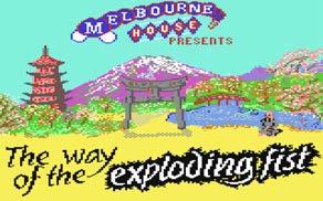
Beam Software, developer; Melbourne House, publisher; Gregg Barnett, designer; Bruce Bayley, additional programming; David Johnston, additional programming; Greg Holland, graphics; Neil Brennan, music
Middle bottom
Horace Goes Skiing, 1982; ZX Spectrum
16/48K, Title Screen.
Beam Software (with Psion), developer; Melbourne House (with Psion), publisher; William Tang, designer; Philip Mitchell, designer
Opposite
The Hobbit, 1982; ZX Spectrum
16/48K, Title Screen.
Beam Software, developer; Melbourne House, publisher; Veronika Megler –designer; Philip Mitchell, designer
Beam Software had to adjust their business model to find publishers willing to take on their games. Games in development at the time of the Mastertronic sale to Virgin were now without a publisher. For example, Aussie Games was not released until 1990, when the uk company US Gold published it. Three years is a long time in the technology driven world of videogames. The delay meant the game not only looked dated on release but missed the spike of interest in Australian culture created by the Crocodile Dundee films (1985 and 1988), and the opportunity to capitalise on the success of its inspiration, Epyx’s sports compilation California Games (1987).
At the end of the 1980s the North American market for games was looking more attractive to Beam Software. The Way of the Exploding Fist (1985) had been very successful on the Commodore 64 there. The Hobbit had done well with its disk releases for Commodore 64, Apple II and ibm through a joint publication deal with Addison Wesley who had marketed the game in a beautiful boxset that contained not only a copy of Tolkien’s book but elegant foldout maps and a comprehensive ‘how-to-play’ manual featuring Tolkien’s own illustrations. This lush presentation had a purpose as the North American market was cautious about budget games.45 North America had experienced a dramatic crash when circa 1983 home videogames escalating sales suddenly plummeted, the market had become oversaturated with

poor quality cheap product and consumers lost faith in the medium. After the ‘crash’ fewer home computer games were being published in the US and players were happy to pay more for what they felt were quality games. The American videogames market confidence was rebuilt by the release of the Nintendo Entertainment System (nes ) in late 1985. Nintendo had strict control over games produced for their system and impressive quality control regimes for software bugs.
Beam saw a chance to really enter the us market by developing for the nes. Through a remarkable and rather risky process in 1988 Beam Software became one the first western games development companies directly accredited by Nintendo to develop games for their console.46
The Melbourne studio shifted from the independence they enjoyed in the era of the microcomputer to working on console games under the very restricted regime of Nintendo. Beam Software entered the 1990s as part of the growing international fee-for-service games development industry. In the nineties videogames grew from being a niche hobby to become a major part of home entertainment. In 1996 Beam Software re-acquired the name Melbourne House (Virgin had let its registration lapse) and the studio remained under the moniker Melbourne House from late 1997 through its various incarnations till its closure in 2010.

52 rmit design archives journal Vol 13 Nº 1 (2023)
Continued
melbourne house: the house of hits 1980s melbourne and the early history of australian videogame design
Epilogue
The work of Melbourne House and Beam Software in the 1980s has help make Melbourne a centre for games development in Australia. Many people from Beam Software went onto to form their own companies in the 1990s, in part establishing the foundations of the Australian games industry.47 Today, Melbourne has a very differently shaped design culture, one formed by the era of digital distribution, the accessibility of the Unity engine and other enabling platforms. In 2023, Melbourne is a city with a global reputation for experimental and innovative game design, a place for critical experimentation, and the incubation of surprise global hits such as the Untitled Goose Game (2019).

Beam Software and Melbourne Houses were pioneers in the 1980s in a new digital design industry. The company’s leadership team Alfred Milgrom and Adam Lancman48 were both very involved in building government recognition and support for videogames as a creative industry in Australia. In 1995 Milgrom was appointed to the inaugural board for Australian Multimedia Enterprise (ame ) who oversaw over half of the 84 million dollar investment by the federal government to build the Australian multimedia industry, part of Paul Keatings 1994 Creative Nation policy. In the early 2000s Adam Lancman, than ceo of the rebranded
Infogrames Melbourne House,49 played a seminal role in the instigation of Film Victoria’s state-based funding for videogames, lobbying for support for local industry.50 It was Film Victoria’s distinctive state-based funding scheme51 that helped sustain a local creative community of gamemaking in Melbourne when the Australian fee-for-service games development industry collapsed after 2007 under the weight of the Global Financial Crisis coupled with shifts in how videogames were made and distributed.52 Melbourne’s current reputation as a place to make games owes much to the 1980s legacy of Beam Software, Melbourne House and the design innovators who worked there. The studio cultivated generations of Australian game developers and from its beginnings in the 1980s, Melbourne House/Beam Software dreamed big for the creative possibilities of this new design medium.
53 rmit design archives journal Vol 13 Nº 1 (2023)
Endnotes
1 Peter Stirling, “Small is Big in the Software Industry,” Business Review Weekly, (1984): 11.
2 In the 1980s the game had to be remade for each system to be compatible with the differing hardware and systems. By the end of the 1980s most personal computers (PC) were based on the IBM chipset and hardware dividing the market between Apple and PC.
3 The Horace series included Hungry Horace, Horace Goes Skiing and Horace and the Spiders. The original game Hungry Horace was programmed by William Tang. Milgrom sent a copy to Psion Software run by academic Dr David Potter, a researcher who worked closely with Sinclair Research. Potter tidied up the game, naming it Hungry Horace. It was Psion’s close relationship with Sinclair Research that saw the first two Horace games packaged with the ZX Spectrum.
4 Bongiorno with his focus on Australia’s political and economic landscape of the era does not linger on technology but videogames get a brief mention, not as new industry as suggested by BRW, but in context of the familiar social anxiety regarding videogames lack of value as a childhood activity. Frank Bongiorno, The Eighties: The Decade that Transformed Australia (2nd ed.), (Collingwood, Vic: Black Inc. Books, 2015).
5 Melanie Swalwell, Homebrew Gaming and the Beginnings of Vernacular Digitality (Cambridge: The MIT Press, 2021).
6 Published in 1975 Mother I’m Rooted was an important local feminist publication. Melbourne House also went on to supported feminist publishing in Australia and in 1980 published Women Sex and Pornography by the Australian academic Beatrice Faust and American activist Lin Farley’s Sexual Shakedown: The Sexual Harassment of Women in the Workplace These are remarkable companions to find at the local origins of Australia’s videogames industry, an industry that is so profoundly male orientated.
7 On its foundation Outback Press was the recipient of $5000 worth of federal literature grants, a funding initiative of the new Whitlam Government that was keen to see Australia develop a local publishing industry.
8 As defined by the Publishers Association, the list of “traditional markets” claimed by the British encompassed the historical British Empire, including countries by the late 1940s no longer under British rule. Mary Nell Bryant, “English Language Publication and the British Traditional Market Agreement.” The Library Quarterly: Information, Community, Policy, Vol 49, no. 4 (1979): 371–98.
9 The antitrust case was led by a group of American publishers working in conjunction with Australian publishers
who had also been agitating for change. Craig Munro and Robyn Sheahan-Bright (eds), Paper Empires: A History of the Book in Australia 1946–2005 (St. Lucia, Qld; University of Queensland Press, 2006).
10 Alfred Milgrom, interview by Helen Stuckey and Noe Harsel, ACMI, April 28, 2006.
11 Alfred Milgrom, interview by Helen Stuckey and Noe Harsel, ACMI, April 28, 2006.
12 Their first publications in 1978 included the novel Appalachee Red by Raymond Andrews, winner of the James Baldwin prize for literature and The Complete Book of Walking
13 Alfred Milgrom, interview by Helen Stuckey and Noe Harsel, ACMI, April 28, 2006.
14 Alfred Milgrom, interview by Helen Stuckey and Noe Harsel, ACMI, April 28, 2006.
15 Peter Stirling, “Small is Big in the Software Industry,” Business Review Weekly, [1984], 11.
16 Contributors included the teenage brothers Mark and Clifford Ramshaw, and Spectrum developer Dr Ian Logon who worked with Sinclair on the ZX, ZX81, QI and ZX80.
17 Beam Software’s name was an amalgam of Milgrom and Besen’s initials.
18 Alfred Milgrom, interview by Helen Stuckey and Noe Harsel, ACMI, April 28, 2006.
19 In the early 1980s all Beam staff were encouraged to write or edit books. Those who received author credits include William Tang, Gregg Barnett, Bruce Bayley, Kevin Bergin, and Andrew Lacey.
20 The Spectrum Microdrive (1983) was translated into German (1984) and Italian (1984). Advanced Spectrum Machine Language (1984) was translated into Spanish (1985) and Italian (1985). The Complete Rom Disassembly (1983) was translated into Portuguese three years after its initial release. “Melbourne House,” World of Spectrum, http://www. worldofspectrum.org/infoseekpub.cgi?rege xp=^Melbourne+House$&loadpics=1.
21 Listings is the term used to describe printed code for computer programs including games that users would type into their computers themselves to run. This was very common with few computers having significant memory, most programs were short and print medium was still the most common means for dissemination of information.
22 Alfred Milgrom, interview transcript, March 1, 2013, provided by Alfred Milgrom.
23 Bernard Boucher, Opalesque, Melbourne House (1982).
24 At one point the Horace games came boxed with the ZX Spectrum, making them many people’s first game.
25 Alfred Milgrom, interview by Helen Stuckey, March 20, 2013.
26 Alfred Milgrom, interview by Helen Stuckey, March 20, 2013.
27 Veronika Megler, personal interview, July 1, 2015.
28 Veronika Megler, personal interview, July 1, 2015.
29 For a full discussion of the The Hobbit see Helen Stuckey, “The Curious World of The Hobbit: An Early Example of a Dynamic Gameworld” in C. Fernández-Vara and B. Foddy (Eds.), Well Played, Vol. 6, Issue 2 (special issue on European videogames of the 1980s), (Carnegie Mellon University: ETC Press, 2016).
30 Veronika Megler and J. Maher, personal communication, October 17, 2013 (shared with the author).
31 Even if the player was too slow to take their turn as ‘time passes’ in the game the other game characters would have another turn.
32 Veronika Megler, personal interview, July 1, 2015.
33 Greg Barnett, Interview by Helen Stuckey, December 29, 2012.
34 The Way of the Exploding Fist is predated by Jordan Mechner’s Apple II release of Karateka (Broderbund, 1984). Karateka is more simplistic in its fight controls. There are also a number of one-on-one arcade fighting games such as the Japanese Karate Champ (Techno, 1984), which was ported to the Apple II and Commodore 64 in 1985.
35 Gregg Barnett, interview by Noe Harsel and Helen Stuckey, video recording, ACMI, April 2006.
36 Edge Retro, “Way of the Exploding Fist,” interview with Gregg Barnett, Retro Gamer (2004), http://www.acornelectron.co.uk/ eug/67/a-expl.html.
37 Created in-house at Beam Software by Andrew Pavlumanolakos. The unexpected scream was to become a favourite part of the game with fans. A games cassette could take over 10mins to load and would frequently fail to load correctly requiring the process to be started again.
38 Ian R. Sinclair’s C for Beginners was the last book published by Melbourne House in 1987.
39 Alfred Milgrom, interview transcript, provided by Alfred Milgrom, March 1, 2013.
40 Alfred Milgrom, interview transcript, provided by Alfred Milgrom, March 1, 2013.
41 NG Alphas, “Melbourne House,” Next Generation, No. 33, (September 1997): 116–8.
54 rmit design archives journal Vol 13 Nº 1 (2023)
42 Beam Software retained rights in Australia to their work and the other games that had been distributed by Melbourne House locally. Personal correspondence, Anthony Guter, January 20–21, 2014.
43 Mastertronic’s accountant of the time Anthony Guter recalls his frustration with the purchase which meant that Mastertronic were now responsible for all the liabilities of Melbourne House UK. The Melbourne House deal committed Mastertronic not just to the games under development at Beam, but others by third parties commissioned by Melbourne House. This meant Mastertronic had to dedicate thousands of pounds to risky games development rather than just purchasing budget games directly. And, while the back catalogue boasted some good sellers like Way of the Exploding Fist, many older titles were now moribund and old stock was being returned by retailers at further cost to Mastertronic. Mastertronic agreed to pay £850,000 for Melbourne House. How much of this was actually paid has not been shared by either party.
44 Guter does not credit the sale to Virgin as the reason for the non-payment of the outstanding instalments. He recalls that Mastertronic felt cheated by the deal for Melbourne House and that CEO Frank Herman, a canny businessman, on discovering he was lumbered with multiple returns and games under development that never materialised or whose development dragged on expensively, became determined not to pay. The sale of Mastertronic to a global behemoth Virgin made it too difficult for Beam to try get the monies owed them. Anthony Guter, personal correspondence, January 21, 2014.
45 See Mark J. P. Wolf, “Introduction” in Before the Crash: Early Videogame History, ed. Mark J. P. Wolf (Detroit: Wayne State University Press 2012), 1-8.
46 How Beam Software became one of the first western accredited Nintendo developers is an impressive story and one that will not fit within this paper. See Helen Stuckey, “How Nintendo Threatened to Destroy the Early Australian Games Industry” at https://playitagainproject. com/how-nintendo-threatened-todestroy-the-early-australian-gameindustry/.
47 The Sydney based game designer and publisher Strategic Studies Group (SSG) founded in 1982 were also important Australian videogames pioneers developing strategy wargames for microcomputers in the 1980s. SSG successfully self-published and distributed their games into the US market. SSG’s Roger Keating was active and highly respected in early US home computing game design circles, notably participating in the legendary early game designer conferences hosted by Chris Crawford.
48 Adam Lancman joined Beam Software in 1982 as their financial director. He was later to become CEO. After the sale of the publishing company Melbourne House in 1987, Lancman travelled internationally constantly to meet with industry and became well known as the business face of Beam Software. (And later the face of Melbourne House when the company reacquired and changed its name in late 1997 to its old publishing house name.)
49 In 1999 the French games development company Infogrames acquired the development studio Melbourne House (previously Beam Software) It was renamed Infogrames Melbourne House. When in 2003 when Infogrames took on the Atari name after buying the company GT Interactive who owned the Atari title it became as Atari Melbourne House. Atari Melbourne House gave the Melbourne design studio a double barrel name for evoking nostalgic affection for early videogame history.
50 In 2000 the author worked at Film Victoria in their Digital Media Fund.
51 Now called Vic Screen, the shape of Victoria’s games funding model has changed dramatically over the decades to meet changes in games design, distribution and creative potential. Lancman would not recognise the fund from the one that he was part of establishing in the early 2000s.
52 The Global Financial Crisis, the high Australian dollar and changes to game production, including a new console cycle and the end of a market for second tier games, destroyed the dominant fee-forservice business model that sustained the Australian Games Industry through the 1990s and 2000s.
55 rmit design archives journal Vol 13 Nº 1 (2023)

56 rmit design archives j ournal Vol 13 Nº 1 (2023)
Computer-Aided Design and Computer Graphics in 1980s Australia: Lyn Tune, Sally Pryor and Andrew Quinn
 Melanie Swalwell
57 rmit design archives journal Vol 13 Nº 1 (2023)

58 rmit design archives journal Vol 13 Nº 1 (2023)
Computer-Aided Design and Computer Graphics in 1980s Australia: Lyn Tune, Sally Pryor and Andrew Quinn
Melanie Swalwell
The 1980s brought new opportunities to use computers in design, particularly for people with both aesthetic and technical skills. In this article, I present historical research on some early computer users in the fields of product design and computer animation. I focus on the careers of three key individuals who were active at the intersection of computing and design in Melbourne, drawing on existing literature, archival research, and interviews: Lyn Tune was an early adopter of cadcam (computer aided design, computer-aided manufacture), while Sally Pryor and Andrew Quinn were the first graduates of a Swinburne course that taught computer animation and went on to work in the commercial field, first in the us and then in Australia. Tune, Pryor and Quinn are notable figures in the 1980s period of creative computing in Australia because in many ways they were ahead of their respective industries in their adoption of digital tools and born-digital design, two critical shifts in design practice in the 1980s.
In addition to early adoption, they were visible and actively experimenting, not only pushing what it was possible to achieve with the then technology but bringing together diverse domains, well before such amalgams as art and technology were taken up as mainstream. Tune and Pryor also reflected on how Australia was positioned and saw itself globally and the significance of computers for the nation at what was a critical juncture in a globalising world.
This essay offers accounts of the careers of these three pioneering individuals, locating their historic practices and achievements against the backdrop of key technical and national policy changes. It draws on research undertaken as part of the author’s Australian Research Council (arc ) Future Fellowship project “Creative Micro-computing in Australia, 1976–92” and accompanies the display of still and moving image artefacts in the “Born Digital and the Emergence of Digital Tools and Design” room of the exhibition Radical Utopia: An Archaeology of a Creative City at RMIT Gallery.1
Lyn Tune
Lyn Tune was an early adopter of microcomputers in the 1980s. After studying at the South Australian School of Art (Fine Art, Graphics and Design) and Torrens College (Drama majoring in production skills, costume design and patternmaking), Tune spent a few years as an art and drama teacher at high school before shifting to adult education and making a name for herself as a designer of
jewellery. Her jewellery pieces are held in major national collections (including the Museum of Applied Arts and Sciences (maas ), the National Gallery of Australia, and the National Gallery of Victoria) and continue to be exhibited (e.g. A Fine Possession (maas, 2014–15)). Tune was active on national arts advisory committees from the late 1970s (including the Crafts Council of nsw, the Crafts Board of the Australia Council, and national committees on Women in the Arts, Multicultural Arts, and the National Crafts Computer Network), was featured in a number of abc tv documentaries, two of which were exhibited in Radical Utopia (2023), Making It (1987) and Review (1989); Tune also published on the significance of the computer as a design tool. While she is well known for her jewellery, the range of products she created and the role of digitality in their design and manufacture has not been widely appreciated, perhaps owing to a limited focus on microcomputers in 1980s creative practice and the fact that many of her designs don’t look digitally designed. Following a car accident, Tune sustained an injury that prevented her from looking down so she pivoted her design practice to explore computing’s potential. She had previously used an Apple Lisa for invoicing and the like, and so began designing on an Apple Macintosh, initially using Power Draw and later Photoshop to set up patterns (she claims to be one of the first five in Australia to have all of what would become the Adobe suite, which was then Macromedia). She would then send these patterns on a
59 rmit design archives journal Vol 13 Nº 1 (2023)
Preceding Pages Still from Dream House (1983), courtesy of the artist. ©2023 Sally Pryor. Opposite Lyn Tune Designs brochure showing light fitting available for purchase at her shop in Armadale, Melbourne, c. 1988, State Library of South Australia.
peer reviewed essay
disk to a laser cutting facility, Laser Tech in Sydney, where materials were cut or stamped to size, into lights, bags and a number of other objects.
Tune absolutely embraced what computers could do. For her, the advantage of using a computer was processoriented. “I didn’t really make anything computer-arty. I was more interested in…how I could do things better, how I could actually cut patterns or make something so that the pieces could all be seen [and to show] how they stuck together.”2
Apart from being a pioneer of cadcam in Australia, Tune was also highly articulate in explaining her thinking through the significance of computer-aided design and also the importance of local cultural products. Evidencing a deep historical understanding of handcrafts and making and the disruptions of previous technologies, she brought a nuanced approach to the intersection between digital design and the material objects she made. In an essay entitled “Hands and Heads: Manufacture Design and Craft in Australia” in the “Art and Technology” special issue of Artlink (1987), also displayed in the rmit Gallery, Tune nuances the issues around mass production and the ‘one-off.’ She sought to reconcile the “qualitative abyss between (expensive and therefore elitist) hand-designed, handcrafting or customised objects and the often ill-conceived, badly-made (but sometimes cheap) mass-produced commodities of manufacturing industry.”3 She argued that a design using computers could produce well designed and thought out solutions, values traditionally associated with the handmade crafts:
I have wanted the tools to be able to mass produce for many years. I enjoy making the conceptual pieces and also the finely finished work but I am a socialist, and I wanted to be able to control the production of objects at a price that was competitive so many people could own
them…I wanted to be able to produce the surface pattern, the cutting pattern and be able to drive the machine to cut out the final objects…[with a] flexibility to change the design after short runs, and not cost a fortune to tool up, [so I used] computer design and laser cutting… Perhaps we can now look again at our relationship with objects. The importance of an article is not just that it is handmade but that it comes from a creative thought process that utilises the qualities of the materials, that it reflects the culture where it was developed and that it is innovative in its design, both physically in how well it works for its purpose, but also in its aesthetic. I feel that a new technology contains the possibility of our being able to design and manufacture within a brief closely aligned with the ethic of craft, and even make a living.4
In Making It (abc tv 1987), we see a repeating monochrome palm tree and dolphins pattern being printed on a noisy dot matrix printer, then having a cutting pattern overlaid onscreen, then appearing as finished earrings in different colour ranges mounted on card, in a retail environment.5 Tune recalls that she switched between programs often. The imagery for the earrings would be screen printed on acrylic from graphics she’d created, initially in Power Draw and later in Photoshop; MacDraw was used for laying out the cutting guides, which were then laser cut into the finished shapes.6

In 1987, Tune says she’s just started manufacturing this way. By 1989, in the television program Review, Tune is clearly more established and explains:
To maintain the high profile that designers need to keep their marketplace, very often the objects are quite expensive, because very well designed solutions require expensive tooling and also materials. I think that it’s also very feasible to produce things which are well designed at the less expensive end of the market. And that’s what I try
60 rmit design archives journal Vol 13 Nº 1 (2023) computer-aided design and computer graphics in 1980s Australia: lyn tune, sally pryor and andrew quinn Continued
Left Lyn Tune Designs brochure (reverse), State Library of South Australia. Opposite Installation view, Radical Utopia: An Archaeology of a Creative City, RMIT Gallery, 2023. Bracelets, Brooch and Earrings, 1986-1987, designer Lyn Tune
to do. I find that much more interesting. I don’t have to prove myself as an artist or a maker of expensive objects anymore. I’ve done that. I’d rather sell in Woolworths.
And a little later in the same program:
I suppose it sounds like too broad a spread—which is one of the criticisms I have of myself is that I tend to look at something and see solutions—but even though they may look very different and like one person can’t do that range successfully, it really is just me sitting in front of a computer and then talking to lots of people and finding a way to do it. It’s just a process.7
In 1988, Tune opened a shop in Melbourne’s Armadale in partnership with a friend. Lyn Tune Designs carried a range of objects Tune had designed using cad and manufactured by laser cutting, including wall hangings, table and standard lamps, mirrors, jewellery, containers, and tables. In an article in the Canberra Times, the then Sydney-based Tune knowingly invoked Sydney-Melbourne rivalry, claiming that “Melbourne knows about design. …In Sydney a style may be in and then out. Things move very quickly but in Melbourne people seem to be more appreciative of style.”8 Several examples from Tune’s range of lamps, objects, and jewellery are included in the exhibition, as well as shown in the videos on display in the gallery. Tune’s range of digitally designed and laser cut lights and a table can also be seen in the publicity still of Lyn Tune’s tables and lights, and her design brochure for her shop in Armadale.

Tune was committed to making design affordable and available to everyday people. She said that while the reception was “quite positive in the shop,” she also sold to Freedom Furniture.
All of [my lighting designs] were made so that they were take-apart-able. I loved the idea of being able to swap things together so I made just about everything like that, because
with a laser you can get that tolerance and so some of them sold really well. Other ones I did as top-end ones, you know, to push myself to see what was possible.9
Tune had strong views on local manufacturing and was reading lots of books on globalisation along with political commentaries. She articulated a distinctive discourse about the new opportunities that technologies were creating for artists. Grace Cochrane quotes her as saying “I…was really irritated by the lack [of] Australian-designed articles and the reliance [on] importing our culture in the form of objects.”10 And there was, she believed, “the potential for artists and intellectuals to contribute to the wealth of the country through their contribution to value-added production and services.”11 She observed that there was “an interest in what new technology could do but there was a lot of fearfulness in the art schools.” She was adamant that students should know how to make patterns and obviously frustrated by the beliefs some people had that earning a living from one’s making was somehow “degrading.”12
In 2019, she told me:
I think it’s really important for artists to connect with people. So, I was very much interested in…the fact that if you connect with people through what you sell and you make things and decide things in your country, that’s actually your culture. It is not just in the galleries. It’s the everyday culture which I was very worried about losing with globalisation and it’s gone. I mean, you know, we manufacture very little anymore.13
Artists getting into high tech business and contributing to the economy was a discourse that governments were actively promulgating in 1980s Australia. Dr Peter Ellyard was the ceo responsible for industry and technology policy during the South Australian Bannon Labor Government and was featured in an abc tv program entitled Business Art (1987) saying:
61 rmit design archives journal Vol 13 Nº 1 (2023)
The challenge is to provide artists with the opportunities first of all to contribute to a modern economy, to take that intellectual property that they have and to learn to transfer that into the products which a modern economy uses, through the use of advanced technology…the artist will develop independent income for the first time, and probably live for the first time in their history, reasonably well. Because artists tend to be, you know, living in garrets and starving to death, don’t they?14
Stereotypes about starving artists aside, talking up innovation and the potential of artists to produce and commercialise intellectual property in a knowledge-based society had obvious appeal to a reforming (neo-liberal) Labor Government. But it seems significant that the discourse was also coming from practitioners such as Tune. In 1987, Ellyard wrote in the Artlink special issue that “In my work I see a lot of wonderful advanced technology being used to do the same thing and make the same products, but not to create new ones…people in industry [are] sitting on potentially creative tools [but] are not utilising these technological tools to their fullest.”15
At the national level, cultural policy as economic policy would, of course, find its fullest expression in the Keating Labor Government’s “Creative Nation” policy.16 But the founding of the Australian Network for Art and Technology (now anat ) in 1988 is inextricably bound up with the discourses that Tune and Ellyard articulated. Indeed, the 1987 special issue of Artlink in which both Tune and Ellyard published was a joint project between anat and Stephanie Britton, the editor of Artlink. Tune was also an anat committee member (in 1988) and later a speaker at anat ’s seventh National Summer School in Computer Generated Art and Interactive Multimedia for Artists in Canberra, in 1996.17 We see the discourse of artists pursuing “opportunities in the economic mainstream” in the report on anat ’s Second National Summer School in cadcam , in 1990. Explicitly for “Artists, Craftworkers, and Designers,” the report enumerates the benefits of the Summer School: For the artists involved, the major benefit is obviously the acquisition of a new body of skills which significantly influences their creative output…and enhances their professional development, and thus their opportunities in the economic mainstream. Most of the involved artists found that the skilling course presented new possibilities for future work direction and have continued to work in the areas of the art/technology/industry interface, in government or semi-government bodies, in industry or as practicing artists.18
In many ways, Tune’s visions of what should have been possible anticipated the current moment. As she remarked in an interview with me in 2019: “now we’re seeing some of the things that I really thought [in the 1980s] were going to come to pass…with 3D printing and…the ability for an artist to actually produce something as a pattern and that pattern could be produced anywhere…and being able to do short runs.”19
Sally Pryor and Andrew Quinn
Sally Pryor and Andrew Quinn were amongst the earliest explorers of the domain of computer animation in Australia. They were part of the 1983 intake to the then Swinburne Institute of Technology’s new Graduate Diploma in Applied Film and Television. The year before, Brian Curtis had made a short ten or twenty second animation, a sort of proof of concept that students could make computer animation. Pryor and Quinn were the first two in the course’s history to make computer animation for any kind of film. At the time, there was no computer animation industry to speak of, with XYZap in Sydney having just been established in 1982. Both Pryor and Quinn credit academic John Bird as being an “innovator,”20 with “incredible enthusiasm.”21 “He could see it coming, clearly, that [computer animation] would be a snowballing [thing].”22 Following their success, Bird got support to develop the Animation and Interactive Media (aim ) Centre. The aim centre would later move to rmit Pryor and Quinn’s backgrounds were different to the rest of the course intake, most of whom were studying classical filmmaking. Both were already earning a living as programmers. Pryor had studied biochemistry, but after working in the field for a few years and doing a short course in biomedical engineering, she had realised: “I really like computers. I’m quite drawn to them.”23 She’d gone on to work for Burroughs Corporation as a Systems Engineer and later Armstrong/Nylex as a Systems Analyst/Programmer.24 Andrew Quinn had studied maths and computer programming at Monash University and had worked as a musician to get through university. He continued as a working musician, only later getting a job as a programmer (in health computing and payroll) when he realised he was missing programming. Quinn heard about the Swinburne course from his friend, Sally Pryor. He’d been very taken by the film Tron (1982), not liking the movie much but loving the look of the computer animations. He’d also seen a presentation from Leigh-Mardon, a firm that printed still frames and animation sequences of line drawings, that had seeded ideas of what computer technology was going to make possible, so that when Pryor told him about the course, he thought “oh yes!”25
Computing was being spruiked as opening new opportunities and it would open many opportunities for creative people with a technical bent, but in the early to mid-1980s, it was not clear just how these would unfold. Both Pryor and Quinn remarked to me, separately, that convergences between different areas that we now take for granted had not yet happened, particularly between creativity and technology. Therefore, at the course admission interview, Quinn recalls that he talked about his life in music and showed some story boards of sequences he’d like to make to demonstrate that he had the requisite creative vision (everyone was happy to assume he had the technical ability). Pryor meanwhile had presented herself as an artist, but as a woman she had to work to convince them that she had the technical ability, despite having been employed in the computer sector for several years.26
62 rmit design archives journal Vol 13 Nº 1 (2023)
Continued
computer-aided design and computer graphics in 1980s Australia: lyn tune, sally pryor and andrew quinn
Opposite Andrew Quinn, still from Waltz Mambo (1983), courtesy of the artist.
Sally Pryor’s graduation film was Dream House (1983) and Quinn’s was Waltz Mambo (1983). Both films are made of wire frame shapes. They first drew the shapes on graph paper, then entered the coordinate points by hand into the computer to generate a still, which then had to be made to move. It was “really tedious” work.27. Their films were made on a cad system from the Manufacturing Engineering Department, running a program called Movie byu that had been written for cadcam modelling at Brigham Young University.28

Old friends, Pryor and Quinn told the story collaboratively in an interview with Helen Stuckey in 2008. Pryor first explained:
It was a system set up to model engineering parts. It couldn’t do any real time playback. It had to flash and erase the screen each time it redrew it in those green neon lines. It was only wireframe, no coloured in things. If you wanted to actually see something moving, you had to record it in some way, and the way they did it was to send it off to a very expensive commercial printer who used to print magazines, I think, called Leigh-Mardon… John Bird figured out a way for us to do real time animation. He got a surveillance camera and he dummied it up so that you could set it up, take a shot at a time, and you would walk off for 3 hours and come back and there’d be 3 seconds of moving image playing on a screen this size with a bar going through it.
Quinn: These people [Leigh-Mardon] were putting it onto film themselves, even though they were a still printing company, and they realised that you could shoot a frame at a time and produce the animation.
Pryor again: But it was horrendously expensive, and we were only allowed one shot at it in our course, at the end, and we didn’t get any second chances.
Quinn: In fact most of our budget went on the print.
Pryor: To put any colour in—that was only films as white lines on black. We had to put it through the optical printer and put in gels and filters.29
Both received grants from Film Victoria which paid for the printing onto 16mm film. In the letter to Pryor, Film Victoria’s Director Terence McMahon laments the fact that “no similar industry exists in Australia and that such migration of talent is necessary.”30
Pryor wanted to make “hot and personal stuff.” Dream House offers a tour of the mind, expressed as a house.31 She recalls it being challenging to make a creative film with something that was designed to model screws.32 The film was screened at the 1984 siggraph Electronic Theatre, and many international video festivals.33
Quinn’s music background saw him create his visuals to go with a piece of music. The imagery is very abstract, opening with elegant wireframe cones and other shapes moving through geometric space; this transitions to a sequence with stylised wireframe quasi-humanoid figures gliding around and musical instruments in a jazzy bar scene. He related the story of the making of Waltz Mambo in a recent TEDx talk:
I’d written a piece, a sort of drunken waltz, on a 4 track recorder and I had to create my visuals. So the music I’d written inspired my visuals. I started to see things when I listened to music. I created my piece and it was like a
63 rmit design archives journal Vol 13 Nº 1 (2023)

64 rmit design archives journal Vol 13 Nº 1 (2023) computer-aided design and computer graphics in 1980s Australia: lyn tune, sally pryor and andrew quinn Continued
feedback process: I had the ideas listening to my music; it created this visual, based on the technology we had at the time (we’re talking early 80s here, computer graphics had just started). And the film was born. But it was my first experience of the process of visuals and music.34
Waltz Mambo would be nominated for an afi award. While it was Quinn’s first experience of writing music and then making images to go with the music, an interest in the relations between visuals and music would become a central part of his process, right up to his present day collaborations: “video installations for multi screen and immersive environments and also digital graphics for interactive dance productions and contemporary music.”35
While their work was not immediately embraced by the traditional animators in the course, “we didn’t care.”36 However, the nascent computer graphics/computer animation field was generating a lot of interest in the early 1980s, and Quinn and Pryor were enthusiastic participants in several Australian events that featured international guest speakers. Pryor had been encouraged to volunteer at the tenth Australian Computer Conference, held in Melbourne in 1983 (by Kate Behan, whom she’d read about in a feature in The Age about women working in computers). That year, Wayne Carlson was the visiting international speaker. He was the manager of Cranston Csuri, which was one of the leading companies in computer animation in the us at the time. After Carlson’s talk, Pryor approached Carlson and she and Quinn invited him to see their work.37 Quinn picked him up the next day and took him out to Swinburne. He was impressed with what they had produced with the equipment they were using and he offered them employment at the Columbus, Ohio company. This was a big break for both Pryor and Quinn who were aware that there was very little work in Australia. There wasn’t an industry as yet, with just one company, XYZap, which was established in Sydney in 1982 that they visited.38 As Quinn describes it, Carlson was “desperately trying to find graduates to fuel the snowballing of computer animation that was happening in America.”39
Before they left for the us, Pryor and Quinn also created an opener for Countdown (1984), the ABC popular music show fronted by Molly Meldrum.40 Pryor describes it as “the proudest moment... Countdown was the coolest show; it was just a part of everybody’s Sunday night. The tragedy was that I only ever got to see my name on the Countdown credits just once before I went off to America to start my new job.”41
Documentary photographs from the era show printouts of screens from Pryor’s Dream House and Quinn’s Waltz Mambo stuck on a wall. Beside Carlson’s visit in 1983, they also capture another international visitor, Alvy Ray Smith, then at Lucasfilm, who came to speak at ausgraph , the annual Australasian Computer Graphics Association Conference in 1984.42 Apart from highlighting the importance of international connections at that time, these photographs are also reminiscent of a certain cultural cringe, according to Pryor:
We [Australians] had a real feeling that we weren’t as good in those days as what was going on overseas, and if you went to overseas, you’d ‘made it’…the cultural cringe was a really big thing and we were really concerned that we weren’t as good. I don’t think anyone buys that anymore; the best in Australia is the best globally…Andrew would have been amongst the best there [at Cranston Csuri] for sure.43
During their time working in the US, Quinn and Pryor were still active contributors to the nascent Australian computer animation scene. For example, Pryor put together a screening program of 3D animation for ausgraph , based on what had been shown at siggraph , and created station IDs for the Australian abc in 1985 and 1986.44
Cranston Csuri was a special effects firm based in Ohio that Chuck Csuri had set up with Robert Cranston Kanuth. Cranston Csuri had written all their own software. Pryor and Quinn went to work there in 1984, and were essentially thrown in to learn ‘on the job.’45 Special effects were presented in the period as being incredibly exciting: “All those wonderful effects we’ve seen in Tron, Star Wars, and Star Trek, as well as on tv shows like Knight Rider and TV commercials, are showing the public a world of exciting visual effects combined with live action which wasn’t conceivable without the technology of computer-generated animation.”46 However, the high price tag meant that few could afford such effects and so the commercial special effects industry largely catered to the world of advertising, logos and television station identifiers or “idents.” As Pryor explains:
We were making ads for the Republican Party and companies that sold armaments and horse races. In those days, that stuff was extremely expensive so…companies would pay for these ads as a way of showing ‘Look how cutting edge and ‘now’ we are’…it really was only for large corporations. There was never a message that I felt I was behind, that I was communicating. So, I found it hard to use my full range of creativity with the expensive stuff. You had to make schlock because no one could afford to pay for it except for you know, top-and-tails, logo flips; mostly logo flips—that’s all you got to do, flip logos—fly them, zoom them, crash them, bash them.47
Pryor yearned to do something more creative. In her downtime at Cranston Csuri, she was creating images of her own. One of these, Trompe l’Oeil II was selected for the siggraph 1985 art show and appeared on the catalogue’s cover. Another two of her images would be published in Artlink in 1987 accompanying the short text “Image Through Process,” in which Pryor described her process for creating the image-scanning a 1950s magazine cover, then writing a program for processing the image and using a paint program to touch it up, block in a face shape, add text to it, rebuild it without every other scan line, move portions of the screen around, and combine the two pictures in a 50% mix—publishing an intermediate version of the image, as well as the finished image. Pryor pronounced the image, entitled One Nuclear Bomb Could Ruin Your Whole Day, “fragmented yet personal.” Even despite the detailed
65 rmit design archives journal Vol 13 Nº 1 (2023)
Opposite Sally Pryor, Trompe l’Oeil II (1984), courtesy of the artist.
description of process, Pryor’s image was misclassified and included in the “New Video” section of the special issue.48 As she reflected, “I did the whole thing on a computer; there’s no video involved at all. But that’s just those times.”49
Quinn was also doing his own work while at Cranston Csuri. He explained to me in an interview:
A still of mine ended up in time magazine—I think everyone was very put out. It was a feature on computer graphics (c. 1985). It was a feature on the new art form of computer graphics, including Industrial Light and Magic—they were doing some fantastic stuff, even back then...And Pixar was just starting: the lamps—Luxo Jr (1986)—had just come out, which got them going.50 This was before Toy Story (which is Alvy Ray Smith). So the feature was about computer graphics in America, and they listed all the companies. And Cranston Csuri had sent a stack of images…they sent off quite a few of their commercial ones and included in this they’d slipped in this one of my silly character with Edna Everage glasses and that’s the one they chose for time magazine, because of course it was a bit more interesting than nfl or Superbowl: a silver football or Edna Everage glasses— choices!51
Quinn was headhunted by the Video Paint Brush Company (VPB), a digital production company set up by another Swinburne graduate, Jean Marc le Pechoux.52 Video Paint Brush had offices in both Melbourne and Sydney, and later became Animal Logic. Pryor also returned to Australia and had stints working at several SFX firms, including Video Paint Brush (1986–87), then Integrated Arts (1987–88) and XYZap Productions (1989).53 Things were changing in 1986, as she recalled, “you were just starting to be able to buy software off the shelf”.54 This played a part in the demise of Cranston Csuri, according to Quinn: “it [the software] became available off the shelf…so it wasn’t now the domain of the universities. It was open to the public and everyone moved into a growing market.”55
While at vpb, Pryor continued to work on her art projects, including making Computers are Fun (1988), an experimental video artwork showing Barbie confidently manipulating the computer; Quinn did the soundtrack for this, and artist Jill Scott gets a credit.56 Both Pryor and Quinn collaborated with Scott on some of her videos, using vpb equipment in down time. While at vpb Pryor also created the opener for Women in 88 that is screening in the rmit Gallery. She was also making animations with an early Amiga microcomputer she’d brought back from the us in her luggage but remarked that “I couldn’t have made anything to look as crisp and clean as that using the Amiga.”57
Reflecting on the careers of Tune, Pryor and Quinn offers a chance to explore the significance of these early practitioners in two areas of design that we now largely take for granted—computer aided design and computer assisted manufacture, and 3D computer animation.
Tune’s history adds texture and nuance to both the histories of microcomputing and product design, as well as
providing real world contexts for the use of software such as Photoshop, beyond the more familiar field of graphic design.58 Her use of digital design tools to create material objects that were somewhere between mass produced and individually designed exemplified the discourse that governments of the era were pushing: that getting creatives into high tech would be an important driver of innovation and economic independence. The national broadcaster seems to have been keen to support such messaging.
Pryor and Quinn’s careers in the 1980s offer a glimpse into the early years of born-digital design in Australia. The local history of the computer graphics industry has not been covered in the usual histories of animation; Dan Torre and Lienors Torre’s book on the history of Australian animation gives only the briefest of glosses to one company, XYZap.59 One has to look in industry and electronics journals to find more.60 In a May 1988 piece in Cinema Papers, Fred Harden, a Video Paint Brush employee, wrote that “this year’s crop of logos should be a turning point in the design for Australian television broadcasting.” As well as detailing the new abc logo that vpb had created for the Australian Broadcasting Corporation, Harden complained about the lack of support for the local industry from the television stations, many of whom were still sending their station ident work to the us to be done. “To me it’s surprising that, at a time when the call to develop our Australian industry is thought to be the only way we can survive economically, two of the four major networks don’t consider it a priority.”61
Beyond the brief account I have offered here into Pryor and Quinn’s contributions, a history of computer animation in Australia remains to be written.
acknowledgements
This research was funded by the Australian Government through the Australian Research Council.
66 rmit design archives journal Vol 13 Nº 1 (2023) computer-aided design and computer graphics in 1980s Australia: lyn tune, sally pryor and andrew quinn Continued
Endnotes
1 Radical Utopia: An Archaeology of a Creative City, curated by Harriet Edquist and Helen Stuckey (RMIT Gallery, February 21–May 28, 2023).
2 Lyn Tune, interview by Melanie Swalwell, Ocean Shores, NSW, October 3, 2019.
3 Lyn Tune, “Hands and Heads: Manufacture, Design and Craft in Australia,” Artlink 7, no. 2–3 (1987): 77–81.
4 Lyn Tune cited in Grace Cochrane, The Crafts Movement in Australia: A History, (Kensington, NSW: UNSW Press, 1992), 325.
5 Making It, Episode 3, ABC TV, 1987, ABC Archives Accession no. 144867.
6 Lyn Tune, email correspondence, January 18, 2023.
7 Review, ABC TV, 1989, ABC Archives Accession no. 119673.
8 Peter Davis, “‘Maker’ in Tune with Art,” The Canberra Times, October 29, (1988).
9 Tune, interview by Swalwell, 2019.
10 Cochrane, The Crafts Movement, 325.
11 Davis, “‘Maker’ in Tune with Art.”
12 Jane Gilmour, “Politics of Production,” Broadsheet, (1988).
13 Tune, interview by Swalwell, 2019.
14 Business Art, ABC TV, 1987, ABC Archives Accession no. 52404.
15 Peter Ellyard, “Artists Technology and Economic Survival,” Artlink 7, no. 2–3 (1987): 27-28. In 1988, Ellyard would be appointed CEO of Australia’s Commission for the Future, a major initiative of the Hawke Labor Government whose terms of reference explicitly included “promot[ing] community awareness and understanding of developments in science and technology and their potential impact on Australia in the future.” Editorial, “Wither the Commission for the Future?” Prometheus 3, no. 2 (1985): 212-214, https:// doi.org/10.1080/08109028508628989, accessed January 17, 2023.
16 Department of Communication and the Arts, Creative Nation: Commonwealth Cultural Policy (1994), https://webarchive. nla.gov.au/awa/20031203235148/http:// www.nla.gov.au/creative.nation/contents. html.
17 “1996 National Summer School,” Scanlines: Media Art in Australia Since the 1960s, http://scanlines.net/event/1996-nationalsummer-school, accessed January 17, 2023.
18 Australian Network for Art and Technology, ANAT Second National Summer School in CADCAM for Artists, Craftsworkers, Designers (Adelaide, ANAT, 1990).
19 Tune, interview by Swalwell, 2019.
20 Sally Pryor, interview by Melanie Swalwell, Coffs Harbour, NSW, November 17, 2019.
21 Andrew Quinn, interview by Melanie Swalwell, Melbourne, Vic, January 2, 2020.
22 Quinn, interview by Swalwell, 2020.
23 Pryor, interview by Swalwell, 2019.
24 “Sally Pryor PhD,” http://www.sallypryor. com/CV.html, accessed January 17, 2023.
25 Quinn, interview by Swalwell, 2020.
26 Quinn, interview by Swalwell, 2020.
27 Quinn, interview by Swalwell, 2020.
28 Pryor, interview by Swalwell, 2019.
29 Sally Pryor and Andrew Quinn, interview by Helen Stuckey, January 21, 2008.
30 Terence McMahon, letter to Sally Pryor, January 23, 1984.
31 Sally Pryor, Dream House, 1983, video, 00:02:33, http://www.sallypryor.com/ works/dream.html, accessed January 17, 2023.
32 Pryor, interview by Swalwell, 2019.
33 Pryor, Dream House
34 Andrew Quinn, “Who Sees Things When They Listen to Music?” TEDx Varese, 2019, video, 00:14:41, https://www.ted.com/ talks/andrew_quinn_who_sees_things_ when_they_listen_to_music, accessed January 17, 2023.
35 “Bio,” Andrew Quinn (website), http:// andrewquinn.org/?page_id=7, accessed January 17, 2023.
36 Quinn, interview by Swalwell, 2020.
37 Pryor, interview by Swalwell, 2019.
38 Quinn, interview by Swalwell, 2020; Dan Torre and Lienors Torre, Australian Animation: An International History, (Cham. Switzerland: Palgrave Macmillan, 2018), 196-7; Robyn Hughes, “A New Era in Computer Graphics,” Electronics Today International, January, (1987).
39 Quinn, interview by Swalwell, 2020.
40 Andrew Quinn, Sally Pryor, Countdown (Australia) Introduction– 1984, 1984, John Bird, producer, Philip Cordingley, ABC art direction, Swinburne Film and Television, YouTube video 00:00:23, https://www. youtube.com/watch?v=pbBTuCiC_3g, accessed January 17, 2023.
41 Pryor, interview by Swalwell, 2019.
42 Hughes, “A New Era.”
43 Pryor, interview by Swalwell, 2019.
44 Pryor, interview by Swalwell, 2019; Pryor, email correspondence, December 19 2022.
45 Quinn, interview by Swalwell, 2020.
46 Hughes, “A New Era,” 11, 13.
47 Pryor, interview by Swalwell, 2019.
48 Sally Pryor, “Image Through Process,” Artlink 7, Vol. 7, no. 2-3, January 1987: 48.
49 Pryor, interview by Swalwell, 2019.
50 Pixar, “Luxo Jr” YouTube video 00:02:08, https://www.youtube.com/ watch?v=FI0T0Oj7WFE, accessed January 17, 2023.
51 Quinn, interview by Swalwell, 2020.
52 Pryor, interview by Swalwell, 2019; Fred Harden, “High Tack: The Computer Animated Logo,” Cinema Papers (May 1988): 66, n.2.
53 “Sally Pryor PhD”.
54 Pryor, interview by Swalwell, 2019.
55 Quinn, interview by Swalwell, 2020.
56 Sally Pryor, Computers Are Fun, 1988, YouTube video 00:02:13, http://www. sallypryor.com/works/fun.html, accessed January 17, 2023.
57 Two of Pryor’s many Amiga animations are on her website: Sally Pryor, Live Machine and Globocard, 1990, http:// www.sallypryor.com/works/Amiga.html, accessed January 17, 2023.
58 Philip B. Meggs, Alston W. Meggs, “The Digital Revolution and Beyond,” History of Graphic Design (New York: John Wiley & Sons. 2016): 570–619; Teal Triggs, “Graphic Design History: Past, Present, and Future,” Design Issues 27, no. 1 (Winter 2011): 3–6.
59 Torre and Torre, Australian Animation, 196–7.
60 Hughes “A New Era” 1987; Fred Harden, “Movies by Microchip: Harry, Meet Max,” Cinema Papers, 61 (January 1987): 64-66; Harden, “High Tack”: 62-66.
61 Harden, “High Tack,” 62. Pryor acknowledged that they did the wave form idents for the ABC while at Cranston Csuri in 1985 and 1986, but gives a different reading: “they knew we were there so they came to us to get it.” Sally Pryor, Interview by Swalwell, 2019.
67 rmit design archives journal Vol 13 Nº 1 (2023)

Making Experimental Workplaces: Backyard Press and Champion Books
 Marius Foley

70 rmit design archives journal Vol 13 Nº 1 (2023)
Making Experimental Workplaces: Backyard Press and Champion Books
Marius Foley
Backyard Press and Champion Books were two print and publishing collectives that were set up in the late 1970s. These collectives represented a shift in cultural movements, as small producer groups began to form in order to create new cultural and activist workplaces and to explore new ways of working together, based on principles of equity, feminism, and cultural experimentation. Ted Hopkins, Sharon Hill and Paul Greene were instrumental in setting up Backyard Press and Champion Books in 1976. I was drawn to their ambitions and the work they were producing and joined shortly after. My main motivation was to experiment with different ways of working collaboratively. This is the story of how Backyard Press and other social action and producer groups aligned with the Victorian State Government, through its Cooperative Development Program.
Hidden in the remnant work documents and ephemera that I found when researching the early years of Backyard Press was a reference to the “job bag.”1 This seemingly insignificant object, which accompanied each print job through the production process, was also a symbol of the flow of relationships within the collective and how a selfmanaged, worker cooperative operated.
The job bag was a paper envelope printed with a form on the front to capture all the information required to take a print job from the client through all the stages in the process—logging the job; pre-press (plate making); printing; finishing (trimming and binding); invoicing and delivery. The team added information and material to the job bag as it moved through the production process, creating a paper trail that allowed each participant in the chain to see where the job was at any time and what they needed to do when it came to them.
Being a fully analogue print process the job bag was a physical presence, multiplied by the number of jobs moving through the process at any time. The job bag also moved through physical spaces, tracing the workflow. Backyard Press was housed in two houses in Greville Street in Prahran. This inner Melbourne street, a centre of the emergent sub-culture in music, art, and fashion, was recently documented in Judith Buckrich’s book, The World is One Kilometre: Greville Street, Prahran 2
One property was a large two-storey home with a front room that served as the client and pre-press room, ten other rooms, one where they did the small offset printing, and a
two storey out building where the guillotine was housed. The other, a terrace house, with a middle room that acted as the darkroom, opening to the kitchen and outside to the garage, where the screen-print table and mid-format print machine were housed. The job bag moved forward and back through those rooms, depending on what was being done and if there were late changes or additions.
The job bag also played a role as a manifestation of the self-managed worker cooperative that Backyard Press was evolving into. The job bag became a sign of the trust and independence given to each member of the collective and the accountability held for each individual’s part in the workflow. It was a performative artefact. The bag was prosaic in the information it contained yet managed to communicate at other levels such as the need for urgency, notes on the client, or suggestions for improvements. Mark Elliot, in his 2007 PhD on stigmergic collaboration 3 talks about the way ants leave “notes” in the environment to instruct the next in line to carry on the work. In a sense, the job bag kept the print job moving while activating collaboration in a similar stigmergic, note-passing manner. In the self-managed model it was important to have clear definitions of roles and minimal oversight, while accountability was baked into the system. This was enhanced by a pattern of meetings, from daily work-in-progress meetings for immediate items to bi-annual decision-making sessions to confer on large-scale decisions that directed the operation, approved purchases and laid out future projects. Backyard Press worked on a consensus model.
71 rmit design archives journal Vol 13 Nº 1 (2023)
Preceding Pages Teledex, author, Ted Hopkins, 1980, designer Paul Greene, publisher, Champion Books, printer Backyard Press, RMIT Design Archives ©2023 Ted Hopkins. Opposite Backyard Press Staff, 54 Greville Street, Prahran, L to R: Chris White, Marius Foley, Mark Carter, and Paul Greene, c. 1979, photographer, David Rae courtesy Marius Foley.
peer reviewed essay
Backyard Press and Champion Books
Backyard Press and Champion Books were sibling and co-located organisations that had two independent yet co-existing drivers for what the organisations did and who they attracted. Melbourne, in this period, was alive with new activity in the arts, theatre, music, politics and social activism, as well as a generation of people who experienced the potential of the short lived Whitlam Labor Government and its conservative backlash in the form of the Fraser “life wasn’t meant to be easy” Liberal Government. A recession was looming, nuclear armaments were threatening, and neo-liberalism was sweeping through politics. Yet, at the same time, a new image of how people could make change by creating new workplaces and cultures was taking shape.
Backyard Press was established as a commercial venture with the idea of building the resources and finances to support an experimental publishing venture, Champion Books. Backyard Press had a rapidly developing market in the live music scene in Melbourne. Many of the performers lived in the street and played locally. Backyard Press found success in the burgeoning scene, by providing cheap and no-questions-asked print services to new bands.
Initially, bands would order runs of 500 single-color A5 pamphlets, the standard order for bands that had a gig on a Friday or Saturday night. We quickly grew to a core working group of seven: Ted Hopkins, David Rae, Cathy Matton, Chris White, Ian Robertson, Angelika Oheme, and myself. The group became the basis of the nascent worker collective.
As the music scene expanded, so did the demand for Backyard Press’ services. Bands began requesting larger quantities, bigger poster sizes, and more high-quality work. New bands became established (Mondo Rock; Steven Cummins and The Sports; Goanna Band and many others).
With the rise of these bands and larger venues, as well as more music promoters and the international circuit, the need for larger machinery, more staff, and stronger expertise across all aspects of the business became necessary. We didn’t anticipate the success that would come with the growing market and how it would drive the business. However, we had thought deeply about the type of workplace we wanted to generate. The collective structure followed our political ambitions to work well together, produce work with purpose and self-manage our own activities. The way we organized ourselves became as important as the work we produced. We wanted to design an alternative way of working and making, that didn’t rely on exploitative low wages and poor working conditions.
At the time, we commissioned independent researcher Stan Anson to write the history of Backyard Press4 (as the result of a grant mentioned below). Anson extrapolated a sequence of motives that drove the way Backyard Press operated, shaping everything from the way the workplace was structured to the final products produced. The first motive was the desire for an autonomous and democratic workplace. This was followed by the need for a viable source of livelihood for all members. The third was the importance placed on the craft of producing printed material. The fourth motive was the desire for access to means of self-expression, which allowed for enhanced creativity and innovation within the collective. The fifth was the importance placed on a broad congruence of extra-enterprise views and values, which helped to ensure that all members of the organisation were working towards a common goal with a shared set of political and social orientations.
Champion Books was established to publish alternative and experimental ‘book works.’ The two entities, Backyard Press

72 rmit design archives journal Vol 13 Nº 1 (2023) making experimental workplaces: backyard press and champion books Continued
Left Heidelberg KORS 20” x 30” printing machine arriving at rear of 54 Greville Street, c. 1980s, unknown photographer, courtesy Marius Foley. Opposite The Book of Slab, 1982, compilers, Ted Hopkins and SLAB, publisher Champion Books, RMIT Design Archives, Gift of Ted Hopkins, 2010 © 2023 Ted Hopkins.


73 rmit design archives journal Vol 13 Nº 1 (2023)
and Champion Books, were structured differently and had slightly different communities around each, although they shared the workplace, resources, and some members.
Champion Books drew together a number of authors, photographers, and bookmakers who were eager to publish work that they couldn’t through conventional publishing houses. Champion Books rarely sought or received government arts funding via the Australia Council Literature Board or local State Government funding bodies. The experimental works we published didn’t fit the parameters set by the funders. Instead, the work was supported by the income and resources that Backyard Press contributed. Some of the works included Peter Lysiostis’ Industrial Woman (with Vivienne Mehes and Jas H. Duke), Journey of a Wise Electron and Other Stories, and Three Cheers for Civilization; Ted Hopkins’ The Book of Slab, Teledex, and The Yallourn Stories; Paul Greene’s Business as Usual, and Sally Morrison’s Who’s Taking You to the Dance?.
Overall, the works were experiments in the form of the book. Teledex, for example, took the form of a telephone teledex, a simple mechanical device for storing names and telephone numbers, which sat by the landline phone. In Teledex, the poems were listed alphabetically, and tabbed for easy access. The Book of Slab contained a pink vinyl pressing of a single recording of Slab Goes Italiano, inserted into the book, along with a collection of paper samples, dye cuts and other print effects, all used to develop the narrative of Slab. In Peter Lyssiotis’ Journey of a Wise Electron, we used a technique called duotone, printing two slightly different black inks (black and dark grey) to reproduce the photomontages in a richer tonal range. We were interested in what the materials did and how they could be orchestrated into a book form, and what that did to the book as a sensory artefact and how it communicated beyond words and images.

As a small publisher, we relied on word-of-mouth and book launches to promote and circulate the works. Often the book launches were a performance work, such as using the live recreation of Burnie Briquette, the advertising mascot of the then sec (State Electricity Commission), to launch The Yallourn Stories and the launch of Moon Poems at the Richmond Swimming Pool.

74 rmit design archives journal Vol 13 Nº 1 (2023)
making experimental workplaces: backyard press and champion books Continued
Alongside Backyard Press and Champion Books were informal groups of people who were connected in some way and were active in their own fields of social action. These included the rascals (Rational and Sane Citizens Against Liberal Stupidity) who produced campaign posters and ephemera around the time of the 1980 Federal Election; Turn The Tide, a successful residents action group that gained control of the St Kilda Town Council; St Kilda Shout, the ‘local’ paper; Australian Surrealists, which produced printed artworks; as well as numerous individuals who used the screen-printing facility and other resources to produce artworks and political and social campaign material.5
Our ethos was to share our expertise and resources with others, driven by both a desire to contribute to various movements and a belief that this is the best way for communities of practice to form and drive change. This approach had the added advantage of generating reciprocal benefits, including increased cross-promotion of our work, and the expansion of our social networks in the arts and cultural spaces. The diverse arts, music, print, media and social action groups were scattered across Melbourne and other cities; community radio was establishing itself here—3cr gained its license in 1975; 3rrr began as 3rmt out of rmit in 1976—and the loose connections were largely social. The groups represented in this journal show a growing market of cultural producers and the need to build a connecting infrastructure through media, events, and actions. At Backyard Press and Champion Books, we were determined to merge the motives of autonomous and democratic work organisation with access to means of self-expression in their workplace, that is outlined above in Anson’s sequence of motives. It was a work-in-progress throughout our operation, as it was for many other small media and publishing ventures at the time. These ventures were driven by a variety of motivations, from political campaigns to opening access to new ways of expressing different ideas. There were small screen-print groups such as Bloody Good Graffix, Jillposters and Another Planet who produced short-run posters to paste on walls on Melbourne streets. Walker Press, a small-offset printer, serviced almost all the political campaign movements such as Aboriginal Land Rights, feminist movements, student rights, antidevelopment, and freeway movements with fast turnaround print materials. Bluestone Graphics and Correctline Graphics supported the publication of gay and lesbian
rights materials. Organisations such as Open Channel set up to build expertise in video making and community radio stations such as 3rrr and 3cr gave voice to alternative news services as well as the alternative live music, fashion, and cultural scenes.
However, a common thread among most of these ventures was that the work was done on a subsistence basis, often eking out small commissions and raising funds to support the organisation and their productions.
The Victorian State Government and the Cooperative Development Program
During the time when Backyard Press was growing, the country was facing high unemployment and a stubborn recession. This was the time between the divisive sacking of the Whitlam Labor Government in 19756 and the large-scale economic modernisation of the Hawke Labor Government7, elected in 1983.
Despite the challenging economic environment, Backyard Press was able to employ around 7–10 people on a regular, if low-income, basis. However, the lack of options to fund the growth of the business was a major limitation. Venture capital was not available for small scale ventures and commercial banks were conservative in their lending practices, often requiring assets to secure loans, which the company did not have.
As a progressive initiative to build new, sustainable employment models, the Victorian Government established the Cooperative Development Program (cdp ). The program was initiated by Liberal Minister for Employment, Brian Dixon before the 1982 state election, and carried forward by the incoming Labor Government of Premier John Cain.8 The program’s goal was to fund small cooperatives to build employment opportunities and act as a small business training program.
The alignment between Backyard’s collective, self-managed workplace and the cooperative structure put forward by the CDP was a good fit. Backyard Press was able to secure a grant of $70,000 from the first round in the program to consolidate the business and convert it into a formal worker cooperative.
The grant allowed Backyard Press to clear debts, improve cash flow and establish good employment practices. The
Opposite He Lies and he knows he lies, poster design by Paul Greene, screen print for the RASCALS, 1980 Federal election, courtesy David Rae.
Opposite top Teledex, author, Ted Hopkins, 1980, designer Paul Greene, publisher, Champion Books, printer Backyard Press, RMIT Design Archives ©2023 Ted Hopkins. Above Journey of a Wise Electron and other stories, 1981, author, Peter Lyssiotis, printer, Backyard Press, publisher, Champion Books, RMIT Design Archives © 2023 Peter Lyssiotis.

75 rmit design archives journal Vol 13 Nº 1 (2023)


76 rmit design archives journal Vol 13 Nº 1 (2023) making experimental workplaces: backyard press and champion books Continued
Top David Rae, Backyard Press, setting up the Roland Press for large format printing, c. 1980s, unknown photographer, courtesy Marius Foley
Bottom Rainer Linz, Backyard Press, sorting posters from the Press, c. 1980s, unknown photographer, courtesy David Rae.
company was also able to invest in capital and grow the business further. A subsequent grant allowed the press to enter a partnership with Versaprint and expand the scale and quantity of posters it could produce. This gave the press the ability to print large format posters and meet the demands of the music industry which was now a significant market for the press.
Financial stability was a new experience for us. At the time, we used the ‘leather jacket index’ as a way to identify who in our networks had received one of several employment grants on offer. Those with a regular income could afford to buy a new leather jacket or similar luxury. This was indicative of a sense of optimism that came with being able to be employed as well as doing what we wanted to do in terms of supporting our values.
Nevertheless, shifting from a self-managed collective structure working outside of the mainstream into a formal cooperative business was a new challenge. Inevitably, there was a period of adjustment as the relationship between Backyard Press and the government department, as well as other groups such as unions and training organisations, was new and all parties had their own agendas.
The following reflection is based on two evaluation documents of the government program, the Evaluation Study of the CDP9 by Brian Innes-Will, Cruickshank Management Resources Pty Ltd, and A Review of Worker Co-Operative Development Agencies in Australia by Brian Greer. 10
The commissioned a “history” of Backyard Press11, written by Stan Anson with contribution from Chris White, was one of the deliverables for the second grant from the cdp. This document only reached draft form and wasn’t published. However, it shows insights into the thinking within the group at the time (including the foresight to write a contemporaneous history). In addition, a number of journals published during the period give a picture of the ‘co-operative movement’ that coalesced around the cdp funding initiative.
The Victorian Cooperative Development Program
When the Victorian Labor Party took over the Cooperative Development Program (cdp ), it placed two new emphases on the fund that were not in the original program: industrial democracy and alignment to trade union rights and conditions. This differed from the program being offered in New South Wales at the time. The Victorian version of the program, which included worker cooperatives, emphasized the need for award wages, protection for workers, and health and safety conditions.
The cdp organizers worked closely with the Co-operative Federation of Victoria to align funded projects with the existing infrastructure. Worker-controlled cooperatives were not well-established in the Australian context, so international examples were drawn on for well-developed structures and regulations. One example was the Mondragon12 cooperative in Basque, Spain, which had been operating since the mid-fifties and had a clear system based on granular-level self-management and worker democracy,
along with a social business model. It was a large and successful organisation with over 70,000 members. The Mondragon cooperative was an exemplar of the necessity to align government policy with the transformative intentions of the organisation. Dan Hill, author of Dark Matter and Trojan Horses notes that the dark matter, in this case the policy and conventions that sit behind the way an economy operates within its context, can determine what change can be made.13 In other words, Mondragon showed a way to impact external policy to drive change. Mondragon continues to operate across its cooperative ecology today.
The cdp organizers were aware of the potential tensions between the organic nature of the cooperatives they aimed to support and the conservative, fixed regulations controlling business structures at the time.
To promote the program and the funded projects, the cdp published The Co-operator magazine, which was written, designed, and produced by Gay Publications Cooperative Limited, typeset by Correct Line Graphics, and printed by Sybylla Press (all cdp-funded cooperatives).
The publication highlighted international cooperative models and provided updates on locally funded projects.
The October 1984 edition of The Co-operator included articles such as: “Trade Unions and Worker Co-operatives” (Sara Charlesworth); “Worker Co-ops and Equity” (Leigh Holloway); “Industrial Democracy and Worker Co-ops” (Kim Windsor); “Worker Co-ops are Different” (David Griffiths); “Rules for Co-operative Workers” (Serge Sztrajt); and “Overseas Models for Worker Co-ops” (Danny Vadasz). Some of these issues touched the day-to-day operations at Backyard Press, while others remained abstract and less relevant to the type of self-management we employed.
The Cooperative Development Program (cdp ) was initially supported by the Government of Victoria and seen as a viable employment option for the people of the state. The Minister for Employment and Training, Jim Simmonds, was responsible for overseeing the program for the new Labor Government, while David Griffith, the Director of the cdp, wrote and spoke widely on the potential for worker cooperatives to develop a foothold in the economy.14 Griffiths also developed the support, training and business advice structure for the groups to transition to formal worker cooperatives.
However, there was tension within the government over the program as it was implemented. The Minister for the Arts, Race Mathews, and Chair of the Ministerial Advisory Committee on Cooperatives, was critical of the program and said that in most instances the funded cooperatives were “wretchedly managed, chronically under-performing, and expressive of the attitude that the world owes their members a living.” He said that the government should “wipe what has already happened in this state in the field of co-operation” and characterized it as “an historical aberration” that “would have been better if it had never been.” This view was supported by the evaluation of the program in the Evaluation Study of the cdp by Brian InnesWill (see below). Mathews was, in fact, a strong supporter of the cooperative as a means of organising, stating in his
77 rmit design archives journal Vol 13 Nº 1 (2023)
address to a Ministerial Advisory Committee in June 1984:
The impact of cooperation can range from relatively minor changes in the ways we see ourselves and relate to one another, to a total transformation in our lives. Consumer cooperatives enable their members to determine the range and quality of the goods which are made available to meet their needs. Credit cooperative members benefit from the direct uses of their savings, as do rental cooperative members in the case of housing stock… Worker cooperatives members control the means of production for themselves, participating on an equal footing in the making of decisions, benefitting equally when there is a profit, and sacrificing equally when there is a loss.15
Clearly the experiment in cooperative development that the cdp set out to make did not meet expectations of many of its supporters. Of the thirty-six cooperatives funded between 1981 and 1986, only half survived to the final reporting period. There were no longitudinal studies conducted to establish any alternative benefits from the experiment. Nevertheless, from the anecdotal evidence, it is apparent that the opportunity to establish a grounding in creative business and cooperative working models was valuable to many, setting the foundations for their careers and practices in other areas of employment over time, myself included.
Evaluation
The 1983 evaluation study conducted by Brian Innes-Will of Cruickshank Management Resources reviewed the program after several years in operation. The report noted the types of cooperative models supported by the program: worker cooperatives; consumer cooperatives; marketing/ producer cooperatives; and community cooperatives.
It is evident in the report that the researchers were well disposed to the work the cdp Unit was undertaking and saw the potential for future development. In Finding 1, the report states: “As an experiment it has experienced a process of evolution. Shifts in emphasis, problem of insufficient support resources and lack of comparative knowledge or experience to draw on. Given these limitations, there has been substantial progress.”16
However, they were also critical of the Unit for the selection of the groups that were supported. They noted that confusion stemmed, in part, from the selection of groups that could be more appropriately funded under social welfare or similar funding programs. The report also noted the need to distinguish between economically viable cooperatives and socially viable cooperatives, as few of the selected groups were intentional economic cooperatives, willing to support the long-term development of the cooperative model being put forward by the cdp
The reviewers reported a lack of internal business knowledge within the public service unit, which led to limited support for the cooperatives. More significant, however, was that even though 75% of the groups could become viable, they were unlikely to convert into successful, long-term employment suppliers, based on the assumption
that these groups were motivated by their purpose, not financial success.
The Cruickshank review recommended the phasing out of the Cooperative Development Program and the establishment of a Worker Cooperative Development Agency and a Common Ownership Fund to replace it. With this, it suggested a re-definition of the definitions, policies, and program guidelines be undertaken.
A separate review of worker cooperatives in Australia, conducted in 1984 by Brian Greer from the Department of Youth Affairs took a broader view of the cooperative movements at play at the time, including those in nsw, wa , and other states. The review identified both successes and failures of the contemporary models and concluded:
It is apparent from looking around Australia at the moment that there is immediate need for specialised agencies to be established to tackle the difficult task of assisting the recent growth of enthusiasm in this country to develop into practical worker cooperatives. To be effective these agencies should be structurally independent and have professional staff. 17 This experimental government initiative that we engaged in aimed to support the regeneration of worker cooperatives, and despite its ultimate outcome, it was a timely effort that contributed to a broader cultural conversation. The initiative sparked political and creative discussions about the possibilities of collectives forming around specific industries, like printing and publishing. People were particularly interested in exploring how democratic, self-managed workplaces could offer alternative models to the traditional hierarchical structures. There were also questions about what type of economy would be required to sustain this movement in the long-term.
These ideas are once again gaining traction, thanks to the emergence of new, digital, and online workflows that have made distributed and collaborative workplaces more feasible. While the way work is delivered and managed may have changed, with many tasks now being done online, the job bag still represents the collaborative handing on from one to another person and maybe from one creative period to another.
Backyard Press ceased operating in 1992. Champion Books continued independently and undertook a number of projects.18 Ted Hopkins later formed Champion Data, a sports data company, outlined in his book The Stats Revolution 19
78 rmit design archives journal Vol 13 Nº 1 (2023) making experimental workplaces: backyard press and champion books Continued
1 In preparation for research commissioned for a history of Backyard Press (see below), we documented our processes, the people involved and the way we evolved process as we went. Some of these typewritten pages survived and are used to inform this article.
2 In The World is One Kilometre: Greville Street, Prahran, (Prahran, Vic.: Prahran Mechanics’ Institute Press, 2019) Judith Buckrich notes: “In the 1970s the Station Hotel was the venue for Captain Matchbox Whoopie Band whose members lived in the street as did Chrissie Amphlett, ACDC, Cold Chisel, the Dingoes, Richard Clapton and many other bands played at the Station Hotel. By the time the Continental opened in 1992, photographer Rennie Ellis had been “capturing” the street for fifteen years and would continue to do so until his death. His studio was on the same corner where Marcus Clarke had lived in the 1870s after one of his many bankruptcies.”
3 Mark Allen Elliott, Stigmergic Collaboration: A Theoretical Framework for Mass Collaboration, (PhD diss., The University of Melbourne, 2007), https:// minerva-access.unimelb.edu.au/items/ b798e7a2-01c8-5074-abe2-2aef532e9d50.
4 Stan Anson, Chris White, Backyard Press: A History (unpublished draft, 1984). Anson was later to write a biography of Bob Hawke, Hawke An Emotional Life. https:// www.politicsbooks.com.au/ccp0prodshow/hawke-an-emtional-life-stananson.html
5 The State Library of Victoria (https://www. slv.vic.gov.au/search-discover/explorecollections-format/ephemera/politicalephemera) and the National Library Canberra Printed Ephemera (https://www. nla.gov.au/collections/what-we-collect/ printed-ephemera) has a collection of the vast array of political ephemera from the time.
6 “The Big Reveal: Jenny Hocking on What the ‘Palace Letters’ May Tell Us, Finally, About The Dismissal,” The Conversation, July 14, 2000, https://theconversation.com/ the-big-reveal-jenny-hocking-on-whatthe-palace-letters-may-tell-us-finallyabout-the-dismissal-142473.
7 Judith Brett, “From Fraser to Hawke” by Brian Head and Allan Patience and “The Hawke-Keating Hijack” by Dean Jaensch, Australian Book Review, no. 115 (October 1989).
8 Mark Considine, Brian Costar, ed., Trials in Power: Cain, Kirner and Victoria 1982–1992, (Carlton, Vic: Melbourne University Press, 1992). From the introduction: “The Cain Labor Government came to office with a reform agenda seldom matched in postwar Australian politics. Innovation and commitment to change were the hallmarks of the new administration. Landmark policies in the areas of environment and conservation, affirmative action, freedom of information, law reform and
occupational health were among the many initiatives which were intended to give Victoria its most progressive government this century. A decade later, a crippled government awaited its end.”
9 Brian Innes-Will, Evaluation Study of the Cooperative Development Program of the Ministry of Employment and Training, Government of Victoria, (Cruikshank Management Resources Pty Ltd, 1983), 175.
10 Brian Greer, A Review of Worker Co-Operative Development Agencies in Australia, (Canberra: Commonwealth Department of Education and Youth Affairs, 1984).
11 Stan Anson, Chris White, Backyard Press: A History
12 Mondragon website, accessed December 2022, https://www.mondragoncorporation.com/en/..
13 Dan Hill, Dark Matter and Trojan Horses (United Kingdom: Strelka Press, 2014).
14 David Griffiths, Co-operative Contradiction: The Victorian Government’s Co-operative Development Program 1981–85, accessed December 2022, Web archive: https:// web.archive.org/web/20070301174748/ http://www.australia.coop/cooperative_ development_program_history.htm..
15 Race Matthews, “Co-Operation: A Different Way of Organising Work,” Ministerial Advisory Committee on Co-operation Seminar, (June 23, 1984), accessed February 17, 2023, Trove: https://webarchive.nla.gov.au/ awa/20140125162109/http://racemathews. com/Page4.htm5.
16 Brian Innes-Will, Evaluation Study of the Cooperative Development Program, 173.
17 Brian Greer, A Review of Worker CoOperative Development Agencies
18 Ted Hopkins, Peter Lyssiotis, Monica Oppen, Slicing the Page: The story of Champion Books, (Redfern, N.S.W.: Ant Press, 2010).
19 Ted Hopkins The Stats Revolution, (Docklands, Vic: The Slattery Media Group, 2011).
79 rmit design archives journal Vol 13 Nº 1 (2023)
Endnotes

Women's Work –Resistance Work: The Political Graphics of Feminism in 1980s Melbourne
 Olga Tsara
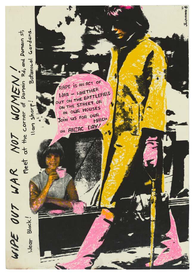
82 rmit design archives journal Vol 13 Nº 1 (2023)
Women's Work –Resistance Work: The Political Graphics of Feminism in 1980s Melbourne
Olga Tsara
In her recent book Doing Feminism: Women’s Art and Feminist Criticism in Australia, 1 Anne Marsh explores, among other issues, the development of a political climate which saw a groundswell of art feminism by the mid 1970s.2 Women in the art world put themselves in conflict with patriarchal attitudes by seeking to redress the relative invisibility of women artists in history, questioning the established gallery system which favoured men, or by creating female imagery which drew on female experiences and traditional crafts.
Reviewing Marsh’s book, Joanna Mendelssohn,3 lends clarity to Marsh’s approach, which is to track her own generation’s contribution to feminist avant-garde art and ideas. Posters are not normally thought of as avant-garde art, though their role in the vanguard of social change cannot be disputed. This may explain why very little attention is given to feminist poster collectives in Melbourne.4 What the reader does get though, is a clear image of the pace of change for women in the art world. While galleries are mentioned as increasing their holdings of women’s art, what is not touched on is the extraordinary push in the 1980s by the major research libraries in the country to collect political posters, many from feminist poster collectives.5 Importantly, both Marsh, and Kirby in more detail, discuss the impetus and events in the 1970s leading to the establishment of slide libraries to document women’s art. In Melbourne the Women’s Art Register was formed and came to be housed at the Richmond Library, pointing to the significant role of libraries in the feminist quest.
The political climate in 1980s Australia
The feminism inherited by poster makers of the 1980s saw its beginnings in the women’s liberation movement of the 1960s and the beginning of second-wave feminism. Posters and other political art produced during the first decade of this period agitated for change on issues like abortion and control over one’s own body, domestic violence, rape, the oppression of patriarchal systems, and equal opportunity. The central political aim was to bring what was private and personal into the realm of the public and political.6 By the 1980s, feminist poster collectives expanded their focus to include the impact of war on women and children, solidarity with other cultures, struggles for justice, and the anti-nuclear movement. We see feminist poster artists
(women and men) working to influence the creation of a better world for all, not just for women.
For some, the world in the 1980s appeared closer to destruction than ever before. Poster artists addressed major concerns of the time, including high unemployment and the destruction of the environment. These were the years of us President Ronald Reagan’s tough talk about nuclear readiness, and the instigation of Star Wars. And added to this, the whole Western World was reeling in the wake of the widespread danger caused by the meltdown of the Chernobyl nuclear power plant in the ussr . In domestic politics there was wide unrest over the Australian government’s sanctioning of the mining and export of uranium. The peace movement began to articulate—often through political posters, and often using humour—the connection between patriarchy, the arms race and exploitation of natural resources.
This political climate prompted a degree of urgency. There were strong calls for action and change. A resurgence in political messaging that arose through opposition to the Vietnam War in the 1970s, had formed the infrastructure and visual language that were now to be employed. By the 1980s though, artists were conscious of how viewers could be put off if the message or design was too didactic. Humour lent a fresh approach and steered away from anything that may have resembled a sermon. Julie Shiels and Julia Church of Another Planet Posters argued that the days of showing doves, Chernobyl and people dying in the streets were over for political posters. Those symbols did not work on the jaded audiences of the 1980s. In an interview in 1988 they talk about how hard they had to work to convince the Nuclear Free Zones Secretariat which had commissioned a set of posters, to steer away from such stereotypes.7
A significant example of a poster making an anti-nuclear statement is Nuclear Free Pacific, Un Pacifique AntiNucleaire8 by Wendy Black. Working as artist-in-residence at Redletter Press, Black created the now iconic poster as an un-commissioned design. The poster is a protest against the testing of nuclear weapons by France in the Pacific on its colonised atolls.9 She worked with Taufou Amos, a Vanuatuan woman who was in Melbourne to learn silkscreen and offset printing. An English version and a Bislama Pidgin English version (both incorporating the
Preceding Pages Sybylla Cooperative Press, International Women's Day rally and march, 1983, screenprint, State Library Victoria H84.248/58. Published by Sybylla Cooperative Press, an imprint of Spinifex Press. Permission to publish with kind permission from Spinifex Press. www.spinifexpress.com.au Opposite Deej Fabyc, Wipe out war not women! Rape is an act of war…March on Anzac Day, Jillposters, 1983, screenprint, State Library Victoria, H89.281/188
83 rmit design archives journal Vol 13 Nº 1 (2023)
peer reviewed essay
This essay presents a discussion and exploration of feminist political graphics that evolved and emerged in Melbourne in the 1980s, building on the legacy of second-wave feminism. Its focus is on the work of the women artists of alternative poster presses, including Sybylla Press, Redletter Press, Bloody Good Graffix, Another Planet, and Jillposters.
Above Sybylla Cooperative Press, International Women's Day rally and march, 1983, screenprint, State Library Victoria H84.248/58. Published by Sybylla Cooperative Press, an imprint of Spinifex Press. Permission to publish with kind permission from Spinifex Press. www.spinifexpress.com.au

Opposite Viva Gibb, Saving the last dance for you, silkscreen printed in purple on pink paper, 1984, State Library Victoria, H98.162/23
French language in the title) were produced, in support of the People’s Charter for a Nuclear Free Pacific, Conference in Vanuatu, July 1983.
Just as powerful and iconic is the poster And the American Warship Sailed Into the Sunset & Never Returned— Australia Nuclear Free and Non-Aligned, 10 by Julia Shiels, a founding member of Another Planet Posters. The poster was produced in collaboration with collective co-worker Colin Russell, for the Anti-Bases Campaign, Melbourne, a community organisation affiliated to the Australian Anti-Bases Coalition.11 These two posters reveal many of the hallmarks of political graphics of the time: flat, bright colour work, prominence of title, significant amount of text-based information, and appropriation and humour. Black’s poster shows a tropical island scene made up of a number of appropriated images from Gaugin’s Tahiti paintings, alluding to French colonisation in the Pacific, while the comically enormous American warship in Shiels’ poster emboldens us to laugh at the formidable and sinister military threat posed by the us
Alernative poster presses, using the principles of collectivism, provided models for emerging new groups. They also provided facilities and support for established independent artists to create their posters. One such artist was Viva Gibb. Gibb often used the access facilities at Redletter Press, creating the screens, sometimes with the help of Wendy Black, and taking them to her own studio to print.12 Gibb was influenced by the direct-action posters produced by the Atelier Populaire during the 1968 civil unrest in Paris. 13 One of the issues she responded to was the threat of nuclear war in the world of the 1980s arms race.14 Gibb’s method was to produce a contemporaneous response to events. She designed, printed and pasted up
her posters within two days of news reports. Established poster collectives like Redletter, enabled her to achieve this immediacy. What follows is an outline of some of Melbourne’s alternative poster presses which operated with a feminist philosophy in the 1980s and a discussion of their significant achievements.
Sybylla Press, 1976–2002
Sybylla Press was established in 1976 by a group of women to provide printing facilities for the production of material to support the women’s movement. Printed works included flyers, posters, cards, and literary works. The political climate of the time, after the sacking of the Australian Prime Minister Gough Whitlam, struck fear in leftist groups. Politicised feminists, like the women who started Sybylla, feared there would be a political backlash against progressive and radical politics.
A small women’s co-operative, the original members were Glenda Ballantyne, Helene Bowen, Rowena Elford, Marg Hosfal, Beth Mart, Jane Murphy, Patsy O’Shea, Sue Pepperell, and Frances Ryan. Artists producing posters included Anne Donald, Leonie Gregory, Alex Hall, Deborah Kelly, Jenny Rosewarne, Lyn Hovey, and Sue Miller. The collective operated from a socialist/feminist perspective, and resolved not to print material that was sexist, racist or anti-working class.15 Its core work was to publish feminist literature, but it also operated its own printing facilities from 1976 to 1988. Situated in Smith Street, Fitzroy (an inner-city suburb of Melbourne), the printery functioned like most other alternative presses, providing affordable printing services for a wide range of political, community, gay, and women’s groups16. In the years the printery operated, the group produced posters, postcards, t-shirts, badges, and stickers to publicise and garner support for campaigns like Reclaim the Night, (promoting awareness about violence and women’s safety), and Close Pine Gap, (in solidarity with the 700 women protesting in November 1983 at the Women’s Peace camp, Pine Gap Defence facility).
Redletter Press, 1977–1991
Redletter Press began as the Brunswick Work Co-operative, initiated by founding member Bob Clutterbuck. It was funded by the Victorian Ministry of Employment and Training and operated as an umbrella for a variety of services. It changed its name to Breadline Posters and Red Trouser Press, and finally to Redletter Press. By the mid-1980s, partially funded by the Australia Council, it had established itself as a print workshop, providing access to printing facilities for disadvantaged groups as well as initiating issues-based art projects for community groups.17 Collective members in the 1980s included Bob Clutterbuck, David Morrow, Chris Reidy, Mark Denton, Dianna Wells, Wendy Black, Kris Koller, Marina Strocchi, Tanya McIntyre, Vicky McConville, Sue Anderson, Fiona Sommerville, Angela Gee, and late in the decade, Carol Porter and Pamela Branas. Though it was made up of men and women, almost all the work emerging from this group can be read as feminist. The left-leaning sentiments of their posters and other print media champion disadvantaged and minority
84 rmit design archives journal Vol 13 Nº 1 (2023) women's work –resistance work: the political graphics of feminism in 1980s melbourne Continued

85 rmit design archives journal Vol 13 Nº 1 (2023)
Top Wendy Black, Nuklia
Fri Pasifik, Nuclear Free Pacific, Red Letter (Brunswick Street Co-operative), 1983, screenprint, State Library Victoria, H84.221/7

Bottom Julie Shiels, White on Black: The annihilation of Aboriginal people and their culture cannot be separated from the destruction of nature, Another Planet Posters, 1988, screenprint, State Library Victoria, H89.160/10
Opposite Dianna Wells, A Story of Labour and Love, Another Planet Posters, 1989, screenprint, State Library Victoria, H89.160/5

86 rmit design archives journal Vol 13 Nº 1 (2023) women's work –resistance work: the political graphics of feminism in 1980s
Continued
melbourne
groups: women, people of non-English speaking origins, First Australians, and gay and lesbian groups.
It is among the house posters (creative posters produced by the artists on issues of their choice) and the work created with community groups where we see the strongest and undeniable surfacing of feminist graphics and messaging. But the message is not the only important aspect; the making of these works is of great value and significance. Poster making projects resulted in a healthy social fabric allowing people of diverse backgrounds to work together. Many projects were developed and led by Redletter artists to empower women by teaching them new skills, and to provide an environment where women of diverse backgrounds could bond, identify needs, or articulate demands. An extraordinary example of this reveals itself in the Patterns of our Lives Project, 1987, where the work capitalised on the fabric printing facilities that had been established at Redletter in 1985. This project was directed towards young migrant women from Turkey, Lebanon, Cyprus, Egypt, and New Zealand. It was funded through the Special Initiatives Fund, Community Youth
Support Scheme (cyss), Department of Employment and Industrial Relations. The fabric was designed by Rose Marie Szulc (Redletter Fabric Artist in Residence), two rmit Textile Design print students, Pat Bull and Glenda Broadbent, and produced by about fifty women from the local community. This breathtakingly beautiful work was made up of seven wall pieces, measuring one meter each, consisting of silkscreen printed fabric, with appliqué, embroidery and assemblage.18
Other examples of artist-initiated projects which operated through government grants include The Equal Opportunity Poster Project (1984/85), and The Youth Law and Justice Poster Project (1986), involving youth and unemployment groups; Western Region Poster Project (1989), involving migrant women and environmental issues; Brunswick Community Education Project (1989), the Urban Environment Poster Project (1989), for ceres (Centre for Educational Research into Environmental Strategies); and Here We Stand Project (1989), The Fabric Printing/Numeracy Project (1989).19

87 rmit design archives journal Vol 13 Nº 1 (2023)
Bloody Good Graffix, 1983–1984
Formed in 1983 by artists Julia Church and Kath Walters, Bloody Good Graffix occupied the Melbourne University printing facilities run by the Melbourne University Union Arts & Activities department, which was managed by Julie Shiels.
Together they ran print, design and access services for various community and university groups, and formulated a Community Employment Program (cep ) funding proposal to extend the services of Bloody Good Graffix.20 (This resulted in the formation of Another Planet Posters.) Posters and postcards were created by Church and Walters advocating for causes they were passionate about (some were done under the banner of Jillposters , which will be discussed below), or on commission for local groups, legal services, exhibitions, and bands.21
Another Planet Posters, 1984–1991

Established with government funding, and originally conceived as a women-only group, Another Planet Posters did include a few men over the years. The members in the decade of the 1980s included Julia Church, Kath Walters, Julie Shiels, Sue Miller, Gabrielle Nhyas, Colin Russell, Peter Curtis, and Nic Mau. The guiding principle of Another Planet was collectivism: the artists operated in a flat structure, made
decisions collaboratively, and acknowledged the voice of all members in decision making. Like Redletter, it provided access to printing facilities, design advice and technical skills training for individuals, community groups and commercial enterprises. It also designed and printed commissioned work for clients who were not interested in having any artistic or production input.22
It was not until 1987 that the artists of Another Planet developed an artist-in-residence program and began to produce house posters. These posters were time consuming in the making because priority in the workshop was given to community work and commissions, but they remain the workshop’s most important work due to their lasting artistic merit. With the approaching Bicentennial Celebrations in 1988, the first lot of artist-in-residence (or house posters) addressed Indigenous Australian issues. The artists questioned the Bicentennial as a cause for celebration, and called for a rethinking of the event, pointing to the mistreatment of Indigenous people by colonialism.23 The works were all researched with discussions and information supplied by the Aboriginal Advancement League, Koorie Information Centre and the Aboriginal Child Care Centre.24 In 1988 the program focused on women’s issues (women’s unpaid labour and women imprisoned for crimes of poverty), and the Pacific Region (calling for the independence and dignity of French colonised Pacific nations).25
88 rmit design archives journal Vol 13 Nº 1 (2023)
women's
Continued
work –resistance work: the political graphics of feminism in 1980s melbourne
Above Carol Wilson, Peter Curtis and Friends of the Earth, Plastic’s got us, hook, line and sinker, 1988, screenprint, Another Planet Posters, State Library Victoria, H2000.185/277
The workshop also produced an impressive folio of community art in this period. The artists generated government grant applications, mainly to the Australia Council, but also to state and local governments, for project funding. They collaborated with myriad groups, involving hundreds of participants from schools and migrant groups to produce posters, videos, and t-shirts on issues such as childcare, racism, education, sexism, nuclear threat, and the environment. These projects primarily attracted women participants,26 and it was the norm to allocate a portion of the grant funding to provide childcare facilities to free up the women to do the workshops.
Conscious of the need to reach a wider audience, the group instigated the Billboard Project which ran in 1988 and 1989. The idea was to develop joint campaigns with community groups using a mainstream advertising medium. The biggest cost of the project was hiring the billboard sites, so funding was sought from the private sector and through government grant avenues.27
Lee-Anne Hall, researcher and writer for the Community Cultural Development Unit of the Australia Council, comments that enlarging posters to billboard size and pasting them on commercial sites brings poster art into the 1980s, and that the monumental size of the image is relative to the importance of issues being addressed.28
In 1989 a billboard was created from Carole Wilson’s poster Plastic’s Got us, Hook, Line and Sinker 29 Originally produced as a poster in 1988 for Friends of the Earth, and with Peter Curtis as printer, the design was realised in linocut and later transferred to a silkscreen print. 30 It won the prestigious Special Jury Prize at the 1992 3rd Chaumant Poster Festival in France.

The billboard version was displayed on 100 sites around country Victoria and metropolitan Melbourne, including the high-traffic main roads of Victoria Street and Hoddle Street in Richmond, and Johnston Street, Collingwood. The sites were donated by Australian Posters, a major billboard company, through negotiations with the Outdoor Advertising Association of Australia (oaaa)
The previous year’s Billboard Project produced an enlarged version of the Warship poster by Julie Shiels, discussed earlier. Measuring 3 x 6 metres, 150 copies were made to be pasted up on over forty sites around Melbourne, including some in Richmond, and a copy was sold to the South Australian Trades and Labour Council for display on the Adelaide docks. Collin Russell collaborated on this project and printed a copy on cotton to make a banner which was used by the Anti-Bases Campaign at the Palm Sunday Rally in 1988.31
89 rmit design archives journal Vol 13 Nº 1 (2023)
Jillposters, 1983–1988
A loose all-women collective of artists, Jillposters members came together on an ad hoc basis, often from other poster collectives. Members included Julia Church, Carole Wilson, Julie Shiels and Kath Walters from Another Planet Posters, Deej Fabyc and Alison Alder from Megalo (Canberra), Jenny Rosewarne from Sybylla,32 Lesley Baxter, Ally Black, Linda Brassel, Zana Dare, Maggie Fooke, Julie Higginbotham, Catriona Holyoake, Barbara Miles, Kate Reeves, Linda Rhodes, Lin Tobias, Julia Tobin, Chaz and Karen.33 The collective’s core aim was to promote issues and events ignored by the mainstream media. It did not apply for government grants to fund its activities, nor did it have its own printery, but used the facilities of other poster collectives. It derived its name from the ubiquitous “Bill Posters Will be Prosecuted” warnings dotted around the city. The only legal option for message posting was to purchase space on hoardings or co-operating sites, which was not affordable for most people. Like other alternative poster presses, the women of Jillposters “challenged the assumption that public space was the realm of big advertisers”34 and posted their works on the streets of Melbourne without permission. They maintained anonymity by not including their names on the posters, only the collective’s logo.
The collective produced posters and postcards from 1983 to 1985 on issues like peace, nuclear threat, women’s safety, childcare, and racism. A notable example of their activism is the body of work created in solidarity with the anzac Day march protests. In the early 1980s, there was wide public debate about the meaning and relevance of the anzac Day march, with many people arguing that the day should be a day of mourning, and that the march served to glorify war. The protests received a great deal of media attention, and a number of protesters were arrested. Jillposters artists produced posters that highlighted issues such as rape in war and child victims of war, and were a rallying call for women to join the protests.
It is interesting to consider the wide, nurturing remit feminism gave itself in the 1980s. The poster presses and collectives of the time provided an ideal production arena for a feminism that was becoming broader in its scope and radicalism. From rallying cries for the rights of women and children, to leading voices in the peace movement, to demands for the protection of the environment, to communities whose diversity was nurtured and harnessed, to the sharing of resources, equipment and expertise, the 1980s saw new voices emerge through the means of the poster.

90 rmit design archives journal Vol 13 Nº 1 (2023)
women's work –resistance work: the political graphics of feminism in 1980s melbourne Continued
Above Deej Fabyc, Wipe out war not women! Rape is an act of war…March on Anzac Day, Jillposters, 1983, screenprint, State Library Victoria, H89.281/188
Endnotes
1 Anne Marsh, Doing Feminism: Women’s Art and Feminist Criticism in Australia, (Melbourne, Vic.: Melbourne University Publishing, 2021).
2 “Art feminism” was a term coined by author Sandy Kirby and not used by Marsh. Sandy Kirby, Sight Lines: Women’s Art and Feminist Perspectives in Australia, (East Roseville, NSW: Craftsman House in association with Gordon and Breach, 1992), 12.
3 Joanna Mendelssohn, “Politics, Pioneers, Performance: 50 years of Australian Women’s Art and Feminist Ideas”, The Conversation, (March 1, 2022), https:// theconversation.com/politics-pioneersperformance-50-years-of-australianwomens-art-and-feminist-ideas-175840, accessed January 12, 2023.
4 Quoting from Kirby (1992), 12, Marsh briefly mentions the Melbourne collectives: Another Planet, Jillposters and Redletter. Marsh (2021), 116.
5 The early to mid-1990s saw several exhibitions about political posters, including the State Library Victoria’s Pressing Issues (1990), and two by the State Library of NSW: Hearts and Minds (1993) and Out of Line: 25 Years of Women’s Posters (1995).
6 Michelle Arrow and Angela Woollacott (Eds), Everyday Revolutions (Acton, A.C.T.: Australian National University, 2019), frontispiece.
7 Another Planet papers, State Library Victoria, RedPlanet Archive, MS 15590. Posters for the Nuclear Free Secretariat include: Think Globally Act Locally, She’s Nuclear Free by Colin Russell, Paradise Lost and Regained by Julie Shiels, and Banish Unwanted Radiation from your Neighbourhood, by Julie Shiels.
8 Wendy Black, Nuclear Free Pacific, Un Pacific Anti Nucleaire 1983, Red Letter (Brunswick Street Co-operative), screenprint, State Library Victoria, Accession number: H84.221/6. The version with the title in Bislama Pidgin English is titled Nuklia Fri Pasifik, Un Pacific Anti Nucleaire, Accession number H84.221/7.
9 The atolls were Moruroa and Fangataufa. Testing done between 1966 and 1996 sparked international protests.
10 Julie Shiels and Colin Russell, And the American Warship Sailed into the Sunset & Never Returned—Australia Nuclear Free and Non-Aligned, 1986, Another Planet Posters, screenprint, State Library Victoria.
11 The Coalition had 150 affiliates, including church, environmental, student, and Aboriginal organisations.
12 Wendy Black, interview with the author, September 29, 2022.
13 Olga Tsara, “Agitation Propaganda at the State Library Victoria: Production, Perception, Preservation,” La Trobe Journal, 84, (2009): 54–55.
14 The posters are: Uranium Shares Boom, 1982, SLV; Saving the Last Dance for you, 1984, State Library Victoria.
15 Trish Luker, “Women Into Print: Feminist Presses in Australia," in Arrow and Woollacott (2019), 121–138
16 Dianne Brown and Maryanne Lynch, “Creating a Space: Sybylla Feminist Press, 1988-2003,” Hecate, 29, Issue 2, (2003): 285.
17 Sybylla Cooperative Press and Publications Ltd., Publications Catalogue, 2, (1984).
18 An outline of the history of this group can be found in: Olga Tsara, “The Art of Revolution: Political Posters in the RedPlanet Archive”, La Trobe Journal, 75, (2005): 95–96.
19 There is photographic documentation in the State Library Victoria, Manuscripts Collection, RedPlanet Archive, MS 15590, F BOX 4564.
20 State Library Victoria, RedPlanet Archive.
21 Julie Shiels, interview with author, October 31, 2022.
22 Further discussion can be found in: Louise Mayhew, “Jill Posters Will be Prosecuted: Australia’s Women-only Print Collectives from the 1970s and 1980s,” excerpt from, Female Art Collectives and Collaborations in Australia, c.1970–2010, (PhD thesis, University of New South Wales, 2011).
23 The operations and ethos of Another Planet are discussed in Tsara (2005): 99–101.
24 The posters produced were: White Australia has a Black History and Survival of the Fittest by Colin Russell, Sacred Objects—White Australia by Julia Church, and White on Black by Julie Shiels.
25 Information about these posters comes from “Artistic Report to the Australia Council,” 1989, State Library Victoria, RedPlanet Archive.
26 The posters are: Women, Prison and Poverty, by Carole Wilson; A Story of Labour and Love, by Dianna Wells; Le Colonisation of the Pacific by Julie Shiels; and Kanaky, Free and Independent by Dianna Wells.
27 Interview with Dr Julie Shiels, Senior Industry Fellow, RMIT University, October 31, 2022.
28 Tsara (2006): 100.
29 Lee-Anne Hall, “Another Planet Posters”, Caper, 27, (1988): 9.
30 Carol Wilson, Peter Curtis and Friends of the Earth, Plastic’s Got us, Hook, Line and Sinker, 1988, screenprint, Another Planet Posters, State Library Victoria, H2000.185/277.
31 The lino printing plate for Plastic’s Got us, Hook, Line and Sinker, 1988 is held by the State Library Victoria, RedPlanet Archive.
32 Annual Report 1986, Another Planet Posters, (1987).
33 Jeannette Fendon, et. al. ‘Jill Posters,’ an excerpt from “Working the Community Circuit”, Lip, 8, (1984): 84–92.
34 Louise Mayhew, “Jill Posters Will be Prosecuted: Australia’s Women-only Print Collectives from the 1970s and 1980s”, excerpt from Female Art Collectives and Collaborations in Australia, c.1970–2010, (PhD thesis, Sydney: University of New South Wales, 2011), 5.
35 Julia Church, Pressing Issues: Contemporary Posters from Local Co-operative Presses, (Melbourne: State Library Victoria, 1990), 5.
91 rmit design archives journal Vol 13 Nº 1 (2023)
SU SAN COHN RADICAL UTOPIA
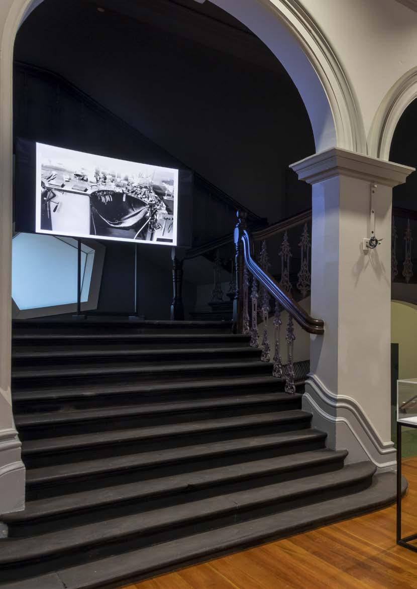
92 rmit design archives j ournal Vol 13 Nº 1 (2023)

93 rmit design archives journal Vol 13 Nº 1 (2023)
Installation view, Radical Utopia: An Archaeology of a Creative City, RMIT Gallery, 2023. Foyer featuring work by designer Su san Cohn.

94 rmit design archives journal Vol 13 Nº 1 (2023)
SU SAN COHN RADICAL UTOPIA

95 rmit design archives journal Vol 13 Nº 1 (2023)
Installation view, Radical Utopia: An Archaeology of a Creative City, RMIT Gallery, 2023. Detail Doughnut Bracelet (Torn Mesh series), 1986, designer Su san Cohn
ROBERT PEARCE
Robert Pearce, the Fashion Design Council and the Culture of Melbourne Fashion
Harriet Edquist
Clarence Chai had broken the mould in 1978 with the Chai Parade featuring the new wave designers Clarence Chai, Jenny Bannister, Jenny Kee and Linda Jackson. It was filmed by Jo Lane and staged at The Universal Workshop, a reclaimed factory in Victoria Street, Fitzroy that provided a venue for all kinds of alternative theatre. Building on this momentum, Gillian Burt and Julie Purvis devised Party Architecture which they staged in 1982 and 1983 at Seaview Ballroom in St Kilda with designers such as Bannister, Chai, Desbina Collins, Matthew Flinn, Kate Durham and Allanah Hill. The 1983 parade reached a new level of event organisation and professionalism with Andrew Lehmann as official photographer, Dean Richards music director, Robert Pearce graphics and set design and Kate Durham set design and pr . Pearce also interviewed every participant on his new 3rrr radio show en masse that he had originally established with Merryn Gates. He designed the stylish poster and brochure for the parade that included photographs and biographies of all involved. It was Durham who, however, in the words of the brochure “propelled Fashion 1983 to undreamed of heights, through her unwavering vision of the collective advancement of Melbourne Fashion.”
Thus it was Durham who wrote the grant application later that year for government funding that would allow her, Pearce and arts-law graduate Robert Buckingham to establish the Fashion Design Council (fdc ) in 1984. While it is most commonly associated with its increasingly extravagant and well-published annual parades through the 1980s, the fdc was in fact a highly innovative form of cooperative member-based enterprise that provided business advice, exposure to new audiences through curated exhibitions and shows in galleries and nightclubs, as well as retail space in a shop in Collins Street for members to sell their work.
Robert Pearce, a graduate of Swinburne Technical College whose talent as an illustrator was fuelled by his knowledge of Japanese, American and British illustration created the distinctive fdc ‘corporate’ style somewhat in the manner of an Art Director, such that every poster, postcard, flyer, brochure and invitation was recognisably of the same family of imagery. He developed the fashion exhibition, designing and curating shows at independent art galleries as well as the Australian Centre for Contemporary Art.
Pearce was a consummate cultural entrepreneur and spread his talents widely. En masse, which first went to air in February 1983 was a fortnightly one-hour fashion program on 3rrr that was a mix of interviews, information and music with people who “set styles/make fashion.” An early edition that aired on 24 July 1983 featured interviews with Ashley Crawford of Tension magazine and Jane Joyce, Michael Trudgeon and Andrew Milne of Crowd magazine before these magazines had even hit the shops. Earlier in the year Crawford’s Virgin Press had published an extensive interview with Pearce while Crowd followed with an article by Pearce in its first issue in 1983 and later a transcript of his 3rrr interview with Japanese fashion label Comme des Garçons.
Pearce founded, published and designed Collections fashion magazine, worked for the prestigious Australian Wool Board and also for maverick architects Edmond and Corrigan, illustrating their radical Keysborough community buildings in 1980. He produced posters for fashion houses, art exhibitions and Built Moderne’s Architecture as Idea exhibition in 1984. He produced paintings and collage works such as The (married) Man-Trap, published in Playboy in March 1980 and The Flogging which was rejected by Playboy magazine Australia but later published in European Illustration Annual
Pearce came out as proud and gay in both the Virgin Press interview of January 1983 and the first edition of Crowd the same year, and he was a vocal advocate for queer culture. When he died of aids in 1989 at the age of 40, Tension published an interview with him that had been recorded shortly before his death and was open and forthright about his illness; Peter Corrigan published an obituary in architecture magazine Transition. That Pearce’s death was reported across all of the city’s major culture/design magazines indicates the wide-ranging impact of his career which was little over a decade long.
It also demonstrates how central alternative publishing enterprises were to the formation of Melbourne’s cultural infrastructure. While the intrinsic relationship between the media and postmodern architecture in the 1970s and 1980s is well understood, what has been less evident is the particular Melbourne way in which fashion was also imbricated in the new design discourses through its transformed events such as the parades, publications and exhibitions in which Pearce played so central a role. These challenged the orthodoxies of the industry’s production and consumption regimes and forged the strong appetite for critical debate that is still a feature of Melbourne fashion.
96 rmit design archives j ournal Vol 13 Nº 1 (2023)
The parade, as a typology specific to fashion, underwent a metamorphosis in Melbourne from the elite post-war private showings at Georges and Le Louvre in Collins street, to the events orchestrated by the Fashion Design Council in the 1980s that were fluid, provocative and performative.
Top Barber House, 1979
Robert Pearce, illustrator; Edmond & Corrigan, architects
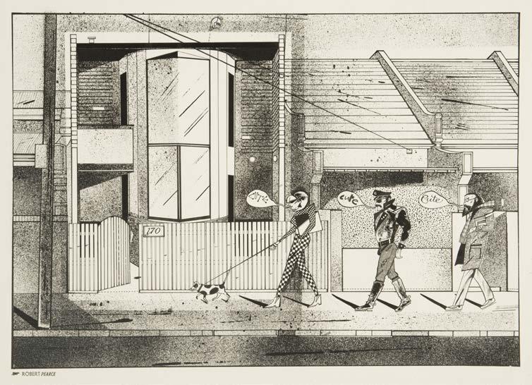
RMIT Design Archives
©2023 Anne Shearman
Bottom
Tension 16, January-February, 1989
Ashley Crawford, editor; Terry Hogan, designer
Magazine
Courtesy Helen Stuckey
©Ashley Crawford
Photographer, Jane Joyce
Published in The Virgin Press
magazine, No 21, January 1983
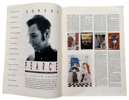
RMIT Design Archives
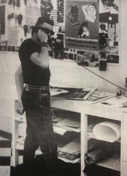
©2023 Ashley Crawford.
Photograph ©2023 Jane Joyce
Bottom right Robert Pearce. Stalbridge Chambers studio, c. 1983
Left
Top left The Fashion Design
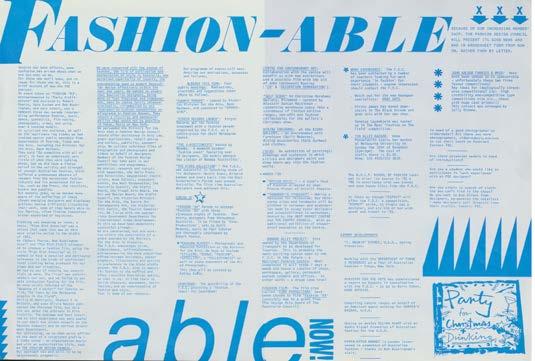
Council of Australia
Newsletter 1984
Robert Pearce, designer
RMIT Design Archives
© 2023 Anne Shearman
Top right
Advertisement for ‘Empire’ clothing store, 1984
Robert Pearce, illustrator
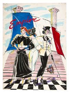
RMIT Design Archives
© 2023 Anne Shearman
Middle left Postcard titled Decade Out
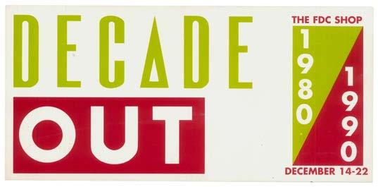
The FDC Shop 1980|1990
Robert Pearce, designer
RMIT Design Archives
© 2023 Anne Shearman
Middle right
Metro Nightclub Press Kit, 1987
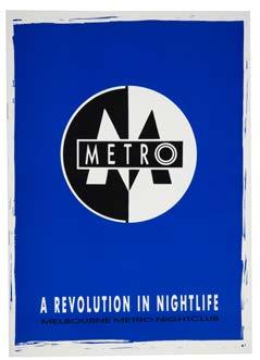
Robert Pearce, designer; Robert Buckingham, copywriter
RMIT Design Archives
© 2023 Anne Shearman
Bottom row Nescafé Fashion *88, 1988
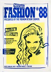
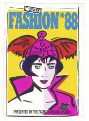
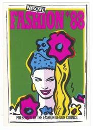
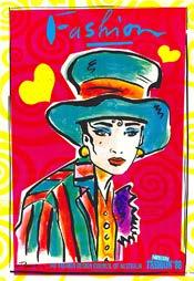
Presented by the Fashion Design Council
Robert Pearce, designer
Posters and postcards
RMIT Design Archives
© 2023 Anne Shearman
Top Kamikaze, 1982
Robert Pearce, designer; Kamikaze, clothing store
Poster RMIT Design Archives
© 2023 Anne Shearman
Bottom left Collections magazine, Vol.1, No.3
Autumn - Winter 1985
Robert Pearce, publisher
Cover design Ian McMaugh for Leroy
“Remembrance of Things Past”, Photograph Andy Rosen
RMIT Design Archives
© 2023 Anne Shearman
Bottom right Collections magazine, Vol.1, No.3
Autumn - Winter 1985

Robert Pearce, publisher
RMIT Design Archives
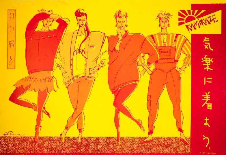
Photograph Rozalind Drummond. ©2023 Rozalind Drummond
100 rmit design archives j ournal Vol 13 Nº 1 (2023)

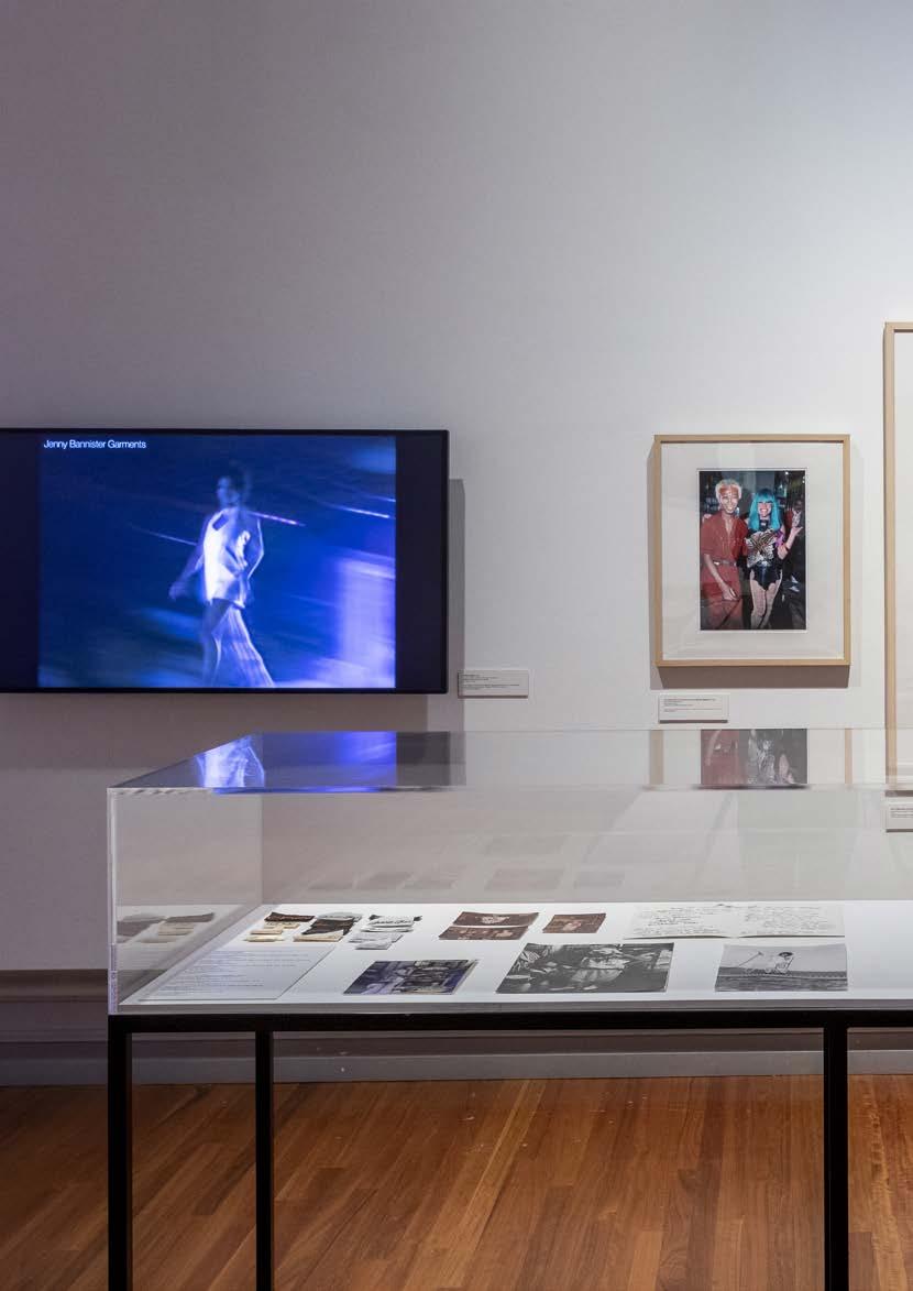
Opposite Installation view, Radical Utopia: An Archaeology of a Creative City, RMIT Gallery, 2023. Detail Revolt into Style! Fashion Video Party, 1986, designer Robert Pearce
Right Installation view, Radical Utopia: An Archaeology of a Creative City, RMIT Gallery, 2023. Revolt into Style display.
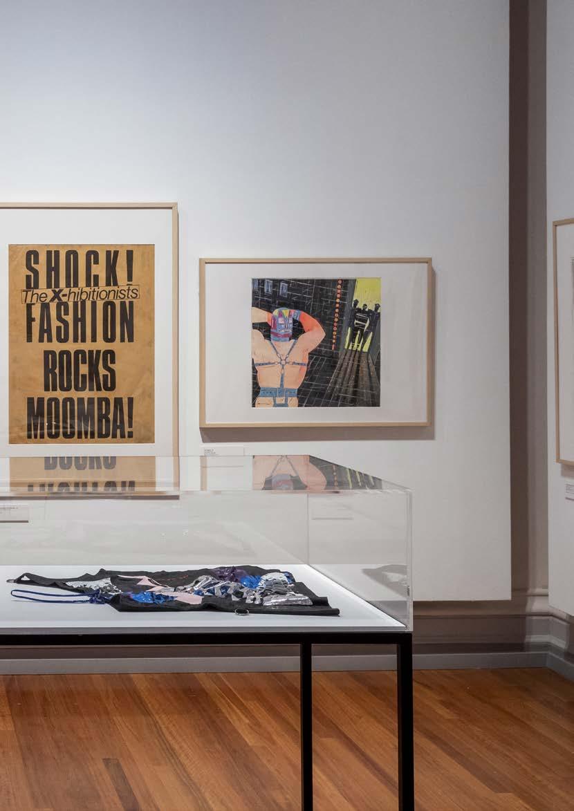
103 rmit design archives journal Vol 13 Nº 1 (2023)
REVOLT INTO STYLE RADICAL UTOPIA
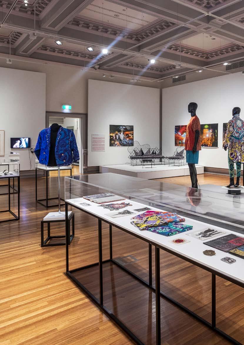
104 rmit design archives j ournal Vol 13 Nº 1 (2023)
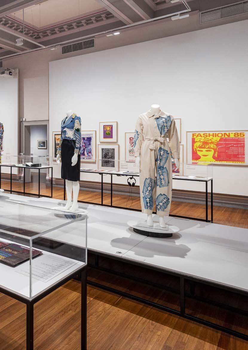
105 rmit design archives journal Vol 13 Nº 1 (2023) Installation
Radical Utopia: An Archaeology of a Creative City, RMIT
2023.
into
view,
Gallery,
Revolt
Style display
REVOLT INTO STYLE RADICAL UTOPIA
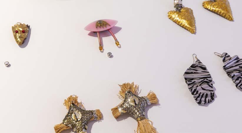

106 rmit design archives j ournal Vol 13 Nº 1 (2023)
Installation view, Radical Utopia: An Archaeology of a Creative City, RMIT Gallery, 2023. Revolt into Style display
Top Necklace, 1980, designer Kate Durham
Bottom right Asymmetrical necklace, c1985–1986, designer Marcos Davidson

Bottom left Earrings and Brooch by designer Peter Scott (with batteries) date unknown; Straw and aluminium earrings, Silver crinkle earrings with painted striped and Gold dolly heart and pearl earrings, 1982–83, designer Kate Durham.
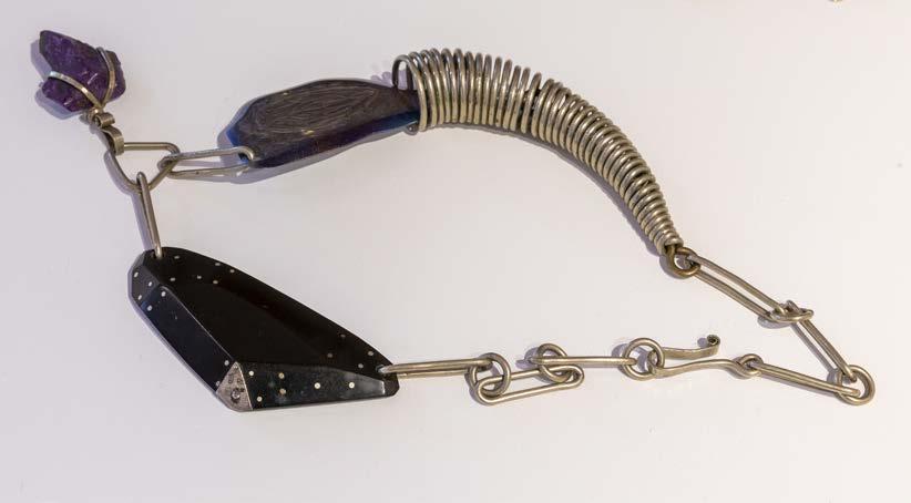
107 rmit design archives journal Vol 13 Nº 1 (2023)
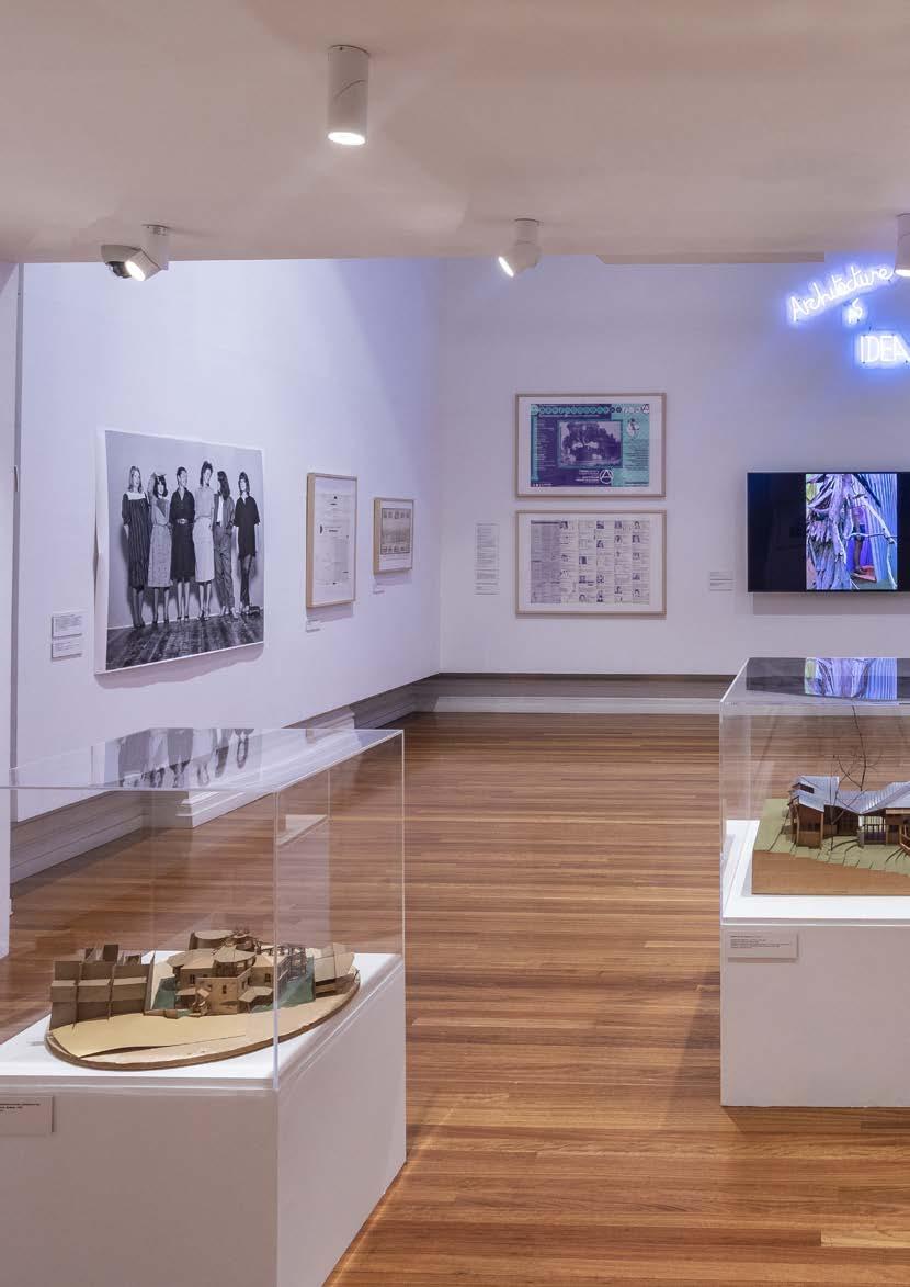
108 rmit design archives journal Vol 13 Nº 1 (2023)
ARCHITECTURE AS IDEA RADICAL UTOPIA
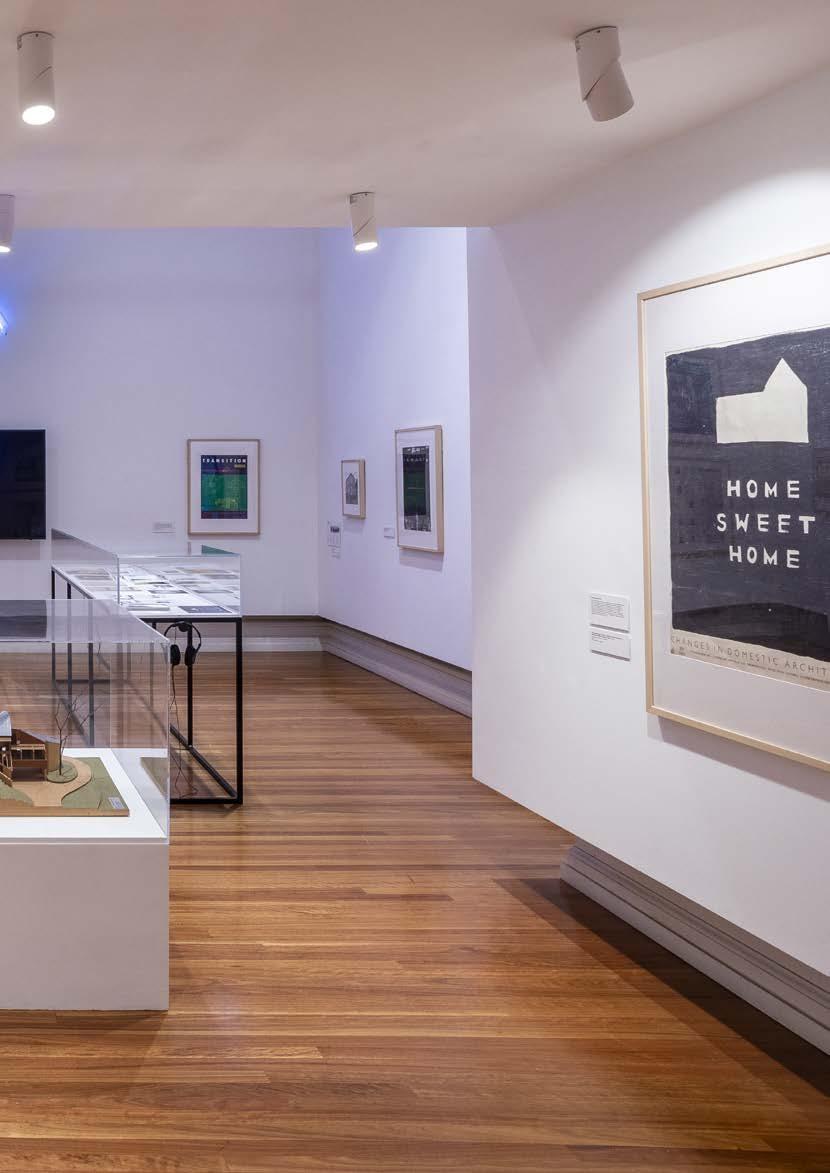
109 rmit design archives journal Vol 13 Nº 1 (2023) Installation view, Radical Utopia: An Archaeology of a Creative City, RMIT Gallery, 2023. Architecture as Idea display
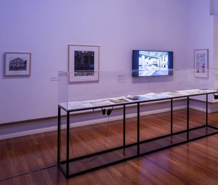

110 rmit design archives j ournal Vol 13 Nº 1 (2023) ARCHITECTURE
IDEA
AS
RADICAL UTOPIA
Installation view, Radical Utopia: An Archaeology of a Creative City, RMIT Gallery, 2023. Architecture as Idea display

Installation view, Radical Utopia: An Archaeology of a Creative City, RMIT Gallery, 2023. Detail of The Completion of Engehurst architectural model, 1980, designer and modelmaker Greg Burgess.
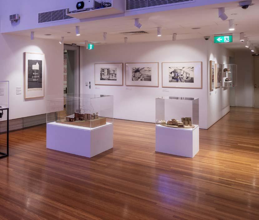
111 rmit design archives journal Vol 13 Nº 1 (2023)
EMERGENCE OF DIGITAL DESIGN
RADICAL UTOPIA
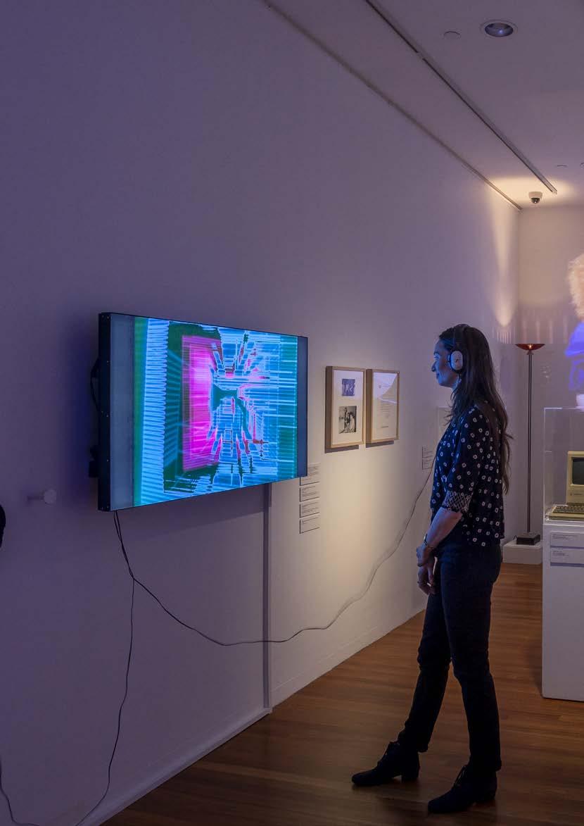
112 rmit design archives j ournal Vol 13 Nº 1 (2023)
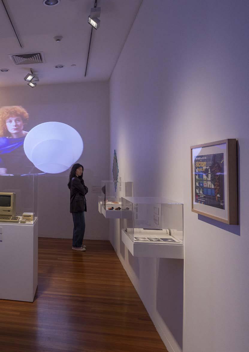
113 rmit design archives journal Vol 13 Nº 1 (2023)
Installation view, Radical Utopia: An Archaeology of a Creative City, RMIT Gallery, 2023. Emergence of Digital Design display featuring the work of Lyn Tune, Sally Pryor and Andrew Quinn.
EMERGENCE OF DIGITAL DESIGN
This Page Installation view, Radical Utopia:
An Archaeology of a Creative City, RMIT Gallery, 2023. Earrings, 1986 designer Lyn Tune
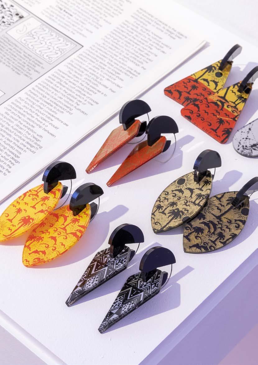
Opposite top Installation view, Radical Utopia: An Archaeology of a Creative City, RMIT Gallery, 2023.
Cassette games for the ZX Spectrum, 1982, designer Beam Software (and Psion), publisher Melbourne House, ZX Spectrum microcomputer, 1982, designer Sinclair Research
RADICAL UTOPIA
Opposite bottom Installation view, Radical Utopia: An Archaeology of a Creative City, RMIT Gallery, 2023.
Cassette games for the Commodore 64 and ZX Spectrum, 19831986 designers Beam Software (and Psion), publisher Melbourne House, Commodore 1530 Datasette, 1982, designer Commodore Business machines.
114 rmit design archives journal Vol 13 Nº 1 (2023)
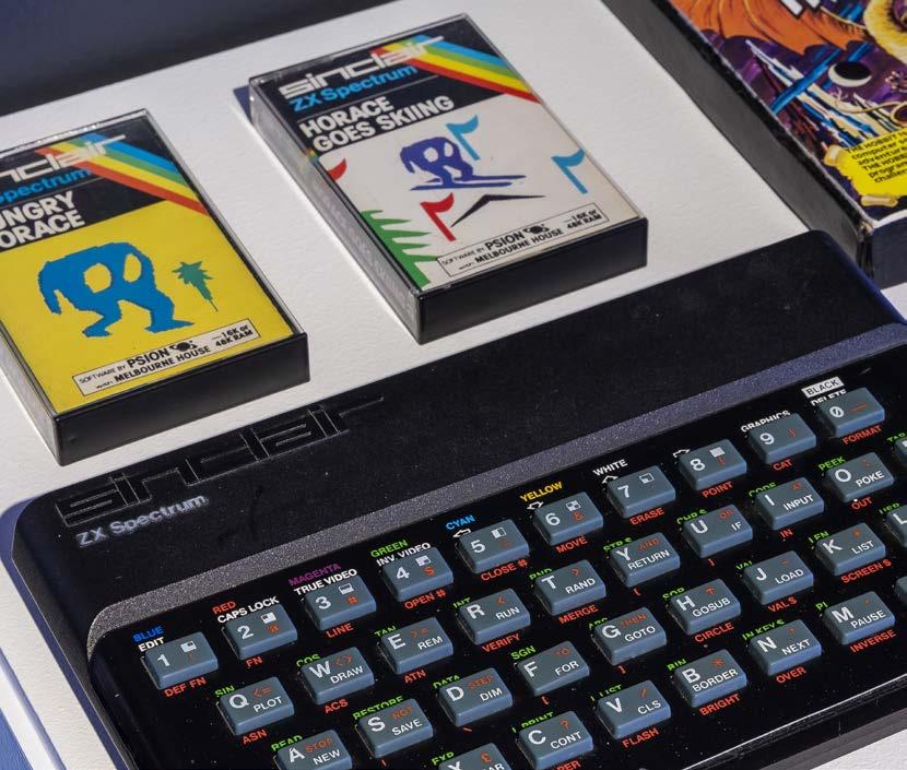
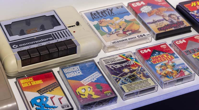
115 rmit design archives journal Vol 13 Nº 1 (2023)
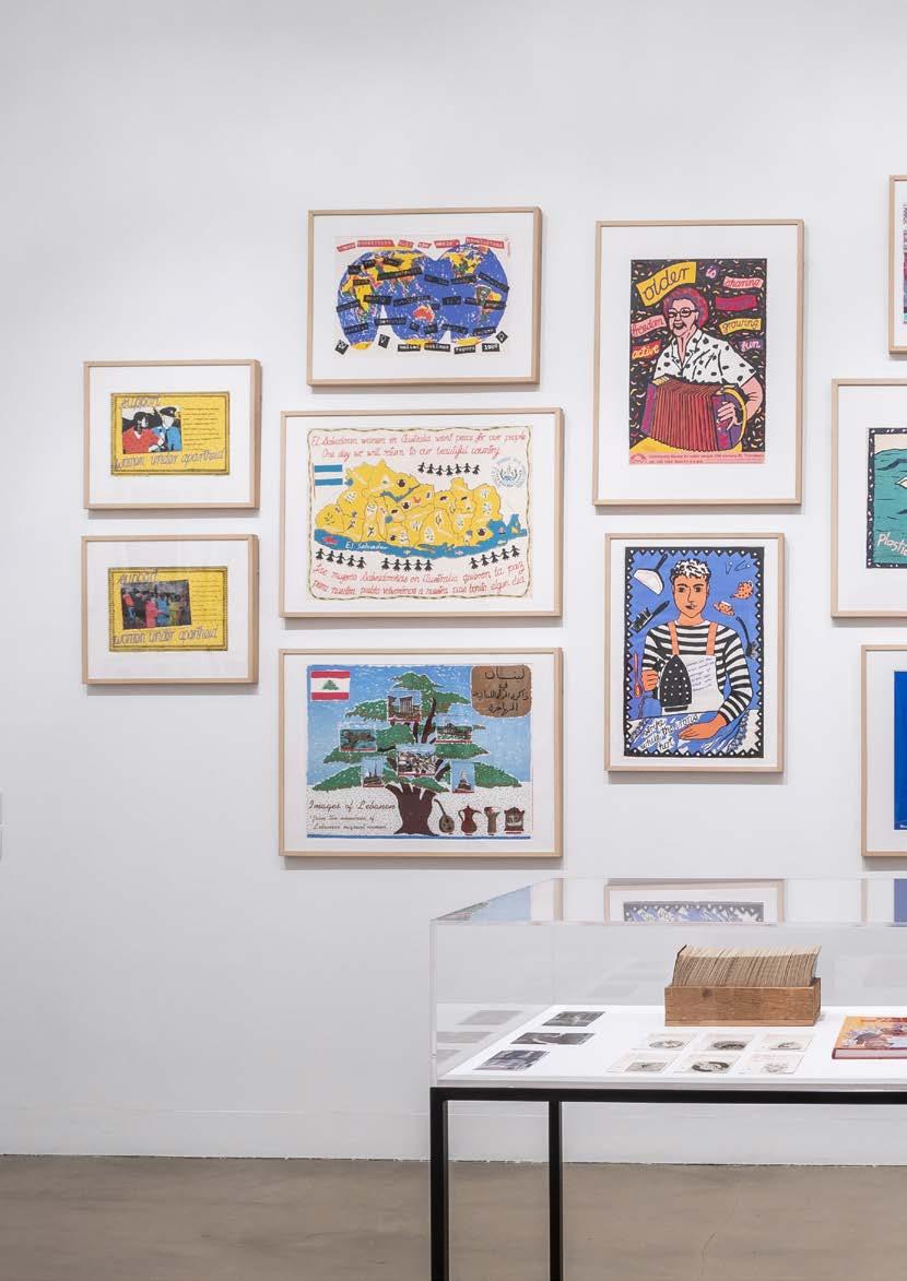
116 rmit design archives journal Vol 13 Nº 1 (2023) STANDING YOUR
GROUND RADICAL UTOPIA
Installation view, Radical Utopia: An Archaeology of a Creative City, RMIT Gallery, 2023. Standing your Ground display; Featuring wall Posters for Jill Posters and Another Planet, designer Carole Wilson; cabinet featuring catalogue and cards for Symbols of Australia publication; and examples of work by the design collectives Backyard Press and Champion Books.
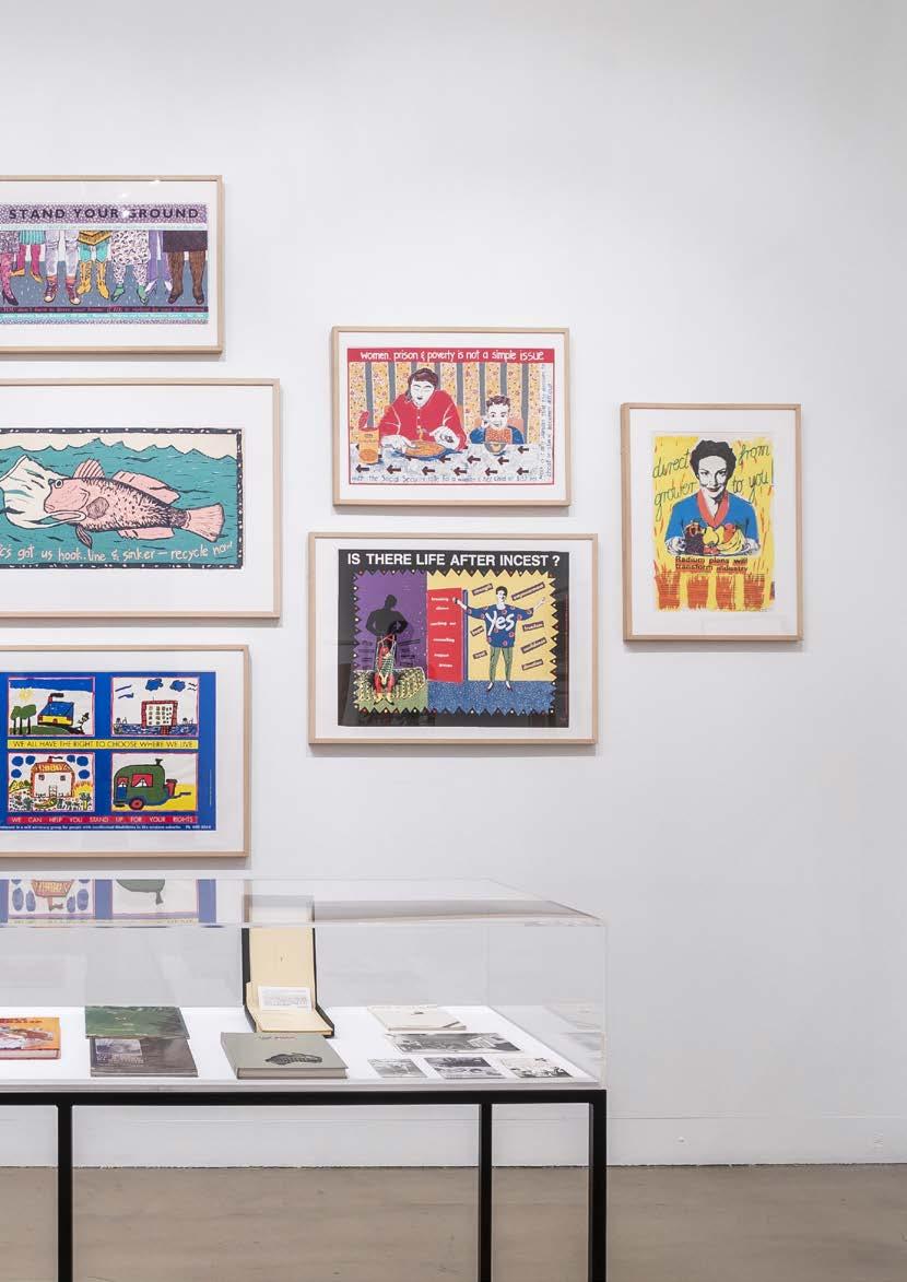
117 rmit design archives journal Vol 13 Nº 1 (2023)
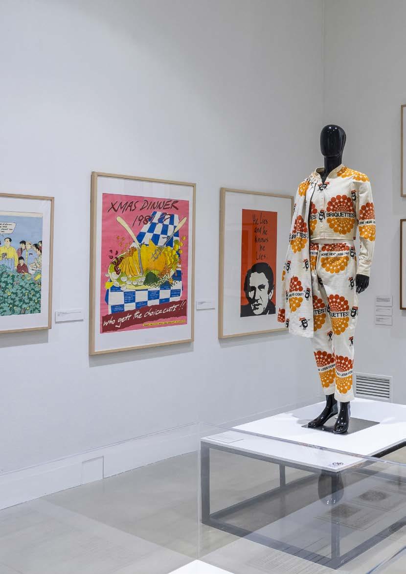
118 rmit design archives j ournal Vol 13 Nº 1 (2023) STANDING
YOUR GROUND RADICAL UTOPIA
Installation view, Radical Utopia: An Archaeology of a Creative City, RMIT Gallery, 2023. Standing your Ground display: Featuring posters from the Australian Queer Archives collection; the work of the collective Backyard Press and the Burnie Briquette suit.
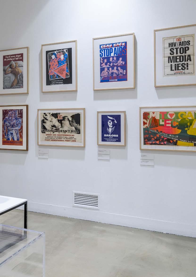
119 rmit design archives journal Vol 13 Nº 1 (2023)
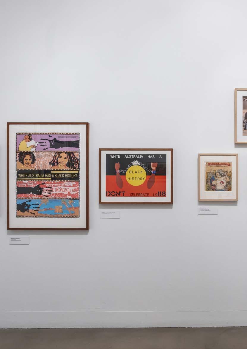
120 rmit design archives j ournal Vol 13 Nº 1 (2023) STANDING YOUR GROUND RADICAL UTOPIA
Installation view, Radical Utopia: An Archaeology of a Creative City, RMIT Gallery, 2023. Standing your Ground display: Featuring “Australia has a Black History” posters for the 1988 protests; portrait of all Australian Graffiti members; early sketches for Symbols of Australia; and Mimmo Cozzolino’s Symbols of Australia suit.
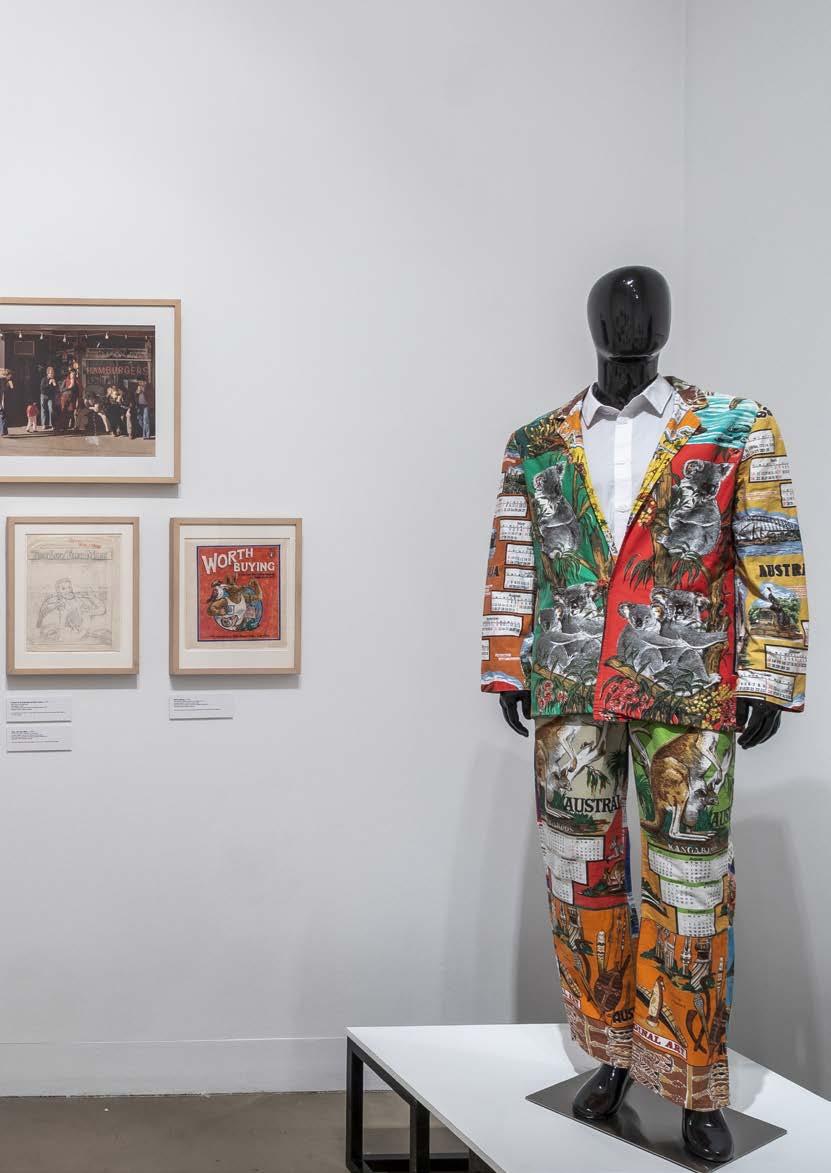
121 rmit design archives journal Vol 13 Nº 1 (2023)
SU SAN COHN
Cohncave bowl, 2021 (designed 1990, in production 1992)
Su san Cohn, designer; Alessi, manufacturer
Epoxy resin coating, stainless steel edge
Courtesy of the artist and Anna Schwartz Gallery
Digital images of Workshop 3000 in Kirk’s Lane, rear 401 Little Bourke Street, Melbourne, date not recorded
Courtesy of Su san Cohn
Doughnut Bracelet (Stonewash series), 1984
Su san Cohn, designer
Anodised aluminium
Courtesy of the artist and Anna Schwartz Gallery
Doughnut Bracelet (Torn Mesh series), 1986
Su san Cohn, designer
Anodised aluminium, 375 gold
Courtesy of the artist and Anna Schwartz Gallery
Earrings, 1982
Su san Cohn, designer
Anodised aluminium, 925 silver or 375 pink gold fittings
Courtesy of the artist and Anna Schwartz Gallery
Timber and aluminium chair, 1988
Denton Corker Marshall, co-designer; Su san Cohn, designer and manufacturer
Hoop pine (Araucaria cunninghamii), plywood, aluminium
Collection National Gallery of Victoria
Purchased from Admission Funds, 1990
Accession No D16-1990
REVOLT INTO STYLE
the parade
Fashion shoot featuring Clarence Chai jumpsuit, 1978
Rennie Ellis, photographer
Digital print, printed 2023
Courtesy Rennie Ellis Photographic Archive
CHAI Parade, 1978
Jo Lane, director; Malcolm Richards, videography
Single-channel video (07 min 45 sec)
Courtesy Jo Lane
Chai Parade Programme, 1978 Jo Lane, publisher
Ink, paper
Courtesy of Jo Lane
Alannah Hill at Party Architecture’s Fashion 1983 Seaview Ballroom, St. Kilda, 1983
Unknown photographer
Photograph
Collection rmit Design Archives
Gift of Clarence Chai 2022
Accession No 0004.2022.0053.1
Vanessa Leyonhjelm at Party
Architecture’s Fashion 1983
Seaview Ballroom, St. Kilda
Unknown photographer, Vanessa Leyonhjelm, fashion designer
Photograph
Collection rmit Design Archives
Gift of Clarence Chai 2022
Accession No 0004.2022.0053.2
Clarence Chai and models at Party Architecture’s Fashion 1983
Seaview Ballroom, St. Kilda
Unknown photographer
Photograph
Collection rmit Design Archives
Gift of Clarence Chai 2022
Accession No 0004.2022.0053.3
Party Architecture’s Fashion 1983
Seaview Ballroom, St. Kilda
Robert Pearce, designer Poster
Collection rmit Design Archives
Gift of Anne Shearman 2018
Accession No 0005.2017.0037
Party Architecture’s Fashion 1983
Seaview Ballroom, St. Kilda
Robert Pearce, designer; Jillian Burt, author; Andrew Lehmann, photographer
Event Program
Collection rmit Design Archives
Gift of Robert Buckingham 1998
Accession No 0176.1998.0333
Ready to Wear, 1983
The Rich Kids: Paul Goldman, Director; Evan English, Producer
Video recording (07 min 01 sec)
Collection rmit Design Archives
Gift of Robert Buckingham 1998 Accession No 0176.1998.0194
En Masse Fashion Radio:
Fashion 1983 at The Ballroom
Special, Tape No. 1, 1983
Robert Pearce, producer and host
Audio (54 min 00 sec)
Collection rmit Design Archives
Gift of Anne Shearman 2018 Accession No 0011.2018.0023.1-3
Fashion 84, Heroic Fashion, 1984
Presented by the Fashion Design Council
Robert Pearce, designer
Poster
Collection rmit Design Archives
Gift of Robert Buckingham 1998
Accession No 0176.1998.0255
Fashion '84, Heroic Fashion, 1984
Presented by the Fashion Design Council
Simon Burton, & Mark Davis, Directors; Terry Doolan, music
Video (04 min 33 sec)
Collection rmit Design Archives
Gift of Robert Buckingham 1998 Accession No 0176.1998.0195
Fashion *85, 1985
Presented by the Fashion Design Council
Robert Pearce, designer; Andrew Lehmann and Martyn Thompson photographers
Catalogue
Collection rmit Design Archives
Gift of Robert Buckingham 1998
Accession No 0176.1998.0001
Fashion *85, Revolt into Style, 1985
Presented by the Fashion Design Council
Robert Pearce, designer
Poster
Collection rmit Design Archives
Gift of Robert Buckingham 1998
Accession No 0176.1998.0312
I spy at Inflation, 1985
Presented by the Fashion Design Council
Simon Burton, Director; music organised by Robert Pearce and Wesley MacDonald
Video (11 min 07 sec)
Collection rmit Design Archives
Gift of Robert Buckingham 1998
Accession No 0176.1998.0196
122 rmit design archives journal Vol 13 Nº 1 (2023)
LIST OF
WORKS
The Fashion Design Council presents Friday 24th May 1985, 1985
Simon Burton, Director; Robert Buckingham, Producer Video (13 min 11 sec)
Collection rmit Design Archives
Gift of Robert Buckingham 1998
Accession No 0176.1998.0177
Revolt Into Style! Fashion Video Party, 1986
Presented by the Fashion Design Council
Robert Pearce, designer
Press Release
Collection rmit Design Archives
Gift of Robert Buckingham 1998
Accession No: 0176.1998.0407
Galaxy Summer "Cabaret"
Fashion Show, 1987
Bruce Slorach, designer; Sara Thorn, designer
Poster
Collection rmit Design Archives
Gift of Sara Thorn 2016
Accession No 0006.2016.0020
Model at Nescafé Fashion *88, 1988
Presented by the Fashion Design Council
Michael Rayner, photographer
Silver gelatin photograph
Collection rmit Design Archives
Gift of Robert Buckingham 1998 Accession No 0176.1998.0785
Models at Nescafé Fashion *88, 1988
Presented by the Fashion Design Council
Michael Rayner, photographer Silver gelatin photograph
Collection rmit Design Archives
Gift of Robert Buckingham 1998
Accession No 0176.1998.0780
Nescafé Fashion *88, 1988
Presented by the Fashion Design Council
Robert Pearce, designer
Three Postcards
Collection rmit Design Archives
Gift of Robert Buckingham 1998
Accession No 0176.1998.0013-15
Nescafé Fashion *88, 1988
Presented by the Fashion Design Council
Robert Pearce, designer
Poster
Collection rmit Design Archives
Gift of Robert Buckingham 1998
Accession No 0176.1998.0289
Fashion Babylon at The Metro, 1988
Presented by the Fashion Design Council
Robert Pearce, designer
Promotional card
Collection rmit Design Archives
Gift of Robert Buckingham 1998
Accession No 0176.1998.0017
the gallery
The Flogging, 1981
Robert Pearce, artist
Magazine Illustration: Paint, adhesive, tape, paper
Collection rmit Design Archives
Gift of Anne Shearman 2017
Accession No 0005.2017.0071
Fashion Supermarket Self Serve
Fashion at Christine Abrahams
Gallery, 1984
Alasdair Duncan MacKinnon, Curator
Invitation
Collection rmit Design Archives
Gift of Robert Buckingham 1998
Accession No 0176.1998.0351
Excerpt from documentary film –Babies, Snakes and Barking Dogs: Keith Haring in Australia, 1984
Robert Alcock, director Film footage (1 min 01 sec)
Courtesy of the Australian Film Television and Radio School (AFTRS)
Insignia, Linden Gallery, St. Kilda, 1986
Presented by the Fashion Design Council
Unknown photographers
Photographic slides, digital presentation 2023
Collection rmit Design Archives
Gift of Robert Buckingham 1998
Accession No 0176.1998.0772-76, 0778
Alasdair Duncan-Mackinnon's ‘Gardener’, 1987
Exhibited in Occupation-Demarkation, Gryphon Gallery, Melbourne, 1987
Robert Pearce, illustrator
Fashion illustration: Paint, ink, paper Collection rmit Design Archives
Gift of Anne Shearman 2017
Accession No 0005.2017.0065
Richard Neylon’s Female Pope, 1987
Exhibited in Occupation-Demarkation, Gryphon Gallery, Melbourne, 1987
Robert Pearce, illustrator
Fashion illustration: Paint, ink, paper Collection rmit Design Archives
Gift of Anne Shearman 2017
Accession No 0005.2017.0066
Meija’s Bellhop, 1987
Exhibited in Occupation-Demarkation, Gryphon Gallery, Melbourne, 1987
Robert Pearce, illustrator
Fashion illustration: Paint, ink, paper
Collection rmit Design Archives
Gift of Anne Shearman 2017 Accession No 0005.2017.0067
Occupation-Demarkation, Gryphon Gallery, Melbourne, 1987
Presented by the Fashion Design Council
Robert Pearce, designer Exhibition Room Brochure
Collection rmit Design Archives
Gift of Robert Buckingham 1998 Accession No 0176.1998.0425
Leigh Bowery with Michael Clark & Co and Body Map: No Fire Escape From Fashion!, Melbourne Town Hall, 1987
Presented by Fantastic Entertainment in Public Places, and the Fashion Design Council Postcard
Collection rmit Design Archives
Gift of Robert Buckingham 1998 Accession No 0176.1998.0420
A Wardrobe to View, Linden Gallery, St Kilda, 1988
Presented by the Fashion Design Council
Robert Pearce, designer
Exhibition invitation
Collection RMIT Design Archives
Gift of Robert Buckingham 1998 Accession No 0176.1998.0439
the club
Jenny Bannister and Clarence Chai at Sheiks Nightclub, 1981
Rennie Ellis, photographer Photographic print, printed 2023
Courtesy Rennie Ellis Photographic Archive
The Hardware Club, 1983
Robert Pearce, designer Poster
Collection rmit Design Archives
Gift of Anne Shearman 2017
Accession No 0005.2017.0041
Inflation Nightclub, 1983
Robert Pearce, designer Poster
Collection rmit Design Archives
Gift of Anne Shearman 2017
Accession No 0005.2017.0039
123 rmit design archives journal Vol 13 Nº 1 (2023)
LIST OF WORKS
Inflation Nightclub Interior bar, 1985
John Gollings
Two digital prints from slides, printed 2023
Biltmoderne: Dale Jones Evans, designer; Randal Marsh, designer; Roger Wood, designer
Courtesy of John Gollings
Jenny Bannister Lookbook 2: 1984-1985, 1987
Jenny Bannister, designer
Scrapbook: Cardboard, leather, paper, plastic
Collection rmit Design Archives
Gift of Jenny Bannister 2014
Accession No 0036.2014.0026
Inferno at Inflation, Monday, June 17, 8pm, 1986
Presented by the Fashion Design Council
Robert Pearce, designer
Invitation
Gift of Robert Buckingham 1998
Collection rmit Design Archives
Accession No 0176.1998.0002
‘Mish-Mash!!’ Sundays at Inflation, c.1983–1989
Presented by the Fashion Design Council
Robert Pearce, designer
Postcard
Collection rmit Design Archives
Gift of Anne Shearman 2017
Accession No 0005.2017.0051
LOCO MOTION at The Ballroom, c.1985
Robert Pearce, designer
Poster
Collection rmit Design Archives
Gift of Anne Shearman 2017
Accession No 0005.2017.0035
Metro Nightclub, c.1987
Robert Pearce, designer
Menu Collection rmit Design Archives
Gift of Anne Shearman 2017
Accession No 0005.2017.0011
Metro Nightclub, 1987
Robert Pearce, designer; Robert Buckingham, copywriter
Press release
Collection rmit Design Archives
Gift of Anne Shearman 2017
Accession No 0005.2017.0012
Metro Nightclub Interior Bar, 1987 John Gollings
Two digital prints from slides, printed 2023
Biltmoderne: Dale Jones Evans, Randal Marsh, Roger Wood, designers Courtesy of John Gollings
Souled Out! at the Metro, c.1987–1989
Robert Pearce, designer
Promotional card
Collection rmit Design Archives
Gift of Anne Shearman 2017
Accession No 0005.2017.0052
Valentine’s card for Metro Nightclub, c.1987-1989
Robert Pearce, designer
Promotional card
Collection rmit Design Archives
Gift of Anne Shearman 2017
Accession No 0005.2017.0050
Lunacy Under a F ull Moon, Checkpoint Charlie Nightclub, date unknown
Jonathan Hannon, designer Poster
Courtesy of the designer
furniture
Lounge Suite, 1983
Built Moderne, manufacturer Healy Metalworking, manufacturer; Raymond Arnold, textile screenprinter Steel, copper, cotton and other materials
National Gallery of Victoria, Melbourne
Purchased with the assistance of the Crafts Board of the Australia Council, 1986
Accession Number D5.a-c-1986
the shop
Clarence Chai at antique market, c.1970
Unknown photographer
Photograph
Collection rmit Design Archives
Gift of Clarence Chai 2022
Accession Number 0004.2022.00052
Victor Wong with Deborah Harry in CHAI, Crossley Street, Melbourne, 1977
Peter Ward, photographer, Jenny Bannister, fashion designer
Photograph Collection rmit Design Archives
Gift of Clarence Chai 2022
Accession Number 0004.2022.0033.2
Jacket, 1976
Clarence Chai, designer; CHAI, Melbourne, fashion house
Cotton, shell, rayon, metal (thread), glass (beads)
Collection National Gallery of Victoria, Melbourne
Gift of the artist 2014
Accession number: 2014.455
Jumpsuit, 1978
Clarence Chai, designer; CHAI, Melbourne, fashion house
Cotton, shell
Collection National Gallery of Victoria, Melbourne
Gift of the artist 2014
Accession number: 2014.454.a-b
Women's asymmetrical mini dress, c.1978
Dress worn by Maggie Edmond
Jenny Bannister, designer; CHAI, fashion house
Metal, plastic, vinyl
Collection rmit Design Archives
Gift of Edmond and Corrigan Pty Ltd
2017
Accession No 0006.2017.0016
Clarence Chai and CHAI garment labels, 1969–1990s
Clarence Chai, designer
Selection of garment labels: Cotton, polyester, paper
Collection rmit Design Archives
Gift of Clarence Chai 2022
Accession No 0004.2022.0031
Kamikaze, 1982
Robert Pearce, designer; Kamikaze, clothing store
Poster
Collection rmit Design Archives
Gift of Anne Shearman 2017
Accession No 0005.2017.0013
Illustration for ‘Michelangelo’ clothing store, 1983
Robert Pearce, illustrator
Ink, paint, paper
Collection rmit Design Archives
Gift of Anne Shearman 2017
Accession No 0005.2017.0069
Advertisement for ‘Empire’ clothing store, 1984
Robert Pearce, illustrator
Ink, paint, paper
Collection rmit Design Archives
Gift of Anne Shearman 2017
Accession No 0005.2017.0068
124 rmit design archives journal Vol 13 Nº 1 (2023)
Continued
F.D.C.’s Fashion Pavilion at the Royal Melbourne Show, 1985 Leaflet
Collection rmit Design Archives
Gift of Robert Buckingham, 1998
The Fashion Pavilion was designed by Biltmoderne architects.
Accession No 0176.1998.0397
abyss studio
Shorts in ‘Daisy Bone’ print, c.1988
Abyss Studio, fashion house: Bruce Slorach, designer; Sara Thorn, designer
Ink, cotton, elastic
Collection rmit Design Archives
Gift of Bruce Slorach and Sara Thorn
2010
Accession No 0072.2010.0036
T-shirt in ‘Daisy Bone’ print with ‘Abyss’ mouse logo, c.1988
Abyss Studio, fashion house: Bruce Slorach, designer; Sara Thorn, designer
Ink, cotton
Gift of Bruce Slorach and Sara Thorn
2010
Accession No 0072.2010.0001
Retail display of sew on patches captioned ‘Badge it!?’, 1986
Abyss Studio, fashion house: Bruce Slorach, designer; Sara Thorn, designer
Ink, polyester, cotton, plastic, cardboard
Collection rmit Design Archives
Gift of Sara Thorn 2016
Accession No 0006.2016.0002
Sketch of 'Daisy Bone' design, c.1988
Abyss Studio, fashion house: Bruce Slorach, designer; Sara Thorn, designer
Ink, pencil, paper
Collection rmit Design Archives
Gift of Sara Thorn 2016
Accession No 0006.2016.0016
Transparency for t-shirt screenprint featuring Abyss mouse logo, c.1988
Abyss Studio, fashion house: Bruce Slorach, designer; Sara Thorn, designer
Ink, acetate
Collection rmit Design Archives
Gift of Sara Thorn 2016
Accession No 0006.2016.0008
Belt buckle, 1989
Abyss Studio, fashion house: Bruce Slorach, designer; Sara Thorn, designer; Le Sac de Mode, manufacturer
Metal
Collection rmit Design Archives
Gift of Sara Thorn 2010
Accession No 0072.2010.0077
Belt buckle with mouse head and crossbones, c.1989
Abyss Studio, fashion house: Bruce Slorach, designer; Sara Thorn, designer; Le Sac de Mode, manufacturer
Metal Collection rmit Design Archives
Gift of Sara Thorn 2010
Accession No 0072.2010.0078
Catalogue for Abyss Studio, 1987
Abyss Studio fashion house: Bruce Slorach, designer; Sara Thorn, designer
Catalogue: Paper, ink, plastic Collection rmit Design Archives
Gift of Sara Thorn 2010
Accession No 0072.2010.0002
Drawing for Galaxy Emporium poster, 1986
Abyss Studio, fashion house: Bruce Slorach, designer; Sara Thorn, designer Ink, pencil, cardboard
Collection rmit Design Archives
Gift of Sara Thorn 2016 Accession No 0006.2016.0013
Galaxy Sticker, 1988–1992
Galaxy Studio, fashion house: Bruce Slorach, designer; Sara Thorn, designer Sticker: Ink, plastic, paper Collection rmit Design Archives
Gift of Sara Thorn 2010
Accession No 0072.2010.0083
Bruce Slorach and Sara Thorn, c.1983
Kate Gollings, photographer
Photograph Collection rmit Design Archives
Gift of Robert Buckingham 1998
Accession No 0176.1998.0858
gavin brown: plain jane studio
Bomb Jacket, 1980s
Gavin Brown, designer; Plain Jane, Melbourne, fashion house
Screenprinted cotton Collection of the designer
Four-piece Bomb outfit, 1984
Gavin Brown, designer; Plain Jane, Melbourne, fashion house; Screenprinted cotton Collection of the designer
Four colour blocks of Indian snakes and ladders fabric, 1985
Plain Jane, Melbourne, fashion house; Gavin Brown, artist
Screenprinted cotton
Courtesy of the artist
Patch, 1980s
Plain Jane, Melbourne, fashion house; Gavin Brown, artist Cotton
Courtesy of the artist
Fashion *85, 1985
Presented by the Fashion Design Council
Robert Pearce, designer; Andrew Lehmann and Martyn
Thompson photographers
Catalogue for Parade
Courtesy of Gavin Brown
Scrapbook, 1980
Gavin Brown Ink, paper
Courtesy of the artist
Plain Jane photoshoot, 1985
Vera Gibb, photographer Gelatin silver photograph
Courtesy of the artist
Plain Jane Studio, Melbourne, 1980s
Andrew Lehmann, photographer Gelatin silver photograph
Courtesy of the artist
fashion design council
The X-hibitionists, Shock! Fashion Rocks Moomba, 1984
Presented by the Fashion Design Council
Robert Pearce, designer
Poster Collection rmit Design Archives
Gift of Robert Buckingham 1998
Accession No 0176.1998.0293
Fashion Design Council Shop, 1989
Penny Jagelio, photographer
Photographic slides, digital presentation 2023
Collection rmit Design Archives
Gift of Robert Buckingham 1998
Accession No 0176.1998.0756
125 rmit design archives journal Vol 13 Nº 1 (2023)
Fashion Design Council Shop, 1989–1993
Unknown photographer
Photographic slides, digital presentation 2023
Collection rmit Design Archives
Gift of Robert Buckingham 1998
Accession No 0176.1998.0770
marcos davidson
Asymmetrical Necklace (Horn) of plenty, c.1985–86
Marcos Davidson, jeweller
Nickel silver, titanium, bakelite, purple rock
Courtesy of Jenny Bannister
Pair of Earrings, date unknown
Marcos Davidson, jeweller
Etched nickel silver, titanium
Courtesy of Jenny Bannister
Star man cuff, date unknown
Marcos Davidson, jeweller
Nickel
Engraved on back
“To my Darling Bunnytoes”
Courtesy of Jenny Bannister
Space Jetsom Wrist cuff , c.1989
Marcos Davidson, jeweller
Etched nickel silver, titanium, iron pyrite, brass
Courtesy of Jenny Bannister
kate durham
Necklace, 1980
Kate Durham, designer
Plastic, wood
National Gallery of Victoria, Melbourne
Purchased 1980
Accession Number D401- 1980
Pair of gold dolly, heart and pearl earrings, 1982-83
Kate Durham, designer
Gold, pearl, aluminium
Courtesy of Jenny Bannister
Pair of silver crinkle earrings with painted stripes, 1982-83
Kate Durham, designer
Silver, paint
Courtesy of Jenny Bannister
Pair of straw and aluminium earrings, 1982-3
Kate Durham, designer
Straw, aluminium
Courtesy of Jenny Bannister
peter scott
Brooch, date unknown
Peter Scott, designer
Pink Perspex, brass, batteries with flashing feet
Courtesy of Jenny Bannister
Earrings, date unknown
Peter Scott, designer
Glitter, fibreglass, batteries
Courtesy of Jenny Bannister
Pair of mask earrings, date unknown
Peter Scott, designer
Brass, batteries with red flashing eyes
Courtesy of Jenny Bannister
print and radio
En Masse Fashion Radio: Sex + Fashion Edition, Vol 2 No. 2, 1983 Robert Pearce, designer Audio reel, box
Collection rmit Design Archives
Gift of Anne Shearman 2018
Accession No 0011.2018.0025
Crowd, Edition 1, October, 1983
Crowd Productions Pty Ltd, publisher; Michael Trudgeon, designer & editor; Jane Joyce, designer & editor; Andrew Maine, editor
Magazine
Collection rmit Design Archives
Gift of Linda Jackson 2011
Accession No 0042.2013.0013
Tension 4, July/August, 1984
Ashley Crawford, editor; Terry Hogan, designer; The Virgin Pres Publishing Co., publisher
Magazine, Keith Haring, cover illustration
Collection rmit Design Archivess
Gift of Anthony Parker 2013 Accession No 0002.2013.0012
Crowd, Edition 8, November, 1985
Crowd productions Pty Ltd, publisher; Michael Trudgeon, designer & editor; Jane Joyce designer, editor; Andrew Maine, editor
Magazine
Collection rmit Design Archives
Gift of Michael Trudgeon and Jane Joyce 2013
Accession No 0042.2013.0017
Collections magazine, Vol. 1, No. 3, March-June, 1985
Robert Pearce, designer; En Masse Media, publisher Magazine
Collection rmit Design Archives
Gift of Robert Buckingham 1998 Accession No 0176.1998.0024
Tension 16, January-February, 1989
Ashley Crawford, editor; Terry Hogan, designer Magazine
Courtesy Helen Stuckey
Transition, No. 27/28, 1989
Karen Burns, editor; Harriet Edquist, editor; Dean Cass; RMIT University, Department of Architecture and Design, publisher Magazine
Collection rmit Design Archives
Gift of Harriet Edquist 2014
Accession No 0038.2014.0260
ARCHITECTURE AS IDEA
postmodern histories
Nichols House, Eltham, 1972–1973
Kevin Borland, designer; Huan Chen, model maker
Architectural model: cork, timber, twigs
Donated by Kevin Borland and Associates to Museum Victoria for its exhibition
Home Sweet Home: Changes in Victorian Domestic Architecture
1939-1989
Collection of Museums Victoria
The Completion of Engehurst
architectural model, exhibited at the Pleasures of Architecture conference, Sydney, 1980
Gregory Burgess, architect and model maker
Caneite, balsa and cardboard
Courtesy of Gregory Burgess
A home for Mr and Mrs Graeme
Blundell and all their friends, 1980
Peter Corrigan, architect
Drawing: Ink, paper, cardboard
Collection rmit Design Archives
Gift of Edmond and Corrigan Pty Ltd 2017
Accession No 0006.2017.0011
Home Sweet Home: Changes in Victorian Domestic Architecture
1939–1989 exhibition at Museums
Victoria, 1989
Museums
Victoria, designer and publisher
Collection of Peter Elliott
126 rmit design archives journal Vol 13 Nº 1 (2023)
Continued
LIST OF WORKS
Stockman’s Hall of Fame and Outback
Heritage Centre, Longreach, 1980
Robert Pearce, illustrator; Edmond & Corrigan, architects
Drawing: Ink, pencil, paper
Collection rmit Design Archives
Gift of Edmond and Corrigan Pty Ltd 2017
Accession No 0006.2017.0003
Barber House, 1979
Robert Pearce, illustrator; Edmond & Corrigan, architects
Drawing: Ink, pencil, paper
Collection rmit Design Archives
Gift of Edmond and Corrigan Pty Ltd 2017
Accession No 0006.2017.0002
Invocation, Church of the Resurrection, Keysborough, c.1980
Robert Pearce, illustrator; Edmond & Corrigan, architects
Drawing: Ink, photographic paper, paper
Collection rmit Design Archives
Gift of Edmond and Corrigan Pty Ltd 2017
Accession No 0006.2017.0008
Resurrection School, c.1980
Robert Pearce, illustrator; Edmond & Corrigan, architects
Drawing: Ink, pencil, paper
Collection rmit Design Archives
Gift of Edmond and Corrigan Pty Ltd 2017
Accession No 0006.2017.0007
Transition Tenth Anniversary
Conference: Robin Boyd and Australian Architectural Criticism, 1989
Dean Cass, designer; RMIT University, School of Architecture and Design, publisher
Poster
Collection rmit Design Archives
Gift of Harriet Edquist 2014
Accession No 0038.2014.0051
New Classicism? Ten Melbourne
architects: Crone, Dance, Day, McDougall, O’Connor, Raggatt, Rijavec, Selenitsch, Timpano/Butler, 1986
Monash University Gallery, publisher; Elaine Merkus, designer
Exhibition catalogue
Courtesy of Harriet Edquist
Fitzroy: Lost and Found.
A History in Photography, 1986 Melbourne College of Printing and Graphic Design, publisher and designer; Suzanne Dance, exhibition curator
Poster
Courtesy of Suzanne Dance
Home Sweet Home: Changes in Victorian Domestic Architecture 1939–1989 exhibition at Museums
Victoria, 1989
Museums Victoria, designer and publisher
Poster
Collection of Peter Elliott mediated postmodernism
Transition, c. 1983
Michael Trudgeon, designer Poster
Courtesy of Michael Trudgeon
Architecture as Idea: Constructions by 26 Melbourne Architects, RMIT Gallery, curated by Built Moderne, 1984
John Gollings, photographer Digitised installation photographs, printed 2023
Courtesy of John Gollings
Architecture as Idea: Constructions by 26 Melbourne Architects, RMIT Gallery, 1984
Robert Pearce, designer
Poster (front, back)
Collection rmit Design Archives
Gift of Anne Shearman 2017, Gift of Dean Boothroyd 2012
Accession Nos 0005.2017.0001 and 0124.2012.0068
Architecture as Idea, 2022 Oz Neon, Melbourne, manufacturer
Neon light
Collection rmit University
This neon is a facsimile of the neon designed by Built Moderne for Architecture as Idea
Transition: The Interview Issue, Vol. 3, No. 3 /4, 1984
RMIT University, School of Architecture and Design, publisher; Ian McDougall, editor; Conrad Hamann, editor; Greg Missingham, editor; Peter Corrigan, editor; Michael Trudgeon, designer Magazine
Collection rmit Design Archives
Gift of Harriet Edquist, 2014
Accession No 0038.2014.0247
New Classicism?, 1986
Half-Time Club, organiser
Audio cassette recording (2 hr 57 min 20 sec)
Collection rmit Design Archives
Gift of Dean Boothroyd 2012
Accession No 0124.2012.0017
Transition: the HalfTime Club with the PWD, No. 18/19, September 1986
RMIT University, School of Architecture and Design, publisher; Karen Burns, editor; Paul Morgan editor; Geoff Barton, cover design
Magazine
Collection rmit Design Archives
Gift of Harriet Edquist, 2014
Accession No 0038.2014.0253
Burning down the house, 1989
Peter Brew, presenter; Neil Masterton, presenter; Peter Raisbeck, presenter; Alex Lawlor, presenter; Craig Gillett, presenter
Audio cassette recording (31 min 30 sec)
Collection rmit Design Archives
Gift of Peter Brew 2014 0037.2014.0015
Battlers lunch, 1990
Photographer not recorded
Photograph
Collection of Peter Elliott
Companion City architecture design competition at ACCA, 1991
Vanessa Bird, designer; Transition, RMIT University, School of Architecture and Design, publisher
Exhibition invitation
Collection rmit Design Archives
Gift of Harriet Edquist, 2014
Accession No 0038.2014.0008
border crossings
Art Tram Class W2, Number 567 designed by Peter Corrigan, c.1978
Conrad Hamann, photographer
Photograph
Collection rmit Design Archives
Gift of Edmond and Corrigan Pty Ltd
2017
Accession No 0058.2013.0055
Model of Art Tram, 1978
Peter Corrigan, designer
Paint, ink, adhesive tape, adhesive, paper, wood
Collection rmit Design Archives
Gift of Edmond and Corrigan Pty Ltd 2017
Accession No 0006.2017.0103
Model of Art Tram, 1978
Peter Corrigan, designer
Paint, ink, paper, adhesive
Collection rmit Design Archives
Gift of Edmond and Corrigan Pty Ltd 2017
Accession No 0006.2017.0104
127 rmit design archives journal Vol 13 Nº 1 (2023)
LIST OF WORKS
Continued
Transporting Art: Impressions of the Painted Trams Project, Victorian Ministry for the Arts Gallery, Melbourne, 1983
Artistic Licence, design, Stephen Hall, Andrew Lehmann, and Greg Scullin, photographers, Victorian Ministry for the Arts, publisher
Poster
Collection rmit Design Archives
Gift of Edmond and Corrigan Pty Ltd 2017
Accession No 0006.2017.0158
Tension, No. 3, April 1983
Ashley Crawford, editor; Robin Barden, associate editor; Terence Hogan, author; Andrew Lehmann, photographer; Built Moderne, author; Ingrid Periz, author; Dael Evans, author
Magazine
Collection rmit Design Archives
Gift of Robert Buckingham 1998
Accession No. 0176.1998.0072
Page opening “Furniture X-Hibition of Built Moderne and Jane Joyce”
Three designers: Biltmoderne at Pinacotheca: Architecture, Interiors, Furniture, August/September 1986
Pinacotheca, publisher; Terence Hogan, designer
Exhibition promotional package
Courtesy of Terence Hogan
Transition: Artists and Architects ’86, No. 17, Vol. 5, No 1, June 1986
RMIT University, School of Architecture and Design, publisher; Kim Halik, editor; Paul Morgan, editor
Exhibition catalogue for George Paton and Ewing Galleries
Gift of Harriet Edquist 2014
Collection rmit Design Archives
Accession No 0038.2014.0252
From Robert Adam to Biltmoderne, the architect as designer, 1987 National Gallery of Victoria, publisher; Christine Lewis, designer; Lithocraft Graphics, printer
Exhibition catalogue
Courtesy of Michael Spooner
Collaborative designs. Working together in Architecture at Meat Market Craft Centre, North Melbourne, 1988
John Gollings, photographer
Digitised installation photographs, 2023
Courtesy of John Gollings
Collaborative Designs. Working Together in Architecture, Meat Market Craft Centre, North Melbourne, 1988
Exhibition Poster
Brian Sadgrove and Associates, designer
Collection of Peter Elliott
The Australian Chair, 1989 Royal Australian Institute of Architects, publisher; Craig Bremner, designer; It’s Art Pty Limited, designer
Exhibition catalogue
Collection rmit Design Archives
Gift of Edmond and Corrigan Pty Ltd 2017
Accession No 0006.2017.0156
women in architecture
Women in Architecture, c.1980s
Kate Gollings, photographer
Digital Print
Left to right: Ann Keddie, Maggie Edmond, Anne Cunningham, Penny Jost, Mary-Ruth Sindrey, Suzanne Dance
Courtesy of Kirstin Gollings for the Estate of Kate Gollings
Transition, Women in Architecture, No. 25 Winter, 1988
RMIT University, School of Architecture and Design, publisher; Karen Burns, editor; Harriet Edquist, editor; Dean Cass, designer
Magazine
Collection rmit Design Archives
Gift of Harriet Edquist 2014
Accession No 0038.2014.0258
Women’s Winter School, 1991 Information brochure
Gift of Lecki Ord 1991
Collection rmit Design Archives
Accession No 0007.2017.0037
Insight-Out: 10 Architectural Works at 200 Gertrude Street, 1992 Ian Robertson, designer Exhibition Poster
Collection rmit Design Archives
Gift of Karen Burns 2018
Accession No 0012.2018.0016
STANDING YOUR GROUND
Selection of six index cards featuring trademarks that were part of Mimmo Cozzolino’s research for Symbols of Australia, 1972–1980
Mimmo Cozzolino, designer
Ink, paper, cardboard
Collection rmit Design Archives
Gift of Mimmo Cozzolino 2016
Accession No 0002.2016.0101.1
Portrait of All Australian Graffiti members, 1977 Bob Bourne, photographer
Photographic paper
Collection rmit Design Archives
Gift of Mimmo Cozzolino and All Australian Graffiti 2016
Accession No 0002.2016.0063
Set of page layouts for Symbols of Australia, 1978-1980
Mimmo Cozzolino, designer; Fysh Rutherford, editors
Ink, adhesive tape, paper
Collection rmit Design Archives
Gift of Mimmo Cozzolino 2019
Accession No 0009.2019.0005
Symbols of Australia, c.1979
Geoff Cook, illustrator; Mimmo Cozzolino, author
Sketch for cover: ink, pencil, adhesive tape, paper
Collection rmit Design Archives
Gift of Mimmo Cozzolino 2019
Accession No 0009.2019.0011
Worth Buying, c.1979
Con Aslanis, illustrator; Mimmo Cozzolino, author
Sketch for cover: ink, pencil, paint, paper
Collection rmit Design Archives
Gift of Mimmo Cozzolino 2019
Accession No 0009.2019.0012
They Left Their Mark, c.1979
Mimmo Cozzolino, illustrator and author
Sketch for cover: pencil, ink, adhesive tape, paper
Collection rmit Design Archives
Gift of Mimmo Cozzolino 2019
Accession No 0009.2019.0010
Mimmo Cozzolino’s Symbol of Australia Suit, 1980–1983
Mimmo Cozzolino, designer; Ilva Romanin, manufacturer
Bought tea towels, cotton, plastic
Collection rmit Design Archives
Gift of Mimmo Cozzolino 2019
Accession No 0009.2019.0013.1-2
128 rmit design archives journal Vol 13 Nº 1 (2023)
Could this be the reason why some designers are not understood by production managers?, 1991
Mimmo Cozzolino, art director, Cozzolino/Ellett Design Studio; Mike Rutherford, photographer
Poster
Gift of Mimmo Cozzolino 2016
Collection rmit Design Archives
Accession No 0002.2016.0137
Symbols of Australia 20th Anniversary Edition, 2000
Mimmo Cozzolino Pty Ltd, publisher; Mimmo Cozzolino, author; Fysh Rutherford, editor; Geoff Cook, cover illustration
Book
Collection rmit Design Archives
Gift of Mimmo Cozzolino 2016
Accession No 0002.2016.0103
aboriginal resistance
Koori culture is self-determination –NAIDOC week Programme 5th–14th
September 1986, 1986 Artist unknown
Poster
Riley and Ephemera Collection, State Library Victoria
White Australia has a black history, 1987
Colin Russell, artist; Another Planet Posters, publisher
Poster
Gift of Another Planet Posters
Riley and Ephemera Collection, State Library Victoria
White Australia has a black history. Don’t celebrate 1988, 1987
Artist unknown
Poster
Riley and Ephemera Collection, State Library Victoria
queer activism
RMIT Gay Collective Meeting
BLDG 29, 1980s
Pru Borthwick, artist;
RMIT Gay Collective, publisher
Poster
Collection of Australian Queer Archives (AQuA), Melbourne
Stonewall, 1984
Deborah Kelly, artist
Poster
Collection of Australian Queer Archives (AQuA), Melbourne
You’ll never forget the feeling of safe sex: how to score safely, 1985
Victorian aids Council
Poster
Collection of Australian Queer Archives (AQuA), Melbourne
Stop AIDS. Use condoms. Don’t share needles, 1988
Paul Drakeford, artist/photographer
Poster
Moomba Deaf Association and Australian Federation of aids
Organisations
Collection of Australian Queer Archives (AQuA), Melbourne
Sailors. AIDS is real, 1988
Victorian AIDS Council, publisher
Poster
Collection of Australian Queer Archives (AQuA), Melbourne
Kissing doesn’t kill. Greed and indifference do, 1990 Red Letter Press, designer; ACT UP, publisher
Poster
Collection of Australian Queer Archives (AQuA), Melbourne
Stop AIDS. Stop media lies, 1991 Jeffrey Grad, photographer; ACT UP, publisher
Poster
Collection of Australian Queer Archives (AQuA), Melbourne
HIV discrimination and grief threaten our community. Build our strength stay together and support each other, 1992
David McDiarmid, artist aids Council of New South Wales (acon )
Poster
Riley and Ephemera Collection, State Library Victoria
collectivism –jillposters & another planet posters
Carole Wilson in Gertrude Street Studio, 1980s
Two digital prints
Courtesy of Carole Wilson
Women of the World, 1983 Jillposters, publisher; Carole Wilson, artist; Deej Fabyc, artist
Poster
Courtesy of the artist
Direct from the grower to you, 1984 Jillposters, publisher; Carole Wilson, artist
Poster
Courtesy of the artist
Support women under Apartheid (2 versions), 1984 Jillposters, publisher; Carole Wilson, artist
Poster
Courtesy of the artist
Strike while the iron is hot, 1987
Jillposters, publisher; Carole Wilson, artist
Poster
Courtesy of the artist
Images of Lebanon, 1988
Another Planet Posters, publisher; Carole Wilson artist; the Arabic Women’s Group at the Thornbury Women’s Neighbourhood House, collaborators
Poster
Courtesy of the artist
Is there life after incest?, 1988
Another Planet Posters, publisher; Carole Wilson, artist
Poster
Courtesy of the artist
Older is fun, 1988
Another Planet Posters, publisher; Carole Wilson, artist
Poster
Courtesy of the artist
Plastic’s got us hook, line & sinker –recycle now, 1988
Another Planet Posters, publisher; Carole Wilson, artist
Poster
Courtesy of the artist
Stand your ground, 1988
Another Planet Posters, publisher; Carole Wilson, artist
Poster
Courtesy of the artist
El Salvadoran women…., 1989
Another Planet Posters, publisher; Carole Wilson, artist; Women of the Unified Salvadoran Community in Victoria, collaborators
Poster
Courtesy of the artist
129 rmit design archives journal Vol 13 Nº 1 (2023)
We all have the right to choose where we live, 1990
Another Planet Posters, publisher; Carole Wilson, artist
Poster
Courtesy of the artist
Women prison & poverty is not a simple issue, year unknown
Another Planet Posters, publisher; Carole Wilson, artist
Poster
Courtesy of the artist
Plastic’s got us hook, line & sinker –recycle now, displayed on a site in the Melbourne CBD, c.1980s–1990s
Peter Curtis, photographer
Digital print
Courtesy of Carole Wilson
cooperativitismbackyard press & champion books
I’m not voting Liberal, c.1975
Paul Greene, designer; Champion Books, publisher; Backyard Press, publisher
Postcard
Collection rmit Design Archives
Gift of Ted Hopkins 2011
Accession No 0078.2010.0013
Backyard Press Studio, Greville Street, Prahran, c.1979
L-R Chris White, Marius Foley, Paul Greene, Mark Carter David Rae, photographer
Courtesy Marius Foley
Teledex, 1980
Ted Hopkins, author; Paul Greene, designer; Champion Books, publisher; Backyard Press, printer
Book
Collection rmit Design Archives
Gift of Ted Hopkins 2010
Accession No 0078.2010.0018
He Lies and he knows he lies, 1980
Paul Greene, designer, Screenprint for R.A.S.C.A.L.S (Rational and Sane Citizens Against Liberal Stupidity), 1980 Federal Election
Poster
Courtesy of David Rae
The Razor Gang, 1980–1981
Ian Robertson, designer; Backyard Press, printer
Postcard
Collection rmit Design Archives
Gift of Ted Hopkins 2010
Accession No 0078.2010.0017
Migrants Love Concrete, c.1981
Peter Lyssiotis, artist; Ethnic Avenger Enterprises, publisher; Backyard Press, printer Postcard
Collection rmit Design Archives
Gift of Ted Hopkins 2011 Accession No 0078.2010.0015
Journey of a wise electron and other stories, 1981
Peter Lyssiotis, author; Champion Books, publisher; Backyard Press, printer Book
Collection rmit Design Archives
Gift of Ted Hopkins 2010 Accession No 0078.2010.0001
The Choice Cuts, c.1981
Ian Robertson, designer; R.A.S.C.A.L.S (Rational and Sane Citizens Against Liberal Stupidity), publisher; Backyard Press, printer
Poster
Courtesy of Marius Foley
The Book of Slab, 1982
Ted Hopkins, author Slab, artist’s collective, compiler; Champion Books, publisher Book
Collection rmit Design Archives
Gift of Ted Hopkins 2010 Accession No 0078.2010.0002
The Yallourn Stories, 1982
Ted Hopkins, author; Champion Books, publisher Book
Collection rmit Design Archives
Gift of Ted Hopkins 2010 Accession No 0078.2010.0012
Burnie Briquette suit, 1982
Attributed to ‘Emmanuel Dakis
The TAILOR’
Courtesy of Marius Foley
Accordion to Mao, 1982
Ian Robertson, designer; Backyard Press, printer
Poster
Collection rmit Design Archives
Gift of Harriet Edquist 2019 Accession No 0012.2019.0001
Art and a Texta, 1983
new-Australian Art a Magazine, publisher and printer
Magazine
Courtesy of Helen Stuckey
THE EMERGENCE OF DIGITAL DESIGN
born digital design - 3d computer animation & video paint brush
Dream House, 1983
Sally Pryor, artist; Willy Zygier, music
3D computer animation
Courtesy of Sally Pryor
Waltz Mambo, 1983
Andrew Quinn, artist; John Bird, producer; David Atkinson, optical printer; Andrew Quinn, music/sound
3D computer animation
Courtesy of Andrew Quinn
Sally Pryor, Andrew Quinn and John Bird at Swinburne Film and Television Lab, 1983
Photographer not recorded B&W photograph
Courtesy of Sally Pryor
Unknown, Alvy Ray Smith, Sally Pryor and John Bird at Swinburne, 1984
Photographer not recorded B&W photograph
Courtesy of Sally Pryor
Countdown 84, 1984
Sally Pryor, 3D animator; Andrew Quinn, 3D animator; John Bird (Swinburne), producer; Phillip Cordingley (Art Director ABC), producer
3D computer animation
Collection ABC Archives
Letter to Sally Pryor from ABC
Art Director John Cordingley, 1984 Ink on paper
Courtesy of Sally Pryor
Hong Kong Bank Advertisement, 1987
Sally Pryor, 3D animator; Video Paint Brush, developer
3D computer animation
Courtesy of HSBC
‘Jean-Marc Le Pechoux –interviewed by Ashley Crawford’, Tension 11, Jan – Feb, 1987
Ashley Crawford, editor and publisher
Magazine
Courtesy of Helen Stuckey
130 rmit design archives journal Vol 13 Nº 1 (2023)
LIST OF WORKS Continued
Crowd Poster, 1985
Michael Trudgeon, designer
Poster Design featured in Crowd magazine
Courtesy of Michael Trudgeon
born digital design –videogames: beam software / melbourne house
ZX Spectrum 16/48K, 1982–1992 Sinclair Research (uk ), developer
Microcomputer hardware Collection Swinburne Digital Heritage Lab
Commodore 64, 1982–1994
Commodore Business Machines (usa ), developer
Microcomputer hardware Collection Swinburne Digital Heritage Lab
Commodore 1530 Datasette, 1982
Commodore Business Machines (USA), developer
Microcomputer hardware Collection Swinburne Digital Heritage Lab
Spectrum Machine Language for the Absolute Beginner, 1982
William Tang, editor; Beam Software, editor; Melbourne House, publisher
Book
Courtesy of Helen Stuckey
VIC Innovative Computing, 1982
Clifford Ramshaw, author; Melbourne House, publisher Book
Courtesy of Helen Stuckey
Hungry Horace ZX
Spectrum 16/48K, 1982
Beam Software (with Psion), developer; Melbourne House (with Psion), publisher; William Tang, designer
Game cassette and case Collection Australian Centre for the Moving Image (acmi )
acmi Identifier ARC000018-1
Horace Goes Skiing ZX
Spectrum 16/48K, 1982
Beam Software (with Psion), developer; Melbourne House (with Psion), publisher; William Tang, designer; Philip Mitchell, designer Game cassette and case Collection Australian Centre for the Moving Image (acmi )
acmi Identifier ARC000016-1
The Hobbit ZX Spectrum 16/48K, 1982
Beam Software, developer; Melbourne House, publisher; Veronika Megler –designer; Philip Mitchell, designer Game cassette and case
Courtesy of Helen Stuckey
Commodore 64 Exposed, 1983
Bruce Bayley, author; Beam Software, author; Melbourne House, publisher Book
Courtesy of Helen Stuckey
Commodore 64 Games Book, 1983
Clifford Ramshaw, author; Mark Ramshaw, authors; Melbourne House, publisher Book
Courtesy of Helen Stuckey
Penetrator ZX Spectrum 16/48K, 1983
Beam Software, developer; Melbourne House, publisher; Philip Mitchell, designer; Veronika Megler, designer Game cassette and case Collection Swinburne Digital Heritage Lab
H.U.R.G ZX Spectrum 16/48K, 1983; Beam Software, developer; Melbourne House, publisher; William Tang, designer Game cassette and case Collection Australian Centre for the Moving Image (acmi ) acmi Identifier ARC000014-1
A Guide to Playing The Hobbit, 1984 David Elkan, author; Melbourne House, publisher Book
Courtesy of Helen Stuckey
Hungry Horace Commodore 64, 1984 Beam Software, developer; Melbourne House; publisher; William Tang (original ZX Spectrum game), designer; Gregg Barnett (remake for Commodore 64), designer Game cassette and case Collection Swinburne Digital Heritage Lab
Horace Goes Skiing Commodore 64, 1984
Beam Software, developer; Melbourne House, publisher; William Tang, designer; Gregg Barnett, designer Game cassette and case Collection Australian Centre for the Moving Image (acmi ) acmi Identifier ARC000015-1
The Way of the Exploding Fist
Commodore 64, 1985
Beam Software, developer; Melbourne House, publisher; Gregg Barnett, designer; Bruce Bayley, additional programming; David Johnston, additional programming; Greg Holland, graphics; Neil Brennan, music
Game cassette and case Collection Swinburne Digital Heritage Lab
The Way of the Exploding Fist
Commodore 64, 1985
Beam Software, developer; Melbourne House, publisher; Gregg Barnett, designer; Bruce Bayley, additional programming; David Johnston, additional programming; Greg Holland, graphics; Neil Brennan, music
Game Software in local emulation Collection Swinburne Digital Heritage Lab
Lord of the Rings Commodore 64, 1986
Beam Software, developer; Melbourne House, publisher; Philip Mitchell, designer
Game cassettes and case Collection Swinburne Digital Heritage Lab
Lord of the Rings ZX Spectrum
16/48K, 1986
Beam Software, developer; Melbourne House, publisher; Philip Mitchell, designer
Game cassettes and case Collection Swinburne Digital Heritage Lab
Asterix and the Magic Cauldron
Commodore 64, 1986; Beam Software, developer; Melbourne House, publisher; Andrew Davie, designer; David Pentecost, designer; Russel Comte, graphics; Neil Brennan, music
Game cassette and case Collection Swinburne Digital Heritage Lab
Mugsy’s Revenge Commodore 64, 1986
Beam Software, developer; Melbourne House, publisher; Andrew Davie, designer; Russel Comte, graphics; Neil Brennan, music
Game cassette and case Collection Swinburne Digital Heritage Lab
131 rmit design archives journal Vol 13 Nº 1 (2023)
Mugsy’s Revenge Commodore 64, 1986
Beam Software, developer; Melbourne House, publisher; Andrew Davie, designer; Russel Comte, graphics; Neil Brennan, music
Game Software in emulation through Emulation as a Service
Collection Australian Centre for the Moving Image (acmi )
Fist II: The Legend Continues
ZX Spectrum 16/48K, 1986
Beam Software, developer; Melbourne House, publisher; Gregg Barnett, designer; Damian Watharow, programming; Steven Taylor, programming; Bill McIntosh, additional programming; Frank
Oldham, graphics
Game cassette and case Collection Australian Centre for the Moving Image (acmi )
Rock’n Wrestle, 1986; Commodore 64
Beam Software, developer; Melbourne House, publisher; Gregg Barnett, designer; Bruce Bayley, designer; Cameron Duffy, designer; Andrew Pavlumanolakos, additional programming; Nigel Spencer, additional programming; Damian Watharow, design and producer; Russel Comte, graphics; Gregg Holland, graphics; Neil Brennan, music
Game cassette and case Collection Swinburne Digital Heritage Lab
Doc the Destroyer ZX Spectrum 16/48K, 1987
Beam Software, developer; Melbourne House, publisher; Pauli Kidddesigner; Geoff Evan, designer; Richard Woolcock, programming; Anthony Burkitt, programming; David O’Callaghan, graphics; Frank Oldham, graphics
Game cassette and case Collection Swinburne Digital Heritage Lab
Wilderland, 2012
CH, designer
Custom emulation that displays the workings of the game code of The Hobbit, 1982, ZX Spectrum game by Beam Software, developer; Melbourne House, publisher; Veronika Megler, designer; Philip Mitchell, designer
Game software in custom emulation system (local)
Courtesy of CH
digital tools for design
– lyn tune
Apple Macintosh Plus with mouse and keyboard, 1986
Apple Computers (usa ), developer Microcomputer hardware and accessories
Collection Swinburne Digital Heritage Lab
MacDraw disk, 1986
Apple Computers (usa ), developer Microcomputer software on disk Collection Swinburne Digital Heritage Lab
Earrings, 1986
Lyn Tune, designer
Laser cut perspex (MacDraw design)
Courtesy of Lyn Tune
Bracelets & Brooch, 1987
Lyn Tune, designer
Laser cut perspex, sandblasted with dye spray colouring (MacDraw design)
Courtesy of Lyn Tune
Halogen Dichromic Uplight, 1987
Lyn Tune, designer
Adonised aluminium, Corian granite base (CAD design)
Courtesy of Lyn Tune
Mirror, 1987
Lyn Tune, designer
Laser cut perspex, sandblasted with dye spray colouring and glass, (cad design)
Courtesy of Lyn Tune
Table Light, 1987
Lyn Tune, designer
Laser cut perspex, heat moulded base, (cad design)
Courtesy of Lyn Tune
Lyn Tune “Hands and Heads: Manufacture Design and Craft in Australia”, ArtLink, Special Issue Art & Technology, Volume 7, No 2&3, 1987
Stephanie Britton, editor; Francesca de Rimini, editor; Art Link Incorporated, publishers
Magazine
Courtesy of Helen Stuckey
Lyn Tune Interview on ABC TV
“Making It” in conjunction with the Powerhouse Museum Episode 3, 1987
Single Channel Video (2 min 35 sec) Collection ABC Archives
Press photo of Lyn Tune table and lamp designs, 1988
Lyn Tune, designer
Reproduction digital print, printed 2023
Collection State Library of South Australia
Accession No (BRG391_332)
Lyn Tune Designs brochure showing light fitting available for purchase at her shop in Armadale, Melbourne (c. 1988)
Lyn Tune, designer
Reproduction digital print, printed 2023
Collection State Library of South Australia
Accession No (BRG391_332)
Lyn Tune Interview on ABC TV “Review”, 1989
Single Channel Video (4 min 54 sec)
Collection ABC Archives
132 rmit design archives journal Vol 13 Nº 1 (2023)
LIST OF WORKS Continued
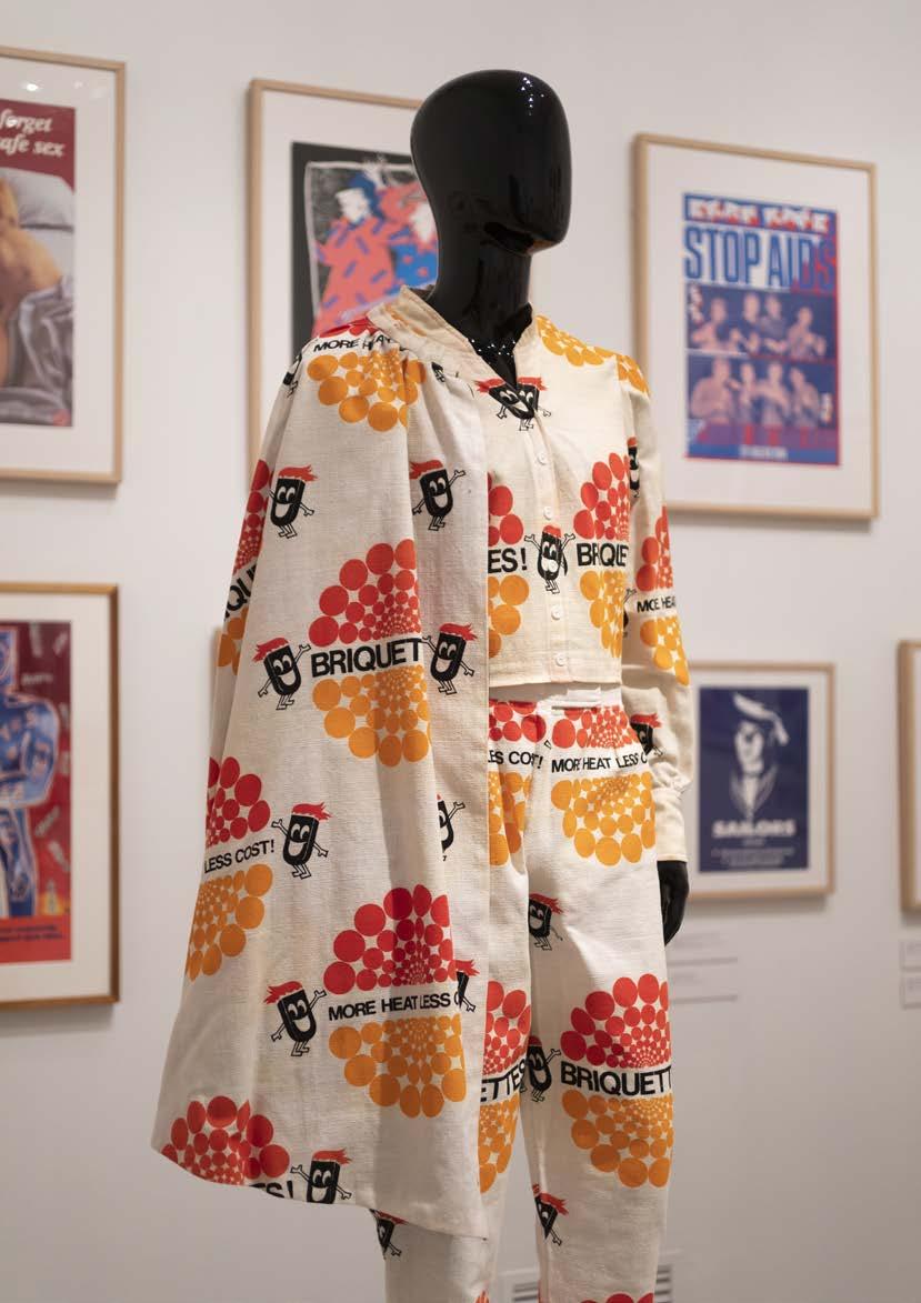
133 rmit design archives journal Vol 13 Nº 1 (2023) Burnie Briquette suit, 1982 Attributed to ‘Emmanuel Dakis The TAILOR’ Courtesy of Marius Foley
Harriet Edquist and Helen Stuckey.

RMIT Gallery | February 21 to May 27 2023 | The project is an RMIT Gallery / RMIT Design Archives collaboration. 134 rmit design archives journal Vol 13 Nº 1 (2023) RADICAL UTOPIA
Radical Utopia: An Archaeology of a Creative City curated by
ACKNOWLEDGEMENTS

The curators would like to thank Professor Melanie Swalwell for her co-curation of ‘The Emergence of Digital Design’ gallery, the participating artists and contributing writers for their involvement and dedication, especially John Gollings for his support and access to his photographic archives of Melbourne in the 1980s. We would also like to honour the memory of Clarence Chai and thank him and his partner for their contribution to the exhibition. This project would not have been possible without the commitment and enthusiasm of the staff of RMIT Design Archives. We would also like to acknowledge the support and commitment of RMIT Culture and the RMIT Gallery team, and the generosity and enthusiasm of our project sponsors and supporters.
exhibition staff
Manager Creative Production
Helen Rayment
Senior Curator
Andrew Tetzlaff
Collections Coordinator, RMIT Design Archives
Jenna Blyth
Exhibition
Project Officer
Julia Powles
Exhibition
Engagement Officer
Lisa Linton
Curatorial Officer, RMIT Design Archives

Ann Carew
Exhibition Project Assistant / Radical Utopia
Project Assistant
Michaela Bear
Archives Officer
RMIT Design Archives
Simone Rule
Collections Assistant
Collections and Archives
Leah Martin
Senior Production Coordinator
Erik North Technical Production Coordinator
Simon Maisch
Production Officer
Tim McLeod Production Assistants
Robert Bridgewater, Mason Cox
Yvette James
Elliot Taylor
Jonty Ransome
Exhibition Assistants
Louise Meuwissen
Celine Saoud
Kyla Sun
Gallery Attendants
Sophie Bishop
Audrey Merton
Jemima Penny
Bek Steel
Andari Suherlan
Melissa Viola
RMIT Gallery would like to thank, the curators, designers and their representatives and lenders for their involvement in the project, as well as the Gordon Darling Foundation for their generous support. The exhibition was also made possible with loans from ACMI, Australian Queer Archives (AQuA), Melbourne Museum, National Gallery of Victoria (NGV), State Library Victoria, Swinburne University of Technology, private collections and RMIT Design Archives. We would like to acknowledge Paula Toal, Head, Cultural and Public Engagement, RMIT Culture and Adam Seedsman, Executive Director, RMIT Business Development and Partnerships; for their enthusiasm for and support of this project.
RMIT Gallery
RMIT University
344 Swanston Street, Melbourne Victoria 3000 Australia rmitgallery.com
Social media: @rmitgallery Tel: +61 3 9925 1717 rmit.gallery@rmit.edu.au
RMIT University acknowledges the people of the Woi wurrung and Boon wurrung language groups of the eastern Kulin Nations on whose unceded lands we conduct the business of the University.
RMIT University respectfully acknowledges their Ancestors and Elders, past and present. RMIT also acknowledges the Traditional Custodians and their Ancestors of the lands and waters across Australia where we conduct our business.
135 rmit design archives journal Vol 13 Nº 1 (2023)
CONTACT US
Email rmitdesignarchives@rmit.edu.au
www rmit.edu.au/designarchives
Tel +61 03 9925 9946
Post RMIT Design Archives, RMIT University GPO Box 2476 Melbourne Vic 3001 @rmitdesignarchives
RESEARCH REQUESTS
Researchers are able to access rmit Design Archives by prior appointment. For instructions and information see Collection Access at www.rmit.edu.au/designarchives
JOIN OUR MAILING LIST
Email rmitdesignarchives@rmit.edu.au or submit an online request at www.rmit.edu.au/designarchives
DONOR ENQUIRIES
For information about donations to the rmit Design Archives email rmitdesignarchives@rmit.edu.au

DISCLAIMER
The rmit Design Archives has endeavoured to contact the copyright holder of this material. In the event you are the copyright holder of material contained within this edition, RMIT is seeking to hear from you in the use of this work. Please contact rmit immediately to discuss permission release and consent. Contact: copyright@rmit.edu.au
This Page
Installation view, Radical Utopia: An Archaeology of a Creative City, RMIT Gallery, 2023.
Women’s Assymetrical Mini Dress, (detail), c.1978, designer Jenny Bannister for CHAI.
136 rmit design archives journal Vol 13 Nº 1 (2023)
Contributors
Karen Burns is an architectural historian and theorist in the Melbourne School of Design at the University of Melbourne.
Harriet Edquist is a curator and design historian and Professor Emerita in the School of Architecture and Urban Design at RMIT University. Edquist is the Co-Curator of Radical Utopia; an Archaelogy of a Creative City.
Marius Foley is Lecturer in the School of Design, RMIT University.
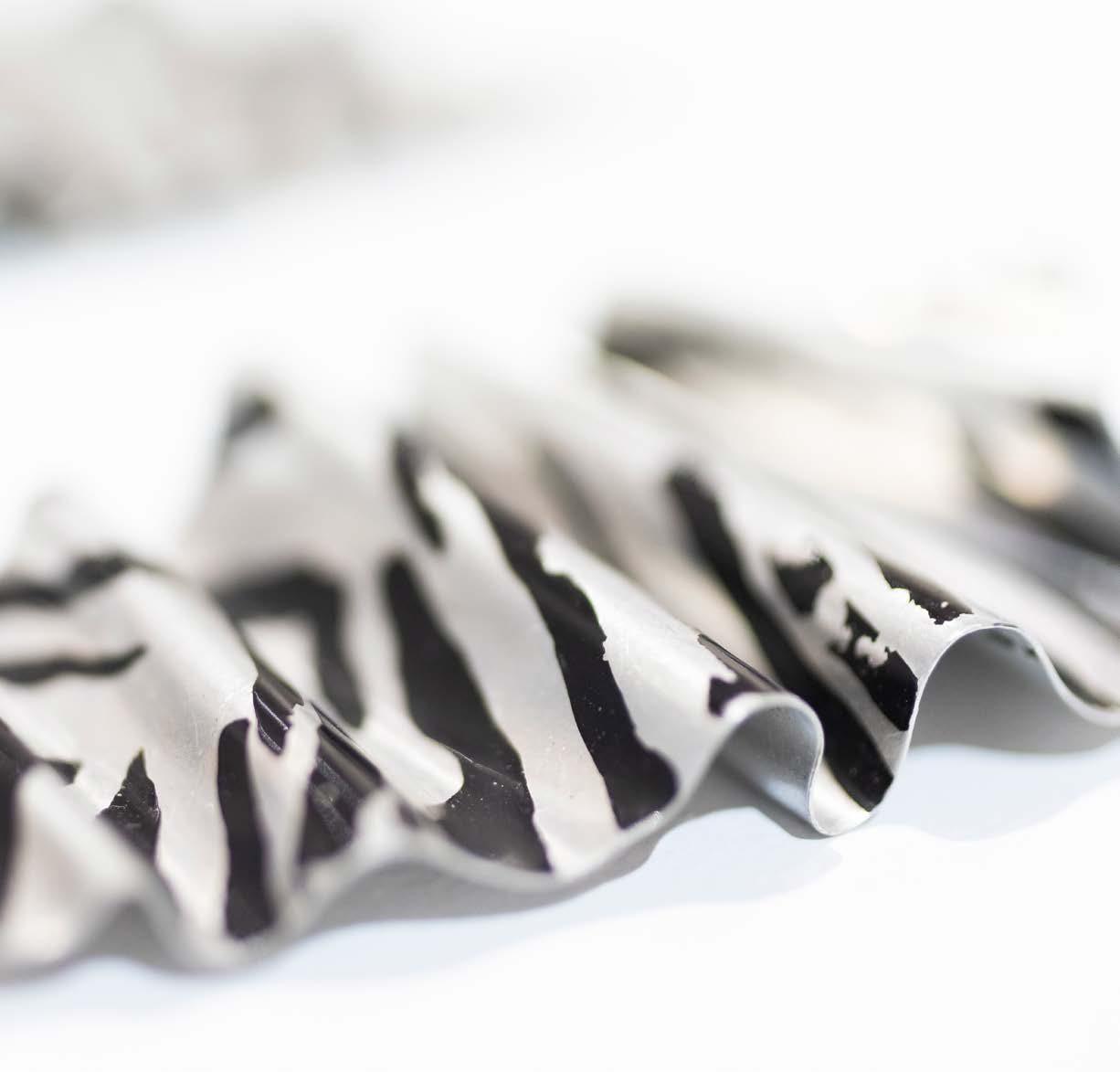
Sally Gray is a writer, curator and cultural historian. She is the author of Friends, Fashion and Fabulousness: The Making of an Australian Style (2017 reprinted 2019).
Timothy Moore is a senior lecturer at Monash University, founder of Sibling Architecture, and the curator of contemporary design and architecture at the National Gallery of Victoria. He co-founded the dance parties Trough and John, which were first hosted at Inflation in the mid-2000s.
Helen Stuckey is Senior Lecturer, Games, RMIT University, and Co-Curator of the exhibition, Radical Utopia: An Archaeology of a Creative City.
Olga Tsara has worked as a librarian with the pictorial collections of State Library Victoria for over 20 years. She researches photography and political graphics.
Melanie Swalwell, Professor of Digital Media Heritage, Swinburne University
