The Redfern Gallery
Centenary Exhibition: Part 2
The Red Studio


Centenary Exhibition: Part 2
The Red Studio
13 September - 27 October 2023
Sarah Armstrong-Jones | Elizabeth Butterworth
John Carter RA | Elliott Paul Emsley | Susannah Fiennes
Annabel Gault | Florence Hutchings | David Inshaw
Linda Karshan | Catherine Kurtz | Ffiona Lewis
Danny Markey | Desmond Morris | Brendan Neiland
Bryan Organ | David Oxtoby | Pierre Skira
Telfer Stokes | David Tindle RA
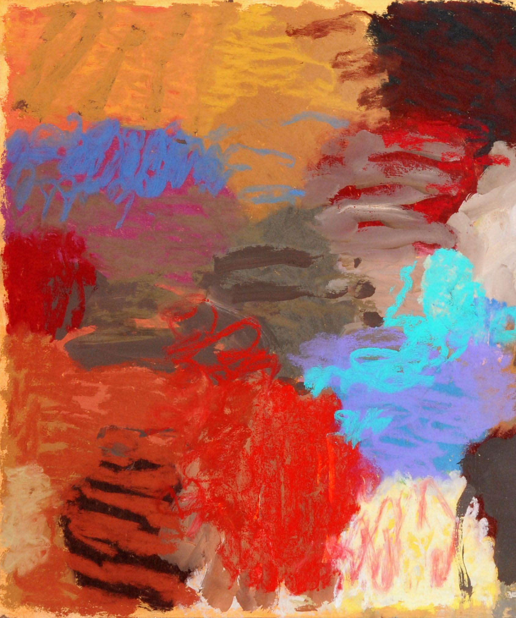
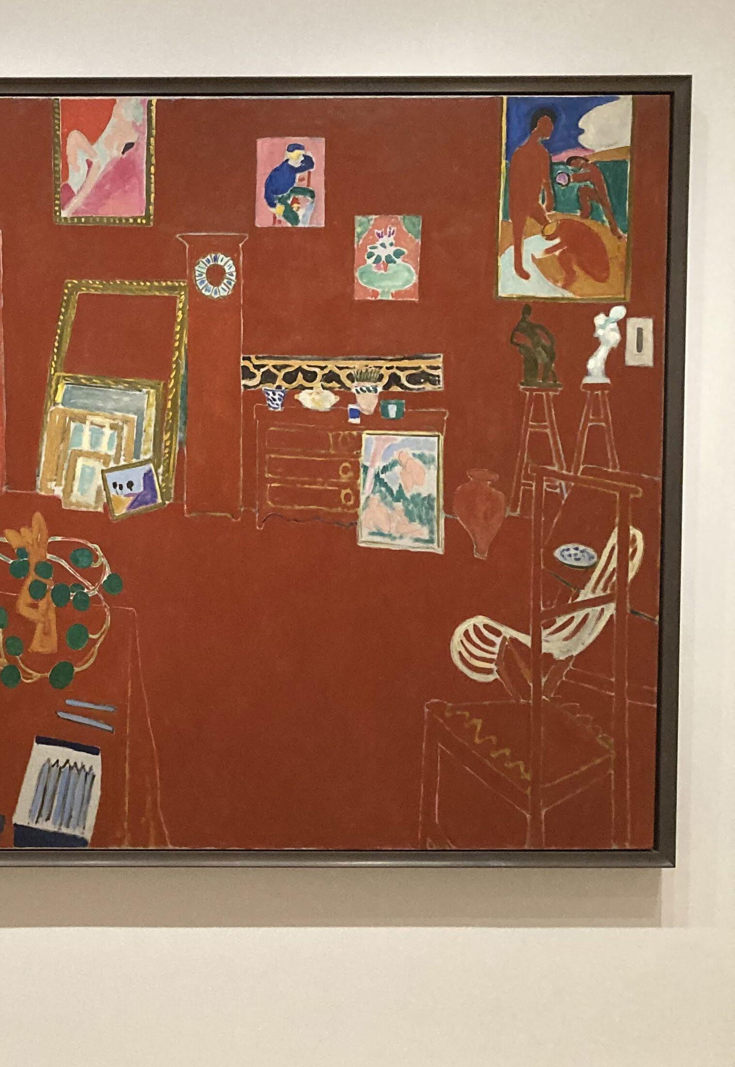
Over the century of the Redfern Gallery’s history, many artists have cited the experience of visiting the gallery and seeing exhibitions, or just single paintings, as inspirational. Francis Bacon and Frank Auerbach both made visits to admire the Céret landscapes of Chaim Soutine, while Kyffin Williams encountered the work of Georges Rouault for the first time at the Redfern, which he later admitted had a profound effect on his work. And it was at the Redfern in 1943 that Patrick Heron first saw The Red Studio by Henri Matisse, describing it as ‘a life-changing experience ... the single most influential painting in my entire career’.
The narrative of how this celebrated Matisse painting was for a time during WW2 hanging downstairs at the Redfern Gallery, has attained the status of legend. Usually told as an indication of the failure of the Tate Gallery to recognise the genius of Matisse when offered the painting at a bargain price, the story goes that it temporarily found refuge in the early 1940s in Cork Street, when the Redfern were instructed to sell it on behalf of its owner, David Tennant. In 1925, Tennant had founded a private members’ club called the Gargoyle in Dean Street, Soho, where the rich and titled mixed with the artistic and bohemian. The Red Studio had been part of a daring interior designed by Matisse of broken mirrored walls and two of his paintings. The other was Studio, Quai Saint-Michel , a more solidly constructed nude on a bed with a view through the window. It is a fine painting, but The Red Studio was the more remarkable image and it was hung in a commanding position next to the tables in the upstairs bar.
When Tennant was in need of money in the late 1930s he sold Studio, Quai Saint-Michel to the art historian Douglas Cooper who swiftly sold it to Kenneth Clark who in turn sold it to Pierre Matisse, son of the artist and an art dealer in New York. Pierre Matisse sold it to Duncan Phillips for the Phillips Collection, where it remains. But The Red Studio , an altogether more challenging painting, was not so easy to dispose of. The painter and writer Patrick Heron (1920-99), himself a Redfern artist, recalled its complicated history. Writing in the spring 1993 edition of the magazine Modern Painters, Heron described finding The Red Studio at the Redfern in 1943 ‘filling the wall downstairs, opposite the stairs (the old small crooked stairs)’. Heron continued: ‘For nearly a year I popped into the Redfern whenever I could get away from digging draining ditches as a conscientious objector, simply to gaze at L’Atelier Rouge. But towards the end of 1944, if I remember, it vanished.’
Heron also recalled asking Erica Brausen, who had worked at the Redfern during the war years before she left to found her own gallery, the Hanover, what had happened to the painting. He quoted her reply: ‘Oh darling, didn’t you know? Rex [Nan Kivell, then the Redfern’s owner] was broke and sold it for £600 to an American — and the Tate never even came to look at it.’ And if that wasn’t bad enough, Heron added another layer to the story, recounting how a painter friend remembered Matthew Smith saying that David Tennant had offered The Red Studio to the Tate for even less money, for £400, and the then director, John Rothenstein, had rejected it.
What is so special about this painting? Matisse talked of making colour ‘conclusively present’, and pattern was one strategy he employed to achieve this. Nowhere does colour register its presence more conclusively than in The Red Studio . Colour reigns supreme in a way it had not before — colour for itself, not used descriptively or expressively. The red cloak of the painting envelops us and we identify with the picture, as Matisse identified with its subject. Here is the first ‘colour field’ painting, which was understandably to exert so much influence over the American Abstract Expressionists when it landed up in New York.
For Matisse, as for many artists, the studio was the centre of his existence, but is this what his studio looked like? No. Matisse’s studio at Issy-les-Moulineaux, in the suburbs of Paris, was actually painted white inside and out, a large simple workroom. There were no red walls anywhere. The colour was entirely invented. Originally the walls were painted a blue-grey colour on the canvas and the painting might have been called ‘The Blue Studio’. But then Matisse made the revolutionary decision to flood on this matte Venetian red, very flat, very frontal, very extreme, and The Red Studio was created.
Where did the red come from? Perhaps it was an optical effect from looking at the green of the garden and then coming into a blazing white workroom. It was certainly imagined or discovered somehow. The painting’s degree of abstraction is memorable: objects are outlined but given no volume, they remain transparent: all is pattern. Perspective goes by the board, and space (such as it is) is created through planes of
pure chromatic colour. John Elderfield called the painting: ‘Matisse’s boldest attack to date on traditional threedimensional illusionism.’
It seems that in 1938, Tennant wrote to Matisse offering him first refusal on The Red Studio , as previously agreed between them. When this was not taken up, the Redfern was given the painting to sell, and it was eventually bought by Georges Keller, a Swiss-born art dealer living in New York. He sold it to the Museum of Modern Art in New York.
The Red Studio was painted in the autumn of 1911. In the spring of the same year, Matisse painted its less familiar counterpart The Pink Studio (which now resides in the Pushkin Museum of Fine Arts, Moscow). The Pink Studio is altogether more realistic and looks much more like a traditional painting than the hauntingly spare humming outlines of the red version. Over the summer of 1911, Matisse had become a radical.
The idea to invite the Redfern’s contemporary artists to reflect upon The Red Studio is an inspired one, and deeply appropriate. This landmark painting is of major historical relevance, but it continues to inspire artists, as can be seen by the work assembled in this exhibition. As there are 19 artists, so there are as many different interpretations of the remit, from artists who wished to take part in the exhibition but not to produce specifically new work for it, to those whose ambitious response strikes new echoes in familiar territory.
Unexpectedly, one of Redfern’s artists actually has a personal
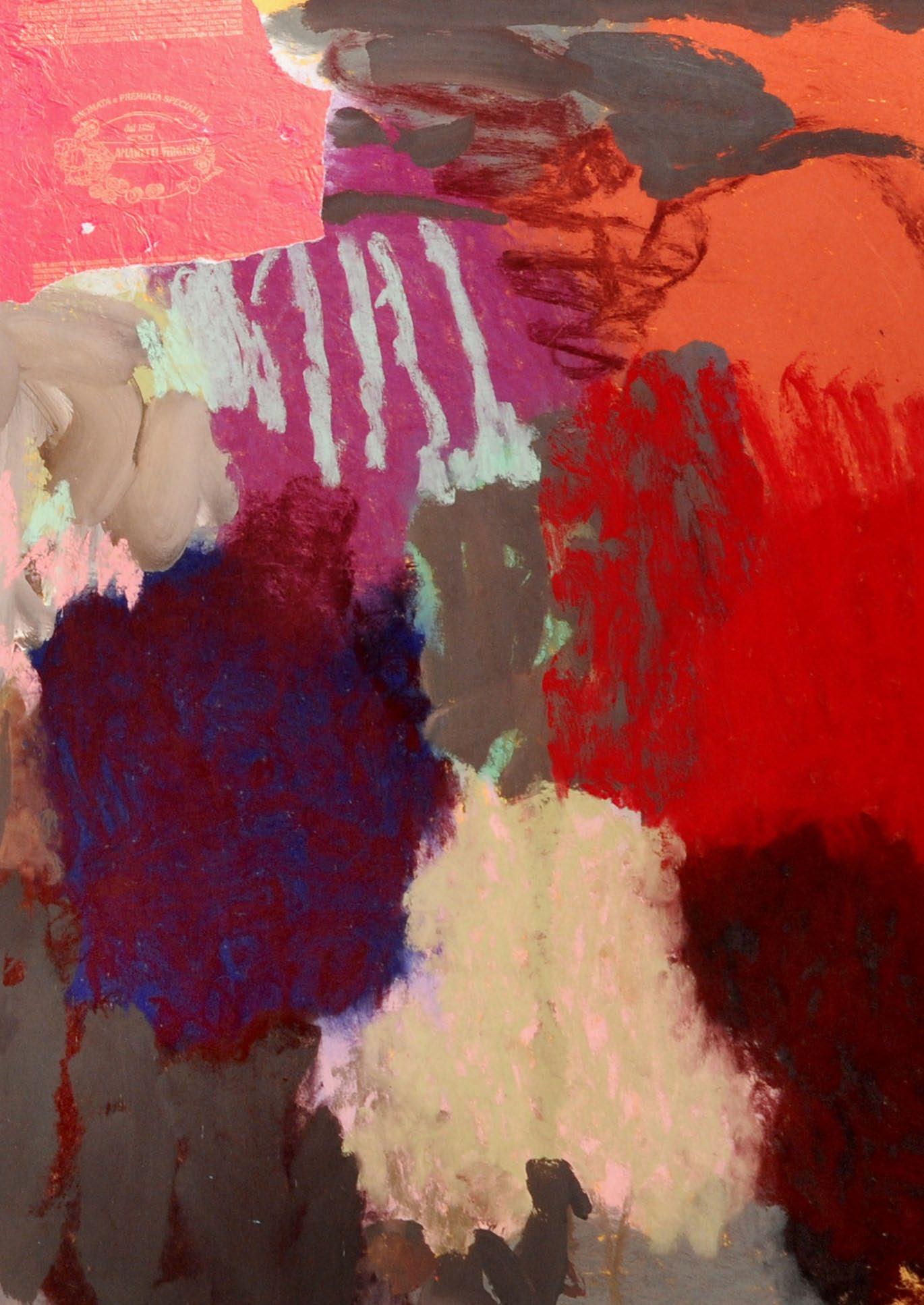
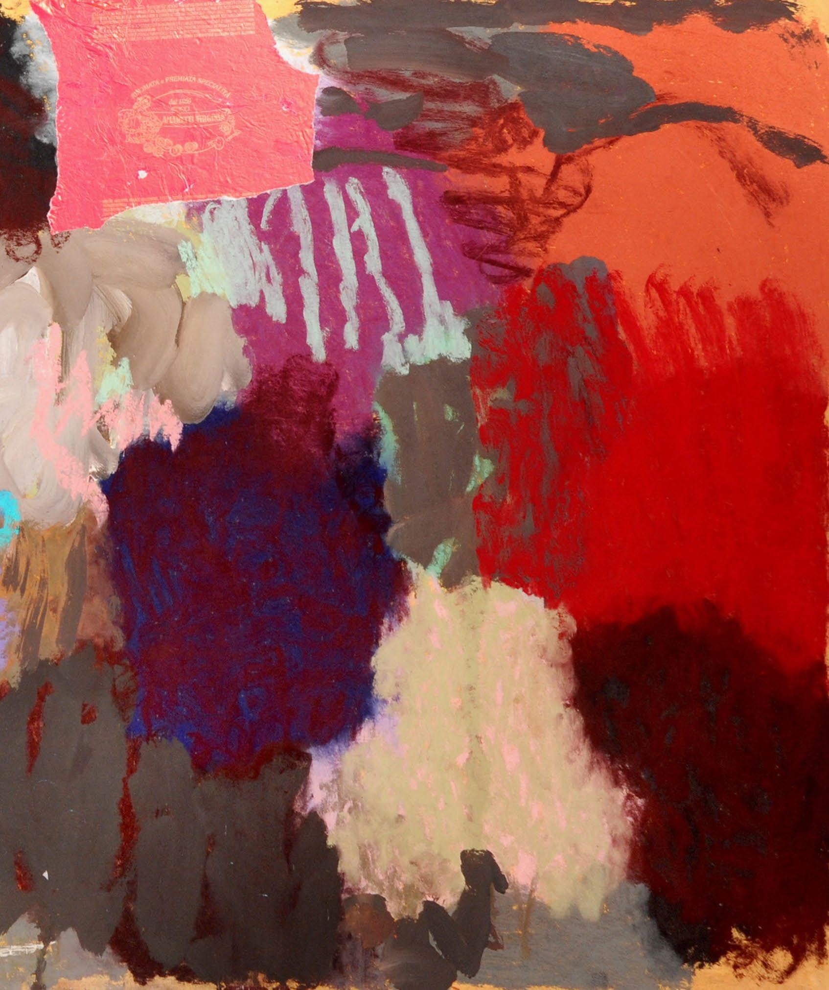
connection with Matisse: Pierre Skira (born 1938). In the late 1940s, Matisse began to make paper cut-outs, his last major initiative as an artist, and a magnificent late flowering. Pierre was taken by his father to see the Master in the early 1950s. Pierre was a teenager, his father Albert the Swiss art dealer and founder of the famous Skira publishing house. Among the greatest of the artists’ books Skira published was Poésies by Stéphane Mallarmé, with 29 etchings by Matisse (1932). Later there were other publishing projects with Matisse, and because of this long-standing relationship, young Pierre was made welcome and gained an enviable insight into the work of one of the giants of modern art. As a consequence, his mixed media collage in response to The Red Studio has something of the authenticity of an historical document.
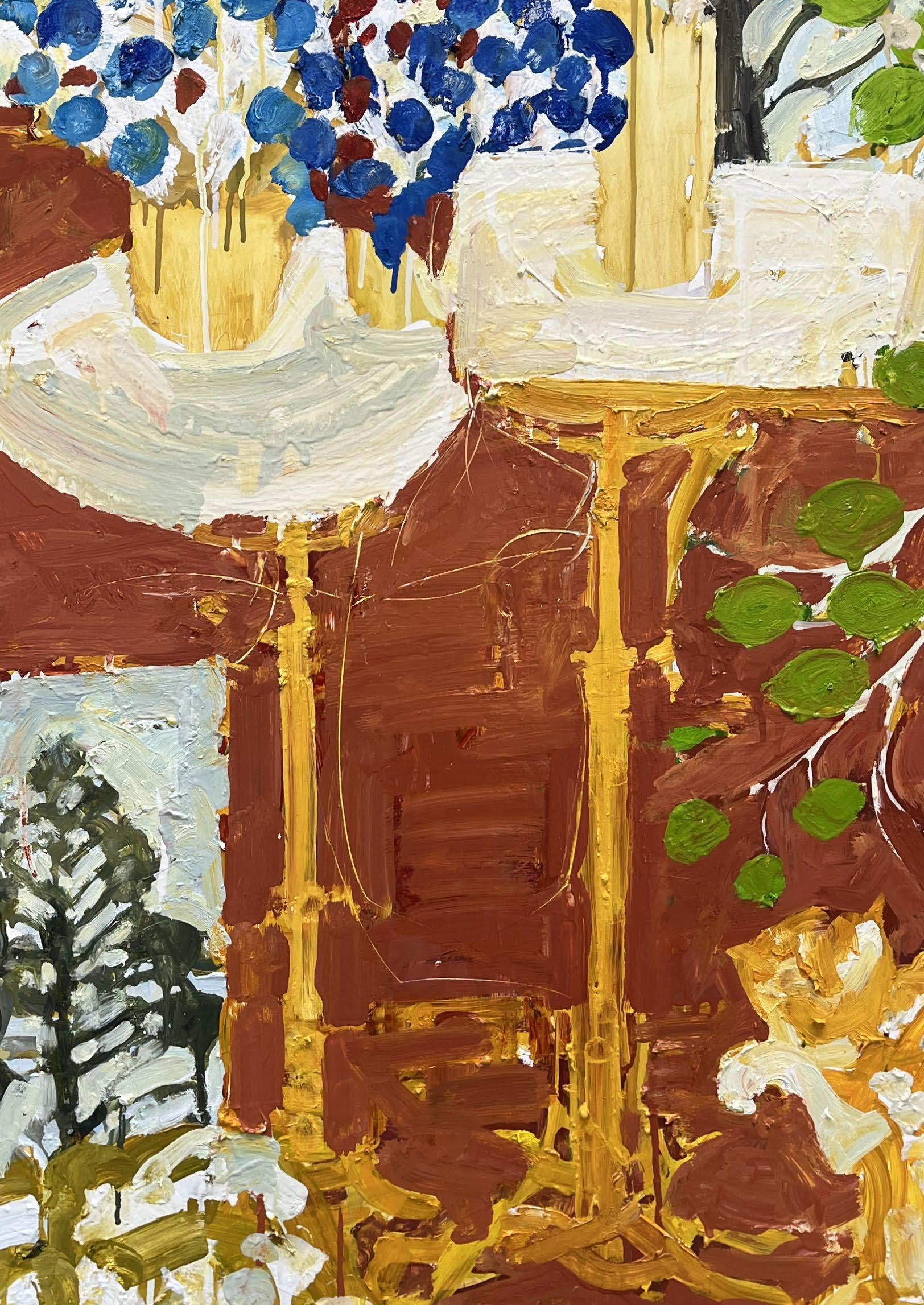
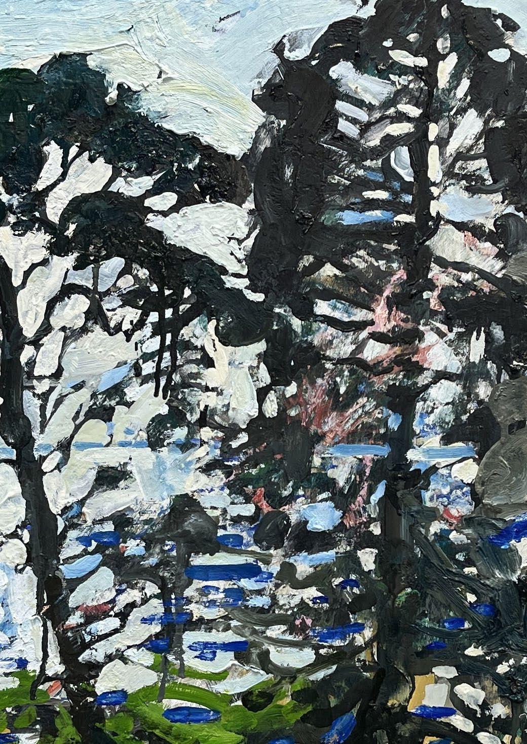
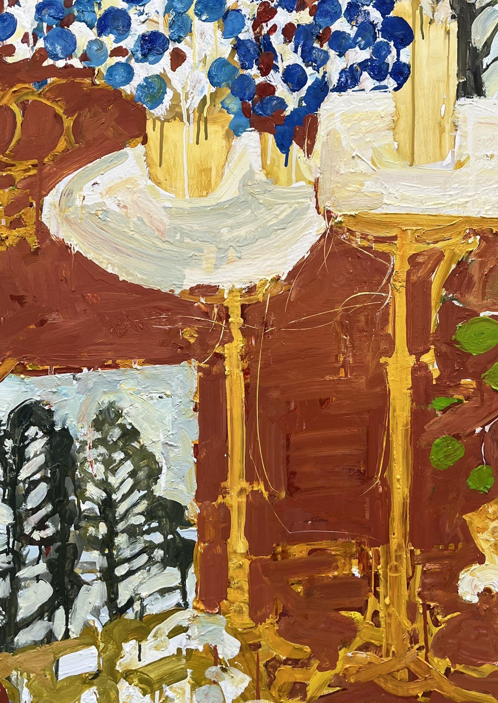
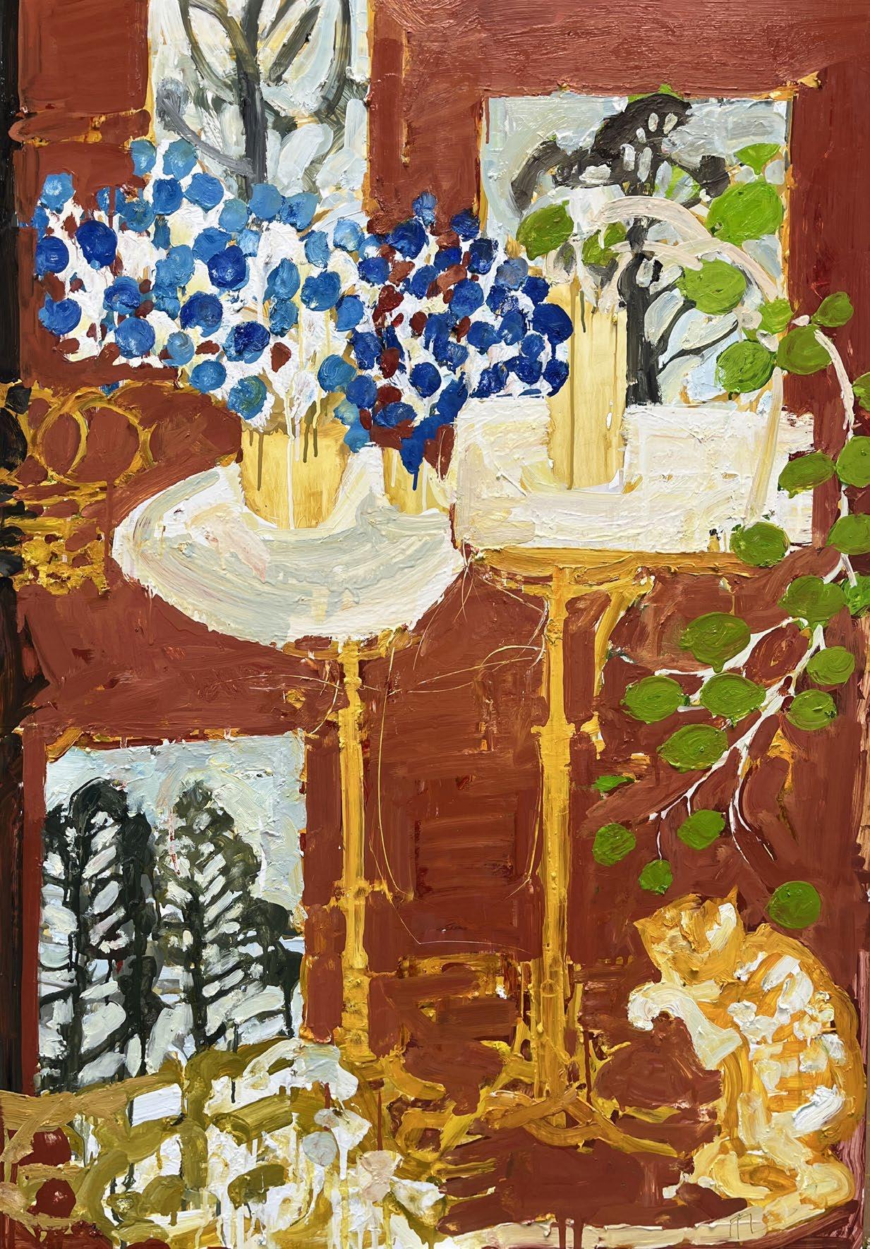
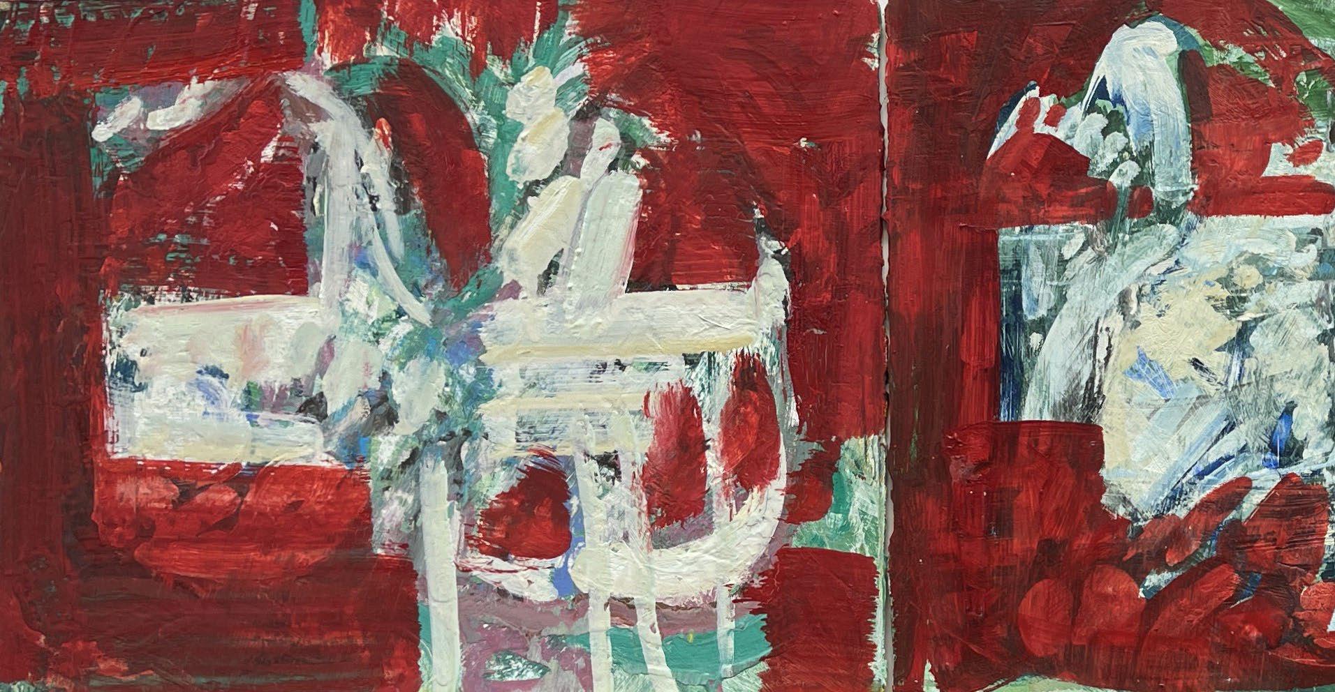
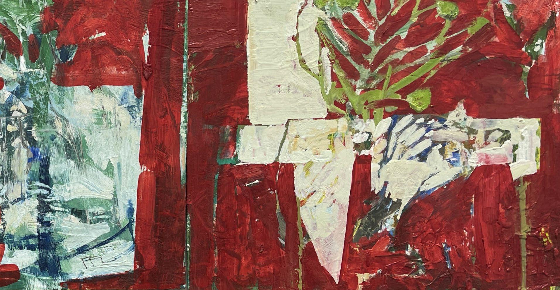
For Ffiona Lewis, Patrick Heron has been a major influence for most of her painting life, so her understanding of Matisse is deeply inflected by Heron’s thought. We know that he described The Red Studio as hugely influential, and Mel Gooding observed in his authoritative monograph on Heron that Matisse’s painting always remained a creative presence in his life and work. For Lewis, the best way of coping with such powerful influences is simply to carry on painting and work through them in this way. Her approach is to learn the lessons from the past that are most relevant to her, absorb what they have to offer and translate that into her own artistic language. Her braided trees and vigorously outlined tables, set against luscious reds and browns, attest to this.
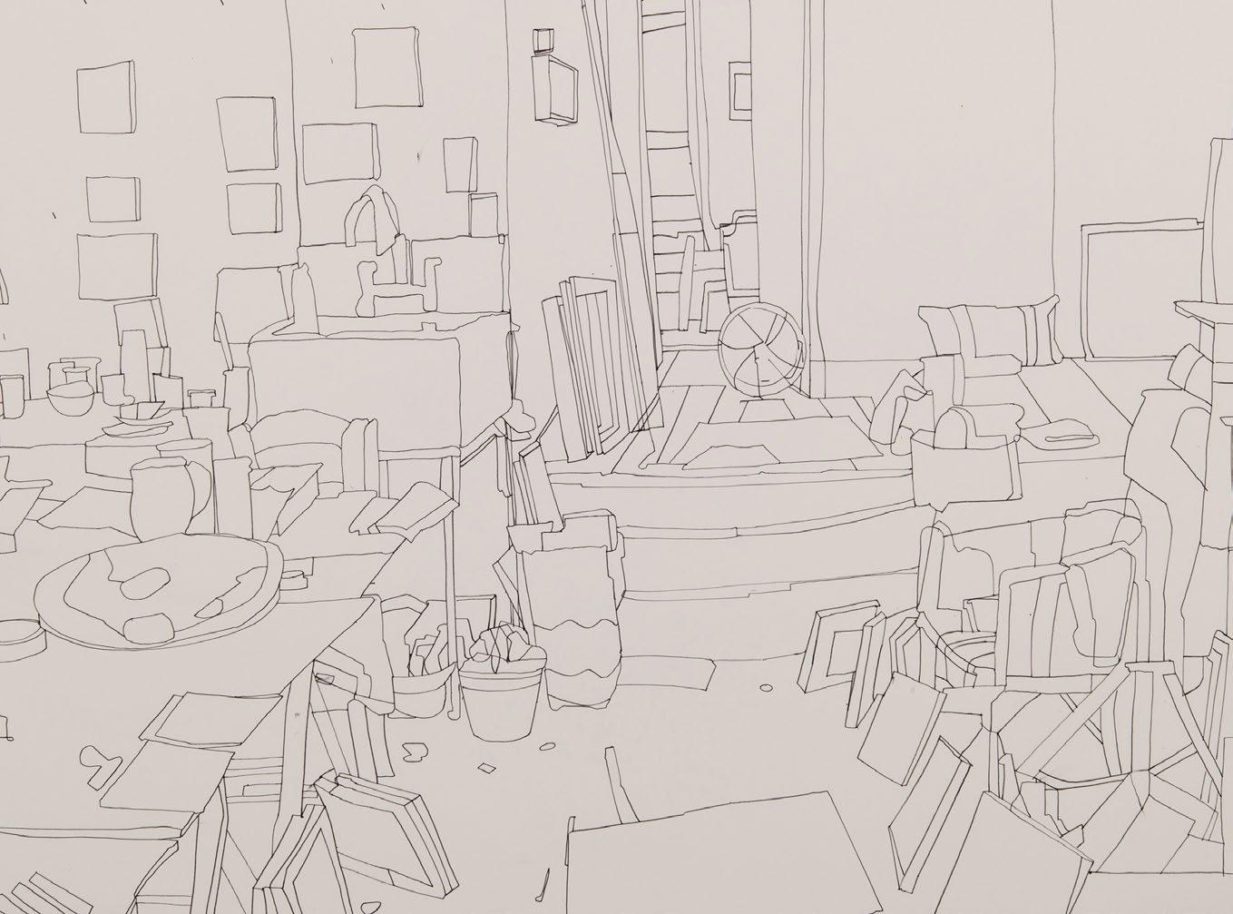
Florence Hutchings calls Matisse ‘a constant inspiration’,
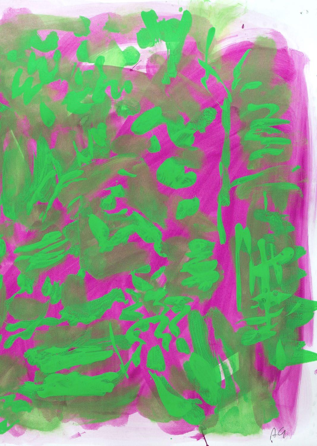
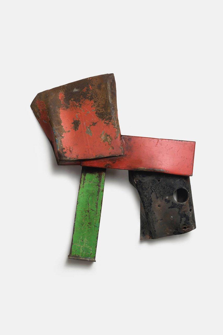
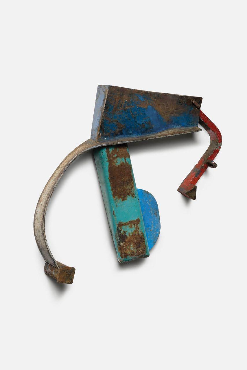
and responded to his great painting through the process of repeatedly drawing her own studio. The quick sketches of her working environment are made with a directness that suggests the naive and untutored, but a sophisticated pictorial intelligence is clearly at work here, capable of tapping into the raw and immediate inventiveness of childhood without losing its compulsiveness and edge. By contrast, Telfer Stokes has long been interested in the collage aesthetic of Matisse and sees his own welded steel assemblages achieving similar objectives, while Annabel Gault responds to the outpouring of joy through colour that is such a Matissean trademark.
Gault is another artist who seeks the release of adult inhibition in the free mark-making of childhood. Her work has tended recently more and more towards abstraction and dynamic colour combinations, and this new work in her most liberated yet. Nevertheless it retains an anchor in the real world, referring back to landscapes and gardens, even figures. Telfer Stokes, an artist like John Carter who does not think of himself as a sculptor, trained as a painter and then spent 30 years making visual books. He has long admired the books Matisse worked on, Jazz in particular. Stokes’ work is all about juxtaposing scrap metal and re-contextualising it. He uses found colour, and red has always been a trigger for his work, full of possibilities.
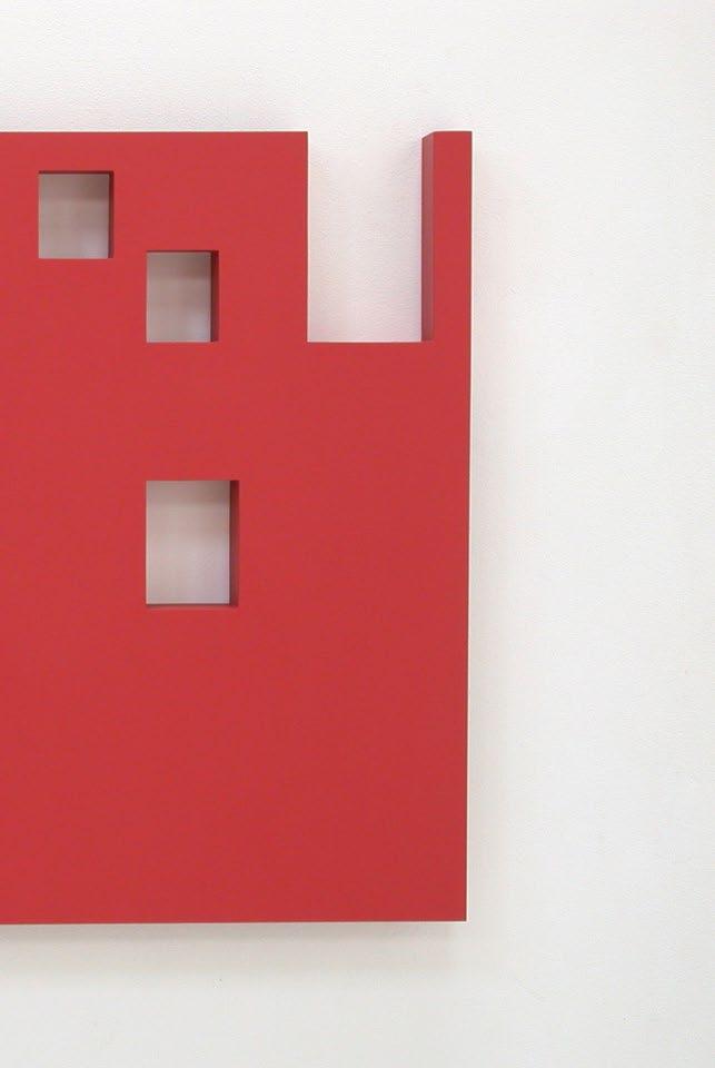
John Carter, a painter whose work has maintained a dialogue with sculpture over the last 60 years, responded to the challenge of The Red Studio with typical thoroughness. His interpretation was carried out in an acrylic painted pierced
plywood construction, with the same relative proportions as Matisse’s canvas, but one third of the size. His Matissean ‘picture-object’ is consonant with the concerns of his own work while reflecting some of the formal attributes of the original painting. He was also able to investigate the dialogue between flatness and depth in the painting according to his own geometric principles. These strategies resulted in a work which is recognisably by Carter, but which also engages with Matisse. If Carter sees it as ‘a curious hybrid object’, it is nevertheless a resonantly original reinterpretation of Matisse and a beautiful work in its own right.
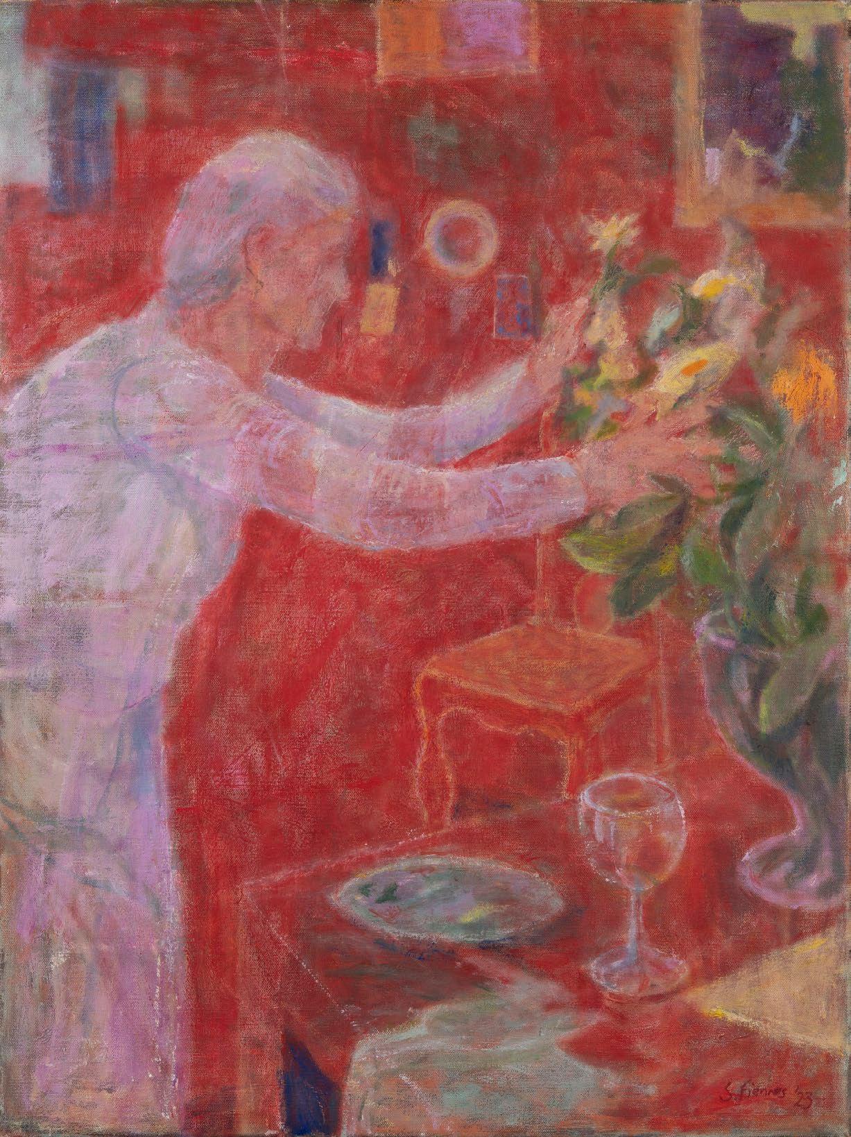
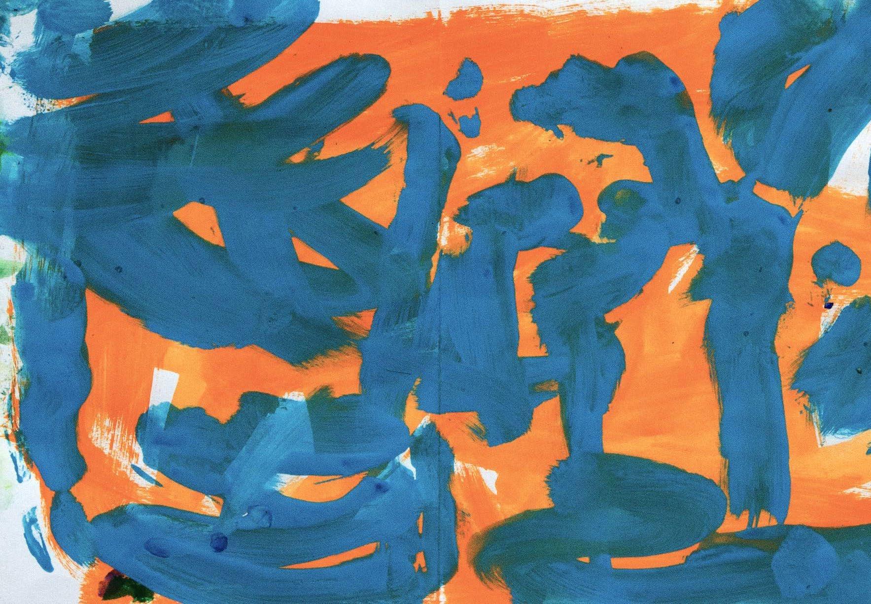
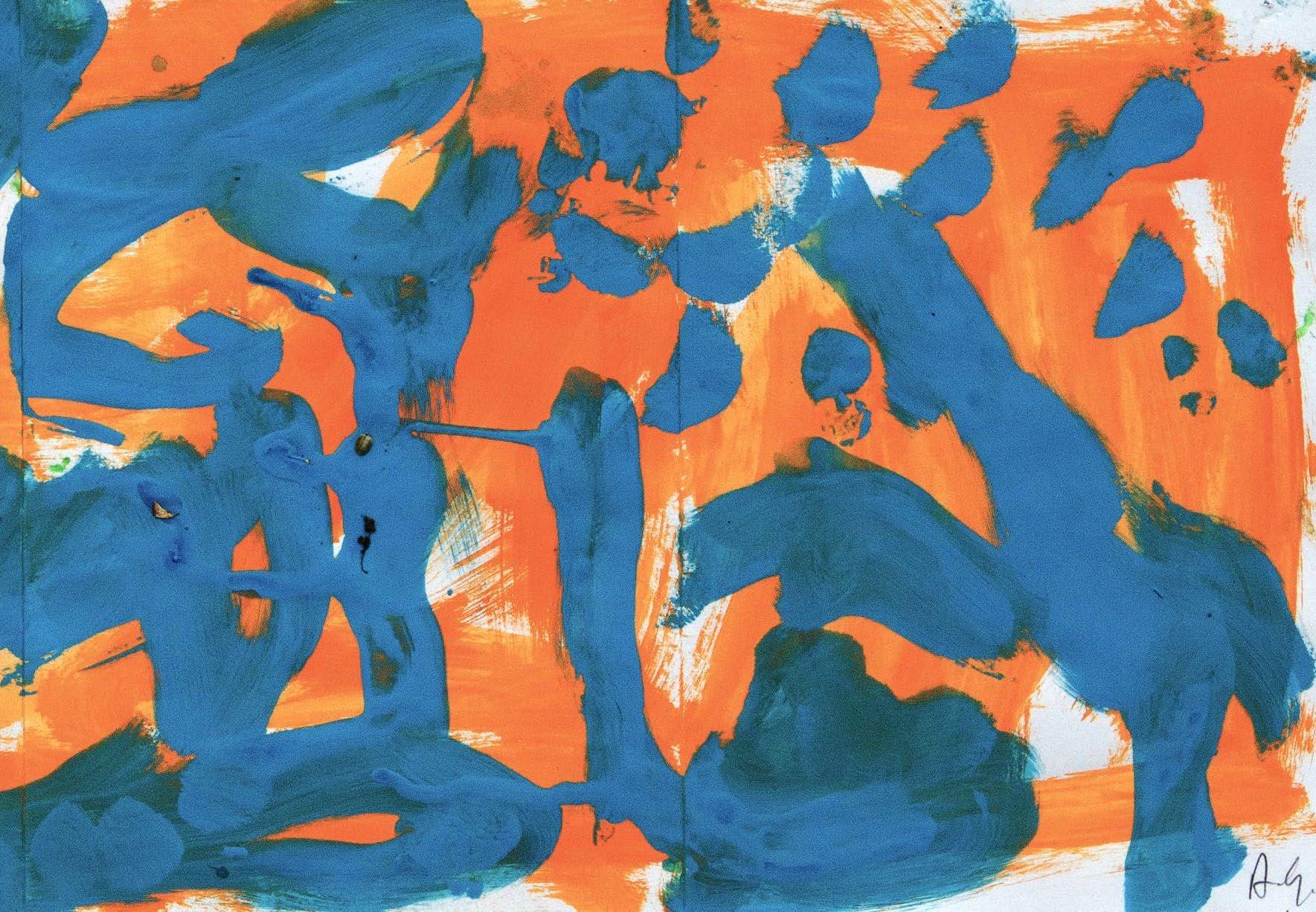
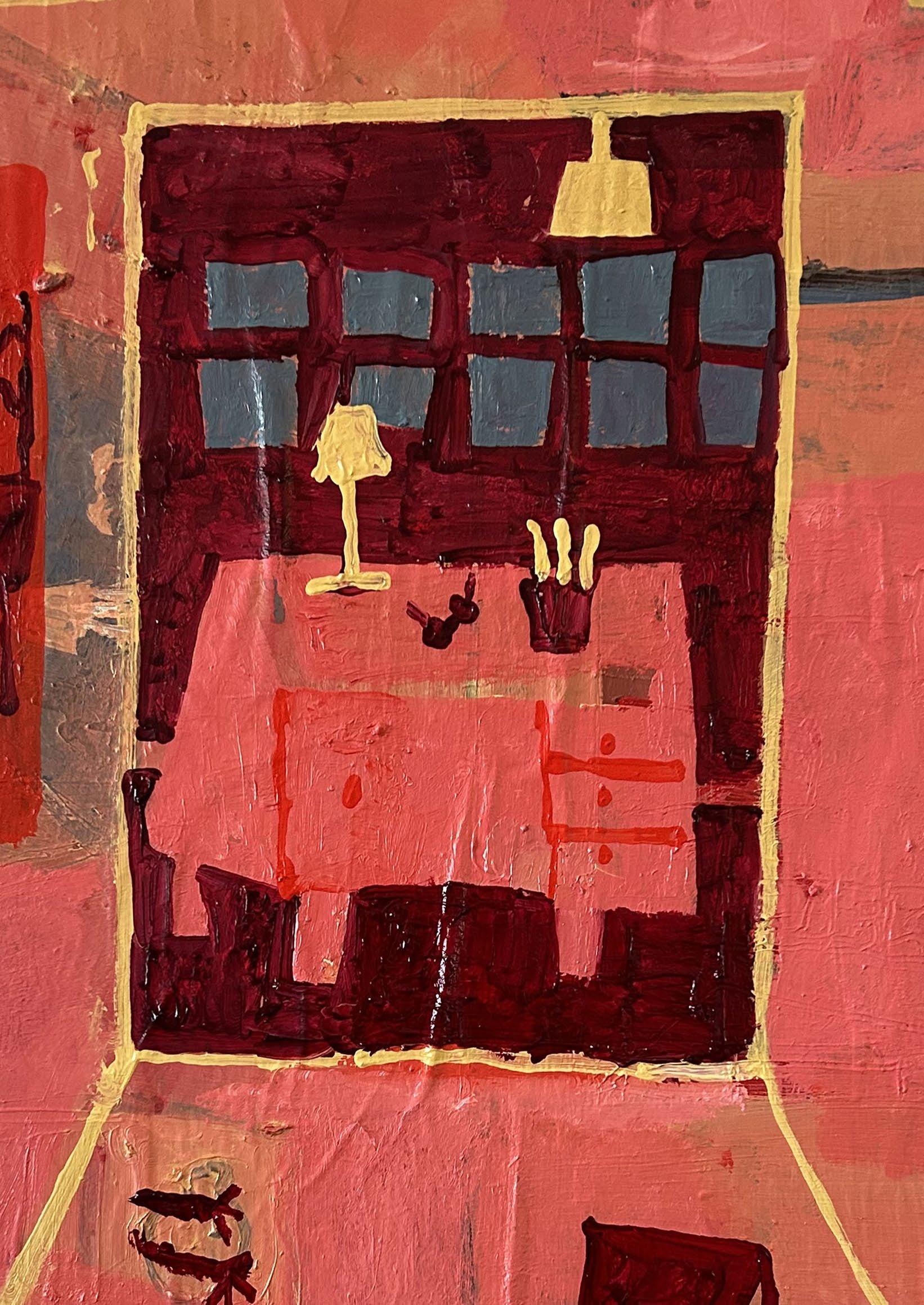
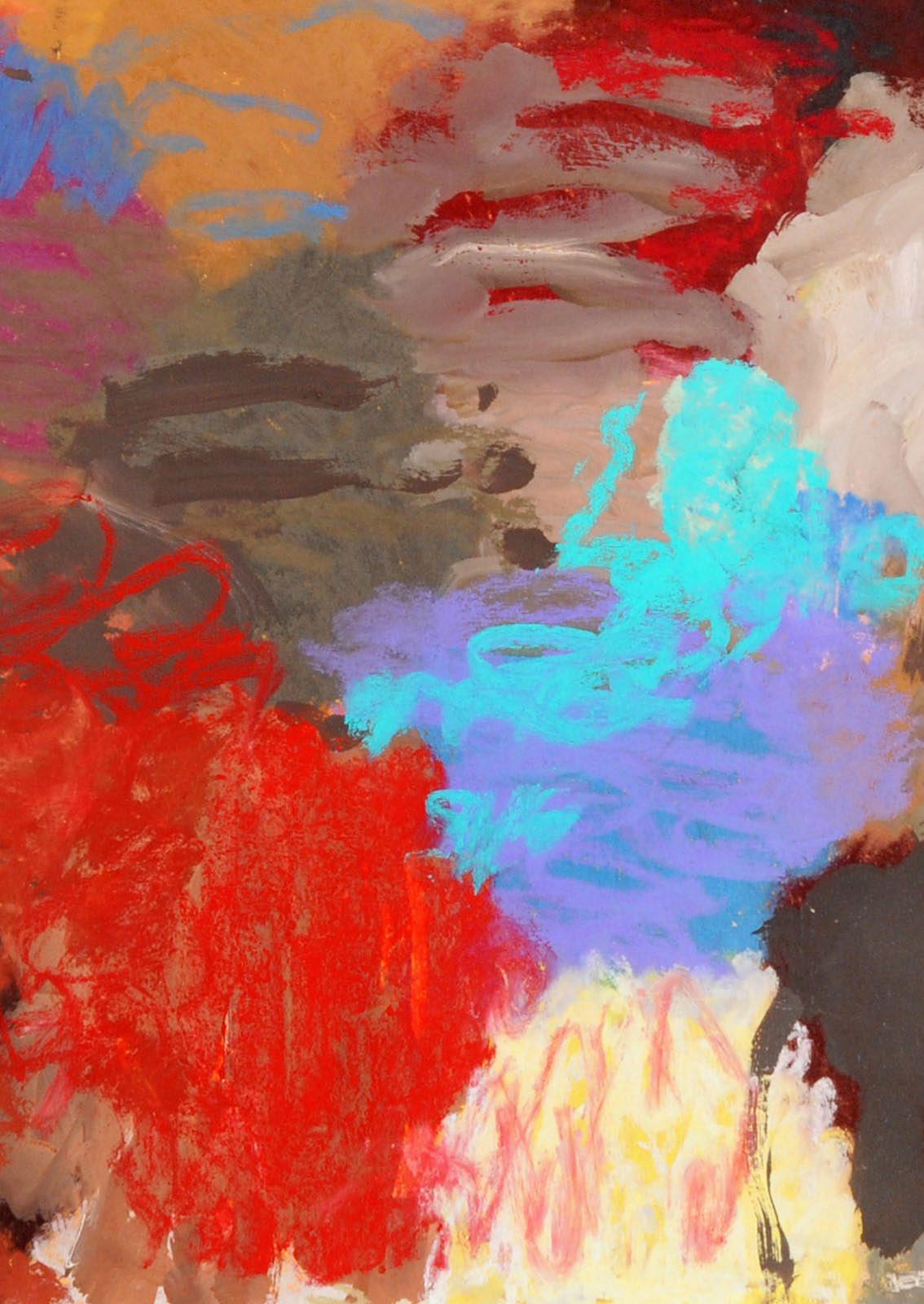
Sarah Armstrong-Jones offers a very intriguing take on The Red Studio , which leads us back to where the red in Matisse’s painting originally came from. Was it indeed produced by the optical effect of looking at bright green (the garden in sunlight) and then the brilliant ambiance of his white studio turning the after-image red? Armstrong-Jones recounts the genesis of her group of works: ‘I started by drawing my own studio, very simply, linear, roughly from a position that reflected Matisse’s view of his room, with paintings, objects, furniture and trying to imagine the room in shades of green and red; the colours representing my paintings and drawings propped up in my own studio.’ Her cooler palette leans more to green and blue and offers a series of clues to the red/green polarity which is key to this interpretation.
One of the most unusual pictures here is Elliott Paul Emsley’s portrait of Matisse standing up to draw with charcoal tied to a
long stick, and painted in the kind of red you find in nightmares. Although the source is a well-known photograph of the artist in old age, Emsley has kindled a hellish conflagration in his picture, as if all the previous history of art is about to be incinerated by the arch revolutionary Matisse, who finds his justification and precedent in Cézanne. Emsley’s painting hints at the curse of being an artist which is not all rhapsodising over light and space, but can also be a dungeon of anxiety and doubt. David Inshaw’s Court is probably the most abstract image of his long career as a landscape and figure painter. Depicting the interior of a Fives court, the box-like space is divided by lines and wall markings, and a blue-topped black buttress at lower left. The predominant colour is the red of the floor, a rich mixture of Venetian red and Naples yellow.
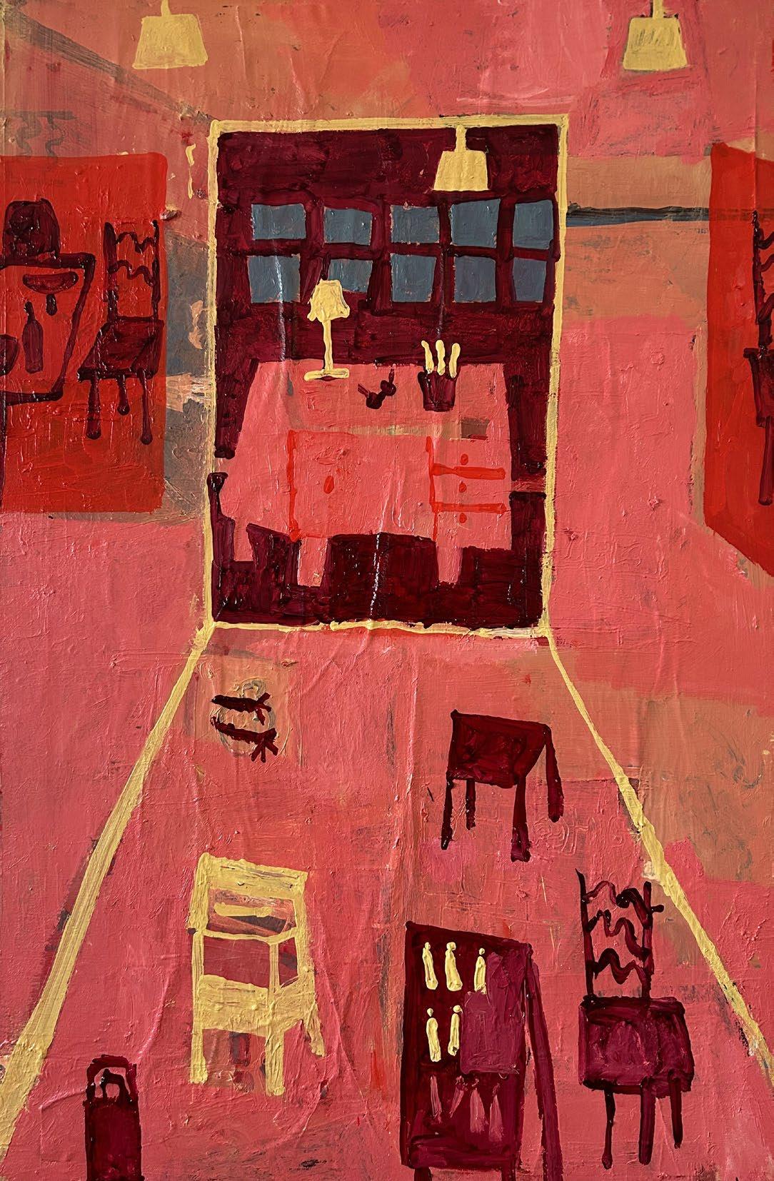
Whether the response is the extreme lyrical freedom of Annabel Gault or the calibrated control of Linda Karshan, there is a remarkable range of idiom on show here, from the loose and painterly to the precise and cerebral. We are presented with gouache feathers and orange nudes, geometry and gesture, dinner parties and red wine. Amongst all this variety, Danny Markey’s Red Room must be one of the more indirect responses. His painting only shows the outside of the house presumably containing the room, with two red-lit windows in its facade. (Traditionally, of course, red lights indicated a brothel or house of ill-repute.) One window is on the ground floor, the other on the floor above. If both light one room, it must be a double-height space and rather intriguing. But who knows what goes on in Markey’s suburbia? That has always been
part of its attraction, and a key part of the diverse and multilayered response of the Redfern’s artists to The Red Studio. Let me leave the last word to the eloquent advocacy of Patrick Heron: ‘For me there has never been anything more energising than a painting by Matisse.’
Andrew Lambirth, September 2023
Further Reading:
Patrick Heron by Mel Gooding, London, 1994
Painter as Critic - Patrick Heron: Selected Writings , London, 1998
Henri Matisse 64 Paintings by Lawrence Gowing, New York, 1966
Matisse in the Collection of the Museum of Modern Art by John Elderfield, New York, 1978
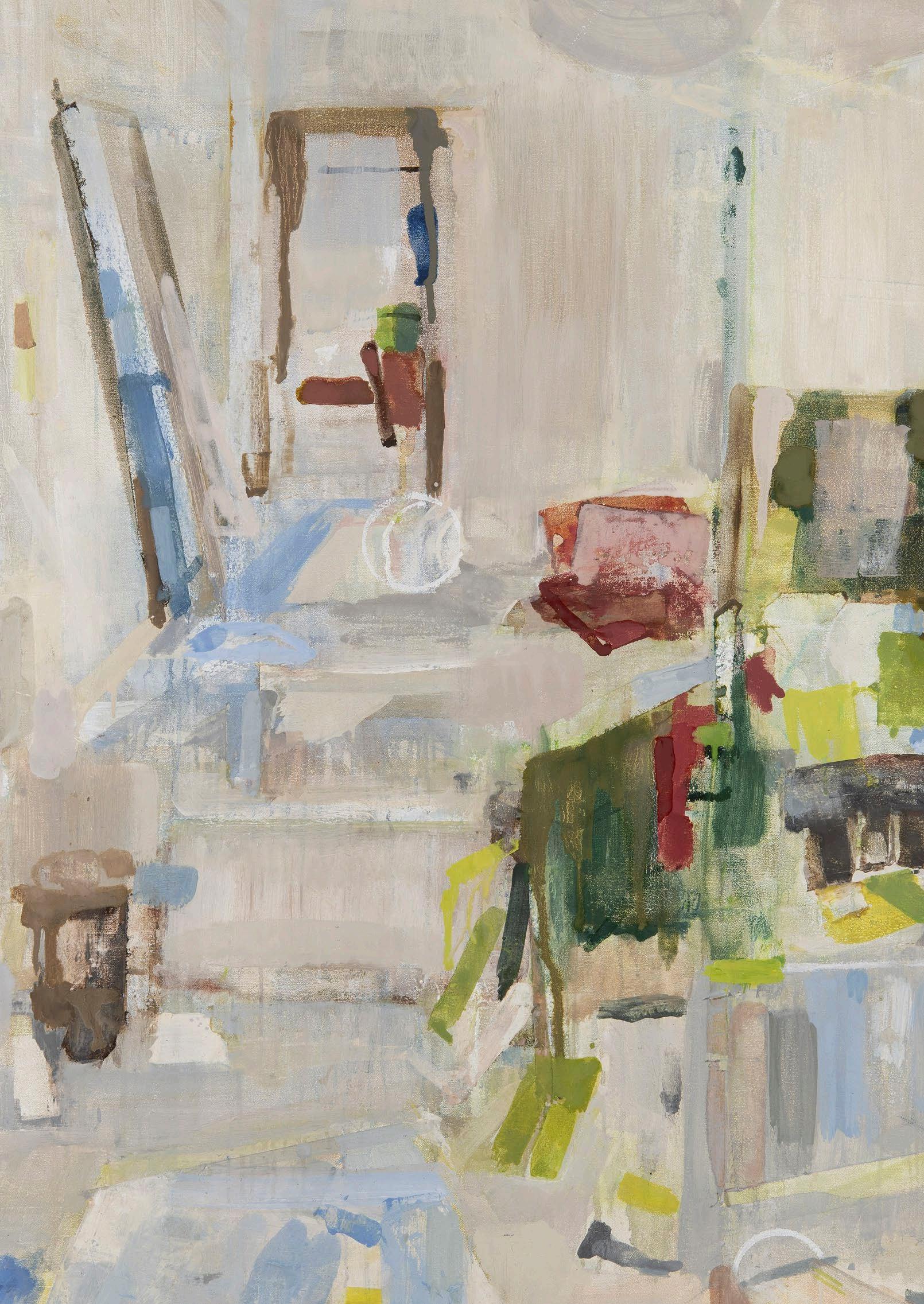
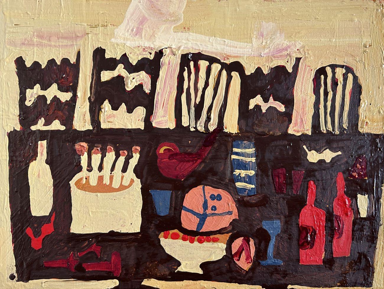
I started by making simple linear drawings of my own studio, roughly from a position that reflected Matisse’s view of his room – with paintings, objects and furniture. I tried to imagine the room in shades of green and red - the colours representing my paintings and drawings propped up in my own studio. A couple of small studies and watercolours allowed me to explore the space more freely.
When creating an artwork I am striving to create balance on the page. The painting involves many thin layers of paint to create both form and depth of colour.
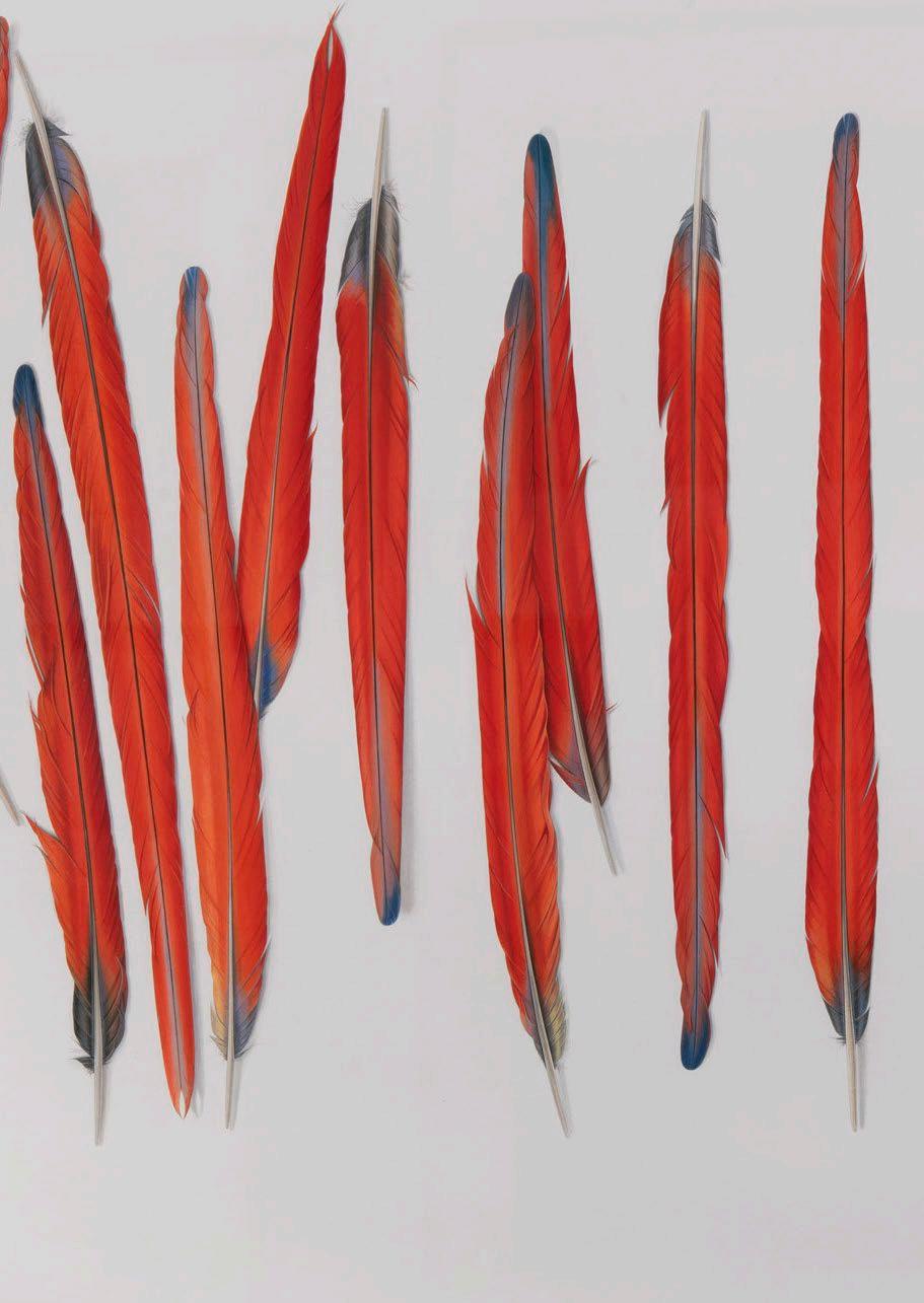
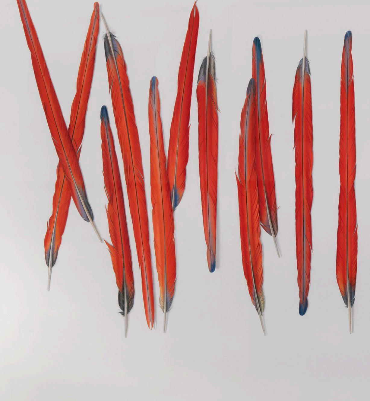
Elizabeth Butterworth
Six Red Feathers 2015
Gouache on paper
70.5 x 48.3 cm
£15,000
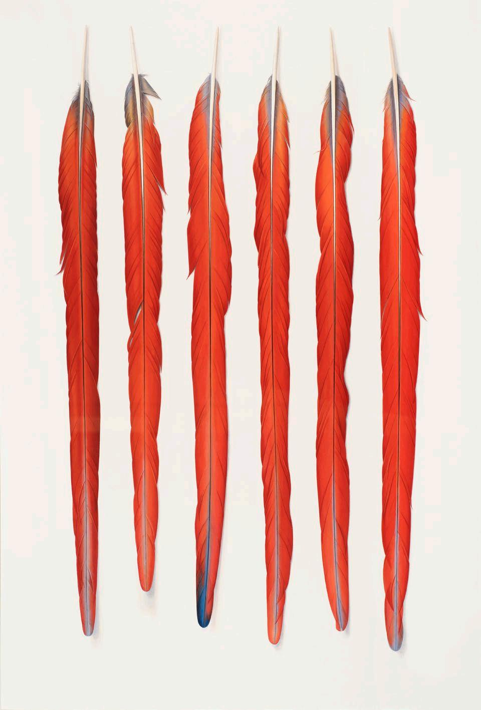
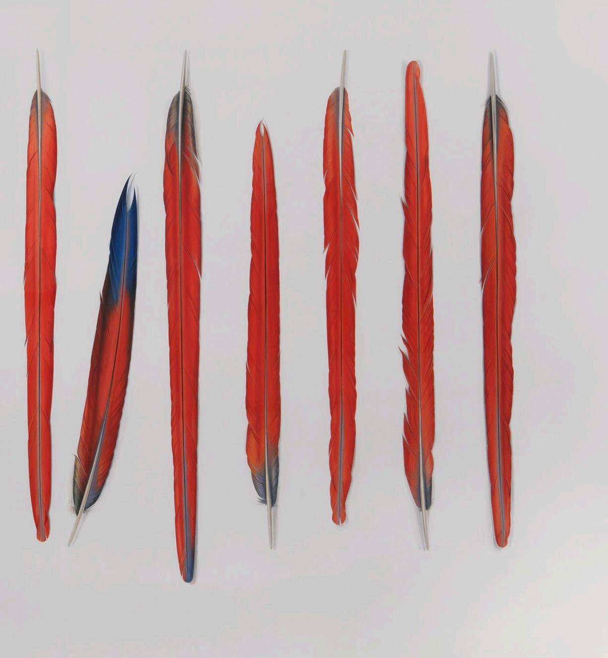
Butterworth
Feathers 2021
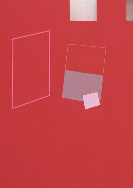
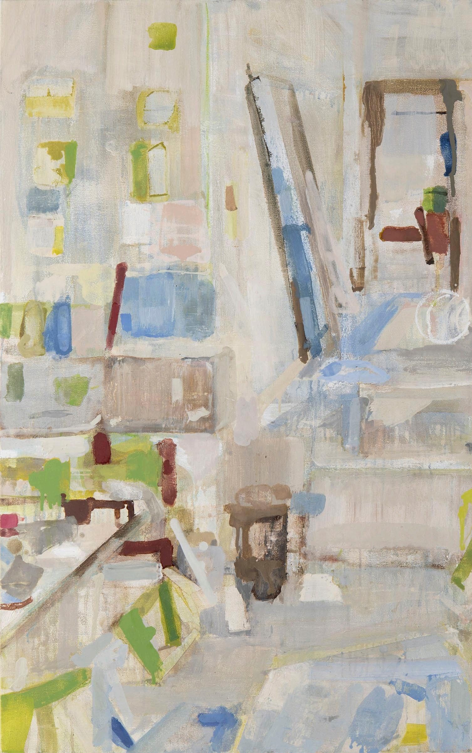
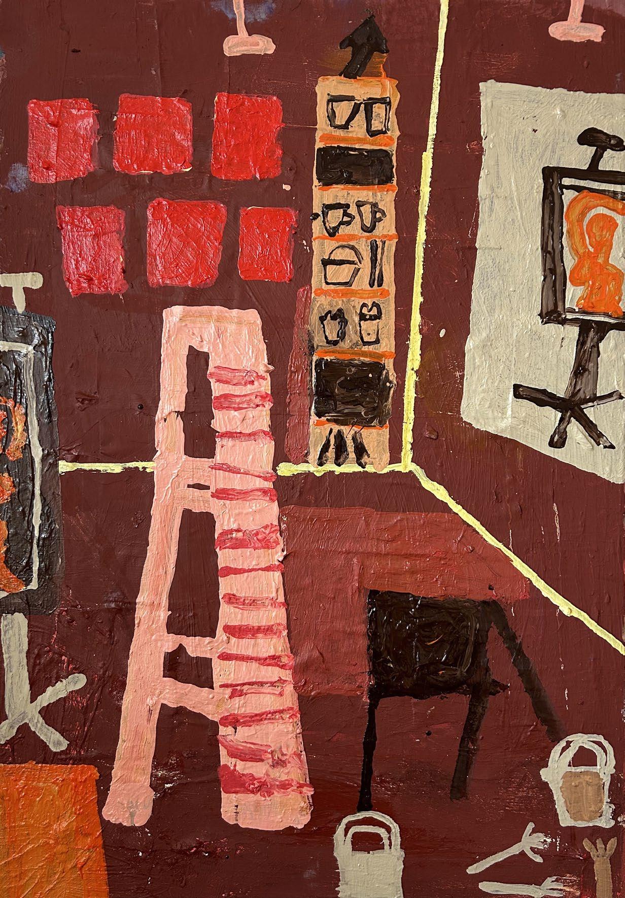
With regard to its dimensions, this work has exactly the same relative proportions as the Matisse canvas, but I have made my version a third the size of the original. The question of how to interpret this painting in a way that might be compatible within my own style, whilst at the same time respecting the Matisse work, presented a problem. However, an answer came quite quickly.
There were two almost square shapes to the right of the centre of the painting, that suggested to me the idea of holes piercing the surface of the work, and that a “sculptural” intervention of this sort might lead the way to the making of a “picture-object” of the type that interested me. This was a start, but there remained quite a large area in the centre and left side of the work, which needed to be dealt with in another way. In the Matisse painting, this area has a “push-pull” character which seems to alternate between flatness and depth.
As his work progressed, Matisse seems to have eliminated many of the indicators of perspective in order to enhance the flatness of the picture. In addition, he reduced many of the shapes to mere outlines, seemingly sunk into the red field. The red spreads everywhere, allowing only the paintings hanging or leaning
against the studio walls to keep their original full colour and tone. Incidentally, these paintings, which are mainly nudes, give a sense of the human presence in an otherwise nearly abstract work. Since all my work is abstract, I had to ignore this.
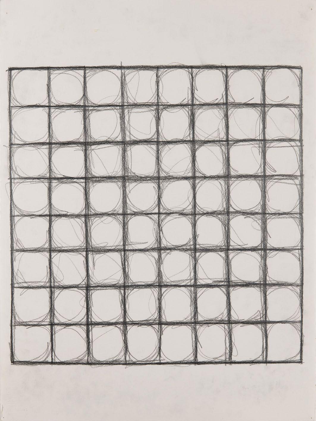
The question for me now was, could this ambiguous space in the centre and left side of the work, continue to function in the context of my sculptural interventions? It was a help to discover that there were a surprising number of horizontal and vertical alignments within the work. This was something which I did not associate with Matisse. These were not absolutely precise, but then Matisse was drawing from what he saw in front of him, rather than from geometric principles. For my own purposes I made the alignments more exact.
Then, to approach the problem of space within the work, I painted some stylised perspectival frames, lining them up in such a way as to express pictorial depth. These elements are in the original Matisse work - I did not invent them - but I simplified and adapted them to serve the specific demands of the new artwork.
In considering The Red Studio project as a whole, I found the creation of this work to have been a strange experience. To engage with Matisse’s work in such a direct way was a fraught, but interesting, experience. It has been like a holiday from my normal practice - and the artwork itself is a curious hybrid object, but I hope of some interest.
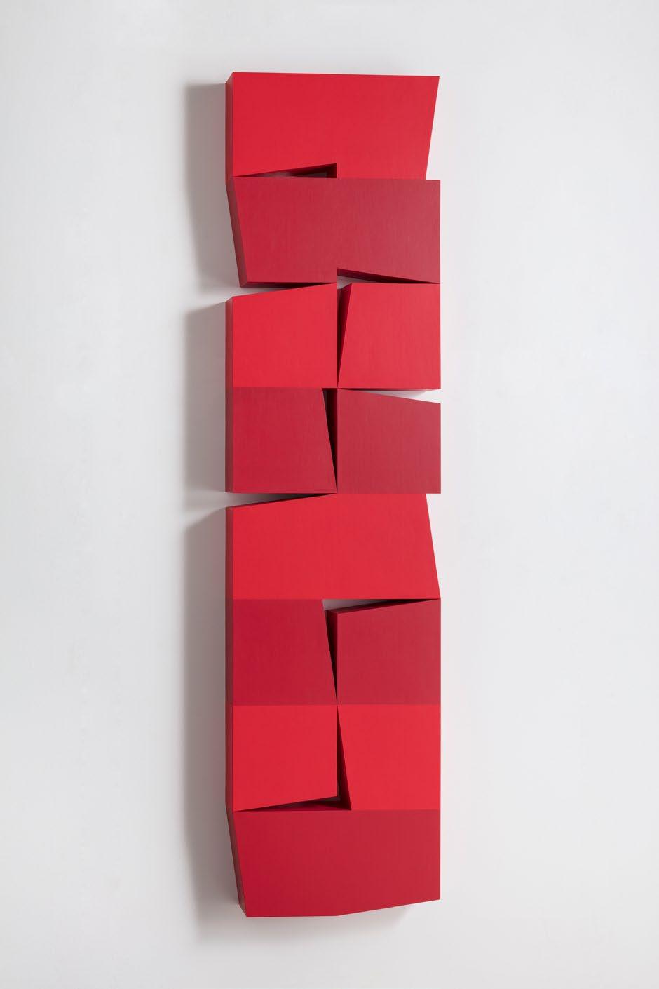
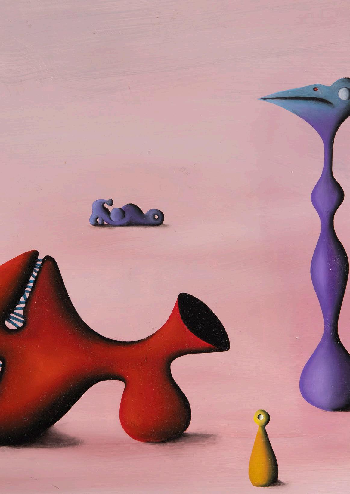
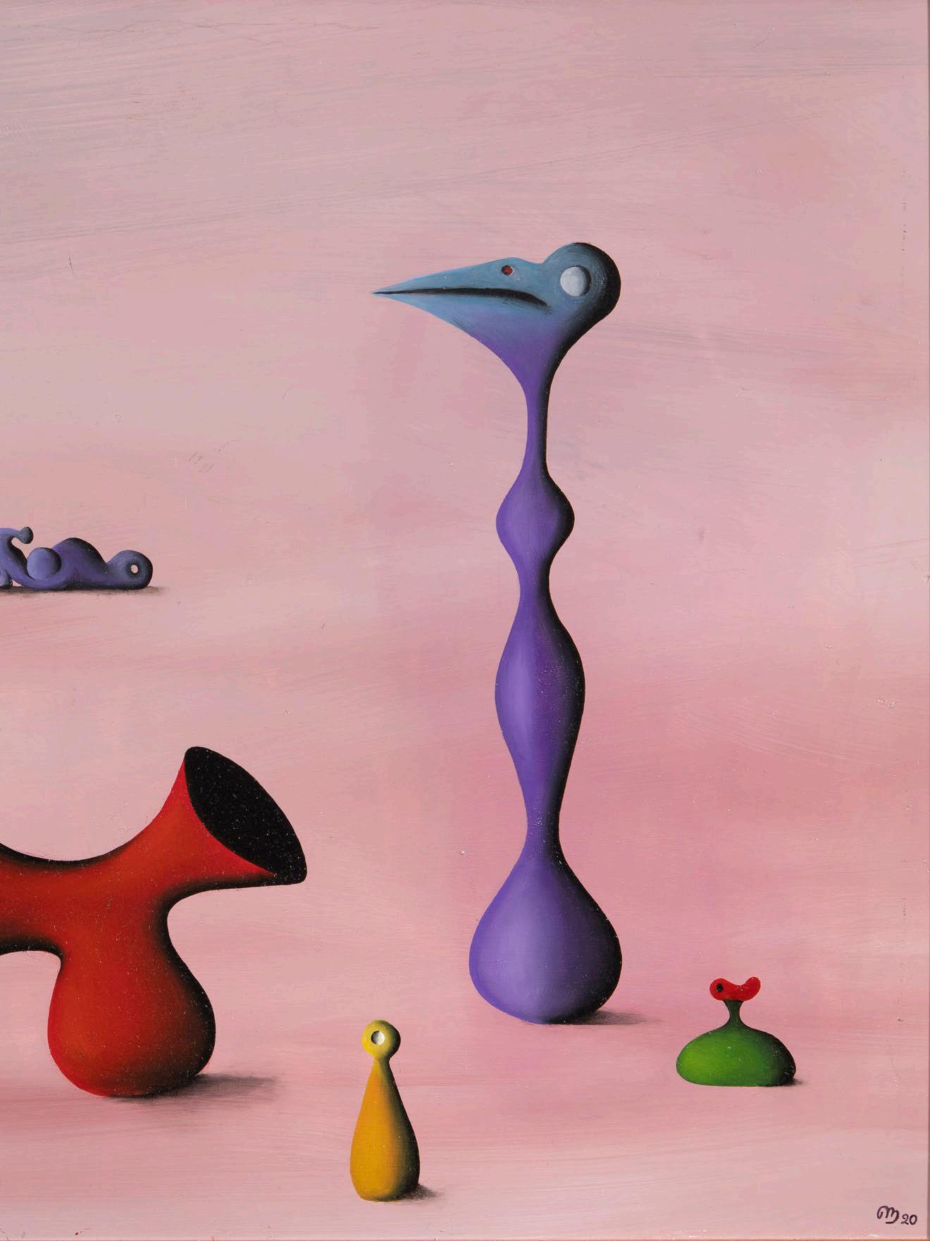
Red Column 2023
Acrylic with marble powder on plywood
200 x 50 x 10 cm
£20,000
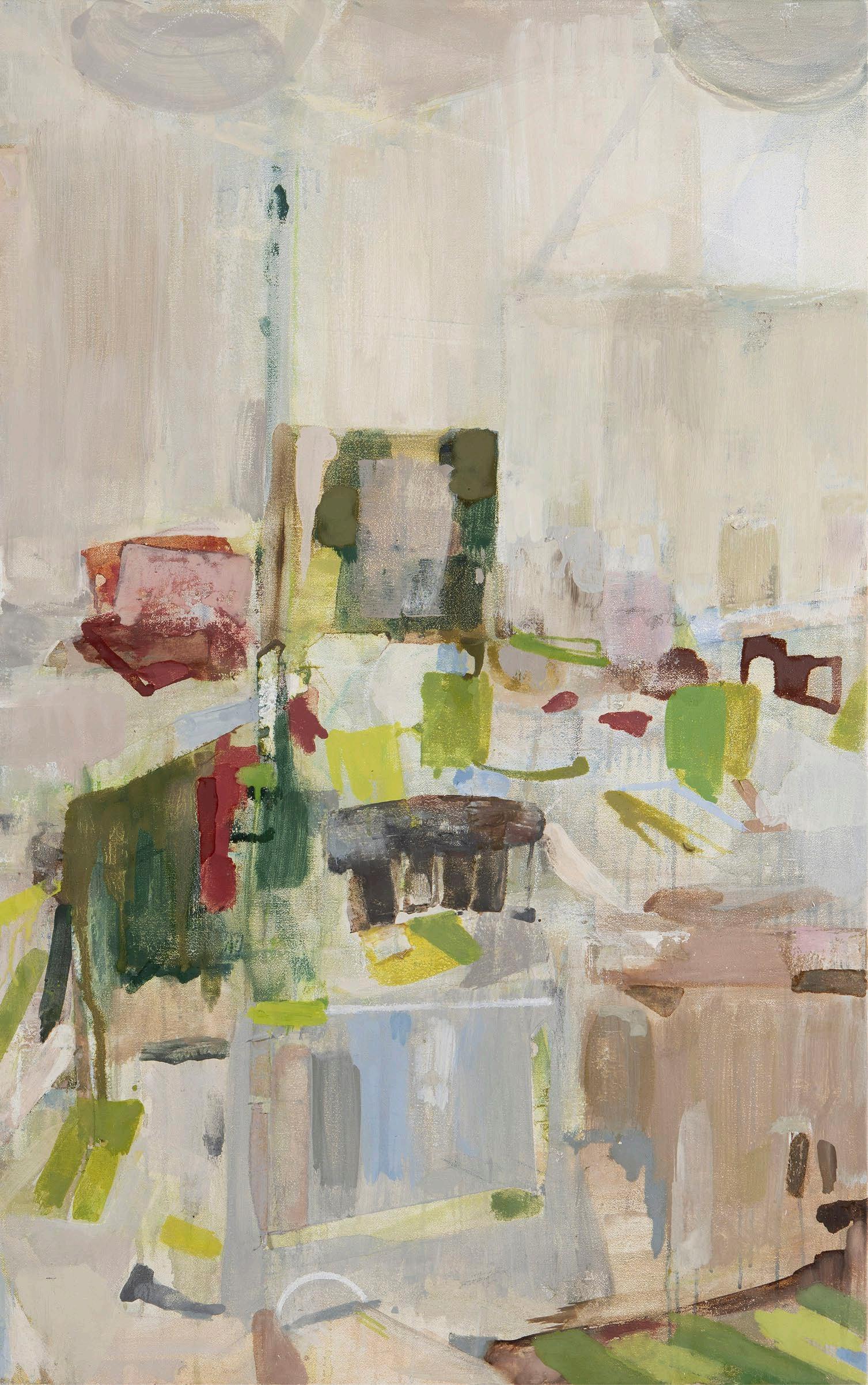
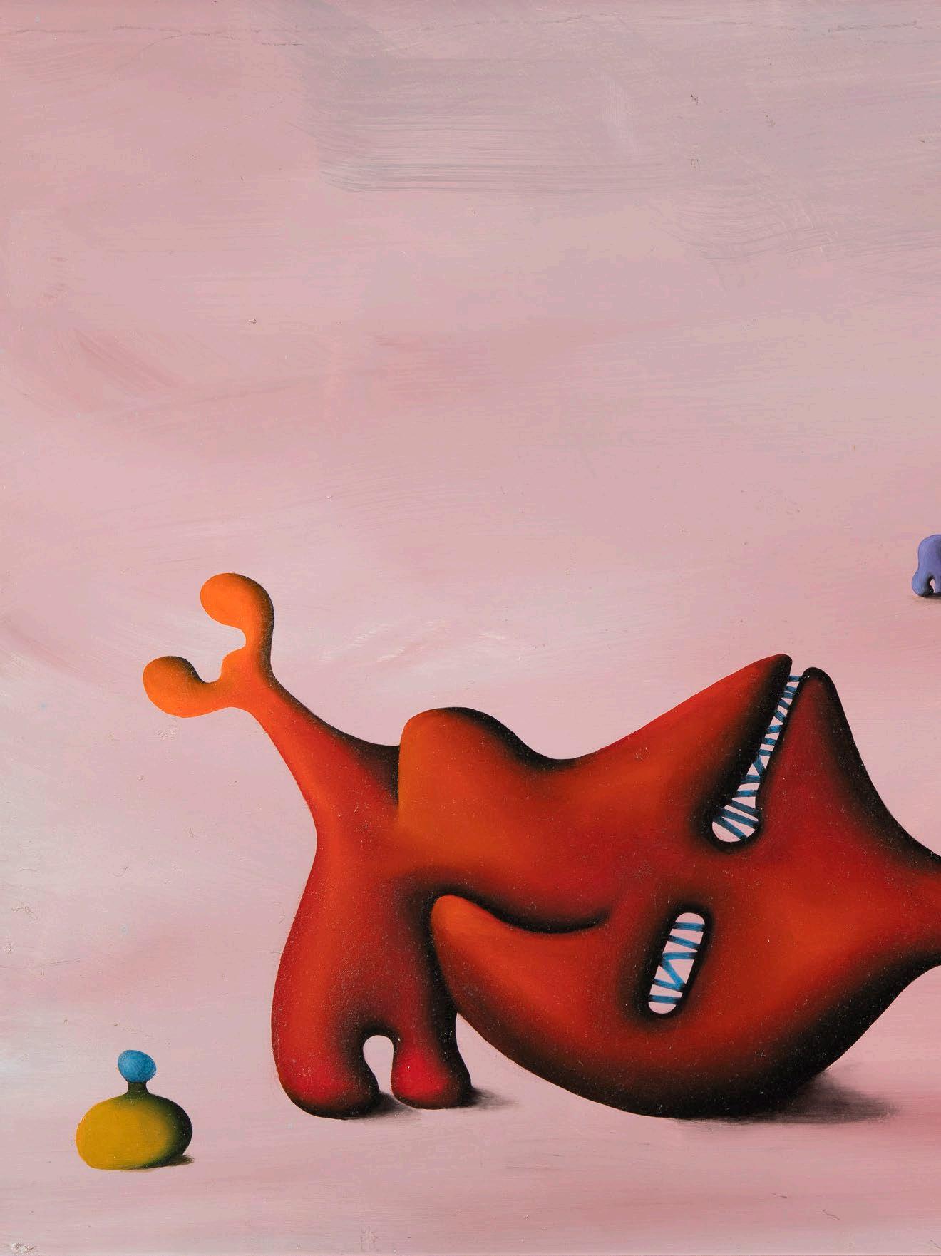
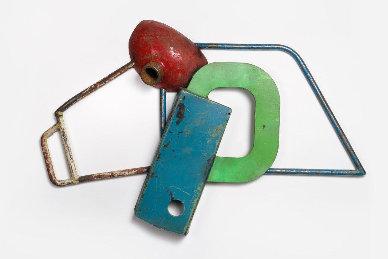
When the idea of the exhibition was put forward, I happened to be reading a biography of Matisse. I was struck by the strength he gained from the belief that ‘if Cezanne was right then I am right’. This sustained him through so many years of criticism, anxiety and doubt. Although my own visual sensibility is far removed from that of Matisse, I have always found him intriguing. The radical development of his work over decades is astonishing. Looking back it’s difficult for us to grasp the personal depths he must have plumbed in order to make such vast leaps.
In my younger years I had a print of The Red Studio in my room. I was fascinated by the wall of red moving across the painting and passing over the sporadic interruptions of objects and pictures. Even after being exposed to so much flat colour painting, I still experience a kind of ‘red taste’ when looking at it. My painting is based on the well-known photograph of Matisse in his latter years drawing on the wall with his charcoal on the end of a long stick.
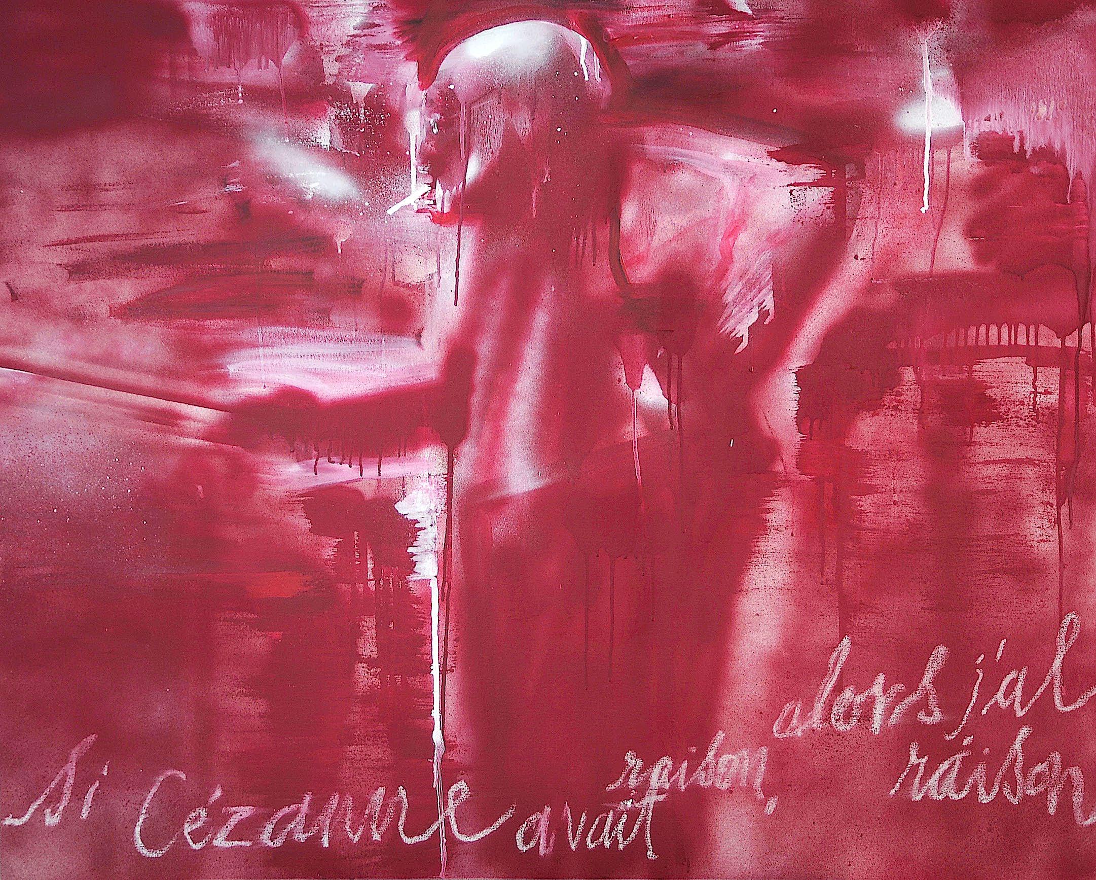
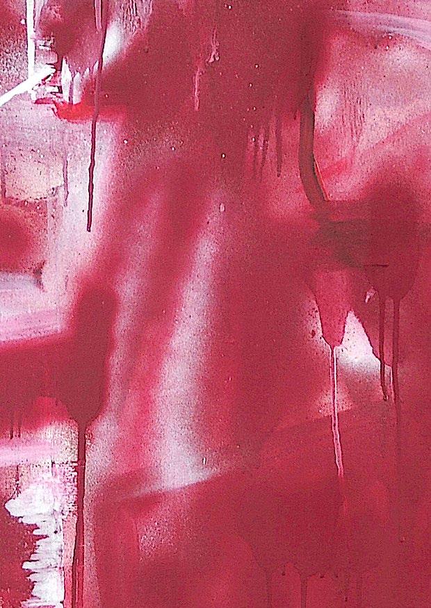
Si Cézanne avait raison, alors j’ai raison 2023
Acrylic, spray paint and oil stick on canvas
95.5 x 120 cm
£1,800
Elliott Paul Emsley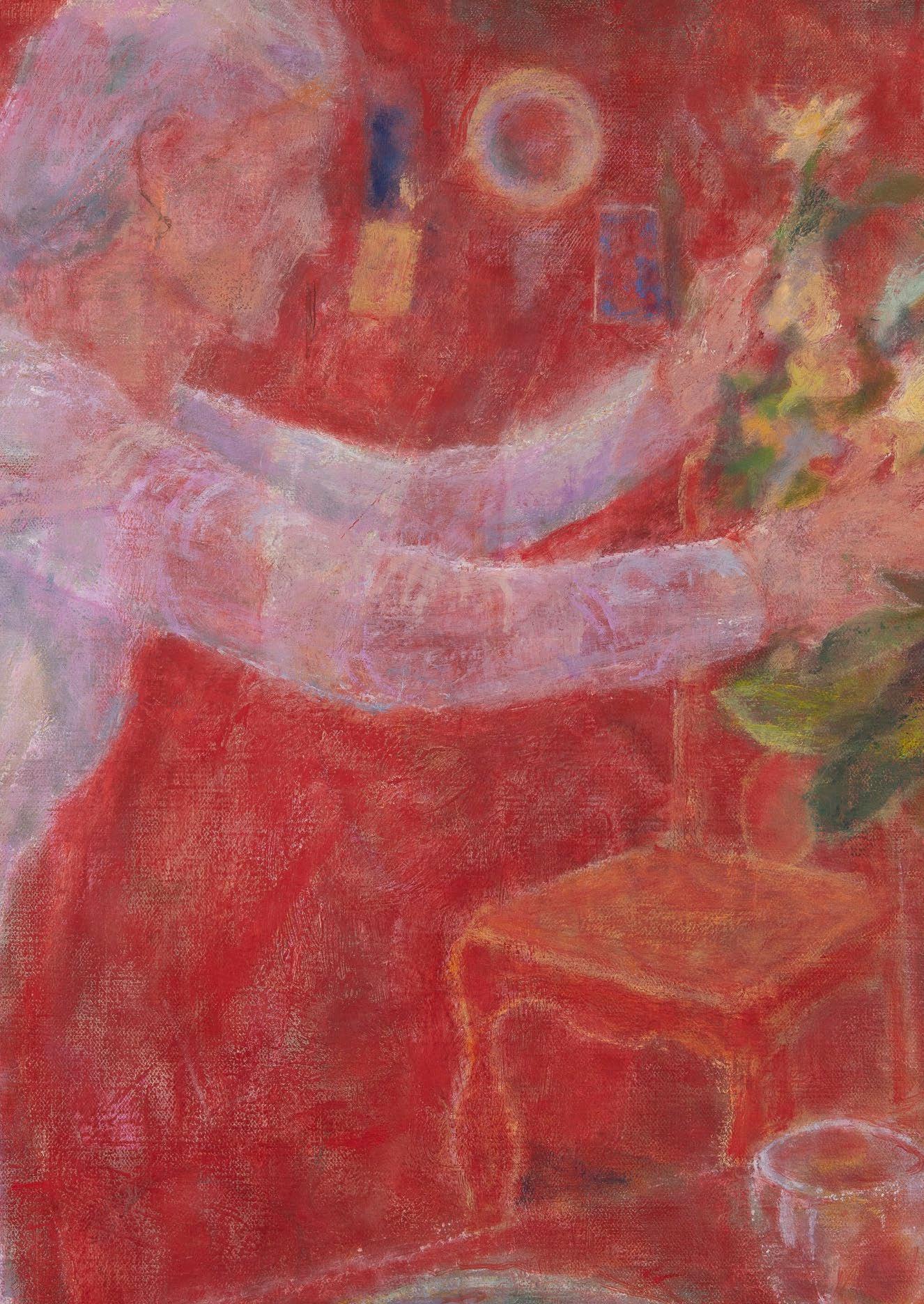
My understanding of Matisse’s painting The Red Studio is that he was playing with the tension between the flat surface of the picture plane and the illusion of space. By covering the painting in a saturated red, and using repeated verticals across the picture, he reinforces the flat surface.
He then uses the scale of objects such a wine glass and a clock to define the space, playing on our assumptions about the size of things. The diagonals on the foreground table and chair, the edge of floor, and the pictures take the eye through the space. The light is made through the juxtaposition of the primary colours with their opposites: green, purple and orange.
In my painting of the Red Room, I also use the red as a common denominator, from which the other colours - particularly the green foliage - emerge. The white figure’s arms act as a bridge between the left and right side of the painting, and the chair sits back in the space behind, aiming to create a three dimensional space.
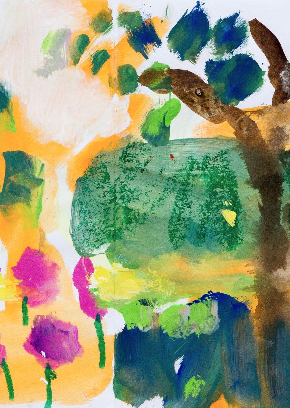
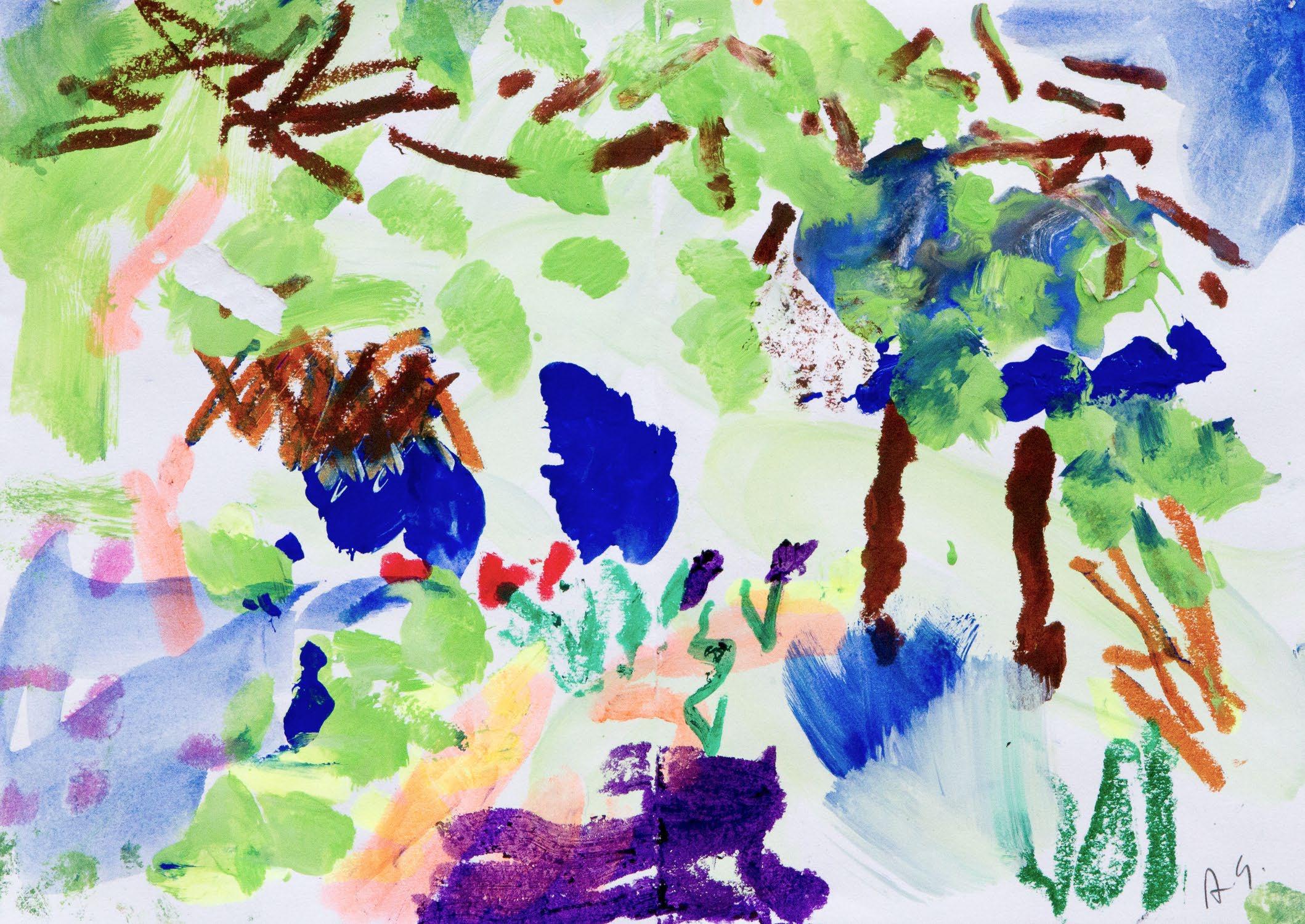
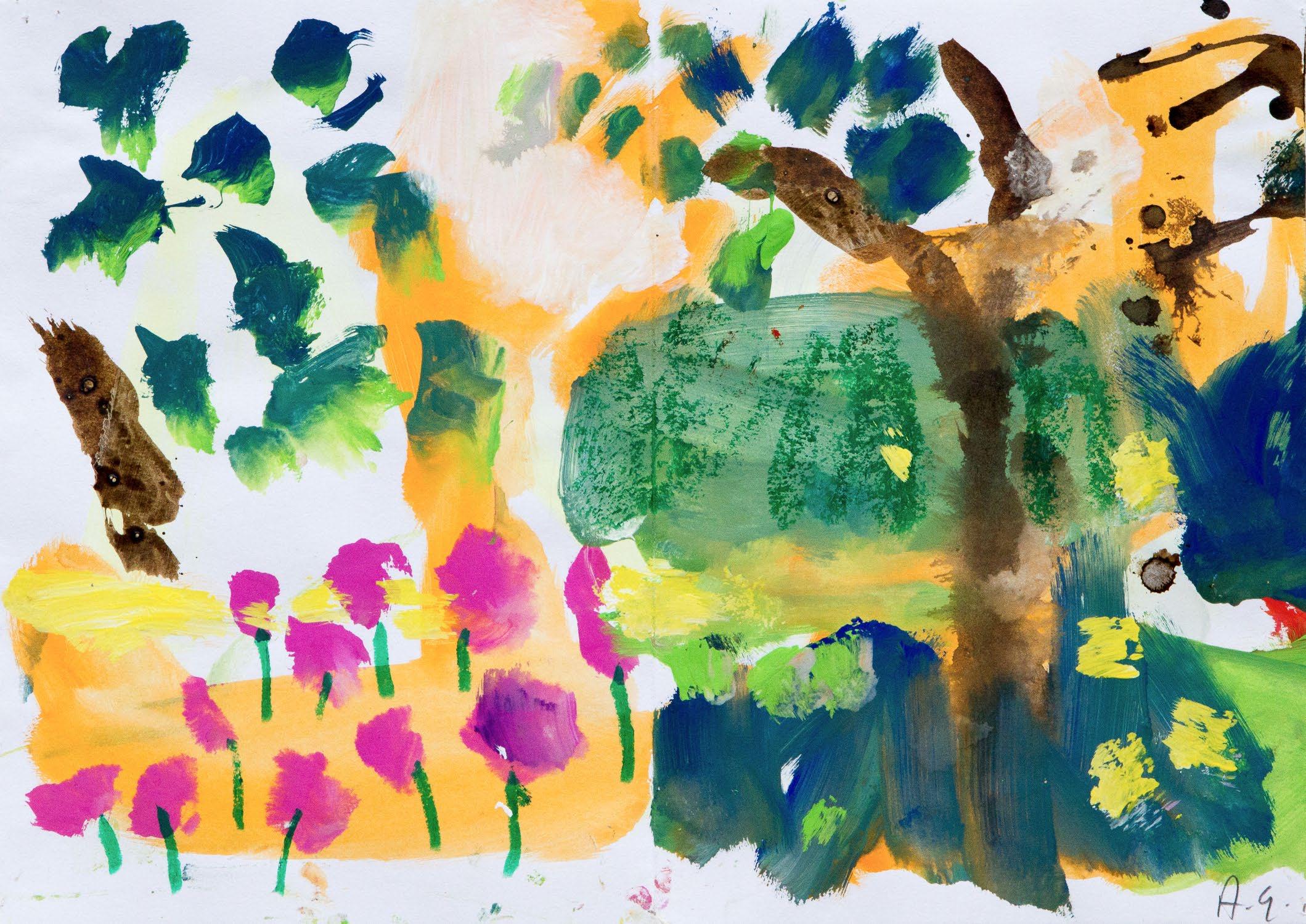
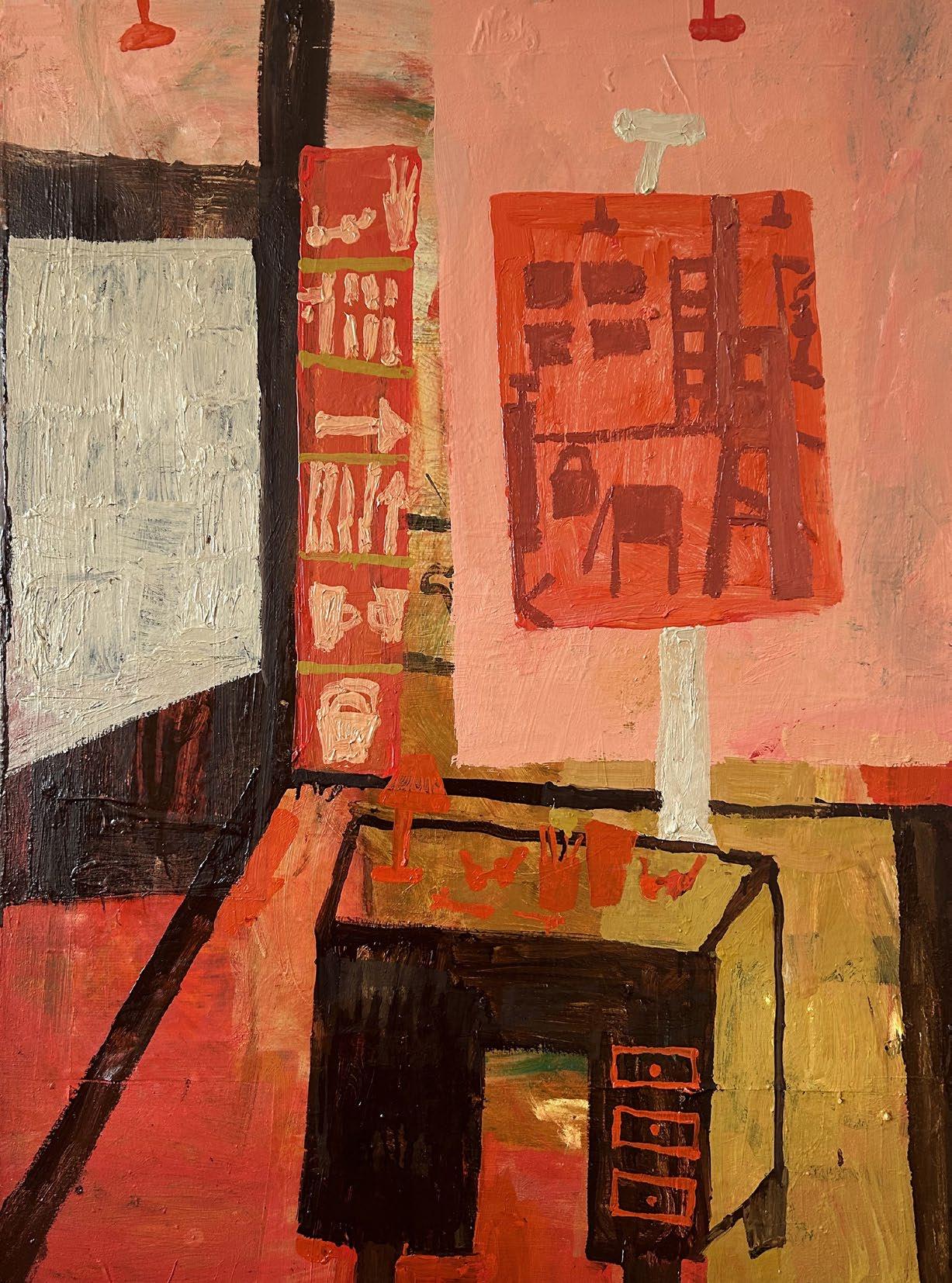
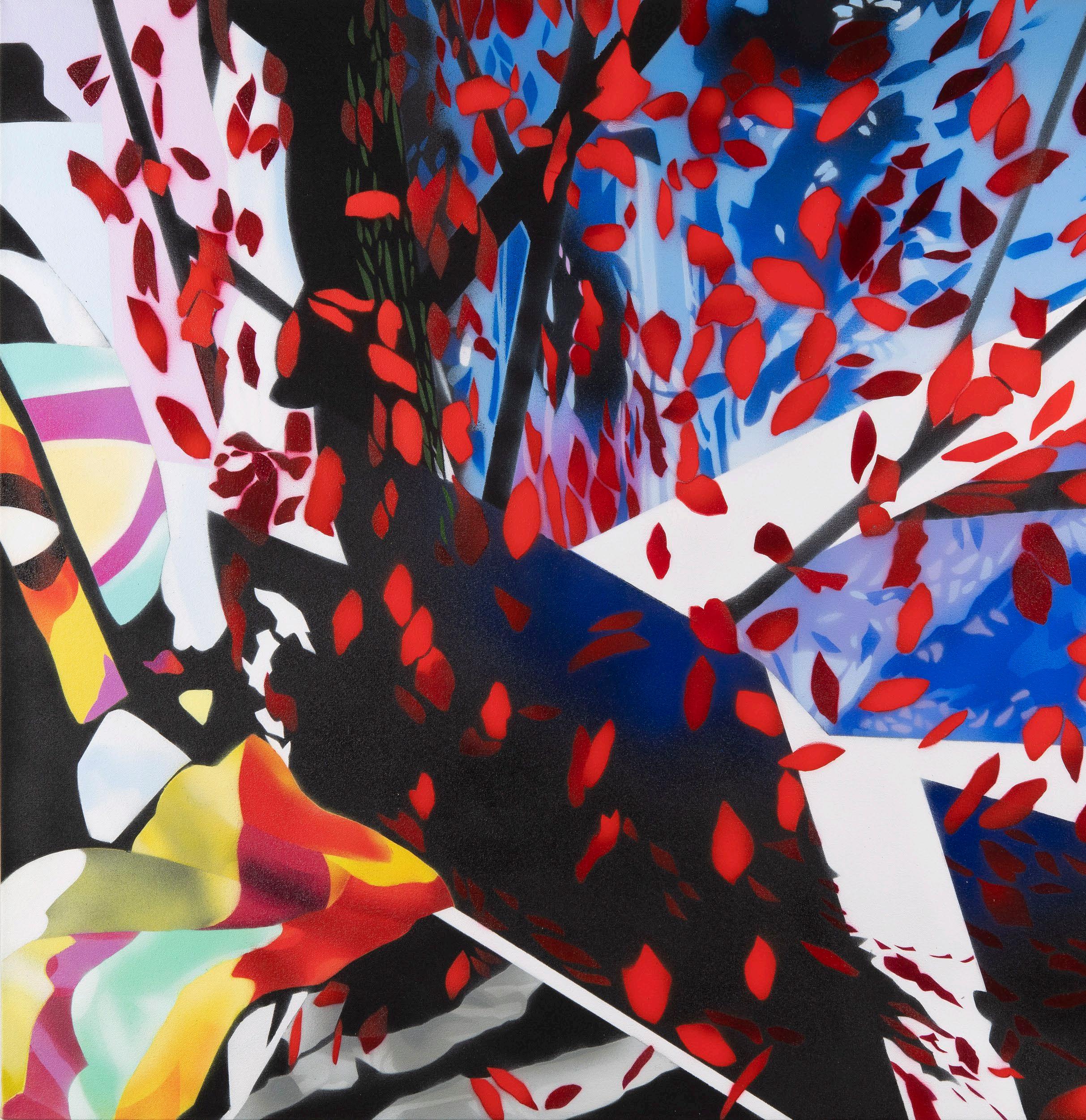
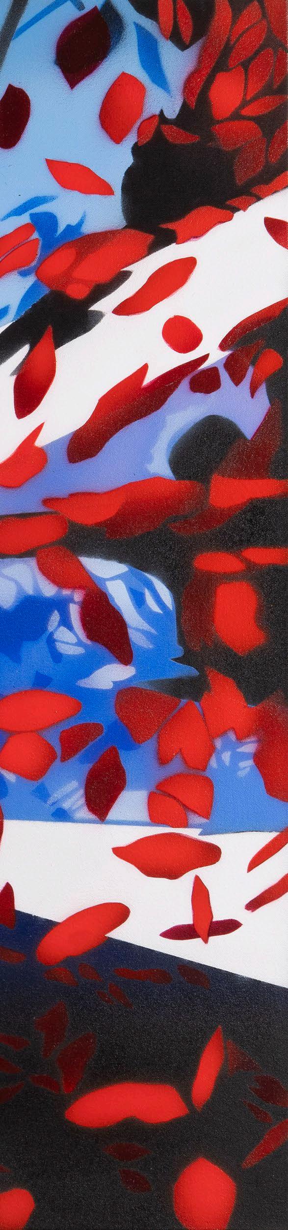
When the Redfern first approached me about this my heart sank. How could I possibly make any work based on my response to Matisse’s The Red Studio when I couldn’t be with the painting in person? I got a poster and pinned it onto the studio wall. It was up for weeks. I tried to work from it but nothing flowed.
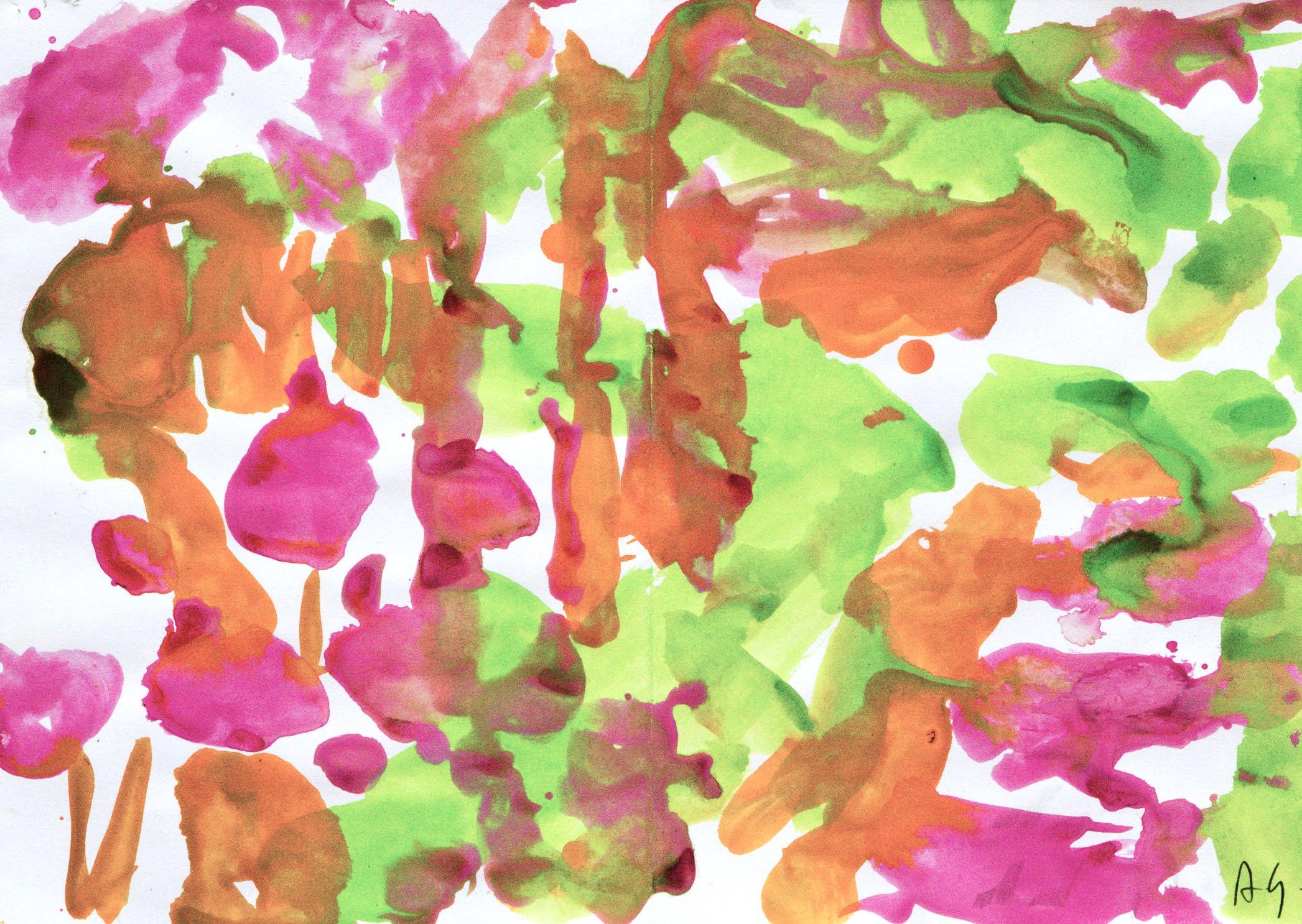
Meanwhile Spring was arriving very fast (in all its technicolour). So I took my paints outside. Matisse speaks about a painter’s need for ‘Whatever will let him become one with natureidentifying himself with her by entering into the things that arouse his feelings.’ So these are small studies done on the spot in a Spring that was so bright and shiny that I couldn’t ignore it. I could say the The Red Studio gave me permission to use a brighter palette, with pinks, bright greens and ultramarines, but really nature gave me permission.
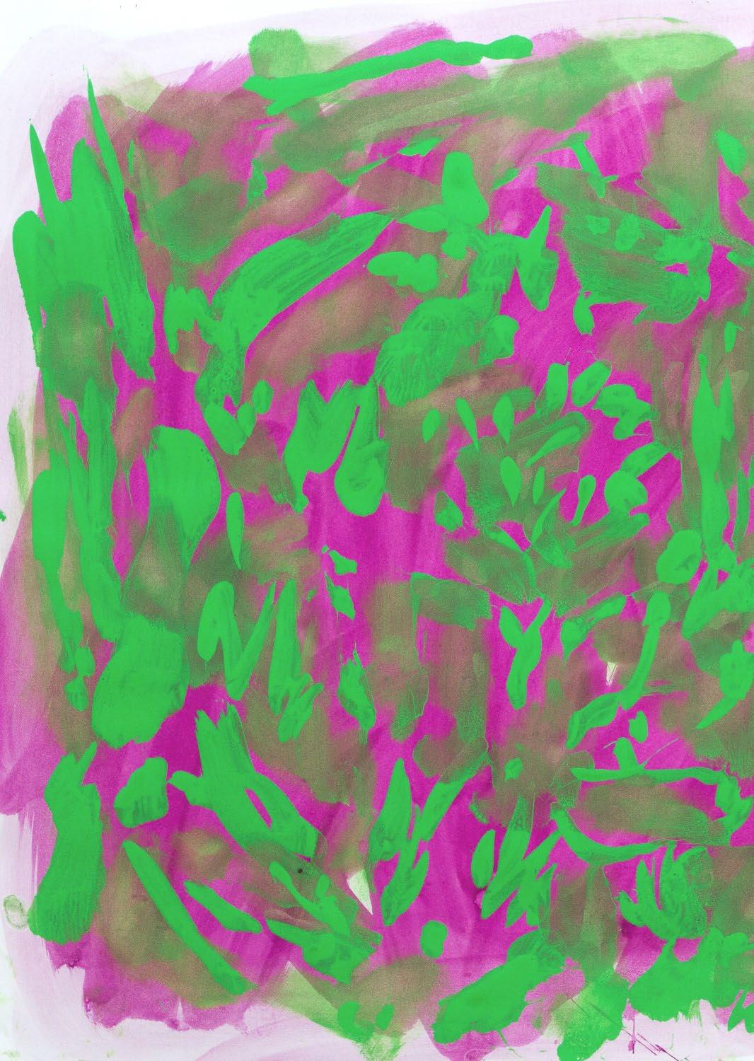
Annabel Gault
Garden Study 2 2023
Acrylic gouache on paper
29.3 x 41 cm
£1,500
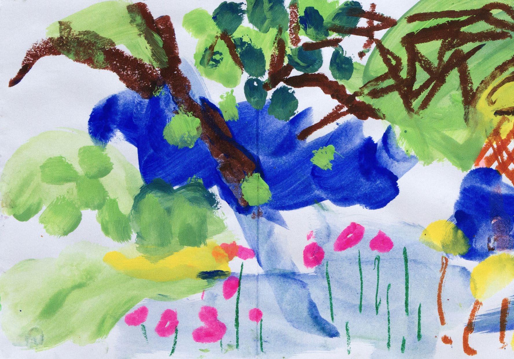
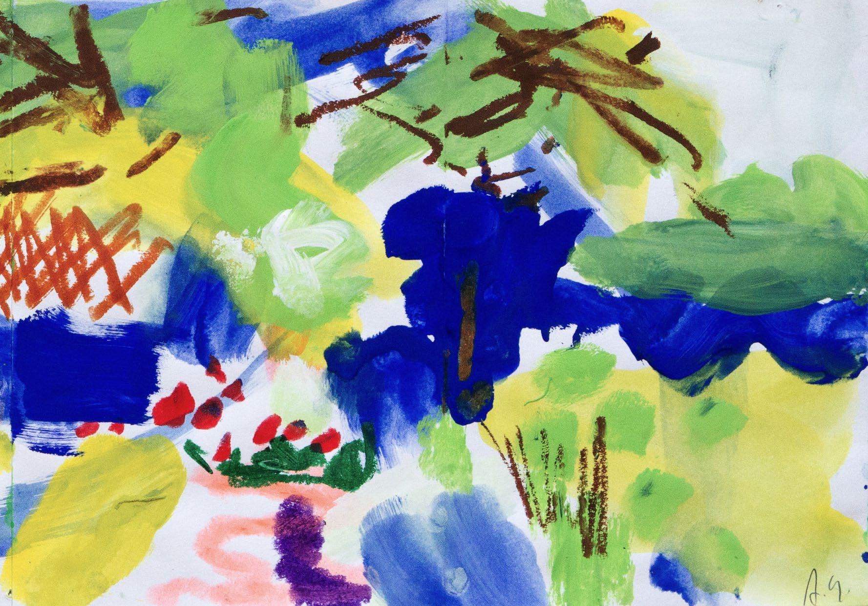
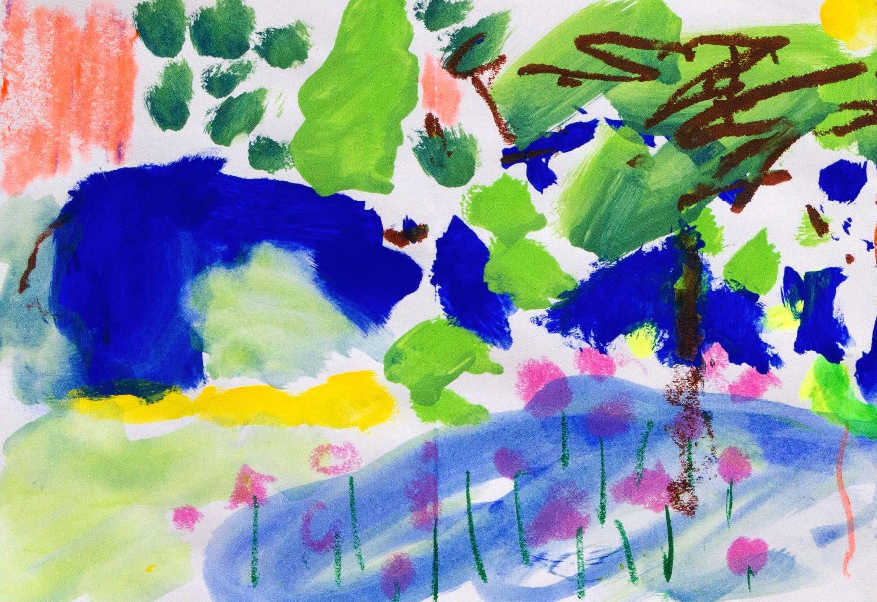
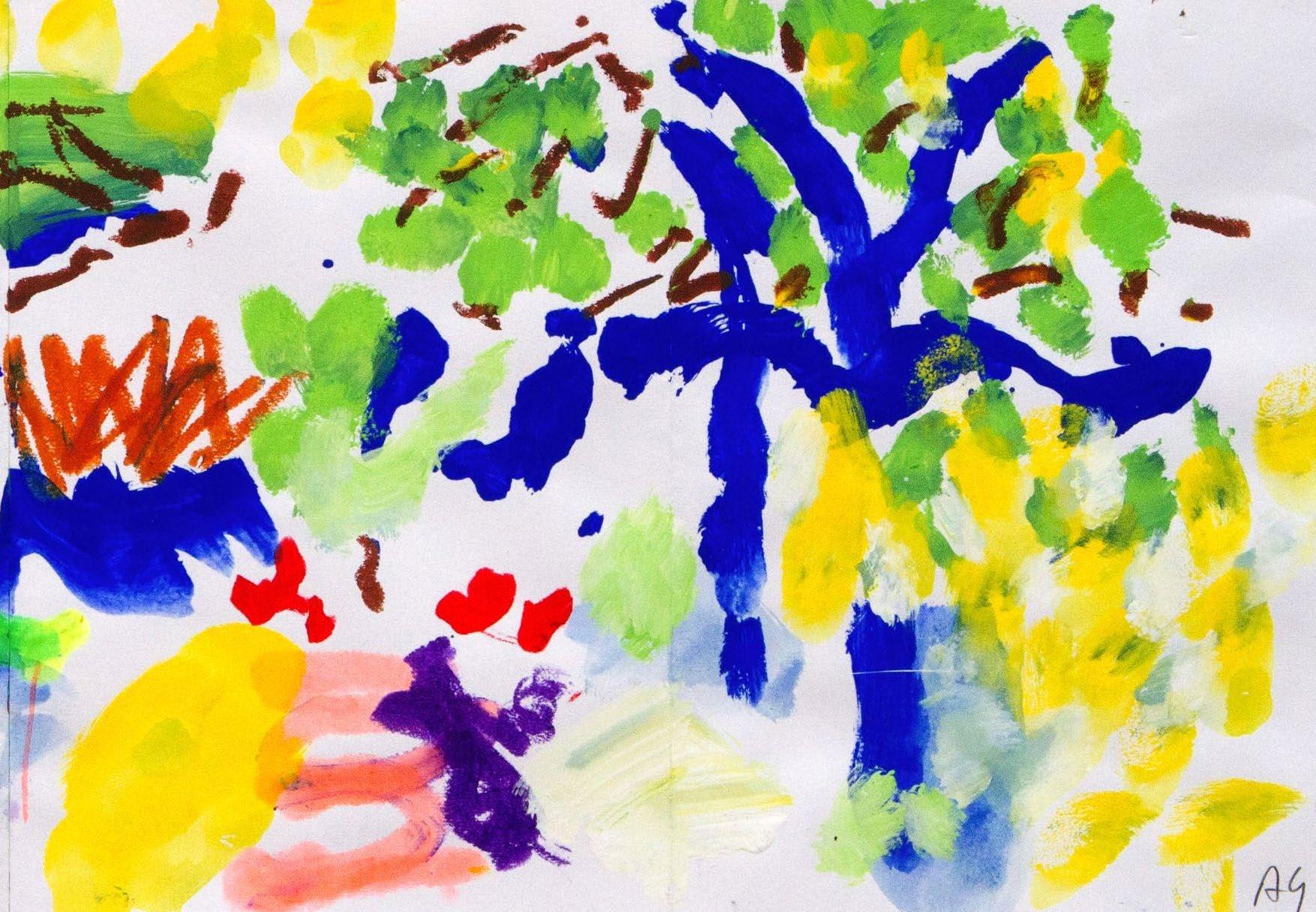
For me, Matisse has been a constant inspiration. Whenever I have thought I couldn’t get more from him, I see a painting or cut-out in a fresh light and it’s like seeing his work for the first time again.
From his use of colour, to his use of collage, Matisse is like no other. It is a privilege to be in a show honouring Matisse’s The Red Studio.
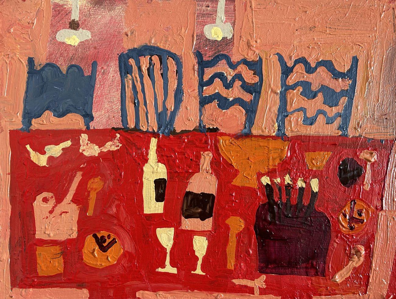
I thought long and hard about what work to make for this exhibition. I was constantly drawing in my studio for a few weeks. Very quick sketches but all playing with the idea of what surrounds me whilst working. I was thinking about how Matisse depicts paintings within paintings, therefore within these works every painting in this show has a nod towards each other and hopefully a nod towards Matisse.
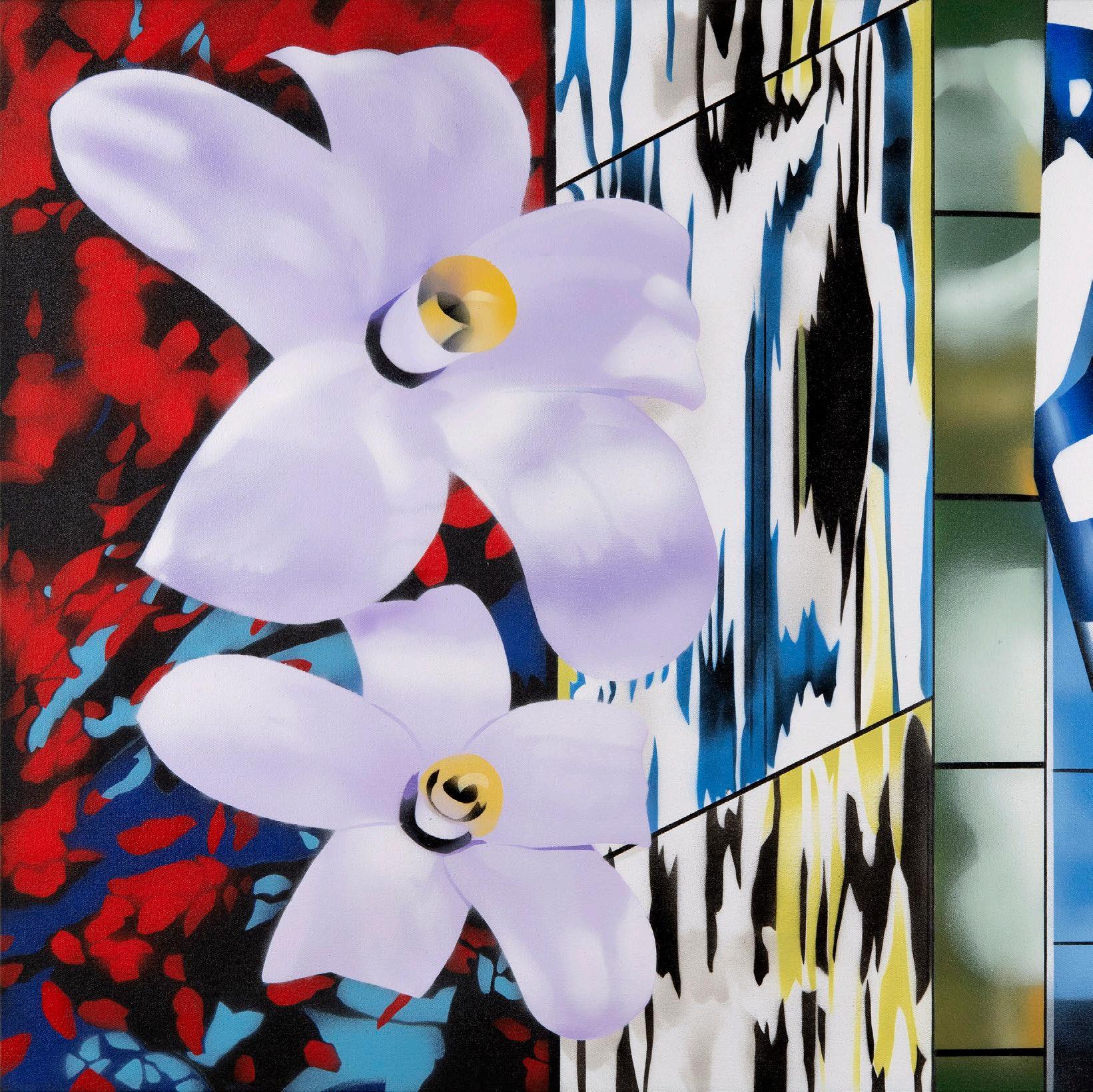
Florence Hutchings
Two Orange Nude Paintings
2023
Oil on canvas
75 x 50 cm
£ 3,000
Florence Hutchings
Painting Two Orange Nudes on an Easel
2023
Oil on canvas
90 x 70 cm
£ 4,000
Florence Hutchings
Dinner Party Paintings on the Wall
2023
Oil on canvas
95 x 65 cm
£ 4,000
 Linda Karshan
In 1986, I saw Matisse’s work in great depth in The Hermitage. Paired as it was with that of Picasso, it was an unforgettable encounter. One could virtually feel their rivalry on the walls. Matisse’s fluid, confident line is the result of a life’s work. This gives a sense of ease, and grace.
On The Red Studio: I know this painting well, living also in NY. There, at MoMA, I saw the recent exhibition around this iconic work. It was moving, and impressive, to have his paintings within The Red Studio brought together again, to be re-considered, and studied. To my mind, each held up. Seemingly simple, each work is a masterpiece.
I was thrilled to read of The Redfern’s role in the history of this venerable painting.
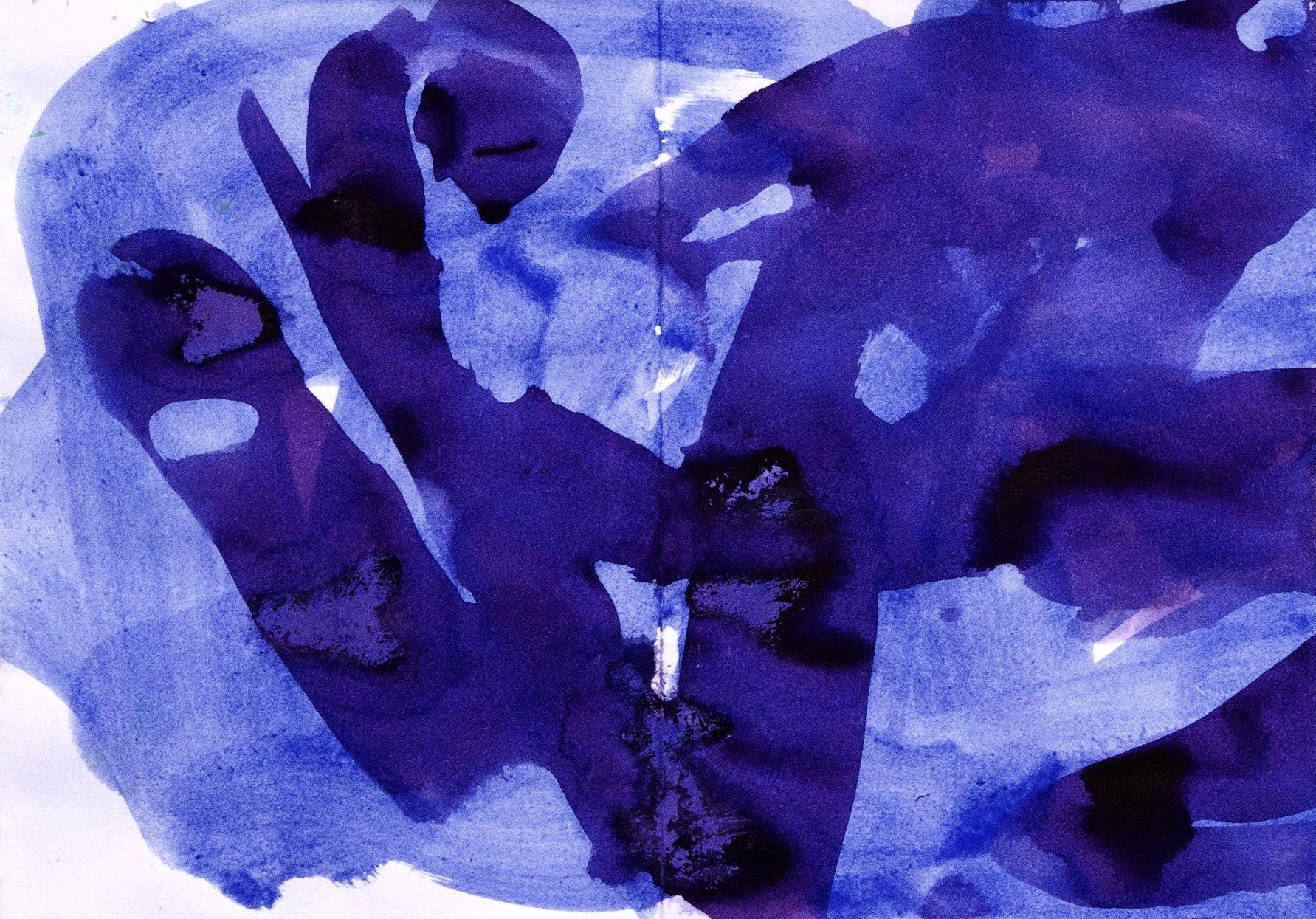
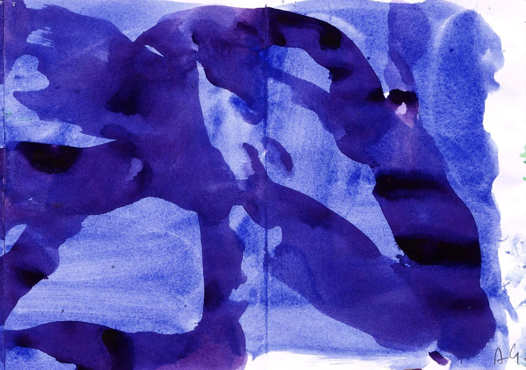
Covid-19 Series I - Dancing Quatrefoils 2020
Graphite on paper
76 x 57 cm
£8,500
Covid-19 Series III - Excellent Filigree 2020
The studio thrums with colour. It is a place for that, a heightened place. Where the order of things can be reinvented. In the imagination of the artist. On the boards, canvases, pieces of paper torn from a sketchbook. That are propped against or taped up on the walls. Imagination runs riot outside. Emotions made manifest. The unreal made real. And the real is singing vibrant, like a vivid dream, fantastic.
Red pitched outward, reaching the retina first, taking up more than its allotted space. It chimes more sharply, more deeply. Down in the blood, with a particular human energy. Red paint calls, and spreads, and unifies everything in sight with its glow. What does a field of red do? It challenges the viewer to resist its unparalleled warmth. Can you still find the bright, lemony tang of yellow. The grounding, earth tones of raw umber. Cool, deep, sea-deep, ultramarine. Pure white, clean white, peeks through and details a plate, a glass, muddles in and fills a field with honeyed pink. White stretches up and articulates a thigh, a profile. The length of a neck. High-gathered hair. A nose. A chin. The dip into a throat.
In alabaster, stark within a field of red. In brushwork, sketchy, rising red out of a field of white. The off-white of paper. The blank page, the world of possibility. And she looks out from it, turns to look. She’s in the studio, with the order and the chaos of it, the red wine and the paint. And it is all within her gaze, within the pages of her sketchbook, on the easel. Evidence of past love and past hope and past endeavour. The seeds of future ideas. Against the walls of the studio. Thrumming with colour.

 Catherine Kurtz
Red II 2023
Oil on board
Catherine Kurtz
Red II 2023
Oil on board
Patrick Heron said of Matisse’s The Red Studio: ‘the single most influential painting in my entire career’ -
Heron has been a major influence on my work for the last 30 years, particularly his paintings from the late 40’s, early 50’s (interiors, windows, tables, objects and figures) and his late garden paintings from Eagles Nest. An extraordinary ‘floatiness’ in drawing quadrants of plant life in paint, his flat thin blocked out washes, and his own mesmerizing colours of mauve, and yellow, and blues and pinks.
Heron saw The Red Studio in the latter half 1943 at The Redfern Gallery, paying endless visits to absorb the revelations of the great masterpiece and went on to exhibit 3 one-man shows at the Redfern from this inspiration.
The inspiration, in my view is the drawing with paint – the painted line begins the painting, thick painted objects develop around these ligaments, and finally a flat wash of thin colour quite detached from line and object.
Heron had to cope with these very strong lessons from Matisse. It strikes me that he dealt with them by doing, painting, and just continuous working. And that is how I can work with Heron’s influence on me: you can find your own way and strike out for yourself.
With this centenary of the Redfern, I have been struck by an extraordinary overlapping of happenings and meetings of minds - the exhibition of The Red Studio at the Redfern; Patrick Heron’s shows at the Redfern, and my treasured copy of Mel Gooding’s book on Patrick Heron, all coming together in this marvellous birthday celebration exhibition – HUZZAH!
£ 7,500
 Ffiona Lewis
White Table 2023
Oil on board (triptych) 24 x 91 cm
Ffiona Lewis
White Table 2023
Oil on board (triptych) 24 x 91 cm
Ffiona Lewis
Studio Music Stand 2023
Mixed media on paper (diptych)
29.5 x 42 cm
£ 900
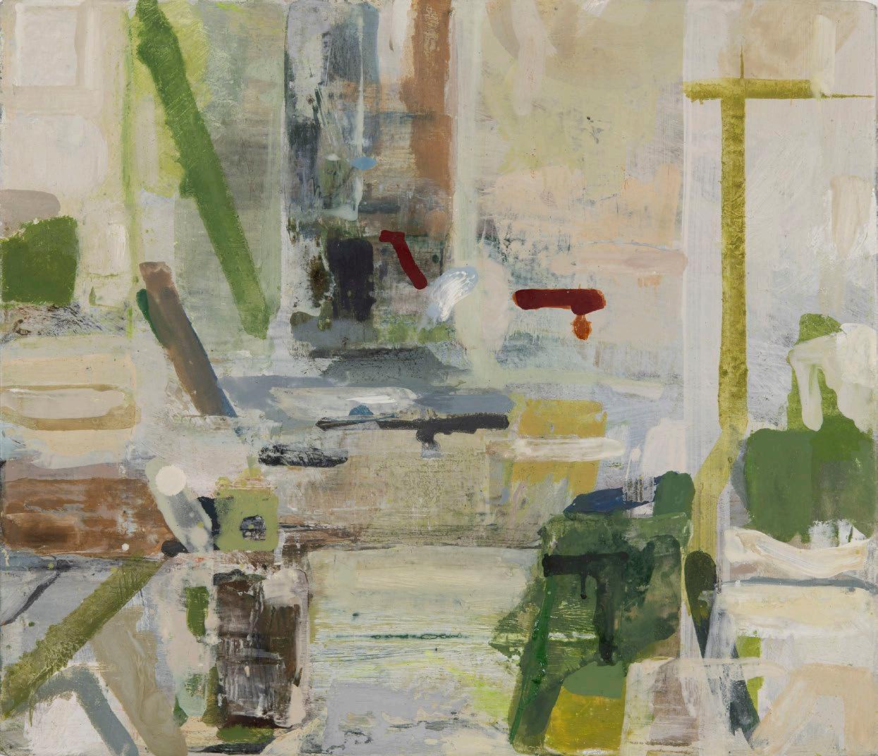
It has been a privilege to have exhibited my paintings at The Redfern Gallery over the years, especially when I think of all the amazing work that has shared these walls. I know Matisse’s The Red Studio well from seeing it in New York; an incredible painting. Flat yet full of light, space, and mystery. My painting here is not a direct response to The Red Studio, rather it is my own version of a red room. I hope there is some connection however in the pleasures of colour and engagement with the intimate everyday objects and places that surround us all.
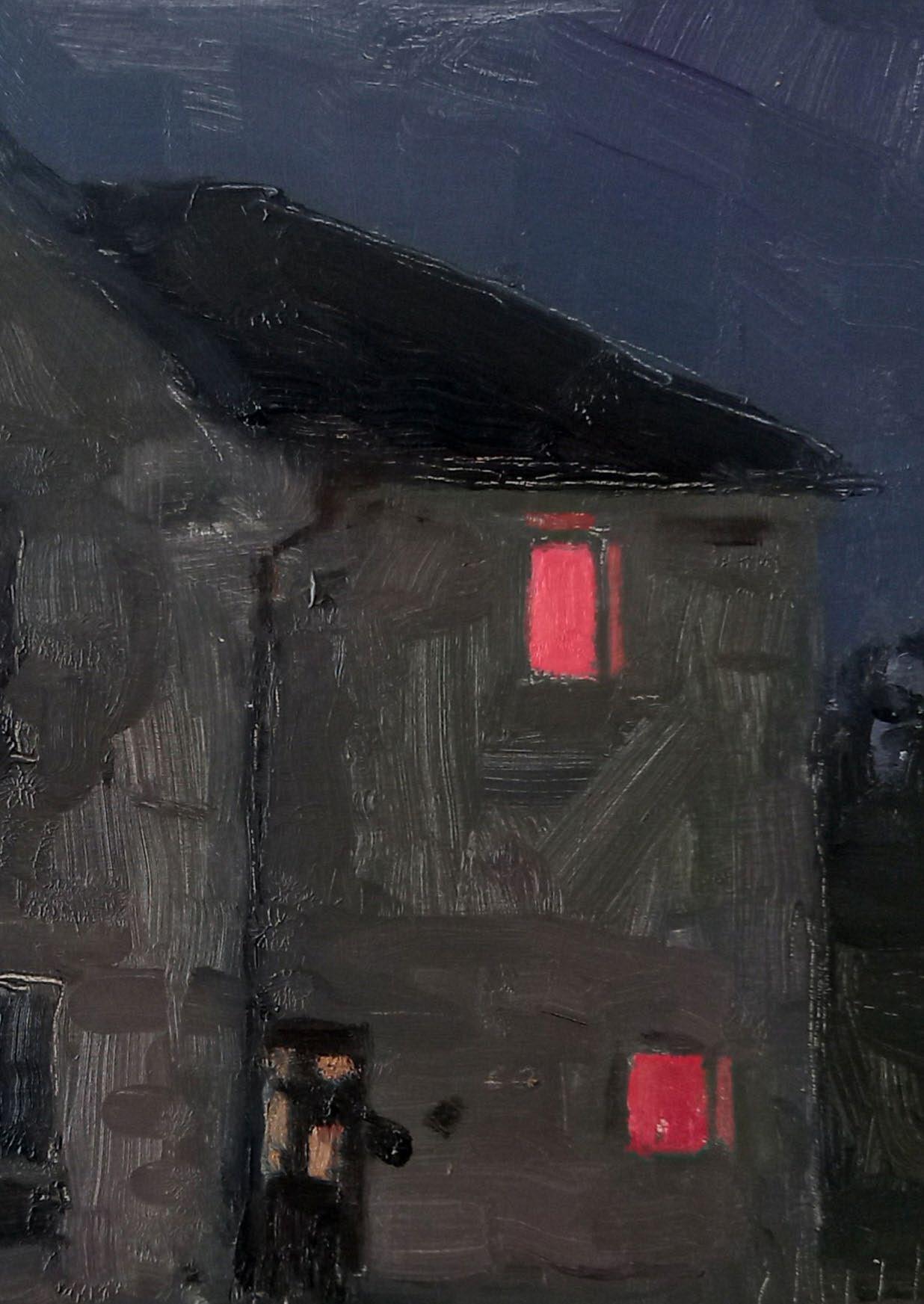
Danny Markey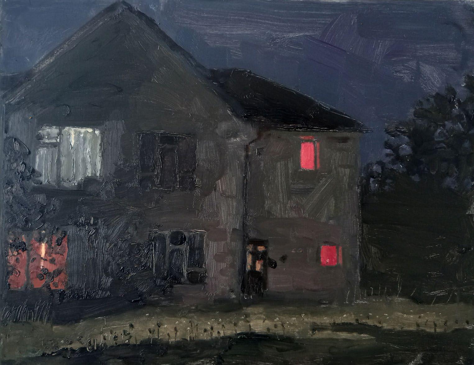
There is such a lyricism and joy in the paintings of Matisse. Rich and sensuous they provide enormous pleasure
The move between figuration and abstraction is effortless
I think of Spring and Autumn, the expectation and the afterglow. A pure sensuous delight.
 Brendan Neiland Sonatina 2023 Acrylic on canvas 101.6 x 121.9 cm
 Brendan Neiland
Petal Power 2023
Acrylic on canvas
100.5 x 120 cm
Brendan Neiland
Petal Power 2023
Acrylic on canvas
100.5 x 120 cm
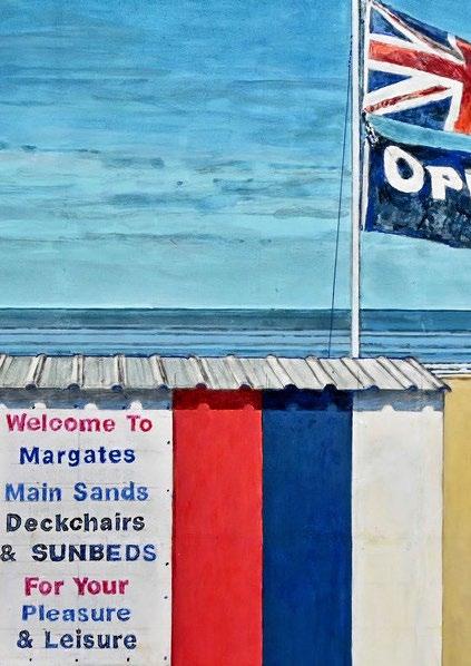
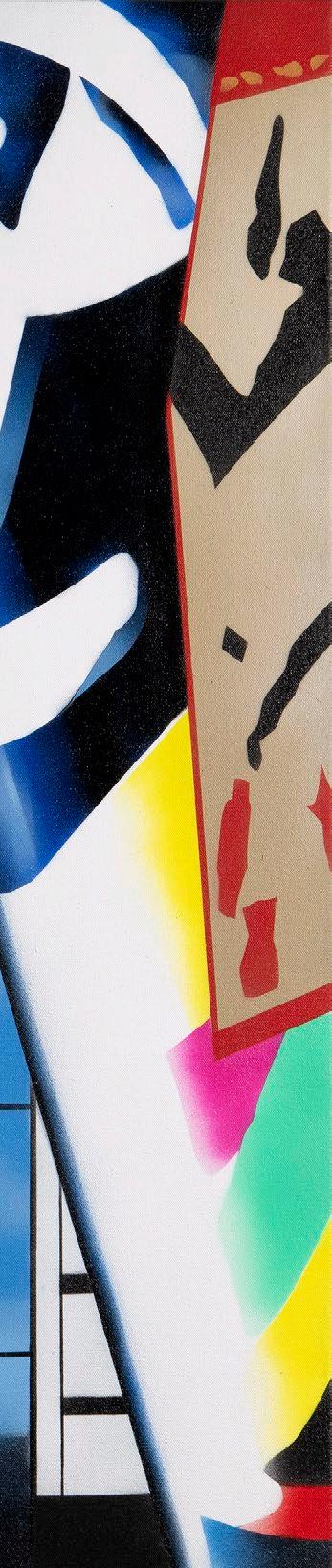
From 1955 at the RA schools (68 years) I have visited and exhibited here at the Redfern Gallery. From time to time the gallery and hanging have looked like The Red Studio. But as Matisse was advised by Camille Pissarro in 1898 to come to London to study Turner’s paintings I felt homage should be paid to the great man by me, The Redfern Gallery and Matisse.
Bryan Organ
Homage to Mister Turner 2023
Acrylic on canvas
101.6 x 101.6 cm
£15,000
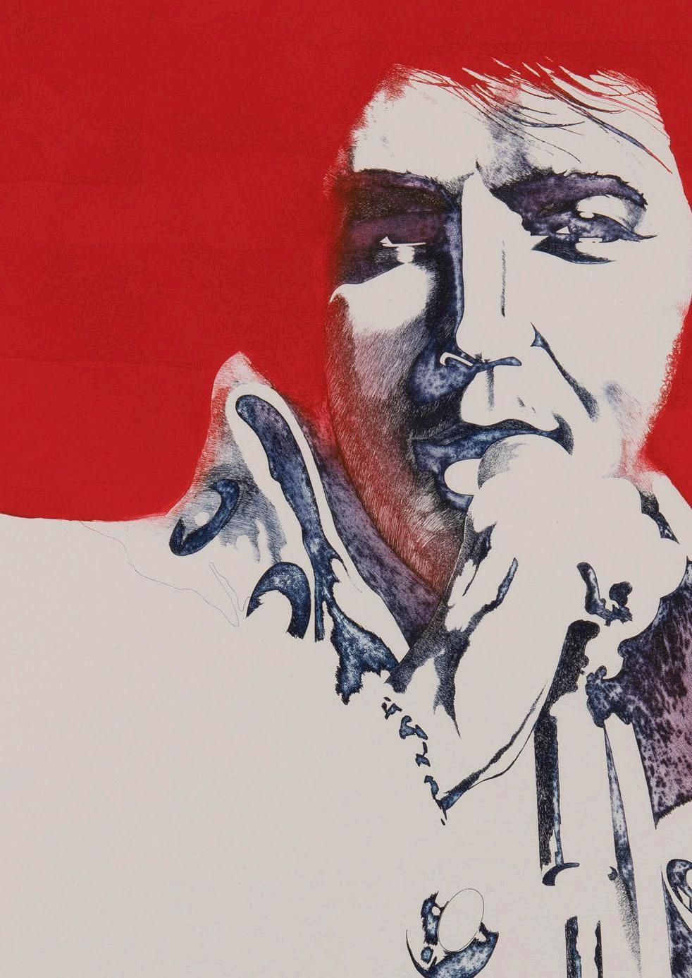
 Pierre Skira
Le peintre triomphe au cœur du réel, il emporte la fable, l’histoire, celle du passé ou de l’avenir.
Il y a cru, le corps cru, la longue série des fantômes intimes. Il y eut une erreur, une erreur rouge.
Le plus intime d’un atelier, ça s’est passé comme ça, sans la pensée, sans toi, sans ton corps, tu n’y as pas cru Henri à ce tableau abstrait.
Rouge 2023
Pastel, acrylic and collage
board
61 x 101.5 cm
£22,000
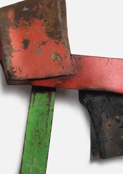
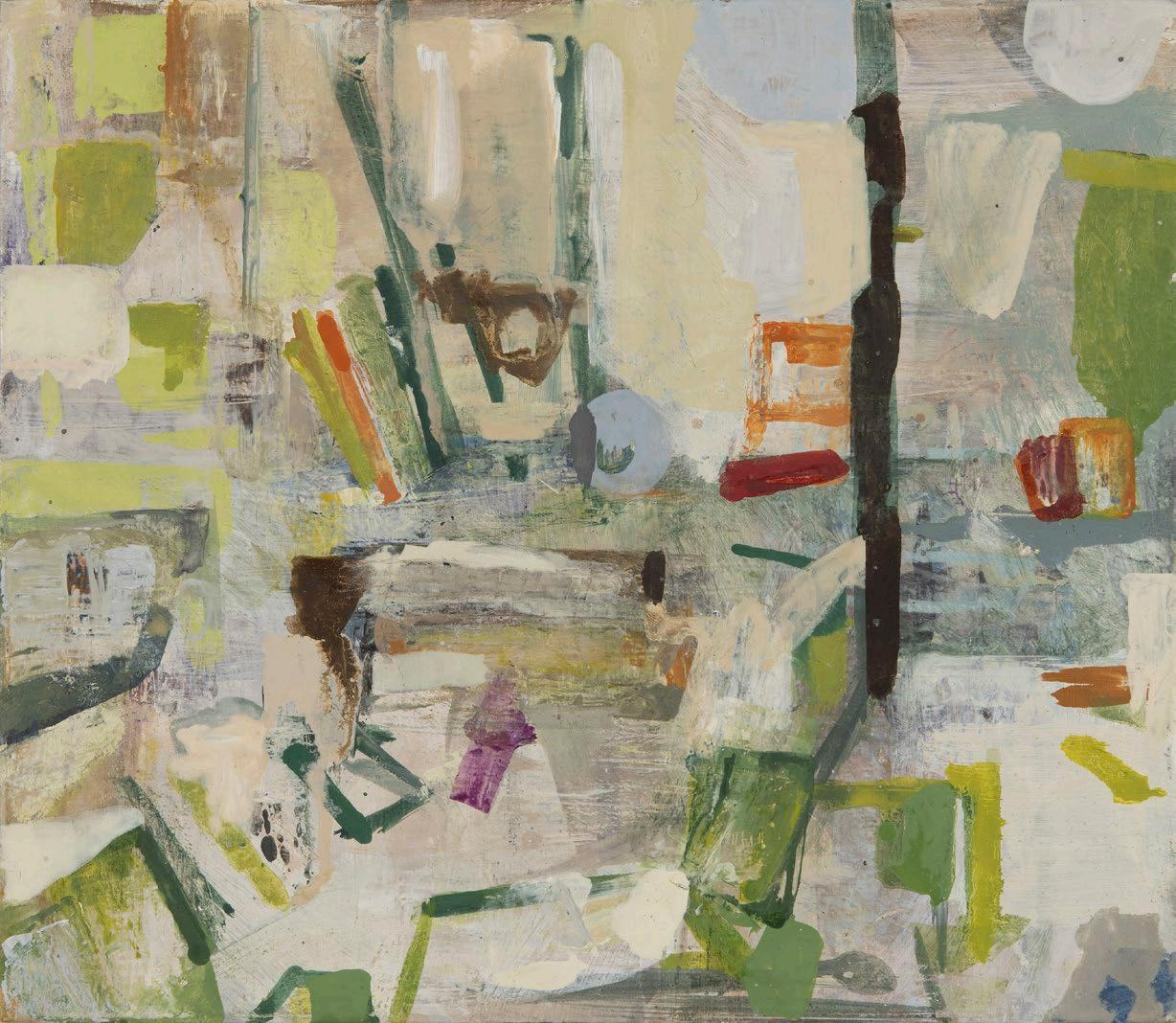
Matisse’s Jazz has always loomed large. I was interested to know that he painted or his assistant painted the paper that he used to make the collages which were then printed in the book.
I think there is a link in him doing this and The Red Studio. That painting could only be that red/brown colour or it wouldn’t have been right.
Going back to the collages, I’m aware of the necessary break between painting his paper the particular hue of colour that he wanted and the moment when his material was at hand to start cutting-out to make his collages.
I collect my material and I’m reliant mostly on chance on what comes to hand to make my work. I am aware of this transition, though, of when I pick something up that is usable and when the moment of possibilities arises.
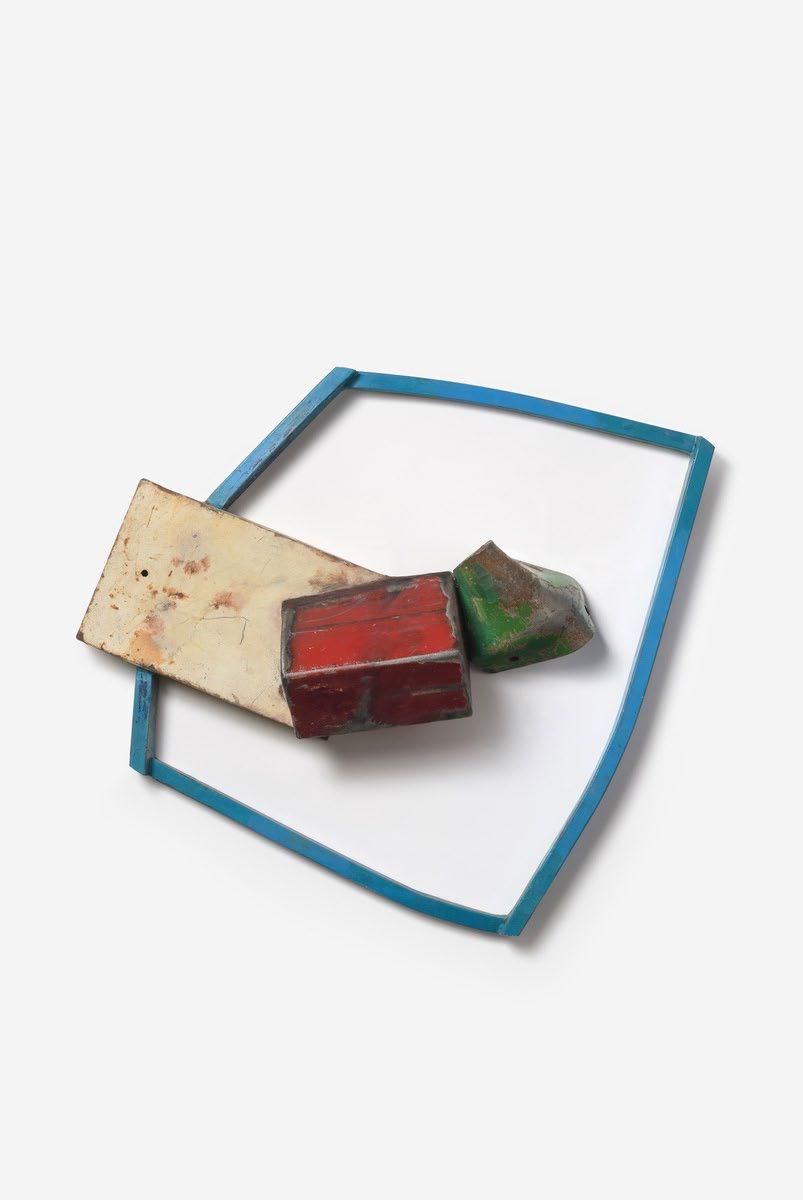
Sprechgesang 2023
Welded steel
70 x 106 x 12 cm
£3,500
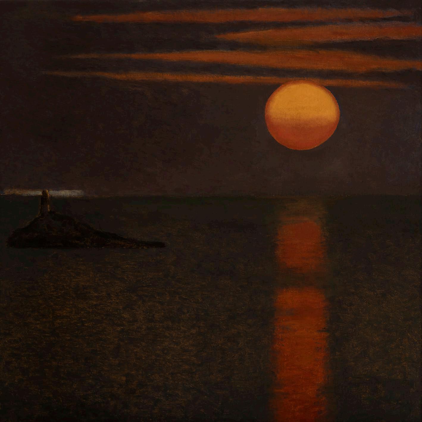
David Tindle has made a name for painting delicate egg tempera scenes, often showing glimpsed views through open doors and windows, which recall the eerie disquiet of Andrew Wyeth and Vilhelm Hammershøi. Tindle has written of his work: ‘Perhaps I see religion frozen in time, but ready to break out of ordinary objects.’ As such, many of his paintings possess a quiet profundity. For the art critic Brian Sewell, Tindle “is a painter in that quietly Romantic tradition of British art ... concerned with small, intimate, domestic subjects that are synecdochisms for the greater grandeurs of Turner’s sunset, twilit calms, and as inseparable from method and technique.”
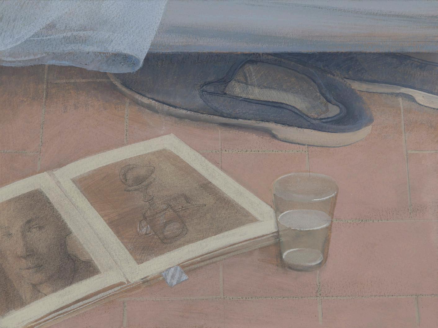
David Tindle RA
Bedside Still Life 2004
Gouache on board
24 x 32 cm
£4,500
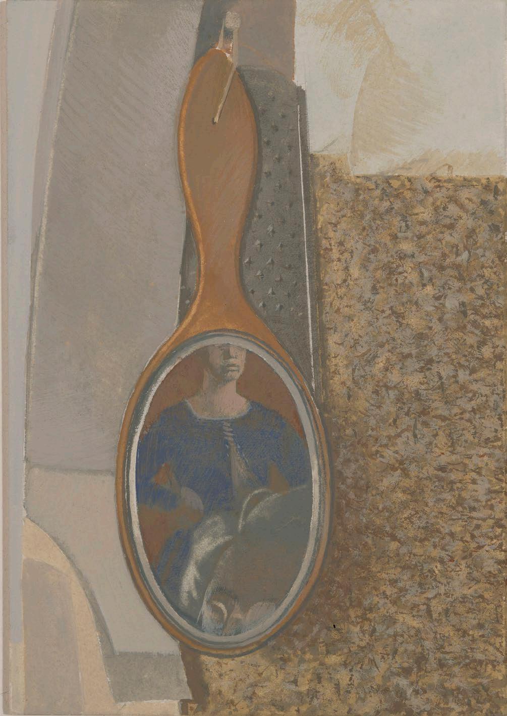
Miss Myth 2006
Egg tempera on board
101 x 70 cm
£18,000
Photography:
Alex Fox
Front cover:
John Carter
The Red Studio: An Interpretation 2023
Acrylic on plywood construction
60.3 x 73.2 x 5.6 cm
Back inside cover:
Pierre Skira
Rouge 2023
Pastel, acrylic and collage on paper laid on board
61 x 101.5cm
Back cover:
Ffiona Lewis
Studio 2023
Oil on gesso board
100 x 70 cm
Essay © Andrew Lambirth
Catalogue © The Redfern Gallery, 2023
All rights reserved.
No part of this book may be reproduced or transmitted in any form or by any means, electronic or mechanical, including photocopying, recording or any other information storage or retrieval system without prior permission in writing from the gallery.
20 Cork Street, London, W1S 3HL
tel +44 (0)207 734 1732
info@redfern-gallery.com
redfern-gallery.com