
1 minute read
SIGN FAMILY MONUMENT SIGN CONCEPTS


Monument signs are intended to be prominent sculptural features at key locations along the trail. The purpose of monument signs are to:
• Showcase the trail and raise awareness of the People Trail network at key locations, such as in parks or at a major trailhead
Advertisement
• Be artistic expressions of the visual identity
• Become sculpture attractions along the trail system
• Use the colors of the visual identity system for visual cohesiveness
For example, a monument sign could be placed along the People Trail somewhere near Central Avenue and State Street. At a prominent and highly trafficked location such as this, the monument will function as public artwork but also will raise awareness of the People Trail within the community.
By using the branding colors and a sculptural element to mark prominent locations along the trail, the monument signage marks the trail location for those who may not be familiar with the network and also reinforces its brand identity.
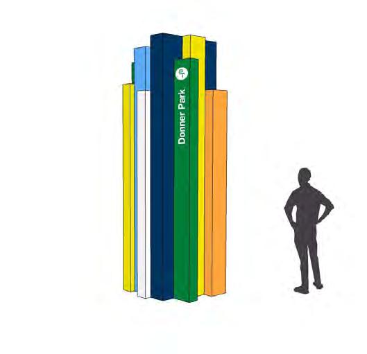
Text on the monument is not needed when used as a sculptural element that is part of the overall wayfinding system; however, text could be used on the monument to recognize donors of the People Trail.
12 ft. minimum
Informational signs are intended to be placed at People Trail trailheads. They include a variety of information specific to their location.
• About the location, using the icon system for quick reference
• Trail map with a “Your Are Here” marker and QR code for mobile phone access to maps, trail, and parks information.
• Directional information for destinations near by
• Trail rules
• Decorative branding elements are to be placed along the bottom and sides of the sign so as not to distract from the information.
Variations of Informational sign. Open green rectangles could frame views of landscape, art, or architecture with information about the framed view on the sign.

• Maintain a 1 in. margin on all directional signage.
• Primary message is to be set in 150 pt Helvetica Bold or 100 pt Helvetica Bold, whichever is larger
• Top-left justified
• PT Symbol is at Bottom-right margin
• Maintain a 1 in. margin on all directional signage.
• Location name is to be set in 50 pt Helvetica Bold. Street to be set in 50 pt Helvetica Roman.
• Ensure all text is sized to meet ADA standards


