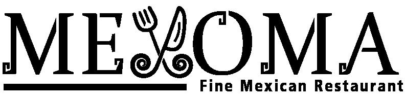
Rationale The final brandmark has been refined based on the concept that I chose. The brandmark is inspired from Mexican traditional art or symbol. I used the objects that symbolised as a restaurant brand the most, which are the fork and knife. The logotype is designed in Mexican traditional style with the fork and knife attached to the spirals at the bottom sides of objects which are inspired from Mexican traditional art. Moreover, I used the figure mark as a typeface which is the letter “X”, and merged with the brand name which it was read as “MEXOMA”. This is a creative way to make the brandmark stand out, where the consumers can see the brandmark and the name in the one representation. The typeface used is the Mexican traditional style which inspired from the mayan temple that locate in Mexico and also the typeface and the brandmark is designed in similar style.
35
35