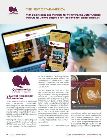
THE NEW QATARAMERICA With a new space and mandate for the future, the Qatar America Institute for Culture adopts a new look and new digital initiatives
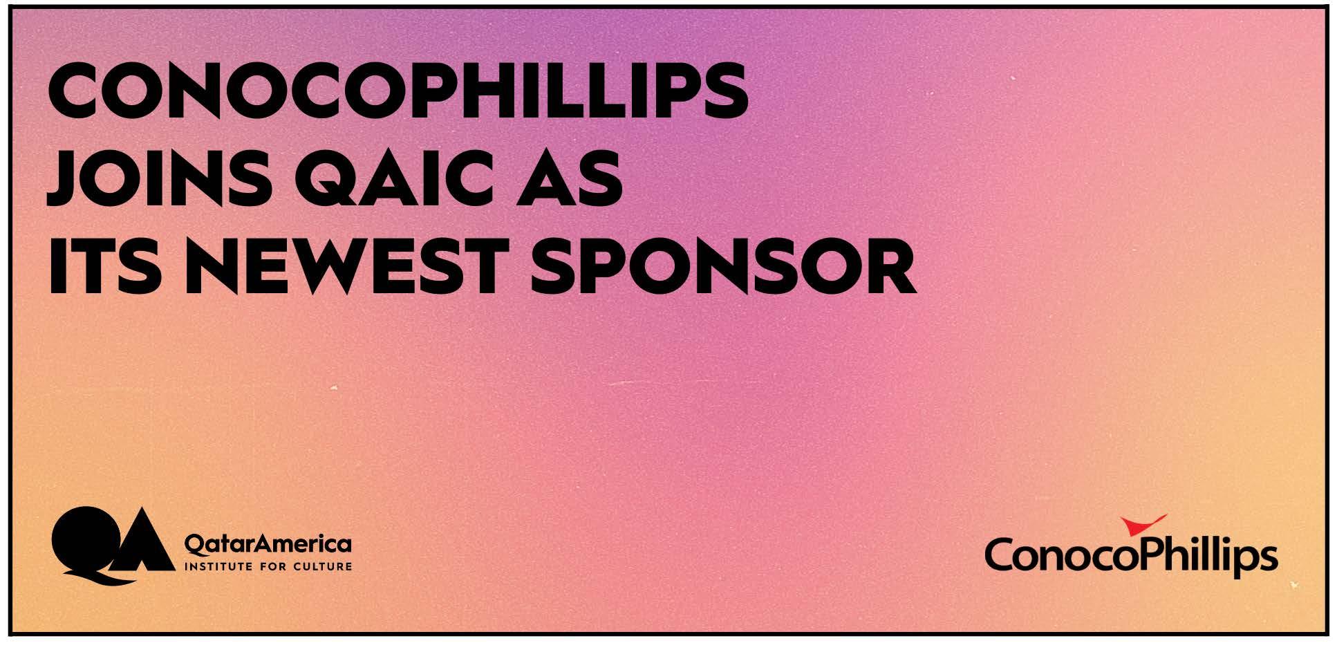
of the organization while maintaining the branding presence behind the “QatarAmerica” name. After a long and arduous process, the new brand for QAIC was officially announced on July 20, 2020.
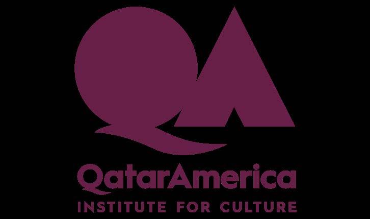
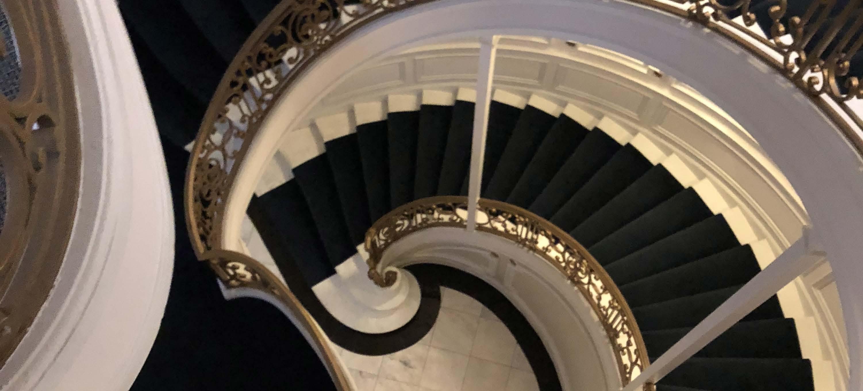
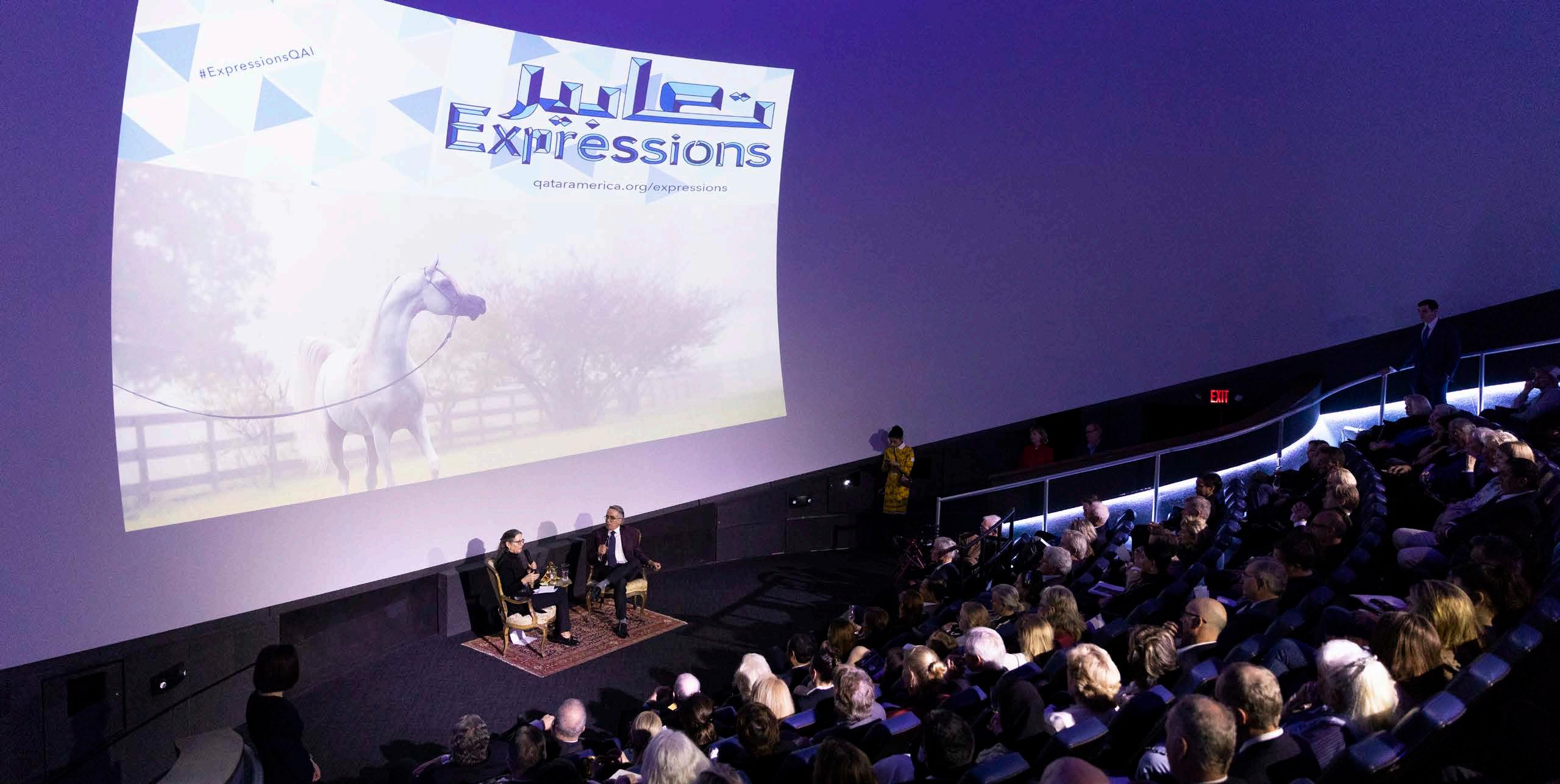
Q & A: The Reimagined QatarAmerica After several months of reforming QAIC’s leadership committees, relocating into a new headquarters, and refocusing under a new mandate, it was only fitting that this organizaitonal transformation be outfitted with a new look to compliment QAIC’s enhanced vision for the future. Working with reknowned branding and design expert Peter Arnell and his team, QAIC created an entirely new aesthetic to best represent the tone and voice
34
2020 Annual Report
Since its reveal, the QAIC brand has quickly become the true mascot for the organization as it is widely incorporated into all of QAIC’s products, digital platforms, and even physical spaces. While the plum-purple Q and A block letters make for a bold and impactful statement, the message is simple: QAIC exists to serve as a nexus between the United States and Qatar for all forms of art and culture, to represent the emerging creative talent of two diverse worlds, and to honor the contributions made by talented trailblazers who carved out spaces to be filled by future generations. To celebrate QAIC’s new identity, a
QAIC-branded post for Thanksgiving
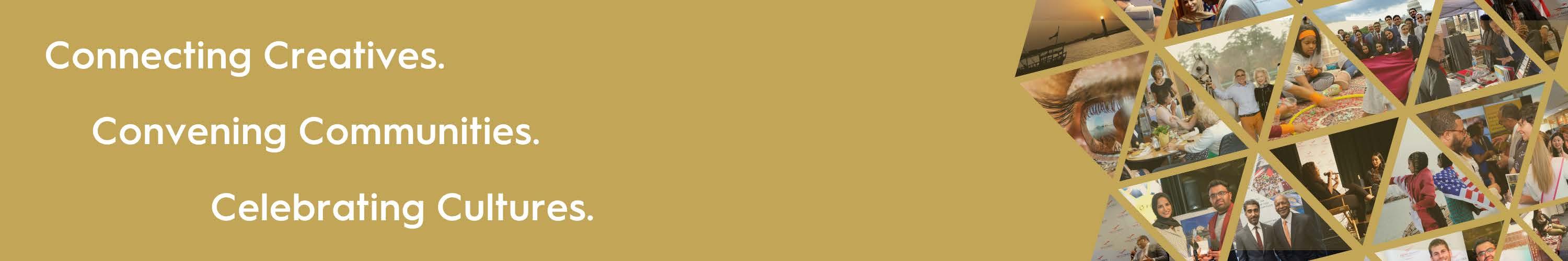
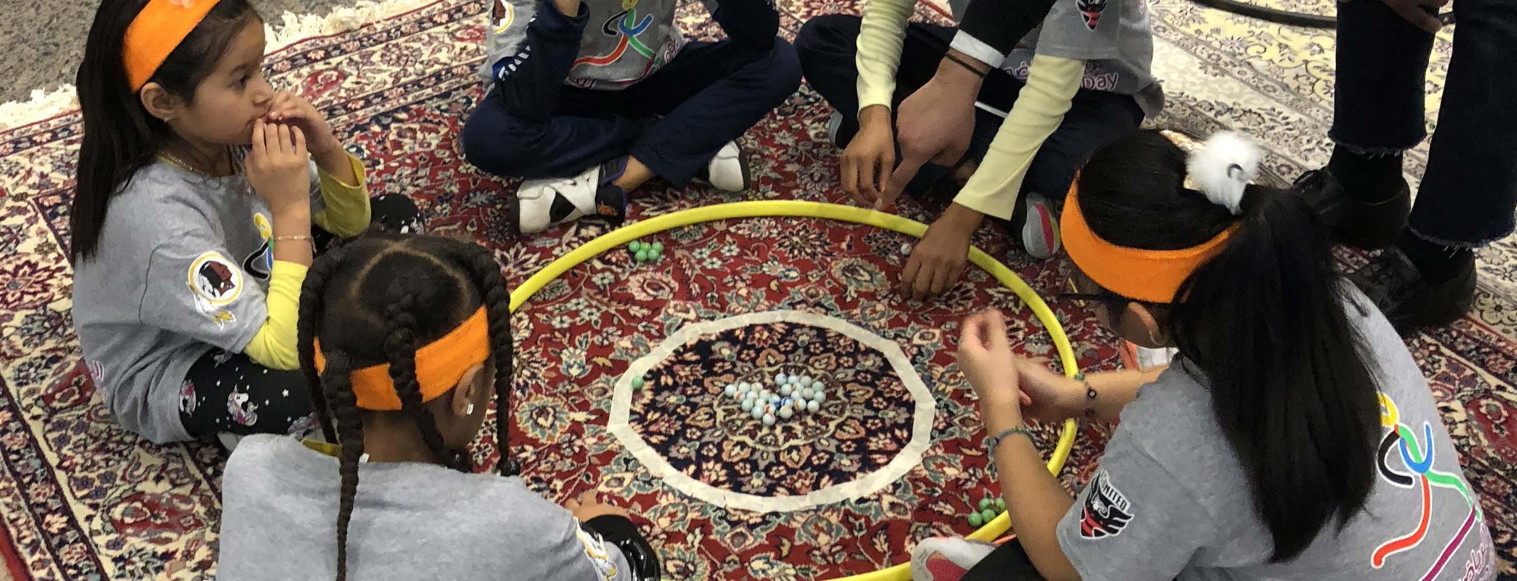
promotional video was produced which featured prominent spaces within QAIC’s new DC headquarters, QAIC’s core values, and representations of QAIC’s future programming initiatives as depicted through visual cues of dance, cuisine, community, and others.
@QatarAmerica | qataramerica.org