3 minute read
Good
For my example of good typography this week, I chose this box of fig bars. Overall, I think that this is a visually interesting design as well as it being aesthetically pleasing and cohesive. The colors chosen for the packaging are very nice, easy to look at, and reflect the product accordingly. Since the flavor of this fig bar is blueberry, the background color and text color are blue to match. Despite both the background and text being blue, there is more than enough contrast for everything to be easily readable. Since the text is also blue on a blue background it does not stand out more than the image. I think this is good design choice because it allows people to immediately notice the appealing fig bar first and the text second. The font choice for this design is also very nice. The large type at the top of the box has a really nice soft and natural style. The soft and natural look of the text helps to reinforce the idea that these fig bars are soft and have natural ingredients. The text below the image is visually appealing and none of the typefaces chosen fight with each other over visual dominance. Despite none of the bottom text having strong typographic voice, they all work well together to create a cohesive and appealing design. All the text on this design is spaced nicely with no text too tight or loose, which helps overall readability. Overall, the typography in this design really helps to enhance the message in a really nice and easy to process style.
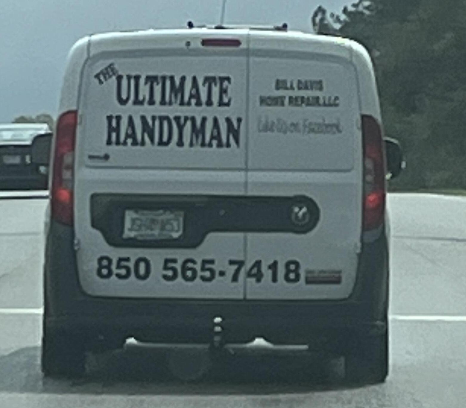
For my example of bad typography this week, I found this truck advertising their electrical company. Overall, the contrast and readability is there. Contrast is fine because it is literally just black text on a white background which makes it fairly easy to read when driving by. Except for the phone number. The font of the phone number is really thin and does not stand out much at all. When someone is driving by this truck or this truck is driving by them, it can be very difficult to read that number because of how thin the type is. Despite most of the text on the truck being fairly readable, it has no voice or character at all. When I look at this design all I see is just some words on a truck. Almost nothing in this design is eye catching or appealing because it is just black text on white and nothing more. When someone is driving by they might be able to see some of the information, but they will not want to look closer. Giving the text more of a voice and have it communicate more of what the company is about would be a great way to make the design more dynamic and appealing. I looked up the company online, and their logo is exactly what is on the truck, so I think that the company as a whole probably needs a bit of a face lift when it comes to the typography and design. Other than that, the E at the beginning of “Electrical” is larger that the other letters despite them all being capital letters makes absolutely no sense and does nothing for the design.
Advertisement

For my example of good typography I chose this bottle of CeraVe lotion. Although I think that the overall design of the bottle is fairly plain, it conveys the information nicely and in a well organized layout. Overall, the contrast for the whole design is nice. The dark blue against the white contrasts really well and the white “Ve” against the light blue background ads some nice visual contrast and is still easily readable. I also think that the design has a nice and simple visual hierarchy. The viewers eye simply goes from top to bottom following the changing size of the text. The brand name is at the top of the visual hierarchy and the bottle because it has the largest font size as well as the most visual interest. “SA Lotion for Rough and Bumpy Skin” is right below the brand name and has the second largest text so the viewer’s eyes will go there next. This visual hierarchy continues down the bottle with the smaller and not bold text. Although it is simple, the way the viewer’s eyes follow the design works really well in describing the information presented. I also like the small line around the word “for.” It adds some nice visual interest to the design without being distracting. One thing that I do not like about the design is that some of the really small and thin text at the bottom of the bottle can be hard to read. However, it is not that big a deal because that information is not quite as important or notable as the text above it.


