6 minute read
INTERIORS

from NN Pulse May 2022

Nick Fewings for www.Unsplash.com
Summer accents
https://www.osborneandlittle.com/
www.evieandskye.com
Dive into summer 2022 with an array of fruity accessories and bright pops of colour. From juicy pinks to sunshine yellow, summer infusions is the perfect trend to get stuck into for the brighter seasons ahead.
Bold, vibrant colours can be used in small quantities as accents, to add impact and interest to a space. They tend to contrast with the rest of the colour scheme so that they stand out and highlight the areas where they are used. Being adventurous with colour can be hugely rewarding and with so many paint, wallpaper and fabric manufacturers embracing the summer vibe, now is definitely the time to experiment with your décor.
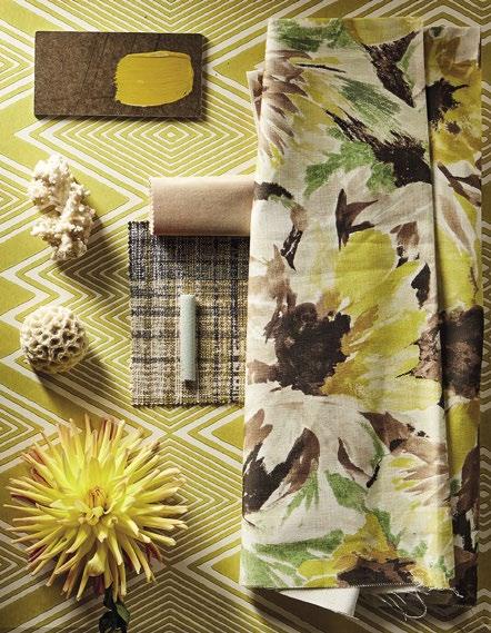
One of the easiest ways to add a pop of summery colour is to paint or wallpaper an accent wall. A single wall behind a bed or sofa creates a focal point in the room and draws your eye into the specific area, allowing the furniture to stand out against the bold, interesting background. A contrasting fabric can be added as a cushion or headboard or you can introduce
Rosie Kinsella Interior Designer 01604 751262 www.millsandkinsella.com a mix of colours in a piece of art, bringing the tones of both the furniture and the wall together in one place. It’s important for the bright colours to feel connected to the overall space.
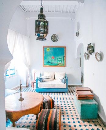
Vibrant summer colours are highly stimulating especially when paired with a crisp white background to make them stand out even more. With so many of us still partly working from home, there’s never been a better opportunity to add some colour to our workspace. It’s a proven fact that colours can affect decision-making, productivity, creativity, and levels of happiness. At Google, head office employees gather in blue rooms to be creative and yellow rooms to make decisions.
Maria Orlova for www.unsplash.com www.sanderson.sandersondesigngroup.com
Achromatic environments (like white and grey) tend to make much less successful workspaces as the relationship between white and grey can’t arouse any change in emotions. Whilst white paint might make the walls look bright and light, employee recognition firm Altrum Recognition suggest the risk of burn out in a completely white room increases by 25%.
If you are keen to add impact and talking points throughout your house, then try to find unusual spaces to decorate. A feature such as a skylight is easy to overlook but can be a great opportunity to use a patterned wallpaper on the ceiling or to add a bright, contrasting paint colour to the frame or cross beams. Think about the light coming in through the window; it’s normally better to use summery, warm colours such as pinks and yellows rather than the cooler tones of blue, green and grey.
Another good tip is to paint the inside of objects in a contrasting colour. The outside might be neutral but a flash of vibrant colour painted on the inside can make you smile every time you open a cupboard or pull out a drawer. If you type ‘wallpaper in drawers’ into any search engine, you’ll find a plethora of colourful inspiration. According to British artist Annie Sloan, ‘colour brings joy so be bold with it’.
Summery colours and prints can be enjoyed in small or grand measure. You will only require a small amount to make quite an impact on your interior. Think of the difference a bright pair of shoes, a colourful pair of glasses or a new nail colour make to one’s appearance. As Marianne Shillingford, Creative Director of Dulux puts so succinctly ‘it’s that dash of flash that gets all the admiring attention’.

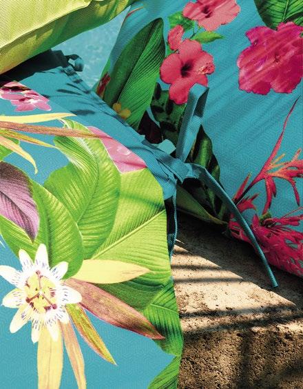
The latest fabric and wallpaper collections from Harlequin and Osborne and Little offer some beautiful patterns in hot, exotic colours ideal for re-energising tired interiors. The new stair runners launched by Roger Oates as part of a collaboration with A Rum Fellow and the latest designs by Off the Loom both offer bolder colours creating the perfect statement carpet runner for your stairs or landing. And Byron and Byron have a superbly vibrant range of curtain poles that have to be seen to be believed. The Floral Neons range creates a powerful look inspired by the bright solid colours seen in pop art.
The past couple of years have really strengthened our relationship with the outdoors and as such there has never been a better time to embrace some summer colour in our homes. So seize the day and live your life in full colour! As Kandinsky is often quoted as saying “colour is a power which directly influences the soul”.
www.schoener-leben-shop.de
The Best Kitchen Wall Décor Ideas
Kitchens and dining rooms are often the busiest in the house with family life but perhaps also the space where we can have the most fun with decorating, finding artwork that transforms the atmosphere or shows your personality.
The Rose Gallery team explain styles to consider and how to create a focal point in your kitchen.
Find matching pieces
Building a full ‘gallery wall’ effect can feel like an intimidating design prospect for many – choosing different sizes, complimentary photos or prints, all requires a lot of thought and a good eye.
Alternatively, artists often release a complimentary duo or triptych of paintings which do all the hard work for you. They are matching sizes, framing and tones and are an easy way to create a theme in your room.
One wonderful statement artwork
If you have a large space to fill behind your dining table, this is where you can go big with your art. One impactful painting will command attention and be the focal point of the room. When choosing a larger piece, it is important to decide what kind of atmosphere you would like.
Landscapes promote rest and wellbeing, or perhaps you want the room to feel modern and unique. If so, take a look at a colourful urban-inspired artwork that will be a real talking point in your room. If your kitchen units and walls are fairly neutral in colour, art gives you a great opportunity to add some wow factor. Compliment your paint colour
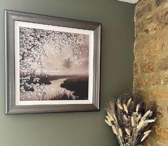
If colour is your thing, you may have gone for a strong wall paint to compliment your kitchen. Art does a great job of breaking up colour, providing an interesting contrast or often to simply compliment the style and tone of your kitchen. Don’t forget, the type of framing you choose can play an important part in this too. In this example, our customer has chosen a sepia and metallic toned artwork by John Waterhouse to compliment her rural green kitchen wall.
Bring the garden indoors
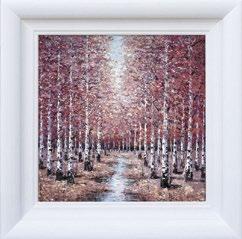
With summer approaching, our kitchen and dining rooms are often where we are closest to the outdoors and our garden becomes an extension of that space. The art on your kitchen walls can reflect that, depicting colourful florals, birds, bees or simply reflect a love for the outdoors. Artist Inam creates textured, colourful paintings of forests.
Gemma Davey Gallery Correspondent www.therosegallery.co.uk