3_BM_Chiasso240x240_Intervista X7.qxp:Layout 1
3.5.2011
39
12:20
Pagina 239
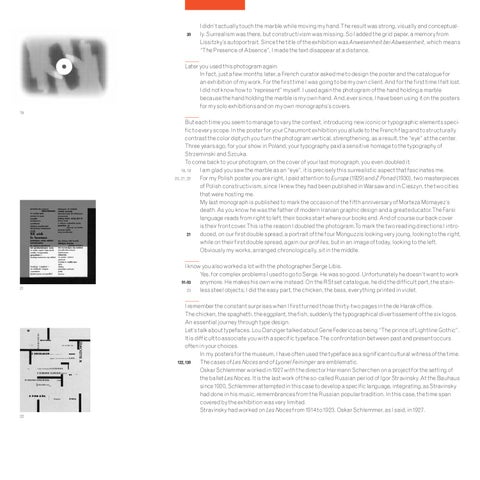
I didn’t actually touch the marble while moving my hand.The result was strong, visually and conceptually. Surrealism was there, but constructivism was missing. So I added the grid paper, a memory from Lissitzky’s autoportrait. Since the title of the exhibition was Anwesenheit bei Abwesenheit, which means “The Presence of Absence”, I made the text disappear at a distance.
Later you used this photogram again. In fact, just a few months later, a French curator asked me to design the poster and the catalogue for an exhibition of my work. For the first time I was going to be my own client. And for the first time I felt lost. I did not know how to “represent” myself. I used again the photogram of the hand holding a marble because the hand holding the marble is my own hand. And, ever since, I have been using it on the posters for my solo exhibitions and on my own monographs’s covers. 19
But each time you seem to manage to vary the context, introducing new iconic or typographic elements specific to every scope. In the poster for your Chaumont exhibition you allude to the French flag and to structurally contrast the color diptych you turn the photogram vertical, strengthening, as a result, the “eye” at the center. Three years ago, for your show in Poland, your typography paid a sensitive homage to the typography of Strzeminski and Szcuka. To come back to your photogram, on the cover of your last monograph, you even doubled it. I am glad you saw the marble as an “eye”, it is precisely this surrealistic aspect that fascinates me. 18, 19 For my Polish poster you are right, I paid attention to Europa (1929) and Z Ponad (1930), two masterpieces 20, 21, 22 of Polish constructivism, since I knew they had been published inWarsaw and in Cieszyn, the two cities that were hosting me. My last monograph is published to mark the occasion of the fifth anniversary of Morteza Momayez’s death. As you know he was the father of modern Iranian graphic design and a great educator.The Farsi language reads from right to left, their books start where our books end. And of course our back cover is their front cover.This is the reason I doubled the photogram.To mark the two reading directions I introduced, on our first double spread, a portrait of the four Monguzzis looking very joung, looking to the right, 21 while on their first double spread, again our profiles, but in an image of today, looking to the left. Obviously my works, arranged chronologically, sit in the middle.
21
I know you also worked a lot with the photographer Serge Libis. Yes, for complex problems I used to go to Serge. He was so good. Unfortunately he doesn’t want to work anymore. He makes his own wine instead. On the RSt set catalogue, he did the difficult part, the stain91-93 less steel objects; I did the easy part, the chicken, the bass, everything printed in violet. 23 I remember the constant surprises when I first turned those thirty-two pages in the de Harak office. The chicken, the spaghetti, the eggplant, the fish, suddenly the typographical divertissement of the six logos. An essential journey through type design. Let’s talk about typefaces. Lou Danziger talked about Gene Federico as being “The prince of Lightline Gothic”. It is difficult to associate you with a specific typeface.The confrontation between past and present occurs often in your choices. In my posters for the museum, I have often used the typeface as a significant cultural witness of the time. The cases of Les Noces and of Lyonel Feininger are emblematic. 122, 139 Oskar Schlemmer worked in1927 with the director Hermann Scherchen on a project for the setting of the ballet Les Noces. It is the last work of the so-called Russian period of Igor Stravinsky. At the Bauhaus since 1920, Schlemmer attempted in this case to develop a specific language, integrating, as Stravinsky had done in his music, remembrances from the Russian popular tradition. In this case, the time span covered by the exhibition was very limited. Stravinsky had worked on Les Noces from 1914 to 1923. Oskar Schlemmer, as I said, in1927.
22