


Our brand’s tone of voice is the consistent way we communicate, reflecting our values and personality in every message.
HAPPY // CONFIDENT // STRAIGHTFORWARD // ORIGINAL
TONE OF VOICE
BRANDBOOK // VISUAL IDENTITY
Our brand’s tone of voice is the consistent way we communicate, reflecting our values and personality in every message.
HAPPY // CONFIDENT // STRAIGHTFORWARD // ORIGINAL
BRANDBOOK // VISUAL IDENTITY
POM Amsterdam brings a ray of sunshine in your closet. Try to compose text that exudes this happiness, as if a newsletter or Instagram post is a box full of sunshine delivered to your inbox or feed. Use happy and positive words; a bright and sunny demeanour makes you friends.
DON’T
Beware of overtly cheery and fun messages laden with superlatives; too happy comes across as a bit childish.
Nay // Just as the last days of dull winter weather are gone, we stow away our warm clothes and opt for something more fun. (Too looking back and moaning, too ‘clouds and sunshine behind it’.)
“Now that we see the first signs of spring, we stow away our cosiest knits and opt for something airy and light.”
(Yes, we loved the cosiest knits, but we welcome spring with airy somethin’ somethin’s. This is more in the here and now.)
POM Amsterdam designs for confident women. Communicate accordingly. Yes, you can wear colourful skirts to a business meeting – that is a given. Cheer women on to do so.
DON’T
Do not ‘dare’ women. Confident women do not need a ‘dare’, they just wear what they like. This is your starting point.
Nay // Dare to wear something colourful to the office and inject a bit of happiness into the boardroom. Would you wear this blouse to work? (Too insecure, too ‘it’s difficult and bold, but we dare you anyway’.)
“Spread happiness in the boardroom as you would pump up a party. Our printed blouse is the perfect ray of sunshine across the boardroom table.”
(Just do it. Because you can.)
Say what you mean and mean what you see. No need to say things in a roundabout way.
DON’T
Steer clear from sentences with negative words like ‘not’, ‘neither’ and ‘don’t’.
Nay // It’s not that we don’t like to dance, we just need a disco tune to get us started. (Too complicated with the not and the don’t, not really cute.)
“We love to dance – especially when a disco tune hits the decks. That’ll get us started!”
(Straightforward, easy to understand.)
Try to be original and authentic. Use other words than just ‘nice’, ‘wonderful’ and ‘beautiful’. A metaphor or something poetic might be what you need to give a text some spunk. A skirt might be dipped in confetti, dripping with faux diamonds, swirling like a falling leaf. A top can be a real headbanger or a total knockout, stunning in bold stripes. Clothes for boogie-woogie days, daily dance-a-thons and dirty disco dipping. And so on and so forth. Originality is key to stand out.
Words or metaphors that are too farfetched to immediately spark recognition, are a no. This is a fine line though; your references may not be mine. Make it easy, but not too ordinary.
Nay // A blouse with polka dots makes a perfect pairing with our pink and white striped blazer. (Just regular information, no fun.)
“A blouse with a sprinkle of yellow confetti and a lollipop blazer might be just what this day needs.”
(More originality.)
Convey our brand story with a consistent look and feel.
BRANDBOOK // VISUAL IDENTITY

The world of POM is colourful, adventurous and infused with a healthy dose of energy. Images are snapshots of a world that you want to be part of. We add fun stills for a light hearted touch, such as tasty ice cream cones with sprinkles and glitters. We love contrast and want to surprise. We dream up a combination of the daily grind with a touch of glitter: your ‘Daily Dose of Up’.


Show positive and powerful energy, be expressive. Fun yet mature.
Be relatable and steer clear of the distant, exclusive fashion image.

Try to show connection, interaction, enjoyment together, liveliness.

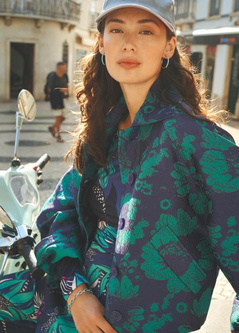
We like models to show openness and positivity. They are playful yet mature, at other times classy and confident. They are energetic and have strong expressions. Models are often looking directly into the camera, inviting you to communicate. We are spectators of their lives in the POM universe.
Contrast is key. We use colours that pop, contrasting with the clothing and styling. Add surprise. An unexpected twist, a combination that isn’t obvious. This can also be reflected in a prop. Think of a disco ball, painted ceramics, or printed newspapers. Adding surprise radiates creativity, with an eye for detail and bold colour combinations. Take advantage of light. Make it bright and fresh.

Our logo is central to our brand’s identity, providing instant recognition and capturing the essence.

The POM Amsterdam logo proudly presents our attitude. The POM part is most prominent: it is bold, chic and modern, while Amsterdam communicates where our roots and heritage lie. The O in POM is a soft and feminine circle, the glue that connects all other parts.
There is always a minimum spacing around the logo. Never use POM and Amsterdam separately or change the relationship between the two elements.
The logo should always be at the centre of the image, whether it is placed above or below. If there is no other way, place the logo in the corner. Don’t rotate the logo.
The logo is generally presented in black or white. On images, the logo may be displayed in colour, provided there is enough contrast. However, the logo should not be used in colour on a coloured background.
Yay (centred at the bottom/top)
Yay (centred in the middle)
Yay (in (any) corner)
Nay (rotated)

(base on base)
Yay (base on colour)
Yay (colour on colour)
Yay (colour/base on image)
Nay (change the relationship)

Nay (contrast is key)
Our brand ambassador. Well designed to make our brand recognisable and accessible.
BRANDBOOK // VISUAL IDENTITY


The p of POM is more than a letter. It’s a symbol of connection and creativity. The dot represents the spark, the confetti, the magic that brings energy and colour to our story. Built on contrast - circle and rectangle. It shows how opposites, like the sisters, combine to create something extraordinary. POM celebrates unique qualities coming together, where true magic happens.
(From the two elements - circle and rectangle, a print is created. The rectangle with double icons forms the basis.)
The p of POM is more than a letter. It’s a symbol of connection and creativity. The dot represents the spark, the confetti, the magic that brings energy and color to our story.

There is always a minimum spacing around the icon. You may use the rectangle and circle separately, but never change the relationship between the two elements. The circle can always be used on its own, like confetti. Never use the rectangle without the circle.
The icon should be placed at the centre or in any corner of the image/background, whether it is placed above or below. Don’t rotate the logo. Only the circle may be turned.
The icon is always displayed in two colours or outlines. Sometimes in combination with an image in the icon. On images or a coloured background, the icon may be displayed in colour, provided there is enough contrast in colour between the circle and the rectangle. The icon may always be used in outlines.
Yay (centred at the bottom/top)
Yay (centred in the middle)
Yay (in (any) corner)
Yay (in (any) corner)
Nay (rotated)
Yay (use elements separately)
Yay (use elements separately)
Nay (change the relationship)
Yay (circle on its own) (circle may be turned)
Nay (rectangle on its own)


Set of typefaces across all branding materials to maintain a cohesive look.
BRANDBOOK // VISUAL IDENTITY
Helvetica is a versatile and timeless typeface, known for its clean and neutral design. It offers a sleek, modern look that contrasts with POM’s colourful style. Its high readability makes it effective for both body text and headlines.
Spacing should always be set to 0.
At a size of 10 pt, the line spacing is 12 pt.
Helvetica Light
Primarily used for body text or quotes.
Helvetica Light Oblique
Utilized for highlighting or emphasizing ‘Helvetica Light’ text or quotes.
Helvetica Regular
Used for body text in cases of ill-readability, but especially for titels. Titles are usually in capitals, but are not fixed. This font is sometime also used for highlighting within a Helvetica Light text.
Helvetica Oblique
Utilized for highlighting or emphasizing ‘Helvetica Regular’ text in cases of ill-readability.
Helvetica Bold
Reserved for small subheads in uppercase.
Romie is a typeface that is both chic and bold, serving as a strong secondary font alongside our primary font, Helvetica. Its elegant design adds a touch of sophistication and is ideal for diverse applications.
Spacing should always be set to 0. At a size of 27 pt, the line spacing is 32 pt.
AaRomie Light
Romie is a creative, elegant font mainly used for graphics. It is never used as body text, but may be used for a quote or highlighting a piece of text. Titles are mainly written in capslock.
AaRomie Light Italic
Romie Light Italic is always used in combination with Romie Light. It is the creative sub font of Romie. Do not use this font for titles.


EXAMPLE USAGE ROMIE TYPOGRAPHY
(Small, clean but elegant. Titles are mainly written in capslock.)

(Big speaking title, sophisticated and bold. Titles are mainly written in capslock.)
Romie is a typeface that is both chic and bold, serving as a strong secondary font alongside our primary font, Helvetica. Its elegant design adds a touch of sophistication and is ideal for diverse applications.
TYPOGRAPHY
(A quote or highlighted piece of text. Not in capitals in combination with a small Helvetica Bold title. This combination keeps it balanced.)
TYPOGRAPHY

TYPOGRAPHY

EXAMPLE USAGE ROMIE
(A graphic where the Romie Light Italic is a creative addition to the Romie Light. A combination to keep contrast.)
EXAMPLE USAGE HELVETICA
(A title in Helvetica Regular, not capslock. Keep it clean.)

Shaping our overall brand identity and creating a consistent brand image across all platforms.
BRANDBOOK // VISUAL IDENTITY
EXTRA PINK
R255 G108 B196
#dae472
PANTONE 806
16-2130 TN
PARTY PUNCH
MULTI COLOUR
CHEERING PINK
C0 M79 Y13 K0
R240 G93 B145
#ef5c90
PANTONE 211
17-2230 TCX
DOPAMINE LIME
C17 M0 Y70 K0
R219 G228 B114
#dae472
PANTONE 379
13-0645 TCX
BOLD BURGUNDY
C48 M87 Y48 K71
R62 G13 B37
#3d0c25
PANTONE 7644
19-2520 TCX
CRAFT WHITE
C0 M0 Y0 K4
R243 G244 B244
#f3f3f4
11-0607 TCX
EASY BLUE
C30 M15 Y0 K0
R174 G197 B231
#adc5e6
PANTONE 2708
15-4030 TCX
BLACK
GROUNDED GREEN
C75 M5 Y44 K71
R0 G76 B69
#004c45
PANTONE 322
19-4524 TCX
We add colour and contrast, use brights and muted tones, mixing in sizzling neon and sparkling metallics. A radiating palette is the end game: energetic and fun, a little extra extra, but balanced to a wearable dose of up.

PRIMARY COLOUR
CHEERING PINK
C0 M79 Y13 K0
R240 G93 B145
#ef5c90
EXTRA PINK
R255 G108 B196
#dae472
PANTONE 806
PANTONE 211 17-2230 TCX 16-2130 TN


THE BASE
Black and white form the foundation of our colour palette. White refers to the canvas we paint on – we like to go from there.
CRAFT WHITE
C0 M0 Y0 K4
R243 G244 B244
#f3f3f4
11-0607 TCX
(OUR COLOUR PALETTE)
A foundation for how we connect with our audience, reflecting our brand identity.
BRANDBOOK // VISUAL IDENTITY

We invite our audience to step behind the curtain and discover what happens within our brand. Through stories about our creative journey, our team, and the individuals who shape our products and campaigns, we bring the essence of our brand to life. Our models are not just the faces of our campaigns: they are ambassadors of our brand values.

We create content that promotes supporting and uplifting one another. Whether it’s encouraging each other, or celebrating big or small achievements, we believe in the power of unity. When we come together and act as one, magic happens.

Our products are a reflection of our brand’s identity. This content pillar focuses on showcasing our designs, from concept to creation, highlighting the craftsmanship and inspiration behind each piece. We share stories of the fabrics, the design process, and the trends that inspire our collections.

This content pillar shines a spotlight on the artistry behind our unique handmade prints. We take our audience through the process of creating these prints, showcasing the care and creativity involved at every step. From the initial concept and design to the actual printing technique, we reveal the skills of our artists who bring each print to life.

We empower our POM women to make our collection their own. We provide styling tips, mix-and-match ideas, and inspiration for every occasion. Whether it’s how to dress up, layering for different seasons, or combining bold trends with timeless essentials.

Welcome to the POM Universe, where our vision and mission come to life. We believe in igniting a spark every day, inviting women to step into a world filled with ‘yay and hurray!’ This joyful spirit is something we strive to convey in every piece of content we create.