
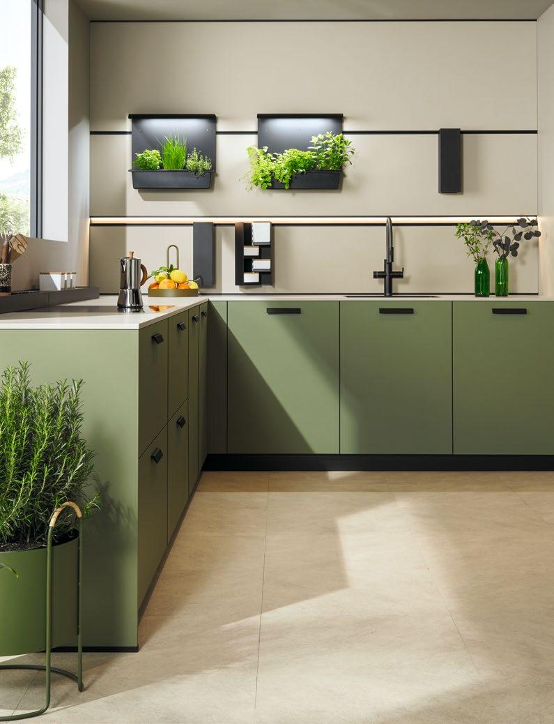
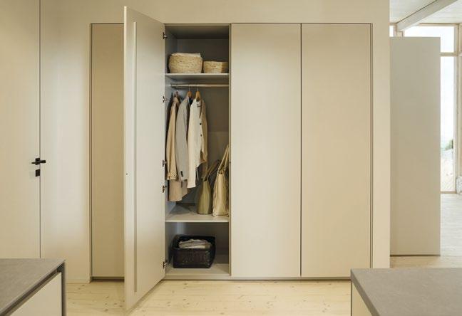
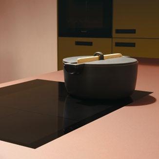
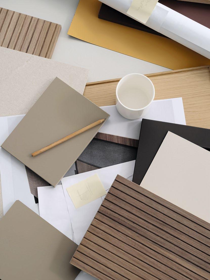
Küchen und Möbel

Küchen und Möbel
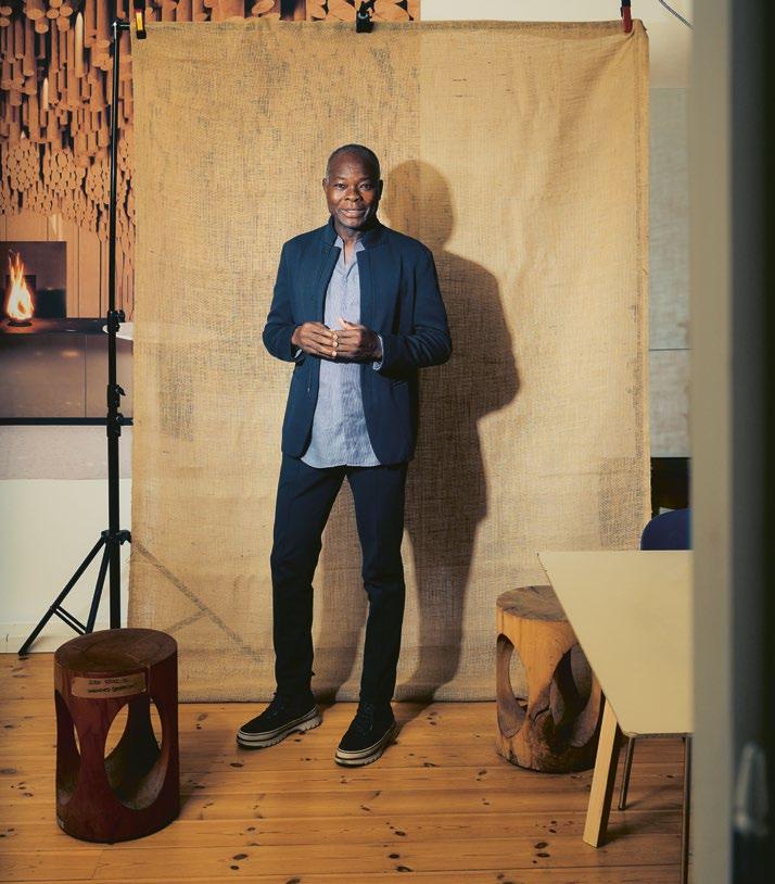
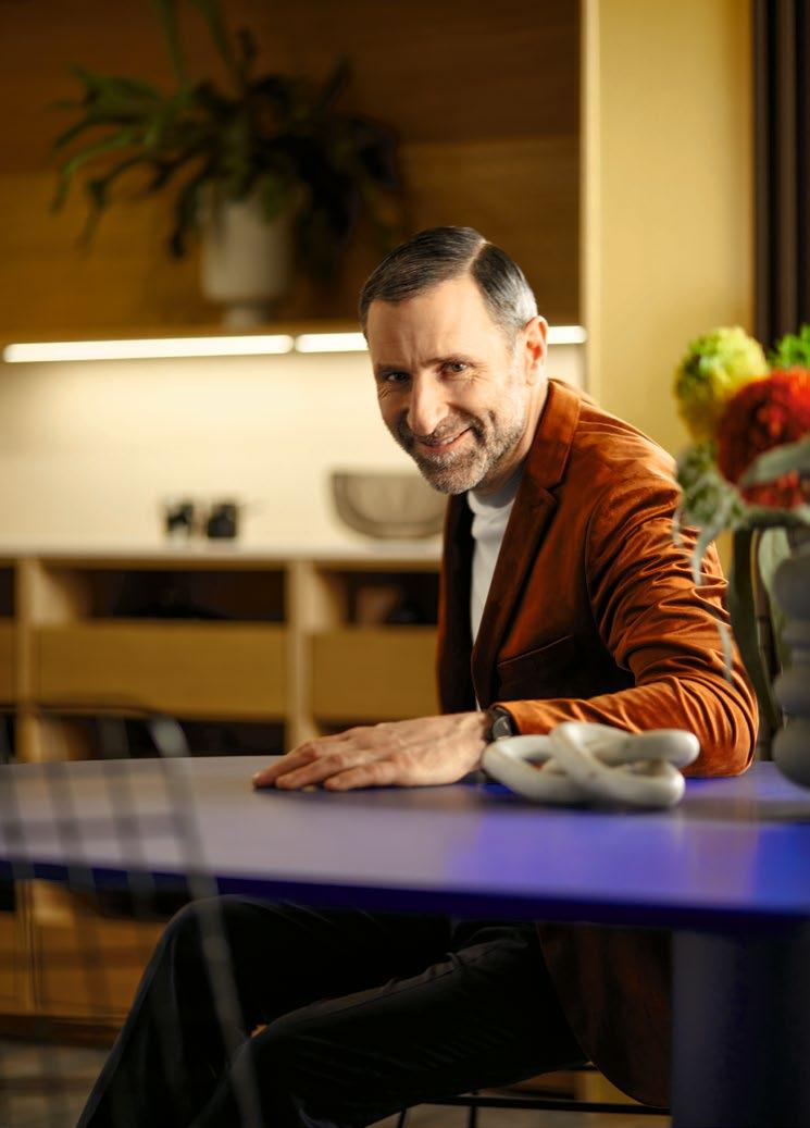
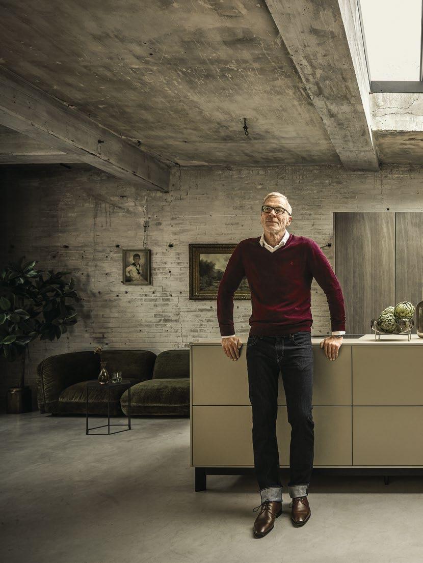
FRANCIS KÉRÉ
Die erste Zeichnung: Sommer 2023
The first sketch: Summer 2023
Es beginnt mit einem Strich
CREATIVE MAKERS: Gemeinsam mit dem Architekten Francis Kéré, Träger des Pritzker Preises 2022, realisierte next125 zur Milan Design Week 2024 ein ikonisches Architektur- und Designprojekt. Der experimentelle Pavillon in Holzbauweise verbindet die archaische und organische Formensprache des weltweit aktiven Architekturpioniers aus Burkina Faso mit der Perfektion und der puristischen Ästhetik der Premiumküche next125. Erleben Sie die Geschichte einer inspirierenden, kreativen Kollaboration.
AB SEITE 034
It all starts with a single stroke
CREATIVE MAKERS: Together with the architect Francis Kéré, winner of the Pritzker Prize 2022, next125 is bringing to life an iconic architecture and design project within the scope of the Milan Design Week: the experimental pavilion has a natural wooden structure and combines the archaic and organic design vocabulary of the architectural pioneer hailing from Burkina Faso with the perfection and purist aesthetics of premium kitchens. Discover the story of an inspiring creative collaboration.
FROM PAGE 034
Mit next125 an The Fireplace zu arbeiten, hat mich sofort in meine Kindheit zurückgebracht. Ich bin sozusagen vom fränkischen Herrieden ins burkinische Gando zu meinen Wurzeln gereist.
Working with next125 on The Fireplace immediately transported me back to my childhood. I travelled from the Bavarian town of Herrieden to the Burkinan village of Gando, back to my roots so to speak.
Francis Kéré
Kreativ und innovativ
Reduziert und zeitlos elegant
Inspiriert vom Bauhaus
Gestaltet und gefertigt in Deutschland
DIE VISION, AUSSERGEWÖHNLICHE KÜCHEN ZU SCHAFFEN, die durch ihre innovative Funktionalität begeistern, treibt uns an. Ausgezeichnetes Design, präzise Verarbeitung und authentische, hochwertige Materialien: Die Liebe zum Detail ist in jeder Küche spürbar. Entdecken Sie neue Küchen, inspirierende Räume und ikonische Möbel, die die Zeit überdauern.
innovative
THE VISION TO CREATE EXTRAORDINARY KITCHENS which are inspirational through their innovative functionality is what drives us forward. Outstanding design, precise workmanship and authentic, high-quality materials: the attention to detail is tangible in every kitchen. Discover new kitchens, inspiring spaces and iconic furniture that will stand the test of time.
Unser Qualitätsversprechen:
Präzision, Emotion, Reduktion, Funktion, Eleganz, Kreativität und Technologie.
NUR GUTES HAT BESTAND. Deshalb setzen wir bewusst auf einen hohen Anteil an Eigenfertigung. Hohe Designqualität und innovative, ständig weiterentwickelte und zertifizierte Produkte sowie unsere konsequente Qualitätssicherung erfüllen höchste Ansprüche. Für zufriedene Kunden in aller Welt.
Our commitment to quality: Precision, emotion, minimalism, functionality, elegance, creativity and technology.
DURABILITY IS AN ESSENTIAL MARKER OF QUALITY. That’s why we deliberately make a large proportion of our products ourselves. Our high quality design and innovative, certified products that are constantly evolving, together with our consistent quality assurance, all meet the highest standards – thus ensuring satisfied customers all over the globe.
Authentische Küchen und Wohnwelten Authentic kitchens and living spaces
The Fireplace next125 & Francis Kéré 034
Pera Meze next125 & Ali Güngörmüş 070
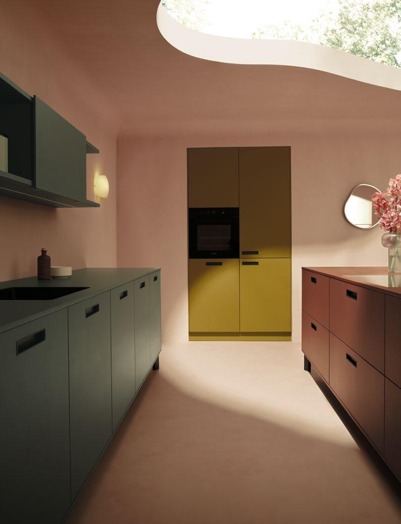
Nachhaltig
Das Farbkonzept
nx680 – nx914
Drawn to the light
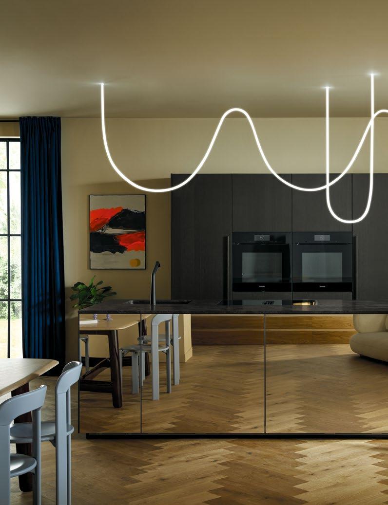
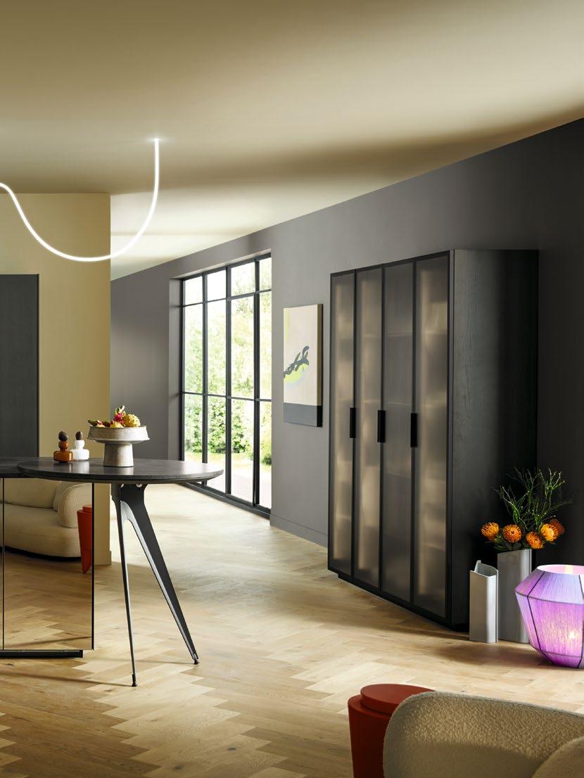
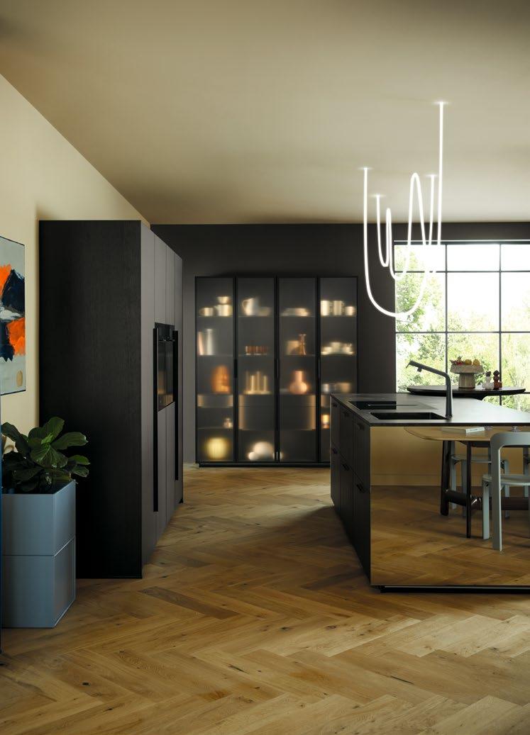
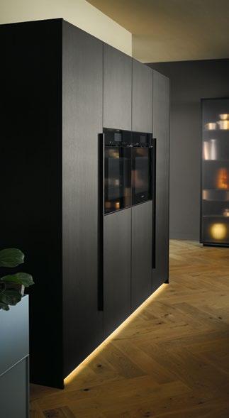
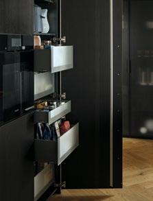
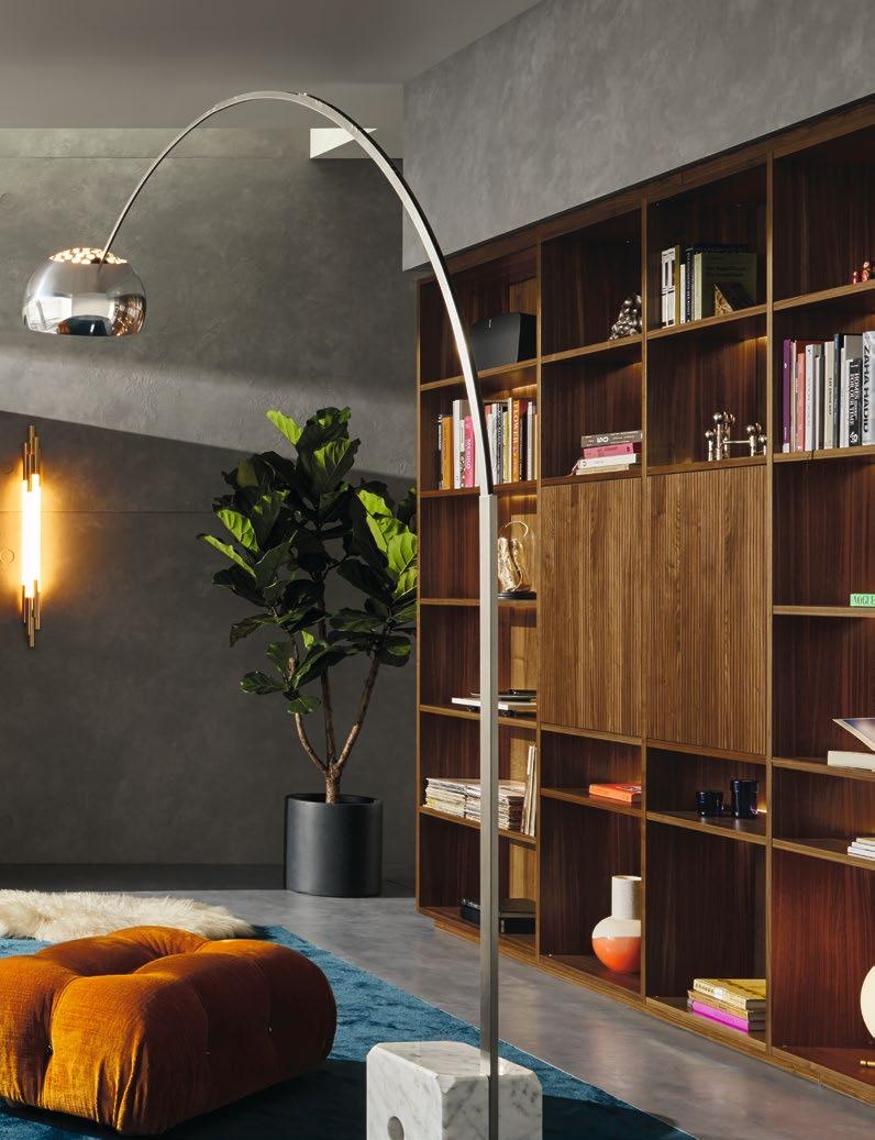
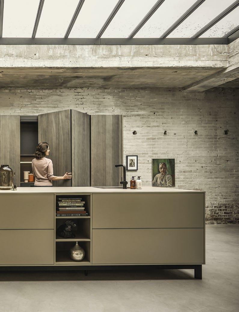
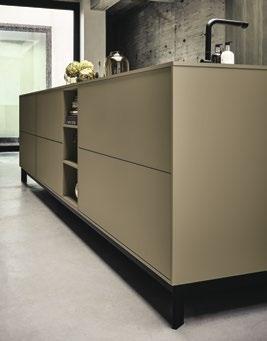
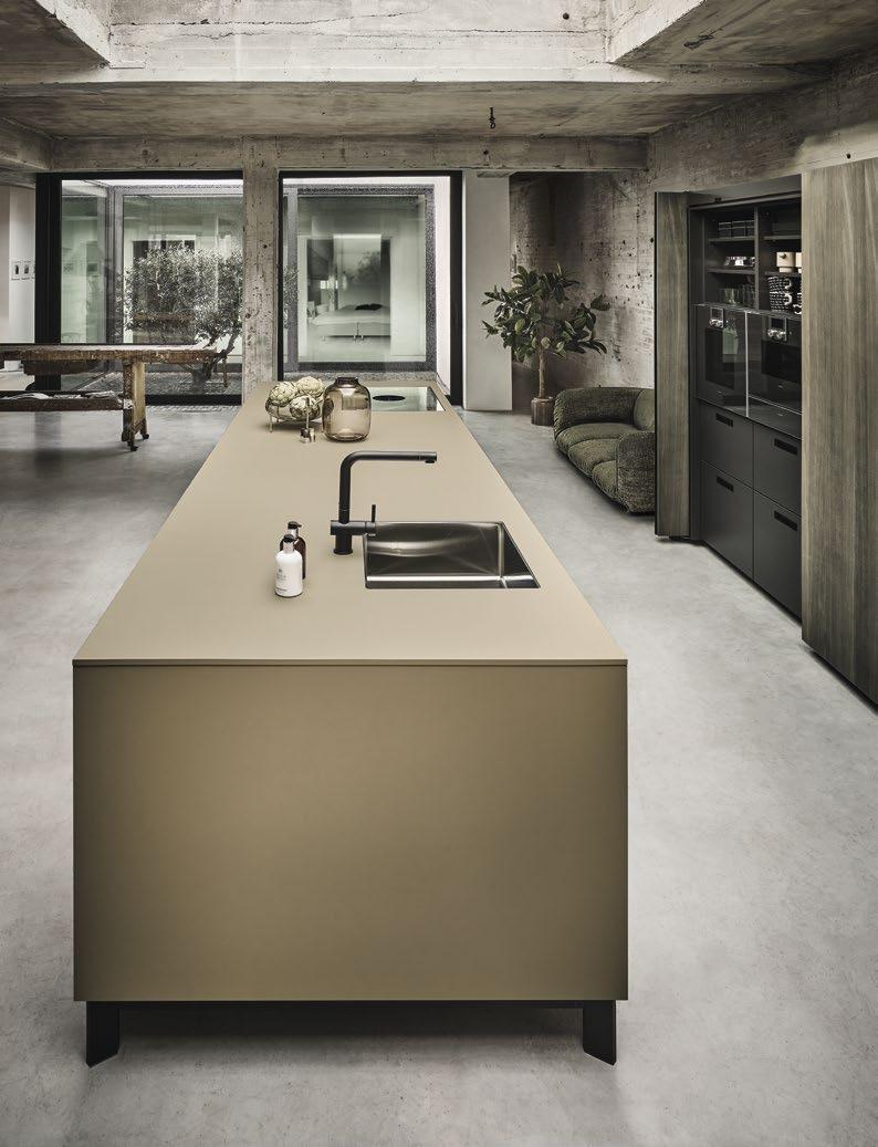
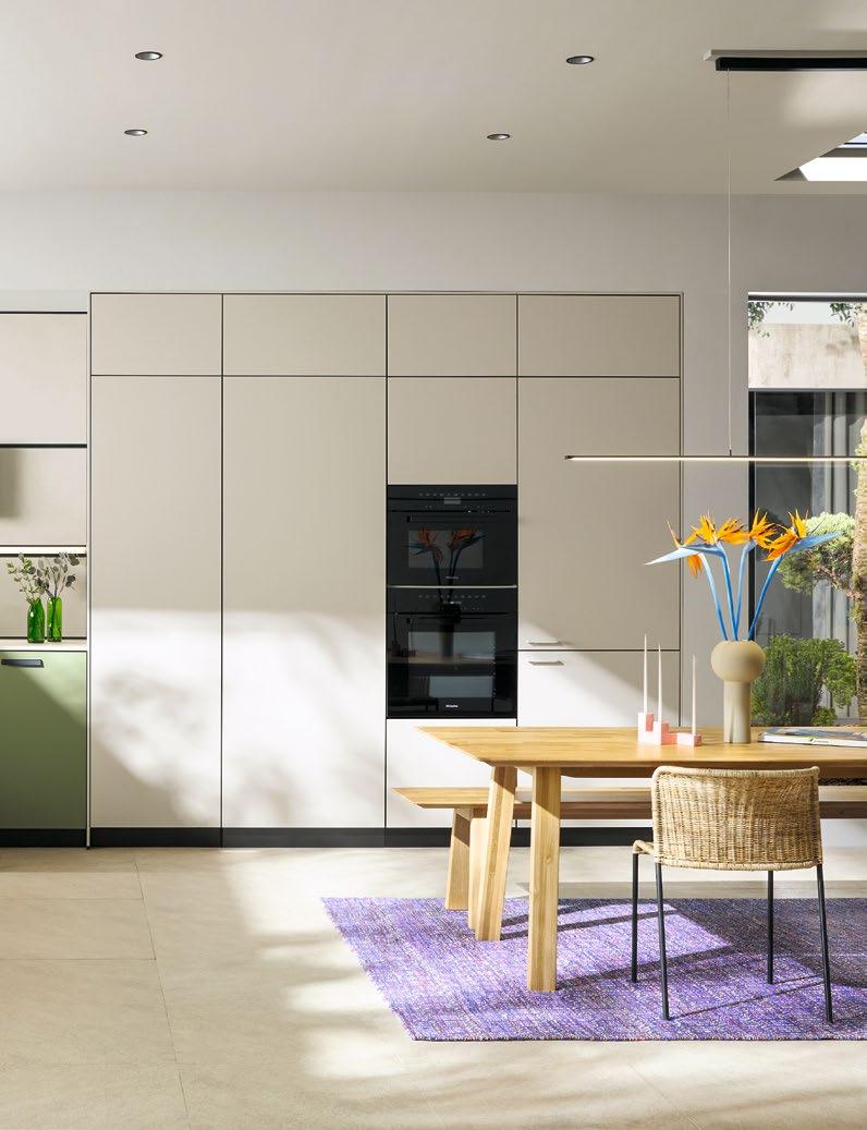
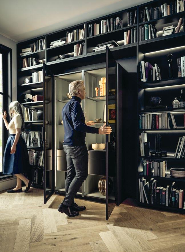
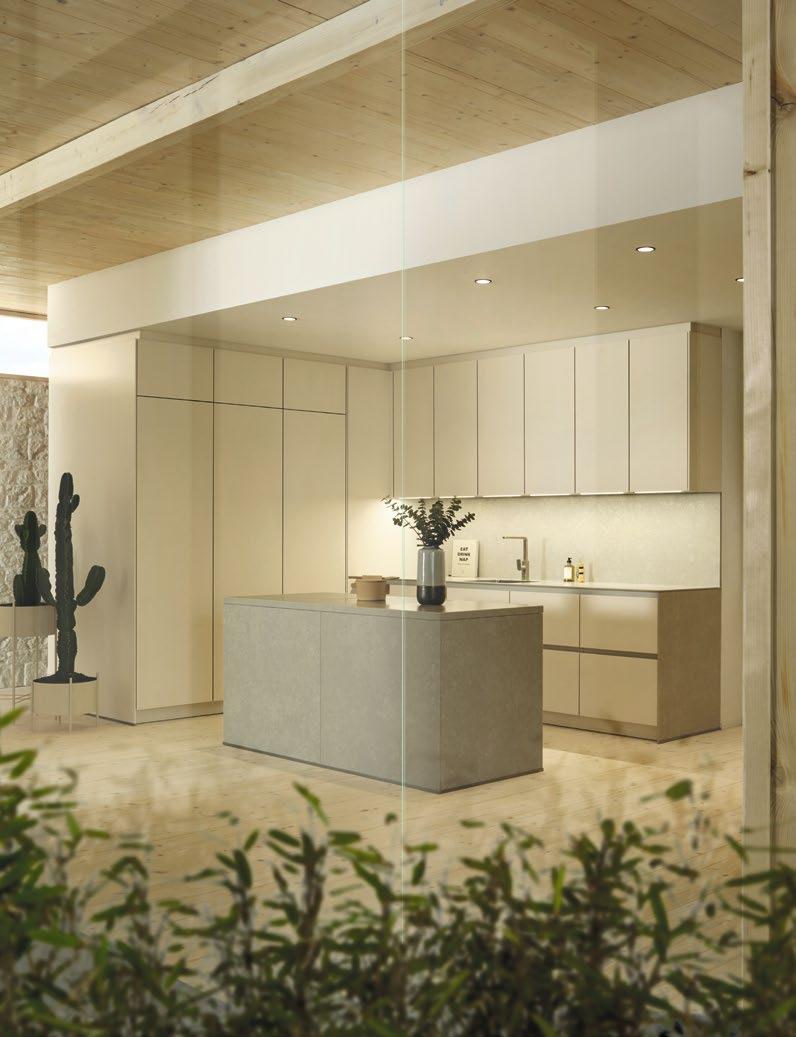
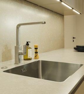
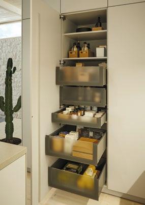
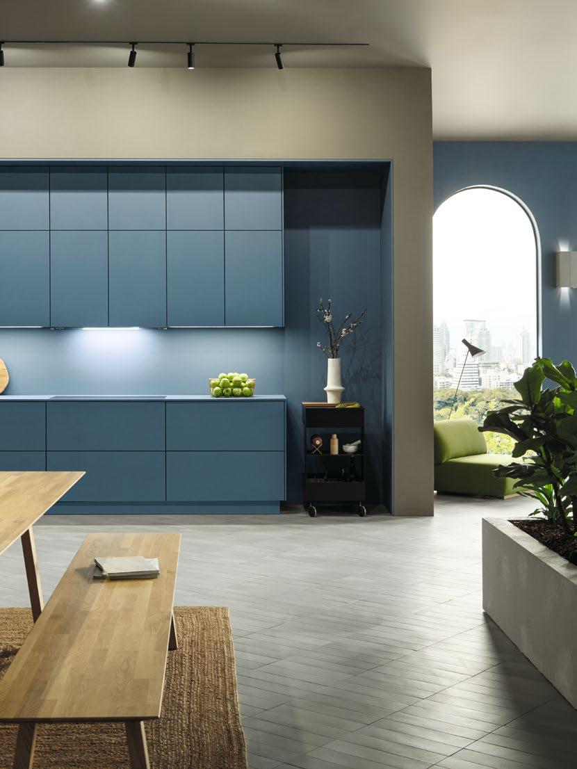
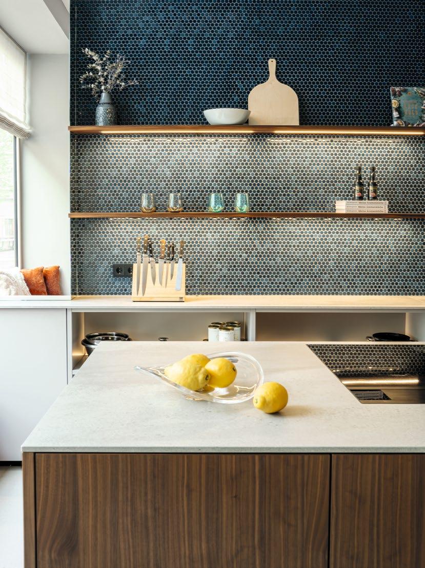
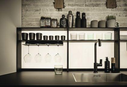
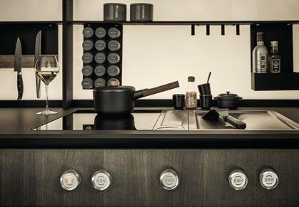
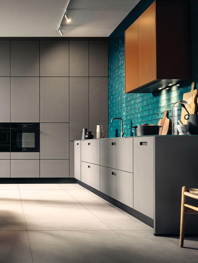
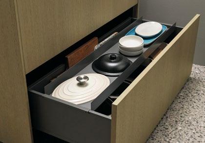
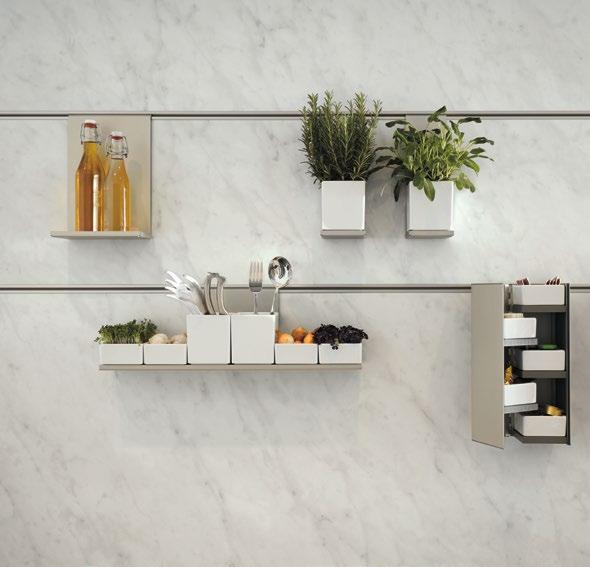
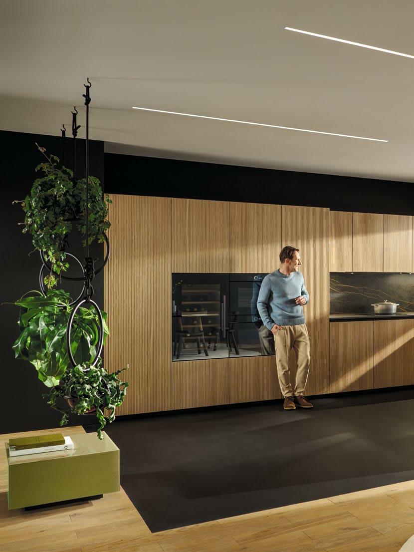
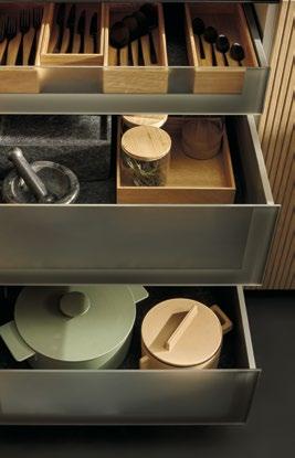
SEHEN. UND GESEHEN WERDEN. Was in Gesellschaft oftmals etwas gezwungen wirkt, bekommt in der Küche eine offene, fast selbstverständliche Wirkung. Im Blickpunkt steht dabei die extravagante Insel, die dem ganzen Raum mit ihren per Tip-On zu öffnenden Fronten aus Spiegelglas bronze eine beeindruckende Tiefe verleiht. Die Klarheit des kubischen Körpers wird von dem auf eleganten Designfüßen stehenden Ansetztisch aufgelockert. Hinter diesem Ensemble hält sich die Hochschrankzeile in Eichenfurnier onyxschwarz farblich dezent zurück – und fügt sich perfekt in das atmosphärisch-ganzheitliche Beleuchtungskonzept der Küche ein: Ob Sockel, Griffmulden oder Innenschübe – alles kann, wann immer gewünscht, illuminiert und inszeniert werden. Genauso wie die vielen schönen Dinge, welche die Vitrine hinter ihren Türen aus Linearglas feinstruktur beherbergt.
SEE. AND BE SEEN. What might seem a little contrived in public looks straightforward and almost natural in the kitchen. The focus of attention here is on the extravagant island, which gives the whole room an impressive depth thanks to its bronze-tinted mirrored glass fronts with Tip-On opening. The clean lines of the cubic carcase are made to look more casual by the adjoining table on its elegant designer feet. Behind this ensemble, the row of tall units with an onyx black oak veneer finish stand back discreetly, blending in perfectly with the kitchen’s integrated mood lighting. Plinths, grip ledges and interior drawers can all be lit up and showcased as desired, as can the many beautiful objects housed behind the fine-textured reeded glass doors of the glass display unit.
DIE DETAILS
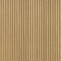
nx680 Holzfront, Eiche durchgefärbt
F815 Eiche durchgefärbt onyxschwarz nx914
Glasfront — Spiegelglas bronze, Rahmen onyxschwarz
G925S Spiegelglas bronze
Systemo Arbeitsplatte und Umfeld N1060 Mystic Grey
THE DETAILS
nx680
Wood front, Oak onyx black solid-coloured
F815 Oak onyx black solid-colored nx914
Glass front – mirror glass bronze, frame onyx black
G925S Mirror glass bronze
Systemo Worktop and surroundings
N1060 Mystic Grey
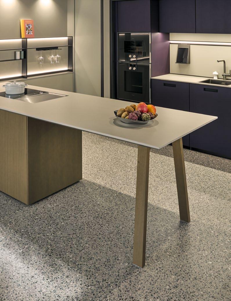
Schlanke Beine aus Metall. Stabile Platte aus Naturstein. Der runde Ansetztisch ist einer der taktgebenden Akteure in einem abwechslungsreichen Spiel mit Formen, Linien, Materialien und Licht.
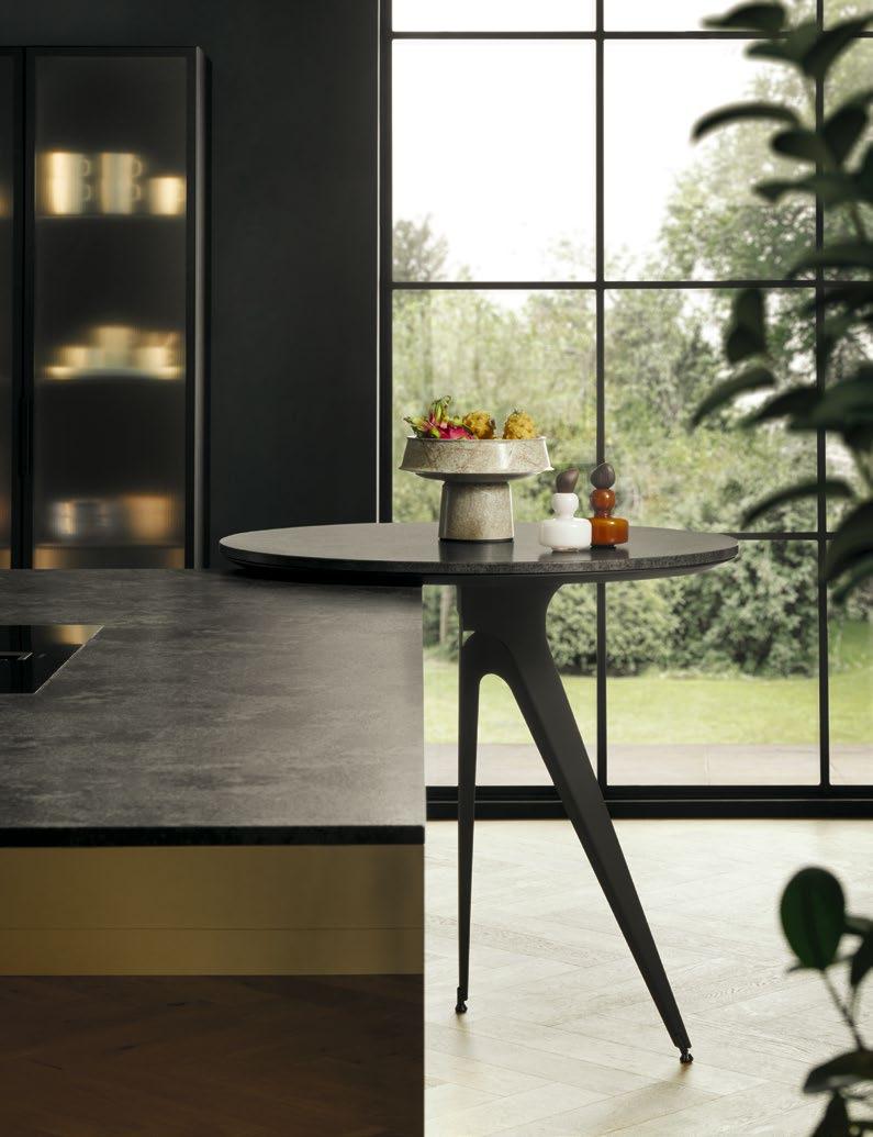
Slim metal legs. A solid natural stone tabletop. The round adjoining table helps to set the pace in a diverse interplay of shapes, lines, materials and light.
nx660 – nx960
Open to everything
RUHE UND LEBENDIGKEIT. SINN UND SINNLICHKEIT. KÜHLE UND WARME TÖNE. Ein offener, luftiger Raum bietet nahezu unbegrenzte Möglichkeiten, mit Design und Materialien einer Küche zu spielen. Was sowohl für die Planung als auch im Auge des Betrachters ausgesprochen einladend ist: Die Fronten mit schmalem Designrahmen aus wohnlich-warmen Eichenholzfurnier stehen in einem eleganten Kontrast zu dem stilvoll durch die Innenbeleuchtung akzentuierten Vitrinenschrank aus dunklem Glas. Das Herzstück bildet die freistehende Kochinsel, die mit breiten Fronten, dünnen Seitenwangen und der Systemo Arbeitsplatte in durchgängigem Ceramic bianco beige ein echtes Statement für charakterstarke Gestaltung setzt. Der niedrige, zurückgezogene Sockel lässt den Block zudem fast im Raum schweben, was ihm im optischen Vergleich zur hinteren Nischenzeile mit Englischen Auszügen die Schwere nimmt.
TRANQUILLITY AND VITALITY. SENSE AND SENSUALITY. COOL AND WARM TONES. An airy, open space provides virtually endless opportunities to play around with the design and materials in a kitchen. Particularly appealing in terms of planning as well as to onlookers are our fronts with slim designer frames made of warm, homely oak veneer, which elegantly contrast with the stylish tinted glass display unit made to stand out by its interior lighting. The main feature is the freestanding cooking island, which makes a real statement for bold design with its broad fronts, slim side support panels and the Systemo worktop in ceramic bianco beige. The low, recessed plinth almost makes the island look like it is floating, taking the weight off it and creating a visual contrast to the units in the recess behind it with their English pull-outs.
DIE DETAILS
nx660
Holzfront mit Design Rahmen F634 Eiche elegant natur
nx960
Ceramicfront, Rahmen onyxschwarz C2785 Ceramic bianco beige
Systemo
Arbeitsplatte
C2780 Bianco beige
THE DETAILS
nx660 Wood front with design frame F634 Elegant natural oak
nx960
Ceramic front, frame onyx black C2785 Ceramic bianco beige
Systemo Worktop
C2780 Bianco beige
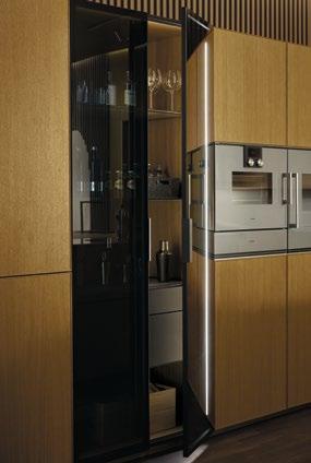
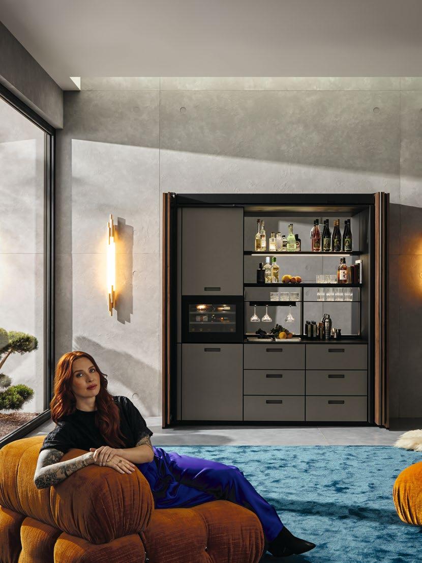
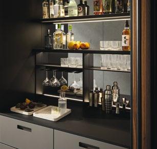
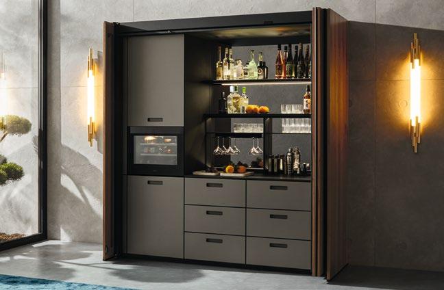
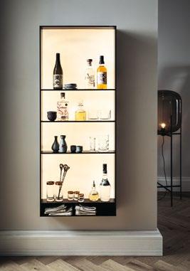
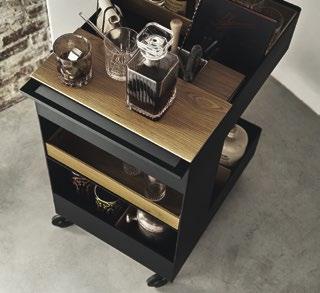
Ein Zuhause für die Barkultur
The home bar
KÜHLEN UND LAGERN. ANRICHTEN UND GENIESSEN. Eine vollständig ausgestattete Bar im eigenen Wohnzimmer braucht jede Menge Raum und ein standesgemäßes Ambiente: Vorhang – besser gesagt – Falttür auf für das next125 Pocketsystem, das dank seiner variantenreichen Einteilungsmöglichkeiten alle Zutaten für das repräsentative Zubereiten sämtlicher Lieblingsdrinks beherbergt. Die Grundlage dafür liefern die mit großzügigen Schüben ausgestatteten Unterschränke, über denen hochwertige Frame-Nischenregale, Glashalterungen und das LED-Lichtboard in Onyxschwarz thronen. All das wird durch die dimmbare Beleuchtung stilvoll in Szene gesetzt, während die verspiegelte Rückwand für Tiefe sorgt. Auch der Weinkühler passt perfekt ins stimmungsvolle Bild dieser großartigen Neuinterpretation eines klassischen Barschranks. Sind dessen Türen geschlossen, fügen sich die gerillten Nussbaum-Fronten elegant in die Umgebung ein.
A PLACE TO CHILL, STORE, POUR AND SAVOUR YOUR DRINKS. A fully-equipped bar in your own living room provides plenty of storage space and a touch of class. Curtains up, or rather, folding doors open to reveal the next125 pocket system. Thanks to its range of set-up options, it can house all kinds of ingredients for conjuring up your favourite drinks. It is built around base units equipped with spacious drawers and crowned by the high-quality Frame recess shelving, glass holders and an onyx black LED lighting panel. The dimmable lighting stylishly showcases the contents, whilst the mirrored back panel adds depth. The wine cooler also fits in perfectly with the harmonious look of this great new twist on the classic drinks cabinet. When the doors are closed, the grooved walnut fronts gracefully blend into their surroundings.
DIE DETAILS
nx670
Holzfront mit vertikalen Rillen F685 Nussbaum natur
nx912
Glasfront matt, Rahmen onyxschwarz
G582 Glas matt basalt metallic
Systemo Arbeitsplatte
K187F SensiQ onyxschwarz feinmatt AFP


THE DETAILS
nx670
Wood front with vertical grooving F685 Natural walnut
nx912
Glass front matt, frame onyx black
G582 Glass matt basalt metallic
Systemo
Worktop
K187F SensiQ onyx black fine matt AFP
HAPTIK TRIFFT OPTIK
Die vertikalen Rillen der geschlossenen Fronten im harmonischem Zusammenspiel mit der eleganten, indirekten Lichtführung in den offenen Fächern: Das Regal von next125 ist ein architektonischer Blickfang, der Sinnliches perfekt vereinen und Räume teilen kann.
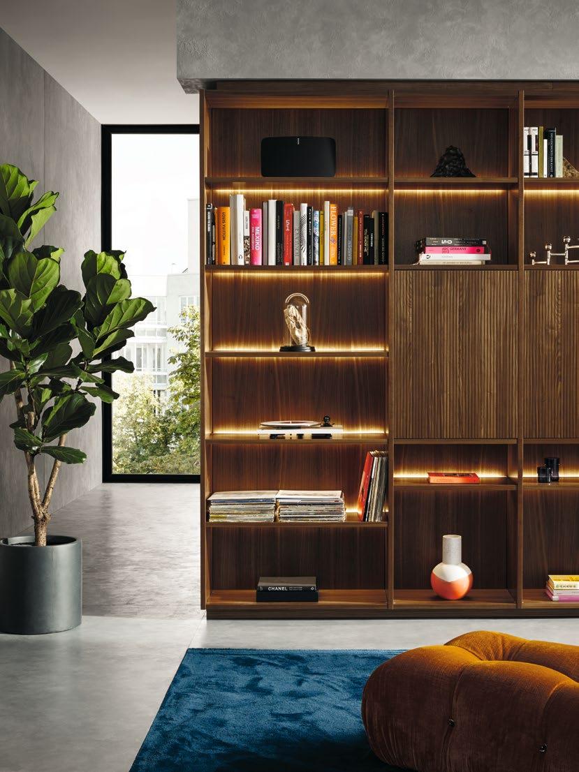
The vertical grooves of the closed fronts create a harmonious interplay with elegant indirect lighting on the open shelves. This next125 shelving is an architectural eyecatcher that can divide rooms whilst perfectly aligning the senses.
DIE DETAILS
nx510
Samtmatt-Lackfront
L202M Saharabeige
samtmatt AFP
nx640
Holzfront
F644 Eiche elegant perlgrau
Systemo
Arbeitsplatte
K202F SensiQ saharabeige feinmatt AFP
THE DETAILS
nx510
Matt velvet lacquer front
L202M Sahara beige
matt velvet AFP
nx640
Wood front
F644 Elegant oak pearl grey
Systemo
Worktop
K202F SensiQ Sahara beige fine matt AFP

OFFENPORIGE WÄNDE. PURER BETON. Um den rauen Charme der spannenden Raumsituation optimal zur Geltung zu bringen, wurde die Küchenplanung zum individuellen Meisterstück. Im Zentrum steht die großzügige Kochinsel, die auf ihren minimalistischen Sockelgestell beinahe schwerelos wirkt. Derweil bietet das rückwändige Pocketsystem ein Maximum an Funktionalität: Ein leichtes Antippen der edlen Falttüren in Echtholzfurnier genügt und schon präsentiert sich die dahinter verborgene Küchenzeile mit viel Technologie und noch mehr Stauraum.
OPEN-PORED WALLS. PURE CONCRETE. To perfectly highlight the raw charm of this exciting room, the kitchen design was transformed into a unique masterpiece. In the centre, the spacious cooking island stands tall, looking virtually weightless on its minimalist plinth frame. At the same time, the pocket system on the back wall offers maximum functionality; just a light touch of the elegant folding doors with their wood veneer is sufficient to reveal the units concealed behind them, boasting an array of technology and even more storage space.
Harmony all around
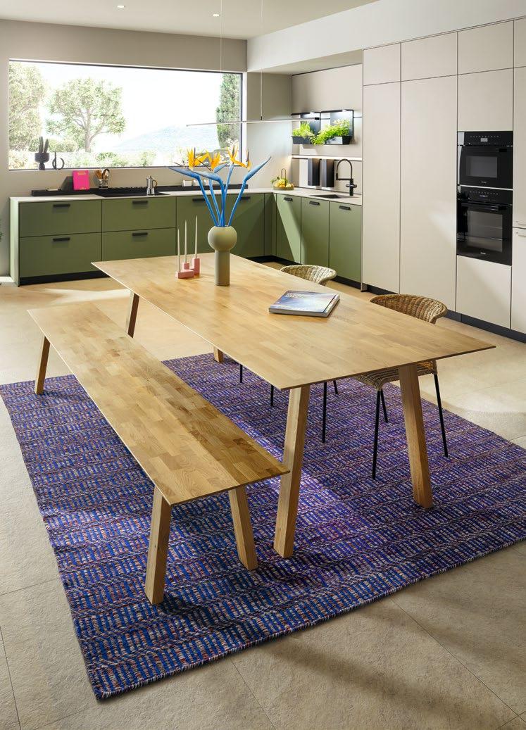
UMGEBEN VON NATUR. UND ZEITGEMÄSSEN MATERIALIEN. So lässt sich eine hochmoderne Küche mit bestem Wissen und Gewissen planen. Die wohltuende Grundstimmung des Raumes wird durch die aus Naturmaterialien gefertigte Front in Linoleum olivgrün getragen, deren Trägerplatte aus 100 % recyceltem Material besteht. Dass Hochschrankzeile, Arbeitsplatte und die Korpusinnenseiten in Kieselgrau samtmatt gehalten sind, passt ebenfalls wunderbar mit ins Bild. Wer in all dieser Ruhe Raum für funktionale Dinge sucht, wird hinter der als Hochschrank getarnten Durchgangstür zum Vorratsraum fündig. Frischen Kräutern bietet das next125 Paneelsystem in der hellen Nische über der Spülenzeile das passende Ambiente, während Gewürze, Kochbücher und -utensilien im Funktionsaufsatz hinter dem Kochfeld stilvoll platziert werden können. Der next125 Holztisch sowie die Pendelleuchte runden den ästhetischen Gesamteindruck nachhaltig ab.
SURROUNDED BY NATURE AND CONTEMPORARY MATERIALS. This is how an ultra-modern kitchen can be planned with a clear conscience. The feeling of wellbeing in the room is conveyed by the olive green linoleum front made of natural materials and particle board made entirely of recycled materials. The row of tall units, the worktops and the carcase interiors all have a pebble grey matt velvet finish, allowing them to blend in perfectly with the overall picture. Those who seek a place for practical objects amidst this peace and tranquillity will find it behind the door to the pantry, which is camouflaged as a tall unit. In the brightly lit recess over the sink, the fresh herbs in the next125 panel system create a pleasant atmosphere, whilst herbs and spices, cookbooks and utensils can be placed stylishly in the practical storage rack behind the hob. The next125 wooden table and pendant luminaires complete the sustainable look.
DIE DETAILS
nx890
Linoleum-Front
E893 Linoleum olivgrün
nx510
Samtmatt-Lackfront
L207M Kieselgrau samtmatt AFP Systemo Arbeitsplatte und Umfeld
K207F SensiQ kieselgrau feinmatt AFP


THE DETAILS
nx890
Linoleum front
E893 Linoleum olive green
nx510 Matt velvet lacquer front
L207M Pebble grey matt velvet AFP
Systemo
Worktop and surroundings
K207F SensiQ pebble grey fine matt AFP
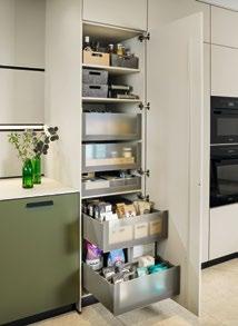
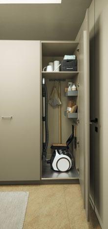
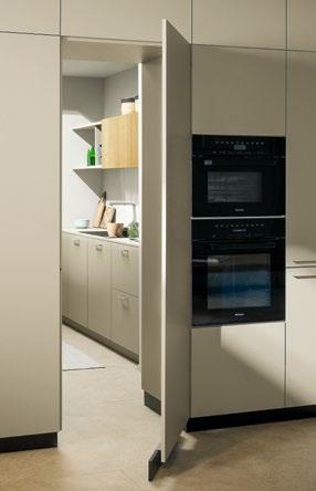
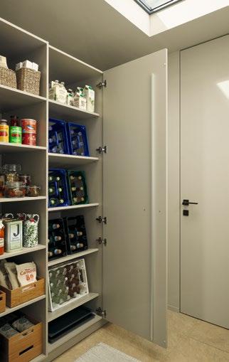
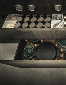
Von außen praktisch unsichtbar. Im Inneren unglaublich praktisch. Der hinter einer Hochschranktüre verborgene Vorratsraum bietet neben einer weiteren Spülenzeile viel Platz für alles, was im Haushalt vorhanden oder erledigt sein muss.
Practically invisible from the outside. Incredibly practical on the inside. The pantry, concealed behind a tall unit door, provides an additional sink and plenty of space for storing supplies or doing household chores.
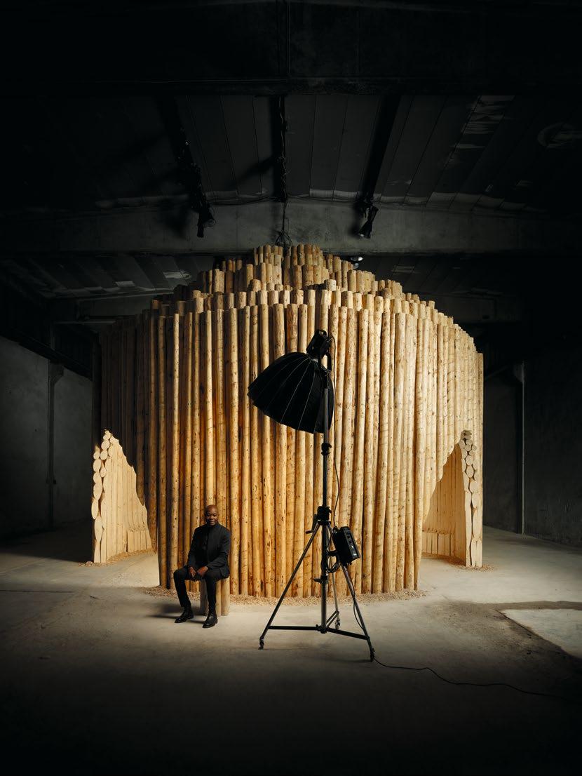
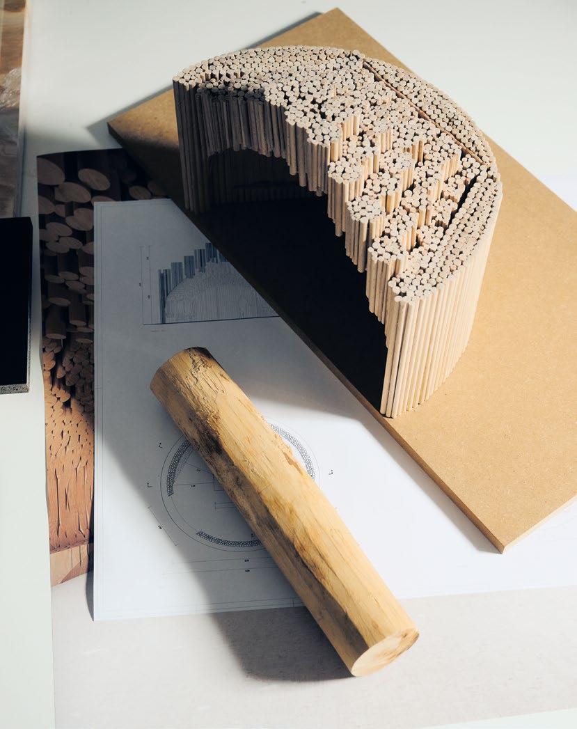
Eine kreative Kollaboration
Aus 600 Fichtenholzstämmen entsteht ein Unikat: The Fireplace.
A creative collaboration
A
Mit The Fireplace möchte ich Menschen emotional berühren, Archaik und Formvollendung zusammenbringen.
With The Fireplace I want to touch people emotionally, to bring together archaism and perfection of form.
Francis Kéré
The fascination of fire
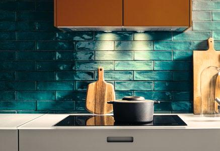
DREI GROSSE STEINE, ZU EINEM UNGLEICHEN DREIECK ZUSAMMENGESCHOBEN. Ein Feuer aus Ästen und Zweigen in ihrer Mitte. Die Gesichter der Kinder, die Stimmen der Erwachsenen, die sich bei Einbruch der Dämmerung um die einzige Licht- und Wärmequelle im Dorf versammeln. Der beißende Rauch. Die Stimme der Großmutter, die zu ihren Erzählungen ansetzt, sie immer wieder mit Gesang unterbricht, während drumherum die Nacht immer tiefer fällt. Die kalte Asche beim Erwachen am nächsten Morgen.
FÜR DIÉBÉDO FRANCIS KÉRÉ GEHÖREN DIESE NÄCHTE AM FEUER ZU DEN PRÄGENDEN BILDERN SEINER KINDHEIT IN GANDO, BURKINA FASO. Jetzt bilden sie die Basis eines buchstäblich unglaublichen Projekts, das Kéré und next125 binnen eines Jahres gemeinsam realisiert haben. Ihre Grundidee: Ein temporäres Bauwerk, das die Küche und das Kochen gleichermaßen feiert. Ihr Ansatz: Ein hölzerner Pavillon mit einer Küche von next125 im Zentrum. Ihr programmatischer Name für das Gemeinschaftsprojekt: The Fireplace.
Die Wurzeln: Tief im Herzen Afrikas
DIE GESCHICHTE DIESES VORHABENS BEGINNT IM SOMMER 2023 IN BERLIN. Im Jahr zuvor hat Francis Kéré den Pritzker Preis und damit die international höchste Auszeichnung für einen Architekten erhalten. Für Kéré ist es die vorläufige Krönung einer außergewöhnlichen Karriere: 1965 in Burkina Faso geboren, kommt er mit einem Stipendium nach Deutschland, wo er nach einer Tischlerlehre ein Architekturstudium beginnt. Bereits für seine erste Arbeit, eine Grundschule in seinem Heimatdorf, die er noch während seines Studiums realisiert, wird Kéré mit dem renommierten Aga Khan-Preis ausgezeichnet. Später plant er für den Regisseur Christoph Schlingensief das Operndorf in Afrika, arbeitet für Bauherren in aller Welt, tritt 2017 eine Professur an der TU München und später eine Gastprofessur in Yale an. Aktuell gilt der 58-jährige als einer der weltweit gefragtesten Bauplaner unserer Zeit.
Ich wollte mit The Fireplace einen Raum schaffen, der organisch und gemütlich anmutet und damit eine Spannung zu next125 aufbaut.
Francis Kéré
THREE LARGE STONES PUSHED TOGETHER TO FORM AN UNEVEN TRIANGLE. A fire built with branches and twigs in its centre. The faces of the children and the voices of the adults who gather around the only source of light and warmth in the village as dusk falls. The acrid smoke. The grandmother’s voice as she starts to tell her tales, interrupted here and there by song as night falls deeper all around. The cold ashes upon waking the next morning.
FOR DIÉBÉDO FRANCIS KÉRÉ, THESE NIGHTS AROUND THE FIRE ARE AMONG THE VIVID IMAGES OF HIS CHILDHOOD IN GANDO, BURKINA FASO. They now form the basis of a truly incredible project that Kéré and next125 have brought to life within the space of a year. Their basic idea: a temporary structure that celebrates both kitchens and cooking. Their approach: a wooden pavilion with a next125 kitchen in the centre. Their name for this joint project: The Fireplace.
Its roots:
Deep in the heart of Africa
THE STORY BEHIND THIS UNDERTAKING BEGINS IN THE SUMMER OF 2023 IN BERLIN. The previous year, Francis Kéré had received the Pritzker Prize, the highest international accolade for an architect. For Kéré it was a momentary crowning of an exceptional career: born in Burkina Faso in 1965, he came to Germany on a bursary, where he began a degree in architecture after completing an apprenticeship as a joiner. In his very first job, working on a primary school in his home village whilst studying for his degree, Kéré was presented with the renowned Aga Khan Award for Architecture. He went on to design the Opera Village in Africa for director Christoph Schlingensief, worked for constructors all over the world, accepted a professorship at the Technical University of Munich in 2017 and then a visiting professorship at Yale. The 58 year old is currently one of the most in-demand building designers worldwide.
My intention with The Fireplace was to create a space that’s natural and cosy in appearance, acting as a contrast to next125.
Francis Kéré
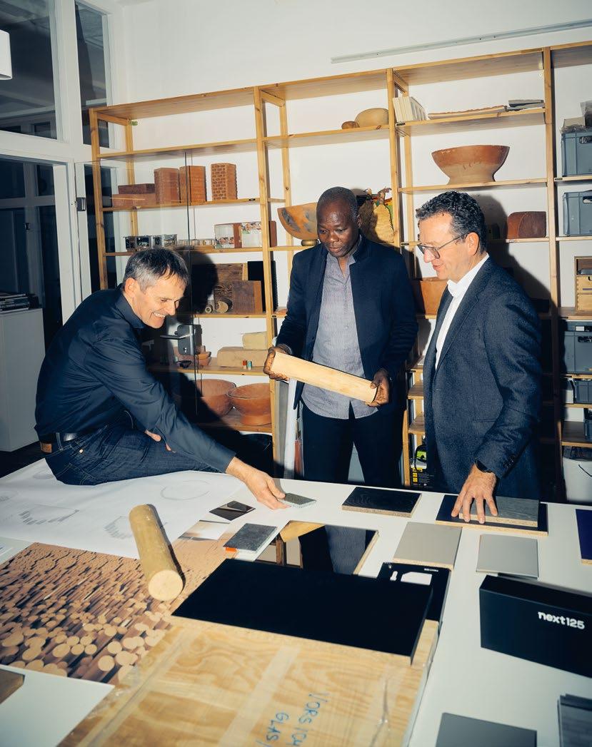
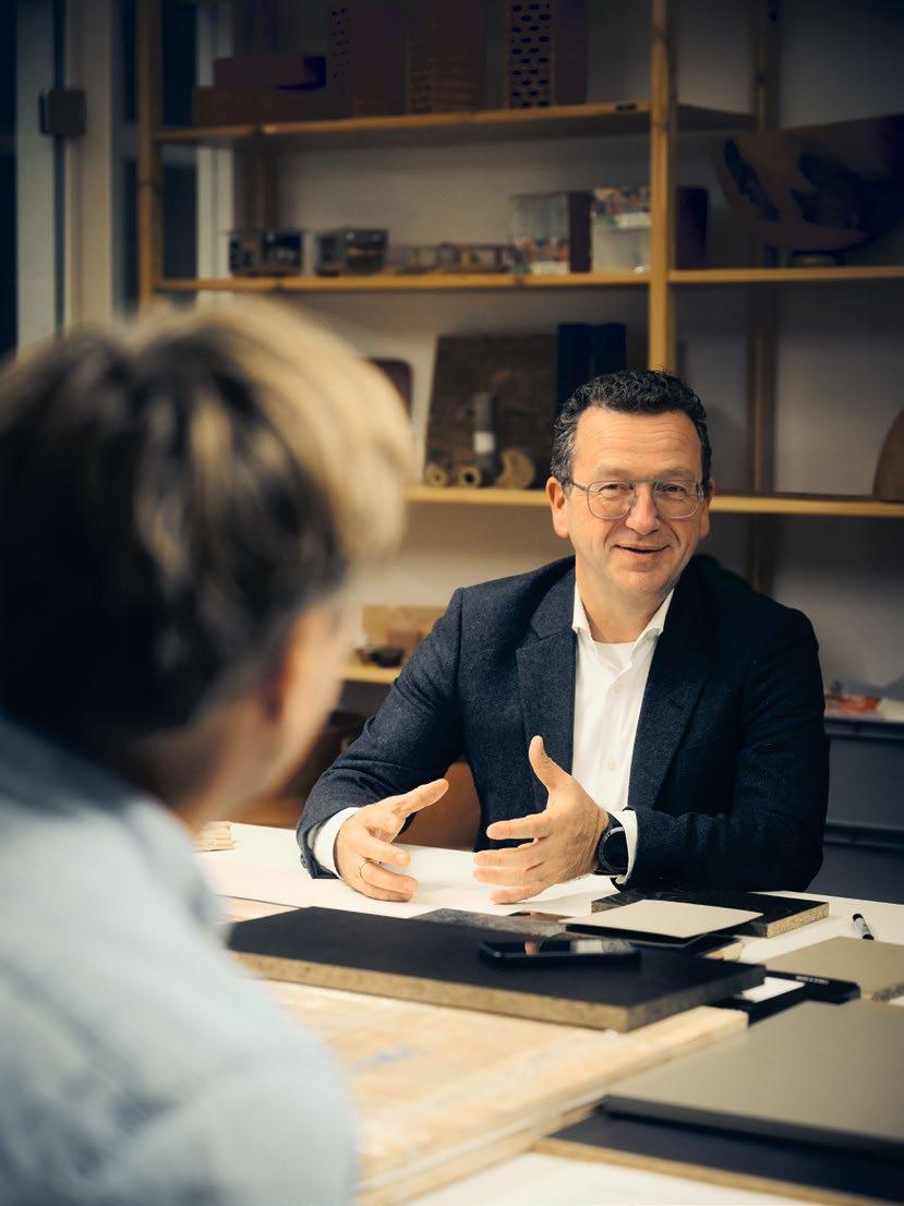
DENNOCH WIRD KÉRÉ GLEICH HELLHÖRIG, ALS IHN DIE ANFRAGE VON NEXT125 ERREICHT. Die Marke hat mit den Creative Makers eine neue Tradition kreativer Kollaborationen begründet, die jetzt mit dem burkinischen Architekten fortgeführt werden soll. Im August reist Kéré zum Firmensitz von Schüller im fränkischen Herrieden. Er erfährt von den Wurzeln des aus einer Tischlerei entstandenen Unternehmens und der kontinuierlich innovativen Weiterentwicklung der Premiummarke next125. Er lässt sich das hochautomatisierte Werk und das Küchenportfolio zeigen. Vor allem aber spürt er die gemeinsame Leidenschaft für Design und Architektur, für die Qualität der Details, für Materialien und den Werkstoff Holz. Was alle verbindet: Die Begeisterung für das Kochen. „Die Präzision der next125 Küchen, ihre rationale Fertigung und die formvollendeten Produkte haben mich als Tischler wie auch als Architekten nachhaltig beeindruckt“, sagt er rückblickend.
Das Projekt: Leidenschaft für Material und Form
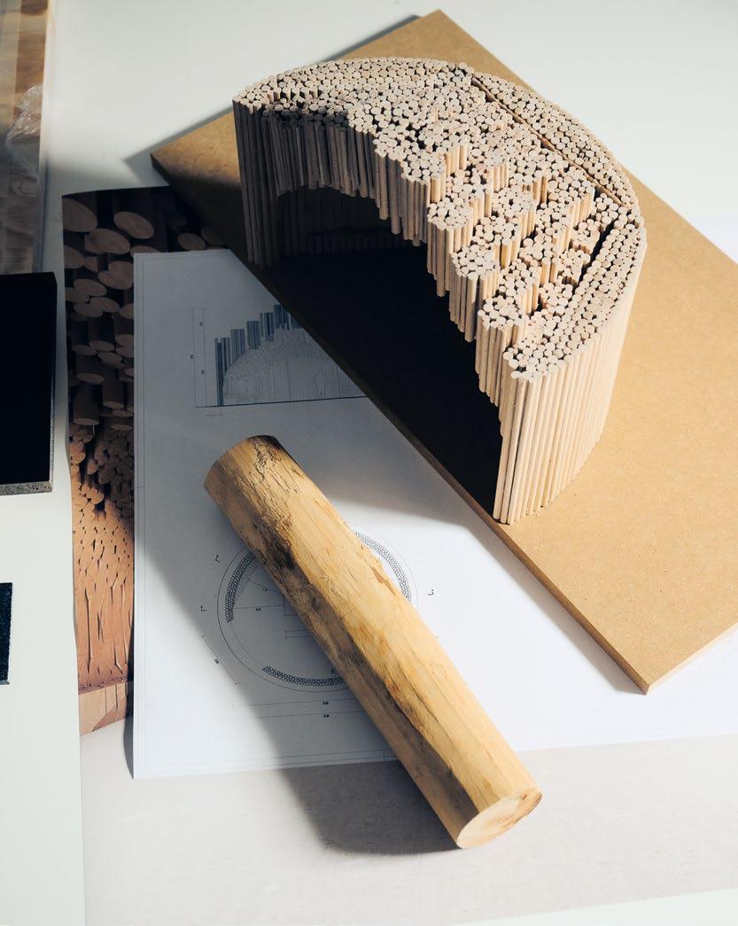
IM PROJEKT, DAS NEXT125 UND DER ARCHITEKT IN DIESEN TAGEN GEMEINSAM ANGEHEN, geht es um eine außergewöhnliche architektonische Metapher für das Kochen und die Küche, für Gemeinschaft und Kommunikation. Vorgestellt werden soll sie im Rahmen der Milan Design Week zum Salone del Mobile 2024, und gleich Kérés erste Entwürfe begeistern die Projektpartner. Auf seinen Skizzen erscheint eine aufgeschnittene Rundhütte von acht Metern Durchmesser und rund sechs Metern Höhe, gefertigt aus Bündeln ungehobelter Fichtenstämme unterschiedlichen Durchmessers und Beschaffenheit. Formal zitiert Kéré hier seinen Xylem Pavillon, den er 2019 für das Tippet Rise Art Center in Montana geschaffen hat: Die Architektur wirkt organisch und warm, abgeschlossen und einladend zugleich. „Mit The Fireplace möchte ich Menschen emotional berühren, Archaik und Formvollendung zusammenbringen“, sagt der Architekt.
FÜR MARKUS SCHÜLLER UND THOMAS PFISTER, DIE MACHER DER MARKE NEXT125, bildet Kérés hölzerne Hülle einen hochinteressanten Kontrast zum puristischen Design der Küche. Während die Marke next125 Werte wie Eleganz, Technologie, Funktion und Reduktion lebt, mutet Kérés Pavillon rau, rustikal und imperfekt an, wie die Bäume, aus denen er gebaut werden soll. Und genau darin liegt die Absicht des Architekten. „next125 verkörpert die perfekte Küche“, sagt er, „ich wollte mit The Fireplace einen Raum schaffen, der organisch und gemütlich anmutet und damit eine Spannung zu next125 aufbaut.“
Der Entwurf: Natur trifft Perfektion
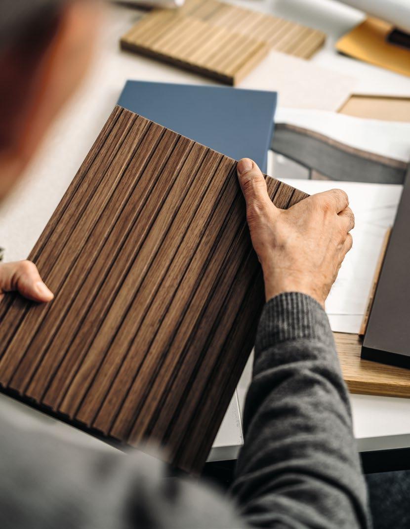
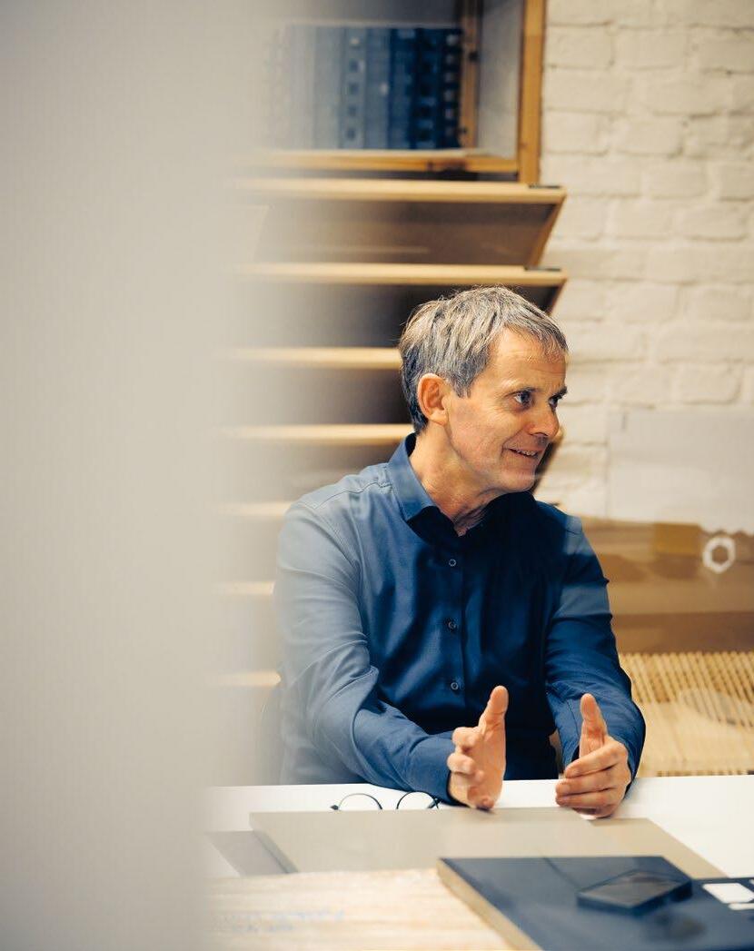
WÄHREND KÉRÉ IN BERLIN AN SEINEN ENTWURFSDETAILS TÜFTELT, arbeitet in Herrieden das Team um Designchef Thomas Pfister an den Details der next125 Küche. Auf diese Weise entwickelt
next125 lebt davon, dass wir neugierig bleiben und uns zusammen mit Creative Makers immer wieder neu erfinden.
Thomas Pfister – Head of Design, next125
NEVERTHELESS, KÉRÉ’S INTEREST IS PIQUED AS SOON AS HE RECEIVES THE QUERY FROM NEXT125. With its creative makers, the brand started a new tradition of creative collaborations, which is now being continued with the Burkinan architect. In August, Kéré travels to Schüller’s head office in the Franconian town of Herrieden. He learns all about the roots of the company which started out as a joinery and about the ongoing innovative development of the premium brand next125. He is shown the highly automated factory and the kitchen range. But above all, he perceives their mutual passion for design and architecture, for the quality of details, for materials and for wood. Linking all of this: a love of cooking. “The precision of next125 kitchens, their rational manufacturing and the perfected products made a lasting impression on me both as a joiner and an architect,” he says looking back.
The project: Passion for material and form
THE PROJECT, WHICH IS NOW BEING JOINTLY UNDERTAKEN BY NEXT125 AND THE ARCHITECT, is an extraordinary architectural metaphor for cooking and kitchens, companionship and communication. It is to be presented as part of the Milan Design Week at Salone del Mobile 2024, and Kéré’s initial sketches delight the project partners from the outset. His drawings show the horizontal cross-section of a circular hut, eight metres in diameter and about six metres high, made from bundles of coarse spruce logs in a range of diameters and conditions. Formally, Kéré cites here his Xylem Pavilion, which he created for the Tippet Rise Art Center in Montana in 2019: the architecture has a warm, natural appearance, both secluded and inviting at the same time. “With The Fireplace, I want to move people emotionally and bring together the Archaic style and perfection in form,” says the architect.
FOR MARKUS SCHÜLLER AND THOMAS PFISTER, THE CREATORS OF THE NEXT125 BRAND, Kéré’s wooden shell forms an extremely interesting contrast with the purist design of the kitchen. Whilst the next125 brand lives and breathes values like elegance, technology, function and minimalism, Kéré’s pavilion appears raw, rustic and imperfect like the trees that it is to be built from. And that is precisely what the architect intends. “next125 embodies the perfect kitchen,” he says. “My intention with The Fireplace was to create a space that’s natural and cosy in appearance, acting as a contrast to next125.“
The design:
Nature meets perfection
WHILST KÉRÉ REFINES THE DETAILS OF HIS SKETCHES IN BERLIN, the team in Herrieden works on the details of the next125 kitchen led by Head of Design Thomas Pfister. This enables a fruitful design dialogue between the architect and the kitchen professionals, between Kreuzberg and Herrieden. Among others, next125 uses natural stone by Systemo with outstanding functional properties. The cubic clarity of the kitchen, a core feature of the next125 brand, creates a stark contrast with Kéré’s primal pavilion. For the top of the kitchen block, which is to be presented in Kéré’s pavilion, Pfister’s team purposefully decides on a bronze mirrored glass surface. “From my point of view, mirrored glass is the perfect material here,” the designer says. “Our mirrored surface visually dissolves the dimensions of the kitchen and enables it to blend in with its surroundings.”
sich ein fruchtbarer Designdialog zwischen Architekt und Küchenprofis, zwischen Kreuzberg und Herrieden. Zum Einsatz kommt bei next125 unter anderem Naturstein von Systemo mit herausragenden funktionalen Eigenschaften. Die kubische Klarheit der Küche, ein zentrales Merkmal der Marke next125, entwickelt einen maximalen Kontrast zu Kérés naturwüchsigem Pavillon. Beim Küchenblock, der in Kérés Pavillon präsentiert werden soll, entscheidet sich Pfisters Team bewusst für eine Oberfläche aus Spiegelglas Bronze. „Aus meiner Sicht bildet Spiegelglas hier das perfekte Material“, meint der Designer. „Unsere Spiegeloberfläche löst die Maße der Küche optisch ein Stück weit auf und lässt sie mit ihrer Umgebung verschmelzen.“
DIE IDEE: Genau so, wie die Projektpartner in diesen Monaten miteinander kommunizieren, sollen auch Design und Architektur in einen permanenten, lautlosen Dialog treten. Kérés Pavillon bildet dabei Anziehungspunkt und Bühne für die Küche zugleich.
NACH MEHREREN MONATEN DER REMOTE-KOLLABORATION kommen die Partner Ende November 2023 in Kérés Berliner Studio zu einer Projektbesprechung zusammen. Draußen hat es geschneit, die Temperaturen liegen unter dem Gefrierpunkt, drinnen arbeiten Architekten aus 12 Nationen an Projekten in aller Welt. Im Besprechungsraum des Architekturbüros versammeln sich Francis Kéré, Markus Schüller und Thomas Pfister um ein hölzernes Modell des Pavillons. Zunächst dreht sich das Gespräch der drei Männer um die ewige Faszination des Feuers. Architekt Kéré berichtet von einer sternenklaren Nacht am Lagerfeuer in Montana, Designer Thomas Pfister von den Kartoffelfeuern seiner Kindheit. „An der Feuerstelle kommen Menschen seit jeher zusammen“, ergänzt Markus Schüller, „die heutigen „virtuellen Lagerfeuer“, also die sozialen Netzwerke und digitalen Platt formen, können diese echten Begegnungen nie ersetzen.“ Und so sei es auch kein Zufall, dass im Herzen des next125 Küchenblocks ein großer Gasbrenner sitzen werde – eine klare Reminiszenz an die wärmende, verbindende Funktion des Herdes.
Die Kochstelle:
Das Lagerfeuer unserer Tage
VON DORT FÜHRT DAS GESPRÄCH SCHNELL ZU DEN „FEUERSTELLEN“ UNSERER TAGE, zu ihrer wachsenden Bedeutung und ihrem Zuschnitt. In seinen Augen gebe es nicht die perfekte Küche, erklärt Thomas Pfister, „aber es gibt eine perfekte Küche für jeden Einzelnen.“ Markus Schüller verweist auf die sich verändernde Architektur des Raumes: Waren die meisten Küchen früher abgeschlossene Werkstätten für die Essenszubereitung, wandelten sie sich heute immer mehr zu offenen Räumen, in denen Menschen wieder zusammenkommen. „Die Küche ist heute mehr als ein Raum. Für viele ist sie Heimat.“
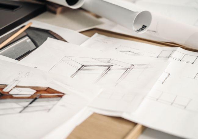
WÄHREND DES GESPRÄCHS GREIFT FRANCIS KÉRÉ ZUM FINELINER und skizziert seine Vision einer idealen Küche auf Papier. In schnellen, präzisen Strichen entsteht auf seiner Zeichnung eine Kochstelle, die funktionalen Stau- und Arbeitsraum für die Handgriffe und Abläufe des Kochens bietet. Drumherum aber zeichnet Kéré Flächen für Bewegung und fürs Sitzen, Sprechen, Zuschauen und Entspannen ein. Mit anderen Worten: Die ideale Küche ist für ihn das, was The Fireplace exemplarisch verkörpert.
THE IDEA: just as the project partners are communicating with each other over the months, the design and architecture should also enter an ongoing, silent dialogue. Kéré’s pavilion is both a centre of attraction and a stage for the kitchen.
AFTER SEVERAL MONTHS OF REMOTE COLLABORATION, the partners come together in Kéré’s Berlin studio for a project meeting at the end of November 2023. Outside it’s been snowing and the temperature is below freezing, while inside architects from 12 different countries are working on projects all over the world. In the meeting room at the architectural firm, Francis Kéré, Markus Schüller and Thomas Pfister gather around a wooden model of the pavilion. The conversation of the three men then turns to the eternal fascination with fire. Architect Kéré tells them of a starry night around a campfire in Montana and designer Thomas Pfister of the potato harvest bonfires of his childhood. “People have been coming together around the fireplace since forever,” Markus Schüller adds. “Today’s ‘virtual campfires’, that is, the social networks and digital platforms, will never replace these real-life encounters.” It is therefore no coincidence that a large gas burner is to sit in the centre of the next125 kitchen block – a clear reminiscence of the warming, uniting function of the stove.
The hob:
The modern campfire
FROM THERE, THE CONVERSATION QUICKLY TURNS TO MODERN-DAY ‘FIREPLACES’, to their growing significance and their customisation. In his eyes, there is no such thing as a perfect kitchen, Thomas Pfister explains, “but there is a perfect kitchen for every individual.” Markus Schüller refers to the changing architecture of the room: whereas most kitchens used to be closed workspaces for preparing food, today they are constantly evolving to become open spaces in which people come together. “Today’s kitchen is more than just a room. For many, it is home.”
DURING THE CONVERSATION, FRANCIS KÉRÉ GRABS A FINELINER and sketches his vision of the ideal kitchen on paper. With quick, precise strokes, a cooking area appears in his drawing which provides functional storage and workspace for all of the utensils and processes that cooking requires. However, around it Kéré draws places for moving and sitting, speaking, watching and relaxing. In other words, for him, the ideal kitchen is what The Fireplace represents.
“A KITCHEN MUST BE PERFECT AND PRECISE, BUT ALSO SIMPLE, COSY AND INVITING,” he explains. “That’s why the materials and textures in the room are gaining in importance – they help us to relax in the kitchen and leave our everyday life behind us.” Kéré himself is no exception: when he makes home-made pasta or ‘chicken à la Francis’ at home after work, he is able to forget about everything else. At the same time, such evenings are great occasions to bring family and friends together.
next125 thrives on our endless curiosity and constant reinvention with our creative makers.
Thomas Pfister – Head of Design, next125
„EINE KÜCHE MUSS PERFEKT UND PRÄZISE, ABER AUCH SIMPEL, GEMÜTLICH UND EINLADEND SEIN“, erklärt er. „Materialien und Haptik des Raumes werden deshalb auch immer wichtiger – sie helfen uns, in der Küche zu entspannen und unseren Alltag hinter uns zu lassen.“ Er selbst bilde da keine Ausnahme: Wenn er nach der Arbeit daheim selbstgemachte Nudeln oder ein „Hühnchen à la Francis“ zubereite, könne er alles drumherum vergessen. Gleichzeitig seien diese Abende wunderbare Anlässe, um Familie und Freunde zusammenzubringen.
Das Material: 100 % nachwachsend und regional
WÄHREND DIE PROJEKTPARTNER IN BERLIN DISKUTIEREN, LAUFEN IM SCHWÄBISCHEN AUHAUSEN DIE VORBEREITUNGEN FÜR DEN BAU DES AUSNAHMEPROJEKTS AN . Übernommen hat diese Aufgabe die Zimmerei Stark, ein 240 Mitarbeiter-Handwerksbetrieb mit über 100-jähriger Unternehmenstradition, der Bauherren vom Gartenzaun bis zum Bürokomplex in Modulbauweise begleitet und jedes Jahr viele Küchen von next125 installiert. „Wir haben echte Gänsehaut angesichts der Entwürfe von Francis Kéré bekommen“, erzählt Projektleiter Michael Seubelt. „Man erkennt sofort die Handschrift eines Gestalters, der sich in Holz verliebt hat. Bei uns waren sich alle sofort einig: Dieses Holzkunstwerk wollen wir unbedingt bauen!“ Für die Konstruktion des Pavillons entwickelt das Team von Geschäftsführer Martin Stark eine Lösung, die im Studio Kéré begeistert aufgenommen wird: Statt durch einen Metallrahmen sollen die Baumstämme mit Vollgewindeschrauben verbunden und das Projekt so ein fast 100%-iger Holzbau werden. Die rund 100 Festmeter Holz, die verbaut werden sollen, bezieht die Zimmerei aus ihrem Betriebswald in der Nachbarschaft, wo ohnehin eine Durchforstung ansteht. Im November 2023 ernten Forstarbeiter hier rund 600 junge Fichten. Die Bäume werden entrindet, zu Stämmen gekürzt und zur Entfeuchtung in die firmeneigenen Trocknungsanlage geschoben. Rinden, Späne und Verschnitte der Fichten dienen dabei als Brennmaterial, so dass die Bäume tatsächlich zu 100 % verwendet werden – eine Lösung ganz im Sinne Kérés, der für seine Verwendung lokaler, nachhaltiger Materialien bekannt ist. Ebenfalls ein wichtiges Detail: Jeder Fichtenstamm behält seinen ursprünglichen Durchmesser und wird weder gerade gehobelt, noch lackiert. Astlöcher, Harzblasen und Jahresringe unterschiedlicher Dicke bleiben so sichtbar. The Fireplace ist ein Unikat, das aus 600 natürlichen Einzelstücken zusammengeschraubt wird und so ein Gewicht von insgesamt über 25 Tonnen aufbringt.
IN DEN ERSTEN MONATEN DES NEUEN JAHRES WÄCHST DIESER SOLITÄR IN DEN HALLEN DER ZIMMEREI STARK HERAN. Unterteilt in mehrere Segmente, wird der Pavillon später in einem Fabrikloft im Zentrum von Mailand aufgebaut. Als am 16. April die Milan Design Week startet, ist klar, dass The Fireplace hier in den nächsten Tagen unzählige Menschen zusammenbringen, inspirieren und ins Gespräch bringen wird. Menschen, die ganz ähnliche Emotionen mitnehmen werden wie jene, die Francis Kéré aus der Küche seiner Kindheit in diese Kollaboration eingebracht hat.
Lässt sich etwas Besseres über next125 sagen?
Francis Kéré – Wanderer zwischen den Welten
Der aus Burkina Faso stammende und in Berlin lebende Architekt gilt mit seinen Projekten weltweit als Pionier des nachhaltigen Bauens. Für seine Arbeit wurde er vielfach ausgezeichnet – unter anderem mit dem Pritzker Preis 2022.
The materials: 100% sustainable and regional
AS THE PROJECT PARTNERS TALK IN BERLIN, IN THE SWABIAN TOWN OF AUHAUSEN, PREPARATIONS ARE UNDERWAY FOR THE BUILDING OF THIS EXCEPTIONAL PROJECT. The task has been taken on by Zimmerei Stark GmbH, a craft enterprise with 240 employees and over 100 years of history which helps clients with everything from garden fences to modular office complexes and installs a lot of next125 kitchens every year. “We got goose bumps when we saw Francis Kéré’s sketches,” project manager Michael Seubelt tells us. “Right away you recognise the trademark of a designer who’s enamoured by wood. We were all in agreement from the outset: we wanted to build this wooden work of art at all costs!”To construct the pavilion, company manager Martin Stark’s team came up with a solution that Kéré’s studio enthusiastically took on board: rather than using a metal frame for the project, the logs are to be joined together using woodscrews, meaning that the structure is made almost entirely out of wood. The joinery obtains the approximately 100 solid cubic metres of wood to be used in the construction from their own commercial woodland nearby, which is ready for thinning. In November 2023, lumberjacks fell around 600 young spruce trees here. The trees are debarked, shortened to logs and transported to the company’s drying facilities to remove the moisture. The spruce bark, shavings and cuttings are used here as fuel for burning, ensuring that full use is made of the trees – a solution that is right up Kéré’s street, given that he is known for his use of local, sustainable materials. Another important detail: each and every spruce log is kept at its original diameter and is neither planed nor varnished. This means that knots, resin bubbles and growth rings of different widths remain visible. The Fireplace is a unique piece in which 600 natural individual parts are to be screwed together, amounting to a weight of more than 25 tonnes.
OVER THE FIRST FEW MONTHS OF THE NEW YEAR, THIS FREESTANDING CREATION WILL BE RAPIDLY GROWING IN THE HALLS OF THE STARK JOINERY. Divided into several segments, the pavilion will later be set up in an old factorys loft in the centre of Milan. When Milan Design Week starts on the 16th of April, it is clear that The Fireplace will be bringing together countless numbers of people, providing them with inspiration and giving them something to talk about. People who will take away similar emotions to those that led Francis Kéré from the kitchen of his childhood to this extraordinary collaboration.
Could anything better be said about next125?
Francis Kéré – a wanderer between worlds
Originally from Burkina Faso and now resident in Berlin, the architect’s projects have earned him a worldwide reputation as a pioneer of sustainable building. He has received numerous awards for his work, including the 2022 Pritzker Prize.
Eine Küche muss perfekt und präzise, aber auch simpel, gemütlich und einladend sein. Materialien und Haptik des Raumes werden deshalb auch immer wichtiger. Sie helfen uns, in der Küche zu entspannen und unseren Alltag hinter uns zu lassen.
A kitchen must be perfect and precise, but also simple, cosy and inviting. That’s why the materials and textures in the room are gaining in importance – they help us to relax in the kitchen and leave our everyday life behind us.
Francis Kéré

DIE DETAILS
nx510
Samtmatt-Lackfront
L187M Onyxschwarz
samtmatt AFP
L237M Steingrau
samtmatt AFP
Systemo
Arbeitsplatte
K187F SensiQ onyxschwarz feinmatt AFP
THE DETAILS
nx510
Matt velvet
lacquer front
L187M Onyx black matt velvet AFP
L237M Stone grey matt velvet AFP
Systemo
Worktop
K187F SensiQ onyx black fine matt AFP


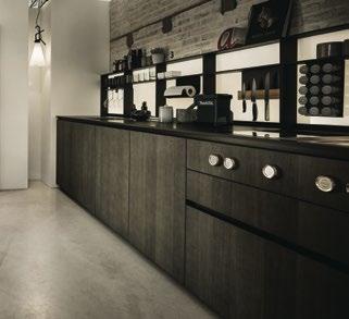
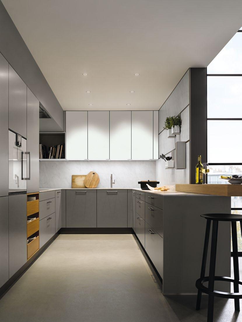
ALTBAUARCHITEKTUR NEU INTERPRETIERT. Die Verschmelzung von Kochen und Leben zu einem kultivierten Wohlfühlbereich erfordert eine durchdachte Planung. In deren Mittelpunkt steht die kubische Insel. Durch die zurückhaltende Farbgebung kann die rückwärtige Küchenzeile in Indischrot ausdrucksstarke Akzente setzen. Schließen sich die Türen des Pocketsystems, entsteht gemeinsam mit der Bibliothek im Ess- und dem Multifunktionsschrank im Eingangsbereich ein harmonisches Ensemble mit reichlich Stauraum.
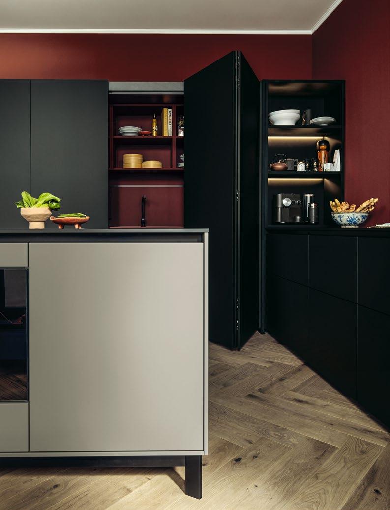
OLD ARCHITECTURE WITH A NEW TWIST. Merging cooking and living to create a sophisticated oasis of wellbeing requires thorough planning. At its heart stands the cubic island. Thanks to its muted colours, the kitchen units behind it in Indian red set a bold accent. When the doors of the pocket system are closed, the bookshelves in the dining area and the multifunctional unit in the hallway form a harmonious ensemble with stacks of storage space.
There is strength in calm
KOCHEN UND GENIESSEN. ARBEITEN UND ENTSPANNEN. Wer den essenziellen Dingen des Lebens einen einzigen, aber angemessenen Raum geben möchte, sollte Prioritäten setzen. Was eine klare Linie und Mut zur Reduktion erfordert. Die Belohnung: Eine offene und luftige Wohnatmosphäre, in der die Küche als zentrales und verbindendes Element fungiert. Ohne sich dabei in den Vordergrund zu drängen. Dafür sorgt die klare Formensprache der L-förmigen Planung und des puristisch gestalteten Küchenblocks. Die deckenhohen Schränke mit ihren grifflosen, samtmatten Lackfronten beherbergen dabei neben großzügigem Stauraum auch State-of-the-Art-Technologie wie N-Drive, durch das sich die Kühlschranktüre per einfachem Knopfdruck öffnen und schließen lässt. So stehen Funktion und Eleganz in harmonischem Einklang. Das spiegelt sich auch in Details wie der flächenbündigen Spüle, Innenschüben mit Glasfronten oder den vielseitigen Ausstattungsmöglichkeiten der Hochschränke im Eingangsbereich wider.
COOK AND ENJOY. WORK AND RELAX. Those who wish to give the essential things in life a suitable space of their own should set priorities. This requires a clear approach and the courage to declutter. The reward is an open, airy living environment with the kitchen as a central linking feature that blends into the background. This is ensured by the clear design language of the L-shaped layout and the purist design of the kitchen island. As well as plenty of storage space, the wall-to-ceiling units with their handleless matt velvet lacquer fronts also conceal state-of-the-art technology such as our N-drive, which opens and closes the refrigerator doors at the push of a button. This creates a harmony between functionality and elegance, which is also reflected in details like the flushmount sink, internal drawers with glass fronts and the versatile range of fittings in the tall units in the hallway.
DIE DETAILS
nx510
Samtmatt-Lackfront
L097M Muschelweiß samtmatt AFP
Systemo Arbeitsplatte und Umfeld
Q1330 Poblenou matt

THE DETAILS
nx510
Matt velvet lacquer front
L097M Seashell white matt velvet AFP
Systemo Worktop and surroundings
Q1330 Poblenou matt
Das Homeoffice macht Arbeit und Leben flexibler. Mit dem Pocketsystem wird beides perfekt. Wenn der Job erledigt ist, lässt sich die Front zuziehen und der Abend genießen. Büro? Für heute geschlossen.
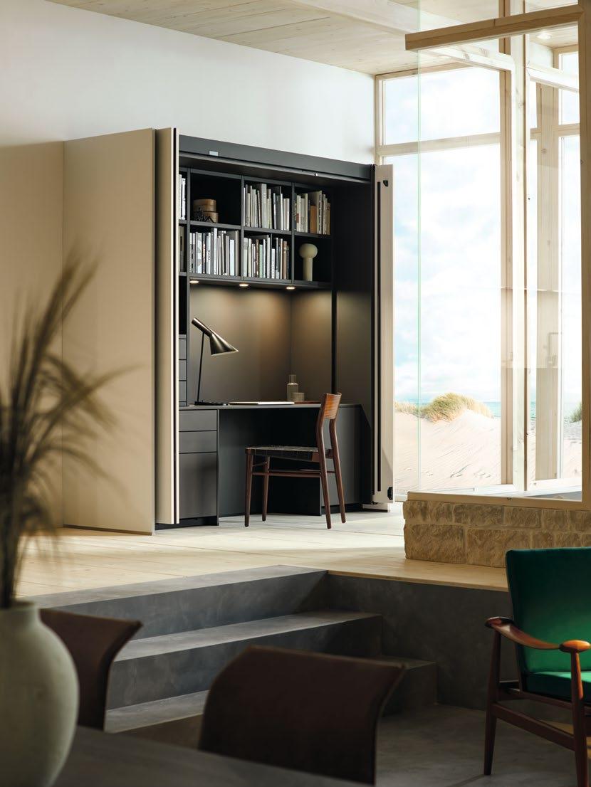
The home office makes work and life more flexible. The pocket system creates the perfect balance. When your work is done, you can just close the front and enjoy your evening. The office? It’s closed for the day.
DIE DETAILS
next 125 Pocketsystem
nx510
Samtmatt-Lackfront
L277M Achatgrau
samtmatt AFP
nx240
Schichtstoff-Front
SensiQ feinmatt AFP
K122F SensiQ kristallgrau feinmatt AFP
THE DETAILS
next 125 Pocket System
nx510
Matt velvet lacquer front
L277M Agate grey matt velvet AFP
nx240
Laminated front
SensiQ fine matt AFP
K122F SensiQ crystal grey fine matt AFP

Distinctive blend
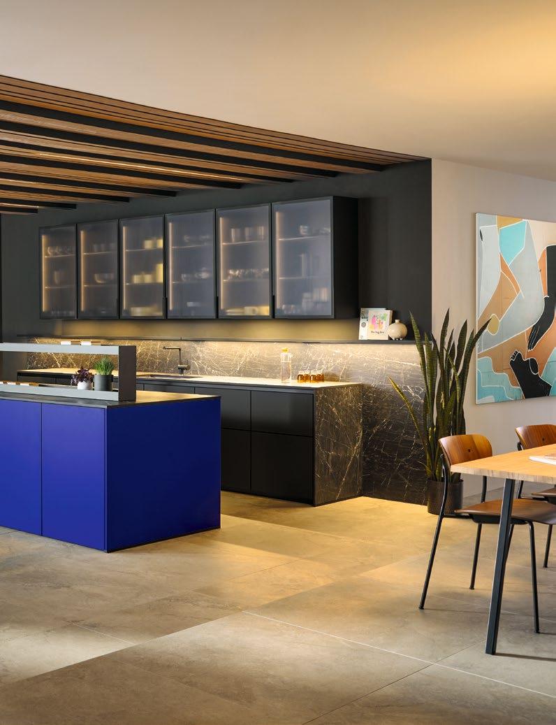
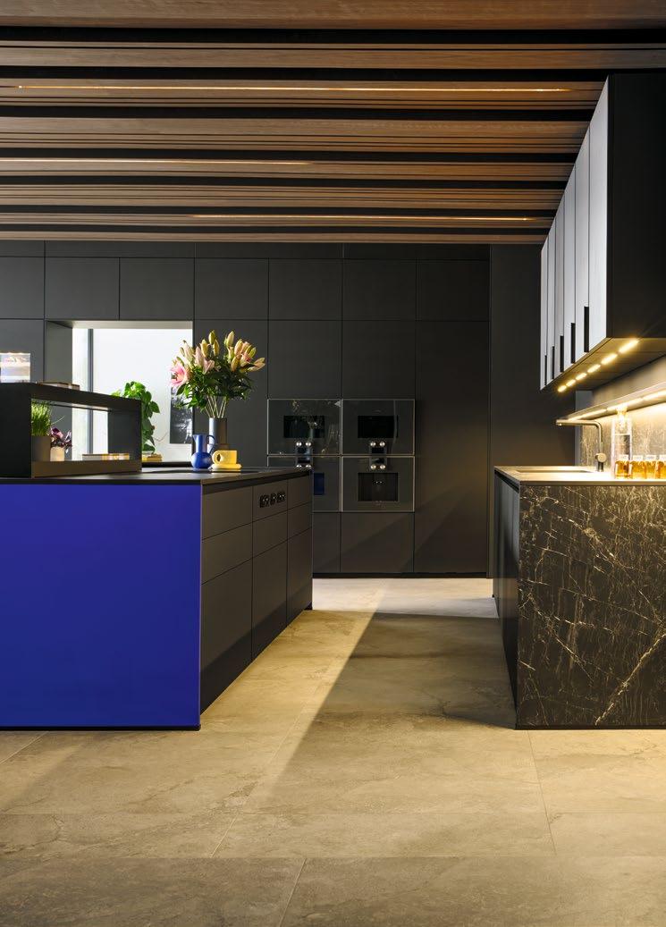
OBEN HOLZ. UNTEN BETON. DAZWISCHEN: ATEMBERAUBENDE KONTRASTE. Blickfang des Raumes ist die Insel in Ultramarin Blau, die dank der Frontverlängerung auf ihrem unsichtbaren Sockel schwebt. So entsteht eine Leichtigkeit, die der Ansetztisch auf seinem elegantem Fuß eindrucksvoll fortsetzt. Beide Systemo Arbeitsplatten sind in dunklem Ceramic Marmordekor gehalten. Auf der Insel bietet der Funktionsaufsatz zwei Etagen Platz für formschöne Einsätze, Steckdosen, Kräutertöpfe und somit schnellen Zugriff auf Gewürze und Utensilien. Wer Stauraum sucht, wird in der Hochschrankzeile fündig. Durch ihre deckenhohe Planung in Onyxschwarz bildet sie einen stilvollen Rahmen für Vorräte, Elektrogeräte – und das Tor zum Nebenraum. Über der hinteren Zeile prangen Wangenborde sowie elegante Vitrinenschränke mit Fronten in Linearglas feinstruktur, die durch ihre Innenbeleuchtung effektvoll in Szene gesetzt werden.
WOOD AT THE TOP. CONCRETE AT THE BOTTOM. BREATHTAKING CONTRASTS IN BETWEEN. The eye-catcher in the room is the island in ultramarine blue which, thanks to the longer fronts, appears to float on its invisible plinth. This creates a feeling of lightness which carries over to the impressive adjoining table on its elegant foot. Both Systemo worktops are finished with a dark ceramic marble decor. On the island, the practical storage rack provides two shelves for aesthetically pleasing inserts, power outlets and herb pots, allowing quick access to seasonings and utensils. If you’re looking for storage space, you’ll find it in the row of tall units. Their floor-to-ceiling onyx black design creates a stylish home for supplies and electrical appliances, and frames the doorway into the adjacent room. Resplendent above the base units on the back wall are support panel shelves and elegant glass display units with fronts made of fine-textured reeded glass, effectively showcased by their interior lighting.
DIE DETAILS
nx510
Samtmatt-Lackfront L527M Ultramarin samtmatt AFP
nx870
Vollkernfront SensiQ feinmatt AFP, Rahmen onyxschwarz V187F SensiQ onyxschwarz feinmatt AFP
Systemo Arbeitsplatte und Umfeld
C2830 Marmor Nox Nachbildung


THE DETAILS
nx510
Matt velvet lacquer front
L527M Ultramarine matt velvet AFP
nx870
Solid core front SensiQ fine matt AFP, frame onyx black V187 SensiQ onyx black fine matt AFP
Systemo Worktop and surroundings
C2830 Marble nox effect
RUNDER ANSATZ
Allein oder in Gesellschaft. Frühstück oder Dinner. Kaffee oder Wein. Der neue Ansetztisch macht die Kochinsel zur individuellen Genussoase. Insbesondere, weil er in unterschiedlichen Höhen-, Standfuß-, und Trägerplattenvarianten geplant werden kann.
Alone or in company. Breakfast or dinner. Coffee or wine. The new adjoining table makes the kitchen island a unique oasis of wellbeing. All the more so, because it is available in different heights with a range of feet and tabletops to choose from.
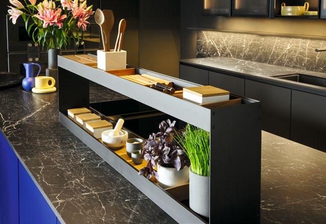
Wer gut und gerne genießt, macht das auch mit dem Auge. Also sind die integrierten Weinkühler ausgesprochen formschön gerahmt.
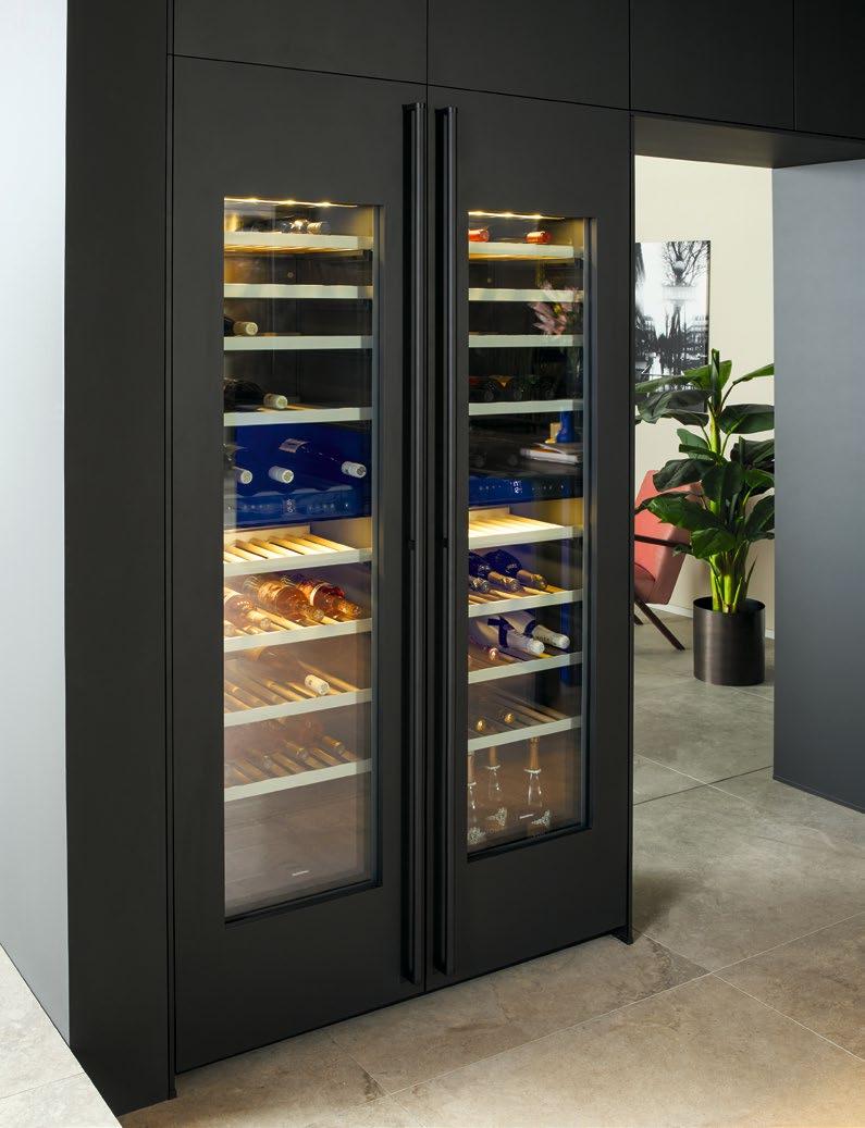
Those who know what tastes good, know what looks good too. With that in mind, this built-in wine cooler is beautifully framed.
Out of the blue
NISCHEN. BÖGEN. RECHTE WINKEL. Außergewöhnliche Raumsituationen erfordern anspruchsvolle Lösungen. Gut also, wenn sich die Küche perfekt in den fließenden Charakter des Grundrisses einfügt. Dabei wirkt die Kochzeile durch ihre azurblaue Farbgebung wie ein Ruhepol – wird aber dennoch auf erfrischende Weise betont. Hinter dem klaren Fugenbild der samtmatten Fronten verbirgt sich ein großzügiges Platzangebot für alles, was das Küchenherz begehrt. Öle, Gewürze, Messer & Co. finden dagegen in dem formschönen Trolley ein mobiles Zuhause. Für die stilgerechte Präsentation von dekorativen Objekten wurde in der angrenzenden Nische Raum für eine Vorratskammer in korrespondierendem Terragrau geschaffen. Diese lässt durch den eleganten Mix von deckenhohen Schränken, Schüben, Regalen und effektvoller Beleuchtung keine Wünsche offen. Weinliebhaber dürfen sich besonders freuen: Der integrierte Weinkühlschrank setzt edle Tropfen gekonnt in Szene.
RECESSES. ARCHES. RIGHT ANGLES. Unusual situations require ambitious solutions, so it’s great when the kitchen fits in perfectly with the features of the room. Thanks to their azure blue colouring, the kitchen units create a haven of tranquillity whilst setting a refreshing accent. There is plenty of room for everything that the heart of the kitchen might desire behind the clean lines of the matt velvet fronts. On the contrary, oils, spices, knives and the like find their mobile home in the elegant trolley. To stylishly showcase decorative objects, a space has been created in the adjacent recess for a larder in the perfectly coordinating terra grey. The sophisticated mix of floor-to-ceiling units, drawers, shelving and sensational lighting leaves nothing to be desired. Wine lovers also have something to rejoice about: the built-in wine cooler tastefully showcases prized collections.
DIE DETAILS
nx510
Samtmatt-Lackfrontt
L417M Azurblau samtmatt AFP
L262M Terragrau samtmatt AFP
Systemo Arbeitsplatte und Umfeld
K417F SensiQ azurblau feinmatt AFP
K262F SensiQ terragrau feinmatt AFP


THE DETAILS
nx510
Matt velvet lacquer front
L417M Azure blue matt velvet AFP
L262M Terra grey matt velvet AFP Systemo Worktop and surroundings
K417F SensiQ azure blue fine matt AFP
K262F SensiQ terra grey fine matt AFP
Küche 2.0: In dieser Nische wird der Bogen zwischen Präzision, Funktion, Technologie, Effizienz und Emotion perfekt gespannt. So macht man aus Stauraum Wow-Raum.
Kitchen 2.0: This recess with its arch perfectly unites precision, function, technology, efficiency and emotion, making the storeroom an impossible-to-ignore room.
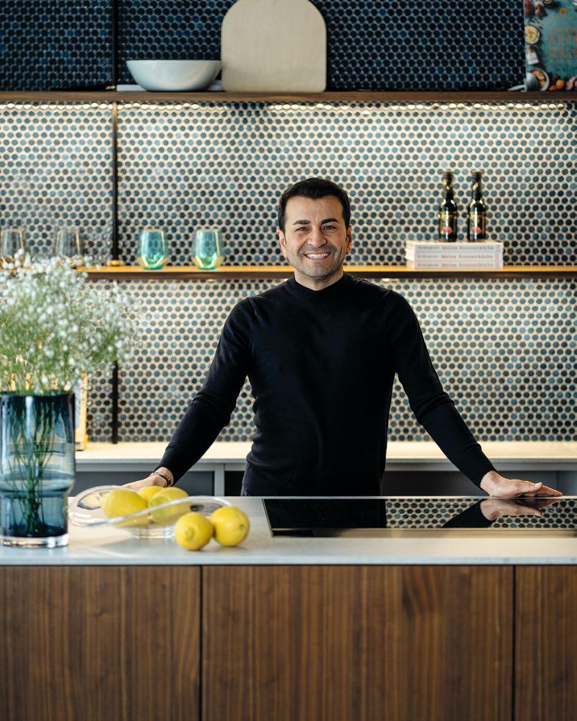
ER AGIERT MIT HERZENSWÄRME, Leidenschaft und doch hoch konzentriert und kreativ. Diese Philosophie möchte Sternekoch Ali Güngörmüş auch in seiner Münchener Kochschule vermitteln. So entstand eine Küche, die nicht nur eine ideale Bühne für ihn und seine außergewöhnlichen Kreationen darstellt, sondern durch eine gemütliche, wohnliche Atmosphäre auch zum gemeinsamen Kochen einlädt.
Das Material
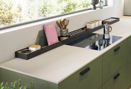
SPEZIELLER CHARME UND BEHAGLICHE WÄRME . Das Naturmaterial Holz besticht darüber hinaus mit hoher Beständigkeit und findet sich in Küchenfronten, Holzlamellen an der Wand sowie im Essbereich wieder. Im Kontrast dazu steht die helle, naturstein-ähnliche Arbeitsplatte aus robustem Systemo-Material in Quarzit Grau. Blaue, orientalisch gemusterte Fliesen und runde Mosaik-Kacheln sorgen an der Nischenrückwand für eine spannende Haptik. Zudem erzeugen in die Regalböden eingearbeitete LED-Streifen ein atmosphärisches, indirektes Licht in der next125 Küche.
Die Besonderheiten
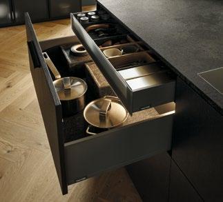
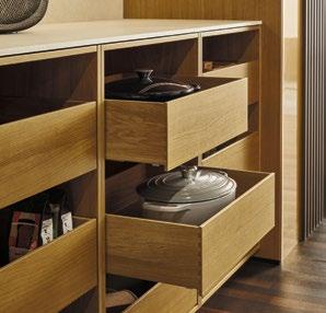
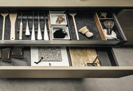
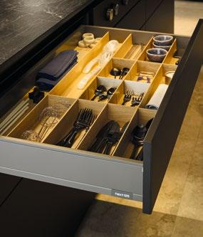
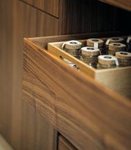
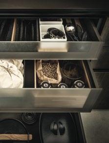
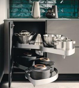
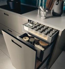
ERGONOMIE UND PRAKTIKABILITÄT sind Ali Güngörmüş sehr wichtig. Schließlich hält er sich als Sternekoch lange und gerne in der Küche auf. Damit es seinen Kochschülern genauso geht, haben Arbeitsfläche und Wandregale eine angenehme Höhe. Im Zusammenspiel mit den Englischen Auszügen, den grifflosen Fronten mit Tip-On Türöffnung, und der Anordnung des Backofens werden alle Arbeitsabläufe erheblich vereinfacht. Auch, weil die Innen auszüge mit Flex-Boxen ausgestattet sind, die sich perfekt für die Organisation von Kleinteilen eignen.
Die Backup-Küche
WO GEMEINSAM GEKOCHT WIRD, braucht es vor allem eines: Platz. Die Backup-Küche mit offenen und geschlossenen Elementen ist die perfekte Lösung für die Vorbereitung und Aufbewahrung der Utensilien und Lebensmittel. Im Gegensatz zur Kücheninsel der Hauptküche, sind Arbeitsplatte und Fronten hier einheitlich und puristisch gehalten: Die feinmatte, steingraue SensiQ-Oberfläche von Systemo sorgt für ein zeitloses und makelloses Erscheinungsbild, das dank einer innovativen Anti-Fingerprint-Eigenschaft auch bei viel Betrieb in der Kochschule erhalten bleibt.
AS SOMEONE WHO IS WARMHEARTED and passionate but at the same time highly focused and creative, Ali Güngörmüş also wanted to convey these attributes in his cookery school in Munich. The result is a kitchen that not only provides the ideal stage for the chef and his extraordinary creations but also has a cosy, homely atmosphere that invites people to cook together.
SPECIAL CHARM AND AN ENVELOPING WARMTH. Wood, a natural material that also boasts excellent durability, is featured on the kitchen fronts, in the slats on the wall and in the dining area. It contrasts with the light, natural-stone-effect worktop made of robust Systemo materials in quartzite grey. Blue, oriental patterned tiles and round mosaic tiles give the recessed back wall a special feel. And the LED strips incorporated into the shelves add indirect ambient lighting to this next125 kitchen.
ERGONOMICS AND PRACTICALITY are very important to Ali Güngörmüş. After all, as a star chef, he spends long hours in the kitchen and enjoys it. To ensure that his cookery students feel the same way, worktops and wall shelving are installed at a comfortable height. In conjunction with the English pull-outs, the handleless fronts with Tip-On opening, and the placement of the oven, all work processes are made considerably easier. Another reason for this are the Flex boxes inside the internal pull-outs, which are perfect for organising small objects.
WHERE PEOPLE COOK TOGETHER, one thing is required above all else: space. The backup kitchen with both open and closed units is the perfect solution for utensil storage and food preparation. Contrary to the island in the main kitchen, the worktops and fronts here have a uniform, minimalist appearance: the fine matt, stone grey SensiQ surface by Systemo has a timeless look that remains flawless thanks to its innovative anti-fingerprint properties, even when things get busy at the cookery school.
Mit dem Produkt muss ich eins sein, und dann fühl‘ ich mich wohl.
I must be at one with the product, and then I feel at home.
Ali Güngörmüş


DIE DETAILS
nx640
Holzfront
F646 Eiche elegant graphitgrau
nx510
Samtmatt-Lackfront
L142M Kobaltgrün
samtmatt AFP
Systemo
Arbeitsplatte
K187F SensiQ onyxschwarz feinmatt AFP
THE DETAILS
nx640 Wood front
F646 Elegant oak graphite grey
nx510
Matt velvet lacquer front
L142M Cobalt green matt velvet AFP
Systemo
Worktop
K187F SensiQ onyx black fine matt AFP
Reduziert auf das Maximum
STEIN. HOLZ. KERAMIK. LACK. Wundervolle Werkstoffe, die in einem kleinen Loft großes Kochhandwerk möglich machen. Manifestiert in einer Zeile, die Funktion, Leidenschaft und anspruchsvolle Ausstattung perfekt vereint; optimal organisiert durch das darüber platzierte Nischenregal Frame.
STONE. WOOD. CERAMIC. LACQUER. Wonderful materials that make great culinary craftsmanship possible in a compact loft. Functionality, passion and upmarket fittings are perfectly combined in a row of units, optimally organised thanks to the Frame recess shelving above it.


DIE DETAILS
nx912
Glasfront matt, Rahmen onyxschwarz
G277 Glas matt
achatgrau
nx510
Samtmatt-Lackfront
L407M Cognac samtmatt AFP
Systemo
Arbeitsplatte
G277A Glas matt achatgrau AS
THE DETAILS
nx912
Glass front matt, frame onyx black
G277 Glass matt agate grey
nx510
Matt velvet lacquer front
L407M Cognac matt velvet AFP
Systemo
Worktop
G277A Glass matt agate grey AS
RUHIGE UND KRÄFTIGE FARBEN. OFFENE UND GESCHLOSSENE FLÄCHEN. Die Küchenplanung spielt gekonnt mit Kontrasten und gibt dem offenen, luftigen Raum einen gleichermaßen außergewöhnlichen wie wohnlichen Charakter: Der behagliche Gaskamin bildet die ideale Verbindung zwischen offenem Bücherregal und grifflosen, extrahohen Hochschränken in Glas matt achatgrau. Letztere kombinieren Stauraum bis unter die Decke mit ergonomisch eingebauten Geräten für komfortables Kochen. Um die Ecke steht in den mit Flex-Boxen aus Eiche und Formvlies ausgestatteten Schüben und Auszügen der Unterschränke weiterer durchdacht organisierter Platz zur Ver fügung. Die Fronten mit fein gefrästen Griffmulden werden von der Systemo Arbeitsplatte aus Glas äußerst filigran abgeschlossen. Darüber bilden die petrolfarbene Wandfließen und der Hängeschrank in Cognac samtmatt zauberhaft-spannende Gegenpole.
MUTED AND BOLD COLOURS. OPEN AND CLOSED SPACES. This kitchen design plays skilfully with contrasts and gives the open, airy room a unique yet homely character. The cosy gas fireplace creates an ideal link between the open bookshelf and the handleless, extrahigh tall units in glass matt agate grey. The latter combine floor-to-ceiling storage space with built-in appliances, taking into account ergonomics to ensure comfort when cooking. Round the corner, drawers and pull-outs in the base units equipped with oak and moulded non-woven material Flex boxes provide even more well-thought-out storage space. A glass Systemo worktop provides an extremely intricate finish to the fronts with their finely milled grip ledges. Above it, the petrol-coloured wall tiles and the wall unit in cognac matt velvet create a magical contrast.

nx510 – nx960
MIT LIEBE KOCHEN. MIT LEICHTIGKEIT LEBEN. Ein perfekter Plan – mit Geschmack und Finesse umgesetzt. Die Fronten aus Ceramik Struktur sand erinnern haptisch an handgeschöpftes Papier und verleihen der Küche eine zurückhaltend aufgeräumte Note. Insbesondere, weil das deckenhoch mit Schränken überbaute Pocketsystem die Küchenzeile verbirgt. Diese setzt mit ihren fingerabdruckresistenten Samtmatt-Lackfronten in Aubergine einen faszinierenden Akzent, der eine stilvolle Verbindung zum Sideboard schafft. Dazwischen sorgt das durch indirekte Beleuchtung elegant in Szene gesetzte Nischenregal für einen formvollenden Mix aus Funktion und Design, den der ikonische Kochtisch elegant fortsetzt. Dieser zeigt, dass sich seine besondere Ästhetik auch mit Wandkontakt entfalten kann. Beine und Unterschrank orientieren sich am Holzton des Wangenregals, was den einzigartig wohnlichen Charakter des Raumes unterstreicht.
COOK LOVINGLY. LIVE LIGHTLY. A perfect plan implemented with taste and finesse. The fronts made of sand-textured ceramic are reminiscent of handmade paper to the touch and give the kitchen a tidy, understated look. This is further emphasised by the floor-to-ceiling pocket system that conceals the kitchenette and is crowned by a row of wall units. The aubergine fingerprint-resistant matt velvet lacquer fronts of the kitchenette set a fascinating accent that creates a stylish link to the sideboard. Between the units, the recess shelving is elegantly showcased by indirect lighting, achieving a perfect blend of functionality and design that is stylishly complemented by the iconic cooking table. Its distinctive design makes it look great even when placed next to the wall. The colour of the legs and base unit matches the wood of the support panel open shelf unit. This emphasises the unique, homely character of the room.
DIE DETAILS
nx510
Samtmatt-Lackfront
L547M Aubergine samtmatt AFP
nx960
Ceramicfront, Rahmen onyxschwarz C2795 Ceramic Struktur sand Systemo Arbeitsplatte und Umfeld C2790 Sand

THE DETAILS
nx510 Matt velvet lacquer front
L547M Aubergine matt velvet AFP
nx960
Ceramic front, frame onyx black C2795 Ceramic structured sand Systemo
Worktop and surroundings C2790 Sand

ANSTOSS ZUR FREIHEIT
Es muss nicht immer Insel sein. Der next125 Kochtisch bricht mit klassischen Konventionen in der Küche und kann durch viel Flexibilität in der Planung Leichtigkeit in jeder Raumsituation schaffen – auch mit direktem Wandkontakt.
It doesn’t have to be an island. The next125 cooking table breaks away from classic conventions in the kitchen and, thanks to flexible planning options, can create a feeling of lightness in any room – even when in direct contact with the wall.
FLIESSENDER ÜBERGANG
Harmonische Verbindung statt strikter räumlicher Trennung: Das next125 Wangenregal wirkt wie ein großzügiger Setzkasten für schöne Dinge, die dem Leben zu Hause eine ganz persönliche Note verleihen.
A harmonious link rather than strict separation of rooms: The next125 support panel open shelf unit acts as a spacious display case for beautiful objects that add a personal touch to the home.
DIE DETAILS
nx510
Samtmatt-Lackfront
L277M Achatgrau
samtmatt AFP
L092M Kristallweiß
samtmatt AFP
Systemo
Arbeitsplatte und Umfeld
C2750 Marmor bianco Nachbildung
THE DETAILS
nx510
Matt velvet lacquer front
L277M Agate grey matt velvet AFP
L092M Crystal white matt velvet AFP
Systemo
Worktop and surroundings
C2750 Marble bianco effect


Let there be light
GERADLINIGKEIT IN DER GESTALTUNG. FREIHEIT BEIM KOCHEN. Besondere Ansprüche erfordern außergewöhnliche Ideen für die Umsetzung. Gut, wenn man dabei wahrhaftig „aus dem Vollen schöpfen“ kann. So setzt die grifflose Holzfront Eiche elegant bianco hell mit ihrer vertikalen Rillenstruktur haptisch wie optisch markante Akzente – und fasziniert im Spiel mit dem Lichteinfall im Raum. Das moderne Holzdesign wird durch die klassische, schwarz-braun geäderte Marmoroptik der Systemo Arbeitsplatte aus robustem und pflegleichten Ceramic umlaufen. Um diese Spannung aufrecht zu erhalten, findet sich dasselbe Material auch in den Nischen und der als kommunikativer Abschluss der Küche gedachten Insel wieder. Da trifft es sich gut, dass Gläser zum Anstoßen sowie Kräuter und Gewürze zum gemeinsamen Kochen im effektvoll beleuchteten Frame Regal griffbereit hängen und stehen.
A DESIGN WITH STRAIGHT LINES. FLEXIBILITY IN THE KITCHEN. Special aspirations require exceptional ideas to bring them to life. It’s great when you can truly draw on unlimited resources to do that. This handleless front in elegant light oak bianco with its vertical grooves provides a distinctive look and feel, fascinating onlookers as it plays on the natural light in the room. The modern wood design is surrounded by the classic, black and brown veined marble finish of the Systemo worktop made of robust, easy-to-clean ceramic. To maintain this spectacular effect throughout, the same material is also used in the recesses and on the island intended to mark the boundaries of the kitchen. In the beautifully lit Frame shelving, glasses are conveniently on hand to make a toast, and herbs and spices stand by to go into joint culinary creations.
DIE DETAILS
nx670
Holzfront mit vertikalen Rillen F628 Eiche elegant bianco hell
Systemo Arbeitsplatte und Umfeld
C2260 Marmor Dolomiti Nachbildung
THE DETAILS
nx670
Wood front with vertical grooving F628 Elegant light oak bianco
Systemo Worktop and surroundings
C2260 Marble Dolomiti effect

An ensemble with a hint of spice
FARBE. FORM. UND FUNKTIONALITÄT. Elemente, die in jeder anspruchsvollen Küche vereint sind, werden hier zum Erlebnis. Dabei stimuliert die Kombination aus Indischrot, Kobaltgrün und Olivgelb nicht die nur das Auge, sondern auch den Orientierungssinn. Jeder Ton definiert einen anderen Funktionsbereich des Ensembles. Die elegant auf ihrem filigranen Alu-Systemgestell schwebende Zeile hält hinter ihren mit minimalistischen Griffschalen ausgestatteten Unterschrankfronten viel Stauraum bereit. Unter der Spüle verbirgt sich ein Wasseraufbereitungssystem, während das gute Besteck in den Flex-Boxen aus weichem Formvlies bestens aufgehoben ist. Andere formschöne und praktische Objekte finden im gleichfarbigen Wandregal mit Schiebetür Platz. Gegenüber der Zeile findet sich die Insel auf den gleichen Füßen und in derselben Breite. Das unterstreicht den kubisch-reduzierten Look und macht die Neuinterpretation des Bauhausgedankens in der Küche perfekt.
COLOUR. FORM. AND FUNCTION. Features that are combined in every upmarket kitchen become tangible here. The combination of Indian red, cobalt green and olive green is not just an eye-opener but also awakens our sense of direction. Each colour defines a different functional area of the ensemble. The base units elegantly hovering on their slender aluminium system frame provide plenty of storage space behind their fronts fitted with minimalist recessed handles. Beneath the sink, a water treatment system is concealed, whilst the good cutlery is perfectly stowed away in Flex boxes made of soft moulded non-woven material. Other objects, both ornamental and practical, find their home in the matching wall shelving with its sliding door. Opposite the row of units, the island stands on feet in the same style and width. This underlines the cubic, minimalist look and makes this new twist influenced by Bauhaus the perfect addition to the kitchen.
DIE DETAILS
nx510
Samtmatt-Lackfront
L292M Indischrot samtmatt AFP
L142M Kobaltgrün samtmatt AFP
L397M Olivgelb samtmatt AFP
Systemo
Arbeitsplatte
K292F SensiQ indischrot feinmatt AFP
K142F SensiQ kobaltgrün feinmatt AFP


THE DETAILS
nx510
Matt velvet lacquer front
L292M Indian red matt velvet AFP
L142M Cobalt green matt velvet AFP
L397M Olive yellow matt velvet AFP
Systemo
Worktop
K292F SensiQ Indian red fine matt AFP
K142F SensiQ cobalt green fine matt AFP
Auf dem Weg: Unsere Verantwortung, unsere Zukunft
On the Way: Our commitment, our future
Als Familienunternehmen leben wir unser Bekenntnis zur Nachhaltigkeit: In unserem Engagement, in unseren Produkten und in Fertigung und Logistik verfolgen wir eine ganzheitliche Herangehensweise.
In our family driven company we are fully committed to sustainability: Whether our personal engagement, our products or our approach to manufacturing and logistics we always pursue a holistic strategy.
Markus Schüller – CEO
Eine nachhaltige und planvolle Strategie: Grundlage unseres Erfolgs
ALS VERANTWORTUNGSVOLL AGIERENDES UNTERNEHMEN setzen wir mit konkreten Maßnahmen ein greifbares Statement: Restholz wird wo möglich recycelt und zu neuen Holzwerkstoffplatten verarbeitet oder dient zur Gewinnung der Heizenergie. Die Stromgewinnung erfolgt durch Photovoltaik. Ein weiterer Schwerpunkt liegt auf der Verwendung nachhaltiger Materialien und Produkte. Nicht zuletzt umfasst unser Bewusstsein auch Verpackung, Logistik und den Aspekt der Kreislaufwirtschaft.
DIESES ENGAGEMENT FINDET IN VERSCHIEDENEN SIEGELN UND ZERTIFIZIERUNGEN SEINEN AUSDRUCK . So können Sie sicher sein, dass der Nachhaltigkeitsgedanke konsequent in die Tat umgesetzt wird.
A sustainable, methodical strategy: The basis of our success
AS A RESPONSIBLE COMPANY, we are making this statement a reality through concrete measures: Scrap wood is recycled where possible and transformed into new wood panels or used to generate heating energy. Electricity is generated by a solar panel system. The use of sustainable materials and products is another key point. Last but not least, our awareness extends to packaging, logistics and the circular economy.
THIS COMMITMENT IS REFLECTED IN OUR MANY SEALS AND CERTIFICATIONS . So you can be confident that our sustainability concepts are consistently put into practice.
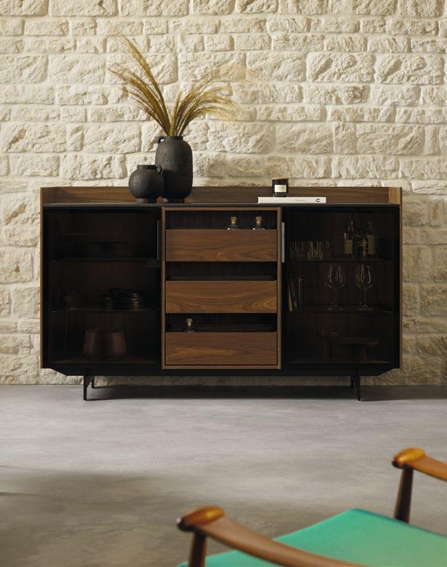
Form und Funktion
Form and function
next125 steht für zeitlose, elegante und ikonische Küchen und Möbel, nachhaltig in Gestaltung und Materialität. Für kreative Menschen mit Sinn für das Besondere in Design und Qualität: Echt und ursprünglich. Präzise und emotional.
next125 stands for timeless, elegant, iconic kitchens and furniture with lasting designs and materials. For creative individuals with an eye for special design and quality: authentic and original. Precise and emotional.
Thomas Pfister – Head of Design, next125
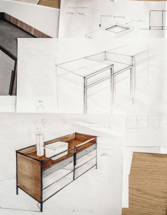

Präzise und emotional
Thomas Pfister skizziert Form, Proportionen und Materialien des next125 Sideboards.
Precise and emotional
Thomas Pfister sketches the shape, proportions and materials of the next125 sideboard.
The industrial evolution
Sinnvoll und sinnlich.
In der Form.
In Material, Funktion und Gebrauch. Kreativ, innovativ und überraschend anders. Reduziert, essentiell und zeitlos elegant. Inspiriert vom Bauhaus. Gestaltet und gefertigt in Deutschland.
Das Wesen macht die Persönlichkeit. Der Fokus auf das Wesentliche macht next125 authentisch.
ANFANGS HABEN SIE AN ANDERE GEDACHT. Haben angefertigt, was der Markt von einer aufstrebenden Schreinerei eben verlangt. Doch irgendwann war das Verlangen größer, als nur Küchenbuffets in Lizenz herzustellen, oder später Einbauküchen. Sie hatten einen Traum, hier in Herrieden, das nicht gerade als Epizentrum der Küchenindustrie gilt. Gut, Palo Alto sieht man auch nicht an, dass dort an der Zukunft des Internets gearbeitet wird – und so machten sie sich in der fränkischen Kleinstadt daran, das nächste große Ding zu entwerfen.
Der nächste Schritt
EINE KÜCHE, BEZEICHNENDERWEISE NEXT 125 GENANNT, WOBEI DIE ZAHLEN FÜR DAS METRISCHE RASTERMASS VON 125 MILLIMETERN STEHEN. Eine Rasterküche also, mit der Schüller sein Terrain um Premium erweiterte und damit in der Branche ein mittleres Beben auslöste. Weil next 125 eine nie gekannte Vielfalt in der Planung von Korpushöhen, -tiefen und -breiten ermöglicht, dazu eine reiche Auswahl authentischer Materialien. Das alles geformt zu hochfunktionalen und dabei ansprechenden Küchen, ergänzt um stilvolle Möbel, mit denen nicht zuletzt die Entgrenzung der Küche und ihre Einbeziehung in den Wohnbereich vorangetrieben wird. So erscheint mit der Marke next 125 der Raum, in dem das Herz der eigenen vier Wände schlägt, plötzlich in einem völlig neuen Licht. „Wobei
Sensible and sensual.
In terms of form, materials, function and use. Creative, innovative and surprisingly different. Minimalist, essential and timelessly elegant. Inspired by the Bauhaus. Designed and manufactured in Germany.
The essentials are what personality is made of. The focus on the essentials is what makes next125 authentic.
AT FIRST, THEY FOCUSED ON INDIVIDUAL REQUESTS. They manufactured exactly what the market expected from an aspiring joiner’s workshop. But eventually they wanted to do more than just produce kitchen sideboards, and later fitted kitchens, under licence. They had a dream, here in Herrieden, which wasn’t exactly the epicentre of the kitchen industry. Then again, Palo Alto doesn’t look like the kind of place that would be shaping the future of the internet – and so they set about developing the next big thing in the small Franconian town.
The next step
A KITCHEN, EMBLEMATICALLY NAMED NEXT125, WHERE THE NUMBER STANDS FOR THE METRIC GRID SIZE OF 125 MILLIMETRES. A grid system with which Schüller expanded his territory to premium kitchens and shook up the industry, as next125 offers unprecedented versatility when designing carcase heights, depths and widths, as well as a wide selection of authentic materials. Everything came together to create a highly functional, emotionally charged collection of kitchens, complemented by stylish furniture, which ultimately drives the dissolution of the kitchen boundaries and its integration into the living area. And with it, the young next125 brand suddenly showed the beating heart of the home in a completely new light. “At first we never talked about a brand,” says
wir zunächst nie von einer Marke gesprochen haben“, sagt Markus Schüller, der Geschäftsführer, „sondern nur von Premium, von einem anderen Marktsegment, anderen Handelsstrukturen und anderen Zielgruppen.“ Und Thomas Pfister, Head of Design, ergänzt: „Gesetzt war nur die Rasterlogik.“ Die Küche sollte sich gut im Raum integrieren und kombi nieren lassen und technisch ganz vorne mitspielen. „Mit der Vorgabe, formvollendete Unikate in Serie fertigen zu können.“
Form follows function
DIE FORM UNSERER KÜCHEN UND MÖBEL FOLGT IHRER FUNKTION. Es ist eine nutzwertige Funktion, immer am Leben der Menschen orientiert. Ziel ist das Streben nach einer funktionalen Ästhetik, die die Küche zu einem langlebigen Gebrauchsgut macht, mit dem man sich täglich gerne umgibt. Alles, was eine next 125 auszeichnet, folgt einer klaren Linie: die Reduktion aufs Wesentliche, eine zeitlose Gestaltung, die wir von ihrer Produzierbarkeit her denken und die untrennbar mit der Emotion des Authentischen verbunden ist. So treiben wir, ganz im Geiste des Bauhaus, die Demokratisierung des Designs voran.
DASS MAN DEN MARKT FERNAB DER GROSSSTADT VON HINTEN AUFROLLT, entpuppt sich dabei als Standortvorteil. Im Weinbau spricht man von autochthon, also Rebsorten, die unabhängig von äußeren Einflüssen in ihrem eigenen Terroir – und nur dort – gedeihen, sich dort in Ruhe entwickeln dürfen. Gepaart mit der Leidenschaft, etwas nachhaltig auf- und auszubauen, führt das letztlich zu eigenständigen Produkten – zumal ein reiferer Wein besser schmeckt. Die Rückbesinnung auf die eigenen Werte war ein weiterer Glücksfall. Das Authentische, diese Bodenhaftung, und trotzdem offen im Denken und Tun, zeichnet den Menschenschlag hier aus. Über 2.300 Mitarbeitende bauen rund 170.000 Küchen im Jahr, ein Drittel davon für den internationalen Markt. „Wir sind ein bisschen gewachsen – und uns dabei treu geblieben“, sagen sie hier. „Ohne angegliederte Zulieferer haben wir sehr viel in die Wertschöpfung des eigenen Unternehmens gesteckt“, sagt Markus Schüller. Das führe zu einer hohen Fertigungstiefe. Fast alles werde vor Ort gesteuert und produziert. Auch ein ausgeprägter Sinn für Kreativität konnte sich so, weit weg vom Wettbewerb, entwickeln.
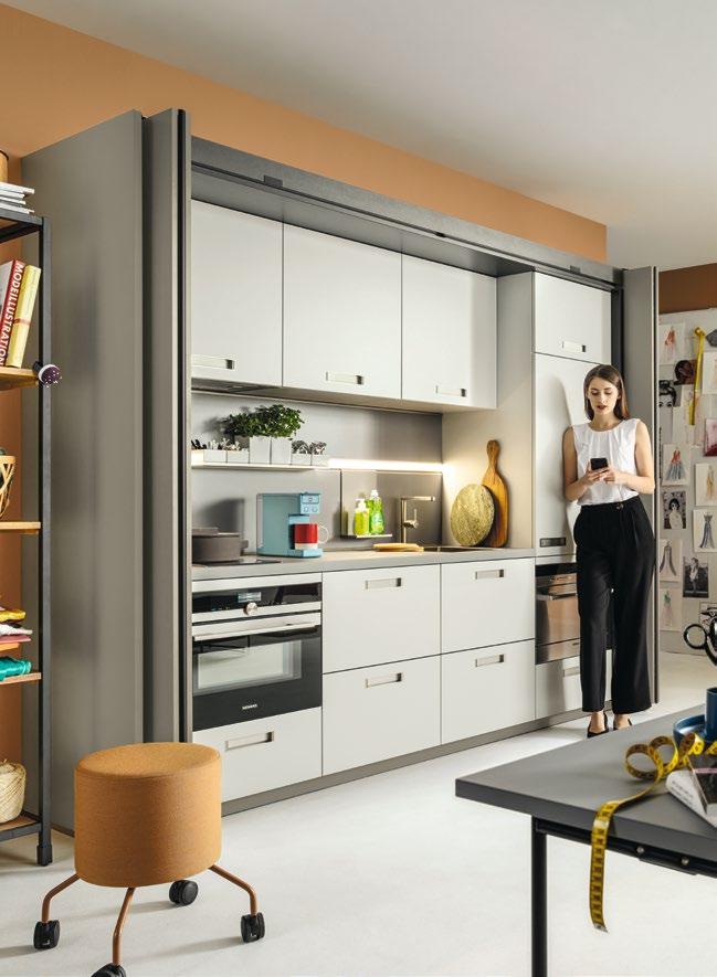
MIT DEM ERFOLG KAM DAS MARKENBEWUSSTSEIN, DAS „MARKENSELBSTBEWUSSTSEIN“, WIE THOMAS PFISTER ES NENNT. Geblieben ist der Blick auf next 125, das kein elitäres Anschauungsobjekt sei, sondern sich immer an seinem Wert als Gebrauchsgut messen lassen müsse. „Aktuell“, so Marketingleiterin Annette Schumacher, „bespielen wir unser Pocketsystem als Homeoffice-Lösung.“ Das allein zeige die Nutzungsflexibilität unserer Küchen. Allgemein gesprochen geht es um eine gute Balance zwischen dem künstlerischen Entwurf und der technischen Machbarkeit. Eine Synthese, die next 125 von der Bauhaus-Schule entlehnt hat. „Im Grunde treiben wir mit unserer Küche die Demokratisierung des Designs voran“, resümiert Annette Schumacher.
next125 Magazin
Entdecken Sie inspirierende Stories, Trends und Hintergründe, neue Küchen und Insights aus der Praxis.
CEO Markus Schüller. “We only talked about premium kitchens, a different market segment, different commercial structures and different target audiences.” Thomas Pfister, Head of Design, adds, “The grid system was the only thing set in stone.” The kitchen had to integrate well into the space, combine well with other features and be at the forefront of technology. “And we had to be able to mass-produce perfectly designed, one-of-a-kind pieces.”
THE SHAPE AND FORM OF OUR KITCHENS AND FURNITURE ARE DESIGNED WITH FUNCTION IN MIND – and their function is to serve people in their daily lives. The goal is to achieve a functional aesthetic that makes the kitchen a durable commodity that people enjoy being surrounded by every day. Everything that sets a next125 piece apart follows a clear line: reduction to the essentials and a timeless design that is based on producibility and inextricably linked to the emotion of authenticity. In this way, we’re adhering to the Bauhaus philosophy and continuing to promote the democratisation of design.
THE FACT THAT NEXT125 IS REVOLUTIONISING THE MARKET FAR AWAY FROM THE BIG CITY has turned out to be a major advantage. In viticulture, people talk about native grape varieties flourishing in their own terroir – and only there – as they are able to grow in peace, unaffected by external influences. Paired with a passion for building and developing something sustainable, this ultimately leads to independent products – after all, wine tastes better with age. Returning to their own values was another stroke of luck. That down-to-earth, yet open-minded authenticity in everything they think and do is what sets the people at next125 apart. Over 2,300 employees build around 170,000 kitchens a year, a third of which is for the international market. “We have grown quite a bit – but we’ve stayed true to ourselves,” they say. “We’ve invested a lot into bringing added-value to our own company without affiliated suppliers,” says Markus Schüller. That has resulted in a high level of vertical integration. Nearly everything is managed and produced on site, and so a strong sense of creativity could develop, far away from the competition.
WITH SUCCESS CAME BRAND AWARENESS, OR “BRAND SELF-AWARENESS” AS THOMAS PFISTER PUTS IT. But the vision for next125 has stayed the same; it’s not an elite showpiece, rather it should always be measured by its value as a commodity. “Today,” says Head of Marketing Annette Schumacher, “we are designing our pocket system as a home office solution.” That alone shows the flexibility of use of our kitchens. Generally speaking, it’s about getting a good balance between artistic design and technical feasibility. It’s a fusion that next125 has borrowed from the Bauhaus school of art. “We are essentially promoting the democratisation of design with our kitchens,” concludes Annette Schumacher.
next125 magazine
Discover inspiring stories, trends and backstories, new kitchens and practical insights.
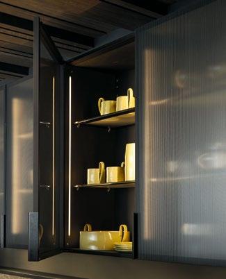
next125
The Glass Display Unit
EIN WAHRES SCHMUCKKÄSTCHEN FÜR ÄSTHETEN: Die Vitrine ist das perfekte Möbel, um sowohl besondere Sammler- und Designerstücke als auch Teller, Tassen und Schüsseln adäquat zu verstauen. Durch das filigrane Zusammenspiel des zarten Rahmens mit den Türen aus Linearglas feinstruktur und dem extravaganten Griff in Lederoptik entsteht eine zeitlose Wertigkeit, die sich im Innenleben nahtlos fortführt. Geschlossene Schubkästen und Auszüge mit Glasfronten verstecken Gebrauchsgegenstände und Utensilien formvollendet, während die Einlegeböden aus satiniertem Glas eine standesgemäße Basis für Schönes und Repräsentatives liefern. Insbesondere, wenn das alles durch die dezent in den Innenseiten eingefräste, dimmbare LED Linearbeleuchtung stimmungsvoll ins rechte Licht gesetzt wird. So ist die Vitrine, als Solitär genauso wie in einer Hochschrankreihe eingebettet, überall ein eleganter Blickfang.
A TRUE TREASURE TROVE FOR AESTHETES: The glass display unit is the perfect place to keep special collector’s items and designer pieces, as well as plates, cups and bowls. The elegant interplay between the delicate frame and the doors made of fine-textured reeded glass and the extravagant handle with its leather finish results in a timeless quality that seamlessly carries over into the interior. Closed drawers and pull-outs with glass fronts perfectly conceal everyday items and utensils, whilst the shelves made of satinated glass provide a classy stage for ornaments and treasured objects. These are wonderfully showcased by the subtle, dimmable, linear LED mood lighting built into the interior. This makes the glass display unit an elegant eye-catcher whether it is used as a standalone piece or as part of a row of tall units.
next 125 Vitrine
V187F SensiQ onyxschwarz feinmatt AFP
G943 Linearglas feinstruktur
next 125 Glass Display Unit
V187F SensiQ onyx black fine matt AFP
G943 Linear glass finely structured
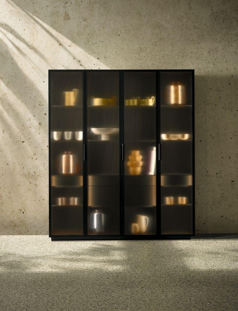
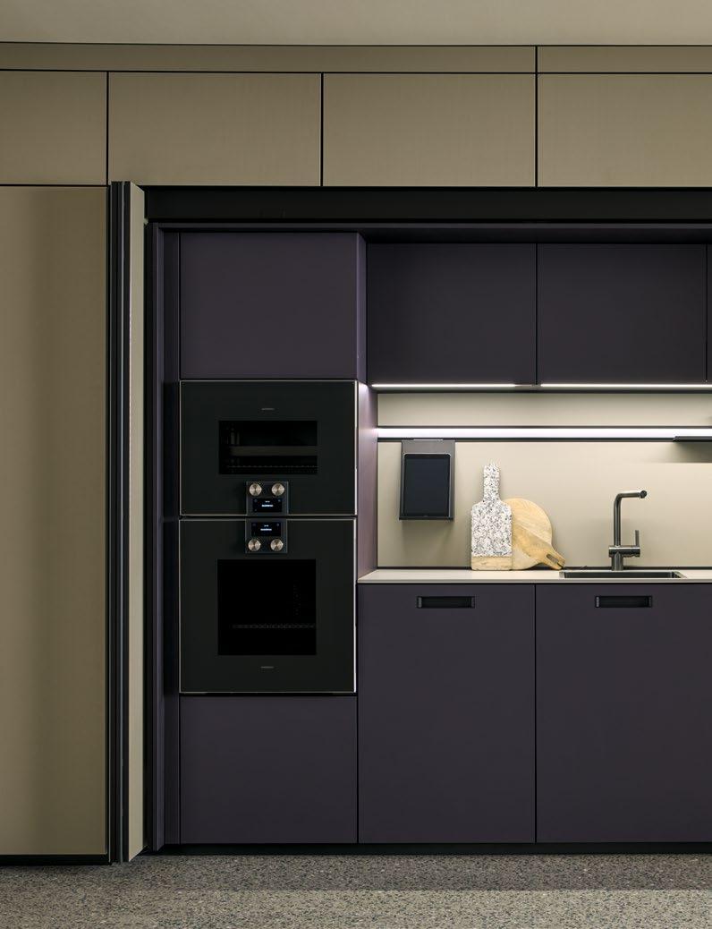
The Pocket System
DIE HOHE KUNST DER VERWANDLUNG: Hinter seiner ruhigen, puristischen Front verbirgt das Pocketsystem einen multifunktionalen Raum, der – beispielsweise als hochmoderne Homeoffice-Lösung, großzügige Hausbar oder vollständige Pantry-Küche – nahezu beliebig eingeteilt und ausgestattet werden kann: Ob Schubladen oder Auszüge, Frame Nischenregal oder Wangenbord, Weinkühler oder Backofen, Regalböden oder Arbeitsfläche, verspiegelt oder beleuchtet: Die ausgesuchten Details offenbaren sich mittels kurzen Antippens der großzügigen Falttüren, die daraufhin fast schwebend im Korpus verschwinden. Nun wird auch ersichtlich, ob und in welchem Ausmaß farbliche und materielle Kontraste zwischen innen und außen gesetzt wurden. Soll dagegen eine ruhige, aufgeräumte Wohnlichkeit entstehen, lässt sich das Pocketsystem ganz elegant im Handumdrehen schließen. Kurzum: Ein architektonisches Meisterwerk, das es „in sich hat.“
THE HIGH ART OF TRANSFORMATION: Behind its tranquil minimalist front, the pocket system conceals a multi-functional space which can be divided and equipped to meet practically all requirements, whether you need an ultra-modern home office solution, a spacious home bar or a complete pantry kitchen. Drawers or pull-outs, Frame recess shelving or support panel shelves, a wine cooler or an oven, shelves or a worktop, mirrored or with lighting: whatever features take your fancy, all will be revealed by a brief touch of the large folding doors, which practically float away into the carcase. The colour and material contrasts between the interior and exterior, however great or small, also become visible. However, if a serene, uncluttered, homely feel is the desired effect, the pocket system can be elegantly closed in an instant. In essence, this is an architectural masterpiece that conquers all.
next 125 Pocketsystem
nx510: L547M Aubergine samtmatt AFP
nx960: C2795 Ceramic Struktur sand
next 125 Pocket System
nx510: L547M Aubergine matt velvet AFP
nx960: C2795 Ceramic structured sand
AUSGEZEICHNETES DESIGN, DAS BEWEGT: Ob im Koch-, Ess- oder Wohnbereich. Ob als Küchen-, Servier- oder Barwagen – der next125 Trolley ist überall ein stilvoller Begleiter. Das mobile Möbelstück gleitet ausgesprochen lässig in mattschwarzem Metall auf weichen Lenkrollen und bietet jede Menge individuell nutz- und gestaltbare Stellflächen: Unterteilungen für Flaschen, Gläser und Gewürze; Einsätze und Tablare in Eiche Natur zum Anrichten und Vorbereiten von Speisen und Getränken – alles kommt stets standesgemäß dorthin, wo man es gerade braucht. Dabei gibt sich die Ikone selbst mit wenig Platz zufrieden und lässt sich an seinem angenehmen Stangengriff in Onyxschwarz problemlos zum unauffälligen Parken in Nischen oder unter den Kochtisch schieben. Aber nur, wenn man möchte – schließlich ist der Trolley dank seines formschönen, mehrfach ausgezeichneten Designs ein echter Eyecatcher.
OUTSTANDING DESIGN ON THE MOVE: In the kitchen, dining area or living room. As a mobile kitchen island, tea cart or bar on wheels – the next125 trolley makes a stylish companion wherever you are. This mobile piece of furniture made of matt black metal glides effortlessly along on its soft castors, providing a host of customisable storage areas. Compartments for bottles, glasses and spices combined with inserts and trays in natural oak for preparing and serving food and drink – everything is exactly where it is needed. Even where space is tight, this icon is content to be smoothly pushed by its comfortable onyx black bar handle into its discrete parking space in an alcove or under the cooking table. But only if really necessary – after all, thanks to its perfected, multiple award-winning design, the trolley is a true eye-catcher.
next 125 Trolley Onyxschwarz
next 125 Trolley Onyx black
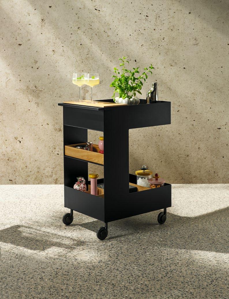

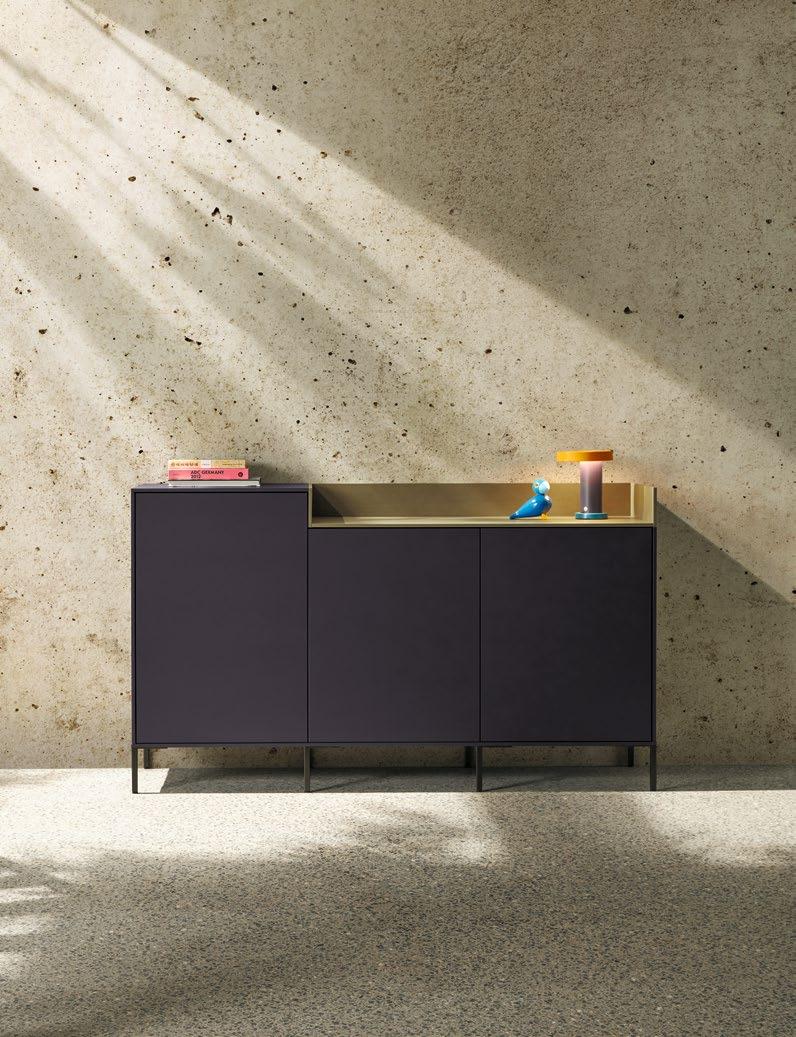
SO INDIVIDUELL UND STILVOLL, WIE SEINE BESITZER: Das multifunktionale next125 Sideboard schafft eine harmonische Verbindung zwischen Küche, Essbereich und Wohnraum sowie dem ästhetischen Bewusstsein der Bewohner. Ob opulent mit den neuen Fronten aus feinstrukturiertem Linearglas und Englischen Auszügen oder lieber puristisch mit geschlossen Furnier-, SensiQ Schichtstoff- oder Samtmattlackoberflächen und Regaleinschüben. Ob auf boden nahen Möbelgleitern, filigranen Sockelfüßen oder dem Sideboardgestell. Ob als funktionales Solitär oder gediegene Hausbar mit einstellbarer Ambientebeleuchtung und Details aus veganem Leder: Die persönliche Traumkombination lässt sich dank vielseitiger Ausführungs-, Farb- und Materialvarianten ganz einfach gestalten. Dennoch bleibt sich dieser Klassiker der Wohnkultur durch seine klare, kubische Architektur stets in allen Varianten treu.
AS STYLISH AND INDIVIDUAL AS ITS OWNERS: The multi-functional next125 sideboard creates a harmonious link between the kitchen, dining area and living room, awakening an aesthetic awareness in its owners. It can be opulent with the new fronts made of fine-textured reeded glass and its English pull-outs, or minimalist with closed veneer, SensiQ laminate, or matt velvet lacquer fronts and shelf inserts. It can sit on low furniture gliders, elegant plinth feet or our sideboard frame. It can be a functional standalone piece or a tasteful home bar with adjustable mood lighting and details in vegan leather. Whatever your dream combination, the wide range of design options, colours and materials makes it easy to bring to life. However, whatever options you choose, this home decor classic always remains true to itself thanks to its clear, cubic architecture.
next 125 Sideboard
nx510: L547M Aubergine samtmatt AFP
nx960: C2795 Ceramic Struktur sand
next 125 Sideboard
nx510: L547M Aubergine matt velvet AFP
nx960: C2795 Ceramic structured sand
The Cooking Table
EIN ORT DER BEGEGNUNG VON MENSCH, FORM, FUNKTION UND EMOTION: Der next125 Kochtisch ist die konsequente Verschmelzung von Kochinsel und Esstisch auf höchstem ästhetischen Niveau. Seine besondere Ausstrahlung wirkt auf Profiund Hobbyköche, Puristen und Genießer sowie Jung und Alt gleichermaßen anziehend. Das mag daran liegen, dass er mit der starren Funktionseinteilung von Arbeit und Freizeit bricht – und auf seinen filigranen Füßen als Workstation für ambitioniertes Kochen und Treffpunkt der Geselligkeit fungiert. Schließlich ist er trotz seines anspruchsvollen Designs voll auf Funktion getrimmt. Der Unterschrank ist in allen Frontausführungen erhältlich, das Gestell des Kochtischs ist in zwei unterschiedlichen Holzarten und insgesamt sieben Ausführungen erhältlich. Der Kochmuldenlüfter lässt sich perfekt integrieren.
A MEETING PLACE FOR PEOPLE, FORM, FUNCTION AND EMOTION: The next125 cooking table is an intentional merging of a kitchen island and dining table to the highest aesthetic standards. Its special appearance appeals to pro and amateur chefs, minimalists and foodies, and the young and old alike. This could be because it puts an end to the stark separation of work and leisure time, acting on its elegant feet as a work station for ambitious chefs and a place for social gatherings. After all, despite its sophisticated design, it is made to be fully functional. The base unit is available in all front versions. The table frame is available in two different typs of wood and a total of seven designs. The downdraft extractor can be perfectly integrated.
next 125 Kochtisch
C2790 Sand F644 Eiche elegant perlgrau
next 125 Cooking Table
C2790 Sand F644 Elegant oak pearl grey
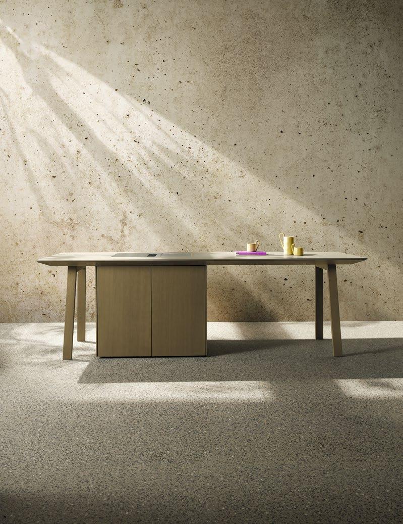

Our colour concept
Essentiell, elegant und außergewöhnlich
FARBEN SORGEN FÜR LEICHTIGKEIT, LEBENDIGKEIT und unterstreichen die Persönlichkeit der Bewohner. Aus diesem Grund ist bei next125 die sorgfältig kuratierte Palette hochwertiger Lacke Dreh- und Angelpunkt des Designs. Sie begeistert mit einer stimmigen Farbwelt, zusammengefasst in drei Farbkategorien für Küche und Wohnbereich.
Essential, elegant and exceptional
COLOURS GIVE AN IMPRESSION OF LIGHTNESS AND VIBRANCY and highlight the occupants’ personality. For next125, the carefully chosen range of top-quality lacquers is thus a key component of our design. It boasts a harmonious colour scheme, grouped into three categories for kitchens and living areas.
FEATURES next125
Carcase designs
Korpushöhe 75 cm
Carcase height 75 cm
Sockelhöhen
5 cm, 7,5 cm, 10 cm, 12,5 cm, 15 cm
Plinth heights
5 cm, 7.5 cm, 10 cm, 12.5 cm, 15 cm
Korpushöhe 81,25 cm
Carcase height 81.25 cm
Sockelhöhen
5 cm, 7,5 cm, 10 cm, 12,5 cm, 15 cm
Plinth heights
5 cm, 7.5 cm, 10 cm, 12.5 cm, 15 cm
Korpushöhe 87,5 cm
Carcase height 87.5 cm
Sockelhöhen
5 cm, 7,5 cm, 10 cm, 12,5 cm, 15 cm
Plinth heights
5 cm, 7.5 cm, 10 cm, 12.5 cm, 15 cm
NEXT 125 – DER NAME GEHT AUF DAS RASTERMASS VON 125 MM ZURÜCK. Dies ist die perfekte Basis für ein homogenes Erscheinungsbild. Eine Küche lebt aber insbesondere durch maßgeschneiderte Planungen, die auf die Ergonomie ihrer Nutzer und die Architektur des Raumes abgestimmt sind. Dafür stehen drei Korpushöhen zur Verfügung: 75 cm, 81,25 cm und 87,5 cm. Da jede davon nun auch durchgängig in den Systemen Pure, Line und Single-Line geplant werden kann, entstehen noch mehr Möglichkeiten zur individuellen Anpassung einer next125 Küche auf persönliche Ansprüche und räumliche Gegebenheiten.
NEXT 125 – THE NAME IS BASED ON THE GRID SIZE OF 125 MM. This is the perfect basis for a uniform appearance. However, above all a kitchen is brought to life by made-to-measure designs that are adapted to the ergonomic requirements of its users and the layout of the room. That’s why three carcase heights are available: 75 cm, 81.25 cm and 87.5 cm. As each of these heights can now be implemented throughout the Pure, Line and Single-Line systems, there are even more options for customising next125 kitchens to meet individual and spatial requirements.
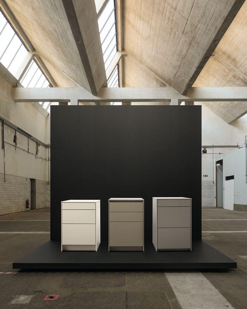
Küchen und Ausstattungen
Handle versions

ZUM ÖFFNEN VON TÜREN, SCHÜBEN UND AUSZÜGEN GIBT ES VERSCHIEDENE MÖGLICHKEITEN. Eine beliebte und puristische Lösung ist die grifflose Variante, die in drei Ausführungen erhältlich ist und durch einen Tip-On-Mechanismus unterstützt werden kann. Für Liebhaber von funktionalen oder dekorativen Griffen stehen Griffausführungen in verschiedenen Stilen zur Wahl.
THERE ARE VARIOUS OPTIONS FOR OPENING DOORS, DRAWERS AND PULL-OUTS. A popular and purist solution is the handleless option, which is available in three versions and can be additionally supported by a Tip-On mechanism. Admirers of practical or decorative handles can choose from a wealth of different designs.
Mit Griffen oder mit Griffen und Tip-On
With handles or with handles and Tip-On
PURE Mit Tip-On With Tip-On
LINE
Grifflos oder grifflos mit Tip-On
Handleless or handleless with Tip-On
SINGLE LINE
Grifflos in Kombination mit Tip-On
Handleless in combination with Tip-On

204
205
OceanIX Plastic schwarz / OceanIX Plastic black
401
Edelstahlfarben / Stainless steel coloured

OceanIX Plastik kieselgrau / OceanIX Plastic pebble grey 547
Nickel matt / Matt nickel
Edelstahlfarben / Stainless steel coloured
STANGENGRIFF HANDLE BAR

402 Onyxschwarz / Onyx black

Edelstahlfarben / Stainless steel coloured
Edelstahlfarben / Stainless steel coloured 770
Edelstahlfarben / Stainless steel coloured
584 Messingfarben gebürstet / Brushed brass coloured
Onyxschwarz / Onyx black
Edelstahlfarben / Stainless steel coloured
588
Eiche onyxschwarz / Oak onyx black
840 Onyxschwarz / Onyx black
GRIFFSTANGE HANDLE BAR
710 / 711 / 712
710
Edelstahlfarben / Stainless steel coloured
GRIFFLEISTE GRIP LEDGE
935 / 936 945 / 946
935
Edelstahlfarben / Stainless steel coloured
GRIFFMULDE GRIP LEDGE PROFILE
Farblich abgestimmt auf die essentiellen Farben aus dem Colour Concept / Colour matching the essential colours from the Colour Concept
7092
Kristallweiß matt / Crystal white matt
7207
Kieselgrau matt / Pebble grey matt
7192
Lavaschwarz matt / Lava black matt
712
Kristallweiß / Crystal white
711
Onyxschwarz / Onyx black
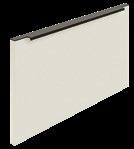
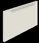
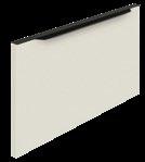
936 Schwarz / Black
945
Edelstahlfarben / Stainless steel coloured
7097
Muschelweiß matt / Seashell white matt
7277
Achatgrau matt / Agate grey matt
7185
Onyxschwarz / Onyx black

7122
Kristallgrau matt / Crystal grey matt
7262
Terragrau matt / Terra grey matt
7173
Edelstahlfarben / Stainless steel coloured
946
Onyxschwarz / Onyx black
7237
Steingrau matt / Stone grey matt
7202
Saharabeige matt / Sahara beige matt
7180
Messingfarben / Brass coloured
GRIFFSCHALE
Kristallweiß matt / Crystal white matt L 194
Farblich abgestimmt auf die essentiellen Farben aus dem Colour Concept / Colour matching the essential colours from the Colour Concept
6173
Edelstahlfarben / Stainless steel coloured
6237
6092
6097
Muschelweiß matt / Seashell white matt
Steingrau matt / Stone grey matt 6277
Achatgrau matt / Agate grey matt
6202
Saharabeige matt / Sahara beige matt
Lavaschwarz matt / Lava black matt
Onyxschwarz matt / Onyx black matt
6122
Kristallgrau matt / Crystal grey matt
Terragrau matt / Terra grey matt
nx902 / nx912
Farblich abgestimmt auf die Frontfarben / Colour matching the front colours


GRIFFSCHALE SHELL HANDLE
nx860 / nx870
Farblich abgestimmt auf die Frontfarben / Colour matching the front colours

8092
SensiQ kristallweiß
feinmatt AFP / SensiQ crystal white fine matt AFP
nx930 / nx940
8257
SensiQ inox feinmatt AFP / SensiQ inox fine matt AFP
8237
SensiQ steingrau
feinmatt AFP / SensiQ stone grey fine matt AFP
8202
SensiQ saharabeige
feinmatt AFP / SensiQ Sahara beige fine matt AFP

8187
SensiQ onyxschwarz feinmatt AFP / SensiQ onyx black fine matt AFP
nx950 / nx960
Farblich abgestimmt auf die Frontfarben / Colour matching the front colours
2785 Ceramic bianco beige / Ceramic bianco beige
2775 Ceramic Marmor nero Nachbildung / Ceramic marble nero effect
2075 Ceramic beton grau Nachbildung / Ceramic concrete grey effect
2275
Ceramic arctic black / Ceramic arctic black
2795 Ceramic Struktur Sand / Ceramic structured sand
2055
Ceramic grafit / Ceramic graphite
Equipment versions for drawers and pull-outs
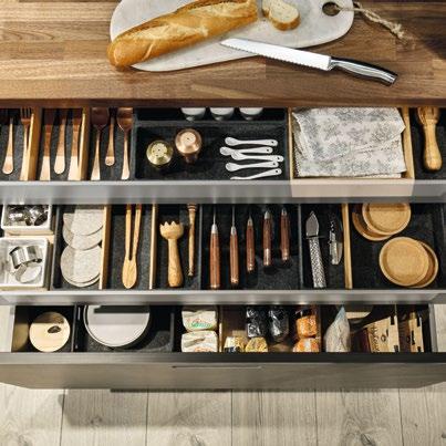
EINE IDEE FÜR SCHÜBE UND AUSZÜGE: UNSERE FLEX-BOXEN AUS FORMVLIES. Das weiche Vliesmaterial ist haptisch angenehm und dämpft die Geräusche von Besteck, Küchenwerkzeugen oder Porzellan. Die Innenausstattung kann individuell aus verschiedensten Formvliesteilen zusammengestellt werden. Die Flex-Boxen aus Formvlies können bestens mit den Flex-Boxen aus Eiche kombiniert werden, da beide Ausführungen maßlich aufeinander abgestimmt sind. Die Reinigung der Flex-Boxen aus Formvlies erfolgt ganz einfach durch Absaugen oder Auswischen (mit einem feuchten Tuch).
AN IDEA FOR DRAWERS AND PULL-OUTS: OUR FLEX-BOXES MADE FROM MOULDED NON-WOVEN MATERIAL. The soft material is pleasant to the touch and softens the noise of cutlery, kitchen utensils and china. The interior can be put together individually from a wide variety of moulded non-woven inserts. The Flex-Boxes made from moulded non-woven material can be optimally combined with those made from oak as the two types are size coordinated. They can be easily cleaned by vacuuming them or wiping them (with a damp cloth).
Besteckeinsatz, Messerblock, Kochutensilieneinsatz und Einlegematte aus Formvlies in Kombination mit vier Porzellanschalen.
Cutlery insert, knife block, cooking utensils insert and anti-slip mat made from moulded non-woven material in combination with four china bowls.
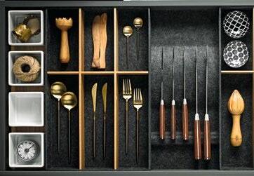
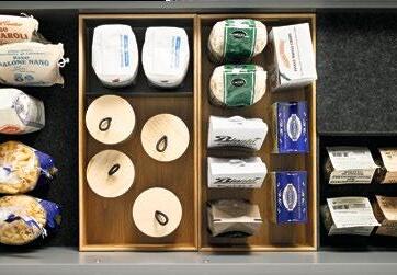
Flex-Boxen und Einlegematte aus Formvlies in Kombination mit Flex-Boxen aus Echtholz.
Flex-Boxes and anti-slip mat made from moulded non-woven material in combination with real wood Flex-Boxes.
Besteckeinsatz, Flex-Boxen und Einlegematte aus Formvlies in Kombination mit Flex-Boxen aus Echtholz. Cutlery insert, Flex-Boxes and anti-slip mat made from moulded non-woven material in combination with real oak Flex-Boxes.
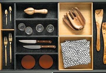
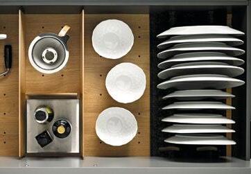
Tellerhalter aus Formvlies in Kombination mit Lochplatte und Trennstegen aus Echtholz.
Plate rack made from moulded non-woven material in combination with a perforated baseboard and separating strips in real wood.
Besteckeinsatz, Welleneinsatz, Messerblockeinsatz mit Einlegematte aus Formvlies
Cutlery insert, wavy insert, cutlery insert and anti-slip mat made from moulded non-woven material
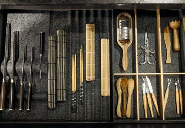
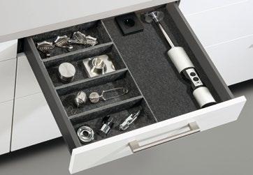
Kabelführung für Schubkästen:
Immer smartere und leistungsfähigere Mobil- und/oder Elektroklein geräte erleichtern den Alltag auch in der Küche immens. Oftmals steht aber am eigentlichen Nutzungsort keine passende Steckdose parat oder diese ist bereits anderweitig belegt. Zudem will man Mobilgeräte auch geschützt aufladen können.
Cable management for drawers:
Ever more efficient and intelligent mobile and/or small electrical appliances are hugely simplifying everyday kitchen routine as well. Yet often there‘s no socket available where you need one or it is already taken by another appliance. Users also want the ability to charge mobile devices where they are protected.
Innenausstattung Primus
Die Natur des Purismus: Das intelligente, variable Ordnungssystem in elegant-warmer Eiche natur organisiert sämtliche Küchenutensilien.
Besteckeinsatz, 2 Porzellanschalen, Folienabroller für 3 Rollen und 4 Serviettenringe
Interior equipment Primus
The nature of purism: The intelligent, variable classification system in elegant and warm natural oak organizes all kitchen utensils.
Cutlery insert, 2 porcelain bowls, film dispenser for 3 rolls and 4 napkin rings
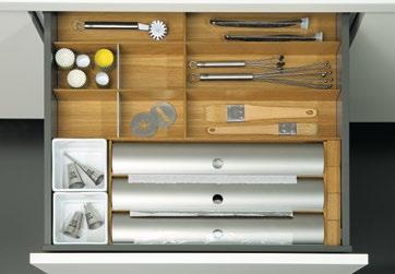
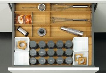
Besteckeinsatz, 12 Gewürzdosen, 4 Porzellanschalen und 4 Serviettenringe
Cutlery insert, 12 spice jars, 4 porcelain bowls and 4 napkin rings
Besteckeinsatz, Ahorn-Schneidebrett mit Abstellrost, 2 Porzellanschalen und 4 Serviettenringe
Cutlery insert, maple chopping board with trivet, 2 porcelain bowls and 4 napkin rings
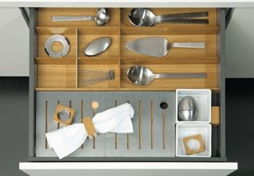
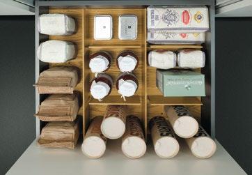
Lochplatte mit Trennstegen:
Die Lochplatte ermöglicht eine individuelle
Platzierung der Trennstege
Perforated baseboard with separating strips: The perforated baseboard makes it possible to position the separating strips as desired
Besteckeinsatz, 4 Serviettenringe, 2 Porzellanschalen und Messerblock
Cutlery insert, 4 napkin rings, 2 porcelain bowls and knife block
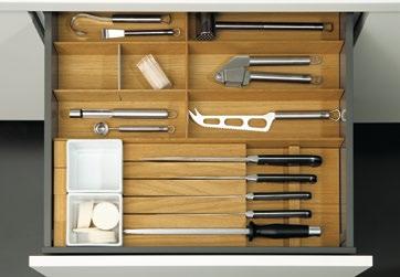
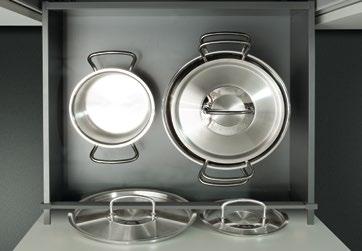
Deckelhalter aus Metall: Töpfe lassen sich bequem stapeln. Deckel finden sicher Halt und klappern nicht mehr
Metal lid holder: Pans can be conveniently stacked. Lids can be securely stored and no longer clatter
Flex-Boxen aus Echtholz
Die praktischen Flex-Boxen aus Echtholz sehen hochwertig aus und sorgen für aufgeräumte Schränke. Sie sind genau auf die Maße der next 125 Schränke zugeschnitten, extrem vielseitig und flexibel. Stapelbar und verschiebbar, nehmen sie selbst kleinste Dinge auf. Und in den entstehenden Zwischenräumen der Flex-Boxen wird gleichzeitig Platz für Töpfe und Pfannen geschaffen.
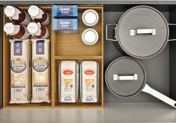
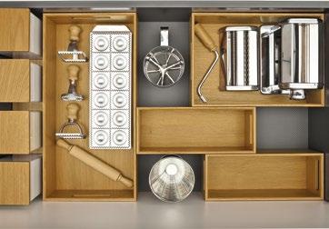
Real wood Flex-Boxes
The practical real wood Flex-Boxes ooze quality and keep cupboards neat and tidy. They are precisely tailored to the next 125 units, extremely versatile and highly flexible. They can be stacked and moved around to accommodate every last item, no matter how small. And in the gaps between the Flex-Boxes, there is still plenty of room for pots and pans.
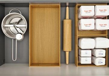
Cube
accessory panel system
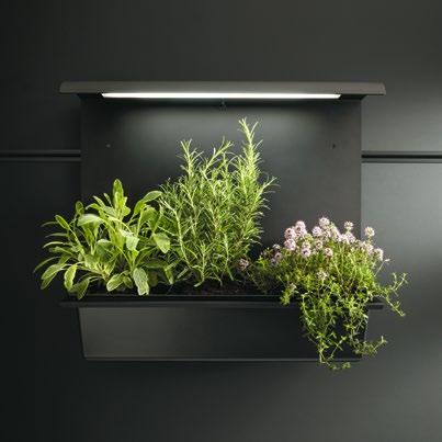
UNSER NEXT 125 CUBE SYSTEM IST EIN ECHTES NISCHENPRODUKT. Es macht das Arbeiten in der Küche um vieles leichter und schneller. Mit einem Griff ist alles zur Hand. Lösungen, die aus der Praxis kommen. Die Küchenrolle zum Aufwischen – ein Griff. Das Gemüsemesser aus dem Block – parat. Keramikschalen in unterschiedlichen Größen, Borde als praktische Abstellflächen. Selbst Gewürze, Kochlöffel, Olivenöl und frisches Basilikum ... alles direkt erreichbar. Notizen und Rezepte werden nicht mehr vergessen, denn next 125 Cube berücksichtigt einfach alles.
OUR NEXT 125 CUBE SYSTEM IS A REAL NICHE PRODUCT. It makes working in the kitchen far easier and quicker. Everything instantly at hand. Practical solutions. Kitchen roll to wipe up mess – right there. The vegetable knife in the knife block – ready and waiting. Ceramic bowls in various sizes and convenient shelves as practical storage space. Spices, utensils, olive oil and fresh basil – everything is within reach. Notes and recipes are no longer forgotten, as next125 Cube takes care of everything.
Zwei Frarben
Das next 125 Cube System ist in Edelstahlfarben oder in Onyxschwarz erhältlich.
cube_66_ Infoboard mit Ablage und foliertem Schreibfeld:
Für die Alltags organisation und Notizen cube_66_Notice board with shelf and laminated area for writing: for everyday organisation and notes
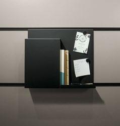
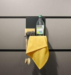
cube_64_Abstellfläche für Spülutensilien: Macht das Umfeld der Spüle ordentlicher und einfacher zu reinigen
cube_64_Rack for dishwashing accessories: tidies up the sink area and makes it easier to clean
Two colours
The next 125 Cube system is available in aluminium stainless steel coloured or in onyx black.
cube_65_Halterung für Weinflaschen: Zur Lagerung von Wein ist diese Halterung eine ansprechende Lösung
cube_65_Wine rack: this rack is a great storage solution for wine
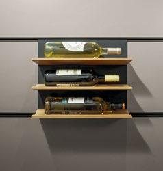
cube_66_Folienabroller für zwei Folienrollen: Der praktische Aufbewahrungsort von Alu- und Frischhaltefolien
cube_66_Dispenser for two rolls of food wrap: a handy storage solution for foil and cling film
cube_68_Halterung für Pflanztöpfe mit Bewässerungssystem: Für frische Kräuter in der Küche
cube_68_Plant pot holder with watering system: for fresh herbs in the kitchen
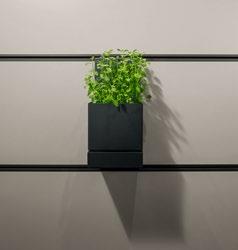
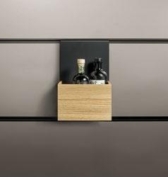
cube_56_Ablagefach für Essig und Öl: Hält die Arbeitsplatte frei und nutzt den Platz optimal aus
cube_56_Vinegar and oil storage rack: keeps the worktop clear and makes optimum use of the available space
cube_01_Küchenrolle:
Optimaler Zugriff auf die verdeckte Rolle, auch bei geschlossener Tür
cube_01_Kitchen rolls:
Optimal access to the hidden roll even when the door is closed
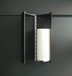
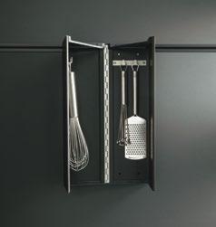
cube_06_Hakenleiste:
Immer zur Hand und dennoch unsichtbar –
4 Haken für Küchenwerkzeuge und mehr
cube_06_Hook rail:
Always accessible nevertheless invisible –4 hooks for kitchen tools and even more
cube_02_Schalen:
Raumsparend untergebracht – die 5 stapelbaren Porzellanschalen (spülmaschinenfest)
cube_02_Bowls:
Space-saving – 5 stackable china bowls (dishwasher proof)
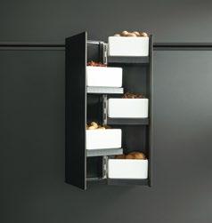
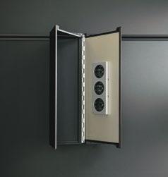
cube_07_Steckdosenleiste:
3 Steckdosen da, wo man sie braucht: sichtbar oder versteckt
cube_07_Multiple socket outlet:
3 sockets placed where you need them –visible or hidden
cube_09_Schalen:
Bietet Platz für 3 kleine und 1 große Porzellan schale (spülmaschinenfest)
cube_09_Bowls:
Provides space for 3 small and 1 large china bowls (dishwasher proof)
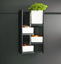
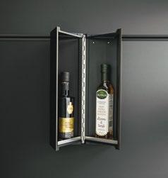
cube_08_Essig- und Ölflaschen:
Direkt im Zugriff. Ausgestattet mit zwei Edelstahlböden
cube_08_Vinegar and oil bottles at your fingertips. Equipped with two stainless steel shelves
cube_53_Hakenset:
Mit 3 Einzel haken, zum Aufhängen von Kochen utensilien
cube_53_Hook set:
With 3 individual hooks for hanging up cooking utensils
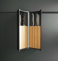
cube_05_Messerblock: Griffbereit oder aufgeräumt – mit 2 Einsätzen für je 3 Messer
cube_05_Knife block: Within reach or tidy –with 2 inserts for 3 knives each
cube_51_Paneelgarten ohne Beleuchtung: Für frische Kräuter in der Küche
cube_51_Panel garden without lighting: For fresh herbs in the kitchen
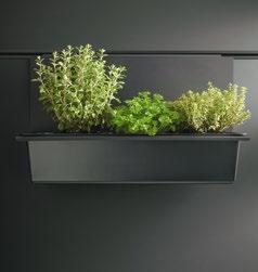
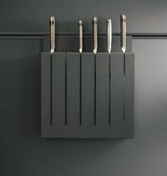
cube_44_Messerblock: Schöner Schutz – 6 Messer finden sicher ihren Platz
cube_44_Knife block: Beautiful protection – 6 knives securely find their place
cube_03_Allzweckbehälter:
Für alles, was man gerne griffbereit hat cube_03_All-purpose containers: For anything you like to have at hand
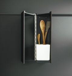
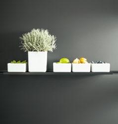
cube_40_Regalbord:
Eine praktische Ablage für die Aufnahme von Porzellanschalen (Schalen optional)
cube_40_Shelf:
A practical option for holding china bowls (bowls optional)
cube_47_Abstellfläche:
Essig und Öl immer im Blick und schnell griffbereit
cube_47_Storage shelf:
Vinegar and oil always in view and quickly within reach
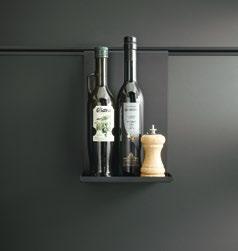
cube_50_Tablethalter:
Hängt und steht gut sichtbar in der Küche
cube_50_Tablet holder:
For clear visibility in the kitchen whether suspended or standing
cube_41_Bord abgehängt:
Ob hoch oder niedrig, für alle Porzellanschalen passend (Schalen optional)
cube_41_Suspended shelf:
Whether big or small – suitable for all china bowls (bowls optional)
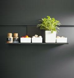
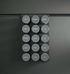
cube_54_Gewürzregal:
Aus Metall, mit Gewürzdosen für unterschiedliche Gewürze
cube_54_Spice rack: Made of metal with jars for various spices
cube_46_Köcher:
Praktisch – abgehängtes Board mit hoher Porzellanschale (spülmaschinenfest)
cube_46_Bowl:
Practical – suspended board with high china bowl (dishwasher proof)
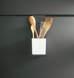
cube_43_Aufnahme für Kücherolle:
Damit liegt die Küchenrolle bequem im Zugriff
cube_43_Kitchen roll holder: For easy access to kitchen roll
cube_31_Hakenleiste mit Glas: 6 Haken vor klarem Glas
cube_31_Hook rail with glass: 6 hooks in front of clear glass
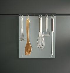
cube_21_Flaschenregal:
Dekorativ aus massiver Eiche natur, für 5 Weinflaschen geeignet
cube_21_Bottle rack:
Decorative in natural oak, suitable for 5 wine bottles
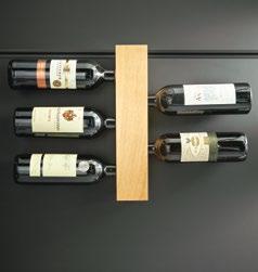
cube_42_Hakenleiste:
Küchenutensilien schnell zur Hand –Hakenleiste mit 6 Haken
cube_42_Hook rail:
For kitchen utensils within easy reach –a hook rail with 6 hooks
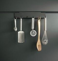
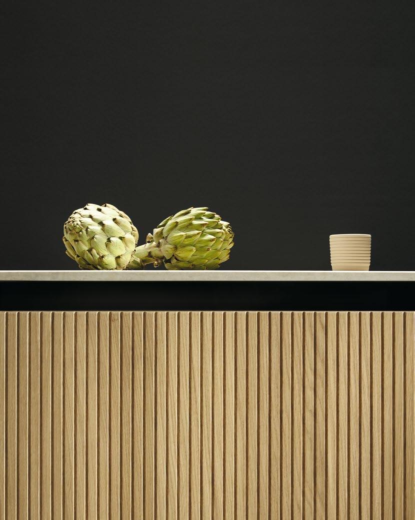
Edle Lacke und Hölzer, Ceramic, Glas und Schichtstoff
Elegant lacquers and woods, ceramic, glass and laminates
nx240 / PGR 2
Schichtstoff-Front SensiQ feinmatt AFP / Laminated front SensiQ fine matt AFP

K092F
SensiQ kristallweiß feinmatt AFP / SensiQ crystal white fine matt AFP

K207F
SensiQ kieselgrau feinmatt AFP / SensiQ pebble grey fine matt AFP

K097F
SensiQ muschelweiß feinmatt AFP / SensiQ seashell white fine matt AFP

K277F
SensiQ achatgrau feinmatt AFP / SensiQ agate grey fine matt AFP

K192F
SensiQ lavaschwarz feinmatt AFP / SensiQ lava black fine matt AFP
nx510 / PGR 3
Samtmatt-Lackfront / Matt velvet lacquer front

L092M Kristallweiß samtmatt AFP / Crystal white matt velvet AFP
L207M Kieselgrau samtmatt
AFP / Pebble grey matt velvet
AFP

K187F
SensiQ onyxschwarz feinmatt AFP / SensiQ onyx black fine matt AFP

K122F
SensiQ kristallgrau feinmatt AFP / SensiQ crystal grey fine matt AFP

K262F
SensiQ terragrau feinmatt AFP / SensiQ terra grey fine matt AFP

L097M Muschelweiß samtmatt
AFP / Seashell white matt velvet AFP
L277M Achatgrau samtmatt
AFP / Agate grey matt velvet AFP

L192M Lavaschwarz samtmatt
AFP / Lava black matt velvet AFP

L407M Cognac samtmatt AFP / Cognac matt velvet AFP

L417M Azurblau samtmatt

L187M Onyxschwarz samtmatt
AFP / Onyx black matt velvet AFP

K237F
SensiQ steingrau feinmatt AFP / SensiQ stone grey fine matt AFP


L122M Kristallgrau samtmatt AFP / Crystal grey matt velvet AFP
K202F
SensiQ saharabeige feinmatt AFP / SensiQ Sahara beige fine matt AFP
L262M Terragrau samtmatt
AFP / Terra grey matt velvet AFP

L347M Toskanagelb samtmatt AFP / Tuscany yellow matt velvet AFP

L292M Indischrot samtmatt AFP / Indian red matt velvet AFP
L552M Tiefblau samtmatt
blue matt velvet
L237M Steingrau samtmatt
AFP / Stone grey matt velvet AFP

L202M Saharabeige samtmatt AFP / Sahara beige matt velvet
AFP
L397M Olivgelb samtmatt AFP / Olive yellow matt velvet AFP

L547M Aubergine samtmatt AFP / Aubergine matt velvet
AFP

L142M Kobaltgrün samtmatt AFP / Cobalt green matt velvet AFP


L527M Ultramarin samtmatt
AFP / Ultramarine matt velvet
AFP


L337M Jaguargrün samtmatt AFP / Jaguar green matt velvet AFP
nx501 / PGR 4
Hochglanzlack-Front / High gloss lacquer front
nx620 / PGR 5
Holzfront / Wood front

L091
Kristallweiß hochglanz / Crystal white high gloss
F728
Asteiche bianco hell gebürsted / Light knotty oak bianco, brushed
F746
Asteiche graphitgrau gebürstet / Graphite grey knotty oak, brushed
nx640 / PGR 5
Holzfront / Wood front
F628
Eiche elegant bianco hell / Elegant light oak bianco
L111G
Brillantweiß hochglanz / Brilliant white high gloss
F734
Asteiche natur gebürstet / Natural knotty oak, brushed
F641
Eiche elegant tabak / Elegant oak tobacco

F741
Asteiche tabak gebürstet / Tobacco knotty oak, brushed
F634
Eiche elegant natur / Elegant natural oak
L121
Kristallgrau hochglanz / Crystal grey high gloss
F685 Nussbaum natur / Natural walnut
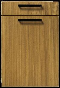
Eiche elegant perlgrau / Elegant oak pearl grey
F744
Asteiche perlgrau gebürstet / Pearl grey knotty oak, brushed
Eiche elegant graphitgrau / Elegant oak graphite grey
next125.com
Weitere Informationen zu den Ausführungen unserer Küchenfronten finden Sie auf unserer Homepage / Further information on the kitchen front versions available can be found on our website
nx902 / nx912 / PGR 7
nx902
Glasfront matt, Rahmen edelstahlfarben / Glass front matt, frame stainless steel coloured
nx912
Glasfront matt, Rahmen onyxschwarz / Glass front matt, frame onyx black
G092
Glas matt kristallweiß / Glass matt crystal white
G207
Glas matt kieselgrau / Glass matt pebble grey
G097
Glas matt muschelweiß / Glass matt seashell white

G277
Glas matt achatgrau / Glass matt agate grey

G572
Glas matt platin metallic / Glass matt platinum metallic
G187
Glas matt onyxschwarz / Glass matt onyx black

G577
G122
Glas matt kristallgrau / Glass matt crystal grey
Glas matt bronze metallic / Glass matt bronze metallic
G262
Glas matt terragrau / Glass matt terra grey

G237
Glas matt steingrau / Glass matt stone grey
G582
Glas matt basalt metallic / Glass matt basalt metallic
G202
Glas matt saharabeige / Glass matt Sahara beige
G192
Glas matt lavaschwarz / Glass matt lava black
nx860 / nx870 / PGR 7
nx860
Vollkernfront SensiQ
feinmatt AFP, Rahmen edelstahlfarben / Solid core front, SensiQ fine matt AFP, frame stainless steel coloured
nx870
Vollkernfront SensiQ feinmatt AFP, Rahmen onyxschwarz / Solid core front, SensiQ fine matt AFP, frame onyx black
nx650 / PGR 8
Holzfront, Wangen nur in 1,3 und 2,5 cm erhältlich, keine Sichtseiten möglich / Wood front, support panels are only available in 1.3 and 2.5 cm, no visible sides

V092F
SensiQ kristallweiß feinmatt AFP / SensiQ crystal white fine matt AFP
V237F
SensiQ steingrau feinmatt AFP / SensiQ stone grey fine matt AFP
V202F
SensiQ saharabeige feinmatt AFP / SensiQ Sahara beige fine matt AFP
V187F
SensiQ onyxschwarz
feinmatt AFP / SensiQ onyx black fine matt AFP
F805
Alteiche / Old oak
nx680 / PGR 8
Holzfront, Eiche durchgefärbt onyxschwarz / Wood front, Oak onyx black solid-coloured

F815
Eiche durchgefärbt onyxschwarz / Oak onyx black solid-coloured
nx890 / PGR 9
Linoleum-Front / Linoleum front

E891
Linoleum naturgrau / Linoleum natural grey
nx930 / nx940 / PGR 9
nx930
Vollkernfront SensiQ inox feinmatt AFP, Rahmen edelstahlfarben / Solid core front, SensiQ inox fine matt AFP, frame stainless steel coloured
nx940
Vollkern-Front SensiQ inox, Rahmen onyxschwarz / Solid core front, SensiQ inox fine matt, frame onyx black
nx950 / nx960 / PGR 9
nx950
Ceramicfront, Rahmen edelstahlfarben / Ceramic front, frame stainless steel coloured
nx960
Ceramicfront, Rahmen onyxschwarz / Ceramic front, frame onyx black
V257F SensiQ inox feinmatt AFP / SensiQ inox fine matt AFP

E892
Linoleum walnussbraun / Linoleum walnut brown
nx904 / nx914 / PGR 9
nx904
Glasfront –Spiegelglas bronze, Rahmen Edelstahlfarben / Glass front –Mirror glass bronze, frame stainless steel coloured
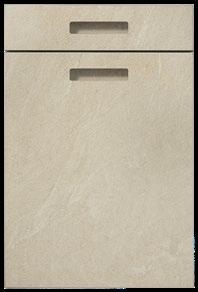
Ceramic bianco beige / Ceramic bianco beige

C2775
Ceramic Marmor nero Nachbildung / Ceramic marble nero effect
nx660 / PGR 9
Holzfront mit Design Rahmen / Wood front with design frame
Eiche elegant bianco hell / Elegant light oak bianco
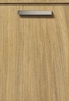
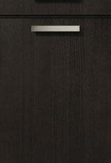
nx670 / PGR 11
Holzfront mit vertikalen Rillen / Wood front with vertical grooving
Eiche elegant tabak / Elegant oak tobacco
nx914
Glasfront –Spiegelglas bronze, Rahmen onyxschwarz / Glass front –mirror glass bronze frame onyx black
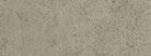
C2075
Ceramic beton grau Nachbildung / Ceramic concrete grey effect

Ceramic arctic black / Ceramic arctic black
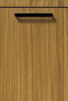
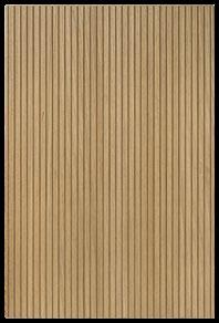
Eiche elegant bianco hell / Elegant light oak bianco

E893
Linoleum olivgrün / Linoleum olive green

G925S
Spiegelglas bronze / Mirror glass bronze

structured sand
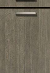
Eiche elegant perlgrau / Elegant oak pearl grey
Ceramic grafit / Ceramic graphite
Eiche elegant graphitgrau / Elegant oak graphite grey
AFP = Anti-Fingerprint / Anti Finger Print
Zeitlos, natürlich, robust und langlebig. Gestalten Sie Ihre Küche mit Arbeitsplatten und individuellen Elementen aus hochwertigen Materialien wie Ceramic, Quarzstein, Glas, Naturstein, Massivholz oder High-Tech SensiQ.
KENNZEICHNEND FÜR DIE ELEMENTE VON SYSTEMO sind die elegante Optik, hochwertige Verarbeitung, angenehme Haptik sowie hervorragende Reinigungsund Pflegeeigenschaften. Über die Arbeitsplatte hinaus hat Systemo weitere Produkte im Sortiment, die einer Küchenplanung einen zeitgemäßen Look verleihen: Wandverkleidungen, Wangen und Barplatten für die Gestaltung einer kommunikativen Küche.
Timeless, natural, robust and long-lasting. Design your kitchen with worktops and customised features made from top-quality materials like ceramic, quartz, glass, natural stone, solid wood or hi-tech SensiQ.
SYSTEMO PRODUCTS ARE CHARACTERISED BY their elegant appearance, highquality finish, pleasant feel and excellent cleaning and care properties. As well as worktops, Systemo offers a range of products that give kitchen designs a contemporary look: wall cladding, support panels and breakfast bars for creating a sociable kitchen.
Authentisch und strapazierfähig – von Systemo
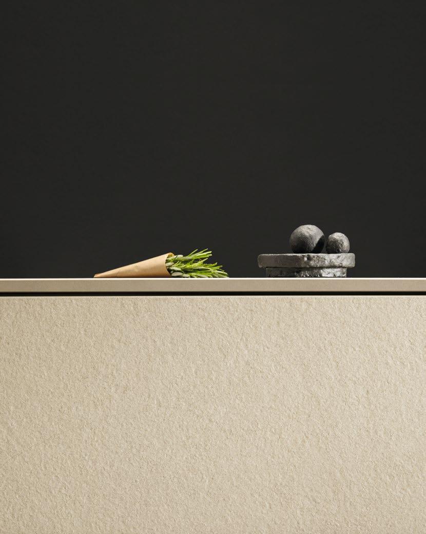
Authentic and robust – by Systemo
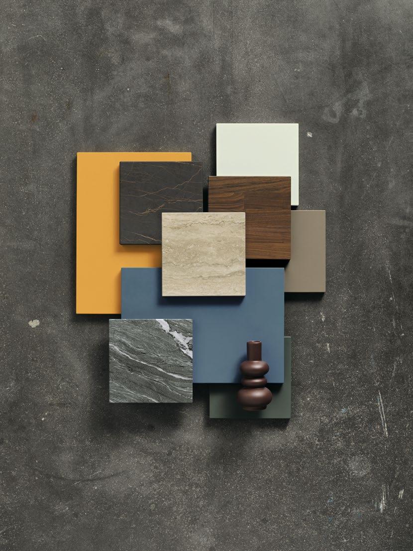
Areas of application
Arbeits- & Barplatte Worktop & bar panel
Nischenverkleidung Recess cladding
Wangenelement und Wangenseite
Support panel element and support side panel
Arbeitsplatten, Wangen und Nischenverkleidungen
WER IN SEINER KÜCHE DESIGN UND FUNKTION VERBINDEN WILL, BEKOMMT MIT SYSTEMO DIE IDEALE VORAUS SETZUNG DAZU. Arbeitsplatten, Nischenverkleidungen und Wangenelemente schaffen die perfekte Basis, authentische Optik mit angenehmer Haptik zu vereinen. Darüber hinaus bieten die Oberflächen aus Ceramic, Quarzstein, Naturstein, SensiQ, Glas und Massivholz optimale Funktionalität und sind lebensmittelecht. Jedes Material besitzt einzigartige Produkteigenschaften. Ceramic-Arbeitsplatten zeichnet beispielsweise eine besonders hohe Kratzfestigkeit aus. Bei hochwertigen Planungen wird empfohlen, Wandverkleidung und Arbeitsplatte aufeinander abzustimmen. Um Sie zu den vielfältigen Planungsoptionen beraten zu können, steht Ihnen gerne der qualifizierte Fachhandel zur Verfügung.
Worktops, side panels and recess claddings
SYSTEMO IS THE IDEAL STARTING POINT FOR THOSE LOOKING TO COMBINE DESIGN AND FUNCTION IN THEIR KITCHEN. Worktops, recess cladding and support panel elements form the perfect basis for an authentic look and a pleasant feel. Ceramic, quartz, natural stone, SensiQ, glass and solid wood surfaces also offer optimal functionality and are safe for use with foods. Each material has its own unique product characteristics. Ceramic worktops, for example, are particularly scratch-resistant. When designing premium kitchens, the wall cladding should ideally match the worktops. Our specialist retailers will gladly advise you on the wide range of planning options.
Material characteristics
WIDERSTANDSFÄHIGKEIT TRIFFT AUF ELEGANZ: Die innovative Funktionalität macht das Material zum Liebling der Küchenprofis. Da die porenlose Oberfläche weder Flüssigkeiten noch Fette absorbiert, ist sie pflegeleicht und hygienisch.
QUARZSTEINE SIND HYBRIDE MATERIALIEN aus natürlichen Mineralien und recycelten Materialien, die der Oberfläche eine außergewöhnliche Resistenz verleihen. Die Bestandteile und das Fertigungsverfahren sorgen dafür, dass Quarzsteine ähnliche Eigenschaften besitzen wie ein hochwertiger Naturstein.
EINZIGARTIG UND BESTÄNDIG: Naturstein fasziniert durch individuelle Farbverläufe, Strukturen und Texturen, die der Küche ein unverwechselbares Erscheinungsbild verleihen. Zudem ist der Werkstoff außerordentlich langlebig und resistent gegen gängige Haushaltschemikalien, sowie schnitt- und kratzfest.
SENSIQ BESTEHT AUS EINER SCHICHTSTOFF-OBERFLÄCHE aus verschiedenen Lagen. Durch die Elektronenstrahlhärtung erhält die Oberfläche ihre matte Optik und samtweiche Haptik. Dank einer innovativen Anti-Fingerprint-Eigenschaft gehören lästige Fingerabdrücke der Vergangenheit an.
Glas
DURCH EINMALIGE EIGENSCHAFTEN UND VIELFÄLTIGE GESTALTUNGSMÖGLICHKEITEN ist Glas bestens für Arbeitsplatten geeignet. Die speziell behandelte Oberfläche des satinierten OptiWhite-Glases punktet mit einer hohen Widerstandsfähigkeit gegen Kratzer und Schnitte.
Massivholz
DIE VERWENDETEN HÖLZER stammen aus nachhaltiger Forstwirtschaft und werden von uns mit einem hochwertigen Massivholzöl vorbehandelt. Bei der Produktion unserer Arbeitsplatten verwenden wir ausschließlich ausgesuchte Hölzer und legen besonderen Wert auf handwerkliche Verarbeitung.
DURABILITY MEETS ELEGANCE: Its innovative functionality makes the material a favorite among professional chefs. The nonporous surface absorbs neither liquids nor grease, making it easy to clean and hygienic.
QUARTZ IS A HYBRID MATERIAL made from natural minerals and recycled materials, which make the surface incredibly durable. The combination of the components and production method gives quartz similar properties to high-quality natural stone.
UNIQUE AND DURABLE: natural stone is fascinating due to its unique colours, structures and textures that give each kitchen a distinctive look. Furthermore, this material is extremely long-lasting and resistant to conventional household chemicals, as well as cuts and scratches.
SENSIQ COMPRISES A LAMINATED SURFACE made of different layers. Electron beam hardening gives the surface its matt look and velvety soft feel. Thanks to innovative anti-fingerprint technology, those pesky fingerprints are a thing of the past.
ITS UNIQUE PROPERTIES AND MANY DESIGN POSSIBILITIES make glass ideal for worktops. The satinated optiwhite glass benefits from a special surface treatment that is highly resistant to scratches and cut marks.
OUR TIMBER comes from sustainably managed forests and is pre-treated with a high-quality solid wood oil. When producing our worktops, we exclusively use selected timber and are committed to offering outstanding workmanship.

C2750 Marmor bianco Nachbildung* / Marble bianco effect*
C2190 Luna grigio / Luna grigio

C2180 Terrazo grigio / Terrazo grigio

C2310 Marmor Venezia Nachbildung* / Marble Venezia effect*
C2790 Sand / Sand
C2820 Magma / Magma
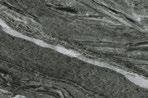
C2280 Alpenschiefer grau* / Alpine slate grey*
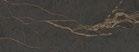
C2260 Marmor Dolomiti Nachbildung* / Marble Dolomiti effect*

C2040 Lavaschwarz / Lava black
C2050 Grafit / Graphite

C2830
Marmor Nox Nachbildung / Marble nox effect

C2270 Arctic black / Arctic black
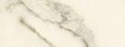
C2800 Marmor Livorno Nachbildung / Marble livorno effect
C2210 Concrete grey / Concrete grey
C2240 Travertin dunkel matt Nachbildung* / Travertine dark matt effect*
C2730 Eisenglimmer grau / Iron glimmer grey

C2770 Marmor nero Nachbildung* / Marble nero effect*
C2780 Bianco beige / Bianco beige
C2070 Beton grau Nachbildung* / Concrete grey effect*
C2290 Beton braungrau* / Concrete brown grey*
C2810 Porto nero / Porto nero

C2250 Alpina nero / Alpina nero
* Dieses Dekor hat in der Fläche unterschiedliche Einschlüsse / This decor has different colour gradients in the surface
Quarzstein
Quartz

Q1340
Blanco Zeus matt / Blanco Zeus matt

Q1370
Et. Calacatta Gold matt / Et. Calacatta Gold matt

Q1310
Cemento Spa poliert / Cemento Spa polished
Q1390
Lime Delight matt / Lime delight matt
Q1360
Calypso matt / Calypso matt
Q1330
Poblenou matt / Poblenou matt

Q1300
Negro Tebas 18 poliert / Negro Tebas 18 polished

Q1320
Seaport matt / Seaport matt
Naturstein
Natural stone
Q1350
Et. Marquina matt / Et. Marquina matt
N1010
Viscont white / Viscont white
N1060
Mystic grey / Mystic grey
SensiQ

K092F
SensiQ kristallweiß feinmatt AFP / SensiQ crystal white fine matt AFP
K207F
SensiQ kieselgrau feinmatt SFP / SensiQ pebble grey fine matt AFP

K347F
SensiQ toskanagelb feinmatt AFP / SensiQ tuscany yellow fine matt AFP

N1050 Silver Cloud / Silver Cloud

N1030
Nero Assoluto classic / Nero assoluto classic

K097F
SensiQ muschelweiß feinmatt AFP / SensiQ seashell white fine matt AFP

K277F
SensiQ achatgrau feinmatt AFP / SensiQ agate grey fine matt AFP

K292F
SensiQ indischrot feinmatt AFP / SensiQ Indian red fine matt AFP

N1000 Steel grey / Steel grey
N1020
Black Pepper / Black Pepper

K122F
SensiQ kristallgrau feinmatt AFP / SensiQ crystal grey fine matt AFP

K262F
SensiQ terragrau feinmatt AFP / SensiQ terra grey fine matt AFP

K417F
SensiQ azurblau feinmatt AFP / SensiQ azure blue fine matt AFP

K237F
SensiQ steingrau feinmatt AFP / SensiQ stone grey fine matt AFP

K202F
SensiQ saharabeige feinmatt AFP / SensiQ Sahara beige fine matt AFP

K142F
SensiQ kobaltgrün feinmatt AFP / SensiQ cobalt green fine matt AFP
SensiQ

K192F
SensiQ lavaschwarz
feinmatt AFP / SensiQ lava black fine matt AFP
Glas Glass
G092A
Glas matt kristallweiß AS / Glass matt crystal white AS
G207A
Glas matt kieselgrau AS / Glass matt pebble grey AS

G572A
Glas matt platin metallic AS / Glass matt platinum metallic AS

G187A
Glas matt onyxschwarz AS / Glass matt onyx black AS
K187F
SensiQ onyxschwarz
feinmatt AFP / SensiQ onyx black fine matt AFP
G097A
Glas matt muschelweiß AS / Glas matt seashell white AS
G277A
Glas matt achatgrau AS / Glass matt agate grey AS

G577A
Glas matt bronze metallic AS / Glass matt bronze metallic AS

G122A Glas matt kristallgrau AS / Glass matt crystal grey AS

G262A
Glas matt terragrau AS / Glass matt terra grey AS

G582A
Glas matt basalt metallic AS / Glass matt basalt metallic AS
G237A
Glas matt steingrau AS / Glass matt stone grey AS
G202A
Glas matt saharabeige AS / Glass matt Sahara beige AS

G192A
Glas matt lavaschwarz AS / Glass matt lava black AS
Massivholz Solid wood
/
AUTHENTIC KITCHEN
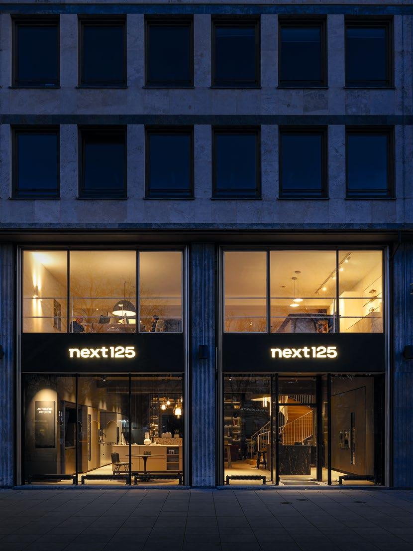
Erleben Sie next125 in Ihrer Nähe
IHRE PARTNER FÜR BERATUNG UND PLANUNG: Finden Sie den next125 Concept Store oder den next125 Händler in Ihrer Stadt oder in Ihrer Region. next125 in your neighborhood
YOUR PARTNERS FOR ADVICE AND PLANNING: Find the next125 Concept Store or the next125 dealer in your city or region.
Folgen Sie uns
LASSEN SIE SICH INSPIRIEREN: Auf Instagram, Pinterest, Facebook und Youtube. Auf unserer Website, in unserem Newsletter.
Follow us
ALLOW YOURSELF TO BE INSPIRED: on Instagram, Pinterest, Facebook and Youtube. On our website, in our newsletter.
Your design
Die next125 Küchencheckliste zum Download
WAS IST IHNEN BESONDERS WICHTIG? Die next125 Küchencheckliste hilft Ihnen, Ihre individuellen Wünsche, Vorlieben und Bedürfnisse zu erkunden.
The downloadable next125 kitchen checklist
WHAT’S IMPORTANT TO YOU? The next125 kitchen checklist helps you explore your individual wishes, preferences and needs.
HERAUSGEBER PUBLISHER
Schüller Möbelwerk KG
Rother Straße 1 91567 Herrieden Germany
Tel +49 (0) 9825 83-0 Fax +49 (0) 9825 83-1210 info@next125.de .next125.com
KONZEPT UND GESTALTUNG CONCEPT AND DESIGN
Strichpunkt – Agentur für visuelle Kommunikation GmbH .strichpunkt-design.de
FOTOGRAFIE PHOTOGRAPHY
Gieske Studios GmbH & Co. KG
Korbinian Seifert Urban Zintel
BILDBEARBEITUNG IMAGEWORKS
F&W Perfect Image GmbH .medien-und-printpartner.de
DRUCK PRINT
F&W Druck- und Mediencenter GmbH .fw-medien.de
KOOPERATIONSPARTNER COOPERATION PARTNERS
Wir danken unseren Kooperationspartnern für die Zurverfügungstellung ihrer Produkte für die Fotografie unserer next 125 Küchen:
Our thanks are due to our cooperation partners for providing their products for the photographs of our next 125 kitchens: Moritz Bönisch / Instagram: mo.mitz
RICHARD LAMPERT .richard-lampert.de
MIN Glas / Instagram: min_glas flex! mid-century vintage design .flex-nbg.de
Mohammad Al Helal .al-helall.de
Zwilling J.A. Henckels Deutschland GmbH .zwilling.com
WMF Professional .wmf-professional.de
CASE STUDY
Pera Meze / Ali Güngörmüş w.pageou.de
CREATIVE MAKER
Francis Kéré .kerearchitecture.com
Technische Änderungen und drucktechnisch bedingte Farbabweichungen vorbehalten. All rights reserved for technical changes and variations in shade and colour due to printing quality.
ZERTIFIZIERUNGEN CERTIFICATIONS


WIR LIEBEN KÜCHEN! Jedes unserer Produkte verkörpert die DNA von next125 bis ins kleinste Detail. Nicht zuletzt deshalb ist next125 vielfach ausgezeichnet: Der Kochtisch, die Vitrine, der Trolley, das Paneelsystem, das Sideboard und – ganz aktuell – der Markenauftritt. UNSERE DESIGN STORY: AB SEITE 106
WE LOVE KITCHENS! Each and every one of our products embodies the next125 DNA down to the smallest detail. That’s just one of the reasons why next125 has won numerous awards for the cooking table, glass display unit, trolley, panel system, sideboard and – quite recently – brand presence. OUR DESIGN STORY: FROM PAGE 106