5 minute read
School Branding

Our new School BRANDING
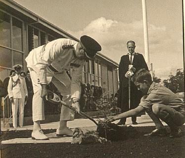
In 2018, PISA testing data highlighted the fact that New Zealand students didn’t seem to have a particular sense of belonging or ownership of their school. Our school data also supported this view.
Armed with this data, and the recently announcedbuilding redevelopment project, the college Board saw this as an opportunity to improve some aspects of our branding in order to improve our student’s sense of belonging. Woods Agency were contracted to create a coherent pathway to link our proud history to the future. Their brief was to make this story meaningful and relevant for our students and to create a sense of pride for the whole school community.
Woods Agency began their consultancy with six workshop groups of students, staff, and the board, as well as a parent / communitysurvey.
The feedback that Woods received from these stakeholders are as follows:
School Strengths:
Being inclusive and accepting of diversity –preparing for the real world Co-ed - cross section of all society Size –allows us to offer more opportunities Strong in special education, music, drama and dance Teachers genuinely care about students and helping them There is a unique and beautiful story about the origins of the site which aligns with the concept of community, and working together to bear fruit
School Challenges:
Large size –students can get lost, feel overwhelmed or isolated Te reo isn’t normalised here –culture shouldn’t be an afterthought Not everyone is aware of the opportunities here –we need to promote thesebetter Lacking a strong brand identity Lack of consistency across ourcommunication The school community struggles at times to cope with change and uncertainty
Woods Agency summary of this process was: “We have found that students are conflicted around the issue of change as they don’t like too many things changing, but also complain that the school brand doesn’t reflect them. They want their school to be relatable to them. It is a confusing time as they are unsure of their identity –so we need to help create a brand that communicates what the future looks like and what it means to them. The college can anticipate that there will be some pushback from parts of the school community with any changes to the identity.
Given this lack of surety, we had to be sure of our Why, How and What:
We agreed on the following:
Our…Why is to prepare students for life.
Our… How is to create opportunities for them to grow and develop in a safe, inclusive learning environment that reflects the diversity found in the real world.
Our… What is that Ōtūmoetai College provides a complete and enriching education that encompasses students’ academic, social and emotional development needs.
What Woods learnt about our crest and motto (DOCTRINA VITAM ILLUMINET):
The crest seems very formal and foreign to their world. The language doesn’t connect with the student base. However, the essence/meaning behind the motto that school prepares students for the rest of their life is still very relevant. Latin? - should be a te reotranslation.
The logo and identity:
Woods Agency explored three options for evolving the school’s identity and considered refining and improving the logo through to a modern reimagining of the logo. Their consultation process indicated a modern reimagining was the best way forward. Through this reimagining process Woods were careful to retain the heritage and tradition of the current brand, showing that the school has solid foundations, while being deliberate about defining a clear new focus. By reimagining the logo Woods were able to craft our identity in order to tell the story we need to. They saw the opportunity to create a modern aesthetic that will enhance the design of the new buildings and set the school up well into the future.
The Logo Iterations from 1 –7 were as follows:
1.
2.

3.
4.
5.
7. 6.
Let Leaning Enlighten Life
Kia māramahia te ora e te akoranga

Consensus was reached as to the two final options for our new school logo, options 6 and 7:
Students had the opportunity to vote on their preferred option and the outcome was as follows:
Students voted 85% for Option 2 and 15% opted for Option 1.
Option 2 was then sent to the Board as the preferred option for a new logo for the college.
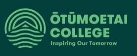
The Board decided to adopt Option 7 as our official logo on 1 st April 2020. It was decided that our motto, Let Learning Enlighten Life, be retained from the previous crest.

OUR LOGO STORY
Our logo is a visual representation of ahi ka (home fires). Ōtūmoetai College is ahi ka for ourstudents - a beacon that will always draw them home to the place where the roots of their future were first planted.

Ahi ka is made up of three parts:: - Nohu - Mahinga Kai - Tipuna.
Noho -a connection to the land and sense of belonging
The confidence to explore, knowing we will always have a home to return to.
MahingaKai-theabilitytogrowourownfood
Carrying knowledge that will help us be selfsustainable throughout life.
Tipuna -our ancestry or whakapapa
Understanding ourselves, where we have come from and where we are going.
Calm waters
The bottom of our logo is made up of curved lines thatrepresentourregion's calm watersand the safety of our learning environment.
Future Potential
The top of our logo takes the form of radiating curves –symbolising Inner growth as we strive to reach our potential
Our logo can be used as a horizontal lock up as well as a badge. .

Horizontal

Badge