COLOUR COMMUNICATION
COLOUR COMMUNICATION
Do you love colours? Most people enjoy colours, either in products or simply in nature. Colours are an important part of our lives and give us so much joy and fascination every day. In our everyday speech, Ò I feel blueÓ , Ò red as a tomatoÓ or Ò I live in the green house down the streetÓ Ð we often boost the story-telling by describing colour or the feeling of colour. Colour is a rather complex phenomenon, especially in psychology. This is the story behind colour communication and why it can be so hard to understand each other!
Colour codes and communication Ð piece of cake!?
Text: LOUISE KLARSTEN CEO ColourHouse Sweden
I
n the old days, we used descriptions like Òt omato redÓ. Well in production this is not precise enough anymore. For several reasons. First, our eyes can capture up to 10 million colours. But no production unit can manage that, it would be a never ending production line, which would be totally hopeless in the fashion industry because of lead time and costs. Secondly, tomatoes do not have the same red colour everywhere for natural reasons. As well as that, we are not sure if we capture the same idea of red evenly, as our eyes are individual, and our colour perception varies. Humidity makes a difference, and the quality of light is different in different parts of the world. Industrialisation, however, brought a need to simplify colour in design, production, quality control for an end-result which controls the colour in reproduction. Goethe tried to see all the colours through the prism, remember? And the artist, Munsell, around the turn of the last century got fed up with buying different colour shades every time he went to the art-shop for more paint. He started to describe colour in three dimensions too. And then this is where the world started, in the early days of colour communication systems in the 50s and 60s, to formulate the standard of colours, to describe 32
try to improve digital colour communication on desktop, on a mobile phone, on a tabletÉ on a TV-set with internet connectionsÉ And on digital screens, all the old-world knowledge of how colour is created, is turned upside down, because on a screen, colour is created by colour, saturation and light, which is the opposite to physical colour where you add black pigments. This is one of the main reasons why we have so much trouble working on screen, looking perhaps at a t-shirt design and changing colours on the screen, to make up our minds Òt his looks like a nice rangeÓ. Then the journey starts. Can I print out the colours on my printer to match the screen. The answer is actually no. On screen we have so many more possibilities (larger colour space) but with a CMYK (cyan, magenta, yellow and key black) we can only achieve a limited range of visual colours. Green, in particular, is especially hard to manage in CMYK. It is, of course, possible to use Solid colour swatches. In a Pantone Plus (former PMS) solid colour 262C, got example, you have a better chance to compare to the screen. But you cannot print it out yourself, you need a printer to hand mix that colour for you and print out. It is OK with 1 or 2 colours, but it is not normal practice to print in original solid PMS colours to achieve full colour. So what you do is compare visually. It might be the case that you have a textile colour swatch, Pantone TCX (cotton) solid woven colour swatch. That will show you the right colour, but it is also very important to look at real colour, since we donÕ t yet wear digital clothes. In other words, do not make your final colour choice on a screen. By all means use cad for the everyday preliminary work, but when it comes to a final decision on colour, use a solid colour system
that matches your needs. And whatever choice of colours you finally make, perhaps a from a colour card of 45 colours, you order swatches for your production partners, so that they can control production using the visual sample. DIGITAL COMMUNICATION
Digital colour communication has evolved in parallel with visual colour communication. As mentioned above, we all do our work on screen these days. But we would also like to pull colours out of a product into the digital world. We can measure a sample, get the reflection curve (digital) in a format such as QTX or CXF, and then the computer shows the colour digitally on our screen. This curve is useful in the dying process, with the necessary support of a physical sample to enable a final decision to be made to accept or reject a colour by eye. There are many occasions where it is helpful to work with the colours in digital format. For instance, you have a photo of a nice printed dress and would love to extract the colours of that print. This can be done today with rather simple and effective tools, known as spectrophotometers. In production, those are advanced and expensive units, but for everyday work there are products such as like Color Munki and Capsure, that read colour from a surface, including uneven knitted surfaces, or from an uploaded digital photo in the newest 2010 versions. Then you can pull out, for example, the Pantone numbers in that print, and continue to work with that colour range. Quick and easy! However, the digital and the human do not always agree on colours. There is another important
colour in a three dimension: colour family, saturation of colour and level of added black. This led to the development and launch of a number of colour systems on the global market over the past 30 years, in all kind of industries. There is the German RAL, the Swedish NCS, the American Pantone, the American Munsell and the Japanese Scotdic. A realistic maximum is around 2,000 colours, which is also the number of colours many of the systems handle and offer as standard. They are all based on different materials, and were originally aimed at a specific business and product need, for graphics, paint, textiles, plastics and metallics and so on. Even today, people choose a system to match the product they are working with, but also influenced by the tradition and custom of their region, business or country. There is, however, a pressing need for global colour language in todayÕ s fast production lines. Visual colour communication guides and books are available in many industries and are used daily by product designers, production units, dyers, graphic designers, printers, weavers and so on. It is not only the products themselves that need colour and quality control, so also do the graphics in labels, packaging and communication. The whole world of online shopping has forced the industry to
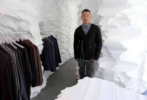
Concentrated work to choose colours from Color Archive, d.cipher fm
33