STORIES
According to neuroscientists, we experience our surroundings through our senses. Through sight, touch, smell, sound and taste we ‘read’ spaces, helping us make good decisions and lasting memories. It explains why, in nature, with its abundance of colours, textures and scents, we feel the environment so intensely.
In our homes too, our senses influence how we respond to the rooms we create. The solid wood that we use in Neptune furniture appeals to many of our senses. Visually, the grain in each piece of wood is unique and beautiful, while its tactility is warm and reassuring, and the smell of the woods we work with, like solid oak, is highly evocative, connecting and grounding us with the natural world.
At Neptune we have always been sensitive to the way a room makes one feel. From our stores which feel more like homes, to the welcoming kitchens our design experts help create and even our new collection of garden and country scented candles, we believe a well-planned, carefully curated home, that appeals to all the senses, is a happy place to be.
In this volume of Stories we explore the concept further, looking at how paying attention to our senses can enhance our lives. From memories of a granny’s rose water bottle in the bathroom cabinet or the sensory aliveness of outdoor theatres to the rich timbres of regional lexigraphy, we celebrate the power of our senses in our homes and beyond.

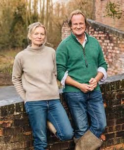
John Sims-Hilditch & Giles Redman Neptune co-founders
The Neptune guarantee
Look out for our new lifetime guarantee on all our timber and upholstered furniture.
Thank you to the talented authors and journalists who contributed to this edition, along with our fabulous team of in-house writers.


Suzanne Imre
For many years Suzanne Imre was the influential editor of interiors magazine Livingetc; a renowned style pundit and trend leader. Today, she works as a brand consultant, content director and writer. She lives in London and is always planning her next decorating project. @suzanne.imre
Kassia St. Clair
Kassia St. Clair is an author, cultural historian and broadcaster, and writes for The Economist and Architectural Digest. Her book, The Secret Lives of Colour, was Radio 4’s Book of the Week. Her latest book, The Golden Thread, is published by John Murray Press. @kassiastclair
Tamsin Westhorpe
As gardener and director of Stockton Bury Gardens in Herefordshire, Tamsin’s horticultural career spans three decades. She is author of three books and was previously editor of The English Garden magazine. Tamsin is an RHS Judge, writer and editor of the Horticultural Trade Association members’ magazine. @tamsinwesthorpe
Noni Ware
Noni Ware was the acting executive editor at House & Garden magazine and was previously executive editor at both Vogue and Harpers Bazaar. She is now a travel writer for AD Middle East and lives in London with her husband and five children. @noni.ware
Roddy Clarke
Design journalist Roddy Clarke’s love for craft and design stems from a background in restoration, growing up witnessing his father restore broken porcelain and pottery. Today, Roddy’s work is centred on the social and environmental impacts that design can have. @roddyclarkedesign
Rachel de Thame
Rachel de Thame is a horticulturalist, broadcaster, designer and writer. Rachel is perhaps best known for presenting on BBC2’s series Gardeners’ World and is a long-term member of the BBC team covering the Chelsea Flower Show. Rachel is a regular columnist for The Sunday Times and The Garden magazine. @racheldethame


Arabella Youens
Arabella began her journalism career on the (then) newly launched Country Life website. Moving to the magazine as property editor, she spearheaded an interiors section which is now a firm fixture within its pages. In 2016 she went freelance and writes about property, interiors and design for national media.
@arabellayouens
Katie Spragg
Katie Spragg is an artist who works predominantly in ceramics, exploring our relationship with plants. She is interested in the ways clay-making can be used as a tool for storytelling, reducing isolation, and promoting creativity and imagination. Katie is also a tutor at the Royal College of Art. @katie_spragg_ceram
Eleanor Cording-Booth
Eleanor Cording-Booth is a freelance writer for titles including House & Garden and Cabana Magazine, plus her best-selling Substack; A Considered Space. Despite frequent threats to move away, Eleanor has rented a tiny flat in London’s Barbican Estate for the past decade.
@aconsideredspace
Emma Sims-Hilditch
Creative founder of Interior Design Studio Sims Hilditch, Emma Sims-Hilditch began her practice twenty-seven years ago. Today, accolades include being listed on The Top 30 Sunday Times Interior Designers. Her passion for vegetarian and vegan home cooking has seen her build a loyal following on Instagram. Emma is also the creative founder of Neptune. @emma_sims_hilditch
Sean Pritchard
Sean Pritchard is an award-winning garden designer, plantsman and author based in London and Somerset. In 2022, Sean designed the Macmillan Legacy show garden at RHS Hampton Court. His first book, Outside In, was released in 2024. @sean_anthony_pritchard
Jo Rodgers
American born Jo Rodgers is a journalist who lives in London and East Sussex with her husband and two children. She is a contributing writer at Vogue, Condé Nast Traveller, House & Garden, and Country Life.
@jo_rodgers
we love Marlborough Tiles
the house red Eleanor Cording-Booth
the kitchen with
Sims-Hilditch
Spragg

Like all good stories, Neptune’s journey began with one idea and a leap of faith.

In the spring of 1996, two entrepreneurial friends were exploring ideas for new products and designs. For John Sims-Hilditch, with two young children and a third on the way, getting a concept off the ground by that summer was pressing. It was then that Giles Redman recalled the success he’d had selling some large Mexican hammocks to friends while at university.
‘The conversation evolved, and we soon realised we could design a hammock for an English garden, based on a naval style canvas one, but make it large enough for two adults because we thought that would be more fun,’ recalls John. ‘And, as I had young children, we thought we’d make one that could hold children safely too. So, our brief was decided: a garden hammock that was both fun and safe.’
In a design approach that would set the strategic direction for all Neptune products, John and Giles weren’t content to use existing concepts but wanted to develop an original design that could improve on existing options, incorporating traditional craft techniques and modern refinements. ‘We used a spreader bar to spread the canvas out (as they do in the Navy) and make it more comfortable,’ explains John, ‘and to make the seat safer, we ran a cord along both sides of the canvas that could be pulled up to hold those inside safely.’
The entrepreneurial duo soon realised that not every garden was blessed with two perfectly positioned trees to hang the hammocks from, so they built an A-frame
structure which could hold one end of the seat, with a spiral screw to secure it, and made a tree or wall hook for the other end. The options meant the hammock could be hung from a tree, from the wall or from the A-frame. Indeed, the first promotional material boasted ‘the hang anywhere hammock will comfortably carry two adults or a gang of children’.
On 20 July 1996, John and Giles set off for Fairford Air Show in Gloucestershire with forty cream, navy, yellow and green hammocks. They were an instant sell out and all summer John and Giles toured country fairs and shows with their ‘hang anywhere’ hammocks. In September they took a stand at the Garden Leisure Exhibition at the NEC in Birmingham. Once again, the hammocks were a resounding hit. By the end of the show, they had signed up 80 stockists, including Harrods. ‘Suddenly, we were in the garden business,’ says John. ‘That first year we sold 5,500 hammocks.’
Needing to respond to this demand, John and Giles quickly established a powerhouse cottage industry of skilled experts. They secured a seamstress in Nottingham to sew the canvas seats and based themselves at a small farm in Wiltshire; the wooden A-frames were made in the outhouses and the hammocks were configured and packed by two local helpers, Shirley and Jackie, in one of the bedrooms. The sitting room became the young company’s nerve centre where John and Giles could plan their next design, a rocking deckchair. Neptune’s story had begun.

A self-confessed perfectionist, Neptune co-founder John Sims-Hilditch tells editor Suzanne Imre how designs are refined to reach the standard required for launch.

hen the Eliza sofa, with its single cushioned seat and exposed oak frame, was launched in 2024 it had gone through months of prototypes and reviews (see Stories Vol 20 for the full story). But that wasn’t the end of the Eliza’s journey, as John Sims-Hilditch, co-founder of Neptune explains:
‘Having designed the upholstered Eliza sofa and brought it to life, we saw it could also work with a loose cover, a relaxed look popular in Belgium interiors and one we’ve always admired.’ And so, an evolution of the Eliza design emerged, the same elegant proportions as the upholstered version, now with a more informal loose cover.
This refining of designs to reflect lifestyles is hardwired into Neptune’s DNA. The new freestanding, solid wood double Suffolk larder is a case in point. A fitted version had existed for years but customers, kitchen designers in stores and our installation teams all clamoured for a freestanding option. And so, a moveable option has been created, making the fitting process simpler and offering more flexibility for customers.
According to John, there is a balance to be had however, a need to understand when a product requires more work and when it is ready to launch. ‘As designers, you can keep going forever,’ says John, ‘but you need to get to a point where a piece looks and feels fabulous and then it is time to let it go. When we launched our kitchen cabinetry nearly twenty years ago, we knew we wanted internal lighting in the cupboards, but the technology wasn’t ready, so we didn’t wait to launch the kitchens. We just introduced lighting as soon as we could.’
This ability to refine a design until it reaches a standard deemed ready to launch is made possible, in part, because we wholly own our design and manufacturing process. ‘In order to create homes that make people’s lives better, you have to go beyond the fundamentals,’ says John. ‘We understand that if you are going to make a kitchen, it’s not just about the cupboards and drawers, it’s about how the pieces feel, the way a door catch closes, and the pleasure and experience of daily use. You can’t achieve that level of detail if you’re not in control of your manufacturing process.’
The Wiltshire based design team work closely with the manufacturing team to invent solutions and resolve challenges. ‘We do our own designs, we select our preferred materials and specify the joinery techniques used,’ says John. While other manufacturers might be guided by what the factory producing their pieces can offer, Neptune’s production house works side by side with the design team to refine and deliver the optimum results. ‘By owning the whole process and making everything from solid wood, we can be sure of the quality we are delivering,’ adds John. ‘It is why we can confidently give customers lifetime guarantees on our kitchens and furniture collections.’

This is the
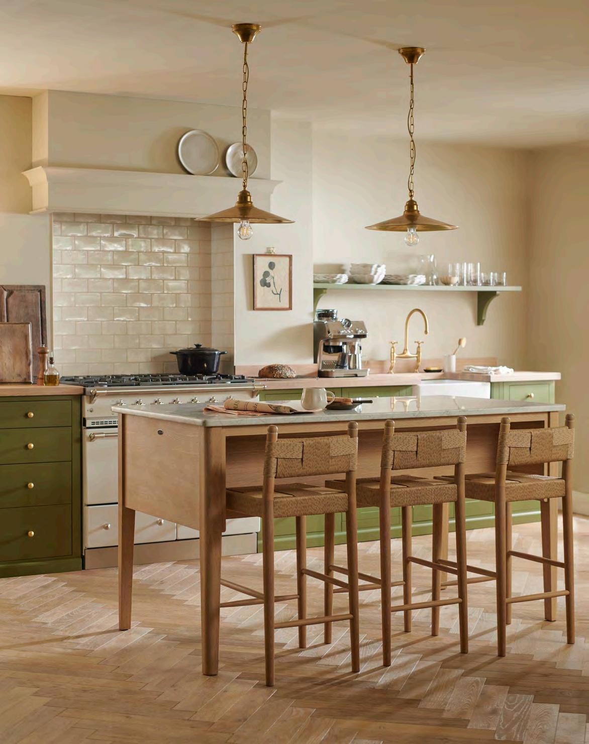
The heart of many kitchens is the island. That all-singing, work surface-meets-storage-meetsdining spot. Yet not all kitchens are designed to house such a solid and immoveable construction. Until now. Step forward the new, freestanding Borough kitchen island. Crafted from natural oak, this Carrara marble-topped centrepiece features four solid oak drawers and space for up to three bar stools. With gracefully curved corners, the Borough island can take centre stage, sit happily to one side of a kitchen or even move with you when the time is right.
Discover our full island collection, visit neptune.com/islands
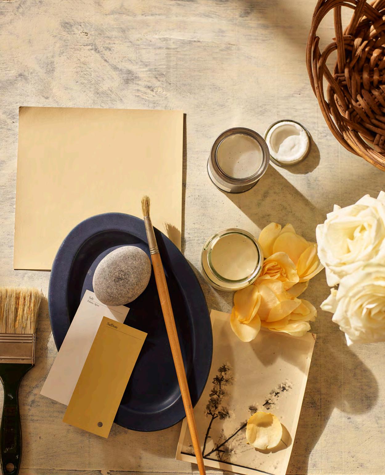
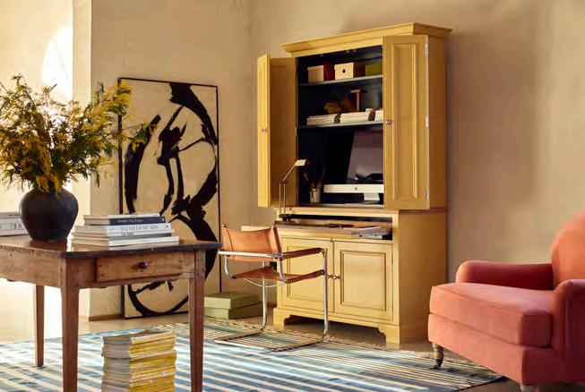
Our new creamy yellow paint shade, Polenta, has a long association with artists but it is the colour’s emotive properties that make it the perfect decorating choice, as colour expert and author Kassia St. Clair reveals.
The Dutch artist Rembrandt Harmenszoon van Rijn was greatly enamoured of soft, buttery yellows. In part this was a fashion of the period. In the wake of the heady, colourful whirl of the Renaissance Masters, artists like Rembrandt, Caravaggio, and Correggio preferred a palette of shadows dramatically interspersed with points of light. In Rembrandt’s painting Danaë, the eponymous mother of Perseus is depicted reclining nude in bed, awash in pale golden light. The Philosopher in Meditation is a darker canvas, the scholar seated beneath a staircase that whorls like lemon peel, his face and desk illuminated by warm light streaming through a window. The glowing light becomes a metaphor for contemplation, learning, even, perhaps, divine inspiration.
As a colour, yellow has a curiously Manichean history. On the one hand, it was derided. Medieval Western culture simultaneously associated it with a choleric, or angry temperament, and with cowardice, think “yellow-bellied”, a twentieth century continuation of the same idea.
On the other hand, few colours have been as celebrated. Yellow ochres were among the earliest pigments ever used, smeared onto cave walls and sprinkled into and around grave sites. Ancient Egyptians depicted beloved gods and goddesses with yellow bodies. This was the colour of the sun, of honey, ripe wheat, plentiful harvests and firelight. It is also, of course, the colour of gold, the most precious metal.
In interior design, after centuries as a mainstay, pale yellows have spent a couple of decades in the margins. Cooler whites and greys became the neutral of choice during the late 2000s and 2010s, but now, it seems, pale yellows are back on the menu.
The reasons for this are complex. In part we can thank the circularity of trends, but there are other factors at work too. The covid pandemic, the increasing demands of technology on our time and attention, our exhaustion with social media and a desire for a more authentic connection with the natural world have all been having an impact on our preference for certain colours for a few years. Think vibrant greens, botanical prints, terracotta tiles, jute and boucle textures.
People want colours that ignite their senses, that remind them of the preciousness of the natural world but that also feel comforting. What better hue then for our homes, than a warm, suffused and pale buttery yellow: the colour of candlelight, inspiration, divinity and the soothing comfort of a bowl of steaming polenta?


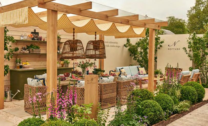
From the rose pavilion to garden furniture, the RHS Chelsea Flower Show is a date for every garden-lover’s diary. Gardener and RHS Chelsea judge Tamsin Westhorpe explains its allure.
Ask me to pick between a country lane or a bustling city and I will always choose the former – that is until May. There is nothing that will keep me from heading to London to walk through the gates of the world’s greatest flower show, RHS Chelsea. For one week every year, the twenty-three-acre site in the centre of London is home to approximately 500 exhibitors, 160,000 visitors, new plants, innovative ideas, celebrities and the world’s most accomplished plants people. Chelsea brings both the unexpected and the familiar – however, the one thing you will never see is a gnome (they are banned in the grounds of RHS Chelsea).
Once wrapped in the comforting arms of the showground the surrounding chaos of the city floats away, and your senses are overwhelmed. It serves as a perfect example of why urban gardens are so important. The show exposes emotions like nowhere else – it’s a place of happy tears and cheers and proves that gardening is as much about people as plants.
This kind of collaborative magic doesn’t happen overnight. It’s taken over 100 years to build such a strong reputation since the first show in 1913, each year is fifteen months in the planning and involves endless sleepless nights, coaxing of plants and solving of logistical conundrums. The reason why so many put so much into this bucket list event is to express their deep love of plants and demonstrate how they can change and enhance all our lives. It’s not just about the clinking of champagne glasses – it takes horticulture forward, breaks boundaries and embraces change.
When the event was first born it was held in a single marquee and has only experienced breaks during the two world wars. What was once one small venue is now the almost three-acre Great Pavilion. It’s home to perfumed roses, plump strawberries, proteas from South Africa and remarkably out of season daffodils. The portfolio of plants here is like nothing else on earth.
As well as a complete and utter indulgence of the senses, the show is a place of competition and excellence. An RHS medal is the goal for all exhibitors. It’s an honour to be one of the volunteer garden judges – we bring with us a wide range of experience and determination to give the best possible medal. There are nine criteria on which the gardens are judged, and these include planting implementation, design layout and construction.
One of the most important criteria is the brief which outlines what the designer hopes to create and the message the garden brings. The stories that the gardens are designed around are highly important, especially if they are relaying an environmental or charitable message.
Show garden judging takes place over two days and involves sixteen judges and two moderators. The public can also vote for the ‘People’s Choice Award’ so everyone gets to make their mark on this world-famous event. What will catch your eye this year?
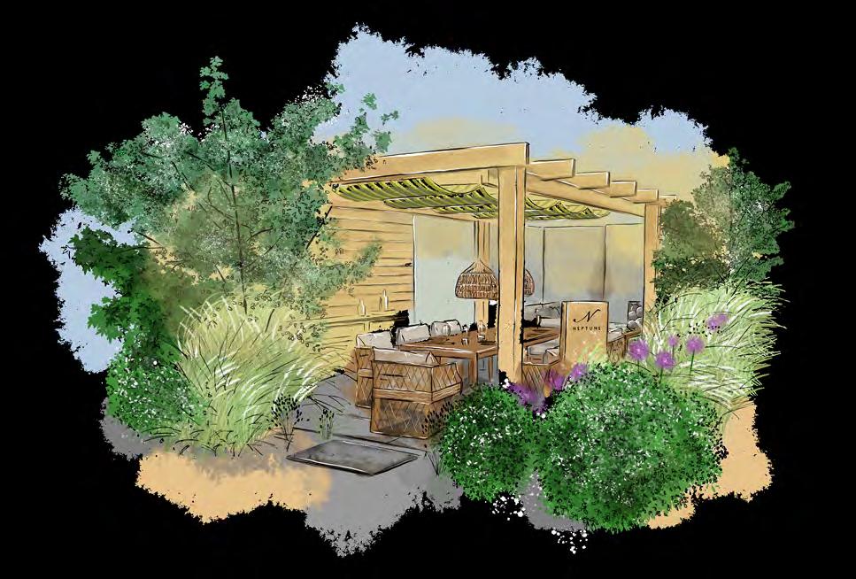
In 2024, we took an exhibition space at the famous flower show, featuring a canopied dining area and relaxing sitting area which won a 5 Star Tradestand Award. This May, we will be at the show again, with our new freestanding kitchen, a dining space and an alfresco seating area. We hope to see you there. For our full collection, visit neptune.com/garden

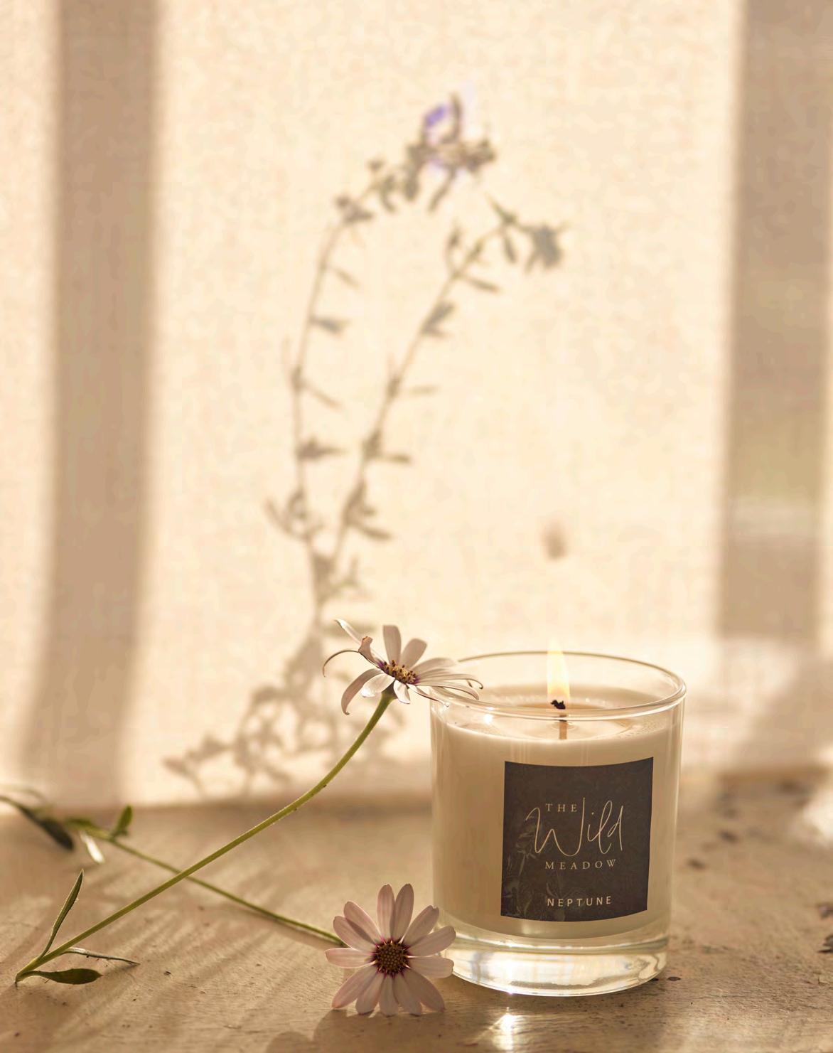
Rose water has been used as a medicine, culinary flavouring and perfume for centuries. As we launch our Rose Garden candle, interiors writer Noni Ware explores the fragrant allure of the rose petal.


It was not a pretty house that my grandparents lived in. Cement and pebble-dashed on the outside, built in the 1960’s with few architectural frivolities. My grandparents were both schoolteachers and the house sat in the Welsh valleys with a wide stream at the bottom of the garden where my sister and I paddled in the icy mountain water and climbed a vast mulberry tree which produced the juiciest purple berries every year.
But it was neither of these things that made a trip to my grandparents’ house so memorable. At the top of the uncarpeted wooden stairs was the bathroom, a pale pistachio green, badly lit and always chilly. Here, sitting on the windowsill, was the greatest excitement of all – a small and dusty, ribboned bottle of rose water. It was one of the defining memories of my childhood; carefully lifting it down from the shelf in front of the frosted windows, opening the top and inhaling that heady scent. A scent so mysterious, so very foreign, that even at the ages of eight and six, my sister and I were mesmerised.
The first Damascus roses were cultivated in Persia, during the Sasanian imperial dynasty when the ruling family built elaborate rose gardens with fountains filled with pink rose petals. Avicenna, an eleventh century Persian scientist, is credited with the invention of the first refined rose water and it was soon being traded throughout Egypt and Rome for its therapeutic and culinary qualities.
The Romans used the water and rose petals to scent their wine, as well as a beauty product for their skin. In India, emperors sprinkled rose water as a symbol of luck. Cleopatra bathed not only in milk and honey but also added rose water. Her fleet of ships was scented so heavily with rose water that Shakespeare writes (in Antony and Cleopatra) ‘the very winds were lovesick’.
It wasn’t until the sixteenth century, though, that the Rosa Damascena was imported into Bulgaria, and it was here, with perfect climatic conditions, that the Valley of Roses became the centre of rose oil and rose water production. Since 1903, the country has held a festival every year in Kazanlak, a celebration of the ‘liquid gold of Bulgaria’ where over 90 per cent of agricultural workers grow or harvest the Bulgarian Rose.
From perfume to soaps, face toner and creams, rose water is believed to have many properties –reducing stress, reversing the signs of ageing and even curing hangovers. But for me, it is a memory, a bottled memory of a childhood spent eating mulberries, paddling in a stream and standing in a cold Welsh bathroom and wishing I could smell that scent forever.
This is the
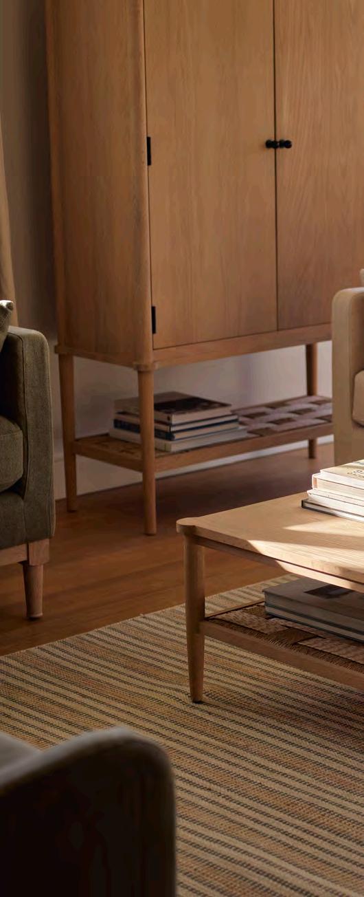
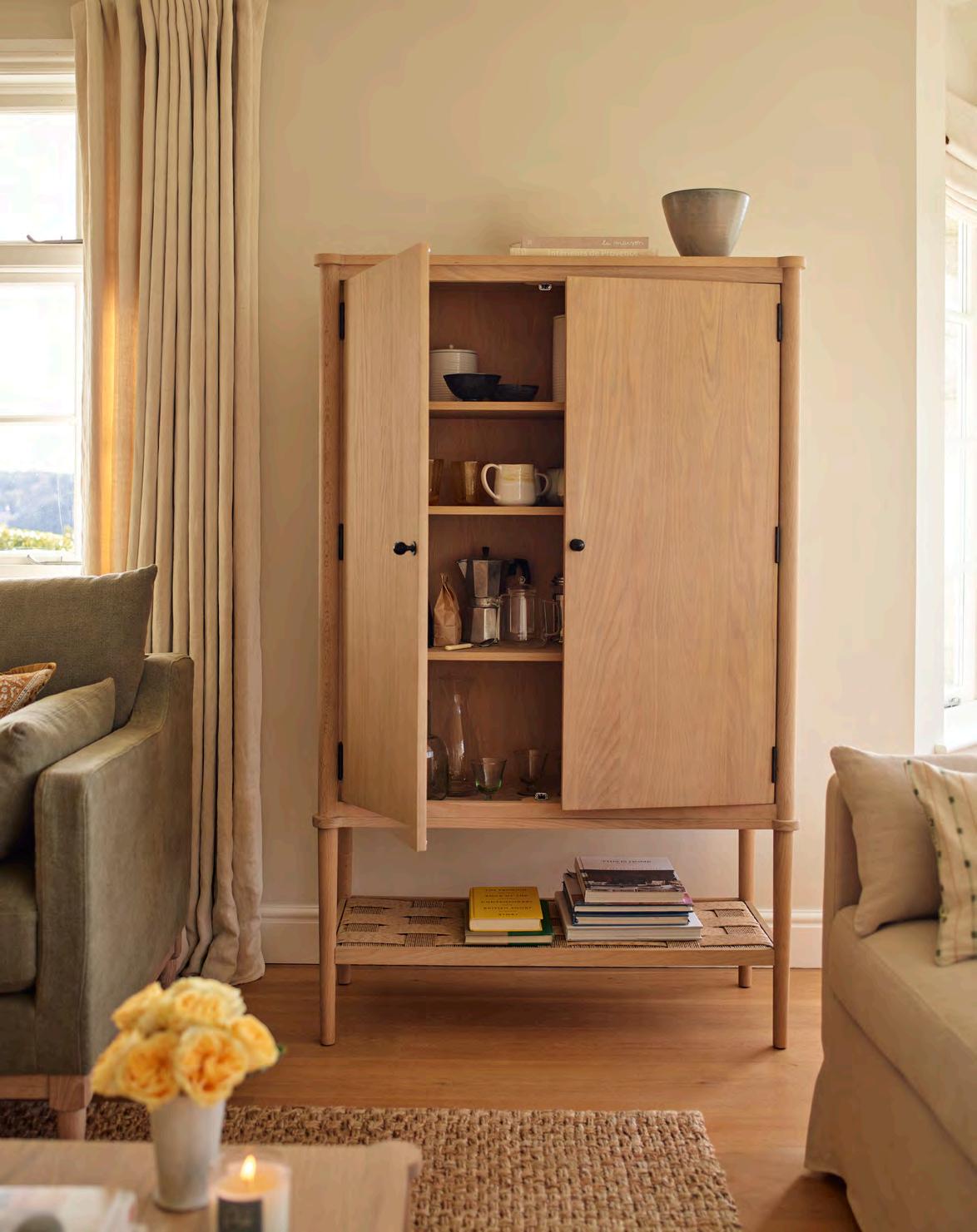
A coffee station, linen cupboard or board game repository. Tucking neatly into a sitting room alcove or against a free kitchen or landing wall, the new solid oak (or lightly painted black) Frome cabinet is a versatile storage option incorporating the finest details. Exposed black-bronze hardware brings a sophisticated, yet utilitarian, edge that balances with the softly rounded corners and tactility of the woven lower shelf. With three flexible internal shelves (thanks to our traditional zig-zag system), consider this a cabinet that adapts to your home’s ever-changing needs.
Discover the collection at neptune.com/frome


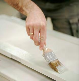
The way we design, craft and make our furniture means we can offer a lifetime guarantee on all our indoor furniture.
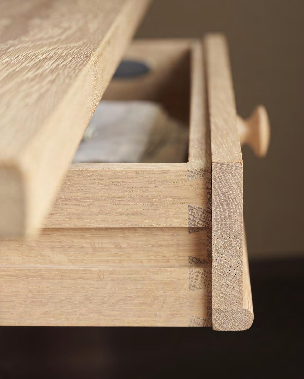
There is a philosophy that runs through Neptune’s design and making processes that made introducing the new Lifetime Guarantee to our furniture collections possible. Co-founder John Sims-Hilditch sums it up best, ‘From the start, I felt that if we were going to make furniture that was going to last indefinitely, then we’d needed to make the right decisions around the materials, how they were designed, and how they were engineered and made. Our first decision was never to use MDF or chipboard because we could see they didn’t have the longevity that we would want.’
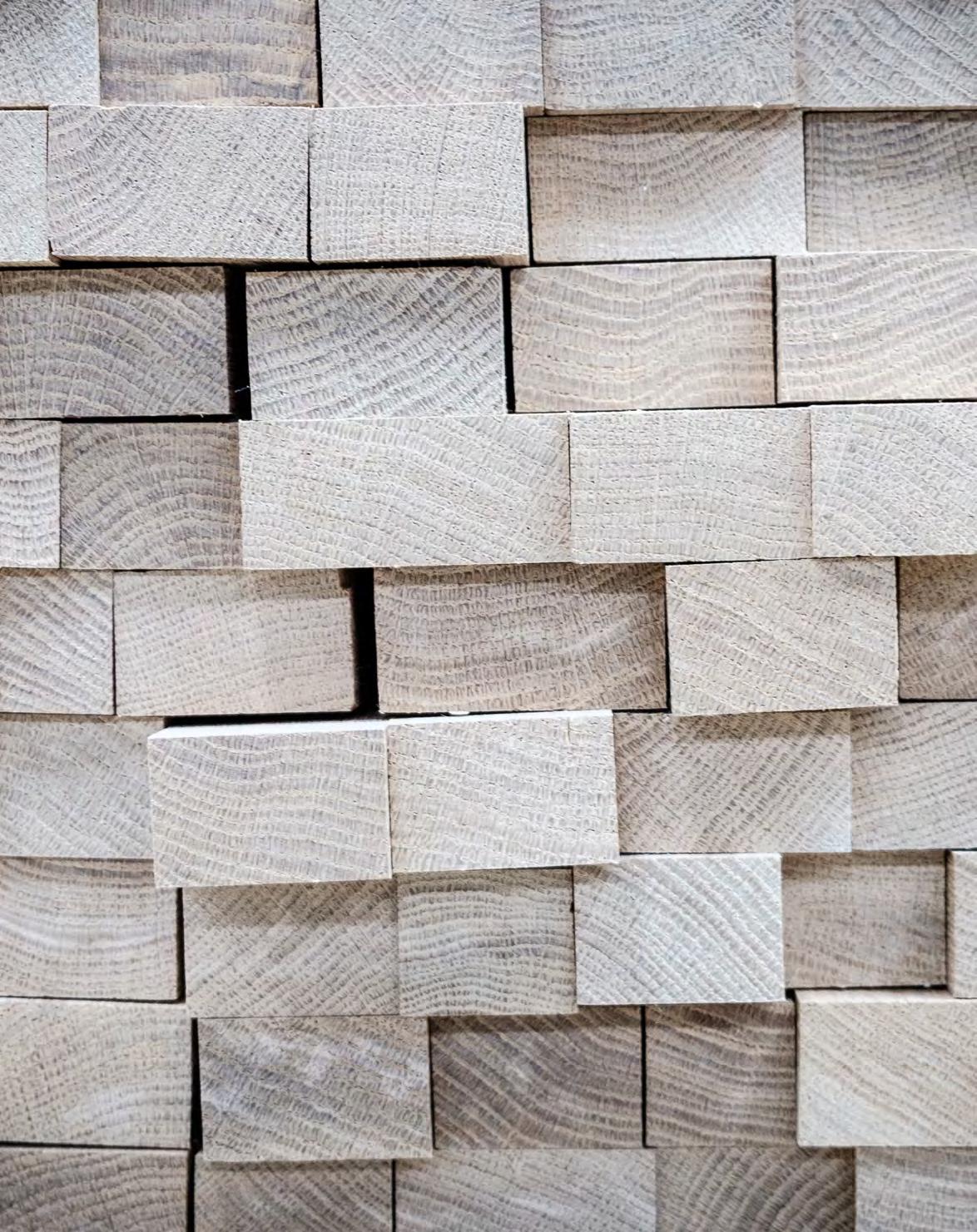
Nearly thirty years on, this commitment to long lasting craftsmanship remains. Solid timber forms the heart of Neptune collections, from sofa structures to trestle tables. ‘Oak has a long history in British furniture making,’ explains John, ‘it is incredibly strong but also naturally beautiful.’ Teak is good for outdoor furniture thanks to its protective high oleo resin content, and tulipwood for painted pieces because it has a smooth surface that carries paint well. Birch plywood is used for inset panels on cabinetry as it gives doors a rigid dependability without being heavy. And even solid tables like the Arundel and Suffolk are designed with central panels of cross-bonded oak to create a super-strong structure that won’t warp over time. ‘No one else uses this technique because it is hard to do, but it dramatically improves the life of the tables, so we believe it is worth it,’ explains John.

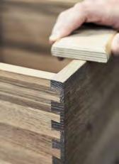
With the materials set, the starting point for any Neptune design is to look to antiques – those very items that themselves have lasted for generations. Design lead Mike Charlton crafts mini balsa wood models that allow him to see his ideas in 3D. ‘The models allow me to play with the shapes and joints and refine them easily,’ he explains. ‘A good model can tell you so much about a full-size piece of furniture, not only in its aesthetic but also in its strength and structure. If I designed the same piece of furniture on a computer, it would be more formulaic, designed the way that the computer has been programmed to work. There are no such restrictions when you use your own hands and physical timber.’
‘No one is going to reinvent the dovetail joint because it’s a thing of beauty as well as a high functioning piece of design,’ says John, and most Neptune designs feature classic, trusted joinery that has been proved to stand the test of time. That said, modern technology is also integrated into the making process. ‘Our lives are spent researching and developing to understand new techniques,’ he adds, ‘and when we come up with innovative ideas like the extending Moreton dining table which hides the extra surface leaves within a false drawer, it is a huge joy to us.’
Wholly owning the making process means quality and details are a focus. ‘We work closely with our highly skilled team at the Neptune factory in Qingdao,’ says Mike. ‘We have a good idea of how we would like the product to be made, however, we don’t have the day-to-day, hands-on experience of the workshop, so we work together to decide on the most appropriate joinery techniques and materials. We also visit the factory every few months to review samples and make any aesthetic improvements.’
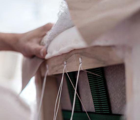
Our sofa collection is a case in point. All the frames are made of solid tulipwood and plywood, and the seat is built up with foam, webbing and Serpentine springs. But when it came to the cushion fillings, the design team were keen to offer an enhanced seating that balanced form and function. Some sofas have 100 per cent feather filled cushions but these require constant ‘fluffing up’. Working with the craftspeople at Neptune’s own factory, the team landed on the ‘perfect balance’ of long-lasting fibre fill, wrapped up with the comfort and ‘sink-in-ability’ of feathers. ‘Having that direct relationship between design team and factory means the product is always the focus and we can revise it until we get it completely right,’ adds Mike.
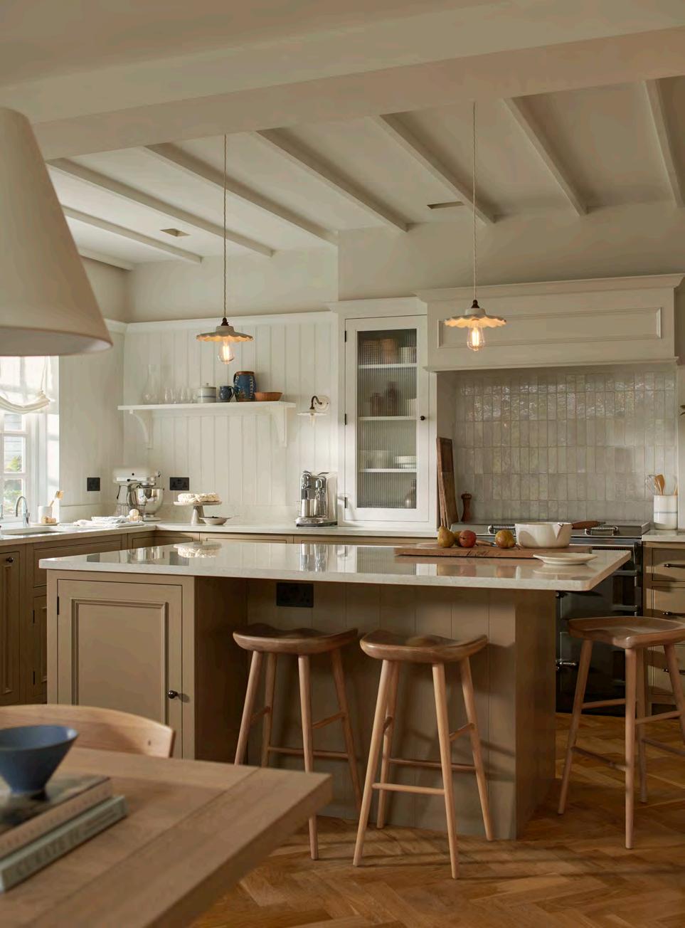
If you’ve ever had an internal conversation that goes something like, ‘I’m tired of my kitchen but there’s nothing wrong with it’, then Vivienne Cutler’s kitchen facelift story might just be for you.
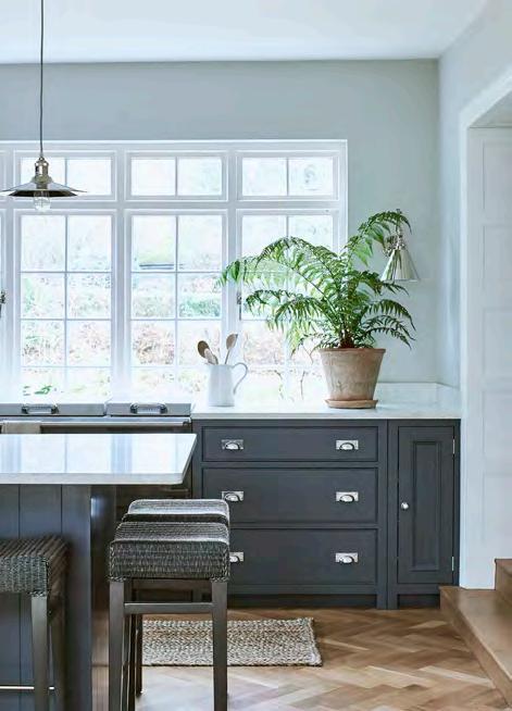
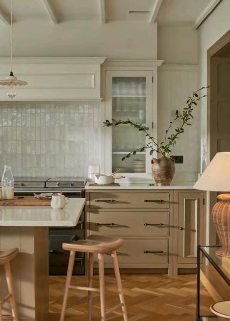
When the decision to build an extension on the front of their Victorian cottage left their relatively new Chichester kitchen in need of more light, it was the catalyst for an unexpected kitchen makeover for interior designer Vivienne Cutler and her husband Matthew. ‘We lost a big window when we added the extension and it really impacted the amount of light the kitchen got,’ explains Vivienne. ‘Suddenly we were needing to have the lights on in the middle of the day and our Chichester kitchen, painted in moody Smoke, felt too dark.’
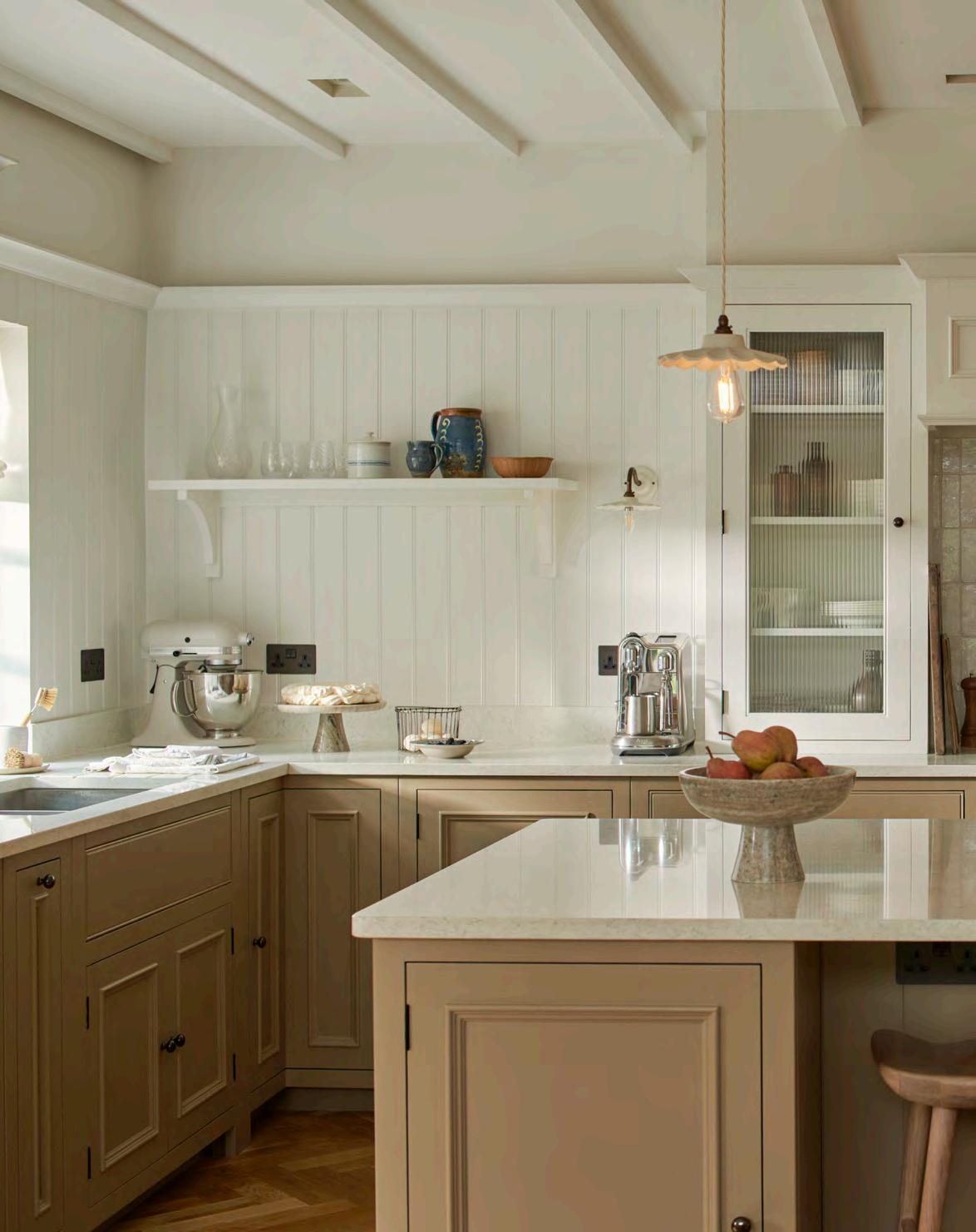
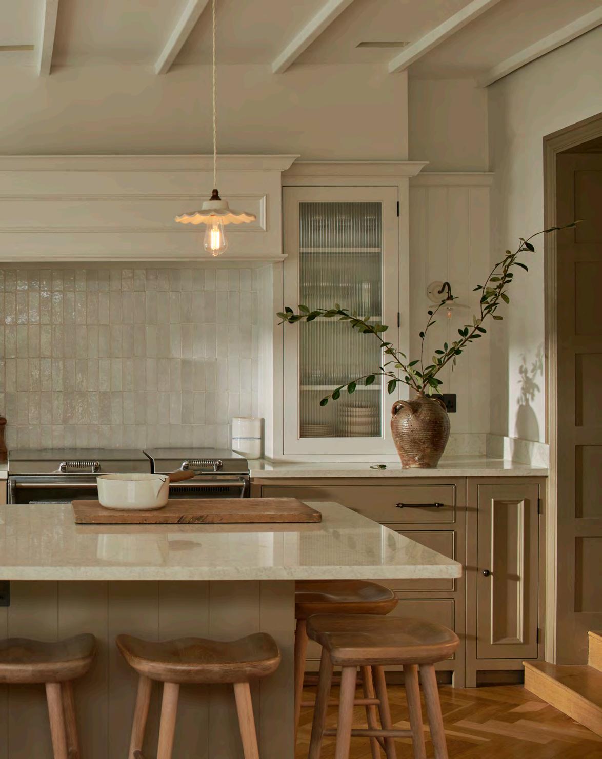
For Vivienne, who regularly shares design inspiration in her West Sussex home on her popular Instagram platform @viviennecutler, it was important to land on a look that felt fresh and unseen. Introducing a light colour was important, but it was only when she decided to create a two-tone scheme that things started to fall into place. ‘For the top half of the room, it had to be a clean white and so I went with Shell for the walls and ceiling,’ says Vivienne, ‘but I wanted a warm neutral for the lower cabinetry and spent months looking for the right colour. It was when I looked back at my Neptune colour chart and spotted Lead Light that I found the right solution.’
Even then, it wasn’t an immediate win. ‘It was only when I also painted the woodwork, doors and walls into the adjoining garden room in Lead Light that the room completely worked,’ recalls Vivienne. ‘The feedback was crazy on Instagram with some of my kitchen posts going viral. To this day, the most asked question I get, is ‘what colour is your kitchen’s cabinetry?’.’
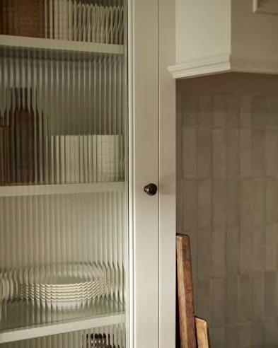
While the kitchen’s layout stayed the same, the extension had created a wall where a window had once been. It allowed Vivienne to add simple panelling, cupboards on either side of the existing Everhot stove and a faux chimney to conceal the extractor. ‘It’s made a feature of that space,’ she adds. ‘You would never guess that just introducing a new colour scheme, adding some panelling and tiling a splashback could give the kitchen a whole new lease of life, but it has.’
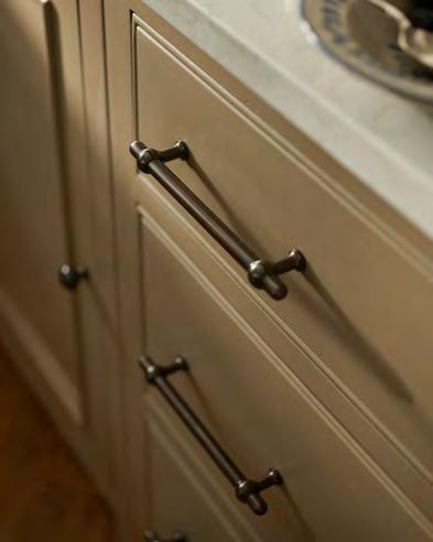
The last – but important – touch in this makeover was new hardware. Previously, the Smokecoloured kitchen had classic cup handles which lent a traditional country kitchen feel. But having introduced bronze hardware in her utility room, Vivienne was keen to carry the texture into the kitchen. ‘I saw the Armac Martin collaboration with Neptune at the Tonbridge store and loved the look,’ says Vivienne, who opted for the small sized bronze handles. ‘The updates made my vision come to life,’ she adds. ‘The original kitchen felt like a classic Neptune kitchen but with the new colours and hardware, it now has a contemporary feel while remaining a country kitchen.’
In practical terms the remodelling was straightforward. ‘We worked with two tradesmen, a carpenter and painter,’ says Vivienne. ‘And it was all done in a week when we were on holiday!’ Back at home, the new look kitchen quickly became a hub for family life while the room transforms into an entertaining space at weekends. ‘It is the heart of our home and where we spend all our time,’ says Vivienne. ‘It doesn’t feel like a separate kitchen but blends seamlessly into our living space which is just what I had wanted to achieve.’
Think about how you will use the space and make sure it is practical. Is the dustbin near the food prep area? Is the pan drawer next to the stove? They are common sense considerations but can get easily forgotten.
Vivienne’s three key kitchen tips
One can never have enough storage, but it is good to consider everything you will want to store at the planning stage, from cookbooks to worktop appliances. And then decide if you’d prefer open shelf storage or want everything tidied away in cupboards.
Lighting is how you give your kitchen a mood. We created a wonderful ambience in the room using a combination of LEDs tucked behind the cornicing and dimmable wall lights and spotlights.
Use our kitchen cost calculator to get an estimate of your Neptune kitchen’s cost, from cabinetry to installation. Then book a free consultation with our design experts and let the creativity begin. neptune.com/kitchen-estimator
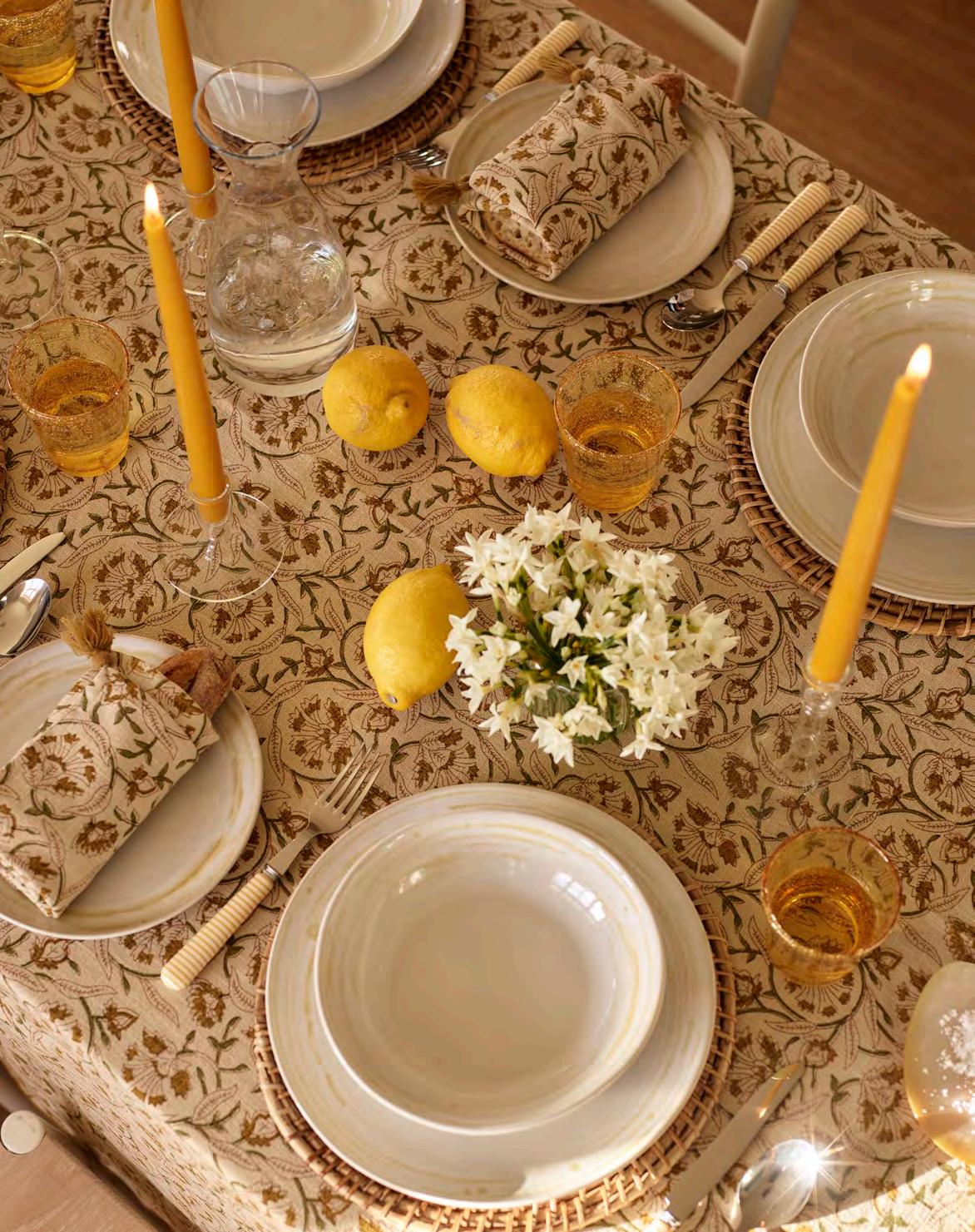
Create a memorable tablescape that sets the scene for spring entertaining.
From a distance, the table looks like a harmonious display of soft yellows. But move a little closer and the intricacies of layered tableware, eclectic glassware and loosely folded linens come into focus. Whether laid for a slow Sunday brunch or an evening dinner party, we believe in well-dressed tables for every mealtime.
Here’s how to create a spring spectacular…
one
Start by deciding on your linens, whether that’s a vintage white tablecloth or a more decorative design like our new Fife collection, crafted from a cotton-linen blend with a traditional block-printed floral pattern. The choice can set the tone for your scheme, taking hues from a coloured tablecloth and echoing them through glassware, accessories and crockery.
Our seasonal shade, Polenta, influenced our table setting dressed by Meaghan Hunter, Neptune art director and stylist. ‘Through the tablecloth we have this wash of creamy shades of yellow which are quite calming and harmonious. I then pulled out pops of more vibrant hues such as the tall saffron candles and a playful scattering of zesty lemons, to give the table depth and interest,’ says Meaghan.
Look to mix complementing shades into the scheme through glassware (our yellow Ella glasses are the perfect choice) and cutlery, before turning your attention to accessories. ‘Cutting the stems of the white Narcissus flowers short, I arranged the flowers in small posies in our Lillian glass tealight holders,’ explains Meaghan, ‘and then used different heights of the Ellington glass candlestick holders, three of each size, to create symmetry down the table, placing a posy between each.’
Fine bone china, or artisanal stoneware, the choice will come down to whether you’re enjoying a relaxed or more formal occasion. Crafted by skilled artisans in Portugal, our Amberley collection leans more towards relaxed dining, its speckled yellow glaze ties back to the shades woven through the Fife tablecloth.
The traditional recommended space between table settings (and adhered to by those laying tables for royal banquets) is 45cm from the one place setting to the next. But if space is tight, remove side plates – used here for bread wrapped in our matching Fife napkins –and stack starter and main course plates on top of each other instead.
If you love the natural grain of your solid wood table and want a more low-key tablescape, swap out tablecloths for textured placemats (like our Ashbourne, seen here) and patterned napkins instead. ‘When switching from a more decorative tablecloth I suggest focusing on larger centrepieces, with a variety of taller vases of flowers or a larger collection of candlesticks to keep the table exciting,’ adds Meaghan. The mix of textures from exposed oak to natural rattan, together with the larger decorative centrepiece, will still add plenty of interest to the table.

While a theatre production is normally centred on the performance itself, it can be easy to overlook the subtle details that often remain unseen. From the sound to the position of the seating, the materials of the stage and even the scent within the auditorium; every layer enhances what the actors present on stage. However, in most theatres, the environment can be controlled, taking the drama outside presents an additional challenge – one which only certain venues have seemed to master.


THEATRE SETS CAN BE IMAGINATIVE, INVENTIVE, EXTRAORDINARY. BUT WHEN IT COMES TO OUTDOOR THEATRE SPACES, THE SENSORIAL ASPECTS OF SET DESIGN REACH A WHOLE NEW LEVEL. DESIGN WRITER RODDY CLARKE INVESTIGATES.


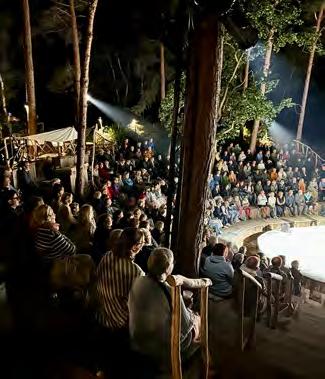
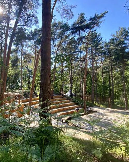
Nestled into the heart of the Suffolk woodland, Thorington Theatre is a perfect example. Born in lockdown and based within a WWII bomb crater, the 350-seat venue has been built to be at one with nature, working with its immediate surroundings to create an experience like no other. Boasting a wooden amphitheatre, with the timber almost entirely coppiced from the neighbouring woodland, Thorington Theatre was produced with a minimal environmental footprint. Making the most of the existing bowl-shaped crater meant very few trees had to be felled and no soil disruption took place. However, while the environmental benefits are evident, the setting also lends itself well to the purpose of the theatre. ‘The acoustics are naturally brilliant thanks to the way the theatre is enclosed within the woodland,’ explains Lindy O’Hare who runs the theatre alongside her husband Mark. ‘Nature embraces you as you sit amongst it.’
With the coppiced wood giving the tiered seating a wonderful tactility, the proximity to nature also augments the immersive aspect of the venue with the benches built around the trees allowing audiences to sit directly under the forest canopy. And, as shows take place in a variety of weather conditions, it unites the audience and cast together, bringing a closer connection with the performers on stage.
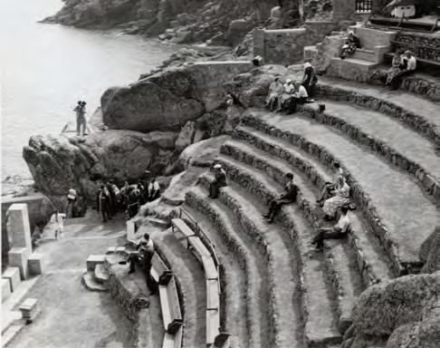
O’Hare says that in its creation they called upon the Minack Theatre – the renowned venue situated on the rugged cliffs of southwest Cornwall. Hosting over 200 shows each year, with nearly a century of heritage since its inception, the iconic theatre has a wealth of knowledge in the running of a successful outdoor auditorium.
Rowena Cade, who built the theatre in her clifftop garden after moving to Cornwall in the 1920s and buying the Minack headland for £100, was the mastermind behind its creation. Carving the terraces by hand with her team, the visionary creative worked with the materials available on-site. Bringing her artistic vision to life through shell facades and ornate arched windows that look out onto the bay, the venue has been cherished by performers and audiences for nearly ten decades.
Over the years, with technical and logistical challenges presenting themselves along the way, the theatre has gone from hosting amateur shows to world-class productions. Thanks to technological advances, the elements of lighting and sound have also developed. From the battery lamps and car headlights that were initially used, to complex lighting and sound systems that now complement the rocky landscape, the venue offers a unique and unforgettable experience. But, even with the latest technology raising the profile and possibilities of what can be showcased, it is often said the moonrise over the sea is still the greatest lightshow that Minack’s theatre audiences can witness.

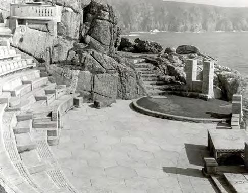


With the background of a natural landscape connecting the two theatres, it is a reminder how natural ecosystems offer the ultimate sensory experience. From the fresh, sea air and earthy aromas of woodland to the sound of seagulls and forest inhabitants (that can now thrive thanks to Thorington’s biodiversity scheme), the shows at both locations go far beyond what is presented on stage. Really, the show begins as you enter, becoming immediately enveloped and immersed within the setting. And, unlike those evening performances that take place within an indoor theatre, the final curtain call is as the moon softly fades amongst the beguiling drama of nightfall.
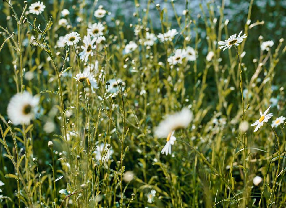
From wild meadow to terrace planters, we can attract pollinators with the flowers we choose to grow, says horticulturalist and Gardener’s World presenter Rachel de Thame.

Being in a garden is always time well spent. We gain so much enjoyment from surrounding ourselves with the beauty of the great outdoors, away from our desks and daily chores. And this applies whether one looks after a balcony or tends acres of grounds. It’s been proven that gardening is good for you. Not only is the sowing, planting, weeding and mowing beneficial for our physical health, but our mental wellbeing is also improved by the contemplative tasks which encourage us to live in the moment.
But the benefits go far beyond satisfying our own needs. With a bit of thought, our gardens can also be a haven for wildlife of all types, not least the tiniest creatures with whom we share each patch of green. Insects are known to be essential to life on our planet. We gardeners can help to ensure they thrive, by giving them what they need. It’s all about creating a balanced space in which plants and pollinators co-exist harmoniously; the former providing food and shelter, in return for the essential pollination services that result in the next generation of plants.
A few years ago, I decided to change my approach to planting in my own garden. We had inherited a derelict walled garden, where bramble romped unimpeded through bindweed and couch grass. The initial plan was to grow edibles and create a fully productive kitchen garden. We tackled the space, building a series of orderly raised beds, filled with tasty salads, legumes and brassicas.
The following year, I added flowers for cutting and found that the garden increasingly hummed with insect activity. I became fascinated by which plants attracted them, not only during spring and summer, but through autumn and into winter.
I found that a few key factors really help: choosing plants with a range of flower shapes to suit the physical attributes of different insects –from tubular foxgloves to open daisies, which allow easy access to nectar and pollen. Making sure there’s something in flower in every month of the year, helps those species that remain active during winter. Allowing some areas of the garden to become a little ‘messy’ and resisting the urge to over-tidy, provides vital habitats for egg-laying and developing larvae. A garden without caterpillars, becomes a garden without butterflies. It should also go without saying, that gardening organically and eschewing pesticides, will give pollinators the best chance.
As a bonus, by helping pollinators I can guarantee you’ll gain even more satisfaction from your own garden. It’s wonderful to watch bees, hoverflies and other beneficial insects dart from flower to flower.
Butterfly and moth numbers have been struggling in recent years, so there’s a real feel-good factor to knowing you’re doing your bit to help sustain their often-complex life cycles. Best of all, you can create a garden that is completely in tune with nature, while looking beautiful and filling each day with joy.

Discover more about creating an insect-friendly garden in Rachel’s new book A Flower Garden for Pollinators, published by Quercus Publishing.
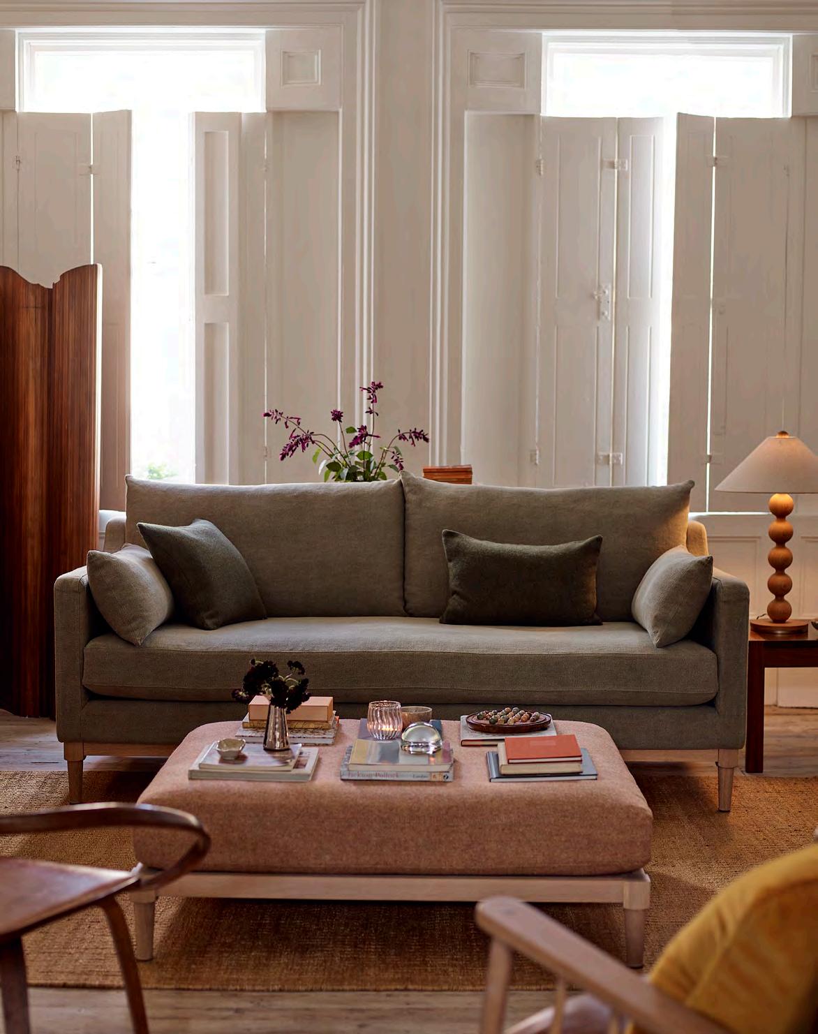
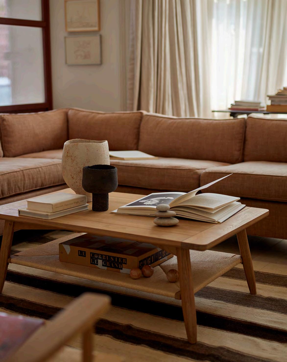
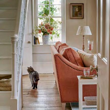
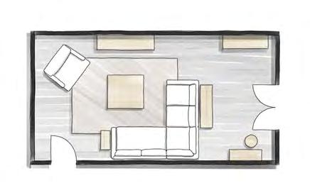
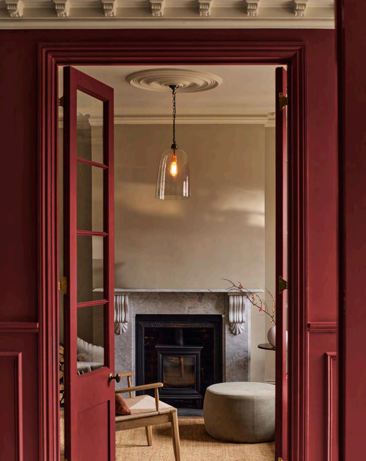
The best sitting rooms are flexible, a relaxing spot to curl up alone with a book and a social space to entertain friends and family.
The Georgians and Victorians put all their energies into the design and décor of their salons, the most public spaces in the home and a chance to display their impeccable taste. And while contemporary lifestyles have changed considerably, with kitchens now the cooking-eating-relaxing heart of the home, the sitting room still has an important role to play in harmonious home design.
‘Start with the purpose of the room,’ says Neptune’s design director Fred Horlock. ‘Sitting rooms should be inviting and relaxing. Consider how many people will use the room regularly and design the seating plan around this but try to include some flexible seating for extra guests.’ He stresses that the room should not be reserved ‘for best’. ‘Make it relevant so it doesn’t become an underused space. It can be all too easy to make it look grand and uninviting, but you can overcome this by careful positioning of furniture, creating focal points and adding in layers of interest.’
Fred advises arranging your furniture around other pieces of furniture rather than against the architecture of the space. Sofas don’t need to sit against walls, for example, but instead can be pulled towards a central coffee table and anchored with a console table behind them and on a rug that encompasses the seating area. ‘You can also use sofas to change the room’s flow,’ adds Fred, ‘or use them as room dividers.’ L-shaped sofas are particularly good for helping re-shape a room as they can make a long space feel more intimate.
Lighting is key for making the room feel inviting and Fred advises incorporating a selection of light sources, from dimmable overhead lights and ambient lamps to task lights. ‘Core lighting should be at eye level when you are seated, so table lamps are the best options,’ he explains, ‘and position lamps nearer the window, that way, the room naturally morphs from a daylight to evening mood.’
When it comes to windows, blinds can make managing the light harder. ‘You block the light from the top of the window which doesn’t make it feel open and inviting,’ explains Fred. Instead, opt for curtain treatments, which also help with sound quality, or heritage shutters which, when open, allow light in from the full height of the window.
Finally, one of the biggest challenges in a sitting room plan is where to position media equipment. Fred recommends using a purpose-designed cabinet to conceal the television and, unless it is a specific media room, ensuring a fireplace or large piece of art is the room’s focal point. Add in some personal objets on shelves, mantel and coffee table and your sitting room is ready for guests – or that half hour curled up with a book.
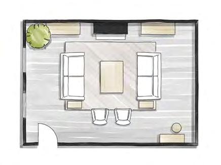
In a large room, take the furniture away from the walls, and instead, use internal architecture like fireplaces and windows to set centre lines to base the layout around. While this might feel counter-intuitive, it actually makes the room feel more spacious and avoids leaving an empty space in the middle of the room. Introduce an expansive rug to ground the seating area. Use the walls for bookshelves or to display art and fill corners with a small desk, like the Ardingly, balanced in the opposite corner with a large plant.
If you don’t have architectural elements to design around, position a large piece of furniture, like a dresser or tv cabinet, to hold the scheme. Break the long space into two with a corner sofa and console behind, extending into the central space to create a low room divide. Then dress the console with tall lamps or flowers to add height but allow light through. A square shaped coffee table interrupts the linear lines of the room, making the space feel more visually interesting. An upholstered chair or love seat in the corner ‘rounds’ out the conversation area and use the other end of the long room to create a library or study area.
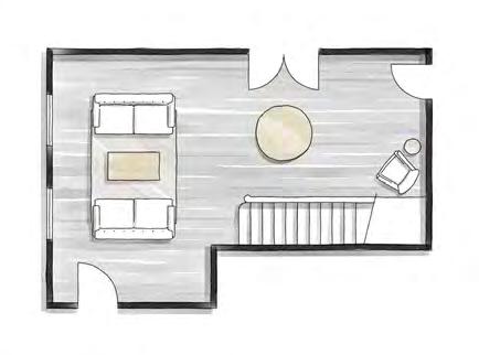
With unusually shaped rooms or those with lots of doors or even a staircase, it can be tempting to push all the furniture against the walls. However, there is a lot of architectural ‘noise’ in such spaces, so it is important to keep the room feeling smart, organised and uncluttered. Circulation is key to make the room feel comfortable, and we recommend leaving at least 80cm between furniture and wall for good flow. Keep walls clear and divide the floorplan into useable blocks to which you can assign areas. Here there is a compact sofa area – we used the slim lines of the George sofa – centred on a rug, and a reception area centred around a pedestal table like the Sheldrake round dining table, which encourages flow in both directions. A dark, unused corner under the stairs is utilised as a seating or reading area.

Mark out where furniture will sit with masking tape on the floor to get a sense of size and scale.
Try to avoid positioning the sofa with its back to a doorway as it will feel a little exposed.
Introduce a range of sofa sizes and shapes while maintaining a sense of symmetry. A sofa opposite two armchairs looks relaxed, two matching sofas facing each other will feel more formal.
Ensure you have at least 50cms between the coffee table and sofa or chair for a comfortable flow.
Ideally you should have a side table on either side of the sofa, or one next to a chair, but don’t introduce lots of different styles and materials for side tables as it can look chaotic.
Select a neutral fabric (this can be a light or dark tone) for your sofa and add pattern and texture with an upholstered footstool, armchair or cushions.
For our full collection, visit neptune.com/living
Discover why warm-but-earthy yellows, like our new Polenta shade, are surprisingly versatile for your home.
Conjuring images of ancient tapestries aged with hues of burnished gold, sun-bleached fields of pale grains, or the earthy sweetness of that most regal of spices, warm yellows – from rich Saffron to our new pale and creamy Polenta – do more than just catch the eye; they capture the senses. These hues stand apart from their brighter counterparts on the colour chart. Deeper, earthier, and more pigmented, they offer a sophisticated richness that distinguishes them from sharper, acid yellows or pallid paler shades.
Our iteration of Saffron, while introduced to the paint collection only a few years ago, is by no means a new discovery. It’s a timeless shade that has been inspiring creatives for centuries, even dating back to Renaissance interiors when it symbolised enlightenment. This season, we welcome its softer sibling, Polenta – a creamy, pale yellow, lightly touched with a hint of black for refined depth. Richer than cream, yet gentler than vibrant yellow, it beautifully balances our yellow paint palette.
‘A warm yellow, like Neptune’s Saffron works so well on a large scale and can really bring a space to life,’ says Taline Findlater and Victoria Gray of Olivine Design studio. To maximise its warm, uplifting benefits consider making Saffron your scheme’s foundation –enveloping the walls, covering your kitchen cabinetry, or even, as Victoria suggests, ‘painting your ceiling to draw your eye upwards with an unexpected twist’.
For a striking contrast that has the same intensity and earthiness, try pairing Saffron with the dark blue of Ink, or for a softer palette, balance it with creamy off-white Salt or try a soothing tonal scheme layering it with our new Polenta.
If you’re drawn to the idea of yellow but prefer to keep it more understated, consider experimenting in spaces you use less frequently that are ripe for creativity, like a guest bedroom or a downstairs loo. Interior designer Lucinda Sanford suggests ‘using just one shade throughout can actually soften its impact, making it feel less intense and more cohesive’.
As a mid-shade, Polenta strikes the perfect balance between a colour and a neutral tone, making it both versatile and welcoming. With a hint of lightness that’s easy to live with, it’s a natural partner for fellow neutral paint shades in our collection like Salt, the pale grey of Silver Birch or fresh, creamy Orkney White, which all feature warm undertones.
These warm yellows bring with them an inviting brightness that can transform spaces, especially in cooler, north-facing rooms. Their adaptability to changing light throughout the day gives them a unique vibrancy, making each room feel dynamic and alive from morning to evening. Whether used as an accent or across entire walls, shades like Saffron and Polenta remind us that warm yellows are no passing trend but a classic, heritage hue that has elevated homes from Renaissance times to today.
Polenta is a perfect, mid-tone creamy yellow. A liveable shade in any room, artist Daisy Sims-Hilditch explains how to use mid-tones to greatest effect whether on canvas, furniture or a wall.
For artists, mid-tone colours are essential for creating depth and dimension on a canvas, helping the eye read smoothly from the darker tones to the lighter ones and giving the painting a sense of 3D-reality.
The depth of pigment also infuses a work with vibrancy. ‘Mid-tone shades are often more intense in colour,’ says Daisy Sims-Hilditch. ‘Mixing white with a darker colour doesn’t always make a good medium shade, it can make the colour look chalky and lose its effectiveness. I like to let true mid-tones sit within a scheme to add beautiful colour.’
For interiors too, mid-tones, like our soft yellow Polenta, can help a room look less ‘flat’, seamlessly connecting darker tones or shadowy corners with areas of highlight. A cabinet painted in a mid-tone might link two parts of a room, or walls washed in a mid-tone can pull together lighter and darker furniture pieces into a cohesive scheme. ‘Use them to create rich paintings (or rooms) full of colour and vitality,’ adds Daisy.

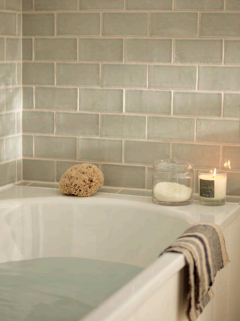
While a warm bath is good for the body, it’s the addition of sensory enhancers like natural Epsom salts that make it a truly beneficial experience, as interiors writer Arabella Youens explains.
Smells and sensations embed deep into our psyche. My grandmother’s old house, set high up in the Chilterns, had a sitting room cupboard carved into a void underneath the stairs that ran up behind the wall. Inside was a small glass-bottle army of Schweppes mixers in their uniforms of blue (bitter lemon) and yellow (Indian tonic). Opening the cupboard unleashed a deep, musty and wooded air that I sometimes catch today in unexpected places and am instantly transported to soothing memories of childhood.
These days, there is more awareness about how we absorb our environment. Studies have shown it’s not necessarily what looks visually pleasing that leads to a state of calmness but how a space feels.
Lying in a bath – a relaxing lavender scented candle to one side – is one of the simplest ways to unwind. Adding a cup or two of Epsom salts into the water is believed to aid the process further. The skin is thought to absorb the magnesium, which can soothe and calm muscle tension and promote better sleep.
But it was only a chance observation that revealed the healing qualities of these salts. In 1618, Henry Wicker, a cowherd, was tending his animals on Epsom Common in Surrey during the hot, dry summer. As the water shortage threatened his cattle, he stumbled across a natural spring. Despite the animals’ thirst, they refused to drink the water which tasted bitter. Yet, as they waded in it, the cowherd noticed that their injuries healed faster than usual.
The inquisitive Wicker investigated his observations further by evaporating the water and naming the remaining white crystals Epsom salt, after the common ground he’d chanced upon them. News of the salts’ healing properties was soon spread by local entrepreneur, John Livingston. Over time, he opened visitor wells, and, in 1667, the diarist Samuel Pepys visited the area to try them for himself. By the start of the eighteenth century, the salt wells had become a destination and Epsom transformed from a small farming community to become England’s first spa town.
Bath and Tunbridge Wells soon took over the spa town crowns, but our love for bathing in Epsom salts remains undiminished: estimates value the global market of these natural, humble salts at several billion dollars a year – and growing rapidly. To relax at home at the end of the day, there are few simpler (and affordable) sensory pleasures.
This is the
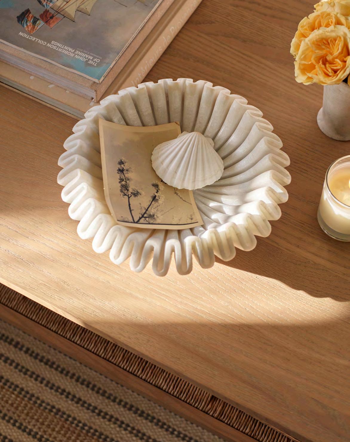
Hand carved by local artisans out of Makrana marble from Rajasthan (the very same white marble that was used to build the Taj Mahal), is our new scalloped edge Malpas bowl. Its detailed, sculptural carving and polished finish showcase the natural beauty of the marble with each piece boasting unique veining variations, making it truly one-of-a-kind.
Discover the collection at neptune.com/ornaments
More than mere visual elements, patterns can tell a story, weaving personality and history into the fabric of our homes.
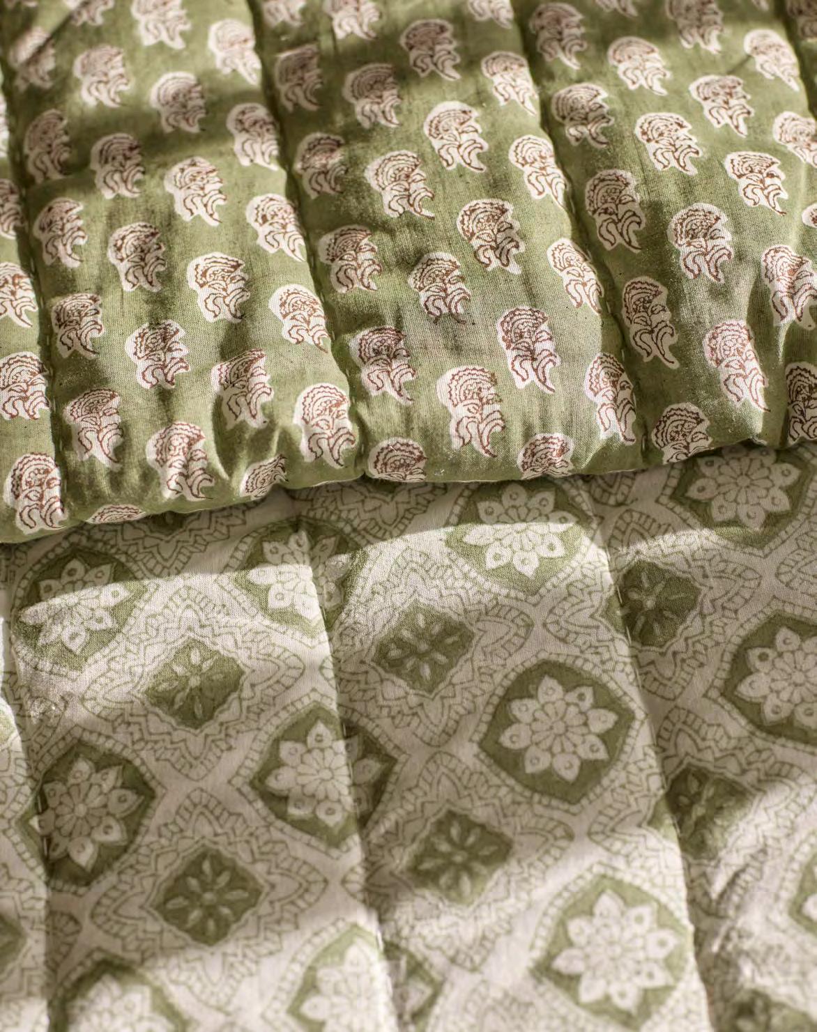
Our relationship with pattern is profoundly personal. Take the stripe. For some, stripes are inherently linked to formality, evoking the structured elegance of a tailored dress shirt. For others, a simple stripe conjures up the laid-back charm of beach huts and umbrellas, suggesting a sense of nostalgia and sea-side frivolity. Either way, the patterns we are drawn to are an expression of our identity, reflecting our tastes, memories, and experiences.
Specialising in elegant but inviting interiors, designer Jessica Buckley offers this advice: ‘If you are unsure how to start incorporating pattern into your home, collate images of rooms with patterns you really love and pull out the commonality: are you drawn to big floral prints or sharp stripes for example?’ By understanding these preferences, we can learn to confidently incorporate patterns into our interiors, creating spaces that feel layered, personal, and effortlessly cohesive.
In the living room…
‘When designing for different rooms, I always consider the functionality first,’ says Londonbased interior designer Eva Sonaike. ‘In the living room, where social interaction is key, mixing patterns of different scales adds energy and warmth, encouraging conversation.’
Begin with a striking print – perhaps on a sofa, footstool, or rug – complementing it with one or two smaller-scale patterns and solid plains to maintain balance. It’s essential to view the room holistically, distributing patterns evenly to create harmony. For example, if you opt for a large-scale pattern on an armchair, offset it with printed cushions (like our new Frida and
Dora cushions) on a plain fabric sofa on the opposite side of the room, to create a dynamic yet cohesive design.
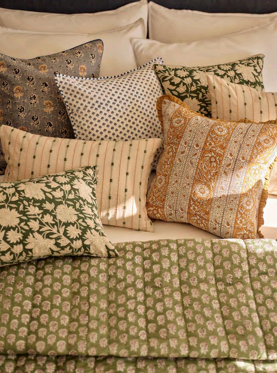
In the bedroom, it’s the textiles that truly bring everything together, from the bedding and headboard to armchairs and throws. To introduce patterns, without overwhelming a space designed to be restful, choose soft, small-scale prints or stripes in muted tones. ‘I would fully advocate starting small with a throw, headboard or small piece of upholstery,’ suggests Jessica Buckley. Our new Elle and Etta bedspreads are perfect for this, offering delicate designs in a variety of subtle hues. The Jacquard patterns, woven from pure cotton in Portugal, lend a gentle softness to any bedroom.
The opportunity to be playful is greater in kitchen-dining spaces, where tabletop accessories are often seasonal and less of a long-term commitment. From tablecloths and napkins to ceramics and glassware, pattern can be incorporated at any stage. Our new organic floral Fife table linen collection is traditionally block-printed by skilled artisans and brings a touch of colourful charm, while our well-loved, subtly striped Maeve linens offer a more understated approach to creating patterned tablescapes. You might even venture into patterned crockery with our Amberley stoneware collection. The key is to style boldly and with confidence; a thoughtful mix of patterns, held together with layers of unembellished surfaces, can create a truly captivating look.
Curating a cohesive and useful library of fabrics was the goal for Charlotte Wright, Neptune product development manager, when she set about curating our upholstery collection.
How does upholstery fit into the Neptune story?
Introducing upholstery was a logical step for us back in 2012. We were already known for our kitchens and timber furniture but wanted to offer customers a complete home solution. After all, fabrics are an integral part of the whole interior design. So, we started with a small collection of plain and patterned linens. Today, the edit offers a collection of natural fabrics from linen to wool which work with our paint colours and furniture finishes.
What was the idea behind the new edit?
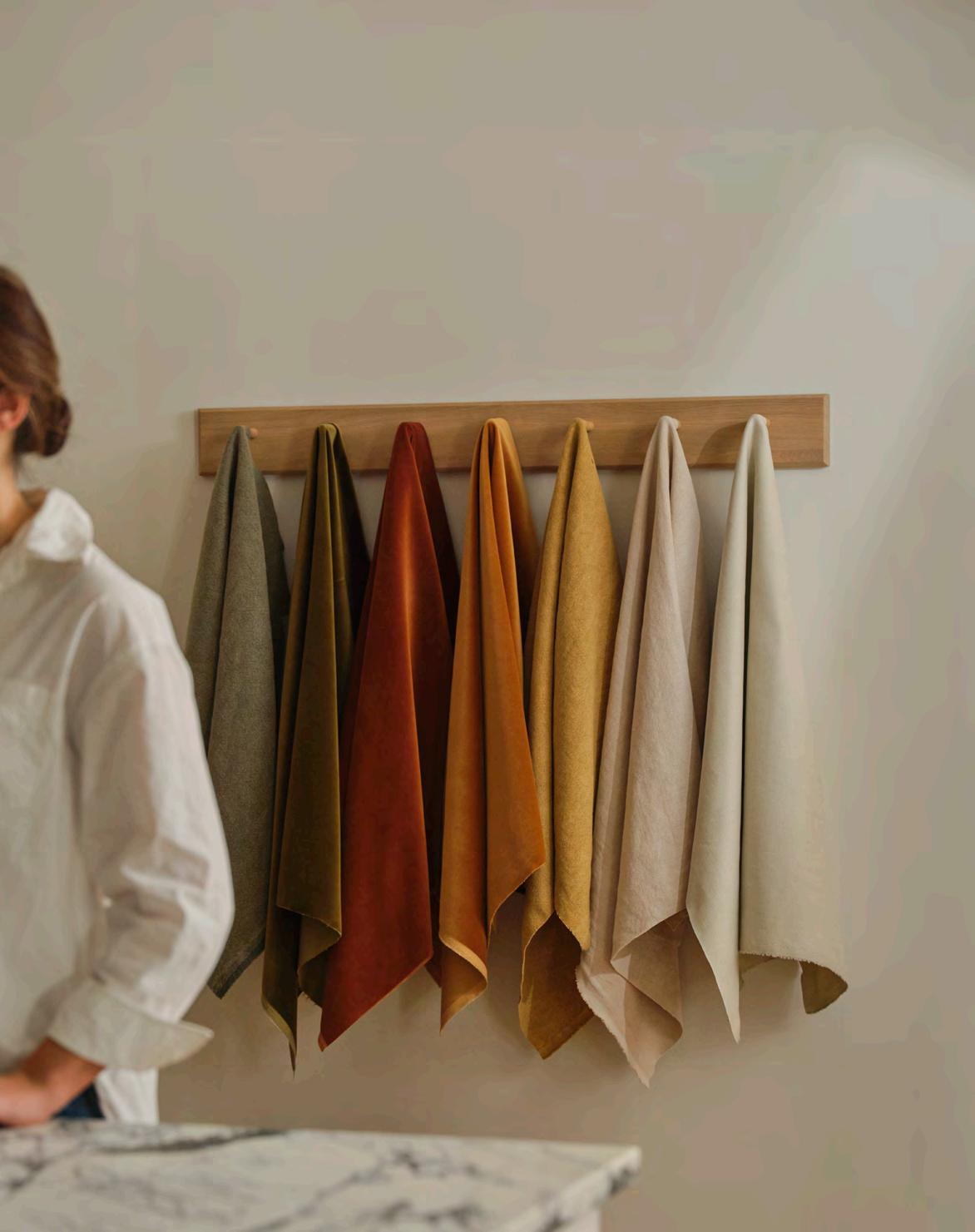
While we’ve always had a curated fabric library, we wanted to offer a more refined choice for an effortless shopping experience. We’ve listened to and learnt from our customers, and are dedicated to offering inspiration, solutions and that hint of newness. We’ve honed the palette to warm neutrals, with an injection of rich earthy tones, and we’ve also opted for a Natural Oak leg on all furniture as it complements each design, and again makes decision-making easier.
Tell us about the new fabric offering. Our ambition was to create a cohesive collection with a variety of textures and harmonious colours. We have five different fabric types, ranging from our traditional heritage fabrics like natural linens to premium fabrics such as cotton velvet and leather.
What are the core fabrics and their characteristics?
Each of our fabrics have been chosen for the way they perform on upholstered furniture and how they all complement each other. Our cotton linen and pure linens are lightly textured, while our wool is luxuriously soft and durable, and the pile of our cotton-velvet is
irresistibly luxurious. We also have a beautiful soft leather that will be available on selected furniture. We have tested the rub count of each fabric so we can help guide customers on which fabric works best for different usage.
Where can customers find our full collection?
When visiting one of our stores you can see our fabrics upholstered on different pieces of furniture. And in our design libraries there are fabric flags of every type to ‘play’ with. Our design experts are on hand to offer fabric swatches to take home and help you build a scheme by layering a chosen fabric alongside a wood finish, paint swatch or tile. And of course, you can always find out more about our fabrics online and order samples.
What’s your favourite fabric?
I’d have to say our Signature Linen in a neutral shade because it is so versatile. Not only is it great on traditional sofas and chairs, but it hangs beautifully when used as a loose cover, like on our Long Island collection. I also love that our fabrics can be used across our entire upholstery collection, from headboards and sofas to dining chairs and ottomans.
Will there be exceptions to the curated collection?
There are some pieces of furniture, such as the Long Island loose cover, where historically we’ve never used a velvet fabric as it doesn’t hang as well as a signature linen. And similarly with leather, some fabrications aren’t as flexible for their usage. We want to ensure that each piece looks its best and performs to a high standard with the chosen fabric.
For more upholstery advice and styling ideas for your home, visit your local Neptune store neptune.com/our-stores
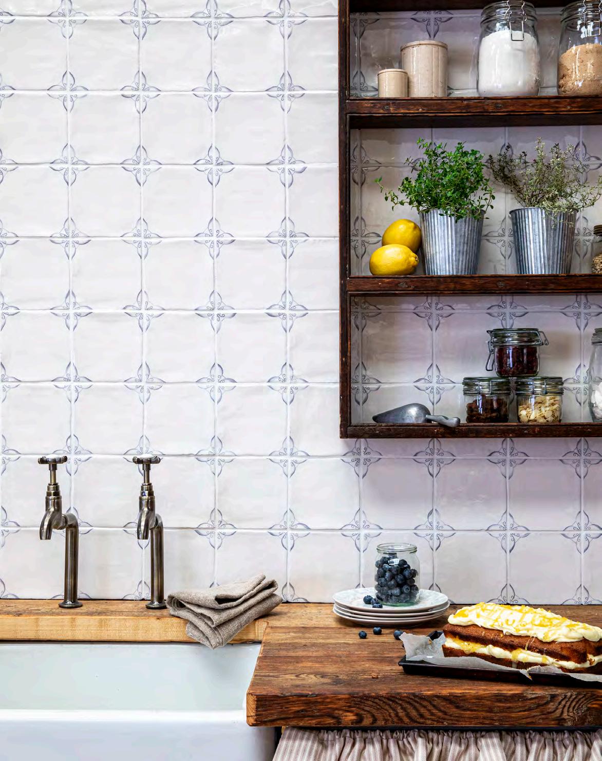
Meet the third generation, family-run artisan company, in the heart of Wiltshire, which applies a centuries-old approach to hand-making and hand-painting bespoke wall and floor tiles.
Marlborough village, Wiltshire, in the early 1930s. Two entrepreneurial schoolteachers, Miss Packard and Miss Ord, discover they can turn their mutual love of painting ceramic tiles into a thriving cottage business. Soon, their exquisitely coloured, hand-painted glazed tiles are being sought by none other than Queen Mary, Fortnum & Mason and the V&A.
And so, the story of Marlborough Tiles began.
While the Second World War briefly halted production and Miss Packard retired soon after, the business grew in ambition when local businessman Hugh Robb became a partner, eventually taking over completely in 1961 when Miss Ord also retired.
Today, this British artisan company, now led by Hugh’s grandson Jamie Robb, together with wife Jo, sets the standard in hand-crafted and hand-painted tiles, glazed and fired in the same factory, on the edge of Savernake Forest, that the Misses Packard and Ord established. Every tile is made to order meaning it can be tailored to a customer’s vision. ‘We can alter the size, shape, colour and decoration to accommodate clients’ specifications making for a truly unique and personal result,’ explains Jamie.
that Marlborough Tiles has become famous for. The lozenge-shaped Meldon and square Barbury collections, produced exclusively for Neptune, are cases in point.
The numerous colour options have been meticulously matched to complement classic Neptune paint shades from Snow to Blakeney Blue, making them stylish solutions for decorating kitchens, utilities and bathrooms.
The process of transforming humble pieces of raw clay into works of art for walls and floors requires a scientific understanding of colour, a relentless desire to innovate and years of honed and skilled artistry. As Jamie adds, ‘We’ve always embraced technology but what has never changed is that every tile is touched by the hands of our makers and artists.’
Jamie and his team spend hours in the laboratory experimenting with raw pigments to achieve the depth, complexity and nuance of colour and glaze
As master craftsmen, the Marlborough Tiles artists specialise in ‘majolica painting’ – a complex, right-firsttime process where a single colour is painted, freehand, on to the chalky surface of the glaze before firing. It is a traditional way of producing decorative tiles, following the same techniques used by Renaissance artists, and results in a more perfect colouration of both background and artwork. It also means every single tile is unique and designs, such as the iconic Delft pattern, can be customised in over 32,000 ways to suit a scheme, using the original Dutch Delft blue pigment procured years ago by the indefatigable Miss Packard and Miss Ord, or even re-imagined in shades of pink or green.
Even more fun and creativity can be had with the many hand-painted British wildlife and botanical collections, or the more graphic word designs which can be customised to feature phrases describing favourite herbs or even fine wines. Alternatively, the scalloped and metro brick shapes in the plain glazed collections and the vintage, hand-piped relief tiles allow for imaginatively laid patterns full of character. ‘Every tile represents the sum total of experimentation, artisan techniques and passion that has been passed down for three generations,’ says Jamie. ‘For us, our tiles are where science meets art.’
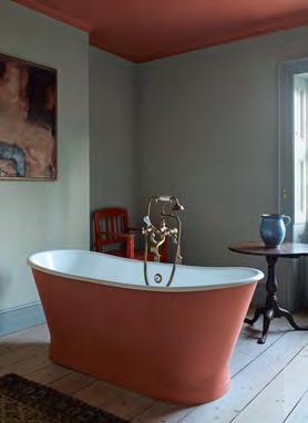
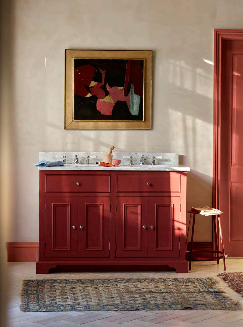
The flash of a red-ripe tomato adds vibrancy to the earthy tones of the average vegetable patch. But how to reflect a similar natural colour balance in our interiors? Design journalist Eleanor Cording-Booth explains.
Bright red – from tomato to pillar box – is arguably the most impactful and divisive colour to include in your interiors. Unlike non-threatening soft greens or warm whites, which anyone could live with and barely register, red’s power is such that it can influence your mood and energy levels. The colour is associated with bold emotions such as anger and passion, so how do you harness such a formidable hue and make it feel harmonious and rejuvenating?
Despite its emotive connotations, the arresting presence of red can work in your favour and transform a room, even when used sparingly. Interior designers and artists have long leaned on red to make a painting or a decorative scheme feel more compelling. A dash of vermillion on a relatively neutral canvas or a bright red lamp against a powder blue background will do more heavy lifting than any other colour.
Despina Curtis, co-founder of Etté, a creative agency for colour, says ‘Tomato red is a highly saturated and ‘active’ colour which can bring energy to some and fire to others. In most people, red releases dopamine, aka the ‘happy’ hormone, evoking feelings of pleasure and excitement.’
Add a red accent to a humdrum space and it will feel like the decorative equivalent of a double espresso during a morning slump. Much like a stop sign, it commands your attention, and the vibrancy lifts its surroundings. You don’t have to go all-in by colour-drenching the walls and ceiling, however, the missing puzzle piece might be a set of red dining chairs or a red side table next to the sofa. For the colour-apprehensive, consider introducing red through smaller accessories such as throws, cushions, a drinks’ tray, vase or a statement picture frame.

And don’t worry about your existing colour palette, red can work with almost any scheme, even when (some might argue, especially when) it seems like it shouldn’t belong.
Despina advises, ‘Red is known to help with concentration and focus and it can stimulate the brain, so use it in an area where you want to feel energised.’ However, she adds, ‘too much bright red can also cause feelings of agitation, so use it sparingly at first.’
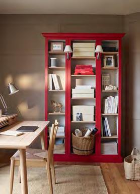
With that in mind, if you paint the walls red, choose rooms that don’t function as your primary spaces for winding down and resting. Avoid the living room and bedroom but a hallway would work, as would a downstairs loo or a walk-in pantry. There you benefit from red’s invigorating nature without excessive mental stimulation. An interesting alternative to painting the walls could be experimenting with red on kitchen cabinetry, window frames, bookcases and woodwork.
If you’re comfortable with colour and keen to emphasise the boldness of a tomato red, Despina advises complementing it with cobalt blue or a vibrant yellow. Try Neptune’s Burnham Red with Navy or Saffron for a strong colour scheme. To dial it down, she recommends pairing a softer red with a putty pink or muddy green, so consider using Neptune’s warm pinky-red Rhubarb as an accent to Potter’s Pink or Sage. Red, in all its hues, is surprisingly versatile –and always impactful.

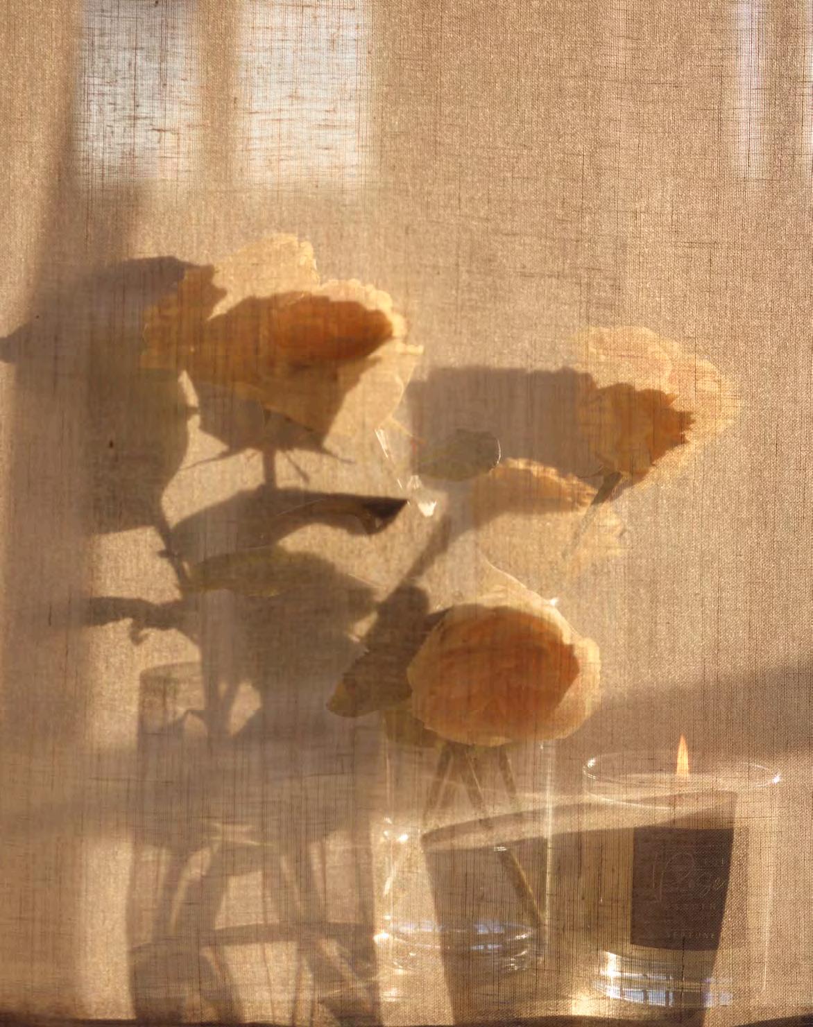
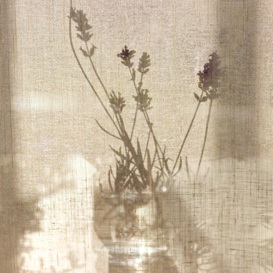
Refreshing, uplifting, calming – our sense of smell has the power to evoke memories and emotions and help create a comforting home. It was the abundance of such evocative fragrances in the British countryside that led to the creation of our new candle collection.
According to neuroscientists, it is our senses that connect us most directly with our environment, through touch and sight as well as smell, helping us make good decisions and create lasting memories.
This layering of senses is also important within the home, from the comforting tactility of solid oak furniture and visual delight of a harmonious colour scheme, to the scent of baking or fresh laundry. There is even growing evidence that suggest we can be influenced to linger a little longer by the presence of pleasant odours, while various aromatherapy scents, such as lavender and peppermint, are said to improve our mood and wellbeing.
When creating our new candle collection, we took inspiration from the British countryside and the memories and emotions associated with being in nature, resulting in five distinctive scents: The Vegetable Patch, The Rose Garden, The Lavender Field, The Wild Meadow and The Herb Garden. Working with one of the world’s leading fragrance houses, we created candles made from a blend of soy and rapeseed wax, which hold and release essential oils slowly and effectively when burning. These natural fragrances often contain aromatic compounds released by trees and plants known for their relaxing properties, and inhaling these scents can help to lower stress levels and promote a sense of calm and wellbeing.
It’s commonly agreed upon that the scents of nature have a positive effect on our mood. ‘These subtle scents in outdoor environments, such as an April dawn in the countryside or the heat of the day in a city in August, are mutable and can shift in the space of five paces,’ says Lizzie Orstrom, fragrance writer and founder of Odette Toilette. ‘I really believe that even if it’s totally unconscious, we are constantly navigating and assessing places and ourselves based on this response to scent.’
Most of our emotional associations with a scent are created in childhood, which is the most vivid period of our lives for memory, and can influence how we introduce scents into our homes. ‘One of the most interesting things about scent is that it elicits a visceral or emotional reaction before we have a linguistic response,’ adds Lizzie.
As with mood lighting, a soft scent of thyme or lavender, both of which feature in our new candle collection, can have the same calming effect as dimming the lights or turning on a lamp, creating an ambience throughout the home. ‘Connecting the senses is a great idea, especially thinking about colour, light and touch,’ explains Lizzie. ‘That might be harmony between the senses or creating an element of surprise, such as a more vibrant scent you associate with joyful childhood memories being used in your serene living space.’
From the earthy scent reminiscent of a grandparent’s vegetable garden, to the joy of receiving a fragrant bouquet from a loved one, welcome the outdoors in with scented candles and relive those precious memories.
Discover our new home fragrances in store now or visit us online to find out more neptune.com/candles
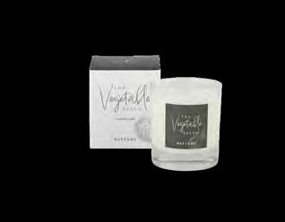
This fresh scent is reminiscent of walking amongst a summer vegetable garden. Top notes of ripe tomatoes and green leaves keep it sweet and uplifting, while being grounded by an earthy base of oakmoss.
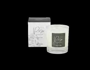
A soft floral scent which captures the aroma of a blossoming rose bush at the heart of a traditional British garden. This scent has top notes of rose with a touch of soft violet and grounded by a musky base of patchouli.
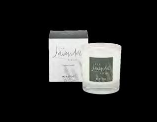
Lavender’s recognisable herbal scent brings moments of calm into the home. Spicy top notes of pink pepper blend with aromatic lavender, grounded by a musky base of patchouli.
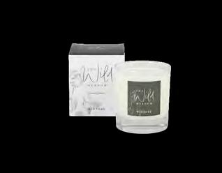
A truly floral scent reminiscent of a meadow in full bloom, with bees buzzing and grasses swaying. Soft notes of wildflowers and sweet petitgrain blend with an earthy wood base for a light summer scent.
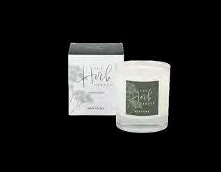
An instantly refreshing scent that captures the essence of freshly chopped herbs on a spring day. Cooling peppermint, thyme, and basil combine with a touch of green galbanum, grounded by earthy accords.

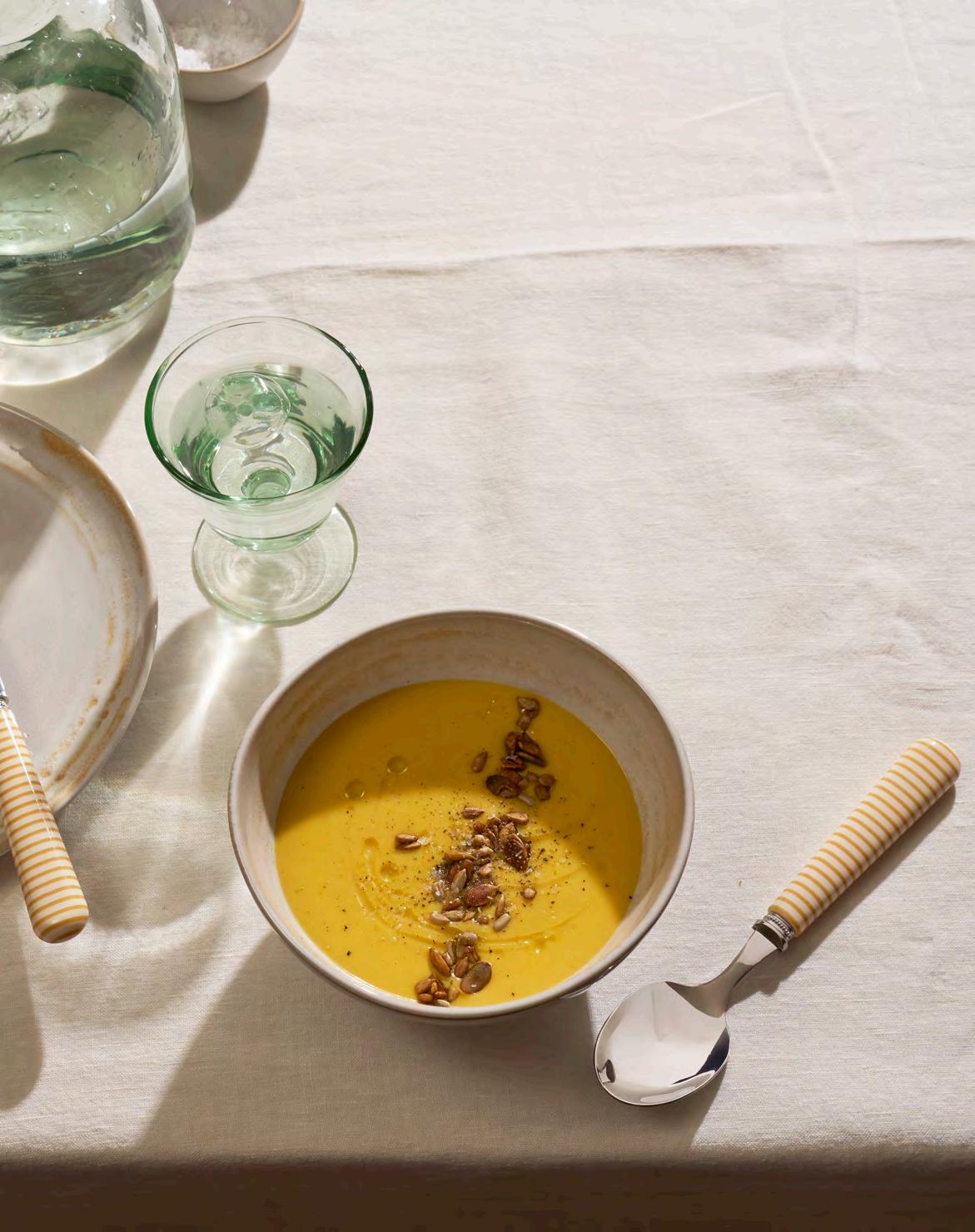
Neptune’s creative founder relaxes by cooking healthy, vegetable-based recipes for friends and family and often shares her ideas on her Instagram feed @emma_sims_hilditch. Here, Emma shares three of her favourite spring dishes for an informal supper party.
When cooking plant-based dishes, it’s important to remember the protein content. Split peas or lentils are a great source of protein, and this soup not only looks beautiful and tastes delicious but is also great as a light lunch served with warm, crusty rye bread.
WHAT YOU’LL NEED
90g shallots
2 cloves of garlic
100g carrot
1 stick of celery (70g)
7g ginger
200g split peas
1200ml water
10g vegetable Boullion powder
½ tsp turmeric
Olive oil
For the garnish
25g each of pumpkin and sunflower seeds
1 tbsp soy sauce
1 Chop the shallots, carrots and celery to 5mm dice. Heat olive oil in a saucepan and add the diced vegetable mix, garlic and ginger. Fry gently, then turn it down to sweat, stirring occasionally. Add the turmeric and the split peas, stir, then add the stock and measured water. Cover with a lid and simmer gently for 45 minutes until the split peas are completely soft.
2 Transfer the soup to a blender. Process until silky smooth, adding a little water if needed to achieve the texture of thick double cream. Pass through the sieve, season to taste and keep warm.
3 Scatter the seed mix on a baking tray and roast for 10 minutes at 180°C in the oven. Remove, sprinkle with soy sauce and allow to cool.
4 Pour the soup into four soup bowls. Garnish with roasted seeds and a drizzle of olive oil. Serve straight away.
Makes enough for four
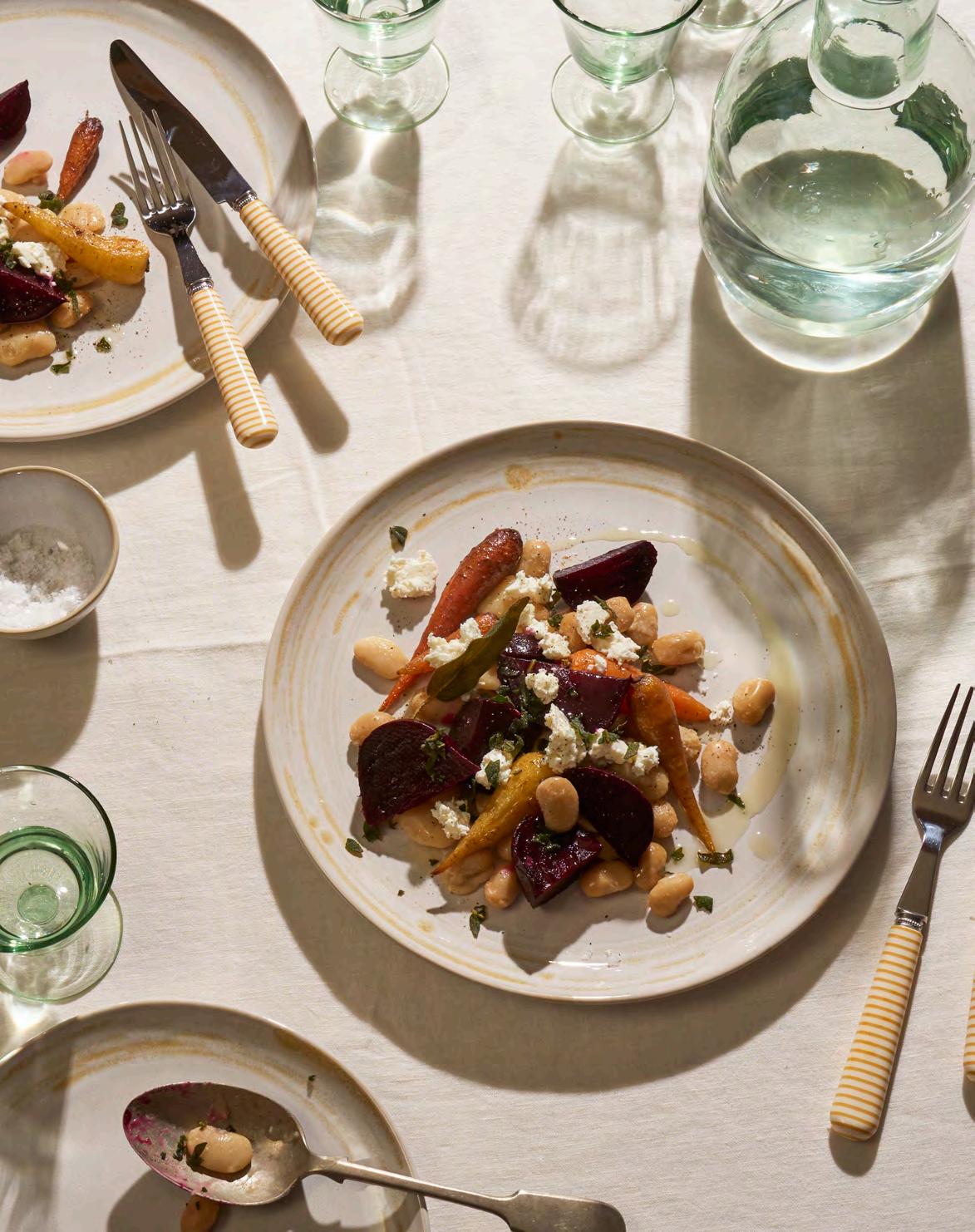
This dish is a family favourite as it is so tasty and reminds us of Italy, where sage is an important ingredient in many pasta dishes. We go big on sage at home, but if you don’t have any to hand, you can always substitute with parsley or other herbs.
WHAT YOU’LL NEED
600g beetroot
400g Chantenay carrots
2 cans of organic butter beans
Bunch of fresh sage
200g feta or goat’s cheese (optional)
Extra virgin olive oil
Garlic salt and pepper
Pinch of chilli flakes
WHAT TO DO
1 Slow roast the beetroot by wrapping each bulb tightly in foil and cooking in the oven for about 1 hour at (fan) 200°C. Check they are cooked by inserting a skewer into the beetroot to ensure it is soft. When cooked, roughly chop up and set aside.
2 Drizzle the carrots with olive oil, garlic salt and pepper and, in the same oven, roast them whole for 25 minutes.
3 Empty two cans of organic butter beans into a saucepan with the aqua fava juice from the tin and leave them to gently simmer for up to 10 mins. Season with garlic salt, pepper and a pinch of chilli flakes.
4 Meanwhile roughly chop up a handful of fresh sage leaves and lightly fry with olive oil and a knob of butter until crisp. Add a sprinkle of garlic salt and pepper to taste. Toss the beans into the sage oil and butter and heat through.
5 Dish the roasted beetroot, carrots, butter beans and sage onto a plate and, if you wish to, crumble over a block of feta cheese or goat’s cheese. Serve immediately.

Makes enough for four to eight pots
This little chocolate pudding really packs a punch and has the advantages of extra virgin olive oil and dark chocolate – both highly beneficial ingredients on the Blood Type Diet, which we follow at home. The delicate rose sorbet is a lovely palette cleanser and balances the chocolate perfectly.
For the chocolate pots
300g dark chocolate, 53-55% cocoa solids, coarsely grated
110ml extra virgin oil
2 pinches of sea salt
360ml boiling water
40g honey
For the sorbet
245g caster sugar
15g dried rose petals
545g water
1 tbsp glycerine Juice of 1 lemon (30ml)
Melt the chocolate over a bain-marie. In a heatproof mixing bowl, combine the chocolate with the boiling water and add the honey, olive oil and salt. Gently whisk the mixture until it is silky smooth and cool to the touch. Pour the mix into four to eight pots and put in the fridge for 4 hours to set.
To make the rose sorbet
1 Bring the sugar and water to the boil and simmer for 10 minutes, add the rose petals and simmer for a further 5 minutes, then add the lemon juice and glycerine. Stir through. Remove from the heat and leave to sit for 30 minutes. Drain the liquid and give the petals a squeeze.
For the chocolate soil
100g caster sugar
2 tbsp water
75g dark chocolate, 53-55% cocoa solids, coarsely grated
2 Pour into a container and place in the freezer uncovered. Leave for a couple of hours until the edges start to freeze. Stir the mixture and allow to freeze again, repeat until frozen. Blend the sorbet to give a smoother consistency then return to the freezer until ready to serve.
To make the chocolate soil
1 Heat sugar and water to around 137°C then remove from the heat and quickly stir in the broken-up chocolate, keep mixing until the soil is a crumbly consistency.
2 Sprinkle a little chocolate soil onto each chocolate pot and top with a scoop of sorbet. Serve straight away.
BY SCULPTURAL ARTIST KATIE SPRAGG
Artist and educator, Katie Spragg works with clay, stone and other materials to explore our relationship with nature and discover its –sometimes overlooked – value in urban and natural landscapes. Her exquisitely delicate sculptures reveal both the fragility and robustness of nature, and she has pieces in the V&A Museum collection and on display at the Garden Museum.
In my making and teaching practice, I am constantly engaging in a sensory, tactile interaction with materials. The books I have selected here inspire me because they offer different perspectives and stories of our embodied ways of being in the world – of being touched by water, plants, relationships with others, and all of that tangled, connectedness of life at once.
Ali Smith (Hamish Hamilton, £9.99)
Summer is the last in Ali Smith’s seasonal quartet of novels and I think my favourite, so my recommendation is to read the other three first. Ali Smith is wonderful at capturing the way we are touched by relationships with others, by the circumstances of the world and by art. Her poetic, sometimes surreal, and always very human stories, make you reconsider both the absurdities and injustices of our time, and the simple hope and joys found in people and art.

Ladies’ Pond (Daunt Books, £9.99)
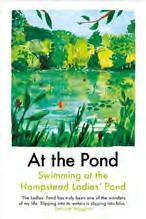
I recently revisited this anthology of texts from writers about the Ladies’ Pond on Hampstead Heath, reading them in the bath, wishing I lived closer so I too could regularly plunge myself into its ‘silky waters’. Through the writing of a diverse selection of authors, from Margaret Drabble to Nina Mingya Powles, themes of belonging, healing and friendship evolve as they submerge themselves in this magical pond in London.
Kathleen Jamie (Sort of Books, £9.99)
Reading Kathleen Jamie, I realised what is missing from the work of many male nature writers, the overlapping messiness of everyday life. Kathleen offers sensory reflections on landscapes and their histories, interrupted by the reality of illness, family, and work. In this series of essays, we travel with her between archaeological sites, from Quinhagak, Alaska to Westray, Orkney, with themes of erosion and climate change connecting these distant places.
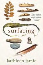
Robin Wall Kimmerer (Penguin, £10.99)
It would be a disservice not to include Robin Wall Kimmerer in a collection of books that have shaped my thinking about plants. She weaves indigenous knowledge and western science with stories of her life as a botanist and as a mother. She writes compassionately and urgently, calling for a more reciprocal relationship with the natural world.
See Katie’s work at The Fragmented Landscape exhibition at the Ruup & Form gallery in London from April to May 2025. @ruup.and.form
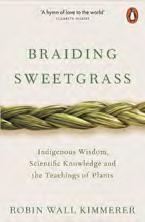
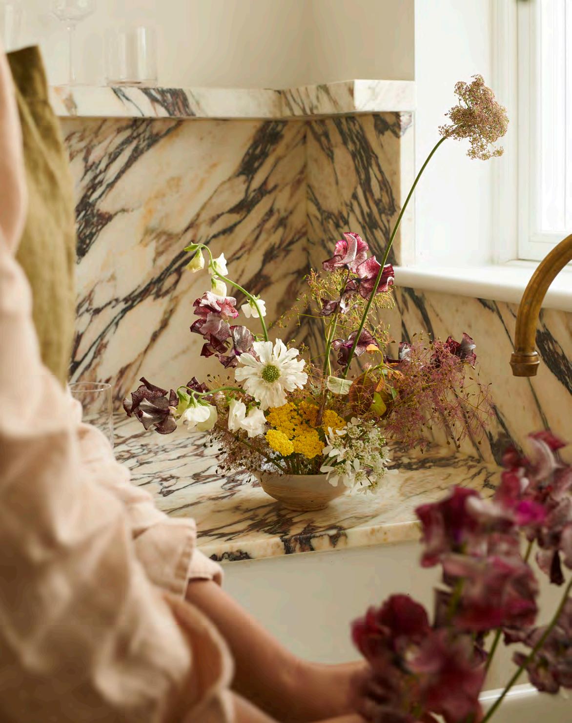
Deep within the ancient Egyptian necropolis in Saqqara sits the tomb of royal servants Khnumhotep and Niankhkhnum. Inside, its decorative chambers depict a feasting scene with seven lotus flowers sitting elegantly in seven urns across a table. Our fascination, it would seem, with displaying inside, the things that grow outside, goes back a long way.
And for good reason: flowers in our homes offer a uniquely multi-sensory experience. Consider a jug filled with flowers from the garden in June. Perhaps what catches our eye first are the towering spikes of foxgloves, their neon-pink trumpet petals cascading down long stems. They’re striking and dramatic, but quickly our attention is pulled away and drawn to the intoxicating perfume of roses. We want to reach out and touch; the intriguing texture of Alchemilla mollis (otherwise known as lady’s mantle) seems irresistible. Our taste buds begin to sing as we see nasturtium leaves – perhaps their peppery and aromatic flavour would be perfect on a salad for lunch?
Despite what your local flower show will have you believe, there are no rules when displaying (or ‘arranging’) flowers indoors. No colour combination is a wrong one, no perfect symmetry need be agonised over. In fact, surely the joy of displaying flowers inside is to capture a sense of the wonderful chaos happening in the outside world.

You can do no wrong when it comes to displaying flowers at home, according to garden designer and author Sean Pritchard.

Take inspiration from the freedom with which nature presents itself: the brilliant yellows of cowslips and primroses crashing against the soft lilacs of bluebells in the spring hedgerow, the sprawling honeysuckle as it scrambles up and over a dry-stone wall, the clouds of cow parsley as they march along the country lane. It really is wild out there – let the flowers in your home be the same.
When it comes to vessels, anything will do. An attractive cup, a favourite jug, an old tureen. Everyday objects all make interesting substitutes for a vase, and a sturdy pin-frog placed within helps keep flowers in place. Pin-frogs are particularly useful when the vessel is shallow; indeed, often it looks attractive, in a surreal way, to use shallow bowls to display tall and upright stems. Choose where to position your indoor flowers strategically. Areas passed by regularly – like hallways and front doors – are a good choice for scented flowers, whereas quieter spots – perhaps a bookshelf or a kitchen dresser – make for a nice surprise when you notice them. Staging the display also adds more interest. Perhaps they sit atop a stack of books or are framed by a window. Think drama.
Unlike Khnumhotep and Niankhkhnum, the flowers we display at home are unlikely to be immortalised in any great tomb, but here, in the land of the living, they root us in a calming sense of time and place. A cup of daffodils by the kitchen sink could only mean spring has sprung. Jugs of sparkling snowdrops reassure us that winter always comes to an end. And the sweet, honeyed scent from a vase of sweet peas remind us that the long days of summer are finally here.

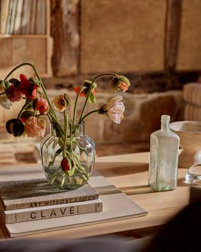

Outside In by Sean A. Pritchard is published by Mitchell Beazley.
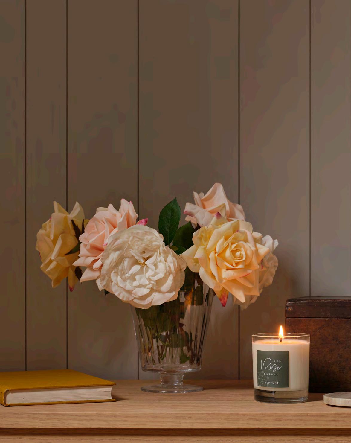
If ready-to-cut garden blooms are not on your doorstep, consider a display of our lifelike faux flowers which are handfinished so no two stems look the same. Match your bouquet to our new candle fragrances for a complete sensory experience.
The new Lavender spray features delicate purple flowers and wispy silvered green foliage and sits well with the new Lavender Field candle. Blooms like Poppy and Queen Anne’s Lace would match with Wild Meadow. Or try combining a vase of our new delicately coloured pink, yellow and white Roses (below) with the sweet scent of our Rose Garden candle.

In our regional lexigraphy, the sound of words can be as rich and meaningful as the natural world they’re describing, as writer Jo Rodgers discovers.
The most histrionic sign of spring in East Sussex, and up along the eastern coast of Britain, is the white-out coastal fog that rolls in from the English Channel and the North Sea. One morning you’ll step outside for a walk and realise you’re half-blind in a cloud. It isn’t until you climb high enough to see the shoreline that you know for certain what’s going on: fog drifting in from the ocean, so thick that it blots the landscape like TippEx, before sinking into valleys, swallowing entire downland villages. If you can get up to a beacon – in my case the ones along the bumpy ridge of the South Downs near Alfriston – you might see other green hilltops poking out of the soup like islands, the sky clear overhead.
It was our second spring in the area before a neighbour, the vicar at St Peter’s Church in Firle, identified this occurrence for me as sea-fret. The phrase seems to conjure an ocean that’s twitchy and ambivalent over the change in season.
Recently, a friend recommended the nature writer Robert Macfarlane’s 2015 book, Landmarks, which suggests that using precise language to describe the natural world has a way of endearing the landscape to us. And the more familiar we are with it, so his thinking goes, the likelier we are to protect it.
Macfarlane travels from the moors on the Isle of Lewis, where a vast, proposed wind farm threatens to change the interior topography beyond recognition, to the Essex mudflats and saltmarshes where the writer and bird-watcher J.A. Baker wrote The Peregrine, to the Cairngorms, the backyard stomping grounds of Nan Shepherd, author of The Living Mountain and one of Macfarlane’s most cited influences. ‘Shepherd’s belief in bodily thinking,’ says Macfarlane, ‘gives The Living Mountain a contemporary relevance. We are increasingly separated from contact with nature. We have come to forget that our minds are shaped by the bodily experience of being in the world – its spaces, texture, sounds, smells, and habits.’
Between the chapters are glossaries of treasurelike nature-words that Macfarlane has collected: underutilised, often regional, sometimes poetic. Did you know that an icicle can be a dagglet in Hampshire, a shuckle in Cumbria, and an aquabob in Kent? I had a note-taking app open for the duration of the book.


Landmarks by Robert Macfarlane is published by Penguin Books.
Sea-fret is listed in one of Macfarlane’s glossaries, its use attributed to the southern and eastern coasts of England, though it appears there simply as “fret.” I couldn’t help thinking that had I read this miraculous book ten years ago, I would have known, that first spring in Sussex, what I was looking at.


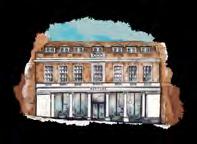
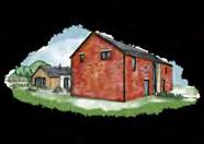


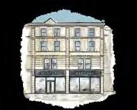

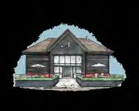

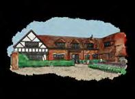


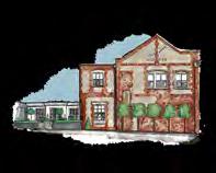


With over 30 stores across the UK and Europe, our friendly teams look forward to welcoming you to your local store, or why not venture further afield and explore stores in different locations? Each one has been individually designed as a relaxing home-from-home and is full of decorating ideas for your home.
To find your nearest store, go to neptune.com/our-stores

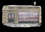
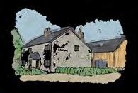


UK
Bath BA1 5BD
Belfast BT7 3GB
Bristol BS8 2QY
Bury St Edmunds IP33 3PH
Cambridge CB22 7PX
Canterbury CT1 3TY
Cheltenham GL50 4DW
Chesham HP5 1NG
Chester CH2 4JR
Chichester PO20 2EW
Chiswick W4 4HH
Colchester CO3 8LT
Edgbaston B15 3AA
Farnham GU9 0BB
Fulham SW6 2TD
Guildford GU1 3AJ
Hailsham BN27 1DQ
Hove BN3 4QD
Knutsford WA16 8TA, Reading RG10 9SA
Southport PR4 6JA
Tonbridge TN9 1RF
Weybridge KT13 8DX
Wimbledon SW19 1RX
Winchester SO21 1HL York YO32 9TW
Yorkshire Outlet WF17 6JF
Wiltshire Outlet SN5 8YG
We have Neptune stores across the UK, Ireland and Europe. To see all of our homes, visit neptune.com/our-stores
Store in store:
Neptune by Treehouse Midmar, Aberdeen, AB51 7NB
Neptune by Creative Classics, Ayr, KA7 2HD
Neptune by Sims Hilditch, Bath, SN14 8JR
Neptune by Woods of London, Blackheath, SE3 0TA
Neptune by Robert James Interiors, Coventry, CV8 3HB
Neptune by Hunters, Derby, DE1 1SY
Neptune by Richard F Mackay, Edinburgh, EH11 2SG
Neptune by Malone and Smyth, Derrychoran
Neptune by Bridgewater Interiors, Gateshead, NE8 2AJ
Neptune By Closa, Tetbury, Gloucestershire
GL8 8AA
Neptune by Aberford Interiors, Leeds, LS25 3DP
Neptune by The Georgian House Ludlow, SY8 1AT
Neptune by Kendrick Interiors
Market Harborough, LE167DS
Neptune by Appleyard, Norfolk, NR25 6AR
Neptune by Wilton Kitchens, Salisbury, SP2 0HX
Neptune by Holloways, Worcestershire, WR6 5DE
Neptune by Bradley Gardens, Wylam, NE41 8JH
Neptune by 1933, Co. Meath
Neptune by Browsers, Limerick
Neptune by Global Village, Dublin
Neptune by Global Village, Wicklow
Neptune by The Orchard, Co. Kildare
Neptune by Trevor Morrow, Co. Mayo
Neptune by Castle Cabinets, Kilkenny
Neptune Paris
Neptune Paris Ouest
Store in store:
Neptune by Beaumont Trélissac
Neptune by Fabrica, Eymet
Neptune by Just Kitchens, Miélan
Neptune by Hérick Aménagement Nantes
Neptune by Sierra Home Samoens 74340
Neptune Berlin
Neptune Fellbach
Neptune Tegernsee
Store in store:
Neptune by Helma Interior, Heidelberg
Neptune by Faszination Oschatz
AUSTRIA
Neptune by Steinwender, Wien
Neptune by O&V Home Interiors, Seneffe
ITALY
Neptune by Adi Arredamenti, Brescia
Neptune by Forteshire, Forte dei Marmi
Neptune by Allure, Vaduz
Neptune by Styles Interiors, Mont-sur-Rolle
Neptune by Friolet Interiors, Zurich
Neptune by The Classic House, Weteringbrug (near Schiphol)
We do everything we can to make sure Stories is as environmentally sound as possible. The paper we use is comes from responsible sources, and is also carbon balanced by the Woodland Trust.
Please note that, while the colours shown in this volume are as accurate as possible, they will not always precisely match our paint shades. All information and pricing is correct at time of printing.
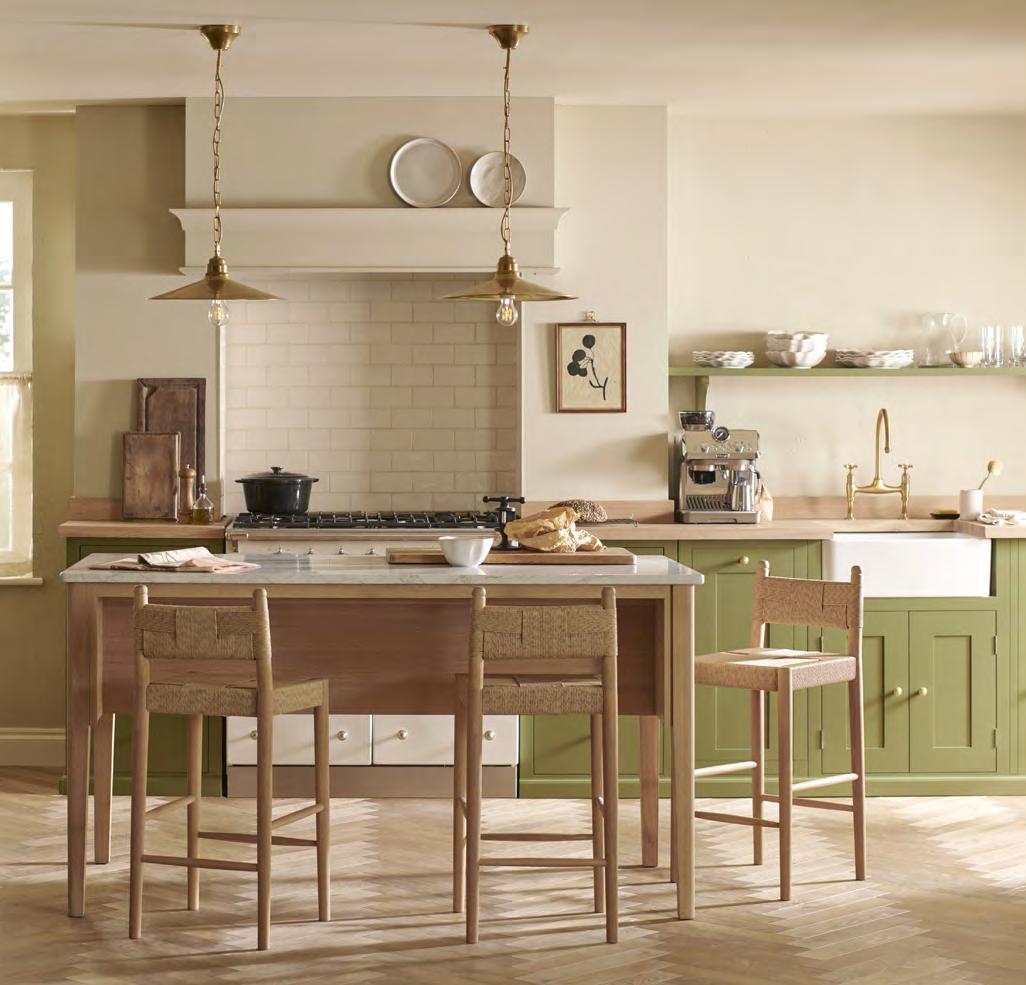
What makes a design last generations? Is it exceptional craftsmanship? Is it honest materials? Is it timeless design? For us, it’s all of these. That’s what makes a Neptune home.