STORIES VOLUME 20
The father of the Arts and Crafts Movement, William Morris, famously stated: ‘Have nothing in your house that you do not know to be useful or believe to be beautiful’. He could have added ‘and make sure it is well engineered and crafted with care’. Such are the elements required to create quality furniture and accessories with longevity, and all are factors that we hold dear here at Neptune.
The new season collection sets a fresh way to decorate our homes. Building schemes with heritage-inspired furniture redefined for our modern lifestyles, introducing considered colour palettes with flashes of stronger shades, and layering rooms with intriguing, original and joyful accessories, developed with expert craftspeople around the world.
This approach also inspired this edition of Stories, which draws on past engineering and design feats in articles about the rediscovered romance of Edwardian birdcage lifts or the attention to detail of Queen Mary’s dolls house (with its mini-Dunhill cigars and tiny champagne bottles filled with the real stuff). In contrast, we also celebrate the simple joy of finding the perfect marmalade and explore how fashion influences accessories, including our new Sennen ruffled tableware.
This autumn, then, is a time to re-imagine your home with a more eclectic, layered feel that draws on the rich heritage of British design. As Morris advises, look for the beauty and practicality in furniture, and invest in pieces that are well engineered and crafted, for they will become your treasured family heirlooms of the future.
For more compelling stories, head to neptune.com/inspiration
Thank you to the talented authors and journalists who contributed to this edition, along with our fabulous team of in-house writers.


Hugo Guest
Hugo Guest is the chef and owner of Glebe House Devon, a guest house and restaurant in the heart of East Devon. Hugo’s food is heavily influenced by his years spent in Italy, while seasonality, locality and artisan techniques define the cooking at Glebe House.
@glebehousedevon
Lisa Armstrong
Lisa Armstrong began her fashion career at Vogue and is now Head of Fashion at The Telegraph. She lives in a compact 1962 mews house in London pretending to be ultra-organised and minimalist while secretly stashing a lot of belongings in the garage. @misslisaarmstrong
Kassia St. Clair
Kassia St. Clair is an author, cultural historian and broadcaster, and writes for The Economist and Architectural Digest. Her book, The Secret Lives of Colour, was Radio 4’s Book of the Week. Her latest book, The Golden Thread, is published by John Murray Press. @kassiastclair
Roddy Clarke
Design journalist Roddy Clarke’s love for craft and design stems from a background in restoration, growing up witnessing his father restore broken porcelain and pottery. Today, Roddy’s work is centred on the social and environmental impacts that design can have. @roddyclarkedesign
Jessica Salter
Jessica Salter writes about interiors, lifestyle and fashion for publications including the Financial Times, The Times, Homes & Gardens and House & Garden. She lives in east London with her husband, two daughters, and a wish-list of interiors projects she’d love to complete.
@jes_salter
Giles Kime
Hampshire-based Giles Kime is executive editor of Country Life magazine and author of several design books including The Evolution of Home with Neptune’s creative founder, Emma SimsHilditch, published by Rizzoli. His latest book, A House in Maine, with Nina Campbell, is also published by Rizzoli. @giles.kime
Jessica Doyle
Jessica Doyle is design and interiors editor at the Telegraph, and has previously written for publications including the FT, House & Garden, Country & Town House and Homes & Gardens. She lives in south-east London with her husband and two children. @tjedoyle


Samantha Scott-Jeffries
Samantha Scott-Jeffries is the editor of The English Home magazine. She has been an interiors journalist for over twenty years in which time she has worked in television, print and has written several books. She lives in the Cotswolds. @samanthascott-jeffries
@englishhomemag Photograph by Grant Scott
Lizzie Ostrom
Producer and writer Lizzie Ostrom is a lifelong fragrance fan. In 2010 she began hosting events and workshops about the sense of smell. Since then, she’s organised countless live experiences, exhibitions and installations where the nose takes centre stage. She also works with brands through her website odettetoilette.com
@OdetteToilette Photograph by Holly Revel
Suzanne Imre
For many years Suzanne Imre was the influential editor of interiors magazine Livingetc; a renowned style pundit and trend leader. Today, she works as a brand consultant, content director and writer. She lives in London and is always planning her next decorating project. @suzanne.imre
Jo Rodgers
American born Jo Rodgers is a journalist who lives in London and East Sussex with her husband and two children. She is a contributing writer at Vogue, Condé Nast Traveller, House & Garden, and Country Life. @jo_rodgers
Caroline Roux
Caroline Roux writes on contemporary art and design. A regular contributor to FT Weekend, she also writes for World of Interiors, The Art Newspaper and Galerie in the US. Caroline was passionate about her own dolls house as a child – a modern design, lovingly made by her father.
Hannah Coates
Hannah Coates is the beauty and wellness editor at British Vogue – and an avid interiors devotee, having embarked on a renovation journey last year. Relishing the push-pull of contrast in the home, she has finally mastered the art of builder’s tea and loves trawling auctions and marketplaces. @hannahcoates

Neptune furniture takes cues from past masters and re-interprets them for modern living. The enduring links? Quality materials, refined design and smart engineering, as co-founder John Sims-Hilditch tells editor Suzanne Imre.
For a company that first made its name in garden furniture, durability and timelessness were always going to sit at the heart of the business. ‘When we started designing kitchen cabinetry and furniture, we had a small collection, so pieces were pared back and simple, influenced by the textures and colours of the natural world and inspired by historic styles such as Georgian and Shaker,’ says John Sims-Hilditch, co-founder of Neptune. ‘Our aesthetic today is richer and more layered but underneath, we are still true to that timeless, pared back look, we’ve just built on the core.’
Aesthetically, certain periods of great craftsmanship have influenced Neptune’s design heritage. The Georgian appreciation of balance and application of the golden ratio of proportion regularly feeds into the contemporary designs, but the simplicity of Shaker lines and the artisan qualities of the Arts and Crafts Movement are also visible through the collections. The Suffolk kitchen cabinetry is a testament to the pared back Shaker style, while the Wycombe rush-seating collection nods to the materiality and craftsmanship of Arts and Crafts.
Materiality impacts every aspect of Neptune’s designs today. According to John, understanding wood is the first lesson we should learn from past masters. ‘Previously, furniture makers had time to allow the wood they were working with to settle into its cut state. Today life is faster, but it is still important to understand how different woods perform. From that knowledge, comes a better understanding of the design and engineering possibilities, so, for example, we use smooth tulipwood for our painted furniture and solid, grained oak for exposed pieces.’
This considered approach also explains why the business never uses materials such as MDF or chipboard in its cabinetry or furniture. Neptune is committed to making furniture fit to last one hundred years and such materials don’t have the required longevity. ‘They are not resilient enough for long lasting jointing techniques,’ adds John, pointing out the importance of combining crafted, heritage joinery, such as dovetail joints on furniture and butt hinges on kitchen cabinetry, with modern engineering solutions, even when they are not the quick-fix option. ‘Butt hinges require a much higher level of precision fitting but are far more elegant and reliable than many modern kitchen hinges.’
When the new, oak Farlow sideboard, cabinet and dresser (complete with traditional mortise and tenon joinery on the legs) were at concept stage, it was to a Neptune icon, the classic five-foot Chichester dresser, that the design team turned first. ‘The original dresser encapsulates the principles for which Neptune stands,’ explains John, ‘it is elegantly proportioned, functions well and is durable. And it is a chameleon in that you can make it whatever you want by changing its colour or texture or hardware. You can even move it easily as we designed it with a removable cornice top. It is an extra detail that you might not often need but it means the piece will last longer.’
The Farlow collection, too, is helpfully flexible as our lives and needs evolve. The three designs mean the storage systems can be used in a multitude of ways, from low (the sideboard), to medium (the cabinet), to high (the dresser, which combines the sideboard and the cabinet). ‘The Farlow is a modern version of the traditional dresser in some ways thanks to its versatility,’ says John, ‘with the addition of beautifully curved edges that look to twentieth century design, ultimately creating a timeless piece of furniture.’
But John notes that beyond materiality and design heritage, there is another, more emotive aspect, to history’s best furniture making. It is a sense of the craftsman’s love and dedication that permeates a caredfor piece and that can still resonate in antiques years later. ‘When something is made with love and talent, it can be powerful,’ observes John. ‘It’s why we care so much about what we make. We design and craft with love and experience and hopefully, that will have a subtle but meaningful impact on whoever enjoys our pieces in their own home.’

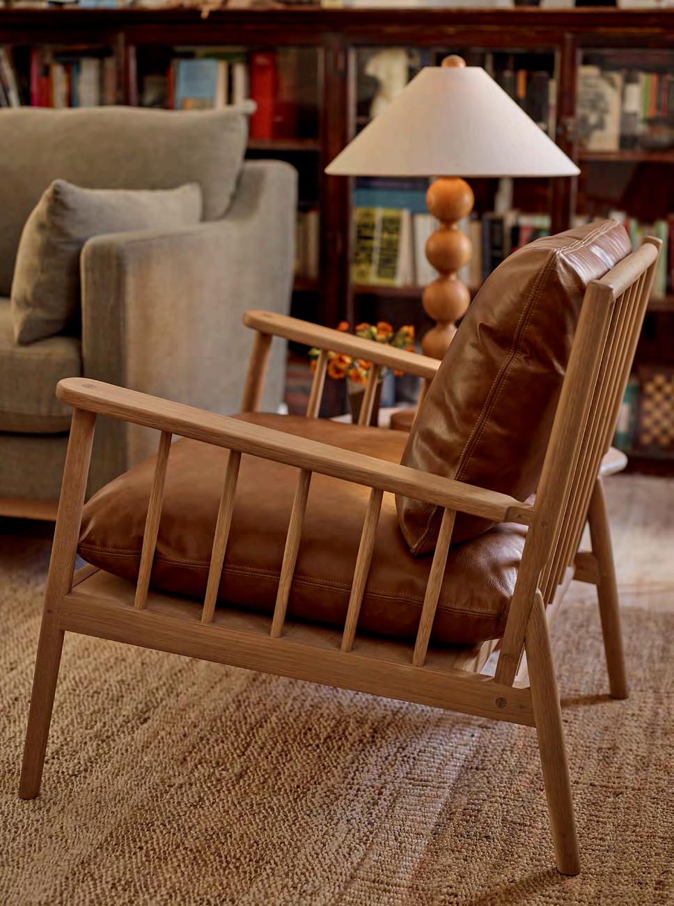
Inspired by the classic Windsor chair and the principles of the Arts and Crafts Movement but re-imagined for a modern lifestyle, the new Casey armchair is testament to simple, honest design and quality materials.
Ernest Gimson. Not a name as familiar as that of his contemporary William Morris, but no less influential in the Arts and Crafts Movement. Indeed, his designs received an accolade from the architect W. R. Lethaby that any designer, past or present, would surely welcome. Gimson’s furniture, wrote Lethaby, was ‘one kind of “perfect”, that is, it was useful and right, pleasantly shaped and finished, good enough but not too good for ordinary use’. In other words, everything that the Arts and Crafts Movement stood for.
What’s more, Gimson lived what he preached. He took lessons in making traditional ladder-back chairs from a Gloucestershire chair bodger (and trained local Sapperton villagers to become craftsmen in the furniture workshop he established with his fellow designers the Barnsley brothers), he used regional woods whenever he could, and he incorporated exposed pins and dovetail joints into his pieces. All principles we’ve also considered when creating our solid oak, cushioned armchair, Casey.
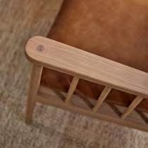
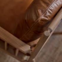
Designed in our Wiltshire studio, the ergonomically elegant Casey takes the spindle design of the classic Windsor chair and re-imagines it for contemporary homes as a comfy, cushioned armchair. The armrests slope very gently upwards at a ‘just right’ gradient, while the back reclines gradually for a relaxed seating position. The feather- and foam-filled cushions are designed for comfort and support and are available in fabric or leather upholstery. Exposed fox tenon joints echo that honest and plain, crafted approach, while the softly tapered curve of the arm helps the chair feel lighter and more contemporary for today’s interiors. Over a century on from the Arts and Crafts Movement, it’s exciting to see modern British designs that honour the craftsmanship of the past while embracing the way we live now. The Casey offers the comfort of an upholstered armchair but, thanks to its exposed timber frame, enjoys a slimmer footprint, leaving more room for an inviting, generous seat. Crafted, practical, comfortable and timeless, just the way Gimson, Morris et al intended us to live.
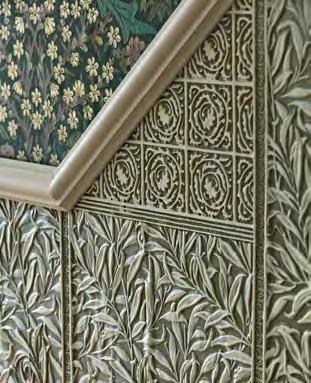
A heritage wall panelling brand with an illustrious pedigree has been reimagined for today’s interiors thanks to a new collaboration with Morris & Co, as Stories editor Suzanne Imre discovers.

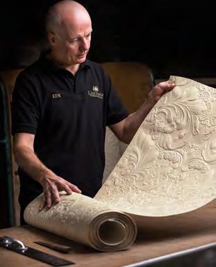
It’s 1990. Linda Evangelista lounges against a wall lip-syncing to what would become George Michael’s iconic ‘Freedom’ video. And the wall she leans against? It was decorated with Lincrusta’s ‘Edwardian Dado’ panel design, a timeless pattern with elements of emerging art deco influences in the wave motif, simplistic floral heads and elegant lines of symmetry. Just one of many occasions Lincrusta wallcoverings have played a supporting screen or stage role – from appearances on Netflix’s Bridgerton to decorating the set of the stage show Cabaret at London’s KitKat Club. And now, the Lincrusta team have collaborated with Morris & Co. to reimagine the latter’s botanical patterns in a contemporary 3D take on the much-loved ‘Acanthus’, ‘Willow Bough’ and ‘Fruit’ designs that, for the first time, allows the user to apply their personal colour interpretations.
Delve deeper into the history and properties of the Lincrusta product and it is a surprisingly sustainable material with an unexpected adaptability that works in interiors from Georgian to contemporary. As Alison Keane, commercial director at Lincrusta, explains, ‘Once it’s painted, it cures to the wall and is incredibly durable; it becomes part of the fabric of the building like the architraves and skirtings.’ In fact, it was the ornate plasterwork of grand Georgian and Victorian houses that Lincrusta founder Fredrick Walton wanted to replicate for a wider (albeit discerning) audience. ‘He democratised the art of plasterwork that had been the reserve of stately homes until then,’ adds Alison.

The crafting of the deeply embossed panels hasn’t changed much since Walton began producing them in the late 1800s. The metal rollers used at the Morecambe factory are hand carved, and each panel is individually inspected and dated for quality control. Made from linseed oil mixed into a paste and pressed onto FSCcertified backing paper, the wallcoverings dry naturally into a flexible roll that’s then adhered to the wall before being primed and painted. Once dry, it hardens up so is an ideal solution for busy areas like hallways and can even be used in bathrooms in place of tiles (though not in the shower cubicle itself!).
‘Thanks to the deep embossed patterns, which create natural light and shadow textures, one paint shade can be enough,’
says Alison, ‘though we say the only limit is your imagination!’ Layering on more colour can be the fun bit: after the first colour dries, highlighter layers can be added using a variety of paint techniques. ‘The charm of Lincrusta is that every panel is unique because it’s always hand finished,’ she adds. ‘And if you feel like a change, it’s simply a matter of repainting, just as you would any wall, making it a sustainable option thanks to its longevity.’
The collaboration with Morris & Co. made sense from the start. Fredrick Walton and William Morris were practically neighbours (Walton in Sunbury-onThames and Morris in Merton), and both set up their businesses within a year of each other. Yet it’s not known if they ever met. It has taken until now for two brands with such synergy to work together to create the three designs. Jessica Clayworth, lead designer at Morris & Co., explains, ‘It felt a very natural extension of the patterns. The way the leaves curve in the “Acanthus” design worked well in relief, and it was great to see “Fruit”, with its intricate dots and details, come alive.’
Used to working in classic Morris & Co. greens, browns and berry shades, Jessica was excited by the colour options this collaboration created. ‘I always think of Morris in deep and moody colours, but I was surprised to see how well the patterns can take soft, neutral shades too,’ she says. ‘William Morris was always challenging patterns to see how far he could push the boundaries, and I think he would have loved the extra dynamic of these embossed designs.’
This is
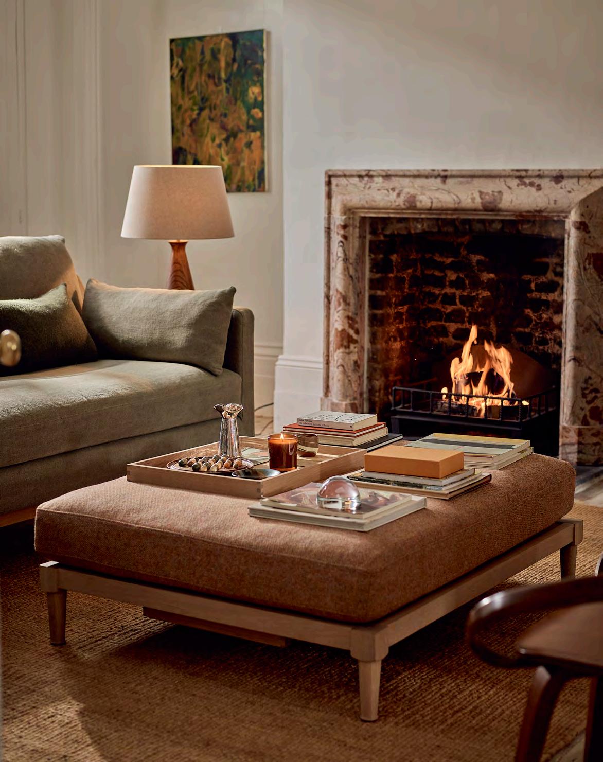
When it comes to spatial planning, the central point of a sitting room usually falls in the middle of the seating arrangement. Such a pivotal position calls for an eyecatching coffee table, and the new Ophelia footstool delivers on all levels. Marrying form and function, it conceals two solid oak trays beneath its plumply cushioned frame that make it the perfect surface to sit drinks on and display collectibles. Or, slot the trays away and it becomes extra seating when there’s a crowd.
Discover our full footstool collection, visit neptune.com/footstools
Having travelled the world with the design team looking for fresh new pieces to add to the accessories collection, Aalish explains the thinking behind the new collectibles.

What was your vision for Neptune’s new accessories collection?
My brief to the team was to be a little more eclectic. Listening to our customers, they like to curate their homes in a way that reflects their unique style, bringing together different complementary elements. It’s a tried and tested British way of styling – collecting curios from different places and craftspeople – to create a joyful, personal aesthetic. As we’re a British brand at heart, eclecticism sits comfortably with Neptune.
How does the brief fit into Neptune’s story?
Well, we’ve always worked with specialist British producers such as Harris Tweed and Fermoie, and now we’ve broadened the net a little wider to offer more choice. We want to build out the Neptune world for our customers, offering them more accessories that introduce freshness and excitement to their own homes or that they can buy for loved ones as gifts.
Where did the team visit for the new collection?
The brief was to travel to find the best product, working with local craftspeople around the world who are highly skilled and create show-stopping pieces. And so, we went to India for hand-knotted rugs, Poland for mouthblown glass, and Portugal for ceramics and bed linen.
We had a wonderful trip to Portugal where we had time to sit down and really consider our designs and developments with our ceramics maker. They are very similar to our own factories in terms of team, ethos, size and attention to detail and so the partnership feels harmonious. Just like us, they are a small, artisanal factory that prides itself on its handicraft.
Is it difficult curating when you see so many tempting pieces?
It’s a fascinating blend of art and science, bringing together what we know our customers love with our creative inspiration for the season. Our customers have great taste, and we have a good sense of what will inspire them, so every decision we make is based on finding the best thing for them.
What’s your favourite piece in the new collection?
This is hard as I love it all. The rugs are a real step change: they bring warmth and texture to sit alongside our favourite calmer palettes. The factory we’re working with is simply the best in the world; their quality and design skills are excellent, and they have used our beautiful natural colour palette to create stunning pieces. Each rug is woven by hand on a loom; it’s incredibly meditative to watch, a real art form. And the results are impressive – the Munro is our new, luxurious bedroom rug, made from New Zealand wool, and is so soft it’s like walking on a cloud.
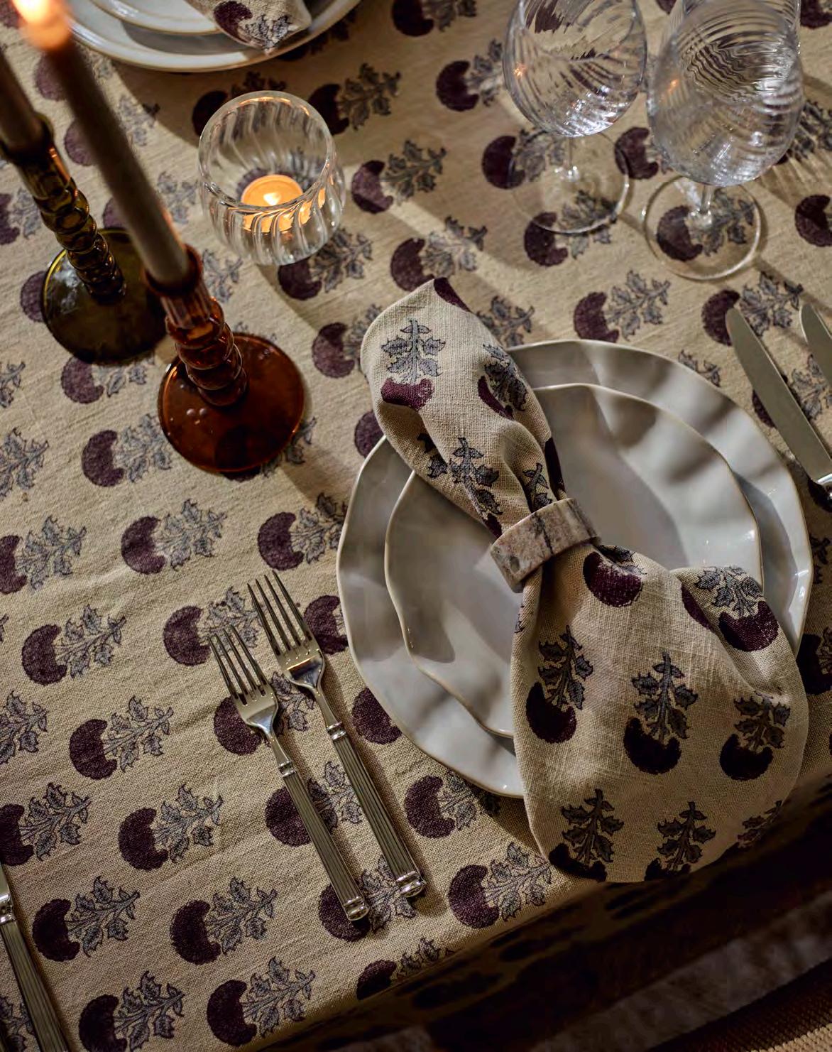
But the Sennen tableware will also be coming home with me. The organic white ceramics bring visual interest and pretty shaping to the table, without detracting from the food. Then we have new patterned table linens and stunning coloured glass candlesticks to layer in and reflect the light, so the whole setting comes together beautifully.
What can we expect from future accessories collections?
Christmas is very exciting this year as we’ll be launching our biggest ever decorations and gifting collection. I have my eye on the ultimate Neptune throw and our new Amber & Cedarwood scented candles. And in the new year, we’ve got something new in the kitchen – a collection of freestanding kitchen furniture including islands, chopping blocks and larders plus a capsule edit of accessories, from bakeware and serveware to rolling pins and chopping boards!
Lisa Armstrong, head of fashion at The Telegraph, explore s the enduring synergy between fashion and accessories that inspires pieces like ou r new Sennen tableware.
Elsie de Wolfe, reputedly the inventor of interior design, once declared, ‘I am going to make everything around me beautiful – that will be my life’. This included clothes. The notion of beautifying every aspect of life is not new.
Then there was Coco Chanel, that great streamliner of twentieth-century womenswear, who set out a blueprint for chic, simple, luxurious clothes, but also rooms, with taupe, cream and black interiors speckled with comfy, luxurious textiles. Or Ralph Lauren who, when he launched his first homeware collection in 1983, sixteen years after his first ready to wear, instantly made ‘dressing’ your home the way you liked to dress yourself more straightforward. Other designers followed. In 2019, the London-based Erdem (a favourite of the Princess of Wales) launched blankets, ceramics and candles that reflect the chintzy, ‘English-stately’ aesthetic of his clothes. By 2020, when London Fashion Week star Roksanda dabbled in interiors for a development in Kings Cross and even staged a presentation in one, where the blush pink (which became a hugely popular interior colour), yellow and burgundy decor mirrored her collection, most of us had got the memo about the interconnectivity of everything that surrounds us.
Now, courtesy of Instagram, we’ve become as familiar with the concept of accessorising our homes as our outfits. Throws, cushions and rugs have never been more of a style statement (the most popular press gifts at the fashion and jewellery presentations recently were Dior’s toile de jouy blankets). During lockdown, ‘cottage-core’ sprigged prints and ruffled dresses and blouses sparked a contagion of delightfully pretty tablescaping with horticulture-inspired napkins, china and pleated lampshades (and yes, some influencers dressed to match their dinner plates). Floral outfits have seen a concomitant surge in the popularity of house plants; green is now everywhere in our wardrobes
and our living spaces. 2023’s catwalk infatuation with stealth wealth (think soothing shades of head-to-toe milk and caramel) has also seen a renewed interest at home in the restful versatility of cappuccino.
Talking of reassuring, in 2024, the comfort and gracefulness of Edwardian style (an era described as a golden age of interiors and architecture) is in full swing on the catwalks and our screens. Thank you Peaky Blinders and Guy Richie’s The Gentlemen, where, in the latter, modern day characters wear updates of tweedy, early twentieth-century tailoring. The now-collectible Vampire’s Wife’s piecrust necklines and fluted sleeves, the nipped-in waists and tailored jackets at Dior, Erdem and McQueen, and Miu Miu’s ruched bags can all be traced back a century. When small British fashion label The Fold launched a silk dress printed with an original Arts and Crafts Liberty print design last June, it sold out instantly. The catwalk’s maxi hemlines and blazers for winter 2024 play on the period’s proportions too. At Chanel, Celine and Maison Michel, boaters are back. Meanwhile, Tate Britain’s recent John Singer Sargent exhibition, with its woozy, glamorous gaze on turn-of-the-nineteenth-century glamour, delighted crowds. Sargent’s sumptuous velvets and jewelled accent colours are already finding their way into our interiors. Ultimately, perhaps, this is not about adopting a oneseason fad from social media, and more about the slow accretion of beloved layers – the subtle ruffled edging on Neptune’s new Sennen tableware that echoes the frills of Victorian and Edwardian silk blouses, and our rekindled love for kilims, needlepoint cushions, wood panelled walls and items that don’t feel perfectly finished or mass produced: a gradual gathering of objects we truly love. As Sister Parish, that master of old-meets-new-meetsglamorous interiors, said decades ago, ‘I never followed trends. …rooms should be timeless and very personal.’
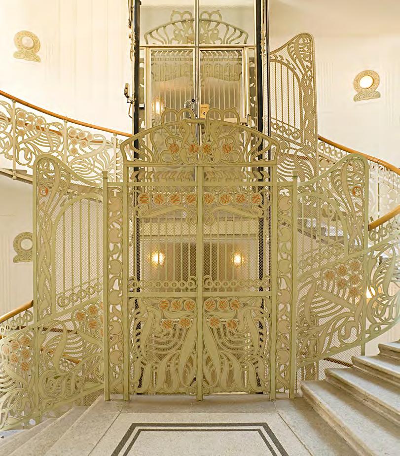
Modern architects are rediscovering the romance and engineering brilliance of birdcage lifts in heritage buildings, as design writer Jess Salter reveals.
It’s not often that you can say calling the lift is a thrilling experience. But on a recent stay in the Hotel Diplomat in Stockholm, I pressed the call button at the entrance to the magnificent gleaming birdcage elevator, rolled back the gates and rose up to my room in an elegance that you rarely encounter at check in.
Birdcage lifts are rare to come across because of their relatively short period in fashion. But there are some magnificent examples that one can still chance upon, often in Victorian-heritage hotels such as the Walpole Bay Hotel in Margate or the Fowey Harbour Hotel in Cornwall, which has a refurbished 1920s lift that delights guests, consisting of a three-sided wooden car with a concertina gate that, of course, must be closed before the lift can operate.
So called, birdcage lifts – consisting of rounded or square cars with often ornate metal frames – started to appear in the chicest addresses around the turn of the twentieth century, prime examples including the cream and gold concertina lift in Austrian architect Otto Wagner’s Majolikahaus in Vienna, built in 1898. They were wonderfully quirky examples of the elegance and ornamental flourishes of late Victorian and Edwardian design, along with the daring feats of engineering that typified this time.
But they also embraced the glamour of the era: some featured chandeliers, upholstered seats, and ornate mirrors that reflected their metal exteriors. Because early elevators were powered by steam (until the
introduction of hydraulic machinery) and ascended at a leisurely (some might say slow) pace, there was time to enjoy the ride.
Happily, the charm of the birdcage continues to captivate many modern architects and developers. Lance Routh, director at leading British architecture practice Stiff+Trevillion, had a ‘wonderful surprise’ when the team discovered an original birdcage lift in the Grade II listed, nineteenth-century department store Arding & Hobbs in Clapham, London, that the firm was redeveloping. It had originally been installed for the personal use of the eponymous proprietors. ‘We just knew it was essential to keep it,’ Routh says. ‘We were very keen to make sure it was preserved as part of the fabric of the building and its history because it harks back to a golden age of British history.’ Similarly, in studio and office space China Works, the only surviving part of the nineteenth-century Royal Doulton headquarters in Lambeth, the designers kept the intricate brass birdcage lift when converting the Grade II listed building into a shared workspace. Now decommissioned, it retains a glimpse back in history that the building’s modern inhabitants – digital nomads hunched over laptops – find charming.
The elegance and careful design of the birdcage lift harks back to an era that we can often yearn for – along with a slow, considered pace of life. Rising to my room, watching the mechanical dial slowly tick between numbered floors, I felt transported. And not just up.
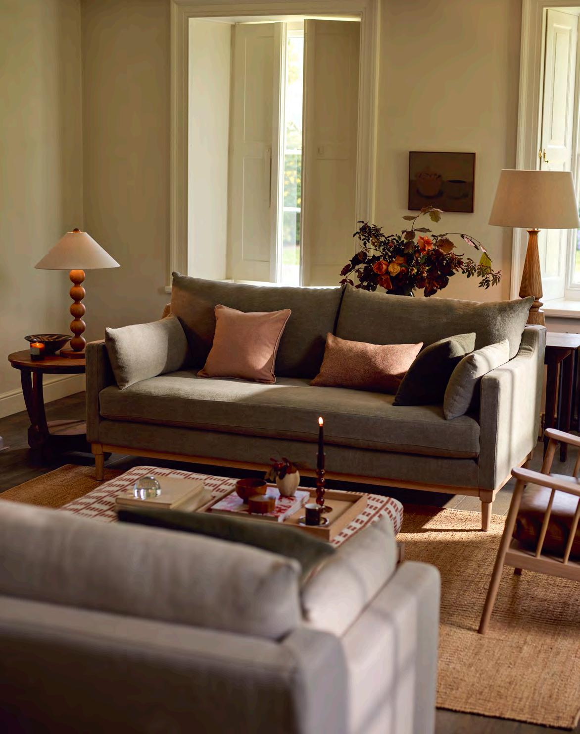
The road from idea to reality is rarely linear. Initial thoughts are discarded, problems are resolved, and minute details can turn out to be the focal point of a final design, as the journey of our new Eliza sofa proves.
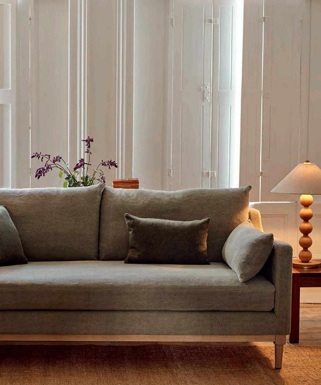
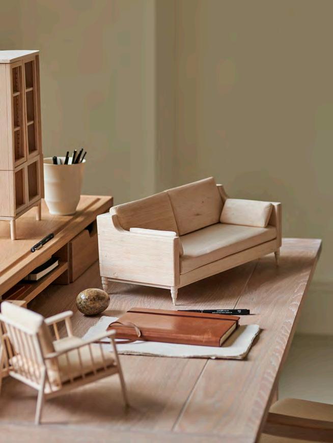
Auction houses are a great source for design inspiration. While researching period sofas, Neptune design director Fred Horlock spotted an antique design that required further investigation. The distinct features nodded to the Edwardian period, with an elegant sloping frame in pale oak, single-cushion seat, and minimalist proportions. The exposed frame embraced a 360° approach to design, allowing the sofa to be placed in the centre of a room – a traditional layout of the period. The design meetings that followed were offshoots from this original concept. But how to reimagine a vintage style for twenty-first century living? Focus was put on harnessing the pared back aesthetic and creating deeper proportions for comfort, while retaining the traditional shape and exposed woodwork to highlight craftsmanship. The result? A sofa made to be admired from all angles.
After finalising the shape of Eliza, designers in our Wiltshire studio came together to produce digital drawings and miniature prototypes. This stage in the journey sparked discussions around the precision of leg angles, the height of the back, and the level of cushioning for the seat. It meant many iterations of the design, especially for the legs. How decorative would they be? Would they be reminiscent of traditional carved legs or be more streamlined? Eventually, the team decided on a more modern, sleek silhouette which would suit any style and period of home.
There was a moment of hot debate over seat cushions too. All our designs are upholstered by hand using the same reliable methods that have allowed antique sofas to survive for centuries. We use serpentine springs to ensure balanced support exactly where it’s needed. Seat cushions are then filled with feather-wrapped foam for the optimum balance of comfort and resistance. But how many seat cushions to use? The final look of one long seat cushion (juxtaposed to two back cushions) was agreed upon as it provides even comfort, with the cushion filling spread out across the whole frame, so no one sinks in the middle. It also mirrors those historic references that had first caught Fred’s eye.
Using pliable balsa wood, our in-house designers then created miniature sofa models. From legs and frame to cushions and exposed details, each piece was carefully constructed so the team had a real-life visual to work with and evaluate from all angles. A miniature sofa, fit for a dolls’ house, if you will.
Seeing the sofa materialise in three dimensions allowed the team to make final evaluations. A blend of modern engineering, innovation and traditional craft influences all our design processes. We’re never just behind a computer screen – the craft element at every stage of the design is what makes each product special.
And the result? Eliza’s exposed oak rail frame and elegantly turned oak legs seamlessly combine comfort with considered details for a sofa that’s designed to be at home in any space, while using kiln-dried tulipwood for the internal frame guarantees strength for years to come. Not one to be tucked away, the final piece is tribute to our pride in craft and design. Each piece of Neptune furniture is built with the sustainable philosophy that it’s destined to become a much-loved antique of the future, and Eliza is no exception.
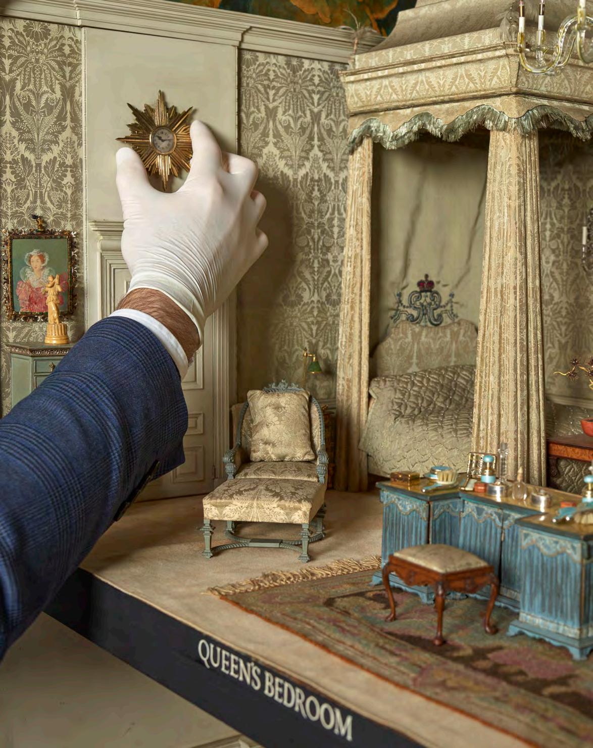
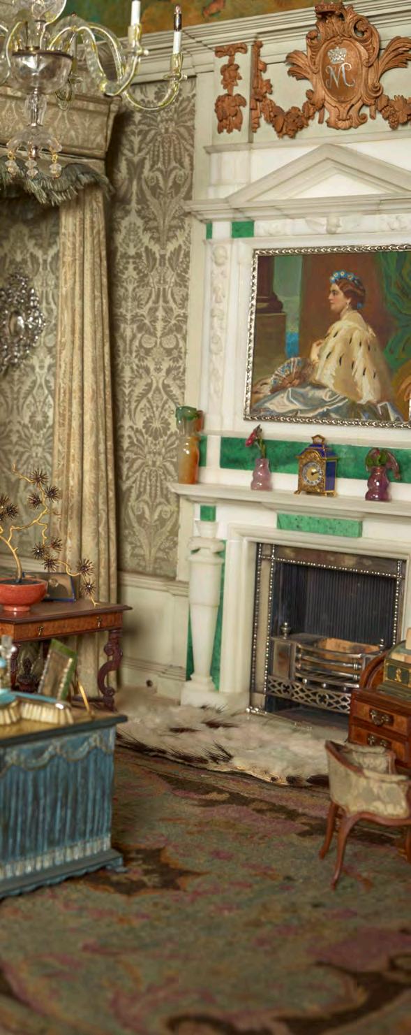


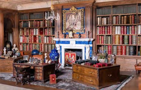
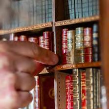
Not all dolls’ houses are made equal. The one crafted by celebrated architect Sir Edwin Lutyens for Queen Mary captures a moment in interiors history with its miniature silver baby’s bath, teeny Dunhill cigars, and scaled-down vacuum cleaner, as arts writer Caroline Roux discovers.
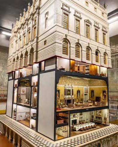


Sir Edwin Lutyens was the most imaginative British architect of the early twentieth century. Rattling through styles from Arts and Crafts to classical, he built castles and churches, a swathe of India’s new capital, Delhi, and the Cenotaph – the war memorial which stands today in London’s Whitehall.
But possibly his most famous project is just over three feet tall. It is Queen Mary’s Dolls’ House, an exquisitely detailed Palladian-style villa that the architect designed in 1921 and which was completed in 1924. Built at onetwelfth scale, and now on permanent display at Windsor Castle in a Lutyens-designed room, it is a dazzling but peculiar sight. Too big to be an actual dolls’ house, it was never intended for play but became a vehicle to show off the very best of British art and craft. The historian Lucinda Lambton has called the house ‘a last hollering HUZZAH for the vanishing Edwardian age’.
The dolls’ house was conceived as a gift to Queen Mary following her stoic behaviour during World War I. She was known as ‘Britain’s Domestic Queen’, and apparently, she loved things in miniature. Fully functioning and state-of-the-art, in its micro way, the house was wired for electricity and water still runs through its taps. It boasted the very latest Ewbank carpet sweeper and a newly invented Hoover sent from America. The seven hundred tiny paintings hung on its walls are original works by the major painters of the day, including Paul Nash and Sir John Lavery.
Lutyens couldn’t wait to take on the commission. He’d had a hard time in Delhi, where he had become obliged to mix local designs into his preferred classicism, and budgets were being cut. Back in England, he could
apply his love of what he called his ‘Wrennaissance’ style – a contemporary homage to the great Christopher Wren, all capacious Roman arches, vaulted ceilings and marble-tiled floors – to his latest project.
He organised a series of ‘Dollyluyah’ dinners through which he engineered the participation of writers, artisans, manufacturers and decorators. In the end, he corralled over 1,500 contributors. Alfred Dunhill made teeny cigarettes and cigars. The country’s finest ironworker, John Starkie Gardner, fashioned its silver stair balustrades. Cartier made a red lacquer screen decorated with Indian playing cards. There are needlepoint renditions of Aubusson carpets, silk upholstered furniture and crystal chandeliers. The Queen’s bedroom has a ‘perished mirror’ ceiling, surrounded by ruby-winged cherubs, created by the painter and sculptor Glyn Philpot.
Perhaps most importantly, the house is an unparalleled time capsule in which nothing has changed. Where its real-life counterparts have been redecorated, or even restored to previous historical accuracies, Queen Mary’s Dolls’ House tells us how the tastemakers and aristocrats of the day operated and just how splendidly and artfully they lived. With its rooms filled with furniture from the eighteenth and nineteenth centuries, suits of armour, oyster forks, Chinese wallpapers (all the rage in the seventeenth century, back in fashion in 1920), the baby Prince of Wales’s solid silver bath, and commodes concealed in rattan-work chairs, it represents an existence that, within fifteen years, would begin to falter. Britain’s Domestic Queen indeed! From this evidence, Mary lived like an absolute king.
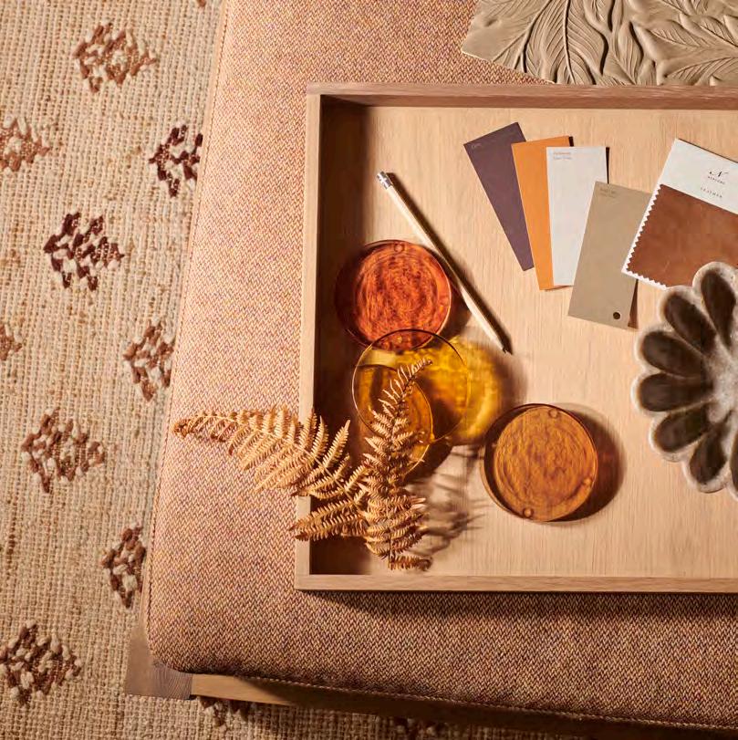
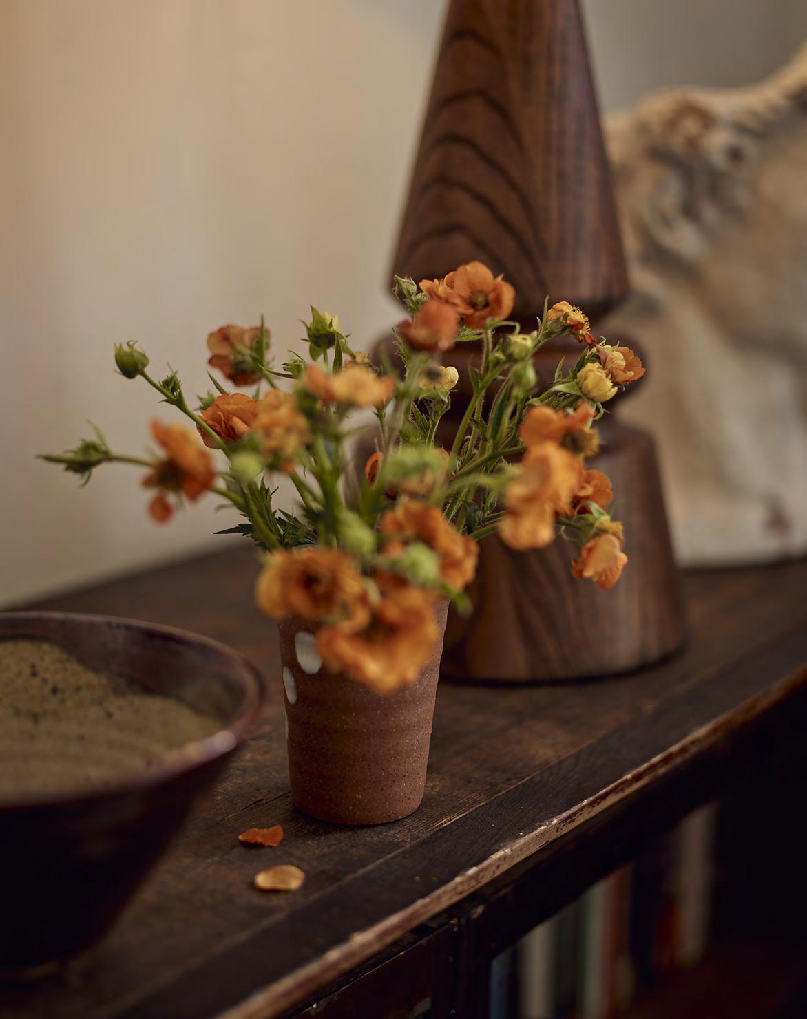
A warm, orange-brown fern leaf with a rich history is the inspiration for our new seasonal colour. From prehistoric fossils to custard cream motifs, author and colour expert Kassia St. Clair explores bracken’s expressive history.

The Victorian naturalist and philosopher Henry David Thoreau once opined that ‘God created ferns to show what he could do with leaves’. A little overblown, you might think, but actually his praise was – for the era – rather restrained. From around 1830 until 1910, society on both sides of the Atlantic was gripped by ‘pteridomania’ – better known as fern fever. Appreciation for this large family of plants was seen as proof of intellect, even virility. Frond-like motifs and references appeared in art, interior decoration, literature, and even on custard cream biscuits. Wordsworth enthused about the ‘brilliant and various colours of the fern’ in the Lake District; Ruskin painted them in Perthshire. Enthusiasts – particularly women – travelled to Devon to collect rare specimens and then housed them in ‘Wardian cases’ (invented in 1829 as a means of transporting live plants, but later a fashionable means of displaying them) and custom-built ‘ferneries’.
Bracken is probably the most iconic fern species – the one with triangular arrangements of delicately branching fronds. It’s a very old (ancestors can be found in fossils dating back fifty-five million years) and large plant, growing up to two metres. Like most ferns, it doesn’t flower or generate seeds but instead reproduces with spores, like fungi. This method has evidently proved extraordinarily efficient: it has colonised almost all temperate and tropical regions of the globe and can quickly dominate a habitat. It’s bracken that you’ll see unfurling tender new fronds on verges and in woodland during the spring. Come October, bracken puts on a spectacle like no other: emerald leaves sliding softly through a suitably autumnal minor scale of gold, copper, russet, rust, chestnut and dun. Because of how widespread bracken is, such displays can cover landscapes as far as the eye can see.
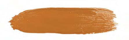
The colour itself is an evocative one. It’s why Neptune has chosen to name its new seasonal shade Bracken. Orange softened with a touch of brown and mustard, it immediately recalls the changing of the seasons and autumn foliage, of course, but other things spring to mind too. The joy of late autumnal sunshine, pumpkins, Halloween, the glowing embers of a bonfire, and hot, spiced drinks gripped between gloved hands. A brighter, more vivacious cousin to perennially popular terracotta and clay-pink shades, it’s comforting, inviting and liveable, with a bold, contemporary edge. It feels subtly Victorian too: an off-beat allusion to all those Pre-Raphaelite redheads, Aesthetic Movement ‘art colours’, and the work of William Morris and his contemporaries. Exactly the kind of colour, in short, of which Henry David Thoreau would heartily approve.
Use our elegant autumn colour scheming ratio and new season paint shade Bracken to help you create a cohesive look for any room.
What was the starting point for your most recent decorating project?
The colour combinations in a favourite patterned fabric or the shades of a much-loved painting maybe? Chances are, it was a colour or two that got the scheme going, with the furniture shapes, textures and accessory choices following later.
Landing on your chosen shades is the first step in putting together a scheme, but the key to success is considering how to apply those colours. The rule of thumb used by the designers at Neptune is the 60:30:10 ratio – a base colour (usually a light or dark neutral) that represents sixty per cent of the scheme, one or two complementing accent colours which account for thirty per cent, and the final highlights (usually a bolder or brighter shade) making up the last ten per cent.
It was this ratio that guided our autumn palette, a contemporary take on the refreshing colours of the early twentieth century that balances warm neutrals with sophisticated soft shades and touches of strong colour. This decorative shift came about as a reaction to the darker, more sombre shades of Victorian interiors, with the new era celebrating cheerful and fresh palettes using warm whites, sage and olive greens, mustard, terracotta, soft blues, and deepest pinks. Interpreting these colours for today’s homes means dialling up the whites to pale beiges, introducing colourful hues with enough black in them to feel refined rather than sweet, and adding a shot of energy with our new orange-brown shade, Bracken.
Sixty per cent
Pick a warm, pink or yellow-tinged white or cream as your base colour.
You could try:
- Salt, a creamy off-white with a comforting warmth
- Silver Birch, a pale creamy-grey, almost an oatmeal shade
- Driftwood, a classic putty colour that feels calm yet cosy
- Orkney White, a fresh, soft white that adds subtle warmth
Thirty per cent
You could take two routes here: a softer palette of Cactus, Flax Blue and Lead Light; or a darker one of Constable Green, Navy and Clove. Both work well with the warm neutrals.
Consider:
- Cactus, a deep, relaxing green with a gentle grey coolness
- Flax Blue, a hazy blue with a touch of grey that’s muted but deep
- Lead Light, a soft khaki; an earthy brown with a hint of green
- Constable Green, a rich, inky green that feels enveloping
- Navy, a deep, dark blue that feels fresh against white
- Clove, a sultry natural shade hovering between deep plum and soft brown
Ten per cent
- Bracken, a vibrant, warm orange-brown that brings energy
- Blakeney Blue, a fresh, true blue with an underlying warmth
See our full paint collection at, neptune.com/paint
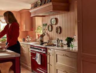
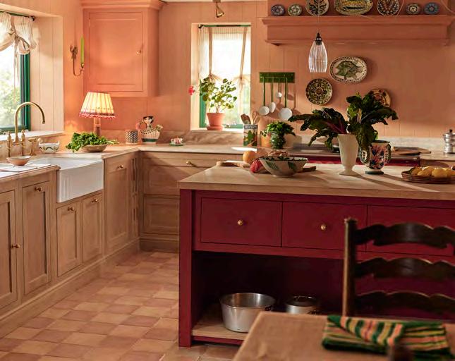
For Devon-based hoteliers
Hugo and Olive, their new kitchen had to balance family life with their love of hosting and entertaining –and colour.
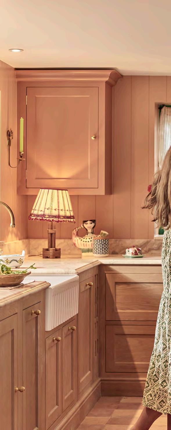
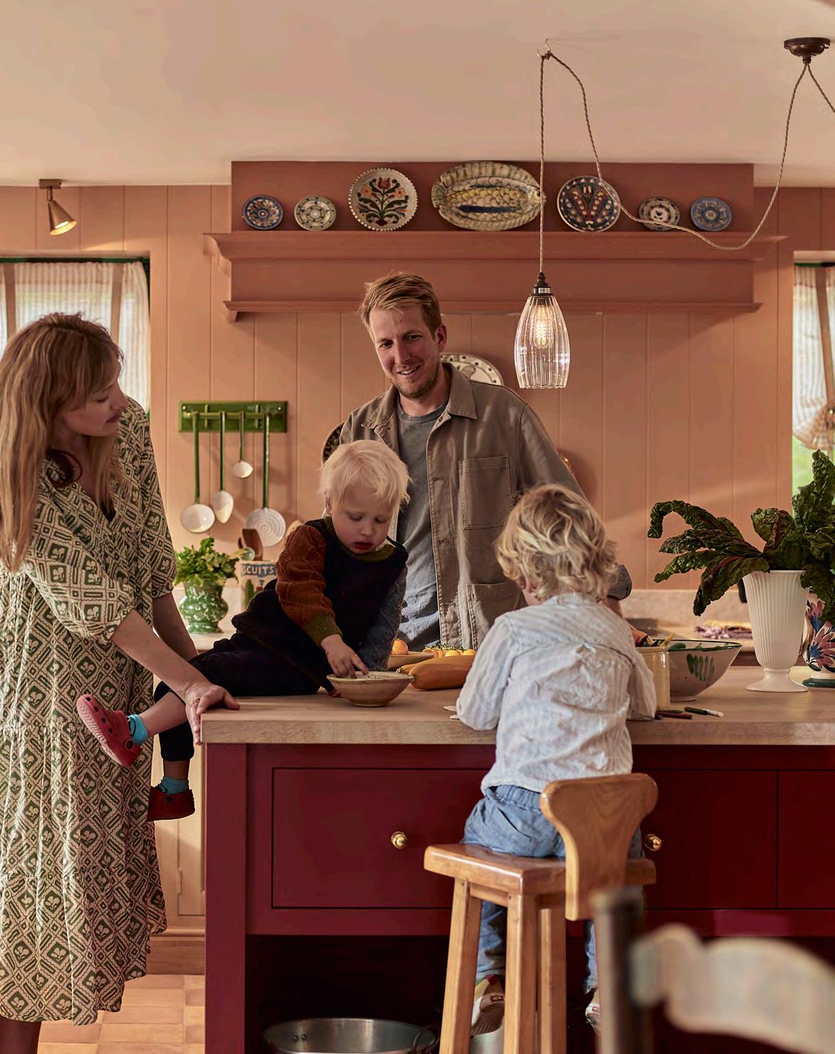
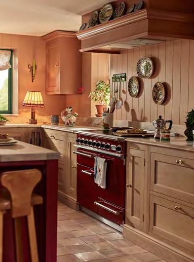


As the paint dried and the Neptune installers completed the finishing touches to their new Henley kitchen, hotelier and chef Hugo Guest and his artist wife, Olive, (who together run Glebe House, a guest house and restaurant in Devon) knew exactly what they had planned for the space once the dust had been swept away. ‘The island is the hub of family activity,’ says Hugo. ‘Our boys are four and two and we love cooking with them – baking, rolling out pasta. Generally getting very messy.’
But this kitchen has been deliberately designed to be versatile too, with a seating and library area to one side, a tucked-away utility room, and a big dining table for entertaining. ‘We were living in a small two-bedroom flat while the building work was going on so haven’t been able to host any friends, other than at Glebe House itself,’ adds Olive. ‘We have a long list of friends to invite over now.’
For keen vegetable-grower Hugo, linking the garden and surrounding countryside to the kitchen was also a key consideration. ‘We have a big kitchen garden that we created from an empty field to serve the restaurant,’ he explains, ‘but there is always surplus veg, which we like to pick with the boys. We grow everything seasonally from radishes and broad beans to kale, fennel and artichokes. Currently, it’s a surplus of Swiss chard!’
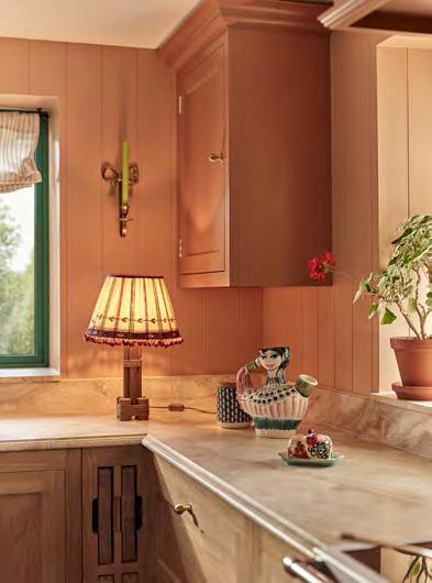
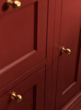
Hugo recalls they chose the Henley collection because ‘the design was simple but had nice detailing; it sits perfectly between modern and traditional style’, and they loved the inclusion of the natural oak cabinetry. Colour was an important way to connect the outside and in and, inspired by the earthy clay shades of the nearby Jurassic cliffs, the couple mixed Burnt Sienna on cabinetry alongside Henley’s natural oak finish, and used Burnham Red on the island (with Farrow & Ball’s ‘Fake Tan’ on the tongue and groove panelling).
They were also influenced by the years they spent living and working in Europe. ‘Our style is inspired by the country kitchens of Italy and France,’ says Hugo. ‘That use of natural wood and stone and warm, earthy colours that feels anchored in the surrounding environment.’ The subtle terracotta chequerboard floor is a case in point: ‘It feels so warm and inviting and transports me to my favourite parts of Italy,’ he adds, noting that laying the floor was ‘a real labour of love – I hadn’t quite appreciated it would need six coats of sealer, but it was worth it.’
Claire Birkbeck, the Bath-based Neptune kitchen designer who worked with Hugo and Olive on the project, recalls the couple had clear ideas from the start. ‘They wanted to make it a really joyful space, somewhere with lots of character and colour, and they also wanted to make sure it fitted their family life set up. As a designer, it was all about making it a hardworking space with good storage, but one that also feels fun and creative.’
For artist Olive, layering colour and pattern onto the warm terracotta base was the next step. ‘I introduced pattern through the floor tiles, our collection of pottery and plates, and soft furnishings. For me, pattern is an instinctive thing – when you see a pattern you like, it just feels right. Not all patterns work together though. I tend to layer different shapes – a geometric with a floral maybe, or a large, wide pattern with a smaller print. And I always choose a thread of colour that ties the patterns together.’
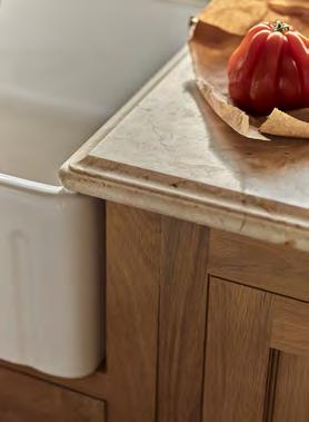
The couple mixed in vintage finishes with the antique brass taps by Perrin & Rowe and a reclaimed butler’s sink in the utility. They worked with designer Claire to select the softly dappled marble for the work surfaces and added lighting such as the Athena scalloped shade, which Olive felt suitably reflected their coastal location.
‘Our original vision was to make the kitchen a place to cook and host but also for our family to live in and relax,’ says Hugo. ‘This is how we imagined it, but Neptune made it a reality.’
To begin your kitchen journey, talk to our kitchen design team at neptune.com/kitchen


DANDELION & ORANGE 09/2024
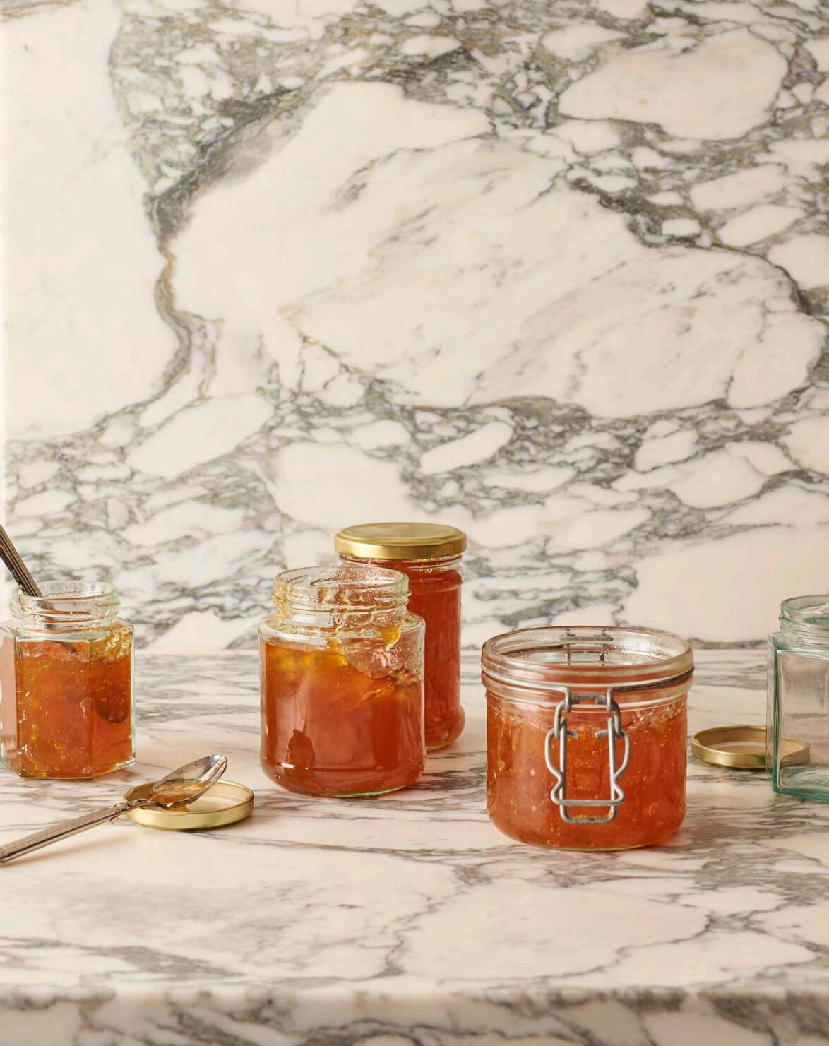
Nothing says breakfast in homes up and down the country like the combination of toast and marmalade. Writer Jo Rodgers shares her quest to find the perfect pot to spread.


The most un-knockable marmalade I’ve ever eaten (over Christmas last year) wasn’t really marmalade at all. At least, an Edwardian breakfaster scraping a pot of Frank Cooper’s Original, – for they were the arbiters of marmalade, the Edwardians; though the condiment had already been around for centuries, they were the ones who made such a religion out of it that it was canonised on British breakfast tables – wouldn’t have recognised it as the proper thing. No, the jar I had was labelled ‘Dandelion and Orange Spread’, made by the Durslade Farm Shop in Somerset.
It was bright and bitter, the citrus rinds mixed with foraged dandelion, subtly vegetal, richer and more fulsome in flavour than any marmalade I’d ever tried. The scent was so concentrated it reminded me of Orangina, that French soda that comes in a glass bottle with little grooves like the skin of an orange. It even spread onto toast easier because, though chunky, the pieces were small enough to distribute smoothly under a knife. In other words, it was the ideal evolution of a classic.
We got through the first pot, the toaster warm at all hours, and ordered another one. Then another. We sent a couple of jars to friends who became evangelical about it too. Then one day in the early spring, the web page vanished. Out of stock, I assumed. A side effect of becoming devoted to something seasonal. The rest of the family, cold-eyed, shifted their loyalties to other spreads, but I kept hanging on, still ensorcelled, still refreshing the page. Nothing. It wasn’t just the taste, I remember telling a neighbour, the lost marmalade now high on my docket of personal news, it was healthy! Everybody knows that dandelions are very salubrious weeds. I feel eighty-five per cent certain about it.
I am not a professional nutritionist. Funnily enough, health was an argument that the Edwardians made in favour of marmalade too, extolling the virtues of vitamin C. Just imagine if they’d had the dandelion to talk up as well.
Anyhow, months passed. The editor of this tome innocently asked if I had any particular thoughts about marmalade, and in the course of things, I checked the website again. Reader – reader! A happy ending: it’s back.
This is
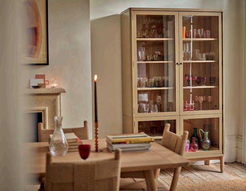
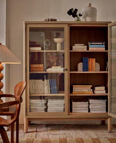
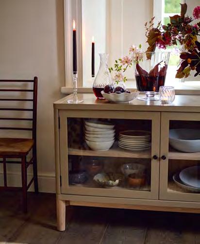
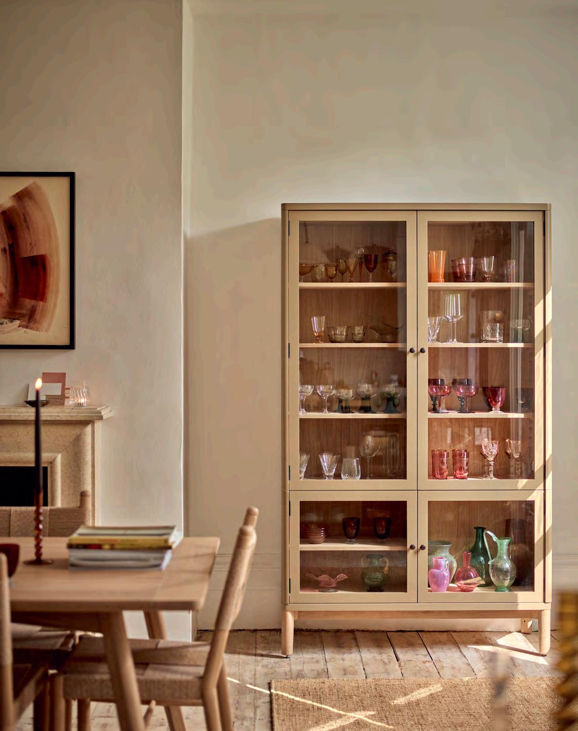
…or the Farlow cabinet, or the Farlow sideboard. This elegant, glass-fronted storage collection, with exposed oak interior and curved corners, has been designed to offer choice and flexibility. As a dresser, the cabinet sits smoothly on top of the sideboard, offering moveable shelves (thanks to the smart zig-zag system) encased in a painted exterior. Or, opt for the six-shelved cabinet or the lower sideboard (perfect for holding a record player or decorative lamp) and add to the collection as your needs grow.

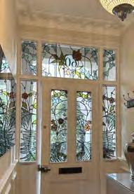
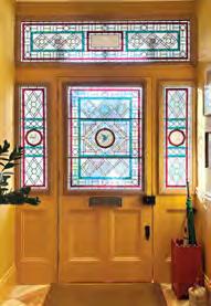
For centuries, jewel coloured stained-glass windows were a core component of hallowed buildings. Now, design writer Roddy Clarke spotlights contemporary artisans who are keeping the art form alive in the twenty-first century as a welcome addition to our homes.
Once the reserve of awe-inspiring medieval churches, as glass became more affordable during the Renaissance era, such ornamental features began to edge their way into homes, moving away from religious depictions to showcase family crests or bespoke decorative patterns. Fast forward to Victorian and Edwardian England and richly coloured stained-glass panels had become de rigueur for front doors – a look still going strong today as modern glass artists offer us the chance to create personal designs for our homes.
Despite its shift in application over centuries past, the methods of producing stained glass have hardly changed since the twelfth century, giving the art form a timeless, enduring quality. ‘It creates an unforgettable first impression,’ says Flora Jamieson, a Dorset-based stainedglass artist working on modern and period commissions. ‘I think the demand for both contemporary and traditional interpretations has increased in recent years as people have become interested in creating unique, bespoke homes.’ Coming across the practice during her studies and a visit to Salisbury Cathedral, Jamieson wanted to explore its relevance within the design world today. ‘I always aim for my stained-glass windows to do three things,’ she explains. ‘To bring joy to those who see them, to exist in harmony with the room or setting, and to weave into the design any symbolic details requested by the client. It’s a wonderfully collaborative process.’
With the beauty of a personalised stainedglass panelled front door being an obvious draw
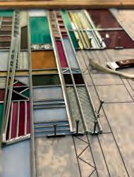
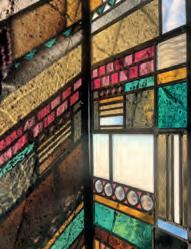
for homeowners, it is, sadly, a craft at risk. This year, historic stained-glass window-making was added to the Heritage Craft Association’s ‘Red List of Endangered Crafts’, largely due to the demise of mouthblown sheet glass making in the UK.
Annahita Hessami, Emma Lindsay and Tamsin Abbott are three glass art specialists passionately keeping the craft alive. ‘It’s a strange conundrum as, while it has been placed on the Red List, I feel there is an increase in people understanding its value and wanting to preserve original features within their properties,’ Hessami says. ‘I’ve also noticed an increase in novice makers on social media, which is certainly boosting the craft’s presence, at least on a base level.’
Illustrator Tamsin Abbott takes a fresh approach to the traditional craft. Drawing inspiration from nature and folklore, her intricate creations are more reminiscent of statement wall art pieces than architectural features. ‘When I began to realise the possibilities of painting onto glass, and began looking at more contemporary work, I started thinking about stained glass in a completely new way,’ she reveals. ‘I saw a way of working with blocks of

colour and black paint to create worlds within worlds which were illuminated differently by the ever-changing natural light around.’
Emma Lindsay feels that there are a variety of routes you can take when exploring the technique. ‘I have been working with stained glass for over twenty years now and it still feels like I have barely scratched the surface of what is possible,’ she explains. ‘Added to this, there’s scope to evolve your practice in so many different directions. You can work to commission like I do, or go into conservation and restoration, teach, or create fine art pieces or hand-crafted products. A word of warning though: once you start, it becomes highly addictive!’
With the worlds of art, craft, architecture and design culminating in the beauty of stained-glass creations, Jamieson reminds us of the wealth of wonderful examples we have within the UK. ‘From the humblest of Victorian churches
and terraced houses right through to exquisite contemporary windows by renowned artists such as Patrick Reyntiens or Brian Clarke, it’s the dazzling beauty of glass as a material that is the thread which connects them all,’ she concludes. And, as stained glass finds a revival in modern homes, I’m inclined to agree that, whether functional or decorative, basking in coloured rays of light while observing an intricately illustrated scene is a magical experience like no other.
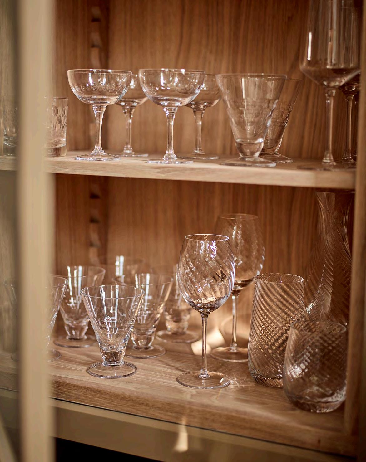
Something to celebrate? You’ll likely want to raise a toast or two in that case, so only the best glassware will do.
Cheers! Salud! Skol! The clinking of glasses is a sign of joyous times all around the world. Be it in restaurants, bars or the comfort of your own home, special occasions have long been marked by the knocking together of glasses (had you lived in medieval times however, the gesture would have aimed to mimick the sound of church bells to ward off unfriendly demons).
Either way, the understated hero of such a moment is the glass itself. An integral part of the whole experience, the glass you choose is much more than simply a vessel. It also plays an important role in the aesthetic, taste and aroma of a drink. A red wine glass, for example, has a larger, more rounded bowl to allow the wine to ‘breathe’ and the rich flavours to develop. A white wine glass is shallower to limit the wine’s contact with air and preserve its crispness. And flutes, with their tall, slim shape, are designed to limit the champagne’s exposed surface area and keep bubbles intact.
At Neptune, our shapes range from tumblers and highballs to wine glasses, champagne flutes and coupes. And for the new collection, Islington, the emphasis is on artisanal skill. ‘It’s produced in a specialist factory in Poland, where each glass is mouthblown and hand-finished with an optic twist,’ explains Hannah Edwards, Neptune’s lead buyer and product developer. ‘We wanted to work with makers who could ensure the pure brilliance and clarity of the glass,’ she adds, ‘something the Polish glass industry has been perfecting for over a thousand years.’
Glassware adds a decorative element to a tablescape, too. Here are our top tips for styling your collection.
Position your glasses where the light (or candlelight) will catch them for extra sparkle (a preparatory wipe with a microfibre cloth will remove any cloudy spots or fingerprints).
Mix and match styles – old and new, clear with coloured, and tall with short –for an eclectic look that feels more informal.
When not in use, group a collection of sparkling glassware on a smart tray on a sideboard for a curated display that retains a relaxed look.
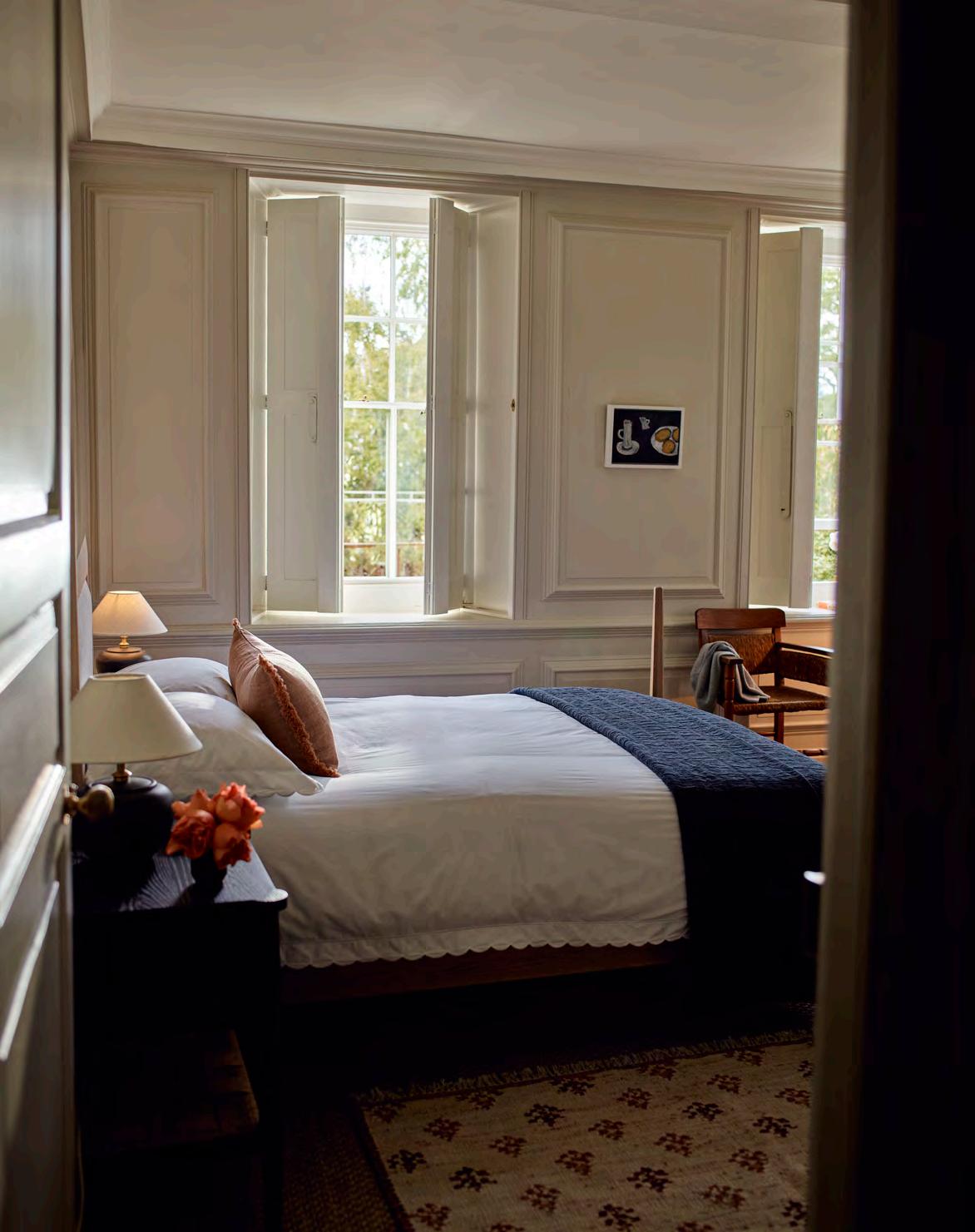
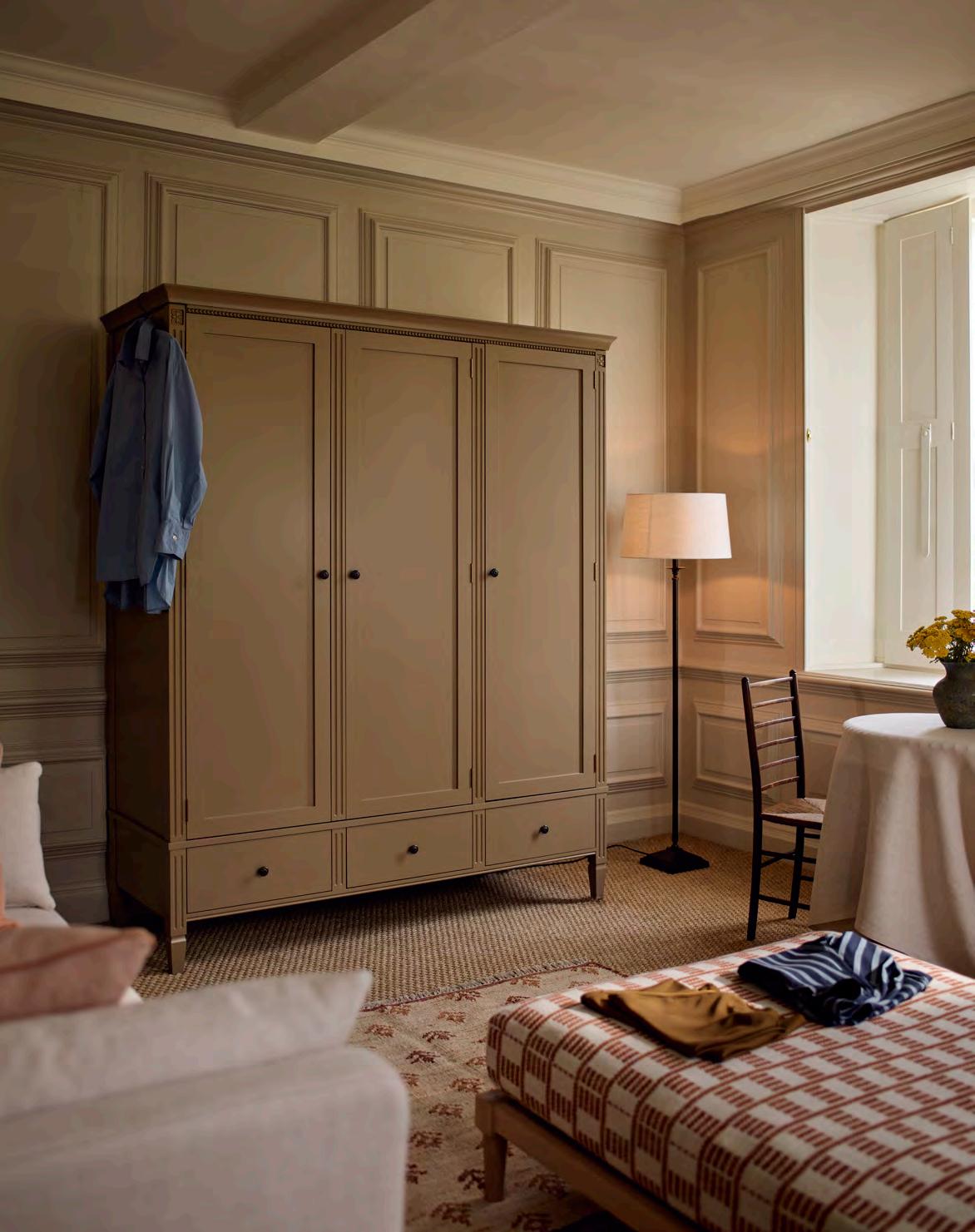
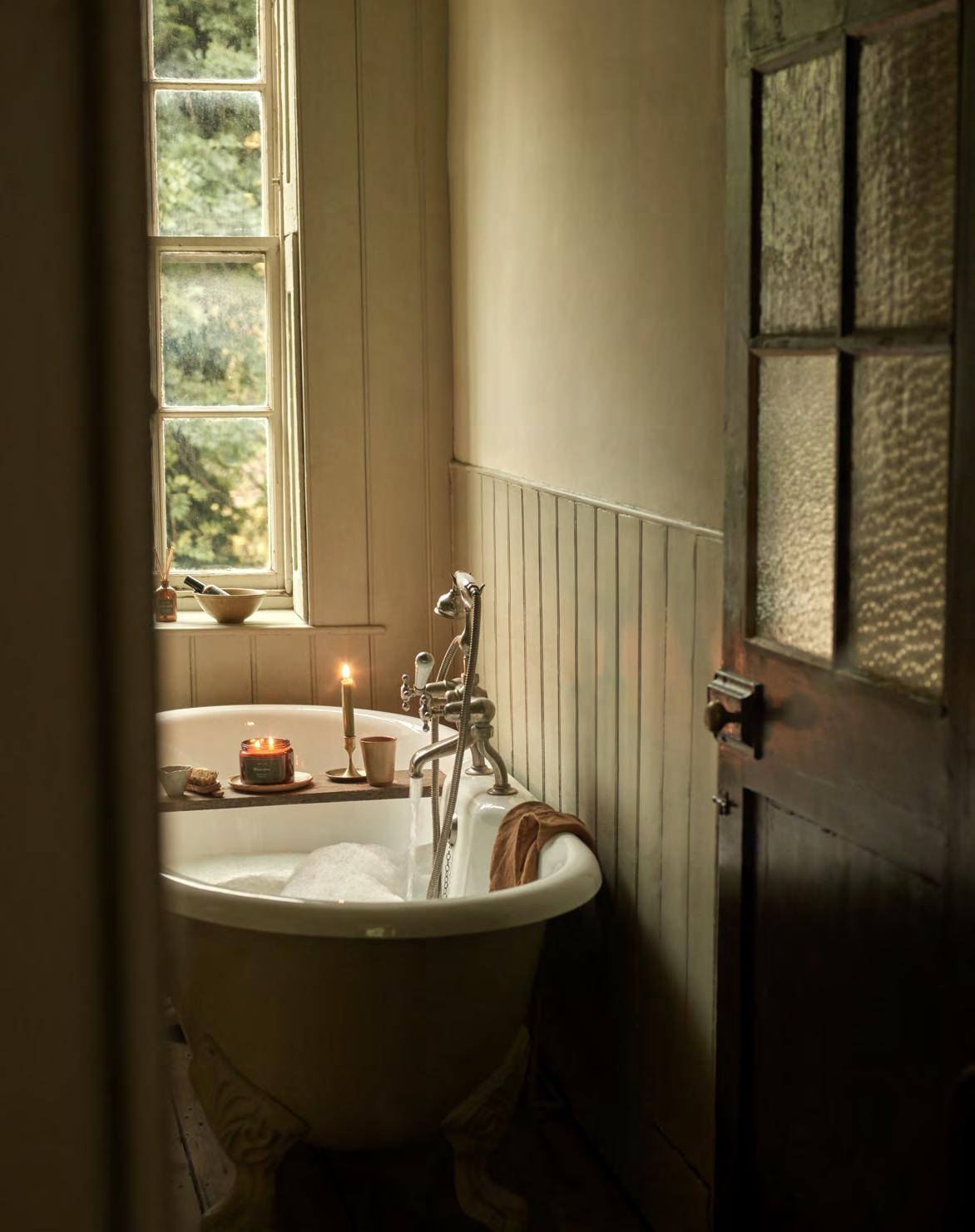
A Sunday morning sitting in bed with a cup of coffee and the papers (or a quiet half hour scrolling) is one of life’s simple pleasures. So how to plan a bedroom layout that delivers for that and so much more?
Acalming sleep zone, a personal retreat, a practical dressing area, and plenty of storage. The average bedroom has many functions to fulfil, which makes a good spatial layout an essential first step. ‘Bedrooms inevitably have large, sometimes unwieldly, pieces of furniture to fit in,’ says Neptune design director, Fred Horlock, ‘so always try out furniture in different layout combinations before deciding where to position large pieces.’
Aside from the bed (of which more shortly), storage can tend to dominate a bedroom, which isn’t ideal. ‘Storage is often visually “hard”,’ explains Fred. ‘If you don’t have discreet fitted storage, then invest in a beautiful wardrobe and drawers that you’ll enjoy looking at, even if it means rotating your clothes and storing off-season outfits in another room.’
An architect will look at a bedroom footprint analytically and might suggest dividing the room with either a floating or full wall to create a separate dressing area which keeps the storage and clutter away from the sleep zone. If this isn’t an option, look to other ways you can utilise the room’s architecture. ‘Timber elements bring a warmth to a room, so consider exposed rafters or wooden floorboards softened with rugs,’ advises Fred. ‘And retain period elements like fireplaces where you can, bringing in freestanding furniture that feels like it belongs next to the original features.’
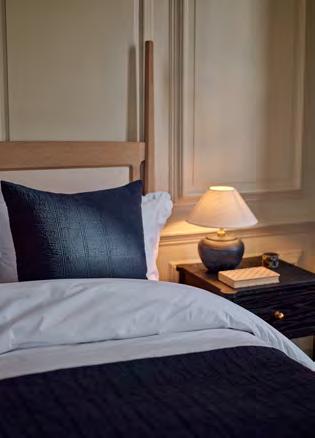
When it comes to bed frames, Fred suggests four-poster styles suit larger, high-ceilinged rooms – though the new Walton four-poster bed will work in a smaller space thanks to its lower silhouette. A timber frame suits a more traditional or cottage vibe, while a shapely, upholstered headboard like the Clemmie can work as a decorative focal point, drawing the eye upwards. ‘Treat the wall behind the bed as an extension of the headboard, be it with panelling, wallpaper or paint,’ adds Fred. ‘Decorating it to complement the style of the headboard will help widen the feel of the room while anchoring the bed securely and helping to make the room feel calm.’
Applying symmetry to the space will enhance that feeling of harmony so important for a good night’s sleep. You can achieve this by framing the bed between two windows or chimney recesses but also by using bedside tables and lamps on either side of the bed for balance. ‘Keep window areas clear,’ adds Fred. ‘That morning light is important so place heavy storage pieces on the opposite side of the room. A large rug under the bed will help the space feel wider and, if you have room, ground the bed with a sofa or footstool at its base.’
Finally, multiple layers of lighting are all-important in the bedroom. Fred suggests incorporating low-level bedside lamps and wall sconces which cast a diffused glow to keep the room feeling relaxed at night. For dressing, include some task lighting with a brighter, daytime light which will feel refreshing. And there’s your dream bedroom: practical by day, restful by night.
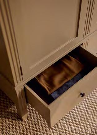
In this practical, small main bedroom, the bed is positioned a little off-centre to line up with the large triple wardrobe, giving the room a sense of balance between the two dominant pieces of furniture. The footstool at the end of the bed softens the visual aspect of the king size bed and provides a useful seat for dressing opposite the wardrobe.

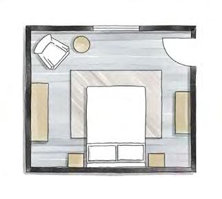
A super king bed is centred in this expansive room, grounded against a two-thirds partition wall which creates a tucked away dressing area. An alternative arrangement could be to position the bed against the far wall and create a relaxed sitting area in front of the bed for watching TV. A washstand is set in the dressing area and, as there is a good sense of space, two large wardrobes balance each corner of the space.

A generous king size bed welcomes guests in this room. The bed lines up opposite the window to give a sense of visual balance and unnecessary storage furniture is kept to a minimum. Instead, a bench, tucked behind the door, is a repository for overnight bags and an upholstered chair and side table offer a comfortable seat for enjoying some personal downtime.

Consider the view of the bed when entering the room. Ideally, you should see the headboard as you walk in rather than have the doorway looming behind the bed, which can feel uncomfortable.
Introduce upholstered furnishings like a small armchair, blanket box or ottoman into the room: they help soften the space and bring colour and pattern into the scheme.
Only single beds should be placed in a corner spot; double beds and larger should have a minimum of seventy centimetres on either side to allow for access.
In a small bedroom, place the furniture intentionally. Position the bed symmetrically against the main wall to give it more presence and help the room feel well proportioned.
Guest bedrooms are opportunities to have some decorative fun. Experiment with colour and pattern or artworks, but also allow plenty of surface space for guests to unpack, and try to include a comfy armchair to give them a place to relax in private.
Finally, the ‘wake-up factor’ sets you up for the day, so make sure you open your eyes to colours, textures and pieces that you really love.
For our full bedroom collection, visit neptune.com/bedroom
This is
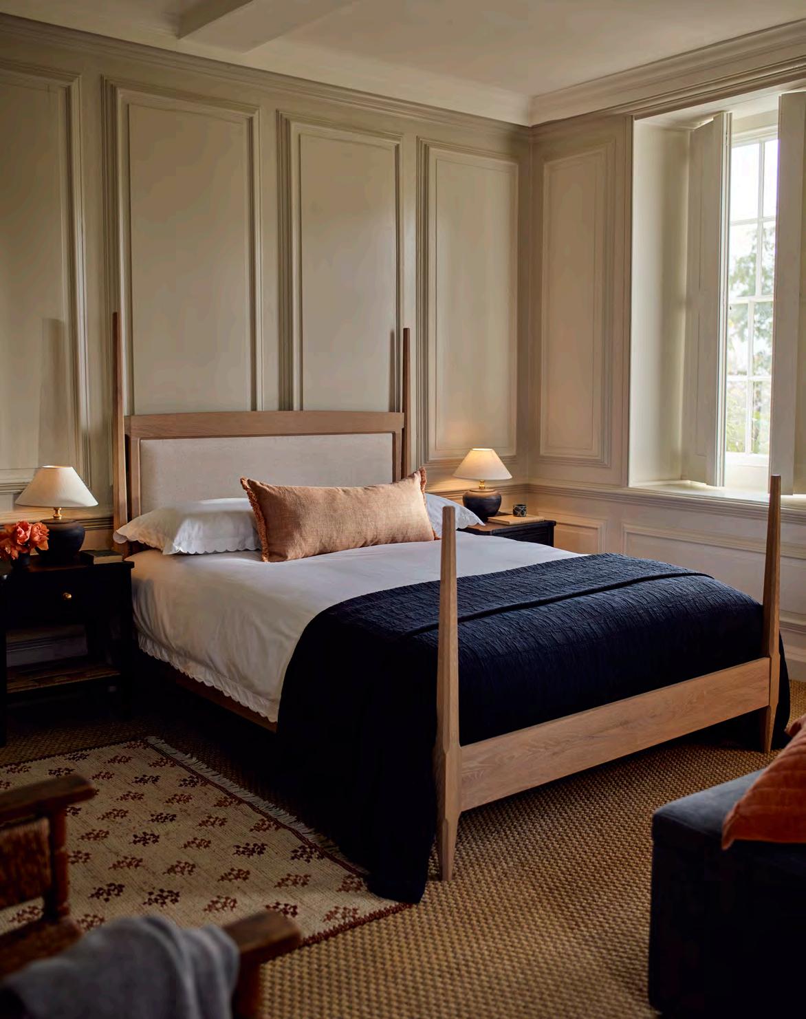
The Arts and Crafts Movement championed simplicity of design, honest, quality materials, and master craftsmanship. The very same ingredients that have gone into our new Walton bed. A contemporary take on a classic four-poster (that thankfully doesn’t necessitate super-high ceilings), the solid oak design combines slim proportions with an element of indulgence, offset by tactile finials and pretty, scalloped details. An upholstered headboard adds a layer of comfort, perfect for when that morning cup of tea is delivered.
Discover our full bed collection, visit neptune.com/bedroom
The most successful rooms appeal to all our senses, as Vogue beauty and wellness editor Hannah Coates explains.
What maketh a room? While a layering of excellent fabrics, natural textures and good lighting are high on the list of things that sort the wheat from the chaff, it’s the way a space smells that truly conjures up a sense of familiarity, warmth and comfort. The best rooms beckon most – if not all – of our senses, but scent is undoubtedly one of the easiest to play with.
Fragrance has a powerful ability to evoke emotion because everything we smell is processed by the areas of the brain that also deal with feelings and memory. Explaining why you never forget the smell of your mum’s perfume, your olfactory system (rather magically) can transport you to moments in time, places or people at the drop of a hat, and can subsequently be a great way to boost your mood.
You rarely experience a scent in solus, either. Whether it’s a bouquet of beautiful flowers or the relaxing flicker of a candle, we often enjoy their fruits via our eyes too, which is great at stimulating the parasympathetic nervous system (responsible for our rest and digest mode – the opposite of fight or flight) and ushering in a state of calm.
Bringing the outdoors in is a great place to start. Our innate human need to be around nature (also
called biophilia) means that, when we tap into Mother Nature’s many plants, herbs and flowers, frantic minds are quickly eased – not to mention that greenery and other botanicals look great on a bedside table or kitchen worktop. Meanwhile, hanging some (long lasting and relatively inexpensive) eucalyptus in your shower is an easy way to transform your morning. As aromatic as it is healing, it decongests, reduces inflammation and pain, and alleviates tension – you can’t go wrong.
As a scented candle devotee, I believe there is nothing quite like marking the end of a busy workday with a match and some wax – look for notes of sandalwood, sage, lavender and jasmine to usher in chill time successfully. Similar effects can be gleaned from the same notes blended in aromatherapeutic bath oils, which do an excellent job of easing tense muscles and equally tense minds. In the cooler months, I also love to add in those that harness invigorating pine, fir or spruce as much for their congestion-clearing wonders as their cosy aromas.
A luxurious room spray can also be misted when occasion calls for it, but diffusers are lower maintenance and do their work in the background – place them where you, or your visitors, will pass by for optimal exposure. Oh, and if all else fails, simply bake some bread. There are few smells in this world that can beat it.
This autumn, we’re launching a delicious new fragrance combination of Amber & Cedarwood, a heartwarming mix that brings together these two base notes with hints of grapefruit, saffron, vanilla and leather. Created to evoke a cosy, fireside mood, it’s the perfect final layer in a sitting room, snug or hallway.
Available as single- or triple-wick candles made from vegan-friendly plant wax, as well as in diffuser form, the new mellow room scent comes in recycled brown glass jars.
It joins our ever-popular English Fig (perfect on a late summer’s evening), Sea Salt & Driftwood (with hints of basil and ocean mist) and Rosemary & Thyme (great in a kitchen thanks to its refreshing herbal and citrus tones).
Scents carry a lifetime of memories. For Lizzie Ostrom, fragrance writer and founder of Odette Toilette, her mission is to encourage us to treasure our sense of smell. Here she selects her four favourite fragrance books.
BY LIZZIE OSTROM

Scent is the subject of a long, sometimes fraught relationship. That we have a sense of smell, to me, seems miraculous; who could ever tire of smelling roses? But at times, as a fragrance writer and event creator, I have also felt dizzyingly overwhelmed by, and even cynical about, the modern fragrance industry which promises us sex, rapture, and magnetism. Then I go and smell a bottle of something which makes me, well, absolutely rapturous. And, as a reader, I’m fascinated by how the writers of these books harness smell, to express collective experiences in such a deeply personal sense.
Harold McGee (Hachette UK, £35)

Want to know what’s behind the smell of a volcano, a microbe or a mushroom? I did, too. Especially as I’m guessing most of us aren’t going to lean into Vesuvius any time soon. McGee’s magic is in making highly technical, organic chemistry absolutely compelling and relatable. Many of us think we have a rubbish sense of smell, but like anything, practice makes perfect. This book offers an everyday invitation to switch onto the many fascinating odours around us.
Niki Segnit (Bloomsbury, £18)
The Flavour Thesaurus was the moment smell and taste came together profoundly for me. This is the recent sequel to Segnit’s original classic which I’ve referenced hundreds of times when I want to jolt some new idea or possibility into being (like ‘what’s ginger’s perfect accomplice in a scent?’). Segnit illuminates the invisible molecular connections between different foods to explore why they vibe together on the plate. I’ve always loved Segnit’s writing. Were she to write a dishwasher manual, I’d be up for it! She’s so funny and drops comic dining anecdotes so casually you can’t believe she’s not saving them up for best.
Luca Turin and Tania Sanchez (Perfüümista ÖÜ, £12.86)
This is the book that kickstarted a revival in scent as a subject that deserves serious attention. It certainly inspired me. Turin and Sanchez pen witty, offbeat reviews in response to hundreds of perfumes, both famous and niche. Each review paints such a vivid picture you’ll laugh in recognition. Strangely, even if you never manage to smell the scent in question, you still feel you’ve sort of got the measure of it. If you do manage to get a sample to sniff alongside, even better.

Elizabeth Arden and Helena Rubinstein: Their Lives, Their Times, Their Rivalry
Lindy Woodhead (Weidenfeld & Nicholson, £12.99)

A gossipy, arch account of the battle between two titans of twentieth century brandbuilding. While more broadly concerning the whole shebang of beauty, Arden and Rubinstein’s role in the creation of consumer desire in the mass-market –from tantalising in-store displays to extravagant spa retreats (where even the horses are scented) – lays bare perfume’s role as a conduit to instant goddess-hood in the American suburbs.
Lizzie Ostrom (Hutchinson, £16.99)
Signature scents and lost masterpieces; the visionaries who conceived them; the wild and wonderful campaigns that launched them; the women and men who wore them – every perfume has a tale to tell. My book was inspired by the amazing but untold cultural role of perfume through the twentieth century, from the arts and advertising to fashion and film.


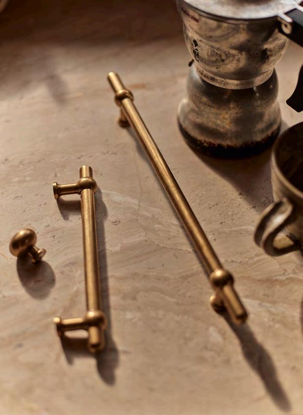
This fourth-generation family business proves heritage craftmanship is not lost but, rather, treasured.
Think for a moment about your favourite mug, the one you always reach for. Chances are the thing that draws you to it each time (rather than the host of other mugs sitting in your cupboard) is the way it feels when it’s cupped in your hands. Its weight. Its tactility. Well, the same thing could be said for the hardware in your kitchen. The handles, the hooks, the rails and the knobs. Afterall, these are the things your hands reach for every day when you open and close cabinet doors and drawers.
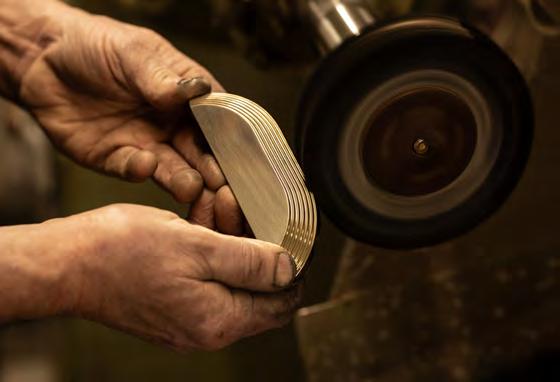
It’s for this very reason that solid brass hardware producers like Armac Martin believe the upmost attention should be paid to the design and construction of kitchen brassware. And it’s not a new belief of theirs either. The ethos of this uniquely British brand has been passed down through generations for nearly a century. From brass fittings founder Harold McGrail to his great grandsons – and now joint CEOs – Richard and Robert McGrail, the company has continued to masterfully manufacture its fine brass products in the heart of Birmingham.
That family approach is something Armac Martin prides itself on; in the factory too, there are parents who are passing on skills to their sons and daughters. ‘We have multiple generations of family members honing their craft here,’ says Richard.
And while some equipment may have been modernised over the years, the overarching craft process remains much the same. ‘Once we have the raw component, pretty much everything else is going through hands,’ continues Richard. These experienced makers are sticklers for attention to detail and each product is reviewed at every stage of the process. ‘Ensuring the quality is at the level it should be is a commitment we’ll always make,’ he adds.
It’s pledges like these that attracted us to working with Armac Martin. Our new collaboration reflects the synergy between the two British brands and has culminated in the release of our Oscott collection: a solid brass, contemporary take on a classic bar handle with traditional ball joints. And while Oscott was ultimately a design-led partnership, because of the brass’s pure weight and tactile nature, it feels good in the hands, too.
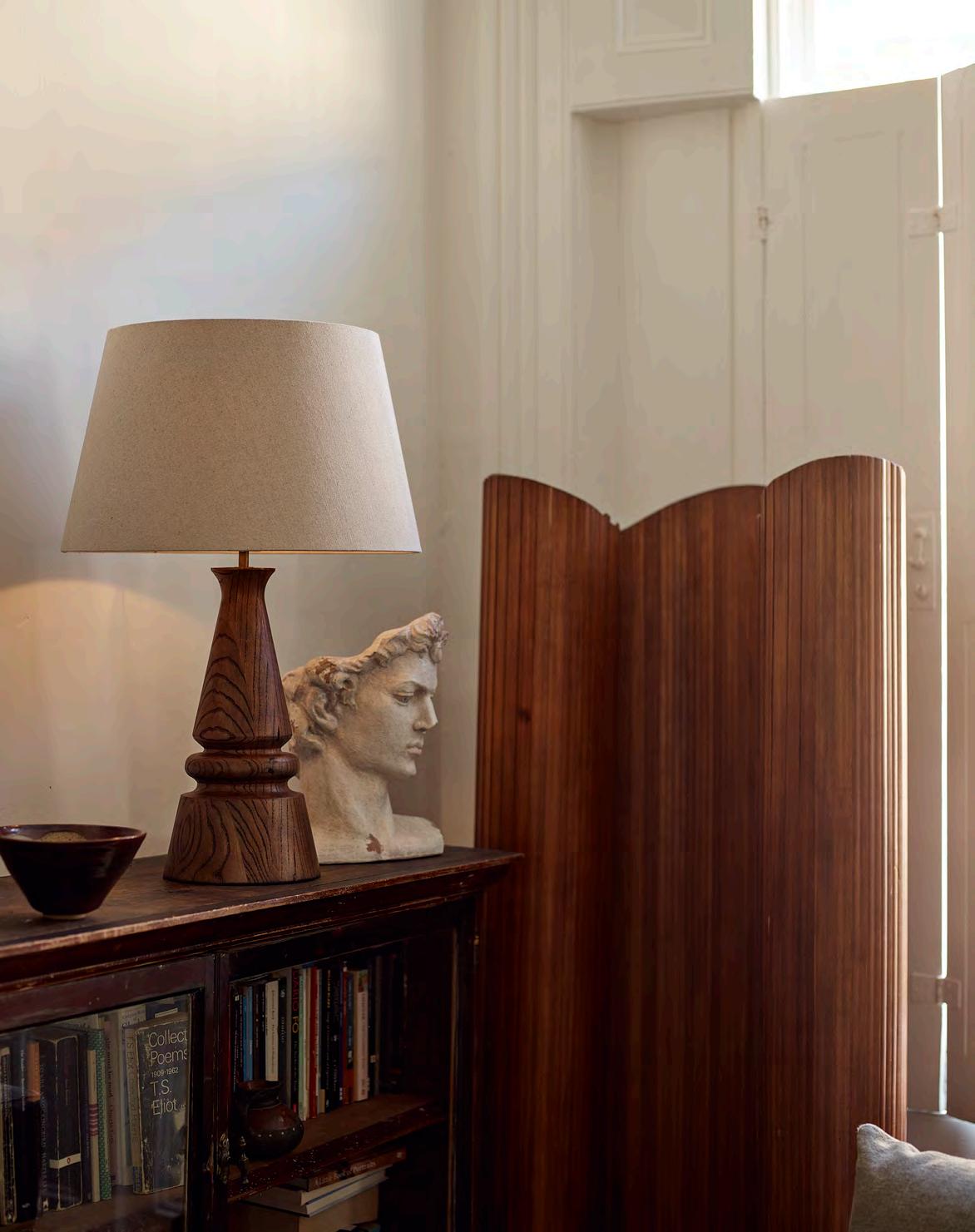
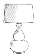
Once seen as simply a source of light, the table lamp is now as much in demand as a highly decorative accessory. Consider it jewellery for your home.
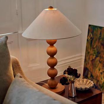
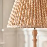
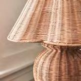
Table lamps have always been a beacon of light to dark corners, but it’s their ‘off’ mode that really transforms the room. Think of them as a decorator’s best friend, boosting any space with a quick fix of texture, height and colour. And that’s before you’ve even turned them on.
While the lamp base takes centre stage, the lampshade has become ‘the new cushion cover accessory of the lighting world, providing a quick room update,’ suggests Bath-based interior designer Sean Symington. ‘A rattan shade adds texture, linen adds warmth and cosiness, while printed designs provide pattern,’ he continues, and each of these styles are just as impactful when the lights are dimmed.
The flexibility of table lamps is another argument for their popularity. You don’t need to make a long-term commitment to placement or invest in concealing wires. Used on a console in the hallway to provide a warm welcome one month and placed by your sofa-side for a cocooning wash of light the next. ‘I love the idea of using lamps on a drinks’ trolley, or nestled into bookshelves. It creates an atmosphere and draws you into a moment in the room,’ says Sean, who often uses a pair of lamps at either end of a desk rather than a more obvious directional task light. ‘We recently used two large lamps on a kitchen island instead of overhead pendants for a more flattering low-level light and unexpected decorative element in the room.’
Lamps can be dainty accessories or dramatic pieces of sculpture. Take our new solid oak Dawes table lamp with its curvaceous spherical design and handcrafted linen shade. It was influenced by the revival of the bobbin style, once popular in the mid-seventeenth century for adding a feeling of decadence to otherwise plain furniture. The glow-up treatment promotes lamps to structural objects of desire in their own right. Equally, our solid oak Mason table lamp has a distinctly recognisable design, moulding itself into the shape of an iconic chess piece and finished with a modern brass base. You’d be forgiven for mistaking it as a piece of art whether the lamp is on or off.
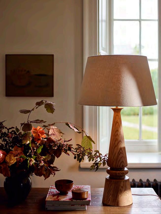
Play with proportion and don’t be afraid of a large lampshade. The shade should always be larger than the widest point of the base.
The height of the lamp should be around two-thirds of the height of the surface it sits on. For larger rooms with high ceilings, look to taller lamps to maintain visual balance.
Consider varying base heights as you don’t want all the lamps at the same level. Perhaps a skinny, tall pair of ‘stick’ lampshades behind the sofa on a console table and then a shorter, more curvaceous design beside an armchair.
When choosing a shade, consider the shape of the base. A round base works well with a drum-shaped shade while a square or angular base works well with a square or tapered shade. Complementing shapes create a cohesive and balanced look.
Switch lampshades with the seasons. In the winter, try a linen or wool shade as that feels cosier, and in summer, opt for a printed, gathered design for a fresh injection of colour.
Pairs of lamps look great either side of a bed or sofa. Add in an unexpected contrasting lamp, whether in texture or size, on an opposite wall to break up symmetry in the room.


From block to beauty, the materiality of natural marble tells a tale of two halves.
Ever wondered what happens to the offcuts of the marble that’s used in kitchens and bathrooms? Probably the largest known excess quantity was used to build the village of Laas in South Tyrol, Italy; a so-called ‘white village’ made from surplus stone dug from the towering mountains above, where even the pavements are carved from offcuts. But perhaps the most famous offcut of all belongs to Michelangelo’s Renaissance masterpiece, ‘David’. The stone, which had been rejected by other artists due to perceived imperfections in the marble’s grain and sat discarded for twenty-five years, was eagerly accepted and carved by the young artist. The rest, as they say, is history.
Today, there’s a whole industry creating objets from stone offcuts and small pieces of marble, each of which could be considered a work of art in its own right. Durable, yet soft. Light, yet heavy. Raw stone and yet smooth. For while marble is more frequently associated with solidity and strength, it’s only with time that these qualities form. In fact, when the material is first quarried, it’s soft and malleable,
characteristics adored by craftspeople and sculptors who can work at it in any way they wish.
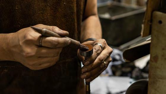
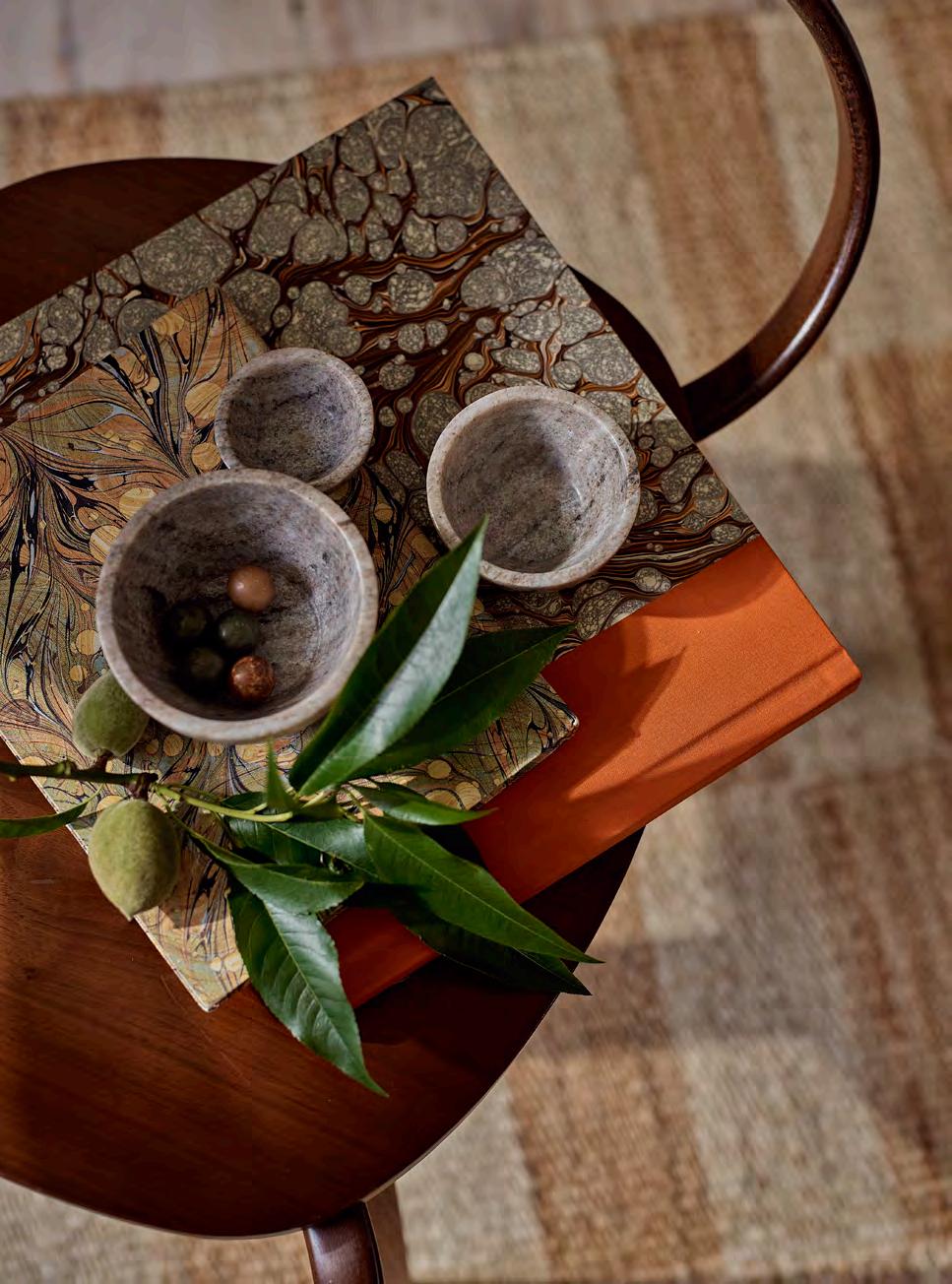
For the experienced stonemasons carving our new marble accessories collection, Malborough, which includes fluted bowls and elegant cake stands, the process begins by hand-sketching the design onto the small blocks sourced from marble mines in Rajasthan, India. They then begin to carefully chip away the excess marble with a chisel and hammer. Refinement is a meticulous process requiring multiple stages, starting with rasps and files to ensure symmetry, and finishing with a polishing buffer to accentuate the stone’s natural luminosity.

The resulting series of sculptural, decorative pieces in the new Malborough collection includes charcuterie and cheese platters, pretty serving bowls, and ornamental accessories like bookends and napkin rings. Each piece is carved from marble dappled with soft brown and grey veins for an objet with an impressive artistic heritage that at once feels tactile and strong, delicate and opulent.
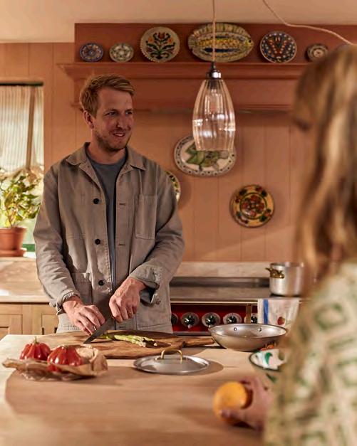
As the chef and proprietor of Glebe House in Devon (together with wife Olive), Hugo Guest brings an artisanal approach to his cooking. Here, he shares his favourite recipes for an afternoon tea with a difference.
This recipe will make about five kilos of marmalade
This is a recipe that was handed down to me by my dad, who takes on the annual task of making gallons of marmalade at the start of the year when Seville oranges are briefly in season. This method avoids the hassle of squeezing orange juice and scraping out pith and pips. Preparing the fruit overnight softens it, making it easier to cut and, ultimately, saving time.
We also make limoncello around the same time, and adding a few tablespoons to the marmalade elevates this classic recipe.
1.5kg Seville oranges
Juice of 2 lemons
2l water
2.25kg sugar
8 tbsp limoncello
The night before
1 Place the oranges and lemon juice in a large pot and cover with two litres of water. If the water doesn’t cover the oranges, use a smaller pot. Weigh the oranges down with a plate to keep them submerged if necessary.
2 Bring the pot to a boil, cover, and then reduce the heat to a gentle simmer.
3 Simmer on low for about two hours, or until the fruit is soft, then turn off the heat and let the mixture sit, covered, overnight.
The next morning
1 Remove the lid and lift the fruit into a colander, leaving the orange liquid in the pot.
2 Cut the oranges in half and scoop out all the pips and pith, adding them to the pot with the liquid. Set the peel aside for now.
3 Boil the juice, pips and pith for six minutes with the lid off.
4 Strain the juice through a sieve, pressing the pulp through with a wooden spoon. This thick liquid is high in pectin and helps set the marmalade. Pour half of it into your largest cooking pot or preserving pan.
5 Cut the orange peel as thinly as desired and add half to the liquid.
6 Add half the sugar and stir over a medium heat until the sugar has dissolved.
7 Bring the pot to a rapid boil for fifteen-twenty minutes until the setting point is reached.
8 Stir in four tablespoons of limoncello and let the mixture sit for ten minutes to cool slightly, then pot, seal and label.
9 Repeat the process for the remaining batch.
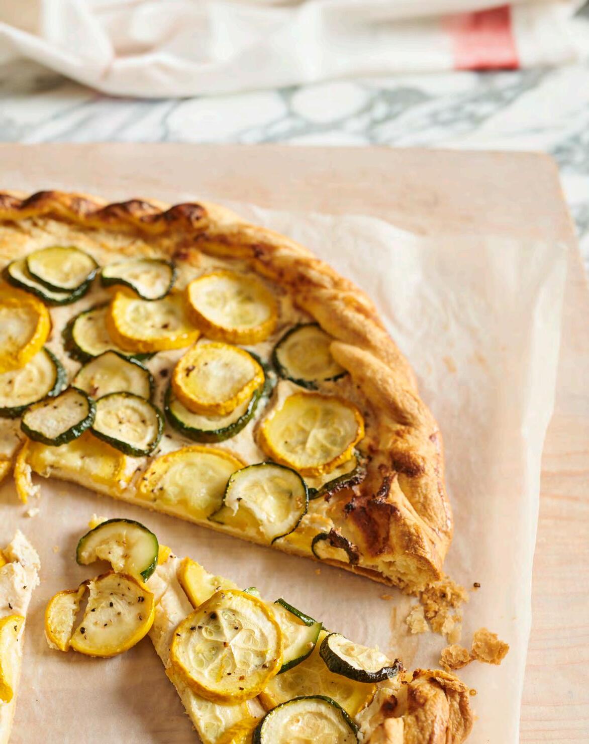
I like to make this tart in the style of a galette. The recipe is hugely adaptable. Ricotta forms a great base and is a blank canvas for any seasonal vegetables. We also make the same tart with thinly sliced tomatoes, sliced squash or wilted chard. You can make it in advance and heat it through in the oven before serving.
For the filling
160g ricotta
1 egg, lightly beaten, reserve half for egg wash
30g Parmesan, grated
A good pinch of flaky sea salt
1 lemon, zested, plus 1-2 tsp of the juice
1 garlic clove, grated
A generous pinch of thyme, freshly chopped
5 anchovies, finely chopped
Black pepper, to taste
For the filling
1 In a bowl, combine the ricotta with half of the egg. Stir in the Parmesan, sea salt, lemon zest and juice, garlic, thyme and anchovies, and season with black pepper.
2 Thinly slice the courgettes (into approximately half-centimetre rounds). Toss these with the salt and place them in a colander to drain for thirty minutes. After draining, gently press out excess moisture and toss the rounds with olive oil.
3 Set your oven to 220°C (200°C for fan ovens) and let it preheat.
4 Roll the dough into a rectangle or circular (depending on preference), aiming for the thickness of a £1 coin. On the dough, spread the ricotta mixture evenly, stopping about 3.5cm from the edge.
For the courgettes
400g of mixed heritage courgettes different shapes and colours make for a more interesting finish
A generous pinch of flaky sea salt
A splash of olive oil
For the tart base
250g flaky pastry (see recipe below) or ready-made puff pastry
Layer the courgettes on top then drizzle with a bit of olive oil. Fold the edges of the dough over the filling to create a crust and brush the folded edge with the remaining egg.
5 Lower the oven temperature to 200°C (180°C for fan ovens). Place the tart in the oven and bake for fortyfifty minutes until it turns golden brown. Ensure the base is completely cooked by lifting it slightly to check. If the top browns too quickly, cover it with foil.
6 A llow the galette to cool slightly, then serve with some nice seasonal leaves and fresh herbs. To reheat, place the galette in a preheated oven at 180°C (160°C for fan ovens) for about ten-fifteen minutes.
Find the full recipe, including how to make Hugo’s flakey pastry, here: neptune.com/pastry
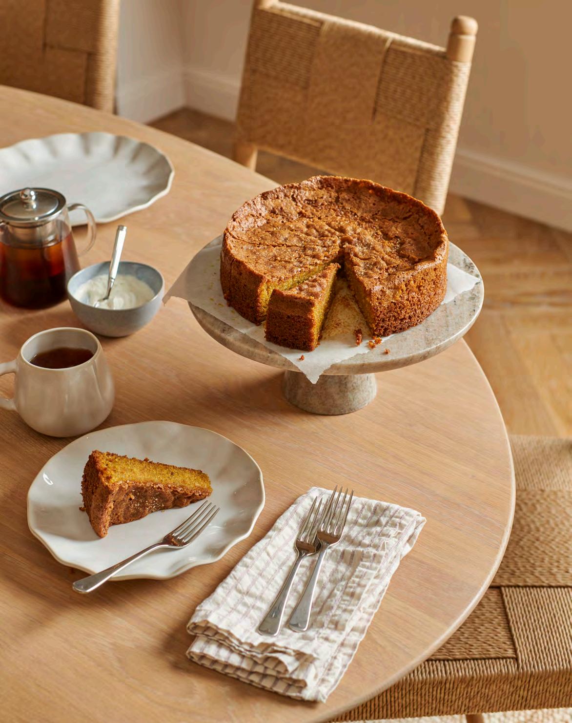
This could, quite possibly, be one of my favourite cake recipes. Originally inspired by Anna Higham’s olive oil and ricotta cake from her extraordinary cookbook, The Last Bite, it is definitely a grown-up cake. The natural oils from the pistachios coupled with good quality, fruity, extra virgin olive oil and the crunch from the stone-ground polenta makes for a special eating experience. Serve sliced, along with a cup of tea.
If you’re struggling to find nice pistachios, ground almonds will be a good substitute.
275ml extra virgin olive oil
4 eggs
250g caster sugar
150g Greek yoghurt
200g ground pistachios
100g stone-ground polenta
2 tsp baking powder
1 tsp salt
Butter or flavourless oil, for greasing
2 tbsp demerara sugar
1 Preheat your oven to 170°C (150°C for fan ovens). In a large mixing bowl, combine the olive oil and eggs, whisking until they’re thoroughly mixed.
2 In a separate bowl, beat the sugar and yoghurt together until the mixture is smooth, then add this to the egg and oil blend. Gradually incorporate the dry ingredients, excluding the demerara sugar, and mix until everything is evenly combined.
3 Make as one large single-layer cake in a twenty-five centimetre springform tin. Be sure to grease the tin well and line the base with baking parchment. Pour in the batter, then sprinkle the top with the demerara sugar. Bake for fifty minutes to one hour.
The right rug is a vital part of a room’s decorative scheme. Think of it as the fifth or sixth wall rather than a bit-part player in the background. In the most put-together rooms, the floor sets the tone, says Telegraph homes editor, Jessica Doyle.
For anyone who finds the maximalist look overwhelming, a patterned rug is a far more subtle way to introduce visual interest than committing to a printed wallpaper or a bold paint colour. As many decorators will attest, it can also help to anchor a room and form the starting point for a palette of accent colours.
‘Floors and walls take up the most surface area in a room, and floors can be incredibly impactful,’ says interior designer Natalie Tredgett, who recommends building a scheme by starting with the rug: ‘There are many options for paint colours, wallpaper and fabrics that can complement a chosen rug, which is easier than trying to find one to match an existing scheme. By starting with the rug, you can avoid the need to opt for a plain colour, allowing for a more cohesive and interesting design.’
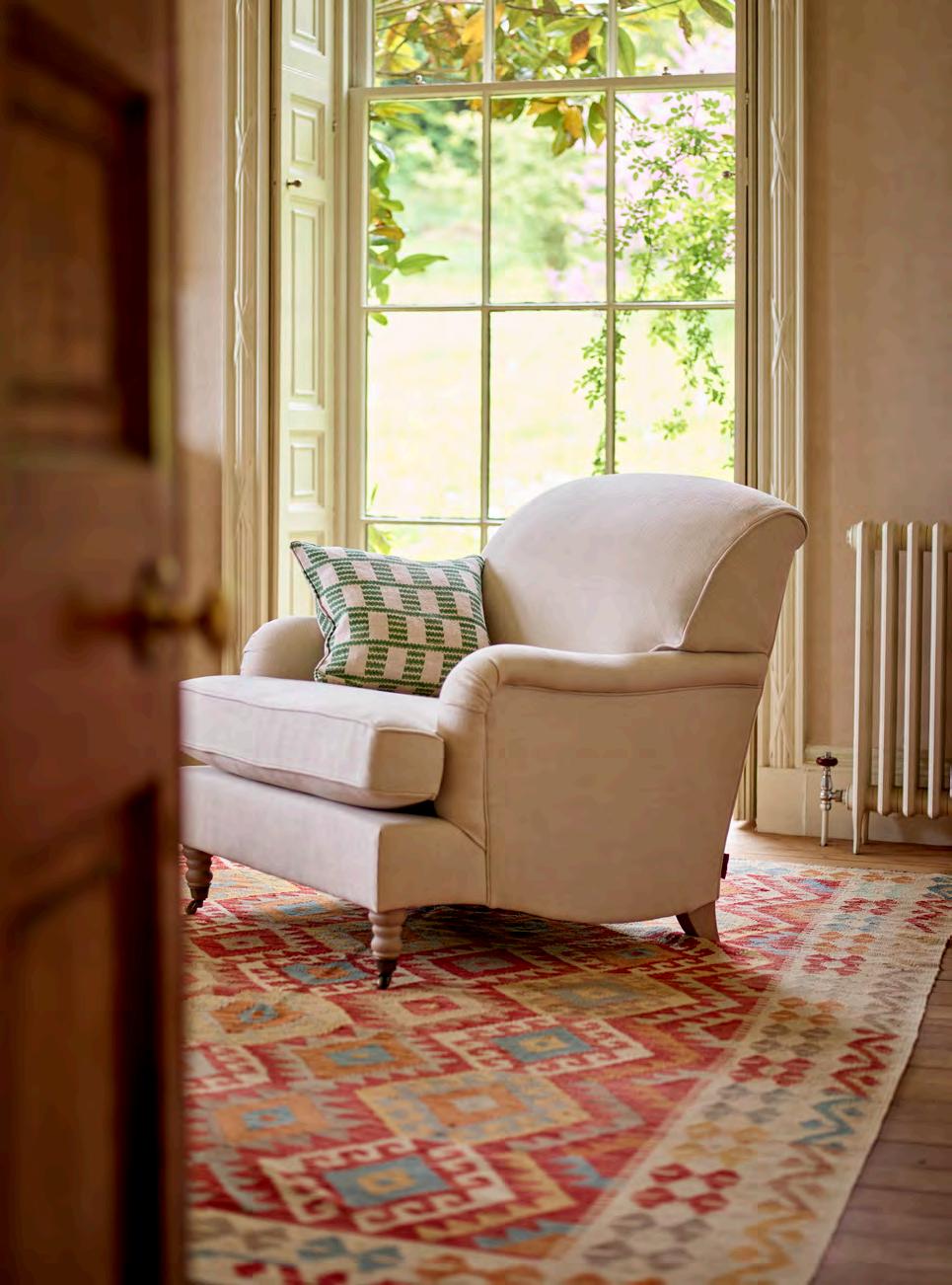
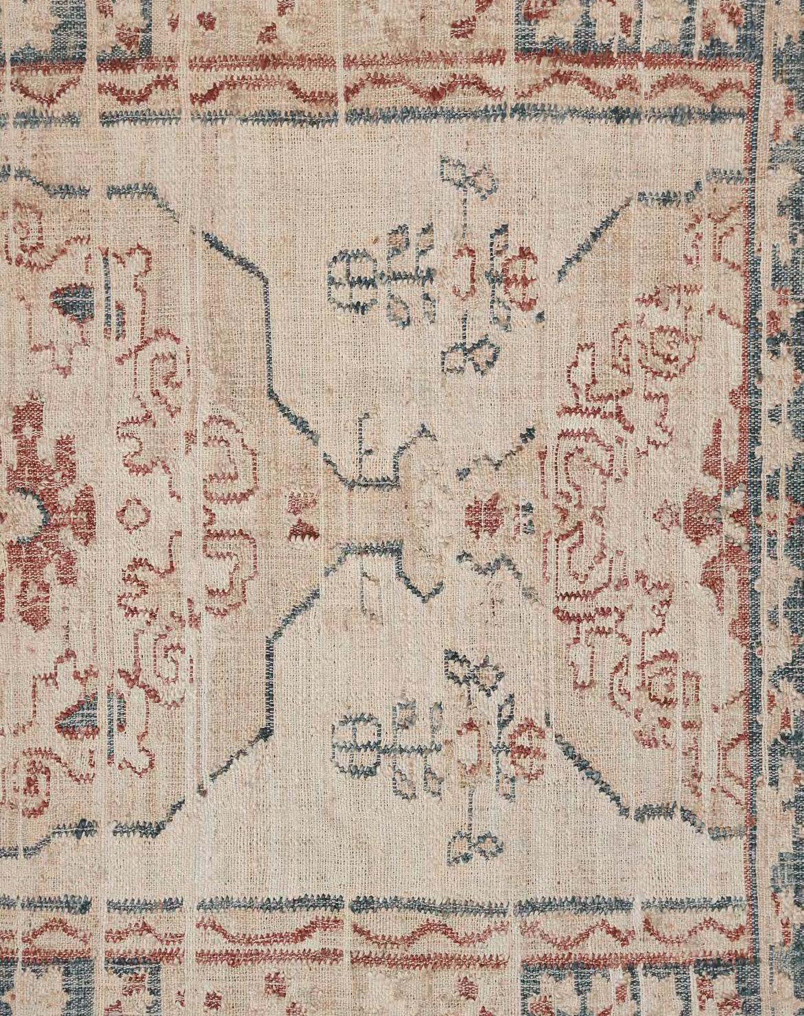
In an already decorated room with pale, calming tones on walls and furniture, a rug can be the perfect vehicle for adding personality to lift the room without introducing visual clutter. ‘In a neutral space, a rug really can add texture, depth and interest,’ agrees interior designer Laura Stephens. Her advice, when choosing a rug, is to bear in mind that it needn’t require a statement-making design to have an impact: ‘Sometimes, a subtle border or motif on a rug with a plain background is enough to give interest and colour to a scheme without dominating it.’
Neptune’s latest collection of rugs gives a classic heritage look a contemporary twist. The rich colours and ornate motifs of traditional Persian and Turkish rugs have been tempered – with repeat patterns and softer shades that modernise the look – without cancelling their character.
As for the correct size and placement of a carpet, Stephens advises choosing one of a generous enough size to ‘ground’ pieces of furniture ‘so that they don’t appear to float around a big floor space’. ‘Rugs are particularly effective in a larger or multi-use space to “zone” specific areas,’ she adds. ‘For example, in a kitchen-diner, a rug under the dining table can define that space.’
Far from being an afterthought then, a rug can be the decorative glue that holds a scheme together.
This season includes five exciting rug collections – the Arran, Calan, Fara, Moray and Rona – all inspired by traditional Persian rugs, featuring a mix of geometric, Aztec and mixed motif patterns. In soft shades of rust, blue, cream and orange, they bring an element of subtle colour to a room. The rugs are handwoven in India by expert weavers on authentic wooden looms and use the best natural materials such as jute and wool.
For added luxury underfoot, there are also two new plush, cosy rugs made from New Zealand wool – the Laith and the Munro – to add more texture and warmth to bedrooms and snugs. In calming, neutral shades and with a tactile bobbled texture, they work perfectly with any colour scheme.
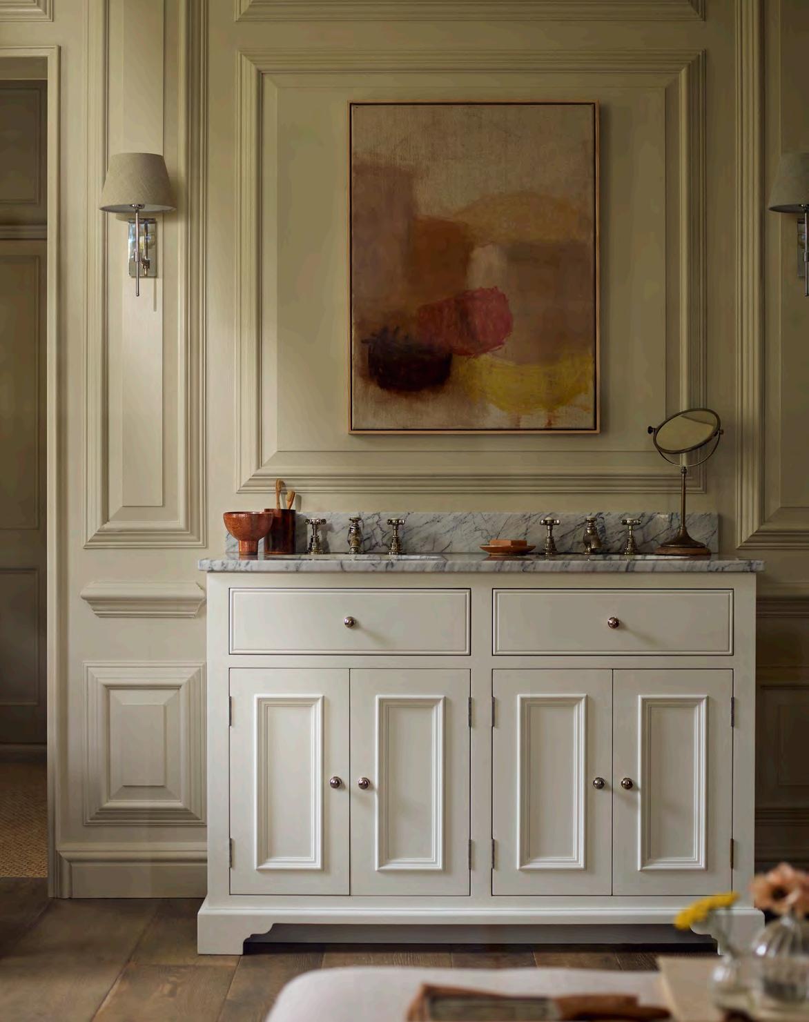
Over the last century, the bathroom has progressively become a retreat. Today, we’re further redefining these spaces by how we decorate them, says Samantha Scott-Jeffries, editor of The English Home.
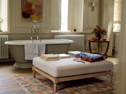
With a job that entails a lot of time looking at wonderful British homes, I’ve noticed that, as they’ve become increasingly decorated, there’s been a desire to extend the way we curate our living spaces to bring personality and comfort to our bathrooms. There’s been a shift away from contemporary or spa-style schemes that favoured sleek, hard surfaces and neutrality, and instead, the current mood is more relaxed and layered, ensuring we create personal relaxation zones to linger in.
Some may note that this harks back to the ethos of the great twentieth-century decorators such as John Fowler or Nancy Lancaster, who extended comfortable country house style into the most functional of spaces. However, there’s also something playful and current about this approach too. Practical and unique, today’s best schemes combine clever, multi-functional designs – such as Neptune’s new Ophelia footstool – with antiques and artwork, speaking about the personality of those who use them whilst ensuring they function beautifully.
Bravely mix country house spirit with new technology. Underfloor heating, innovative lighting, or surround sound in the shower can be mixed with a classic upholstered armchair or an antique dresser to display products, bath linen and plants.
Repurpose and layer rather than redesign. Use boldly painted walls or patterned floor and wall tiles to juxtapose simple, timeless sanitaryware. An overscale vintage chandelier (bathroom compliant, of course) brings drama.
Add elegant forms for modern practicality. Twin basins set in capacious vanity units are practical for busy families or couples. When a pair of antique mirrors or wall lights are hung above, they also add classic symmetry. Contemporary side tables provide surfaces for a book, drink or candle.
Embrace a relaxed approach. Curtains and rugs soften, adding pattern and texture. If they get damp, they will dry! However, choose to display framed prints or a collection of ceramics or glass over precious paintings for carefree style.
Finally, include your ultimate bathroom luxury – such as a drinks trolley positioned for a tipple to enjoy in a roll-top bath.

The totemic London hotel is more hit than myth, says Country Life’s executive editor, Giles Kime.
There are buildings that become so obscured by their own mythology that they cease to be bricks and mortar: the Taj Mahal, the White House and Buckingham Palace to name a few. The Ritz in London is another. Ever since it opened its doors in 1906, it has, in the popular imagination, been a parallel universe of lofty ceilings and sweeping vistas, populated by people of almost unimaginable fame and limitless wealth – Edward VII (and Edward VIII), Elizabeth Taylor, Jackie Onassis, Churchill, Eisenhower, the Rolling Stones, as well as Charlie Chaplin, who threw carnations from his suite to ecstatic fans in Arlington Street below – and doormen who paid the hotel to work there in anticipation of the generous tips.
The Ritz was one of the Queen Mother’s happiest places where, on her arrival, the pianist would play ‘A Nightingale Sang in Berkeley Square’ and the diners in the restaurant would rise from their seats as she entered. More recently, the hotel was immortalised thanks to its pivotal role in Notting Hill, Richard Curtis’s romantic comedy starring Hugh Grant and Julia Roberts.
In their book London Ritz: A Social and Architectural History, Hugh Montgomery-Massingberd and David Watkin described The Ritz as ‘the product of one of those near miraculous convergences of civilised patron, architects and craftsmen of genius working together in complete harmony both with each other and with the social and architectural fashions of the day.’
It combines a heavy dose of Gallic glamour that infuses both inside and out. After decades in which British architecture and interior design had been dominated by Gothicism, the Louis XVI-inspired glass and gilt interiors of the Palm Court must have seemed as light as a soufflé magicked up by Auguste Escoffier, the culinary collaborator of the hotel’s founder, César Ritz. Where else would the interiors of lampshades be painted pink to radiate a flattering glow?
Yet The Ritz also demonstrates that a light touch doesn’t have to mean frivolous or fly-by-night; it demonstrates, oh so eloquently, that real elegance is based on beautiful materials, fine craftsmanship and classical foundations that never go out of style.


much more than a store

Our stores are spaces to relax in, just as you would in your own or a friend’s home. They are inspirational places, too, thoughtfully curated to showcase our approach to design.
So, while we hope you enjoy looking through this volume of Stories, we look forward to meeting you in person, too.
Find your nearest store neptune.com/our-stores
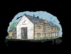
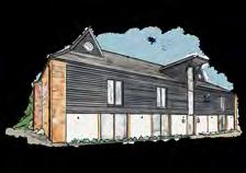
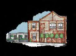


UK
Bath BA1 5BD
Belfast BT7 3GB
Bristol BS8 2QY
Bury St Edmunds IP33 3PH
Cambridge CB22 7PX
Canterbury CT1 3TY
Cheltenham GL50 4DW
Chesham HP5 1NG
Chester CH2 4JR
Chichester PO20 2EW
Chiswick W4 4HH
Colchester CO3 8LT
Edgbaston B15 3AA
Farnham GU9 0BB
Fulham SW6 2TD
Guildford GU1 3AJ
Hailsham BN27 1DQ
Hove BN3 4QD
Knutsford WA16 8TA, Reading RG10 9SA
Southport PR4 6JA
Tonbridge TN9 1RF
Weybridge KT13 8DX
Wimbledon SW19 1RX
Winchester SO21 1HL
York YO32 9TW
Yorkshire Outlet WF17 6JF
Wiltshire Outlet SN5 8YG
Store in store:
Neptune by Treehouse Midmar, Aberdeen, AB51 7NB
Neptune by Creative Classics, Ayr, KA7 2HD
Neptune by Sims Hilditch, Bath, SN14 8JR
Neptune by Woods of London, Blackheath, SE3 0TA
Neptune by Robert James Interiors, Coventry, CV8 3HB
We have Neptune stores across the UK, Ireland and Europe. To see all of our homes, visit neptune.com/our-stores
Neptune by Hunters, Derby, DE1 1SY
Neptune by Richard F Mackay, Edinburgh, EH11 2SG
Neptune by Malone & Smyth, Co. Fermanagh, BT92 9BL
Neptune by Bridgewater Interiors, Gateshead, NE8 2AJ
Neptune By Closa, Tetbury, Glos. GL8 8AA
Neptune by Aberford Interiors, Leeds, LS25 3DP
Neptune by Kendrick Interiors
Market Harborough, LE167DS
Neptune by Appleyard, Norfolk, NR25 6AR
Neptune by Wilton Kitchens, Salisbury, SP2 0HX
Neptune by Holloways, Worcestershire, WR6 5DE
Neptune by Bradley Gardens, Wylam, NE41 8JH
Neptune by 1933, Co. Meath
Neptune by Browsers, Limerick
Neptune by Global Village, Dublin
Neptune by Global Village, Wicklow
Neptune by The Orchard, Co. Kildare
Neptune by Trevor Morrow, Co. Mayo
Neptune by Castle Cabinets, Kilkenny
Neptune Paris
Neptune Neauphle-le-Château
Store in store:
Neptune by Agence Beaumont Chamborand
Neptune by Fabrica, Eymet
Neptune by Mi Figue Mi Raisin, Forbach
Neptune by Rosiris, Granville
Neptune by Just Kitchens, Miélan
Neptune by Hérick Aménagement Nantes
Neptune by Sierra Home Samoens 74340
Neptune Berlin
Neptune Fellbach
Neptune Köln
Neptune Tegernsee
Store in store:
Neptune by Helma Interior, Heidelberg
Neptune by Faszination Oschatz
AUSTRIA
Neptune by Steinwender, Wien
BELGIUM
Neptune by O&V Home Interiors, Seneffe
Neptune by Adi Arredamenti, Brescia
Neptune by Forteshire, Forte dei Marmi
LIECHTENSTEIN
Neptune by Allure, Vaduz
SWITZERLAND
Neptune by Thomas Homes, Luzern
Neptune by Styles Interiors, Mont-sur-Rolle
Neptune by Friolet Interiors, Zurich
THE NETHERLANDS
Neptune by The Classic House, Weteringbrug (near Schiphol)
We do everything we can to make sure Stories is as environmentally sound as possible. The paper we use is all FSC-certified as coming from responsible sources, and is also carbon balanced by the Woodland Trust.
Please note that, while the colours shown in this volume are as accurate as possible, they will not always precisely match our paint shades.