STORIES VOLUME 19
According to Ordnance Survey, the length of the British mainland coastline accounts for more than eleven thousand miles. So much space to intrigue and explore. For this highly fractal shoreline is steeped in history, from important archaeological sites and designated areas of outstanding natural beauty to scenes of ancient conquests and heroic sea battles.
The British coastline was the starting point for our spring collection, with a seasonal colour, Orkney White, inspired by the soft white sands of its island namesake, and lighting, furniture and accessories that reflect the silhouettes and textures of this varied coast. Rippled glass lighting, rattan lamps, raw jute rugs and scalloped tableware all speak to this carefully curated story, layering interesting shapes and natural materials onto a tranquil, softly coloured backdrop.
The coast became the inspiration for this edition of Stories too, as we sought out captivating tales of shell artists, fossil experts and seaweed collectors. From the simple pleasures of sea glass hunting on Sussex beaches to the joys of stone skimming on the west coast of Scotland, the shorelines of Great Britain are rich sources of creativity, beauty and fun in equal measure.
But this edition – and our spring collection – is also a tribute to that British sense of individuality and how we seek to express it through our actions as well as our homes. We celebrate Mary Annings, the Victorian fossil hunter who gathered up her skirts to wade through rockpools on the Jurassic Coast and search for relics, and the modern-day design duo creating hauntingly beautiful prints of seaweed. While at home, exciting additions across our kitchen collections and new Fermoie fabrics upholstered on classic Neptune shapes enable you to design a truly personalised space.
As spring arrives, we hope you enjoy this edition of Stories.
For more compelling stories, head to neptune.com/inspiration
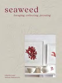
Front cover: Photography by Polly Wreford for ‘Foraging, Collecting, Pressing’, published by Pavilion Books Back cover: Detail of shell sculpture by Blott Kerr-Wilson Opposite: Athena uplighter chandelier / Stratford dining tableThank you to the talented authors and journalists who contributed to this edition, along with our fabulous team of in-house writers.


Aimee Farrell
Aimee Farrell is a writer and consultant specialising in design, interiors and the visual arts. Her work is published in the Financial Times’ HTSI magazine, where she is a contributing editor, as well as British Vogue and The New York Times Style Magazine, T. She lives in Cambridge. @aimee_farrell
Amy Moorea Wong
Amy Moorea Wong is an interiors and lifestyle journalist, previously features editor at ELLE Decoration and news editor at Livingetc. Her book Kaleidoscope: Modern Homes in Every Colour is published by Hardie Grant. Amy has a penchant for Scandinavian design and eco materials. @amy_moorea
Kassia St. Clair
Kassia St. Clair is an author, cultural historian and broadcaster and writes for The Economist and Architectural Digest. Her book, The Secret Lives of Colour, was Radio 4’s Book of the Week. Her latest book, The Golden Thread, is published by John Murray Press. @kassiastclair
Melanie Molesworth
Melanie Molesworth is co-founder, with Julia Bird, of seaweed design company Molesworth & Bird. After working as an interiors stylist for Livingetc, The Telegraph Magazine and House & Garden, she now lives and runs her seaweed art shop in Lyme Regis. Molesworth & Bird’s book, Seaweed: Foraging, Collecting, Pressing, is published by Pavilion Books. @molesworthandbird
Lucy Searle
Lucy Searle has written about interiors, property and gardens for over thirty years, including recently as global editor-in-chief of Homes & Gardens magazine. Based in London, Lucy is now content director of Homes & Gardens, Woman & Home, Ideal Home, and Real Homes. @lucysearle8373
Giles Kime
Hampshire-based Giles Kime is executive editor of Country Life magazine and author of a number of books on interior design including The Evolution of Home with Neptune’s creative founder, Emma Sims Hilditch, published by Rizzoli. His latest book with Nina Campbell, also by Rizzoli, is titled A House in Maine @giles.kime
Michelle Ogundehin
Michelle Ogundehin is a thought-leader on trends, colour and style. She is the lead judge on the BBC2/Netflix Interior Design Masters, and author of Happy Inside: How to Harness the Power of Home for Health and Happiness @michelleogundehin
Photograph by Ben Anders


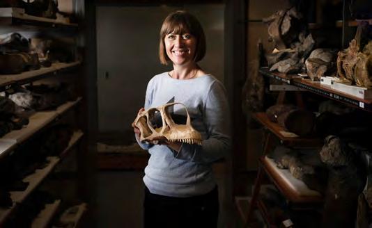
Susannah Maidment
Susannah Maidment is a dinosaur researcher at the Natural History Museum. She runs excavation programmes in Morocco and the US, and in 2019, was one of National Geographic UK’s Women of Impact. Susannah was awarded the Geological Society of London’s Lyell Fund and the Palaeontological Association’s Hodson Award for contributions to palaeontology. On X: @tweetisaurus
Jessica Doyle
Jessica Doyle is design and interiors editor at the Telegraph, and has previously written for publications including the FT, House & Garden, Country & Town House, and Homes & Gardens. She lives in south-east London with her husband and their two children. @tjedoyle
Freya Bromley
Freya Bromley is a London-based writer. Her work explores love, loss and healing through nature. She writes for Lonely Planet, Condé Nast Traveller, the Financial Times, and National Geographic Traveller. Freya’s book, The Tidal Year, published by Coronet, was shortlisted for the Nero Book Awards 2023. @freybromley
Claudia Baillie
Claudia Baillie is a London-based design and interiors journalist. Formerly the interiors editor at Sunday Times Style and editor at ELLE Decoration Country, she now writes for a broad range of publications across areas from designer profiles to homes, trends, architecture and travel. @claudiabaillie
Alice Vincent
Alice Vincent is a writer, broadcaster, and author of three books, including Why Women Grow and Rootbound: Rewilding a Life, both published by Canongate. She is also a self-taught urban gardener. @alicevincentwrites
Amy Bradford
Amy Bradford is the former features director of ELLE Decoration. Now a freelance writer and editor, she’s a regular contributor for Neptune and also writes for titles such as The Telegraph and FT How To Spend It. She lives in Suffolk.
Suzanne Imre
For 17 years, Suzanne Imre was the influential editor of interiors magazine Livingetc; a renowned style pundit and trend leader. Today, she lives in London and works as a brand consultant, content director, and writer. @suzanne.imre
Jo Rodgers
American born Jo Rodgers is a journalist who lives in London and East Sussex with her husband and two children. She is a contributing writer at Vogue, Condé Nast Traveller, House & Garden, and Country Life. @jo_rodgers
For children, collecting shells from the beach is a rite of passage. For some, that interest develops into a career as a shell artist, as design writer Aimee Farrell reveals.
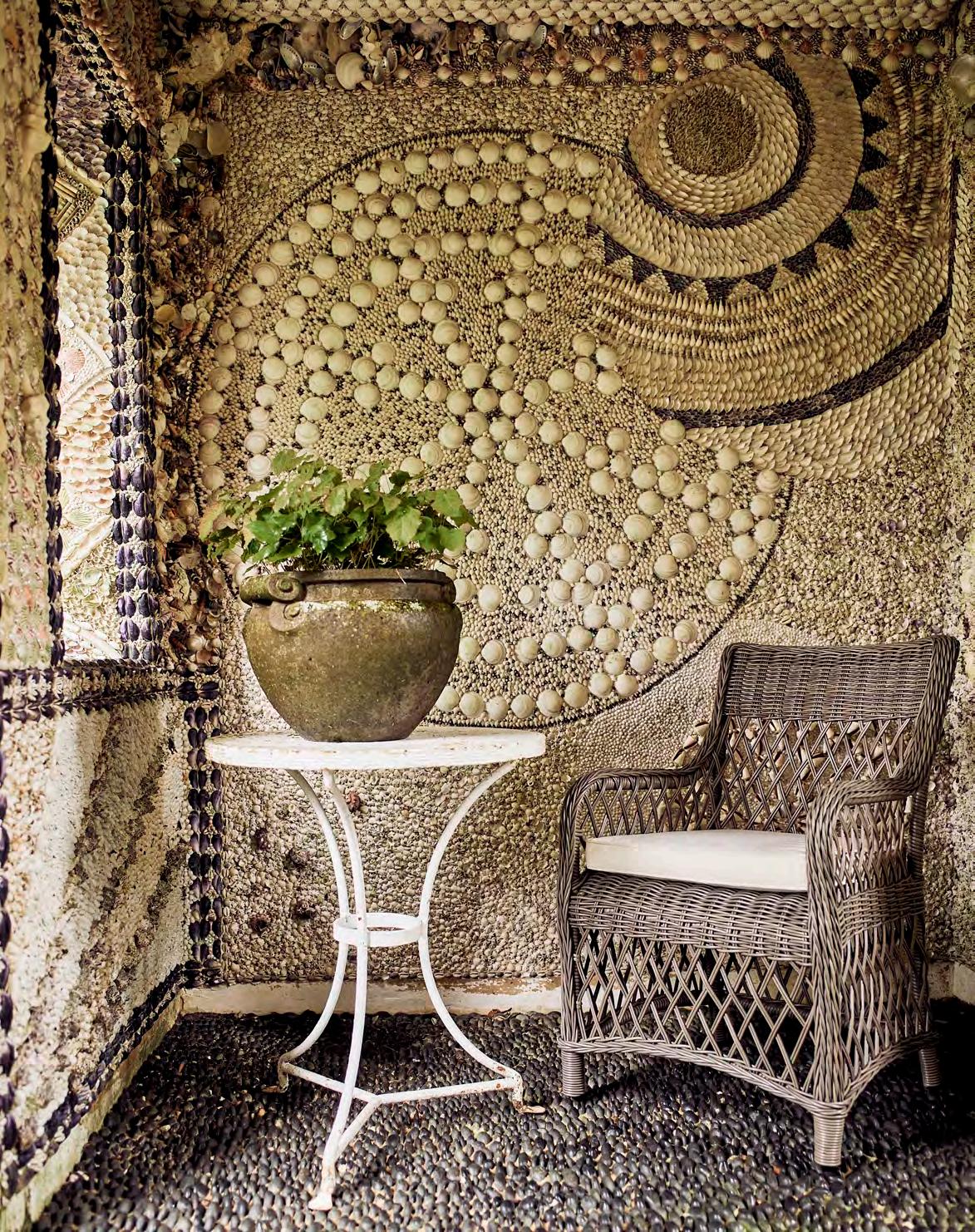
The marvel and mystery of seashells has enchanted humankind since prehistoric times. During the eighteenth and nineteenth centuries, English aristocrats were gripped by shell mania, amassing vast collections of rare and breathtaking specimens. The desire to collect these tiny seashore treasures has run in tandem with the inclination to decorate with shells, and England’s bucolic landscape is scattered with peculiarly elegant grottoes and houses that are little architectural odes to the magnificence of shells.
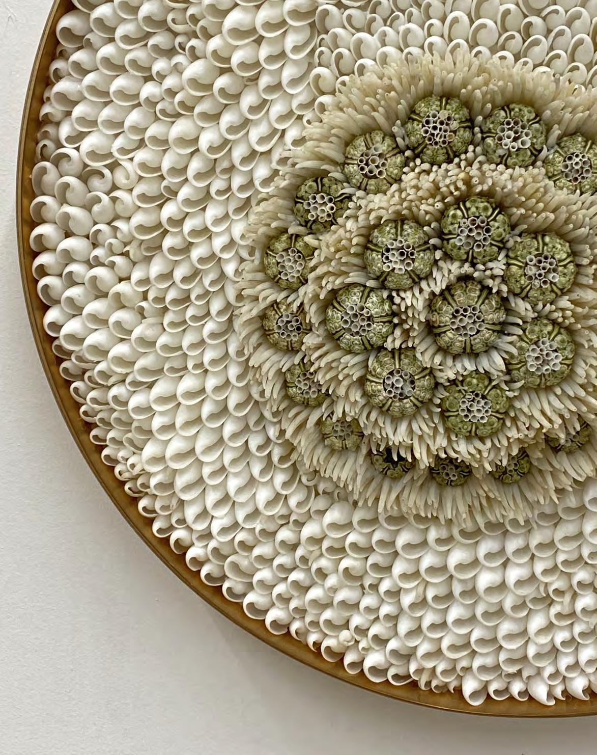
Though shell mania has long since lulled, we’re currently in the midst of a shellwork renaissance. ‘There is a huge revival in shelling,’ says the shell artist Blott Kerr-Wilson, pointing to the work of fellow practitioners like Tess Morley and Katherine Lloyd. ‘It’s wonderful to see how many people are experimenting with this free material.’
The artist Tess Morley’s work includes the painstaking, decade-long restoration of the Goodwood Shell House in Sussex – one of England’s finest and most extraordinary examples of the art of shelling, dating to the 1740s. Alongside restoration, Morley crafts everything from intricate sailors’ valentines to humble salt cellars to shell grotesques with her uniquely baroque-style ornamentation. Meanwhile, the oceanic creations of Katherine Lloyd – who works from her garden studio in Wimbledon – are defined by their crisp, modern simplicity. A case in point: the pleasing, almost watery flow of the Shell Bar she conceived for the private members’ club 5 Hertford Street.
There’s a similar sense of dynamism in the work of Blott, who is currently creating a series of brand-new shell houses for clients everywhere from the West Country to the Channel Islands, alongside more sculptural works of art and shellembellished decorative objects. Unlike the follies of the past, today’s shell structures are conceived as functional outdoor rooms such as dining spaces and airy summer houses. At Belcombe Court in Bradford-on-Avon, for instance, Blott transformed an oriental garden outhouse into a charming pebble-and-shell adorned grotto. ‘They’re no longer dank and dusty spaces,’ she says.
Now sixty, Blott’s life in shells started in the early 1990s when she decked every last inch of the bathroom in her Peckham flat with shells, a space immortalised by The World of Interiors magazine. ‘From that moment on, I became “the shell lady”,’ she says. ‘Shells are the way I express myself.’ Her first commission, completed in 1995, was the majestic interior of The Shell House at Ballymaloe Cookery School in southern Ireland.
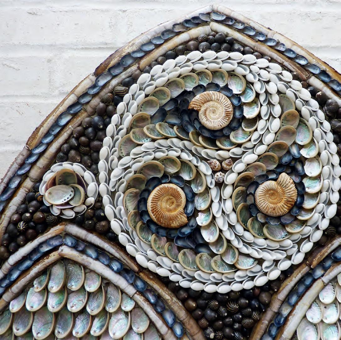
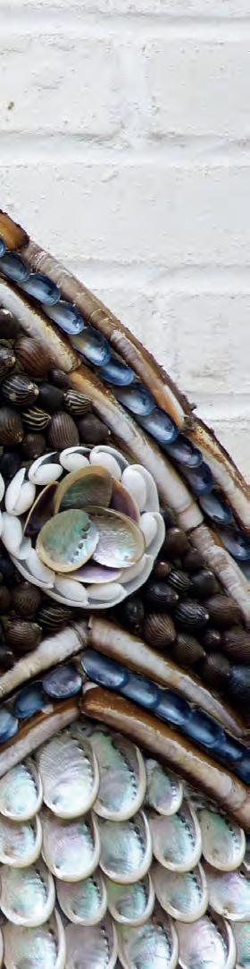
It takes close to three months for Blott to complete the interior of a single shell house. ‘I can look back at a design and see the tension and relaxation that I was feeling at the time in the placement and pattern,’ she explains of the emotive creative process. Taking cues from the client’s own interior tastes, the peccadilloes of the architecture, and the movement of light in a space, Blott works freehand to conceive dynamic custom arrangements. ‘I never plan or sketch things out,’ she says. ‘I just always assume that I’ll have the right number of shells and it will work out. My mind works in patterns.’ Her designs are nothing short of extraordinary: at once playful, experimental, and brilliantly eccentric – the very definition of what she terms ‘modern shelling’. When it comes to creating your own artwork, she suggests staying mindful of the shape of the shell – it’s this unique silhouette that will bring movement and dynamism to the design.
Perhaps best of all is the democratic nature of the craft. For those hoping to try their hand, Blott advises only employing shells that are found in abundance as some are protected or restricted. Equally, utilising shells that are a by-product of the food industry is a good way to source them in quantities. Blott’s own north Norfolk studio is filled with glass jars brimming with hundreds of different varieties of shell, many of which she has been given.
Shellwork is also a chance to celebrate the often-overlooked wellspring of shells found on local beaches. ‘At first sight, British shells can look boring,’ she says. ‘But when you put them together, they have such beauty and colour. British mussels, for example, are the only blue shells in existence.’ So next time you’re on a coastal stroll, take a moment to look again at the beauty beneath your feet.
See more shell works of art on Instagram: @blottshells @katherineshells and @tess_morley
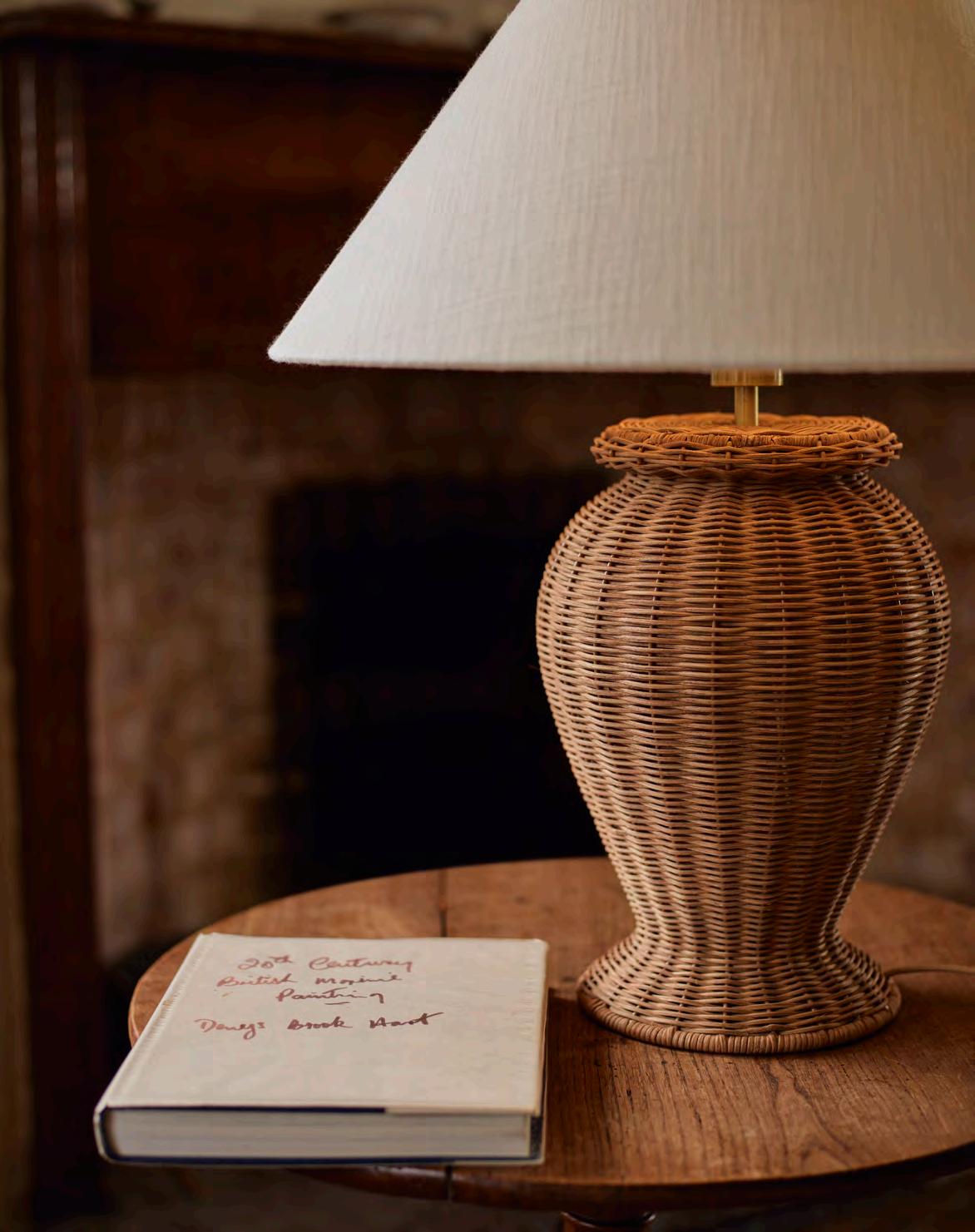
Loved for its flexibility and sustainable properties, rattan is also a style statement that has stood the test of time, as design writer Amy Moorea Wong discovers.
Rattan, wicker. Wicker, rattan. The words have come to trip off the tongue interchangeably, because we all know what we mean – the woven wood-y products that are increasingly popping up in homes. But for when it next comes up: rattan is the core of a vine-like plant (there are over six hundred varieties) whereas wicker is a style of weave. So, rattan pieces are made from rattan stems; wicker products can be woven from multiple materials, including rattan. Cane is the tough outer skin of rattan, if you want to add an extra layer of complication.
Something of a marvel, rattan is renowned for its inherent strength; it’s remarkably hard and durable, yet lightweight and flexible enough to be skilfully bent and woven into intricate forms. Found predominately in the tropical forests of South East Asia as well as parts of Africa and Australia, it grows upwards, climbing trunks and branches at phenomenal speeds, reaching up to two hundred meters in length and coming in as one of the world’s fastest growing plants. Joyfully sustainable, it regenerates speedily and grows all year round, before being carefully harvested by hand from the wild.
Harnessed over two thousand years ago by indigenous cultures, rattan was initially used for weaving furniture, baskets, utensils, and tools. Skilled artisans often created intricate designs specific to their community, embellishing function with beauty and meaning, and passing making techniques down the generations. Sailing to Europe in the seventeenth century as trade routes expanded, its ‘exotic’ feel fascinated Victorians, and tying into the nineteenthcentury trend for all things handicraft, rattan furniture officially announced its arrival into the era’s interiors scene as part of the 1851 Great Exhibition.
Style icons such as Italian designer Gabriella Crespi gave the unassuming material a cosmopolitan rebrand in the 1960s and 1970s, rattan becoming the go-to for a sophisticated yet serene home as a free-spirited antidote to the preceding cold, hard lines of modernism. Today, the rattan renaissance is part of the contemporary movement towards embracing the relaxing ambiance nature brings indoors, as well as its obvious sustainable credentials.
Neptune’s new season lighting collection is infused with ageless eco-elegance. In rattan, the vase-shaped Athena table lamps are a laid-back, organic twist on classical ceramics, while the art deco-esque scalloped edges of the pendant and wall lights adopt a whimsical, romantic feel when woven. Each piece is a journey along the design timeline with its roots deep in the ancient jungle.
Opposite: Athena table lamp with Oliver lampshade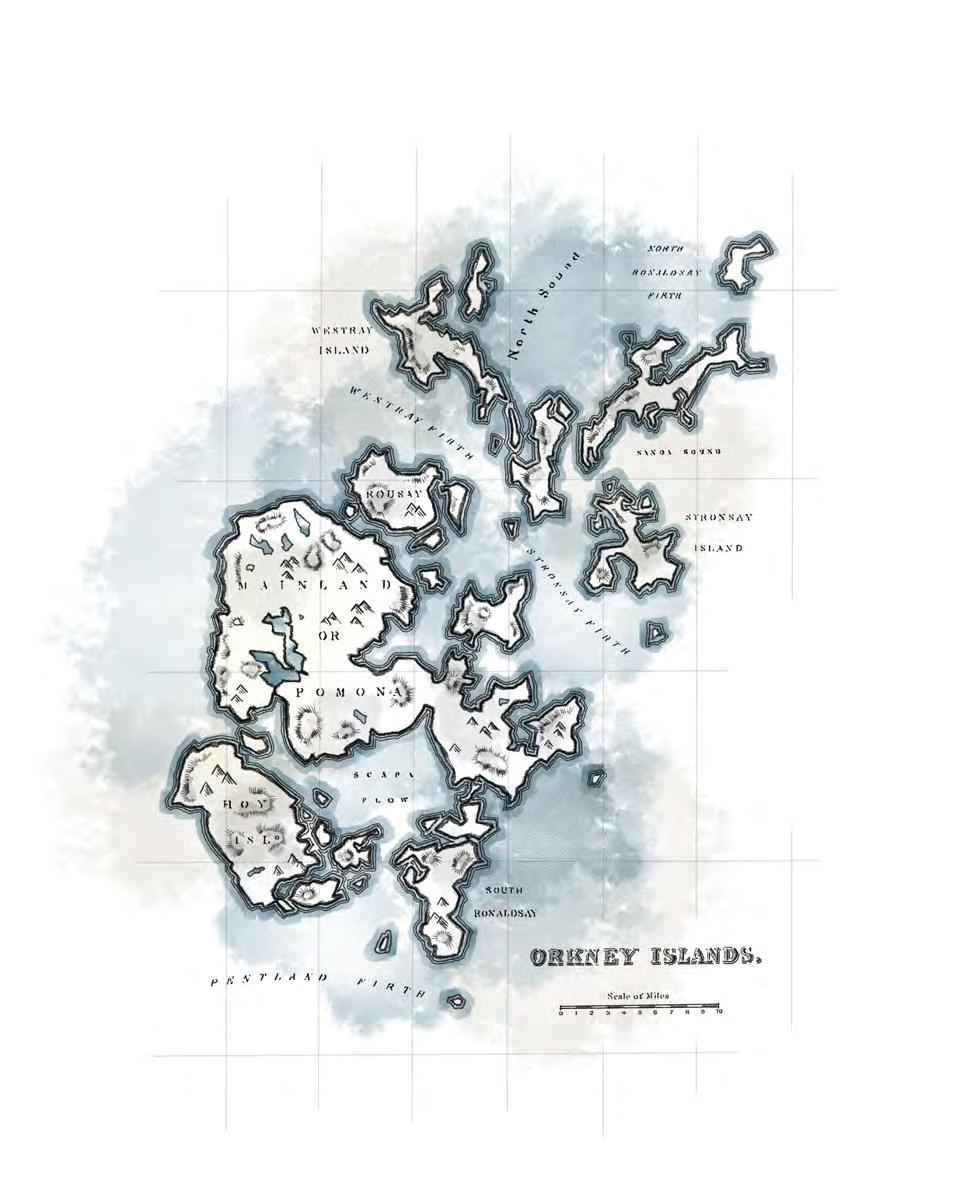
Inspired by the soft white sands of the Orkney Islands’ beaches, our new Orkney White shade has a rich, textural history, as colour expert and author Kassia St Clair discovers.
History lies closer to the surface in some places than in others. Heading down from the village of St Margaret’s Hope in South Ronaldsay in the Orkney Islands, for example, the waters of Scapa Flow will glimmer beyond a moon-bright crescent of sand. The name itself, Scapa Flow, is a relic. It’s a corruption of the moniker given to this body of water by Norse raiders and conquerors a thousand years ago – precious, because it’s cradled away from the worst Atlantic storms.
The islands and their history have a curious affinity to the colour white. They were formed by glaciers wearing away layers of sand and limestone. The Norsemen who held them for centuries traded in cloth, salt, walrus ivory and fish, plying frothing seas in longships powered by winds puffed into woollen sails. Relics of earlier histories – in the forms of fossil, bone or stone fragments – are often unearthed by storms.
White has been a colour of dualities. Power and simplicity; pride and humility; wisdom and innocence; joy and mourning. It was associated with deities and enlightenment, but also material wealth. Fine cloth, like wool, silk, linen and lace, had to be bleached to a pristine whiteness – a labour intensive and expensive process – and keeping it that way took battalions of servants who could launder, repair and starch precious textiles. Simultaneously, white has been embraced as a symbol of purity and virtue, which is why brides wear it. In design, it can sometimes be haughty. Le Corbusier, for example, liked to opine that whitewashing all interior walls would have a moralising effect on a society. But whites – particularly those infused with candlelight yellow, peachy or shell-pink undertones – as Neptune’s new creamy neutral Orkney White is – can be fresh, cleansing, even warming.
Syrie Maugham, a trail-blazing British interior designer nicknamed the ‘princess of pale’ during the 1920s and 1930s, had a knack for layering off-white tones. This was a revelation for generations used to a surfeit of bright colours, piled fabrics and high ornamentation. We’ll never know what Orkney’s Norsemen might have made of her spaces, but perhaps given that one admirer called them visions of ‘smiling, shimmering, all-white’, I think we can guess.
The only surety of the British coastline is that it will look different in an hour’s time. Weather rolls in and out, tides ebb and flow. It means the colours of our coast are an ever-changing palette, from stormy dark greys and bruised yellows to palest watery aqua. Indeed, J. M. W. Turner, probably the most famous seascape painter of all time, worked from a palette that included cobalt blue, ultramarine, Prussian blue and inky indigo, alongside the sea green of viridian and a smattering of reds and oranges.
Such a palette was also the starting point for our spring 2024 colour inspiration, which sees our new creamy Orkney White (inspired by the white sands of the Hebrides) and classic warm Salt shades balanced with the soft blue of Alpine and relaxing Sage green, the khaki tones of Lead Light and the darker drama of Walnut. And the finishing touch: a mere hint of spicy red Paprika or ochre-toned Saffron. An interior’s palette even Turner might have approved of.
You can order a sample pot of Orkney White online or pick one up in your local store. For inspiration on decorating with our seasonal shade, head over to our Instagram, @neptunehomeofficial
This is
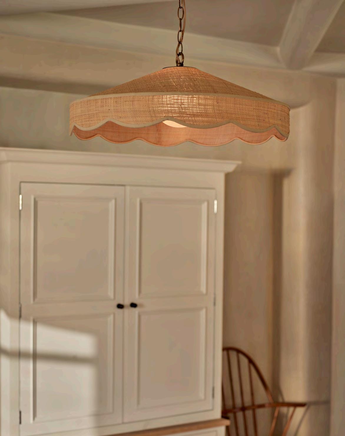
From Panama hats to storage baskets, the versatility of raffia (sustainably harvested from raffia palms native to Africa) has long been appreciated by designers. And now we’ve used this durable, natural material for a new addition to our lighting collection.
Suspended on an antique brass chain and lined with a protective matt perspex layer on the interior, the Marina pendant marries a pretty, scalloped edge with a neat, tailored finish. Hang it over a kitchen island to bring a little shape and texture to the space, or position it low over a side table to create a pool of soft light.
For our full light collection, visit neptune.com/lighting
Opposite: Marina pendant
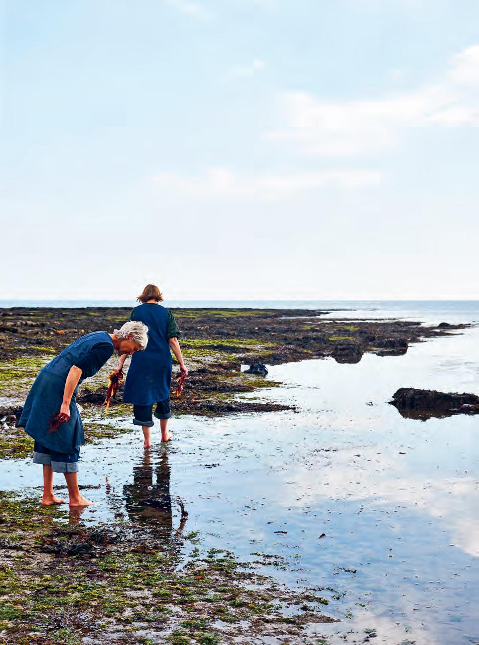
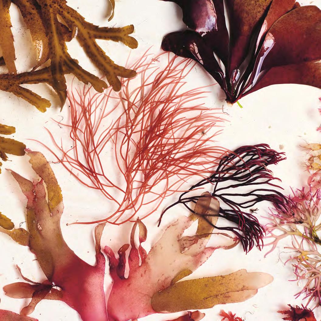
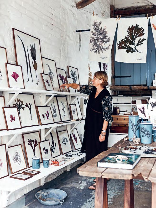
Looking back, I wonder if it was seaweed that led Julia and me to our respective coastal homes in Cornwall and Dorset. We’re continually amazed and inspired by the beauty of the stunning underwater garden that surrounds our island. It has certainly been an influence on how we now choose to spend our days.
A love of the British coastline has grown to become a creative business for seaweed artists and authors Melanie Molesworth and Julia Bird, as Melanie explains.
We’ve been friends for years – whilst living in London, we both worked as freelance interior stylists and, coincidentally, shared a fascination for seaweeds. Julia’s homes had always been inspired by nature, with rooms painted in soft coastal shades and forest greens, and featuring exquisite arrangements of her nature finds, often foraged during visits to the beach. I, at the same time, had a prized collection of framed Victorian seaweed pressings displayed in my London kitchen. It was this collection that was the catalyst for our journey reviving a forgotten and undervalued art form.
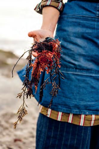
Now we both live by the sea and the creative process of foraging and pressing seaweeds has become part of our lives. Julia gathers her specimens from the dramatic coves close to her home in south Cornwall, whilst I hunt along the Jurassic Coast in west Dorset. Many of our finds overlap, but we’ve discovered some are more abundant in one or other of the two areas. For Julia, it’s the blousy pinky-red ‘beautiful fan weeds’ – they make stunning pressings. Here in Lyme Regis, I enjoy plenty of the fine and delicate ‘cock’s comb’. When foraging, we’re mindful of our responsibility to preserve the natural habitat – we never cut or damage growing plants. All our pressings are created from what we find washed up on the shore or free flowing in the shallows and rock pools.
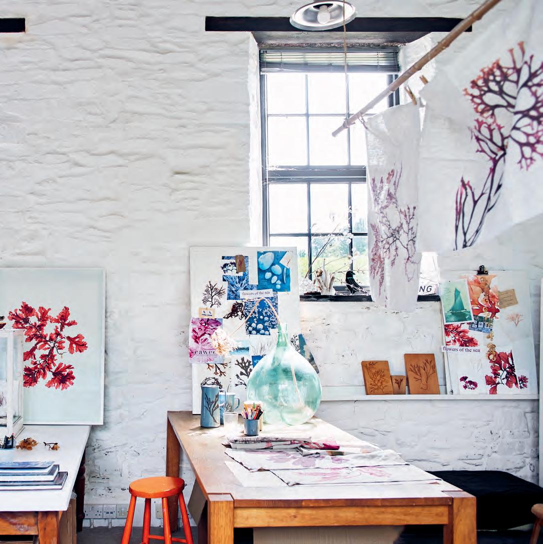
Pressing seaweed began as a delightful part-time hobby but has gradually developed into rather an obsession. Over time, we’ve tried and tested various methods to successfully press our finds and, eventually (after many failures), have come up with a technique that works (most of the time). We now run a business together producing prints, cards, fabrics and more –all created from images of our own original pressings. We meet up regularly to compare our latest finds and discuss our new projects, often at a favourite spot in Ashburton in Devon, halfway between our homes.
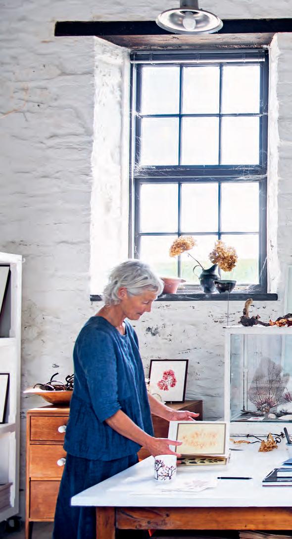
 Above: Julia in her studio in Cornwall, photographed by Polly Wreford
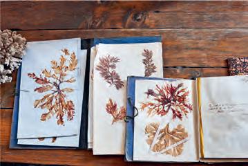
Although there is seaweed to be found on our coastline all year round, the bounty does vary from season to season. Spring offers up some of the more delicate and pretty specimens such as the elusive, feathery, pink ‘sea beech’, which appears for a few brief weeks and is a sign that summer is nearly with us. The warmer months can be less fruitful as weeds become fragile and bleached by the sun (although even these can create beautiful pale watercolour-like images when pressed). Autumn usually sees the return of the dark reds of the dulse and ‘beautiful eyelash weeds’ as fresh growth appears. ‘Serrated wrack’ takes on russet tones at this time of year as the temperature drops and the sea chills. During the depths of winter, the stormier weather often produces delightful dark tangles of ‘egg wrack’ and kelp for us to tame and press.
Our love of collecting still burns strong; in fact, as our knowledge and identification skills have grown, we’re even keener to hunt out elusive, rare specimens to add to our growing collection of beautiful sea plants.
This season, we’ve collaborated with Melanie and Julia’s interiors and accessories business, Molesworth & Bird, to produce four elegant, framed seaweed prints, available in stores and online from May, part of our new summer collection. Hang one alone or as a group to introduce an element of subtle colour and natural beauty to a room.
To find out more about Melanie and Julia’s work, look for their new book, ‘Seaweed: Foraging, Collecting, Pressing’, which is published by Pavilion Books (£30)
Layering patterns into any room will create a characterful space, but in a bedroom, it’s vital that the result is restful and harmonious, says interiors editor Lucy Searle.
Igrew up in a house bedecked with pattern, and when I bought my first home back in the early nineties, the somewhat maximalist bedroom had been decorated in Morris & Co. Owl & Willow wallpaper and curtains. I’m ashamed to say that I’d reached pattern saturation point by then, so I took the curtains down and painted over the wallpaper. Since then, I’ve fallen firmly back in love with pattern but, in a bedroom, I still use it with restraint.
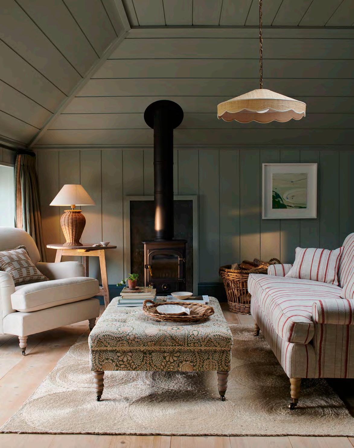
Pattern, after all, is as integral to your bedroom’s mood as its colour palette. For a textured, calming space, I find that a small-to-mid-scale hero pattern in low-contrast tones – as shown on Neptune’s Clemmie headboard in Fermoie’s Shell Grotto fabric – is ideal. Large-scale, highcontrast patterns bring energy, so are better limited to lampshades, cushions or a headboard for interest.
Light levels and room proportions are a factor, too. Busy patterns over large areas – wallpaper, window treatments, rugs and bedding – will make your bedroom feel cosier but smaller. This might be perfect in a light, lofty bedroom, but if your aim is a bigger, brighter-looking room, I would pick out a one-colour pattern that your eye translates as soothing texture, or choose a light-coloured hero pattern with plenty of space between motifs.
Stripes, whether classic or abstract, can perform proportion-fixing tricks. Used vertically, in either wallpaper, curtain fabric or a tall headboard, they lift a
low-ceilinged bedroom’s height. Or, used horizontally, they’ll exaggerate a small bedroom’s width or length. Or try laying an understated diagonal-checked rug to make a room feel both wider and longer.
I always find the hero pattern to be the best starting point for other pattern choices and the room’s colour scheme, since it will likely cover the largest proportion of the space, whether the headboard, floor, or walls. Whatever the hero’s scale, a successful combination of patterns usually includes one large and three to four smallto-mid-sized motifs, united by a toning colour palette.
Use your favourite colour from the hero pattern in the greatest proportion as a plain, perhaps as a wall, wardrobe or carpet colour, and two or three low-contrast, toning accent colours from the hero pattern in smaller measures – picked out in bedding, a window seat fabric, in the border on a rug or the piping on upholstery.
Combining pattern styles and themes is vital for interest – aim for three to five. For example, if your hero is a trailing floral curtain fabric, you can layer in depth with geometrics, perhaps a subtle stripe for blinds or the headboard, and abstracts, such as a just-discernible textured-look wallpaper, all against a plain hero colour carpet. Of course, most brands group their fabrics and wallpapers in coordinating collections, which makes narrowing your choice – and planning a restful scheme – so much easier.
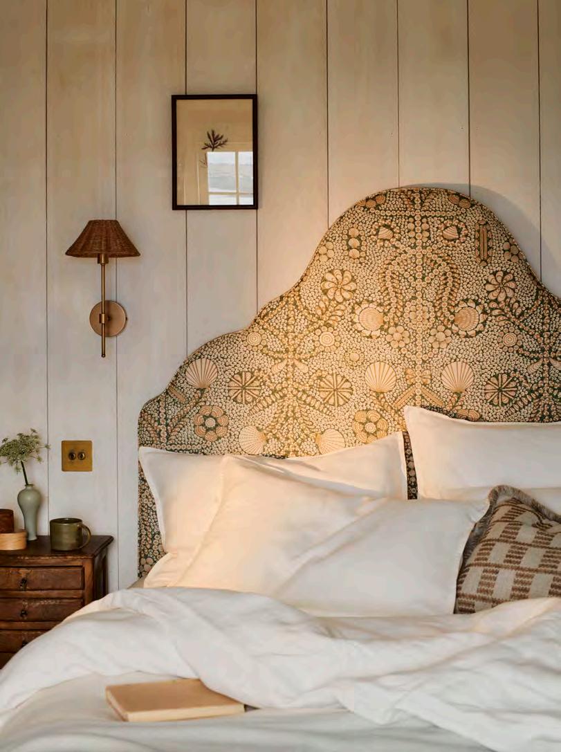 Clemmie headboard in Shell Grotto by Fermoie / Athena mini wall light

Scallop/skŏl'ǝp
- any of various marine bivalves of the family Pectinidae, having a fluted fan-shaped shell - either of the shell valves of any of these molluscs - a scallop shell or similarly shaped dish in which fish, especially shellfish, is cooked and served - one of a series of curves along an edge, especially an edge of cloth - the shape of a scallop shell used as the badge of a pilgrim, especially in the Middle Ages
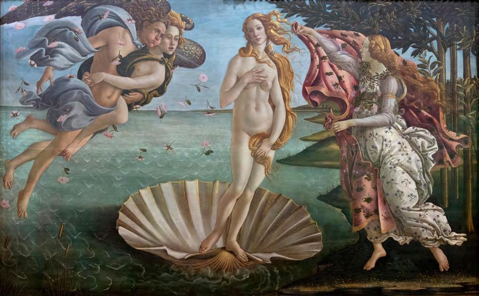
Birth of Venus (Nascita di Venere) by Sandro Botticelli. Uffizi Gallery, Florence, Italy. c. 1484Why have the gentle curves of the scallop inspired generations of architects, artists and designers, asks interiors editor Giles Kime.
When, in the late fifteenth century, the artist Sandro Botticelli depicted Venus, goddess of love and beauty, after her birth, he showed her being borne across the waves on a giant scallop shell that had conveyed her from the depths below. Back when the sea was still uncharted territory, shells, pearls and coral – as well as sea creatures such as whales and dolphins –were evidence of a mysterious parallel universe with its own deity, from Neptune to Poseidon.
Botticelli and his contemporaries, like the sculptors, muralists and mosaicists of ancient Rome and Greece before them, were inspired by the simplicity of natural forms – and not just the human body but also the striking features of plants and animals, such as the scrolling acanthus leaves which characterise the Corinthian capitals that are a feature of classical buildings. Like the colours to be found in nature, these pleasing shapes brought architecture and design to life.
But in particular, it was the sea that, for centuries, inspired generations of artists and designers – and still does. The gentle, rhythmic curves of the scallop shell contrast against the functional efficiency of the straight line. In Moorish and medieval buildings, scalloping adds a decorative edge to arches. In the classically inspired architecture of the seventeenth and eighteenth centuries, it brought a flourish to architectural facades and interior plasterwork.
The shape of the scallop also lends itself to lighting; in the twentieth century, it inspired iconic lighting designs by the Finnish industrial designer, Paavo Tynell. More recently, British interior designers such as Rita Konig, Salvesen Graham and Soane Britain have employed the scallop to bring a whimsical quality to slipcovers, rugs and furniture. On the table, this decorative edge gives a discrete, curvaceous feel to mats and linen. Yet the appeal of a scallop’s gentle curves is not just visual, it’s also tactile. As handles, such as the Aberdovey drawer pull in the collection of hardware specialists Armac Martin, bring pleasure to the simple act of opening a drawer. The allure of the scallop shell lives on through the centuries.
This is
Hardwearing, organic and easy to clean, jute rugs are a popular and sensible choice for any well-walked area of the home. But they can tend to look – forgive the expression – a little flat.
Step forward the new Harlyn rug (available in three sizes). With its distinct, geometric brick design in a natural and rust-coloured weave, it elevates the hardworking fibre mat into a smart, decorative rug worthy of any sitting room, dining space or kitchen.
Discover our full rug collection, visit neptune.com/rugs
How do you choose the perfect artwork for your home?
It’s all about listening to your heart, says author and presenter Michelle Ogundehin.
Many conversations about art seem to get tangled up with talk of ‘provenance’, ‘collections’ and ‘curation’. To me, it’s much simpler. Art is whatever you want it to be. Whatever you look at and think is beautiful, arresting, intriguing or even just pretty.
Some of the things I consider as art in my own home include piles of pebbles from various beaches, a pair of Japanese matchboxes set within a deep box frame, and a tiny watercolour of a rainbow that my son did when he was about six years old. There are more conventional pieces too: a Tracey Emin limited-edition print; a black and white etching of a seagull from a student show; and my prized possession, a Rachel Whiteread laser-cut plywood relief of a portion of herringbone floor.
They’re all very different, but because I absolutely adore each one, they ‘work’ together. I consider them the punctuation points of my taste. The visual pause points and full stops around my home that tell you something of my story. They’re memories in three dimensions that allow glimpses into corners of my personality.
I think the walls in our homes are our biggest canvases on which to express ourselves. We can divide them with panelling, add depth with texture, adorn with colour, and play with pattern to create engaging planes on which to gaze. But adding art – whether pictures, prints or paintings, or curiosity shelves within an alcove to accommodate tchotchkes and sculpture –is the ultimate finishing touch. It should always be the final layer of your decorative journey; the emotional embroidery, if you will, on the characterful tapestry that is your home.
As such, let’s underline that, however you define it, art is essential. It’s a pivotal part of the interior design toolbox, as important as furniture, colour, or plants. Capable of elevating any space, whether rented or owned, from mundane to marvellous. Art is the fast-track to magical mood making – to surround yourself with the richness of creativity is to wrap yourself in wellbeing.
In conclusion, I don’t have rules per se as to how and where to display what and why, only five suggestions that always work well for me.
Hang by eye – where does a picture feel best in terms of height or relation to other things in the room? If doing a collage of pictures though, it works best to keep the gaps between each piece roughly the same.
Put art in unexpected places, like at the bottom of the stairs (or the top), in the loo, and opposite your shower. These are places to take a moment and be surprised.
Frames are as important as the pictures themselves. Mounts too. Take your time choosing both.
Don’t be afraid to switch paintings around: it can give a room a whole new feel.
Always choose with your heart. It doesn’t matter who a piece is by, or where it’s from, as long as you want to keep looking at it.
This spring sees the launch of our new partnership with Artground a contemporary gallery which champions emerging artists around the country. In Neptune stores across the UK, Artground will curate exhibitions featuring locally based artists, starting with a show of works by Cornish artist Martha Holmes at Neptune Bath.
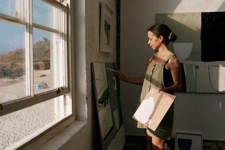
For landscape and still life artist Martha Holmes, it’s the rugged Cornish coast, where she studied and lives, that influences her work. ‘My starting point is always the landscape around me,’ she says of her joyously natural oil paintings, ‘then the final work will have a flavour of those colours and shapes but with an abstract quality to them – on canvas, they form a new type of landscape.’
When it comes to displaying art at home, Martha suggests leaving space around each piece so it can breathe, and picking up on colours that can be carried through on fabrics or paints – albeit subtly.
A selection of Martha’s works will be available to buy in store at Neptune Bath from the end of March.
Martha Holmes in her studio in Cornwall, photographed by Toby ButlerOur homes are expressions of who we are. Here, Neptune CEO, Aalish Yorke-Long, explains how the business is encouraging people to embrace that individuality.
How is Neptune responding to the move towards more individual interior styles?

Neptune is all about British style and, by definition, British style is eclectic. We’ve always had strong design principles that draw on historical references, so looking to antiques will always be our starting point. Now, we’re moving towards more ‘found’ pieces rather than focusing on building out our families of collections. By harnessing that Britishness and marrying it with our manufacturing skill and the quality of our materials, you get this magical formula that will keep us true to our essence, producing furniture fit to last a hundred years.
How can people customise Neptune pieces?
We’ve always offered lots of choice in terms of colour, and we encourage people to create their own look. For example, I recently had a Chichester workstation painted Olive on the outside and Lead Light on the interior, and I added antique brass hardware. It’s amazing how different it feels to the same piece painted in Snow with chrome details.
This season, we’re introducing a warm neutral, Orkney White, which takes its inspiration from the white sands of the Hebrides and feels restful and calm. It will be fascinating to see how this is interpreted by our customers.
How do you balance more choice while also offering a curated selection?
I’ll be honest, it’s the hardest thing we do as we plan our collections. Our pieces can remain popular for years because they have a timeless aesthetic, but when the customer tells us that they’re tired of a particular style, we’ll replace it. That allows us to breathe new life into a collection rather than adding newness for the sake of it. That said, a guiding principle is that seasonal newness must be harmonious with the whole. You can come into a store three years apart and find things that will work together.
How can someone inject personality into their home?
Accessories are a good place to start, and our spring collection has a focus on lighting, tableware, and occasional pieces. Our homes are long-term investments so you’ll want the bones to be long-lasting, and then you can figure out what to have fun with.
Do customers want more individuality in their kitchens?
Yes! Our UK bespoke workshops are busier than ever and, in response, we’re offering more ways for people to customise their kitchen with different hardware, work surfaces, and choices such as clear or fluted glass in cabinets. Today, a classic Chichester kitchen can look unrecognisable in two different homes.
Our kitchen design teams can help personalise the project while also being creative with budgets; delivering the look a customer wants at a budget that works for them. It’s where the skill of the designers really comes into play.
Is art a starting point or a final touch?
Finding a painting you love can be a great place to start as the colours used are usually complementary and they can help with the proportionality of a colour scheme too. In fact, our spring palette was inspired by Turner’s famous ‘Helvoetsluys’ seascape in which you see sky blues, sea greens, warm neutrals for the clouds, and just a pop of red in the crimson buoy.
That said, sometimes it’s easier to look at an almost finished room and see what it still needs. Art can bring that lift retrospectively. I’m going to be doing just that in my bathroom by adding some of our new seaweed prints as finishing touches.
How do you personally create individuality at home?
There are four things I do. Firstly, I love colour and believe every surface, from architrave to skirting, should be considered as a medium for colour. I’ve got warm neutral pinks in entertaining rooms, green in the kitchen (historically it was thought to be good for digestion) and an unusually warm blue in our snug.
Secondly, I love eclecticism. We’ve gradually filled our home with things we’ve inherited, picked up from flea markets, and invested in.
Then, as I’ve got older, I’m drawn to pieces with meaning. It doesn’t have to be a significant piece, but it does need a connection or a story.
And finally, I incorporate some statement lighting – I’m tempted by our new rattan pendant lights and ceramic lamp bases as they’re practical and flexible ways to add personality to a room.
Where do you look for inspiration?
Everywhere! Museums, hotels, friends’ houses (I’m very nosy!), or an afternoon with a glossy magazine and a cup of tea. And Pinterest and Instagram have been transformational. I’d recommend following interiors accounts like @inigo.house and @bibleofbritishtaste, or interior and garden designers like @sarahvanrenen, @laurenoliviadesign and @marcusbarnettstudio. And finally, @glebehousedevon, an inspiring guesthouse and restaurant that we discovered on Instagram and are now collaborating on a kitchen with.
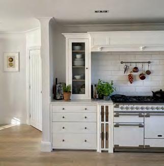
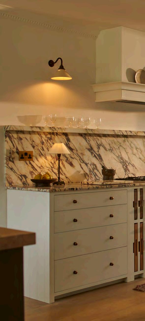
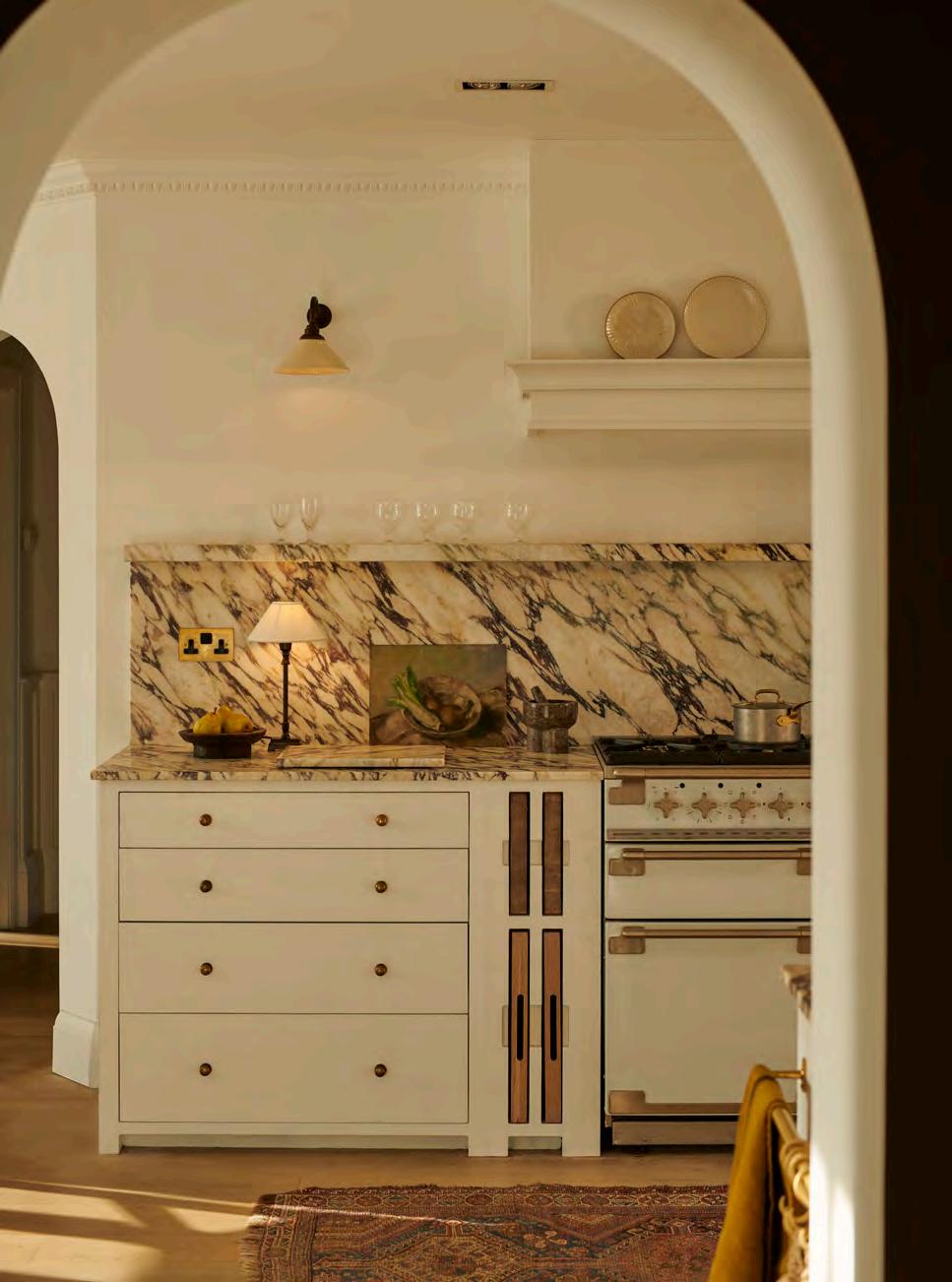
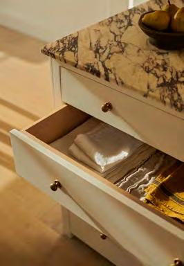
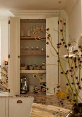
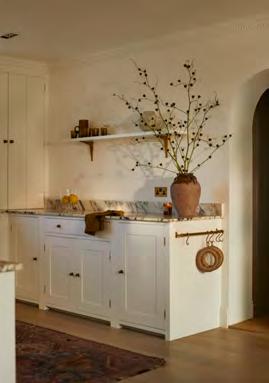
NDesigning a kitchen that works for your particular space means you might want to look beyond the regular options for extra adjustments or individual details.
ooks, beams, chimney breasts or sloping walls. The bones of most kitchens include a smattering of awkward or irregular ‘features’ (to be polite) that make a cookie-cutter kitchen design all but impossible. Add to that the desire for a circular sink maybe or a particular sized cooker hood, and many people find themselves needing cabinetry, fixtures or accessories that aren’t immediately available.
As kitchen makers of over twenty-five years, we’ve designed pretty much every iteration of kitchen and resolved the most unusual of requests. From cabinetry created for the family dog to sleep in to cupboards that work around a three-generations-old AGA, or even the farm kitchen that needed to be painted in a shade that would disguise the mud when young lambs had to be nursed indoors – no challenge is too much.
Luckily, the three main collections offer a great degree of flexibility just by the nature of their designs. Henley focuses on deep drawer cabinets, Chichester has more cupboard options, and Suffolk is a combination of the two. And now, all the collections offer the option of plain or fluted glass panes for wall cabinets, while different larder cupboards can be customised with interior lighting and marble or wood work surfaces. Even
furniture pieces like the freestanding Charlecote island can be adjusted to create an overhang for bar seating, or cabinets and drawers can be configured to create an extra-slim – or extra-wide – fitted island.
From May, worktops too can be specified to lend a sense of originality, be it the thickness of solid wood or an elegant ogee-edged finish on a marble surface to elevate a classic island design. Hardware is also a good way to add an individual touch, and we offer an impressive array of handles in six finishes – from chrome to blackbronze and flattened brass – alongside an exclusive solid brass bar handle and knob, designed and made in the UK in collaboration with prestigious hardware brand Armac Martin, with the further option to order across the brand’s extensive range.
But what about those specific design elements that can make all the difference to the final result? Our UK workshops and in-store design teams are at hand to help with requests, from an original paint combination for the exterior and interior of cabinets to sourcing a brass kitchen tap. And they do it all with an eye to a customer’s budget – if a bespoke option proves too costly, then they can suggest an inventive combination using existing cabinetry, meaning no two Neptune kitchens will ever look the same.
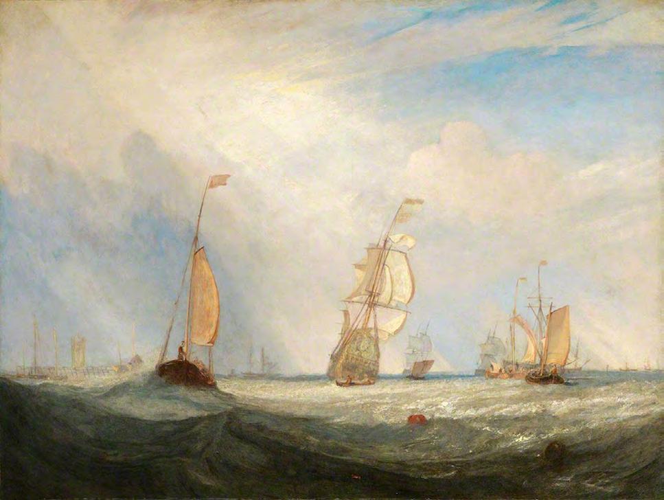
When J. M. W. Turner added the red daub of paint, representing a buoy, to his watery ‘Helvoetsluys’ seascape as it hung next to the bold river Thames oil painting of his rival John Constable, he stole the show at the 1832 Summer Exhibition. Yet, while it was that speck of red oil that caused such controversy, it was Turner’s depiction of cloud formations –something that captured his interest throughout his career – that won admiration.
For who hasn’t marvelled at the sky as they gaze out to sea, the wide horizon a perfect vista to view the ever-changing cloud patterns and anticipate what weather they might bring.
Clouds are classified in three groups: cumulus (large and lumpy shapes), stratus (layers that blanket the sky) and cirrus (wispy clouds found at high altitudes). But how to identify what you’re looking at? Here are the ten most common cloud formations to spot.
1 Cumulus: puffy, bright white with flat bottoms in a blue sky, much like a child might draw.
2 Stratus: hang low in the sky and look flat and featureless; often seen on overcast days.
3 Stratocumulus: puffy, white and grey clouds with smaller patches of blue sky between them –the epitome of a cloudy day.
4 A ltocumulus: nicknamed ‘sheep backs’, they look like mounds of sheep’s wool, sit higher in the sky than cumulus, and are larger than stratocumulus.
5 Nimbostratus: a dark grey layer of cloud that can blot out the sun – these are classic rain clouds.
6 A ltostratus: a thin layer of grey or blue-grey cloud that dims the sun and stops the sunlight casting shadows.
7 Cirrus: wispy strands of cloud streaked across the sky at a higher altitude. Sailors regard them as a warning of a coming storm.
8 Cirrocumulus: short-lived patches of high cloud that appear spread across the sky in bumpy rows.
9 Cirrostratus: a barely-there veil of cloud covering the entire sky that produces a halo effect around the sun or moon.
10 Cumulonimbus: dense thunderstorm clouds that rise up from cumulus shapes and span the low, middle and high altitudes, billowing upwards with a darker, flat bottom.

Dorset’s Jurassic Coast has a strong pull for renowned
But, as she reveals, she’s not the first female fossil hunter for she walks in the footsteps left by
British palaeontologist Susannah Maidment. associated with the region, Victorian palaeontologist Mary Anning.

Ispent a lot of my childhood holidays in Charmouth on the Lyme Regis coast, where my little brother and I would go fossil-hunting on the beach. We’d spend hours sifting through the golden sand while splashing around in the sea, chipping away at the pebbles we’d find with a hammer and discovering, to our delight, that some of them contained ammonites – a pretty cream and brown fossil. It meant that I learnt all about fossils and ammonites from a really young age.
Working with fossils was always what I was going to do; there was never any question that I wouldn’t study geology at university (I did my degree at Imperial College, and my PhD at Cambridge). My great-grandfather was a manager of a coal mine in Nottingham, and although he died when I was a baby, I was given many of his geology books, as well as his beautiful collection of plant fossils that the miners had found underground, which helped cement my interest.
I joined the Natural History Museum in 2018, where I study armoured dinosaurs, particularly stegosaurus (the one that every seven-year-old would be able to recognise). Ultimately, it’s so that we can understand broader questions around evolution. The best bit about working here is having one of the world’s most significant fossil collections at my fingertips.
But it all started in Lyme Regis, and that was where, as a child, I learnt about the Victorian fossil-hunter Mary Anning and her work on the Dorset coast. Anning had a few female contemporaries who also did important work – Elizabeth Philpot, Mary Buckland, Charlotte Murchison – but as women, none were allowed to write or present academic papers or join the relevant institutions. Who knows what these women could have achieved had that not been the case. Even today, I’m one of very few female palaeontologists working on dinosaurs globally, which frustrates me. Across all academia, women are less cited than their male colleagues, less well paid, and much more likely to leave their field – as is the case in palaeontology.
So, I think that it’s fantastic that, a couple of years ago, a local schoolgirl launched a fundraising campaign to erect a statue of Anning in Lyme Regis. The bronze figure of Mary Anning and her dog now stands overlooking Church Cliff beach, near where she lived and the beaches where she made her discoveries. Hopefully people will see it and feel inspired to find out more about her, and maybe want to do some fossil-hunting themselves. It would be brilliant if it encourages more girls into the field.
The Dorset coast is a spectacular part of the world, with its dramatic cliffs and weathered rocks. How the world has changed over millions of years is just laid out for you – for example, you can see rocks that were once deposited in relatively deep seas that now sit high up in the cliff. As you walk along the coastline, the whole history of the Mesozoic era is there for you to look at. You don’t even have to understand much about geology to be able to read the story that those rocks tell.
I loved being able to take my daughter back to Lyme Regis – we’d go and collect shells and fossils, and I’d show her Ammonite Pavement, a beach where you can see huge ammonites embedded in the rock. I think my own childhood memories have become intertwined with those of taking my daughter there –especially when we went with my mum, too. Those were special times.
Now she’s ten years old, though, my daughter is not especially interested in fossils. I can’t understand how anybody can visit that coastline and not come away with a fascination for geology. We’re so lucky to have an incredible diversity of fossils in this country for such a small area. You can walk along the Dorset coast and go from the Triassic era right the way up to the Cretaceous period – that’s 150 million years of Earth history right there for us. Honestly, there are few places I’d rather be.
 Above: Susannah Maidment photographed by Luke Korzen Martin for The Garden Productions
A NEUTRAL INTERIOR SCHEME CAN BE FILLED WITH CONTRAST AND INTEREST WHEN SHAPE AND TEXTURE ARE TAKEN INTO CONSIDERATION, SAYS INTERIORS EDITOR JESSICA DOYLE.
A room that is filled with colour and pattern will, by its nature, not lack visual stimulation. But for those who favour this season’s more calming, neutral shades, how can one create a scheme with enough character and interest to delight the eye, while keeping to a restrained and serene palette?
The key, says interior designer Sarah Vanrenen, is to think in terms of texture. ‘One should never have too much of any one textile, for example,’ she says. ‘It’s important to create an interesting palette by mixing woven fabrics with velvet and linen.’
Other surfaces, too, can play their part in this play of contrasts: a glazed ceramic lamp base paired with a rattan shade will instantly add a note of intrigue to a room; the tactile quality of a natural oak table can tone down the sumptuousness of a velvet sofa; and a textured, off-white rug (such as Neptune’s new jute Saunton rug) brings variation to the eye without the need for bold colour clashes.
Balance is also a vital element to consider when working with an understated interior scheme. While Sarah believes that ‘bigger is better with regard to most things – bigger lamps, bigger cushions, bigger sofas wherever possible’, she also points out that proportion must be taken into account: ‘An enormous lamp and shade teetering on a spindly little table is not a good balance.’
The same applies when considering the shapes of furniture and accessories that are combined in a room. While the curved and rounded forms that have come to the fore in recent years bring a welcome dose of softness and comfort to a space, the friction that comes from juxtaposing such pieces alongside others executed with sharper silhouettes makes both styles more appealing. Sarah recommends pairing traditional upholstery with modern, clean-lined furniture and art, for example, but it could be as simple as placing a collection of curvaceous vases and jugs on a kitchen shelf or installing a softly scalloped rattan ceiling light, like the new Marina pendant, above a marble-topped island.
Play with shape, texture and contrast in this way, and a neutral, understated scheme need never be boring, but will be rich in variation and visual interest.
Opposite: Arthur stool in Shell Grotto by Fermoie / George sofa in Carskiey Stripe by Fermoie / Olivia armchair in Hugo Pale Oat / Saunton rug / Marina pendant / Athena table lamp with Oliver lampshadeDebbie Harris loved her Neptune Suffolk kitchen but wanted to reconfigure it as her lifestyle changed. Here’s what she did.
Moving into a new property is exciting, but there can be a temptation to make quick decisions. A few years on, however, and that earlier vision can change. That was the situation commercial director Debbie Harris found herself in, seven years after moving into her forever home and installing her much anticipated Neptune kitchen.
‘I’d been obsessed with Neptune kitchens for ages as I’d seen advertisements for them in magazines,’ she recalls. ‘When I moved into my house, Neptune Canterbury was just opening, so I went to the launch day and quickly got to work with the design team on creating my dream kitchen.’
Debbie, who channels her creative passion for interiors into the Instagram account @aurorahome.england, was clear that she wanted in-frame, painted cabinetry, and was drawn to the simplicity of the Suffolk collection. ‘I loved the idea that I’d have the ability to change the look in the future whilst having a kitchen that was guaranteed to last a lifetime.’
Her Suffolk kitchen was duly fitted, and Debbie settled into life in her detached 1930s Kent house with her two growing children and Alfie the cockerpoo.
Roll on six years and Debbie was ready for change but not for the cost of a new kitchen. She admits: ‘I didn’t live in the house long enough to see how I’d use it. There were areas that always bothered me.’ An existing partition wall between the kitchen and eating area, where the island was situated, made the space feel enclosed. Debbie wanted a better sense of connection and wanted her island to be a social place as she loves to entertain friends and family. But her Suffolk cabinetry was robust and so she was keen to find a way to reconfigure the space to suit her new vision.
Debbie reached out to Lauren Jennings at Neptune by Closa whose design work @laurenoliviadesign she’d long admired. ‘I had a good idea of what I was looking for this time around,’ she says. ‘I wanted a marble work surface and splashback, and was impressed by how Calacatta Viola marble can warm up the look of a kitchen.’
‘Debbie loved a previous project of mine with a tall stone splashback and stone shelves,’ explains Lauren, ‘so we knew from the outset that this was something we wanted to add. I came up with a brief for new stone work surfaces in a bold marble and suggested the island be painted a green-brown shade with an oak worktop. Debbie wasn’t initially thinking of a wooden worktop but, after some consideration, was happy to go with it.’
Lauren helped Debbie source the stone. ‘The process is very different to manmade alternatives. There’s so much variety and you can’t choose from a sample cut; it’s advisable to view the slabs in person,’ she says. ‘This can be a slow and sometimes painful process as slabs you travel to see may not always be right for the project. It’s good to be aware of the slower pace and enjoy the experience of seeing so many beautiful stones. I always find it’s worth it in the end.’
Lauren also came up with a solution to conceal some awkward boxed-in piping. ‘We used a pantry cupboard to hide the pipes,’ says Debbie, ‘and it also proved useful for tucking away the kettle and toaster.’ The previous cooker hood was replaced by a bespoke, more discreet version, and the sink was realigned directly under the kitchen window – swapping out one base cabinet for a slimmer wine rack.
Debbie opted for a colour update and had the cabinetry repainted from Cobble to Snow, while the island was transformed with Mylands’ ‘Artillery Ground’ shade. Its oak work surface was also extended to offer a more sociable seating arrangement.
Debbie’s new-not-new kitchen is a remarkable makeover. While she splashed out on the marble surfaces, the rest of her kitchen revamp was more cosmetic and yet she’s left feeling as if it’s a whole different space. ‘The project has given the room a new lease of life without the expense of a new kitchen,’ she says, ‘and I’ve fallen in love with it all over again.’


The golden ratio is both, and is an excellent basis for good design to boot, as Neptune co-founder John Sims-Hilditch explains to editor Suzanne Imre.
The ancient Greeks knew a thing or two about proportion, as illustrated by the Parthenon, a veritable essay in applying the golden ratio to architecture. From the height of the architrave to the distance between the Doric columns, the magical 1:1.618 ratio can be applied.
While the Greeks were early students of the concept, its associated numerical sequence was only identified in the twelfth century by Italian mathematician Fibonacci, when he discovered a series of numbers where each is the sum of the preceding two (1, 1, 2, 3, 5, 8, 13, and so on), so one can only imagine how those temple architects landed on their vision in the fifth century BC.
Perhaps it was observations in nature that steered them towards the harmonious equation, for the golden ratio also exists naturally – from the spiral curve of the nautilus shell to the arrangement of seeds on a sunflower (to maximise their exposure to sunlight) and even the arc of a wave, as illustrated in the nineteenth century Japanese woodblock print, Under the Wave off Kanagawa by Katsushika Hokusai. In all, there is evidence of the golden ratio at play.
‘It’s extraordinarily powerful that nature has such mathematics behind it,’ observes John Sims-Hilditch, ‘and in our homes, the ratio can also be used to create a sense of harmony. On a simplified level, a pleasing window proportion will measure 1m x 1.6m, and it gets more interesting when you apply that equation to a set of windows laid out in the format of 1:1.618.
Similarly, you could apply the concept to the space for paintings on a picture wall. It will add a layer of elegance quite naturally.’
For John, the golden ratio has influenced his design work both intuitively and overtly. He recalls recently approving the design of a glass tumbler: ‘It felt too tall and was jarring for me. Without realising it, I wanted to shorten it to reflect the proportions of the golden ratio.’
John also applies the formula in his design process on a more conscious level. ‘I turn to it when I’m having a problem with a prototype, or sometimes I’ll start out on an idea thinking let’s create something with this in mind.’ The Stratford table is a case in point. ‘In the design phase, we changed the shape of the ellipse tabletop. Previously it was longer, but now its proportions almost exactly reflect the golden ratio, and it has a beautiful silhouette as a result.’
From aesthetics to consistency, the golden ratio has many design advantages, but perhaps most important is the sense of harmony it generates. ‘Creating natural beauty is a good foundation for the human spirit,’ says John, ‘and bringing it into our homes the way we do at Neptune means that, if a space has natural harmony, it’s going to help the people living there find their contentment.’
From John’s perspective, that constant search for design perfection – like the golden ratio sequence – is never-ending. ‘You’ll never get there, but at Neptune, we keep trying and keep refining.’
After working as a chef in London and Italy, Hugo Guest and his wife, Olive, returned to Glebe House, Hugo’s family home in Devon, in 2020 to run it as a restaurant and guest house. They built a vegetable garden, an on-site bakery, and a temperature-controlled ageing room for salumi production to support their artisanal approach to cooking. Here, Hugo shares his favourite recipes for a special spring lunch.
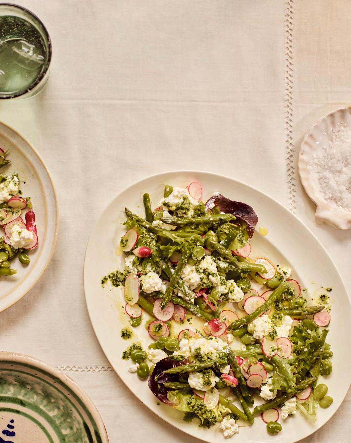
The combination of early broad beans, radishes, asparagus, wild garlic and a heady mix of mustard salad leaves showcases the best ingredients spring has to offer. The addition of fresh curd cheese brings a little decadence and is a nice contrast to the rest of the dish.
150g broad beans, shelled
A bunch (about 200g) of asparagus, trimmed and cut into bite-sized pieces
100g radishes, thinly sliced
100g mixed mustard salad leaves
150g fresh Jersey curds
(you could also use sheep or goat’s curd)
1 Bring a pot of salted water to a boil. Add the shelled broad beans and asparagus and cook for a minute and a half. Drain and rinse with cold water to stop the cooking process. Set aside.
2 In a large salad bowl, combine the sliced radishes, asparagus pieces, broad beans and mustard salad leaves.
3 To make the wild garlic dressing, add the wild garlic leaves, pine nuts, grated Parmesan cheese and lemon juice to a food processor. Pulse a few times to roughly chop the ingredients, then, with the food processor running, slowly drizzle in the olive oil until you reach a smooth and creamy consistency. Season with salt and pepper to taste.
For the wild garlic dressing/pesto
50g wild garlic leaves, washed and roughly chopped 30g pine nuts
30g grated Parmesan cheese ½ lemon, juiced
120ml extra-virgin olive oil
Salt and pepper, to taste
4 Drizzle as much or as little of the wild garlic dressing as you’d like (leaving a little for topping at the end) over the salad, and toss again to evenly coat the ingredients.
5 Divide the salad among four plates, then top each one with a generous sprinkle of fresh Jersey curds, and a few extra spoonfuls of the wild garlic pesto dressing. Serve immediately.

Hugo Guest
Hugo Guest is the chef and owner of Glebe House Devon, a seven-bedroom guest house and restaurant in the heart of east Devon. Hugo’s food is heavily influenced by his years spent in Italy, and seasonality, locality and artisan techniques define the cooking at Glebe House. @glebehousedevon
Makes enough for four
Pollock is a sustainable but equally delicious alternative to cod or haddock, and lends itself perfectly to this recipe. The lentils act as a blank canvas for lots of yummy things to be cooked through them: a base soffritto of onion, celery and carrot remains constant, however the spring greens can be replaced by any other seasonal vegetable. A punchy aioli ties this dish together nicely.
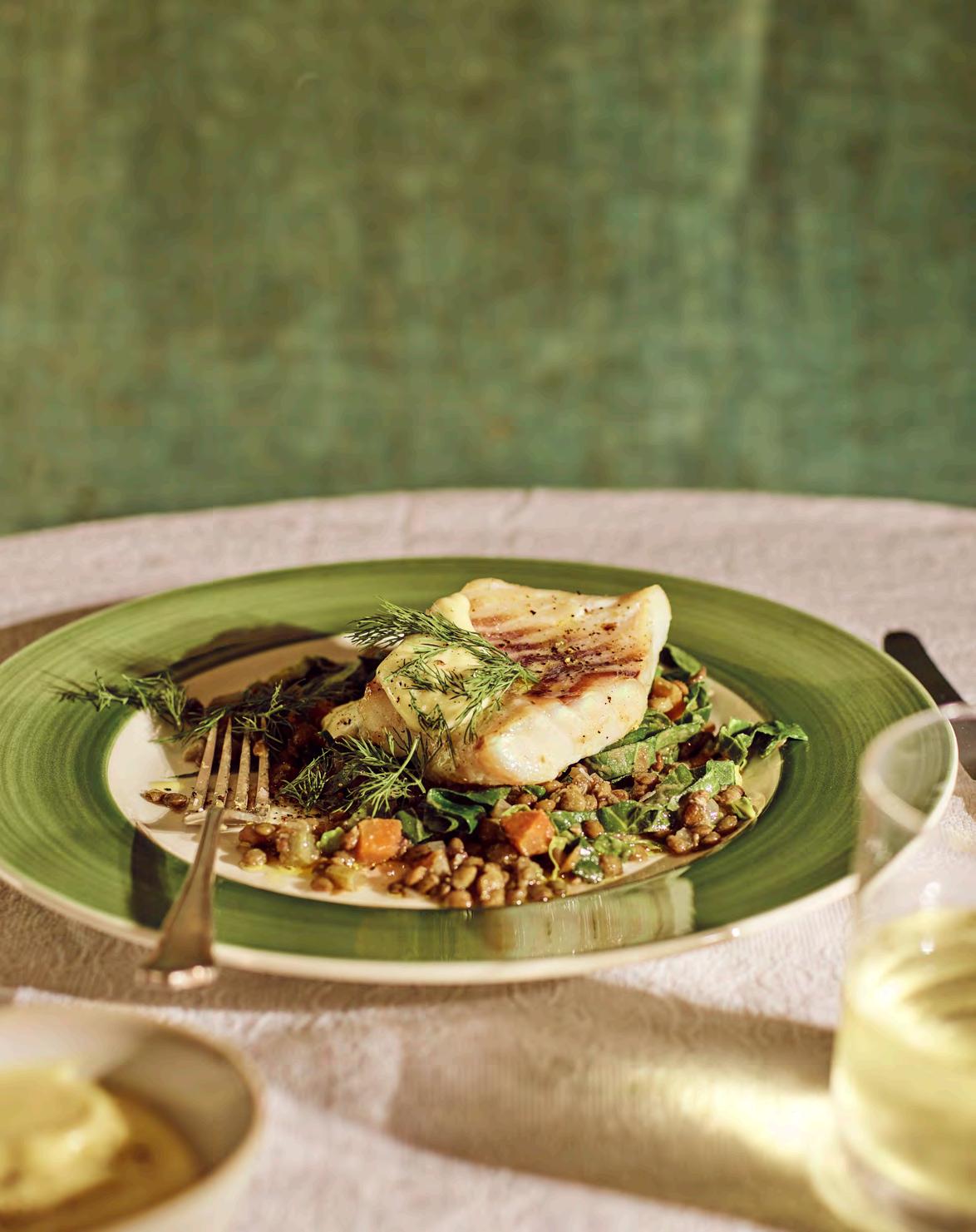
240g green or puy lentils
700ml water
A bouquet garni of thyme and 2 bay leaves
3-4 whole garlic cloves
1 onion, finely chopped
2 carrots, peeled and diced
2 celery stalks, diced
400g spring greens, shredded
1 lemon, zested
4 pollock fillets
1 tbsp olive oil
A handful of chopped fresh parsley
A handful of chopped fresh dill
Sea salt
For the aioli
3 egg yolks
2 large garlic cloves, finely grated or minced
30g Dijon mustard
A pinch of sea salt, plus extra to taste
450ml light olive oil
Lemon juice, to taste
1 Preheat the oven to 160°C.
2 To make the aioli, blitz together the egg yolks, finely grated garlic, Dijon mustard and a good pinch of sea salt in a food processor. While the motor is running slowly, drizzle in the olive oil in one continuous stream to create a stiff emulsion. When the mixture thickens, finish with lemon juice and additional salt if needed.
3 To a saucepan, add the lentils, water, bouquet garni and whole garlic cloves, along with the chopped onion, carrots and celery. Season well with salt (you want the water to flavour the lentils as they cook). Bring the mixture to a gentle simmer, then reduce the heat to low. Cover the pan and allow the lentils to cook for about fifteen–twenty minutes, or until they’re partially done.
4 Remove the bouquet garni and garlic cloves. Stir in the shredded spring greens and lemon zest. Continue to cook for a few more minutes until the spring greens have wilted, then transfer the lentils and greens to a suitable baking dish.
5 Drizzle the pollock fillets with olive oil and season with a good pinch of flaky sea salt, then place them on top of the lentils and greens.
6 Roast for approximately twelve minutes, or until the pollock is just cooked through (you can tell if it’s done when the skin peels off with ease). Allow the fish to rest for a few minutes.
7 To serve, spoon a generous portion of the lentils and greens onto each plate and top with a roasted pollock fillet. Finish with a dollop of aioli and a generous scattering of chopped parsley and dill.
Makes enough for eight to ten
This pudding holds a special place in our hearts as it was one of our first puddings at Glebe House when we opened. It combines tangy rhubarb jelly, a layer of booze-soaked sponge, creamy custard and fluffy whipped cream. You can use your preferred shop-bought custard and savoiardi biscuits (otherwise known as lady’s fingers) to save time. If you’d prefer to make them yourself, head to our website for the full recipe including how to make Hugo’s delicious custard and savoiardi biscuits.
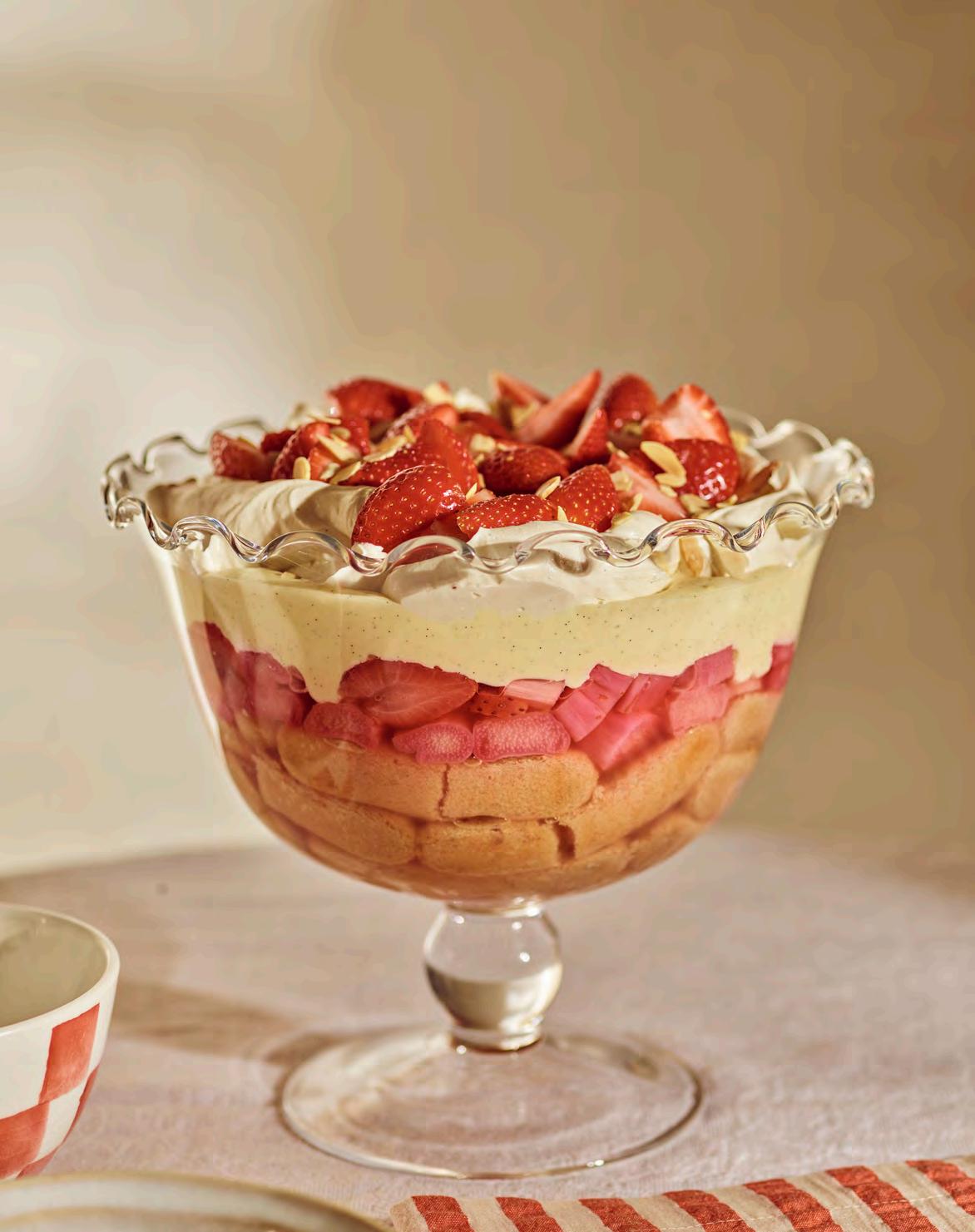
Find the full recipe, including how to make Hugo’s custard and savoiardi biscuits, here: neptune.com/trifle
For the rhubarb jelly
500g fresh rhubarb, trimmed and chopped
95g caster sugar
250ml water
1 orange, rind and juice
80g strawberries, hulled and thickly sliced
2.5 bronze gelatine leaves
Extra orange juice, to top up if needed
To make the juice for the jelly (start a day before)
1 Add the chopped rhubarb to a lidded casserole pot with the sugar, water, orange rind and juice and mix well. Cover and leave overnight at room temperature to allow the juices from the rhubarb to seep out.
2 The following day, preheat the oven to 140°C. Place the casserole dish (with its lid) in the oven and bake for around forty minutes, or until the rhubarb has softened.
3 Once cooked, remove from the oven, then add the thickly sliced strawberries to the rhubarb. Put the lid back on and leave everything to cool.
4 Strain the juice through a fine sieve and put to one side. Make sure you reserve the stewed rhubarb and strawberries as these will be added to the jelly for texture.
Assembling the trifle
1 Start by soaking the biscuits in the sweet dessert wine, then use them to create the first trifle layer in the bottom of your chosen dish – no deeper than a quarter of the bowl’s overall depth.
To top the trifle
Whipped cream (450ml cream, 1tsp vanilla extract, 60g icing sugar)
Flaked almonds, toasted
Fresh strawberries, diced
2 Now for the jelly. Soak the gelatine leaves in cold water for about ten minutes. In the meantime, take the rhubarb juice you made earlier – you should have about 600ml (if not, top it up with the extra orange juice) – and warm half of it to a low simmer. Squeeze out the water from the gelatine and whisk it into the warm liquid, then add the rest of the rhubarb juice.
3 L ay the poached rhubarb and strawberries (leftover from making the juice) on top of your sponge layer, then gently pour over the jelly mixture. Place the half-assembled trifle in the fridge until the jelly has set (this will take about three to four hours).
4 Once set, take the trifle out and pour over the custard. Chill in the fridge again for a couple of hours until set further.
5 W hen you’re ready to serve, whip the cream, vanilla and icing sugar together until soft peaks form, and either pipe or spoon the mixture over the top of the trifle. Finish by sprinkling with the toasted flaked almonds and freshly diced strawberries.
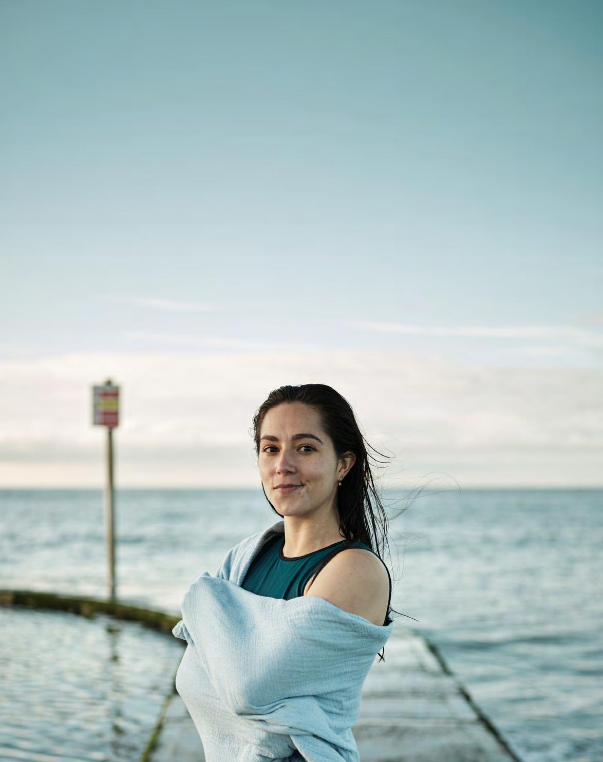
As a writer, I often worry about having the right words in the right moments. At a recent book event in Penzance, I spoke to an audience member about grief. He’d started sharing photographs of the sunrise with his daughter, who lives far away. It was a way to communicate that neither of them was sleeping, but still finding wonder in the world. After all, he said to me, doesn’t nature offer us all there is to say? And I totally agree.
In The Tidal Year, I wrote about my journey swimming in Britain’s tidal pools and also my journey with grief following my brother’s death. When I’m still searching for words, these are the books I return to. Here is a list of four gorgeous and – in my opinion – timeless books about the beauty of the British coast. Each by a writer who has found something very different in nature, whether that’s belonging, recovery, renewal, or solace from grief.
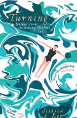
Freya photographed by Liz SeabrookJessica J. Lee (Virago, £10.99)
In Turning, Jessica J. Lee swims all of Berlin’s fifty-two lakes. I felt totally submerged in her obsession with the thrill of cold water swimming, and could really imagine her there on the edge of a lake, ready to crack the ice before diving in. Her journey inspired my own, and I’ve returned to this evocative book (and her descriptions of ‘cool as silk’ waters) often. Her doctorate in environmental history makes this book a unique combination of lyrical prose, history and ecology.
The Green Hill
Sophie Pierce (Unbound, £18.99)
Hermit
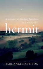
Jade Angeles Fitton (Hutchinson Heinemann, £18.99)
A stunning story about the healing power of nature. In Hermit, Jade explores how to find (and keep) solitude. I followed Jade’s journey through forested footpaths and along salted cliffs and would let her prose guide me anywhere. She writes beautifully about Lundy, an island off north Devon, which I’m also inspired by. I learned so much about the history of this magical place through her research and experience.
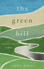
From the river Dart to moorland via Devon beaches, Sophie Pierce writes exquisitely about her local landscape. These are places she knew with her son and places she is getting to know, again, after his death. Amongst Sophie’s wanderings are letters she has written to him. I think people often avoid books about grief because they assume they’ll be sad, but this book is reflective, honest and celebratory. Her letters inspired me to write my own, which has been a healing creative practice. I’d recommend it to anyone approaching a loved one’s birthday. Pick up a pen, say hello.
Nina Mingya Powles (Canongate, £14.99)
As much as this book is about swimming, it’s also about belonging. Nina transports us to the bodies of water she has known in Malaysia, New Zealand and London. As well as her own experiences, she shares her dreams, and this book has a dream-like quality. It’s full of whales, earthquakes, stars, and the ancient lunisolar calendar. I love the fragmentary approach which seems to dip and dive back and forth in time. What comes to the surface most for me are Nina’s reflections on growing up between two cultures. What does it mean to belong? And where do you call home?
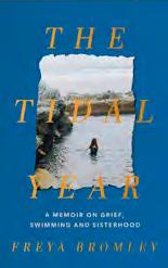
Freya Bromley (Coronet, £16.99)
The Tidal Year is a true story about the healing power of wild swimming and the space it creates for reflection, rewilding and hope. Freya swam in every tidal pool in Britain in a year with a friend. The adventure takes them from a pool hidden in the cliffs of fishing village Polperro to the quarry lagoon of Abereiddi. An exploration of grief in the modern age, it’s also a tale of loss, love, female rage and sisterhood.
Take a tour around your home and the one thing you’ll find in every room is lighting. Be it the kitchen, the bedroom, a study or your living room, whatever the function of the space, at some point it will need to be lit. Not only is good lighting a necessity, but well-chosen designs can change the look and feel of a scheme at the flick of a switch. And in the same way that investing in the right handbag can make a simple outfit look a million dollars, beautiful lighting is an easy way to give any interior a boost.
Even in the spring and summer months, there will be north-facing areas that feel gloomy without proper lighting, and according to Lauren Quelch-Woolls, head of product at Neptune, a variety of sources that can be fine-tuned independently give a room the ability to transform from day to night all year round. ‘All our ceiling lights are compatible with dimmer switches, which are a necessity,’ she notes, ‘and our new table lamps have dimmers too, so the light can be adjusted to your preference or requirements.’
Good lighting is just as important in the brighter summer months as it is during winter, says design journalist Claudia Baillie, not least because a beautifully shaped or textured lamp brings both style and light to a room.
As well as offering such functionality, Neptune’s spring/summer 2024 lighting collection is crafted from a palette of natural materials including raffia and rattan, as well as shapely ceramics in glossy and textural finishes guaranteed to add richness and character to a space. ‘We were heavily inspired by the coast, but instead of obvious references, we wanted to create an organic collection that feels soothing and elemental,’ continues Lauren. ‘Scalloping is key, and we translated this trend in our own way, ensuring that our designs remain timeless rather than overly decorative.’
The Marina raffia pendant, she says, is a highlight, as are the woven rattan Athena lamps and the new ribbed glass Malton lighting collection. The Caspian table lamp (available from May) is one of Lauren’s favourite designs. ‘The glaze is a beautiful deep green, and the uneven surface adds real movement.’
The coastal theme continues outside with the solid brass Emerson wall light with ribbed glass shade, which has recently been rated for exterior use. ‘The great thing is that the lights can all be styled in bedrooms, living rooms and kitchens alike,’ says Lauren. ‘The pieces are incredibly versatile, and we can’t wait to see how people use them.’
Opposite: Malton table lamp
When it comes to the interior and exterior design of our stores, we look to discover the beauty in what’s already there through renovation, restoration and rebuilding, as these three store-stories reveal.
Location, location, location was the buzz phrase when it came to our Chesham store in Buckinghamshire, situated on a busy road next to a stream, because as design director Fred Horlock observes, the 1950s building itself was ‘pretty awful’. Indeed, it was so awful that the design team determined to demolish it and erect a new building that followed the footprint and structure of the original Victorian timber mill, Canada Mill, that had once occupied the site.
Plans were soon drawn up for a solid flint wall, which referenced the traditional building materials of the local area, and cedarclad sides to add a contemporary edge, while architectural details such as the jutting lucarne dormer window referenced the mill’s working heritage. At the front of the two-storey building, a double-height window panel took pride of place, creating a cross-section slice through the space and flooding the store with light.
entire site was flooded. But, undeterred, the team installed wire-framed gabion baskets filled with rubble to give stability to the riverbanks and allow plants from the stream to take root and flourish. What had once been an ugly, unkempt stretch of water is now an attractive feature of the site. It was also one of the improvements the council noted when the finished store was later awarded a heritage plaque.

Outside, the team’s biggest challenge was the nearby stream. It meant the ground was extremely boggy, and the foundations of the new building hit a number of technical difficulties along the way. At one point, the
As Neptune Chesham enters its seventh year after opening, the building has settled into itself. With plenty of windows, it’s light, bright and inviting. One spot that Fred is particularly pleased with is the Chichester kitchen-diner area, which was challenged with low ceilings and large beams that intruded awkwardly into the space. After much discussion, the team decided to play to the cosy nature, cladding the ceiling and beams with floorboard planks designed to look and feel like the underside of a floor of a traditional old cottage. ‘It created a warm and inviting room without feeling claustrophobic,’ says Fred. ‘It’s probably one of my favourite spaces in any of our stores.’
Adilapidated Grand Marnier factory in a quiet village to the west of Paris was an unlikely spot for our latest standalone store, but it was just the type of place that Neptune partners Pierre and Francine Pensec were searching for back in 2020.
The couple already run the Neptune store in central Paris, so were familiar with our design ethos to breathe new life into an old or unloved building wherever possible. And that was just what they did with Neptune Neauphle.
Built around 1900, the industrial building had produced and housed the great vats of liqueur for the prestigious French brand.
But it had stood derelict for the past eleven years. Mindful of respecting the local community’s pride in the site’s former history, the Neptune design team wanted to create a space that felt sensitive and complementary while also showcasing the collections in warm, inviting spaces.
The original steel-framed windows were retained, just with improved glazing, and inside, the building’s industrial character was the starting point for the decorating scheme.

The relatively low-level ceilings and plentiful dark, narrow spaces were more of a challenge however, so the team opened up one of the original archways to create a full-height window at the front of the store, which let light flood in and allowed passers-by an inviting glimpse inside. Other than that, rather than fight the interior architecture, the designers made a virtue of the cosy, cocooning spaces, building an impressive cinema room-meets-snug, and using colour to draw customers along the passageways, such as the lure of a pink sofa positioned at the end of a narrow hall.
Such a delicately balanced brief required some inventive thinking. The exterior was left much the same – even the Neptune signage was positioned in the exact same spot that the Grand Marnier sign had hung.
But the pièce de résistance is undoubtedly at the back of the building, where the huge vats of cognac and orange liqueur would once have been mixed. Now, it’s a double-height gallery space with a stunning mezzanine kitchen display reached by a newly installed staircase. Magnifique, as Pierre and Francine might say.
When George III visited Cheltenham in 1788 to take the waters, it secured the town a place in Georgian history. Often described as ‘Britain’s most complete Regency town’, it was a place that felt instinctively right to open a Neptune store in. So, when an old pub on a street just off the historic high street became available, the building’s complete lack of interior charm didn’t put off the design team.
Instead, they set about a considerable restoration project. The double-fronted property was Grade II listed but, in the intervening years, an unsympathetic extension had been added to one side of the building and, inside, most of the internal walls had been removed to create a large, open-plan venue, complete with sticky pub carpet. ‘We wanted to make it look like it should have done,’ explains design director Fred Horlock.
helped the team map out the property’s original floor plan. A hallway with dining and drawing rooms off to either side was duly reinstated.
The extension was also resolved and the symmetry of the window arrangement, a classic element of Georgian architecture, was restored. Keen to get the details historically accurate, the designers worked with renowned plaster restorers Stevensons to research the appropriate architrave designs and plasterwork for the building’s age. Even the garden area was redesigned in a more formal style in keeping with its Regency heritage.

There were very few clues as to what had once existed, bar a fireplace on the ground floor which the team retained, but they worked with the local heritage officials who dug out the history of the building and
Today, the building feels warm and welcoming.
The original windows are relatively small but lend a cosy, moody light to the spaces, which are decorated in a timeless Neptune colour palette. But, as with all successful interiors, there’s also an architectural visual surprise. Venture upstairs and you’ll discover a Chichester kitchen scheme sitting under the oak beams of a lofty vaulted roof that the team decided to expose. A light and airy space – just what the Georgians would have approved of.
This is
In both fashion and interiors, stripes are regarded as chic statements, adding precise pattern to a scheme and bringing order and connectiveness across a range of materials, colours and designs. Here, the refined proportions of the classic George sofa, with its scrolled backrest and subtle pin-tuck tailoring, are refreshed and re-imagined in Fermoie’s red Carskiey Stripe heavyweight linen, one of the new fabrics available at Neptune as an upholstery option on both the George sofa and Rupert footstool and also as a fifty-centimetre square cushion.
For our full sofa collection, visit neptune.com/sofas
Opposite: George sofa in Carskiey Stripe by Fermoie / Scatter cushion in Cove by Fermoie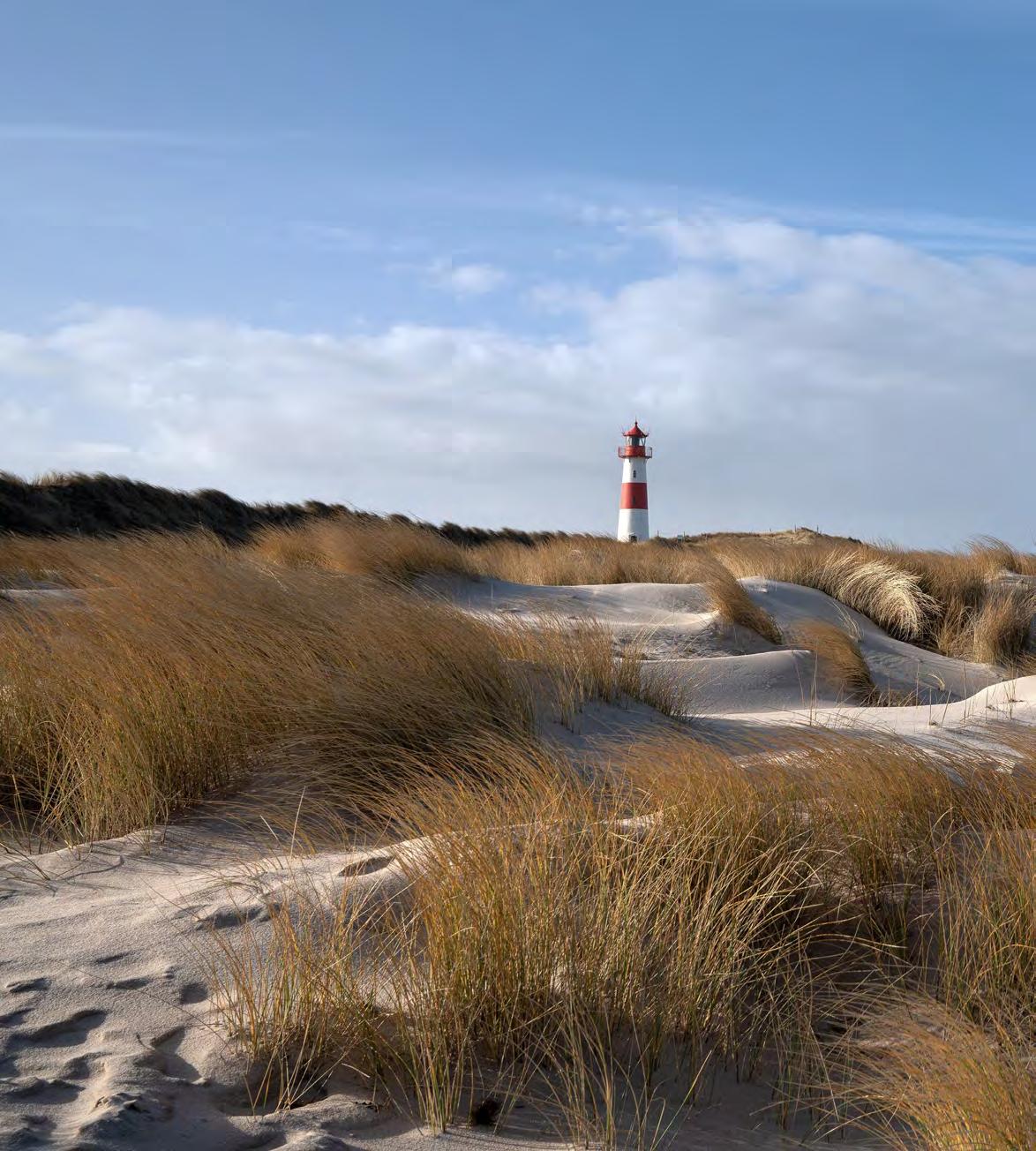
A stalwart of the sand dunes that fringe much of our British coast, the marram grass that thrives on them is an eco-wonder in its own right, as author Alice Vincent reveals.
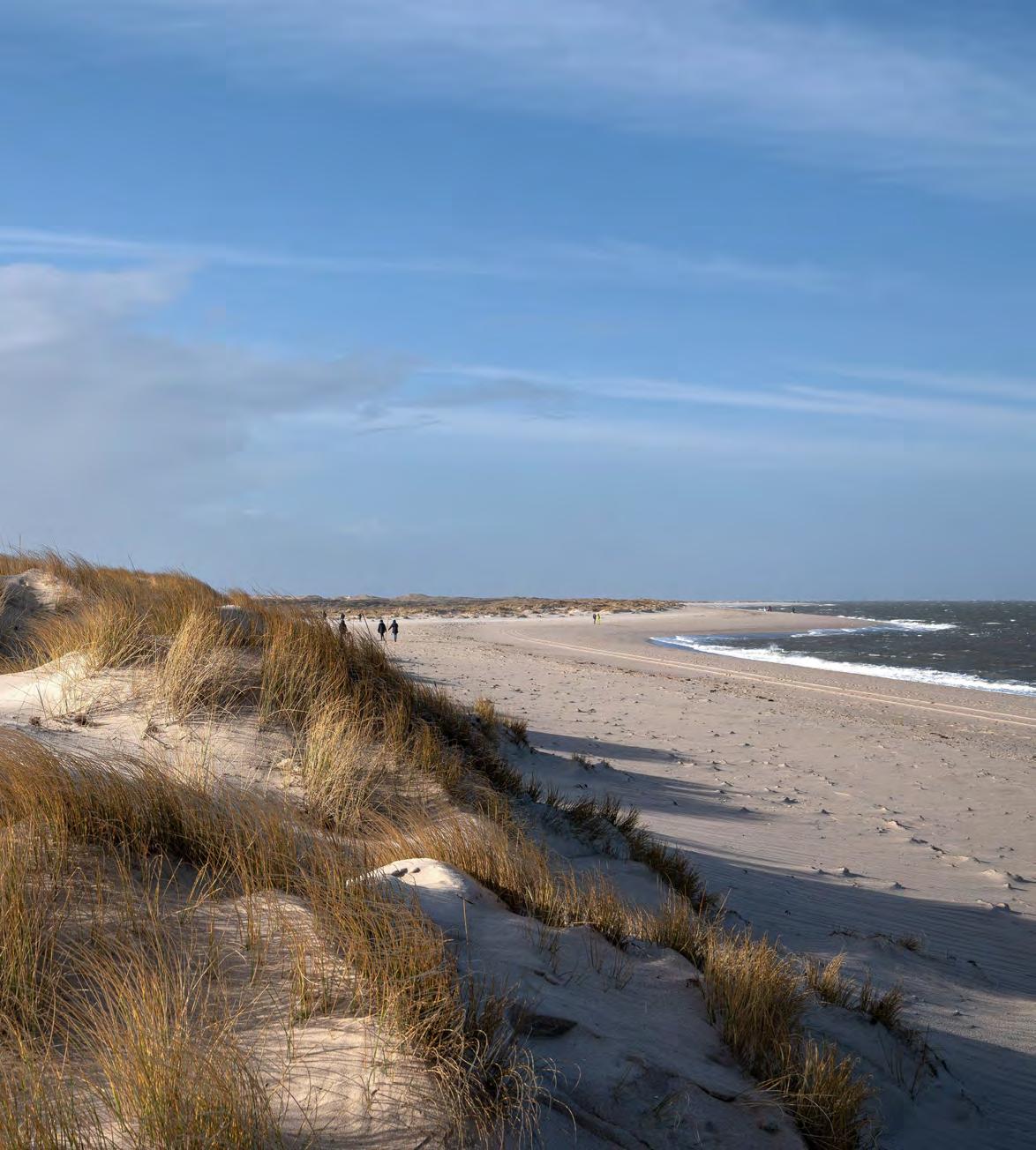
Afew years ago, in the depths of January, I travelled alone to the Northumberland coast for an off-grid break in a cabin. I spent the short days walking beneath the clearest, coldest blue skies I’d seen in a while. The beaches in Northumberland are vast stretches of white sand made all the more expansive by the lack of people on them. They’re separated from field and rock by dunes, and some of those dunes are smothered in marram grass. Under the right conditions – blue skies, bright sunlight – the plants conspire to look otherworldly: an enormous, swaying fringe of gold and green. A gateway to the churning waters beyond.
British coastlines are intricate ecosystems like any other part of the country’s landscape, but among the offerings of the sea, plants can be overlooked. And yet it is here, among some of the toughest weather conditions faced by the natural world – turning tides, thunderous wind, the salty residue of what washes upon our shores – that nature can be wildly ingenious.
Marram grass is a good example. This ferociously tough grass grows where little else would be able to, and in the process, creates a habitat for other plant life to exist. Beneath the sturdy tussocks of elegant green spines lies an elaborate – and tenacious – root system. A mass of long roots grows deep into sand dunes from far-reaching rhizomes, enabling the marram grass to hold tight where other plants would lose grip. In doing so, it also traps the sand. The grass provides a scaffolding to protect the dunes, and the sand gives the grass somewhere to make a life.
And it’s a beautiful one: while marram grass flowers in the school holiday months of July and August, those yellow spears reflecting the sand below, the tough green stems remain standing all year round. To see them is to know the coast is near – without, necessarily, seeing the sea. Among the shifting undulations of the dunes, the grass conjures a nostalgic sense of freedom and wilderness. It was on the marram grass-clad dunes of Sligo’s Streedagh Point that Sally Rooney’s Normal People was filmed; in the swaying ripples of the landscape, youth, longing and love collided.
The grass has also been brought inside and, for centuries, was fashioned by hardy hands into roofing thatch, baskets, ropes, cushions, and brooms. Though here lies a cautionary tale: in 1695, harvesting marram grass was banned after its removal led to the breakdown of the dunes themselves. As sand broke free of this precious boundary, it smothered the farms and villages beyond. It’s a worthwhile reminder of the power of this plant.
Our new Orkney White paint shade is a tribute to the pristine sands of the cluster of North Sea islands just off the Scottish coast. Tresness beach on the isle of Sanday is probably the best known for its stripe of white sand edged by wind-whipped dunes, but there are other, equally unspoilt spots that might be considered the North Sea’s best kept secrets. Here are a few of our favourites.
Rackwick Bay, Orkney
A shallow valley on the island of Hoy surrounded by cliffs and hills, on a sunny day, Rackwick Bay can be the hottest spot in the Orkney islands. The pinky-white fine sand beach is strewn with sea-smoothed boulders and overlooked by a scattering of historic crofts.
Sylt, Germany
Part of the Frisian Islands, Sylt is often described as the North Sea’s answer to Martha’s Vineyard. A UNESCO World Heritage Site, its miles of white beaches are dotted with Strandkorb: the iconic blue and white striped canopied beach chairs that add to the old-world elegance of this German holiday destination.
Moskenesøya, Norway
On the northern side of Moskenesøya island on the west coast of Norway is one of the North Sea’s most remote beaches. Bunes beach, a curve of white sand set against soaring cliffs, is only accessible by kayak or boat from the picture-perfect fishing village of Reine, but worth the two-kilometre hike to get there.
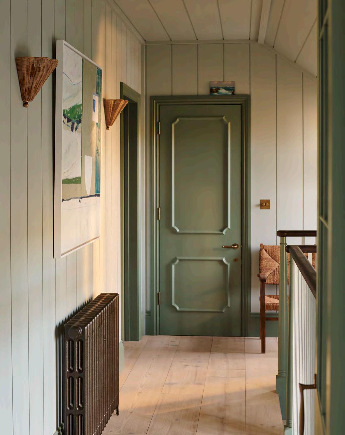
As its name suggests, shiplap boarding has nautical origins. Since Viking times, it’s been used to build boats, keeping them watertight. Today, it’s often stylishly adapted for our homes as robust wall panelling that’s a warmer alternative to tiles.
It’s especially useful where you want to improve sound quality and insulation. ‘While it won’t block out noise completely, it does offer some soundproofing and warmth,’ says Neptune’s interior design lead, Simon Temprell. ‘And you can enhance the effect by putting a thin layer of insulation between the wall and the panelling.’
Shiplap is much more than just a practical choice though. It has endless potential for transforming a room. Neptune’s Cranbrook shiplap has been a mainstay of the collection for several seasons, as Simon explains: ‘Panelling always elevates a room, making it feel luxurious. Cranbrook has an architectural feel and can dramatically lift the mood of a characterless room; we use it wherever we want to create a rustic or coastal look, or make a space feel cosier.’
There are various ways to decorate with shiplap, and Simon adds that he loves using Cranbrook in unexpected settings, such as on ceilings, for extra impact. ‘It’s laidback but strong on personality, so you don’t need a
With its raw timber texture, shiplap boarding is the contemporary way to do coastal. Interiors writer Amy Bradford explains how to use it in your home for maximum impact.
lot of it to make a statement,’ he continues. ‘Use it to clad a feature wall or a chimney breast to create a focal point. It also looks great in a farmhouse- or Shaker-style kitchen to contrast with tiles or installed in a bathroom up to dado height; the raw texture makes the room feel warm and inviting.’ Shiplap even has a place in bedrooms as a finishing touch behind the bed, adding contrast to a statement headboard. ‘It can also make a huge difference in rooms with low ceilings if used vertically,’ Simon points out. ‘The upward lines give the impression of height.’
Made from spruce, Cranbrook comes in a washed paint finish that reveals the timber’s natural grain; left just as it is, it nods to Scandinavian interiors and windswept beach cabins. If you add paint on top, it can chime with any style of décor, traditional or modern. Whites and neutrals make for a crisp, classic coastal feel, while dark colours shift the mood to contemporary, says Simon. ‘Add wall lights – or concealed lighting strips at the top or bottom – to accentuate the texture.’
Quick and easy to install, shiplap is effortless to look after, requiring little beyond occasional light dusting and vacuuming. Clean in summer and cosy in winter, it’s a year-round wonder for walls.
A team volunteer day planting a hedgerow in the Brecon Beacons to support our partner charity Stump Up For Trees, turned into a jolly good adventure
The January day dawned clear, crisp and cold as six Neptune team members set out to take part in a volunteer initiative supporting our partner charity Stump Up for Trees (SUFT) as they planted a new hedgerow on a hillside farm in Wales.
Heading westwards that morning to meet the SUFT team was Neptune co-founder John Sims-Hilditch, CEO Aalish Yorke-long, design director Fred Horlock, head of people and culture Erica Downham, head of marketing Harry Melsom and employment engagement specialist Simon Bye. Decked out in multiple layers of old walking clothes (and even some 1990s ski gear), the team were keen to find out for themselves more about the work of SUFT and help where they could.

Readers of Stories Vol 18, might recall that Neptune partnered with SUFT in 2023, inspired by the woodland creation charity’s long-term approach to ecological restoration – planting trees and hedgerows to suit the local wildlife and environment and then nurturing them into maturity. While the charity’s vision is holistic, with a focus on surveying, designing and nurturing projects, in only three years, it has planted 235,000 trees. By the end of the Neptune volunteering day, that number would have swells by a further 1004 trees.
Arriving at the fifth generation-run farm to be greeted by farmers Jim and Kate Beavan, the team were temporarily silenced by the ‘breath-taking’ beauty of the setting. ‘The farmhouse was nestled between hills and mountains,’ recalls Fred. ‘There has been a farm there since 1100AD which has never formed part of an estate,’ adds Harry, ‘so it still retains its individuality.’
But with work to be done, there wasn’t much time to admire the architecture and after an important safety briefing which included warning against getting poked in the eye by cane marker-stakes when bending over to dig, the six-some were soon hiking up a rather steep hill heading towards their task.
Over the course of the day and sustained by a lunchtime break for steaming spiced butternut squash soup provided by Sarah at Neptune’s Provenist cafe, the team planted eleven varieties of saplings, including hawthorn, cherry, willow, crab and oak trees, carefully selected to create a diverse environment for the wildlife and to support long term development of the hedgerow.
Working on a steep incline, wedged between a barbed wire fence (to keep inquisitive sheep away from the young plants) and a row of prickly brambles, it was a precarious business, but the team set to it with relish and by the afternoon were admiring the 1km of hedgerow and trees they’d planted.
All that remained was a restorative tipple of the farm’s famous cider before the volunteers headed home with aching shoulders and cold toes, but as Erica notes, ‘on a massive high’. Altogether, a splendid adventure.

Back at their desks, a few of the volunteers reflected on the experience.
Erica Downham: ‘What stayed with me is just how knowledgeable the SUFT team is, from sustainability to conservation to woodland management. And I loved the idea that not only will our hedgerow provide a safe travel corridor for wildlife but by including willow trees we can support animals’ natural instincts –who knew that when sheep have problems with their feet, they instinctively know to eat willow leaves.’
Harry Melsom: ‘We had some fascinating conversations during the day with the SUFT team, ranging from the gender of trees to developments in gene sequencing to find more resistant strains of the ash tree. They understand that ecology must work with agriculture, so they are pragmatic and approach rewilding and tree planting as something that needs to work in harmony with the economic needs of farmers.
Plus, I discovered that the repopulating concept isn’t new. Apparently, after one sea victory, Lord Nelson visited the area and was appalled at the destruction of forests to build his navy. He immediately initiated a programme to plant 6,000 more oaks.’
Fred Horlock: ‘Planting our 1000th tree of the day was a special moment but above all, I realised that it is quite simple to plant trees, and anyone can do it and make a difference for future generations. The samplings we used were small and easy to handle, between 10cm and 40cm high, which gives a high success rate, according to the SUFT team. I like gardening anyway, but this volunteering day has made me inclined to do even more.’
Find out more about our partnership with Stump Up For Trees at neptune.com/meaningful-plan


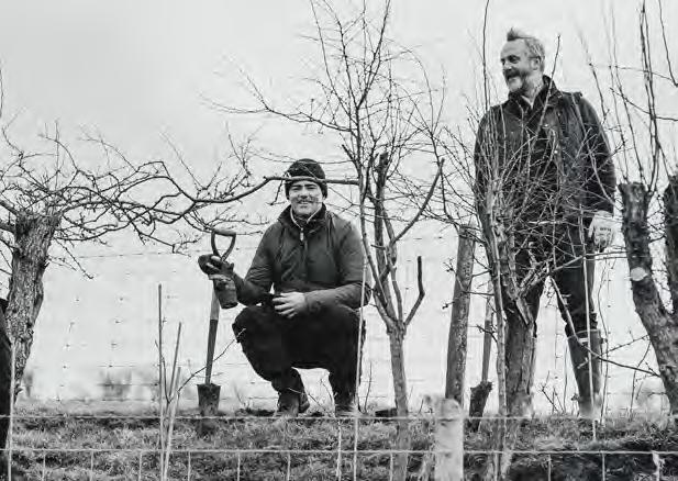
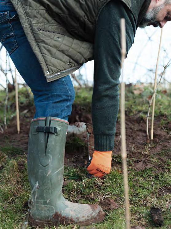

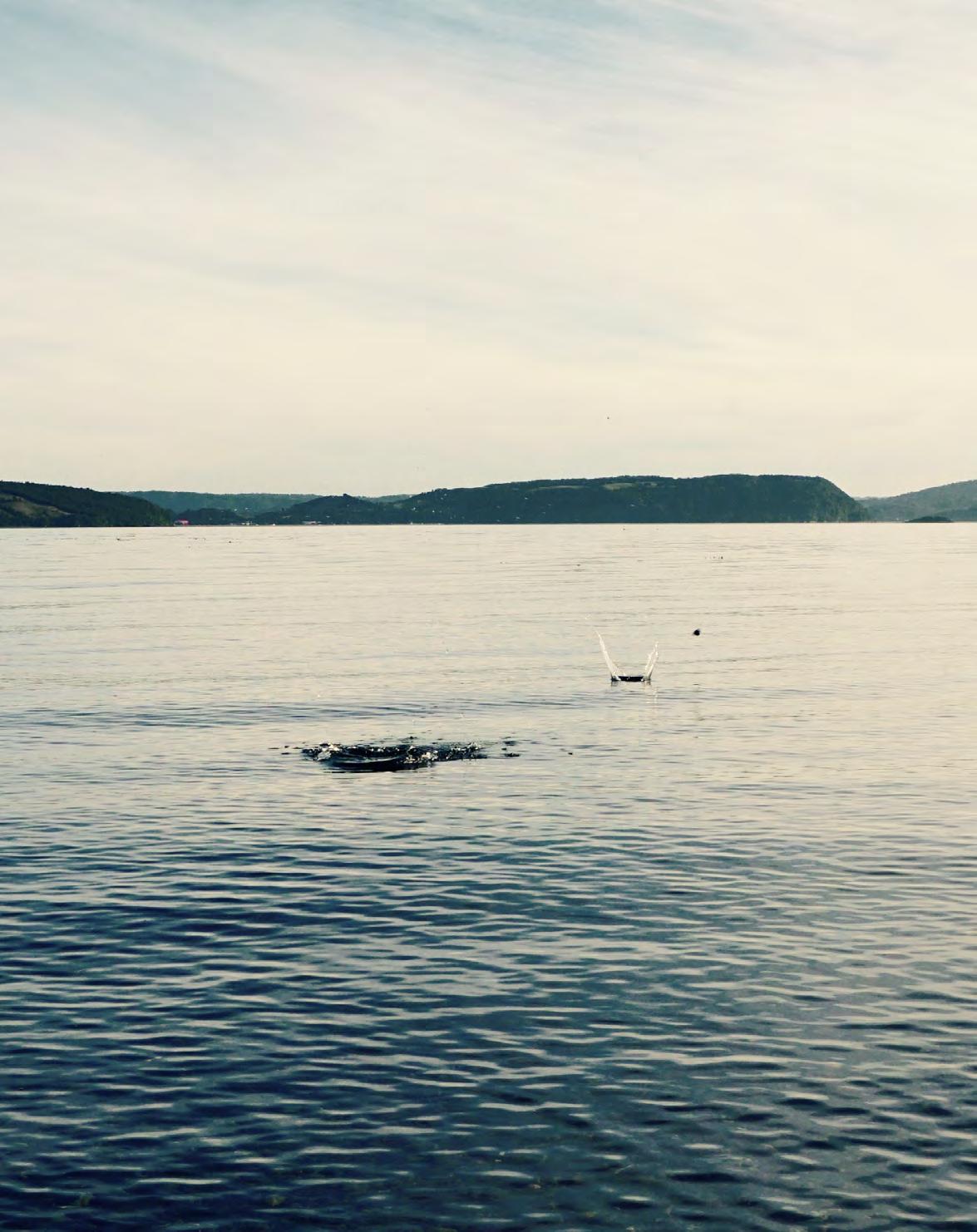
On a dank September morning in 2023, on the remote Hebridean island of Easdale (with a population of just seventy), an international tournament was underway. Competitors had flocked from around the globe to take part in the World Stone Skimming Championships.
Using small pieces of the island’s slate (Easdale is one of the Inner Hebrides’ Slate Islands, which produced roofing slate from the seventeenth century right up to Victorian times), their goal was to hit the back wall of the flooded quarry lake, some 206 feet away. On that wet Sunday morning, it was a local lad, sixteen-year-old Finn Dower from Perthshire, who won the competition with a cumulative score of 557 feet for his three attempts.
While such a feat might be beyond most people’s achievements, here’s how to tally up a respectable number of skips of a stone.
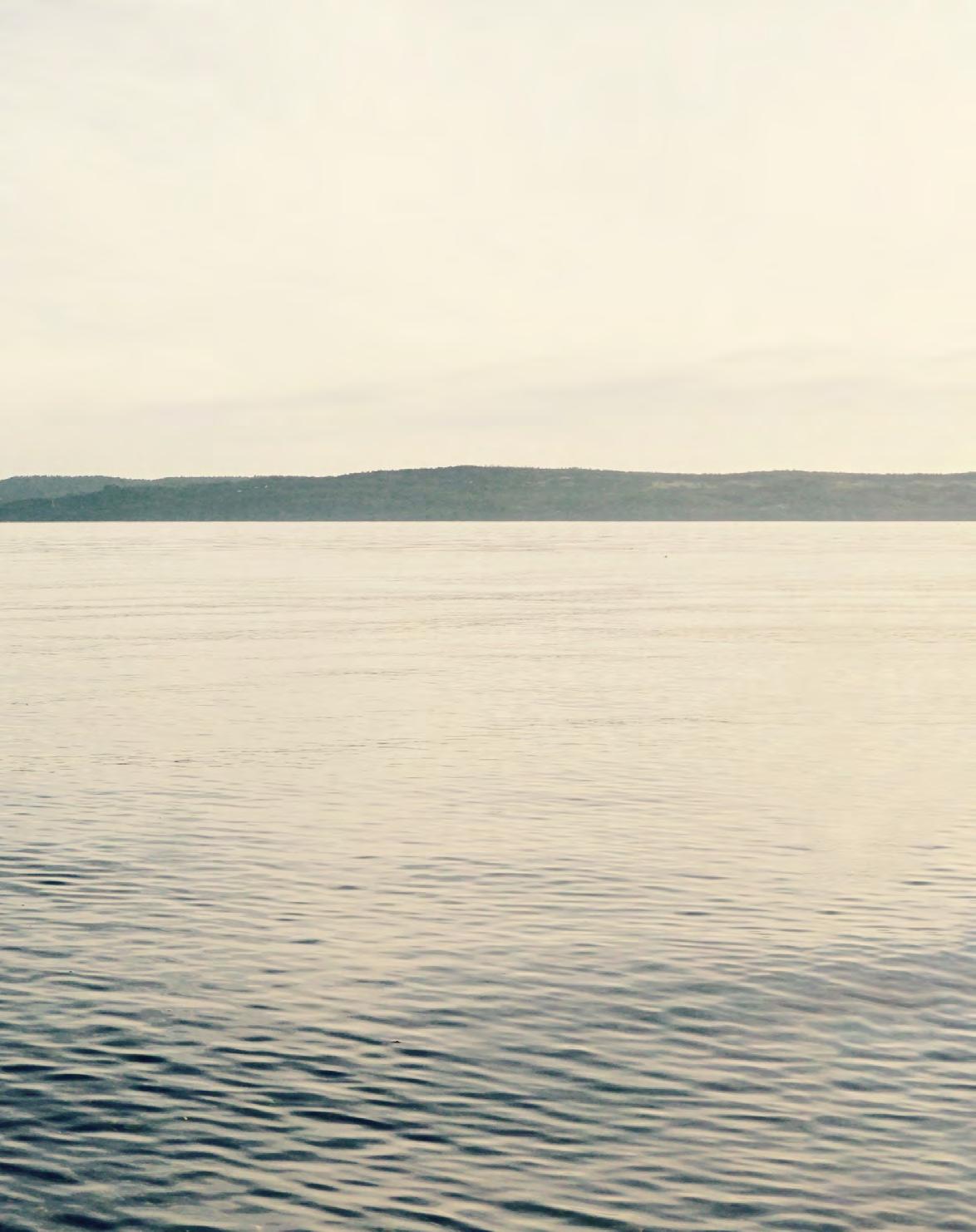
1 The preparation
You’ll need a calm stretch of water and a cache of smooth stones that fit easily into the hand. Look for ones with a slight corner that you can curl your finger around. Flat with a gently curved bottom is best. If there’s a wind, opt for a slightly heavier stone, or select lighter stones on a calmer day (though too light and they might catch on the wind resistance and flip backwards).
2 The physics
For the stone to bounce on top of the water, it must travel fast enough to hit a ‘minimum velocity speed’ to stop it sinking. It also needs to be spinning to stabilise the stone. As it hits the water, it loses energy, but it also pushes the water downwards which creates a lift force making a rebound bounce possible.
3 The throw
Before throwing, wet your fingers to maximise friction. Turn sideways to the water and angle the stone at forty degrees to prevent it ‘bombing’; too deeply angled and there’s too much friction between stone and water. Draw your arm backwards and throw with a flick of the wrist at the last moment. And remember, it takes practice!
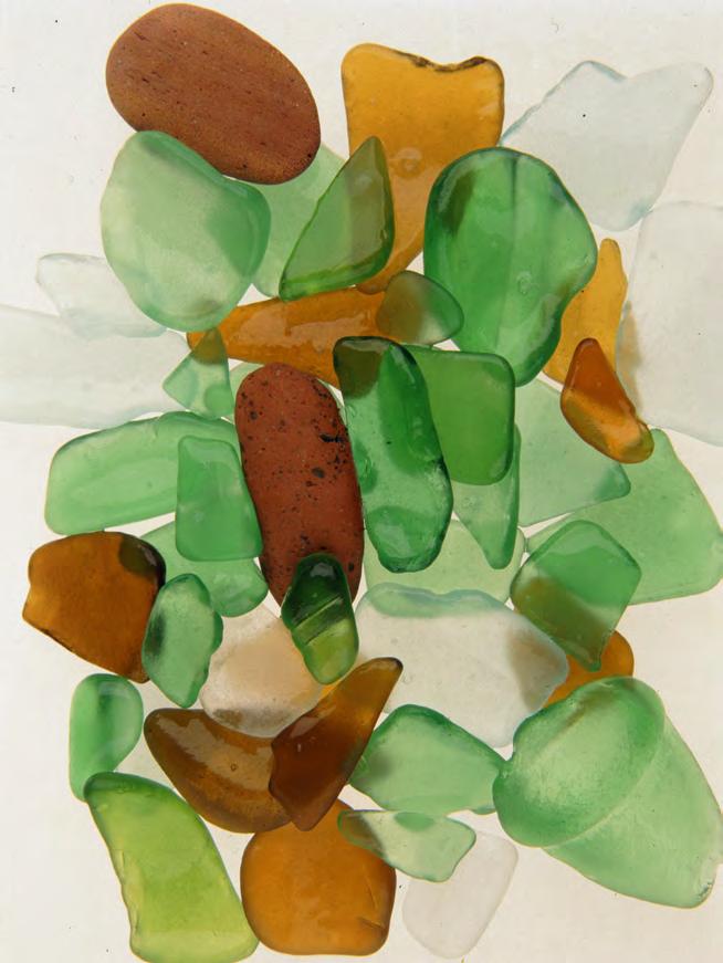
Writer Jo Rodgers contemplates the simple coastal past time of hunting for sea glass.
Aneighbour in Firle told us about Tide Mills beach, an undeveloped, deserted stretch of coastline south of Lewes in East Sussex, otherwise we never would have known about it. To get there, you park your car by the A259 and carry all of your stuff – towels, snacks, kids – over a railway and past the strange ruin of an eighteenth-century village (the eponymous Tide Mills), to a clear run of pebbled beach on Seaford Bay. There are no concession stands or bathrooms or privacy of any kind, and what she (the neighbour) actually said was ‘you will love it so long as you don’t mind seeing a lot of half-naked acquaintances’, which is a good summing up of the atmosphere.
After swimming, you need to make your own fun. People take out paperbacks; unpack fried-chicken-and-coleslaw sandwiches from the Flint Owl Bakery. Sometimes someone will try to sunbathe on top of the gumballsized rocks, which are always sliding downhill. My husband, Andrew, and I have young children, so our family goes beachcombing for sea glass. It’s not an activity that I would have chosen, pre-kids, but now I can’t get enough of it. The drama of scavenging is instantly familiar: one of those time-warpers than funnels you into your own childhood, like the smell of those wooden tongue suppressors, or eating Babybel waxed cheese. We pick around the stones, scanning for loot, and rate the finds according to colour: frosty greens, blues and whites are common; amber is rare; pinks and purples only ever seem to happen to other people. Someone told me that cobalt-blue sea glass, which I’ve never found, can be the result of ye olde poison bottles, flung by bearded Victorians.
The smoother the glass the better, of course, since rounder edges might indicate an older specimen. Thousands of shipwrecks in the English Channel contribute to the takings at Tide Mills, as well as centuries of people walking along the busy ports in the southeast of Britain and dropping their wine bottles, crockery, and Coca-Colas into the ocean. I hate to think of us being united as litterbugs, but there it is. Another reason to collect what washes up.


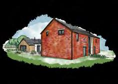

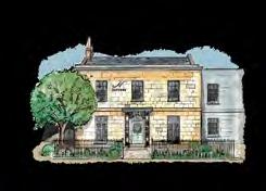
Our stores are spaces to relax in, just as you would in your own or a friend’s home. They are inspirational places, too, thoughtfully curated to showcase our approach to design. So, while we hope you enjoy looking through this volume of Stories, we look forward to meeting you in person, too.
Find your nearest store neptune.com/our-stores
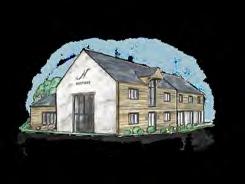
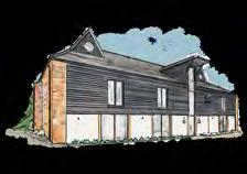
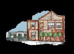


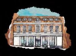
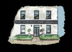
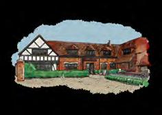

UK
Bath BA1 5BD
Belfast BT7 3GB
Bristol BS8 2QY
Bury St Edmunds IP33 3PH
Cambridge CB22 7PX
Canterbury CT1 3TY
Cheltenham GL50 4DW
Chesham HP5 1NG
Chester CH2 4JR
Chichester PO20 2EW
Chiswick W4 4HH
Colchester CO3 8LT
Edgbaston B15 3AA
Farnham GU9 0BB
Fulham SW6 2TD
Guildford GU1 3AJ
Hailsham BN27 1DQ
Hove BN3 4QD
Knutsford WA16 8TA, Reading RG10 9SA
Southport PR4 6JA
Tonbridge TN9 1RF
Weybridge KT13 8DX
Wimbledon SW19 1RX
Winchester SO21 1HL York YO32 9TW
Yorkshire Outlet WF17 6JF
Wiltshire Outlet SN5 8YG
Store in store:
Neptune by Treehouse Midmar, Aberdeen, AB51 7NB
Neptune by Creative Classics, Ayr, KA7 2HD
Neptune by Sims Hilditch, Bath, SN14 8JR
Neptune by Woods of London, Blackheath, SE3 0TA
Neptune by Robert James Interiors, Coventry, CV8 3HB
We
have Neptune stores across the UK, Ireland and Europe. To see all of our homes, visit neptune.com/our-stores
Neptune by Hunters, Derby, DE1 1SY
Neptune by Richard F Mackay, Edinburgh, EH11 2SG
Neptune by Malone & Smyth, Co. Fermanagh, BT92 9BL
Neptune by Bridgewater Interiors, Gateshead, NE8 2AJ
Neptune By Closa, Tetbury, Glos. GL8 8AA
Neptune by Aberford Interiors, Leeds, LS25 3DP
Neptune by Appleyard, Norfolk, NR25 6AR
Neptune by Wilton Kitchens, Salisbury, SP2 0HX
Neptune by Holloways, Worcestershire, WR6 5DE
Neptune by Bradley Gardens, Wylam, NE41 8JH
IRELAND
Neptune by 1933, Co. Meath
Neptune by Browsers, Limerick
Neptune by Global Village, Dublin
Neptune by Global Village, Wicklow
Neptune by The Orchard, Co. Kildare
Neptune by Trevor Morrow, Co. Mayo
Neptune by Castle Cabinets, Kilkenny
FRANCE
Neptune Paris
Neptune Neauphle
Store in store:
Neptune by Etat d’Esprit, Cannes
Neptune by Beaumont Chamborand
Neptune by Fabrica, Eymet
Neptune by Mi Figue Mi Raisin, Forbach
Neptune by Rosiris, Granville
Neptune by Just Kitchens, Miélan
Neptune by Hérick
Aménagement Nantes
Neptune by Etat d’Esprit, Pertuis (Provence)
GERMANY
Neptune Berlin
Neptune Fellbach
Neptune by Wooden Empire Neptune Köln
Neptune Tegernsee
Store in store:
Neptune by Helma Interior, Heidelberg
AUSTRIA
Neptune by Steinwender, Wien
BELGIUM
Neptune by O&V Home Interiors, Seneffe
ITALY
Neptune by Adi Arredamenti, Brescia
Neptune by Forteshire, Forte dei Marmi
Neptune by Forteshire, Milano
LIECHTENSTEIN
Neptune by Allure, Vaduz
SPAIN
Neptune by Sacarello, Gibraltar
SWITZERLAND
Neptune by Thomas Homes, Luzern
Neptune by Styles Interiors, Rolle
Neptune by Friolet Interiors, Zurich
Neptune by The Classic House, Weteringbrug (near Schiphol)
We do everything we can to make sure Stories is as environmentally sound as possible. The paper we use is all FSC-certified as coming from responsible sources, and is also carbon balanced by the Woodland Trust.
Please note that, while the colours shown in this volume are as accurate as possible, they will not always precisely match our paint shades.