3 minute read
Paint


on trend
Advertisement
Geometric feature walls
Can’t decide on a colour for your feature wall? Then opt for a few. Geometric feature walls add impact and fun to any space. Go for something muted like this wall, or choose bold, contrasting colours if you’re feeling brave. Take your time to map out where one colour ends and another begins and buy good-quality painter’s tape to get those nice sharp edges.

Wall, cupboards, splashback and stool are all colours from the Dulux Reset palette. Stylist: Julia Green. Photographer: Armelle Habib.
Give your Concrete a Colour It Australia Makeover


COME IN & SEE OUR HUGE DISPLAY AREA
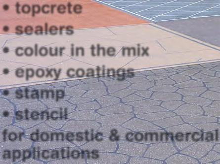
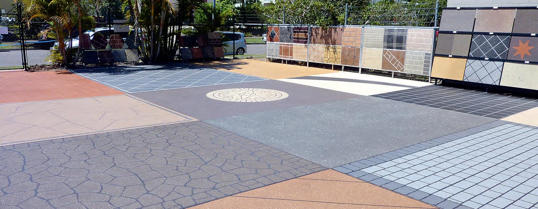
• topcrete • sealers • colour in the mix • epoxy coatings • stamp • stencil for domestic & commercial applications
24hr display: 20 Endeavour Dr, Kunda Park PHONE: 07 5445 2399 E: sales@ciaconcrete.com.au www.ciaconcrete.com.au
QUESTION: DO I NEED TO USE A PRIMER? Answer: Always use a primer on a surface (whether that’s a wall, trim, furniture or other material) that has never been painted before. If you’re repainting, you should also use a primer on a surface that has become porous, or is so worn that it has an uneven finish.
COLOUR BASICS Having trouble choosing your paint colour? According to the experts at Dulux, colour isn’t that complicated, and once you know the basics, creating a palette that works in your home is easy. Understanding the following will help get you on your way to choosing colours with confidence: • Temperature: Colours are divided into two groups – warm and cool, and these aff ect the
mood of a room. Warm colours such as red, yellow and orange draw attention to a space, while cool colours such as blue and green are soft er on the eye and make a space feel larger. • Tone: This refers to a colour’s lightness or darkness (adding black to a colour darkens it, adding white makes it a lighter tone). Light tones make a space feel airy while darker tones add sophistication and moodiness to a room. • Hue: This refers to whether a colour is primary (red, blue and yellow), secondary (a mix of two primary colours) or tertiary (a combination of primary and secondary colours). • Lighting: Natural and artificial light change the way a colour looks in a room. Cool whites and neutrals suit rooms that have loads of natural light and big windows. Rooms that are darker or on the side of the house that gets less natural light are best painted with warmer whites.
TIPS • Nervous about colour? When you’ve got your colours chosen from your colour card, go for a shade lighter – when you paint the colour on the wall from the sample pot, sometimes it will look darker than the swatch. • Don’t be stingy with sample pots – get lots of samples and take your time deciding which colours look best. • Don’t use the pot to paint a wall; instead, paint a board and hang it on the wall and move it around the room to see how the colour looks against the other elements in a space.
Our advantages: • No Demolition • Scratch, Stain and Heat Resistant • 10 Year Warranty
Follow us Call us or visit our showroom for a free design consulta on
3/4 Access Crescent, Coolum Beach, 4573 Ph 07-5446-4548 Visit us www.granitetransforma onsqld.com.au
QBCC Licence number 1308566