1 minute read
Digital Sketches Version 2


31
Digital Sketches
Advertisement
Version 2
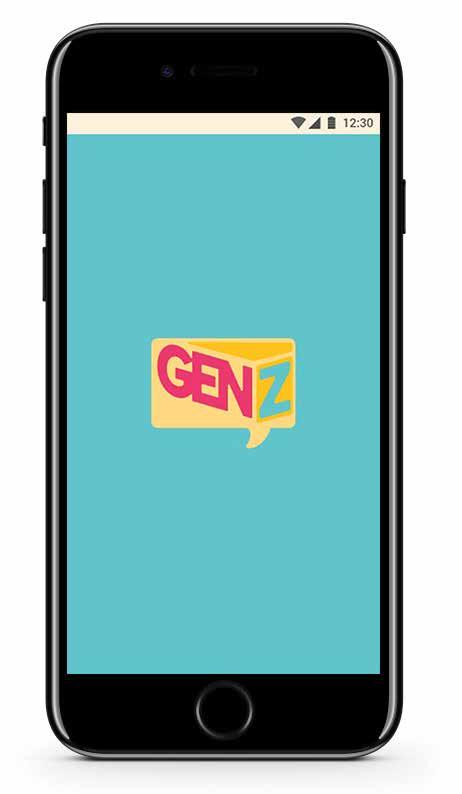
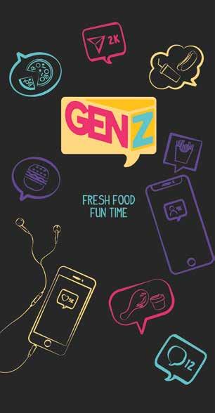
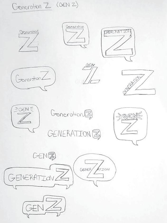
The “GENZ” logo design that pointed outward in between the middle and looked like a 3D rectangle was the design that worked best for GenZ because it represented a physical location that you could see go to. Adding the text bubble around the type allowed me to incorporate the technology aspect in with the location aspect. Making the text bubble 3D at the top and 2D at the bottom added a bit of an illusion to the logo.