#139
Cover Story: SKP Chengdu, China
Retail Lighting
Andrea Hartranft Light + Building Review



LITE - THE EXCLUSIVE UK PARTNER FOR GOBOSERVICE
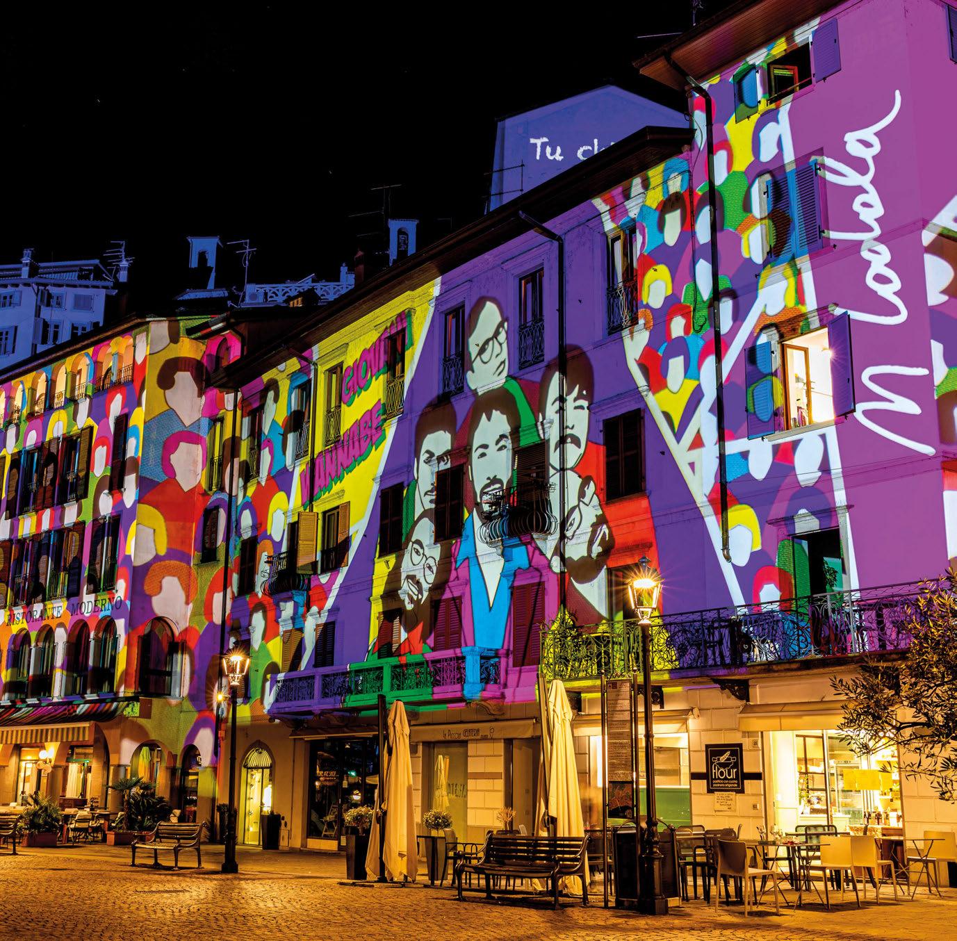
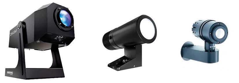
Goboservice, is a trusted manufacturer of custom gobos and low-power, high-definition projectors that illuminate buildings, streets and businesses. Known for their high performance and impressive brightness, Goboservice’s gobos and projects are suitable for a wide range of indoor and outdoor use, with the capability to project images, logos, symbols and signals across a plethora of applications.
Sales@lite-ltd.co.uk | www.lite-ltd.co.uk
Illumination that takes your breath away


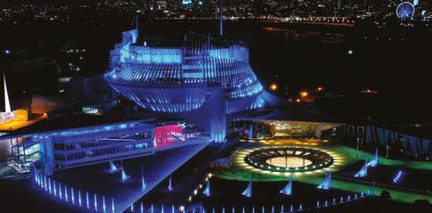
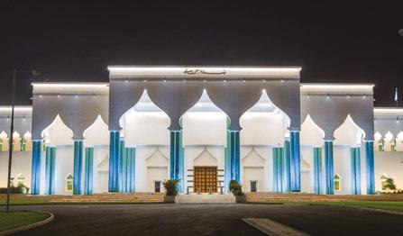




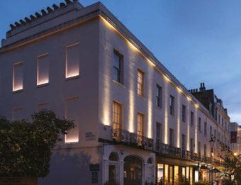


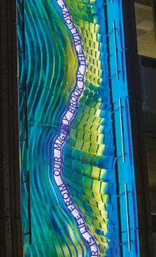
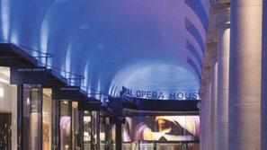


The world’s most iconic architecture deserves premier facade lighting solutions to match. Lumascape is proud to o er a full range of best-in-class luminaires and control systems to transform any building into a dazzling display of performance art with the power of light.


Learn more Visit lumascape.com

+44 (0)20 7471 9449 sales@pharoscontrols.com pharoscontrols.com 272 Gunnersbury Avenue London, W4 5QB United Kingdom @pharoscontrols DYNAMIC LIGHTING CONTROL
Pharos Architectural Controls - celebrating its 20th anniversary year in 2024 - is an award-winning and independently owned British manufacturer of dynamic lighting control solutions for architecture, themed entertainment, and other specialist industries. Our hardware and software solutions are designed and built in-house, backed by a 5-year warranty, and supported by an experienced technical team.
Pharos products are trusted to run day and night, illuminating iconic installations around the world - from international landmarks and historic architecture to theme parks, airports, stadiums, bridges, shopping malls, art installations, and more.


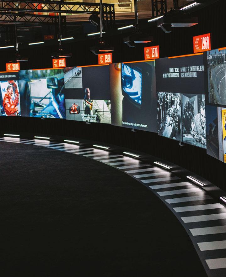
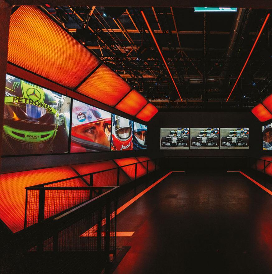
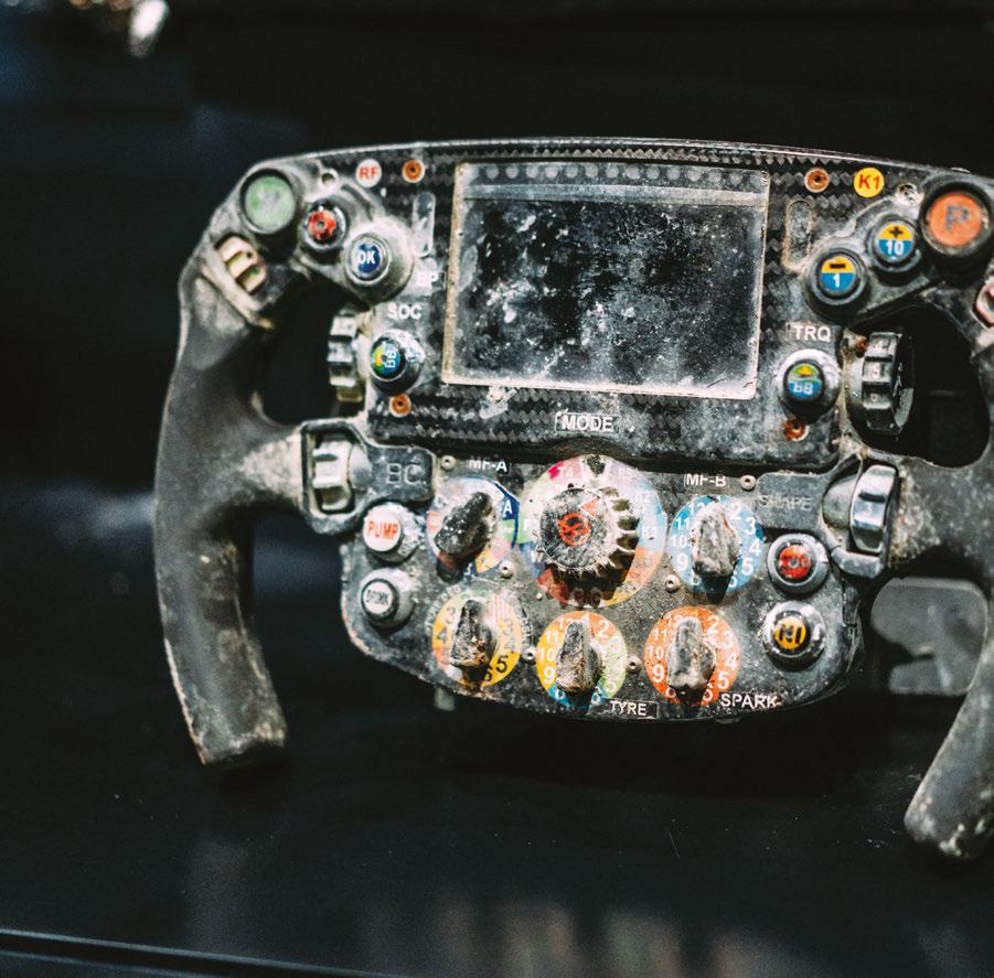
The F1® Exhibition
Photography: The F1® Exhibition

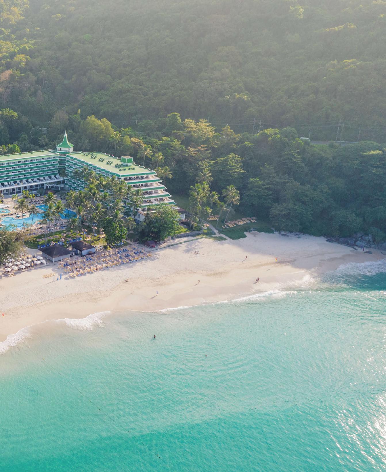
The next session: 24 – 26 September, 2024 Le Meridien Resort Phuket, Thailand www.darcsessions.com A series of events connecting the very best people creating exceptional lighting projects around the world. For more information contact Jason Pennington: j.pennington@mondiale.co.uk
For specifiers and suppliers of global lighting projects
IALD ENLIGHTEN EUROPE 2024 LIGHTING DESIGN CONFERENCE
21 - 22 JUNE · 155 BISHOPSGATE ·
A vital part of the lighting design industry’s leading conference series, IALD Enlighten Europe 2024 takes place in the vibrant city of London this June.
In addition to a two-day agenda of informative seminars, educational sessions, and hands-on workshops, attendees will see the return of popular and professionally beneficial Enlighten conference features, including:
Innovative Keynote Speakers•Social Receptions
Lighting Cross Talk•Exhibitor Demonstration Tables
Member Meetings•Region + Chapter Gatherings
IALD Education Trust Student + Educator Recognition
Join hundreds of the world’s best and brightest professionals as they converge in London for IALD Enlighten Europe 2024, and get ready to #IlluminateTheFuture of the lighting design industry.
Information and registration at iald.org/ee24

ILLUMINATE THE FUTURE

LONDON, UK
Pieces of Heaven

stay connected
#LEDmadeinGermany
#LEDplayedinBerlin
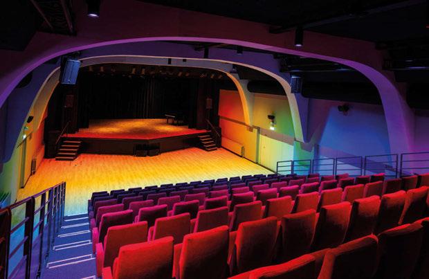
Studio 14 is open. rbb rearranged their studio in the 14th oor of the rbb-Fernsehzentrum in the city center of Berlin, Germany. Intended to be a studio as well as a club, a restaurant, an eventlocation and a large scale meeting room, the Studio 14 invites people to be closer to heaven.
Depending on the purpose of the room furniture the lighting can be changed between fun and functional.


schnick.schnack.systems /SchnickSchnackSystems @schnick.schnack.systems
Our rgbw-tiles D50 are used in clusters to lighten the room with an outstanding lightquality and to connect the ceiling to the sky.
Photo by KOY + WINKEL Fotografie


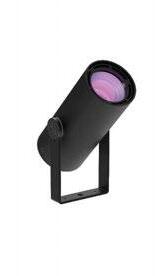






LED lighting solutions designed & made in the Netherlands since 2002 www.cls-led.com
> > > > > > >
Fidei Et Arti Oudenbosch, The Netherlands, Tholhuijsen Elektro
Discover the ColourFlow Series here:

Welcome
I’m writing this a couple of weeks removed from the sensational, 80s-drenched [d]arc night party, where we honoured the winners of the 2023 [d]arc awards, and what a night that was! It was the ninth edition of our annual awards party, the seventh that I have been involved in (it is my seven year “workiversary” this week - both the shortest and longest seven years of my life!), and I hope I’m not being too bold to say that it was our best one yet! The 80s theme really brought with it such a fun, vibrant and creative vibe, from the amazing installations throughout the venue (find out more about these later in the issue), to the wonderful outfits that everybody wore. When the [d]arc media team arrived at the venue adorned in our most ridiculous 80s-inspired garb, there was a fear that we’d be the only ones dressed up, which would only make us feel even more ridiculous, but you lot did us proud. The amount of shell suits on display may well have been a bit of a fire hazard, but big shout out to everyone who got into the spirit of the occasion!
Huge congrats to all of this year’s awards winners, especially Eugenia Cheng of LightOrigin Studio, who picked up the Best of the Best award for the amazing Artifact Bar. Eugenia has taken part in the Snapshot feature in this issue, so you can find out more about Artifact Bar, and some of her other beautiful projects in just a few pages. There’s been so much going on of late that our “eventful” trip to Frankfurt already feels like a distant memory. You’ve already heard about the immense travel disruption caused by the Lufthansa and train strikes (not knocking the strikers, support your local union); what this meant is that while some of the team got stranded in Frankfurt for a few extra days, myself and the arc sales team ended up booking an Uber for a short, 400km trip to Brussels to fly home from there. Big shout out to our driver Dieter for getting us out of dodge! The show itself felt like a return to form though; it was great to see so many cool new products, innovative stand designs, and familiar faces! We’ve got a recap of the show in this issue, which includes this year’s CoolKitList from Kevin Grant of LightAlliance, and the thoughts of Peter Earle, just a cool 10 years since his last comment piece for us! Enjoy the issue!
 Matt Waring Editor
 Front cover: SKP Chengdu, China (Image: Sybarite)
#139
Inside this issue
Regulars
Event Diary
Drawing Board
In Conversation
Peruvian designer Claudia Paz tells us about her new book.
Snapshot
LightOrigin Studio
Silhouette Awards
The winning mentees for the 2024 programme were revealed at L+B.
Marcus Steffen
On why we need to acknowledge the sales aspect of lighting design
GreenLight Alliance
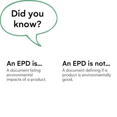
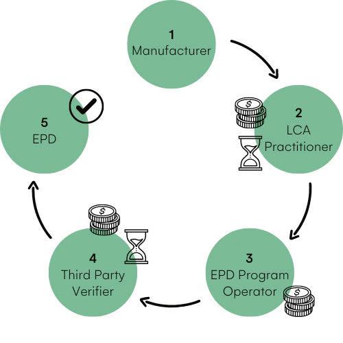
Learn more about the impact categories of EPDs, with some lighting examples.
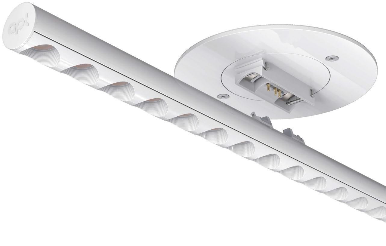
David Morgan Review APL LTwo
Manufacturer Case Studies
Bucket List
Ulrike Brandi
Eye Openers
Echoes of the Earth: Living Archive
Refik Anadol
The Moving Hues Studioplus
The Pearl Breakfast
Energy Dynamics
Jason Bruges Studio
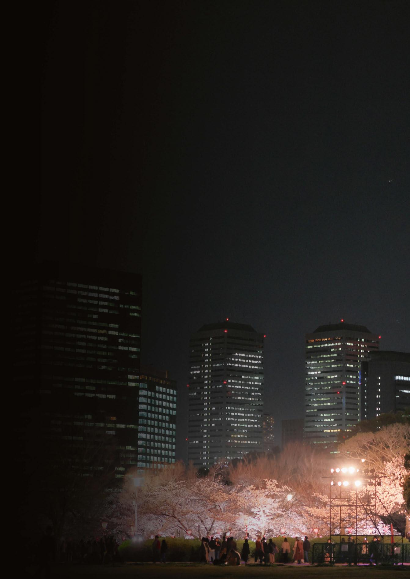
Tower of Osaka Castle
Motoko Ishii Lighting Design
Features
Jonathan Howard
David Robertson, Director at DHA Designs, reflects on the legacy of his colleague, Jonathan Howard.
[d]arc awards
From the amazing installations to the vibrant 80s theme, we look back on a successful [d]arc night.
Andrea Hartranft
The IALD President tells arc about her past, and the association’s future.
Carolina Florian
Florian shares how an environmentally responsible lighting strategy was created at Amaala, Saudi Arabia.
Light + Building Review
From the CoolKitList, to Peter Earle’s thoughts, to our own product picks, some of the highs of L+B.
Casambi Awards
The winners of the fourth annual Casambi Awards are revealed.
LEDucation Review
A look back at some of the highlights from the New York event.
Projects
SKP Chengdu
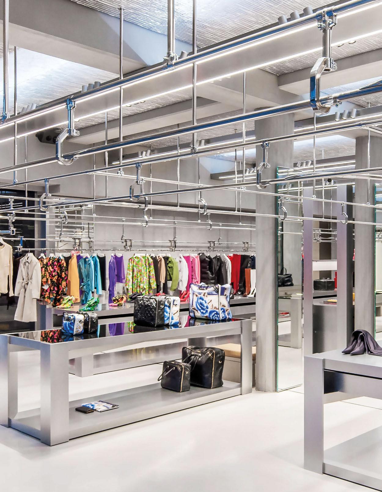
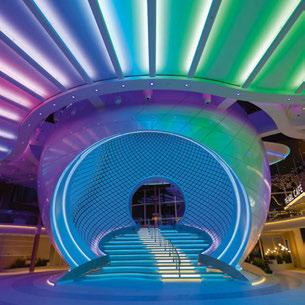
A vast new luxury retail space has been brought to life by Speirs Major Light Architecture.
Tiffany & Co - The Landmark
Tillotson Design Associates honours both the old and new at Tiffany’s flagship New York location.
Galeries Lafayette
Lighting by Nulty boosts the Shenzhen store’s “Breathing Fashion” concept.
Merlata Bloom Mall
L+DG Lighting Architects brings the vibrant DNA of Milan to this new mall.
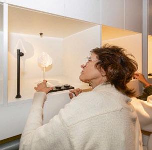
Luxury Watch Boutique Metis Lighting sought to enhance the aesthetic of this luxury retail space.



#139
Proudly Supporting
028 052 062 102 014 020 024 026 038 050 120 124 130 138
018 028 040 096 102 118 126 016 036 052 094 116 054 062 072 078 086
Light Panels
Bespoke backlighting solutions adding an extra dimension to translucent and decorative surfaces.
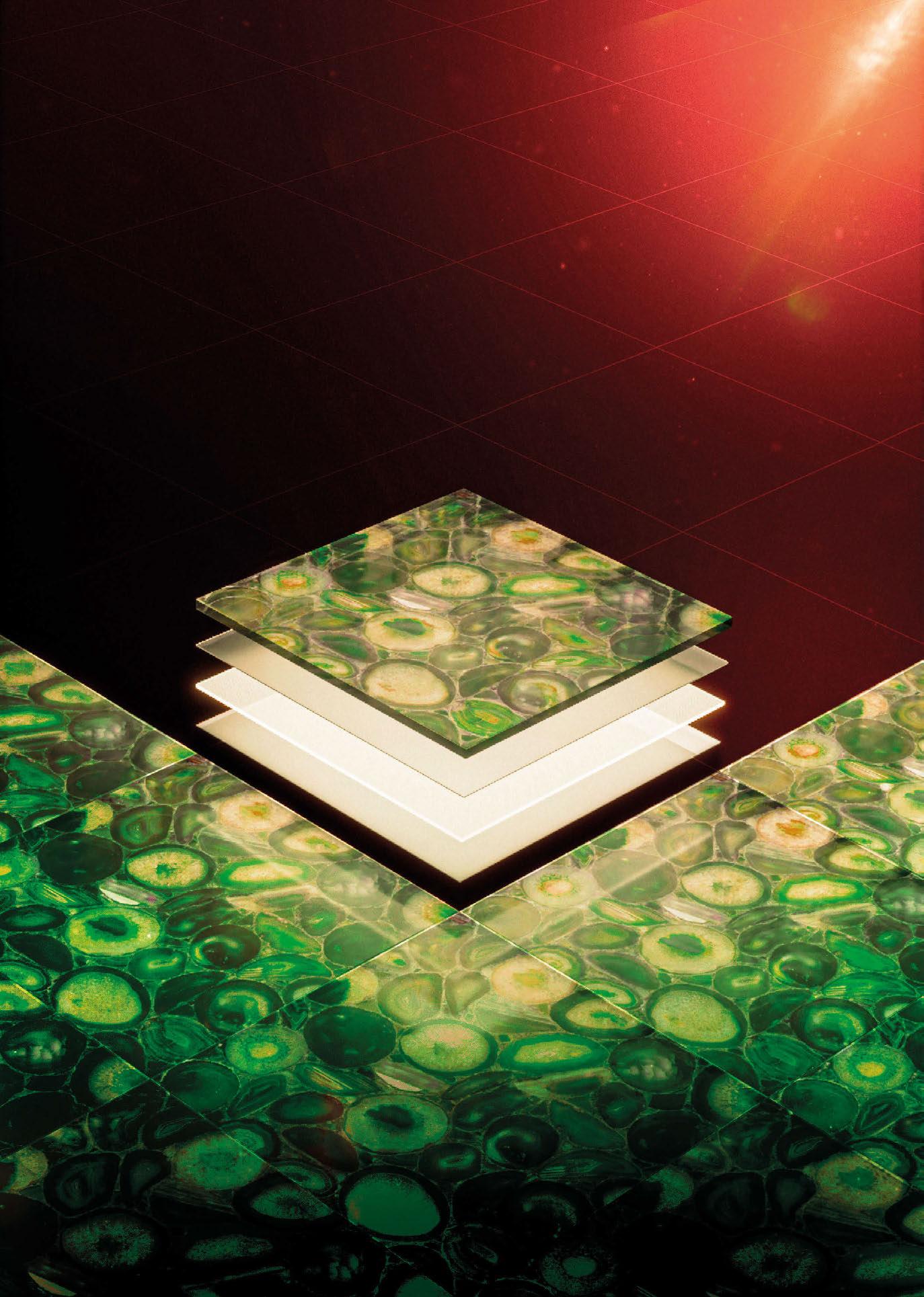
As featured in The Ivy Asia restaurants.
Factory
Greenside Way, Middleton, Manchester,
info@unibox.co.uk
& Showroom:
M24 1SW
Events Diary
MAY
Net Zero Lighting Conference
2 May
London, UK www.thelia.org
[d]arc sessions Europe
14-16 May
Troia, Portugal www.darcsessions.com
Clerkenwell Design Week
21-23 May
London, UK www.clerkenwelldesignweek.com
JUNE
GILE
9-12 June
Guangzhou, China
www.guangzhou-international-lighting-exhibition. hk.messefrankfurt.com
IALD Enlighten Europe
21-22 June London, UK www.iald.org
AUGUST
LEDforum.24 14-16 August
São Paolo, Brazil www.ledforum.com.br
SEPTEMBER
Plasa 1-3 September London, UK www.plasashow.com
ArchLIGHT Summit 17-18 September Dallas, USA www.archlightsummit.com
[d]arc sessions Asia 24-26 September Phuket, Thailand www.darcsessions.com
OCTOBER
IALD Enlighten Americas 17-19 October San Diego, USA www.iald.org
Hong Kong International Lighting Fair 27-30 October Hong Kong, China www.hktdc.com
NOVEMBER
LiGHT 24 20-21 November London, UK www.lightexpo.london
HIX
27-28 November London, UK www.hixevent.com
EDITORIAL
Managing Editor Helen Ankers h.ankers@mondiale.co.uk
Editor Matt Waring m.waring@mondiale.co.uk
Contributing Editor Sarah Cullen s.cullen@mondiale.co.uk
Online Content Creator
Ellie Walton e.walton@mondiale.co.uk
COMMERCIAL
Managing Director
Paul James p.james@mondiale.co.uk
Head of Business Development
Jason Pennington j.pennington@mondiale.co.uk
Media Sales Manager Andrew Bousfield a.bousfield@mondiale.co.uk
International Account Manager Ethan Holt e.holt@mondiale.co.uk
Events & Marketing Manager Moses Naeem m.naeem@mondiale.co.uk
DESIGN
Design Manager David Bell d.bell@mondiale.co.uk
Design Jez Reid j.reid@mondiale.co.uk
Production Mel Capper m.capper@mondiale.co.uk
CORPORATE
Chairman
Damian Walsh d.walsh@mondiale.co.uk
Finance Director Amanda Giles a.giles@mondiale.co.uk
Credit Control
Lynette Levi l.levi@mondiale.co.uk
[d]arc media ltd Strawberry Studios, Watson Square, Stockport SK1 3AZ, United Kingdom T: +44 (0)161 476 8350 www.arc-magazine.com ISSN 1753-5875
arc (ISSN No: 1753-5875; USPS No: 21580) is published bi-monthly by Mondiale Publishing, UK and is distributed in the USA by RRD/Spatial, 1250 Valley Brook Ave, Lyndhurst NJ 07071. Periodicals postage paid at So Hackensack NJ. POSTMASTER: send address changes to arc, c/o RRD, 1250 Valley Brook Ave, Lyndhurst NJ 07071. Mailed by Spatial Global Printed by Buxton Press · To subscribe, visit www.arc-magazine.com or call +44 (0)161 476 5580 014 / 015

Echoes of the Earth: Living Archive
London, UK
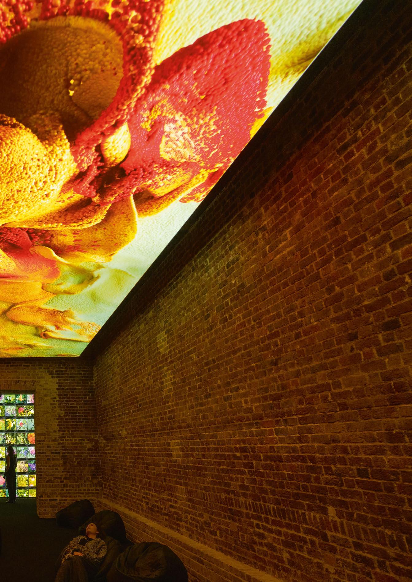
Internationally renowed artist, technologist, and pioneer in AI arts, Refik Anadol, has brought an exhibition of his new and recent works, titled Echoes of the Earth: Living Archive, to London’s Serpentine North gallery.
Known for his digital works and large-scale public installations that present real-time generative environments, Anadol’s collaborative creative process with AI plays on human perception. Echoes of the Earth: Living Archive presented this years-long experimentation with visual data of underwater landscapes and rainforests.
The exhibition, which ran from 16 February to 7 April, featured Artificial Realities: Coral (2023), an immersive installation enveloping viewers in an AI’s imagination of underwater landscapes.
For this artwork, Refik Anadol Studio trained a unique AI model with approximately 135 million images of corals openly accessible online.
Generating abstracted coral images, the AI constructs new visuals and colour combinations based on the dataset.
Anadol’s solo exhibition also featured the UK premiere of Living Archive: Large Nature Model – a new, site-specific installation that was first introduced at the World Economic Forum 2024 in Davos, Switzerland. At Serpentine North, the installation transformed the gallery into the AI model’s interpretation of a rainforest. It was the first installation in a growing body of work that is created employing ‘The Large Nature Model’ – the world’s first open-source generative AI model dedicated to nature. For this ongoing research, the artist work with the data of major institutions, including the Smithsonian Institution and London’s Natural History Museum. As additional data partners, such as universities, museums, foundations, government entities, and libraries join the effort, the model, centred around archival images of fauna, flora, and fungi, will expand over the coming years.
Taking the data that surrounds us a primary material, and using a neural network – a method of AI that is inspired by the human brain – as a collaborator, Anadol creates compelling visualisations of our digitised memories and expands the possibilities of interdisciplinary arts. His work explores the meaning of humanity in the era of artificial intelligence as well as

the challenges that ubiquitous computing has brought forth. He investigates the profound ways in which the dominance of technology in our daily lives alters our perception and experience of time and space.
Speaking of the exhibition, Anadol said: “I am thrilled to bring our Studio’s most ambitious AI art projects to date to the Serpentine. A ground-breaking initiative that we call the Large Nature Model, developed by our Studio, stands as the world’s first open-source, generative AI multimodal focused on nature, trained on an extensive and ethically sourced dataset of the natural world.
“Echoes of the Earth: Living Archive displayed multisensory artworks derived from this model, featuring visuals and sounds. Collaborating on such a significant project with my long-time mentor, Hans Ulrich Obrist, with whom I’ve shared many stages discussing the future of AI art, is an immense privilege.”
Bettina Korek, CEO, and Hans Ulrich Obrist, Artistic Director at Serpentine, added: “Refik Anadol brings art, science and technology together to create generative, immersive environments that fascinate, educate, and enchant audiences. This show kicks off a year of research and projects by the Serpentine Arts Technologies department focused on AI, and we could not be more pleased to collaborate with him.”
www.refikanadol.com
www.serpentinegalleries.org
eye opener
016 / 017

This March, the lighting design community was shocked and saddened by the unexpected passing of Jonathan Howard, Director at DHA Designs. David Robertson, colleague and fellow Director at DHA Designs, reflects on Howard’s legacy.
Jonathan Howard, who has died aged 58, was a director at DHA Designs for 30 years. He was a hugely respected and popular designer in the industry who has left a magnificent legacy.
Having studied Drama at Royal Holloway University of London, and at Central School of Speech and Drama, Jonathan worked at the Young Vic and Phoenix Theatres, learning the hands-on electrical and focusing skills that served him all his life. He then moved to Imagination, where he brought his theatrical flair to events, expos and motor shows, and an ambitious scheme for the Croydon skyline, way ahead of its time.
He completed the MSc in Light and Lighting at the Bartlett, where many fellow alumni are still well known in the business.
He joined DHA Designs in 1994, working on the QE2, where he was ‘forced’ to sail to New York, sampling the delights of its cocktail bar. He worked with David Hersey on large-scale projects in Las Vegas: in 1998, Jonathan used his technical wizardry to design the show accompanying the fountains of Bellagio. Using a floodlighting scheme reliant on manual colour scrollers, the entire floodlighting of this vast hotel changed colour and effect as the fountains danced; 25 years later it is still one of the most famous images of Vegas. Alongside architectural work, Jonathan moved into exhibition lighting, realising that the potential for his unique skill set could be applied to the museum sector.
As well as areas of the Millennium Dome and the Wellcome Wing, Jonathan was lighting consultant to the Royal Academy of Arts for years. DHA was the V&A’s FuturePlan lighting consultant, and he worked on more than 75 gallery refurbishments, including Medieval and Renaissance, Ceramics, Paintings and Miniatures.
His work was recognised with D&AD, Lux and Lighting Design Awards for the Atmosphere Gallery, and the façade lighting of the Science Museum. He mixed these with non-museum projects such as the One Aldwych restaurant and Weston Library, Oxford. Shortly after his death, Alexander Pope’s Grotto, an underground heritage project with bespoke candle sconces designed by Jonathan, received a Civic Trust Award.
Jonathan loved to travel and many of us recall fond trips with him to far-flung corners of the globe, where he could inevitably find the best restaurant. His work took him to museums in Oman, Miami and Philadelphia, the Stanislavsky Centre in Moscow, floodlighting a whole mountain (Jebel Buhais) in UAE and Hibiya Tower in Tokyo.
His ability to manage multiple projects with a pleasant demeanour was exceptional, even with challenging material, such as the recent Holocaust Galleries at IWM.
One of his greatest achievements was the relighting of Hintze Hall at London’s Natural History Museum, where he designed all architectural, exhibition and event lighting. He managed so many stakeholders in one of London’s most famous historic spaces with grace and positivity, and his loyalty to the NHM was reflected in his still working on six projects there when he died. He was especially proud of the Best of the Best [d]arc award he received that year for Hintze Hall as it was voted by his fellow lighting designers. Most of Jonathan’s museum and designer clients, he had worked with for more than 20 years, and the incredible tributes we have received have brought comfort at this sad time. His popularity in the industry was also reflected by the lovely messages of support from other lighting designers, including many who were trained by him. Will Salter, now a Senior Lighting Designer at Steensen Varming, recalls: “Jonathan was more than a colleague, he was a friend and a mentor. I learnt so much from working together at the start of my career, and his talent and passion for his work was infectious. His kindness and charm will be missed greatly.”
Jonathan’s work rate was prodigious as ever and he was always game for trying new things and not repeating himself. In the first three months of 2024 alone, he completed Legion at the British Museum; Lucien Freud at the V&A; William Blake’s Universe at the Fitzwilliam, Cambridge and Showtown in Blackpool. All received glowing reviews and are a testament to his incredible eye for detail.
Jonathan was a polymath who, while at DHA, also completed an Open University degree in Astronomy and got his Amateur Radio Licence. He had many followers on his Instagram blog, @jothebulb, which featured cocktail recipes. As his colleagues, we never lacked advice on food and drink, new technologies, the latest Apple products (and why he needed them) and occasionally, lighting. We will miss him enormously. www.dhadesigns.com
IN MEMORIAM
018 / 019
JONATHAN HOWARD


Roxana Rakhshani, now Senior Lighting Designer at Cundall, reflects on her former mentor:
“In loving memory of my dear former colleague, Jonathan Howard, I would like to take a moment to honour his remarkable qualities. Jonathan was not only a mentor to me, but also a source of inspiration and knowledge.
“With his curious mind, creative hands, and caring heart, he left an indelible mark on the field of lighting design and influenced and shaped my career as a lighting designer,
“Jonathan’s work was nothing short of mesmerising, akin to the ethereal glow of an aurora light. Each project he undertook was a testament to his artistic vision and meticulous craftsmanship. He poured his passion into every detail, setting ablaze the spaces he illuminated with an unparalleled dedication.
“Though Jonathan may no longer be with us, his brilliance and inspiration will forever be intertwined with the very essence of the lighting design community. Jonathan Howard will forever be remembered for his immense talent, his boundless creativity, and the deep passion he had for the transformative power of light. Each time I step into a space bathed in the glow of his creations, I am reminded of his unwavering dedication and the profound beauty he brought into the world.
“Jonathan, thank you for the invaluable lessons, the unwavering support, and the profound impact you had on my life. Rest in peace, dear friend, knowing that your artistic legacy will continue to illuminate the paths we walk.”
Hintze Hall, Natural History Museum
The Bellagio, Las Vegas
Alexander Pope’s Grotto, London
Medieval and Rennaisance Gallery, V&A, London
Jonathan Howard, collecting his Best of the Best award at the [d]arc awards, 2018
QUAD PERFECT
Superior color saturation. Smooth color and beam blending. Designed to suit any application.

Quad perfect™ is our patented technology that is engineered to create superior near field color mixing. This technology smooths the natural distribution of the quad chip orientation and reduces normal striations of linear quad chip positioning. When your color changing application demands the best color performance, Insight’s Quad Perfect™ delivers.


TM
Learn more

Peruvian lighting designer Claudia Paz has recently published a new book – Claudia Paz: A Lighting Designer out of the Box – that documents her career to date, with contributions from a range of high-profile lighting designers. Here, Paz explains the inspiration behind the book, and how it came together.
How did you first get into lighting?
While studying architecture at university, after having explored working in interior design, I had the opportunity to work for a company that distributed Targetti in Perú. It was there that I met Giancarlo Castoldi, whose passion for light and the way he talked about it, fascinated me. At that moment I realised that lighting was a crucial tool in architectural design, and I knew that this was the career for me. Learning from Giancarlo was important, his view of lighting was the view of a designer, not a salesperson. He visited Perú annually for intense three-day training sessions with our team. Although I had always been fascinated by architecture, I felt that lighting design was something unknown for many people and I would constantly discover new things. At that time there weren’t any lighting design programmes in Perú, so I had to search and learn more by myself, travelling and going to seminars in other countries. I don’t like the monotony, I have too much energy to be in the same place always, so the idea of being in constant research makes my life fantastic! Discovering new things make my heart jump, so lighting was the perfect career for me.
Is there a philosophy behind your work?
My philosophy is clear: take risks, and this will make the way to excellence. Be open minded and believe that everything is possible, this way you don’t limit your imagination. Be curious, this will fuel your creativity. Face challenges, this way you will innovate. Always observe, imagine, show perseverance, and don’t stop learning, there is always something that will surprise you. And in the journey have fun!
What was the inspiration behind the new book? The idea had been in my head since the pandemic; I wanted to communicate to the new generations my journey in lighting design, how much I had enjoyed it and continue to enjoy it. After my lectures, many people asked how I have achieved it and some of them saw it as something distant or impossible in their countries. I wanted to share my story and prove that you can be truly innovative if you work for it and don’t give up on challenges. It was also important to me as a gesture of gratitude towards the people who helped me along the way, supporting and teaching me.
How did the opportunity to produce a book come about?
During one of my many “work and fun” trips, that I usually plan once a year to explore the new technologies in lighting but also meet friends,
I landed in Milan for Euroluce 2023. I met with Esther Torello, a friend whom I have always admired for her work and excellent writing skills. During one of our long conversations, I mentioned the idea of publishing a book to celebrate 20 years and more of the studio and my lack of time to write it. I asked her if she would do it. She said, “Let me think about it during my vacation and I’ll send you an idea when I get back.” And she came back with a proposal that perfectly captured my essence: a format that would reflect my work, but most importantly, the energy and passion I put into projects, and the people who have influenced my life. We couldn’t include them all because the book would have been too long. I am delighted that she captured my thinking, as this is the legacy that I want to share with the lighting community.
The book features a series of essays written by different contributors. How was the experience of pulling this information together? Esther designed the format and chose the collaborators for the book. I wrote to them, and fortunately received positive responses from each of them. I think the most challenging part was my interview; I spoke to Esther via Zoom during two or three-hour sessions, and she recorded everything. I shared anecdotes, project adventures, and my design process of the most relevant projects in 20 years. I know the hardest part must have been translating this into text, but Esther’s work was impeccable, and I know that she did it from the heart, not only professionally, but also because of the friendship we share.
What does it mean to have such respected names in the field contributing to the book?
I feel grateful and lucky to have crossed paths with all of them; they are people that I admire because each of them has taught me something valuable and is an integral part of my career and my life.
What is your ambition for the book?
I wish every designer would have a copy. It tells the story of a Peruvian study that began in a country where the profession did not exist, proving that if you set a goal, you can achieve it. With hard work and energy, but above all, with passion. If the book inspires new designers to push boundaries and transcend convention to be truly creative, I will have achieved my purpose.
Claudia Paz: A Lighting Designer out of the Box will soon be available on Amazon. A digital copy is available to view on Paz’s website www.claudiapaz.com
IN CONVERSATION
024 / 025
CLAUDIA PAZ
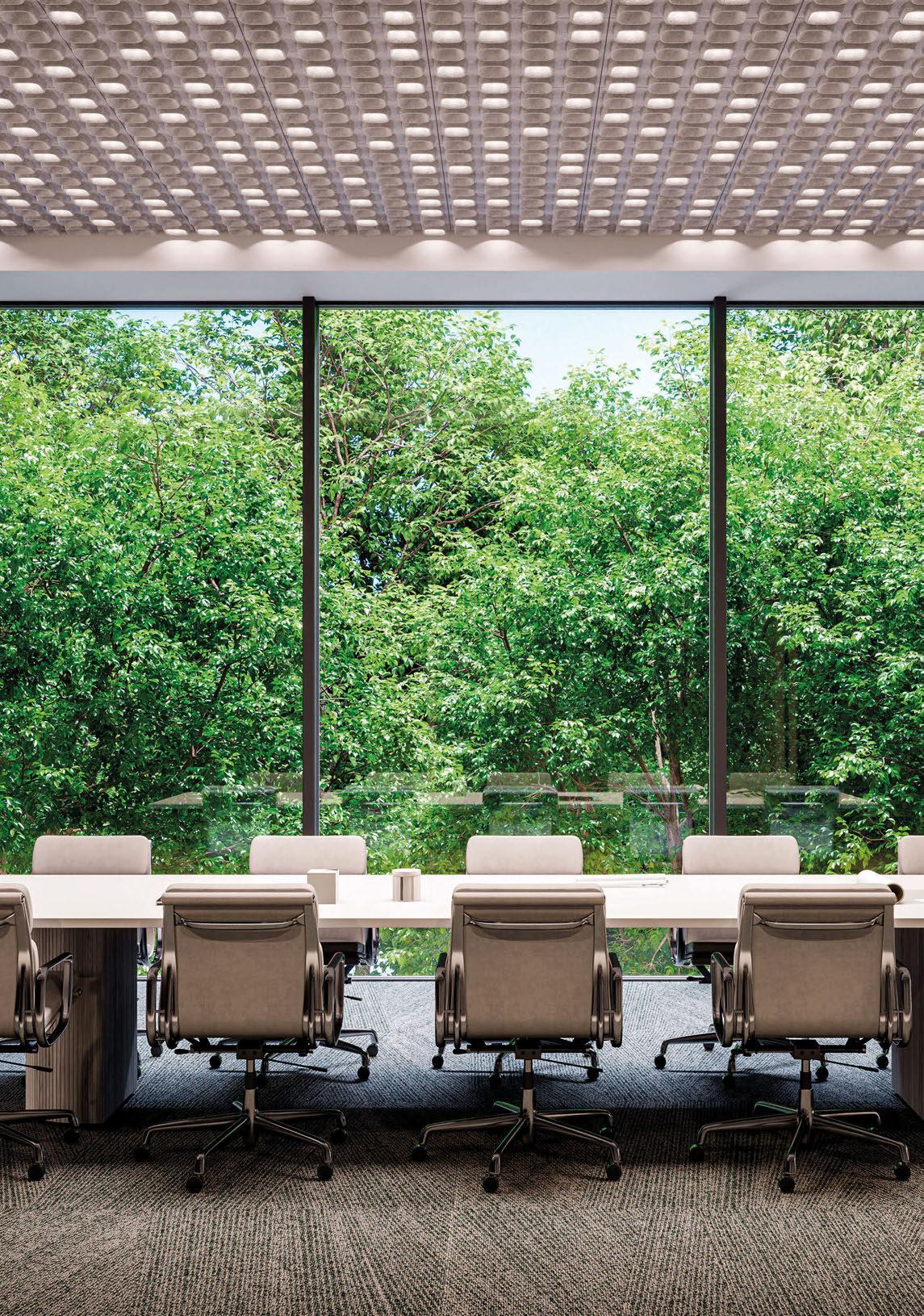
www.intra-lighting.com/ #Pyrymyd Pyrymyd | All-in-one: acoustic ceiling and a luminare, up to 1600 lm, UGR<19 Pyrymyd E(c)ho friendly RENAMED
Snapshot LightOrigin Studio
Fresh from its success at this year’s [d]arc awards, we take a look at some of recent highlights from Hong Kongbased LightOrigin Studio’s remarkable portfolio of work, including the Best of the Best-winning Artifact Bar.
Artifact Bar
Hong Kong, China
Artifact Bar is a speakeasy bar hidden inside Hong Kong’s BaseHall Central. Aligning with NCDA’s interior design theme of rhythmic patterns of underground cisterns, the lighting inspiration is drawn from the underground cisterns’ tranquil yet theatrical atmosphere and ethereal ambience.
Circular windows resembling industrial pipes mark the secret entrance with digital light art displays. Dim and subdued passageway lighting evokes a clandestine, industrial atmosphere while rotating decor lights resembling surveillance cameras add intrigue. Entering the main bar, guests are met with a mirrored ceiling that creates an illusion of infinite heights accompanied by bold riblike architectural structures accentuated by strategically placed indirect lights. The bar features a captivating circular skylight, emitting a soft glow that transports guests to an immersive visual and sensory delight. Each seating booth features table lamps for intimacy and focus, while soft illumination under seats and footlights creates a dramatic runway effect. The private room continues the theme with pipe-like windows exuding radiance akin to the hues of sunset light. The lighting strategy integrated lighting fixtures within the architectural elements; this design approach created a soft, indirect, and functional illumination effect, while low-wattage downlights provided supplementary lighting in darker areas to comply with building safety regulations. Combining architectural mastery and creative illumination, the bar offers an extraordinary and ethereal experience – the ideology of the paradoxical presence of sunlight in an underground space, juxtaposed with the dimly lit surroundings, imparts a sense of surrealism.
Laguna City Medical Centre
Hong Kong, China
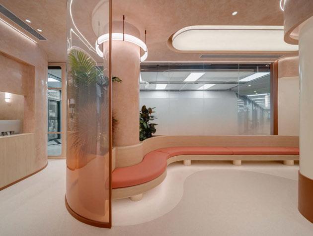
Laguna City Medical Centre is a health and wellness establishment. The interior and lighting design’s project objective is to redefine the perception of traditional medical centres commonly known for being sterile and often uncomfortable, daunting
environments. JJ Acuna/Bespoke Studio’s interior design and use of elements such as gradient fabrics, textured paints, artful wall coverings, and fresh plants, the centre provides a relaxing atmosphere for patients. Located on Laguna Plaza’s lower level, the clinic’s entrance stands in contrast to the cool-white general lighting of the mall corridor. Neutral white downlights illuminate the reception and waiting area, offering a welcoming environment for patients. In the absence of natural light, two large oval-shaped artificial ceiling light boxes emit a soft but bright, warm white glow, fostering a calming and friendly ambience. Fine light lines in the ceiling accentuate the organic curvatures of the interior architecture, creating a sense of wellness while gently illuminating the earthtoned walls. In the medical examination rooms, cool white light with high CRI is used for practical purposes. Coelux lighting systems are installed in each room to replicate the natural light and the visual appearance of daylight. The lighting design focuses on creating a user-centric and novel experience for patients while prioritising the wellbeing of the staff.
JW Marriott
Man Ho
Hong Kong, China
Man Ho is a beloved Chinese restaurant, known for its traditional and authentic Cantonese fine dining cuisine. In 2019, the restaurant underwent an interior renovation to blend traditional chinoiserie with modern elements while preserving its renowned grand atmosphere and excellent hospitality. The interior design by Henmax Interiors draws inspiration from tranquil Chinese gardens, featuring polished light grey marble walls, intricately carved traditional panels, modern geometric metallic accents, and contemporary Chinese floral motifs reflecting the seasons. The private dining rooms with operable walls offer scenic views, catering to social events and intimate gatherings. Aligning with the design concept, the lighting design integrates lighting elements, technology, and scene sets to create a neonostalgic experience. At the main entrance, the uplit lotus glass water fountain creates a dramatic yet serene arrival, while linear
wall washers illuminate the original and signature Chinese wooden gate to emphasise the grand entrance further. Entering, the sparkling and stunning Art Deco crystal pendant greets diners. Taking centre stage is the main ceiling’s wave of floral glass chandeliers that gently illuminate the 4,000sqf interior with a soft glow, with each table accented, showcasing the table centrepieces and bone china dinnerware while creating an intimate setting within the open space.
4
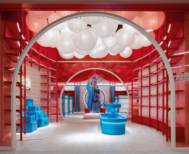
Natural Is Best Flagship, Xiqu Centre Hong Kong, China
Located at West Kowloon Cultural District’s Xiqu Centre, Natural Is Best’s flagship store was designed by the architectural interior design studio Metagram. The interior draws inspiration and pays homage to Chinese Opera and Xiqu Centre’s vibrant and theatrical aesthetics. The lighting design objective was to create a retail experience with a theatrical approach while maintaining appropriate retail illumination. The lighting strategy was to create a harmonious lighting dialogue between soft and spotlighting effects. In the entrance vestibule, a sea of lanterns evenly illuminate the space, inviting customers to enter between two symbolic moon gates. In the main retail space, narrow spotlights accent the different shopping zones, and rows of delicate red fabric are strewn to symbolise stage curtains. High bay luminaires are positioned above these curtains, adding functional light to the space and appearing like stage spotlights against the black-painted ceiling. Located mid-shop, suspended artistic translucent acrylic sheet sculptures of Chinese Opera characters float above an illuminated platform akin to a theatre stage, creating iridescent layers that draw attention. The back of the store features the artwork of a celebrated Chinese Opera artist, framed and illuminated within a bold black oculus. The setting is framed with up-lit columns to its sides. Each element is lit individually, with a specific fixture chosen to create the optimal effect. Using neutralwarm white lighting for the store ensures a soft and welcoming glow while intentionally elevating the brand and creating a comfortable environment and cultural experience.
1 2 3
026 / 027
Based in Hong Kong, China, LightOrigin Studio is an award-winning lighting design studio, completing a diverse range of local and international projects in both the private and public sectors.
Founded by 40 Under 40 winner Eugenia Cheng, LightOrigin Studio’s design ethos centres around the principle and art of balance, creating life-centric and user-centric lighting solutions that seamlessly integrate utility and aesthetics, utilising both natural and artificial lighting. With backgrounds in interior, spatial design, and lighting optics, the team modestly collaborates with architects and interior designers, passionately illuminating and elevating designs, crafting environments and spaces that evoke emotions and bring design visions to life, from meek concept to awe-inspiring completion.
LightOrigin Studio’s dedication is humbly rooted in designing with consideration for health and sustainability, embracing the profound impact of environmental and human factors. The studio firmly believes that good lighting should be accessible to all, fostering a sense of humility and responsibility in its approach and ensuring that its creations not only illuminate but also contribute positively to the wellbeing of individuals and the environment. www.lightoriginstudio.com


100 / 100
2 4 1
Image: Common Studio
Image: Steven Ko Photography
Image: Susanna Yeung Photography
3
Image: Steven Ko Photography

[d]arc


awards


With a vibrant 80s theme, the 9th annual [d]arc awards was one of the best yet. Held at London’s legendary fabric, the awards showcased the best in lighting design.
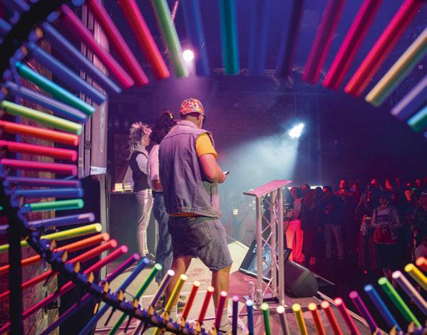
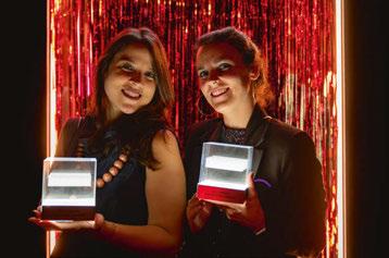
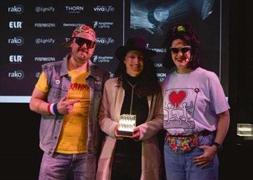
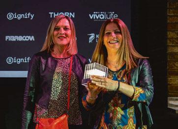
This March, the design community dusted off its shell suits and donned its best leg-warmers as the winners of the 9th annual [d]arc awards were revealed in a special, 80s-themed [d]arc night.
Returning to the legendary fabric London, [d]arc night, the official [d]arc awards party, saw around 600 guests fully embrace the retro theme.
Alongside an open bar and 80s-inspired food offerings, the night featured a series of neoninspired light art installations, UV face painting, a video game arcade, sponsored by Lutron, and selfie spot, sponsored by Unibox, while an 80s-themed DJ ensured the party went on until the early hours.
This year, more than 11,000 votes were cast across the awards’ 14 categories, with 370 entries submitted from around the world. The programme’s global reach was demonstrated by the international scope of the winners, with winning projects spanning China, Taiwan, USA, UK, Ireland, Saudi Arabia, Spain, and the Netherlands.
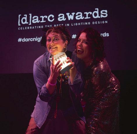
The coveted ‘Best of the Best’ award for 2023 went to Lightorigin Studio for the Artifact Bar in Hong Kong, which also won the Places - Low Budget category. The Best of the Best award is given to
the project that received the most votes overall out of all project category winners, so a huge congratulations to Eugenia Cheng and Lightorigin Studio for this wonderful achievement.
There were also awards on the night to the best installation - given to Into Lighting and Fibr8, and four prizes for the “best dressed” guest. These were selected by [d]arc media’s Sarah Cullen and Ellie Walton, and given to Kael Gillam, Nayl D’Souza, Sophie O’Rourke and Emory Smith, congratulations to them for their fantastic efforts!
[d]arc media would like to say a massive thank you to all of our design partners, sponsors, and supporters, to everyone who entered a project or product into the awards, who voted, and who took part in the awards process this year. We would also like to say a special thank you to our production partners Streeem, photographer Gavriil Papadiotis, and to Light Collective, who we couldn’t do the awards without.
More information about all of the winners can be found in a dedicated [d]arc awards supplement, available to view online now. www.darcawards.com
028 / 029
Images: Gavriil Papadiotis





[D]ARC AWARDS

[d]arc awards installations
In keeping with the overall theme of the night, this year’s series of light art installations for [d]arc night were all inspired by the 80s.
As well as revealing the winners of this year’s [d] arc awards, another one of the defining features of the [d]arc night party has always been the incredible light art installations on show, created by supporting design teams.
Each year, the design teams - which pair a lighting design practice with a lighting manufacturerare given a theme around which to create their installations. In keeping with the wider theme of the event, this year’s installations were all inspired by the 1980s.
With such a broad theme, the level of creativity on show was very inspiring, with teams taking cues from music, film, video games, fashion, nights out, and even exercise videos in their work.
Alongside the 14 installations created by supporting design teams, the awards party also featured a 80s-inspired photo booth from Unibox, while Lutron provided a series of classic video game machines for its “Lu-Tron” arcade.
Arup & Kingfisher LightingFlicker of Fear
Taking inspiration from the classic horror movies of the 80s, Arup and Kingfisher Lighting wanted to create their very own horror movie night through
their installation, Flicker of Fear. Recreating a typical 80s living room adorned with posters of 80s horror movies, the space was designed as an immersive experience for two people. Inside the “living room” were two seats and a television set, once the television was activated, a sequence of programmed horror clips, accompanied by RGBW lights played, culminating in a final “jump scare”. Alongside the RGBW lighting, the design team utilised UV tape and paint to create spooky messages and entice people inside.
Lighting Design Studio & Rako Controls - Top of the Crops
For their installation, Lighting Design Studio and Rako Controls looked to transport partygoers back to a typical 80s barbershop, complete with an array of mullet wigs. A fun, visual spectacle, guests were invited to take a seat in a barber’s chair, and press a button that would randomly select a wig from the uplit “wall of mullets”, with styles including Tina Turner, Prince, David Bowie, Cher, and Pat Sharp. Assisted by Rako Controls’ team of ‘stylists’, guests could try on the wigs for a unique photo opportunity.
Clockwise from above: TM-Tetris by Nulty & Applelec; Let’s Get Physical! by Michael Grubb Studio & No Grey Area; Top of the Crops by Lighting Design Studio & Rako Controls; Flicker of Fear by Arup & Kingfisher Lighting.
030 / 031
Images: Gavriil Papadiotis
Michael Grubb Studio & No Grey AreaLet’s Get Physical!
The inspiration for this installation came from the aerobics craze of the 80s, and the aesthetic that came with it. Michael Grubb Studio and No Grey Area wanted to create an interactive space that also worked as a gathering area with a striking atmosphere that would take guests back in time through colour, reflection and lights. Drawing upon the 80s workout classes, the design team created a dance floor, and simulated movement with programmable LEDs behind a stretch ceiling ‘screen’. Silhouettes would light up and move in a loop, incorporating neon, geometric elements and reflective surfaces to create an immersive experience. A platform surrounding the outer perimeter in an L-shape allowed users to dance and take the stage against the projected workout sequence.
Delta Lighting Design & Designed Architectural Lighting - Blockbustetris
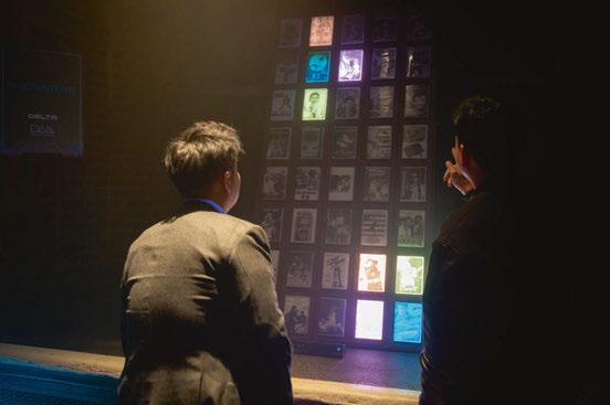
Videotapes were a major source of entertainment back in the 80s – a world sealed in a box. At the [d]arc awards, Delta Lighting Design and Designed Architectural Lighting combined the love of videotapes with a retro arcade, creating an interactive video rental shop. A shelf of classic video tapes turned into an interactive game of Tetris when a viewer interacted with the piece –different tapes would be lit, as if a pixel in a Tetris game. Players could then control the movement of the blocks by waving their hand in the air, captured through motion sensors.
Nulty & Applelec - TM-Tetris
The iconic arcade game was also the inspiration for Nulty and Applelec’s installation. Situated upstairs in Room 3, the installation turned an entire wall into a three-metre-tall, large-scale game of Tetris. Using Applelec’s LED light sheets, the interactive game, was deceptively difficult, with a high score on the night of – allegedly – 25 lines.


[D]ARC AWARDS
BDP & Radiant Architectural
Lighting - Pac Man
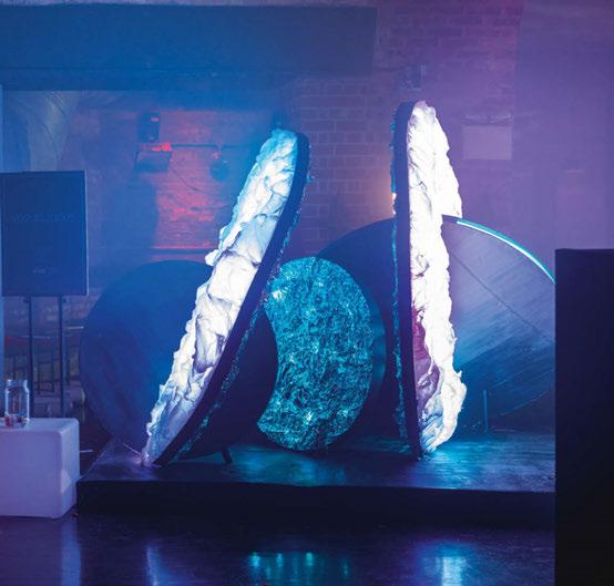
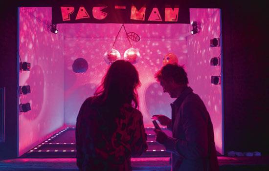
This installation took its inspiration from another iconic arcade game of the 80s, Pac-Man. Here, the team looked to transform Pac-Man’s essence into a three-dimensional light installation, transcending flat surfaces and creating an immersive environment. The sculptural aspects involved translating key game elements, such as the ghosts and cherries, into abstract shapes using various materials. This added a tactile dimension, inviting observers to appreciate the installation from multiple perspectives. Using advanced lighting control systems, the piece was animated to mimic the vibrant energy of Pac-Man eating the flashing dots – a striking and dynamic maze structure formed the base of the frame, while the interplay of light and shadow captivated onlookers, transporting them into the world of Pac-Man.
Foster + Parnters & formalightingSaturday Night Live
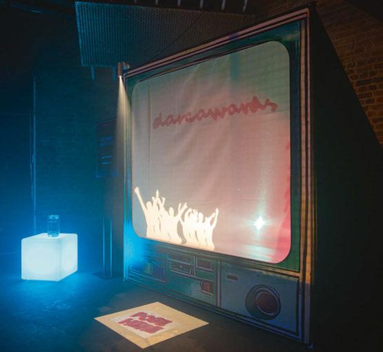
For their installation, Foster + Partners and formalighting created a giant television screen, behind which guests could create their own shadow play. Whether through the use of props and puppets, or their own dancing, viewers were invited to star in their own variety show.
Cundall & Signify - A Fruity Place to Dance
Reminiscing on a typical “80s night out”, the design team of Cundall and Signify hoped to use bold, clashing and psychedelic colour combinations to elicit playful energies and encourage a strong sense of night time euphoria through their discoinspired installation. At its centre, a pineappleshaped disco ball – a nod to Pineapple Studios and pina coladas – created from a mosaic of recycled CDs, created dazzling reflections of colour through hidden RGB projector luminaires. The overlapping coloured shadows created a mesmerising effect that the design team hoped would accurately mirror the colours and illuminations of night life in the 80s, depicting the hazy and rose-tinted memories of the past.
Light Bureau & Vivalyte - Voguelicious
Light Bureau and Vivalyte’s installation was inspired by the Vogue ballroom scene that emerged in the 80s as a space of liberation and expression for the LGBTQI+ community, which at the time was persecuted and discriminated against, so inclusion was one of its greatest characteristics. The presence of dance, lip sync, modelling and performance were characteristics of these spaces, and it is here where the Vogue dance style, or
032 / 033
[D]ARC AWARDS
Clockwise from top left: Voguelicious by Light Bureau & Vivalyte; Blockbusters by Delta Lighting Design & Designed Architectural Lighting; Saturday Night Live by Foster + Partners & formalighting; Pac Man by BDP and Radiant Architectural Controls.

Founder and head designer of corporate friends®, Jan Eickhoff, says about the company:
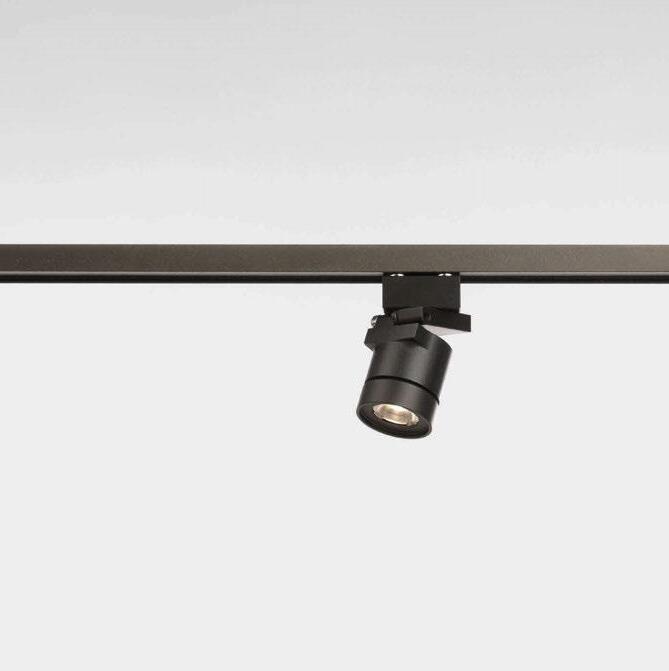
“The year 2010 marked the beginning of our incredible journey. When I was searching for museum showcase lighting for one of my wife‘s projects, we found that nothing available met our expectations. „I just have to do it my way,“ I said to myself, and I got to work. After extensive research and experimentation, I created something new – a small, technically and aesthetically advanced spotlight that is a joy to work with. More projects followed, and soon the idea arose: „Why not turn this into a business?“
In 2011, I founded the company and began fully dedicating myself to developing our own lighting system for museum display cases. Today, with our entire team, we take pride in knowing that our products help preserve cultural heritage in top museums around the world, and we‘re grateful for every moment of this adventurous journey.”

WORK WITH FRIENDS
corporate friends®
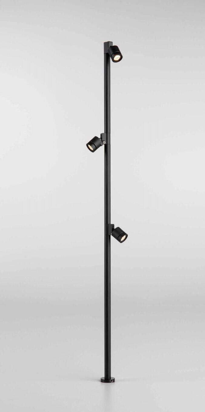
1:1 scale C1-micro-LC spotlight attached to a low voltage magnetic track All edges closed 12V magnetic track Cube using three-axis Y-connector Modular Pole-Spotlight C1-micro-VL with independently dimmable heads


vogueing, was born. As part of the concept for this installation, the design team wanted to recreate the spatial feeling of ballroom dancing and fashion culture through the deconstruction of the disco ball. The user could interact with the space and appropriate it, with reflective materials and interactive lighting used under a sustainable concept.
Hoare Lea & Thorn LightingThe Darc 80s
During their concept workshops, the design team of Hoare Lea and Thorn Lighting were intrigued by the relationship between the nostalgic, rosetinted view we often have of the 80s, and the troubling events that occurred during the decade. The challenge became how to communicate this contrast effectively.
The team took cues from Keith Haring, an American pop artist that emerged from the New York graffiti subculture during the decade; his work explored darker themes as a social commentary, while maintaining a colourful, bold, and playful style. The idea of something appearing fun and colourful at first glance, but revealing complexity
and carrying a meaningful message upon closer inspection, is what they aimed to channel into their installation.
dpa lighting consultants & Architectural FX - Murder on theDance Fluor
The immediate consensus among the team of dpa lighting consultants and Architectural FX when thinking about the 80s, despite many of the team not having actually experienced the decade, was the bright neon fluorescent colours of that era. The concept for this installation, therefore, was to utilise fixtures from APL, and in conjunction with other elements, use them as building blocks to create a striking sculptural form that guests could spot from afar, but ultimately interact with and immerse themselves into at close proximity. The use of UV light and animated light sequences further added to the level of interactivity with the installation, which proved to be a popular photo opportunity on the night.
Buro Happold & Proled - Illuminated Dreamscapes
Through their installation, Buro Happold and
034 / 035
Clockwise from top left: Now That’s What
I Call Darc by Into Lighting & Fibr8; Party Light Out by Equation & ELR; The Darc 80s
by Hoare Lea & Thorn Lighting.

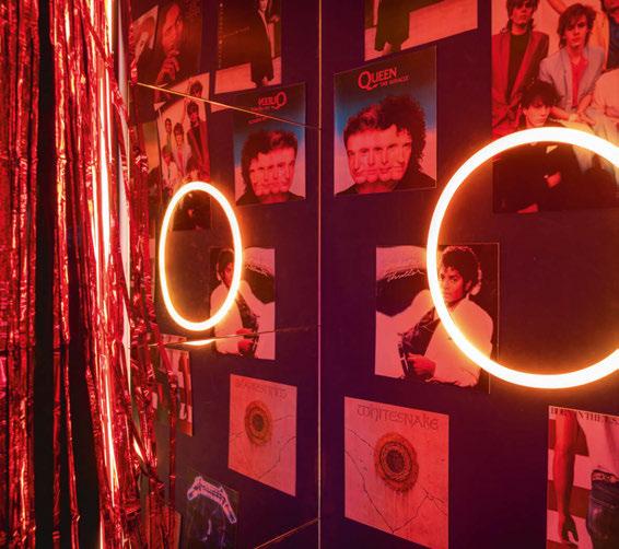
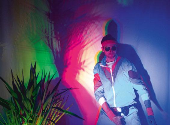
Proled aimed to create “a room with iconic memories”. Stepping through a ribbon curtain into the room, visitors are greeted with walls adorned with 80s posters, creating a vivid snapshot of the era. Immerserd in the pulsating beats of 80s music, surrounded by iconic posters of 80s bands, movies and video games, and engrossed in the pixelated magic of vintage gaming, the room provides a nostalgic vibe to the cultural tapestry that defined the decade. The posters and coloured light whispered stories of teenage rebellion and the vibrant spirit of a time when cassette tapes ruled the airwaves. Light elevates the poster elements by introducing interactivity, motion, and a third dimension to the flat walls.
Equation & ELR - Party Light Out
Party Light Out was an installation that focuses on the final moments of preparation before going out to a party. The coloured lighting used in the installation illuminated the faces of participants as they looked in the mirror, almost like a hologram that transformed the facial features into something glamourous and exciting. The installation comprised a semi-circular enclosure with a suspended structure overhead with adjustable
RGBW spotlights akin to a theatre lighting rig. Inside, a chair and Hollywood-style makeup mirror with integrated lights creates a boudoir of light, while the play of brilliants and reflections of light transform the small enclosure into a party venue.
Into Lighting & Fibr8 - Now That’s What I Call Darc
The winner of the Best Installation award on the night, created by Into Lighting and Fibr8, was inspired by the classic “Now That’s What I Call Music” compilations, and the perils of winding a cassette tape. With a clear acrylic, laser cut tape front and centre, the piece used Fibr8’s laserpowered fibre optic light lines – which also won in the KIT - Technology category – to create a mesmeric, tangled ribbon of light spanning the length of one of fabric’s corridors, bringing to mind the dreaded unreeling and tangling of a cassette tape. www.darcawards.com
Clockwise from top left: Murder on the Dance Fluor by dpa lighting consultants & Architectural FX; Illuminated Dreamscapes by Buro Happold & Proled; A Fruity Place to Dance by Cundall & Signify
[D]ARC AWARDS
The Moving Hues
Bangalore, India

The Moving Hues was a collaborative light art installation created by Studioplus and MYVN Architecture for the latest edition of Design Uru – a week-long collaborative design festival in the city of Bangalore organised by IIID (Indian Institute of Interior Designers) – to promote design experience in public spaces and engage communities positively.
Situated on Rangoli Metro Station Boulevard, which is a transition point for people moving from one point to another, this light installation was an experimental addition to the urban streetscape. It creatively employed sheer fabric to explore the play of light during the transitions of
dawn and dusk, the torn edges of the fabric symbolised rawness and the motion of the sheers created a captivating tunnel of light through its translucency and layers. It also acted as a transition point for passersby to stroll into a large and captivating space dedicated to celebrating luminosity, which became a delicate element within the broader urban context.
Navigating through a portal-like, four-grid single module, it allowed viewers to take a pause, experience the space from within, and stroll out.
The central void, referred to as “A palanquin of colour”, encouraged personal interaction

eye opener 036 / 037

with light. Beyond its visual appeal, this area imparted a profound message – “you become who you surround yourself with.”
The transformative power of light blended variable shades into a harmonious unity, showcasing both distinctiveness and the shared essence that unites us all.
During the daytime, the structure looked lightweight and airy due to the repetitive and harmonious use of white sheer fabric. At night, the same fabric diffused lights of various hues within and around the installation, making it look like a glowing box from across the road. The goal for this was to acquaint the community with the public space positively through the medium

of a light art installation, making it a successful temporary urban insert.
The global lighting community was invited through Instagram to make the piece more engaging, interactive, and inclusive. The participants chose their favourite hues, which were programmed, and images of the outcome were shared on social media. The responses were warm, welcoming, and exciting.
Speaking after the event, StudioPlus said: “The vibrant and changing colours and hues of the installation capture the true essence of Bangalore City which is a melting pot of multiculturalism.” www.studioplus.in


SILHOUETTE AWARDS
EVE GAUT & KATIA KOLOVEA
And the winners are...
Founders of the Silhouette Awards programme, Eve Gaut and Katia Kolovea, reveal the 2024 winning mentees, and look back on a special, in-person celebration at Light + Building.
At the end of February, we announced the winners of our 2024 awards programme in a virtual celebration. The lighting and design community from across the globe was invited to join this momentous occasion, with sponsors and supporters taking part in celebrating the winning mentees and their mentors.
The 2024 winners and mentor partnerships are as follows:
• Ksenia Karmolina – Mentor: Andrew Bissell
• Mashaaraa Bhatia – Mentor: Carla Jardim
• Anna Forrester – Mentor: Chip Israel
• Cristina Maricela Cornejo Mejia – Mentor: Daniela Viloria
• Marco Nozza – Mentor: Dave Anderson
• Seyma Gunaydin – Mentor: Fanny Englund
• Rafa Elnour Mohamed – Mentor: Faraz Izhar
• Martin Concepcion Reyes – Mentor: Giulio Pedota
• Shu-Ang Yeh – Mentor: Jorg Frank Seemann
• Jelena Popov Abouhanian – Mentor: Maria Dautant
• Margareth Sunjoto – Mentor: Neha Sivaprasad
• Paula A Serna Vanegas – Mentor: Pamella Phang
• Tiziana Regalado – Mentor: Panos Ferentinos
• Samuel Leo Walker – Mentor: Paulina Villalobos
• Teodora Kukova – Mentor: Rachel Fitzgerald
• Raluca Dascalita – Mentor: Sandra Brookes
• Ashwin Pherwani – Mentor: Sara Isabel Ortega Donoso
• Andra Munro – Mentor: Tejas Doshi
• Catrinel Sabaciag – Mentor: Veronika Mayerboeck
• Alisa McClymont – Zerlina Hughes
Winning mentee Marco Nozza says: “Receiving the nomination as one of the winners of the third edition of the Silhouette Awards Mentorship Programme means I have unhinged my comfort zone to be inspired to act, with the aim of becoming the best version of myself, starting from here. With all my energy and inexhaustible passion, I hope to grow in a welcoming and bright community of light and, at the same time, to offer my talent for the good of others and this planet. It is not possible to translate the explosive happiness that surrounds me at this moment, but I can, and I want to thank all the people who have given me this journey in the light.”
Mentee Rafa Elnour Mohamed adds: “Beyond the personal accomplishment, the Silhouette Awards is a door to new opportunities and connections within the design community. It signifies a nod from industry experts, encouraging me to continue exploring innovative approaches and refining my craft. Winning this award amplifies my commitment to the transformative power of light in design, reinforcing the idea that thoughtful illumination goes beyond functionality – it’s a form of art that resonates with people. This award is a community that brings together all the incredible lighting
038 / 039

designers under one umbrella and from my humble perspective this is invaluable.”
Winner Jelena Popov Abouhanian comments: “Winning the Silhouette Award holds immense significance for me, representing the culmination of my dedication and passion in architectural lighting design. For me, the award is not just a personal triumph but a validation of my commitment to creating meaningful environments that positively impact human wellbeing. It fuels my aspiration to continue pushing boundaries and contributing significantly to the field. Winning the award is not just a celebration of past achievements, but a catalyst for future endeavours, inspiring me to illuminate even more innovative paths in architectural lighting.”
As part of the continued commitment to build a strong community, the Silhouette Awards also curated a special in-person event at this year’s Light + Building in Frankfurt. The in-person celebration was very wellattended – with participants including lighting designers, past mentors, and past mentees, as well as the current mentors and winners that were just announced a few weeks ago. International supporters, associations, publications, other awards, and sponsors who
have been supporting the programme from the beginning also joined the event, which was led by Co-Founder Katia Kolovea of Archifos, and Stacey Westbrook of Parrot PR and Marketing, who introduced winning mentees and mentors from 2024 and previous years.
The event began with celebrating this year’s winners, who all received a huge round of applause from the attendees. Martin Klaasen, a mentor from year 1 and year 2 then gave a keynote speech on his experience with mentorship and lessons learned during leadership in lighting. This was followed by Swathi Madhi, mentee winner from year 1, reflecting on her mentorship experience with Lara Elbaz, followed by Cherina Talge, mentee winner from year 2, who was mentored by Maida Hot. It was an honour to finish on a personal reflection panel with Linus Lopez, from the first line up of mentors from year 1, Claudia Paz from last year’s mentors, and last year’s winning mentee, Valeria Coghi, who was mentored by Paul Traynor.
The Silhouette Awards team would also like to say a special thank you to David Gilbey, mentor from year 1 and 2, who attended the event and shared a few wise words about the value of mentorship for everyone’s career, regardless of what stage you are at.
At the end of the curated session, everyone came together to take the biggest photo of the Silhouette Awards community yet – with all guests receiving a special Silhouette Awards badge as a gift for being part of this growing community. The Silhouette Awards would like to thank sponsor LEDLuks for hosting everyone at this exciting event and making it possible.
The entire Silhouette Awards team also extends a huge thank you to this year’s sponsors for their commitment and support to the programme, becoming leading brands investing in the future talent of the industry.
Power Sponsors: Monarca.
Core Sponsors: ADO Lights, GVA Lighting, and LUG Light Factory.
Light Sponsors: LED Luks – Lighting Solutions, Intra Lighting, ATEA – Architectural Lighting, L&L Luce&Light, Lucent Lighting and WE-EF Lighting.
The next edition of the Silhouette Awards will open for entries in September 2024. www.silhouetteawards.com
SILHOUETTE AWARDS

“We need to be able to sing the values of what quality light brings to the built environment, and to help and improve people’s lives in all the ways that we’re able to do.”
Andrea Hartranft
040 / 041 talking with…
Ahead of IALD Enlighten Europe, taking place in London this June, arc editor Matt Waring sits down with the IALD President, Andrea Hartranft, to discuss her career to date, and the ongoing evolution of the IALD.
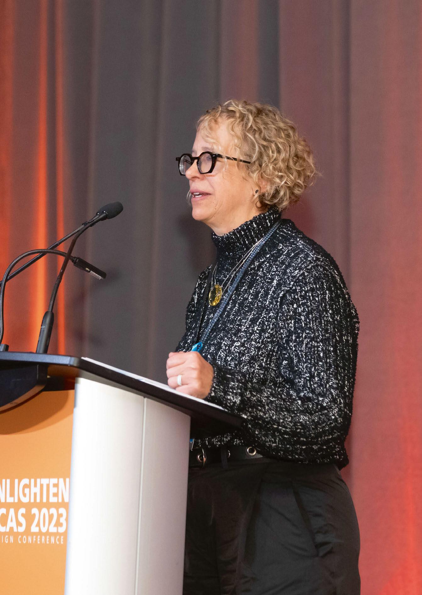 Andrea Hartranft speaking at IALD Enlighten Americas, Banff, Canada 2023 (Image: Eric Daigle Photography © IALD)
Within the close-knit community of the lighting world, we are all very aware of the value of good quality lighting design, and the benefits that this can bring to a piece of architecture, a space, and most importantly, the users of the space.
However, it wouldn’t be unfair to say that outside of our lighting community, that awareness isn’t quite as strong. But this is something that Andrea Hartranft, Principal of Hartranft Lighting Design and President of the IALD, is hoping to change.
“Inside our lighting walls, we’re roaring to each other,” she tells arc. “But when you are standing outside of the walls of the lighting industry, it’s more of a meow. We need a louder voice. We need to be able to sing the values, roar the values of what quality light brings to the built environment, and to help and improve people’s lives in all the ways that we’re able. We need that voice, and my hope for the future of the IALD is that our voice strengthens, and that we can send our message outside of those walls loudly and clearly.”
Hartranft took over as President of the IALD earlier this year, succeeding Monica Luz Lobo – the culmination of a journey that began at Penn State University in the 1980s, although it was one that almost didn’t happen at all.
“I started at Penn State in journalism, because I thought I was going to write,” she recalls. “But after about a year, I wasn’t bored with Penn State as such, but I was bored; I wasn’t taking journalism classes yet, it was a lot of liberal arts that was interesting, but it wasn’t challenging. My grades didn’t show it that way, but it wasn’t challenging like I thought something like engineering might be. My dad was an engineer, but I had never really thought about it as a career. But one morning I woke up and had the words ‘architectural engineering’ in my head, and that afternoon I transferred into architectural engineering. I didn’t even know what it was, I had no clue what I was doing, but something told me that it was the path that I ought to take.”
After a couple of years, Hartranft had the opportunity to work with Craig Bernecker in the lighting lab – an experience that she feels showed her “the power of light in the human existence, how light can benefit people”. An experience, she says, that was powerful enough to guide her onto the path of lighting design.
“For the first 10 years or so of my career, I worked in engineering and lighting, working for architectural engineering firms, learning everything. But with every year that went by, it became clearer and clearer that I really wanted to just do lighting.”
With that, Hartranft began working at CM Kling + Associates, under the tutelage of her mentor, Candace Kling. Hartranft explains how the two met, and how they came to work together: “I’d had to have a hard conversation with somebody in the lighting industry, and I didn’t really know Candy at the time. We were at an event, and another person in the lighting industry came up to me and just railed into me, and Candy stood up for me. She didn’t know me, but she knew it wasn’t right, and stood up for me, and I thought ‘this is somebody

that’s going to always have my back, and she always did. That in itself was a good enough reason to come work with her.
“She was probably the most generous boss a human could have,” she continues. “I got great training from someone who was super generous with their knowledge, and everything that she did communicated how much she loved being involved with lighting. And it rubs off on you – it’s hard not to get excited about it.
“Her ability to see the space three dimensionally and understand the architecture and the opportunities, just by closing her eyes – very few people have the skills that she had. She started on Broadway, and worked with Jean Rosenthal, made the transition to architectural lighting working for Howard Brandston and then Jules Horton, and ultimately starting her own firm, so she had some pretty good mentors as well, but she didn’t study lighting. She didn’t go to college for lighting, she learned by doing it. She just had an extraordinary vision; she was a great person to learn from. She
042 / 043

gave me the opportunity to be creative and to have a voice.
“You learn from bad bosses, and believe me I learned plenty from others that were not good managers or not kind people, but she put her ego at the door and understood that we are here to serve the people whose needs we meet. We don’t do this for us. Any time I had a question, of course I got a good answer, or I got sent to a place where I would get a good answer. She taught me a lot about how to be.”
This kind of leadership meant that throughout her career since, Hartranft has always tried to stay humble and grounded, continuing to look at ways to improve her knowledge and skillset. “You never want to think that you’ve learned all you can learn. I don’t ever assume that I’m the smartest person in the room because I’m not by a long shot usually, especially with my team, I have some really smart people around me.”
Hartranft worked at CM Kling + Associates for 18 years, before branching out on her own in 2013
“It’s a really good time for the IALD to grow and be as inclusive as possible. For so long, our conversations have been about independence and what you can and can’t do, rather than what you can do to make things better, and what you should do as a lighting designer.”
Andrea Hartranft
TALKING WITH... ANDREA HARTRANFT
Bell Tower Park, Salisbury, NC, USA (Image: Stanley Capps)

and forming Hartranft Lighting Design. When setting out, she sought to continue with a design philosophy that she developed while working under Kling. “Always remember that you’re doing this for others. That’s a really good place to start,” she says.
“It doesn’t matter what you think, it matters what you do. In our firm, we went through the ‘why’ of it all, and our ‘why’ was to support all, so others may thrive. I’m paraphrasing, but the idea is that from within the firm, you want people to thrive, but also in the environments that you create, you want the people to thrive.
“Even the clients that we work with, we try to educate. Anything that we touch, we want to make better, that’s not a bad place to start. Do your job, try to do it as well as you can, keep learning, and always remember that you’re doing it for other people.”
Across its portfolio of work, Hartranft Lighting Design has covered a broad spectrum of projects, covering fields as varied as retail, places of worship, infrastructure, workspace, transport, and stadiums. But across this scope, Hartranft feels that the firm’s specialism is simply “people”.
“We light for people; wherever they are, we light
for them. We’re in pretty much every sector, and depending on the person in the firm, they’re going to have their preference. Everyone has their thing. We have folks that are theatrically educated, so they bring that to the table; some are architecturally educated and focus on wellbeing and sustainability and those conversations. But if it’s a good project, it’s a good project. I’m looking for good clients that really do care about how the lighting is in the spaces that they’re building.”
As a thriving business owner, Hartranft has spoken at a number of lighting events already this year –including Light + Intelligent Building Middle East in Dubai, and the Women in Lighting anniversary celebrations at Light + Building in Frankfurt, on the subject of business ownership, but she admits that running her own firm is not something that was originally in her plans. However, she is hopeful that her story can be an inspiration to others.
“I have to say, until I started my firm, I didn’t have any interest at all in running a business. It wasn’t on my radar. Candy was well aware of that. The business side of things can be a real slog, it’s hard. It is good for people to see that someone with no business background can find their way, but it’s not for the faint of heart. You have to be a risk taker, or maybe in my case be so oblivious to the risk that you jump in with both feet and hope for the best, knowing that you’ve surrounded yourself with really smart people, really good people. There are definitely some skillsets that are necessary.
“I’m thrilled that I get calls and emails from young designers wanting to have a conversation, and I want to follow Candy’s path of being as generous as I can with my experiences. They’re not necessarily their experiences, but I can share some pitfalls that I learned from. But until you experience them on your own, it’s like anything else; you don’t really get it until you have to pay your first tax bill or whatever. Then, you realise all of the things that you need to learn.”
To help prepare the next generation for potential business ownership, whether it is on their radar or not, Hartranft adds that she actively encourages the young designers on her team to read proposals, get involved in business-centric conversations, and be a part of the business management process. “We’re not perfect, but we’re trying to figure it out so that they have a voice, and they start to understand some of the things that go into at least managing a firm.
“My job now, with my partners, is making the decisions that keep the firm strong, competitive and moving forward, so I’m not as day-to-day on the design part of it, but for the younger members of the team, even if they’re not interested, even if they never want to run a practice, it’s really important for them to understand what can make or break a firm.”
Hartranft’s position as a leader and mentor now extends to her role within the IALD as the current President of the association. She has been a member of the association for more than 30 years, getting involved as soon as she heard about it.
In recent years, she has served as Awards Chair, overseeing the IALD Awards process, before
TALKING WITH... ANDREA HARTRANFT 044 / 045
Andrea Hartranft speaking at Light + Intelligent Building, Dubai, 2024 (Image: courtesy of Light + Intelligent Building Middle East)

Some Light Reading?
scan to download
now available
“Anything that we touch, we want to make better. Do your job, try to do it as well as you can, keep learning, and remember that you’re doing it for other people.”
Andrea Hartranft
sitting on the Education Trust board and serving as Treasurer and then Trust President, most recently being nominated and elected to the Presidency.
“A couple of years ago, it seemed like the IALD was changing and evolving, and it was exciting. So, in my mind, I thought ‘if I’m going to do this, now would be the time’. I’d been on the board for a bit, and I felt like I had my paw in a lot of the different sectors of the IALD, and I really appreciate what I’ve gotten from it. So, when I thought about it in those terms, I wanted to be able to give back as well.”
After spending a year as President Elect, Hartranft began her term at the beginning of this year, and she is hopeful that during her stint as President, she can continue to lead the evolution of the association.
“I feel like it’s a new day,” she says. “My predecessors worked really hard, figuring out how best to move the IALD forward, and I’m thrilled that the membership agreed with their vision for the future of the association.
“In my mind, all the pieces are in place to have open minds, and a willingness to see beyond the boundaries that had been set for the IALD in the past, and now take the conversation with membership to a whole new level.”
“Having Monica [Luz Lobo] as the President and learning from her has been invaluable – knowing that she is there to share her experience is comforting – Monica is such an incredibly kind, patient soul and I hope to learn to listen as well as she does. Working with Christopher [Knowlton, IALD CEO], who I think is absolutely brilliant and a visionary and Brandon Thrasher [IALD Treasurer], who is super smart and so pragmatic is an absolute
gift – not just to me, but to the membership as a whole. Having Jill Cody at the helm for the Education Trust, Rachel Fitzgerald leading the Membership Committee, our unbelievably hardworking staff, the support of the LIRC and our incredible network of volunteers gives me great confidence in the future of the association and the profession.
“It’s a really good time for the IALD to grow and to be as inclusive as possible,” she continues.
“For so long, our conversation has been about independence and what you can and can’t do, rather than being about what you can do to make things better and what you should do as a lighting designer. And now we have this opportunity to really focus on the quality conversation – how we can make things better using all the tools that are available to us and all of the knowledge that we have accrued. That’s the conversation, how do we add quality.
“That’s where I think lies the opportunity to educate our clients. It doesn’t mean that we can’t voice pride in being an independent lighting designer. I’m proud of the fact that I’m totally objective, but I’m aware that there are other ways to do lighting design, and do it at a very high level, and that’s been demonstrated by others. For me, it’s having the opportunity to move things forward, to be able to talk about lighting design and what quality lighting design really can do across the board.”
One such opportunity to talk about good quality lighting design is the IALD’s Enlighten conference. A popular fixture in the lighting design calendar, the next edition of Enlighten Europe will take place in London this June, and Hartranft is looking forward to getting the lighting community together again.
“I am so excited,” she says. “Berlin was fantastic last year, and I know London will be as well. It’s so inspiring to go to any of the Enlighten events, whether it’s Enlighten Europe, Enlighten Asia or Enlighten Americas, which will be in San Diego this Fall. It’s such great conversation.
“As a North American, I really relish the opportunity to chat with people who are not North American and get those perspectives and understand the different business models, and all the different things that people are focusing on that maybe aren’t necessarily the same exact focuses in the United States. That’s how we grow. And above all, the events are fun.
“I’ve said this before, but for me, the IALD is a home, and my great hope for it is that more and more people are able to see it as a home, a place where you go because your family is there, the people that share the things that are important to you, your values. We have that in our personal lives, but it’s nice to be in a profession and an industry where it transcends just the workday part, to becoming some of your closest friends. I consider some folks in our industry as my family, and that means that when you go to these conferences, whether they’re local, regional, national, or international, you’re getting to have conversations that matter and learning from others and maybe imparting your own knowledge to others.”
046 / 047


TALKING WITH... ANDREA HARTRANFT
BAC Camperdown, Greenville, SC, USA (Image: Halkin Mason)
Jim Beam Brands Company Campus, Claremont, KY, USA (Image: Luke Hayes Photography)

Another aspect to these conferences, particularly the Enlighten events, that stands out to Hartranft is the social aspect. “It has always been a fascination of mine how lighting people can be up having drinks until one, two, three o’clock in the morning.
And yes, we’re talking about other stuff too, but it’s amazing how much lighting we’re talking about. To me, going to the events and the talks is great, but I think a lot of us really look forward to those late evening drinks, just sitting at a table in a hotel or in a bar and talking. It’s a good thing.”
The revived Enlighten conferences come after a difficult few years not just for the IALD, but for the world, as we had to adapt to a “new normal” and a new way of working. Thankfully, it would appear that we have all emerged from the other side, but this changing atmosphere, Hartranft believes, only helped to solidify its online presence, and the idea of the IALD as ‘home’.
“Here’s a global organisation, working all the time to be global-er. We worked hard to redevelop the website to be much more functional – it looks the same, but functions a whole lot better. But the next step will be to create a place where people can go, all in one place no matter where they are in the world, and get what they need. This improved functionality provides the foundations for the new learning platform that we are launching this year. The Learning Education Resource Network, LERN is aimed at bringing high quality content to professionals of every level irrespective of geographic location. Increasing the availability and benefit of being part of the IALD family.
“The IALD has over 30 regions and chapters and is continuing to grow regionally, adding new chapters, means that we able to, at a much more local level, benefit people, no matter where they are or what their needs are. The needs in the United States are very different from the needs in India or Japan or the Middle East. There’s a learning curve, but I love how the IALD is growing and finding ways to be more for the people that it serves.”
Indeed, Hartranft is hopeful as she looks to the future that the IALD can continue in its growth and evolution, to the point that it reaches outside of the “walls” of the lighting community and into the wider architectural world.
“Humans are humans, and their needs are still their needs. The physiological, the psychological, those don’t change. Maybe they evolve, but the essence of the needs humans have, those are the things that we have to serve,” she says. “How we do that may change, how lighting designers make their money may change, the impact of AI on lighting design may force a change, but I think smart businesspeople and smart designers are agile and they evolve with the times.
“I wish I had a crystal ball, but my hope is that the people that are building spaces understand better why quality lighting is important, and seek it from the lighting design, specifically the IALD community. That is a great future. That’s what we want.”
www.hartranftlighting.com www.iald.org
TALKING WITH... ANDREA HARTRANFT 048 / 049
RIO Lakefront, Gaithersburg, MD, USA (Photography: Adam Brockett)


Lighting Designers are just salespeople
In this issue’s column Marcus Steffen breaks down the hidden salesmanship that comes with lighting design, and why we need to acknowledge this aspect of the business. COMMENT
I am going to annoy some designers and explain how all lighting designers are salespeople. Once the rage inside has died down, I will explain how this is actually not a bad thing, and that what we sell is actually one of the most wonderful things in the world (spoiler: it’s dreams).
Sales is a pretty dirty word in our industry, as it is in most. The word conjures up crooked, second-hand car salesmen and telemarketing people, pressure selling you junk products, PPI, insurance, etc. It is perceived to be all about greed and money, leaving a wake of unhappy customers. Unfortunately, this reputation has been earned, and is really the result of poor sales training and a fundamental lack of understanding of what sales should be.
So, what is sales? In most industries they are the first direct point of contact for companies with customers. They are there to get the orders and bring the money in. Often it just comes down to that, hitting certain targets, but good sales is something more. Andy Bounds (author of The Jelly Effect and a world-leading sales trainer) said something to the effect of, “sales is an expert helping a client to buy.” The problem is that salespeople generally try to get the client to buy the product that they sell. This turns it into an adversarial relationship. They are trying to shoehorn in a product that does not solve the issue the client has, which is always going to end badly. We have all had a good experience with a salesperson, where we have gone in looking for something, potentially buying something expensive, and they turn round and advise you either that it is not right for you, or that you need something else. They take pride in helping customers, even if it means they do not get an order, and you walk away feeling like you have really benefitted. You are likely to go back to that salesperson again, and if they advise you to purchase a product from them you are much more likely to purchase, because they have earned that trust. This is what good sales looks like. But how is this relevant to us as designers? We are creatives. We create the schemes, we produce the
documentation, and we know that if it is followed, it will look and feel great at the end. We are not selling any products, which is what the suppliers and manufacturers do. We don’t do sales, do we? Wrong. While lighting designers are not selling the products directly, we are selling the client on the ideas, design, and the products. There is no point in doing a design if we don’t eventually specify a product that will deliver the lighting we want. As designers, we are reliant on manufacturers making light fittings that deliver the light we want to a space. What is really happening is we are being paid to provide the advice that an exceptional salesperson would deliver for free. We are being paid to tell the client where to spend (or if you want a nicer word, invest) their money in a project. But how is realising we are salespeople useful? Why is it relevant? To answer this, I need to reveal one of my biggest pet peeves, which is designers complaining. We all do it. We all moan about how a client doesn’t listen, how our projects are being value engineered, and how the client follows recommendations from other, less experienced, professionals. While there is always going to be an element of this happening, I feel that us designers (not just in lighting but across the board) use this as an excuse for not doing a better job. We need to improve the way we work, how we present to clients and how we conduct ourselves as designers to combat these issues, rather than just complain they are happening. This is where understanding sales, and the unique set of skills there, is beneficial. I am going to refer to Andy Bounds again, and his key concept for selling is understanding the Afters. Afters are what the client is left with after everyone has finished. These are the reasons they are doing the project, and often fulfilling a goal or dream of theirs. What does the client have after the building is finished, all the trades and designers have left? You might think this is lighting, but actually this is not what they are getting. They might not care about the lighting (shocking, I know). What the client might care about is dependent on the project. For example, public realm lighting
050 / 051
MARCUS STEFFEN
“If you can articulate to clients that you are not really designing lighting, but rather you are delivering them what they truly want, they will be far more engaged.”
might be about safety and security. Lower crime rates, less accidents, more considerate to ecology.
For residential, it might be a relaxing atmosphere, a practical space for when the kids are doing homework, romance for an anniversary, and often all of the above in one space. If, from the start of the project, you can articulate to clients that you are not really designing lighting, but rather you are delivering them what they truly want, then they will be far more engaged. If you can convey to them that the lighting design you have produced gives them the outcome they want, and adjustments to it will take away this outcome, then your client becomes your ally. They understand the value of what you do in terms that they also value, and they will defend your design for you. Really learning about sales techniques and understanding clients will help build these skills and improve delivery of your design to final completion.
The client is just the first person to sell to. As we all know, lighting design is extremely complex, and a lot of this is because we cross over with so many other areas in a project. You need to sell your design to everyone on the project, and they all have different afters that they want. Architects and interior designers will want their designs to be enhanced, and often want to satisfy their egos by having input into the design as well. Contractors want to be able to finish a project on time and on budget so they can move onto the next one. HVAC installers want the easiest possible install (which might lead to clashes with your lighting positions).
Understanding everyone else’s Afters, and communicating how your design can deliver for them, will make them want to engage with you. Ultimately you will be delivering the outcome your client wants and fulfilling what is likely to be a longheld dream. So go, improve your sales knowledge, sell your clients on what your lighting design gives them, and deliver those dreams they dearly want.
Book Recommendation: Andy Bounds, The Jelly Effect www.mslightingdesign.co.uk
 Image: Scott Graham, via Unsplash
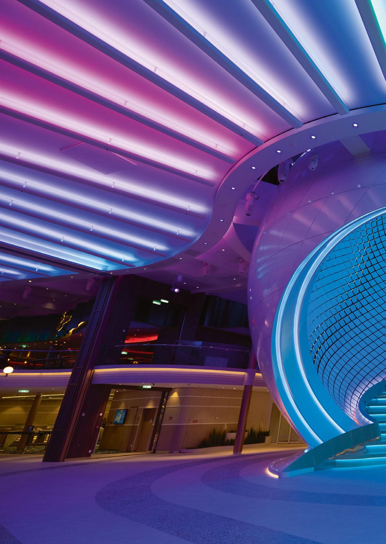
The Pearl Icon of the Seas
For the Royal Caribbean’s new ship, Icon of the Seas, Brooklynbased new media artist Breakfast has created The Pearl – the largest kinetic art sculpture in the world.
Spanning more than 14-metres, and with a diameter of 15.3-metres, The Pearl is composed of nearly 3,000 computerdriven kinetic tiles. This awe-inspiring work stands out not only for its sheer size, but also for its ability to capture the essence of the ocean. The sculpture beautifully simulates various natural phenomena, such as rolling waves, gentle breezes, shooting stars, and the dynamic ocean surface. Drawing inspiration from the sea, the tiles are arranged in a Fibonacci sequence, echoing patterns found in marine life.
As well as its sheer size, what sets the artwork apart is its utilisation of data from nature. The sculpture’s movements are influenced by real-time tidal and wind data from the Caribbean. By pulling this data from the web, it allows the piece to continuously transform, reflecting the current environmental conditions in an ever-evolving display of calmness or intensity.
The journey to bring The Pearl to life took more than four years for Breakfast – this period was marked by innovative conceptualisation, design, and custom fabrication of each part, underscoring the artist and their studio’s commitment to craftsmanship and detailed execution.
Now residing on the Icon of the Seas, The Pearl is not just a sculpture, but an immersive experience that invites viewers to engage with the rhythm and heart of the ocean. As the world’s largest kinetic art sculpture, it is a landmark achievement for Breakfast, and a significant addition to the world of contemporary art. www.breakfaststudio.com
eye opener
052 / 053
 Image: courtesy of Breakfast
SKP Chengdu Chengdu, China
A vast new luxury retail space, spanning two distinctive underground environments and a large civic park, has been given a stunning after dark identity, courtesy of a lighting scheme designed by Speirs Major Light Architecture

054 / 055

RETAIL LIGHTING
ituated within a greenbelt site in China, SKP Chengdu is a vast, luxury retail masterplan that comprises three interconnected spaces – two distinctive underground retail environments, overlaid with a large civic park – in one remarkable, harmonious scheme.
Designed by architecture firm Sybarite, the entire space has been elevated to another level thanks to a lighting scheme from Speirs Major Light Architecture (SMLA).
Activating the site at night with a stunning after dark identity, the lighting design plays an integral role in enhancing the signature SKP style, creating a vibrant atmosphere for shoppers, while also supporting intuitive wayfinding and navigation.
SMLA joined the project having previously worked with Sybarite and SKP on its Beijing superstore.
The existing relationship meant that the initial brief from SKP was relatively straightforward, as Benz Roos, Associate Partner at SMLA, explains: “The client said to us ‘you’ve done this great thing in Beijing, can you repeat it?’ That was the starting point, but the scope of this project turned out to be vastly different.
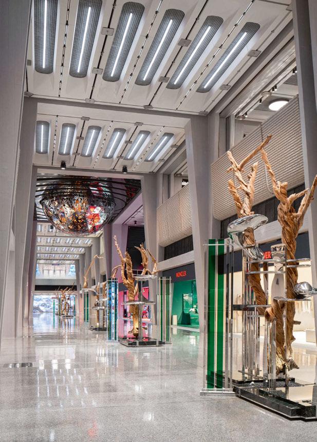
SMLA Senior Partner and CEO Keith Bradshaw notes: “We were incredibly excited to work on this project as our experience was that there is something special about working with Sybarite. Their ambition and encouragement lead us to do great work together. SKP Chengdu was an extraordinary opportunity – a huge public park and retail environment flowing across multiple levels.
“Working also with our close friends at Field Operations and Fountain Workshop also meant that we were able to develop ideas and solutions that are often simple but never dull. The after dark image was on everyone’s mind from the very start, and the project was a real team effort.”
Roos continues: “It was such an unusual location for a retail space - sunken into the ground with green space on top of it. Where typically in retail you have a public-facing presence, here you can’t see it from street level.
“Our scope was initially for the retail façade lighting, but this naturally grew and evolved to include the interiors and the landscape lighting for the park, until we ended up lighting essentially everything.”
Across SKP Chengdu, the project is interspersed with standout moments, from the sprawling Towers of Life – six illuminated water towers – to the glazed Central Cube, the spectacular escalator entrances, and the ‘Supernova’ – a bespoke light feature.
Connecting each of these elements together into one fluid scheme was one of the core components of the lighting approach, as Roos explains: “We had to think of this not as individual pieces, but as parts of a larger puzzle. Within that, we honed down a strategy based around some key moves. The Central Cube is a centrepiece in the space; the Towers of Life is another centrepiece; the Supernova is another.
“So, part of the concept was built around creating these fabulous sculptures and an almost museumlike experience – that was something that we embraced.
“And on the other hand, something that Torquil Macintosh from Sybarite was very open and honest about, which I appreciated, is that it is still retail –people come to this place to buy stuff. That is what the true core is.
“While we aim to be poetic and experiential, it’s necessarily both a spectacle and an experience –that is what retail is about.
“Sybarite and SKP do retail spaces very well, so it was inspiring to work with them. As a designer you want to create amazing spaces, and that is what they do.
“It’s a tricky balance however, because as lighting designers you are always thinking about the experiential moments, the arrival, and using light to create space and legibility, but in retail you are by definition the background, because you can’t overshadow the shops themselves. You need to have that journey sequencing throughout.”
Within the park space atop the shopping centre, the lighting design team was mindful of retaining its luxuriant green character. The lighting of the landscape elements is carefully controlled, with bespoke fixtures creating contrast that gives rise to a stylish, ‘outdoor film set’ feel.
RETAIL LIGHTING SKP CHENGDU
S 056 / 057


058 / 059 RETAIL LIGHTING SKP CHENGDU
“We designed these fixtures as Sybarite initially didn’t want to include lighting columns,” Roos continues. “We showed them a column that created an effect that looked almost like a fashion show –where the trees become the models. The columns use indirect light and reflectors, so that there is no glare. We also made smaller versions to uplight the trees – it was a much softer way of lighting and creates a sense of drama and celebration.”
The softer approach to illuminating the park space atop SKP Chengdu is punctuated by the “major moments” of the Towers of Life – the spectacular, colour-changing lighting for six water-spewing beacon sculptures that rises to 39-metres above the ground – and the stunning glazed Central Cube, which provides access to the metro network. Here, light creates a beautiful glow with gentle animation on the water-washed glass, but equally provides vital functional light for wayfinding and orientation.
Criss-crossing the park, canyon-like avenues are cut into the landscape, connecting the 500,000sqm of submerged retail environments. Apertures are encircled at park level by lit handrails, providing a buffer between the landscape and the retail, and assisting with wayfinding and orientation. The handrails, Roos explains, were fitted with a mesh detail throughout, casting the space in a soft glow, while the patterned grazing of light along the frit creates a unified aesthetic across the site. With multiple ways to descend, each entranceway has its own character. The open stair is a grand descent, lit simply by light along the handrail, keeping the focus firmly on the retail vista ahead. Several escalator entrances feature backlit shimmering mirrored wall panels and eccentric linear roof lights, supporting a glamorous, lively transition.
These enticing features were complemented, Roos believes, using reflective materials, such as metal canopies and the aforementioned mirrored wall
panels, meaning that the lighting approach could be kept relatively simple.
“It’s not always about the luminaires, it’s about the materials and how light interacts with these materials. We worked with Sybarite on what finishes should be used; in one of the retail spaces there are large copper canopies – if these are fitted with downlights, it’s a no brainer to put white paving underneath it, because then the white paving reflects, and it lights the space much better. It’s quite simple lighting but it works by the nature of reflections. Architects often forget that with metals, you should not light the metal, you should light what is opposite it to make it come to life. But Sybarite was open to this, and it has helped the overall appearance of the space, both during the night and the day.”
The collaborative approach to bring the best out of the space is also evident on one of the entrance portals – a space where the absence of light adds to the overall aesthetic quality. Roos continues: “We talked a lot about contrast. At one of the entrance portals, the elevator shaft is black. At first, they wanted to light the shaft, but we talked about it, and I said, ‘don’t light the shaft at all’. Because everything else is lit, this black, monolithic thing becomes a centrepiece; the absence of light makes it a centrepiece. “
Within the retail space, SKP Chengdu is broken down into two separate, distinct areas: SKPNorth and SKP-South. The lighting design for the common spaces, avenues, and concourses is designed to reinforce the powerful branding inherent in the design language. Details are fully integrated and the lighting focuses on enhancing the signature curved surface elements, ‘folded’ textured façade details, and revealing the material qualities of key vertical surfaces.
In SKP-N, the lighting feels positive and luxurious, while allowing the merchandise to remain the primary focus. SKP-S, however, is the cutting-

edge, fashion-forward zone; here, the design is more brutalist, with a lot of textured concrete, and the lighting reflects this through a more monochromatic, industrial aesthetic.
“They are like two different worlds that live next to each other,” Roos explains. “It made the project very exciting to work on, as there is the elegant, high-end retail setting of SKP-N, and then the craziness of SKP-S, which was more of an experimental, experiential shopping environment.
“What is fun about SKP-S is that it is more about the overall experience, whereas SKP-N is calmer, and the brands are more like experiences in themselves. Because SKP-S is a brutalist space, the idea was to create a lit environment that was monochrome in colour, which would contrast with the amazing colour of the shops.”
apt. Because of this approach, he says the result is “a wonderful and remarkably cohesive tapestry of different spaces and areas, each containing different experiences in light.”
Looking back on the completed project, and the culmination of each of these different spaces, he says, is “surreal, because of the scale”.
He continues: “We were often focused on all the individual details, yet in the end, all the puzzle pieces came together. Sometimes you can only imagine so much; and to comprehend something of this scale and have the overall vision, it feels like you need to be like a film director – I’m not always sure if my brain can process that volume!
Client: SKP
Lighting Design: Keith Bradshaw, Benz Roos, Justyna Ashcroft, Camile
Benoit, Marina Andronescu, Martin Firera Alessandri; Speirs Major Light
Architecture, UK
Architect: Sybarite, UK
Landscape Design: James Corner
Field Operations, USA
Lighting Specified: GVA, iGuzzini, JinFX, Lumino
Photography: Sybarite
SKP-S is also home to the bespoke Supernova light feature. Inspired by stars, planets, gravitational waves and the connection of time and space, the piece spans eight metres in diameter and consists of three layers of triangular, perforated panels that move and rotate around a giant luminous hemisphere, creating a mesmerising, otherworldly effect.
With multiple spaces, each with their own requirements and unique aesthetics, Roos’ description of the project as a “puzzle” is entirely
“As a designer, you always design in the context; it was always about this sunken space and the dark park on top of it. There are so many details that we can talk about for hours – we constantly zoom in and zoom out, but then the finished images came in, and this is where we finally saw the full picture coming together. We saw how all the elements work together and form this language.”
By designing a lighting scheme that is perfectly tailored to the key architectural elements of SKP Chengdu, SMLA has further contributed to this great retail space, crafting a stunning, experiential after dark identity.
www.smlightarchitecture.com
RETAIL LIGHTING SKP CHENGDU
060 / 061
Architectural and Technical LED Luminaires

www.ledluks.com
specific projects'
With the main focus on quality and sustainability, we design, develop and manufacture luminaires for offices, educational facilities, public buildings, hospitality and similar applications. From product engineering and design to prototyping and manufacturing state-of-the-art LED luminaires, we adopt only the best components and latest technology to satisfy clients’ needs and guarantee long lasting quality. With innovative approach to digital solutions, we provide also made-to-measure products for
needs.
LED Luks d.o.o., Mednarodni prehod 6, Vrtojba, SI-5290, Šempeter pri Gorici, Slovenia (EU)
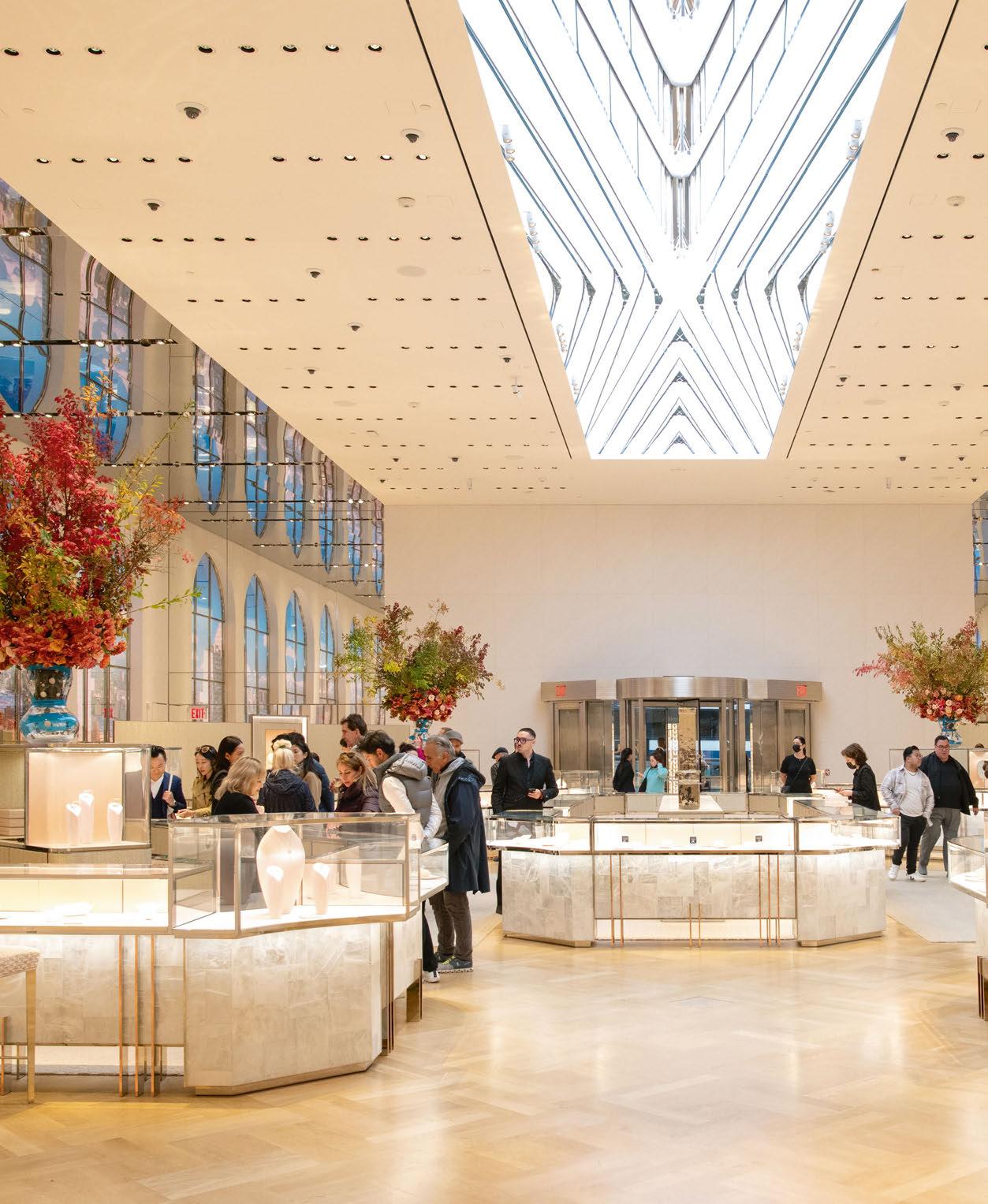
RETAIL LIGHTING 062 / 063
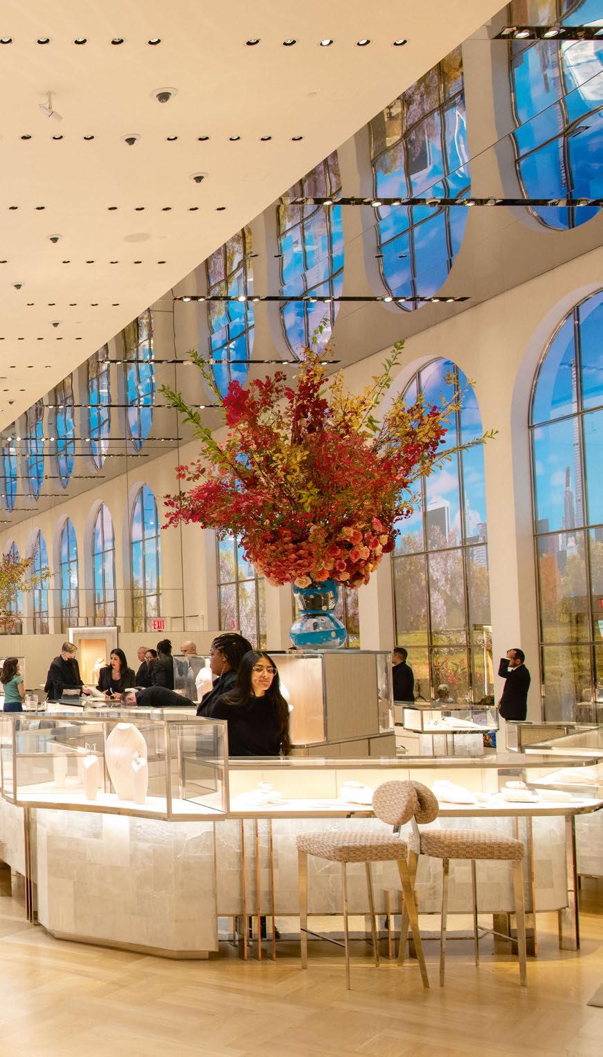
Tiffany & CoThe Landmark New York, USA
A landmark destination in New York, the flagship Tiffany & Co location - The Collection - has undergone a major refurbishment, it’s first since opening in 1940. Tillotson Design Studio crafted a lighting scheme that would honour both the traditional elements and modern new additions.
irst opened in 1940, the Tiffany & Co flagship store in New York City has long stood as a landmark destination in the city, and a must-visit for those looking for high-end jewellery – or a present for their partner.
The store has recently undergone a full renovation – its first since its original opening – in a bid to portray “the new image of Tiffany & Co”, transforming the space into a cultural hub that showcases exquisite interiors, superior hospitality, and cutting-edge art and design.
Spearheaded by Design Architect Office for Metropolitan Architecture (OMA) and Executive Architect Callison RTKL, the new-look store offers a narrative of both past and future, from the iconic details of the original façade to the modern new additions.
Lighting design for the project was delivered by Tillotson Design Associates, brought on board by OMA having collaborated with the architects on several projects in the past.
Erin Dreyfous, Partner at Tillotson Design Associates, recalls the studio’s early forays into the project: “Tiffany was looking for a new and fresh perspective on its existing lighting standards, and recognised the catalyst that its prestigious landmark store would be for all future developments.
“OMA designed a beautiful ‘jewel box’ addition at the top of the building, and wanted it to feel as if it were floating above the existing, historical building and to feature the subtle rippling within the glass façade after dark.
“We wanted to do our best to honour the legacy and historic significance of the building. We also aimed to create a signature nighttime identity for Tiffany that would provide an enhanced brand recognition from the exterior. For the interior, we set out to create a lighting design that elevated the merchandise and ensured that all patrons were bathed in a flattering, warm illumination as they traversed through each unique space, and specifically when trying on their jewellery.”
Once the initial conversations for the project had taken place, Dreyfous says that there were some “surprising turns along the way” as the team worked through the design. She continues: “We were in the middle of discussing some very interesting and innovative concepts for the iconic ground floor lobby with OMA, but then paused when Tiffany was acquired by LVMH.
“LVMH brought in architect Peter Marino (PMA) to take over the interior merchandise levels and the ground floor lobby design. From there, it became a mesmerising exploration of bespoke, artisan materials with their very talented team and the project became as much a retail store as an exhibition space for their extensive art collection.”
Tillotson Design Associates was responsible for almost the full extent of the project from a lighting perspective, including all exterior façade lighting systems, the events space and adjacent terrace, all merchandise levels, and the iconic ground floor lobby. Two other lighting firms took on selected, limited scope, including the connecting stair and the Level 10 private customer spaces.
Beginning with the building’s historic exterior, Noor Traboulsi, Associate at Tillotson Design Associates and lead project manager, details how the firm’s lighting concept was brought to life. “For the exterior, we maintained the integrity of the façade with minimal intervention and repurposed existing fixture locations to illuminate the areas around the atlas and clock. The ambient glow emanating from the interior at each windowsill contributed to the building’s distinctive identity.
“Working in close collaboration with PMA and CRTKL, we crafted interior details for each floor in harmony with the overall architectural design. Carefully selected interior finishes on each level were curated to mirror the displayed collection. We strategically placed lighting above casework to eliminate shadows on the jewellery, while simultaneously accentuating the architectural elements and furnishings throughout the space.
The Bridal Floor, for instance, features curved walls designed to mimic the graceful contours of the dresses. The lighting design seamlessly follows the curvature of the walls, producing a shimmering effect on the reflective finish. Additionally, we incorporated small decorative fixtures dispersed in a more random pattern, evoking the sparking allure reminiscent of the engagement rings showcased on this floor.”

F 064 / 065

RETAIL LIGHTING TIFFANY & COTHE COLLECTION

On the main floor, motorised, recessed accents play a quiet, supporting role to the commissioned central skylight, drawing focus to the merchandise displays.
Featured artwork and washed walls in the main elevator vestibule draw visitors up to the six merchandising levels above. Arrival on each floor is a unique and dazzling experience. Various layers of light feature a myriad of bespoke, artisanal materials and custom installations.
The added ‘jewel box’ on the roof of the building houses an event space with highly flexible light slots that respond to various programmes.
The signature ‘Tiffany Blue’ spills out from a system of lighting embedded at each window opening, and at the spandrel of the upper levels, complemented by a wash of light at the underside of the floating upper volume.
Throughout the store, the lighting designers were careful to create a scheme that would be respectful of both the traditional and modern elements, while adding a sense of coherency that knits the various spaces together.
Dreyfous explains: “The team aimed to create an overall design that was respectful of the iconic and historic identity of the building, mostly seen within the preserved details of the exterior façade, the main entrance that was left mostly intact
and in the proportions of the ground floor lobby. Subtle illumination of these details was intentional and key in doing so.
“One example, the original ground floor lobby, had integrated uplighting at the taller display cases scattered throughout the open space that cast light up onto the square ceiling clouds, dramatising the height and grandeur of the space. We recalled the original detail within our design using updated technology to softly uplight the solid bands of ceiling and to add sparkle to the cut glass, central skylight.
“Beyond that, we knew that the project aimed to set itself apart from all other traditional retail environments, and to create a new and innovative concept for what retail could be. We took our cues from the architectural design and selection of bespoke materials and furnishings, working with the team to seamlessly integrate lighting that featured these elements and created highly flexible spaces that could respond to their ever-changing exhibitions, displays and overall use.”
Given the type of products on display in the store, careful studies place lighting above casework at a maximum 10° tilt to ensure try-on jewels are never in shadow. Intricate detailing of lighting within the custom casework also helps to enhance the brilliance of the merchandise.
066 / 067
RETAIL LIGHTING TIFFANY & COTHE COLLECTION
discreetly trough-mounted, with positional awareness for accurate scene recall
TIFFANY NYC
features 400+ drx5 & drx2 motorised luminaires
complete control
fixtures boast intelligence for ground-level control over movement, dimming, CCT, and beam angle
highly versatile
designed for retail spaces, ballrooms, museums, streamlining setup, adjustments, enhancing

remote controlled lighting over 2 decades of design expertise
100,000+ global installations
offers unmatched flexibility, seamless light refocusing

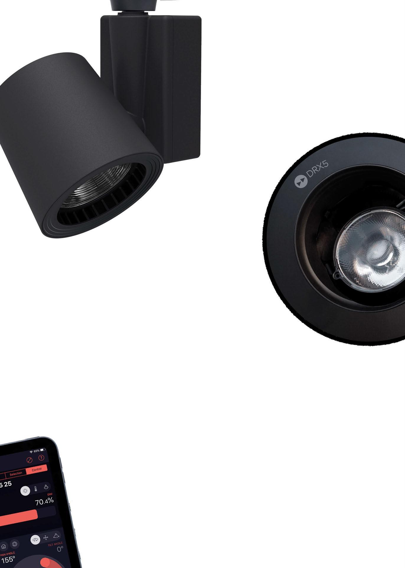
drx2
drx5
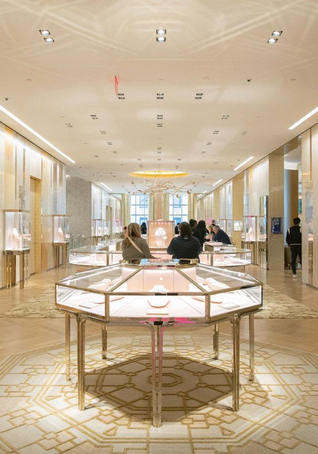
While the prospect of illuminating such dazzling jewels may have been a challenge for Tillotson Design Associates, Dreyfous explains that in some ways, the merchandise actually made their job easier. “Put any accent lighting on diamonds or beautiful cut crystal glassware and it almost sells itself,” she says. “But we did a lot of experimentation in determining what type of light quality showcased items best, such as the Elsa Peretti silver bangles, or what spikes in CRI values made the signature Tiffany blue ‘pop’ against its respective backdrop.”
The challenge instead came in reaching the high standards set for the project’s various environmental, health, and wellbeing initiatives.
The Landmark reopened with a significant investment in such initiatives and was constructed to operate sustainably for years to come.
Traboulsi adds: “It was a challenge meeting high light level requirements while adhering to sustainability standards for WELL Platinum and LEED Gold. This demanded careful fixture selection and detailed lighting calculations to
ensure that we used highly efficient fixtures and still maintained sufficient power reserve for illuminating vertical surfaces and the beautiful art.
“In addition, we implemented a detailed narrative outlining specific requirements for façade lighting, millwork lighting, and decorative lights, all programmed to turn off after a designated hour. Scene settings were carefully crafted to fulfil energy efficiency criteria, while also providing ample light for security and post-hours cleaning operations.”
When it came to the specification of lighting fixtures for the project, Dreyfous explains that, as with most retail projects, the schedule and turnaround time was a significant factor in the selection and fine-tuning of fixtures.
She continues: “We worked with LPA in the fabrication of most fixtures installed at the retail levels, and took great care in designing modifications and building in lensing and shielding accessories through an exhaustive prototyping process.
“While we had limited opportunities for on-site mockups, we did everything we could to test and verify fixtures with materials samples in-house, as that interplay was absolutely key in the success of the overall interior environments.”
Also key to the project’s success was the close collaboration between all parties – from the lighting designers to the architects, manufacturers, and Tiffany’s in-house design team. “We were in constant communication with the PMA team, often running back and forth to their studio with fixture samples to review and test with the latest material prototypes that they had procured from artists to evaluate for the final project,” Dreyfous adds.
“We very much enjoyed collaborating with the in-house Tiffany design team on the many custom display cases and integral lighting detailing as well. We also took on the bulk of the heavy lifting with the CRTKL team in coordinating a full working set of lighting design documents for the overall project to build and procure from, including controls coordination (everything is individually addressable and highly flexible), LPD calculations, emergency
RETAIL LIGHTING TIFFANY & COTHE COLLECTION 068 / 069


9000Lumens 24persqft in nim radius www.specialty-lighting.com ialty tri es Available Options

Client: Tiffany & Co
Lighting Design: Erin Dreyfous, Noor Traboulsi, Gabriela Grullon Pena Sr, Trinetra Manickavasagam; Tillotson Design Associates, USA
Executive Architect: Callison RTKL, USA
Design Architect (Jewel Box
Addition): OMA, USA
Interior Design: Peter Marino
Architect, USA
Additional Design: Metis
Lighting, Italy (Lighting for the interior of Level 10); Orsman Design, USA (Lighting for the Grand Stair)
Lighting Specified: Apure, Color Kinetics, Coronet, CSL Lighting, Dado Lighting, Designplan, DMF Lighting, Ecosense, Erco, Eureka Lighting, Eutrac, Feelux, Hubbell Lighting, iGuzzini, Interlux, Kendall, LED Linear, LF
Illumination, Litelab, Lighting
Partners America, Lucifer
Lighting, Modular International, Oracle, Prescolite, RCL, Selux, Specialty Lighting, Stoane
Lighting, USAI, WAC Lighting, We-ef
Photography: Floto + Warner, Michael Young, Narek Tashdjian
calculations, etc. It was a huge task in a short amount of time, and we’re very proud of what our team was able to accomplish!”
Working closely with the in-house design team at Tiffany also meant that the lighting designers could advise the brand on its overall aesthetic in the wake of such a large-scale renovation. “The Tiffany team was very receptive to re-evaluating their existing standards and looking for opportunities to improve them,” Dreyfous continues. “We started our process by surveying several of their recently opened retail locations and then in discussing with them what worked well, why, and what we might do to elevate or completely revamp these concepts for the landmark store.”
Such conversations have led to a successfully realised project, showcasing both the historic elements of the landmark building, and also its new, modern additions. As with any project with a tight deadline, the Tillotson Design Associates team is still fine-tuning some “Day 2 items” with the team, but Traboulsi believes that the design and execution of the project has “been successful and remain true to our initial concepts”.
“In this visually captivating environment, our lighting design aims to be discreet; we prioritise washing walls, accentuating featured artworks,
while treating the architecture itself as a work of art by showcasing bespoke materials, drawing people into an immersive experience through the floors,” she continues.
“In the café space, a specially designed slot with wallwashers and track heads strategically illuminates the perimeter walls and tables. Thoughtfully positioned accent lights, subtly concealed within custom floating Tiffany boxes, draw attention to the central tables.
“On the main entry floor, we used motorised recessed quiet accents arranged in a grid pattern in harmony with the commissioned featured skylight, which remains the focal point of the ceiling design, evoking a ‘wow’ moment as soon as you enter the space.”
Traboulsi also reserved special praise for the teamwork on show to bring this project to light. She concluded: “I’d like to emphasise the incredible teamwork and dedication that went into bringing this project to life. From the initial conceptualisation to the final execution, every member of the team played a crucial role in ensuring its success. It was a great opportunity to be part of such a rewarding endeavour.”
www.tillotsondesign.com
070 / 071
RETAIL LIGHTING TIFFANY & COTHE COLLECTION
Galeries Lafayette Shenzhen, China
The latest addition to the Galeries Lafayette chain, in Shenzhen, China, is built around a concept titled “Breathing Fashion”. Lighting designers at Nulty explain how light was instrumental in realising this concept.
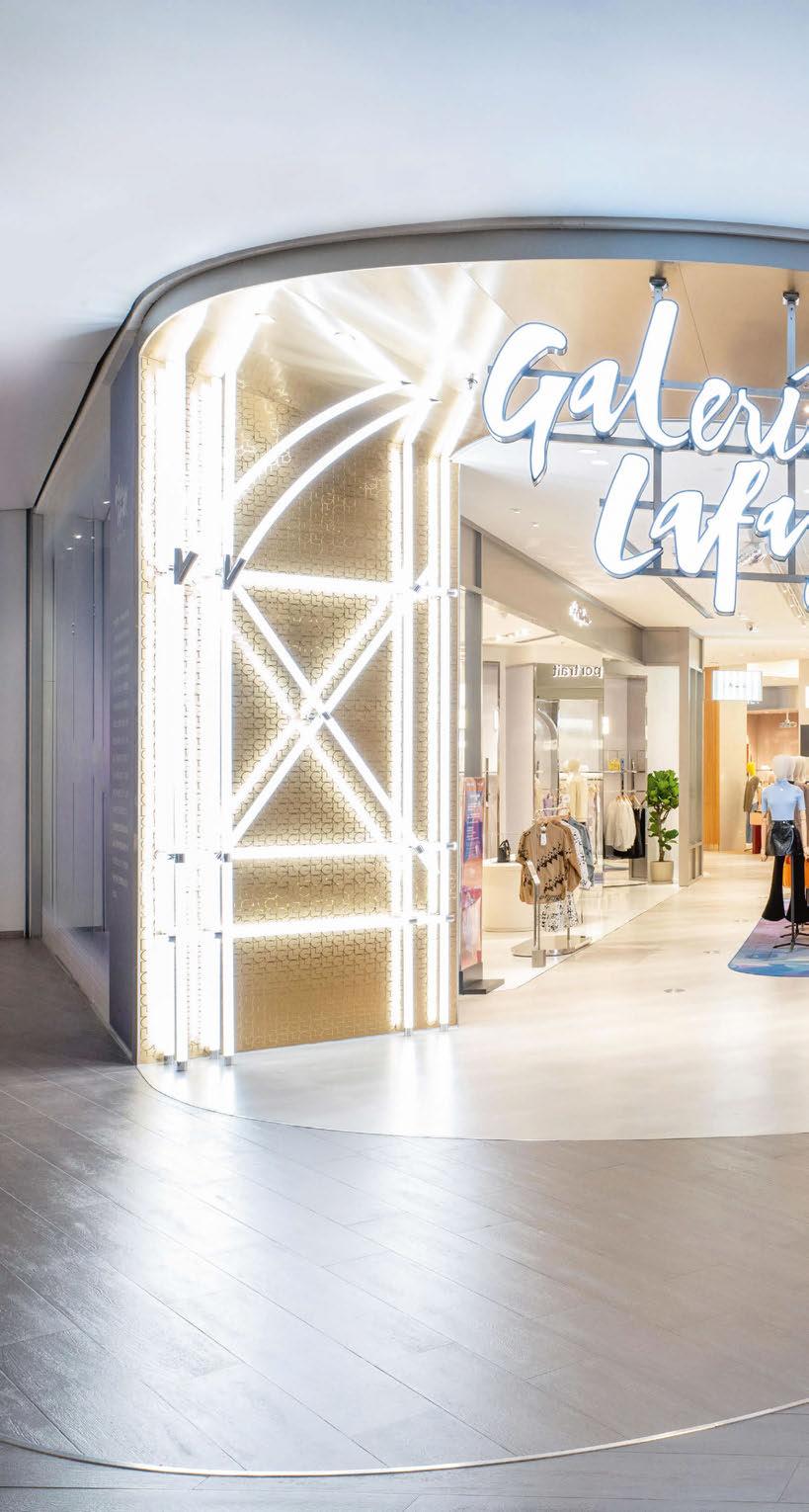
072 / 073
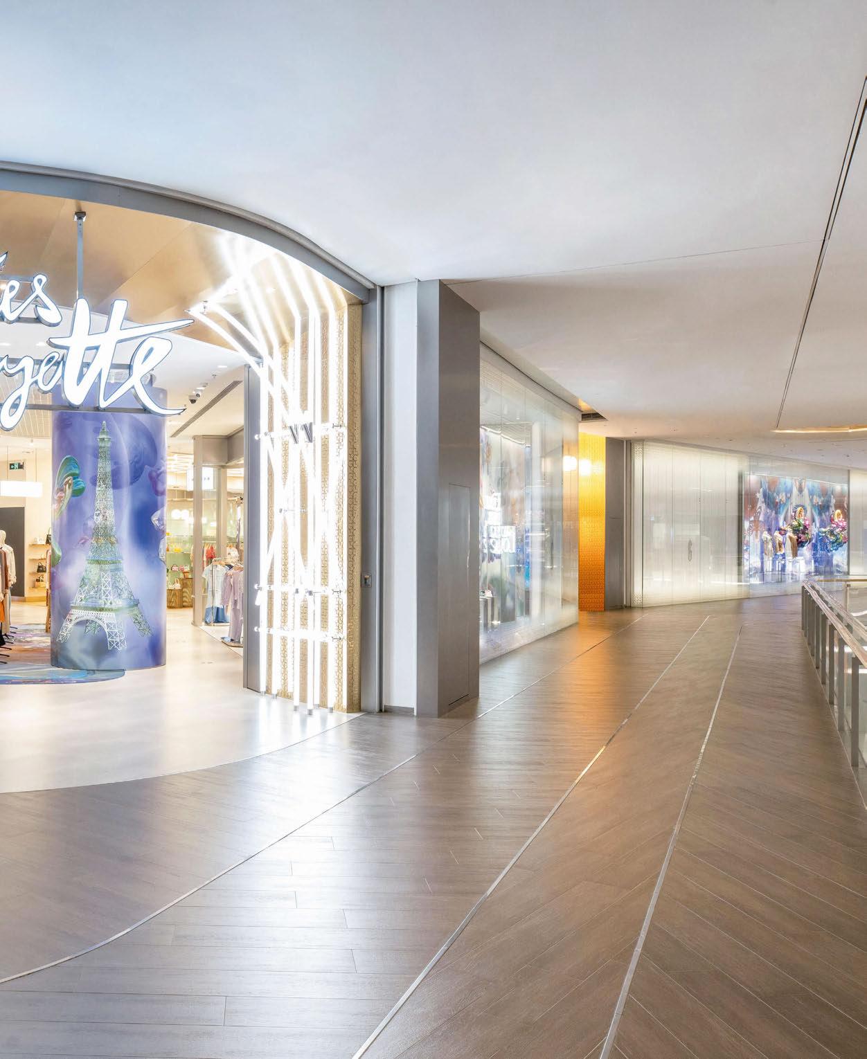
RETAIL LIGHTING
Light is a storyteller of places, weaving narratives with shadows and illumination.
Much like theatrical lighting, which can whisk away an audience to distant lands or delve into the depths of a character’s psyche and evoke emotions, architectural lighting can harness those same powers when crafting immersive experiences.
In Shenzhen, China, Galeries Lafayette’s newest retail haven stands as a testament to the artistry of light. Nestled within the Upper Hills Mall, this enclave of style and chicness, conceived by the talented minds of interior and architectural studio Cardy Papa, beckons shoppers into their concept of “Breathing Fashion”, a series of living and breathing spaces akin to the boutiques of Paris.
As trusted collaborators of Cardy Papa, Nulty was initiated to work on the project, to use lighting as an element that brings life to the storytelling aspect of the theme and crafts an engaging atmosphere that encapsulates the inherent chicness of the brand.
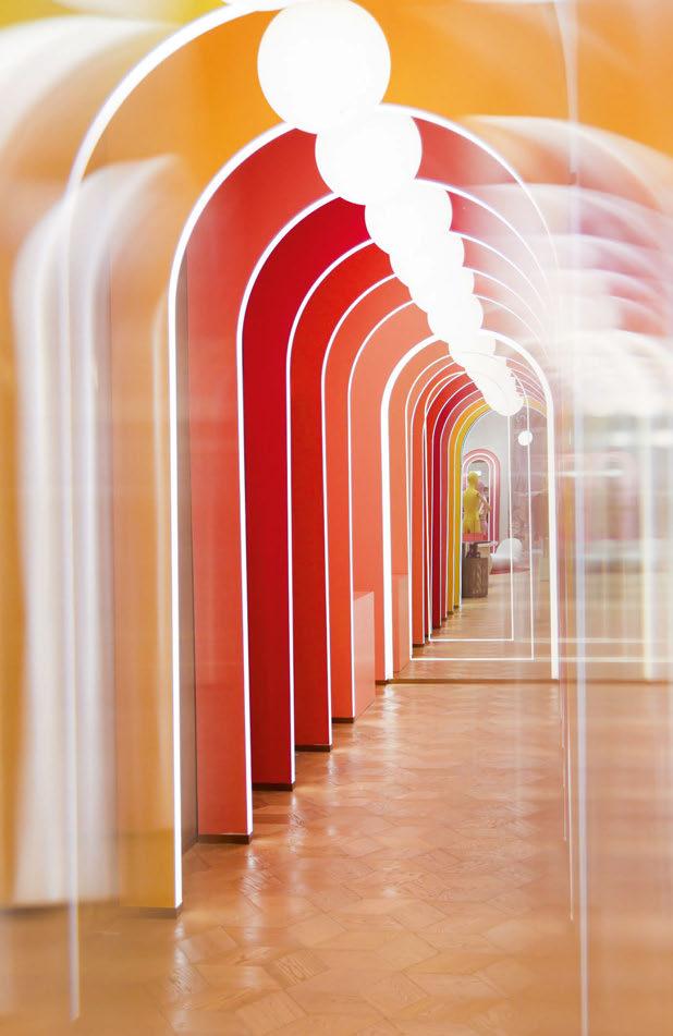
In conversation with Daniel Blaker, Creative Director at Nulty, arc delves into their close collaboration with Cardy Papa to turn traditional retail design on its head to deliver something tailored and experimental. While Cardy Papa led the design, the Nulty team was given freedom to explore the overriding theme freely through whatever creative expression of light they wished.
“Our aspiration was to create a visual tapestry of light, so we looked at what light is doing at every stage of the journey to enhance the aesthetic and deliver emotional value for customers,” says Blaker.
“Everything was considered to the most minute detail. We began by integrating light into the infrastructure of the store to create a backbone of convivial ambient illumination. We then used layers of light to add drama and accent details.
“In some areas, this meant using light to frame a viewpoint or enliven a specific dwell point, in other spaces it is about creating a moment of drama or stylistic exuberance. The intent behind all these creative lighting interventions was to draw occupants in and encourage them to engage with the space.”
An illuminated archway inspired by the architectural lines of the Eiffel Tower, a symbol of Galeries Lafayette’s Parisian roots, greets shoppers on arrival and is replicated elsewhere in the circulation areas to form a unifying design language.
“It’s an overtly themed moment that honours the cultural importance of the landmark,” adds Blaker.
“We replicated the arch motif elsewhere in one of the main circulation areas to reference the legacy of the brand once more and bring a sense of continuity to the lighting narrative. In this iteration we were able to be more theatrical because this space is tucked away from the wider context of the mall. The composition of white tube lights is predominantly the same, but we set it against mirrored surfaces to produce a more theatrical effect.”
The meticulous placement of white tube lights orchestrates a captivating entrance experience, delineating the shift from conventional shopping mall ambience, whereas elsewhere in the escalator area, the effect is magnified as the play of lines of light and mirrored surfaces creates the illusion of a double-height space. The visual trick produces an elegant dwell point and serves as a subtle nod to the brand’s heritage.
It was important to Nulty to pull customers in and encourage people to explore the space from the entrance point. The lighting features at the threshold had to complement the rest of the mall, so they were stylishly integrated but playful enough to begin the immersive feel. As you move further inside, the lighting becomes more expressive; for example, in the fitting rooms, customers access the area via a dramatic walkway of colour and light to heighten the ambience.
The Beauty Boulevard is where the interior design team sought to capture the boutique-lined streets of Paris, through the bold use of colour and lighting. A huge floral creation featuring suspended globe pendants elevates the space from functional to theatrical and turns the traditional beauty hall concept on its head.
RETAIL LIGHTING GALERIES LAFAYETTE
074 / 075


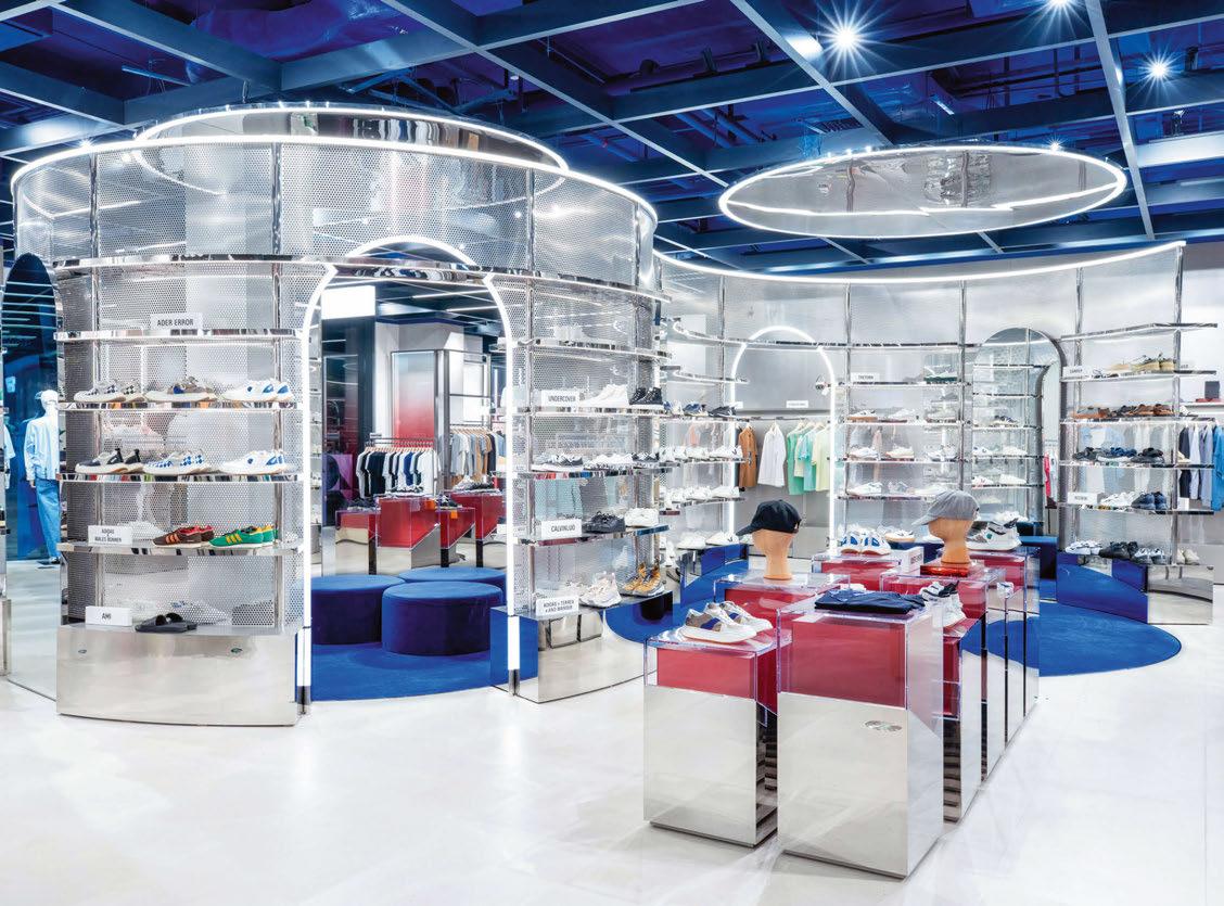
076 / 077
“We worked closely with Cardy Papa to integrate light into the installation and used suspended globe pendants to produce a beautiful quality of diffuse light. It’s a subtle intervention that doesn’t vie for attention. The pendants augment the feature and provide a soft, flattering layer of illumination for customers sampling cosmetics at the display counters beneath,” explains Blaker.
Beneath the installation, a space designated for content creation has been given a backdrop of illuminated slogans and diffuse pendants to offer the perfect blend of decorative and flattering light for social media moments. The right quality of lighting for video content was achieved through a balance of decorative, ambient, and cylindrical lighting. The backdrop features illuminated slogan signs to provide visuals for those posting for social media. The contrast of downlights and diffuse pendants also enable good facial recognition as well as a flattering level of light.
At each beauty concession, adjustable recessed spotlights discreetly illuminate the merchandise, ensuring that the eye is drawn to the graphic lines of light framing the individual display areas. This effect helps to make brand touchpoints feel more tailored and considered. The Nulty team optimised the lighting by using an LED Beauty module, an intelligent development by Nulty and its partnership with the University College London and Xicato.
“The collaboration came together because we realised that accurate rendering of skin tone is a difficult challenge, due to the fact when it comes to illuminating skin tones we are dealing with a rich and complex palette. Our fittings feature a 2:1 ratio of beauty and artistic LED modules, developed to deliver a better colour rendition for shoppers when they are sampling makeup” says Blaker.
On “The Edit” fashion floors, the lighting design approach is consistent, however subtle variations add distinction. The idea is to create a scheme that felt like a journey of discovery. Working with a rectilinear aesthetic in the men’s section, minimalist spotlights were integrated into a dramatic exposed ceiling and teamed with transverse linear arrangements that bring a sense of rhythm and repetition to the circulation areas. Dramatic lines of light border the mesh frame display units and give rise to a bold aesthetic and energetic tone. This theme is influenced by the exposed industrial ceiling by the tones and finishes of the material palette. The ambience is noticeably softer in the women’s area. Diffuse lines of light illuminate the architectural grid in the ceiling, while clusters of globe pendants offset the minimalism and highlight key merchandising points.
An illuminated pink mirror makes a strong bid to steal the limelight in the centre of the space, and turns a simple pause point into a genuine wow moment.
Blaker adds: “In the women’s area we replicated the use of lines of light to illuminate the architectural grid in the ceiling and merchandising displays, but here the light levels are more diffuse, and the lines are softer, to complement the light-toned woods and delicate colours of the scheme.”
Like any project, the lighting design team encountered obstacles in realising its lighting scheme particularly when faced with the architecture of the building.
Blaker explains: “We were working with exposed ceilings so there was an unfinished quality to the architecture that we had to consider. Minimalist fittings were used to form a discreet layer of light that blends into the background. We then offset this with human scale accent lighting to draw the eye. Some of the large-scale feature installations presented fabrication challenges because the finish had to be seamless. We maintained the structural integrity of the more complex features through rigorous testing and a high level of coordination with the design and fit out teams to get it exactly right.”
Challenges were met with precision by the Nulty team, who successfully and seamlessly integrated light into the architectural canvas. The project itself is testament of the transformative powers of light and its ability to create holistic experiences such as walking down the boutique streets of Paris, to those ‘wow’ moments and personal journeys. For Blaker it was quintessential that the lighting brought a quality to the experience of shopping that entices people back into the physical world of shopping and interact with the brands they’re buying.
He says: “Consumers can purchase a product with a simple swipe on their device these days, so they need a touch of magic and spontaneity when they visit a store to help them engage with that brand. This is something that can only be accomplished when the lighting is designed to be part and parcel of the whole experience, as only then does the space come alive and feel unique.”
www.nultylighting.co.uk
Client: Galeries Lafayette
Lighting Design: Daniel Blaker, Beatrice Rossi, Chia Huei Lu, Eleanna Kafka, Kathrin Nuestro, Motheo Ramphele; Nulty, UK
Architect: Cardy Papa, UK
Lighting Specified: Encapsulite, Fagerhult, Flos, Folio, LEDFlex, LightGraphix, LightLab, Lucent Lighting, Precision Lighting, Reggiani, Viabizzuno, Vode Photography: Galeries Lafayette China
RETAIL LIGHTING GALERIES LAFAYETTE
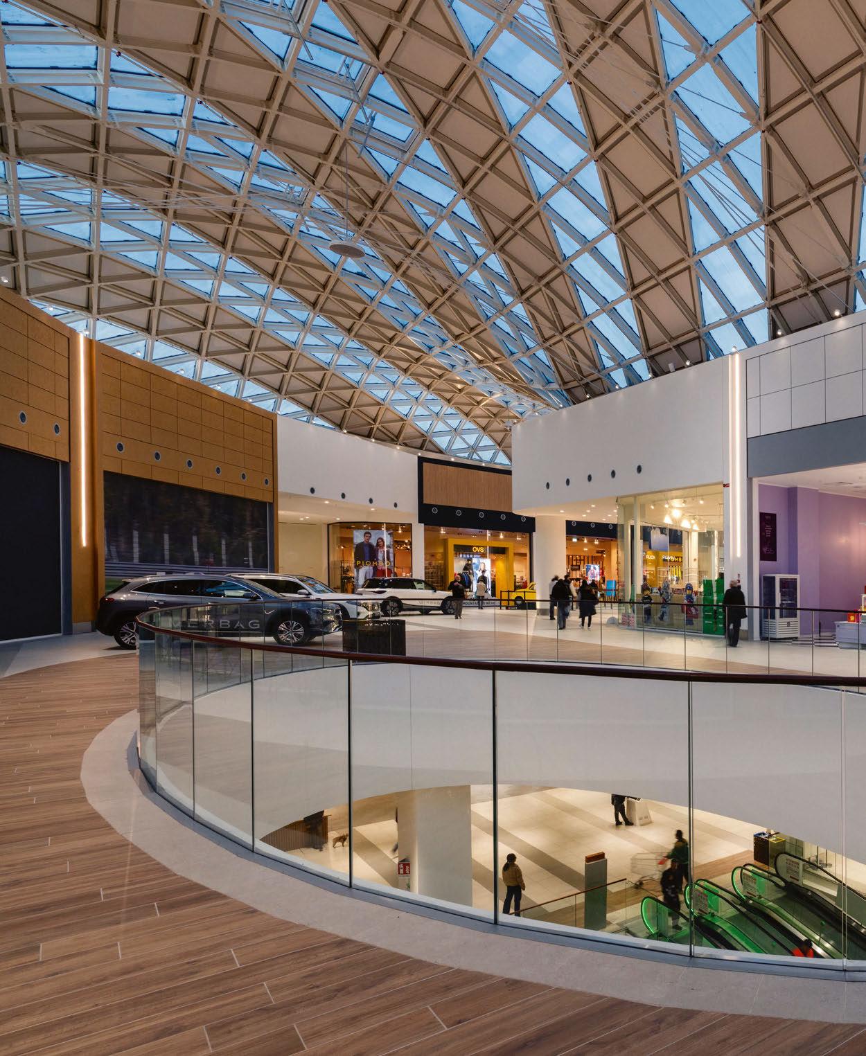
RETAIL LIGHTING 078 / 079

Milan, Italy
The newly opened Merlata Bloom Mall looks to bring the vibrant DNA of Milan to a burgeoning new area of the city. Lighting designed by L+DG Lighting Architects helps to showcase the flowing architecture of the space while improving visual comfort for visitors.
Merlata Bloom Mall
nspired by the helical structure of DNA, the recently inaugurated Merlata Bloom shopping mall takes the vibrant and dynamic DNA of Milan and extends it to a previously underdeveloped area of the city.
Designed by Callison RTKL (CRTKL), the futuristic mall is home to more than 200 stores, and is distinguished by its organic, flowing form, with two circular buildings connected by a suspension bridge.
To further reflect the vivacious spirit of Milan, Greek lighting designer Thomas Gravanis of L+DG Lighting Architects developed a tailormade lighting scheme that would aptly satisfy the project’s inherent requirements for visual comfort and sustainability, while creating a welcoming and engaging atmosphere.
Inside its doors, the Merlata Bloom showcases magnificent, expansive, seamlessly interconnected spaces distinguished by ample use of glass elements. Spaces as diverse and intricate as these naturally have different lighting requirements, which CRTKL sought to address by aligning with the building’s bioclimatic and energy-efficient design principles.
From a lighting perspective, Gravanis took inspiration from a different field to bring the myriad spaces together. He tells arc: “In a way, designing for shopping centres has many similarities with another sector, that of hospitality – macro projects, within which multiple small projects coexist.
“In hotels, one traditionally finds well-defined and
autonomous spaces such as restaurants, bars, spas, and the hotel rooms themselves. Similarly, in shopping centres, shops, restaurants, cinemas, gyms, meeting places and even outdoor landscape spaces, as is the case with Merlata Bloom, coexist. It is precisely from this mixture that the greatest challenge arises: each of these rooms requires a particular lighting solution, calibrated to its function and in balance with the other solutions.
The thing that all scenarios must have in common is the feeling of wellbeing perceived by the users of the space; everyone must feel special. In a way, light becomes a marketing tool.”
To create this harmonious lighting scheme, one that would knit the different elements of the mall together, Gravanis utilised a range of fixtures from Italian brand, Linea Light Group. On the first floor, at the entrance to one of the many food courts, an escalator connecting the two floors creates a double-height space. Here, to emphasise the verticality of the space, suspended cylindrical tubes – Linea Light Group’s TU_V – deliver 360° diffused light along the vertical axis. With varying heights, these tubes produce a captivating sense of motion akin to a cascade of shooting stars, creating a play of light resembling “luminous lakes”.
The ceiling of the main concourse, featuring a glazed, barrel-shaped structure, posed a considerable architectural and structural challenge, due to its wooden baffle boiserie. Here, Linea Light Group’s hexagonal-shaped ceiling fixture, Skin, was creatively positioned, facilitating the formation of continuous and intricate linear compositions, allowing its silhouette to illuminate the contemporary architecture’s complex or irregular perimeters. Custom recessed lighting solutions were developed to illuminate the ceilings of the corridors connecting the stores, aligned in clusters, the COB44 downlights provide ample, but not flat, lighting. On either side of the shop windows, decorative pilasters host vertical linear light fixtures – Rollip Pro – which aids in distinguishing and characterising the entrance to each shop.
Gravanis explained how the interior lighting solutions improve the visitor experience, while also showcasing the flowing architecture of the space: “Mall lighting, similar to shop lighting, is a complete experience. One only has to take a walk through the city centre and look at the lighting in the showrooms to see how it can enhance the architecture and design of the shops, and make them more attractive to customers, encouraging them to stay longer inside and shop.
“We also followed these principles at Merlata, striving to create a welcoming, fluid, and engaging environment in which visitors could have a pleasant experience and spend quality time. Whether window shopping, eating, or socialising, the lighting should be discreet and not ‘shout out’, but rather contribute to the joyful experience.
“We have adopted various solutions to eliminate glare produced by LED sources, using anti-glare accessories and, in some cases, designing special anti-glare luminaires. In addition, we paid a lot of attention to the quality of the light, ensuring that it was very high, to avoid optical problems and

I 080 / 081
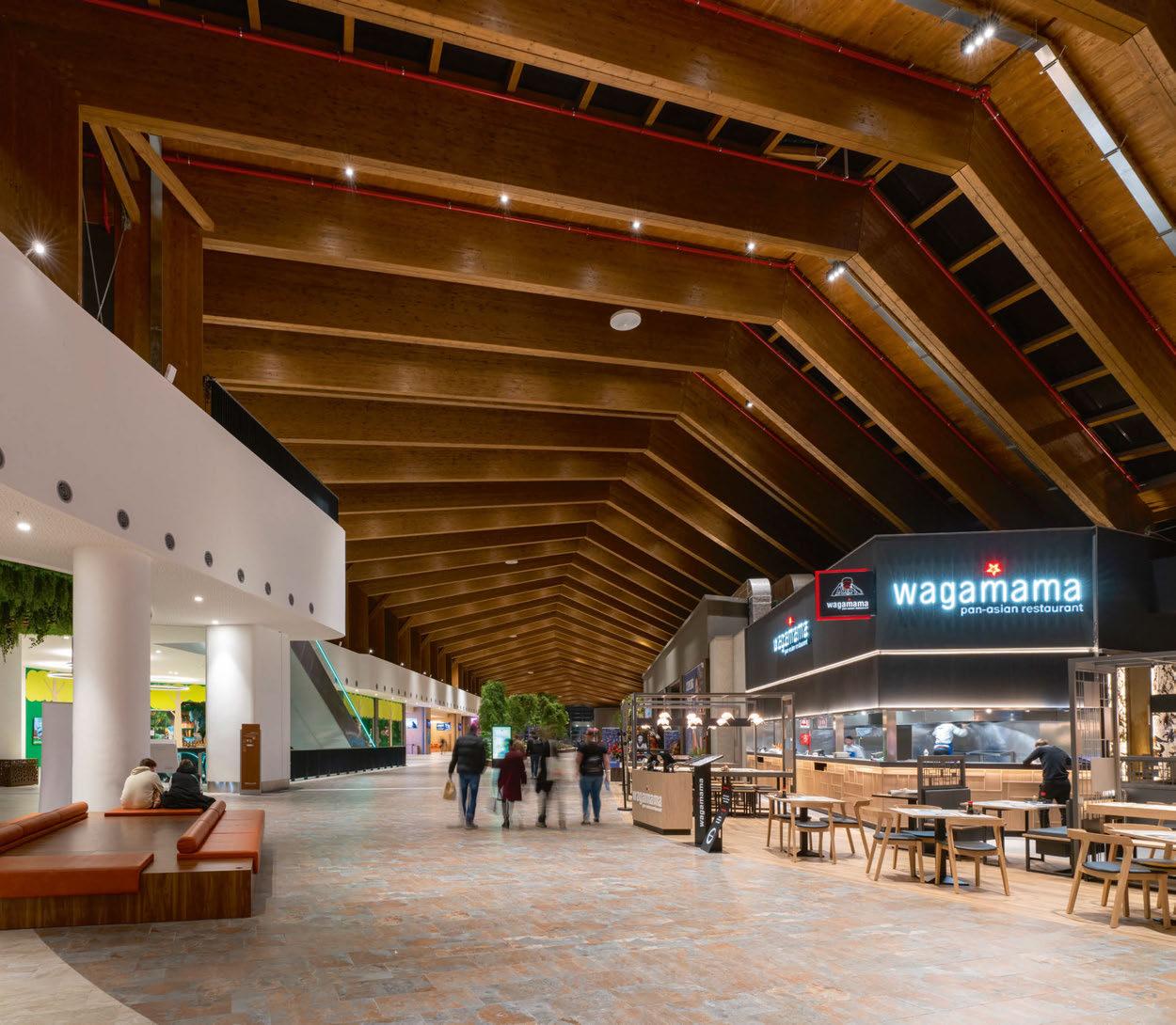
RETAIL LIGHTING MERLATA BLOOM MALL
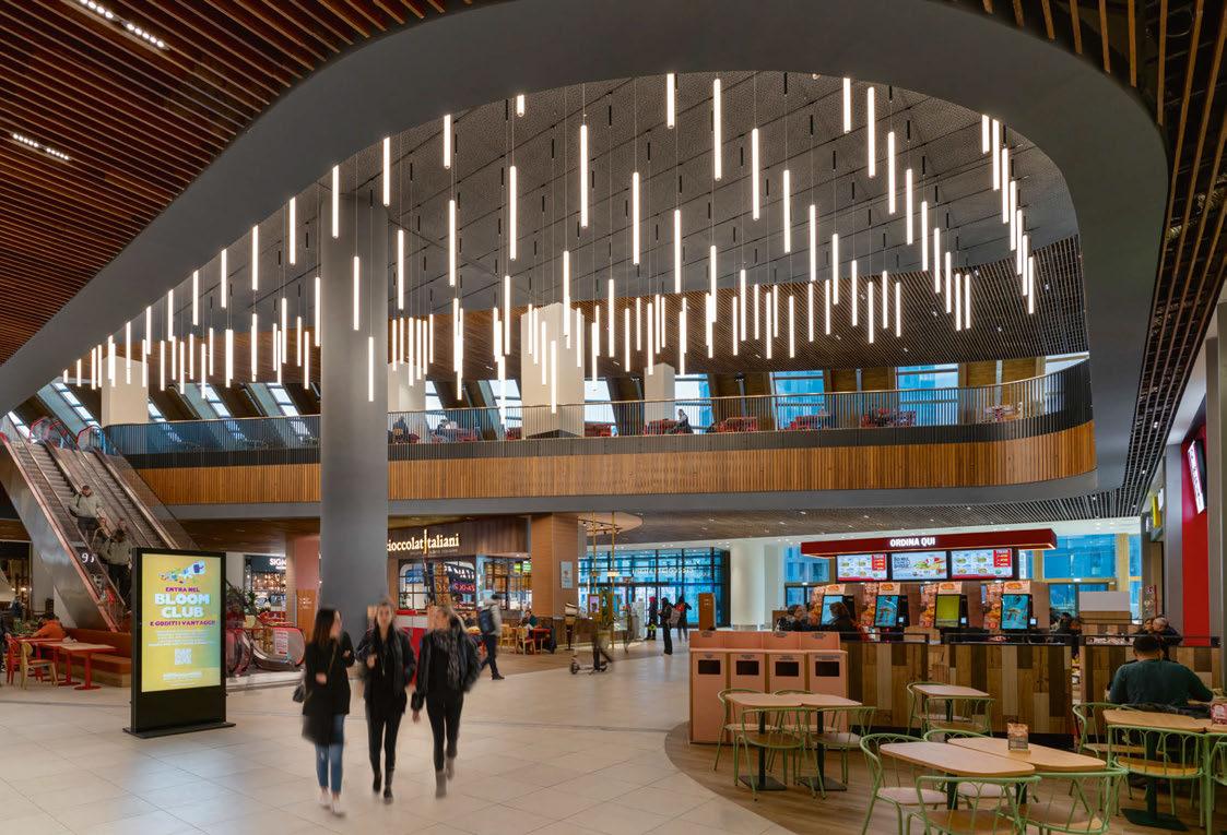
provide pleasant and comfortable lighting.”
One of the core architectural principles from CRTKL was to create a modern, “bioclimatic project” that would become a landmark for the area. With that, one of the main concerns for the lighting design was to meet the requirements inherent in the bioclimatic and energy design of the building.
Gravanis explains: “We took these requirements into account throughout the design process, focusing in particular on the main roof of the shopping centre – a strongly characterising element whose lighting was not ‘immediate’.
“An initial concept was to illuminate the roof structure upwards, with controllable projectors to avoid light spill into the environment through the glass. However, its glazed barrel structure – appearing like the organic bone structure of a mysterious sea creature, did not allow the installation of lighting fixtures directly on it, mainly because of the inevitable maintenance difficulties that would be involved.
“In general, we took advantage of the different types of ceilings in the various areas of the shopping centre, in smooth plasterboard or with wooden ribs, using recessed spotlights of different shapes, all with excellent quality characteristics in terms of lighting colour rendering. In the areas where high-end brands are present, we applied our studio’s philosophy of creating optical
stimulation by playing with shadows and light whenever possible to achieve a visual result that was not uniform or flat, while in the larger spaces the lighting was made more uniform. Even in the food courts and restaurants, we wanted to focus on a play of light, creating ‘lakes of light’, while in the planted areas, we treated the lighting as an integral part of the urban landscape, almost as it if were an ‘en plein air’ experience.”
One of such planted areas, a green space known as the “Winter Garden” that visitors arriving on foot from the Merlata district walk through, has been illuminated by four carefully selected solutions, chosen to mitigate environmental and light pollution concerns. Firstly, Warp recessed downlights are installed in the upper false ceiling at the entrance to the shops, used to support the Navata Optus directional spotlights, strategically positioned to minimise glare. On the ceiling, black illuminator downlights have been mounted along the wooden “ribs”. To illuminate the greenery in the flowerbeds, 3000K Bond Pro bollards were inserted, this being one of the few solutions in the entire project not adhering to a colour temperature of 3500K.
Outside the bathrooms, a typically highly frequented area, there are tree-like installations under which visitors can relax and freshen up. Here, Orma uplight solutions have been installed at the foot of the trees, softly illuminating the
RETAIL LIGHTING MERLATA BLOOM MALL
082 / 083


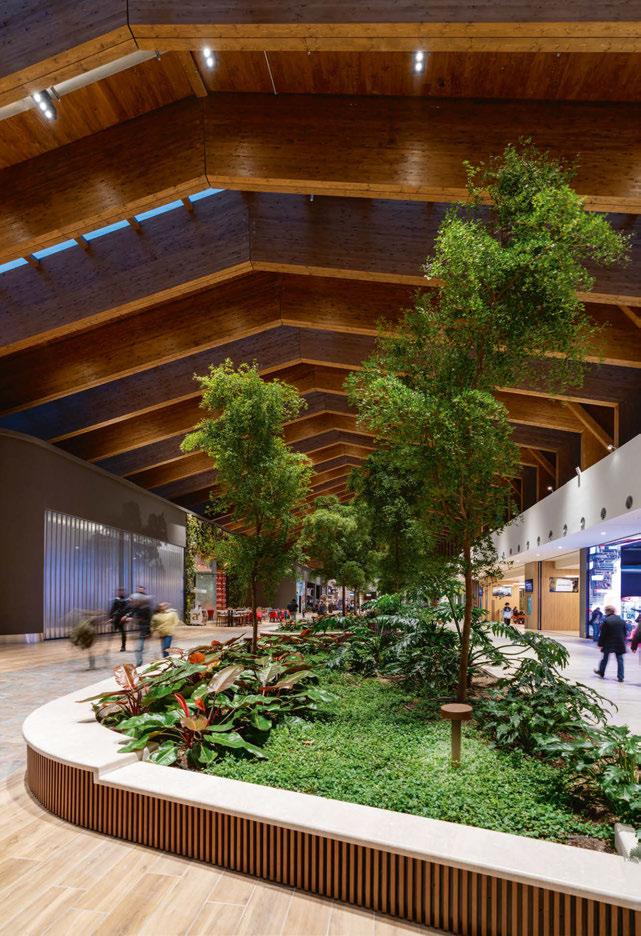
surroundings, creating an atmosphere of peace and calm. To complement the ambience, lightweight Tour circular suspensions have also been installed. Outdoors, the adopted solutions respond well, amply satisfying the limitations imposed by the municipality and the challenges of highway restrictions. Even from the outside, the organic architecture of the Merlata Bloom successfully catches the eye.
transiting the motorway. It is an architecture that harmoniously combines advanced technology and sustainability, in which the main roof is designed to be environmentally friendly and provide abundant natural light without causing glare or overheating, elements that are anything but obvious.
“The basis of our lighting design was the initial brief provided by CRTKL’s team of architects, and chief architect Jorge Beroiz. Our initial concepts were based on the helical appearance of the building, which in itself suggested an idea of ‘dynamism’, of something that would have the ability to change throughout the day. Our aim was to offer a different perception to anyone driving along the motorway – we wanted to create a dynamic, non-static form with indirect lighting that would integrate harmoniously with its surroundings. This would have really helped to fully understand the sculptural form of the building, but it was here that the first obstacle arose: the first concept also included the use of colour through RGB luminaires, which the transport authority objected to, as the colour change on the façade, although slow in transition, would have increased the risk of distraction for passing motorists, with the consequent increased risk of accidents at what is a very busy junction. All in all, the final monochrome solution still satisfied everyone.
Client: Merlata Bloom Milan
Lighting Design: Thomas Gravanis, L+DG Lighting Architects, Greece
Architect: Callison RTKL, UK
Lighting Specified: Linea Light Group
Photography: Andrea Martiradonna
Gravanis highlights how the lighting design helps in showcasing the sinuous architecture of the mall: “This is a project that has developed in an urban area with a strong industrial past, and is increasingly defining itself as a new centre of interest for Milan. Located close to a major motorway network, the exhibition centre, and a newly developed residential area, Merlata Bloom is the focal point of this new urban centre, with its eye-catching, organic architecture.
“Its façades are designed to enhance the visual experience from both near and far, both for visitors to the shopping centre, and for motorists
“Then there was the issue of light pollution – a real danger when dealing with extensively glazed structures like this. The main concern of our study was to comply with the new energy and environmental requirements imposed by the bioclimatic and energy design of the building, both for the external and internal lighting, aiming at having zero impact on the surrounding environment, i.e. zero light pollution and glare reduced to a minimum. A requirement here that is all the more important because of the frequent passage of aircraft on approach or take-off, to which upward lighting would certainly have been a nuisance in what are the most delicate phases of the flight.”
Despite several challenges, the outcome is subtle, high-quality lighting that accentuates the distinctive architecture of the lifestyle centre.
Indeed, Gravanis is in agreement that lighting brings an added element to this already unique piece of architecture, concluding that despite some difficulties “we managed to create a very beautiful and vital architectural design.”
www.lightingdg.com
RETAIL LIGHTING MERLATA BLOOM MALL 084 / 085
Flex Tube Wellness
Choose PROLED for unmatched reliability. Wherever you are.
Safe Anywhere
From the tropics to the arctic, you can rely on the PROLED Flex Tube Wellness for consistent light intensity. It’s built to last, even in high temperatures. With IP67 protection, heat-sealed end caps, and WaterStop cable protection.
proled.com

086 / 087

Luxury Watch Boutique Milan, Italy
In Milan’s historic Galleria Vittorio Emanuele II, Metis Lighting has delicately enhanced the aesthetic of a luxury watch boutique, celebrating both the customer experience and the architectural significance of the site.
In one of the most celebrated historic landmarks of Milan, the 19th-century iron-and-glass arcade of the Galleria Vittorio Emanuele II, a new chapter unfolds. Among some of the most luxurious boutiques, a prestigious watch showroom recently opened, giving shoppers a sophisticated, immersive retail experience.
Metis Lighting played an integral role in the restoration of the space, led by ACPV Architects. An extensive intervention, the project aimed at honouring the unique stylistic codes of the architecture, while expressing the strong individuality of the company.
The lighting design contributes to this harmonious, synergistic synthesis with attentive sensitivity. Through light, the designers sought to delicately find and calibrate the most appropriate hues and intensities to celebrate with atmospheric relevance of the architecture, the narrative and user experience.
“The objective of the lighting concept was clear,” says Gloria Cancellieri, Lighting Designer at Metis Lighting. “We conceptualised and designed each layer of light to be in perfect and seamless integration with the architecture. Light is impeccably asserted in every design detail, conferring high visual comfort and hierarchy to every space by carefully balancing diffuse luminosity with accents.”
Different lighting components in concert across the three levels of the boutique, tailored to customer needs, define the exclusive space, each serving specific functions.
The ground floor, dedicated to the exposition area, welcomes with the appeal of an elegant,
inviting environment orchestrated on pale tones. Indirect coffer-ceiling lighting, in combination with a handful of direct spotlights, ensures ambient luminance levels, while a majestic, custom-made blown glass chandelier, specifically designed for the brand and realised in collaboration with experienced artisans, provides a central focal point, suspended above a display table in geometric resonance. It magnifies with suffused, focal glow the iconic featured pieces, paying homage with its “play of brilliants” to one of the three pioneered theoretical concepts of Richard Kelly. The chandelier, envisioned by ACPV Architects, technically designed, and engineered by Metis Lighting, makes a statement of compositional and formal refinement.
“The piece consists in a sequence of long, thin, hand-chiseled and polished cylinders, framed by two brushed brass profiles. The arrangement enlivens the scenographic aesthetic allure of the artful, sculptural sign, intensifying the delicate, suffused glowing brilliance radiating from hidden lighting sources,” says Claudio Valent, Head of Lighting Design and Founder of Metis Lighting.
The ideal complementarity of crafted linear light sources with focused light beams, hidden and integrated into the ceiling’s folds, provides a visual scale and multi-layered reading key of the almost monochromatic setting without any glaring effect.
The lighting design outlines the overall fluidity of the interior layout, suggesting visual continuity and highlighting the vertical flow of the experiential journey.
RETAIL LIGHTING

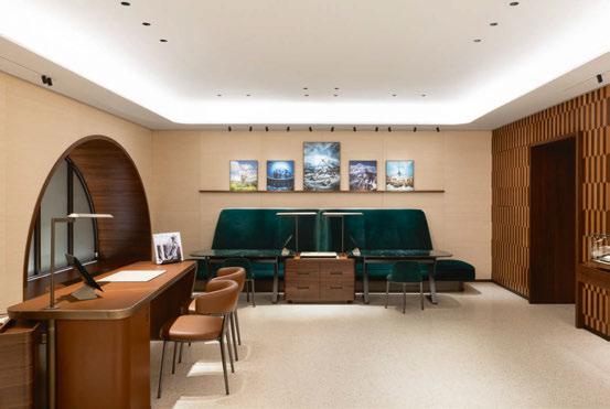
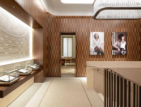
From a ceiling razor-sharp cut, an uninterrupted luminous stripe indirectly livens the uniform smooth, clear terrazzo surface of the wall and staircase, emphasising the vertical momentum, as well as the graphic sculptural features and purity of the clean lines, in juxtaposition with a sumptuous walnut boiserie.
In the exclusive lounge, on the upper floor, lighting accepts the challenge of enhancing the space, brought back to the original splendor by a long, precise conservation-restoration effort.
“The intervention on the two VIP rooms was particularly complex, since the main ambition was to preserve the characteristic features, from the floor to the windows, including the frescoed ceilings, protected by the municipal superintendence,” explains Antonia Maiello, Lighting Designer at Metis Lighting.
“Another relevant theme is that in environments like these, where the visual task can vary according to exigencies and demands of the moment, the correct equalisation of different light sources, guaranteeing multiple levels and variations of intensity, is an imperative strategy that always proves to be successful,” continues Marinella Patetta, Head of Lighting Design and Founder of Metis Lighting. “Light of high quality where and when it is needed makes carrying out daily work easier, leading to better results, providing the best degree of comfort to those who live in the space for many hours every day.”
Client: Confidential
Lighting Design: Gloria Cancellieri, Antonia Maiello, Marinella Patetta, Martino Scalabrino, Claudio Valent; Metis Lighting, Italy
Architect: ACPV Architects, Italy
Lighting Specified: Aggio Light, Atea, Flos, Formula Luci Italia, formalighting, KKDC, ZCube
Photography: Gianluca di Ioia
“We chose how to proceed after some mockups, and then tested with a selection of profiles and devices. The balanced and meticulous combination of direct and indirect fonts ensures that hidden tracks in unison with adjustable projectors strategically stress the artistic patrimony, emphasising with diffuse and directional light original frescos, geometries, and floral motifs of the terrazzo flooring.”
Designing the light for such an innovative space was demanding but of great value. Metis Lighting’s design aims for an attentive reading of the space, never overwhelming the architectural project, while enhancing its narration in all its choices and subtleties.
Valent concludes: “Light is our material, we understand it in all its characteristics, gradients, variations intimately, and yet, when a project finally ‘turns on’, a strong emotion always arises – the emotion of something new being born, of an unprecedented atmosphere, a new story that begins.”
www.metislighting.it
RETAIL LIGHTING LUXURY WATCH BOUTIQUE 088 / 089


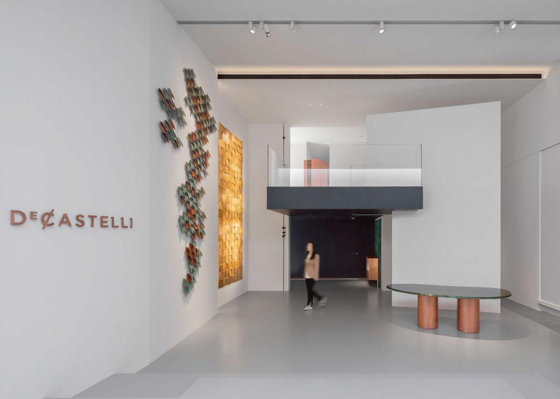
De Castelli Showroom
Beijing, China
Presenting merchandise as art, Erco spotlights and recessed luminaires display unique pieces with accent lighting at Beijing’s De Castelli showroom.
The De Castelli brand is known for its dedication to metalworking, which adds a touch of craftsmanship to the luxurious furniture collections. The De Castelli Gallery in Beijing is located in a picturesque traditional courtyard and displays exquisite metal artworks, furniture, and surfaces. To present these masterpieces in the right light, Erco was commissioned to develop a lighting solution that would emphasise the beauty of the exhibition space.
The showroom was designed by Liwan Yang from Just Design. According to De Castelli, the showroom design combines oriental spirit and western beauty, rational compatibility and a warm atmosphere that reflects the brand’s three core values: exquisite craftsmanship, outstanding technology, and continuous innovative development.
With its open-plan design, the main hall is reminiscent of an art museum. In this room, the boundaries between the inside and outside appear fluid thanks to the large, high windows. The building’s second floor has a more modern and functional design and houses the material exhibition area and the conference area. Large glass window frames create natural images, emphasising the changes of the day and the seasons with details.
The exhibition space welcomes visitors as a large, open area with a double volume. It conveys a sense of grandeur, while the visitor’s gaze is drawn to the large-scale metal artworks accentuated by Erco Optec spotlights in various light distributions. Metal can be difficult to illuminate due to its highly reflective properties – this is where Erco’s precise light control comes into play to reduce glare and reflection as much as possible.
Accent lighting draws attention to specific pieces by emphasising unique features and textures. This lighting approach helps to create hierarchies of perception in the space and to direct the visitor’s gaze to the displays.
A colour temperature of 3000K was chosen to emphasise the modern and simple aesthetics of the furniture while at the same time creating a cosy and intimate atmosphere. The track lighting enables flexible positioning of the luminaires so that the light can be easily adapted to changes in the exhibition concept. In addition, the use of recessed channels for the tracks ensures seamless integration of the lighting system into the architecture.
www.erco.com
090 / 091 case study
RETAIL LIGHTING
Image: Studio SZ / Justin Szeremeta


Brand new. The hero for highly robust architectural lighting.
Timelessly elegance, made for eternity. With outstanding characteristics, this series defies the most adverse conditions.


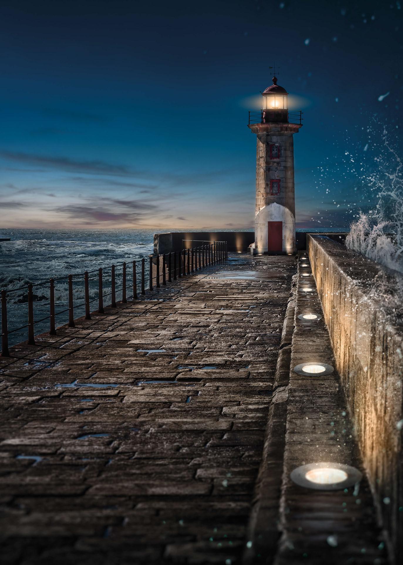






MADE IN GERMANY. SINCE 1919. WIBRE Elektrogeräte Edmund Breuninger GmbH & Co. KG 74211 Leingarten · info@wibre.de · +49(0)7131 9053-0 WWW.WIBRE.DE BUILT TO LAST. MADE FOR CHALLENGES.
More at www.wibre.de TM GROUND SERIES HIRO IK 11 V4A 316Ti LOAD 2t IP 69 IP 68 CAP STOP

Central Department Store Ladprao
Bangkok, Thailand
L&Es’ craftsmanship meets creativity, the installation at Central Department Store Ladprao, utilising fixtures from Clear Lighting, stands as a testament to the artistry of illumination.
Crafting an unparalleled ambiance within Thailand’s premier shopping destination calls for a masterful fusion of innovation and elegance. As the epitome of retail sophistication, this establishment caters to a discerning clientele seeking an immersive shopping escapade. Enveloping Ladprao in a tapestry of luminescence, L&E’s vision transcends the ordinary, embracing the ethos of ‘futuristic beauty’ for the cosmetic and ladies departments. The approach to the installation marries form and function. Through meticulous design, L&E has adorned these spaces with a dual-layered tapestry of illumination, ensuring a harmonious coexistence with essential ambient lighting. Ensuring the integrity of colour fidelity remains uncompromised, each luminaire dances delicately to accentuate the merchandise without overshadowing its inherent allure.
At the heart of the design lies the avant-garde appeal created by low-resolution media bars seamlessly integrated into the celestial expanse of the ceiling. Here, the gentle illumination cast from Clear Lighting’s LED Neon Flex brings another level to the space, its pliable form and ethereal radiance weaving a narrative of modern opulence.
Clad in bespoke black jackets and ensconced within sleek, anodised aluminium profiles, each element harmonises effortlessly with its surroundings. Harnessing the power of Smart DMX addressable technology, the creation takes on a life of its own, choreographing a dance of light. From subtle gradients to dynamic movements, the pulse is meticulously orchestrated, ensuring an immersive sensory experience.
In this symphony of light and shadow, tradition and innovation converge, elevating Central Department Store Ladprao to new heights. L&E’s creation stands as a testament to the enduring allure of timeless beauty, forever etched into Thailand’s retail landscape.
www.lighting.co.th www.clearlighting.com
092 / 093 case study RETAIL LIGHTING


Energy Dynamics
London, UK

The latest installation by Jason Bruges Studio – Energy Dynamics – was designed to tell a story of energy, progress, resilience, and remembrance.
In April 2021, Ukrainian energy company DTEK approached Jason Bruges Studio to create a data-driven art installation for its new London office. The vision was a digital frieze celebrating DTEK’s mission to provide light and warmth to millions, as well as its wider mission to drive Ukraine’s transition from fossil fuels to renewable energy. Just as with the laws of thermodynamics
that govern the transfer of energy from one place to another, or from one form to another, so Energy Dynamics shows the transfer of energy from source to city, and from a ray of light, gust of wind, or lump of coal to the power that drives a nation. It also acts as a memorial for hundreds of staff who have lost their lives since the start of the fullscale invasion over the past 22 months.
Energy Dynamics consists of 593 luminous arcs mounted on a 12-metre-wide canvas, hung above DTEK’s offices in the Leadenhall Building, London. Each arc represents
eye opener
094 / 095
a Ukrainian city, power station, renewable installation, or weather pattern that is then brought to life through live data links that send energy pulsing across the board – a stylised map of Ukraine – as undulating waves of light. The effect is a real-time ‘power map’ that also mimics the behaviour of atoms – the simplest form of energy.
Tragically, war has given the artwork new meaning and poignancy. From a piece originally commissioned to show Ukraine’s decarbonisation, the Russian invasion in February 2022 turned Energy Dynamics into a

symbol of endurance and a visual statement of DTEK’s mission to – quite literally – keep the lights on. Far from a picture of pessimism however, this artistic centrepiece is a testament to the country’s resilience. Power stations in occupied territory appear static today, but they remain ready to light up once again.
In the meantime, Energy Dynamics stands as a monument to the bravery of those on the energy front line, who sustain Ukraine through the darkness. www.jasonbruges.com
Image: James Medcraft, courtesy of Jason Bruges Studio

Amaala – Shining a light on the environment
Carolina Florian, who led the lighting team at Buro Happold, explores the impact of lighting on the natural environment, and the steps taken at Amaala, Saudi Arabia, to create a pioneering, environmentally responsible lighting strategy that protects sensitive local wildlife.
The impact of lighting – both natural and artificial – on our lives is significant and should never be underestimated. At a human level, it can transform a space into a warm and inviting place, create safety and legibility or, if not properly considered, create damaging light pollution. Psychologically it can affect mood, sleep patterns, health and stress levels. An often overlooked, yet hugely important aspect of outdoor lighting is its impact on local nighttime environments, particularly wildlife and the visibility of stars in the sky. Lighting is typically not considered beyond initial assessments for major infrastructure and for human safety at the planning stage, and mitigation is limited and rarely prioritised over other commercial considerations. But an exciting project on the western coast
of Saudi Arabia has put its lighting scheme at the heart of its design and is committed to protecting the surrounding natural environment. It has brought together designers, engineers, globally recognised marine turtle biologists and environmental lighting subject matter experts to develop a lighting scheme that has defined the project’s ethos, and ensured the protection of locally nesting endangered marine turtle species.
A place for nature
Located on the Red Sea coast, the Amaala destination is being developed by Saudi Arabia’s Red Sea Global. Surrounded by awe-inspiring mountainous landscapes, tropical sea and extraordinary coral reefs, the new development
 COMMENT
CAROLINA FLORIAN
096 / 097
Fig 1. Bortle Scale (Image: produced by BH graphics team for this article based on external sources)

will be a breathtaking holiday destination and place to relax amongst beautiful natural surroundings.
Yet, building in such an environmentally rich location while minimising the impact on local wildlife has its challenges. At Amaala, the client team was adamant that the planning for the development would prioritise the protection of local wildlife, particularly the local beaches that provide nesting habitat for internationally protected marine turtles.
To protect these areas, limiting artificial lighting and other infrastructure near the beaches was of critical importance. Artificial lighting on or within sight of beaches can deter female turtles from nesting and disrupt nesting behaviour. It also affects hatchlings by interfering with natural light cues, leading to misorientation and disorientation, preventing them from reaching the sea. This makes hatchlings more vulnerable to predation, exhaustion, dehydration, and death.
This is why our specialist lighting team at Buro Happold first got involved, working with leading sea turtle biologists from 5 Oceans Environmental Services and Pendoley Environmental (PENV), to create a masterplan that would ensure lighting decisions focused on the conservation of local marine turtle populations. This collaboration and expert guidance around lighting helped define the final architectural and masterplan designs –something rarely seen on projects.
Creating an action plan
The first step was defining high-level external lighting strategies were used by the PENV team to conduct preliminary sky glow modelling. The intensity and areal extent of sky glow emissions were predicted using an upgraded version of the landscape scale ILLUMINA model. The model output was used to assess the impact of lighting on sensitive receptors including marine turtles and Dark Sky conservation values. This process allowed us to determine acceptable lighting levels. However, a clear methodology to assess lighting levels was needed to translate this into implementable solutions.
To assess the impact of the developments on marine turtles, PENV modelled the light visible in the sky as viewed by a sea turtle looking at the horizon. The output included both lights directly visible from the beach as well as broad scale regions of sky glow. Then, the model output was used by Buro Happold to establish a site-wide map of environmental lighting zones, with areas closest to the beach given the highest level of protection, while less severe lighting restrictions were applied on areas further away from the sensitive turtle nesting areas. This was done following international best-practise guidelines such as the ILP Guidance Note GN01; the Reduction of Obtrusive Light; the CIE 150; Guide on the Limitation of the Effects of Obtrusive Light from Outdoor Lighting Installations; the CIE
126; Guidelines for Minimising Sky Glow; and the IUCN CMS Light Pollution Guidelines for Wildlife.
Similarly, to assess the impact on Dark Sky values PENV modelled the light in the overhead sky (i.e., looking upwards) and compared the output with the Bortle Scale (see Fig. 1). Created for astronomers, the Bortle Scale is a qualitative approach to estimating sky brightness and interpreting how light pollution is affecting the visibility of stars.
The project team recognised the value in providing measurable lighting output through modelling as critical to ensuring lighting levels will be managed and mitigated to minimise impact on marine turtles across the Amaala destination. The output provided a clear framework to work within at planning and design stages. As the development design evolves it is likely an adaptive management approach will require additional light modelling and impact assessment at different phases of the project.
Design decisions to match
Using this framework, we assessed the initial masterplans for the project. It soon became clear that some initial space planning decisions would need to be adjusted. The first step was collaborating closely with the masterplanning team to determine where buildings could be placed. Early-stage design

proposals, for instance, had villas located much closer to nesting beaches.
Beyond just the placement of buildings, our new lighting requirements led to a rethink of the entire landscaping design, including the location and design of pathways, proximity of hospitality space to beaches, smart lighting operation and selecting more appropriate luminaires for wildlife protection. Light management considerations included only using light when and where needed, using warm white light of low correlated colour temperature (CCT) LEDs as a default option (CCT below 2700K), focusing lights downwards, and shielding lights to prevent upward light spill. Furthermore, this process involved a close collaboration with the masterplan architect to ensure planned landscape features will fully conceal and block the visibility of outdoor light sources from nesting beaches. In practice, our lighting plan split the proposed resort areas adjacent to turtle nesting beaches into three environmental lighting zones, each with different levels of lighting management (see Fig. 2).
Environmental Lighting Zone E0, covered the beach and a defined setback area where no artificial lighting is permitted. Zone E1 is located behind the setback area and requires 100% light shielding (i.e., no direct visibility of lights from the beach). The
third zone, E2, required at least 66% light shielding in the areas where the resort infrastructure is most dense, and buildings can be used to physically shield lights from the beach.
Based on the advice that marine turtles are most responsive to light within viewing angles from sea level extending up to 14° above the horizon, the presence of light sources was also assessed from various viewing locations on the nesting beaches. Together with the PENV light modellers and turtle biologists, Buro Happold’s lighting and ecology teams developed a line-of-sight model to assess the visibility of lights from the nesting beaches, ensuring there were no lights directly visible that could disrupt nesting females or sea finding in hatchlings.
Planning for the resort areas with such strict outdoor light management presented challenges for our lighting team, especially in areas where lighting was necessary, such as at building entrances, in the public realm and swimming pools and along pathways and roads. Some of the mitigation proposals included the placement of building entrances on the side of villas instead of seaward facing, or on the back of the building facing inland. Pathways illumination had to be mounted low to the ground, downward facing, with
COMMENT CAROLINA FLORIAN 098 / 099
Fig 2. Lighting Plan Zones (Image: produced by BH Lighting and improved by BH graphics team for this article based on Amaala learning points)

Contemporary lighting solutions designed to enhance the beauty of outdoor spaces while also meeting the needs of both people and the environment Lighting designed for places and people
dwwindsor.com
Exchange Square, Broadgate Lighting Design: Speirs Major Product: Pharola Max

fully concealed light sources (LEDs) and additional shielding by vegetation and/or landscape elements (see Fig. 3).
Importantly, when developing our lighting masterplan and design guidelines, we identified and proposed manufacturers already producing luminaires tailored to be more turtle aware. In doing so, we showed that considerate lighting design is now a reality and not something far off into the future.
Together, these light management and mitigation measures will help ensure there is no light directly visible from the beach and will minimise sky glow, reducing the risk of disruption to the local marine turtle population to as low as possible.
Future proofing
Despite the production of a detailed lighting masterplan, good environmental practice requires that the proposed lighting design shall be audited upon completion of construction and during subsequent operation of the resort. Consequently, regular lighting audits, inspections and monitoring will be required to ensure the lighting management measures are having the desired effect and marine turtle nesting and hatchling sea finding are not impacted. Our lighting plan, in combination with future environment, ecology and biodiversity management plans, will support the programmes to monitor marine turtle populations and ensure any lighting related impacts are quickly identified and addressed.
Lessons learned
The lessons learned from the Amaala project can be applied more widely by urban designers and developers. The best practice approach to lighting design taken by BH has demonstrated that development and environmentally responsible lighting can co-exist if sensitive biological receptors are identified up front, good lighting principles are adopted at an early stage in the design process, and if there is flexibility in the masterplan to balance all drivers including wildlife and human needs. We strongly believe that this early multidiscipline collaboration between biologists, lighting designers, architects and engineers is increasingly necessary globally.
In order to create an environmentally responsible and sustainable project it is important to engage environmental scientists and biologists early in the design process and to give equal status to environmental issues relative to other commercial considerations. Designing, implementing and managing light responsibly not only protects the local environment, such as wildlife and visibility of the stars, but also creates the unique guest experiences that make these places successful. These lessons will only become more important to lighting specialists as clients increasingly focus on biodiversity as part of meeting sustainability goals and compliance with international environmental legislation. With the right project team expertise, and a willing client, it’s possible to deliver new developments that aim to truly coexist with the natural world.
www.burohappold.com
100 / 101
–
COMMENT CAROLINA FLORIAN
This article was written by Carolina Florian – Lighting Consultant, Associate Lecturer at University College London, and Vice President of the Society of Light and Lighting (SLL), with contributions from Ashley Greensides
–
Director, Cities Project Leadership at Buro Happold, and Dr. Kellie Pendoley
Director at Pendoley Environmental
Fig 3. Obtrusive light mitigation by shielding of light sources (Image: produced by BH Lighting and improved by BH graphics team for this article based on Amaala learning points)
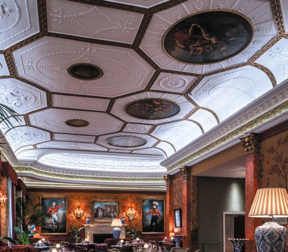
Club,
Please contact Radiant for product information, to see demo samples, or for a presentation. arc ad April - May 2024.indd 1
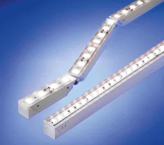
Euclid 20 Ball-Joint IP20 High Output System. Interior, 3D flexible, modular LED lighting system. Custom mounting wedge. Custom lengths to fit the space. 160 x 0.3 Watt mid power LEDs per mtr. Optical film provides diffusion. Up to 30 Watts per mtr. Up to 2,900 lumens per mtr.
www.radiantlights.co.uk | +44 ( 0 ) 208 348 9003 | david@radiantlights.co.uk | London, N6 5JW | All products designed by
 Oriental
London. Lighting design by Victoria Jerram. Photography by Sim Canetty-Clarke. Euclid 20 Ball-Joint fixtures are installed in the straight and curved cove features running around the perimeter of the dining room, providing a wash of light onto the decorative plaster ceiling.
15/04/2024 15:01:22

CoolKitList
The returning Light + Building has also seen the revival of the CoolKitList from Kevin Grant, Design Principal of Light Alliance. Here, he breaks down some of his favourite finds from the show.
Something about Light + Building seems to attract a mixture of creativity and chaos, disruptors and disruption. This often transpires into a bit of an adventure for those brave souls travelling to or from the event. In recent years we have had to deal with the impact of Volcanic Ash clouds, ‘The Beast from the East’ and Thundersnow storms, and this year’s adventures were provided courtesy of Lufthansa airline ground staff strike and rail strikes, meaning many of us had a choice of staying at home, leaving early or staying later than planned – I chose the latter.
Aside from all the chaos, this is still the biggest and best lighting show globally, and this year attracted a fantastic and diverse mix of brands, products, and people.
As with previous years there were some bold claims about sustainability, but many of the brands were displaying some good progress and implementing some innovative ways to reduce waste and improve efficiencies. Considering the reduction of energy and materials, easily replaceable parts, and upgradable components, minimising waste in the production/packing/transportation and installation of their products, using bio-based natural materials, re-using materials, fewer parts or multifunctional components. There were some obvious examples of things becoming much smaller, meaning less material, waste, transportation impact, and cost. The fusion of light and controls was also prevalent with many integrating lighting within other systems and incorporating access to different types of sensor data and triggers. Glare management was mentioned a lot, but some clearly doing better at this than others, (which is why this type of event is so valuable – you can see with your eyes that things that can appear identical on paper or screen, don’t always look or behave the same in reality!)
We always discover some nice and unique features, innovations, and problem-solvers when our industry comes together like this – so with this in mind, here are some of our highlights…
A.A.G Stucchi presented its minuscule lighting track system, the Core5 (which as the name suggests has an aperture of only 5mm and with a depth that can be contained within a sheet of gypsum plasterboard). It’s made from a polymer that provides mechanical strength and electrical features – so smaller dimensions, less components, and more flexibility in terms of shapes and forms. The Auto Tracking Light (ATL) by Aero is a range of elegant remote-controlled downlights that can be paired with an auto-tracking remote device to easily auto-focus by placing the tracker device where light is required. Aero also presented the Akin Honeycomb 3D Bendable range, which incorporates a honeycomb anti-glare shield within continuous linear flex product.
Alphabet by Zambelis displayed some innovate concepts, such as its Architainment systems, which combine functional light with dynamic digital media and the Airslot modular magnetic track system, which allows for ventilation without visible grilles.
APL presented a modular, miniaturised luminaire system called LTwo – based around the form factor of a T5 lamp diameter. It uses nanotechnology optics and includes a wide range of optical configurations with quick-fit or retrofit magnetic holders and interfaces.
Artemide presented a beautiful concept called Somnium, based around a modular cell that comprises of translucent louvre and lens, crafted from a single material (to reduce material, weight, and production steps) into a single 30x30mm modular component. The cell can be arranged into straight or curved arrays and provides direct and indirect emission to deliver useful low-glare light. The Turnaround system is a miniature track available in recessed trimless, surface-mounted or suspended variants, with linear, angled and curved modules which can be combined providing electrical and mechanical continuity.
The vast Bega stand was a magnificent presence in Hall 3, and reinforced the Bega philosophy of robust, well-designed equipment that is
COMMENT
102 / 103
KEVIN GRANT


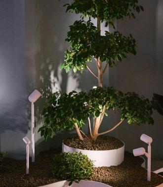
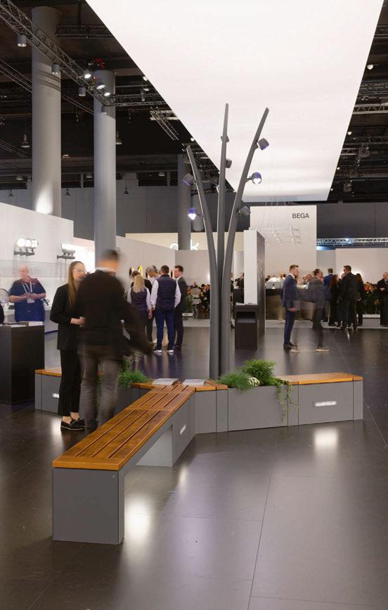
LIGHT + BUILDING REVIEW COOLKITLIST
Delta Light
Artemide
Aero
Bold Bega
Alphabet by Zambelis
L&L Luce&Light
Georg Bechter Licht


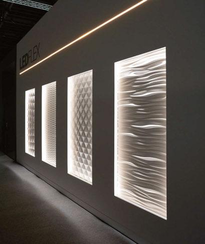

 Erco
iGuzzini
MP Lighting
LEDLuks
Folio
Meyer
LEDFlex
Esse-Ci
104 / 105
Targetti
designed to last, and live on! The Aubrilam/Bega partnership presented timeless modular furniture and lighting systems with a diverse selection of wooden and metal material finish options, accents and accessories. Adjustable Optics have evolved to include a Tiltable Inground WallWasher and Targetted Light range, which permits digital adjustment of the beam or intensity of 25 individually controllable optics within a 5x5 grid. Excellent optical control from discreet and lowglare luminaires were the main focus of Bold, which presented a range of direct and indirect technical luminaires designed to light artworks, objects, or vertical surfaces. Including a range of optics for its Billet range (Stealth/Grazer) with super-low glare louvres; and also Ghost, which employs indirect light reflector with double focus technology to achive very discreet and low glare lighting from a compact form factor.
Casambi Pro now provides the ability to create a “digital twin” of the project lighting controls, enabling layout-based editing, creating templates to plan and pre-commission remotely to speed up and optimise the commissioning process and also providing outputs of installation data, scenes and associated values.
Some eye-catching innovations were on display in the Delta Light stand. A range of new finishes that are specially painted look like turned anodised metal finishes. Shiftline magnetic track incorporates a super slim LED light slot along its length. Splitline magnetic profile is a flushrecessed plaster-in system with possibility of curved or angled corners and was displayed with the super-discreet fully recessed spotlights. Its new Nature Centric Lighting range provides a dual mode, with low-impact long wavelength light mode (for bug/turtle friendly light). The optics with its Polesano bollard mean they can be spaced up to 10-metres apart and provide useful light. Air combines lighting and ventilation, in a range of linear track or point light form factors.
The Axis by Erco is a very compact and discreet, yet powerful, display case lighting solution with perfect and uniform colour appearance (SDCM at 1.5 step MacAdam, CRI 97) with filters, snoots and honeycomb louvers. The Invia 48V is a very effective modular system available as flush or flanged recessed, surface or suspended profile, which incorporates a range of direct and indirect insets and high-precision wall washers. With ESave systems, lighting installations can be dynamic and responsive, have control automated, be monitored, configured, and controlled centrally or on the road without the need to be in wireless range of the installations. Its SLC Hub/Gateway with compatible sensors can detect a wide range of conditions – PIR motion, radar, temperature, humidity, sound, Carbon Dioxide, air quality which can all be used as triggers or inputs for Light-ondemand and intelligent smarts city solutions. Combining diffuse and directional light to good effect is Esse-Ci with its modular Clou range, which is available as a bollard, wall, or ceiling element suitable for use outdoors.
Exenia launched its updated Revo Optics and
associated products/accessories, complete with some ‘smoke and mirrors’. Smoke effects were used to help demonstrate the beam definitions, between 6 and 52° and manipulation of the optics, including the double focus patterns used to provide wider beams, yet reduce glare, and with high 98CRI and precise 2 SCDM packages. Nobody seems to provide unique arrangements of backlit surfaces quite as well as Folio – the Opal10L and ELine Shaped products allow for complex shapes with freely-formed homogeneous surfaces incorporating accessories like spots and tracks (which can now even be curved). Its Shelves provide perfectly unform light from very neat and discreet compact dimensions.
Georg Bechter Licht also presented some air handling luminaires, with a bit of twist, the Verve Air can be flush mounted into ceilings or walls and is designed to reduce visual clutter and minimise draughts. The System Dot range provides powerful lighting effects from a very compact aperture and with only 28mm installation depth, all based on Bartenbach optics. It offers a 15-year cycle guarantee on all its products and promotes reparability, durability and product recycling through modular design,
The 3D Hydromatrix by HB Laser opens up new design possibilities where water and light combined as animated 3D sculptures. Pixel accurate videos and pictures can be combined with a third dimension, by using the height of an illuminated water jet.
iGuzzini certainly displayed the tiniest track system I have ever seen, with the Filorail range having an opening of only 3.6mm, tabled as a ‘practically invisible narrow and sinuous track’ it can disappear into a shadow gap between panels. The Libera modular system was launched before the show but the visual appearance and visual comfort of the slender Optidiamond louvre was impressive to see. The Sipario professional floodlight was designed for display applications allowing easy adjustment with a single lever attachment system, with 160lm/W luminous efficiency and wireless control. The renowned Trick range has been updated with the Trick_Em configuration, which offers new optics that can be digitally divided into 10 autonomous and multifunctional segments, providing options for 360° movement to create dynamic sequence, accent specific shapes, or patterns of light.
There always seems to be lots of innovation on the LEDFlex stand. Highlights include the updated Flexi Neon Range with upgraded features and new profiles/widths for direct view façade enhancement applications, and 3D dual bending variants in several different sizes. The Flexi Grazer developed to provide grazing light around organic flowing forms has evolved into Optico Neon, with an impressive range of optics and 2700K, 3000K, 4000K, RGBW, SPI PIXEL variants. The Joinery Range offers a curated selection of profiles and flex, tailored for various applications. Rigid Optico provides high-power dynamic fixtures designed for exterior wall washing with high efficiency (100lm/W)
LIGHT + BUILDING REVIEW COOLKITLIST
Some adaptable and upgradable luminaires were on show from LEDLuks, including an evolution of the modular Camaleo, which allow for components to be easily changed (to vary the shape/material, or optical distribution). Also present was Lene Art, with fully illuminated body and custom-made patterns, and Ilo Natur, made from hemp-based bioplastic.
Lightnet created another amazing 3D display with Liquid Line – the range has evolved to simplify construction and optimise performance with options for a continuous diffuser, enabling complex shapes to be created without any visible joints.
The garden area provided by LND was a great way to show off its landscape range, including the tiny Lako bollard (18, 40 or 60cm height options), beautiful wooden Duvali bollard and the innovative Handle, which is an adjustable ‘handle’ shaped system that can be provided in floor, ceiling, or wall mounted variants.
L&L Luce&Light presented the Reiko architectural projectors (various sizes and optics, including shadow effect filter to recreate dappled light through foliage). The impressive Ginko family with variety of sizes, optical and features, including adjustable optics, Light Shaper Optics, and option with very impressive super narrow 2° beam.
The Lumen Façade Max by Lumenpulse employs its Opticolor mixed-at-source technology and Optidrive technology to deliver maximum performance but also with high quality of light, consistency of colour and beam blending within inches. The Optic is very clever, the pattern blends individual colours so the colour at lens appears the same as emitted light.
Meteor aims to provide a diverse range of advanced high-ceiling solutions with dynamic colour changing technologies, and it showed some interesting variants this year. One example was the WHIZ2/0 Bi Directional, which provides a powerful independently controlled uplight/downlight from a slender pendant package, providing ability to provide functional light and/or saturated colours.
The Meyer stand was looking more colourful than usual thanks to its Minipost display (very compact floodlight with some nice features – integral glare shield, wide range of optics and wireless control of the monochrome or RGBW source). Metaspot uses its innovative darklight indirect optic, where the source is shielded from view to provide powerful light with excellent glare control. Various sizes and optics are available for surface or pole mounting.
MP Lighting developed a ‘wine rack’ lighting system, specifically designed to celebrate and completely illuminate wine bottles in various configurations and orientations, with super discreet antiglare shroud. Aside from its usual tiny, high-quality luminaires, it also launched some interesting wood effect finishes.
The IQ System and IQ Linear by Nanoptiqs produce sophisticated nano and microstructures with precise architecture. The optics can be further manipulated dynamically to finetune the light distribution by changing the LED or optic position. Neko Moduline 05 is available in recessed and surface mounted version with insets including
diffuse linear, accent lights, spotlights, and decorative pendants all tailored to its 5mm track system.
OneEightyOne presented its DiGiDot controllers and intuitive systems, which can provide a full solution for any pixel-controlled projects (managing SPI-driven fixtures as well as other protocols such as DMX).
The key principles adopted by Prolicht across the entire product range in 2024 include miniaturisation, configurations, acoustic integration, and compatibility – the Minimal Track range is a good example of most of these, and the Lullaby adds the acoustic sound absorbing elements.
The Mosaico L from Prolights is a compact and yet powerful exterior grade image projector with seven colour-filters, seven interchangeable rotating gobos, animation wheel and motorised framing shutters, offering 7-49° linear zoom, all sealed to IP66. The ECLDISPLAY DATFC compact RGBW projectors can be track-mounted, rail mounted or recessed and provide multiple lens options with profile (zoom and static) or wash optics and a wide range of control options.
Almost every product on the SGM stand was cool in some way due to the vast combination of tech and features now provided as standard (to eliminate humidity, reduce corrosion, manage thermals using passive or active cooling, boost colours and perceived brightness, calibrate colours and accuracy for colour mixing, accommodate harsh climates and vibrations, and with wired or wireless RDM DMX). Stand-outs were the i-6 POI with 2.3° native beam angle (which can deliver 500 lux at 150m), the P-3 Vision Dual Source Direct View and Wash Light, meaning we can reproduce pixel content and provide illumination from a single package, and the i-3/P-3 Wash POI products, which provide very useful RGBW light from a compact size and with TM66 score of 2.5 (due to the fully recycled materials, localised supply chains and serviceability).
SIDEiS ONE from SIDEiS is a smart, ultra-compact, low-level lighting system with concealed LED light source hidden from drivers view. It contains tuneable photometry with reflective and refractive optical guides, which can be modified via on-board intelligent control system software to adapt for different route types or conditions.
The Digital Beam optics from Simes control the shape or intensity of light in compatible luminaires via mobile app or control system. Ikonic Senor brings dynamic and reactive lighting to its outdoor bollard range, with programmable behaviours that can respond to presence. The Shift range integrates an interesting combination of adjustable, rotatable, and lockable DALI controlled spotlights within a family of slender poles or bollards.
Targetti has launched Catirpel adjustable modular miniature outdoor projectors, which are arranged in a flexible linear array and can be oriented in multiple directions via the mechanical connection with spherical joints.
TecsoLED presented evolutions of its Linkflow
106 / 107


ultra-slim magnetic range (for integration into furniture/cabinets/Shelves) and also Julia, which is an impressively small linear pendant system with integral DALI control gear and concealed connections for an extra sleek appearance.
Also, with a focus on tiny and integrated furniture lighting and details was Topmet, offering aluminium profiles for LED strips with a variety of compatible components such as diffusers and mounting accessories, with more than 1,200 different profile designs.
Wibre’s Linear 252 range incorporates some very clever optics into a relatively small form factor to create a particularly wide and homogeneous lit effect throughout the entire water surface, as well as illumination of the pool floor. It has been developed for wide illumination of larger pools or water bodies and is suitable for installation up to 10-metres deep. The range includes RGBW variants for tailored hues or dynamic light effects.
Like many participants, the XAL stand was showcasing sustainable design that extended beyond lighting – with cardboard furniture, recycled demountable modular components and fixtures all identified for re-use after the show. The Move It Pro modular track system now introduces 11 conductors and designed for 230V mains
voltage and supported by smart sensors with many innovative lighting insets plus, opportunities for connection of other 230V devices. The cylindrical Conex system was displayed like a work of art, displaying how the diverse rotatable connections and compatible lighting systems can be configured and combined. IQLUX provides complete freedom to create luminaires, attachments, shapes, and textures from a range of natural, recycled, or bio-based materials (including wood, concrete, graphite, ceramic, algae, corn and soil).
Aside from unveiling the “world’s largest continuous ceiling light” as recognised by Guinness World Records at this year’s show, Zumtobel also unveiled a partnership with Enlighted Systems giving it access to some very tiny and intelligent smart system sensors. The Izura concept luminaire embraces circularity with modular construction with plastic free reflector housing and utilises bio composites that are biodegradable after use and provide opportunities for a fully customisable outer skin. Tramao is a neat and discreet, fully recyclable, acoustically effective pendant range with diffused surface light and also options for directional light and full spectrum lighting. www.lightalliance.com
LIGHT + BUILDING REVIEW COOLKITLIST
XAL
Prolicht
Meteor Lighting
LND
Wibre
Zumtobel

COMMENT
Ten Years Later
Lighting consultant Peter Earle last wrote a Light+Building review for arc magazine back in 2014. Now, ten years later, he has returned to share his thoughts on what many are calling a ‘return to form’ at this year’s Frankfurt fair.
Same old Frankfurt, same old route from the backstreet hotel to the Messe, familiar iron man with hammer and the walk up the steps to the City Entrance. Same old trade show smell in the air, queueing to get in on the ground floor only to be squeezed onto the single escalator.
It is almost the same old introductory paragraph I used for my 2012 and 2014 reviews for the version of this great magazine, that was mondo*arc back then.
Ten years later, what’s changed? I’ve changed. My job has changed, independent rather than corporate. The world has seriously changed. Somehow, it’s not the same old Frankfurt. The city centre itself felt a bit edgy, a bit chaotic, beautiful high-rise steel and glass architecture right next to beautiful boarded-up and derelict architecture from previous centuries. I hurried past O’Reilly’s and didn’t go in.
I wasn’t here for the city experience; I was here to take the pulse of the lighting industry. How are we doing these days? Is there still a place for massive trade shows like this, following recent global events? I didn’t make it to the 2022 version of L+B, the last time I was here was 2018. I heard that I didn’t miss much at the 2022 edition, not surprisingly. In the meantime, LiGHT 22 and LiGHT 23 caused a lovely stir, as a UK industry we seemed really happy to be re-convening and sharing our ideas, products and solutions.
I only had Sunday afternoon, Monday and Tuesday morning and at the end of it I’d managed 40km walking. I’m not reviewing anything at a technical or even product level, I was looking for the trends. The first obvious and continuing trend is sustainability, circularity and minimising waste, re-use rather than recycle. When I joined Philips Lighting in 2011 the global CEO was talking about a circular economy. I’d never heard of that before. No-one in lighting really knew what it was back then, not a lot of people cared. Not a lot of people even wanted LED back then, fixture manufacturers had order books full of fluo and HID. We were happy to chuck away our tubes and re-lamp. If they
got recycled, we felt a bit better about it, that was it. I’m just a regular chap, I’m no evangelist, I’ve grown up with the word ‘thrift’ that was explained to me when I was 11. That means I fully approve of our efforts as an industry to minimise waste, to me it’s common sense and a way of life. Sadly, it becomes a marketing tool and the South Pole offsetting projects debacle, for example, is such a shame. A shame for the communities that perhaps didn’t benefit from it, I mean.
Miniaturisation is still a thing! I saw some lovely tiny linears and spots, amazing optics where the light cut-off is so good and the beam-shaping so amazing it’s hard to tell from the ground looking up what’s ceiling and what’s fixture. It reminded me of a conversation I had some years ago with one of my esteemed industry colleagues, a top global lighting designer. He told me his ideal light fitting would be invisible. I pointed to nothing in the corner and said something like, “there’s a pallet of invisible fittings, they’re yours for £20k”.
Sometimes we forget it’s L+B with the B being building. To be honest I got pretty overwhelmed when I walked round all of the building controls companies’ booths like KNX and ABB. I suppose I’m a lighting guy at heart and I felt more comfortable in Hall 8, where most of the lighting controls companies were. I remember talking about the ‘promise of LED’ in the early noughties. The industry has realised finally, I believe, that the ‘promise of LED’ can only be delivered using appropriate control. That means using digital data. Data can be extracted from the driver, in a standard manner thanks to DALI. Data can be sent over multiple transport protocols, wired and wireless. Data can be used to deliver useful lighting outcomes, as I saw on Zumtobel Group’s Tridonic booth. It can be used to deliver, most importantly, quality of light. We like to forget about quality of light from time to time don’t we? When lm/w or $/lm is more important. Ten years ago, I was wondering if this data would ever make it to ‘mass market’. Well, it has, so let’s use it. And so has wireless. Which brings me to the following.
108 / 109
PETER EARLE


Is it Battle of the Titans or David and Goliath? Is it a coalition government? I love a mixed metaphor. Hall 8 saw DALI Alliance a few booths down from Casambi, DALI being an open global standard and Casambi being a proprietary control protocol. Never the ‘twain shall meet, I hear you chuckle. No? Well, Casambi, which is undoubtedly one of the most popular, but not the only, wireless ecosystems around, seems to have entered the wired world. Its new product can connect a Casambi ecosystem to a wired DALI system and control everything through the Casambi app, it seems. DALI Alliance has launched DALI+, just before the show in fact, and was proudly showing the first compliant products. I think the phrase is watch this space, I shall watch with interest.
Before I admit to what I got completely wrong in my 2014 review, let me mention the final important trend that I witnessed.
Human Centric Lighting (HCL), sometimes labelled ‘circadian lighting’, is mentioned in the same sentence perhaps with phrases like ‘melanopic lux’ and ‘non-visual effects of light’. I have never seen so many lighting companies claiming that they have some form of HCL, what a revelation. Do they have HCL? If so, what is it? The ones I asked, about 50/50 split in my opinion either had not much of a clue or had a clue but didn’t think they could really sell it. It’s niche, it’s less than 1% of real projects they


said. It’ll be VE’d out they said. Strange because it was high on the marketing agenda. There must be something in it? I saw full spectrum chip solutions with SPD graphs everywhere. Infrared wavelengths are even on the lighting agenda these days. We could be on the brink of a new frontier of lighting for health. Or we could be wandering up the greenwashing path, except it could be labelled ‘wellwashing’. Call me a cynic, go on.
I thought it would take 10 years, but it’s taken 20. The global players like Philips, Osram and GE seem to be firmly in the past. The Forum had a new tenant. I didn’t see many UK visitors and that was before the well-timed airline strike disruption, I got out with a day to spare. In my 2014 review I mentioned I’d sensibly booked an airline that wasn’t on strike, so some things remain the same! The show is hard to navigate physically, I’m able-bodied and I was shattered after a couple of days. There’s limited signage, even I got lost and I’ve been going since 2006. Metres and metres of carpets being ripped up again. We have been so happy as an industry to start up the trade shows again, but I wonder if this is a dead-cat bounce, (look that up if you don’t know).
So what did I get wrong? In 2014 I wrote ‘OLED… it’s on the right path’. Can’t wait for L+B 2026…
LIGHT + BUILDING REVIEW TEN YEARS LATER
Light + Building 2024 Product Highlights
Billet
Bold Lighting
Bold’s linear range seamlessly integrates into any environment with outstanding optical performance, providing efficient horizontal illumination and uniform vertical illumination for up to 25-metres wall height. Whether for indoors (IP20) or outdoors (IP67) applications, for surface, recessed, pendant, wall mounted, inground, or path lighting applications, Billet allows you to maintain the same optical performance, light consistency, and overall aesthetics across the entire project. www.boldlighting.us
FLXible Narrow
Feelux
FLXible Narrow is ultra slim and bendable for creating very bright curves that adapt perfectly to different types of installation. It has two options according to bend direction: Horizontal (4x7mm), Vertical (6x6mm). Thanks to its thin but powerful physical characteristics, it can convey light in even small furniture effectively. Also IP65 field-cuttable products can be installed in both indoor and outdoor environments with friendly customisation. www.feelux.com
Whiz 2.0 Bi-directional Meteor Lighting
Building upon Whiz’s performance legacy, the Whiz 2.0 Bi-directional delivers the same powerful downlight output at an equivalent wattage and seamlessly integrates a 6,810lm, 60W indirect uplight. This innovative design achieves a maximum combined output of 36,410lm, 1,010lm more than Whiz 2.0 delivers. By integrating uplight and downlight functions in a single fixture, the Whiz 2.0 Bi-directional offers unique versatility for high-ceiling illumination. www.meteor-lighting.com
Cube Direct Mountable Chip
Nichia
Nichia’s Cube Direct Mountable Chip marks a significant advancement in LED technology by employing horizontal light distribution to create a softer, less glaring light. With its ability to immerse spaces in gentle light yet with high luminous flux density, the Cube Direct Mountable Chip enhances lighting design flexibility, enables reductions in fixture weight and material usage, improves building safety, and supports the development of environmentally sustainable lighting solutions. www.nichia.com
Helgoland Artemide
Helgoland is an efficient and perfectly controlled light principle that applies to an incremental, compact and optimised geometry, capable of casting good light into any space. The patented technology of the refractive optics is miniaturised and developed according to a hexagonal mesh that maximises the density of the luminous flux emitted, reaching 150 lm/W output. Helgoland has an optimised sustainable construction. The light engine is an element of only 12.5mm of thickness, which can be combined with various accessories for ceiling or recessed installation, or connected to other systems such as Sylt. www.artemide.com
Taglio di Luce
LedsC4
A collection of profiles that opens the door to integrated lighting in walls and ceilings, enabling light to define the space through linear, wallwasher, contour or recessed lighting. The stand featured an intervention by Peruvian lighting designer Claudia Paz, providing visitors with a transformative experience to understand the significant impact of light on space perception and materials. Integration of a DMX system allows individual control of each Taglio di luce fixture, injecting dynamism into the space and creating an area where light sequences designed by Claudia Paz came to life. www.ledsc4.com
Node System
Linea Light Group
Node System is the new indoor linear system designed to overcome any architectural obstacle. The connection joints allow installation flexibility, while the many available light modules and connection accessories – diffused linear bars or with dark-light microcells, projectors, suspensions, flexible diffused light elements this guarantees total freedom and design creativity. Mono or bi-emission, wall, ceiling or pendant, Node System is synonymous with boundless linear and modular light for all interior environments. www.linealight.com
Multi Line
LEDFlex
LEDFlex Group’s flexible light engines feature multiple lines of LED to complement wider profiles. This series is engineered to deliver an even light distribution, tackling the common issue of maintaining consistent brightness throughout the entire lighting surface. The design streamlines installation, eliminating intricate cabling and soldering while considerably reducing setup times. The range is available in IP20 and IP54 as well as in various colour options including single colour, dynamic white, RGB/RGBW and Pixel. www.ledflexgroup.com
Axis Erco
Axis is the new modular system from Erco that offers light that is protective, effective, flexible, and precise with digital connectivity. The system includes miniaturised stem luminaires, surface-mounted luminaires and semi-recessed luminaires that can be individually adapted to their tasks. The variable stem luminaire provides additional flexibility in terms of the height of the light points. The Axis system offers various options for positioning its miniaturised, pivotable light heads. The single, twin and 4-gang semi-recessed luminaires integrate into showcase bases and ceiling panels. www.erco.com
Legatus Spot
Bright Special Lighting
Round, compact, efficient and powerful, with excellent colour rendering, different colour temperature options, rotatable and tiltable. The fittings may be small in diameter but with high performance reflectors, high luminous efficiency and homogeneous distribution. Efficient and stylish, with low maintenance costs, excellent colour rendering and efficient glare control. In tight mounting situations, every millimeter in recessing depth of a luminaire counts. Bright Special Lighting has developed luminaires with a shallow recess depth, to provide excellent light quality in areas with limited installation space. www.bright.gr
DMX Pixel LED Neon Flex
Olympia Lighting
Olympia Lighting DMX Pixel LED Neon Flex is the ideal lighting solution for large façade projects. It is compatible with and expandable through DMX512 protocol signals, and features automatic code writing capabilities. With 16-bit DMX smooth grey level and 65,536 greyscale, along with built-in gamma correction design, it ensures optimal colour accuracy. Moreover, the DMX Pixel LED Neon Flex adopts a bidirectional differential signal, providing excellent anti-interference and transmission stability. www.olympialed.com
Daline
LEDiL
Meet Daline, the latest addition to LEDiL’s Dark Light portfolio, known for exceptional eye comfort and captivating aesthetics, Daline optics are the perfect solution for compact, glare-free architectural lighting. It seamlessly integrates with the LINDA-10 platform for effortless luminaire customisation, providing a versatile solution for refined lighting in various settings. www.ledil.com
110 / 111
9 4 3 10 2 5 7 11 1 6 8 12


A look back at some of the product innovations that caught our eye in Frankfurt during Light + Building 2024.


1 2 4 5 6 7 8 9 10 11 12 3 LIGHT + BUILDING REVIEW PRODUCT HIGHLIGHTS


Arcflex Clear Lighting
The 4th Gen lighting technology Arcflex Free Bend Linear Light is powered by Clear Tech’s groundbreaking Adapwire, SegPCB, ZagLiu, InterFlexa technology. Seamlessly blending horizontal and vertical bends into a single light, Arcflex empowers you to bend and shape light freely in three-dimensional space, unlocking endless design possibilities. From captivating architectural installations to dynamic commercial settings, Arcflex revolutionises the way you illuminate your environment. Experience unparalleled flexibility, unleash your imagination, and illuminate your world with Arcflex. www.clearlighting.com
Izura Zumtobel
The Izura concept luminaire with its modular design not only offers countless options for customisation, but also meets all the criteria for circular product design. The concept envisages a modular product design that consists of just 40 individual components and no requirement for welding. These include, for example, a plastic-free reflector made of degradable biocomposites and a housing made of recyclable sheet steel. This saves resources and ensures greater sustainability. www.z.lighting


Mini Track TecsoLED
Mini Track is a system composed of four types of track and several models of luminaires, which add personality and character to the areas where it is installed. Its dimensions, adaptability and aesthetics are its strong points, achieved through an ultra-small, elegant and flexible design. The versatility of moving the luminaires with a simple click along the rail makes it a totally changeable system with infinite possibilities. www.tecsoled.com
Flex Tube Wellness Proled
From the tropics to the Arctic: the Proled Flex Tube Wellness is your safe companion when it comes to areas with large temperature fluctuations. Whether in spas or in façade projects: The IP67-tested tube prevents moisture ingress, not least thanks to its injection-molded end caps, and offers consistent light intensity even at high temperatures. Available in 2200K, 2700K, 3000K and RGBW, it can be adapted to your individual application length up to 10-metres. www.proled.com


Ginko 3.5 L&L Luce&Light
With new Light Shaper optics, the light output for the Ginko 3.5 can be shaped using an internal framing system. Using multiple lenses, this system can create infinite light geometries – its four beam shapers creating a myriad of regular and irregular forms. Ginko 3.5 offers a luminous flux of 585lm, 15W power, a 24Vdc power supply and three colour temperatures, The fixture uses a high-density COB LED source with a high CRI of >90. The 6mm, hightransmittance, transparent, tempered extraclear glass guarantees chromatic uniformity and excellent impact and scratch resistance. www.lucelight.it
Filorail iGuzzini
With an opening of just 3.6mm and microconnections for attaching spots or other lighting systems, Filorail is a practically invisible electrified track that appears to disappear and fulfil its functions inconspicuously. A new basis for designing museum and exhibition spaces, it also opens new perspectives for the interior design of living, retail, and hospitality environments. As a product, it is designed for technology to be used freely within any living environment, without adding the formal fixtures typical of the commercial world. www.iguzzini.com
4 3 2 5 1 6 112 / 113 LIGHT + BUILDING REVIEW PRODUCT HIGHLIGHTS 1 2 4 5 6 3


Kumux Platform Kumux
Kumux Platform is a cutting-edge software that optimises dynamic lighting in architectural spaces by bridging the gap between the control system and the lighting fixtures. The software supports the creation and automation of illuminance and colour temperature settings throughout the day based on scientific principles to ensure users’ well-being. Kumux applies AI algorithms to customise lighting to the project geolocation, space type, international circadian guidelines, and the luminaires spectrum. www.kumux.io


DiGi Linear E-Series OneEightyOne
The DiGi Linear E-Series luminaire offers a versatile and weatherproof solution for architectural lighting projects. This IP68rated linear LED fixture delivers a wide 150° beam angle, ideal for uniform illumination of large surfaces. Available in lengths from 300mm to 1500mm, the E-Series caters to diverse design requirements. The luminaire offers selectable colour options including RGB and RGBW, enabling creative control over the aesthetic impact. SPI protocol ensures seamless integration with control systems for flexible operation. www.oneeightyone.com


3 2 5 1 6
Logic Linear On Deltalight
Logic Linear On simplifies the task for landscape architects to weave consistent linear lighting into their architectural narrative. This professional linear solution, now available in a surface-mounted version, offers diverse mounting options, ensuring no environment is left without the perfect illumination. Utilising the same LED-Caset technology found in the Frax, Polesano and Logic 190 R fixtures combined with optional wallwashing or wallgrazing optics, the fixture can adapt to any surface with a focus on effortless in-line installation. www.deltalight.com
4
Camaleo LEDLuks
Camaleo was tailored for projects requiring high-quality lighting systems and exceptional visual comfort, its design profoundly influences both product sustainability and lifecycle. Camaleo offers endless opportunities for an aesthetic transformation and delivers optimal illumination. The profile comes in three different shapes – straight, outwards curved, and inwards curved. Different finishes, like colour combinations, textiles, wood stones, and other materials are available to alternate your luminaire and adapt it to your interior. www.ledluks.com
Folio Art Folio
Imagine a window where there’s a wall: this is possible with Folio Art luminous surfaces, able to perfectly replicate the quiet view on a greenery or the beautiful grain and veins of a sophisticated marble stone. With a unique print technology, Folio can replicate any image you need in your design with unlimited shapes and a maximum single surface dimension up to three meters by two. www.folio.it
Coolon
Drawing inspiration from the potential of organic architecture, Aduro CL stands as a groundbreaking and multiple award winning semi-rigid LED chain, offering complete flexibility and precise illumination for curved and organic spaces. This modular chain fixture incorporates flexible connections between each light, purposefully engineered to attain an unparalleled level of flexibility while preserving the robustness, performance, and longevity associated with rigid printed circuit boards. www.coolon.com.au
1 2 4 5 6 3
Aduro CL
114 / 115 LIGHT + BUILDING REVIEW PRODUCT HIGHLIGHTS
ACOUSTIC Lighting


Acoustic Lighting combines a lighting source with sound-absorbing materials, to provide a luminaire that helps reduce unwanted noise in a space. These fixtures create a highly functional space that both absorbs the noise whilst providing a light source. BRIGHT provides different designs within acoustic light range. Lamps in combination with an acoustic function is a very efficient way to improve a space.
www.bright.gr /


info@bright.gr
SEDO 5 CURA SP
SECTA 3 SP
SECTA TR 5 SP

Tower of Osaka Castle Osaka, Japan
A landmark lighting conversion project in Japan has created a stunning result at the historic Tower of Osaka Castle.
The tower was originally built in the 1580s, two years after the construction of Osaka Castle, but was destroyed by fire in 1615 and again in 1665. The current castle tower, restored in 1931, has become a must-see attraction for those visiting Osaka, especially as it offers a panoramic view of the city from the observation deck on the eighth floor.
Major renovations were carried out in the 1990s, to cope with the ageing structure and to improve its earthquake resistance. During this project, a new lighting scheme – respecting the prestige of the historical Osaka Castle Tower – was designed by world-famous lighting designer Motoko Ishii. In 2023, the latest project was commissioned to convert the floodlights to LED and offer controllability. Architectural and commercial lighting solutions provider Architainment Inc in Japan, led the installation, specifying Pharos Architectural Controls to supply the control elements of the upgrade, installing a Pharos Designer LPC (Lighting Playback Controller).
The project also aimed to reduce the structure’s electricity consumption and operating costs in line with the UN’s Sustainable Development Goals. As well as the switch to LED technology, which saves money due to its higher efficiency and less energy intensive requirements, fewer devices have been used to illuminate the stone walls. By cutting the number of devices by around half, energy and costs have been reduced. As well as overhauling the night-time aesthetic of the building, the project has delivered a reduction in annual energy consumption by approximately 85% and reduced annual carbon dioxide emissions by around 41 tonnes.
The LED conversion needed to create a lit environment that was appealing to locals and visitors, while maintaining the original design principles. This has been achieved through the installation of full-colour LED lighting solutions from Lumenpulse – supplied and commissioned by Architainment Inc and controlled by the Pharos Designer LPC 1. The ability to illuminate and keep the surrounding environment in an array of colours has enabled the tower to be appreciated even during dark hours and become even more of an attraction as night-time falls.
The project also features a Pharos Cloud portal, allowing for full device interoperability and
access – anywhere in the world. The system also integrates a backup redundancy controller that will switch over in the unlikely event of a fault.
Tony Symms, Regional Manager at Pharos Architectural Controls, said: “The Tower of Osaka Castle has such a rich history, and Pharos is proud to now be part of its future. The use of colour LEDs, controlled by our Designer LPC is a fantastic combination; illuminating the structure, showcasing its architecture, and creating a beautiful atmosphere at night.”
Kengo Hayashida, CEO of Architainment Inc, added: “Osaka has a proud heritage, and the Castle Tower is an integral part of this. By improving the existing lighting scheme through the use of LED technology and control solutions from Pharos Architectural Controls, we have been able to deliver significant savings, cost reduction and an improved aesthetic that still remains true to the original lighting design.”
Mr Hayashida from Architainment Inc added: “This is an incredibly impressive result, achieved through the collaborative approach of all partners and stakeholders, alongside the utilisation of the best technology available.”
www.motoko-ishii.co.jp www.architainment.co.jp www.pharoscontrols.com
eye opener
116 / 117

Image: Architainment Inc
Casambi Awards
The winners of the fourth annual Casambi Awards have been revealed, with the top prizes going to the Ca’ d’Oro in Venice, Italy, and Robonica’s Linfa Desk Light.
The 2024 Casambi Awards, now in its fourth year, have once again spotlighted luminaries in the architectural lighting world. This event celebrates the seamless integration of Casambi technology into both products and projects, pushing the boundaries of what is possible in the realm of smart lighting control. Previous winners include the epic Panathenaic Stadium in Athens, a bamboo beauty in Bali; the John Hardy boutique, an unbelievably accurate artificial skylight; the CoeLux HT25 mini, and an extraordinarily tactile remote control, the LEPUK, that fits snuggly into the palm of your hand.
For the 2024 Casambi Awards, the esteemed panel of judges reflected a truly global perspective. Shoshanna Segal, Principal at Hartranft Lighting Design, USA; Nikolaj Birkelund, lighting designer, For The Love of Light, Denmark; Fernando García, CEO of Electronica Olfer SL, Spain; Yvonne Soh, Executive Director, Singapore Green Building Council; and Giorgio Pierini, Design Liaison Manager, iGuzzini Illuminazione, England, comprised the diverse and discerning group that ultimately crowned two outstanding winners.
Ca’ d’Oro – A renaissance in light
The 2024 Casambi Project of the Year award went to the restoration masterpiece of the Giorgio Franchetti Gallery at the Ca’ d’Oro in Venice, Italy. Spearheaded by restoration architect Giulia Passante, the Venetian Heritage Foundation, and lighting designer Alberto Pasetti Bombardella with Erco, this project highlights the best of heritage preservation and technological ingenuity. The Ca’ d’Oro, a jewel along Venice’s Grand Canal, underwent a meticulous façade restoration, revealing its original golden splendour. The challenge was met with finesse as Alberto Pasetti Bombardella orchestrated a dance of light and water, capturing Venice’s essence. Casambi’s wireless lighting control system allowed for flexibility in creating
complex lighting scenes, resulting in a breathtaking display that accentuates the palace’s architectural grandeur.
Here, Casambi worked like magic, guiding 90+ Beamer and Kona luminaires by Erco through 51 static lighting scenes and four captivating animations to revive the historic charm of Ca’ d’Oro with a stunning light show. All this was done with a nod to conservation, cleverly avoiding major renovations and keeping the building’s rich history intact. Pasetti’s vision was easily orchestrated through the Casambi App, which is designed to enable experimentation.
In the judges’ comments, Segal praised the project’s use of Casambi, noting its clever timing and patterning cues. Soh highlighted the profound impact on the historic structure, creating a dynamic, breathtaking beauty that brings the building to life. Judges Pierini and García both commended the delicate balance of light and darkness achieved through wireless controls, elevating the Ca’ d’Oro to a level of artistry that lives up to its name.
“This is an exemplary project in every sense of the word. Using Casambi as a means to provide “remote” source control for the front lighting locations and the submerged luminaires were brilliant examples of marrying product and project. I was impressed with the attention paid to avoiding light pollution in the night sky,” says Shoshanna Segal, Principal at Hartranft Lighting Design.
Giorgio Pierini, Design Liaison Manager, iGuzzini Illuminazione, adds: “Lighting historical buildings is always a challenge, and I can imagine lighting such a wonderful façade in the middle of Venice must have been an incredible challenge. Wireless controls provide a huge advantage in such an environment, where limiting wiring and installation points is a must while controlling the lights individually is equally important to create that delicate balance of light and darkness.”
The 2024 Casambi Project of the Year award for the Ca’ d’Oro recognises not only its
conservation efforts but also its ability to captivate onlookers with scenes that reflect the building’s magnificence and historical significance.
Linfa Desk Light – A melding of light and greenery.
The Linfa Desk Light by Robonica claimed the 2024 Casambi Product of the Year award for seamlessly blending technology with nature. This innovative office solution, celebrated for its integration of LED lights and water pumps, introduces a new era of sustainable and nature-inspired workspaces.
Designed to cater to the demand for ecofriendly office environments, the Linfa Desk Light features dual tunable white LED lights and a hydroponic irrigation system. The key differentiator is its integration with Casambi technology, providing automated controls for optimal lighting conditions and plant cultivation.
Yvonne Soh, Executive Director of the Singapore Green Building Council commended Linfa for its innovative application of light and controls, fulfilling “both functional and well-being aspects for both humans and plants”. She lauded it as “an enabling product that places nature at the forefront of the workplace”.
Fernando García, CEO of Electronica Olfer SL, praised Linfa’s “three-in-one functionality, contributing not only to noise reduction and privacy needed in office spaces but also enhancing wellbeing with flourishing greenery.”
The Linfa Desk Light’s ability to create a positive, environmentally conscious office environment has rightfully earned it the 2024 Casambi Product of the Year award, solidifying its position as a transformative and sustainable design solution. www.casambi.com
118 / 119


As Easy as EPD
In a bid to offer more understanding of the impact categories of environmental product declarations (EPDs), Irene Mazzei PhD, Sustainability Lead at Stoane Lighting, and Professor Francesco Pomponi, Senior Associate at Cambridge Institute for Sustainability Leadership, University of Cambridge, break down the important terminology with some lighting-specific examples. GREENLIGHT
IRENE MAZZEI & FRANCESCO POMPONI
The industry is seeing an increase in the use of environmental product declarations (EPDs).
Equipment manufacturers are taking first steps with some indeed covering whole product ranges. There is an increased interest from architects and engineers in EPD data alongside the expanding database of information from other materials and products in the built environment. The specification community are also turning to EPD information to support their decision-making processes or respond to assessment and disclosure requirements under building level certification schemes, such as BREEAM or WELL. Many stakeholders are motivated to address one key environmental impact, carbon emissions. While a luminaire’s carbon emissionrelated impact can be evaluated from an EPD, there are several other impact indicators, each also important in their own ways.
Establishing the importance of the various impact indicators for specific applications is a controversial subject that does not have a single answer. It is crucial, however, that a baseline knowledge is built on the meaning of impacts and their significance in the aspects that characterise lighting products and their use.
In this article we explore these other impact categories, break down the terminology and give some lighting-specific examples of where some of the impact might come from.
Impact indicators and their meaning
Several common impact indicators are likely to be included in EPDs – sorry, this means a few more acronyms for the lighting industry to get familiar with. The examples listed here don’t necessarily indicate the biggest contributors in each category, nor consider where in the lifecycle of a product the biggest impact comes from, this will vary from one product and manufacturer to another.
Global Warming Potential (GWP)
Definition: Global warming potential describes the effect of greenhouse gases in the atmosphere, related to their ability of retaining heat on the Earth’s surface. If you are interested in knowing the “carbon emissions” of a product then this is where to look. When we quantify the “carbon impact” of products, it’s the GWP value we use: “carbon” – or CO2 – is a greenhouse gas, as are also methane and nitrous oxide. They all contribute to global warming and therefore their effect is included in the GWP value.
The total reported value for Global Warming Potential consists of the sum of GWP values related to the consumption of fossil fuels (GWP-F), land use (GWP-L) and biogenic carbon (GWP-B). These generate greenhouse gases due to emissions from combustion, deforestation, and processing of biomasses. However, for industrial processes, the total GWP value is mostly influenced by fossil fuel use-related emissions.
Unit: Global Warming Potential is expressed in kilograms of CO2 (carbon dioxide) equivalents – or kg CO2 eq. This means the mass of all greenhouse gases emitted, represented as an equivalent mass of CO2 only.
Example: The production of electricity necessary for manufacturing operations of the luminaire or to power a luminaire during its use is one of the main contributors to the total GWP of lighting products. The renewable electricity mix varies a lot globally, so it is common to see higher GWP in products manufactured or used in parts of the world with a higher prevalence of fossil fuel power generation. The EPD should make clear where the product is manufactured and being used for the purpose of calculating impacts.
ALLIANCE
120 / 121


Abiotic Depletion Potential (ADP)
Definition: Abiotic Depletion Potential refers to the extraction of finite natural resources, which can lead to their exhaustion. This can refer to mining and extraction of minerals (ADP-¬E, for elements) and materials for energy production (ADP-F, for fossil fuels).
The Abiotic Depletion Potential is defined considering the available natural reserves of a specific resource, combined with the rate of extraction of said resource. This means that the more we extract resources of which very little is left, the quicker those resources will become scarcer.
Unit: Abiotic Depletion Potential is expressed in kilograms of Sb (antimony) equivalents – or kg Sb eq for ADP-E, and in MJ – mega Joules of the fossil fuel’s net calorific value for ADP-F.
Example: In electronic products, including luminaires, the extraction of precious metals such as gold and silver for the fabrication of printed wiring boards, or copper for cables, represent the highest contributions to the Abiotic Depletion Potential indicator.
Increasing numbers of lighting manufacturers are looking to use higher proportions of recycled materials, for example aluminium; it is in scrutiny of the ADP numbers that one can see the effect of this recycled content approach.
Ozone Depletion Potential (ODP)
Definition: Ozone Depletion Potential indicates the relative effect of a substance to damage the ozone layer in the atmosphere. Even though the production of several ozone-depleting substances has been phased out or banned, the use of certain substances with high Ozone Depletion Potential is still allowed, when a better alternative cannot be found.
Damage in the ozone layer is created when
substances react with O3 molecules, breaking them down, with consequent thinning of the ozone layer. This permits higher amounts of UV (ultra-violet) radiation to reach the Earth, with dangerous effects for human health.
Unit: Ozone Depletion Potential is expressed in kilograms of CFC-11 (trichlorofluoromethane) equivalents – or kg CFC-11 eq. This means the mass of all ozone-depleting substances released, represented as an equivalent mass of CFC-11. Example: Generally, ozone-depleting substances are not directly used for the manufacture and use of lighting equipment; however, some of these might be employed in intermediary industrial processes, such as the production and transport of natural gas for energy-generation purposes. So once more we see a relationship between impact and the renewable content of the energy grid in the region of manufacture or use of a luminaire.

Acidification Potential (AP)
Definition: Acidification Potential refers to the relative effect of acidic substances released into the atmosphere, which react with water and fall back on Earth as acid rain. This phenomenon is even more exacerbated due to the long persistence of these substances in the atmosphere, allowing enough time to be transported for long distances, thus affecting wide areas. The acidic rain interacting with different ecosystems on Earth changes the chemical composition of water bodies and soil, also affecting forests and fields. Additionally, some acidifying substances also play a role in climate change, ozone depletion and over-fertilisation of ecosystems (see Eutrophication Potential). Unit: Acidification Potential is expressed in moles of H+ (hydrogen ions) equivalents – or mol H+ eq. A substance capable of releasing H+ is considered an acid, and the concentration of H+ is a measure of acidity. Example: In addition to sulphur dioxide and
nitrogen oxides emissions from the production of electricity from coal and natural gas, other emissions causing acidification phenomena derive from mining operations of metals necessary for the production of printed circuit boards and other electronic components, prevalent in lighting equipment.
Eutrophication
Potential (EP)
Definition: Eutrophication Potential indicates the potential of some substances to cause over-fertilisation of freshwater (EP-F), marine (EP-M) and terrestrial (EP-T) ecosystems. This is due to the release of nutrients in these environments, causing over-growth of biomass. Aquatic ecosystem eutrophication takes place when algae populations quickly increase, feeding on the exceptionally high flow of nutrients. As the algae die and decompose, bacteria populations will quickly increase as well, which will consume oxygen in the water.
Oxygen-depleted waters cannot properly support other forms of life, creating so-called “dead zones”. Terrestrial ecosystems suffer from eutrophication due to nutrients dispersed in air: these will attract species feeding on them, causing the growth of their population, which could threaten the population of other species living in the same environment, thus causing changes to the habitat structure and potential loss of sensitive species.
Unit: Eutrophication Potential is expressed in kilograms of P (phosphorous) equivalents – or kg P eq for EP-F, kilograms of N (nitrogen) equivalents – or kg N eq for EP-M, and moles of N (nitrogen) equivalents – or mol N eq for EP-T. Phosphorous and nitrogen-based compounds are the highest contributors to eutrophication phenomena.
Example: For the production of lighting equipment and generally electronic devices, treatments required in mining operations for the extraction of precious metals generate the
emission of phosphates. Other processes linked to the production of electricity (from non-renewable resources) and transport of goods by sea contribute to nitrogen oxide emissions. Manufacturers of lighting equipment have some power to influence this by choosing supplies which contain high proportions of recycled materials, taking into account the region of manufacture/renewable energy mix and their supply chain distances.

Particulate Matter Formation Potential (PMF)
Definition: Particulate Matter consists in a mixture of solid particles dispersed in air, of various sizes and coming from various sources. These particles are made up of a wide variety of substances and can be the result of chemical interactions between other pollutants. The risk posed by these particles is related to their inhalation; some of these, when their diameter is small enough (fine particulate), can also penetrate the bloodstream, increasing the risk of causing serious health problems.
Unit: Particulate Matter Formation Potential is expressed in disease incidence rate. This refers to diseases related to particulate matter in air that is introduced in the body.
Example: Particulate matter, especially fine particulate, mainly originates from combustion processes – such as those happening in motor vehicles used for transportation, industrial processes or during open burning of waste. Manufacturers can consider the waste generation and subsequent treatment from their manufacturing processes and again supply chain distances and transport methods.
Photochemical Ozone Creation Potential (POCP)
Definition: Photochemical Ozone Creation Potential refers to the formation of ozone at low levels in the atmosphere, due to the reaction of Volatile Organic Compounds (VOCs) in the presence of sunlight – this explains the name photochemical ozone. Contrarily to stratospheric ozone, which is at risk of being depleted (see Ozone Depletion Potential) and should be protected, photochemical or tropospheric ozone is responsible for potential damage to human and ecosystem health through inhalation into the body or uptake by plants.
Unit: Photochemical Ozone Creation Potential is expressed in kilograms of NMVOCs (NonMethane Volatile Organic Compounds) equivalents – or kg NMVOC eq. Example: Similarly to other indicators (see also Acidification Potential and Eutrophication Potential), VOCs can be generated during processes for the production electricity from
non-renewable resources. Other processes contributing to this impact indicator are related to transportation, mining operations and manufacturing processes. Some types of liquid paints used in lighting products may also be linked to the release of VOCs. This may also be the case for certain adhesives and cleaning solvents and, depending on the materials and additives used, for plastic treatments (e.g. injection moulding).
Toxicity Indicators
Definition: Toxicity potentials refer to the emission of harmful substances into the ecosystem, which result in damages to the ecosystem itself and the life it supports, such as humans. Following the release of chemical substances into aquatic environments, the Ecotoxicity potential (ETPF) in that ecosystem is dependent on how long a chemical remains in the water, how organisms interact with it and what the effects of the exposure are. However, this is generally not only limited to that specific ecosystem, as freshwater bodies are used for drinking water, food and irrigation, therefore spreading the harmful substances they contain. Human toxicity indicators (HTC) take into account the exposure and toxicity levels of substances dispersed in air, water, and soil when humans are exposed to them. Some of these substances may also have potential to cause cancer, therefore are collected in a separate indicator measuring their carcinogenic effects in humans.

Unit: Ecotoxicity Potential (freshwater) is expressed in CTU-e (Comparative Toxic Units for ecotoxicity) and represents the potentially affected fraction of species integrated over time and volume, per unit mass of a chemical emitted. Human Toxicity potentials are expressed in CTU-h (Comparative Toxic Units for humans) and represent the estimated increase in morbidity in the total human population per unit mass of a chemical.
Examples: Looking at the processes used for the manufacture of luminaires, treatments necessary during mining operations, especially for precious metals such as gold and silver, are highly contributing to freshwater ecotoxicity. Other contributors are related to the preparation and desulphurisation of coal and the purification of discharge waters. Substances contributing to human toxicity are mostly emitted during the treatment of copper residues destined to landfill, or of waste residues after the production of virgin aluminium: more reasons for relying on recycled metal suppliers for lighting manufacturing. Some of these emissions may also have carcinogenic effects, including substances generated during the
incineration of electronic waste. A toxic substance already well known to the lighting industry is mercury, which could be found in lamps until these products were only recently phased out.
Conclusions
Whilst “carbon emissions” – indicating all greenhouse gas emissions – contributing to the global warming phenomenon remain the focus of most policy targets and are the most commonly assessed environmental impact indicator, it is important to remember that climate change is not the only negative effect of emissions and that human activities are leaving a mark on the Earth’s ecosystems in different ways.
It is fundamental that lighting industry stakeholders keep other impact indicators in mind when evaluating the sustainability of products and processes, for example when they use Environmental Product Declarations. While deep analysis of our impacts on this planet as an industry can make sombre reading, (everything we do, use or consume will have such impacts) it’s heartening to see that through LCA and an increasing understanding and quantification of impacts we are empowered to act. These impact indicators allow various stakeholders to explore options to reduce impact in a measured way. They also serve the purpose of allowing more informed choices in decision-making between alternative or similar products, which has traditionally mostly been based on cost or some elements of technical performance. Actions to achieve this should be focused on different aspects, based on the awareness of how they affect environmental indicators: several of them are highly linked to mining operations and the treatments that raw materials require, therefore focus to reduce impacts should be put into limiting these operations. Use of recycled materials, re-use, re-manufacturing, and other circular approaches are just some ideas to tackle this. Another major contributor in most impact indicators is the use of electricity generated from non-renewable sources, which affects especially the use-stage of lighting products. The implementation of lighting control devices has the potential to drastically reduce these impacts, however, this also strongly depends on how the electricity provided is generated in the first place – some countries can ensure the provision of renewable electricity in higher proportions than others. In most countries, national targets are put in place to reach Net Zero Carbon targets by mid-century, which include the use of a progressively greener energy mix; this will not only reduce carbon emissions, but will also be beneficial for other environmental impacts.
This series is curated by Dave Hollingsbee of Stoane Lighting, dave@mikestoanelighting.com
GREENLIGHT ALLIANCE
122 / 123


Take LTwo
A new company from the founders of LED Linear, APL has recently launched its innovative, minimalist new luminaire range - LTwo. David Morgan took a closer look at the system during Light + Building.
Second acts in business life are always interesting to watch. Will the new venture be as successful as the first? Will lessons learnt by bootstrapping growth achieved in the first startup be applicable to the more amply funded new company?
It would appear that APL, the new company launched by the duo who started LED Linear, Dr Michael Kramer and Carsten Schaffarz is both well-funded and aiming for rapid global growth. Kramer and Schaffarz were colleagues at VosslohSchwabe Optoelektronik before launching LED Linear in May 2006, initially operating from the proverbial start-up garage. The company was acquired by the Fagerhult Group in 2016 and the founders moved on after three years.
Looking for another challenge, they have started a new lighting company, All Purpose Lighting (APL) based in Mülheim an der Ruhr, North RhineWestphalia in Germany.
The APL launch system, LTwo is a minimal and visually neutral cylindrical luminaire range. It is based on the form factor of the familiar T5 fluorescent lamp with a diameter of 16.4mm and modular lengths ranging from 140mm up to 1,400mm. The conundrum is determining whether it is a luminaire or a light source, or maybe a completely new combination.
The range of custom optics is remarkable, with 13 different distributions from 10° up to 90°, including elliptical and two batwing versions. The optical performance of the various samples that were presented to me at Light + Building was impressive, with the wall washer producing an even lit effect on the wall from top to bottom and the narrow beam producing an attractive spot of light on the wall. The light engines at the heart of the system incorporate CSP (chip scale package) LEDs with a fixed pitch of 17.5mm. Available colour temperatures range from 2700K, 90CRI up to 5000K, 80CRI. The LEDs are combined with reflectors and nano film optics to produce the wide range of distributions available. The LTwo
system produces an efficient light output of up to 3,500lm/m, depending on the colour temperature and optics used. Three different designs of scooped anti-glare snoot mouldings provide good visual comfort for the versions with optics and also provide some degree of product identity. A UGI rating of under 16 is claimed for the 60° batwing office lighting version, which includes a specific snoot moulding. A simple cylindrical cover is also available in clear, diffuse, or full opal acrylic, which replaces the snoot moulding and the reflectors to provide homogenous lines of light.
LTwo is available in both constant voltage and constant current versions. The 48 VDC CV version is most appropriate for use on larger projects with a single large power supply to run many metres of the system. The CC version fits better with individual luminaires. All the standard dimming protocols are supported via the separate PWM dimming channel and the remote power supplies and CC drivers.
In addition to the sophisticated range of optics, a series of magnetic mounting clips, incorporating connectors for LV power and dimming, have been developed, including snap-in and screw-in types for a variety of materials and applications. The connector ensures that the three connection pins are always aligned correctly, and the light engine circuits allow the modules to be inserted in either direction. Only the wall wash version needs to be oriented towards the wall due to the asymmetric optics. To provide angular adjustment in the vertical plane, the LTwo luminaires incorporate up to 40° of adjustment in five-degree steps. Adding an adjustable angle adapter increases the aiming angle range to more than 100°. Replacing an individual module at the end of life is as simple as changing a traditional retrofit lamp.
APL claims that the LTwo system has good environmental credentials based on the high energy efficiency – up to 185lm/W; the miniature size using the smallest quantity of materials; and the screwless construction designed for ease
runs David Morgan Associates, a London-based international design consultancy specialising in luminaire design and development and is also MD of Radiant Architectural Lighting.
david@dmadesign.co.uk
DAVID MORGAN
David Morgan
Email:
Web: www.dmadesign.co.uk
124 / 125


of disassembly at the end of life without tools. However, the inability to replace the light engines at the end of their life does not fit well into a circular economy model. Most of the mechanical components are sourced from suppliers in Germany or elsewhere in Europe, with final assembly in Mülheim and in Portugal. The first products were delivered in 2024 for multiple projects, including a library, art galleries, three metro stations, and a high-rise office tower. It is understood that Michael Kramer developed the concept for the LTwo range over years of discussions with lighting specifiers, installers, and distributors about their requirements for an ideal lighting system. The system has already won a couple of design awards including a Red Dot award. The design and development of the LTwo system took more than two years, with the most challenging aspects of the process being the optical design and the mounting clip design. The optical design required numerous iterations until the required performance was achieved. Michael Kramer and his colleague Sören Bleul, Chief Design Officer for the company, undertook the design and development in-house. Kramer sits as Chairman of
the supervisory board, along with Carsten Schaffarz, and other investors are involved with the company.
As part of the presentation at Light + Building, APL showed samples of its Lumami office task lights that incorporate LTwo modules. The low glare and even distribution provided a good demonstration of the quality of the system. It also provided a good example of how other luminaire manufacturers can use the system to develop their own added value luminaires based on the LTwo system. The detailed design packed into the small size of the LTwo system is a great achievement, allowing the system to offer architectural quality lighting from a miniature form factor. I have discussed the system with lighting specifiers who, while impressed with the performance, did comment that functional appearance of the system might limit the opportunities to integrate it into their architectural projects. Given the dual luminaire / light source nature of the system, that kind of comment seems inevitable at this point. It will be interesting to see how the market develops for this highly capable new system.
www.apl.ag
LEDucation 2024


Needle Deltalight
Born from a collaboration with Niteo Lighting, the Needle is the latest addition to Deltalight’s magnetic modules. Its slim, streamlined silhouette offers unparalleled versatility, effortlessly accommodating both direct and angled placements to suit specific lighting needs. Ideal for spotlighting or ambient illumination, the Needle effortlessly blends into various architectural settings, offering both style and practicality in lighting design. Available for use in both Splitline and Shiftline profiles. www.deltalight.com
Unity
Acclaim Lighting
The award-winning Unity fundamentally rethinks what an outdoor LED floodlight can be. It uses the all-new Spectrum Five engine to give you perfect, high output / high CRI whites, dynamic white operation, and full-colour mixing in the same unit. It also provides a single, fully homogenised beam with no colour striations or separation. Unity features Acclaim’s ColorSync Digital Colour Calibration technology and Aria Wireless control built into every unit. www.acclaimlighting.com
This year’s edition of LEDucation was another roaring success, with the New York’s Hilton Midtown a flurry of activity. Here, we recap some of the highlights from the fair.


Ghost
Bold Lighting
Ghost is an innovative optical lighting system designed to vanish within a slim 1-inch (25mm) slot, blending seamlessly into the ceiling. Utilising indirect light reflectors and double focus lens technology, it delivers glare-free illumination. With versatile configurations, it transitions from fixed to adjustable downlight, single to double wall wash. Features include discreet design, UGR <10, multi-optics options, up to 40° beam angle, +/-40° tilt without clipping, and trimless or with trim mounting. Achieving a 4:1 max:min ratio for vertical uniformity, Ghost offers outstanding, subtle lighting effects. www.boldlighting.us
Bolt Nova
Meteor Lighting
Bolt Nova is a natatorium-rated, indirect luminaire set to redefine the landscape of indirect applications. Engineered with precision and boasting industry-leading performance, the Bolt Nova excels in challenging environments. The Bolt Nova stands as Meteor’s next-generation luminaire, delivering an impressive 147,000lm that illuminates with unparalleled efficiency. With more than a decade of illuminating diverse natatorium projects, from community recreation centres to Olympic-sized pools, the Bolt Nova is an amalgamation of the company’s engineering prowess for Natatoriums. www.meteor-lighting.com


Micro Downlight
Lucifer Lighting
The newest addition to Lucifer Lighting’s lineup is the Micro Downlight. With efficient installation, it saves time and resources for contractors. Its small size makes it ideal for projects with space constraints while maintaining design integrity. Architects, designers, and lighting professionals can elevate their projects with this product, combining cutting-edge technology with a focus on aesthetics and experience. www.luciferlighting.com
LED Linear
LED Linear’s Ultima represents a groundbreaking step for lighting integration into architecture. Its miniaturised design and low glare makes it blend into any building structure and nearly disappear from sight. Its cross section of 10mm x 13mm (H x W) makes it an ideal candidate for finesse integrations into architecture and confined spaces. Likewise, the miniaturisation brings down its environmental footprint by using less raw materials. The result: 1 gram of luminaire = 20 lumen. www.led-linear.com
126 / 127
Ultima
4 3 2 5 1 6
1 2 4 5 6 3 LEDUCATION REVIEW


UNITY Designed for the Designer THE AWARD-WINNING SINGLE SOURCE LED FLOODLIGHT BOLD BRIGHT COLORS + SEAMLESS COLOR BLENDING (RED, GREEN, BLUE, AMBER & LIME) HIGH CRI WHITES: 2500K-8000K 10,000+ LUMENS OUTPUT SCAN ME 2023 PIA AWARD RECIPIENT AcclaimLighting.com Inspire Illuminate STERLING VINEYARDS, CA Learn how the Unity showcases this magnificent property in wine country.


GrazeFall
Specialty Lighting Industries
GrazeFall is a family of premier linear wall grazers for highlighting feature walls and textures. With sleek lines and minimalist aesthetics, the range offers numerous widths, customisable continuous lengths, and cutting edge features including custom curves or slopes. GrazeFall includes recessed or surface mounted capabilities with baffles and lens options with long throw optics up to 40ft walls. Specialty offers a variety of optics, outputs, and sources; static, tunable, RGBW and ambient dim. www.specialty-lighting.com
Medley Argo Family
MYKA
2
4
1 5
Insight
The Medley Argo family consists of three distinct products: Argo Pro, Argo PEX, and Argo Media tube. The Medley Argo family features Insight’s patented Quad Perfect technology, which blends linear quad chip distributions to remove near-field striations in RGBW formats. Medley Argo Pro also features a new Cable Conceal, an innovation designed to hide linear plug-and-play connections for a better and safer architectural lighting presentation. www.insightlighting.com
Luminii
MYKA delivers superior light output, impressive CRI, precision, and unmatched versatility in a sleek, smaller form factor. With six distinct models, MYKA offers easy installation and field flexibility for various applications in commercial and residential spaces. From cove lighting in tight alcoves to under-cabinet illumination in shallow spaces, MYKA fits seamlessly where larger fixtures can’t, ensuring even light distribution and nearzero glare. Declare Certified for sustainability, MYKA is available now, offering powerful illumination for challenging lighting scenarios. www.luminii.com
Dark Series Exenia
Exenia’s high-performance luminaires are meticulously crafted to elevate interior spaces, achieving a delicate balance between aesthetics and functionality. Its Dark adjustable downlight series epitomises excellence in glare control, boasting a remarkable UGR below 10. With a diverse array of options, including 12 optics, five sizes, and a variety of decorative finishes and accessories, it serves as a versatile creative toolkit, empowering designers to realise their vision while prioritising visual comfort, energy efficiency, and performance. www.exenia.eu
3
Folio
Folio luminous surfaces can be designed in countless shapes and finishes, allowing the creation of beautiful and unique shelves with opal diffuser and accessories to combine general and accent lighting. Thin or thick, with frame or frameless, Folio Shelves can be integrated in any architectural setting, from retail to hospitality to housing and furniture. www.folio.it
SAF Flame
6
Hydrel
Three distributions are available: Narrow, Wide, and Lotus Flame. Each distribution creates an accent gradient effect with distinct depth and emphasis for specific applications. Hydrel also offers the Flame visualiser, enabling lighting designers to experiment with the new lighting technique against different façades. www.hydrel.acuitybrands.com
1 2 3 4 5 6
Folio Shelves
LEDUCATION REVIEW 128 / 129


It’s the ultimate solution for dynamic color mixing and variable white patterns.
With its high-CRI output, this projector offers seamless tunability from 1650K to 8000K. Equipped with framing shutters and DMX control, it effortlessly integrates into any architectural setting, whether it’s a museum, retail space, or restaurant.

BY 5 Holt Drive Stony Point, NY 10980 • (845) 947-3034 • tslight.com
MANUFACTURED

Rocchetta Mattei Castle Northern Apennine Mountains, Italy
A neglected castle in the Appennine Mountains has underground a huge restoration to breathe life back into its beauty. Using L&L Luce&Light fixtures, light restores the palace’s mysterious allure and secretly reveals architectural details.
The Rocchetta Mattei castle, located on the Northern Apennine Mountains and named after Count Cesare Mattei, was built in the 19th century on the ruins of the 13th-century Rocca di Savignano. The castle was designed to complement Count Mattei’s eccentric character and personality, in a multifaceted symphony of open and closed spaces that were conceived as an alternative to everyday life. The spaces are interpreted in a style that aims to be neo-medieval with inspirations that are Moorish, Florentine, neoromantic, Arab, and Slavic.
Today the castle is owned by the Fondazione Cassa di Risparmio di Bologna, which has brought it back to life through an extensive restoration, re-establishing its artistic and cultural value and making it once again accessible to visitors after years of closure. In addition to the building – with a floor area of 2,700sqm, and a height of 30-metres –undergoing structural redevelopment, the lighting system was also given a complete makeover. The task was assigned to architect and lighting designer Beatrice Ferrieri, who chose L&L Luce&Light fixtures to restore this private residence with its unique characteristics to its former glory. From the start, the lighting was envisaged as a solid material whose source could be concealed, so as not to disturb the original architectural balance. At the same time, it needed to be calibrated so that it could thrill new visitors to the castle, as well as being eco-friendly and maintainable.
The lighting design emphasises the castle’s most exquisite details, breathing fresh life into a space that was neglected for decades. With the fixtures hidden away in the corners, it stirs up new sensations as if by magic. The design was developed with the aim of using light to guide, orient and enrapture visitors to this monumental maze of spaces that communicate with each other in a most unusual manner. The compact dimensions of the Spot 1.0, positioned on perforated brackets, can render unobtrusively. There are many ways it can be adjusted, making it highly versatile. Consequently, the fixtures are able to satisfy all the design requirements, highlighting the details and characteristics of every room. Chiaroscuro effects are particularly evident inside the chapel room, where Arabic Islamic elements, such as the arches, interact with elements of the Italian-medieval architectural tradition. The structure and decorations are purely ornamental, made of local materials such as plaster, cement, brick, and wood. In complete accord with the existing architecture, theatrical effects, charged with multiple meanings, are now created by the new lighting. This, combined with various technical considerations, such as the use of calibrated optics or grazing light to enhance the richness of the inlays and building materials, has substantially contributed to the success of the lighting design. www.lucelight.it
130 / 131 case study
Image: Fabio Bascetta

Proudly Made in Italy Interior, outdoor, bespoke qu-lighting.com gd D+ studio / ad Aldo Parisotto / ph Pietro Savorelli

Kenwood House London, UK
TM Lighting’s MasterLight ensures precise illumination of a series of classic artworks at the Neo-Classical Kenwood House.
The MasterLight was designed by TM Lighting to inspire a more profound encounter with the world’s great masterpieces, transforming internationally significant art and art collections. Bringing to light Rembrandt’s Self-Portrait with Two Circles (c. 1665) and one of the last remaining Vermeer’s in existence, The Guitar Player (c. 1672), the MasterLight enhances the viewing experience, enriching each encounter with these masterpieces. Sleek and slender in appearance, with the optical performance of larger picture lights, the MasterLight can light any canvas size due to variable product widths, adjustable arm height and modular features. Equipped with a front cowl for glare control and an adjustable trim feature to eliminate light spill above the canvas. The MasterLight ensures targeted light distribution for canvases up to four-metres in height without compromising on optical performance.
Central to TM Lighting’s ethos and the design of the MasterLight is its 3C’s methodology: high colour rendition of 97+CRI to express the artwork’s truest colours; colour temperature that considers the immediate environment and the nature of the artwork being lit at 2700K for historic and domestic homes; and colour consistency of two MacAdams ellipse. The fine-tuning features enables the light to be tailored individually to each artwork allowing precise conservation levels to be set, or to enhance certain pieces, giving them more prominence in the space, prompting the viewer’s focus towards significant works.
Kenwood House has advanced English Heritage sustainability initiatives by improving the energy
efficiency of the collection’s lighting. TM Lighting’s new lighting solution accomplishes a more effective, even wash of light on the artworks while reducing energy consumption by 75%, compared to incandescent lighting. Consequently, this not only reduces operational costs for the house but also contributes to its ongoing journey towards sustainability.
The MasterLight’s blend of innovative technology and cutting-edge design allow the collection within Kenwood House to take centre stage while the lighting integrates seamlessly with its surroundings. Available in three slender profilesclassic, square, and round, at Kenwood House, the classic MasterLight was chosen to complement the building’s historical fabric and deliver museum-grade lighting in a blend of tradition and innovation.
Wendy Monkhouse, Senior Curator at English Heritage says: “TM Lighting’s MasterLight has delivered everything we hoped for in relation to lighting the exceptional works in the Iveagh bequest, providing a uniform and gentle spread of light across the entire painting. We deliberately chose the contemporary design because its discreet profile allows the light fixture to disappear into the background, giving more focus to the works of art on display. As well as the aesthetics of the light fixtures and the light they cast, conservation and preservation of the collection are of paramount importance. Using TM’s technology and product flexibility enabled us to set precise conservation light levels for the pieces on display.” www.tmlighting.com
132 / 133 case study
Image: Andrew Beasley

Are you an Architect, Interior Designer or Buyer? Join our Trade Program! Archiproducts is the global source for Architecture and Design with over 700 international brands and more than 50,000 products on sale. Every day, thousands of professionals choose Archiproducts to find inspiration and discover the best design solutions. Our Trade Program is the affiliation program for Architects, Interior Designers, and Buyers. It offers exclusive benefits and reserved prices on the largest catalog of the industry to make your work easier and focus on your projects. START NOW business.archiproducts.com/trade-program

Senior Lighting Designer and Lighting Designer
Our projects are almost exclusively very high-end residential and super yachts. We work internationally on some of the largest, most complex and incredible homes and yachts in the world. Alongside internationally recognised architects, yacht designers and interior designers. Due to the privacy of our work, most go unseen in the public realm. Projects may range from a private car museum to a 180-meter super yacht. Attention to detail and creating the most beautiful spaces are the driving factors in our projects.
Our creative designers role is to inspire our clients with beautiful concepts and then help bring those ideas to reality through the production of highquality design information and excellent communication. With the support of our technical design team and project managers. The right candidate will need to be passionate about lighting and design, show very high attention to detail and importantly have good creative flair.
You will be working alongside our established creative designers both in our Lambeth based Creative design team as well as with our technical lighting design team and our project managers. Projects are international and so some travel is to be expected. The role will be hybrid office and working from home. Although for the initial probation period we would expect a high level of office based work with colleagues to ensure a good introduction and interface with the team. Our design studio is based in Lambeth, with a head office in Kent, an experience centre on Great Portland Street, and Monaco.
Candidates must have a good working knowledge of AutoCAD, Photoshop and Dialux. IT equipment/laptop provided by the company. Competitive Salary and benefits packages are available, dependent on the successful candidate’s individual experience.
We have a very family friendly ethos and respect a good work life balance. Although we have over 150 staff across all our services, we still cultivate the same atmosphere that we had when we could all fit around a pub table.
To apply, contact careers@ideaworks.co.uk
Please clearly state on your covering email which position you are applying for.
Applicants must be eligible to live and work in the UK. Strictly no agencies, please.
Advertisers Index
Acclaim Lighting 127 APL 015 Archiproducts 133 Bold Lighting 115 Bright Special Lighting 115 Clear Lighting 101 CLS-LED 010 Coolon 083 Corporate Friends 033 DALI Alliance 093 [d]arc sessions 006, 007 dpa lighting consultants 136, 137 DW Windsor 099 ELR 057 Feelux 071 Folio 075 formalighting 089 IALD 008 Ideaworks 134 Insight Lighting 023 Intra Lighting 025 KKDC 045 LED Linear 140 LEDItaly 049 LEDLuks 061 LiGHT 24 139 LITE 002 Lumascape 003 Luminii 067 Meteor Lighting 113 MP Illumination 129 Ning Field Lighting Design 135 Olympia Lighting 123 Pharos Architectural Controls 004, 005 Proled 085 QU Lighting 131 Radiant Architectural Lighting 101 Schnick Schnack Systems 009 Specialty Lighting Industries 069 Times Square Lighting 129 Unibox 013 Wibre 091
Advertising enquiries should be made to Jason Pennington
Tel: +44 (0) 161 464 4750 email: j.pennington@mondiale.co.uk
.

Photography: Chapel of Sound © 2021 Jonathan Leijonhufvud Connect with us at info@ningandlight.com and be a catalyst for positive change through the power of light. 1: Senior Lighting Designers 2: Lighting Designers www.ningandlight.com Ning Field Lighting Design Career Opportunities

We have the following positions available within our Oxfordshire, London and Dubai studios: Senior Associates - Associates - Senior Lighting Designers www.dpalighting.com
Career Opportunities
Photography: “The Dancing Trees of Sumba” by Vikas Chander dpa lighting consultants


“Let me tell you now, child
That morning sun is here
To greet us,
With a loving light, so warm
That morning sun is here
To meet us
Waiting on the waking up of everyone
She ain’t gonna quit
Till you’re smiling now.”
Melody Gardot

What

Everywhere where you are
When
At night and day. When you need to comfort yourself, to remember what’s really important, to communicate with those who are not there anymore – if you have the desire.
How
Take
Why
www.ulrike-brandi.de
bucket list #39 curated by
138 / 139
Ulrike Brandi
Ulrike Brandi Licht
Enjoy the sky above us. The blue – cloudy – starry sky Where
your time. Make it a habit. Sing for yourself or listen to the birds or the universe.
It’s fun, and you might see a shooting star at night, or a satellite in the sunshine.
Top: Saint Peter Ording, Germany (Image: Ulrike Brandi, Drawing: Light Principles); Bottom: The Wave, Utah (Image: Johannes Brandi, Johanna Rieckhoff)
20 & 21 November 2024 • Business Design Centre • Islington • London www.lightexpo.london STEP INTO THE…
UK’s only dedicated trade show for designers working with light Interested in Exhibiting? Contact: John-Paul Etchells on jp.etchells@mondiale.co.uk
The


 Matt Waring Editor
 Front cover: SKP Chengdu, China (Image: Sybarite)


 Andrea Hartranft speaking at IALD Enlighten Americas, Banff, Canada 2023 (Image: Eric Daigle Photography © IALD)


 Image: Scott Graham, via Unsplash

 Image: courtesy of Breakfast


 COMMENT
CAROLINA FLORIAN


 Oriental
London. Lighting design by Victoria Jerram. Photography by Sim Canetty-Clarke. Euclid 20 Ball-Joint fixtures are installed in the straight and curved cove features running around the perimeter of the dining room, providing a wash of light onto the decorative plaster ceiling.


 Erco
iGuzzini
MP Lighting
LEDLuks
Folio
Meyer
LEDFlex
Esse-Ci

